SEE UPDATE 2 AT END OF POST
Guest Post by Bob Tisdale
GISS released its August 2014 global surface temperature data today. As I was preparing the graphs for the August 2014 surface and lower troposphere temperature update, I noticed a sizeable jump in the short-term trend in the GISS data. (I’ll try to post the full update this evening.) The August GISS LOTI value is higher than July, but it should not have had that much of an effect on the trend for the period of January 1998 to present. Not too surprisingly, much of the increase in trend was caused by adjustments to data from 2000 to 2013.
Figure 1 compares the short-term annual trend of two recent versions of the GISS global surface temperature data, from 1998 to 2013. The version as of August 7, 2014 (through June 2014) is available through the Wayback Machine here, and the August 2014 update is available through the GISS website here.

Figure 1
Now keep in mind that we’re not looking at the 2014 data so any variations this year do not impact these trends. In June 2014, the 1998-2013 trend was 0.062 deg C/decade, and a few months later, it jumped up to 0.066 deg C/decade.
The old short-term trend must not have been high enough. GISS must not like it that the UKMO’s HADCRUT4 data is catching up with them during this period. Can’t have that.
It has been said before. It will be said again. The adjustments always seem to add to global warming.
PS: Yes, I realize we’re discussing a trends presented in thousandths of a deg C/decade. But these small changes keep coming and they add up.
UPDATE (September 15, 2014): Sorry, I should’ve included a graph with the year-to-date (January to June) 2014 data to also show the impacts of the tweaks on this year. See Figure 2.

Figure 2
With the adjustments, 2014 has a better chance of matching or breaking records.
That explains it.
# # #
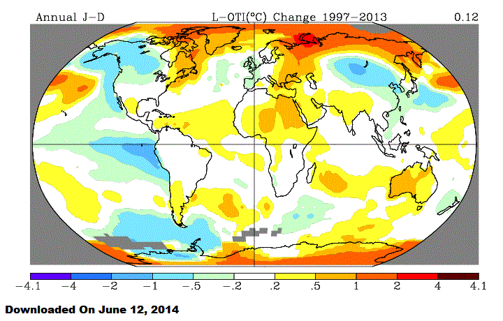
UPDATE 2 (September 16, 2014): Animation 1 compares GISS trend maps. One was downloaded on June 12, 2014. The second was downloaded yesterday June 15, 2014. To complicate the comparison, GISS recently revised their Robinson projection maps. On their Updates to Analysis webpage, they write:
September 15, 2014: Color maps using the Robinson projection are now presented without contour smoothing, since that process occasionally results in skipping some color bands.
It appears, however, that there is new data in the Arctic, north of eastern Siberia. GISS must’ve found an island in the Arctic Ocean with some data so they could infill that region with missing data.
Animation 1
Gee, I wonder why the adjustments never go down in any year?
Because the homogenization routines assume errors will be for both cooling and warming. In reality the vast majority of station moves, modifications, etc are due to things that will contaminate the record with an ever-increasing warming trend. When the station is moved, repainted or maintained…the temperature record has a step change (usually down) and the homogenization routine assumes it to be error and realigns the temperatures, lower the temperatures of the past.
But its peer reviewed so the past must really be getting colder.
They do adjust previous years downward to make the temperature trend look more upward. We have the worst bunch of liars running the US government that I have seen in my lifetime, by far. Inflation calculations have been adjusted to make inflation look small when by 1980’s standards it would presently be about 9.5%, unemployment/underemployment is much higher than reported due to all the folks no longer in the employment numbers, the propaganda outlets (news reports) do not tell us that most of the new job formation is part-time, low wage McJobs, GDP calculations ahve been changed and include items like government spending that make it look better and the list goes on and on. Benghazi, IRS, Fast and Furious, etc., etc.
The media outlets are heavily responsible for the lack of informed citizens in our country and unfortunately there are few to hold them accountable. Even Fox News falls down on the job not reporting the full story ie the effects of the fed’s open market operations on the markets or the rules of engagement which cause even conservatives to oppose troops on the ground when the goal of war should be to win, decisively, and it is not, and has not been since WWII.
Really? I heard that was all mostly due to the unintended consequences of a rather fractious and intransigent winter.
The EU has REJECTED the Global Warming crisis in QUEST OF SAVING THE ECONOMY – green filed to produce enough power at a competitive cost excluding the carbon tax which was used to subsidize wind and solar – well the economy crashed, millions of JOBS were lost and entire industries were forced to move.
To correct the economic disaster created by e=green projects Germany is now building COAL PLANTS – India and China are building 2 or more each week – so the air will not be clean for decades as they build their economy. 2 or 3 billion jobs need to be created between them if they are to escape 3rd world Standards.
Here is the current EU actions . . a lot to read but very informative.
http://us4.campaign-archive1.com/?u=c920274f2a364603849bbb505&id=02e1f5a684&e=cdaa309e6c
Government spending has been part of GDP/GNA since those statistics were first issued. Any claim to the contrary is simply wrong. Whether the contribution of government to GDP should be valued at the price of the inputs is another matter.
How can money the government took for the people or they borrowed from the future be added to the GDP as they created no product . . just debt/
Jim- I think you are aware that the US Air Force was established based on the theory that wars can be won from the air, and if people admit we can’t win a war without ground troops, then there’s no reason for a separate Air Force, and where are we then, with all those generals out of work? 😉
Except the GDP, see PA Ken’s comment below, Amen! The current administration seems to have an unusually high number of prevaricators, no?
@ profitup10
September 15, 2014 at 11:17 am
—
Interesting link, thanks.
You are welcome – I wonder why we are not reading any American press on the numerous articles? I even take a Australian news paper and not a peep?
If they went down I’d suspect criminal intent. They go up because that is what is needed to attract government money.
Anthropogenic statistical entropic inflation is its technical term. Its inflation sort of like mixed up with entropy always trending in one direction. Oh and man made of course.
There must be a tipping point.
They need to expand the vertical axis, 0.001C should make a truly “scary” trend apparent.
As it is, if they used the error bars, as normal science must, the signal would be noise.
And of course the imaginary information of an accuracy of 0.01C, continues to be perpetuated.
As a tool for destroying citizens confidence in their government institutions, CAGW has few peers.
The IRS.
I wonder if any one has bothered to count the total number of adjustments over the years and whether any of them where downwards?
I was thinking the same thing.
I would really love to see a tally of all adjustments (up versus down) for satellites, tide gauges, balloon data, Argos, … and so on. It’s my perception that corrections are overwhelming biased towards increasing the trend. Maybe that’s just my own bias …
A rather good site is this: http://climate4you.com/
He shows how the temperature series have been changed in time. Their stability or unstability.
This is a followup on Svend Ferdinandsen’s observation.
The author of http://climate4you.com speaks of the maturity of temperature estimates. This simply refers to the inevitable adjustments one might see in a data set over time. However, we would expect the oldest parts of the data set to be settled on, hence the term maturity.
You can decide for yourself if the adjustments made to the GISS data set appear reasonable or not.
See http://www.climate4you.com/GlobalTemperatures.htm#GISS MaturityDiagram
The entire webpage of GlobalTemperatures.htm is a very good read on the subject.
There are maturity diagrams for each of the major data sets.
There are many downward adjustments in the PAST. The effect is an ever increasing trend up.
Looks like its gone up about 0.07 deg C in 15 years. So many half a degree per century ? If they would plot this on a linear graph with absolute zero as the X-axis that would put it in perspective.
Regardless, from NOAA’s own global temperature data, the trend from 2002 to 2013 is a downward trend of -0.02 C. But that is my own little cherry picking. Even with its adjusted data, it does show a downward trend for a recent 12 straight years.
Catastrophic climate cultists compel culling.
[Always avoid alliteration ~mod.]
climate cultists compel pruning (CCCP)
Mods mainly monitor midnight- mornings monthly; making mid-afternoons mostly magnanimous.
I wouldn’t necessarily say the adjustments are to achieve more warming. It’s only that folks want to find more warming, and so do not consider strongly those things that might show more cooling.
At some point if the adjustments continue to weigh strongly in one direction (more warming), it won’t be necessary to even know how the numbers are calculated. The percentage chance will be so overwhelmingly lopsided as to prove in and of itself there is bias. 32 all warming adjustments, no cooling, chance is 1/4B, for instance.
I think expectations bias is so strong that if data shows a strong up-trend, it is simply assumed to be correct (no need to look further), but if data shows a flat, weak up trend or a down trend – it is assumed to be in error and the search is on to find reasons WHY the data should be ‘corrected’. If you look hard enough, you will always find a reason. When you are dealing with pathological data (noise >= signal), it’s fairly easy to find just enough adjustments to get the signal you want. It’s not a conscious ‘fraud’, just the result of a group wanting a particular outcome so badly.
Currently adjustments are as large or larger than the ‘signal’ we are supposed to see. This should sound warning bells for anyone with an ounce of objectivity.
http://en.wikipedia.org/wiki/Pathological_science
The climate4you.com site showed this graph. Is that convincing enough?
http://climate4you.com/images/GISS%20Jan1910%20and%20Jan2000.gif
This is a very convincing plot. Thanks.
Anthony I know I’ve asked for it before, and I know it would be a huge amount of work, but I sure would appreciate a WUWT Data Adjustments Reference Page. Thanks as always.
I am deeply saddened that our tax funded federal agencies, NOAA, NWS, NASA, are totally involved in the Climate Change scare campaign. Small and large actions are constantly building a federal foundation under this bad science. We mere citizens have little power to battle back. Thanks to all the great scientific minds that display the truth in posts and comments here on WUWT. I know many of you are posting on other websites as well. I really think the time has come to organize into a active, coordinated blitz email, letters, posts and cyber invasions on selected sites. Otherwise, I fear I will die among losers.
From what I’ve seen its not that they’re not doing it on purpose. But they are at this point “actively ignoring” (its brought to their attention but they refuse to act) the recent discovery that the routines they use for homogenization will add a warming trend to many stations’ data…turning flat (Or even negative) trends positive, and making positive trends worse. Its ironic…they did a good job removing urban heat island but every time a station moves to avoid UHI, these routines effectively adjust the UHI back in by cooling the past.
John, do you have a list of names to hit up? Emailing into the maw gets any effort deleted by hirelings, who are do-as-you’re-tolders hired to cull cranks and those who should be ignored. It’s a waste of time and resources. An email directed to a specific person should make it by the first cut. Since you are far closer to the biz and an insider, perhaps you could expand on this comment by saying who should be contacted by email and letter, and have Anthony put it up as a headline post.
I would be more than happy to write, but I am not going to waste two to three hours to have it deleted by a minimum-wager whose success depends upon pleasing the boss. I DO know that physical letters carry enormous weight; the logic is that someone must [really] give a damn to take the time. A well-written physical letter carries the weigh of 10,000 letter/opinions. The non-smoking sections in airplanes came about as a result of three letters.
Don’t think that way John! We mere humans are indeed battling a Jagger naught of corruption, that said, good things are happening, and the continued sobering effect of the earth in a cooling phase ( god forbid a full on ice age ) and the general public experiencing reality in the face of mass media climate scare porn has delivered a kind of tipping point of public awareness we are being assaulted by bogus policy by the entire elite power paradigm. Pitch forks may well come out, lets hope we stay focused and sober emotionally as the house of cards smoke and mirrors come tumbling shattering down! And yes Mr. Coleman and organized media push back is in order, you my friend and hero must hear how your work and efforts are absolutely appreciated and needed. Thank you, thank you, thank you.
Best model…..errr dropped data…….hmmmmm….complex arrangement………uuuhhhhh…more accurate than the raw data…..heh! denialist scum!
Tweaking? Twerking!
For http://www.woodfortrees.org/plot/rss/from:1995/from/plot/gistemp/from:1995
The OLS trend of the difference, GISS – RSS, from 1995 to now, is +.075 C per decade. At this rate there will be a whole degree difference between them in only 8 years.
The dead hand of DR Doom once again makes is presence felt .
The real shame is that other are playing three wise monkeys while this is going on, to their shame.
They ought to store data in a revision control system, it is not enough to publish stuff on the web any more. Failure to do so is inexcusable.
Errata control might be more appropriate.
It’s not really data if it’s been adjusted… However, I think the output should be stored in a data warehouse or data mart — that’s if they do things like actually use a database.
They may be outputting individual files. If so, a revision control system would work.
Not only that. A proper revision control system would reveal the full history of how history is being rewritten and make it impossible to tamper with that aspect of the process retrospectively. It has a built in facility with a standard software interface to make as many local copies of the full process as the general public wishes, therefore it would effectively prevent hidden &. undocumented manipulations and would make easy to visualize changes over time by adding another software layer.
These tools are developed to deal with complexity in a transparent way and transparency is the lifeblood of science, is it not?
What’s their excuse for increasing it this time?
there’s a perfectly good excuse for this….
…we were too stupid to read a thermometer 10 years ago
Why are people still lettin them get away with this?
If global warming is causing all what ills us, what does global cooling do?
@ policycritic.
If global warming is causing all what ills us, what does global cooling do?
———————————
Hi there.
The climate scientists, if you ask them this question, will be in no problem to tell you what global cooling do, or a natural global warming can do, and you by now know their answer about the AGW.
If any of these scenarios possible to happen they will be found correct with their explanations, in general, I think.
(But very little chance there for any as such as above.)
But the problem that the only scenario they can give you an answer when the ever rocketing CO2 emissions considered , as in the way been till now, unfortunatly is the scenario of AGW.
They can have an explanation about it, a kinda of theory, also the possible problems can be identified at most and quantified, and no any paradox there.
But in a natural climate trend, either of warming or cooling, to explain it how come to be and what it could do, in a such already high CO2 emissions and in the prospect of ever increasing CO2, any theory or explanation it will be more complex and difficult and very hard to comprehend.
Further more no way of any possibility to identify or quantify the problems related to, simply because, ever rocketing CO2 emissions in a natural climate change or trend, becomes a paradox, at a given moment.
There is a natural tolerance in the system about CO2, at a given point the tolerance will be reached.
There is ways of estimating while that reached, more or less.
The AGW scenario has the higher tolerance of CO2 emissions allowed, to a point that climate will be in a new equilibrium, meaning a higher tolerance and further in future point of that tolerance reached.
With all the scare stories Agw is the most benign autcome, one to wish for.
But unfortunately is becoming more clear with every day passing that that is not the case.
In the natural cause, in the scenario of a warming trend or period in the given condition, the tolerance is much less than in the case of AGW, but more than in the scenario of the cooling.
So the scenario of a natural cooling period is the most difficult scenario to explain, and a disturbing one while trying to explain,………. the point of paradox is reached earlier and quicker.
And a scientist confronting a paradox is like Mozart facing his own piano and looking at his own partitures unable to play it or even make head from tails. or like Davinci not been able to Identify his own Mona Lisa while told how much it cost today to own it……
But anyway, I don’t think there any posssibility, if all taken in account, to really identifie or quantifie what a cooling can or would do in the particular way is happening.
That is the harder part, avoided by climate science, and that is what I think makes these scientist to still persue the AGW way. To desperate and shocked to see it otherwise.
The simpler answer you would get to your question, probably the most correct one will be in the lines: “We don’t know, is an unprecedented scenario, contradictive and soon to become a paradox.”
A simple way will show that with a cooling and CO2 ever increasing, the natural tolerance will be reached while the CS or TCS will reach the lower value of 1.5C, the moment the climate will show no any sensitivity at all to CO2 emisssions and the further increment. Simply that is the point when further CO2 emissions become a paradox.
All the data fudging thus far is causing an artificial postponing of that day by increasing artificially the warming and therefor keeping for longer the droping of CS or TCS metric and artificially increasing the amount of CO2 considered as allowed and still below the natural tolerance value. .
From the day one, AGW science has tried to convince the rest about the imediate need to cut CO2 emissions, while in the same time has artificially increased the amount of the considered tolerance of CO2 allowed in the system,…….and still at doing it.
If science can be viewed as a magnifying glass used to check-view-look wider and further in the horizons for better understanding and comprehention of the environment and the place we thrive and belong, this AGW scientists seem to be using it backward, looking at it from it by the wrong end.
Very sad indeed if that happen to be the truth.
First, the AGW science or the orthodox climate science from this point will just be in regression modus operandi, as far as intellect and real scientific method considered.
Second there will be a long or rather very long time before any turn on the right direction expected to really happen.
Anyway that is just what I think in this particular point, I do consider that probably, hopefully I am wrong.
Cheers
It is the new process being used called Gavinization!
Are these adjustments cumulative in any sense? Ponzi schemes collapse under the weight of the constantly increasing payout required to keep the scheme afloat. Can they keep these small adjustments up forever, or could they reach a point where the departure from reality is too large to hide. Is there any way they are sowing the seeds of their own exposure and downfall? Can they tweak the satellite record or is that safe from manipulation?
That would work if they weren’t cooling the past…..to fabricate the incline
In what other field of science would constant adjustments to the historical record be tolerated without fully published, bullet-proof justification?
In climate science, we make unidirectional adjustments every time a team member waves their arms.
Oh golly, it’s just an occasional helpful nudge for the sake of the planet.
Why not look on the bright side.
These nudges are likely to make reality a lot more hard to swallow as the climate itself refuses to cooperate.
These adjustments may coddle the alarmists in an immediate sense but as time marches on and the climate disappoints them they’ll increasingly find themselves wishing they had not traveled so far from the comfort of truth.
…..And you thought mann-made global warming adjustments would stop, when Michael Mann left the GISS operations??
[Mann at NASA/GISS? or Hansen? .mod]
Thanks for the correction! Juggled too many things on a hurried lunch break….
Mac
These activities in the US, Australia, New Zealand and elsewhere demonstrate that so-called climate change is anthropomorphic, not anthropogenic: Anthropomorphic is to assign human traits to thigns in nature: Faces in mountains, clouds; patterns in stars controlling human destiny, etc. What is abundantly clear is that climate data, filtered through the anthopomorphism of the climate obsessed, is interpretted by the climate obsessed as *proof* of climate doom caused by CO2.
Yes, astrology comes to mind.
In college, if I had gone back into my lab books and altered recorded data, I would have been tossed out of the program. If in my report of the experiment I modified the recorded data using approved statistical analysis, I had to show and justify the statistical treatment. Looks, like I should have majored in climatology – could have saved myself a lot of effort.
The GISS and HADCRUT4 data are sure to reflect ever increasing temperatures as the ice packs begins its march southward out of N Canada’s higharctic.The Global Warmists alarms will get ever louder as theGreat Lakes start retaining ice through the summer.
Too much money for renewable subsidies and carbon tax schemes are in jeopardy if this is not.
No surprise. This is how MatheMannics and AlGoreithms work.
Ka-ching
Folks – please remember that this analysis by GISS is their **interpretation** of the NCDC data. Their methods are based on a lot of questionable assumptions (to say the least) and the numbers mean very little in terms of actual trends (and are certainly thermodynamically meaningless). In the modern era, the satellite data is, I believe, the most reliable indicator of the “average earth temperature”.
In other words, just ignore the GISS analysis, much like you would ignore the Weather Channel’s cute naming of low pressure systems and cold fronts… [heh!]
Thanks, Bob, I think.
I’m afraid that the new way of doing science might take hold. That would be catastrophic, man-made, and even global. But warm? It sends shivers down my spine.
What will happen when the trend spread between satellite temps and land-based adjusted temps becomes too huge?
In other words, how long can they get away with this ?
“What will happen when the trend spread between satellite temps and land-based adjusted temps becomes too huge?”
Remember – the GISS trends are **meaningless** in terms of actual, thermodynamic temperatures. For example, if their temperature anomaly “index” (to put it charitably) increases by 10% over one year, does that mean that the average temperature of the earth increased by that much? Of course not! The true average may in fact have increased, but probably not nearly as much. And given all of the “corrections” and “adjustments” it is all but impossible to compare their index values with those derived from historical data.
Bottom line – GISS anomalies have little to do with actual temperatures. It is mostly for entertainment purposes only.
UAH and RSS constrain them a bit after 1979. Nothing constrains them before unless we vote the rascals out.
Truly the saddest part of the adjustment scheme we are seeing is that from an instrumentation perspective, it is completely invalid. Sure, someone with a strong academic standing can write peer reviewed papers explaining just how correct and wonderful the scheme is but that does not make it hold water in the real world of instrumentation engineering. It is simply mistaking real world measurement system errors for theoretical random number noise problems and differences between nearby (?) stations as an indication of calibration error.
To justify shifting a set of observations up or down when a step change is assumed, calibration reference reading from both the beginning and end of the period to be shifted must be available and a calibration reference must be available for just after that period. Even that is still shaky technically as it will assume a linear error shift from the beginning to the end of the period to be shifted. In the case of a white washed wooden structure continuously exposed to weather, obviously issues such as dust/dirt build up and rain wash just some of the simplest things that can temporarily shift observed temperature values by fractions of a degree.
Next, homogenization algorithms, if they are to be used at all, must always be performed against raw values from neighboring sites. That does not appear to be the case. Homogenizing a site’s records with previously homogenized sites destroys actual correlation comparisons between those sites. It is no longer possible to know whether the ups and downs on a site’s records are real or errors if compared against a previously artificially smoothed site’s records.
What is needed is to stop trying to polish good historic temperature data into laboratory grade data. The information needed to correct real or theoretical deviations from perfect does not exist. Now amount of second guessing the real world will improve the accuracy of that data. No matter what algorithms are used, the accuracy will still remain plus or minus one degree Celsius at best – for every single temperature observation value and every value derived from it.
Is there a reason why no-one can ask for the adjustments to be explained?
You are not allowed to ask that question. We know the reason, and that is enough.
you are assuming that adjustments is the reason.
GISS only do 1 adjustment: UHI.
The adjustments can also be the response to one of the other factors included in GISS LOTI. Sea ice extent, for example. If Antarctic sea ice extended farther into the Southern Ocean in a given month, breaking new record extents in places, then wherever new ice was reported, the data would be changed permanently from sea surface temperature data to land surface air temperature data.
And, of course, there could have been changes to the GHCN data or the ERSST.v3b sea surface temperature data. We’ll know that in a few weeks.
Steven M, is all the data GISS receives raw? (You know it is not) Also there is much logical evidence that the UHI adjustment is wrong.
Steven M, please explain the Iceland adjustments. http://stevengoddard.wordpress.com/2014/09/14/occupy-iceland/
Seriously Mr. Mosher. Just justify this ONE adjustment. You berate some for not understanding how it s so complicated. Well Sir, simplify it!! Explain just this one adjustment. (That should not be to hard.)
This looks like more then UHI.
http://wattsupwiththat.com/2014/09/15/nasa-giss-tweaks-the-short-term-global-temperature-trend-upwards/#comment-1737525
Western region Coop station data, as it appears on NCDC websites, has changes to, and deletions from, data logged by observers. Whoever is doing the changing/deleting does not know what they are doing, which is apparent in the data from stations where data is logged in the morning or logged twice per day. The high temperature logged at stations that log data in the morning will be Tmax from the day before, but NCDC data show it as being the high temperature for the day on which it was logged. In some cases this resulted in record low high temperatures announced by the NWS in August being discarded by NCDC.
From the FAQ section at GISTEMP’s homepage:
“Q. How can we combine the data of the two stations above in a meaningful way?
A. What may be done before combining those data is to increase the new data or lower the old ones until the two series seem consistent. How much we have to adjust these data may be estimated by comparing the time period with reports from both stations: After the offset, the averages over the common period should be equal. (This is the basis for the GISS method). As new data become available, the offset determined using that method may change. This explains why additional recent data can impact also much earlier data in any regional or global time series.”
Source: http://data.giss.nasa.gov/gistemp/FAQ.html
It is a consequence of the way GISTEMP combines data from different stations as explained in the quote.
You left out the example of two stations referred to above …
“Q. Can you illustrate the above with a simple example?
A. Assume, e.g., that a station at the bottom of a mountain sent in reports continuously starting in 1880 and assume that a station was built near the top of that mountain and started reporting in 1900. Since those new temperatures are much lower than the temperatures from the station in the valley, averaging the two temperature series would create a substantial temperature drop starting in 1900.”
… and the important bit following …
“Another approach is to replace both series by their anomalies with respect to a fixed base period. This is the method used by the University of East Anglia’s Climatic Research Unit (CRU) in the UK. The disadvantage is that stations that did not report during that whole base period cannot be used.
More mathematically complex methods are used by NOAA National Climatic Data Center (NOAA/NCDC) and the Berkeley Earth Project, but the resulting differences are small.”
This implies that homogenisation of the entire raw data is reworked from scratch (right back to 1880) as time passes and new values are appended. That in turn means the whole thing is floating about and the increment or decrement each month has no meaning when compared to values in previous versions. Then we have this at the bottom of both versions of dataset used to produce the graph below.
“Best estimate for absolute global mean for 1951-1980 is 14.0 deg-C or 57.2 deg-F, so add that to the temperature change if you want to use an absolute scale (this note applies to global annual means only, J-D and D-N !)”
Is it any wonder folk are confused? How many megawatt hours of CO2e have been wasted on blog arguments worldwide due to this misunderstanding of crackpot numerology whose credibility disappears up its own rounding/truncation errors? You cannot create precision where there isn’t any.
I have no idea how this code was put together but unwitting penny millionaires are everywhere.
If you look at the J-D annual averages compared to monthly values it looks as though they are all truncated rather than rounded. But maybe they’re derived independently of monthly averages and that’s just coincidence. The output format also suggests integer arithmetic (based on hundredths of a degree) may have been used throughout, which would naturally truncate intermediate and output values by default. Usual line of mod and conditional increment required. It could of course all be floating point in some language with output formatting that does the same. IIRC some older varieties of FORTRAN used to do that.
Even if it’s using traditional 5 up 4 down rounding it’ll still bias older values down and new ones up with masses of individual small values increasing over time centred around zero. 5 up 4 down has a natural bias. Tax man’s rounding (6 up 4 down, 5 to the nearest even higher order digit) would likely make it a bit more stable.
Academic as far as actual warming is concerned (who’s interested in hundredths of a degree FFS). But at least it might reduce the waste of coal on these endless silly arguments over something that has little basis in physical reality in the first place.
1999 to 2014 trend – no context of course – is 1.3C/100 years. Even out-of-context-bogus there is nothing to support the CAGW narrative.
SRJ: I am glad they said that their method combined data in a meaningful way.
It is a shame that the result is meaningless!
I think GISTEMP must update its time series if it believes that it is necessary. You can compare their data with those of other organizations (NOOA, HADCRUT, Berkeley etc.). I hope that these organizations are working independently. I found for the Gistemp LOTI data for Aug 2014 following running annual means Trends: 15 yr: 0.090+-0.01 °C/Dec, 30yr: 0.170+-0.05 °C/Dec , 60 yr 0.135+-0.02 °C/Dec. Obviously, the trends strongly depend on the time interval used.
You all look at the raw data a lot more than me . . what happens when you plot the temperature versus the global wind patterns – they change as the jet streams move?
It is my understanding, that GISS, UAH, RSS, HADCRUT, whatever, ALL report at some periodicity (daily / weekly / monthly / yearly / decadely / whatever; a single number, that is some computed “Temperature” measured on some arbitrary NON-SI Temperature scale, commonly referred to as an anomaly (it surely is).
So is there in existence, a peer reviewed paper, or series of such papers, that gives a rigorous physical proof, that the earth weather / climate / whatever , can indeed be completely and unambiguously represented by such a single Temperature (anomaly) number reported periodically, without any reference to any other physical parameter of the earth climate system.
What is it about Temperature, that enables it to survive alone, as the ONLY index of earth climate ?? Why do all other variables cancel out as quite irrelevant to earth climate and climate history ??
Just asking of course.
How many of the 57 approved climate models give a proof, of the total cancellation of all other physical variables besides Temperature ??
When I attended University in the early 60s – you could only PEER REVIEW a Peer review request required all data, method, formulas, math, and all pertinent information for the Reviewers to attempt to recreate the hypothesis – none of the climate papers are real Peer Reviewed – as the Law now permits them to keep datasets, methods, math used proprietary [aka undisclosed] – so how can one review Political OPINION?
Surely not per Scientific method . . I would have been flunked out of many classes if I submitted that kind of paper for a grade – muchless peer review. The e-greens were not getting enough papers through so they could apply for more grant money so they started there own journals and selected their own peer reviewers.
Humm sounds like a money scam to me.
big fat 0
It now seems to me that a large segment of the so called climate science community (N.Z. scientists included) is quite prepared to produce “fantasy” data in support of their own personal beliefs. Do they really think they are fooling anyone? I suspect only the already deluded will place any value to the above tortured data set.
Check the Australians they have bailed on the false science of CAGW.
So maybe Steven Goddard is on to something after all. Looks like more analysts are discovering what he has been promoting for some time now.
Every little bit they can do for the upcoming “Summit” in NY. WMO and Nasa made their contribution with the news on the overwhelming amount of CO2 with no mention of NO warming. I guess they are adding what warming they can in time. As in a billy pail of bog water, the bugs are swimming faster and faster as the end approaches.
The warming adjustments will make the descent appear much steeper when a cooling cycle is realized.
It will be interesting to watch the acrobatics.
Don’t forget the impact of the Zombie Weather Stations
Want some more warming? Close down some more of the cooler stations and “manufacture” readings more friendly to “The Cause.”
Back to the figure for August:
NASA GISS LOTI is running at +0.64 C for the year to date including August. So 2014 could be a top 3 year on their data set.
Because recent years have been consistently warm, with no cooler years such as 2008 to drag down the average, the 5 year running mean could go marginally record warm when the 2014 data is added in.
They have a goal.
Just Gavined up Schmidty data.
Ha ha
Bob, in my post http://wattsupwiththat.com/2014/07/03/giss-hockey-stick-adjustments/ I included a zip file https://wattsupwiththat.files.wordpress.com/2014/03/work.zip with 94 monthly GISS downloads between August 2005 and May 2014, but there are some gaps in the 2006 and 2007 downloads. Read the readme.txt fie after unzipping, for instructions.
Feel free to download it and use it in your analysis. I also have June/July/August on my hard drive. Let me know if you need any of them.
There must be a trend and a hockey stick in there somewhere Bob. Every little yelps …
http://s28.postimg.org/icmtt7g6l/jestco.png
[Rather “every little yelp hurts” ? .mod]
So increased CO2 results in increased adjustments in data in the upward direction. Can I have a few million in grant funds to prove this alarming trend?
;-))
How dose GISS square this with the CRN data that shows a definite cooling trend? Something stinks to high heaven..
On the average, over the period since 1940, the adjustments to all global datasets have kept up their upward trek of a mere 0.000625°C per month. Now that seems rather insignificant and you would almost never be able to actually detect it but this over time has adjusted the datasets at that rate time 1200 months in a century of 0.75°C/cy. The surprising result of this, cooling the past and always assuming today’s readings are the correct ones, create this graph when you go back and merely remove that 0.000625°C from each month since 1940. That rate of 0.75°C/cy comes from published adjustments from two datasets and a third had the slope at 0.81°C/cy, so this approximate. Kind of like the ‘thousands cuts’.
http://i44.tinypic.com/29axhua.png
(and with more smoothing)
http://i39.tinypic.com/1118rnl.png
This is basically my attempt to “un-adjust” the HadCRUT4 adjustments. You get basically the same if you use GISS or USHCN datasets and they have the adjustments published, in chart form at least.
I always find this telltale of what has happened… it has all been in the adjustments!
It used to be done with white-out and a straight edge. Now all you have to do is delete and re-enter the value you want, hit print and voilà! Global Warming!
Emails between top Environmental Protection Agency officials reveal they saw their fight against global warming as putting them at “forefront of progressive national policy.”
http://www.foxnews.com/politics/2014/09/15/emails-epa-rules-part-progressive-agenda/
Internal emails: EPA rules part of ‘progressive’ agenda
http://www.foxnews.com
‘This is not about climate’
The only form of man made global warming that is actually occurring is the sort that involves keyboards, computer programs and changing historical records.
Actually, the BIG PICTURE just hit me….if the adjustments and data measurement errors are nearly as big as the actual warming, then common sense says the warming simply is not a problem.
Of course I’ve read peer reviewed research that says global warming is killing 160,000 people a year. I’m slightly doubtful of that considering the warming has been roughly the same as what happens when you don’t paint the Stevenson shelter.
Mary – do have a link to the research which claims 160,000 people a year are victims of global warming? That’s totally preposterous! Climate happens over decades and centuries. There’s NO way to attribute short term events to long term climate change.
Study came out in 2002 or 2003. Recently I had a guy tell me “It’s much worse now”. I don’t have the link handy to the actual science…but here is Reuters writeup from 2003…Considering they thought it would “double by 2020”, we should be killing 250,000 a year now.
I think we should pass an emergency “Stevenson Screen Paint Bill”. If we immediately paint all the Stevenson Screens in the world, it would lower the global temperatures enough to eliminate all these unnecessary deaths.
……………………………………………………..
Global Warming Deaths on the Rise
Reuters Email 09.30.03
MOSCOW — About 160,000 people die every year from side effects of global warming ranging from malaria to malnutrition and the numbers could almost double by 2020, a group of scientists said Tuesday.
The study, by scientists at the World Health Organization and the London School of Hygiene and Tropical Medicine, said children in developing nations seemed most vulnerable.
“We estimate that climate change may already be causing in the region of 160,000 deaths … a year,” Professor Andrew Haines of the London School of Hygiene and Tropical Medicine told a climate change conference in Moscow.
“The disease burden caused by climate change could almost double by 2020,” he added, even taking account of factors like improvements in health care. He said the estimates had not been previously published.
This seemed to be such an amazing finding that I added it to Dr. Haines Wikipedia page. We will see if it stays there.
“We estimate that climate change may already be causing in the region of 160,000 deaths … a year,” Professor Andrew Haines of the London School of Hygiene and Tropical Medicine told a climate change conference in Moscow.
“The disease burden caused by climate change could almost double by 2020,” he added, even taking account of factors like improvements in health care. He said the estimates had not been previously published.
You are right on point. There is zero proof of the effects of climate change on human life expectancy in the next 5 decades. The life span of ALL HUMANS in all countries are being extended.This silliness is not new:
Climate is what we expect, weather is what we get.
Mark Twain
Oh…one more thing…when Vladamir Putin was told of the “160,000 deaths a year ” presented at the 2003 Moscow conference he suggested in jest that global warming could benefit countries like Russia as people “would spend less money on fur coats and other warm things.”
It’s a sad world when crazy dictators make more sense than London epidemiologists.
Mary Brown
September 16, 2014 at 7:59 am
…..
Global Warming Deaths on the Rise
Reuters Email 09.30.03
MOSCOW — About 160,000 people die every year from side effects of global warming ranging from malaria to malnutrition
…..
I call BS. Malaria extend has nothing to do with global warming.
https://en.wikipedia.org/wiki/Anopheles
“Although malaria is nowadays limited to tropical areas, most notoriously the regions of sub-Saharan Africa, many Anopheles species live in colder latitudes (see this map from the CDC). Indeed, malaria outbreaks have, in the past, occurred in colder climates , for example during the construction of the Rideau Canal in Canada during the 1820s.[11] Since then, the Plasmodium parasite (not the Anopheles mosquito) has been eliminated from first world countries.”
And btw… guess what eliminated it from the first world countries territories?
next point malnutrition…
Now with world food production on the rise if we would not burn the food instead of diesel, if we would not destroy greeenforests for palm oil…
http://www.rationaloptimist.com/blog/bioenergy-versus-the-planet.aspx
The planet got greener due to more CO2 and these guys want to say in overall malnutrition is due to more CO2? Now really….
Good link thank you for sharing.
Thinking more about painting Stevenson screens and data homogenization….I have no idea how often a obs box is painted or how much the temperature changes…but Imagine this scenario….
You place a brand new instrument shelter in service. The average temperature is 50 deg in 1900. This creeps up to 51 deg by 1920 when you realize the thing is brown and needs new paint. You paint it and temp drops back to 50 deg. This happens every 20years.
“Data Homogenization” does not notice the slow warming as the box decays from white to brown. No adjustment is made.
When the box is painted, a long period of slow accuracy decay is fixed. The station shows an instant drop in temp which is detected by the “Data Homogenization”.
Magic. Global warming. The slow warming from shelter decay is retained while the fix, which produces cooling, is eliminated.
Same thing happens with Urban Heat Islands……
An obs location gradually gets compromised by a growing UHI. This produces artificial warming. No adjustment is made. Then, the obs site is relocated to eliminate the UHI problem. The data shows an immediate cooling. Data Homogenization algos pick up on the discontinuity and adjust the old data cooler.
More Magic. Global warming.
I understand… Adjustments are needed. The problems are difficult to get a clean data set. Many people are doing their best to fix this. But the problem is, the rabbits are guarding the cabbage patch. Adjustments that create warming are enthusiastically embraced and adjustments that don’t are ignored or explained away.
You can see in these examples that the warming bias happens slowly and can be hidden or ignored. The cooling happens instantly when sites are fixed. These get eliminated. The result is a slow contamination of the overall data.
I don’t know about the globe but it’s been a bit chilly here the last few days.
Maybe after they burn enough grant $ greenl reality will actually warm up?
I suppose part of the the problem is that the grant money isn’t really “burned’. It ends up up in somebody’s pocket.
“Palo Alto Ken says:
September 15, 2014 at 2:20 pm Government spending has been part of GDP/GNA since those statistics were first issued. Any claim to the contrary is simply wrong. Whether the contribution of government to GDP should be valued at the price of the inputs is another matter.”
I knew they were, my point was that they should not be.
cmarrou says: September 15, 2014 at 2:48 pm
“Jim- I think you are aware that the US Air Force was established based on the theory that wars can be won from the air, and if people admit we can’t win a war without ground troops, then there’s no reason for a separate Air Force, and where are we then, with all those generals out of work? ;)”
Ground troops should not be sent in until rules of engagement are modified to allow us to win and our guys to protect themselves, we are willing to stay until we win decisively and under no conditions should we give any faction over there any weapons.
You have to wonder how many people think that scientists just take the temperature of the Earth and it is going up. Not that simple, is it?
The region of “uncertainty” in the Southern Pacific also takes a hit – I guess if you tweak it so that the weather stations they DO have encompass more area, you can get rid of ALL the uncertainties…. 😉