By Steven Goddard
The topic this week is verification of data sources. NSIDC reports :
At the end of the month, extent fell near the level recorded in 2006, the lowest in the satellite record for the end of May
That sounds bad! Let’s see how 2010 compares with ten, twenty and thirty years ago :

Ice looks healthier than 10 years ago

Ice looks healthier than 20 years ago

Ice looks healthier than 30 years ago
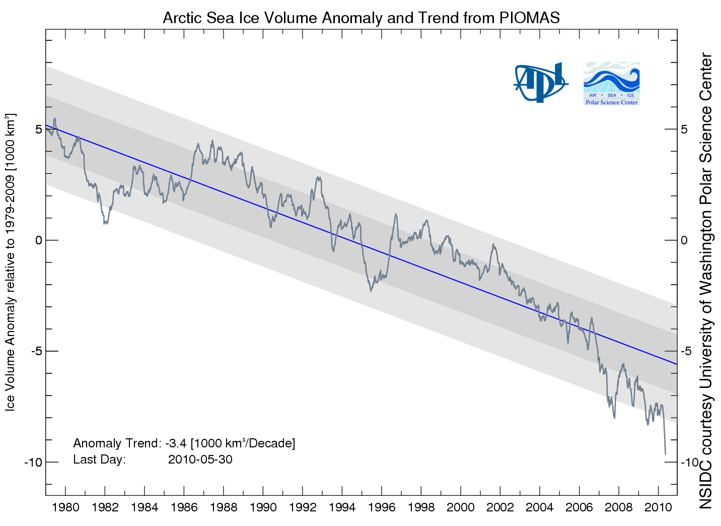
Then NSIDC discussed my favorite graph from PIOMAS, showing a record low anomaly of Arctic ice volume.

PIOMAS shows an anomaly nearly 50% greater than 2008. If that is correct, then surely we will have a record minimum this summer. However, the PIOMAS data seems inconsistent with PIPS2 data, which shows thicker ice covering a much larger area in 2010. My guess is that PIOMAS is looking at only a small region of the Arctic interior.
Next data source to look at are the Arctic Ice Concentration maps. UIUC has archived lower resolution maps since the start of the satellite record, such as the one below for June 11, 2010.

Their newer maps appear to show a lot more detail.
")
Note that the newer map shows a lot of low concentration ice in the Beaufort Sea (green, yellow, light pink.) Let’s see how that compares with a current satellite photo.

I must be missing something, because I don’t see much of that low concentration (green) ice in the satellite photo. The two videos below compare satellite vs new and old concentration maps. New comparison first :
The old concentration maps correlate much more closely with the satellite photo.
You can also see in the video below how erratic the bands of yellow and green are in the newer maps. They appear one day and disappear the next.
In the low colour version of the video, it appears that they may be having trouble differentiating between cloud cover and low concentration ice. We see large areas of open water switching to saturated ice overnight, and vice-versa.
It appears that the precision of the newer maps is much greater than their accuracy. Better to use a low precision map which is matched correctly with its accuracy.
Moving on, Barrow Sea Ice is starting to show first signs of thinning. By June 16, 2007 the ice had already broken up.
.
http://seaice.alaska.edu/gi/observatories/barrow_sealevel/brw2010/BRW_MBS10_overview_complete.png
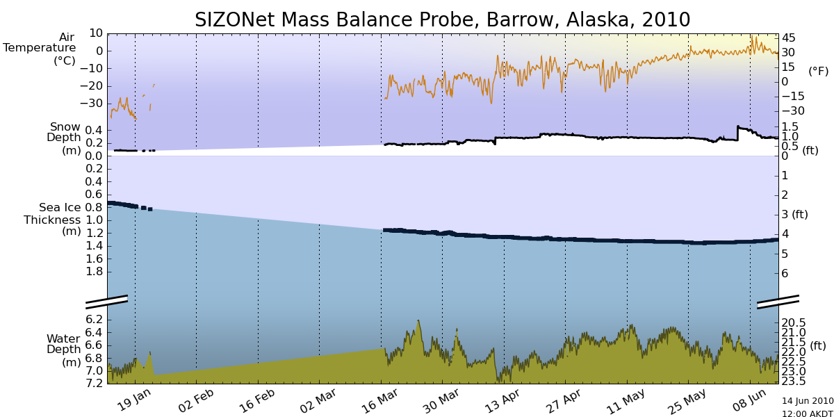
Temperatures in the Arctic have continued below normal and below freezing for the last few weeks.
")
http://ocean.dmi.dk/arctic/meant80n.uk.php
NCEP is forecasting below freezing temperatures for much of the Arctic Basin during the next week.

This week, the sun reaches its highest point in the sky. Next week it starts its decline towards winter.
Now, the really interesting stuff. Arctic Basin sea ice volume (calculated from PIPS maps) remains close to the 2006 track, and well above the last three years

Area is slightly below 2006 and 2009.

Thickness is nearly identical to 2006 and 2007.

Conclusion : 2010 minimum extent is on track to come in just below 2006. With the cold temperatures the Arctic is experiencing, the likelihood of a big melt is diminishing.
NSIDC shows extent lower than 2007. The modified NSIDC map below shows where they believe the gaps are (in red.)

On the surface, this appears to disagree with my measurement above that Arctic Basin ice area is greater than 2007. The difference is that I am only considering regions that have perennial ice – i.e my PIPS calculations assume that there is no summer ice in Hudson Bay or the Barents Sea, and that they are a “don’t care” for estimating minimum extent. You can see in my PIPS ROI (Region of Interest) maps for June 14 below, that there is excellent agreement between PIPS and NSIDC. 2007 had less ice in the Chukchi and Laptev Sea, and more in the Beaufort Sea.

PIPS June 14, 2010

PIPS June 14, 2007
The modified NSIDC image below shows ice loss since June 3.

The modified NSIDC image below shows ice loss since early April.

And finally, the modified NSIDC image below shows regions which have below normal ice extent.

My analysis indicates the highest late summer extent since 2006. In discussing, please remember that the regions in red above normally have no ice in September. They don’t figure in to the summer minimum.
I guess that means you are estimating around 5.7 to 5.9 x10 ^6 km2 in extent then Steve?
Jaxa seems to have got stuck on the website again. Also, quite a few clear days on the northpole webcam this year compared to last year I seem to recall, just as an aside.
Andy
AndyW
I should probably attach units to the graphs. My measurements are in pixels, and I haven’t calculated the relationship to km2. You can’t compare my numbers to JAXA or NSIDC anyway this early in summer, because my ROI is smaller.
Looks like ice maps are now much more detailed. See this Loeb’s slide set:
http://science.larc.nasa.gov/ceres/STM/2003-10/pdf/Loeb.pdf
Slide 9:
“SSF ED1A used the NSIDC map incorrectly: It assumed that if snow/sea-ice was
present, it covered 100% of the area.
SSF ED2A will correct this problem: ED2A will account for fractional seaice.”
Now the question is: when this change did happen? Has something changed this year with JAXA and Cryosphere?
That are the datasets JAXA and Cryosphere are now using to calculate sea ice cover?
About the more detail map in the post ( http://climateinsiders.files.wordpress.com/2010/06/arctic-seaice-color-000-1.png ), please note the scale of the map is different to the map we are used to, the yellow and red represent a concentration of 85-90%, even the green one are like 75%, so it might be hard to notice the difference in an ordinary satellite picture, and because the difference is so small, I do expect the % in the map would be highly volatile because of the dirfting or otherwise.
Facinating Steve! You of course know how much I completely disagree with your analysis, and believe that this years summer minimum will be just slightly more than the low seen in 2007, and I shall have a longer response later (as this is my favorite topic, as you know), but let’s look at just one of your faulty points of analysis. You claimed that you could not see the larger area of lower concentration in the Beaufort Sea as shown in the higher resolution UIUC maps. You indicated that you think the lower res map was more accurate, and the maybe even the higher res map was seeing clouds, or other inaccuracies. You seemed to gather all of this from a low res satelite image. Well, I would suggest that you, and the other readers take a look at this very high res image of the Beaufort sea:
http://ice-map.appspot.com/?map=Arc&sat=ter&lvl=7&lat=74.321318&lon=-140.843843&yir=2010&day=165
Now, oddlly, the trained and even untrained eye can clearly sea the ice is breaking up in a pattern extending outward that oddly matches the pattern of yellow, green, and blue shown in the higher res UIUC concentration map– not so oddly actually, as that concentration map is quite accurate, as the close up analysis of the high res pic shows. The concentration and extent are falling in the Beaufort Sea already this early in the melt season, as this accurate graph clearly shows:
http://arctic.atmos.uiuc.edu/cryosphere/IMAGES/recent365.anom.region.11.html
and according to one PIOMAS based model, we’re going to see a very big melt continue in this region this summer:
http://psc.apl.washington.edu/zhang/IDAO/seasonal_outlook.html
More importantly, you’re absolutely dead wrong in discounting the early melt in both the Beaufort Sea, the Barants Sea, and the Kara Sea, as these have a much higher correlation to the condition of the sea ice later in the season than anything you’ve mentioned so far and all three are well below their 30 mean for this time of year, so early in the melt season. I strongly suggest that you and your readers read Ron Lindsay’s 2010 Arctic Sea Ice Analysis here, where he makes a great analysis of why the early season ice in these regions is so closely correlated with the summer minimum:
http://psc.apl.washington.edu/lindsay/prediction.html
Dr. Lindsay’s prediction is also based on PIOMAS, but a little different slant (as you’ll see) from Dr. Zhang’s.
I have much more to say about your update, but I think this provides an early quick rebuttal. But as always, a nicely put together post and one that I couldn’t disagree with more!
Perhaps we can just rename this WUWT Sea Ice News?… 🙂
So I did some digging in NSIDC archives, and here’s the Antarctic Sea Ice concentration for yesterday;
http://nsidc.org/data/seaice_index/images/daily_images/S_daily_concentration_hires.png
and as compared to the same day in 2007;
http://nsidc.org/data/seaice_index/images/daily_images/S_record_concentration_hires.png
they seem to confirm the significant increase in Antarctic sea ice concentration I found in the Cryosphere Today data last week.
(Steve, the Arctic Cryosphere Today charts you found have much more detail than the ones I used last week, please let me know if you come across an Antarctic archive on Cryosphere Today with these more detailed concentration maps)
Also, as I mentioned last week, Antarctic Sea Ice Extent is currently above NSIDC’s misleadingly narrow normal range;
http://nsidc.org/data/seaice_index/images/daily_images/S_stddev_timeseries.png
and I found some good Antarctic Sea Ice Extent maps that show 2007 Extent;
http://nsidc.org/data/seaice_index/images/daily_images/S_record_extent_hires.png
and the significant increase in Extent in 2010.
http://nsidc.org/data/seaice_index/images/daily_images/S_daily_concentration_hires.png
These maps help to demonstrate how widespread the comparative increase has been, except for an apparent decrease in the Ross Sea, which calls into question the hypothesis that an ozone hole driven offshore wind over the Ross Sea is the primary driver for recent increases in Antarctic Sea Ice:
http://www.nasa.gov/topics/earth/features/antarctic_melting.html
In the NASA article/press release you’ll note a familiar name, “Jinlun Zhang, an oceanographer at the University of Washington, has pieced together a complex computer model that helps explain why Antarctic sea ice is expanding even with signs that ocean and air temperatures are on the rise.”
Yes, that’s the same Zhang whose responsible for the spurious PIOMAS Arctic Sea Ice Volume model and chart:
http://psc.apl.washington.edu/ArcticSeaiceVolume/IceVolume.php
Seems that Zhang and his models can explain away all of the Warmist’s sea ice troubles…
I am in agreement still. I believe 2010 minimum will be close to 2006. Nothing about this year would indicate to me (yet) that we will see a dramatic summer ablation unless some odd winds come from somewhere.
NCEP is forecasting below freezing temperatures for much of the Arctic Basin during the next week.
What is the difference between the NCEP forecast and ESRL plot:
http://www.esrl.noaa.gov/psd/cgi-bin/data/histdata/fnl.pl?date1=20100614&date2=&days=1&var=Air+Temperature&level=1000&type=0&proj=Northern+Hemisphere&custproj=Cylindrical+Equidistant&xlat1=&xlat2=&xlon1=&xlon2=&labelc=Color&labels=Shaded&cint=&lowr=&highr=&scale=200&Submit=Create+Plot
I cannot find the freezing temperatures.
Best regards
One wrong link in there, here’s the current Antarctic Sea Ice Extent Map:
http://nsidc.org/data/seaice_index/images/daily_images/S_daily_extent_hires.png
apologies for the missing by line steve, fixed.
mosh
R. Gates
In a few weeks there won’t be any need to speculate about the accuracy of my predictions ;^)
“I cannot find the freezing temperatures.”
The deepest shade of violet means temperatures < 5 degrees. You aren't getting enough resolution on that graphic to see "freezing" temperatures because the coldest it displays are temperatures "less than 5".
I recommend you view the lecture by David Barber at the recent IPY conference in Oslo
http://video.hint.no/mmt201v10/osc/?vid=55
Perhaps you will then be less sanguine.
If you look at this graph:
http://ocean.dmi.dk/arctic/meant80n.uk.php
You will see that the AVERAGE temperature above 80N is just about at 0C. One would be safe to conclude that temperatures over some portion of the area above 80N would be below freezing.
I’d make a friendly wager with Mr. Gates regarding the minimum this year. I do not believe it will be close to the 2007 mark. I’ll
let him decide what “slightly more” than 2007 actually means and we can then set the
terms of the wager.
According to PIOMAS: “Shaded areas represent one and two standard deviations of the anomaly from the trend. Updates will be generated at 3-5 day intervals.”
But the graph is now two weeks out of date.
While Steve continues to show his miscalculated ice thicknesses, here is plot of the ice thickness, volume and area correctly derived from the PIPS 2.0 data:
http://img7.imageshack.us/img7/6466/pipshistorybig.png
The relationship between thickness and volume is worth examination. Within a few days we should expect to see the annual sudden drop in thickness. If this drop is precipitous, like on 2008, we would be heading for a low minimum volume. If the drop comes to an abrupt halt as in 2007 that might indicate a low ice extent. We should know which in just a week or two.
I really wish that each article would start with an abstract, or executive summary.
Regarding sanguinity, according to JAXA’s data, June is thus far having the fastest decline of the years that they display. It should be noted that ice extent has dropped below the value it had at 26 November last year, so not all of this decline has been melt of ice only a month or two old. (There is nothing that unusual in it reaching the 26 November mark by around this date – in both 2005 and 2006, this occurred. For 2007, 2008 and 2009, thing were a week or two later).
crosspatch says: (two times)
1. June 15, 2010 at 12:13 am
Thank you. But does it mean the ESRL was more reckless (less precise?) than NCEP in data visualization? Please do not be offended but I saw the colors in right context. Writing my words I wanted to turn your (readers) attention to discrepancies. Plotting the lowest temperatures from 0 (zero) to 5 deg C with ONE color is too big simplification as far as Arctic issues are concerned. There’s too much at stake to make such “simple” plots.
2. June 15, 2010 at 12:13 am
Nope. Far fetched claim. Either there is an area (Arctic Basin is a big one) with above freezing temp or just contrary. It is a game changer. GISS is being flocked constantly for such infers leading to “brown” Arctic Ocean areas on their plots.
I asked my question because I am a layman in climatology but not without inquisitive nature.
Best regards
stevengoddard,
I would also be wary of a comparison that showed current ice in a healthier state now than it was 30 years ago. While it is possible that ice is recovering (although I do not think that it is) the proposition that it *has recovered* does not pass the smell test. The cryosphere today comparison images have problems, in that they are never the same as the image for the day that is on the main page – most of the detail is wiped out, as you have seen (due to differences in resolution, I guess).
And two more question.
1.
NCEP shows -5 to 0 (zero) deg C for Arctic Basin. ESRL 0 (zero) to 5 deg C.
We got -5 to +5 deg C gap – a range too big for me.
2.
NCEP plot shows __forecast__ for the area. What presents ESRL? Which one is closer to the “truth”?
Regards
R Gates is counting his chickens a little too early I fear, confusing ablation and current led break up with melting and ignoring mass for extent.
There are some early signs that point to a big melt and signs that point to an average melt, a confusing picture where the real outcome is still a couple of months away and we shall see what we shall see when we see it.
I certainly understand his eagerness to see what he wants to see, we all do that but in a month we should see a clearer picture so staking out a determined position at the moment is a little premature.
Please don’t write “normal” when you mean “average (1979-2000)”
Cassandra King,
Is stevengoddard being a little premature, too? 😉