By Steven Goddard
The topic this week is verification of data sources. NSIDC reports :
At the end of the month, extent fell near the level recorded in 2006, the lowest in the satellite record for the end of May
That sounds bad! Let’s see how 2010 compares with ten, twenty and thirty years ago :

Ice looks healthier than 10 years ago

Ice looks healthier than 20 years ago

Ice looks healthier than 30 years ago
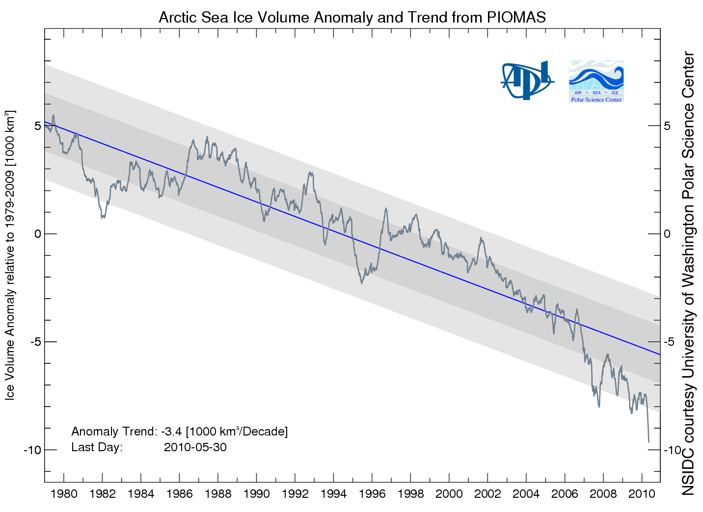
Then NSIDC discussed my favorite graph from PIOMAS, showing a record low anomaly of Arctic ice volume.

PIOMAS shows an anomaly nearly 50% greater than 2008. If that is correct, then surely we will have a record minimum this summer. However, the PIOMAS data seems inconsistent with PIPS2 data, which shows thicker ice covering a much larger area in 2010. My guess is that PIOMAS is looking at only a small region of the Arctic interior.
Next data source to look at are the Arctic Ice Concentration maps. UIUC has archived lower resolution maps since the start of the satellite record, such as the one below for June 11, 2010.

Their newer maps appear to show a lot more detail.
")
Note that the newer map shows a lot of low concentration ice in the Beaufort Sea (green, yellow, light pink.) Let’s see how that compares with a current satellite photo.

I must be missing something, because I don’t see much of that low concentration (green) ice in the satellite photo. The two videos below compare satellite vs new and old concentration maps. New comparison first :
The old concentration maps correlate much more closely with the satellite photo.
You can also see in the video below how erratic the bands of yellow and green are in the newer maps. They appear one day and disappear the next.
In the low colour version of the video, it appears that they may be having trouble differentiating between cloud cover and low concentration ice. We see large areas of open water switching to saturated ice overnight, and vice-versa.
It appears that the precision of the newer maps is much greater than their accuracy. Better to use a low precision map which is matched correctly with its accuracy.
Moving on, Barrow Sea Ice is starting to show first signs of thinning. By June 16, 2007 the ice had already broken up.
.
http://seaice.alaska.edu/gi/observatories/barrow_sealevel/brw2010/BRW_MBS10_overview_complete.png
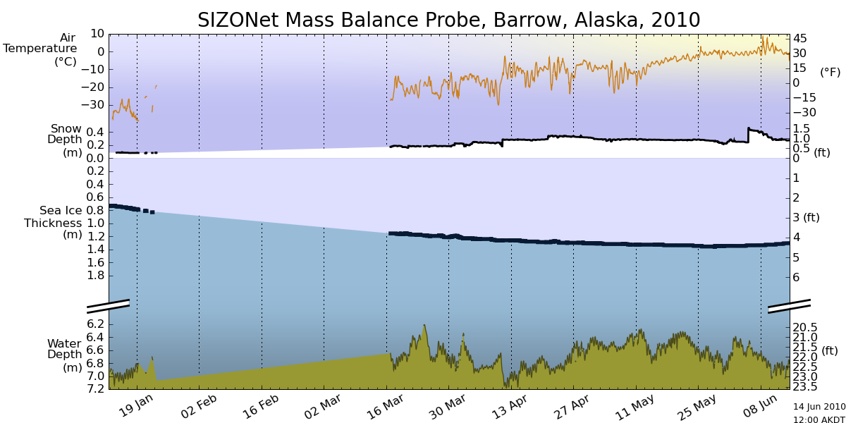
Temperatures in the Arctic have continued below normal and below freezing for the last few weeks.
")
http://ocean.dmi.dk/arctic/meant80n.uk.php
NCEP is forecasting below freezing temperatures for much of the Arctic Basin during the next week.

This week, the sun reaches its highest point in the sky. Next week it starts its decline towards winter.
Now, the really interesting stuff. Arctic Basin sea ice volume (calculated from PIPS maps) remains close to the 2006 track, and well above the last three years

Area is slightly below 2006 and 2009.

Thickness is nearly identical to 2006 and 2007.

Conclusion : 2010 minimum extent is on track to come in just below 2006. With the cold temperatures the Arctic is experiencing, the likelihood of a big melt is diminishing.
NSIDC shows extent lower than 2007. The modified NSIDC map below shows where they believe the gaps are (in red.)

On the surface, this appears to disagree with my measurement above that Arctic Basin ice area is greater than 2007. The difference is that I am only considering regions that have perennial ice – i.e my PIPS calculations assume that there is no summer ice in Hudson Bay or the Barents Sea, and that they are a “don’t care” for estimating minimum extent. You can see in my PIPS ROI (Region of Interest) maps for June 14 below, that there is excellent agreement between PIPS and NSIDC. 2007 had less ice in the Chukchi and Laptev Sea, and more in the Beaufort Sea.

PIPS June 14, 2010

PIPS June 14, 2007
The modified NSIDC image below shows ice loss since June 3.

The modified NSIDC image below shows ice loss since early April.

And finally, the modified NSIDC image below shows regions which have below normal ice extent.

My analysis indicates the highest late summer extent since 2006. In discussing, please remember that the regions in red above normally have no ice in September. They don’t figure in to the summer minimum.
stevengoddard says:
June 15, 2010 at 5:11 am
Note how the low-concentration ice healed up between June 10 and June 13. Indicates a likely problem with the maps.
Thanks for pointing these things out. Some will say we’re not supposed to be focusing on Arctic ice like this, and I do see why they say it. But Al Gore has forecast that Arctic ice could be gone in summer of 2013 (he is now hedging his bets on that) and we’ve been told, and are still being told, Arctic ice is in a ‘death spiral’. But it looks like there is no alarming loss of ice happening. It looks like everything that is happening is within normal variation.
Standing back and looking at the big picture, I can’t see how counting ice cubes matters at all. This is weather, not climate.
@BillD:
Did Professor David Barber try cruising at high speed through the ice in 1979 as well? Or in 2001? 2009? Or did he just try this last year, thinking that this must be unusual?
For this method to have any validity whatsoever, he should made this trip every year over a 20-year period, with the same speed, same ship, following the same route.
And even then, this doesn’t seem like a very scientific method to me: cruising at high speed through “rotten” ice one year, and drawing sweeping conclusions about the state of the arctic from this little trip.
Interesting, but probably not indicative, that the north of 80 temperature reached the long term average right on time, to the day.
Are these images and is the data into the PIOMAS model corrected for surface melt water? Even with the temperature slightly below zero, sunshine will melt the surface of the ice.
Mr. Gates, your detailed photos show a very high compaction, even if they do indicate some breakup. To all intents there is no 15% concentration, or even 50%. I continue to think that you are missing, or choosing to ignore this point. Comment?
I wonder how much more evidence some will need before they agree the PIOMAS graph cannot be right?
/me yawns and looks at calendar. Another two weeks and I’ll start getting interested again.
stevengoddard says:
June 15, 2010 at 6:23 am
In more important news, New Zealand scored with 30 seconds left to tie Slovakia 1-1. Something which actually affects people’s lives.
I think the blaring of those obnoxious horns is affecting people’s lives more. I have read there has been a run on ear plugs in the stores there.
Of four sea ice extent products, 3 show extent at the lowest in the record for this time of year, and the fourth is close to the minimum for this time of year.
http://nsidc.org/data/seaice_index/images/daily_images/N_stddev_timeseries.png
http://www.ijis.iarc.uaf.edu/seaice/extent/AMSRE_Sea_Ice_Extent_L.png
http://www.iup.uni-bremen.de:8084/amsr/ice_ext_n.png
http://arctic-roos.org/observations/satellite-data/sea-ice/observation_images/ssmi1_ice_ext.png
How come these products, which were regular features at this site a couple of months ago when they showed near average (normal) sea ice extent, are not discussed in some detail?
I think rather they try to assess total Arctic sea ice. They model “pan-Arctic” and assess “Total Arctic Ice Volume”.
http://psc.apl.washington.edu/ArcticSeaiceVolume/IceVolume.php
Arctic ROOs, the greatest extent of the four above, also has ice area at near-record lows, currently tracking 2008 as the second lowest area in the record.
http://arctic-roos.org/observations/satellite-data/sea-ice/observation_images/ssmi1_ice_area.png
The Cryosphere Today map comparisons heading the top post have this disclaimer boldly printed:
Historic snow cover data not displayed on these images. Sea ice concentrations less than 30% are not displayed in these images. Snow cover data is displayed only for most recent dates.
So you’re not getting the full picture there.
It is much easier to establish extent and area than volume. That there is a discrepancy with the concentration maps and the extent data might be an artefact of the missing data covering <30% concentrations. I wouldn't be too confident about the findings in the top post.
stevengoddard says:
June 15, 2010 at 5:31 am
Steve from Rockwood
Does ice melt faster at -30C or -33C?
Is there some reason why a 3C temperature anomaly in January in the Arctic is relevant to forecasting summer extent?
Yes, the colder the ice gets in winter the thicker it gets which means more ice to melt the following summer. (ice thickness grows approximately as the squareroot of the number of days below -1.8ºC)
Nice propaganda piece, you really must learn to use the zoom button on your monitor though!
stevengoddard says:
June 15, 2010 at 5:31 am
Does ice melt faster at -30C or -33C?
I still remember in another thread R. Gates saying the Arctic “enjoyed warm conditions” this past winter. -30 instead of -33, or -51 instead of -54 made it enjoyably warm there.
Great football comment from the Guardian Web Site. Brazil and Portugal both have matches this morning.
http://www.guardian.co.uk/football/video/2010/jun/15/vuvuzela-an-idiots-guide?showallcomments=true#CommentKey:b6436cee-cda7-4c47-900c-ac551e180df1
Smokey says:
June 15, 2010 at 6:18 am
Robert says @4:44 am:
“Jim,
discussing antarctic sea-ice is a moot point…”
No, it is merely an inconvenient point to our friends visiting from RC. The Antarctic is gaining ice, and Robert doesn’t want to discuss that uncomfortable fact because it debunks the CAGW conjecture.
Most of us follow Anthony’s admonition to stick to the subject of ‘Arctic’ in these posts, you being a persistent exception! Nice try at changing the subject though, hopefully no-one takes the bait.
Rotting ice can only come from a warming earth. But temperatures have decreased slightly since 2001. If you wanted to include El Nino warmth then there has been cooling since 1998.
Ice is ‘rotting’ in a cooling earth??
rbateman says:
June 15, 2010 at 4:43 am
Przemysław Pawełczyk says:
June 14, 2010 at 11:07 pm
You haven’t been looking at the right maps:
http://weather.unisys.com/surface/sst.html
No, I was looking into right maps of Air Surface Temperature, _not_ Sea Surface Temperature ones.
stevengoddard says:
June 15, 2010 at 4:50 am
Przemysław
Measured temperatures near the pole have been below freezing.
Steve,
You showed NCEP _forecasting_ map which I wasn’t able to confirm with ESRL _observed_(?) map of AST.
Also, _one_ IABP PAWS Buoy does not confirm your claims related to the NCEP map. I need something more convincing.
BTW. rbateman has touched very important issue related to Arctic maps (it was rattling in my mind for some time) – which of them are much credible? Why NCEP is better then ESRL, etc. or vice versa?
I beg your pardon but many times I have an impression that there is too much “cherry picking in” (some of you likes the expression, I prefer “juggling with”) the Arctic maps domain.
Best regards
Jason Calley says:
June 15, 2010 at 6:26 am
Robert says (at 6/15, 5:38): “Slight difference in the amount of open water between the two eh? Ice-forified schooner and no engine catamaran…”
Anyway, congratulations to Mr. Roubinet on a wonderful adventure, but his success does not in any way demonstrat that the Artic ice is unusually sparse these days.
At least 6 yachts successfully sailed the NW Passage last year and the previous year without being equipped with ‘ice skates’. Amundsen’s 47 ton yacht Gjoa did indeed have an engine, according to Amundsen: “I may say that our successful negotiation of the North West Passage was very largely due to our excellent little engine”.
Steven Goddard,
Thanks for making all these videos!!
These are comments from the PIOMAS website – the bit which amuses me is: “These data are not suitable for time series, anomalies, or trends analyses”.
PIOMAS is a numerical model with components for sea ice and ocean and the capacity for assimilating observations. For the Ice Volume simulations shown here, sea ice concentration information from the NSIDC near-real time product are assimilated into the model to improve ice thickness estimates.
Snow and Ice Data Center (NSIDC) creates the current NISE product using passive microwave data from the Special Sensor Microwave Imager/Sounder (SSMIS) on board the Defense Meteorological Satellite Program (DMSP) F17 satellite. The SSMIS instrument is the next generation Special Sensor Microwave/Imager (SSM/I) instrument. These data are not suitable for time series, anomalies, or trends analyses. They are meant to provide a best estimate of current ice and snow conditions based on information and algorithms available at the time the data are acquired. Near-real-time products are not intended for operational use in assessing sea ice conditions for navigation.
On my earlier post at 6:26 today, in reference to a post by Robert I gave incorrect figures on the draft of Amundsen’s boat. Clear mistake on my part, my apologies. If anyone has the correct figures, I would welcome a correction.
I’ll have to ask my brother if the Canadian military has been doing any coring as they are right there on Baffin’s northern shores. If the rumours are true, then CF presence in the High arctic are going to once again be commonplace as they are withdrawn from Afghanistan. There’ll be an opportunity for satellite data and models to be tested against actual measurements taken by real live humans without an agenda outside that of Canadian sovereignty.
Robert says: June 15, 2010 at 4:44 am
“discussing antarctic sea-ice is a moot point.”
Yes Robert, ignoring the Southern Hemisphere and more than half of the average sea ice on Earth is clearly the best path to expanding human knowledge…
And this Global Sea Ice Area chart should be completely discounted as well…
http://arctic.atmos.uiuc.edu/cryosphere/IMAGES/global.daily.ice.area.withtrend.jpg
Steven Goddard says:
“Does ice melt faster at -30C or -33C? Is there some reason why a 3C temperature anomaly in January in the Arctic is relevant to forecasting summer extent?”
I would turn it around and ask you does ice grow faster at -33C or -30C (I don’t know the answer myself but I assume colder temps lead to faster ice growth). If ice “grows” more slowly in the winter because of higher than expected surface temperatures it seems reasonable to assume there is less ice when it starts melting in the summer.
Steve, I think it is important for your readers to understand what the ice concentrations actually mean at this time of year. Once melt water appears, the passive microwave sea ice algorithms underestimate the actual sea ice concentration since melt water “appears” as open water in these algorithms. Thus, when you see lower ice concentrations, that can imply either open water or surface melt/melt ponds. If you look at the MODIS image from the Beaufort Sea area as R. Gates linked to, you will find that both open water and surface melt are contributing to the lower passive microwave-derived ice concentrations in that region.
Because of this, NSIDC focuses on the actual binary extent (i.e. ice or no ice based on a 15% sea ice concentration threshold) rather than the actual ice area (area multiplied by ice concentration).
It is the sea ice extent that is today the lowest observed during the satellite era. Other years have shown lower ice concentrations at this time of year than today (2007 is a good example), which may imply more surface melt rather than more open water (MODIS or SAR imagery could be used to validate that).
Peter, you are correct that the near-real time data from NSIDC are not meant to be used for long-term trends since they are not the highest quality checked fields, but NSIDC has done a lot of comparisons with the near-real time data and the higher quality data received from RSS and there are very little differences between the two data sources. The main differences appear related to occasional geolocation errors in the near-real time data stream. Of course NSIDC is going to advocate using the highest quality product for any long-term analysis.
R Gates suggests a 4.5 million sq KM minimum this year?
I suggest we place bets on the minumum now, perhaps a widget on the side to vote for our favoured minimum, say from 6.5 down to 4.0?
My guess as a lay person is 5.8 million sq KM although making estimates now with any sort of determination could well make the person doing the guessing look quite foolish.
Perhaps a prize of a signed copy of Al gores new book for first prize and two copies for second place?
Steve from Rockwood says:
June 15, 2010 at 7:55 am
Steven Goddard says:
“Does ice melt faster at -30C or -33C? Is there some reason why a 3C temperature anomaly in January in the Arctic is relevant to forecasting summer extent?”
I would turn it around and ask you does ice grow faster at -33C or -30C (I don’t know the answer myself but I assume colder temps lead to faster ice growth). If ice “grows” more slowly in the winter because of higher than expected surface temperatures it seems reasonable to assume there is less ice when it starts melting in the summer.
As I pointed out above you are correct, thickness depends approximately on the square root of (freezing degree days), freezing degree days being the number of days below -1.8ºC multiplied by (abs(T)-1.8).
Julienne
You sound like you may know what you are talking about.
Which is better for estimating ice volumes and thicknesses – PIOMAS or PIPs2 (or 3 or 4)? Both use defense satellites to gather their basic data – yet once ‘interpreted’ both produce very different results. Or is this just a simple case of comparing apples with oranges?