By Andy May
The IPCC references global mean temperature increases to the 1850-1900 mean (IPCC, 2021, Ch. 2&4), and radiative forcing increases to 1750 (IPCC, 2021, Ch 7), then uses the two numbers to help them model warming since the pre-industrial period. According to Pages 2K the world warmed 0.1 to 0.2°C (see figure 1) between 1750 and 1850-1990 (Pages2K, 2019). AR6 (p 150) estimates a change of 0.1°C (-0.1 to 0.3°C):
“This assessed change in temperature before 1850–1900 is not included in the AR6 assessment of global warming to date, to ensure consistency with previous IPCC assessment reports, and because of the lower confidence in the estimate. There was likely a net anthropogenic forcing of 0.0–0.3 W/m2 in 1850–1900 relative to 1750 (medium confidence), with radiative forcing from increases in atmospheric greenhouse gas concentrations being partially offset by anthropogenic aerosol emissions and land-use change. Net radiative forcing from solar and volcanic activity is estimated to be smaller than ±0.1 W/m2.” (IPCC, 2021, p. 150)
The key assumption in this AR6 quote, unsupported in my view, is that natural climatic forcing is negligible, or varies randomly over shorter climatic periods than 100 years.
Evidence for Solar Forcing
There is considerable evidence for natural solar driven climate oscillations longer than 100 years (Stefani et al., 2024) & (Scafetta & Bianchini, 2022). Figure 1 shows the Pages 2K temperature reconstruction (Pages2K, 2019) since 1600AD, this is one of the temperature reconstructions cited and used in AR6 (IPCC, 2021, p. 61).

The AR6 “temperature 0” and “radiative forcing 0” are not from the same point in time and both are within, or just after, the Little Ice Age, a period of rapid natural climate change. In this section I will discuss the AR6 assertion that natural solar forcing is negligible.
Problems with tree-ring data
The Pages 2K estimate of the global warming between 1750 and 1850-1900 is possible given the data available, but, as AR6 notes, the data is sparse and of poor quality before 1850. The data is mostly tree-ring data (see figure 4 here), but its accuracy, at least since ~1950 and probably sooner, is affected by increasing CO2 concentrations and possibly other anthropogenic factors (Briffa et al., 1998b). Since tree-ring records are calibrated in the modern era, increasing CO2 creates calibration difficulties. Additional CO2 accelerates tree growth, independently of temperature and precipitation, this is especially true in the colder, dryer regions preferred for tree ring analysis (Briffa et al., 1998b).
Briffa, et al. emphasize that increasing CO2, whether from anthropogenic or natural sources, using standard tree ring paleotemperature techniques, can:
“… result in systematic overestimation of past temperatures, particularly in regions where the loss of low-frequency temperature sensitivity in tree growth is greatest (eastern Siberia and eastern North America).” (Briffa et al., 1998b).
Is TSI an adequate measure of the Sun’s climatic effect?
Another problem is that AR6 only considers TSI (total solar irradiance) when evaluating solar forcing, when it has been shown that other solar changes influence our climate (Lean J. , 2017), (Lean & Rind, 1998), (Haigh J. , 2011), (Hoyt & Schatten, 1997). According to Judith Lean, Earth’s climate system somehow amplifies changes in solar output, because the effects (Earth’s surface temperature changes) are larger than can be accounted for from the changes in TSI forcing alone. Exactly how this works is not fully understood due to “ambiguous observations, dubious correlations, and lack of plausible mechanisms.” (Lean J. , 2017).
One long-term TSI reconstruction is from Steinhilber et al. The data I used for figure 2 is from Steinhilber et al. 2012, but also see Steinhilber et al. 2009. AR6 does not directly use Steinhilber’s reconstructions, they use SATIRE-T and NRLTSI2, but Steinhilber’s reconstruction is similar. I prefer Steinhilber’s cosmogenic isotope reconstruction because it shows more detail in periods of low solar activity. The problem with SATIRE-T and NRLTSI2 is that they rely too much on sunspots and zero sunspots does not equate to zero solar activity.

AR6 does not use Steinhilber’s reconstruction because they require annual resolution and Steinhilber’s reconstruction only produces 22-year averages. The sunspot-based magnetic flux models used in AR6 correlate better with modern satellite TSI measurements, but unfortunately due to problems with the satellite datasets, the correlations are ambiguous and open to interpretation, as discussed in more detail here (see especially figure 5 in the linked post). Some sunspot-based reconstructions show up to 5 W/m2 difference between 1700 and the present day. The satellite record of total solar irradiance is short and fraught with problems (see especially figure 7 in the linked post).
AR6 explicitly ignores:
- Solar magnetic field strength doubled from the beginning of the Modern Solar Maximum around 1930 to the peak of solar cycle 19 (~1958), the strongest solar cycle in recorded history. The solar magnetic field then leveled off until about 1990, followed by a slow gradual decline (Lockwood, 2003).
- Solar wind became more geoeffective (efficiency of transferring energy into Earth’s magnetic field) during the Modern Solar Maximum. This led to enhanced coupling with Earth’s magnetosphere.
- The Heliosphere has become better at reducing cosmic ray flux.
- Solar UV variability is much more variable than TSI.
- Stratospheric ozone shows a 1-3% increase at solar maximum.
- The Modern Solar Maximum (~1930–2000) is the longest in over 600 years.
As Joanna Haigh writes:
“Understanding the role of variability in solar activity is essential for the interpretation of past climate and prediction of the future. In the past, although much had been written on relationships between sunspot numbers and the weather, the topic of solar influences on climate was often disregarded by meteorologists.” (Haigh J. , 2011).
As an example, the temperature changes in the upper troposphere and lower stratosphere (~20 km) are three times higher than at the surface. The main point that Joanna Haigh and Judith Lean make is that the IPCC is oversimplifying the impact of solar variability on climate by only considering TSI. AR6’s estimate of solar forcing is not a measure of the total solar influence on the climate, as Judith Lean writes:
“Because solar radiation impinges primarily at low latitudes, the increased radiant energy alters equator-to-pole thermal gradients, initiating dynamical responses that produce regions of both warming and cooling at mid to high latitudes. Because solar energy deposition depends on altitude as a result of height-dependent atmospheric absorption, changing solar radiation establishes vertical thermal gradients that further alter dynamical motions within the Earth system.” (Lean J. , 2017).
As Christopher Scotese has shown, the equator-to-pole temperature gradient is fundamental to average global surface temperature over geological time (Scotese et al., 2021). A steep gradient means a colder planet and a shallow gradient means a warmer one (see Scotese’s figure 7 for more details).
The Little Ice Age
The deepest and most widespread cold period during the Holocene is roughly 1645-1715AD. After this cold period, glaciers reached their greatest Holocene extent in Europe, Iceland, Alaska and New Zealand. The period contains the historically coldest winters in Europe and North America and follows five consecutive solar grand minima, including the longest solar grand minimum of the past 6,000 years.
There were also numerous large volcanic eruptions during the period, Parker (Philippines, 1641), Serua (Indonesia, 1693), Fuji (Japan, 1707), plus three others that have been identified in sediments and ice with unknown locations. In addition to these, there were probably three other eruptions in the western Pacific in 1654 (Japan), 1673 (Indonesia), and 1674 (Indonesia). The Little Ice Age is identified in figure 3 and compared to high-quality temperature proxies from Indonesia, Greenland, Antarctica, and the logarithm of CO2 from the Dome C ice record.

The key point of figure 3 is that the Little Ice Age is the coldest period in the entire 12,000-year Holocene Epoch, at least in Greenland, Indonesia, the North Pacific, and in the New Zealand area. It is also cooler in Antarctica, but not as much. For more details on the proxies see here and here. Thus, the AR6 implication that this period (the “pre-industrial”) is somehow preferred to today’s temperature or is some sort of climatic baseline is disingenuous. Further, how can a pre-industrial climatic baseline be composed of a baseline temperature and radiative forcing that are separated by over 100 years and within the climatically unstable Little Ice Age (Parker G. , 2012)?
Antarctic CO2
Figure 3 also shows that the logarithm of atmospheric CO2 concentration in Antarctica does not correlate well with temperature in Greenland or Indonesia, although it does visually correlate reasonably well with the Antarctic Dome C ice core temperature proxy. Regional temperatures naturally capture regional amplification effects, but since CO2 is a well-mixed gas it is supposed to have a global effect. The trends in figure 3 cast considerable doubt on this idea. AR6 relies very heavily on the Dome C CO2 record (Jouzel et al., 2007) & (Lüthi et al., 2008) for their studies, but it only seems to support a CO2-temperature correlation for Antarctica, not a global correlation.
The Little Ice Age Glacial Maximum
It was quite cold between 1809 and 1820, at least partly due to the famous Tambora eruption in 1815. But by 1850 the worst of the cold was gone, and the world began to warm. Thus, it is difficult to compare warming from 1850-1900 and radiative forcing since 1750, the climate (or more accurately global mean surface temperature) was quite variable between 1750 and 1900 as shown in figure 1. Table 1 shows glacier losses since the Little Ice Age glacial maximum (~1750) in 1900 and 2020.
Region | Area Remaining in 1900 | Area Remaining in 2000–2020 | % Loss by 1900 | % Loss by 2000–2020 |
|---|---|---|---|---|
New Zealand (Southern Alps) | ~80 % | ~45 % | ≈ 20 % loss | ≈ 55 % loss |
Alaska (Glacier Bay region) | ~60 % | ~25 % | ≈ 40 % loss | ≈ 75 % loss |
Europe (Alps) | ~70 % | ~35 % | ≈ 30 % loss | ≈ 65 % loss |
I had Microsoft Copilot generate an illustration of the glacier positions in New Zealand, Alaska, and in the European Alps at important times. It is shown in figure 4.

Glacier extent is a very sensitive indicator of climate change, in the sense of average surface temperature change, in the glacier’s region (Bray, 1968) & (Zumbühl & Nussbaumer, 2018). It is well understood from historical records and paleo-glacial-moraine data that the maximum glacier extent in the three regions shown in figure 1 occurred between 1700 and 1800, with a maximum reached around 1750. This is just after the historically coldest part of the Little Ice Age, ~1640-~1715 when one-third of the world’s population died (Parker, 2008) & (Parker G. , 2012). There is a delay between the glacial maximum and the cold that caused it due to the time necessary for the snow to compact, form the glacial ice, and move to its ultimate maximum point.
The data sources for the New Zealand illustrations in figure 4 are the NIWA Climate Database (CliFlo) climate snow and ice records (link), the NIWA Snow and Ice Network (SIN) high-elevation glacier/snow monitoring group (link), and the NIWA Glacier Inventory and terminal position update group (Part of the new Climate Present and Past group: link).
The Alaska data is from the USGS (link and link). More details are available in Connor, et al. (Connor et al., 2009), who write:
“Neoglacial climate and landscape dynamism created difficult but endurable environmental conditions for the Huna Tlingit people living there. Choosing to cope with environmental hardship was perhaps preferable to the more severely deteriorating conditions outside of the Bay as well as conflicts with competing groups. The central portion of the outwash plain persisted until it was overridden by ice moving into Icy Strait between AD 1724—1794. This final ice advance was very abrupt after a prolonged still-stand, evicting the Huna Tlingit from their Glacier Bay homeland.” (Connor et al., 2009)
Thus, the maximum ice advance in southern Alaska was around 1750. Additional sources were the NOAA NSIDC data access portal (link) and NCEI (link).
For the European Alps the data are from WGMS (link, link, and link) and swisstopo (link, link, and link). In 1644 the Mer de Glace reached its maximum extent after swallowing three villages in the mountain valley. The terrified and homeless villagers asked Bishop Jean‑Amédée de Milliet to perform an exorcism ritual at Chamonix, France to halt the advancing ice in 1645. The exorcism’s effect was temporary however, in 1821 the glacier reached a second maximum, which was nearly as far down the mountain as the first in 1644. The glacier’s ultimate retreat finally began in the mid-1850s (Zumbühl & Nussbaumer, 2018).
As we can see in table 2, 20-40% of the loss from that maximum occurred by 1900, the end of the temperature baseline period. Thus, it is hard to relate radiative forcing change, as seen in glacial records, since 1750 to temperature changes in 1850-1900. Another complication is that the last of five consecutive grand solar minima was in 1680 and the beginning of the longest grand solar maxima in 600 years was in about 1930 (Usoskin, 2017).
Summary
From this discussion, it should be clear that the Little Ice Age is not a good climatic baseline from the standpoint of humans or human civilization. It was a time of war, famine, drought, plague, and misery in Europe, North America, the Middle East, Japan, China, and probably elsewhere (Parker G. , 2012). The climate of the Little Ice Age is not a climate any sane person would want to return to. This baseline was chosen by the IPCC out of scientific convenience because it had the best available data and not for any meaningful purpose. It is madness to imply that the “pre-industrial” or the Little Ice Age is an ideal climate.
So, what is the optimal global temperature for humankind? This period must be a time when agriculture was productive, civilizations expanded, ecosystems were stable, extreme cold was rare, and glaciers were not advancing into farmland and villages. Historically, when were these times? Refer to figure 3 and here and we see the best times for humans were the Holocene Climatic Optimum (~8000BC to 4200BC), the Medieval Warm Period (~800AD to 1250AD), and the Modern Warm Period (~1905 to present). These were the times that civilizations grew and prospered. Table 2 lists the average temperature in these periods from all three curves in figure 3. The average shown for the Modern Warm Period is mostly from the Pages2K instrumental data after it was moved to the same reference period used for the proxies.

The values in table 2 are the change in temperature, during the Holocene Climatic Optimum (HCO), the Medieval Warm Period (MWP), and the Modern Warm Period relative to a 1961-1990 mean (top table) and the “pre-industrial” (1850-1900). In both tables, the Modern Warm Period falls in between the MWP and the HCO.
The values in table 2 are very rough (perhaps ± 0.2° to 0.3°C or so), but directionally correct. The MWP was probably about the same temperature as the late 20th century, and the HCO was probably warmer than today. This is important because humans and human civilization thrived during these warm periods and suffered during the Little Ice Age or pre-industrial period, see here and here for a discussion and comparison. The best human-centric climate baseline is not the Little Ice Age, it is the climate seen in the HCO, MWP, and today.
Download the bibliography here.
Good presentation of data and associated issues (issues like using the end of the Little Ice Age to start the Global Warming trend). What’s the best climate/temperature for humans? How did the dinosaurs get so big? By eating sand fleas in the desert at 400 ppm CO2? NO. How about an environment that lets humans get humongous? That’s it, I’m going to vacation in Jurassic Park.
“The best human-centric climate baseline is not the Little Ice Age” is my back yard in SE Virginia, right now. can’t ask for much better.
The Little Ice Age can’t be the humans centric baseline as it was significantly warmer just 300 years earlier during the Medieval Warm Period and warmer still during the Roman Warm Period.
“Radiative forcing” is simply the balance difference between ASR & OLR. (TFK_bams09)
OLR-ASR positive and Earth is “forced” cooler.
OLR-ASR negative and Earth is “forced” warmer.
The Earth’s terrestrial system is divinely balanced but GHGs allegedly upset that balance.
More GHGs, less OLR = warmer.
But 396 BB/333 GHGS/63 duplicate net is imaginary.
ISR swings 91 W/m^2 from perihelion, 1,414 W/m^2, to aphelion, 1,323 W/m^2. Imbalance in motion. (math & physical constants)
Nobody agrees on the value of the albedo w guesstimates from 94 W/m^2 to 117 W/m^2 or a 23 W/m^2 difference of opinion. (Trenberth 2011jcli24)
Because of the tilted axis any given point ToA swings 740 W/m^2 from summer to winter. (math, geometry & trig)
Single digit values, 1, 2, etc. and decimal values, 0.1, 0.2 etc., for “radiative forcing” are not meaningful numbers being infinitesimal noise in the data.
Radiative forcing is nonsense, a first cousin to caloric & phogiston.
Earth is cooler with the atmosphere, water vapor and 30% albedo not warmer.
Ubiquitous greenhouse effect energy balance graphics do not balance and violate both GAAP and the Laws of Thermodynamics.
Kinetic heat transfer processes of the contiguous atmospheric molecules render a black body surface and “extra” greenhouse effect energy impossible.
GHE = bogus & CAGW = scam.
AM, good data presentation. However, I have a big problem with your general thesis.
The archeological and anthropological evidence suggests our intelligent species’ (maybe only a subspecies) Homo sapiens evolved about 200k years ago in Africa, and since has occupied the entire planet. Species evidence includes ‘sophisticated’ stone tools spread planet wide. Subspecies evidence, Homo Erectus stone tools also spread near planet wide. Any ‘Sapiens’ species/subspecies should intelligently evolve its technology— like stone tools.
For example, Homo Sapiens Aborigines arrived in Australia about 55 Kya—during the indisputable depths of the ice age just preceding the present Holocene.
For example, sedentary agriculture was only invented between about 11kya and 8 kya. Provable in many ways. Before that Homo Sapiens were just hunters/gatherers like Homo Erectus.
So I do not see any even loose correlation between climate and Homo Sapiens well being. And that lack of correlation includes the past 50 years, during which climate alarmists have claimed it must be otherwise. There still are no ‘climate refugees’ despite human population having grown from about 4.1 to about 8.3 billion over the past 50 years of ‘climate change’.
Rud, I see your point, but given the choice between the LIA climate and today’s climate, I choose today’s. Humans, regardless of the type of human, have survived a multitude of climates and arguably are better prepared today for climate change. But, today’s climate is much better than 300 years ago by any measure.
And the time between two interglacial periods is even more unstable.
I have big problems with your objections.
We do not occupy the whole planet even now.
No Homo species ever occupied whole planet.
Thriving healthy populations tend to remain in their comfortable territory, the many and vast migrations were caused by some conditions or events in addition to population pressure.
There was never an abrupt hunter/gatherer transition to agriculture according to contemporary evidence.
The evidence of a vastly higher death rate from cold in contrast with the death rate from heat in breeding age humans is clear evidence that environmental temperature matters a great deal to human social groups.
I maintain that Australia is an object lesson – the entire continent is subject to ENSO which causes wide fluctuations in the continental climate with such frequency that while the Eurasian, North African and both American continents provided sufficient time periods for advance beyond the Stone Age, the two migrant streams into Australia remained in the Stone Age at the same time despite them being fully Homo sapiens sapiens too.
There have been more than 2 migrant streams into Australia.
Very definitely 3, highly probably 4, and a strong chance of 5.
The last of which arrived after the last Ice Age and brought dingoes with them, which are genetically derived from the common Indian pi dogs.
Come on all you Climatistas one of you must know the answer to these two simple questions.
…
It’s OK to admit if you “Don’t Know”
Any climate Pundits out there?
“Human induced Warming” NEVER took over the process.
No gas at any concentration in the atmosphere can warm the atmosphere or Earth’s surface. There is no greenhouse effect and there are no greenhouse gases. I see no benefit, besides baiting the Climatistas, in entertaining their junk science beliefs. We need more CO2, not less, as we approach the next glacial period.
Every time I hear people talk about fine-tuning Earth’s global thermostat, I have to step back and marvel at the sheer ambition of it all. We live on a dynamic, breathing planet powered by deep geological forces, continental drift, complex ocean currents, and massive solar cycles that have reshaped the climate for billions of years. Yet today, the dominant narrative suggests that humanity can somehow select an ideal temperature for the entire globe and maintain it indefinitely by micromanaging atmospheric carbon dioxide. It assumes a level of human control over the natural world that feels far more like wishful thinking than practical reality.
To begin with, the very idea of a “perfect” global temperature is a human invention. Earth’s climate has spent millions of years shifting between vast glacial periods and lush, ice-free greenhouse worlds, none of which had anything to do with human activity. What feels like normal climate stability to us is really just a brief snapshot in deep geological time. Choosing one specific era’s average temperature as the forever benchmark ignores how endlessly adaptive nature actually is, not to mention how wildly different optimal weather looks depending on whether you live in equatorial Africa or subarctic Canada.
Beyond the question of what temperature to aim for, there is the staggering complexity of the planet’s systems. The Earth’s heat budget is governed by an intricate web of mantle activity, volcanic outgassing, oceanic circulation shifts, and solar radiation variability, all interacting in non-linear ways. Trying to dial in a precise planetary temperature by regulating human emissions of a single trace gas in the atmosphere feels like trying to steer a massive ocean liner with a wooden paddle. It vastly oversimplifies how global scale weather works and understates the enormous, uncontrollable variables that truly drive our world.
None of this means we shouldn’t be thoughtful stewards of our surroundings or minimize local pollution where we can. Taking care of our immediate land, air, and water is sensible and practical. But there is a massive difference between local environmental care and believing we possess the knowledge and technology to master Earth’s climate engine. Real planetary resilience comes from understanding our limits, respecting the incredible scale of natural processes, and learning to adapt to a changing world rather than believing we can engineer it into standing still.
There’s a wonderful five letter word to describe just this aspect of humanity…
Hubris!
In English that’s a six-letter word!
And you are the first to catch that little discrepancy which took 25-1/2 hours since original posting. You get a ⭐
Ahhh.
The old “deliberate mistake” to see if anybody read your comment.
I use it myself frequently. 🙂
But, but , but, so many profit or rule from the what we see going on today. . 😏 Worlds biggest and has been the most profitable (to a few) con job humans have ever bought into. Well, maybe Covid was bigger, or a tossup. Good comment, Idbobi. I screenshot it.
I think you’re correct.
Human CO2 induced Climate Change #1 Con.
Covid 19 from Chinese “Wet Market” #2 Con. (Though it definitely has claimed more lives)
(Definitely Lab Leaked HUMAN CAUSED)
The biggest con job is much larger and includes virology and all of the related assumptions. No virus has ever been isolated, purified, and shown to cause disease. Viruses are claimed by inference and there is never any investigation of possible environmental toxins or physiological problems with nutrition or internal toxins. Healthy tissue does not do viruses, only already sick tissues. Imagine or envision the massive industry that has been built around bacteria, viruses, vaccines, and pharmaceuticals. As an insightful doctor has said, “No one has ever become sick from a pharmaceutical deficiency.”
Fine tune the Earth’s global thermostat.
In home, that is +/- 2 to 3 F.
Since the 1850 benchmark, +1.5 C at most (+ 2.7 F).
If we cannot fine tune my living room how can we fine tune the planet?
Nice article Andy. I am a firm believer that the so-called climate on earth has a cyclical nature with unstable periodic functions that combine in various ways over time. Attempting to trend the outputs of these is a lost cause. The Holocene Optimum was named that prior to the CAGW scare and is what we probably should be using as a baseline. I suspect that we are now walking up to a cliff where temperatures will change very quickly to a cool trend just as when the HO ended.
Actually, we stopped warming in 1989, had a fairly steady temperature for over a decade, started cooling gently in 2002, and more rapidly in 2006, still going today. It is the advent of 1) the loss of many rural temperature sites,
2) urbanization of the remaining sites, with most new sites being low grade, and
3) data manipulation that always cools the past and warms the present
that indicates we are warming.
The data handlers literally make up temperatures for sites that no longer report or even exist. Huge areas of Earth that do not have sites are filled in from distant neighboring sites, which might even be on the other side of a mountain range. What could possibly go wrong.
The best way to monitor temperature is to leave out all urban or suburban sites and go with what you have left. No fabrication of data involved. If there is a trend it will show up. Global data, just reliable data, is not required.
Just to clarify.
At summer solstice solar flux on a horizontal surface at 40 N latitude is 1,311 W/m^2.
At winter solstice solar flux on a horizontal surface at 40 N latitude is 610 W/m^2, a difference of 700 W/m^2.
This difference ranges from very little at lower latitudes and higher at higher latitudes the average being 678 W/m^2 summer to winter.
The math, geometry & trig for this is your homework.
“Radiative forcings” of a few W/m^2 are meaningless.
Your geometry assumes a point source. The energy intercepted by the earth is a plane wave. That is, it is equal at all points. Assuming that the energy at all points on the plane wave is 1365 W/m², then all square meters of the earth receive 1365 W/m²,
What occurs is that the angle of incidence controls the amount of energy that is absorbed and reflected. So at 40° N, and with a 30% albedo, and assuming a sphere.
Summer solstice at zenith:
Winter solstice at zenith:
Here is a screenshot from Practical Meteorology, Dr. Roland Stull. It is a free download.

One really should evaluate these averages with the number of hours of sunlight. So in summer, assuming 15 hours from sunrise to sunset you get (584)(15) = 8760 W/m² For winter, assuming 10 hours of sunlight you get (276)(10) 2760 W/m². These are just estimates. As the book shows one can calculate it more accurately using another trig formula that applies radian values for sunrise and sunset.
Using a flat earth with 1365/4 is a joke. It simplifies a 3D problem to 2D and ignores reality.
Very good explanation Jim. Albedo is complicated, if one takes all the solar radiation striking the Earth and measures all the radiation reflected, the common way of judging albedo, then the albedo is about 29%, but this is misleading, since the surface albedo changes from place to place as CERES has made clear. It depends upon whether the surface is covered with ice, plants, sand, or water. So you need to take location into account also, making it more complicated.
Thanks Andy. Albedo is complicated. You not only have the reflection due to angle of incidence, but things like greenery reflect specific colors. I am trying to get an idea what insoation does to land surface in CRN stations that have good data. Slow slugging. I can tell you clouds are damn important in day to day variation. The variations I am seeing at the Manhattan, Ks CRN station in surface radiation really makes me wonder about the uncertainty in calulating an energy imbalance. My own weather station has similar variation. Simple averaging won’t cancel the uncertainty introduced by variation in the subject.
At a solar angle of 30 degrees, the sunlight must pass through more of the atmosphere.
How is the atmosphere’s absorption of sunlight affected as the solar angle increases?
The optical depths of the various absorbers (governed by path lengths) increase; Rayleigh scattering and aerosol scattering also increase.
The optical path length is longer so more scattering and more absorption. Never a constant albedo.
What is the relationship between the calculation of a 30-degree solar angle with black asphalt and the increased scattering at a 30-degree solar angle?
I’m not sure what you are getting at here. Scattering and black asphalt are two different things. Scattering will reduce the intensity of insolation that strikes the black asphalt. The color of the surface (black vs white) will determine part of the albedo value.
You’ll notice that the example I showed from the textbook uses black asphalt so that the Iabsorbed = I0sin(θ) and reflectivity is not an issue. I mentioned to Andy earlier that albedo varies considerably and is a tough issue.
Calculation of W/m²:
Will increased scattering at higher solar incidence angles reduce albedo and increase solar radiation absorption?
Does increased scattering need to be included in the mathematical formula?
Scattering usually ends up with at least some absorption. That absorption would be in the atmosphere.
Albedo is a complicated item. An average loses the variance of different paths, clouds, and surface characteristics. An example is in summer a lot of green wavelength never reaches the soil while in winter there is less reflection.
I am not an expert in albedo nor its vagaries. I suspect an answer to your question is very involved.
The fun part is that, at summer peak in the Arctic, sunlight hits the surface at a very low angle after traveling through a long slice of the atmosphere. Although it seems bright due to all of the whiteness, the insolation is only ~3%, which is why insolation is not a factor up there. Any radiation absorbed by open water is almost instantly lost to evaporation from the water surface. And, of course, the average over the year is ~1.5%, with 0% during the Arctic night.
“Is TSI an adequate measure of the Sun’s climatic effect?”
Yes. TSI does something important the scientists mentioned in that section of this post did not find, so they only see the one thing they think answers the question fully, when it doesn’t.
TSI induces an effect on earth that affects the incoming TSI at specific times of the solar cycle, predictably enhancing direct TSI. I showed how such occurrences are predictable in my NASA-LASP Sun Climate Symposium and AGU posters since 2018.
Here are the official and verified values of the stratospheric zonal wind index (QBO) at the 30 hPa level (in m/s), taken from the official data set from the Singapore station updated by KIT Atmohub: July 2026: -24.1 m/s (Eastern phase / negative – strong easterly winds)August 2026: -26.5 m/s (Eastern phase / negative – further strengthening of easterly winds) In both July and August 2026, a fully developed, deep eastern (negative) phase persisted at this stratospheric level. Wind speeds steadily increased in the negative direction, approaching the maximum typical for this phase, which usually ranges from -30 to -35 m/s.
10 hPa level (Middle stratosphere)July 2026: +11.8 m/s (Western phase / positive)August 2026: +13.1 m/s (Western phase / positive)50 hPa level (Lower stratosphere)July 2026: -13.4 m/s (Eastern phase / negative)August 2026: -15.9 m/s (Eastern phase / negative).
These data clearly show the classic vertical structure of the QBO, in which a new western (positive) phase has already emerged in the upper stratosphere (10 hPa) and is gaining strength, while in the lower layers (30 hPa and 50 hPa), the older eastern (negative) phase still dominates and is intensifying.
The two-year QBO oscillation clearly indicates that changes in wind direction from the equator toward the poles in the stratosphere originate in the upper stratosphere and are completely independent of the troposphere. They are exceptionally regular.
A polar vortex may also be influenced by a decline in solar activity.

The Devil take it they’re mongrels…No Spots…No Spots at all
People underestimate changes in the magnetic field at high latitudes and changes in the strength of the solar wind’s magnetic field. No one notices that ozone is diamagnetic and reacts to strong magnetic fields.

The polar vortex this winter may be weakened, and excess ozone will block it over the Bering Sea. This means further stratospheric intrusions in the U.S.
The polar vortex is regularly blocked in these regions because ozone (O₃) is heavier than the surrounding air. Ozone in the stratosphere behaves in the opposite way to water vapor in the troposphere. Water vapor rises, while ozone sinks toward the tropopause.
It should also be noted that ozone has a long lifetime in the lower stratosphere at low winter temperatures.
Good points. It could be an interesting winter in the Northern Hemisphere, but I’m not predicting anything, when I do, I’m almost always wrong.
“Solar wind became more geoeffective (efficiency of transferring energy into Earth’s magnetic field) during the Modern Solar Maximum. This led to enhanced coupling with Earth’s magnetosphere.”
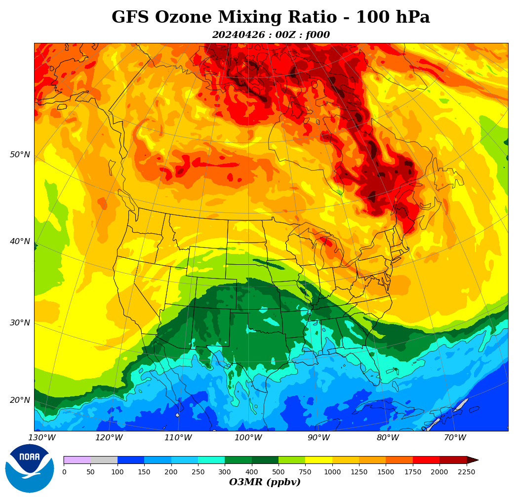
The distribution of ozone in the tropopause indicates stratospheric intrusions.
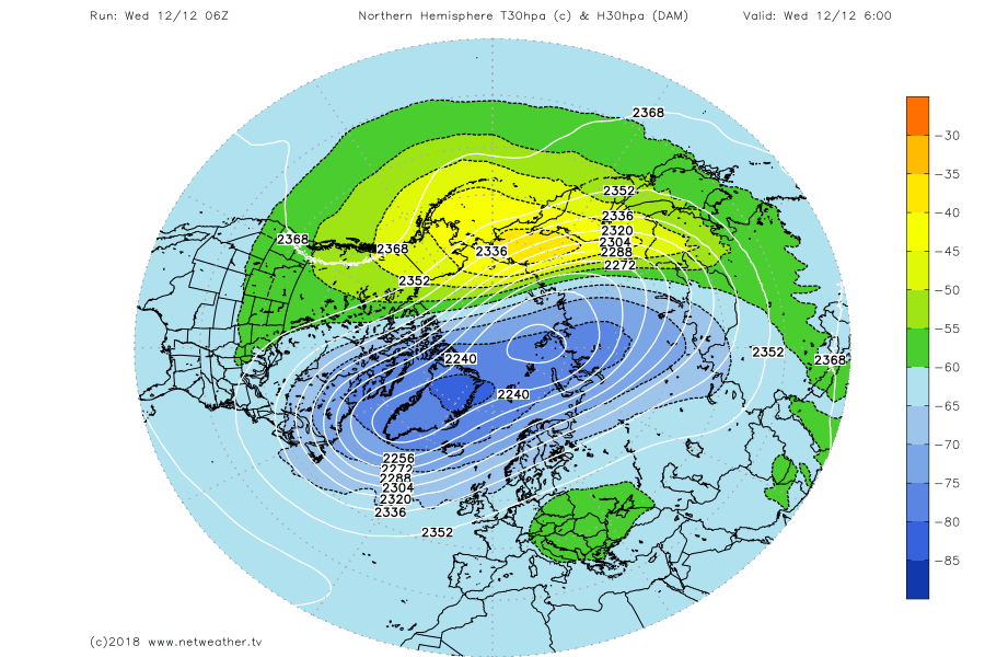
Circulation in the troposphere during winter depends on circulation in the stratosphere between 10 and 100 hPa.
Imagine that, glaciers actually melted at end of the Little Ice Age.
“ Holocene Climatic Optimum (~8000BC to 4200BC), the Medieval Warm Period (~800AD to 1250AD), and the Modern Warm Period (~1905 to present)”
You forgot the Minoan and the Roman Warm Periods. The six periods are quite regularly spaced timewise and the peak temperatures of the five Warm Periods form a linear downward trend that should not be ignored. We just do not know when we will drop into the next glacial period, 13,000 years being what might be considered a long interglacial period.
And, as we do not have any control or influence on this pattern, we are not delaying anything with our harmless and seriously beneficial CO2 emissions.
In about 10,000 years, the axial tilt will reach its minimum, and summer temperatures in the Arctic Circle will drop. For now, we will see an increase in snowfall in Greenland due to the warm Atlantic.
I didn’t forget about them and I do think they exist, but they are not as well defined as the others and harder to work with.
IMHO, Mankind should be preparing now to face the next major glaciation, and that is the technology we should be developing now, while adapting to the present conditions of climate, including its evolution. We are not certain about the start of the next major glaciation, but without any other consideration than the timing of previous cycles of glaciation-deglaciation, it should start between 500 and 5.000 years from now and be quite sudden. The possibility of it starting in the coming 500 years and its major disruption, extinction-capability, should worry us more than the present change, or evolution of climate.
I haven’t seen any projections of the impact of the next glaciation in civilization, while a view of that apocaliptic possibility should be interesting. We may have time now to prepare the energy production needed to survive as an species, as well as the necessity of preparing for ocean water glaciation, and potential migration requirements.
Projections of the impact of the next glaciation:
Ignore all of the many the preposterous elements, but assess the impact as projected in The Day After Tomorrow.
It’s interesting that the most recent data is from October 2025.
http://wso.stanford.edu/gifs/Polar.gif