By Vijay Jayaraj
Whenever “experts are shocked” they usually have marginalized or ignored altogether factors wrongly assumed to have no influence over their hypotheses, theories or beliefs.
Nowhere is this more evident than in climate science where changes in geophysical phenomena continue to defy assumptions and forecasts presented by some of the most highly paid and influential scientists on the planet.
Among the most infamous examples is the failure of computer climate models to accurately predict real-world temperatures. This is predominantly due to the unscientific exaggeration of carbon dioxide’s (CO2’s) potency in warming the atmosphere.
Now scientists have encountered more “shocks” as polar sea ice is refusing to behave as expected. Since September 1, 2024, an astonishing 579 billion tons of fresh snow and ice have blanketed the Greenland ice sheet, marking the most significant accumulation for that date in at least eight years—far surpassing the 1981-2010 average.
Meanwhile, both the North and South Poles are defying expectations, piling on more ice despite, as reported in hyperbolic headlines, “record-breaking” global heat. It’s a breathtaking, almost surreal twist in the story of our planet’s climate!
According to NASA, “Arctic sea ice reaches its minimum extent (the area in which satellite sensors show individual pixels to be at least 15% covered in ice) each September.”
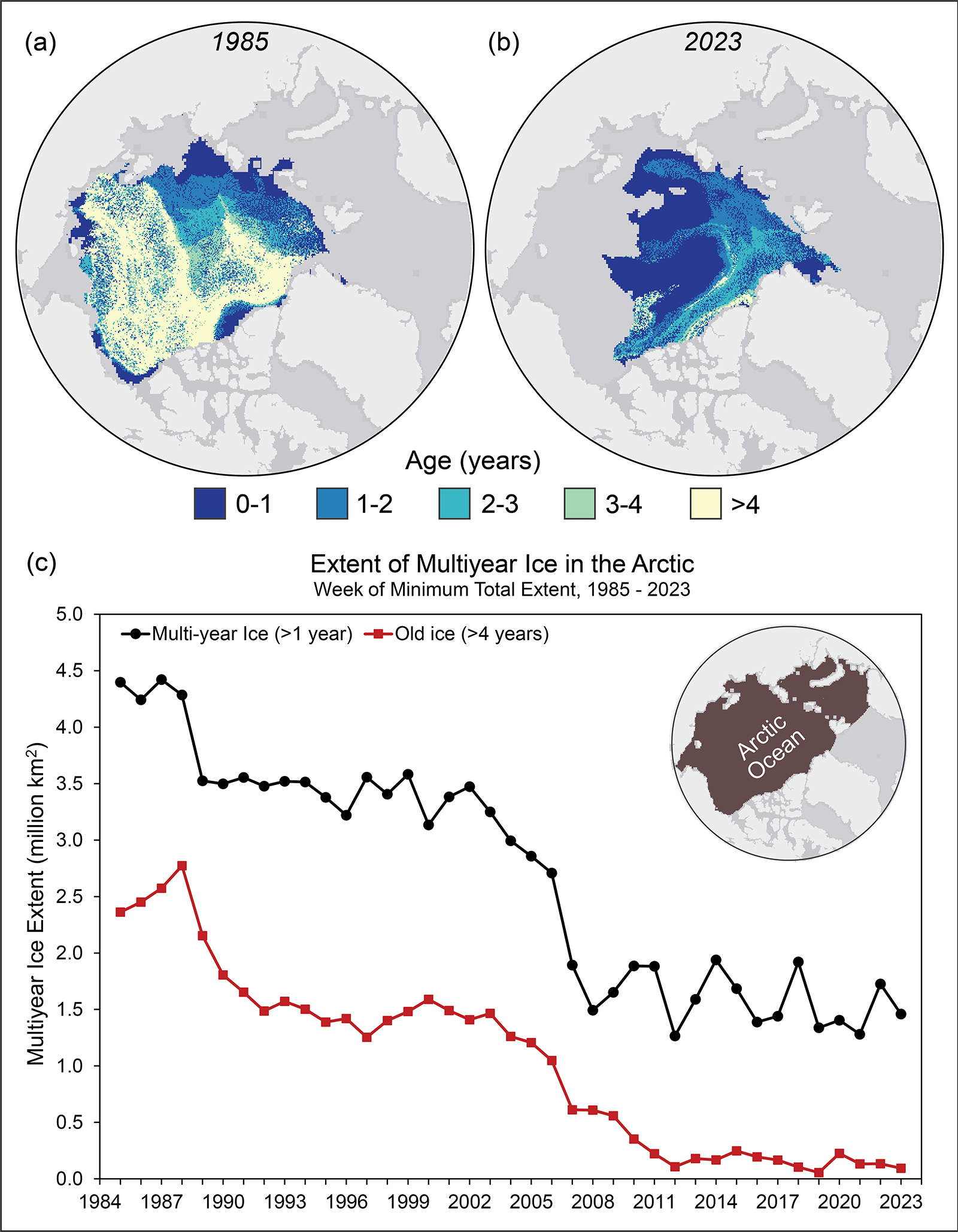
In the post-2010 era, the September minimum extent of Arctic sea ice occurred in 2012, which was also the lowest since satellite measurements began in 1980. But ever since 2012, ice has been increasing or oscillating well above that year’s mark.
Likewise, the volume of sea ice has not significantly dropped since 2012 and there has been a nominal increase in volume since a low point of 2020.
So, why is the minimum coverage of Arctic sea ice holding above the level of 2012?
One of the most obvious reasons could be that CO2 is not as powerful a temperature control knob, which is a possibility that many well-funded scientists refuse to even take into consideration.
Also, remember that we are in the Holocene epoch, a warm geological phase between two glacial advances – one that ended about 10,000 years ago and the next expected to occur some number of thousand years hence. An upward tick in Arctic temperatures shouldn’t surprise us regardless of whether we emit CO2 or not.
In fact, Arctic ice levels witnessed in the 17th century during the Little Ice Age was one of the highest since continental glaciers blanketed Canada and extended into the lower 48 states to create the Great Lakes.
At one point, news media were abuzz with the unexpected gain in Antarctica’s ice mass. Antarctica gained ice from 2021 to 2023, with studies showing nearly 108 gigatons per year added, mainly due to increased snowfall in East Antarctica.
Data from Vostok and Concordia stations in East Antarctica indicate extremely cold temperatures in early May, with minimums of minus 106.6 degrees Fahrenheit at Concordia on May 12. With winter just beginning the temperatures are likely to dive further.
As recently as 2023, Concordia station recorded one of its lowest temperatures for the current decade, a brutal minus 117.76 degrees. Similarly, at Western Antarctica’s Byrd Station, a likely all-time low of almost minus 50 degrees was recorded as recently as 2023. These numbers may be surprising, but they are in tune with the unpredictability of climate – and of nature in general.
Let’s just admit it. Things are not as “straightforward” as crisis-obsessed scientists are making it out to be. The climate system is complex, and the science is not settled. Our understanding of climatic dynamics is in its infancy. And to suggest that changes –whatever the direction – in polar ice presages a catastrophe is infantile.
Vijay Jayaraj is a Science and Research Associate at the CO₂ Coalition, Arlington, Virginia. He holds an M.S. in environmental sciences from the University of East Anglia and a postgraduate degree in energy management from Robert Gordon University, both in the U.K., and a bachelor’s in engineering from Anna University, India.
Compared to 1699/1700, from October 25 2024 to May 19 2025. the daily average solar EMR at 70S was up to 1.5W/m^2 less. That would reduce the amount of melt over Antarctica. But to balance that, from July 23 2025, the solar EMR will be up to 1.3W/m^2 higher than in 1700 so the recovery from the depths off cold will be a little faster
Climate changes and always will. Anyone who appreciates how Earth’s relationship with the Sun changes will know that.
No exaggeration. CO2 has no “warming” ability at all. That’s why it has never been used to “warm” anything at all.
On the other hand, frozen CO2 (dry ice) is still used to keep things cold.
Strangely, though, some ignorant and gullible people believe that as frozen CO2 turns to gas, it starts warming the surface! No, adding CO2 to air does not make it hotter. No GHE at all.
More CO2 absorbs more IR and more sunlight SW too, not much, but enough to label you a “denier” and not worthy of being listened to by many. Maybe you should rework your argument to something that can’t be refuted by a junior high school student doing an internet search for their science fair project. Such a rework might then improve that student’s understanding instead of accepting max-hype doomsday scenarios.
Electromagnetic energy is not heat, not kinetic energy.
That there are absorption and emission characteristics are true, that does not lead to a conclusion that CO2 affects temperature.
There is the little discuss interaction of all molecules with the electromagnetic wavefront.
There is a trivial, but not zero, exchange in momentum.
This minor detail leads to an increase in EM emitted by the ground counteracts the solar EM and effectively cools the molecules. Trivial, but not zero.
Electromagnetic energy is not heat, but it can easily be converted into heat.
Well, that’s profound. Do you have personal knowledge of anybody who doesn’t know that?
Easily under some circumstances like putting a copper wire in a varying EM field with the wire part of a circuit with induce a current and I^2 R applies.
EM energy is not easily converted into heat. Anyone using thermalize in that way does not understand the term and possibly science.
What’s that got to do with anything?
The Earth has had four and a half billion years of continuous sunlight, but has cooled anyway.
Adding CO2 to air does not make it hotter.
Only stupid and gullible people believe in a GHE for which there is not even a consistent and unambiguous description – if they believe in the scientific method.
If GHE worship is your religion, I won’t challenge your GHE, nor any miraculous properties you believe it possesses. Your religious beliefs are yours.
CO2 valence electrons do absorb specific frequencies all of which are in the IR bands, not visible sunlight (SW).
You might wish to clarify that CO2 cannot create energy out of nothing. Kirchhoff’s law must be obeyed.
Of course but what it can do is convert electromagnetic energy into kinetic energy and thereby heat the surrounding gas.
So does all matter. The reason anything has a temperature at all, is because it is above absolute zero. All matter above absolute zero has absorbed infrared radiation – otherwise it would remain at absolute zero.
But it does not convert EM into KE.
You have been fooled by the hijacking of the word thermalize.
You have been fooled by the “trapping” heat description.
Heat is thermal energy flowing across a temperature gradient. If it is trapped it is not flowing and therefore is not heat.;
It certainly does! The 15𝜇m radiation that is absorbed by a CO2 molecule causes the CO2 molecule to vibrate (bending mode) thereby converting the electromagnetic energy to kinetic energy. That kinetic energy is then transferred to the translational kinetic energy of surrounding gas molecules via collisions.
Anybody who thinks that adding CO2 to air makes it hotter, is ignorant and gullible. CO2 cannot create energy. Hopefully, that clarifies the fact that CO2 cannot create energy out of nothing.
Harold The Organic Says:
“CO2 Does Not Cause Warming Of The Atmosphere!
Shown in the chart (See below) is a plot of temperatures at the Furnace Creek in Death Valley from 1922 to 2001. In 1922 the concentration of CO2 in dry air was ca. 303 ppmv (0.59 g CO2/cu. m.), and by 2001,it had increased to 371ca. ppmv (0.73 g CO2/cu. m.), but there was no corresponding increase in air temperature at this remote desert. The reasons there was no increase in air temperature at this arid desert is quite simple: There is too little CO2 the air to absorb enough IR radiant energy from the desert surface to cause heating of the air.
This empirical temperature data falsifies the claims by the IPCC and the unscrupulous collaborating scientist (aka welfare queens in white coats) that CO2 causes “global warming” and is “the control knob of “climate change”. The purpose of these claims is to provide the justifications for the continued maintenance and generous funding of not only the IPCC but also the UNFCCC, the UN COP and the climate scientists and distribution of funds from the doner rich countries to the poor countries.
At the MLO in Hawaii, the concentration of CO2 in dry air is 429 ppmv. One cubic meter of this air has a mass 1.29 kg and contains a mere 0.841 g of CO2, a 15% increase from 2001. Most all people and especially the politicians and even the climate scientists do not know how little CO2 there is the atmosphere.
Hopefully, President Trump will put an end to the greatet fraud since the Piltdown Man.
Here is the chart of the temperature plots at the Furnace Creek weather station in Death Valley. The chart was obtained from the late John Daly’s website “Still Waiting for Greenhouse” available at:
http://www.john-daly.com. From the homepage, scroll down and click on “Station Temperature Data”. On the “World Map” click on region or country (e.g., Australia) to access temperature charts from over 200 weather stations located around the world. Be sure to go Oz and check the chart for Adelaide which showed colling since 1857.
If you click on the chart, it will expand and become clear. Click on the “X” to return to text.
Here is the chart for Adelaide. In 1857, the concentration CO2 was ca. 280 ppmv (0.55 g CO2/cu. m.) and by 1999 it had increased 370 ppmv (0.73 g CO2/cu. m.)
Bad news Story Tip
Reeves forced to back down in net zero row with Miliband
Starmer sides with Energy Secretary after Chancellor seeks to cut key projects
https://www.telegraph.co.uk/politics/2025/06/04/reeves-forced-to-back-down-in-net-zero-row-with-miliband/
I wonder how many petroleum derived polyester safety vests and jackets they wear for publicity stunts and then discard.
Why do both sides of the climate rift hang their hat on sea ice area/extent?
Regardless, both the Arctic and Antarctic are following the low trends set in recent years.
However, area/extent does not represent the AMOUNT of ice, it is not a metric that can be reliably compared or used as an indicator from one moment to another.
The volume of sea ice needs to be examined, and if DMI data is to be trusted, the last Artic minimum and maximum were new lows. PIOMAS gives a slightly different picture, but not much.
As I often say, I’m very much a climate skeptic, since the dawn of the internet, but no one should refuse to accept reality.
I thought CO2 was the bogey?
Good luck with finding a GHE fanatic who will claim that adding CO2 to air makes it hotter!
One need only tune in to the media for that. People like Jim Dale.
Utter nonsense. Observations are well within the projected model range and, in fact, are running slightly warmer than the multi-model average at present.
The problem is that these projections are no better than I (or a smart 12 year old) can do.
What do you put these warmer thermometers down to?
No idea? Why am I not surprised?
You’re not addressing the point. The author of the article points to what he calls:
“…the failure of computer climate models to accurately predict real-world temperatures…”
When this is clearly shown to be wrong, rather than admit that it is an error on his part, you switch to claiming that the model projections are too wide, or that the thermometers are “warmer” (whatever that means).
Observations are within the projected model range and currently warmer than the multi-model mean.
This author states otherwise. He is wrong.
No I don’t. You are delusional. If you admit you don’t know what “warmer” means, you have no reason to think any one is going to value your opinion any more than I do.
Adding CO2 to air does not make it hotter. If you are ignorant and gullible, don’t blame me.
Two or three years ago that was not the situation. That is, at least in part, from comparing apples with pineapples. That is, the model means have less variance, suggesting some sort of smoothing is happening. Thus, the actual temperatures transit the model mean frequently, and are currently above the model. What should be done is to smooth the measured temperatures so that they have a variance comparable to the model data. Historically, the models have a reputation for running warmer than reality.
Checking the Berkeley Earth link chosen by you led to their “Figure 3” (copied below).
Note the “Difference to Observed (°C)” note in the bottom-right corner.
“It doesn’t make any difference how beautiful your guess is. It doesn’t make any difference how smart you are, who made the guess, or what his name is. If it disagrees with experiment, it’s wrong. That’s all there is to it.” — Richard Feynman
Copying the figure’s caption from that webpage :
.
The IPCC’s “hot models problem” was highlighted in Figure 1 of the “FAQ 7.3 ; What Is Equilibrium Climate Sensitivity and How Does It Relate to Future Warming?” box in the AR6 WG-I report, on page 1025 :
FAQ 7.3, Figure 1 | Equilibrium climate sensitivity and future warming. (left) Equilibrium climate sensitivities for the current generation (Coupled Model Intercomparison Project Phase 6, CMIP6) climate models, and the previous (CMIP5) generation. The assessed range in this Report (AR6) is also shown. (right) Climate projections of CMIP5, CMIP6 and AR6 for the very high-emissions scenarios RCP8.5, and SSP5-8.5, respectively. The thick horizontal lines represent the multi-model average and the thin horizontal lines represent the results of individual models. The boxes represent the model ranges for CMIP5 and CMIP6 and the range assessed in AR6.
.
The IPCC decided in 2020/2021 that they had to apply “expert assessment” to a much greater extent for the CMIP6 model outputs used in the AR6 cycle — especially at the high end of the “GMST projections in 2081-2100 under RCP8.5 / SSP5-8.5” range — than they did for the CMIP5 model outputs used in AR5 (2013).
Even Zeke Hausfather, one of the founding members of the (self-declared !) “Hockey Team”, accepts that the CMIP6 climate models have a tendency to “run hot”.
So should you.
But it doesn’t disagree with ‘experiment’ (observations, in this case).
Observations are within the multi-model range and running warmer than the multi-model average.
You’re quoting Feynman against yourself.
Most of the time, temperatures have been below the running average in recent years. The well-discussed spike at the end is the HT eruption combined with El Niño. The models run hot, as discussed on WUWT countless times.
Look at the chart.
The long-term trends in the observations and multi-model mean are virtually identical.
There is absolutely ZERO probability that a global temperature fabrication created from often sparce and mostly unfit-for-purpose surface sites, missing data for huge areas of the land surface, ocean data that is highly suspect and is basically non-existent for much planet’s oceans, then adjusted and fabricated using spurious methodology…
.. can be remotely representative of any fictional “global temperature”
Since about 2005 the model projections have been running warmer than most of the measured temperatures, with the notable exception of El Nino years. The uncertainty range has been increasing in recent years. With sufficiently wide uncertainty ranges anything can be bracketed. What you should be asking yourself is if the current range (5%-95% ensemble range) has any utility for forecasting or policy decisions?
A Tour de Force!
Excellent comments.
There is no “climate sensitivity”. Adding CO2 to air does not make it hotter.
Berkeley Earth is a non-profit tax free organisation dedicated to enriching its staff.
You are free to donate as much as you like to Berkeley Earth, but I don’t think you are that stupid, are you! Correct me if I’m wrong.
The ECS concept only applies to the output of climate models with idealised “CO2 doubling” or “4xCO2 run” inputs, but a distorted version of the idea can indeed be cogitated upon in relation to the real-world “Earth climate system”.
One common mistake is to assume that “the Earth’s ECS [ or TCR ] value” is constant on geological timescales (millions of years), where plate tectonics is a major factor.
.
That is correct.
.
Your inference just before this extract, however, is indeed wrong.
I am not now, nor have I ever been, and I have no intention of ever becoming, a Berkeley Earth donor.
.
.
In my OP I was using the “Beat them to death with their own data” approach.
This (mostly …) avoids the problem of people refusing to accept references to third-party data sources, which will more often than not be summarily dismissed as “not serious / unsubstantiated / already thoroughly debunked / …”.
A thousand pardons, good sir.
I grovel in mortification at your feet. We agree that adding CO2 to air does not make it hotter.
I apologise for my most egregious error. Carry on your good work.
During hindcasting, which is part of the presented chart, “control knobs” are adjusted until the model output matches the historical records. Hindcasting is curve fitting so of course the models are accurate going back in time. It is a bogus process.
Curve fitting does not improve projection or predictions. It in fact degrades them.
Even in a model where the input is CO2 and the output is temperature related to CO2 inputs.
Berkeley is bogus temperatures from hugely bogus surface sites.
.. then manipulated to match the models.
Even Berkeley has to rely on El Nino events to get near the fake model mean !
Artic and Antarctic amount of sea ice is not a measure of sea level rise … as any increased sea ice reduces sea level rise rather than increasing it (try a warmed ‘bourbon on the rocks’ for proof).
The fact that land based ice is accumulating on both the Artic and Antarctic totally disproves the ‘Global Warming; theory
No problem. GHE fanatics just call on –
You silly person, the GHE causes both warming and cooling.
/sarc off
Gotta love it when you catch them speaking out both sides of their mouths simultaneously.
Go back and review Archimedes.
Formation of ice from water has no affect on water levels.
As water freezes it becomes less dense, hence it floats by displacing a mass of water equal to the mass of the ice.
Land based ice is not floating and is not part of the definitions above.
That water evaporates and falls as snow creating ice is a potential contribution to reducing ocean levels. Trivial, but not zero. When the ice melts, it flows back into the ocean restoring the start point water level.
That ice is accumulating support the argument against the global warming theory, but with so many other factors and functions involved, a single item can not by itself disprove anything except that single items contribution to the results.
I’m unaware of any such “theory”, to be honest.
It’s apparently a fantasy based on a mythical “GHE”, for which no consistent and unambiguous description exists.
Somebody has confused religion with science, at a guess.
You are correct. The nul hypothesis was not applied in my comments.
It is a conjecture or, at best, an unproven hypothesis with very little supporting data.
I apologize for abusing the word theory.
So how come British naval ships observed a great loss of Arctic sea ice 1815-1817 in the Dalton minimum? Because the negative North Atlantic Oscillation conditions which bring the cold to Europe, also drive a warmer AMO, and and increase warm humidity events into the Arctic, like in summers 2007 and 2012.
Rising CO2 forcing is modeled to increase positive NAO states, so it should be inhibiting the oceanic and atmospheric poleward heat transport.
Paying some scientists lots of money hasn’t helped them work out the obvious.
Also, remember that we are in the Holocene epoch, a warm geological phase between two glacial advances
Hmmm you don’t say?
West Antarctic Ice Sheet is on the verge of collapsing, scientists warn
The research team – also including experts from academic institutions in the UK and Germany – ran model simulations through the glacial cycles over the last 800,000 years.
During this period, the Earth’s climate has switched several times between cold periods known as ‘glacials’ and warmer periods called ‘interglacials’….
‘In the past 800,000 years, the Antarctic Ice Sheet has had two stable states that it has repeatedly tipped between,’ said Chandler.
‘One, with the West Antarctic Ice Sheet in place, is the state we are currently in. The other state is where the West Antarctic Ice Sheet has collapsed.
Conclusion: Clearly we’re doomed unless we give up fossil fuels.
I’m not surprised. They didn’t want to sit round doing nothing.
All climate “scientists” should have to spend an entire winter in the Arctic. Doing so will enlighten them.
They do ….
https://www.nature.com/immersive/d41586-020-01446-x/index.html
I hope they enjoyed it. No doubt they all ask to do it again. 🙂
So all of the tens of thousands claiming to be climate scientists were present on the same trip?
Or book a berth on the “ship of fools” –
There’s been a steady decline in mult-year ice, but that decline has leveled off in recent years. Younger ice/annual ice has been holding strong. I’ve guessed that a lot of these trends has been the melting and recycling of the older, dirty ice.
Yes the decline has leveled off because most of the older ice has gone!
Yet the current extent is still far above what it has been for most of the last 10,000 years. !
Actually, with all the older thick mass gone as you say, it should be much easier to for the one-year ice to vanish must faster and develop less the next year.
Meanwhile the ice mass was built up during the 1960’s and 1970’s during the cooling time so when the warming restarted in the late 1970’s it was going to dwindle over time to a new lower level thus your chart is incomplete and therefore misleading.
The world’s temperatures have been accurately modeled. You are either ignorant or lying. Which is it?
The probity and provenance of the world’s temperatures records are seriously lacking.
Constructing models with these as inputs plus many dodgy assumptions (eg clouds influences) is either a fool’s errand or a snake oil formulation.
Or both?
Tony Watts use to make such nonsensical claims and then never published what he promised. Have you learned nothing from the lies?
You have leant nothing except propaganda mantra.
Science.. you have NONE. !!
Accurately?
Hogwash.
How many temperatures, aside from the nonsensical global average have been modelled?
I know for a fact the temperature of my home town has not been modelled by the climate syndicate.
All it takes is one to disprove a broad inclusive statement.
Reality, the rapid warming of the globe has been accurately modeled.
Utter Bovex. !
GISS et al do not remotely represent “global” temperatures…
It is physically and mathematically impossible for them to do so.
Yes.. they have manage to fabricate GISS et al to somewhat resemble their fake models.
Real.. NOPE !!
Good to see you start your comment by letting us know what you wrote is utter bovex
You used the word “temperatures” which is plural.
Not you divert to a single global temperature.
There is no single global temperature. It is a badly made statistical construct and has NOTHING to do with reality.
It is not informative. Single point: T^4,
The words “accurate” and “accurately” are subjective. Different people will apply different specific numbers for criteria / thresholds.
.
From section 1.5.4 of the IPCC’s AR6 WG-I assessment report, “Modelling techniques, comparisons and performance assessments” on page 221 :
In the specific case of the CMIP6 model ensemble used for the AR6 document cycle the IPCC was slightly less categorical in their claims, even in the heavily scrutinised SPM.
In “Box SPM.1 : Scenarios, Climate Models and Projections”, on page 12, the “Box SPM.1.2” paragraph includes :
If “expert judgement” is used to manually filter out the least accurate model runs then it is not surprising that the resulting “ensemble mean” closely matches the observational data.
.
The IPCC was open about which areas of “current” climate models were open to improvement in the future, for example in “FAQ 3.3 box : Are Climate Models Improving?, on pages 519 and 520.
FAQ 3.3, Figure 1 | Pattern correlations between models and observations of three different variables: surface air temperature, precipitation and sea level pressure. Results are shown for the three most recent generations of models, from the Coupled Model Intercomparison Project (CMIP): CMIP3 (orange), CMIP5 (blue) and CMIP6 (purple). Individual model results are shown as short lines, along with the corresponding ensemble average (long line). For the correlations the yearly averages of the models are compared with the reference observations for the period 1980–1999, with 1 representing perfect similarity between the models and observations. CMIP3 simulations performed in 2004-2008 were assessed in the IPCC Fourth Assessment, CMIP5 simulations performed in 2011–2013 were assessed in the IPCC Fifth Assessment, and CMIP6 simulations performed in 2018–2021 are assessed in this Report.
.
Why not make claims about just how “accurate” the climate models are hind-casting the observed precipitation data instead of GMST ?
Yes, models of global temperatures have been accurate. Glad we agree the author of this blog post is wrong
WRONG Show us the modelled temperatures that have no warming from 1980-1997 and from 2001- 2015 like UAh does.
Surface data is just JUNK data fabricated from totally unfit-for-purpose warming-biased urban surface sites, manipulated to give whatever they want as the answer.
Your claims about warming are wrong. Good to see you begin your post by letting us know what you wrote is wrong
Sophistry. Pure sophistry.
A copy of the summary image file of the 43 “CMIP6 model differences from BEST” in my response to TFN above …
That shows individual models with errors ranging from “BEST – 2°C” to “BEST + 2°C” in places (especially around the poles).
NB : You can substitute “BEST” with “GISS / NASA” or “NCEI / NOAA” or “HadCRUT” (or …) if you want, but the “error range” will remain the same.
Which individual model(s) can be described as “accurate” ?
What is your definition of “accurate?” Can you provide a percentage error that distinguishes between accurate and inaccurate?
Two other possibilities that you have not considered is that your statement is false and you are either ignorant or lying. What evidence do you have to decide which of the four possibilities is correct
“Likewise, the volume of sea ice has not significantly dropped since 2012 and there has been a nominal increase in volume since a low point of 2020.”
Not true, according to Piomas the seaice volume is second lowest on the record and significantly lower than 2012 and it’s quite likely that this year will see a record low!
Piomass 2011 -2024..
Piomas volume as of 31 May 2025 18,370 km^3
1980s average 29,375 km^3
1990s average 27,701
2000s average 24,123
2010s average 19,814
2012 as of 31 May 19,591
record low 31 May 2017 = 18,096 km^3
“Quite likely” is conjecture without any support unless you have recently purchased one of the new Mark V Crystal Balls.
It is a conjecture which does have support. The current value is the second lowest in the record as shown above and the average loss of the last ten years would produce a record low, in fact all but two of the remaining losses in the last 15 years would produce a record minimum. We’ll find out in about 100 days.