Guest essay by Larry Hamlin
NOAA has released its June 2024 updated Global Time Series average temperature anomaly data which demonstrates that the earth is experiencing declining trends of monthly anomaly values.
This outcome signals the continued weakening of the most recent natural climate occurring El Nino event which commenced in the July period of 2023 as declared by the World Meteorological Organization (WMO).
This most recent El Nino events increasing trend impact on global average temperature anomaly values since its commencement has been politically manipulated by climate alarmists to proclaim that a global “climate emergency” is occurring which was nothing but election year politically contrived alarmist hype.
The data analysis provided below evaluates a 30-year period (clearly revealing the weakening El Nino driven decline of global monthly average temperature anomaly values) showing all monthly NOAA Global Time Series average temperature anomaly measurements between January 1995 through June 2024.
NOAA’s latest updated 2024 report highlights the month of June’s latest value with prior June anomaly values but provides no highlighted comparisons encompassing all months as was the case for NOAA’s May update as addressed in a WUWT article for the May 2024 update (found here) which concealed comparisons of May 2024 versus all other months.
NOAA’s Global Land and Ocean June 2024 average temperature anomaly data (shown below) establishes that this most recent monthly value continues a 10 month duration declining trend since reaching a peak value in September and November of 2023 of 1.42 degrees C (provided in the table below) compared to the June 2024 value of 1.22 degrees C (highlighted in red) making the June monthly anomaly value only the 342nd highest of 354 measured values.

NOAA’s Global Land June 2024 average temperature anomaly data (shown below) establishes that this most recent value continues the 8 month declining trend since the November 2023 El Nino peak value of 2.36 degrees C (see table below) to 1.75 degrees C (highlighted in red) making the June value only the 325th of 354 measured values.
Additionally, the June 2024 Global Land average temperature anomaly value is significantly below the prior February 2016 El Nino highest peak monthly average temperature anomaly value of 2.51 degrees C (over 8 years ago) also shown in the table.

These June 2024 monthly Global average temperature anomaly declining trend patterns continue for other NOAA Global Regions including the Northern Hemisphere, Southern Hemisphere, Asia, Europe, North America, Oceania, East N Pacific, Hawaiian, Arctic, and Antarctic as presented in NOAA’s updated and identified Global Region diagrams shown and discussed below.
These consistent global wide regional average temperature anomaly declining trends clearly establish that the earth is not experiencing a “climate emergency” as falsely hyped by climate alarmists who politically exploited the most recent El Nino driven global average temperature anomaly outcomes.
Northern Hemisphere Land and Ocean
The June 2024 monthly average temperature anomaly (shown below) 8 month duration declining trend value of 1.56 degrees C (highlighted in red) is below the most recent peak El Nino average temperature anomaly November 2023 value of 2.01 degrees C (see table) as well as being below the prior El Nino event February 2016 peak anomaly peak value of 1.84 degrees C also shown in the table. This makes the June 2024 measured anomaly value only the 339th highest value of 354 measured values.

Northern Hemisphere Land
The June 2024 monthly average temperature anomaly (shown below) 8 month duration declining trend value of 1.97 degrees C (highlighted in red) is below the most recent peak El Nino average temperature anomaly November 2023 value of 2.90 degrees C (see table) as well as being below the prior El Nino event February 2016 peak anomaly peak value of 3.15 degrees C also shown in the table. This makes the June 2024 measured anomaly value only the 317th highest value of 354 measured values.

Southern Hemisphere Land and Ocean
The June 2024 monthly average temperature anomaly (shown below) 10 month duration declining trend value of 0.88 degrees C (highlighted in red) is below the most recent peak El Nino average temperature anomaly September 2023 value of 1.10 degrees C (see table). This makes the June 2024 measured anomaly value only the 347th highest value of 354 measured values.

Southern Hemisphere Land
The June 2024 monthly average temperature anomaly (shown below) 10 month duration declining trend value of 1.25 degrees C (highlighted in red) is far below the most recent peak El Nino average temperature anomaly September 2023 value of 2.51 degrees C (see table). This makes the June 2024 measured anomaly value only the 316th highest value of 354 measured values.

Asia Land
The June 2024 monthly average temperature anomaly (shown below) downward trending value of 2.08 degrees C (highlighted in red) is far below the prior peak monthly average temperature anomaly February 2020 value of 4.10 degrees C (see table). This makes the June 2024 measured anomaly value only the 299th highest value of 354 measured values.

Europe Land
The June 2024 monthly average temperature anomaly (shown below) 5 month duration declining trend value of 2.55 degrees C (highlighted in red) is far below the prior peak monthly average temperature anomaly February 2024 value of 4.15 degrees C (see table). This makes the June 2024 measured anomaly value only the 332nd highest value of 354 measured values.

North America Land
The June 2024 monthly average temperature anomaly (shown below) 7 month duration declining trend value of 1.54 degrees C (highlighted in red) is far below the prior El Nino peak monthly average temperature anomaly December 2023 value of 4.41 degrees C (see table). This makes the June 2024 measured anomaly value only the 257th highest value of 354 measured values.

Oceania Land
The June 2024 monthly average temperature anomaly (shown below) downward trending value of 0.72 degrees C (highlighted in red) is far below the prior peak monthly average temperature anomaly December 2019 value of 2.21 degrees C (see table). This makes the June 2024 measured anomaly value only the 166th highest value of 354 measured values.

East N Pacific Land and Ocean
The June 2024 monthly average temperature anomaly (shown below) downward trending value of 0.65 degrees C (highlighted in red) is far below the prior peak monthly average temperature anomaly October 2015 value of 1.79 degrees C (see table). This makes the June 2024 measured anomaly value only the 236th highest value of 354 measured values.

Hawaiian Land and Ocean
The June 2024 monthly average temperature anomaly (shown below) downward trending value of 0.36 degrees C (highlighted in red) is far below the prior peak monthly average temperature anomaly September 2015 value of 1.76 degrees C (see table). This makes the June 2024 measured anomaly value only the 167th highest value of 354 measured values.

Arctic Land and Ocean
The June 2024 monthly average temperature anomaly (shown below) downward trending value of 1.60 degrees C (highlighted in red) is far below the prior peak monthly average temperature anomaly January 2016 value of 4.99 degrees C (see table). This makes the June 2024 measured anomaly value only the 198th highest value of 354 measured values.

Antarctic Land and Ocean
The June 2024 monthly average temperature anomaly (shown below) downward trending value of 0.10 degrees C (highlighted in red) is very far below the prior peak monthly average temperature anomaly August 1996 (nearly 3 decades ago) value of 2.23 degrees C (see table). This makes the June 2024 measured anomaly value only the 144th highest value of 354 measured values.

NOAA’s latest Global Time Series monthly average temperature anomaly data declining trends addressed above clearly establishes there is nothing resembling a “climate emergency” being experienced by the earth contrary to climate science data unsupported and purely politically driven climate alarmist hype.
“This outcome signals the continued weakening of the most recent natural climate occurring El Nino event “
Well, yes, although what you don’t see under all this verbiage is that June was actually warmer than May. The main point is that it was still the hottest June ever, and hotter that any other months before 2023, except for a couple in 2016. Here (from here) is the stacked graph of NOAA months making that point, and showing recent ups and downs in detail:
The main point is that it was still the hottest June ever…
This is just ridiculous. The hottest June EVER?
The hottest June since when, exactly, and what does it show if it was?
OK, hottest June ever measured.
According to NOAA, since 1895 the highest average CONUS June temperature was 72.57 in 2023 and it was 71.82 in 2024. So what are you looking at that shows June 2024 is the hottest?
Global temperatures. Larry’s Fig 1.
The fact that surface data is massively affected by urban warming, bad sites, airport expansion agenda-driven “adjustments”….
… makes it TOTALLY MEANINGLESS as a comparator over time.
WRONG.
Larry’s figure DOES NOT show “global” anything.
It shows a fabrication from badly effected and corrupted urban surface data..
Looking at global vs individual regions assumes that region specific factors affecting temperature are the same which is not correct. There is a reason they are broken out.
These are not temperatures. They are RATES OF TEMPERATURE CHANGE. Ollie above shows you the problem with calling anomalies and actual temperatures. Since individual monthly anomalies all have different temperatures that are unknown when examining an GAΔT there is no way to analyze an actual global average temperature.
You want to indicate an actual temperature, choose a common value like a 15°C baseline to calculate all anomalies around.
In the US, temperature is usually measured to the whole degree F with an implied error of +/- deg. F, and never to +/- 0.1 or +/- 0.01 deg. F.
In countries that use the Celsius scale , temperature is measured to
+/- 0.1 degree.
Thus, 72.57 should be 73 and 71.82 should be 72. With an implied error of +/- 1 deg. F, the temperatures are essentially the same.
Measurement errors are like enemies, they accumulate!
That’s true but NOAA’s CONUS numbers are not single readings.
100%!!!!!
In the US in many stations the temperature is recorded in the units digit on the Fahrenheit scale. Then that is converted to Celsius. That means that temperature can’t be determined past the units digit in Fahrenheit. Converting to Celsius provides decimal digits that are a phantom resolution, the measurement uncertainty in Fahrenheit should be propagated onto the Celsius value. Rounding to the units digit in Fahrenheit creates a built-in measurement uncertainty of +/- 0.5F. This is +/- 0.3C.
This is a built-in systematic measurement uncertainty that simply can’t be eliminated. Averaging can’t eliminate it.
Using significant figure rules the last significant digit in the measurement should be in the same decimal place as the uncertainty. Meaning no measurement should be given past the tenths digit in either Fahrenheit or Celsius.
72.6 +/- 0.5 (an interval of 72.1 to 73.1) and 71.8 +/- 0.5 (an interval of 71.3 to 72.3) have partially overlapping intervals of possible values. So who knows if they are the same or not.
But blob sez all you have to do is glom enough of them together and it all DISAPPEARS.
Yep. You can measure the diameter of a crankshaft journal down to the thousandths of an inch if you just take enough measurements with a yardstick! All measurement error will be random, Gaussian, and cancel! Resolution can be increased through averaging.
When measuring the same thing, yes. When measuring temperature at different times, etc. NO.
But “climate science” can’t seem to grasp the difference.
Actually even when measuring the same thing the ultimate resolution is determined by the resolution of the measurements, not by how many digits your calculator has when determining the average value.
It’s the whole concept of measurement uncertainty. You can’t know what you don’t know – and that includes the average.
Since when, by whom, and with what quality?
By NOAA. I am just showing the Fig 1 of Larry rearranged, with the columns colored by year and sorted into months.
So you are showing the collective effect of urban warming, bad station sites, airport expansions and agenda-driven “adjustments”
ie, the comparison is totally meaningless.
And we all know that YOU KNOW that is the case.
What do you get out of continually posting what you KNOW is meaningless nonsense.
You have ZERO credibility. !
The
hottestbalmiest June ever measured FIFY.I wouldn’t call it balmy in New Hampshire. Fortunately I have inside stuff to work on.
Took the dog for a walk this morning.
That slight breeze and overcast made it {swear word} COLD. !
It is winter down here, of course…
Now inside with the reverse-cycle air-con running in the lounge and the study…
… probably costing me a bit because there is too much cloud to have much electricity from the solar panels.
You don’t know this, but you desperately want it to be true.
A totally meaningless comment.
We don’t have reliable, un-urban effected data.
So the whole concept of “hottest” or “global” measured temperature is absolute BOLLOCKS
Hottest June ever
measureddetermined by statistical analysis of accumulated data from numerous measurements, many—probably the vast majority—from poorly sited stations across the globe that don’t meet the quality standards of NOAA’s own U.S. Climate Reference Network.Just to be clear about what’s being “measured” and how carefully.
Dr. Spencer’s analysis from UAH shows the last few months were the warmest in the 40-plus year satellite record so it was probably warm, not that most people noticed because the temperature difference was minuscule and some places experienced unusual cold.
Even if it actually was, statistically, the “hottest” June ever, what that means is subject to your interpretation biased by your belief system. I believe that global “warming” is demonstrably moderate, mostly due to natural variation, easily adapted to, and no big deal. The hyperventilating climate alarmists think it’s the apocalyptic End Times; a belief with no evidence, but which fuels an unhealthy pessimism about the future and life in general which is causing serious, pathological anxiety that also inspires ineffectual, massively expensive and destructive public policies that are worsening the living standards for hundreds of millions of people.
“from poorly sited stations across the globe that don’t meet the quality standards of NOAA’s own U.S. Climate Reference Network”
How do you know? Or does it matter? Here is a graph of USCRN with the much wider network oof ClimDiv US stations (basically, everything in GHCN). The result is exactly the same:
Of course it is, you mindless twit.
They make sure it is. !
WTH do you think the ‘R’ in USCRN means.
How do I know? Because no other country has established a climate reference network like the USCRN. The USCRN has 137 stations compared to the USHCN which has over 1200. As Anthony Watts pointed out years ago, most of the U.S. stations are influenced by the urban heat island or artificial structures. There is no reason to suppose it’s any different in any other country. Ergo, it’s safe to assume that the global climate network is strongly influenced by UHI. Statisticians ostensibly attempt to remove UHI by offsetting measurements by an arbitrary number, but that’s not the same as not incorporating it into the measurements in the first place.
I’m not sure what you’re showing with the USCRN plot. That the ClimateDiv graph tracks fairly closely with USCRN? ClimateDiv has the benefit of a reference network (USCRN) to help identify how much to offset the UHI in the raw data. Other countries don’t. It wouldn’t surprise me if ClimateDiv uses USCRN to improve their UHI offset.
Curiously, both USCRN and ClimateDiv show no warming trend since 2005, demonstrating my point that even if there is “global” warming, it’s not catastrophic. It’s benign, and, so far, more beneficial than harmful as cold-related deaths decline. And Earth’s flora appreciates the extra CO2 in the atmosphere. It’s nothing like the apocalyptic fantasy painted by alarmists.
“It wouldn’t surprise me if ClimateDiv uses USCRN to improve their UHI offset.”
Graphing ClimDiv minus USCRN leaves absolutely zero mathematical doubt that is what they are doing.
ClimDiv starts a bit higher in 2005, then get close and closer over time.
This can only happen by the gradual “honing-in” of “adjustment parameters”.
Can you clarify the data you used?
I’m looking at this page. It provides the values of the monthly anomalies and compares their differences across the networks.
“ClimDiv starts a bit higher in 2005, then get close and closer over time.
This can only happen by the gradual “honing-in” of “adjustment parameters”.”
All it really shows is that USCRN is warming significantly faster than ClimDiv.
I think the scale on that graph is wrong. It’s showing the difference in °F not °C.
The liner change in the differences is -0.07 ± 0.02°C/ decade.
The warming rate for ClimDiv is +0.32 ± 0.25°C / decade.
The warming rate for USCRN is +0.39 ± 0.25°C / decade.
0.39 – 0.32 = 0.07.
I’m guessing that the actual anomalies for USCRN a based on the ClimDiv anomalies, which is why the average difference is very close to zero.
WRONG as always.
We don’t know how fast ClimDiv is warming BECAUSE IT IS BEING ADJUSTED.
So you think ClimDiv might have been warming as fast or faster than USCRN, but it was adjusted to decrease the rate of warming?
An interesting thing happened when I reproduced your graph above:
It was immediately apparent that you have arbitrarily shifted your difference series up along the y-axis so that the latest points tend toward zero. I presume you’ve done this to falsely bolster your delusional narrative, because it is a deliberate act of deceit. Care to speak on this?
Correctly displayed without your fabrication, the graph merely suggests that nClimDiv is warming a bit less than USCRN, which is actually counterintuitive to the paranoid conspiracy theory that NOAA is arbitrarily modifying nClimDiv values to align with USCRN. Is that why you decided to tell a lie, bnice?
Found an errant conversion calculation.. Thanks.
But your graph makes it even more obvious that they have been trying to match ClimDiv to USCRN
Climdiv started above USCRN in 2005, and have been gradually honed into a closer match.. as shown by your graph, so of course the linear monkey calculation through the 2016 El Nino will show USCRN “warming” insignificantly faster.
Little bit more adjustment parameter tuning and they will have it near perfect. See how the difference has levelled of.
Since about 2016, USCRN has almost exactly the same trend as ClimDiv.
How does that happen. 😉
Now try calculating the trends of USCRN and ClimDiv without the 2016 El Nino that you all know is the only warming.
From 2005 to mid 2015.. and from 2017 to 20203 before the current El Nino.
Then provide evidence of human causation.
It isn’t getting closer and closer, though, it gets close around 2013 and then gets further away again. This is just the expected pattern if the two series have different slightly different trends.
But even if that were not the case, and it is, the adjustments are not performed on a point by point basis, the algorithm is simply applied to the entire series as a whole. You wouldn’t expect to see the series drawing closer together over time, you’d just expect them to be a close match across the length of both series.
“It wouldn’t surprise me if ClimateDiv uses USCRN to improve their UHI offset.“
It doesn’t. People here love to imagine that someone is matching up ClimateDiv to USCRN, but they don’t and they can’t. ClimDiv data are published within minutes of being read, and long before USCRN data would be available. It’s an open process, though none of the conspiracy folks bother to check it out.
“Curiously, both USCRN and ClimateDiv show no warming trend since 2005″
Often said here, but just untrue. To 2022, USCRN trend was 0.3 C/decade, higher than global. That is 3C per century. ClimDiv was actually lower, at 0.23 C/decade.
Yes, Nick, they have their “adjustment parameters” down pat.
They got them closer and closer over time.
There was no warming in USCRN from 2005-2015, then the 2016 El Nino bulge, then cooling until the start of the current El Nino.
No sign of any human caused warming whatsoever.
How do you account for bnice2000’s graph? What are the statistical probabilities that this occurred by random chance?
As usual, very little explanation of the graph. But it looks like a (small) diference of absolute temperatures. And the likely reason is that USCRN started with an excess of cold places, but then got a more even distribution.
An excess of cold places? Anomalies calculate deviations from the expected seasonal average.
Yes, but are they anomalies. The poster didn’t say, but I suspect not.
Hoist on his own petard.
You have totally disengaged your brain, Nick !
So you just make up GARBAGE.
Do you really , even in your wildest brain-washed fanaticism, believe they could allow ClimDiv to diverge from USCRN.
How STUPID would that make them look !
They put in a “REFERENCE NETWORK” for a reason…
… and they are using to adjust urban data.
All it takes is honing the “adjustment parameters”, which they couldn’t do without the reference data.
You know, like “climate models”, expect they have actual data to “adjust to” rather than an “agenda”
the likely reason…. translated: opinion, not science, pure speculation.
In other words, you have no idea of what is going on. Just pure gaslighting.
The Earth is still in a 2+ million-year long-term ice age with 90% of the fresh water locked up in 200,000 glaciers and polar ice caps.
Warm in an ice age isn’t saying much.
They have now got those “parameter” such that trends over the slight cooling from 2017 to 2023 (just before the El Nino), are basically identical.
I see à very noisy graph with no long-term warming trend whatever. Thanks for posting it!
Uhm Nick, that graph shows the “hottest” months were in 2005 and 2011, over a decade ago.
Happy to accept your result.
That is for ConUS
“That is for ConUS”
The ONLY place with a REFERENCE temperature network.
Anywhere else is basically nonsense based on really bad weather sites , urban warming , and agenda “adjustments”
They can “make-up” their own reality.. and they do. !
“poorly sited stations across the globe”
I wonder how carefully the stations are looked at in backward areas. I envision a guy just glancing at the thermometer and estimating. Or are they all digital? Are they recorded automatically? Even if there were a million of them sited perfectly across the planet and on the ocean- the measurements could still be taken sloppily. Maybe not- I don’t know.
On the middle of a dirt roof next to a new air-con outlet (if they are luck enough to have reliable electricity), in the middle of an ever-expanding treeless town.
Just the place to “create” warming. !
Billions of people
UAH can’t tell if the TEMPERATURE was the warmest month or not because it doesn’t actually measure temperature. The radiance level that it measures can be modulated by water vapor and clouds (and probably other things like smoke and dust). The radiance level is adjusted to make alllowances for cloudiness but who knows if those adjustments are accurate or not on a global basis.
It cloudiness decreased globally it could look like temperature went up when it actually didn’t go up at all. Especially when you are trying to identify differences in the hundredths digit!
Since about 1880, then. Again, so what? The climate does vary, both globally and regionally. Its just that people recently seem to have developed the irrational idea that it doesn’t, so they have been working themselves up into a panic every time we have a warming or a cooling episode.
And working themselves into a frenzy proposing supposed remedies, like EVs and heat pumps and wind turbines, which are impractical, unaffordable, and can have no effect on the supposed problem anyway.
It isn’t a warming episode. Arrhenius worked out in 1896 that putting CO2 in the air would cause warming, and he worked out how much. Scientists since have reaffirmed that. But we did it, and the warming followed, and shows no sign of stopping. It will get warmer and warmer while we continue to burn C. And at some time, it will be too warm. We have to try to get some control of what we are doing.
” Arrhenius worked out in 1896 that putting CO2 in the air would cause warming,”
Absolute BS !!
He made a stupid conjecture based on erroneous understanding of the energy transfers in the atmosphere.
He used a very simplistic model and couldn’t even get the dimensional analysis correct in his equations.
That simplistic error has been carried through all of the climate modelling.
Wanabee got a nobble prix for his contribution to the erroneous AGW scam.
That means it is all just JUNK SCIENCE based on low-level computer games
I’m pretty sure you are aware of that fact, too.
Disingenuous LIES is all you have left. !
NOBODY has ever been able to produce empirical measurements of CO2 warming
IT IS NOT SCIENCE.
“It will get warmer and warmer while we continue to burn C”
Complete and utter ANTI-SCIENCE BS.
There is no empirical evidence that atmospheric CO2 causes warming.
And no real physics to back up the false conjecture, either
Arrhenius did it with a wooden box and a glass cover. That is a greenhouse, not an atmosphere, and Cv plays a much bigger role.
“Arrhenius did it with a wooden box and a glass cover.”
Absolute BS
Since 1850 according to Ed Hawkins of Reading University.
That would be 174 out of around 10,000 available June’s this interglacial.
Pretty shocking in reality for the recovery from a particularly long and cold snap.
Bugger! Auto correct that’s a groccer’s apostrophe in “Junes” plural.
Hotter than June 1938?
Yes, much
BS…
No way you can reliably say that, certainly not using surface data fabrications.
Many places in the NH shows the 1930s,40s warmer than around 2000-2010.
And with massive urban warming and “adjustments”, you can’t possibly make a valid comparison of now vs 1938
Certainly not in the US.
Nick’s little finger paintings again. SO funny !
Yes Nick.. we know that there has been a strong persistent El Nino event..
That El Nino event is now subsiding.
Pretty pictures don’t change that fact.
Now.. evidence of human causation ????
These construction paper charts can cause blindness.
It is as he creates them with the help of his 5-year-old grandchildren !
(Assuming he has any… a real climate zealot wouldn’t) 😉
Nor would he drive a diesel country-style SUV/ute.
June was hotter than May. Duh! Entering summer. June should be warmer than May.
These are anomalies. Seasonality has been removed.
Besides, the globe has 2 hemispheres.
Nick expresses post-normally with the untrue generality that the earth has 2 hemispheres. No explanation of assumptions, no expression of alternative numbers, merely a single unsupported assertion so much in IPCC style.
The hard science reality is that every sphere has an infinite number of hemispheres. It just depends on your choice of equatorial position. You can have an Eastern and a Western hemisphere if you wish.
Readers can decide if the Nick assertion of 2 hemispheres or the hard science reality is most valid. Some of us are fighting against this fuzziness of expression to return to concise, defined hard science. This little example shows why. Geoff S
Axis tilt defines N & S on a second by second basis.
It is part of the chaotic, dynamic environment (atmosphere, oceans, land, biosphere).
So, Geoff, in your world how many hemispheres are there?
In the real world, any spherical body can be divided into an infinite number of hemispheres.
If you disagree with that concept, then you flunked calculus. There are no other solutions available.
My atlas had a NH and a SH
Mine had stains from spilled Coca-Cola.
Geoff S
As said, infinite.
Geoff S
Nick just showed he has no understanding of basic calculus. So how can he be considered an expert in climate science?
You can’t remove the variance of the data by using anomalies. Colder temps, i.e. winter, have a higher variance than warmer temps, i.e. summer. When you jam data together that have different variances you have to weight the data to correct statistical analysis. (look up “iid”) This is true for both absolute temps and anomalies.
Tell us which data set or data analysis of temps do this. My guess is that you don’t know and don’t care. Just like the rest of climate science.
Seasonality has not been removed because anomalies of different months each with different baselines averages and monthly averages provide no information of different baseline temps. You lose this information when calculating anomalies.
Anomalies only give a rate of change.
Example: Car A has an anomaly of 1 mi/hr. Car B has an anomaly of 2 mi/hr. Which one has a higher speed?
Finding the combined variance of multiple combined data sets that have different variances is not a trivial exercise. But, as usual, climate science just ignores that because they don’t believe variance is a metric for the measurement uncertainty of a data set.
That is incorrect and is something you can easily check for yourself. Here is a series exhibiting seasonality:
And these are the anomalies for the same series:
There is no seasonal pattern.
Without knowing it, you just proved my point. The two graphs don’t quite line up so actual points are hard to decipher.
However, look at the first few temps. They show increasing from about 13 to 15°C. Now look at the anomalies. They are decreasing from 0 to -0.18.
By using anomalies you would say temperatures are decreasing. But, guess what, THEY ARE NOT!
You have also lost the ability to determine the absolute temperatures.
Lastly, anomalies are NOT temperatures! They are a rate of change only. They have no seasonality to start with and trying to show that they remove seasonality from absolute temperatures is meaningless.
You guys have obviously never had to perform dimensional analysis in chemistry, physics, or electronics. Most professors I had wanted to see that done before even starting to plug in numbers. An anomaly is a ΔT/month. It is not a ΔT/day, or ΔT/week, or ΔT/season. They are not Tavg/month, or Tavg/day, or Tavg/season. It is no wonder you have trouble understanding measurement uncertainty.
Slow your roll there, the series is just a seasonal cycle with some random noise imposed, there is no long-term trend in the data. The apparent trend in the anomalies you identified is not significant at the 95% level (i.e. indistinguishable from noise). But importantly the presence of a seasonal cycle can obscure the presence of any underlying long term trend depending on the length of the series, which is one reason why the anomalies are helpful. In fact, here is an example where I’ve imposed a long term trend on the series, but the trend is only visible in the anomalies, not the full series:
And we know the positive trend is there in the absolute series because I added it in.
Saying the anomaly has no seasonality to begin with is synonymous with saying that taking the anomaly removes seasonality, and this is a desirable trait when the goal is to examine long term trends.
The anomaly is not a rate of change, it is a difference, in units of degrees, not degrees per unit time.
Here is an anomaly -> +0.15. Tell me what period of time it covers!
It is a ΔT per period of time! 0.015/year -> 0.15/decade -> 1.5/century. If time is not part of the ΔT, I don’t know what is.
Here is an example from a Nick Stokes post in this thread.
Another way to write this is:
3C/century or 0.23C/decade. See the time units?
Here is a dimensional analysis.
You are correct. I will change that verbiage. However, it is a “delta”, that is, a change in a rate. When you take a difference to compute a change, you create a delta. That is the ΔT that I have been using. The delta does not carry with it the values to create it.
Quit with the strawman arguments that you knock down. I never mentioned trends at all. I said anomalies do not remove seasonality from temperature trends.
By the way I notice you changed the data on the second graph. Why didn’t you also show the temperatures again? Did you screw up on the first set?
I am pointing out that you can not compare anomalies to judge whether one anomaly illustrates a warmer or colder period of time than another. An anomaly simply does not convey the temperatures used to compute it.
Many stations have higher anomalies in winter December/January than in summer July/August.
I think you’re just conflating a trend and ann anomaly. A trend is a rate, an anomaly is a difference. The anomalies can exhibit a trend, and that trend indicates how the temperature is changing over time.
You are correct that the anomaly doesn’t carry information about the baseline, it just reflects how different than the baseline the temperature was, which is the thing we care about when talking about climate change (we want to know if that difference is growing in a consistent direction over time – the trend).
But that is quite literally the piece of information the anomaly conveys. It allows you to compare two times to see which was warmer or colder. You can look at monthly anomalies to see if there are seasonal differences in variance.
Im Not sure I follow what you’re asking, but the variance in the data is randomly generated, it’s not possible to get the same series twice. The only thing that is consistent is the seasonal cycle and any baked-in trend.
Hottest in a 2+ million-year long-term ice age named the Quaternary(Glaciation) isn’t saying much.
Outside to the Tropics everybody that can uses heated transportation and works and lives in heated building and owns warm clothes.
For the $US7 trillion that is spent each year on so-called “Climate Change” through subsidies and incentives they could have bought everybody in the world.a new air conditioner.
https://blogs.worldbank.org/en/voices/hiding-plain-sight-missing-trillions-climate-change
There are about 2 billion households in the world. For $2 trillion they could have bought all of them a $1,000 air conditioner which considering the volume would have been pretty good.
The hottest June ever, except for those that were hotter………
Ever? Hyperbole is not science. It is politics.
“making the June monthly anomaly value only the 342nd highest of 354 measured values.”
I think you’re reading the rankings upside down. That’s the 342ndowrst anomaly. The 13th highest.
meaningless gibberish.
There is no way you can reliably compare “global” temperatures over time using urban surface data.
I see my phone managed to garble my meaning. Thanks for alerting me to the gibberish. Let me correct it.
That’s the 342nd lowest anomaly out of 354. The 13th highest anomaly out of 354.
“There is no way you can reliably compare “global” temperatures over time using urban surface data.”
Yet that’s exactly what this article was trying to do.
Great to see you now agree with what I said.
Grow up.
So you again agree that..
Why not just say so. !
Or don’t grow up. It’s your choice.
Are you really so dumb as to not realise you are quoting your own words, not mine.
““There is no way you can reliably compare “global” temperatures over time using urban surface data.””
Still no counter…. why is that?
Is it because you KNOW I am correct ??
Having a gormless and juvenile child-mind of 12 or less telling me to “grow up”….
YAWN !!!!
Why are you trying to show yourself to be a complete LUSER. ?!
Why don’t you just declare him an existential threat and put a bullseye on him?
The only thing bnice is a threat to, is the credibility of WUWT.
“““There is no way you can reliably compare “global” temperatures over time using urban surface data.””
Still no counter… you poor muppet…
Your credibility is in the bottom of the sewer.. with the rest of you.
What’s to counter? It’s your claim, you need to justify it. Writing things in bold, is not justification.
I disagree that you can’t compare one month with another, but if that’s your way of coping I’m not going to stop you. I’m just pointing out that you are now arguing the premise of this entire article is wrong. You cannot say that temperatures are declining after the El Niño as that’s comparing different global temperatures which you think is impossible.
It also means that all your graphs claiming to prove that temperatures only increase because of El Niños are also wrong, given they are making a comparison of global temperature anomalies.
So the 342nd lowest anomaly is really the 13th highest anomaly.
Must be new math.
Trendology math.
Trendology math – it works.
A new slogan for you.
“So the 342nd lowest anomaly is really the 13th highest anomaly.
Must be new math.”
It’s very straight forward maths. Maybe it’s new to America.
If there are 354 values, the lowest one will also be the 354th highest. The 2nd lowest will be the 353rd highest, and so on. If a value is the nth lowest it will be the 354 – n + 1 highest. Hence the 342nd lowest is the 354 – 342 + 1 = 13 highest.
As a check, you can look at the NOAA page linked to in this article and sort by anomaly. You will find June 2024 in 13th place.
Actually, I’ll do it for you.
You can’t compare anomalies of different months to gauge absolute temperatures. That information is gone. Same with averages of monthly anomalies. They are a joke. You need a constant value of a baseline temperature to compare different months or averages of monthly anomalies.
“You can’t compare anomalies of different months to gauge absolute temperatures.”
Which is why I prefer to compare the same calendar month. Then you are comparing like for like.
This article is claiming a declining trend on the basis of anomalies, which is reasonable if you want to show how much of a cool down there has been relative to the time of the year. But is misleading if you think it means the world has got colder over that period.
““There is no way you can reliably compare “global” temperatures over time using urban surface data.””
AT ALL !!
Still trying to DENY there has been a strong El Nino, the effect of which which is gradually declining.
How many more times are you going to use your own idiotic quote as if it’s something I said?
If you think it’s impossible to compare global temperatures over time, you need to accept you think this article is wrong. and then explain why you keep directing your little tantrums at me, rather than the author of article or WUWT for publishing it.
Assuming your interpretation is correct, a risky assumption, how does June qualify as the hottest ever?
And you assume that “warmer” is worse.
Thereby accepting the biggest lie of the Climate Fascists.
At this point one might ask bellcurveman why he pursues these lies in the face of all the failed predictions generated by said Climate Fascists.
“…why he pursues these lies…”
Care to point out the lie. This post said that NOAA showed June to be only the 342nd highest anomaly in the last 30 years. I corrected that by pointing out they showed it to be the 13th highest.
If you think I’m lying about that – show your workings. Provide some evidence that it really was one of the lowest anomalies in the last 30 years when a quick check of the provided graph clearly shows it wasn’t.
“And you assume that “warmer” is worse.”
No. Where did I say that. I’m pointing out bad statistics, not making any assumptions about what would be better or worse. It’s a meaningless claim unless you define what you mean by worse or how much warmer.
“The data analysis provided below evaluates a 30-year period (clearly revealing the weakening El Nino driven decline of global monthly average temperature anomaly values)”
You can click on the trend button on that site. It shows the trend since 1995 to be warming at 0.23°C / decade. 10 months of cooling from a record high does not make a trend.
Keep using those El Ninos, and massive urban warming.
One is NOT AGW.. one is AUW, also not AGW.
And you know the so-called “record high” is totally due to the very strong El Nino event.
But that is gradually subsiding.
Where is your evidence of human causation in the only remotely representative “global” temperature trends.. ie UAH.
From an article using the peak of an El Niño to claim a 10 month cooling trend.
“And you know the so-called “record high” is totally due to the very strong El Nino event.”
What’s this obsession with bold? Do you or the author of this article think it makes you sound more impressive, rather than just demented?
Anyway, to your rant – nobody knows why this spike was so warm. Anyone who claims they do is lying. Your claim that it entirely due to the El Niño that we set new records, makes no sense, unless you assume this was a record breaking El Niño – for which you have no evidence. It also ignores the obvious rise in temperatures over the decades. Any record has to be seen in the context of already warmer temperatures.
“Where is your evidence of human causation in the only remotely representative “global” temperature trends.. ie UAH.”
So now you we have to accept UAH data? After all those years of people insisting it has huge uncertainties and isn’t fit for purpose.
In answer to your question, my evidence is the same as it was the last 2000 times you asked the question. The observed warming trend fits the rise in CO2. If you want to submit an actual working model that demonstrates a better fit using just ENSO, be my guest.
And your fake evidence relies totally on El Nino events.
El Nino events provide the ONLY warming in the UAH data.
Unless you can show how humans can cause EL Nino events.
YOU HAVE NOTHING !!
CO2 is rising steadily .. and for most of the UAH data .. temperature IS NOT !
You have FAILED yet again.
The step changes you calculated for each El Nino event are close enough to what I calculate.
(although Bod Tisdale notes another couple of El Nino events that affected ocean temperatures)
So let’s take the El Nino events, spike and step change, out of the UAH data.
This is what we get.
THERE IS NO OTHER WARMING….. period. !!
So unless you can somehow create a fantasy that humans cause El Ninos and the step change…
.. you are just an evidence-free empty sad-sac. !
“The step changes you calculated for each El Nino event are close enough to what I calculate.”
I’m not calculating any step changes. It’s just the combination of CO2 and ENSO spikes.
Now how does your model work? Every time there’s an El Niño it adds some fairy dust to the climate and makes it permanently warmer? How does it stop the world from simply cooling down to it’s previous equilibrium? Why do some of you step changes say add and others subtract when the temperature just keep rising?
“And your fake evidence relies totally on El Nino events.”
No. It relies on CO2 and El Niño events.
“El Nino events provide the ONLY warming in the UAH data.”
That’s your bold assertion. One you keep failing to provide a shred of evidence for.
“YOU HAVE NOTHING !!”
Are you scared? You sound scared.
“CO2 is rising steadily .. and for most of the UAH data .. temperature IS NOT !“
Which is exactly what the model shows. No magic, it just demonstrates that a linear combination of CO2 and ENSO is enough to explain a lot of of the temperature variation seen in the data.
Your petty little models shows absolutely NOTHING
At least now you have agreed that there is no warming in UAH data apart from the El Nino events.
“One you keep failing to provide a shred of evidence for.”
The evidence is in the data, that ANYONE without a totally twisted AGW cultist cretinism can see.
Baby steps for a child’s mind. !
No, not scared of the mincing yapping poodle that you are.
You still have ABSOLUTELY NOTHING. !
—-
“El Nino events provide the ONLY warming in the UAH data.”
“One you keep failing to provide a shred of evidence for.”
The evidence is in the data, that ANYONE without a totally twisted AGW cultist cretinism can see.
Show us the warming in UAH that doesn’t come from an El Nino spike and step change.
There is none.
You know that, so your continued blethering is just making you look extremely STUPID. !
You can tell how worried bnice is that he might be wrong just form the amount of abuse he has to throw up. Four responses my comment, all just screaming about how he knows his model is correct just be eyeballing the graph. And his usual infantile strategy of just lying about what I’ve said.
“I’m not calculating any step changes.”
You did a couple of days ago.
Do you really think that CO2 warming “hides in the oceans (which they can’t warm anyway) then just “jumps out ” at an El Nino event. Its a travesty, hey !!
What a bizarre and moronic concept. !
Anyone would think you were IGNORANT that ocean warming spreads out from an El Nino event.
No accounting for how dumb and ignorant you are, is there.
Now… empirical scientific evidence of human caused ocean warming causing EL Nino events ???
Waiting, waiting !
With lots and lots of whining.
Do you really DENY that each major El Nino has given a step change.
Oven your eyes and your tiny little mind, dum-dum. !
“It’s just the combination of CO2 and ENSO spikes.”
Absolute BS.
1… CO2 does not warm the oceans.
2… your mythical warming can’t just “hide-way and jump-out only at El Nino events.. It is a travesty to even make such a dumb anti-science suggestion.
3… any model made by an ignorant, brain-washed AGW-zealot with an unproven conjecture of CO2 warming… is just meaningless scientific JUNK. !
Since the oceans represent the largest surface area in the data it’s temperature has a big impact on the overall “average”. What this means is that the oceans don’t get completely cooled off before the next El Nino occurs. Whether that will eventually happen is something that has to be looked at over hundreds of years, not just the last 30 years or even 100 years.
Most of us don’t live on the surface of the ocean or even in the ocean depths. We live on the land. Removing the El Nino spikes from the data shows what those living on the surface of the land actually experience.
So it’s not fairy dust. It’s an artifact of the faulty science that climate science indulges in.
Bellboy is the one that “belieeeeves” in fairy dust. (calls it CO2)
He thinks it hides away and sudden gets release at El Nino events.
What a bizarre and childish little twit !
“What this means is that the oceans don’t get completely cooled off before the next El Nino occurs.”
Why would the ocean surface not cool of? Thy warmed up because heat came from below. The water below the surface is now cooler and the ocean surfaces are giving off more heat to the atmosphere. In the real world the hotter something is, the quicker it loses heat.
“Removing the El Nino spikes from the data shows what those living on the surface of the land actually experience.”
Those living on the land are seeing temperatures warming at a faster than the oceans.
The continued rising of the sun is perfectly correlated with me waking up. I get up every morning and then the sun rises.
You need more than correlation.
Also, your hypothesis does not explain how Vikings farmed permafrost.
“The continued rising of the sun is perfectly correlated with me waking up.”
That doesn’t sound healthy. Maybe you need better curtains.
“You need more than correlation.”
I was asked for evidence. Correlation is evidence. I’ve never claimed it’s proof.
Correlation is evidence of nothing. You can’t even determine in which direction there *might* be a causal relationship.
Does CO2 correlating with temperature mean higher temps cause more CO2 or does more CO2 cause higher temps?
You can’t tell from correlation so you have no evidence of anything other than that there is a correlation.
Correlation is not evidence. Correlation is mathematical relationship.
Claiming correlation is evidence is no different than claiming correlation is proof.
Proof is always based on verified evidence.
Maybe if you didn’t live in a padded basement you would realise the SUN is good for you.
Correlation is NEVER scientific evidence.
Particularly when it doesn’t exist for large period of the time.
There is no correlation between the near zero trends in most of the UAH data and steady atmospheric CO2 rise.
UAH shows that most warming comes at El Nino events, with very little happening for long periods in between.
Bos Tisdale shows the same with ocean temperatures.
“the SUN is good for you.”
As is having a sense of humour.
“There is no correlation between the near zero trends in most of the UAH data and steady atmospheric CO2 rise.”
Don’t make me tap the graph again. There is correlation throughout the UAH data. It gets better if you factor in spikes caused by ENSO conditions.
“UAH shows that most warming comes at El Nino events”
You have provided no evidence for that apart from draw some arbitrary cherry picked lines over noisy data. You need to demonstrate a statistically significant correlation. But even if you could – guess what – correlation does not imply causation.
BTW. Sun is good for you in small doses. Too much can be lethal.
“I was asked for evidence.”
And you FAILED completely, yet again. !
You can’t trend anomalies where they all have different baselines and say there is a warning trend.
The best you can say is that the average rate of change is x.x. You can’t even provide the “average” baseline temperature when doing current calculations.
“You can’t trend anomalies where they all have different baselines and say there is a warning trend.”
I certainly can. In fact I just did. Your hypocrisy is on full display again. You say you can’t claim a warming trend, yet you seem quite happy to accept cooling trends, or pauses, based on exactly the same data.
“The best you can say is that the average rate of change is x.x”
Not really. This is not the average of all trends, it’s the trend of the average. But I would guess they are likely to be the same thing.
“You can’t even provide the “average” baseline temperature when doing current calculations.”
Baseline temperatures are irrelevant to trends. They simply add a constant to all values.
You are treating anomalies as a temperature. They are not a temperature, they are a rate of change. A basic station anomaly is “T/Month”, that is a change, not an absolute temperature.
At best what you are trending is the rate of change average. That is not a measure of temperature.
I’ll post this until you understand.
May Monthly Avg = 65 => +2 anomaly
June Monthly Avg = 70 => +1 anomaly
December Monthly Avg = 35 => +1.5 anomaly
Which one is warmest?
“You are treating anomalies as a temperature.”
Take whatever you think the average global temperature was in the lower troposphere between 1991 – 2020, and add it to every annual anomaly. It will make no difference to the trend as you are just adding a constant term. Did you not learn this in your elementary calculus class?
“They are not a temperature, they are a rate of change.”
They are not a rate of change. Why do you keep making this ridiculous assertion. You said before you thought an anomaly of 1°C in one year means it’s 1 degree warmer than the previous year. And that lead you to completely misunderstand the graph.
An anomaly is the difference between the current temperature and a base line temperature. Simple as that. There is no “rate” in it.
“A basic station anomaly is “T/Month””
Good grief – No. I’d have thought you would have at least learnt something from your previous howler – but apparently not. Now you think anomalies are a change per month. If temperatures are increasing around 0.5°C a month, we’ve got really serious problems.
“I’ll post this until you understand.”
This patronizing drivel, would work better from someone who didn’t insist that anomalies are measured in T/Month.
I know how seasons work. It’s irrelevant to my graph, which is showing annual averages.
Yes, I seem to recall that the *adjustments* to the “instrument temperature record” correlate about 95% with the rate of rising CO2 levels.
So the “data” has been cynically altered to fit the preconceived conclusions.
He doesn’t care, all that matters to him is keeping the rise alive.
A trend of anomalies, all calculated from different baseline temperatures is meaningless. Go back and use a common baseline temperature, then show a trend.
That is what I am proceeding to do in some of my calculations.
“A trend of anomalies, all calculated from different baseline temperatures is meaningless.”
And yet this entire article is doing just that. Did you object to the claim that
“Go back and use a common baseline temperature, then show a trend.”
I assume you will demand that of Monckton next time he claims a pause based on these meaningless trends not using a common baseline temperature. Hopefully if you do he’ll be able to explain to you why it makes no difference. A change in a global average temperature is the same as the change in a global average anomaly.
“That is what I am proceeding to do in some of my calculations.”
Please let us know your results.
I will require of anyone who attempts to use the term hotter or warmer, hotter, or higher temperatures when describing anomalies, especially those that use different baselines.
That just isn’t true. Even GISS’s Temperature Index (data.giss.nasa.gov/gistemp/tabledata_v4/GLB.Ts+dSST.txt) only shows anomalies by month with no baseline temperature for each month. Only that it was calculated from 1951 – 1980. Common baseline years DOES NOT mean a single common global average temperature value was used throughout the data.
If May had a +2 anomaly and the average temperature for May is 58 while June had a +1 anomaly and the average temperature was 63, which month hottest just by looking at the anomalies?
Using anomalies as a temperature, one would pick May and would be incorrect in doing so. That occurs throughout climate science when discussing anomalies.
If you can find a global average temperature database that uses a single common global average absolute temperature to calculate all the anomalies you should post it. I’ve checked all over NASA and cannot find one.
“I will require of anyone who attempts to use the term hotter or warmer, hotter, or higher temperatures when describing anomalies, especially those that use different baselines.”
Require what?
“That just isn’t true.”
It is in the context of trends. As I said elsewhere the only issue is comparing different months. NH summer months will probably be warmer than winter months, even with a much lower anomaly value. But if you are basing a trend on absolute monthly values you are doing it wrong. You have to correct one way or another for the seasonal changes. (I tried to explain that to Monckton when he insisted on using CET absolute monthly values for a rate of change. Even over 40 years is=t still added a spurious warming to the trend.)
“If May had a +2 anomaly and the average temperature for May is 58 while June had a +1 anomaly and the average temperature was 63, which month hottest just by looking at the anomalies?”
As I keep saying, that’s why it’s better to compare like for like. But if you want to get a handle on warming or cooling it’s better to look at the anomalies rather than the actual temperatures. People here are complaining about how cold it is, but it’s still much warmer than it was in the mild winter. You have to compare the temperature with the typical temperature for the time of year to know if it is hotter or colder than expected.
“That occurs throughout climate science when discussing anomalies.”
Including this article and all the UAH ones. But just becasue it’s warmer now than it was a few months ago, doesn’t mean you can’t point out the significance of the anomalies declining. When you compare global temperatures with the average value for the time of year, you can see that there is a decline even though temperatures are warming. Or would you have preferred it if the headline was “This June was hottest month on record.”?
“If you can find a global average temperature database that uses a single common global average absolute temperature to calculate all the anomalies you should post it.”
Find? I’ve no idea what you want. You do not calculate station anomalies from a single global temperature. If you could do that there would be no need to use anomalies – just say 0°C is the base line. The whole point is to use the individual stations baseline for each station.
What are you smoking?
The original behind anomalies was to find a value that could indicate what the growth rate in temperatures around the globe was. Climate science has perverted that into something it is not.
A trend of the averages of absolute values is valid as any trend. What it doesn’t show directly is the value of the amount of growth. It is a shame someone would need to read values from the graph and subtract.
An average of rates of change is meaningless when trying to determine actual temperature change. I notice you did not refute the fact that one month can show a larger anomaly but actually be cooler than a warmer month with a smaller anomaly. That does occur. You can’t deny it. As a consequence you simply can’t call a given month warmer or cooler in temperature simply based on the anomaly value. If you want to discuss warmer or cooler, you must use absolute temperature values.
You posted this earlier. Like it or not an anomaly is a rate of change. In climate science is actually “ΔT/month”. Averaging temperature OVER a month provides a label of “avg T / month”. When you subtract a baseline, you are subtracting an “avg T / month” value. You end up with an anomaly of “ΔT/month”. By doing so, you lose the absolute values used in the calculation.
When you average ΔT/month, you will obtain an average of rate of change, not an average absolute temperature. That information is long gone, and you can’t judge when given months are warmer or colder by comparing those values.
You have failed to address your claims with any evidence. Simply claiming that trended anomalies allow one to judge if one month is warmer or colder than another is ludicrous.
“What are you smoking?’
You misspelled “I wasn’t sure what point you were making. Could you clarify?”
“A trend of the averages of absolute values is valid as any trend.”
As long as you think it’s valid to see a spurious trend caused by seasonal changes.
“ I notice you did not refute the fact that one month can show a larger anomaly but actually be cooler than a warmer month with a smaller anomaly. “
Talk about a straw man. Why should I “refute” something I agree with. I explained it in my comment and tried to explain why that can be a problem.
“…you simply can’t call a given month warmer or cooler in temperature simply based on the anomaly value.”
which is why you shouldn’t do it. Even stating you are using anomalies can lead to confusion. That’s why I wish Spencer didn’t start each report by saying what the change is compared with the previous anomaly. It’s why I prefer to put each month in the context of that calander month. E.g. this was the nth warmest June, not this was the nth warmest anomaly compared to all months.
But if you want to look at short term trends it’s even more misleading to use absolut temperatures, and ignore seasonal changes.
This article demonstrates this. You can describe recent changes as here, a decline in the anomaly over the last few months. Or you can use absolute temperatures and say they have been rising over the same period.
The second headline would be misleading as temperatures are only warming because we are moving into NH summer, and we would always expect temperatures to be rising. Using anomalies shows that whilst temperatures are rising they are not rising as fast as they would normally be – hence the anomalies are declining.
“Like it or not an anomaly is a rate of change. In climate science is actually “ΔT/month”.”
Saying “like it or not” before a falsehood does not make it true. I’ve still no idea how you could think that an anomaly is a rate of change. You’ve never explained what you think it means. It just seems like a weird fetish at this point.
The anomaly this month (using NOAA data) is 1.22°C. that means the average temperature is 1.22°C warmer than the 20th century average. It does not mean temperatures are warming at 1.22°C per month.
I really think it incredible that you can’t see the difference.
You are building a strawman to try and prove a point. Your strawman doesn’t address the issue. Your remark indicates that you think there is ONE global temperature based on a 20th century global average temperature that is used at all stations.
The 20th century average only defines the time period used to determine an average baseline temperature at a station. You need to show otherwise. Too many folks here have already shown that anomalies are calculated on a monthly station by station basis so you’ll need to have resources that show otherwise.
If you have information that shows NOAA uses ONE common global temperature to calculate anomalies at each station you need to show that. Otherwise the 1.22°C is an average derived from using individual station baseline values to obtain individual anomalies for each station which are then averaged.
The use of individual station anomalies totally hides the absolute temperatures used to calculate the anomaly. This prevents one from using anomalies to judge absolute temperatures differences between separate anomaly values.
“You are building a strawman to try and prove a point.”
I’m asking you to justify your claim that anomalies are a measure of a rate of change, specifically a rate of change per month. How is tat building a strawman? If I’m misunderstanding what you mean by rate of change, you’ve had years to explain my mistake. You could have done so now rather than claim I’m using a strawman.
“The 20th century average only defines the time period used to determine an average baseline temperature at a station”
Speaking of strawmen, I’ve not said anything different. Anomalies are calculated on a per station, per month, basis.
I think where you are misunderstanding me, is that I’m saying the purpose of using these individual station anomalies is to construct a global average anomaly, which is equivalent to the global average temperature minus the global average temperature over the base period.
The end result is that if you know the trend for your global anomaly you also n=know the trend for the global temperature, as that is just the anomaly plus the global base temperature.
Show a reference that supports this.
I’ve shown you examples where that doesn’t work.
When trending you are essentially comparing summer anomalies with winter anomalies. Do you really think anomalies provide ANY hint of absolute temperatures?
Do you really believe averaging tropical anomalies with pole anomalies allows you to decipher the absolute temperatures involved.
LOL, using anomalies say one thing is warmer than another is a joke propagated by mathematicians who have no clue about physical measurements.
The best you can say from the way anomalies are computed and averaged is that the average rate of change is different.
I’ll post this until you understand.
May Monthly Avg = 65 => +2 anomaly
June Monthly Avg = 70 => +1 anomaly
December Monthly Avg = 35 => +1.5 anomaly
Which one is warmest?
“I’ve shown you examples where that doesn’t work.”
To many different things being discussed here. Let me be more precise.
If you trend data using annual averages there will be no difference between using absolute temperatures or anomalies.
If you compare trends for specific months, e.e. the trend for all Junes, or just compare one June with another, there will be no difference between using absolute temperatures or anomalies.
If you trend over monthly values there will be a difference between using absolute temperature and anomalies. That’s because anomalies remove the seasonality. This is a good reason for using anomalies rather than absolute temperature. You do not want the seasonal trend to appear in your overall trend.
“LOL, using anomalies say one thing is warmer than another is a joke propagated by mathematicians who have no clue about physical measurements.”
Nobody should be saying that. Anyone with a functioning brain should realize that a high winter anomaly at the North Pole does not mean it’s hotter there than at the equator in summer. If I say we have had a cold summer but a mild winter, most people will realise I am not saying it was actually warmer during the winter than it is during the summer. It’s cold for the time of year.
You still haven;t said if you would have preferred the headline of this article to be 10 months of warming temperature, rather than 10 months of declining anomalies. Which do you think is a more useful indication of whats happening to the climate?
“I’ll post this until you understand.”
And I’ll keep ignoring it until you understand the answer is in everything I keep telling you. Stop being so pathetically patronizing.
I’ll take headlines with too large an adjectives adverbs verbs punctuation ratio for $100 Alex.
Six days ago, Javier Vinós posted about the Hunga Tonga-Hunga eruption. Might be a good idea to read that. Regardless, there is no climate crisis.
And to Nick: Can you post an interpretation of the “stacked graph” – my aging brain (better than Sleepy Joe’s) has not made much sense of this other than it is snapshot of a frequency curve for a rapper’s track.
John,
It’s just a rearrangement of the NOAA bar chart – first graph of Larry. I color the columns by year, bin them in months, and arrange by height, tallest at the back (like a school photo).
Here is the corresponding table of numbers – just each month gathered in T order and year shown and colored (with more pastel colors):
Thanks.
Yes, Nick.. we just had a major El Nino event.
It provided a transient spike, much broader than usual, that is gradually diminishing
Now… show us the human causation.
A short period of GW.. but certainly not AGW.
Some recent information needs to be put into context. It could be highly relevant.
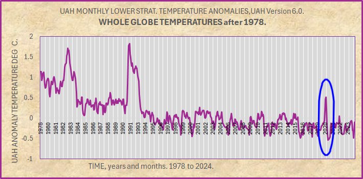
For other studies, I delved into UAH lower stratosphere temperatures for the whole globe.
In simple pattern terms, there are only 3 strong excursions each showing as a high peak.
Those around years 1982 and 1991 have been researched.
Steiner et al 2020. https://doi.org/10.1175/JCLI-D-19-0998.1
Explosive volcanic eruptions such as El Chichón in
1982, Mount Pinatubo in 1991 (Robock 2000) and also
minor volcanic eruptions after 2000 affect short-term
temperature trends in the troposphere and stratosphere
(Solomon et al. 2011; Stocker et al. 2019).
Solomon 2011. https://doi.org/10.1126/science.1206027
A reasonable hypothesis would have the 2020 peak caused by volcanic eruption.
However, there would need to be a strong volcanic eruption in 2020, stronger than any since 1991, otherwise they also would show a peak for their eruption year. No such eruptions can be found by search of the literature.
The 2020 peak must therefore be attributed to another physical process.
There is not much literature as to cause in 2020. The Hunga Tonga event was 2 years later and it does not show a peak, so is easily excluded.
The Hunga Tonga simple timeline is –
“In December 2021, an eruption began on Hunga Tonga–Hunga Haʻapai, a submarine volcano in the Tongan archipelago in the southern Pacific Ocean.[6] The eruption reached a very large and powerful climax nearly four weeks later, on 15 January 2022.[7]”
https://en.wikipedia.org/wiki/2022_Hunga_Tonga%E2%80%93Hunga_Ha%CA%BBapai_eruption_and_tsunami
The main search result gives Rieger et al with this Abstract extract:
“Stratospheric aerosol, temperature, and ozone anomalies after the 2020 Australian bushfires are documented from satellite observations. Aerosol extinction is enhanced in the Southern Hemisphere (SH) lower stratosphere (LS) in early 2020, comparable in magnitude to the Calbuco eruption in 2015. Warm temperature anomalies of 1–2 K occur in the SH LS during January-April 2020 and are coincident with enhanced aerosols.”
https://agupubs.onlinelibrary.wiley.com/doi/full/10.1029/2021GL095898
…..
This does not explain the 2020 UAH peak. There have been other fires since 1978 that show no peak on the graph that can be separated from its noise. Where is the peak for Calbulco 2015?
It is plausible that this 2020 peak reflects an event that has not been noted to date.
It was a “strong” event.
If all of this is correct, we have an example of a powerful event that has affected lower stratospheric temperatures but has not yet been assigned a cause.
….
This has significant implications. Presumably (but yet to be shown) this lack of attribution could also exist for strong peaks in the troposphere.
This places a large and new uncertainty on the interpretation of UAH temperatures.
It places uncertainty on the attribution of “hottest ever years or months. If there are indeed events like tis 2020 peak, they cound exists at other times to create an entirely false claim of hottest.
Geoff S
“There have been other fires since 1978″
But none so big. You haven’t shown fires couldn’t be a cause.
And here is the money shot.
The aviation stratospheric water vapor model is based on a 3 year lapse rate, that is why you see a number > 95 billion. Notice the Stratospheric warming occurs during the drop in aviation activity.
Nick,
It is not my task to show it could not be fires.
It is the task of people (often paid and employed) who are doing attribution studies to show that these Australian fires were indeed the cause.
Note that the graph has only 3 strong peaks. Whatever caused the 2020 peak had substantial energy. Geoff S
It seems that Covid-19 pandemic affected air travel, significantly.
Well done Nick..
You have just said that fires have been lower since 1978..
Better not tell your AGW comrades, they might cancel you.
ROFL!! Nick *never* thinks through the implications of his assertions!
I found out what most likely caused the Stratospheric warming event in 2020. You ever wondered why the Stratosphere became so trendless after Pinatubo effects dissipated. It is because global aviation has the Stratosphere saturated with water vapor. When the lockdown went into effect the continuous feed of aviation exhaust into the lower stratosphere was cut in half. At 2019 humanity was burning 95 billion gallons of jet fuel per year. By the end of 2020, that number was down to 45.
The 80’s and 90’s saw a huge increase in global aviation, the stratosphere was cooling during that period, but it was masked by the disruption from El-Chichon and Pinatubo.
Water Vapor causes cooling in the stratosphere, remove it and it warms up. Cut aviation exhaust to 0, you would see many killer freeze vortex breaches for a few years and global temps would plunge at an alarming rate, much as it is doing now as the HT water vapor cycles out of the Stratosphere.
The record hurricane season of 2008 was likely accentuated by the drop in aviation during Mr. Obamas recession, and the unusual low of global temperatures that was recorded during that period, in which it almost touched the UAH baseline. That cannot be solely explained by a marginal La-Nina.
It takes 3 – 4 years for water vapor to cycle through the Stratosphere, it’s only path is up, in which it clears the ozone layer in which extreme UV breaks the molecular bonds of the H2O molecules and the H and O become ionized in the mesosphere.
Important indeed.
I believe that the 2020 event was caused by the drop in aviation exhaust from the lockdown.
Before the pandemic humanity was burning 95 billion gallons of jet fuel per year, in 6 months that rate went down to 45 billion gallons.
If you look through the mess of El-Chichon and Pinatubo you can see the Stratospheric temperatures dropping because of the huge increase in global aviation during the 80’s and 90’s.
Basically, since the 60’s the Stratosphere has been under the effects of continuous feed of anthropogenic water vapor into the Stratosphere, which causes a cooling trend.
The hurricane season of 2008 (cooler air aloft) and unusual cooling observed on global temps, which brought global temps close to the UAH baseline. This is also caused by the drop in aviation exhaust because of Mr. Obama’s recession. During that year a hurricane hit Texas in July, and then IKE hit 2 months later.
After the effects of Pinatubo dissipated, the stratosphere has been fairly flat, because it is under a continuous feed. We are talking roughly 5 – 10% of the water vapor that HT put into the Stratosphere global aviation does that every year.
Water vapor causes cooling in the stratosphere, remove it and it warms up.
Significant implications indeed.
I have always been a skeptic of CO2, but interested in the truth. Been searching for decades and this is the only thing that makes sense.
LT3,
Interesting hypothesis, but you will need to work through the math if the energy flow to see if it could be strong enough to form the peak in the red ellipse.
It is like people assuming that combustion of avgas produces enough heat to warm an airport and it’s thermometers measurably. I have not seen any math to show it is strong enough to matter. Geoff S
Well, HT proved that water vapor is highly effective in the Stratosphere. The other piece of data that anchors this as far as a solid hypothesis is that there was an anomalous warming from 1939 – 1945. INMHO, 9 billion gallons of aviation fuel burnt over the period, a period that prior to that, there was little if no anthropogenic water vapor in the Stratosphere. I only have the UAH loaded in my system now. But here is my model, utilizing ENSO, Transmission and Stratospheric Water Vapor from aviation and HT.
1 – 3 Inputs.
4 Modeled output.
5 UAH Global.
It is overwarming right now and needs some tweaking, but in the ball park for back of the napkin.
Aviation was left constant at current last reported annual rate of 85 billion gallons. If and when aviation excedes 100 billion we should see warming again, but probably nothing like the HT period we will see again, at least in our lives.
But there will be something else, and I plan on being on top of it, instead of arguing about CO2. I think I am going to remove it from my datasets, I am not a Botanist and I do not make my own soda so it is of no use to me.
Also of interst look at the last 3 samples of transmission, we are likely under the effects of the Canadian forest fire of late last year. I think it was the one of the largest fires in Canadian history.
Thanks for the feedback.
Operational flight altitudes were much lower during WWII, so that may not have been much of a factor. Lancasters flew at around 20,000 feet, although B17s did fly above 30,000.
Anytime you see a contrail above the cumulonimbus though, it is very likely that water vapor will continue upwards. When you get above the weather, you are above the bubble point, and you are cheating nature in a way, as far as emitting hot water vapor into the upper atmosphere relative to doing so in the deep atmosphere.
You are right both the Lancasters and B-24 Liberators cruised well below 30,000 feet. But the B17 dropped 640,000 tons of bombs, and it can only carry slightly less than 5000 lbs, so that is a lot of flights.
The Stratosphere is thousands of feet lower at those lats, vs the equator.
I have not looked at the numbers for the B29 Raids over Japan yet.
“cheating nature”???
Never before have humans had machinery that that could place water vapor in the stratosphere. Nature gets water into the stratosphere primarily from convection through thunderstorm activity, and aviation adds roughly 10% of that amount on average artificially day and night in significant quantities, since the early 60’s.
Does it, or is the tropopause a barrier?
From NOAA,
9.000 metres is near enough 30,000 feet, so that would have put B-17s above the tropopause.
It would certainly be interesting to quantify the amount of water vapour which entered the lower stratosphere due to aviation each year since the beginning of WWII.
I am going to try to model it, but back of the napkin says there should have been around 250,000 B17 flights to deliver the tonnage claimed.
The inefficiencies of a 5000 lb. ordinance payload required a lot of trips.
That is kind of mind boggling…
You see the drop in aviation followed by the HT eruption, set up some experiments that we can calibrate the observations to the tremendous set of data available this century, and see if the model creates the anomalous warming over the WWII period.
And if that works,
Here is the earliest clue that the Stratosphere can cause rapid and significant warming from water vapor.
The Year Without a Winter: 1877-78 | Minnesota DNR (state.mn.us)
A strange unexplained warming occurred, and it looks like a very unique eruption in Iceland put a significant amount of water vapor into the Stratosphere in 1875. And a couple of years later the world experienced record temps just like what is happening today.
The Askja volcano eruption in 1875 – where did all the water come from? (Invited) – NASA/ADS (harvard.edu)
I’m going off on even more of a tangent, but is the tonnage figure for “delivered” (ie dropped) or loaded for takeoff? The attrition rate for those poor devils was horrendous.
Then you have to add fuel for the support fighters, but probably not for interceptors because they spent a large proportion of their flight time climbing to altitude or descending.
Hard to imagine a battle of such attrition again.
Guess what, further analysis indicates there were predictable warming periods over the duration of the Korean and Vietnam Wars, billions of gallons in each conflict.
I apologise if I appear obtuse, but I fail to see any warming whatever in this graph – quite the opposite in fact. What am I missing?
Graeme,
The red ellipse?
Geoff S
The primary conclusion from this is exactly what you say, it places large uncertainty in attribution studies. It once again shows that very few in climate science understand “uncertainty” and its implications.
It would be interesting to see your plot adding in solar activity.
The Pause!
The Pause is back!!
Hooray!!!
How daft can people get?
I guess we’ll see here over the coming months.
Thanks, WUWT. Where stupid comes to die.
You’re not dead yet.
“How daft can people get?”
You certainly keep pushing what any rational person would have thought was the upper limit of daftness and ignorance.
Keep striving !
I’m sure you are quite capable of proving there is no upper limit to your daftmess.!
I don’t think that means what you think it means. Oh, the irony is very tasty! LOL
poor fungal dies every time it comes here..
No more toenail rot !
Weakening El-Nino, that’s cute. At some point, now that El-Nino has been dead for 9 months, will there be a time when it will not be said anymore that the record warmth is associated with El-Nino., or will IQs continue to decline this century?
People screaming of a climate emergency, willing to destroy much of the world’s industry to avoid using fossil fuels, forcing people to buy EVs and heat pumps, covering vast areas of the globe with wind and solar “farms”, Al Gore saying the oceans are boiling- all that indicates a big drop in IQ.
Mistaking ENSO 3.4 indicator for the effect of the EL Nino event.
A common mistake.
Not a mistake, I actually model data, there is no heat left in the box son.
AN El-Nino event?
Care to share what the definition of that is?
El-Nino and La-Nino are essentially a box of ocean temps that are above or below a threshold, we are neutral and have been for some time. If you look at a global temperatures it should be blatantly obvious that the signature of this event is not indicative of a typical weak El-Nino classification, other factors are at play.
There is no clear definition of how an El-Nino / Nina forms, why it forms, when it will form, how long it will last. Only the teleconnections observed and documented allow for crude outlooks for various countries. The effects are clear, the mechanism, everyone is clueless.
The current warming episode has exceeded the duration of the 98 event, so much so that anyone claiming that we are still in an El-Nino event, well, I will save my disdain, and leave at, it is a common mistake.
Just look at the effect of the El Nino.
Started early, lasted long, only starting to subside now.
Lots of heat still there in the atmosphere.
Can only assume your model is wrong and doesn’t include all the warming produced.
I have looked at it, it ended at the beginning of the year.
Perhaps this will help, the US government who is usually late to the party issued a statement last month that 2023-2024 El-Nino has ended.
“El Niño—the warm phase of the El Niño-Southern Oscillation (“ENSO”) climate pattern—has ended, and forecasters think La Niña, the cool phase of ENSO, is likely to emerge later this summer—just in time to influence the peak of Atlantic Hurricane season.”
El Niño & La Niña (El Niño-Southern Oscillation) | NOAA Climate.gov
We are neutral as far as ENSO is concerned.
Are you going to acknowledge that, or are you going to continue to be Dr. Jello from Yahoo Answers?
“I have looked at it, it ended at the beginning of the year.”
The El Nino warming effect on the atmosphere is only just subsiding !.
Look at the UAH data.. DENIAL is stupidity !
ENSO 3-4 is only an “indicator” of El Nino events.
Right, you know more than the NOAA about El-Nino, they said its (The CYCLE) done. I said it’s done, but you say it’s still going, even after a La-Nina almost formed last month and the Stratosphere overturned and brought devasting vortex breaches to Russia and China last winter.
But then again, I do not take you seriously because I have seen your BS throughout this site.
When you know you get your ass kicked intellectually, then comes the name calling, that is your MO, life might become easier for you, if you just try to learn instead of pretending to know.
There is growing research that provides clues to the cause of El Nino. It appears the strengthening hypothesis is that plate tectonics and varying geothermal effects are involved, perhaps significantly.
It is a complex bit, the underlying forcing is elusive, but the dance of ENSO variations around atmospheric phenomena seems to be related. Such as the powerful ENSO swings following the Pinatubo effects.
El-Nino phased down some time back, but that is not what weakening El-Nino means. It means the lingering effects of El-Nino are dissipating.
Despite all the climate alarmism, people are choosing to ignore it and certainly don’t intend to make the major lifestyle changes needed to combat it. Aren’t fossil fuel consumption levels still at near-record highs. And hasn’t Consumer Reports shown depreciation levels of EVs to be consistently higher that ICE types? How about air travel? Are airlines cutting flights because people are so concerned about high-altitude emissions? The reality is that in North America both the US and Canada are likely to elect governments during the next year that will further exploit natural resources to bolster their economies. Meanwhile China and India are so concerned about the putative “climate catastrophe” that they continue to build coal-burning electricity generation stations at record levels. So the doomsday climate predictions are just wishful thinking on the part of those who can benefit the most from them.
Larry “data miner” Hamlin continues his reign of error. As usual, his articles are much ado about nothing.
No sane person could present so many words and charts for one month’s global average temperature.
He has become the El Nino data miner trying to make a temporary heat spike into something of great importance for a long term temperature trend.
If he gets paid for these articles, then this website is wasting its money.
And here I was thinking RG was a rabid EL Nino denier.
Certainly can’t counter anything Larry has put forward.
As usual, RG’s comment is totally empty of any real content.
“And here I was thinking”
A new trend. or did you hire a ghostwriter?
“I was thinking”‘ is a new high in BeNasty comedy
Poor RG, still as empty as always.
Mr zero-evidence, zero-content. !
Larry demonstrates that there is no climate emergency.
He is correct.
Larry demonstrated nothing
A climate emergency is merely a long term prediction based on unproven theories and worst case assumptions
It can not be refuted with a one month weather report.
In fact, a wild guess prediction of the climate in 100 to 200 years would take at least 50 to 100 years of actual data to refute the prediction.
The warming since 1975 has been enough to claim the 100 to 200 year predictions are possible.
What was not predicted 50 years ago was that warming would be good news.
It was predicted that the warming rate would be faster than it has been and the warming would be bad news.
Hamlin does nothing toi refute the climate emergency predictions. He data mines a month of weather (temperature average) with no apparent goal other than long winded pontification, as if he is paid by the word.
RG proved he is nothing but hot air. !
No-one would ever pay for his comments.
RG,
You are invited to give your explanation about why the present temperature peak is NOT due to some unexplained strong event of the type I have described for UAH lower stratosphere data in these comments.
Geoff S
I thought we were not talking
The people who claim Hunga Tonga caused a measurable change in the global average temperature have the responsibility to provide evidence of such a change. The effect should be strongest just after the eruption, and gradually fade away after a few years.
Science requires evidence to support a theory
Nothing is proven or disproven’
This is not “My theory is correct because you can’t prove it wrong”.That is equivalent to “You are guilty until proven innocent”, which only applies to Donald Trump here in the US.
I challenge the Hunga Tonga fans to provide evidence the eruption caused even +0.1 degree C. of global warming.
And don’t tell me there was a 17 month delay of Hunga Tongs climate effects that just happened to match the timing of the 2023 El Nino heat release
According to NASA, the effects of Tonga will be felt for years after the eruption and the wetting of the stratosphere will cause warming, again according to NASA..
Data Miner Hamlin has expanded his data mining from the TMAX in one month of USCRN (last article here) to NOAA global average for one month in this article
Although NOAA global is less trustworthy than USCRN, which is a half step backwards.
Perhaps a two month average in the next nearlt worthless article?
El Nino effect is subsiding.
It had no human causation
Get over it, luser.
NICE ! 🙂
Bing Videos Judge tosses out Trump classified documents case.
I know of a couple who are crying in their Cheerios right about now … they better get used to it, the rest of the Jenga tower is about to fall.
Watch out for the affected vs effected spellings. Also, when it’s warm it is climate change. When it is cold, it is weather. Always has been and always will be.
My favorite quote from John Steinbeck from East of Eden
“And it never failed that during the dry years the people forgot about the rich years, and during the wet years they lost all memory of the dry years. It was always that way.”
I’m always baffled that NOAA can fudge their data so much that they make the 1998 el niño event almost disappear.
They should compete for the David Copperfield prize.
And the large 1930,40s peak that basically all NH and most SH data has.
All gone due to agenda-driven mal-adjustments.
As we enter the upcoming grand solar minimum, along with various orbital and axis changes along with planetary effects and cosmic radiation, it will be fascinating to see how this goes forward.