Gabriel Oxenstierna
What drives climate change? Is it the anthropogenic emissions of CO2 and other greenhouse gases [GHG], as the established climate science and the IPCC claims with its GHG forcer hypothesis?
Or is it the natural variations in heat transport to the polar regions during winter, as the new “Winter Gate-keeper hypothesis” [WGH] claims?
The WGH asserts to be a general hypothesis for climate change, fully capable of explaining historical climate change, as well as current changes, and with explicit forecasts for our future climate. In these respects, it compares itself with the established IPCC hypothesis of climate change being driven by anthropogenic GHG emissions. The WGH is fully described in two recently published books, and has also been explained in some detail here at WUWT by its originator Javier Vinós (here, here, here), and also by Andy May (here, here).[1][2]
The WGH introduces a novel climate-forcing mechanism by proposing that changes in poleward heat transport can strongly influence climate. As the planet Earth has two such polar regions, we have one in cold season during most of the year. Temporally, planet Earth has two peaks of energy loss to space. They are when each of the polar areas is dark and cools by radiating more during the polar winter.
The two polar regions have little incoming solar energy and the green-house effect is also very small, especially during the polar winter. If, e.g., more energy would be transported polewards, we’d get a higher loss of energy at the top of atmosphere (ToA), without any compensating gain elsewhere. The energy flux of the planet would be altered by that change in transport.
Of specific significance is the regulation of the heat transport into the Arctic. The highest loss of energy is during the dark Arctic winter. Between November and February, the planet emits more energy than at any other time. It’s a complex mechanism, where five different “gate-keepers” influence the climate via the polar vortex, thus regulating meridional heat transport. This mechanism affects the radiative flux at the ToA, which changes the energy content of the entire climate system.
The WGH is a unified hypothesis that builds on a multitude of established theories regarding its contributing processes. An attempt at “definition” of the WGH by its creator formulates a whole range of testable claims:
“The Winter Gatekeeper hypothesis proposes that changes in the heat and moisture that reach the polar regions during winter, particularly the Arctic, play a major role in climate change. This is because the winter polar regions have a very low greenhouse effect due to the lack of atmospheric water vapor, the Earth’s main GHG. Combined with the lack of solar radiation, this leads to an effective loss of energy to space through outgoing infrared radiation.
Consequently, changes in the transport of heat to the polar regions during winter have an impact on the energy budget of the planet. The Arctic is particularly important in WGH because its weaker polar vortex allows for greater variations in heat transport.
Any factor that affects the atmospheric zonal circulation, the generation and propagation of planetary waves, or the strength of the polar vortex acts as a vortex gatekeeper capable of regulating the transport of heat to the Arctic during winter. These gatekeepers include theQuasi-Biennial Oscillation, El Niño-Southern Oscillation, volcanic eruptions, multi-decadal ocean oscillations(modes of variability), andsolar activity. […] The climate exhibits decades-long heat transport regimes, separated by abrupt shifts.”([2], pages 408f and 533, my emph.)
In this, and following posts I will analyze the bolded claims regarding heat transport by looking at climate data with a focus on the warming Arctic, since WGH gives the Arctic a defining role in climate change processes. Actually, the Arctic is a focal point for both the two competing hypotheses about climate change.
The Arctic has been warming almost four times faster than the global average since around 1990.[3]The established climate science (IPCC) essentially explains the warming in the Arctic with the greenhouse effect and has given it its own name: “Arctic Amplification” [AA]. The IPCC claims that 50-70 percent of the AA is caused by the increased amount of anthropogenic GHG in the atmosphere (emissions of CO2 etc.).[4] These increase the green house effect, which is assumed to cause the large temperature increase in the Arctic in winter. However, they neither provide any coherent theory how this happens, nor an explanation of the timing of the AA.
The WGH rejects the IPCC hypothesis. Instead, it claims that changes in energy flows into the Arctic are fundamental to explain the increasing temperatures there. It asks: From where comes all the additional energy that makes the Arctic winter temperature rise so sharply?
Watts in must correspond to watts out
The climate is constantly striving for a basic energy balance: the solar energy coming in must be balanced by an (approximately) equal amount of thermal energy radiating out – globally: Watts in must correspond to watts out.This has to be true as a global average, but spatially and temporally it is never met. See the animation below with the monthly sequence of the radiation balance, from January to December.
Figure 1. ToA radiation balance month by month. The animation shows the net energy exported or imported per gridcell, 1°x1°, average value per month, 2000 – 2023. Data from Ceres.
All this temporal and spatial flux is naturally driven by the Earth’s and the Sun’s various diurnal and seasonal cycles and other interactions. In spite of all the flux, there is a global balance. How is it achieved?
The Sun doesn’t shine in the polar regions during the winter polar night, thus no heat is provided from space. The main source for the outgoing radiation is the energy transported there from the tropics. The Sun irradiates so much into the tropics that it cannot all be efficiently radiated back to space. The energy is therefore transported away – advected – to the regions where it more easily can radiate to space. The resulting polewards transport of energy is achieved by advection of heat and moisture via atmospheric weather systems, and to a smaller degree by ocean currents:[5][6]

Let’s look at the the global radiation (im)balance for one month, calculated as the net incoming solar energy (solar irradiation minus reflected SW radiation) minus outgoing LW radiation (OLR) at the Top of the Atmospere (ToA). Here’s June:

In June, the maximum of solar irradiation is in the northern parts of the tropics. These parts absorb much more heat than they radiate to space, as shown by the orange and red areas. The highest levels are reached over the oceans, where humidity is high. We can also note the effect of the very dry atmosphere over desert regions in e.g. Sahara.
Some of the absorbed heat is converted into kinetic energy in weather systems. These do the job of moving the heat from the tropics to the polar regions. Solar heat accumulated in the tropics (positive values; shown in green/yellow/red colors) is thus transported polewards, where it is radiated into space (negative values; in grey/ blue/black).
The northern hemisphere up to the Arctic (except Greenland) has a positive energy balance during summer. In other words, we have a surplus of incoming solar radiation minus what is radiated back into space. But even in the summer month of June, the Arctic north of 70° latitude has a negative net radiation of energy, as seen in the figure.
In the Southern Hemisphere, it is winter in June and Antarctica is in the polar night. No solar energy comes in. To the north of Antarctica is the Southern Ocean, where the energy balance is maximally negative with up to 200 watts per m2 radiated into space (the black areas in the figure).
For the climate, water is the only significant energy carrier. The reason why most of the energy is emitted over the ocean is that the humidity is high there, so more energy is available. Energy is mainly transported by water vapor in the atmospheric weather systems. Over continental Antarctica, however, the air is extremely dry and only a fraction of the energy is available compared to the Southern ocean. This also applies to Greenland.
In December, six months later, the figure is reversed. We now have a huge wintertime radiation deficit in the Arctic, as seen by the negative values reaching almost -200 W/m2 there. That is balanced by a large surplus, mainly in the southern tropics:

Researchers have since long established the negative energy budgets for the polar regions.[7] The current average yearly heat loss in the Arctic is 114W/m2, with up to 200 W/m2 lost in the winter. This strongly negative radiation budget is a result of the dryness of the atmosphere and a very small greenhouse effect. The negative energy budget is much more pronounced in the middle of winter (fig. 3B) but applies all year round, as seen in the animation in figure 1. Three questions arise:
1. How to account for the heat that is radiated to space from the Arctic?
If we look at the Northern Hemisphere south of the Arctic, we see that the average radiation balance is almost 9W/m2 for the latitudes up to 70°N:

This excess net energy originates in the tropics and advects polewards with the weather systems via the Hadley and Ferrell cells. The amount of energy advected from the southern latitudes into the Arctic is of similar size to what is radiated from the Arctic (2.1 PW compared to 1.8 PW, as yearly averages according to the radiation data).[6][8]
Another, much smaller source of energy is latent heat released as the summer meltwater freezes. As fall transitions to winter, the Arctic cools. When the surface freezes, the latent heat stored in the water since the previous spring thaw is released. [6]
During the summer months, the Arctic energy balance is around zero as seen in figure 3A. Incoming net solar is balanced by an equally large OLR.
2. How do we know that the energy directed towards the polar regions is actually radiated out into space?
The surface in the Arctic is covered with ice and snow most of the year. Ice and especially snow have low thermal conductivities. The small energy flow through ice is also always from the warmer ocean below the ice to the colder air above the ice. Most of the net energy coming to the Arctic via the atmosphere will thus be radiated to space. Except for a few summer months with open water no significant amount of energy from the ocean can contribute to the radiation at ToA. During summer, a lot of energy is also spent on melting ice and snow. That latent heat is later released as the freeze sets in. The net energy from this cycle balances around zero on a yearly basis. [7]
3. Do changes in the energy transport coincide with the onset of AA?
The export of net energy from the tropics has a positive trend since around 2000, see figure 4. The intensity of the tropical Hadley cells have increased, and they have also significantly expanded polewards since 1997.[9] Also the Ferrel cells show similar increases.[10] The ocean also contributed to the Arctic with a net step change in 1997.[11]
The increase in net heat transport to the Arctic shown in figure 4 is almost 2 W/m2 since 2000. This is distributed between increased radiation to space and increased downward longwave radiation that warms the surface.
The outgoing heat radiation (OLR) from the Arctic is currently around 197 W/m2. The OLR has been increasing significantly with around 4 w/m2 since 1990, when the AA started, wherof around 2 W/m2 since 2000:

The energy transported to the polar regions has clearly increased over time, which has helped to increase the energy lost via AA. The result is a planetary cooling effect.
We thus have the answer both as to the amount, and the timing of AA: the increase in OLR in figure 5 in the 1990/2010 timeframe corresponds quantitatively with the increase in advected heat from the south. The data and the science fully support the Winter Gate-keeper hypothesis in this respect.
The second round brings up the topic of climate shifts.
References
[1] Vinós, Javier, Climate of the Past, Present and Future: A scientific debate, 2nd ed., Critical Science Press, 2022.
[2] Vinós, Javier. Solving the Climate Puzzle: The Sun’s Surprising Role, Critical Science Press, 2023.
[3] The Arctic has warmed nearly four times faster than the globe since 1979, Rantanen and 7 co-authors, Nature 2022, https://doi.org/10.1038/s43247-022-00498-3
[4] IPCC AR6 WG1, chapter 9, see e.g. figure 9.14https://www.ipcc.ch/report/ar6/wg1/chapter/chapter-9/
Forthcoming posts will analyze the greenhouse effect in the Arctic in more detail, as well as IPCC’s explanation for AA.
[5] Global ocean heat transport dominated by heat export from the tropical Pacific, Forget and Ferreira, Nature 2019, https://doi.org/10.1038/s41561-019-0333-7
[6] Decomposing the meridional heat transport in the climate system, Yang and 4 co-authors, Clim Dyn 2015, https://doi.org/10.1007/s00382-014-2380-5
[7] Peixoto, J.P. & Oort, A.H., 1992. Physics of climate. New York: American Institute of Physics. pp.353–364.
[8] Heat Transport Compensation in Atmosphere and Ocean over the Past 22 000 Years, Yang and 5 co-authors, Nature 2015, https://doi.org/10.1038/srep16661
[9] The Hadley Circulation in Reanalyses: Climatology, Variability, and Change, Nguyen +4, 2013, https://doi.org/10.1175/JCLI-D-12-00224.1
[10] Contributions of the Hadley and Ferrel Circulations to the Energetics of the Atmosphere over the Past 32 Years, Huang and McElroy, AMS 2014, https://doi.org/10.1175/JCLI-D-13-00538.1
[11] Increased ocean heat transport into the Nordic Seas and Arctic Ocean over the period 1993–2016, Tsubouchi and 7 co-authors, Nature 2021, https://doi.org/10.1038/s41558-020-00941-3
Technical note
It’s not an easy task to knead the satellite data files so that you can select and plot the data the way you want. This note is to help others with a guidance as to which softwares and methods are workable, reliable, and accessible without too much programming.
I first download data in the NetCDF4 format, e.g. from Ceres. The data are then preprocessed in the program CDO (Climate Data Operators) in Linux (in my case Ubuntu under Windows). All the time series data are calculated as surface-weighted monthly values in CDO. (I highly recommend preprocessing data in CDO rather than attempting it in R or Python, as the command line operated CDO is very efficient, fast, and reliable.)
After preprocessing, the selected data in the resulting .nc files were read into R/Rstudio where the figures were created with GGplot. The raster map plots were created with tidyterra:SpatRaster.
All data and software are free to use/open source.
Gabriel Oxenstierna is a PhD at Stockholm University and one of the Clintel signatories.
The photo illustrating WGH in the vignette is the GateKeeper roller coaster.
The model seems plausible, but the test would be making predictions contrary to the IPCC model that prove more accurate.
There are predictions made by the Winter Gatekeeper hypothesis.
Several more or less exact forecasts are given in both [1] and [2]. The forecasts are given in contrast to the ‘Enhanced CO2 Effect Hypothesis’, i.e. CO2 forcing plus assumed feedbacks.
See Figure 93 in [2] for an example.
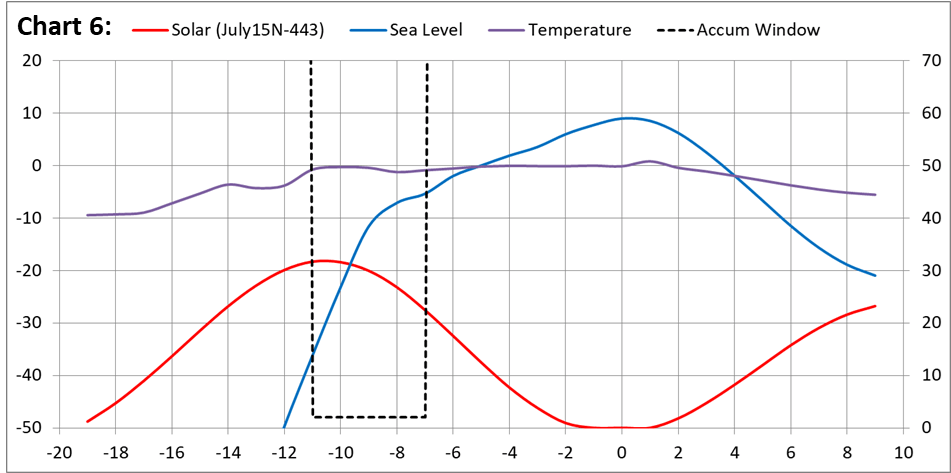
Contrasting climate projections to 2050 from two competing hypotheses.
a) Temperature data from the HadCRUT5 dataset (black line to 2022). Temperature projections from models (dashed red line) and the new hypothesis (black line from 2022 to 2050).
b) September Arctic sea ice extent data (black line to 2022). Sea ice extent prediction from models (dashed red line) and the new hypothesis (black line from 2022 to 2050).
c) Sea level data from NASA (black line to 2022). Predicted sea level rise from models (dashed red line) and the new hypothesis (black line from 2022 to 2050).
I plan to discuss these forecasts in a forthcoming post.
Sea level should be added to equation.
Out of the last ice age, ocean area has increased by 30%. Sea level by 400 some feet. The increased area and lower sea level atmospheric pressure super charges the water cycle thru evaporation. More cooling then snow first at high elevations. Just waiting for correct orbit geometry to trigger next ice age.
Can we get Eschenbach take on WGH Please
Why would you want an opinion about “radiative balance” from someone who doesn’t know what “radiation” means?
J. Parmentola (2023) “Celestial Mechanics and Estimating the Termination of the Holocene”
Holocene termination is about 500 years off.
Something to be said about those who make predictions beyond their estimated life expectancy . . .
Dammit! My wife and I have non-refundable tickets for a Caribbean cruise leaving 500 years from now, next Friday. Of all the luck..
Termination is arguably already under way. Greenland is already gaining permanent ice extent and the summit is increasing in elevation. There are two of permafrost monitoring sites in Alaska near the Arctic Ocean that have thaw depth reducing. Another on the north slop of Marmot Mountain in Canada this had reducing depth before being abandoned in 2002.
I am predicting clearly evident permafrost reversal by 2200 and sea level reducing within 2000 years.
 ?ssl=1
The oceans in the northern hemisphere need to got a lot more surface area up to the 30C limit before snowfall overtakes melt.
The system works even without water vapour or CO2.
The elephant in the room is the bulk atmospheric gases including nitrogen which is radiatively inert.
Kinetic energy is taken from the surface via conduction by the rising legs of the Hadley Ferrel and Polar cells and is progressively converted to potential energy with increasing height.
The reverse in the descending legs.
The greenhouse effect is a consequence of the time taken for the up and down cycle because that causes a delay in energy loss to space.
The principle applies to every planet with an atmosphere regardless of composition.
Adding radiative gases or particles simply alters the speed of the up and down cycle due to an effect on the lapse rate slope.
Sounds like you’re saying that additional CO2 emissions will cause a further delay in the loss of energy to space, hence warming.
No, because the convective overturning runs faster to get kinetic energy back to the surface sooner for radiation to space thus offsetting any potential delay from CO2.
There would be a tiny adjustment in the global air circulation but not enough to measure compared to natural variability.
Good. So to phrase it in my own words, we have a heat transport system that maintains thermal stasis around whatever climatic set point is determined by exogenous factors, or combinations thereof, such as orbital mechanics, plate tectonics, galactic cosmic rays, etc.
All substances, including gases, with a temperature above absolute zero emit radiation; this fact is captured in the Stefan-Boltzmann law of physics. (Acknowledging that gases do NOT radiate in blackbody-type spectra.)
Practically, there is no such thing as a “radiatively inert” substance.
In terms of the theory of greenhouse gases, few people recognize the LWIR-absorbing atmospheric gases have orders-of-magnitude greater probabilities of thermally equilibrating with N2 and O2 in the atmosphere (via molecular collisions) than they do of re-radiating LWIR photons back to Earth’s surface or to other atmospheric greenhouse gas molecules.
Yes. And my understanding is that the thermalization of the atmosphere is a necessary condition for convection to occur.
Re. your second point, I think Alarmists are quite happy for most people to carry around the misconception that there is some sort of conservation of photons that must be satisfied by the climate system, rather than of energy.
“And my understanding is that the thermalization of the atmosphere is a necessary condition for convection to occur.”
Hmmm . . . I not too sure about that. In a gravity field, convection in fluids (i.e., gases and liquids) can be driven simply by an unstable gradient in densities, even those in the very same medium. An example of such would be hot (less dense) air near the ground underlaying a laying of colder (more dense) air . . . a situation giving rise to “thermals”, quite familiar to sailplane pilots.
Differences in molecular weights for gases at the same temperature and pressure will also drive convection (e.g., a bubble of helium in still air at sea-level will rise = convect upward). As you know, convection is a much different process than diffusion.
So, to the extent that thermal equilibration between a LWIR photon-energized greenhouse molecule (such as H2O at MW of 18) and a non-LWIR active molecule such as nitrogen (at MW 28) would tend to minimize their density differences—both assumed starting at the same temperature and pressure before LWIR photon absorption—this would be a case of “thermalization” tending to dampen convection.
The opposite is true for thermalization of IR-excited CO2 (MW of 48) with nitrogen, which would increase the density difference between the two.
Subject to correction, I presume that absent GHGs, radiation from the surface directly to space would absolutely swamp heat transfer to the atmosphere via conduction. The addition of GHGs allows for the transfer of much more heat to the atmosphere, which results in much greater thermal expansion of same and, therefore, convection in a gravitational field.
Well, now you’ve brought in the physics of “thermal conduction”. which is totally different from “thermal convection”.
I think you brought up ‘conduction’, if only indirectly, when you stated that the near-surface atmosphere would be warmed even in the absence of GHGs, ‘giving rise to thermals…’.
Good point . . . but such warming is actually more due to horizontal air motion (i.e., convection cells) moving across the solar-warmed stationary surface than it is vertical conduction through the near-surface gaseous atmosphere.
Thermal conduction in a still column of a gas is a painfully slow process compared to convection.
Agreed.
And what is the relevance in relation to the article subject?
A point i would make: energy does not necessarily equal heat which is i think an important point to make when discussing the ‘greenhouse effect’, human caused or not. And it is of course relational, as is the ‘delay’. But it is imo not a ‘simple’ mechanism, especially with H2o involved, fluid dynamics etc.
So how does this explain the approx. 1 degree rise in the last century that is the cornerstone of the AGW crowd ? Warmer due to advection changes seems like it would rapidly tend toward circular proof.
From the above summary of the WGH:
— This statement sounds good, but is not self-evident. At the same time that one pole is in darkness during its winter season, the other pole is receiving increasing solar radiation by virtue of the Sun being continuously above the horizon and higher in the sky during that pole’s summer season. One needs to see the math that shows this statement to be true as relates to time-averaged global energy balance, which I suspect will be highly dependent on the assumed albedo differences between the two poles that, in turn, will be temporally and spatially variable with assumed differences in both percentage of areal cloud cover and percentage of areal surface ice & snow cover.
Also to be taken into account: the substantial differences in energy exchange per unit wavelength between solar energy absorbed in the visible-near IR spectrum versus the energy exchange per unit wavelength emitted from Earth’s surface in the LWIR spectrum associated with surface/cloud temperatures in the range of 210-310 K, the latter of course being subject to reduction from (ooops!) greenhouse gases.
I need to read the cited references for further details on the WGH, but it seems to be much has been glossed over in the above-quoted simplification statement.
“Of specific significance is the regulation of the heat transport into the Arctic. The highest loss of energy is during the dark Arctic winter. Between November and February, the planet emits more energy than at any other time.”
— Again, this statement is not obvious without seeing the scientific data/math on a global basis. Earth is at it greatest distance from the Sun at the time of Arctic summer, at which time is it receiving about 7% less energy from the Sun compared to being at perihelion. Therefore, one might reason that the greatest net loss of global energy occurs during the Arctic summer, not the Arctic winter.
Also to be taken into account, the Earth is traveling slower in its orbit at aphelion than it is at perihelion, so the time-integrated average of net heat loss on a global basis over an equal number of days between Arctic winter and Arctic summer must consider this.
As I stated, I have yet to read the details of the Winter Gatekeeper hypothesis (mea culpa), but on first blush, based the summary in the above article, it doesn’t pass the smell test.
It is more rational that CO2 being the control knob.
That is no reason to suspend scepticism.
Correction:
It is more rational than CO2 being the control knob.
I have stupid fingers at times.
“the greatest net loss of global energy occurs during the Arctic summer, not the Arctic winter.”

Not correct. It is as said in the post, the highest loss of energy is during the dark Arctic winter. Between November and February, the planet emits more energy than at any other time. Here is a graph for proof:
The total outgoing radiation is at its maximum in late November/early December. See further explanations in this article:
https://wattsupwiththat.com/2022/10/25/meridional-transport-the-most-fundamental-climate-variable/
The graph that you present shows that the yearly variation in TSI (representing power flux input to Earth) is about 23.5 W/m^2, more than twice the yearly variation in TOR (representing power flux output from Earth) of about 9.0 W/m^2.
Furthermore, in that graph you identify NH winter as the three months of mid-Nov thru mid-Feb, so by symmetry we can define the NH summer as the months of mid-May thru mid-Aug. If I integrate the quantity (TSI-TOR) over NH summer months I get a negative value, whereas if I integrate (TSI-TOR) over the winter months I get a positive value.
Therefore, I stand by my statement that the greatest net loss of global energy occurs during the Arctic (NH) summer, not the Arctic (NH) winter.
Thank you for providing the quantitative data that shows this is so.
{N.B. Earth albedo (at an average of about 0.3) is needed to adjust for incoming radiation at TOA versus that absorbed in the atmosphere and at the surface, but it will not change the above conclusions.}
TSI and TOR aren’t really comparable like you do. Not all of TSI warms the planet, as you correctly note at the end, some 30% is reflected away. But this affects only TSI.
Whereas TOR has already accounted for that.
The NH in winter is 2.2 ° C colder than the SH in winter, notwithstanding Antarctica being so cold. The boreal winter is not only the coldest period for the NH, but also for the planet (Jones et al. 1999; Fig. 10.2), despite the Earth receiving 6.9% more insolation in January than in July. Planetary albedo is higher during the austral summer due to oceanic clouds and Antarctic albedo, so more shortwave radiation is reflected at perihelion compensating in part for the higher incoming shortwave radiation.
A further explanation is provided in [1] for the figure:
The global surface average temperature of the planet (thick line) changes by 3.8 ° C over the course of a year, mostly because the NH (thin line) varies by 12 ° C. The planet is coldest during the month of January, despite receiving 6.9% more total solar irradiance (TSI, dotted yellow line) in early January when the Earth is in perihelion. The planet has two peaks of energy loss (TOR, Total Outgoing Radiation, outgoing longwave and reflected shortwave, dotted red line) when each hemisphere cools, with the highest during the cooling of the NH. Between November and January the planet emits more energy (TOR) than at any other time. SH, dashed line. NH winter, light grey area. 1961– 1990 temperature data from Jones et al. 1999. Radiation data from Carlson et al. 2019.
Vinós, Javier. Climate of the Past, Present and Future: A scientific debate, 2nd ed. (p. 427).
Gabriel, thank you for your more detailed explanations as they have given me much more to consider than I previously had. I am serious in this statement.
However, I remain troubled by these two observations:
FIRST
The chart you presented above (attributed to Vinós 2022), shows a close temporal alignment of the planet being coldest and the time of maximum heat loss . . . as you quote above
— “The planet is coldest during the month of January . . .”
— “Between November and January the planet emits more energy (TOR) than at any other time.”
So, given the tremendous heat capacity of the oceans on Earth as well as the latent heats associated with the phase changes of water ice <—> liquid and water liquid <—> vapor, I assert that these two curves should be separated in phase by significantly more time than just one month.
Part of the problem may be in not knowing exactly what comprises the “global average surface temperature” (per the graph’s title and right-side axis) . . . is it only near-surface atmospheric temperature, is it lower troposphere temperature, does it include SST, etc.?
It’s the age-old problem of trying to infer energy change using temperature as the metric, as opposed to the more straight-forward calculation of energy change using power as the metric.
SECOND
Why don’t any of the graph lines representing NH, SH and global temperatures show any response to the secondary peak of TOR that is shown centered on June. The amplitude of that peak, referenced to beginning-of-May, is about 33% of the amplitude of the primary peak in TOR that occurs close to beginning-of-December, also referenced to beginning-of-May.
If TOR is the climate/”average surface temperature” driver that you, Javier Vinós and Andy May state it to be, then one would think its secondary peak would be reflected in the associated temperature curves—perhaps with a one-month phase lag—but those curves don’t reflect any such thing.
Ooops . . . “Part of the problem may be in not knowing exactly what comprises the “global average surface temperature” (per the graph’s title and
right-sideleft-side axis) . . .”Thanks for interesting comment reg. lags in the annual cycle of water phase changes (latent heat)
“It’s the age-old problem of trying to infer energy change using temperature as the metric, as opposed to the more straight-forward calculation of energy change using power as the metric.”
I don’t think what you say is correct, WGH doesn’t rely on temperature data. The main metrics are radiation/energy (measured by satellites) or energy flows in the oceans.
As regards the secondary peak of TOR that is shown centered on June, this relates to the Antarctica where the polar vortex is more or less impenetrable for planetery waves or eddies. Yes, it’s a big TOR, but it’s not subject to all those gatekeepers that we have around the polar vortex in the Arctic. That’s why all focus is on the Arctic, we have a bigger potential for planetary energy loss, and we have much more sensitive ‘throttles’, the ‘gate-keepers’.
“established climate science”? It’s more like “establishment” climate science.
While the Arctic is warming in winters and not ion summers. Antarctica is not warming at all.
How does this theory explain completely different observations in the Northern and Southern Hemispheres?
And how does this model explain the sharp decline of Arctic September sea ice extent from 1975 to 2012, that has reversed since 2012?
The basic explanation to the different warming developments in the polar regions are first of all their very different geographies, and secondly the very different character of the polar vortexes in the Arctic and the Antarctica. All that is described in great detail in both [1] and [2].
I’m getting to the Arctic sea ice extent in a coming post.
Great, the problem is just, there is planetary warming..
AA is not so complicated, rather it is darn simple. The irony is just that “climate science” does not like real physics and prefers some “polar feedback” narrative. The AA simply is about the loss of sea ice. Sea ice insulates the surface from the milder water below and allows low, continental temperatures on the surface, above the ice.
Less sea ice means more moderate, oceanic climate with a smaller annual temperature range. That is exactly what we see in the arctic. It is also the reason why the winter is warming, not the summer.
https://greenhousedefect.com/basic-greenhouse-defects/the-mysterious-polar-amplification
Exactly. I’ve pointed this out many times myself. The climate is affected mainly by the large changes in energy flow. This comes from large energy sources, aka the sun, the oceans or a combination of both. While atmospheric changes do have short term effects, I don’t see them as being the big Kahuna that drives climate over decades or longer. The atmosphere generally is reacting to the big Kahunas.
The 60 year Arctic sea ice cycle is the primary driver of the changes in climate since 1990. Ocean currents are the most likely source of century and millennial cycles.
Don’t discount the atmosphere in heat transport and particularly the radiation balance. Wind is the dominant driver of the ocean surface currents and wind is simply the movement of the atmosphere.
Water vapour punches well above its weight in the atmosphere. The atmospheric column gains as much sensible heat as latent heat when it takes up water due to the expansion of the column from the low density water vapour. At 30C surface temperature, saturated ocean atmosphere has 21% more energy than a dry atmosphere over a 30C surface. The water vapour added mass is just 1.2% of total mass.
The NH oceans have been warming for a few hundred years now. The atmospheric water has been increasing accordingly and not just in the NH. Parts of the SH have less atmospheric water but, on average, it has more:
 ?ssl=1
There are two dominant drivers of the increased winter advection to the Arctic. One is more atmospheric water. The other is the temperature difference in autumn and winter between ocean surface and land surface.
Thanks Rick for bringing this up. I can see that more atm. water drives (deep) convection.
But what do you mean when you say that more atm. water ‘drives’ the winter advection? In what way does it create meridional momentum? Would appreciate if you have references to that!
I’ll cover the latitudinal temperature gradient in the next post.
The heat content is strongly influenced by the moisture. So for same air flow, the heat transport is increased by the water vapour.
If you compare dry and saturated atmospheric columns both at 30C surface temperature, the saturated column has 21% more energy for just 1.2% increase in mass. Water vapour punches well above its weight for energy transport in the atmosphere.
The linked chart shows where heat is being retained in the oceans. Few people realise more heat is being retained the SH than NH, Both peaks are in the region of the Ferrell cells. . This is due to more heat transport from the tropics polewards in both hemispheres but land responds more than ocean.
 ?ssl=1
Thanks Rick, really interesting graph!
The Net radiation is from the ocean, correct? All land is masked away?
What are the data sources?
Not quite. I am sorry, but I am not a “one trick does it all” guy. I am only talking about the polar amplification, and that is that. If you want reveal “the truth” you will have to go many steps further, doing it properly step by step.
Early morning and I haven’t had a shot of whisky yet, but my mind isn’t able to interpret the image (right top) with the blue things. Help!
Import two shots, come back and check your energy balance.
I think the image to the left is even more dizzying!
Isn’t vaporized C2H5OH a greenhouse gas, b.t.w.?
All these hypotheses, but nobody shows where the increase in energy is coming from. The WGH explains the increase in OLR at the poles, but in order for it to be complete, it would have to show a compensatory loss of energy in the tropics/subtropics if you hold energy input steady. The GHG theory makes the same mistake. Somehow increasing GHGs or energy transport magically creates energy.
I recall several papers, consistent with what you present, that note that a decrease in clouds has resulted in some 2.0 W/m2 increase in energy input to the surface. Another estimated 5.4 W/m2 since 1980. Ol Willis touches on this with his cloud studies in the tropics as well. The only way that either WGH or GHG hypotheses work, IMO, is for there to be an increased input of SWR to the SURFACE … not the TOA, thus supplying the heat necessary to increase OLR at the TOA. Otherwise, the temperature would be falling. I just find this TOA approach to be a statistical slight of hand that is true but inappropriate.
Another factor I never hear anybody discussing. I don’t know the exact math, but burning fossil fuels results in a constant supply of extra Watts of energy to the system that nobody seems to mention. Seems like I saw some reference of 100s of Trillions of watts per year. Granted, I’m sure its miniscule in the scheme of TOA energy, but essentially, we are re-introducing energy that was absorbed and stored millions of years ago back into the atmospheric system. And it’s not lost on the fact that most of this is in urban centers where urban heat island effect occur. Watts did a whole study about the impact of this and that on thermometers. Seems pretty elementary to me that if you have a flame burning all the time, it’s going to increase the free energy in the system.
“All these hypotheses, but nobody shows where the increase in energy is coming from.”
I always show the difference between Javier’s ideas and mine, as my ideas and work include where the increase in energy came from, from the accumulated changes in solar cycle irradiance absorbed by the ocean over decades and centuries.
“, but essentially, we are re-introducing energy that was absorbed and stored millions of years ago back into the atmospheric system.”
You should factor in that for every temperature increase there is an unequal decrease later. What causes those down-spikes when more CO2 and free system energy are present from FF burning?
Nobel Prize laureate Dr. John Clauser showed recently the OLR changes from cloud changes vastly overwhelm the concensus’ expected TOA forcing changes from man-made emissions, although he didn’t say whether clouds were an independent variable.
What causes those down-spikes when more CO2 and free system energy are present from FF burning?
Down-spikes of what? That imaginery number Global temperature? If the energy added to the system every year by human activity is as small as expressed (i.e. less than two hours of incident solar), there is most likely a much larger difference of incident solar itself between aphelion and perihelion.
The changes in clouds have reduced the reflected short wave by 2.4W/m^2 over the past 22 years. This is partially offset by an increase in OLR of 1.3W/m^2:
 ?ssl=1
An important feature of the chart is the change in cloud just north of the equator. It shows the power of the negative feedback of the tropical clouds.
Watts is a measure of power. Joule is the measure of energy. In electricity systems Wh (3600J) is a common unit. Total anthropogenic primary energy consumption from fossil fuels is 160E15Wh each year. Oceans are currently retaining 3.33E18Wh each year. So just the extra heat retained in the oceans is 20 times more than humans produce from fossil fuels. The amount of sunlight is many orders of magnitude higher than the ocean retained heat.
A small fraction of the waste heat from human activity goes directly into the oceans but most ends up in the atmosphere or physical changes to materials. Aluminium, for example, is often regarded as congealed electricity. So not all the fossil fuel energy goes to heat.
The dominance of temperature measurement around urban areas certainly contribute to the reported temperature rise on land. Not so much on ocean but ocean warming is linked to land warming because it slows down summer advection.
“Each day the Earth is receiving {from the Sun—TYS} roughly 2,000,000 times the energy we consume.”
— https://www.quora.com/What-is-the-average-energy-consumed-by-all-of-humanity-relative-to-total-energy-produced-by-our-sun-per-second
That ratio of 2,000,000:1 is the reason nobody is concerned with the amount of heat released by humanity affecting climate. It is equivalent to a 0.0000005 decrease in Earth’s albedo . . . far, far less than albedo measurement uncertainty.
CORRECTION: I just did a double-check on the math in the cited quora.com link and found that it is erroneous. Based on an average of 19.6 TW of continuous power use by mankind in 2021 (all forms of energy equivalent . . . see https://en.wikipedia.org/wiki/World_energy_supply_and_consumption) versus average TOA solar insolation of 1361 W/m^2 and albedo of 0.30, the Earth actually receives roughly 6,200 times as much power from the Sun as that produced by mankind.
Even at a ratio of 6,200:1 (NOT the 2,000,000:1 ratio I previously cited), we have the same end result . . . human production of energy (ending up as waste heat in the environment) is insignificant, <0.02%, compared to energy it receives from the Sun.
Note: these corrected numbers agree with AndyHce’s post of May 22, 2024,12:13 am.
It has not been discussed for some years, as far as I know, but the claim from a number of sources was that the yearly total energy use of all humans activity is less than two hours of sunlight intersecting the globe.
That’s the fallacy of using “global”. The “two hours” considers energy for the whole globe, but it is only the energy in the vicinity of the thermometer that counts. Urban Heat Islands aren’t “global”, yet they are a significant driver of the global temperature.
“All these hypotheses, but nobody shows where the increase in energy is coming from”.
Dr.
Energy in a system is not only controlled by energy input. W/M2 are not all equal.
If we look at the energy in a system as a combination of “input energy” and “energy residence time” the situation becomes clearer.
Clearly changes in global albedo (Clouds) will affect surface energy input and global surface temperature.
Also, any increase /decrease in energy residence time will affect surface temperatures. The original energy from the sun is held in the system for longer. There does not need to be a change in input energy.
Increased meridional transport of energy will speed up energy transport to space and consequently act as negative feedback. This is very likely the case as the Earth’s climate system is essentially a massive heat engine.
The Earth’s many different surface conditions and microclimates all affect energy residence time or forcing efficacy to some extent. For example, if ocean phytoplankton concentration changes it will affect energy residence time. If ice gets discoloured, it will also have an effect. The list is endless and is the basis for the overhyped GH effect.
“Climate sensitivity is proportional to the time taken to equilibrium after any perturbation”, is the general rule and has an enormous effect on surface temperatures. Input energy is not the whole story.
Gabriel, while I think you did a commendable job with your plots and writing, Javier’s thesis is half-baked, missing the true driver, solar irradiance changes.
“This excess net energy originates in the tropics…”
The arctic sea ice and air temperature are strongly related to the NH SST, which is governed by solar activity. Your plots show the changes in Arctic OLR, which are from NH ocean warming.
The cumulative warming effect of the Solar Modern Maximum is clearly seen in the HadSST3 anomalies cumulative departure from average curves (CDA) of Global, NH, SH, and Tropics data:
Solar irradiance changes generated the net energy from the tropics and global SST growth:
In the above plot from my 2018 AGU poster, I correctly projected La Niña for 2020-2024.
Solar activity regulated tropical changes from solar minimum to maximum over 9 solar cycles:
My last image set was published in 2022 in my AGU and Sun-Climate Symposium posters, where I established the odds of those tropical steps being unrelated to solar activity as 1.6(10^19):1.
Furthermore, my 2023 work produced good ENSO and warming predictions wrt sunspot numbers.
One should not think this winter gatekeeper hypothesis, ie Arctic mechanism actually drives the climate, rather it is a response to the driver, the solar activity (TSI) warmed ocean in general.
Generally speaking it’s wise to just let your opponent make his mistakes without interruption, but the stakes are too high to leave this to people who don’t respect the major solar influence, TSI.
I established my work from 2014-22. How many Americans or Europeans here are aware that I have carried this whole ball by myself for 10 years, in the battle firsthand at science meetings on your behalf before Javier imposed himself by taking over my Solar Modern Maximum commentary, the one I started here in 2014/15 and at the AGU and Sun-Climate Symposiums in 2018?
Im not sure you should pose “the stakes are too high”. Whatever differences there are the alarmists are not listening anyway. All we can do here is present articles. Diversity is the name of the game. I think its better to be less, mmm, fragile.
That’s easy for you to say with no skin in the game. I’m not providing “diversity”, I’m providing the right answers to everyone, including Javier, about what reality is and isn’t.
Right after the v2 sunspot number was first available I developed and verified the time of the 1935-2004 Modern Maximum, a 70 year period, it was my very first scientific discovery in my life. There are literally dozens of my comments about this scattered throughout the WUWT archives from 2014-2018.
After informing him of this, Javier has had every opportunity to acknowledge my discovery, which I paid hard cold cash to publish in my 2018 science posters and attend two science meetings, talking to actual climate and solar scientists, not just skeptics on blogs. After I’ve told him of this he still hasn’t addressed it once. That tells me a lot about his character. He wants people to think it was his idea first. It wasn’t.
When Javier first started writing about the Modern Maximum he said it was 70 years from 1935-2005, which is 71 years. Aside from him not acknowledging this mistake, his theory itself explains little the IPCC doesn’t already know in terms of Arctic warming and downstream effects, and the cause of it, global warming.
His heat transport subject is nothing new either, so what is left is the solar-ENSO connection which others like me have discovered and developed. Whatever he is doing won’t change anything because he doesn’t get to why global warming happened, after all these articles, so what’s the point other than selling books? How does that help anyone?
Do you have any idea why I wanted to know about the Modern Maximum? Because I wanted to see the what the long-term changes in sunspot number average differences were in order to assess the TSI-induced temperature changes on the ocean. Science.
I wouldn’t have said anything about it if he had just acknowledged my discovery.
It’s not that I should be more fragile, it’s that others should recognize this reality.
Bob Weber:
In a previous thread, “How we know that the sun changes climate (II). The present.” you challenged me to identify “which VEI4 volcanic eruption(s) with their maximum cooling effect lagged 14-16 months occurred sometime during the recent 2020-2020 triple La Nina”
According to the WoodForTrees.org graph that I downloaded, it was the 2020 Jan 12 TAAL eruption in the Philippines. You had never commented on it, it appeared that you had never seen the post.
But it does appear to call your work into question.
Burl I don’t always go back to a blog if someone doesn’t comment back right away. I’ll now have to go back and make the same comment there too.
I really appreciate that you went through the effort to identify an VEI4 in 2020. That’s great, now, look at the aerosol optical depth movie from NASA and see for yourself there are no discernible aerosols in 2020 coming from the Phillipines.
https://eoimages.gsfc.nasa.gov/images/globalmaps/data/mov/MODAL2_M_AER_OD.mov
As well, 2020 had impressively clear skies allowing for high UV index worldwide.
Sorry Burl, but the TAAL eruption doesn’t appear to call my work into question at all.
Bob Weber.
You are overlooking the FACT that the TAAL eruption injected enough SO2 aerosols into the stratosphere to cause average global temperatures to decrease enough to form a La Nina.
I am sorry, but this temperature change was obviously not caused by a temporary solar blip, and DOES call into question your claims.
Your claim is not a fact Burl, it’s your opinion, obviously not a good one either.
As you can see for yourself from this Aerosol Optical Depth (AOD) data, the peak AOD level in 2020 was also reached in years without La Niña, and in La Niña year 2011 there was no large AOD peak preceding it or during it, which thoroughly falsifies your pet theory. Time to give it up Burl.
I’ll be expecting you to learn the right lesson from this, as your theory is done.
Bob Weber:
For your information
Thank you Burl, but NASA’s video doesn’t show it and neither did the AOD data I just showed you register anything unusual or definitive.
That little puff that made it all the way to Japan looks pretty sparse, so I doubt it had the volume or extent to affect the eastern tropics, if it could.
It would help you tremendously if you would use the available image data from here and here to see where the aerosols are/aren’t and use the numerical data provided to produce monthly AOD timeseries and subtract months from each other to see how things evolve in places.
Here is another look at January 2020, which looks grim for your theory
https://neo.gsfc.nasa.gov/servlet/RenderData?si=1784097&cs=rgb&format=JPEG
…and 16 months later, April 2021
https://neo.gsfc.nasa.gov/servlet/RenderData?si=1804241&cs=rgb&format=JPEG
Remember, all models are wrong, some models are useful.
Just as we can learn things from experiments that don’t work, we can learn from models that don’t work. Always we must remember we are working with models, not the real world.
Actually, some models are correct, but only if the inputs and parameters are properly toleranced and the transfer functions are based on actual physics. And especially if the models are simple, relatively non-complex. I model circuits all the time and then test those circuits confirming the modelling. Just an example.
These are the first two rules of models.
All models have limits. Many models work very well within those limits.
Given I verify the model results with testing and the model outputs perfectly align with test results, I submit the model is not wrong.
I grant you that most models are wrong. But there are specific cases where they are right.
There are no absolutes it the real point.
I will also grant there is a nuanced difference between a model and a simulation. If you care to classify my example as a simulation, I can agree. In this context the difference between a model and a simulation is a simulation has no guess work or assumptions.
Very nice Gabriel, this is really important and more important understandable.
Weather and over the long term climate are the measurable results of the earth’s thermal engine in operation. This piece demonstrates that nicely.
Well done.
Thank you very much for the article, Gabriel. I am happy that the hypothesis is put to the test.
I know I’m just a Layman, but it seems to me that there is more involved in “Climate” than just CO2 or any other GHG.
The oceans retain “heat” during the day and slowly release it during the night. etc., etc.
Lots we don’t understand or are just beginning to understand about what keeps this little blue ball habitable.
(The Moon is about the same distance from the Sun. The dark side is freezing. Why doesn’t the dark side of the Earth freeze?)
Lot’s to learn.
The current “political science” question is, “Can Man control any of it?
My pleasure 🙂
Your hypothesis deserves much more attention by the climate research community than it has gotten so far. After all, you endeavor to provide a truer and better explanation of climate change than the incumbent GHG hypothesis.
This is intended to be a series of posts about the WGH, there will be some critical points as well.
“The WGH asserts to be a general hypothesis for climate change, fully capable of explaining historical climate change, as well as current changes, and with explicit forecasts for our future climate. In these respects, it compares itself with the established IPCC hypothesis of climate change being driven by anthropogenic GHG emissions.”
It seems to be a general set of mechanisms for heat movement, but what it lacks is an actual driver. AGW has one – it is the massive mining and burning of carbon, which certainly wasn’t happening before. But what in all this talk of cyclic effects explains why the Earth is getting so much warmer than it was before?
“…but what it lacks is an actual driver. “
This is what I’ve been saying. I don’t want to hear any more theories either, just cold hard facts.
CERES data says the actual driver of temperatures is cloud cover changes.
Fewer clouds equals warmer temperatures as more sunlight hits the Earth, and more clouds equals cooler temperatures as less sunlight hits the Earth.
So why is most of the post-1975 warming TMIN rather than TMAX, when fewer clouds at night would encourage faster cooling at night?
Are there fewer clous in the day and more clouds at night? Seems unlikely to me.
And why is the very rough measure of percentage of cloud cover an accurate proxy for the actual amount solar energy blocked by clouds?
But as we talked about before, are clouds actually the independent variable?
Hi Nick, thanks for your comments.
“…it lacks is an actual driver.”
These are the drivers affecting global warming via changes in meridional transport:
Most of the warming during the 20th century can be explained by the combined effect of the ocean multidecadal oscillations and the Modern Solar Maximum on meridional transport.
No other proposed factor, such as CO2, can satisfactorily explain the early 20th century warming period, the mid-20th century shallow cooling, and the late 20th century strong warming period, without resorting to ad-hoc explanations, such as aerosols.
“what in all this talk of cyclic effects explains why the Earth is getting so much warmer than it was before?”
It isn’t getting warmer than it has been before during holocene. We’re indeed cycling.
What, in your opinion, would be the cause(s) of the various climate maxima and minima over the last, say, 2000 years? The Roman warm period, the Little Ice age, etc.
The +/- 0.5 C. variations in the past 5,000 are random variations. That is the range based n an average of LOCAL proxies which is not an accurate global average.
2023 was VERY likely warmer than any other year in the past 5000 years.
Utter and complete RUBBISH from a rabid and demented AGW-cultist.
MWP, RWP, and anything before the RWP, was all warmer than now. !
“Most of the warming during the 20th century can be explained by the combined effect of the ocean multidecadal oscillations and the Modern Solar Maximum on meridional transport.”
This is handwaving until you show what those are. “oscillations” is vague. This is what Wiki says about the “Modern solar maximum”:
“The Modern Maximum[1] refers to the period of relatively high solar activity[2] which began with solar cycle 15 in 1914. It reached a maximum in solar cycle 19 during the late 1950s and may have ended with the peak of solar cycle 23 in 2000, as solar cycle 24 is recording, at best, very muted solar activity.[3][failed verification] Another proposed end date for the maximum is 2007, with the decline phase of Cycle 23.[citation needed] In any case the low solar activity of solar cycle 24 in the 2010s marked a new period of reduced solar activity.”
with this graph, showing indeed decline since 1950. But it keeps getting warmer::
The 20th century has two periods of reduced transport (warming), that coincided with the ascent of the Atlantic Multidecadal Oscillation and the effect of the modern solar maximum. This resulted in 80 years of diminished transport that contributed to the greatest warming in 600 years.

The PDO, the PDO-linked ENSO and the AMO reflect the efficiency of heat transport through the respective ocean basins.
The AMO is interesting, because it’s well correlated with both solar variations and Atlantic surface heat transport. Currently, it’s in its positive phase indicating reduced transport resulting in heat accumulation and a high rate of global warming.[1 p.505]
From this article:
https://wattsupwiththat.com/2022/09/23/the-winter-gatekeeper-hypothesis-vii-a-summary-and-some-questions/
No numbers on those axes, and you only give the AMO. You don’t say how much warming should result from “weak transport”. And what about the phases of the PDO, and how much should they matter?
The multidecadal ocean oscillations are all temporally related, as shown by:
Wyatt, M.G., Kravtsov, S. and Tsonis, A.A., 2012. Atlantic multidecadal oscillation and Northern Hemisphere’s climate variability. Climate Dynamics, 38, pp.929-949.
Here is the relationship between AMO and PDO. When the last one is expressed as cumulative there is a good agreement between phases.
Scientists try to explain the relationship between different oceanic oscillations as teleconnections, atmospheric bridges and other esoteric explanations for what is clearly a global phenomenon with local manifestations.
It’s important to realize that the WGH is an over-arching, unifying conceptual model.
However, it’s built on a multitude of underlying theories and models. Most of them are well established theories, often expressed with mathematical models and quantifications.
There are e.g. quite a few papers w. quantifications of the mer.trprt in the literature. Some of them will be referred to in forthcoming posts.
But we have no consolidated quantification yet of the ‘gate-keepers’ of the Arctic polar vortex, afaik.
Hopefully there will be attempts at quantifying the WGH’s main traits. Some climate researchers will become interested once it becomes clear that the CO2 hypotheses wasn’t the explanation to global warming.
“It’s important to realize that the WGH is an over-arching, unifying conceptual model.”
You’re not aware you are also engaged in fantasy ideation like Javier.
What we don’t need is a conceptual model without an energy source.
Climate scientists already know about ocean warming, heat transport, ocean oscillations, Arctic warming, Arctic OLR, polar vortices, etc.
Javier is doing exactly what the climate scientists do, telling story after story about effects as causes. What happens at the Arctic is an effect of other things elsewhere in the climate. They know that. At least the climate scientists know they need to account for the original source of the increased energy, something that Javier has not done. Forget about ‘heat-trapping gases’. CO2 is not a real source of energy and SST CO2 regulation is an effect too.
The central issue is where did the energy come from. You and he didn’t ever answer that question, so you’re both wasting our time thinking this mishmash of effects as causes will change anything.
All this WGH is is like a repackaged Stadium Wave hypothesis, where one area of the climate affects others circularly with no change in energy input from the sun. This is clearly wrong circular thinking that doesn’t work without increasing incoming energy from the sun.
Javier repeated a phrase I coined at WUWT in his writings about the Modern Maximum, “the power of the Modern Maximum“, but denies the power of it by denying the TSI ocean warming effect. By following his ideas you too are denying the true power of the Modern Maximum.
I defined the 70-year Solar Modern Maximum from 1935-2004 by 2015, the first person to do it, for the specific reason to understand the amount of energy change from the sun that would affect the climate.
Here is my Mod Max from my 2018 AGU poster, plot updated in 2020:
When I posted this image on WUWT Javier said it was a nice graphic, then I find out he uses my Modern Maximum without attribution to me. There are a lot of citations in his bibs except for that one.
Gabriel, do you think that was legit and ethical and if so why?
Tell me why this unattributed use of my Modern Maximum isn’t a form of scientific misconduct…
Later I developed a TSI-SN model that computed the exact measured change from 1890-2010 in the 30-year HadSST3 via the 109-year sunspot number by using Hansen’s Planetary Temperature Equation:
Gabriel, please address my comment here and those further down the post, I’d like to know whether you’re the least bit objective.
Hi Bob,
I checked the references to the Solar Modern Maximum and it’s a concept thats been around since at least 2001. In what way do you then claim to be its originator?
RECONSTRUCTION OF WOLF SUNSPOT NUMBERS ON THE BASIS OF SPECTRAL CHARACTERISTICS AND ESTIMATES OF ASSOCIATED RADIO FLUX AND SOLAR WIND PARAMETERS FOR THE LAST MILLENNIUM,
N. R. RIGOZO et al.
DOI: 10.1023/a:1012745612022
As for your general argument reg. TSI, it is discussed by JV at length in his books. See ch. 11.6 The search for a controversial sun-climate connection in [1]
Vinós, Javier. Climate of the Past, Present and Future: A scientific debate, 2nd ed. (p. 517). 9788412586718.
Which 80 years in particular?
“The AMO is interesting, because it’s well correlated with both solar variations and Atlantic surface heat transport.”
The AMO is also well correlated with the U.S. regional temperature chart.
The AMO is *not* well correlated with the bogus, bastardized Hockey Stick chart.
Sunspot counts are BS
AMO an PDO are important only if they are synchronized — maximums or minimums at roughly the same time.
AMO every 60 to 80 years
PDO every 20 to 30 years
“While the two cycles are approximately the same length, they’ve been almost exactly out of phase since 1854, with the warm phase of one cycle almost coinciding with the cool phase of the other”
Science Under Attack
The two cycles are compared in the following figure, which shows indexes measuring fluctuations in average Pacific (top) and Atlantic (bottom) sea surface temperature since 1854 (1856 for the AMO); red denotes the warm phase, blue the cool phase of the cycle.
My guess is that the cycles are related, either the PDO causes the AMO or the AMO causes the PDO
“But it keeps getting warmer::”
So you claim. It’s not getting any warmer going by regional temperature charts. It’s not any warmer now than it was in the 1930’s.
After the 1930’s, the temperatures cooled by about 2.0C.
Based on satellite data since the late 1970s, sunspot counts grossly exaggerate tiny changes in TOA TSI and should never be used for science conclusions
Based on RG comments, which are baseless and gormless…
… they should never be used for scientific anything.
“No other proposed factor, such as CO2, can satisfactorily explain the early 20th century warming period, the mid-20th century shallow cooling,”
I wouldn’t call this “shallow cooling”. You must be looking at a bogus Hockey Stick chart.
What the U.S. regional chart show is a cooling of about 2.0c from the hot 1930’s to the cool 1970’s. That is not shallow.
Back in the 1970’s there were fears that the Earth was slipping into another Ice Age as the temperatures cooled for decades from the 1930’s to the 1970’s. The fears were based on the large amount of cooling that took place during this time.
The bogus Hockey Stick that you apparently think represents reality only show about a 0.3C of cooling from the 1930’s to the 1970’s.
Would any climate scientist get exercised over a 0.3C cooling? None that I know of. Certainly none that had any sense.
Using bogus Hockey Stick charts in your analysis doesn’t instill any confidence in me. Scientists who study temperatures should know better. All the regional temperature data is still available and no doubt has been seen by most, yet some still think a bogus Hockey Stick chart represents reality, when its temperature profile looks nothing like the temperature profile of unmodified regional charts. Conformation impluse?
Explain why climate scientists in the 1970’s were voicing fears of a new Ice Age. it wasn’t over a 0.3C drop in temperatures as portrayed by the bogus Hockey Stick chart. Back then they didn’t have Hockey Stick charts to look at. All they had was the U.S. regional chart above, and similar ones from all over the globe that show a similar temperature profile: Hot in the 1930’s and cold in the 1970’s, with a *significant* cooling.
Not true.
Conservative myth.
Only a tiny minority of climate scientists predicted a global cooling crisis. The predictions peaked in 1974 and got a lot of press coverage. A 48 year warming tren began in 1975,
The large majority of scientists — probably over 99% have predicted warming from more CO2 since 1896 in science papers the general public never read.
Not that climate predictions are real science.
Predictions are never based on data
Science requires data.
At the least, a discovery of a regular climate cycle that can be expected to repeat.
Yet you never claim how many a tiny minority is.
Name them and quantify them. Otherwise stop armwaving.
Quote from ‘The Complete Ice Age’ edited by Brian Fagan, Thames & Hudson 2009 p209.
“As Lowell Ponte (1976) summarized:
Since the 1940s the northern half of our planet has been cooling rapidly. Already the effect in the United States is the same as if every city had been picked up by giant hands and set down more than 100 miles closer to the North Pole. If the cooling continues, warned the National Academy of Sciences in 1975, we could possibly witness the beginning of the next great Ice Age. Conceivably, some of us might live to see huge snow fields remaining year round in northern regions of the United States and Europe”
The large majority of scientists……..
“Consensus science” is to engineering as “herbal remedy” is to medicine.
There that AGW-cultist call to consensus again.
Very sad state of “science” from RG.
“Science requires data.”
We are still waiting for RG to produce any. !
Modern Solar Maximum?
Fiction based on sunspot counts
Satellite data show almost no change of TOA TSI since the late 1970s.
The Solar Modern Maximum was from 1935-2004, when the sunspot number averaged 108.5, 65% higher than the previous 70-year period from 1865-1934 when the sunspot number average was 65.8.
The TSI change from this 70-year sunspot activity change caused global warming.
‘Almost no change’.
If you take your change, your coins, out of your pocket every day and bank them, the accumulated change over time will add up.
The absorbed solar energy from a solar cycle is stored in the ocean far longer than the length of the cycle, so small solar energy changes add up to big ocean changes.
That’s what my graphic on this post with the S-B equation shows.
“getting so much warmer than it was before” When is “before”? Just go look at the graphs in this site’s “paleoclimate” page. It has been warmer, and colder, just in the last 2000 years. Right at the moment, we’re coming out of the “little ice age”. The main driver seems to be solar cycles.
“It has been warmer, and colder, just in the last 2000 years”.
Only colder in the past 5000 years
Never warmer than 2023
Rubbish…. AGW cultism at its worst !!
“But what in all this talk of cyclic effects explains why the Earth is getting so much warmer than it was before?”
The only thing that shows the Earth is getting “so much warmer” is the bogus, bastardized Hockey Stick global temperature “record”.
Going by the written, historical, unmodified temperature records, it is no warmer today than it was in the recent past.
You are operating on a false assumption. As are all who think Hockey Stick charts represent reality.
it is no warmer today than it was in the recent past.
you have no data to support that claim
You have no data AT ALL !!
I am totally confused.
How can the winter gatekeeper hypothesis be correct, when the other side of the globe is enjoying summer temperatures?
What we know is all the atmospheric warming since 1978 occurs in steps caused by super El Niños. What causes these is a matter of speculation and debate, ranging from the sun to subsea volcanoes. I think simple ocean circulation does it.
“What we know is all the atmospheric warming since 1978 occurs in steps caused by super El Niños.”
Often said here, but just not true. Here is a plot where I have whited out the El Niños, even 2010. The warming just goes on, year by year. The El Niños are just added spikes.
This is worthless statistical surface junk. I am referring to UAH. Each big El Niño is followed by a period of nonwarming, but each such period is warmer than the flat period before that El Niño. This new big spike should be likewise. That is a testable hypothesis that will take five years or so to test.
Perhaps you have not seen this data:
https://wattsupwiththat.com/uah-version-6/
Tota BS
The rising trend of the GAT temperature is disturbed by BOTH the temporary La Ninas and EL Ninos
Where is the EL Nino “signal” in the 1940 to 1975 cooling period?
EL Ninos create a temporary spike in the existing GAT rising trend and La Ninas flatten the GAT trend. Nick Stokes just blew your crackpot El Nino theory “out of the water”
The global average air temperature is a meaningless number that cannot and does not describe “the climate”.
Using GISS or similar when you KNOW it is absolutely junk urban data.
And you have only erased the spikes, not the associated step changes..
You have zero credibility !!
Here is UAH Land. Near ZERO TREND between major El Ninos
(Note: Bob Tisdale isolates another El Nino in 1987 that would split the 1980-1997 slight trend into a cooling from 1980-1987 then a near zero trend to 1998.)
El Nino Nutters stick together like lunatic roommates in a mental asylum, making conservatives into climate science deniers.
You Wojick and Joe Bastardi are The Three Stooges of the El Nino Nutters.
Unable to counter the data shown on a graph, and obvious to absolutely everyone….
RG goes down the childish and completely non-scientific path of name calling
Nothing more is expected from him.
It is a demented form of Tourette’s syndrome.
ENSO is an aperiodic oscillation in vertical ocean circulation. The atmosphere also has such oscillations. Neither need be caused by anything other than chaotic constant internal energy. We do not need external drivers to explain highs (air flow down) and lows (air flow up) nor do we need them to explain El Niño (water flow not up) and La Niña (water flow up). What we need is a good map of ocean circulation over time which we do not have.
David Wojick:
Everything that you say is incorrect!
All of the atmospheric warming since circa 1980 has been due to decreased levels of industrial SO2 aerosols in our troposphere, due to Clean Air Act legislation (first introduced in 1971, and later amended several times), and other similar global efforts). The steps caused by “super El Ninos” are only temporary and do NOT contribute anything to our climate.
How does SO2 explain the ups and downs of this chart (Hansen 1999):
Tom Abbott:
All ups and downs are due to increasing or decreasing levels of SO2 aerosols in the atmosphere, due to volcanic eruptions (or the lack thereof), or to changes in American industrial activity.
According to NASA, SO2 aerosols are a haze of microscopic droplets of Sulfuric Acid in our atmosphere, which reflect sunlight and cools the lower atmosphere, and the Earth’s surface.
And, naturally, if their level is reduced, the intensity of the solar radiation striking the Earth’s surface increases. causing increased insolation..
We have an El Nino Nutter here folks
Ignore the La Ninas
Ignore the temperature neutral ENSO trend over 30 to 50 years periods (aka “climate”, not weather)
Ignore the 1940 to 1975 global cooling with El Ninos followed by 1975 to 2024 warming with El Ninos. El Ninos can do everything
They are faster than a speeding bullet, more powerful than a locomotive, able to leap tall buildings in a single bound. Look down in the ocean! It’s El Nino Man
Greene is spewing again, someone hit the big red button.
Show us the La Nina effect in UAH data, RG
Or be forever a gormless AGW-cult clown. !!
And get your pitiful little tantrums under control, FFS !!
“Ignore the temperature neutral ENSO trend over 30 to 50 years periods “
You mean the long ZERO TREND periods in UAH land data ?
Why ignore the VERY OBVIOUS El Nino effects.?
Blind.. or just AGW-demented !
Ok. Now this should correlate with Willis’ “Rainergy” hypothesis, particularly re the amount of heat put into the air near the equator.
EDIT FUNCTION:
It is new to me, although others may have been using it.
When a comment is posted, a small circular image appears to the left of the last line, which if clicked on says EDIT. Corrections/changes can then be made to the post, and if “saved”, will appear in the post.
This was a test. The image appears at the bottom right of the “reply” to the post
Yes, if you want to insert an image from your harddrive into the comment, the image button is on the right while the comment box is active. Just click on the box and you will be directed to select your image. Select it and it will appear in the comment when you hit the “post comment” button.
Except for those of us who don’t get to see the attach image button.
There used to be an attach an image button as described. Now there isn’t.
The edit button is on the right side, Burl.
Tom Abbott:
Yes, as I had noted above.
I have an issue w the edit function. If i try to correct a typo and click on the text the page goes black and freezes. This was not the case previously..
ballynally;
Probably a problem with your browser. Mine had been giving me some problems.
The Winter Gatekeeper has so much explanatory power. Recommend Javier Vinos’ book Solving the Climate Puzzle: The Sun’s Surprising Role. in hardback as you get the illustrations in colour.
At last some real science and climatology! Should be required reading for all school kids!
Everything really does fit together like a big puzzle, for example how else can you explain these well documented phenomena?
• The Little Ice Age, the coldest period in the last 10,000 years, occurred between 1300 and 1845.
• The pronounced warming of the early 20th century, pre-fossil fuels.
• The significant melting of the Arctic between 1915 and 1930, followed by a cooling trend until the 1980s. There is a clear but inverse (!) correlation of sun activity and polar temperatures. Why?
• The surprisingly close correlation between the speed of rotation of the earth (measured very accurately since the 1960s with atomic clocks) and solar activity.
The last one is especially convincing.
Thanks Hugo,
I also recommend interested readers to start with his book Solving the Climate Puzzle: The Sun’s Surprising Role. It’s much more accessible than his first book, which is more of a review of the science.
“If, e.g., more energy would be transported polewards, we’d get a higher loss of energy at the top of atmosphere (ToA), without any compensating gain elsewhere. The energy flux of the planet would be altered by that change in transport.”
The warm AMO phase also causes a reduction in cloud cover, which is probably why upper ocean heat content has increased since 1995.
The AMO and Arctic warmed from 1995 due to negative North Atlantic Oscillation regimes 1995-1999 and 2005-2012. The negative NAO warms the Arctic directly with warm humidity events, and indirectly by driving a warmer AMO.
Rising CO2 forcing is modeled to increase positive NAO states, which in theory would only drive a colder AMO and Arctic.
https://archive.ipcc.ch/publications_and_data/ar4/wg1/en/ch10s10-3-5-6.html