By Andy May
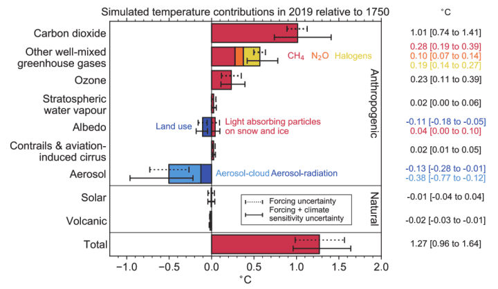
I hate statistics, as many of you know. Some people think statistics and/or statistical models that meet standard statistical criteria are facts. The IPCC can be like that. They statistically model global surface temperatures with models of volcanic and anthropogenic forcing and compare the model to one with only volcanic forcing. Then they turn to us, with a straight face, and say the comparison shows anthropogenic forcing is driving all the warming. What about solar? Oh, they considered that they say, the Sun makes no difference, see their chart in figure 1 from AR6.[1] Solar is assumed to be zero and volcanism is small, thus the model assumes all recent warming is due to humans, then draws the same conclusion in a perfect example of circular reasoning. But what if the solar forcing is not zero? What difference does that make?
Numerous papers have been published that show the Sun could have more impact on global temperatures and climate change than assumed by the IPCC.[2] We must remember that statistical models are not evidence or theories, they aren’t even proper hypotheses. They are just a tool to test the validity of ideas and a hypothesis might come out of a statistical model, but proof never will. If a model repeatedly predicts the future accurately, then it is evidence the hypothesis is correct, it isn’t proof. The IPCC presents their statistical climate model with the plots shown in figure 2.
Figure 2 is quite busy, but what it says, in brief, is that they assume that natural warming (heavy green line) is zero, which makes, under their assumptions, all warming due to human activities. The WG1 AR6 report is 2,391 pages long, but figure 2, modified slightly from what they display on page 441, really encapsulates everything it proposes. The rest is filler.
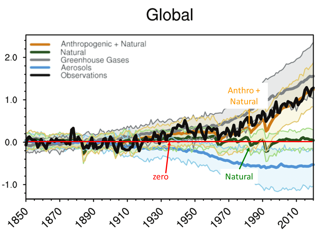
There are numerous problems with figure 2, but we will focus on the comparison between the anthropogenic + natural models, in orange, and the observations in black. First of all, the orange is not one model, but the average of many selected models. The range of model calculations (5 to 95th percentile) is shown with light orange shading. The range is quite large, if they had confidence in their models wouldn’t they choose the best one and use it? If they don’t trust the models, why try to use them as evidence that the Sun has no influence, and all the warming is due to human activities? Why use the models to confidently predict a man-made climate catastrophe? AR6 WGII Summary for Policymakers (p 12-20) reports high confidence in many future catastrophes based on model results. Why high confidence, if the models are so imprecise, that they must be averaged? Second, they use thick lines to try and obscure the differences between the black and orange lines, but the differences are significant, especially between 1935 and 1976 and 1980 to 2000. The model average between 1920 and 1960 looks almost hand-drawn because it is so straight relative to rising temperatures until 1944 and falling temperatures afterward.
So, let’s take a different approach. The classical paleoclimate literature, pre-IPCC, mostly thought that solar variability dominated climate change.[3] Over time the study of the cosmogenic isotopes 14C[4] in tree rings and 10Be[5] in ice cores has led to accepted proxy records of the Sun’s output that go back thousands of years (see the discussion of Carbon-14 and Beryllium-10 here).[6] These isotopes are created in the atmosphere when galactic cosmic rays make it through the solar magnetic field and impact the atmosphere. When solar output is high, its magnetic field is stronger than when it is low. Thus, low concentrations of 14C[7] and 10Be[8] suggest a strong solar output and vice versa. Since 1700 sunspot records provide a more accurate view of solar activity.[9]
Studies of 14C, 10Be, and sunspot records have uncovered four major long-term solar cycles. These are the Hallstatt (or Bray) cycle of about 2,400 years,[10] the Eddy Cycle of about 1,000 years,[11] the de Vries (or Suess) cycle of about 210 years, Feynman (or Gleissberg) cycle of about 105 years,[12] and the Pentadecadal cycle of about 50 years.[13] All the cycle periods are approximate, further, they may vary over geological time.[14] Some may not like my use of the term “cycles,” since our understanding of the cycle periods and the strength or power of each cycle is poor. Perhaps the term oscillation would be better but understand that I fully appreciate how poorly we understand these cycles and use the term only for convenience and not necessarily according to the precise definition of the word.
The Sun is a dynamo and generates a magnetic field that controls the variations in its output over time. Such a dynamo will have cycles, we have shown they exist and affect Earth’s climate, but the details are sketchy. What astrophysicists and paleoclimatologists have done is observe the Sun and solar impacts on Earth’s climate and recognized in-phase patterns of both solar activity and climate impacts. We discuss these observed (but only approximate) patterns in the post and correlate them to HadCRUT5. Cycles are also observed in other stars that are like our Sun.[15]
There are also shorter periods of solar variability, like the sunspot cycle which has a varying period and asymmetrical shape that averages about 11 years.[16] Finally, we have the ENSO cycle, also with a varying period, that is driven, in part, by solar activity.[17] To cover the shorter solar cycles we include the SILSO sunspot record[18] and the ERSST Niño 3.4 (ENSO) record from KNMI.[19]
If we ignore the IPCC assumption that solar activity has played no role in climate change since 1750, as suggested in figure 1, it is possible to investigate the correlation of these well-established cycles or oscillations and one of the global surface temperature records used in AR6, the HadCRUT5[20] record. Unfortunately, the HadCRUT5 global surface temperature record only goes back to 1850, but it is an instrumental record, and preferable to proxies. The data used to build HadCRUT5 is poor prior to 1958,[21] so we will also investigate the even shorter period of more accurate data from 1958 to 2023.
We used statistical multiple regression to see how well these cycles and data can predict HadCRUT5. We understand going in, that even if we can build a multiple regression model with a high R2 (Coefficient of determination or the square of the correlation coefficient), we haven’t proven anything. We also understand that while global average surface temperature is an important metric of climate change, it is not the only important metric. Other metrics, such as mid-latitude wind speed and direction, as well as surface temperature trends at the poles, and in the tropics (especially in the middle troposphere[22]) are also important. The purpose of this post is simply to show that the IPCC’s choice to characterize the correlation of the trends in the logarithm of CO2 concentration and global average surface temperature as “proof” or “evidence” that CO2 and other human greenhouse gas emissions drive climate change is not very solid. In fact, it is probably wrong. Other reasonable correlations are possible, and arguably better.
Figure 3 is a plot of the independent or predictor variables used in our regression study. They have been normalized to scales of -3 to +3 by dividing the larger variables (Log(CO2) and sunspots) by their mean to better compare the variables to one another. In addition, we divided the sunspot number by its standard deviation to help make it comparable in scale to other variables.
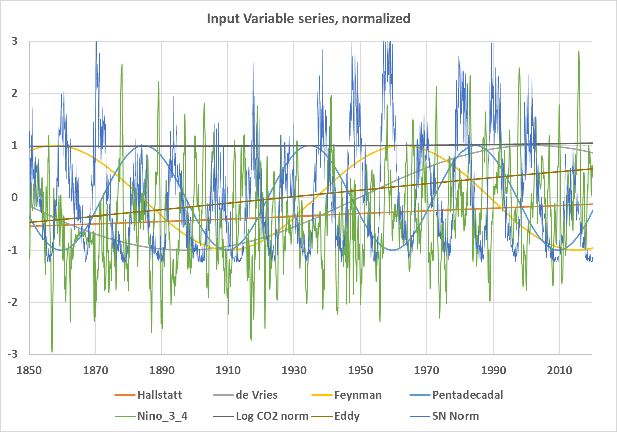
Unfortunately, our period is too short to properly evaluate some of the stronger climate cycles, like the Hallstatt (light blue) and Eddy (orange) cycles. These two cycles bottomed in the Little Ice Age and their periods are so long they almost appear as straight lines, but they are increasing like the HadCRUT5 record. The logarithm of CO2[23] is also nearly a straight line, and very slightly increasing. The CO2 data are interpolated yearly averages to avoid the seasonal wiggles.
The ENSO 3.4, sunspots (SN Norm), and CO2 (Log CO2 Norm) records used in the study are from well-known datasets.[24] The longer-term solar cycles are created using a sinusoid function[25] of the form:
- Cycle (t) = cos(2πft – offset)
Where the cosine argument is in radians, f=frequency, t=time, and the offset is used to align the sine wave with assumed cycle lows (cold periods) from Ilya Usoskin[26] and Joan Feynman.[27] For more on this transform, used in Fourier analysis, see David Evans’ paper here.[28] These lows are not precise and must be estimated from the available data. The actual values used, and the precise functions are in the supplementary materials which are linked at the end of this post.
The Multiple Regression Model
I performed a number of regressions with the variables plotted in figure 3 and various subsets of them. In every case where I could tell, the statistically most important single variable, judging from AIC,[29] sum of squares, and R2, was the logarithm of CO2. However, all the variables were significant, and CO2 compared to the impact of all the others combined was small, as we will see. AIC ranks the input predictors for the 1958 case rank as follows: Log_CO2, Nino_3_4, Hallstatt, Eddy, Pentadecadal, sunspots, and finally de Vries. AIC is based on the sum of squares, so it can be problematic in autocorrelated series[30] like these. The plots below give you feel for the relative importance of the main variables, which is hard (maybe impossible) to calculate statistically with any precision, mainly due to the brief period of our instrumental data and the long periods of the important solar cycles. The next four plots are for the whole instrumental record, 1850 to 2023. Figure 4 includes all the variables in the study.
Figure 5 uses all the variables except Log_CO2. In both figures the blue line is the smoothed HadCRUT5 record, and the fine gray line is the monthly HadCRUT5 data. The orange line is the model. We can see that Log_CO2 visually adds little to the match between observations and the model. Significant improvement is visible around 1940, otherwise the two models are about the same.
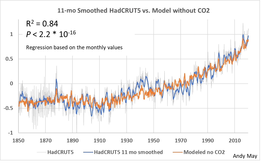
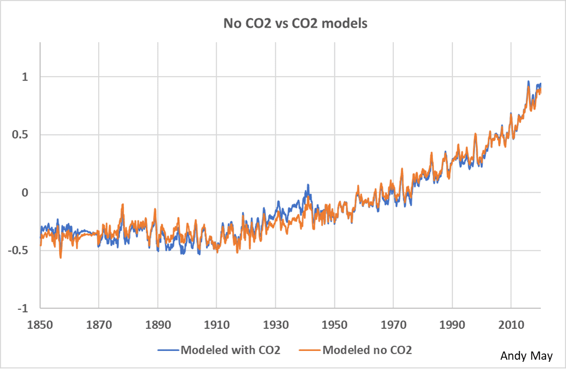
Figure 6 compares the model that uses Log_CO2 to the model that only uses the solar related variables. The two models are similar. The only noticeable differences are before 1940 when CO2 was supposedly not very important. It is possible that the differences are due to data quality. As we will see, the data prior to 1958 was lower in quality than the data after that date.
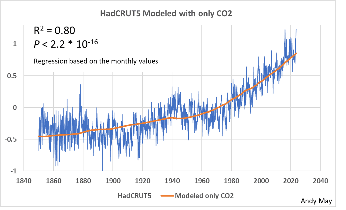
In figure 7 we model HadCRUT5 with only CO2. While the R2 is 0.8 and the model generally follows HadCRUT5, the model lacks the granularity and detail that is apparent in figures 5 and 6. The IPCC calls the granularity natural variability and dismisses it as statistical “noise” that is random. Notice the P-value doesn’t change, the P-value is of little use in models like this that have a lot of observations and produce good matches. It is not a good measure of model quality.
Next, we repeat the above four plots using a new model that only uses the data between 1958 and the present day. This is the largest period possible with good data. To get another upward step change in data quality we would need to move to 2005 when the ARGO array became sufficiently large to produce better data on ocean temperatures than we can get from ships. But only 17 years of good ocean data is not long enough to judge the influence of the longer solar cycles.
Figure 8 shows a good visual match between observations and a model with all the variables. It also has an R2 of 0.9, which would be impressive if the variables were independent and not autocorrelated. The mismatch between 1992 and 1995 is probably due to the Pinatubo eruption in 1991, which was not incorporated into this model.
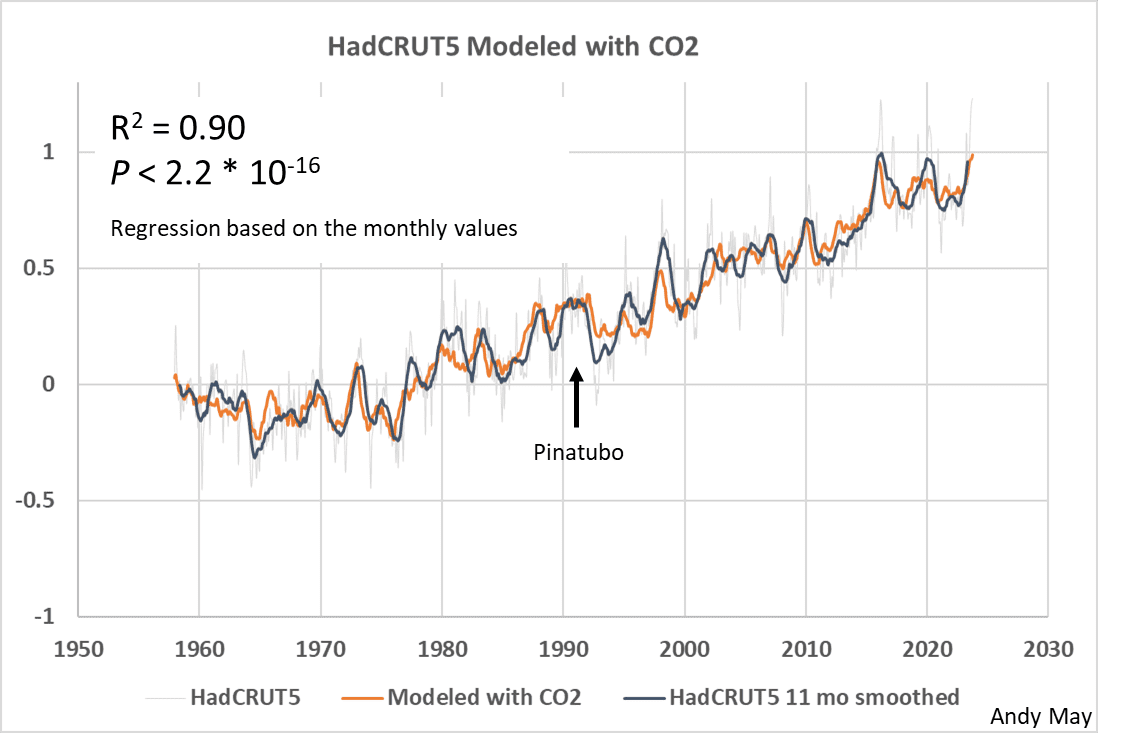
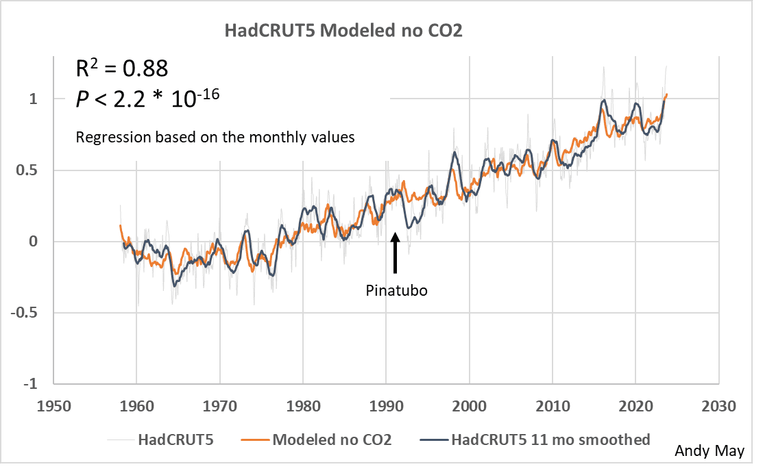
Figure 9 is the model with all variables except for CO2. The match is still good, but there are differences in detail suggesting that adding CO2 makes a difference. The large difference just after 1992 is probably due to the influence of the Mt. Pinatubo eruption in the summer of 1991. The effect of the eruption lasted several years. With the exception of the Pinatubo eruption, the model is almost as good as the model that includes CO2, at least visually.
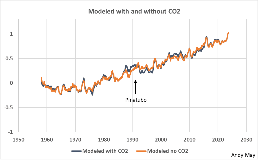
Figure 10 compares the models with and without CO2 directly, and except for the period right around the Mt. Pinatubo eruption, the match is excellent. I’m not saying that Pinatubo had an effect before it erupted, just that the large impact of the eruption on the HadCRUT5 record (see Figure 11) could have distorted the two regressions differently in that period. Possibly the addition of CO2 makes a small difference, but it isn’t apparent in this plot anywhere except around the eruption.
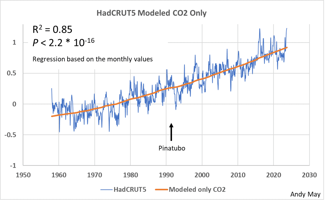
Figure 11 shows a model using only the logarithm of CO2, there is a general correspondence of temperature and CO2, but a great deal of detail is missing that we see in the other models. We can argue that the variation of the HadCRUT5 record around the orange model in figure 11 is not random noise if it can be modeled with solar cycles.
A word on statistics
The risk in evaluating regression statistics of models of autocorrelated series is most easily seen by considering that any two monotonically increasing time series, for example CO2 and temperature since 1850, will appear to correlate, even if they are unrelated. This is why I often hate statistics, too often statistical measures of fit, like R2, or computed statistical probabilities are used to gaslight readers into believing something that isn’t true. Your first judgment of a correlation should be made with a plot of the data versus the model, second should be a plot of the residuals. Are the residuals evenly dispersed about zero, or do they have a trend? All the residual plots for the top models in this post are trendless, as they should be.
The main point is to trust your eyes, not statistical measures of the fits, they are secondary. Sometimes the obvious is correct. To illustrate this point, I used a stepwise regression to order the models. To generate these four models, I removed the top variable (according to its AIC) and reran the regression with the remaining variables until the visual model did not match HadCRUT5 very well. The procedure suggests the most important variables are Log_CO2, Hallstatt, and Eddy. The four acceptable stepwise regression models are plotted in figure 12.
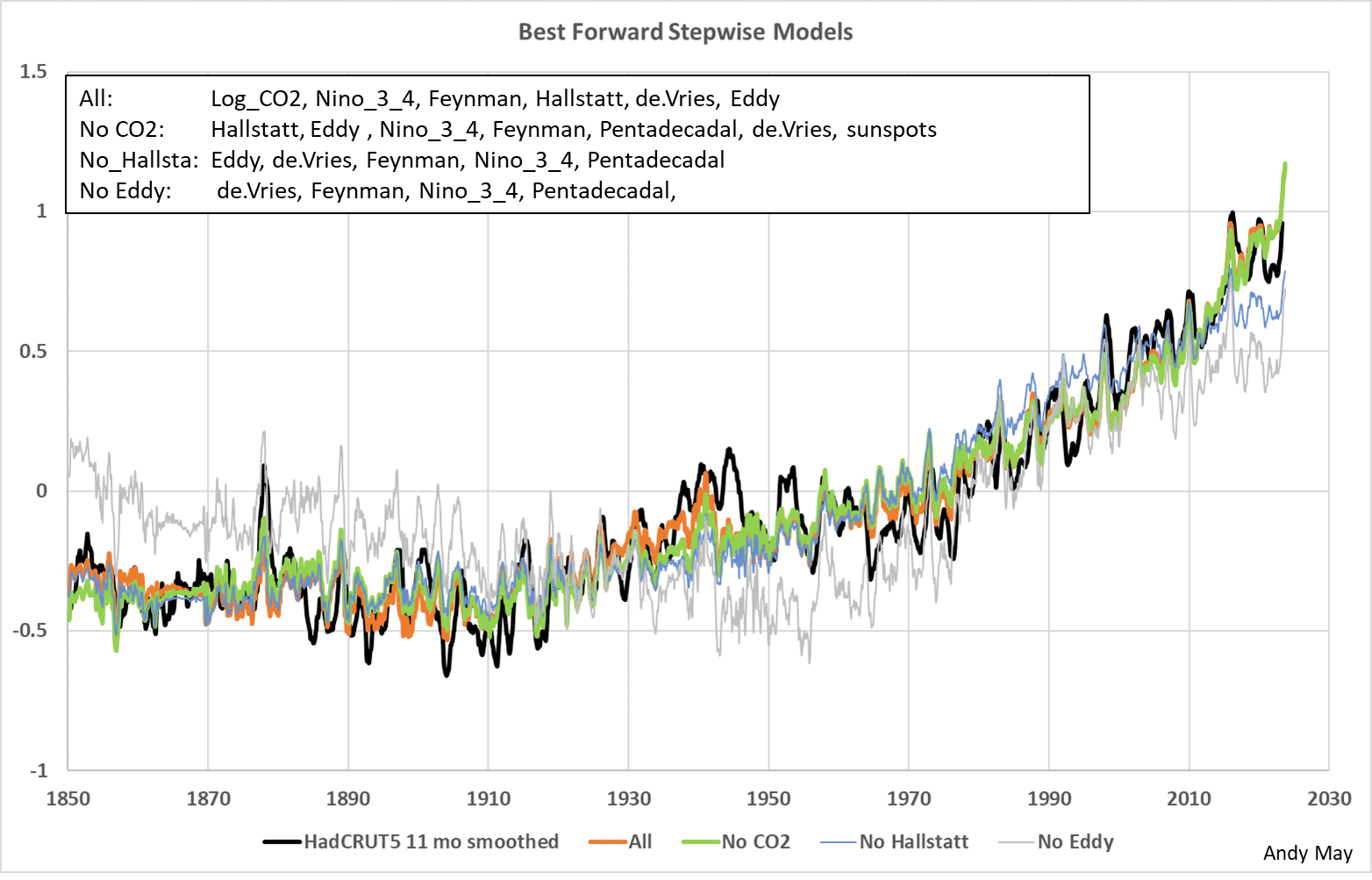
The first stepwise model (All) chose the variables listed in the figure. The variables are listed in order of importance according to their AIC scores. The best models, visually, are “All” and “no CO2,” and it is hard to tell the difference between the two. Notice that when CO2 was removed from the selection list, more variables were chosen.
After Hallstatt is removed, the list of chosen variables shrinks, but the model visually degraded a lot. Once Eddy was removed the model becomes very poor. The top variable, by AIC, is Log_CO2, but when Log_CO2 is removed from the model (the green curve) the match to HadCRUT5 is still good. Other models were also evaluated in this fashion, but these three are the best.
The variables that came out consistently on the bottom, according to AIC, were the Pentadecadal cycle and sunspots. However, removing these variables always caused the model to visually deteriorate unacceptably. Thus, AIC, while useful, is not a good sole criterion for the value of variables or models. Always look at the plots.
Conclusions
There are several logical conclusions from this study.
- A successful model can be built using only solar cycles, ENSO, and the sunspot record.
- Adding CO2 to the model described in (1) above adds a little to the fit, mostly in short intervals, like from 1935 to 1940 and in the middle 1990s around the Pinatubo eruption.
- Standard statistical measures, like AIC, R2 or the P test, cannot be used as the sole measure of the success of the model. Evaluating the plots is critical.
This study shows that solar variability, at least statistically, correlates to HadCRUT5 at least as well as CO2. Since HadCRUT5 is one of the main global average surface temperature records used by the IPCC to measure climate change, their conclusion, as stated in the AR6 Technical Summary is:
“Taken together with numerous formal attribution studies across an even broader range of indicators and theoretical understanding, this underpins the unequivocal attribution of observed warming of the atmosphere, ocean, and land to human influence.”
AR6 TS, page 63, emphasis added.
This is incorrect, and the result of their unsupported assertion that the Sun has no influence on climate. They should seriously investigate the influence of solar variability on climate change. I expected to have to deal with lagged solar effects on climate in this study going in. Possible multi-year lags between solar events and related climatic effects are mentioned in many papers (example here, other examples are cited in Eichler, et al.), but the observation/model matches in this post were all achieved with no lags.
I would like to thank Charley May and David Evans for their help with this post, although if there are any errors, they are mine alone.
Download the bibliography here.
Download the supplementary material here. You will find the R code to create all the models and Excel code to make the main models, not all the R models can be made in Excel. To run the models in Excel you will need to the “Analysis ToolPak” and the “Solver” Add-in. These are found under File/Options/Add-ins.
(IPCC, 2021, p. 961) ↑
-
See especially: (Connolly et al., 2021), (Hoyt & Schatten, 1997), (Soon, Connolly, & Connolly, 2015), (Usoskin I. , 2017), (Usoskin, Gallet, Lopes, Kovaltsov, & Hulot, 2016), (Scafetta N. , 2023), (Vahrenholt & Lüning, 2015), and (Judge, Egeland, & Henry, 2020). ↑
-
(Hoyt & Schatten, 1997) and (Bray, 1968) ↑
-
14C is the Carbon-14 isotope, except for nuclear bombs it is only created in the atmosphere by galactic cosmic rays, which increase when the Sun is less active. It has been used a proxy for solar activity for many decades. It is stored in tree rings, which provide a convenient and accurate date for each 14C concentration. (Cain & Suess, 1976) and (Cain W. , 1975). ↑
-
10Be is an isotope of Beryllium that is created by cosmic rays and is also inversely correlated with solar activity. It is stored in ice cores. (Beer, Blinov, Bonani, & al., 1990). ↑
-
(Beer, Blinov, Bonani, & al., 1990) and (Hoyt & Schatten, 1997, p. 174) ↑
-
(Bray, 1968) ↑
-
(Delaygue & Bard, 2011) ↑
-
https://www.sidc.be/SILSO/datafiles ↑
-
(Bray, 1968) ↑
-
(Abreu, Beer, & Ferriz-Mas, 2010) ↑
-
Joan Feynman studied this centennial cycle and the pentadecadal cycle for many years. She called it the Gleissberg cycle, but since many have used the name Feynman cycle, we continue with that name here (Feynman & Ruzmaikin, 2014). See also (Peristykh & Damon, 2003). ↑
-
The Pentadecadal cycle was first recognized by Rudolf Wolf in 1862 (Peristykh & Damon, 2003). He recognized that two or three high cycles were often followed by two or three low cycles. More formal recognition of the cycle was made by (Feynman & Ruzmaikin, 2014) and (Clilverd, Clarke, Ulich, Rishbeth, & Jarvis, 2006). ↑
-
(Peristykh & Damon, 2003) ↑
-
(Judge, Egeland, & Henry, 2020) and (Baliunas, et al., 1995) ↑
-
(Peristykh & Damon, 2003) ↑
-
(Roy, 2014) ↑
-
https://www.sidc.be/SILSO/datafiles ↑
-
https://climexp.knmi.nl/getindices.cgi?WMO=NCDCData/ersst_nino3.4a&STATION=NINO3.4&TYPE=i&id=someone@somewhere ↑
-
https://www.metoffice.gov.uk/hadobs/hadcrut5/ ↑
-
1958 was the International Geophysical Year (IGY), which led to gathering much higher quality climate and climate-related data. It is notable that the late S. Fred Singer was one of the organizers of this project and that it was organized in James Van Allen’s living room in 1950. According to Van Allen, it was his wife’s (Abigail) chocolate cake that sealed the deal that day. (Korsmo, 2007). ↑
-
(McKitrick & Christy, 2018) and (McKitrick & Christy, 2020) ↑
-
CO2 concentration varies as the logarithm to the base 2 with temperature, which means as CO2 doubles, temperature increases linearly. As CO2 concentration increases, its effect on surface temperature decreases. (Romps, Seeley, & Edman, 2022) and (Wijngaarden & Happer, 2020) ↑
-
ENSO 3.4 is from ERSST, which only goes back to 1854. 1850 through 1853 are filled in with the Webb, 2022 ONI. The sunspot number is from SILSO, and the CO2 concentration data are from NASA and NOAA. The CO2 record is interpolated yearly averages to avoid the seasonal changes. ↑
-
(Evans, 2013) ↑
-
(Usoskin, Gallet, Lopes, Kovaltsov, & Hulot, 2016) and (Usoskin I. , 2017) ↑
-
(Feynman & Ruzmaikin, 2014) ↑
-
(Evans, 2013) ↑
-
AIC stands for Akaike Information Criterion. It estimates the information lost by using the regression model in the place of the measurements. Like R2, it is based on the sum of squares and is susceptible to inflation (making variables and models look better than they actually are) due to autocorrelation. The Wikipedia article on this metric is helpful, see here. The lower the AIC value the better the model. ↑
-
All the input time series used in these multiple regression models are autocorrelated, which simply means each value in the series is highly dependent on its previous values not independent of one another as required by the rules of regression. This artificially inflates the statistical measures often used to evaluate the quality of a regression, such as the R2 value shown in some of the plots. ↑
CO2 as a thermostat does not seem to be the only viable hypothesis. It does not even look like a good fit.
On the first graph what is the Ordinate reading?
How do you model ”with co2” if no one has the slightest clue what it does?
In fact, how do you model at all when no one has the slightest clue about anything?
I have no idea what he was doing.
The main purpose of statistical models is to try to gain understanding of a process. If all this stuff was understood then making all these models would be pointless.
What the author has shown is that the underlying assumption of the ippc (that the sun isn’t a significant factor) is probably wrong.
You can make a model of any two or more variables to see how well they correlate or not. Or in this case to see if one of the variables adds to the correlation, or not. Understanding the process is a separate thing all together, which was the point of the post. The IPCC (and many others) want to say, “See, I made a model and it looks OK, that is proof I’m right.” This article is saying that logic is very flawed. Bob Rogers has it correct.
Time series, i.e., a series where time is the independent variable and something else is the dependent variable, that is, temperature, will only ever provide a correlation unless time is part of the functional relationship between the two. That is why Andy uses the term correlation so often. It is not physical evidence.
Linear regression was originally used to validate the functional relationship between an actual independent variable in an equation and a dependent variable which is the output of the functional mathematical relationship. In other words, does the equation accurately predict the relationship between input and output.
Once one has recognized a correlation, then one can postulate a hypothesis. Further correlation proves nothing. Only a physical connection can prove the hypothesis works to predict an outcome. Climate science has spent 50 years and billions of dollars trying to show better and better correlation as if that will prove something. It won’t.
Very well said!
“Time series, i.e., a series where time is the independent variable and something else is the dependent variable,”
The CO2 models used in this post are not using time as an independent variable. They are using CO2 as an independent variable.
The sun based models are using time as a variable given all the cycles are just sine waves based on time.
“Linear regression was originally used …”
Linear regression has always had multiple uses. The first use of the least square best fit was in predicting the position of Ceres based on limited observations. That’s describing a physical relationship between time and position. But the first use of the name linear regression was used to describe the relationship between the heights of children and parents. This is never going to be functional relationship. The same parents can have different sized children.
The question in most uses of linear regression is not, does it predict the exact value, but does it accurately predict the mean value. Real world data is always noisy, both because if uncertainty in the measurements, but also because there are thousands of variables that contribute to any one value.
“Once one has recognized a correlation, then one can postulate a hypothesis. ”
That’s one option. But more usually you start with a hypothesis and then test is with the data.
“Further correlation proves nothing.”
Nothing is ever “proven” in science or statistics. But the better the correlation the stronger the inference.
‘Only a physical connection can prove the hypothesis works to predict an outcome. ”
What do you mean by a “physical connection”? How would you prove that the connection exists, rather than just treat it as a hypothesis backed by strong evidence?
Are you joking? Every graph on here is using time on the x-axis. That is the normal independent variable. The only other interpretation is that CO2 creates time! Not likely.
Again, time does not CAUSE the position of Ceres. Time may be useful in the case of periodic phenomena, but again the cause is related to a physical functional relationship based on mass and gravitational forces. Have you never had to calculate the orbits of bodies in physics? It is not easy to even do circular orbits let alone elliptical.
Why am I not surprised. A physical connection is the functional relationship between phenomena. A physical connection can be described by a chemical reaction formula, a pressure based on the ideal gas formula, etc. In other words, a mathematical relationship predicting values of various components.
This is the whole purpose of Andy’s essay. The models obviously use CO2 as an independent variable. That is what they were designed to do. Yet they fail as Andy shows very well. That means there are other variables at work that combine to make our global climate. Trying to correlate two variables, temperature and CO2, based on time is becoming a waste of time AND MONEY.
You’ve never really done science have you? Science begins with an observation. You then proceed to see if you can find a connection that may result in a physical relationship. I said “Once one has recognized a correlation, then one can postulate a hypothesis.” I never said that a correlation couldn’t be used to generate information that results in an hypothesis. That is your interpretation of what I said.
I also said “Only a physical connection can prove the hypothesis works to predict an outcome. Climate science has spent 50 years and billions of dollars trying to show better and better correlation as if that will prove something. It won’t.” I stand by that. CO2 is not the only cause of an increase in temperature. There is most likely a multivariate cause. Concentrating on only one variable, and probably a small one at that, is fruitless.
The fact that government grants dictate the direction of research is laughable. Explain why large experiments using a cylinder like a rural water district tank can not be used to gather information about CO2’s effects. Expensive? Sure, but considering the trillions being spent on finding a genuine correlation, it would be a drop in the proverbial bucket. That is probably the most condemning part of climate science, that is, no physical experimentation to determine physical connections and their mathematical relationships.
“Are you joking?”
No. The model is not using time as an independent variable. You can see for yourself by downloading his material.
The only way in which time is an independent variable is in all his sine waves representing hypothetical solar activity.
Don’t confuse the model, with how it is represented in the graphs.
“The only other interpretation is that CO2 creates time! Not likely.”
Or that CO2 is changing with time – quite likely.
“Again, time does not CAUSE the position of Ceres.”
I never said it did. But any determination of where Ceres would be at a particular point in time would have to know how its position changes over time.
“A physical connection is the functional relationship between phenomena.”
I keep trying to explain to you – a functional relationship is not the same thing as a physical relationship.
“In other words, a mathematical relationship predicting values of various components.”
You said “Only a physical connection can prove the hypothesis works”. A mathematical equation does not prove a physical connection.
“The models obviously use CO2 as an independent variable. That is what they were designed to do. Yet they fail as Andy shows very well”
What models are you talking about? It’s possible to use a simple linear regression model to show a correlation between CO2 and temperature, and in no way does Andy May demonstrate these models fail. He just says you can get an equivalent correlation using multiple sine waves.
But the linear model is not what is meant when talking about the general hypothesis of global warming caused by rising CO2. That’s based on many different types of models. Physical and complicated computer models.
“That means there are other variables at work that combine to make our global climate.”
And nobody has seriously said different. You are descending into strawman territory again.
The temperature vs ln(CO2) graph doesn’t look much like the time series until one reaches about 320ppm/1965.
There is a negative slope below 300 ppm, and a quite distinct spike centred around 315ppm.
The forcing graph is very similar.
I started playing with this a little while back, but have been travelling for the last couple of weeks. I’ll try to put in a cursory effort to work out how to post these.
No confusion at all. If CO2 is the independent variable, then why do we NEVER see graphs depicting it with the temperature increases that it causes?
The models are nothing more than curve fitting exercises based on time. They are unable to provide a functional relationship as to what temperatures will do at various levels of CO2 concentrations.
It appears that you have never had a real physical science class. A functional relationship is REQUIRED for a hypothesis to be validated. Note, I am not saying proved, only validated. However, if a functional relationship, developed from a hypothesis, provides repeatable predictions of a phenomena, then it is proof that the hypothesis WORKS!
Thanks for expressing your faith-based proposition that the models don’t fail.
If your assertion that a simple linear regression will work is true, then why is all the time and money spent on numerous models? You are using circular logic to arrive at a conclusion which is typical of climate science.
Lastly, Andy has shown that the sun’s insolation has as good a correlation as CO2, that by itself is proof that stand alone CO2 concentration as an indicator of human caused warming is not correct. Models used by the IPCC that have CO2 as the only change agent fail to prove human caused warming. That is nothing new. Past predictions of models have all been wrong and are still wrong.
“If CO2 is the independent variable, then why do we NEVER see graphs depicting it with the temperature increases that it causes?”
I’ve given you graphs like that on numerous occasions – but you have a very selective memory.
Here’s one generated from Andy Mays data.
And here it is if you add ENSO conditions.
I think that’s log2 rather than ln, but it doesn’t make a lot of difference in the greater scheme of things.
What is interesting (in an Asimov sense) is the left-hand third of the graph, not the right-hand two thirds.
The left third (280 – 320 ppm CO2) represents over half the time period (1880 – 1965).
There is a negative correlation between CO2 and temperature from 280 to 310 ppm.
There is a distinct peak centred on 315 ppm.
Why is it so?
Does the temperature range for the 280 – 310 ppm range represent:
natural variation?
noise?
solar?
ocean effects?
little green men?
measurement uncertainty?
sampling effects?
What is the significance of the
picklespike at 315 ppm?You will get a similar graph by graphing birth rates in Denmark vs swan populations in Denmark. Does that imply a functional relationship between the two?
Once again, all your graph will tell you is that both are increasing. So are postal rates, income taxes, and energy costs. What is the causal relationship between all of these?
“You will get a similar graph by graphing birth rates in Denmark vs swan populations in Denmark.”
Prove it. To are you just making stuff up to win an argument.
“Once again, all your graph will tell you is that both are increasing.”
Which is half the point. If one was increasing and the other wasn’t it would be impossible to reject the null-hypothesis that COL2 has no effect on temperature.
What it also does is show that on the whole temperatures are increasing at the same point CO2 is increasing at it’s fastest. And it shows that ENSO effects also affect short term trends.
“What is the causal relationship between all of these?”
I don’t know how many times this has to be explained to you – but correlation does not imply causation.
“They are unable to provide a functional relationship as to what temperatures will do at various levels of CO2 concentrations.”
Someday you will take my advice and learn what “functional relationship” means.
A linear model is by definition a functional relationship. The function 2.2*log2(CO2) + 0.064*Nino34 – 18.7 is a functional relationship between an estimated mean monthly temperature and CO2 and ENSO. The model is a functional relationship. That does not mean that any months temperature will be exactly the predicted value. Identical levels of CO2 and ENSO may give a different monthly temperatures. Hence the relationship between the actual monthly average and CO2 is not a functional relationship. Almost no real world relationship is functional – there are always a multitude of other factors that affect the final value.
“However, if a functional relationship, developed from a hypothesis, provides repeatable predictions of a phenomena, then it is proof that the hypothesis WORKS!”
You obviously have a different definition of “proof” to mine. Modern science is based on the philosophical argument that it is impossible to proof any hypothesis, only falsify it. You might say, and I’d agree, that with enough evidence the hypothesis is very likely to be correct, at least for the data you can test it on, but that does not constitute proof that it will always work. Nature never says “yes” to a theory, only “maybe” – as Einstein is reported to have said.
“A linear model is by definition a functional relationship. “
No, it is *NOT*. It is a data matching exercise! Nothing more. Functional relationships describe a CAUSAL relationship. Time as an independent variable cannot describe a FUNCTIONAL, CAUSAL relationship.
“No, it is *NOT*.”
You’re claiming a linear relationship is not functional. Please supply your proof.
” Functional relationships describe a CAUSAL relationship.”
No they do not. You would know this if you ever took a second to check what these words mean.
“Time as an independent variable cannot describe a FUNCTIONAL, CAUSAL relationship. ”
That’s opening up a lot of philosophical conundrums about the nature of time and causality.
But it’s also irrelevant – because as I keep trying to tell you, I am not the one linking time to temperature. I am pointing out that you can ignore time altogether and still see a relationship between the amount of CO2 and temperature. May’s model on the other hand is entirely dependent on time, and the assumption that there are sine waves determined by the passage of time.
“You’re claiming a linear relationship is not functional. Please supply your proof.”
Tell me what the temperature will be at the top of the Eiffel Tower at 12:00GMT for November 21, 2023 and I’ll agree that time has a functional relationship with temperature. I’ll want to see your calculations of course.
You keep confusing data matching with functional relationships.
A linear equation developed as a data matching exercise tells you nothing about what caused the data. It is a tool used to try and understand what the functional relationship being studied is doing over time and that’s all.
I can track the current in the collector of a transistor based on the current injected into the base of the transistor and develop an equation describing the relationship between the two. But that tells me nothing about what *causes* the collector current to be the value that it is.
If I start with the base current at 0 microamp and increase it every second by one microamp over the time period of 12:00GMT to 12:01GMT I can create an equation to track the relationship between the two over that time period. But it isn’t the value of 12:00:25GMT that determines the value of the collector current at 12:00:25GMT. 12:00:25GMT just isn’t part of the functional relationship between the two currents. Time just isn’t part of the functional relationship at all.
The linear equation you develop simply won’t tell me what the collector current will be at 12:01:30. For that I need to know the base current being applied at 12:01:30GMT and the functional relationship between the base current and the collector current. And 12:01:30GMT isn’t part of that functional relationship.
“Thanks for expressing your faith-based proposition that the models don’t fail.”
You are getting as bad as bnice now. I never said that. The only way you can possible claim it’s what I said is to be dishonest or dense.
What I said is that Andy May has not demonstrated that the CO2 model fails. That does not mean I think it’s impossible for the CO2, or any other model, to fail.
“If your assertion that a simple linear regression will work is true, then why is all the time and money spent on numerous models?”
What do you mean by “work”. All the simple linear regression of CO2 and temperature shows is that it’s wrong to claim there is no correlation. It doesn’t proof a causal relationship, and you cannot use it to predict what an ultimate temperature will be for a given CO2 rise.
“Lastly, Andy has shown that the sun’s insolation has as good a correlation as CO2”
And I’ve disagreed with that claim. All he’s shown is that a handfull of different sine waves can fit the data as well. As I’ve demonstrated, this is expected as you can get any random assortments of sine waves to fit the data – this is the problem of having too many parameters – the old with 4 parameters you can fit an elephant and with five you can make it’s trunk wiggle.
I’ve also shown that a consequence of using this fit is to produce impossible predictions – the fit would suggest temperatures were 40°C colder a few hundred years ago, and would have been 40°C warmer at other points in the past. It’s a consequence of trying to fit a small part of a sine wave to a strong trend in the data.
Finally, I would point out that nowhere has it been established that these sine waves actually describe any actual change in the sun. The data they are based on never suggests an exact sine wave, or anything approaching one. Nor do the hypothesized cycles ever have an exact period. Any model based on the assumption that you can exactly predict half a dozen hypothesized solar cycles as exact sine waves is doubtful, to say the least.
“What do you mean by “work”. All the simple linear regression of CO2 and temperature shows is that it’s wrong to claim there is no correlation.”
Correlation is not causation. Correlation without causation is meaningless. As in the birth rate vs swan population in Denmark is meaningless even though it is correlated.
Wasting huge amounts of societal capital on things that are correlated but haven’t been shown to be causally related is a fool’s errand. You may as well claim that you can decrease/increase the birth rate in Denmark by culling/subsidizing the swan population in Denmark!
“. It doesn’t proof a causal relationship, and you cannot use it to predict what an ultimate temperature will be for a given CO2 rise.”
Really? Then why is John Kerry (and the entire US government) using it as such?
“ this is the problem of having too many parameters – the old with 4 parameters you can fit an elephant and with five you can make it’s trunk wiggle.”
This is the statement of a statistician, a “curve matcher”, and not of a scientist. Functional relationships are based on causation, not correlation, and there can be *many* factors in a functional, causational relationship.
The path of a bullet from the end of a gun to the target is a function of many, many causational variables. Yes, you can graph the impact points at the target and generate all kinds of statistical descriptors describing the impact points, things like range, variance, etc, but none of those graphs of the impact points or the statistical descriptors will tell you WHY the impact points are as they are. Those impact points may even be correlated to time! But none of them, including time, tell you anything about the causal relationship that generated the impact points.
“Finally, I would point out that nowhere has it been established that these sine waves actually describe any actual change in the sun. “
Simply unbelievable. Sunspots aren’t indicators of actual changes in the sun. The solar wind isn’t an indicator of sun activity. The insolation of the sun’s radiation at the top of the atmosphere isn’t an indicator of the sun’s activity level. The height of the sun’s photosphere isn’t an indicator of the sun’s activity level.
All of these are cyclical, indicating a sinusoidal relationship. Thus those sine waves *do* describe actual changes in the sun.
You *really* don’t science much, do you?
“This is the statement of a statistician, a “curve matcher”, and not of a scientist. ”
So now you’re saying Von Neumann isn’t a scientist.
Von Neumann took his degree in chemical engineering. He was a physicist and mathematician as well.
His genius was in developing functional relationship equations, if you will. He came up with the equation for the functional relationship describing how thermonuclear reactions proceed. He didn’t just take the power output of the reaction, graph it, and develop a data matching equation and call it the “functional relationship”.
It’s like William Shockley and the transistor. Shockley didn’t just map the input current to the base of a transistor to the current in the collector, do a data matching exercise, and say *this* is the functional relationship between the two. My guess is that you have *NO* idea of what went into determining the actual factors for that relationship. Have you ever even heard the term “tunneling”?
Data matching is *NOT* science. Data matching is NOT a functional relationship. It is a tool useful in judging the adequacy of a functional relationship equation but it is *NOT* a functional relationship in and of itself.
pv = nrT is a functional relationship. Do you see time in there anywhere? I can track pressure and volume over time and say “here is what we saw over time” but the equation describing what you saw is *NOT* the functional relationship. The equation will tell you nothing about the factors of “n”, “r”, and “T”. You won’t even know what the determining factors *are* let alone their relationship.
I open the output valve at the bottom of a tank and measure the volume of liquid in the receptacle receiving the liquid over time. You take that data and develop an equation describing the relationship of volume vs time for the receptacle tank. Is that a functional relationship?
No way!. How that liquid comes out depends on a lot of factors, some are the height of the tank, the diameter of the tank, the size of the output pipe and valve, the viscosity of the liquid being drained, the temperature of the liquid, and probably a lot of other factors. *THOSE* factors determine the functional relationship and allow you to calculate how fast the volume in the receptacle grows. Your data matching equation only describes one specific instance of measurement, it does *NOT* define a functional relationship.
You are so lost in your statistical world that you can’t even tell what a functional relationship is!
“Von Neumann took his degree in chemical engineering. He was a physicist and mathematician as well.”
The point;s obviously gone right over your head again. The quote about the elephant was from Von Neumann. You called him a non-scientist and a curve fitter.
I said nothing about Von Neumann. Stop lying. I said curve fitters are not scientists. Von Neumann was not a curve fitter, he defined functional relationships that determine values. He didn’t just create a linear regression line that fits the observed values and call it the functional relationship defining the values versus time.
I quoted Von Neumann, you said the quote was made by a curve fitter, not a scientist.
Own your mistake. If you weren’t so determined to find fault with everything, you might have realised the context, and not made such a fool of yourself.
As usual you had no idea of the context associated with the quote. It was just cherry picking on your part.
The context is pretty well known – and irrelevant. The gist is correct in many contexts – with enough parameters you can fit just about any data – and the danger is that this is all May is doing when gets a good fit by combining multiple sine waves.
Those sinusoids are not just “parameters”. They are component parts of a functional relationship.
I despair of you *ever* being able to connect your statistics with reality. You haven’t done it yet and I doubt you ever will!
LOL! Just like all the models using CO2 as the control knob. They have likewise failed miserably in accurately predicting future temps.
Why do you think sine waves that have varying periods and interactions between themselves will remain constant to assure that kind of growth? That more closely resembles the climate models whose output Pat Frank shows turns into a linear projection.
A “model” as you define it is NOT a functional relationship. A functional relationship defines one real physical value for each set of inputs. Your “model” does not accurately define an output. If it did, you would have solved this century’s largest problem since it could be used to define the best CO2 level for the earth. Alas, no such luck. You won’t join the ranks of Einstein -> e=mc² or Boyle -> pv=k, or Charles -> v/t=k or any discoverer of a functional relationship relating physical quantities.
Your little model doesn’t even meet a dimensional analysis determination. CO2 appears to be ppm, so 2.2 would need to have units of “°/ppm”. Nino34 is a ΔT°, so 0.064 is unitless. 18.7 would need to be in “°”. Are these constants validated physical constants?
“LOL! Just like all the models using CO2 as the control knob.”
Really? Do any of them predict anomalies a few hundred years ago should have been -40°C, or will fluctuate between ±50°C over the course of a few millennia?
“Why do you think sine waves that have varying periods and interactions between themselves will remain constant to assure that kind of growth?”
I’m not the one making that claim – May is. He’s the one trying to fit thousand year sine waves onto the last hundred years.
If the real solar cycles do not behave like a linear combination of perfect sine waves (and they obviously don’t), any claim to explain recent climate change using them is clearly bunk.
“A functional relationship defines one
real physicalvalue for each set of inputs.”I corrected that sentence for you.
“Your “model” does not accurately define an output.”
I said nothing about accuracy – just that it was functional.
“You won’t join the ranks of Einstein”
Way to destroy all my dreams. I was certain I was in line for the next Nobel prize.
“Your little model doesn’t even meet a dimensional analysis determination.”
Coming from someone who thinks anomalies are rates of change, I’ll reserve judgment on that claim.
“CO2 appears to be ppm, so 2.2 would need to have units of “°/ppm”. Nino34 is a ΔT°, so 0.064 is unitless. 18.7 would need to be in “°”.”
This is just insane. The equation describes a relationship. It is not converting CO2 into temperature, it is just saying if you plug a value into the equation I get another value in °C. What do you think the units are when May shows a relationship between the sine of time and temperature?
“Or that CO2 is changing with time – quite likely.”
This is *NOT* evidence of a physical relationship with time, it doesn’t mean that time is an independent variable in a functional relationship. If the *causal* independent variables have a time relationship you will always find some kind correlation. But you will also find the same kind of correlation with non-causal variables as well simply because both are related to time. It’s why the there is a correlation between baby births and stork populations in Denmark! The only *real* conclusion you can reach is that that each independent variable is a time series which does *not* define a functional relationship between them!
Statistical descriptors are *ONLY* that, descriptors. They do *NOT* define anything associated with physical relationships. They simply cannot do so. It’s why statistics will tell you that postal rates also drive temperature since both are positive with respect to time. There will always be a correlation between the two different things because of the time relationship of each.
Statistics are not science. They are only tools to be used in science to make judgements about the ability of hypotheses to describe a functional relationship. But the statistics do not define the functional relationship.
Andy’s work shows that the functional relationship is multivariate. It’s why the models will never get it right by depending solely on GHG concentrations Climate science is caught in the meme of assuming things that are inconvenient are random, Gaussian, and cancels. Things like uncertainty, natural variation, the sun, the winds, the oceans, and the clouds just all get assumed away by the meme of assuming they are random, Gaussian, and cancel.
The meme may make things easier to analyze statistically but it makes functional relationships impossible to verify from the resulting statistics. Andy just showed you this. Why do you continue to try and deny it?
” It’s why the there is a correlation between baby births and stork populations in Denmark! ”
If you are going to keep repeating this dumb claim, could you at least provide evidence for it. Given there are only around 10 pairs of storks in Denmark in total it’s difficult to imagine there is a strong correlation.
I suspect you are mixing it up with this spoof article
https://www.researchgate.net/figure/How-the-number-of-human-births-varies-with-stork-populations-in-17-European-countries_fig1_227763292
which is not looking at just Denmark, but showing a week correlation between stork population and birth rates across various countries.
As an attempt to demonstrate the truth that correlation does not imply causation, I think it’s a bit weak as it’s easy to see the problem. There are 17 countries listed, but the bulk of the correlation comes from just 2 – Poland and Turkey. Both of which have very large stork populations and birth rates.
The main problem here is just using raw numbers, with no regard to the different sizes of the countries. Look at the stork density by area, and compare it to the birth rate per population and there isn’t remotely a significant correlation. p-value is 0.5, unadjusted r^2 is 0.025.
“If you are going to keep repeating this dumb claim, could you at least provide evidence for it. Given there are only around 10 pairs of storks in Denmark in total it’s difficult to imagine there is a strong correlation.”
I’ve given this to you twice in the past. It’s *YOUR* fault you don’t go look at it, download it, and print it out so you can frame it on the wall. The summary associated with the paper:
“spoof article”
Why don’t you do some *real* google research? Here’s an excerpt from one paper:
“Data are shown in Fig. 2. There has been a decline
of the total birth rate from 1990 to 1993/94. After a
slight increase until about 1997, a nearly constant rate
has been reached. Numbers of out-of-hospital deliv-
eries increased from 1991 to 1999. In parallel, the
stork population in Brandenburg has increased dur-
ing that period, which shows a significant statistical
correlation (linear regression R2= 0.49). However,
there is no such significant correlation between deliv-
eries in hospital buildings (so called clinical deliver-
ies) and the stork population (linear regression
R2= 0.12).”
As usual, you are just blowing smoke out your backside. The point is that correlation is useless without some kind of causal link. That’s what Andy’s article truly points out. In a multi-variate functional relationship you simply cannot use the “random, Gaussian, cancels” meme to ignore all but one of the independent variables in the analysis. Regardless of your protestations otherwise the correlation *IS* being used to ruin the lifestyles and economies in so many countries. In essence you seem to be joining the “climate change denier” ranks but are trying to whitewash it so you don’t have to worry about being challenged about it. As usual, you want your cake and to eat it as well.
“I’ve given this to you twice in the past. ”
This is your stock claim every time I ask for evidence – yet you never just give me the reference.
Still from your quote I’ve found the article you are talking about.
https://web.stanford.edu/class/hrp259/2007/regression/storke.pdf
It’s trying to illustrate how to do statistics badly – it does not mean that all statistics are equally bad. Cherry picking 10 years and ignoring data which goes against your hypothesis. You are doing the same thing by suggesting the evidence for storks and births is on a par with that for CO2 and temperature.
And I’m still waiting for your evidence from Denmark – this report is all about Berlin.
“This is your stock claim every time I ask for evidence – yet you never just give me the reference.”
I’ve told you before. I am not your research assistant. Go do your own research, EXHAUSTIVE research, before claiming you haven’t been given any evidence!
This is nothing more than one of your typical rules for avoiding the truth. something like Rule 2: “your answer is too vague”.
“It’s trying to illustrate how to do statistics badly – it does not mean that all statistics are equally bad.”
No one has said *ALL* statistics are bad. The statistics used in climate science ARE BAD. Statistics are a tool. And far too many in science today, especially climate science, try to use a hammer (statistics) to turn a screw (real world). There is just too much “correlation is causation” in science today.
” Cherry picking 10 years and ignoring data which goes against your hypothesis.”
That is EXACTLY what climate science does!
“You are doing the same thing by suggesting the evidence for storks and births is on a par with that for CO2 and temperature.”
They ARE on a par! They are both correlation studies and not functional relationship studies. As such they are both really useless as far as science goes. You may as well graph federal income tax rates against temperature and claim that income tax rates determine temperature!
A functional relationship between CO2 and temperature would allow you to calculate the temperature at the top of the Eiffel Tower on Nov 22, 2023 by assuming a CO2 concentration and calculating the resultant temperature.
But you can’t do that can you? Surprise! Neither can the climate models. All they can do is extend a data matching exercise and “guess* at what the temperature two years, ten years, or 100 years will be.
“Go do your own research”
The yell of charlatans throughout the ages. “Don’t ask me for evidence – find it yourself.”
OK. I found a census of storks in Denmark and birth rates. It’s not very extensive as the storks only have figures for 1934, 1958, 1974 and every year ending in a 4 after that.
There is some correlation, but not very significant. p-value of 0.048, barely significant at the 5% level, and not something that woulds shift my prior believe that storks do not deliver babies.
That doesn’t mean the correlation is meaningless though. Storks show a massive decline over the last 70 years or so – and I expect that may be related to economic development which might also result in a reduced birth rate.
It should be noted that the model suggest that at zero storks, you will still have a birth rate of about 1.2%, which means that storks cannot be responsible for all the babies born in Denmark.
Of course, if we really wanted to test the hypothesis, rather than just cherry-pick a small country with almost no stalks, we might compare it with many more storks.
Here’s the same data used for Poland, a country which has many more storks than Denmark.
No significant correlation at all – and if anything the correlation is negative.
It doesn’t matter if the correlation is positive or negative – assuming that either implies a functional relationship is not science.
It does if you want to claim storks are causing babies.
Correlation does not imply causation is all that need to be said. Obsessing over storks as some meaningless gotcha doesn’t help the argument. There is no realistic comparison between the corrolations involving CO2 and those involving storks.
Yet the correlation between temperature and CO2 is used to justify degrading the lifestyle of every human on earth as if the correlation is indeed causation.
I asked you once before if you have joined the ranks of climate deniers. You never answered. If you don’t believe correlation implies causation then stand up and say so about temperature and CO2. Stop trying to have your cake and eat it too!
“The yell of charlatans throughout the ages. “Don’t ask me for evidence – find it yourself.””
More BS. Why do you think scientists review *all* the literature when studying a subject? They do it themselves. They don’t depend on others to do it for them. The only cry of charlatans here is yours – and its based on pure laziness and/or the inability to actually do your own research!
“That doesn’t mean the correlation is meaningless though. Storks show a massive decline over the last 70 years or so – and I expect that may be related to economic development which might also result in a reduced birth rate.”
You make the same mistake here than you do with CO2 and temperature. There is no functional relationship between stork populations and birth rate. Each is related economic development as a confounding variable. In a cause-effect study you MUST consider all confounding variables or your conclusion will be incorrect. It’s why correlation does *NOT* determine functional relationships. There can be many confounding variables that cause similar impacts on totally unrelated objects of study.
Just like with CO2 and temperature. Climate science is stuck in the meme that CO2 determines temperature and just assumes that no confounding variables exist. They assume all other possible confounding variables are random, Gaussian, and cancels out. So do you when you think a graph of temperature vs CO2 implies a functional relationship. If there is no functional relationship then it’s a waste of time doing the graph. If there is a functional relationship then it needs to be laid out so that it can be used to calculate temperature using CO2 at any point in time. Climate science refuses to do this.
“Why do you think scientists review *all* the literature when studying a subject? ”
And like all the charlatans before him, Tim fails to understand who is making the claim. If you make a claim that storks are causing babies, you need to provide the evidence – as well as showing you have reviewed all the literature. You do not make the claim, provide no references and say it’s up to the reader to find the evidence for themselves.
*YOU* are the one that is claiming that time determines temperature because of correlation between the two – exactly the same as claiming a relationship between stork population and birth rate based solely on correlation.
I’ve given you the research, you even quoted from one of them! Again, I am *NOT* your research assistant or your teacher. If you want to learn about a subject it is up to *YOU*, not me.
“*YOU* are the one that is claiming that time determines temperature because of correlation between the two”
No. I’m saying that to some extent CO2 levels determine temperature. You’re the one who keeps bringing up time as a distraction.
“exactly the same as claiming a relationship between stork population and birth rate based solely on correlation.”
“Exactly” the same apart from storks being at best a weak cherry-picked correlation,. which you can;t even provide the evidence for, and which has no sensible reason to work – and CO2 having quite a strong correlation, and fitting with existing hypothesis about how climate might respond to changes in the atmosphere. Apart from that – yes they are exactly the same.
“If you want to learn about a subject it is up to *YOU*, not me.”
And when I do that and show how weak the correlation is in Denmark, and how there is zero correlation in Poland – you’ll just insist I do more research.
“No. I’m saying that to some extent CO2 levels determine temperature.”
CO2 vs Temp is *ONLY* a correlation. If you do not have a functional relationship from which you can calculate temperature give a CO2 level then you have nothing.
“which you can;t even provide the evidence for,”
Again, I gave you the summary from an accepted study, not the one you keep calling a spoof. You haven’t refuted that study at all. All you have done is identify that a confounding factor can explain the correlation. The exact same thing is quite possible for the CO2 vs temp correlation. You can’t even list out possible confounding variables, you just accept the correlation as causation.
The correlation in Denmark is *still* a correlation. Of course you are going to deny that.
The research that needs to be done is to provide a functional relationship for CO2 and temperature – NOT A DATA MATCHING COMPUTER ALGORITHM!
“A functional relationship between CO2 and temperature would allow you to calculate the temperature at the top of the Eiffel Tower on Nov 22, 2023 by assuming a CO2 concentration and calculating the resultant temperature.”
You keep confusing “functional relationship” with being psychic. At best all this model can do is estimate what the expected global average anomaly for a month will be. And by “expected”, I mean that’s what you would get on average.
“You keep confusing “functional relationship” with being psychic”
Is this the *best* you got? Complete and utter malarky?
” At best all this model can do is estimate what the expected global average anomaly for a month will be.”
Anomalies are calculated from absolute values. You need to be able to calculate the absolute values in order to calculate the anomaly.
Averages are calculated from absolute values. You need to be able to calculate absolute values in order to determine average values.
All you have done here is apply the argumentative fallacy of Appeal to Tradition. “As it was in the past so will it be in the future.”
If you can’t calculate future absolute values then you can’t calculate future averages. All you can do is ASSUME future averages will be the same a past averages. Then you get stuck in the conundrum of how you define the past!
“Anomalies are calculated from absolute values. ”
Tim must put a lot of effort to keep missing the point so badly – or maybe it just comes naturally to him.
The point has nothing to do with anomalies verses absolute values. It’s that in a statistical model, you are not predicting an exact value for any month, but estimating the mean value for a range of possible values. With an additional point being that if you are only looking at monthly global averages then you can only at best know what the monthly global average is expected to be. That won’t tell you the temperature at an exact point in space at an exact moment in time.
This is the same idiocy that allows climate science to say that daily mid-range temperature values describe the climate at any location – when different climates can give the very same mid-range value!
Climate science simply can’t give you a functional relationship between mid-range value and max/min temperatures when it is max/min temperatures that actually define climate!
If a monthly global average can’t tell you max/min values at a point in time then how does the monthly global average tell you anything about the climate for that month? How would the monthly *local* average mid-range value tell you anything about the local climate when you can get the same local average mid-range value from different climates?
“This is *NOT* evidence of a physical relationship with time”
I never said it was.
“it doesn’t mean that time is an independent variable in a functional relationship.”
Time can be an independent variable. You keep flogging this dead horse rather than try to understand what any of these terms mean.
“But you will also find the same kind of correlation with non-causal variables as well simply because both are related to time.”
Gosh – it’s almost as if correlation does not imply causation.
“It’s why statistics will tell you that postal rates also drive temperature since both are positive with respect to time.”
Statistics do not tell you that. Correlation does not mean causation.
“They are only tools to be used in science to make judgements about the ability of hypotheses to describe a functional relationship.”
Please learn what a function relationship is – it really hurts your argument when you keep using it like this. The question isn’t whether the relationship is functional, it’s whether it’s causal.
And the main use of statistics is not to make judgements about the type of relationship – it’s to establish whether a hypothesis has been falsified or not.
“Andy’s work shows that the functional relationship is multivariate.”
I think you mean multiple regression, not multivariate. But Andy#s model is no more functional than any other. Temperature will always have natural variability or random factors, that make it impossible to predict a single months value from any number of multiple variables.
“t’s why the models will never get it right by depending solely on GHG concentrations”
You keep confusing your models here. These regression models Andy and I use, are not the same as the circulation models used to project future warming.
“I never said it was.”
Then exactly *what* are you trying to say?
“Time can be an independent variable. You keep flogging this dead horse rather than try to understand what any of these terms mean.”
Time is *NOT an independent variable in any functional relationship I can think of. As I pointed out you simply can’t say what the temperature will be by specifying a time like 12:00GMT. There is no functional relationship that will allow you to calculate the temperature at the local tavern based on the time of 12:00GMT. You can track changes across time but it isn’t *time* that determines those changes!
Take velocity. Velocity is distance divided by the time interval. But it isn’t *time* that determines the how fast the object is going! It is the force exerted on the object that does that and time is not a functional part of the force determination. If you push a swing with your son/daughter in it, it isn’t time that determines how high the swing goes – it is the force you apply at the start of the swing. And time has nothing to do with how much force you can exert at the start of the swing. There is no functional relationship between time and the force exerted while there *is* a functional relationship with the size of your biceps!
It’s the same with CO2 and global warming. I can’t give you a CO2 concentration and have you calculate a temperature. There is no functional relationship that allows that. You *can* track the correlation between temperature and CO2 but that is *NOT* a functional relationship any more than the birth rate and stork population is a functional relationship. Correlation is not causation and no amount of R^2 or p-value can make it so.
“Then exactly *what* are you trying to say?”
If you actually read the comments you reply to, rather than just trying to find something to get angry about – I’m sure you could figure it out.
I exactly said “CO2 is changing with time”. That seems a point we should all agree on. You claimed I was saying that there was a physical relationship between time and CO2, and go on to imply that means that time is causing CO2 to increase.
In reality, CO2 is increasing because humans are burning fossil fuels – at least that’s the hypothesis. This cause the change to happen over time, because CO2 does not travel backwards through time. CO2 accumulates in the atmosphere over time, and the levels increase over time. Why you would think this implies that time is causing the increase in CO2 is your problem.
“Time is *NOT an independent variable in any functional relationship I can think of.”
Then you are not thinking hard enough – or more likely, still don’t understand what “independent variable” or “functional relationship” mean.
“As I pointed out you simply can’t say what the temperature will be by specifying a time like 12:00GMT.”
Who said anything about “will be”. If I know what the temperature was at 1200 and I know what it was at different times, then there is a functional relationship.
If you want a predictive relationship – I can look at the relationship between the sun and time, and predict where the sun will be at any given time, or where any planet will be at a given point in time. Time is the independent variable – the sun’s position depends on it.
“But it isn’t *time* that determines the how fast the object is going!”
Which has nothing to do with there being a functional relationship. If the object has a unique position at any given time there is a functional relationship between time and it’s position.
“It is the force exerted on the object that does that ”
Oh dear. You really need to read up on modern physics (such as Newton’s laws of motion.)
“And time has nothing to do with how much force you can exert at the start of the swing. ”
Say a apply a force to a stationary object, causing it to accelerate to a velocity of 1 m / s. Can I use just that force to calculate where the object will be at any moment of time, or will I also need to know the time?
Are you really claiming it’s position does not depend on time? As I say, it might be a philosophical argument whether time cause the object to move, but without time velocity is meaningless, and you certainly need to know the time to predict the objects position.
“I can’t give you a CO2 concentration and have you calculate a temperature.”
You could try. I could give you an estimate of the temperature – how accurate it would be is another question. But your problem, is you still expect an exact answer, whereas the rest of the world understands there relationship is never going to be exact. The best you can say is what the temperature will be on average.
And this still has nothing to do with time. The linear regression in model is just about CO2 and temperature – no time involved.
“In reality, CO2 is increasing because humans are burning fossil fuels – at least that’s the hypothesis.”
In other words you can’t even identify the REAL issue. The issue isn’t whether CO2 is increasing. It is whether or not that increase is causing global warming! Something you consistently shy away from.
Continuing to post correlation graphs of CO2 and temperature proves nothing about a causal relationship. That’s the whole point of Andy’s post!
“Why you would think this implies that time is causing the increase in CO2 is your problem.”
You apparently can’t even read a graph. Graphing CO2 levels against time implies, at least indirectly if not completely directly, that time has some relationship to the CO2 level in the atmosphere. If you want to avoid that then you should start showing CO2 concentration levels with respect to the amount of fossil fuels being burned. As usual, you want your cake and eat it too!
“Then you are not thinking hard enough – or more likely, still don’t understand what “independent variable” or “functional relationship” mean.”
I’ve given you at least THREE different examples of functional relationships. You haven’t addressed *any* of them. Velocity, nuclear reactions, and transistor operation are all primary examples of functional relationships. None are time dependent, except in your fevered imagination.
“Who said anything about “will be”. If I know what the temperature was at 1200 and I know what it was at different times, then there is a functional relationship.”
But that functional relationship can’t be defined using time as an independent variable because time doesn’t determine the actual value! You can graph the values over time but time doesn’t determine the functional relationship, only the relationship of the values with respect to time – that is *NOT* a functional relationship! Functional relationships allow you to calculate the value being graphed, and time does not allow that calculation to be made.
It’s why correlation graphs are so misleading if both objects being looked at have the same relationship to time, increasing or decreasing with time. What you are actually showing is the relationship of each with time and *not* a functional relationship between the two objects. The only thing you can tell from high correlation values is that the growth rate for both is about the same! So what? That doesn’t mean that the two objects have a functional relationship! Functional relationships define the causal connection between objects. Correlation relationships simply can’t do that!
“If you want a predictive relationship – I can look at the relationship between the sun and time, and predict where the sun will be at any given time, or where any planet will be at a given point in time. Time is the independent variable – the sun’s position depends on it.”
BS, time is *NOT* an independent variable in this. In the equation y = Asin(wt), t is not the independent variable, sin(ωt) is! You determine the value of y using the radian value, e.g. π/2 or π or π/4. Time is a functional component of the radian value,wt but not of the position. sin(ωt) ≠ t.
It’s exactly the same as the rate of flow from a tank. The rate of flow is *NOT* dependent on time, time simply doesn’t determine it at all. The physical structure of the tank and piping and the characteristics of the liquid being drained determine the rate of flow. You can graph the relationship of the amount collected against time but time doesn’t determine the value, the rate of flow does! It’s the same with an orbit. Time only determines at what point in the orbit you calculate the position but it is the 3-dimensional vector velocity that determines the actual position, not time.
“Are you really claiming it’s position does not depend on time?”
Absolutely! I just explained that. Time only determines where in the orbit you calculate the position. But the position is a function of the 3-d vector velocity and not a function of time. Again, specifying time as 12:00GMT doesn’t allow you to calculate the position therefore time is not an independent variable for the position.
You seem to be having a hard time with the concept of time vs elapsed time. Elapsed time is what is used to determine the position in a sinusoid. E.g. the position in a circle is signified by the radian value. The radian value is determined by the elapsed time from time0 and not by the vector time.
See if he can derive T = f( t )…
He can’t. I’ve asked him multiple times on different things. No answer.
The function in May’s CO2 only model is T = 2.3 * log2(CO2) – 19.4 + ε, if that’s what you’re asking. You could easily find this yourself by downloading his source.
Time is not a factor. As I’ve said it’s purely a static comparison between CO2 and temperature.
ROFL!! Andy developed a functional relationship based on CO2! Not one based on time. Yet you can’t even admit that your comparison of CO2 and temp a correlation and not a functional relationship!
Round and round the plug hole this discussion descends.
Not up to indulging this nonsense today – so let me just spell out some key points.
This nonsense all starts because I showed a correlation between CO2 and temperature that did not include time as an independent variable. So this obsession with time is, at best, missing the point.
Of course time can be an independent variable – there are not many circumstances where it is dependent.
In many cases, time is not being used to explain the dependent variable, just to observe how it changes with respect to time. E.g. the trend in global anomalies quoted by Dr Spencer, and Christopher Monckton. Time is not causing the change – it just shows how quickly it’s changing.
It’s utterly bizarre that velocity is being used as an example where time cannot be an independent variable. You just cannot describe a moving objects position without using time. You can argue if time itself causes an object to move, but there is no other causal variable you can use in it’s place.
Tim is really tying himself in knots to deny it. “Time only determines where in the orbit you calculate the position.”. Yes – that’s why you need time to know its position. “But the position is a function of the 3-d vector velocity and not a function of time.” No. The velocity only tells you position when you multiply it by time.
Seriously, how can you possibly know an objects position if you don’t know for how long it’s been moving. Just try plotting its position against velocity and see what it looks like.
“specifying time as 12:00GMT doesn’t allow you to calculate the position therefore time is not an independent variable for the position.” It does if you know it’s starting point at a different time.
“You seem to be having a hard time with the concept of time vs elapsed time.” Elapsed from when? If you want to know an objects position you need to know it’s position at one point in time, and how much time has elapsed since then. A duration of time on it’s own will just tell you how far it has moved – not where it is. And is he really now saying he can accept elapsed time as an independent variable?
“The radian value is determined by the elapsed time from time0 and not by the vector time.” As I say, really tying himself in knots. What distinction is he trying to make? That it’s OK to say it’s 500 years since 1500, but wrong to say it’s 2000?.
“Of course time can be an independent variable – there are not many circumstances where it is dependent.”
You just can’t get anything into your head, can you? Time does not determine any functional relationship that I can think of. The value of the dependent variable is *always* based on the input factors at a point in time. Temperature at the top of the Eiffel Tower on November 29th at 12:00GMT is a result of the conditions at that point in time, the air pressure, the humidity, the wind, where on the sinusoidal/exponential-decay curves the point in time occurs. The TIME doesn’t figure into calculating that value at all!
Graphing the values of the functional relationship over time does *NOT* make time an independent variable. It simply isn’t a factor in calculating the value of the dependent variable at all.
“Time is not causing the change – it just shows how quickly it’s changing.”
How quickly it is changing is *NOT* a functional relationship. The values plotted versus time is a result of the independent factors in the functional relationship.
“It’s utterly bizarre that velocity is being used as an example where time cannot be an independent variable. You just cannot describe a moving objects position without using time”
The velocity is determined by the force applied to object at time zero, not by the time at which the object is pushed. And you can certainly describe position without using time – think longitude and latitude. Time is not a factor in that position specification in any way, shape, or form.
If time was an independent factor in a functional relationship then you could tell me how fast my car will be travelling at 21:00GMT today. Just like with the temperature at the top of the Eiffel Tower at a specific time I await your determination of the velocity of my car later today. Just like with the temperature at the Eiffel Tower I suspect I will be waiting forever!
In a frictionless vacuum with no external forces the velocity of the object will always be the same, it will be a function of the force applied to the object at time zero, and it will never change. The velocity will be the same no matter what time you pick to look at the object.
In an environment the velocity of that object at any point in time will be determined by the external forces applied to it, i.e. a functional relationship – friction in all its forms, gravitational forces, etc. Time is not a part of that functional relationship.
“The velocity only tells you position when you multiply it by time.”
But time is *NOT* a factor in the functional relationship. Time is a vector that does not interact with physical reality, at least in our 3D reality. And your assertion here would only apply if the velocity remains constant over time. If your object accelerates to a maximum value and then slows down, the position at any point in time cannot be determined by the velocity at a point in time multiplied by the time interval being specified.
I’ll ask one more time and I’m not going to reply again until you answer. If time is an independent variable of a functional relationship then you could tell me how fast my car will be going at 21:00GMT today. Can you tell me? Please show your calculations.
“Graphing the values of the functional relationship over time does *NOT* make time an independent variable. It simply isn’t a factor in calculating the value of the dependent variable at all. ”
Then you are going to have to explain what is the independent variable you want to use in place of time. Say I want to describe how far an object moving at a constant velocity over a specific time. There’s a simple functional relationship that describes this – v * t. What would you use in place of t?
Or say I drop an object from a great height in a vacuum. The object accelerates towards the earth at g (say 10 m / s^2). What function would you use to determine its velocity after 3 seconds? what function would you use to determine how far it had fallen at 3 seconds? Please show your workings if time is not an independent variable.
“The velocity is determined by the force applied to object at time zero, not by the time at which the object is pushed.”
A constant velocity is constant. The question is about things changing over time – either position, or an accelerating velocity.
“And you can certainly describe position without using time – think longitude and latitude.”
That’s describing a static point. The question is about how that point changes when the object is moving.
“If time was an independent factor in a functional relationship then you could tell me how fast my car will be travelling at 21:00GMT today. ”
When you say things like that I really can’t tell if you are genuinely stupid, or trolling. Can I use Newtonian laws to describe a functional relationship between time and object’s position under simple ideal conditions? Yes. Does that mean I can predict where every atom in the universe will be at a given moment in time? Short of a Devs style computer, no.
“In an environment the velocity of that object at any point in time will be determined by the external forces applied to it, i.e. a functional relationship – friction in all its forms, gravitational forces, etc. Time is not a part of that functional relationship.”
Force causes acceleration. Acceleration is a change in velocity over time. Velocity is a change in position over time. Without time your object will not move, and it’s velocity will not change. If you think you describe a function that describes how the objects position changes that does not include time as an independent variable, demonstrate it.
“Then you are going to have to explain what is the independent variable you want to use in place of time.”
If temperature depends on CO2 then the functional relationship is T = f(CO2) and not T = f(t)!!!
Yet you keep wanting to say that T = f(t) *is* the functional relationship!
“What would you use in place of t?”
The issue is what you use for velocity! You specifically use a limited situation – constant velocity. What functional relationship CAUSED that velocity! *THAT* is the functional relationship you need to know! And if velocity is constant then it doesn’t depend on time at all!
“over a specific time”
You STILL haven’t internalized that time is not an interval! An interval is a Time1 – Time2. What is the value of the velocity at time Time!? What determines it? You can’t even determine the location using your relationship because it doesn’t state the position at Time0.
You *still* aren’t defining a functional relationship! If you can’t calculate V = f(t) where t = 12:00GMT or Position = f(t) where t = 12:00GMT then you don’t have a functional relationship.
Where is your car at time 12:00GMT? What is the value of P = f(12:00GMT)?
All you are doing is saying that given a set of values vs time you can draw a line through the data and get a value at a time (t). But you have no idea of how those values were arrived at – and *that* is the functional relationship, not the line drawn through the data values!
This is getting pathetic. You claim that time cannot be an independent variable. I’ve given you simple examples where time has to be an independent variable – e.g. position of a moving object, or velocity of an accelerating object. I ask you to explain why you think time is not an independent variable, or what you would use instead of time to describe the changing position of an object. Rather than answer, you just change the question.
“The issue is what you use for velocity!”
No. The issue is what is the relationship between position, or velocity, and time. This is a functional relationship, as an object cannot be in two places at once. Time does not depend on position – hence it is the independent variable in a functional relationship.
“What functional relationship CAUSED that velocity! *THAT* is the functional relationship you need to know!”
No it is not. If an object is moving at a constant velocity I do not need to know what caused that velocity to know how it will move. I just need to know what it is to know what the functional relationship is between position and time.
And if I do want to know how the velocity changed, I need to know the acceleration over time. You cannot get away from the fact that both movement and acceleration depend on time.
“You STILL haven’t internalized that time is not an interval! An interval is a Time1 – Time2.”
Time is an interval. What do you think a unit of 1 second is if it’s not the interval between two points in time separated by 1 second? You might describe a specific moment in time using a value – but that value is implicitly from some fixed point. When you are looking at the rate of change of temperatures over the last 40 years, it makes no difference what labels you attach to the individual years. Use CE values, or start the numbering from 1979CE – it makes no difference.
“You can’t even determine the location using your relationship because it doesn’t state the position at Time0. ”
Stop playing dumb.
The change in position can be relative to the starting point, or you can specify a starting position. Whatever you do, you still have a functional relationship between time and position, with time the independent variable.
“You *still* aren’t defining a functional relationship!”
In what way is P = V * t + p0, not a functional relationship? I’m assuming that you have by now actually read up on what a functional relationship is. Explain how that equation can produce two different Ps for the same t (with constant V).
” If you can’t calculate V = f(t) where t = 12:00GMT or Position = f(t) where t = 12:00GMT then you don’t have a functional relationship. ”
For constant velocity.
Let’s say V is 1 m / s, and the object is at position 0 at 00:00GMT. Then Position at 12:00GMT is 12*60*60 = 43,200 meters.
For constant velocity.
Is the object has a relative velocity of 0 m / s at 00:00, and experiences a constant acceleration of 10 m / s^2, then it’s velocity at 12:00 is 10*12*60*60 = 432,000 m / s at 12:00GMT.
“But you have no idea of how those values were arrived at”
In this case it’s by assuming Newtons laws are correct. But as always, you do not have to know what causes a functional relationship for it to be a functional relationship – and regardless of how or why an object moves, the relationship with time is nearly always going to be a functional one, with time as an independent variable.
“This is getting pathetic. You claim that time cannot be an independent variable. I’ve given you simple examples where time has to be an independent variable – e.g. position of a moving object, or velocity of an accelerating object.”
What is pathetic is you refusing to admit that you can’t calculate a single value of anything, which is what a functional relationship does, using time as the independent variable.
You are stuck in the delusion that because you can graph a set of values against time that time therefore determines the values. Yet you have not been able to show a single example where time determines the value. NOT ONE!
” If an object is moving at a constant velocity I do not need to know what caused that velocity to know how it will move.”
ROFL!! You have to have a value for that velocity in order to so anything with your “time”. That velocity is determined by a CAUSE! That CAUSE is what determines the functional relationship! And time is not a part of that functional relationship.
You can graph birth rate vs time but time does *NOT* determine birth rate, it simply isn’t part of the functional relationship. If it was you could calculate the birthrate at any date and time I would give you! But you can’t!
If a factor isn’t a part of calculating a value then it isn’t part of a functional relationship. You have yet to give an example where time is used to calculate a value, instead trying to substitute the ability to track values as being the “functional relationship”.
As with uncertainty your grasp of physical reality is just non-existent. Nothing is ever going to change that.
You really need to have a word with your brother. Last week he was upset because I pointed out Newton’s laws could not be proved. But they work so they are useful.
Now you are arguing that if it’s not possible to use them to predict the position of every atom at every point in time, then they are useless.
You keep claiming I haven’t provided a single example where time is an independent variable. In fact I’ve given several. Position for an object with a constant velocity, velocity of an object with a constant acceleration, and for that matter the position of an object subject to constant acceleration. All are standard problems in analysis, and all can be used to send rockets to the outer solar system. And you can not do any of this without considering time as an independent variable.
So instead you whine about what caused the velocity, and in so doing completely miss the point. This in turn comes from the fact you still don’t understand that a functional relationship is not the same as a causal one. Time doesn’t need to cause an object to move for there to be a functional relationship between it’s position and time. I don;t need to know what caused the current velocity to be able to use it predict where the object will be at any point in time.
I’m guessing the average person (?) knows nothing about computer models.
Computer models are used to provide a “Sciencey” veneer to a predetermined conclusion.
That is not the way it is supposed to work, but today, all too often, it is.
The average climate scientist knows nothing about computer models. In fact none of them know anything about computer models, which is clearly evident from the absurd claims made as a result of how they use them.
I simply do not understand how anyone can even claim to be a scientist when publishing ‘results’ from models as if they were facts. When was the last time, if ever, that anyone on this board saw confidence intervals provided with forecasts made from computer models? I’ve NEVER seen confidence intervals provided, even though they’re the most basic requirement for any results based on any form of modelling or statistical analysis.
The reason why, of course, is obvious.
How do the residuals of the w/ CO2 and w/o CO2 models look like? Are they basically the same and within the data uncertainty of the temperature record? If they are not significantly different, which is what I suspect, then the w/o CO2 model would be preferred, according to Occam’s Razor. The CO2 contribution would be negligible and should be discarded.
fansome,
You have a point and I should do a serious study of the residuals. I did not include them in this post because it was already too long. The R code to make them is in the supplementary materials if you want to make them yourself, or you can make them in the Excel spreadsheet for most of the models in the plot. I will probably write one or two more posts about this study, so maybe I will do a residual study also. My memory says the answer to your question is yes. I think the IPCC is combining random and systematic error. Good point.
What about all the Urban effects in the HadCrud fabrication ??
Yeah and don’t forget the El Nino rocket and the the tooth fairy farting.
Simion still in abject DENIAL of the two most obvious and measurable facets of surface temperatures.
El Ninos and Urban Warming…. It’s quite hilarious. 🙂
You don’t have to remain totally ignorant ALL your life, simple one. !!
The Fairy and Unicorn farts are YOUR religion, not mine. !
Thanks for confirming that you have nothing to contribute.
You mean the tooth fairy that James Hansen said you would have to believe in if you thought unreliables could power most modern economies?
I’m not able to reach that level of detail in this effort. This was meant to only answer the question “What would happen if I made a simple multiple regression model of HadCRUT5 versus known solar variability, then added CO2. What does CO2 add statistically?
Interesting how all the alarmists chose CO2 as the cause rather than the sun. Must have something to do with being able to tax and gain power and control. If they picked the sun they couldn’t get rich.
By golly I think you got something there!!!
Agree, that’s been my position for at least the last 20 years. They want a big “carbon” tax to ensure their funding.
Exactly, since the very beginning. CO2 became the new asset class to be plundered.
Back to “Trading Places” where the brothers explain that they make money on EVERY TRADE.
Carbon markets are just a way for traders to profit. The skim makes up billions, taken from the poor and given to the rich “crony capitalists”.
“Next, we repeat the above four plots using a new model that only uses the data between 1958 and the present day. This is the largest period possible with good data.”
No drama with the article except above. Since 1958 most countries have introduced automatic weather stations and many have switched from Fahrenheit to Celsius instrument observations, both having an influence on the comparability of pre and post their introduction.
Further, many weather bureaux have homogenised past records, often wiith a cooling of history.
I simply question whether “modern” data can be described as good data.
“Further, many weather bureaux have homogenised past records, often wiith a cooling of history.
I simply question whether “modern” data can be described as good data.”
_________________________________________________________________________
GISTEMP is over due with their October data. They make several hundred changes to the monthly data all the way back to January 1880 every month. So far in 2023 here are the number of changes since January:
2023
Jan Feb Mar Apr May Jun Jul Aug Sep Oct Nov Dec
365 236 345 248 238 384 371 251 380
Their changes follow what is now a predictable pattern:
The aim, of course, is to make it match the near linear CO2 growth and the CO2-based computer game simulations.
I may have used the wrong adjective, maybe “better” would have been better. David Evans commented when he read the post that even the data since 2005, with ARGO, wasn’t all that good, probably +-0.5 deg.
Instead of statistics, there is a straightforward way to show that an increase in the atmospheric concentration of CO2 cannot heat the oceans and cause climate change by analyzing the physics of the ocean surface energy transfer.
The downward longwave IR (LWIR) flux from the lower troposphere to the surface interacts with the upward LWIR flux from the surface to produce a partial exchange energy. Within the main LWIR absorption/emission bands, photons are exchanged without any significant heat transfer. The cooling by net LWIR radiation is limited to the LWIR flux emitted into the atmospheric LWIR transmission window in the 800 to 1200 cm-1 spectral region. In order to dissipate the absorbed solar flux, the bulk ocean temperature increases until the excess heat is removed by wind driven evaporation or latent heat flux. There is no requirement for an exact flux balance on any time scale. Any flux imbalance produces a change in the heat content (enthalpy) of the oceans. Because of the large heat capacity of water, the temperature changes are small. The penetration depth of the LWIR flux into the ocean surface is less than 100 micron. Here it is fully coupled to the wind driven evaporation. Using long term zonal averages from Yu et al (2008), the sensitivity of the latent heat flux to the wind speed over the ±30° latitude bands is at least 15 W m-2/m s-1. The increase in CO2 concentration since 1800 is about 140 ppm, from 280 to 420 ppm. This has produced an increase in downward LWIR flux to the surface of approximately 2 W m-2 [Harde, 2017, Table 1]. Within the ±30° latitude bands, this is dissipated by an increase in wind speed of 13 CENTIMETERS per second (~0.5 km per hour). Using TRITON buoy data along the equator, the 20 year average wind speed is between 4 and 6 meters per second with a one sigma standard deviation of 2 meters per second (~14 to 22 ±7 km per hour) with larger wind gusts. At present, the average annual increase in CO2 concentration is approximately 2.4 ppm per year. This produces an increase in downward LWIR flux to the surface of about 0.034 W m-2. This is dissipated by an increase in wind speed of 2 MILLIMETERS per second.
The increase in downward LWIR flux to the surface produced by an increase in CO2 concentration cannot couple below the ocean surface and produce any change in temperature.
The dominant term in the global mean temperature record is dominated by the signal from the Atlantic Multidecadal Oscillation (AMO). As weather systems move overland from the Atlantic Ocean, they ‘carry’ the AMO temperature signal with them and couple it to the weather stations over a very wide area. There is also more recent warming from urban heat island effects and changes to the number and urban/rural mix of weather stations used in the global average. The raw data has also been warmed by extensive ‘adjustments’ called ‘homogenization’.
The role of the AMO in setting the surface air temperature has been misunderstood or ignored for a long time. The first person to claim a measurable warming from an increase in CO2 concentration was Callendar in 1938. He used weather station temperatures up to 1935 that included most of the 1910 to 1940 warming phase of the AMO. The warming that he observed was from the AMO not CO2. During the 1970s there was a ‘global cooling’ scare that was based on the cooling phase of the AMO from 1940 to 1970. In their 1981 paper Hansen et al chose to ignore the obvious 1940 AMO peak in their analysis of the effects of CO2 on the weather station record. Similarly. Jones et al conveniently overlooked the 1940 AMO peak when they started to ramp up the modern global warming scare in 1986. The IPCC also ignored the AMO peak in its first assessment report in 1990 (IPCC FAR WG1 fig. 11 SPM p. 29) and it has continued to ignore it as shown in AR6 WG1 TS CS Box 1 fig. 1c p. 61, 2021. This is illustrated in Figure 1 using the HadCRUT4 data set. The AMO and the periods of record used are shown in Figure 1a. The temperature records used by Callendar, Douglas, Jones et al, Hansen et al and IPCC 1990 and 2021are shown in Figures 1b through 1g. The Keeling curve showing the increase in atmospheric CO2 concentration is also shown in Figures 1d and 1e.
The problems with CO2 induced warming started with the equilibrium assumption introduced in the nineteenth century. This assumed an exact flux balance between an average solar flux and an average LWIR flux returned to space. When the CO2 concentration is increased, there is small decrease in the LWIR flux emitted to space within the spectral region of the CO2 emission bands. In the real atmosphere the small amount of extra heat produced in the troposphere is decoupled from the surface by molecular line broadening and reradiated to space as wide band emission mainly by water vapor. There is no change to the energy balance of the earth. In his steady state model in 1896, Arrhenius simply increased the surface temperature to restore the LWIR flux. In addition, the ‘surface’ had zero heat capacity. This was the start of global warming. Later, in 1967, Manabe and Wetherald (M&W) added a 9 or 18 layer radiative transfer model with a fixed relative humidity distribution to the Arrhenius model. This added a ‘water vapor feedback’ that amplified the initial mathematical warming artifact. They got a 2.9 °C temperature increase for a ‘CO2 doubling’. In reality, there is no fixed relative humidity, especially near the surface, so the water vapor feedback is just another artifact in the model. M&W spent the next 8 years building a ‘highly simplified’ global circulation model that incorporated their 1967 model artifacts into every unit cell of the GCM.
In 1976 Hansen’s group at NASA copied the 1967 M&W model and added the warming artifacts from 10 more ‘minor species’ to the CO2, H2O and O3 used by M&W. Then in 1981 they added a ‘slab’ ocean model, the CO2 doubling ritual and a ‘fit’ to the ‘global mean temperature record’. They ‘tuned’ their model to have a ‘climate sensitivity’ of 2.8 °C for a CO2 doubling. Figure 5 of Hansen’s paper marks the start of the use of radiative forcings, feedbacks and climate sensitivity that has been the fraudulent foundation of all of the climate models used to create the CO2 warming scam. Also, the 1940 AMO peak can be seen in all the plots in this figure, and in their temperature record, shown in figure 3.
Later, in the Third IPCC Assessment Report in 2001, the radiative forcings were split into ‘natural’ and ‘anthropogenic’. The climate models were run with and without the ‘anthropogenic’ forcings and this was to claim ‘human’ causes for increases in ‘extreme weather’. This became the justification for Net Zero. The original work was done at the UK Hadley Centre in 2000 by Stott et al and Tett at al.
An infrared radaitive forcing by greenhouse gases does not change the energy balance of the earth, nor can it produce a measurable change in the surface temperature.
Further details are available at:
https://www.researchgate.net/publication/369594161_RADIATIVE_FORCING_OF_THE_DYNAMIC_EQUILIBRIUM_STATE
https://www.researchgate.net/publication/375584039_A_REVIEW_OF_THE_1981_PAPER_BY_HANSEN_et_al
https://www.researchgate.net/publication/375583589_A_REVIEW_OF_THE_1967_PAPER_BY_MANABE_AND_WETHERALD
https://clarkrorschpublication.com
Figure 1: a) AMO anomaly and HadCRUT4 global temperature anomaly, aligned from 1860 to 1970, b) temperature anomaly for N. temperate stations from Callendar, 1938, c) global cooling from Douglas, 1975, d) global temperature anomaly from Jones et al, 1986, e) global temperature anomaly from Hansen et al, 1981, f) and g) global temperature anomaly from IPCC 1990 and IPCC 2021. The changes in CO2 concentration (Keeling curve) are also shown in d) through g). The periods of record for the weather station data are also indicated.
“downward LWIR flux to the surface of approximately 2 W m-2”
How would you propose that the colder atmosphere can develop power (via Joule heating) onto the warmer surface at all? No one has ever measured this taking place…
And how would the net energy flux change if the temperature differences/gradient in the atmosphere didn’t.
“They ‘tuned’ their model to have a ‘climate sensitivity’ of 2.8 °C for a CO2 doubling.”
This is the part that baffles me. We are led to believe that a 2.0C increase in average global temperature will be catastrophic, we are led to believe that the CO2 we emit into the atmosphere raises average global temperature, we are led to believe that the models show we are are on our way to destruction but we are not informed that the models have basically been made to do what they claim will happen if we don’t mind them.
I hate being buffaloed and I hate the people who try to buffaloes me.
“At best, only one of the models can be right. At worst, they can all be wrong”
~richardscourney
If one threw out just the 50% of models that diverged the most from observations (as absurdly and obviously flawed) and averaged what remained, the new result would make the climate crisis go poof! and disappear. Averaging bad models with worse models is the only way they have to keep the alarm alive.
Hmmm, excellent point. I’m embarrassed I hadn’t considered that.
Only 1 model is even close to reality.. that is the Russian one (can’t remember its name)
Make them show that half the models can’t give the measured temperature for the Earth and run either 5°C hot or 5°C cold. If the model can’t reproduce the measured temperature, how can it predict with any confidence the increase that comes with more CO2 (or any other variable).
Some people think there were prophets born a thousand or so years ago that had particular insight into the future of mankind.
Both types of people are frequently disappointed as their lives progress.
my simple question is why is nature taking a holiday from its. millenial old role of climate change?
Heavier objects fall faster than lighter objects. You can devise millions of experiments and models that show this to be true. Thus it is true.
Not on the moon though:
https://www.youtube.com/watch?v=Oo8TaPVsn9Y
So you have to understand the physical basis of the model.
Look at the paleo records. Temperatures start falling when CO2 peaks. They start rising when CO2 is at minimum.
This has repeated many time at a global scale over the past million years and falsifies the theory of CO2 driving temperature.
Furthermore, temperatures always change BEFORE CO2 with a lag of 800-1000 years. This one simple observation drives a stake through the heart of the CO2 GW hypothesis. There is no way back from this.
Those prehistoric CO2 changes are caused by changes in sea surface CO2 absorption and emission plus changes in plant respiration and emission with varying polar ice cover, and from a time when humans burnt less wood in total than a forest fire would emit in CO2.
Human emissions by large scale use of fossil fuels are a recent (fairly large CO2 percentage) change to our atmosphere. The “temp changes 800 years before CO2” argument is very weak, IMHO, while the prehistoric evidence for Low and High CO2 levels at both cold and warm climatic periods shows how weak the CO2 effect really is, and is thus a better argument to make against climate craziness.
5.5 kilometers is the effective radiation height of the atmosphere. Is is also the 500mb height, the 1/2 mass of the atmosphere. This is the height where the average temperature of the atmosphere is -18C, which is the temperature due to the sun.
Above this altitude the lapse rate cools the atmosphere, transferring energy to below the 500mb height, down to the surface. In total the lapse rate cools the atmosphere 33C above 500mb, and warms the atmosphere 33C below the 500mb line.v this 33C of warming is what we falsely attribute to CO2. It is not caused by CO2, it is a giant heat pump caused by water and convection, driven by the heat of the sun. The pressure differential required by the heat pump is caused by the weight of air.
Basically you are correct, but one must be careful with that emissions height concept. Viewed from outer space Earth is a mosaic of warm oceans and cold cloud tops, 0 C ice fields, and some water vapor emissions varying with altitude…It just averages -18 C….
The HadCrut data is junk science at its worst. In fact, all of the aggregate temp proxies for the Earth are junk. Much of the early data is just made up and it’s all adjusted to add a positive slope. Look at unadjusted data in the US. You will be hard pressed to find any station that has data that looks like HadCrut. The SE US has been cooling for 70 years. So has much of the Earth south of 45S. Temperature data should not be aggregated. It should be analyzed using cross sectional time series techniques, which is the nature of the data.
Interesting, but I’m not sure from a brief resdi g what exactly the model without CO2 is.
If you can get amodel that predicts a warming trend when sunspot numbers have not been increasing, it must be coming from the sone waves used to simulate the claimed solar cycles. But I can’t see any explanation as to how these sine waves were determined. If they are just based on a best fit to the data, it’s hardly surprising if you can get a good fit using them.
All good questions and you have to go to the references in the bibliography to get answers. I would start with Ilya Usoskin’s papers and Joan Feynman’s 2014 paper. As for the actual sinusoid functions, download the supplementary materials. Both climate and solar proxies identify matching solar/climate cycles with specific lows. I lined up the sinusoids, so they had the right low point according to Usoskin and Feynman’s papers.
The most important cycles are the Hallstatt and Eddy cycles, with lows in 1470 and 1680 in the Little Ice Age respectively. They are very long cycles (2400 and 1000 years) so they show up as monotonically increasing (like HadCRUT5) over the instrumental era (see them in figure 3). They have more slope than the CO2 line which is very flat. The shorter solar cycles have less power, but they provide the character in the model. I would emphasize that these solar cycles are well known and extremely well documented, as you will see in Usoskin and Feynman’s papers, We just don’t have a physical understanding of how they work. That said, the Sun is a dynamo, and all dynamos have cycles.
This may be a case of overfitting then. There’s nothing wrong with curve fitting models until you invoke a fit without a causative mechanism. If the fit were just based on contemporary sunspot counts or TSI then the mechanism is primarily the planetary energy imbalance with only a few months or years lag that is fairly well understood by the known heat flux processes. But if you’re fitting from the Hallstatt and Eddy cycles you need to explain how solar radiation from 2400 and 1000 years ago respectively is still modulating the global average temperature today and how that extreme lag could overpower the near term planetary energy imbalance and heat flux processes. If a convincing physical mechanism cannot be identified that explains both then we remain hyper-suspicious of overfitting.
This is just a statistical correlation study using the most well-known and established solar cycles. I have no idea what the physical mechanism is behind the cycles, I just know they exist.
This study does show that these cycles can do just as good a job as the hypothetical CO2 cause of warming, which the IPCC is studying. They should also study the solar cycles, as a cause, they are just as likely to be the cause of our recent warming.
Overfitting can only be determined by removing each predictor one by one. You are welcome to do this. All the data you need is in the supplementary materials. I’ve done it already and may write about it at some point if you can wait. Lots of possible posts may come from this study.
“Overfitting can only be determined by removing each predictor one by one.”
The best way I know of is to separate training from testing data.
Here for example is what happens if you train your model on the data after 1900. A good fit for the data it’s trained on, but completely wrong for any data before that.
Here is the same for the model just using Log CO2 and your ENSO values. Not perfect, but a lot better.
The title should, of course, be “CO2 and ENSO Model.
I miss the edit button.
“This may be a case of overfitting then.”
Yes. The model is having to multiply the Hallstatt vales by over 40 to get the correct response over the last century or so. But project that into the past and you have predicted anomalies of -40°C in 13th century.
Looking at your graph above that is definitely an overfit.
Thanks. Sorry I haven’t had time to look into the references. But I was really hoping you could describe the actual model output – how much weight is given to each cycle.
The worry is that with enough cycles you can get a good fit that tells you nothing about the actual cause. This is especially a problem when you say the most important cycle is the Hallstatt, given it’s effectively a straight line over the period of the data. When temperatures are increasing in a roughly linear fashion, any independent variable that is linear will provide a good fit – this includes CO2, or postage rates.
Out of interest I thought I’d see what sort of fit I could get using 5 random sine waves of various lengths, alongside ENSO conditions. My random periods were 7.3, 44,0, 92.6, 111.3, and 1330.4 years, each with a random offset.
I got statistically significant fit, with an r^2 of 0.84.
Lol
You know Hadcrud is a manically adjusted urban temperature series.
Temperature ARE NOT increasing a roughly linear fashion , …
… until after they have been manically adjusted.
It is the continual “adjustments” that turns the data into a near linear form…
… designed specifically to mimic CO2.
“You know Hadcrud is a manically adjusted urban temperature series.”
So what data set would you prefer Andy May used? I doubt it would have made much difference as they all show essentially the same thing.
Bellman,
Thanks for the info, it will be helpful in my current residuals study. Two points:
I did this as a quick experiment and didn’t record all the random variables. So I’ve now repeated it, and kept a notebook of the steps.
For this exercise I’m using your data for HadCRUT and ENSO. I’ve set the seed to 12345, so this should be repeatable.
For the periods I generated 5 uniform random variables between 20 and 40, but multiplied them by 1, 2, 5, 50 and 100 respectively. This was to ensure a reasonable variety of cycle lengths, similar, but different to the cycles used in this article.
For the offset I just generated 5 random numbers between 0 and 2pi.
Here’s the code for the random values
This gives the following cycles
Each cycle is generated using the formula sin(year * 2 * pi / period + offset).
First I used the model with just these 5 sine waves
lm(formula = HadCRUT5 ~ Cycle1 + Cycle2 + Cycle3 + Cycle4 + Cycle5, data = modeldata) Residuals: Min 1Q Median 3Q Max -0.6263 -0.1041 -0.0014 0.1012 0.6627 Coefficients: Estimate Std. Error t value Pr(>|t|) (Intercept) 7.974402 0.310749 25.662 < 2e-16 *** Cycle1 -0.016794 0.005043 -3.330 0.000883 *** Cycle2 0.095531 0.005246 18.212 < 2e-16 *** Cycle3 0.053626 0.008146 6.583 5.81e-11 *** Cycle4 12.188157 0.288381 42.264 < 2e-16 *** Cycle5 -4.818861 0.098396 -48.974 < 2e-16 *** --- Signif. codes: 0 ‘***’ 0.001 ‘**’ 0.01 ‘*’ 0.05 ‘.’ 0.1 ‘ ’ 1 Residual standard error: 0.1578 on 2079 degrees of freedom Multiple R-squared: 0.8388, Adjusted R-squared: 0.8384 F-statistic: 2164 on 5 and 2079 DF, p-value: < 2.2e-16Then added the ENSO values.
Call: lm(formula = HadCRUT5 ~ Cycle1 + Cycle2 + Cycle3 + Cycle4 + Cycle5 + Nino_3_4, data = modeldata) Residuals: Min 1Q Median 3Q Max -0.55182 -0.09422 -0.00027 0.09516 0.55086 Coefficients: Estimate Std. Error t value Pr(>|t|) (Intercept) 7.468094 0.285756 26.135 < 2e-16 *** Cycle1 -0.016296 0.004620 -3.528 0.000428 *** Cycle2 0.107210 0.004840 22.150 < 2e-16 *** Cycle3 0.055848 0.007462 7.484 1.06e-13 *** Cycle4 11.514573 0.266283 43.242 < 2e-16 *** Cycle5 -4.658736 0.090482 -51.488 < 2e-16 *** Nino_3_4 0.074038 0.003702 20.000 < 2e-16 *** --- Signif. codes: 0 ‘***’ 0.001 ‘**’ 0.01 ‘*’ 0.05 ‘.’ 0.1 ‘ ’ 1 Residual standard error: 0.1445 on 2078 degrees of freedom Multiple R-squared: 0.8648, Adjusted R-squared: 0.8644 F-statistic: 2216 on 6 and 2078 DF, p-value: < 2.2e-16I’ve tried repeating this with lots of different seeds, and they nearly all give similar results, with the r^2 over 0.82.
The only bad seed I’ve seen so far was 123456, which goes a bit wonky at the ends, and has an r^2 of only 0.80.
Thanks bellman, very helpful.
I’m fairly far along in my residual study and things have changed a lot. I don’t get the same coefficients you do, mine are much smaller, but no matter.
R^2 will always be high with this data, and it is not helpful.
I’m trying to reduce the number of variables, but I added the Hale cycle because it is well established. So now I have:
HadCRUT5 ~ Eddy + de.Vries + Nino_3_4 + Hale
This base model is only so-so, but if either Log_CO2 or Hallstatt is added to it, it becomes pretty good, with a very nice match to HadCRUT5.
Sunspots just don’t make the cut for some reason.
I will check out varying offsets and see how much they matter. Thanks for tip on that.
“The most important cycles are the Hallstatt and Eddy cycles, with lows in 1470 and 1680 in the Little Ice Age respectively.”
I’ve now had a chance to look at your model, and the first thing that strikes me is how large the coefficients are. Just looking at the Hallstatt and Eddy components, you model is
17 + 48 * Hallstatt – 18 * Eddy.
That’s for an anomaly in Kelvin, where the values for Hallstatt and Eddy range from -1 to +1.
I used your cycle lengths and low points to generate the two sine waves, and using just those values over the current length you get a reasonable prediction. It’s clear that these two sine waves can predict much of the changes over this time period.
But with the very large coefficients, this is not going to be a stable or realistic relationship. Here’s the same model used to predict temperatures over a longer time period. If this was accurate temperatures should have been 40°C cooler in the 13th century. And will be 5°C above average by the end of the century.
Thanks for the article Andy, thought provoking. Given your opening line you might like the book “The Cult of Statistical Significance” by Ziliak and McCloskey. A good read if you haven’t already discovered it.
So if figure 1 is a chart created primarily using modelling? It concludes that CO2 has 50 times more impact than H2O? What is the refutation of figure 1? huh.
I think this post refutes figure 1 pretty well. Look at the articles by Connolly, Soon, and Scafetta in the bibliography, they do a good job as well.
I like what you’ve done here. I toy with multiple regression models myself though I tend stay confined within the post 1979 period since that was the start of satellite era.
The period since 1979 is too short to see the influence of the strongest solar cycles. The really strong ones are the Hallstatt and Eddy cycles that bottomed in the Little Ice Age, they can be substituted for CO2 without much loss of statistical significance.
bdgwx, with all due respect to Andy May, because your fit follows numerous up and down wiggles, I find it much more impressive than his. I should like to see a WUWT article written about this! (Or even a peer-reviewed paper.) The only parameter I can understand from your legend is the CO2 sensitivity of 1.9 degC per doubling, which seems reasonable.
A common trap that over-reliance on statistics can lead one into is treating all measured values as error-free. This includes the unwarranted assumption that subtracting a baseline from a time series (i.e. the use of anomalies) cancels non-random error. It does not, instead it increases measurement uncertainty.
Pat Frank, in a detailed and well-researched paper, showed that the liquid-in-glass thermometers used before 1900 were not fit for the purposes that these old data are being used in climatology. I forget the name of the problem—basically the amorphous glass anneals over time causing a slow drift of the calibration. The uncertainty limits for these old data are much larger than the ±0.1K or less that climatology assumes.
Another problem is the assumption that averaging the outputs of the various IPCC models produces a meaningful number—they are not independent observations of the same quantity. The outputs reflect the prognostications and pre-gnostications of the operators about how CO2 has/will change.
All true, I agree.
Their understanding of aerosol action is almost certainly far worse than their understanding of the effects of CO2.
How convenient that the assigned error bars for aerosols are so large. Sometimes uncertainty can be your friend when you are a charlatan with a number to fudge.
That is how economists get around the uncomfortable fact that the Earth apparently runs a trade deficit with the rest of the universe.
Obvious problem here is that you’ve simply used SSTs from the NIno3.4 region to represent ENSO. Since that is a region of the globe and the global temperature has increased we would expect temperatures in that region to go up for the same reason as the rest of the planet, regardless of other variations in that region.
In at least this one part your modelling essentially purports to explain the global warming trend as a consequence of the global warming trend.
The proper way to incorporate ENSO in this kind of modelling is after detrending. Probably best method is by differencing from global average or tropical average SSTs. This is actually done for you on the source you used – KNMI climate explorer – and is the first item in the options available for monthly climate indices.
paulski0, you began your comment with (My boldface):
“Obvious problem here is that you’ve simply used SSTs from the NIno3.4 region to represent ENSO. Since that is a region of the globe and the global temperature has increased we would expect temperatures in that region to go up for the same reason as the rest of the planet, regardless of other variations in that region.”
Really? ERSST-based NINO3.4 SST anomalies have increased at a rate comparable to the global temperatures for the period of 1958 to present? You apparently have never plotted ERSST-based NINO3.4 SST anomalies (used by Andy May), which have a very flat trend compared to global temperatures for that period. Your ignorance of the temperature anomalies for that region of the equatorial Pacific and the reasons for their relatively flat trend are showing.
Sorry to disappoint you on your first comment here at WUWT, but you should understand the topic before you comment here.
Regards,
Bob
Interesting comment, but I disagree. Two points:
As stated in the post, sunspots and ENSO are not very important in the regression and when I get around to doing a residual study and an overfitting study they might wind up being removed. I’m not sure why, and more than a little surprised, they contribute so little.
Andy May:
I don’t know where your chart “Simulated Temperature Contributions in 2019 relative to 1750” came from, but it is SERIOUSLY incorrect.
It shows only a negative forcing for aerosols, but since 1850, the introduction of dimming industrial SO2 aerosols into our troposphere grew from ~2 million tons to a peak of 136 million tons in 1979, and because of their cooling effect, there were fears of a returning Ice Age.
However, because of Acid rain and health concerns, “Clean Air” mandates to reduce the amount of SO2 aerosols in the atmosphere were introduced in the late 1970’s, and by 1980, temperatures began to INCREASE as the amount of SO2 air pollution decreased.
So, their absence represents a POSITIVE forcing for aerosols, which is not noted on the Chart, but is actually the bar attributed to greenhouse gasses.
Could you comment on this observation?
It’s right there in the caption:
Figure 1. The IPCC AR6 assumed forces affecting global surface warming translated to degrees C. From AR6 WG1, page 961.
karlomonte:
Thanks.
I suspected that it was from the IPCC; but somehow failed to read the caption.
Any thoughts on my query?
BurlHenry,
I agree that the info in Figure 1 is incorrect. My post was mainly a refutation of that figure. It is contrived, not modeled and almost everything in the figure is incorrect.
Just looking at this analysis, one could reasonably conclude that CO2 is a result of temperature change, and not a contributing cause. That would explain the good correlation and the small difference it makes when removed. The rest of the variation could easily be the result of measurement error.
Another possible conclusion is that the warming is nearly entirely natural and just happening at the same time as our fossil fuel CO2 emissions are increasing.
What does the prediction of the solar based model look like in 2100?
The Norwegian Government statics group canned climate models in a recently released report:
https://www.ssb.no/en/natur-og-miljo/forurensning-og-klima/artikler/to-what-extent-are-temperature-levels-changing-due-to-greenhouse-gas-emissions/_/attachment/inline/5a3f4a9b-3bc3-4988-9579-9fea82944264:f63064594b9225f9d7dc458b0b70a646baec3339/DP1007.pdf
I plan to do a forecast later. First, I need to do a residual study and a variable elimination study.