Rick Willoughby
Australia’s mostly government funded scientific research organisation, CSIRO, has participated in the United Nations IPCC program to identify human impacts on climate. CSIRO has contributed to the various assessment reports through evolving climate models over the past 20 years.
This article examines how well the CSIRO climate models serve the Australian community that fund their work.
El Nino Southern Oscillation (ENSO)
The phases of the Tropical Pacific have a significant impact on the weather that most Australians experience. The Eastern States of Australia, where most of the population live, experience dry and hot conditions during the El Nino phase that often result in droughts while the La Nina phase is associated with higher rainfall and often regional flooding.
This statement from the Australia Bureau of Meteorology:
Australia’s weather is influenced by many climate drivers. El Niño and La Niña have perhaps the strongest influence on year-to-year climate variability in Australia. They are a part of a natural cycle known as the El Niño–Southern Oscillation (ENSO) and are associated with a sustained period (many months) of warming (El Niño) or cooling (La Niña) in the central and eastern tropical Pacific. The ENSO cycle loosely operates over timescales from one to eight years.
Identification of the Pacific phases dates back to the 17th century when South American fishermen observed warmer waters off their coast during the El Nino phase resulting in the origin of the phase names. Henry Blanford, the Imperial Meteorological Reporter to the government of India, identified a connection between dry conditions in India and other regions of the globe associated with ENSO phases in the late 1800s. A statistical connection was formalised in the 1920s.
The best indication of the shifting phases is the ocean surface temperature in the central Pacific identified as the Nino 3.4 region that extends across the equator from 5S to 5N and along the equator from 120W to 170W. There are reliable Nino 3.4 surface temperature records dating back to the late 1800s because of the regions importance to global weather.
Nino3.4 Satellite Sea Surface Temperature
Satellite based monitors have been providing high spatial resolution spectral data as the basis for determining the sea surface temperature globally since the early 1980s. The US based centre for environmental prediction (NCEP) produces a sea surface temperature data set that uses the satellite data to interpolate between surface based measurements at moored buoys; combining the accuracy of in-situ measurements with high spatial resolution. Chart 1 plots the NCEP interpolated data for the Nino 3.4 region throughout the satellite era.

The measured temperature has averaged 27C for the 42 years of the data collection and currently has a slight downward trend of 0.63C/century. El Nino phase is associated with regional temperature above 28C while La Nina phase is present when the temperature is below 26C. The significant El Nino occurrences around 1982, 1998 and 2016 stand out in the plot.
Coupled Model Intercomparison Project (CMIP)
The CMIP framework dates back to 1995 and set an agreed basis for the inputs to climate models produced by numerous research groups around the world for comparing their model output.
CMIP3
CMIP3 was established for the third assessment report that projects climate state from the year 2000. The Special Report for Emissions Scenarios (SRES) provided a number of scenarios with a range of inputs but only two are noted here:
- SRES A1b projects atmospheric CO2 to reach 703ppm by 2100
- SRES A2 projects CO2 to reach 836ppm by 2100
Chart 2 shows the surface temperature prediction for the Nino34 region produced by CSIRO’s Mk3.0 model using the worst case SRES A2 scenario:

The model output starts 3C below the measured average temperature at year 2000 then reaches the current average by 2100. So, although the there is a warming trend of 2.79C/century, the modelled temperature under the worst case CO2 emissions only reaches the present temperature by 2100. The upward trend of the model output during the 23 year overlap with measured data is 4.19C/century compared with measured cooling trend of 0.51C/century.
CMIP5
By 2007 and the fifth assessment report, the emission scenarios had been renamed to Representative Concentration Pathways (RCP). The CO2 emissions associated with the pathways are:
- RCP 2.6 projects CO2 to reach 421ppm by 2100
- RCP 4.5 projects CO2 to reach 538ppm by 2100
- RCP 6 projects CO2 to reach 670ppm by 2100
- RCP 8.5 projects CO2 to reach 936ppm by 2100
Chart 3 shows the predicted temperature for the Nino 3.4 region based on CSIRO’s Mk3.6 model using the RCP 8.5 scenario.

Chart 3 has hindcasting back to 1980 where the average is 3C below the measured average at that time but ends up averaging 29C by 2100 to give a linear upward trend of 4.48C/century. The model produces a warming trend from 1980 to 2023 of 1.85C/century compared with measured cooling trend of 0.63C/century.
CMIP6
The emission scenarios for the sixth assessment report were set out in 2015 as Shared Socioeconomic Pathways (SSP) with CO2 emissions as listed:
- SSP126, 440ppm by 2100
- SSP245, 600ppm by 2100
- SSP370, 860ppm by 2100
- SSP585, 1130ppm by 2100
Chart 4 shows the predicted surface temperature in the Nino3.4 region for SSP585 from CSIRO’s ACCESS CM2 model:

Chart 4 also displays hindcasting to 1980. The overlap with measured data has a warming trend of 1.72C/century, which is in the opposite direction to the cooling trend of 0.63C/century with measured data. The starting temperature of 26C is now closer to the measured average of 27C while the temperature averages 31C by 2100. By 2080, the model is predicting regional open ocean surface temperature to sustain temperature above 30C. This is physically impossible with the current atmospheric mass.
The maximum sustainable temperature of 30C is regarded as well known. It has been stated in scientific literature dating to the 1970s. A 1991 paper by Ramanathan and Collins even linked the temperature regulation to cirrus cloud formation. It also appears that the Russian INM model is consistent with this limit as shown in Chart 5.

Chart 5 displays the surface temperature prediction for the Nino3.4 region under the worst case scenario. It starts well below the current average but reaches the current average by 2100. It has a warming trend of 2.73C/century, which is opposite direction to the observed cooling trend. However it does not predict the physically impossible like the CSIRO’s ACCESS model.
Open Ocean Temperature Limit of 30C
It is possible to now observe the way that oceans and the atmosphere above limit heat input to regulate the open ocean surface temperature on a daily basis looking at ocean warm pools using satellite data. There is also historic data recorded by ocean moored buoys that provide surface level observation at specific locations. Chart 6 examines surface temperature data for the moored buoy in the middle of the Bay of Bengal located at 15N, 90E.

The chart covers an annual cycle for two years 10 years apart with daily temperature readings. The chart includes the calculated monthly top of the atmosphere solar EMR. The solar EMR is almost constant at 15N through May, June, July and August. In 2008, the temperature regulation began shortly after the surface reached 30C around day 120 then continued to regulate till almost day 300. In 2018 the temperature overshot to almost 32C before the regulation set in around day 150 and continued regulating to day 280.
Chart 7 includes the measured surface insolation for 2018 to clearly show how the cloud formation associated with the monsoon limits surface sunlight to hold the surface temperature at or just below 30C.

Near clear sky conditions prevail from day 30 through to day 150. The monsoon sets in around day150 and persists in steady cyclic mode till day 265 as the ToA solar EMR is reducing. During this period, the average surface insolation is 169W/m^2, which is only 39% of the ToA solar EMR. The temperature climbs under clear sky from day 265 to 280 till it exceeds 30C then cloud forms again to bring the temperature back under 30C. After day 300, the ToA solar EMR is too low for the surface to reach 30C.
Both the Bay of Bengal and Arabian Sea have limited northern extent and both regions of the Indian Ocean become warm pools through April and May before the atmosphere approaches equilibrium with the surface enabling convective instability causing the monsoon to set in. This contrast with the tropical western Pacific where warm pools persist most of the year as shown in Chart 8.

The tropical Atlantic is more constrained longitudinally and typically only approaches or reaches the 30C limit in late September as shown in Chart 9.

CSIRO Model Claims Versus Performance
The outputs of the various CSIRO models over the three assessment reports are not directly comparable because the highest CO2 emissions scenario has increased with successive reports. However the INM and CSIRO model comparison for CMIP6 with SSP585 emissions produce vastly different results with the INM a result closer to the measured data but still with a warming trend; opposite of what has been observed through the satellite era..
The description for CSIRO’s ACCESS climate model states the following:
Around the world there are over 100 global climate models available and used by international research teams to better understand our historical and future climate. Each climate model has different strengths and biases. Most climate models are developed by research groups in the Northern Hemisphere. As a result, these models may not always focus on the climate drivers and phenomena most important or relevant to Australia.
ACCESS equips Australia with the ability to focus on global climate as well as the weather and climate of the Australasian region and the Southern Hemisphere. The development of ACCESS has also built the capability and capacity of Australian researchers and technicians in climate science, observations and highperformance computational modelling. This means that Australia has the modelling capability to be able to conduct its own global and regional climate experiments using ACCESS and can critically assess the results of climate experiments done by others internationally.
The measured data shows that the ACESS model falls a long way short of achieving anything of value for weather and climate prediction in Australia. It does not come close to forecasting the ENSO phases that are so critical to climate states in Australia. The Russian INM model is at least in the ballpark and does not make unphysical projections.
With regard the Southern Hemisphere, it has been experiencing lower peak ToA solar EMR since 1600. This is now reflected in cooling trend in the Southern Ocean of 0.64C/century since 1980. The ACCESS climate model has a warming trend of 3C/century in the Southern Ocean – again, the trend is in the wrong direction.
The CSIRO and its ACCESS modelling team are no longer serving Australia. Rather they are deeply embedded in the corruption of science evident in climate models they claim are useful but are clearly not. This is what the ACCESS Team claimed for the CMIP6 results:
ACCESS models and expertise of researchers has helped significantly to understand Australia’s future climate, as part of the International Coupled Model Intercomparison Project (CMIP6)
Only a scoundrel with a gullible audience could make such stupid, untestable claim about the future. The modelling CSIRO did back in 2000 that now has 23 years of testable output is far from validated. The current ACCESS model clearly produces unphysical nonsense.
Climate Change
Climate has always changed. One of the major flaws with climate modelling is that the modellers arbitrarily choose a pre-industrial starting point with the assumption that there was a state of climate equilibrium at that point in time. In reality, there is compelling evidence that following the regional peak sunlight gives insight into the direction of observed climate trends.
The output of the sun varies slightly through the 11 year solar cycle however there is large spatial and temporal variation in solar EMR reaching the top of Earth’s atmosphere due to its orbital relationship with the sun. Chart 10 shows the variation in monthly average ToA solar EMR as a function of latitude for selected months in 2023.

The location with the highest monthly ToA solar EMR is the North Pole currently averaging 520W/m^2 in June. As observed in Chart 6 above, the four months shown have close to the same monthly average solar EMR at 15N. Note that there is a mid latitude peak in June located at 44N.
Chart 11 examines how the peak daily mid latitude ToA solar EMR has changed over time and will change in the future. The peak daily solar intensity usually coincides with the summer solstice.

The lowest peak daily solar EMR of 483.7W/m^2 occurred at 44N in 1584. It is now at 483.9W/m^2 and will reach its next high of 505.4W/m^2 in 10900.
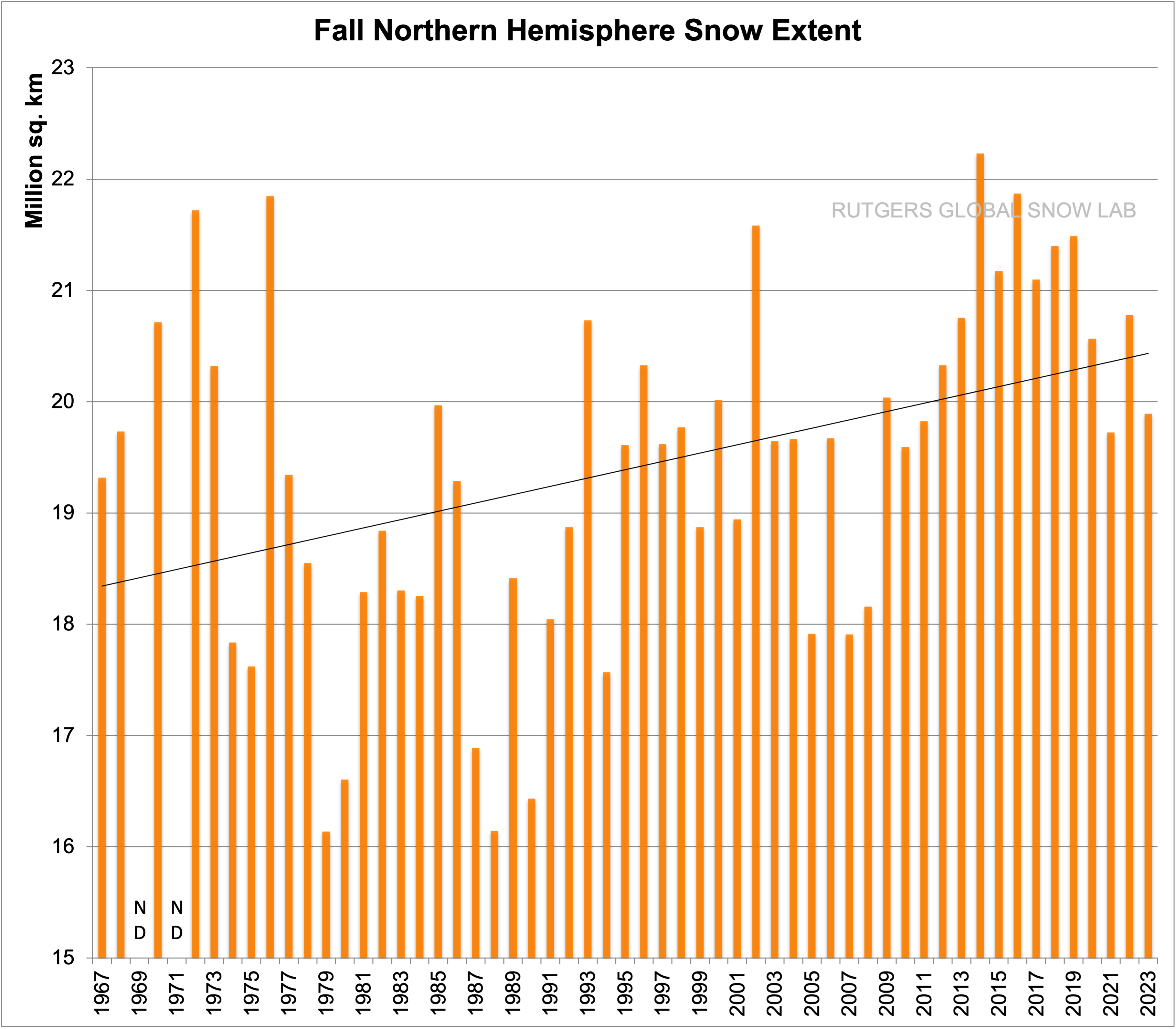
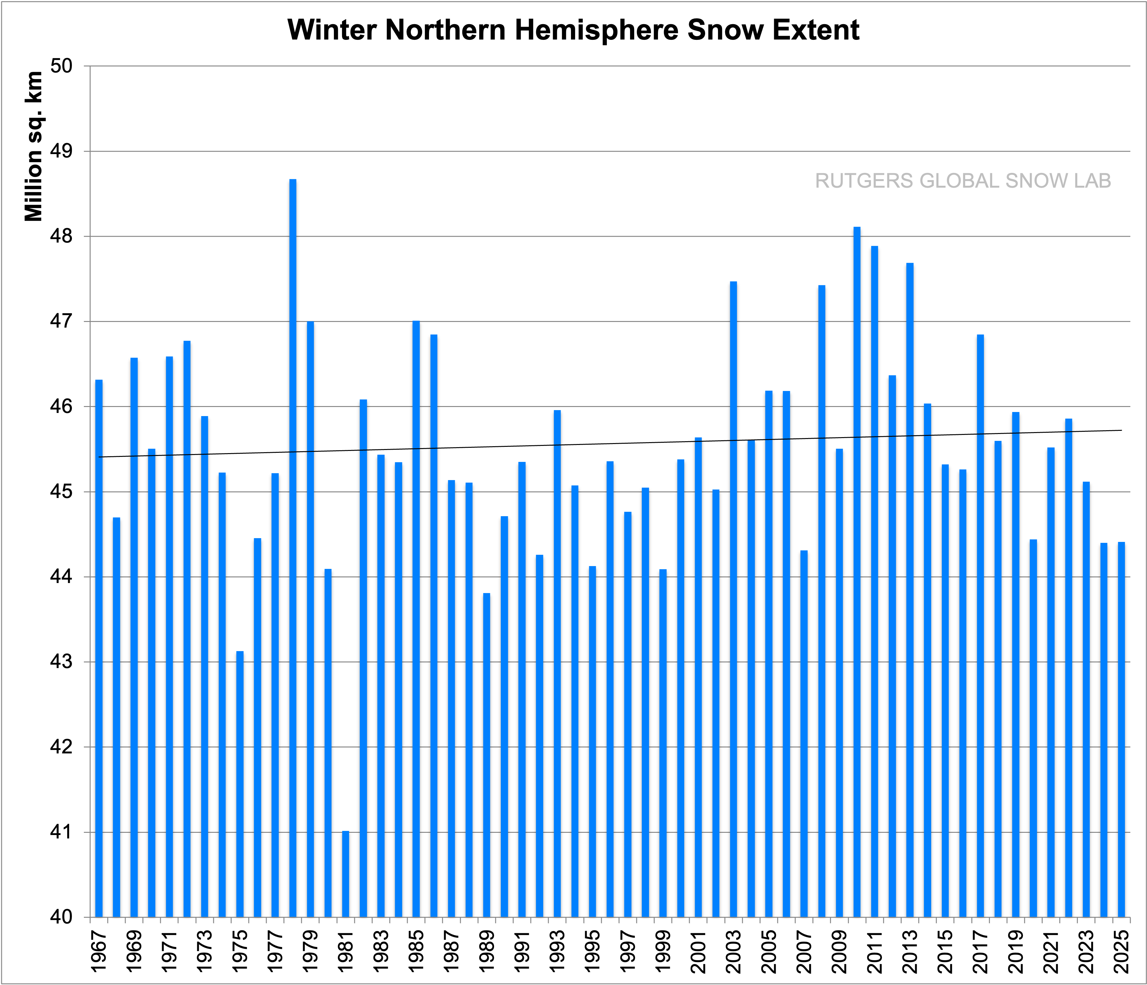
The lowest peak solar EMR coincides with historically low recorded temperatures in the NH as well as other evidence of a cold period commonly known as the Little Ice Age. The NH has been warming now for at least 200 years based on the slow rise in sea level over the past two centuries. Autumn snowfall and extent across the NH has been trending up for at least 70 years consistent with warmer NH ocean surface in late September. The maximum extent of snow coverage is also trending up. The Southern Ocean has already started to cool as the SH peak solar EMR declines.
The region with the most rapid rise in seasonal temperature is the Greenland Plateau in January; displayed in Chart 12.

The trend over the satellite era is upward at 9.1C/century. This can only be the result of increased winter ocean air advection resulting in increased snowfall. The elevation of the plateau has indeed increased 170mm in the past decade. Hindcasting in the CSIRO ACCESS model with CMIP6 SSP585 emissions scenario for the same region yields a January trend of just 3.9C/century. This highlights the inability of the ACCESS model to predict observed changes in the region exhibiting the most warming since 1980.
The proportion of ocean surface reaching 30C is increasing as the NH ocean surface warms up in response to increasing peak ToA solar EMR. The ocean area reaching 30C in April, before the Indian monsoon sets in, has increased by 30% over the two decades from 2003 to 2023. This trend will continue due to the increasing peak solar intensity across the NH.
Climate has always changed and will continue to change. Climate modellers are not providing any useful insight into why climate has changed. The ACCESS model produces unphysical nonsense that has no relationship to observations or even produces plausible projections.
The Author
Richard Willoughby is a retired electrical engineer having worked in the Australian mining and mineral processing industry for 30 years with roles in large scale operations, corporate R&D and mine development. A further ten years was spent in the global insurance industry as an engineering risk consultant where he developed an enduring interest in natural catastrophes and changing climate.
Here is a simple layman’s reduction of this excellent technical post.
Russian INM CM5 is the only CMIP6 climate model that does NOT produce a spurious tropical troposphere hot spot. The CSIRO model does. Case closed.
Doesn’t surprise me, Rud. There was a time when even Richard Black at the BBC sort of mentioned in passing that the models were a little bit rubbish in much-vaunted tropical hotspot area.
It’s depressing that now, what I considered appalling science reporting back then, would actually seem pretty educated and enlightened today. Is there anyplace where this has been discussed recently in the MSM?
COMPLETE GARBAGE!
Wow, concise counter argument there Burl.
Yes, the models ARE complete garbage. !
That is pretty much what Rick is saying.
Yep … Them Models ARE COMPLETE GARBAGE!
Agreed
Let me give the reason for my comment.
It is IMPOSSIBLE to model our climate because it it is solely controlled by the random effects of dimming SO2 aerosols from volcanic eruptions and industrial activity, and modified by Clean Air efforts to reduce industrial SO2 air pollution (the cause of the upward trend in global temperatures)
CO2 has NO detectable climatic effect, yet is included, I believe, in all models
Yes, much better explaining your point.
Also new maritime fuel regulations seem to be having a similar effect to CAA, reducing solar blocking aerosols and thus reflected solar SW. This is similar to the periods a few years after Mt P and El Chichon when the ejecta and aerosols cleared leaving a more transparent upper atmosphere and more solar energy making it into the lower climate system.
Climategrog:
You have an unusually good understanding of what really drives our climate!
Here is a link to a supportive article which you should find to be very interesting
https://doi.org/10.30574/wjarr.2023.19.1.1329
That the cooling trend is due to the slow change in insolation caused by the slow orbital changes is a hypothesis without evidence. Orbital changes present trends for thousands of years. 0.64C/century is too much for a long-term trend. It means 6.4C change in 1000 years which is absolute nonsense. The difference between the Holocene and the Last Glacial Maximum is about 6C.
Temperature trends have many causes and usually last for a few years or decades before changing.
As an example in your last figure, chart 12, you talk about a 9.1C/century trend. In reality, what the figure shows is rapid change in the 1995-2005 period and mostly stable before and after. This is the same situation that can be seen in Arctic sea ice extent data. These are abrupt changes. Talking about centuries makes no sense.
The Southern Ocean has partial ice cover. The trend is based on NCEP, which only considers water and water temperature never gets lower than -1.7C. So the different phases and extent of ice come into consideration when looking at surface temperature in the Southern Ocean.
Time will tell. But the northern ocean surface temperature is increasing to warm consistent with rising peak solar intensity and that will continue to increase warm air advection onto the Greenland Plateau. The heat content in the atmosphere over the plateau in winter is very low so it does not take much heat input to shift the temperature dramatically. And ice is a good insulator but hard to shift above 0C.
The climate system has very long term components. We know that ice can be stored on land for tens of thousands of years to millions of years. The thermal inertia of the ocean abyss runs to thousands of years.
No one knows how these long term components impact the average surface temperature. Regional temperature can change dramatically over short periods depending on moisture content, biomass and human developments.
The observations I have made were prompted by following the peak sunlight and the trends follow the sunligh apart from ocean warm pools that are temperature limited by convective instability. But more of the ocean surface is reaching the 30C limit.
It was interesting to note the calculated rise, and the upcoming peak in 10900, for the solar energy at the top of the atmosphere for the northern hemisphere.
Can we expect a similar, although opposite trend for the southern hemisphere?
If the cause is the precession.of the orbital axis, then the answer would be yes. Some further data on this would have aided the article.
And of course, if the NH is experiencing a forecast rise and the SH a fall, then those models from the CSIRO would appear to be more out of alignment with the potential trend.
I wonder if they even looked at the precession of the axis in their models?
The answer is yes on average. The South Pole is already 2,600 years past its peak intensity of 566W/m^2 at the summer solstice. 45S will bottom at 501W/m^2 in about 200 years. I would need to look at yearly ephemeris to pinpoint exactlyy. 60S January peaked at 497W/m^2 900 years ago and now has an established cooling trend. The cooling trend is progressing north in the Southern Hemisphere. The overall average for the SH peaked around 1600.
In the article, I provided a link to the IMCCE web based solar calculator:
http://vo.imcce.fr/insola/earth/online/earth/online/index.php
It resolves to 100 years. I use 1362W/m^2 as the solar constant because that appears to be close to the measured intensity. There are other web based solar calculators that can resolve to yearly ephemeris data.
NASA produce emphemeris data that is available for modelling but my understanding is that the models assume an equilibrium climate state at some preindustrial point in time. In any case they do not even capture snow accumulation and melt well so they are naive when it comes to actual climate processes. The best model only has 20 atmospheric layers so have ZERO hope of simulating convective instability that drives the overall energy balance.
MEI.v2: NOAA Physical Sciences Laboratory shows a similar decline
meiv2.timeseries.png (887×601) (noaa.gov)
The opening paragraph on the NASA link is wonderful reinforcement of my premise about the importance of the region:
It reinforces my point on the importance of the region to forecasting climate swings. If you were aiming to serve communities with climate modelling, this is the region you would want to nail down. All climate models produce a warming trend in this region where there has been none.
Very nice. As much as I hate the UN I think it needs a new department. This department would not be run by the UN but the UN would be obligated to publish all findings. The purpose of the new department would be to make available a pathway for persons to challenge studies or reports used by the UN or its affiliates. All studies challenged must be defended to the satisfaction of the challengers.
Bob
I produced this article to articulate my grievance against the claims of the CSIRO ACCESS Team. And I thank Charles for publishing it.
I have lodged an official complaint with the CSIRO after not getting a satisfactory response to questions I raised on their modelling. They are unwilling to engage on anything but consensus science, offering more models that produce the same nonsense and claiming they are “centre of the road”.
My complaint has been acknowledge by their legal counsel. But so far no technical response.
The 30C ocean limit cannot be disputed on technical grounds. The sad part is that Ramanthan and Collins and others were doing very good work on understanding the process back in the 1990s but they went to the dark side once the IPCC got traction.
I have two other higher levels of recourse before initiating legal action. I am in it for the long haul.
There is probably already a disputes procedure possible through the international Court of Justice, which is part of the UN. The poor nations of the world are being systematically disadvantaged by climate zealotry. They are denied development funds for fossil fuel projects because they do not fit the climate agenda. Every person living in a State where climate zealotry is driving energy supplies would have a financial case
Renters in Australia, who do not own a roof to take advantage of government subsidies for solar panels are financially disadvantaged. They probably have grounds for class action againts the government for the RET scheme set up in Australia.
The UN is totally unaccountable and legally protected around the world from any kind of prosecution for corruption or malfeasance by diplomatic immunity.
They should NOT be put in charge of anything at all unless they are prepared to be accountable and fully auditable.
“Climate modellers are not providing any useful insight into why climate has changed.”
Touché, as they say.
It’s always good to be reminded just how bad they are at explaining anything in the face of real world data. The significant changing variances in natural parameters on short, medium, and long time scales, and geographical areas, are large. Yet modelers confidently make unwarranted disaster predictions on much smaller changes.
And. remember, these modelers are people who have already been given most of the answers before the test begins.
Never mind buying a bridge from these people, would you even entrust your life to crossing a bridge they had designed?
Years ago several folks pointed out it was not possible double the ppm given the 50:1 ratio of ocean to air.
So all those ppm’s above 600 are impossible.
“So all those ppm’s above 600 are impossible.”
More’s the pity.
I guess 600ppm will just have to be enough.
Humans can resort to calcining limestone to keep atmospheric CO2 above plant survival level. I expect mountains of ice will be a problem before CO2 depletion though.
As I point out in the article, climate models are not hampered by impossibilities. They thrive on physical impossibility and would not exist without them.
Until I looked it up, I assumed the RCPs and SSPs of similar notation were aligned as far as CO2 was concerned but SSP 585 is really out there. I expect the intention was to guarantee really scary projections for promotional purposes. Any modelling group with integrity would not even consider doing runs with unrealistic input scenarios.
Can you elaborate or reference on this? My understanding is there are significant portions of the earth’s history where CO2 levels were significantly higher than 600ppm. Are you saying that it would essentially be impossible for humans to liberate enough CO2 from the long-term storages that exist as there would be a “sequestration equilibrium” due to the oceans?
There have been estimates in the past that if we were to gather all the oil, gas and coal currently available into one pile (figuratively speaking) and burned it, that this would increase the CO2 levels to about double what they are today, or about 800ppm.
Not that alarming. Especially considering that considering that will never happen, and even if it did, climate alarmists cannot really tell you how much warmth that much CO2 would add to the atmosphere. They have a lot of guesses, but nothing definitive.
The truth is climate alarmists cannot tell us if CO2 net warms or net cools (after feedbacks) the Earth’s atmosphere.
So far, it is much ado about nothing.
The physics indicate that if you burned all of the available hydrocarbons, CO2 levels would increase by around 2 ppm. The remaining would be absorbed by the oceans and mineralized as fast as you could produce it. The physics also indicate that if humanity stopped producing CO2, atmospheric CO2 levels would still increase by about 2 ppm.
Richard,
Excellent post, thank you.
Can you provide a source/reference for the data plotted in Chart 11?
Glad you liked it.
I provided a link to the IMCCE web based solar calculator in the article and repeated here. You can get that data from there. I use 1362W/m^2 as the solar constant. The default is 1368W/m^2, which is higher than measured:
http://vo.imcce.fr/insola/earth/online/earth/online/index.php
My view isa that the sun is under rated as the driver of Earth’s climate and its change. Obviously the energy balance overall depends on convective instability but some of the nuances of climate change are predictable by following the peak sunlight at the top of the atmosphere.
The models are merely one aspect of the UN’s climate “science” propaganda machine. Indeed, the models an integral part of the CAGW false narrative.
The models exist to create a technocratic output that supports; indeed, they must support the UN’s ideological fantasy of global boiling.
The models produce nothing that relates to the real or physical world. I believe the UN (ipcc) now reside in what Jean Baudrillard; a French sociologist & philosopher refers to as hyperreality, where the simulated world has displaced the real world.
From the article: “Shared Socioeconomic Pathways”
LOL !
I noticed that the part of Chart 3 that is in the time period of Chart 1 is in fairly good agreement with Chart 1. The time period covered by Chart 1 has a downward trend in ENSO indices, by ending with the temperature depression by a triple dip La Nina and having right after its start the spike of a strong El Nino. Although most climate models are overpredicting global warming, such a cherrypicked time period in one small area of the world’s surface with lack of overlaying Chart 1’s curve with the curves in the other graphs with different time periods makes this a weak argument that climate models are doing poorly.
Followup: During the time period covered by Charts 1 and 3, I found that Chart 3 has slightly more-warming less-cooling trend than Chart 1 has, but the difference is small and much of that difference is Chart 1 lacking a dip from the Pinatubo eruption that is generally shown in global temperature datasets.
Something else I noticed: The Chart 3 model being argued against is an RCP8.5 one. RCP8.5 is a high-side of “business as usual” that does not take into account improvements of energy efficiency; more realistic is RCP 4.5 or 6, whichever is greater because of RCP6 having a period of lagging the other RCPs. Arguing against climate models that use RCP8.5 is not a good argument against climate models in general, even though climate models are getting a track record of overpredicting warming with global climate sensitivity mostly being modeled as greater than what data is showing. For example, studies by N. Lewis, with and without J. Curry, mostly indicate climate sensitivity around 1.5-2 degrees C per 2xCO2 which is low side of what most climate models are indicating.