After an arduous judging process, we have selected a first and second place winner. We received over 20 submissions, but because some essays didn’t meet the criteria for what would be considered an essay of “original work,” there were 19 valid entries to the contest. We received entries from the USA, Canada, Britain, and Australia.
I commend everyone who submitted an essay. All were read and appreciated, and it was very difficult to choose a winner as final scoring had some ties, and required a second round of scoring, which caused a week of delay.
The first place winner is a college student in Alberta, Canada, and the second place winner is a student in Tennessee, USA. As we noted in the contest announcement/rules, students had the option to remain anonymous due to the fact that some school systems and universities are openly hostile to the idea of climate skepticism. Both winners have been vetted to verify their identity.
Below is the first place essay from, Canada. The second place winner will be published in the next few days.
Choosing the Baseline Reference Period
Author wishes to remain anonymous,
The convention when calculating an anomaly is to select a 30-year period to serve as the baseline, against which to calculate the temperature anomaly (or residual in ‘statistics speak’). In practical terms, the handiest reference point would be a timeframe where there was little to no industrial activity (i.e., GHG emissions low), but there were actual temperature data being collected. The timeframe I would propose for this analysis would be the 30-year period spanning January 1890 to December 1919, inclusive. There are a few good reasons why this timeframe works well for this purpose, but most imporantly:
- All of Canada’s provinces and territories had been settled, and all contemporary or future provincial/territorial capital cities had been established;
- This period long precedes the widespread extraction of carbonaceous fuels in Canada and industrial activity was confined to Southern Ontario;
- It precedes the sudden upward trend in atmospheric CO2 seen in the mid to late 1950’s
- Relatively accurate and standardized temperature records were being kept that were generally representative of all inhabited regions (Table 1).
Table 1. Number of sites (and percentage of total) reporting homogenized monthly mean temperatures for the years 1890, 1920 and 2021. (Source: Environment and Climate Change Canada)
| Year | Pacific coast (BC) | Prairie Provinces | Central Canada | Maritimes | Northern Canada | Total |
| 1890 | 4 (6%) | 16 (25%) | 33 (52%) | 10 (16%) | 0 (0%) | 63 |
| 1920 | 54 (19%) | 87 (31%) | 104 (37%) | 32 (11%) | 7 (2%) | 284 |
| 2021 | 91 (16%) | 146 (26%) | 180 (32%) | 61 (11%) | 77 (14%) | 555 |
The data
The temperature data (in degrees celcius) used in my analysis are adjusted homogenized mean monthly temperatures that are available from Environment and Climate Change Canada’s website[1]. One of the nice things about these data, is that a single mean temperature is reported for sites where multiple stations are present. In other words, the mean monthly temperature for Toronto, Ontario (population ~ 2.8 million) is weighted the same as Gjoa Haven, Nunavut (population ~ 1350). This feature likely mitigates against undue influence of the urban heat island effect.
Analysis methodology
Since Canada is a big place, it is probably useful to break things down by region. As such, I will present the historical temperature trends for the Pacific Coast (BC), the Prairies (Alberta, Saskatchewan, Manitoba), central Canada (Ontario and Quebec), the Maritimes (New Brunswick, Nova Scotia, Newfoundland and Labrador, and Prince Edward Island), and the North (Yukon, Nunavut and the Northwest Territories). Doing so should maximize our ability to resolve the signal from the noise.
My first step was to calculate the baseline average temperature for each region in each month for the 30 years spanning 1890 to 1919 (Table 2). Next, I calculated the regional mean temperature for each month from 1920-2021 and then converted this to an anomaly by subtracting the respective baseline average temperature for that month.
Table 2. Average temperature (°C) in each month for each Canadian region, 1890-1919 reference period.
| Jan | Feb | Mar | Apr | May | Jun | Jul | Aug | Sep | Oct | Nov | Dec | |
| Pacific Coast | -4.5 | -2.4 | 1.4 | 6.2 | 10.3 | 13.3 | 16.1 | 15.8 | 11.5 | 7.0 | 1.4 | -1.9 |
| Prairies | -16.2 | -14.8 | -7.7 | 3.2 | 9.3 | 14.1 | 16.9 | 15.5 | 10.4 | 4.3 | -5.2 | -11.3 |
| Central | -9.7 | -10.2 | -4.1 | 4.1 | 10.7 | 16.3 | 19.1 | 17.7 | 13.9 | 7.6 | 0.3 | -6.8 |
| Maritimes | -7.5 | -7.9 | -3.3 | 2.3 | 7.8 | 12.4 | 16.6 | 16.4 | 12.7 | 7.6 | 1.8 | -4.5 |
| North | -29.4 | -25.5 | -18.2 | -4.4 | 5.2 | 11.6 | 14.6 | 12.6 | 6.2 | -2.5 | -16.3 | -23.3 |
To keep things accessible to the largest possible audience, rather that loading up on fancy statistics, the temperature anomaly graphs include dashed lines representing +/- 2 standard deviations from the mean anomaly. Statistically, if temperature anomalies are normally distributed, about 95% of the observed values should fall within this range. Any beyond this would be ‘extreme’ values.
The way I will proceed will be to use these data to consider certain key claims. More specifically, I will show you what I’ve found, provide my two cents on what it looks like to me, and then leave it to you to determine whether you agree or not.
Claim 1: Canada is in the midst of an ‘unprecedented’ warming trend
Do historical climate data actually support the claim that Canada is experiencing unprecedented warming? The following figures show the temperature anomaly (1890-1919 reference) since 1950 in 4 of the 5 regions (we’ll save the north for the next section).
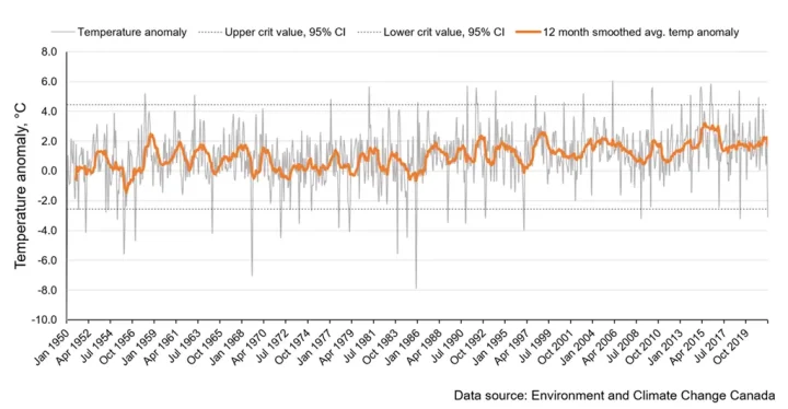
Figure 1. Temperature anomaly (°C) Pacific coast of Canada relative to the 1890-1919 reference period, 1950-present.

Figure 2. Temperature anomaly (°C) in the Prairie provinces of Canada relative to the 1890-1919 reference period, 1950-present.
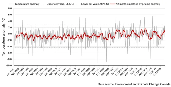
Figure 3. Temperature anomaly (°C) in Ontario and Quebec relative to the 1890-1919 reference period, 1950-present.
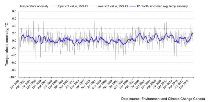
Figure 4. Temperature anomaly (°C) in the Atlantic Maritime provinces of Canada relative to the 1890-1919 reference period, 1950-present.
There’s a couple of common themes to all 4 of these above regions. First, the long-term trend in the temperature anomaly has stayed remarkably consistent over the past 70 years. Second, in virtually all of the cases where the measured temperature anomaly falls outside the 95% confidence interval, it is during the months of December through February. In other words, spring, summer and fall in Canada have stayed remarkably stable over the past 70 years. Cooling or warming trends therefore seem to ultimately be the result of unusually cold or warm months during the winter. On this basis, I would argue that the claim that Canada is experiencing unprecedented warming is not supported by historical climate data. In fact, it isn’t even clear that there is any significant warming at all.
Next, let’s look at a specific claim made about Canada’s north.
Claim 2: The north is warming disproportionately faster than anywhere else
A recent report from the Government of Canada[2] claims that our artic region is warming at about 2 to 4 times the rate as the rest of the world. There are all sorts of ways of interpreting this claim, but for the purposes of this discussion what we are looking for is a steeply increasing trend in the value of the temperature anomaly (…perhaps something hockey stick shaped?).
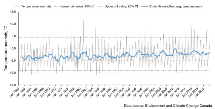
Figure 5. Temperature anomaly (°C) in Canada’s northern territories relative to the 1890-1919 reference period, 1950-present.
Well, no hockey stick. What is also notable is that despite claims of extreme warming in Canada’s north, the temperature anomaly is, on average, still well below the 1890-1919 baseline. While the 12-month smoothed average does appear to have a positive trend, the anomaly is still within the historical 95% confidence interval. Further, when you zoom in on the graph, the reason for this upward trend appears to be slightly less severe winter temperatures.
Claim 3: This decade is the warmest in history
A problem with adjudicating this claim is that it is virtually impossible to understand the basis used by claimants to arrive at this conclusion. In service to my objective and in the interest of clarity, Figure 6 charts the mean temperature anomaly in each region for each of the decades spanning the 1920 – 2019 period. The shaded area in each graph is the 95% confidence interval for the temperature anomaly metric.
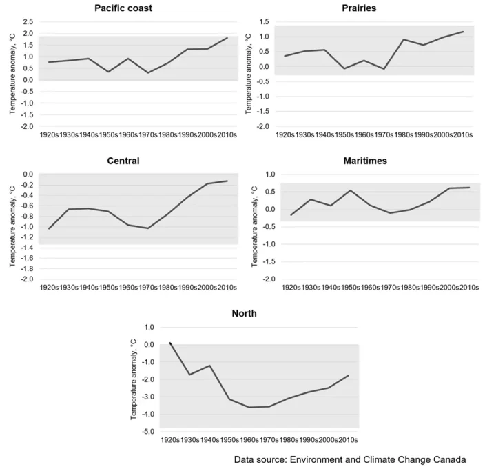
Figure 6. Decadal trend in temperature anomaly (°C) in each Canadian region northern territories relative to the 1890-1919 reference period, 1920-2019. Shaded area represents the historical 95% confidence interval for the temperature anomaly measurement.
What becomes clear is when long term variation is taken into account, the decadal temperature anomalies all fall within the 95% confidence interval. In other words, it is impossible to claim that one decade is warmer or colder than any other over the past 100 years. What is also interesting to note is that compared to the 1890-1919 reference period, the Pacific Coast appears to be consistently warmer, while both Central and Northern Canada are consistently colder.
To further interrogate this claim, Table 3 summarizes the top 10 warmest months on record in each region based on the monthly temperature anomaly.
Table 3. The 10 ‘hottest’ months on record for each region, based on maximum positive temperature anomaly relative to the 1890-1919 baseline.
| Rank | Pacific Coast | Prairie | Central | Maritimes | North |
| 1 | Jan 2006 | Feb 1931 | Dec 2015 | Jan 1956 | Jan 1981 |
| 2 | Feb 2016 | Feb 1984 | Feb 1998 | Feb 1981 | Feb 1920 |
| 3 | Jan 1931 | Jan 2006 | Feb 1981 | Feb 1960 | Jan 2016 |
| 4 | Feb 1991 | Feb 1998 | Mar 2012 | Dec 2010 | Jan 1944 |
| 5 | Feb 2015 | Feb 1977 | Mar 1946 | Jun 1930 | Jan 1985 |
| 6 | Feb 2010 | Feb 1954 | Feb 1984 | Feb 2010 | Jan 1940 |
| 7 | Jan 1981 | Jan 1931 | Mar 1945 | Dec 2020 | Jan 1977 |
| 8 | Jan 1992 | Feb 1991 | Mar 2010 | Jan 1958 | Jan 2021 |
| 9 | Jan 2015 | Feb 1987 | Feb 1954 | Feb 1954 | Jan 2017 |
| 10 | Jan 2010 | Jan 2001 | Dec 2001 | Mar 1936 | Nov 1928 |
Table 2 confirms what was suggested by Figures 1 – 6: that most of our unusually warm months in Canada occur during the Northern Hemisphere winter. This suggests that what drives differences year-to-year in the temperature anomaly is not excessively warm summers, but rather warmer weather in the winter months.
Given that Canada receives anywhere from 0 to 7 hours of sunlight (at a steeply southern angle mind you) for most of our winter, it is difficult to envision a scenario where winter warming could be driven by an extra few ppm of CO2 (which is absorbed more rapidly into cold oceans anyway). It is far more likely the result of a meridional flow pattern of the jet stream carrying pockets of warmer air further north and other atmospheric circulation phenomena.
The takeaway
I hope I have convinced you that in the Canadian context at least – whatever the climate is doing, it does not seem to be heralding the end of days (sorry Greta).
I believe that the credibility of the whole scientific enterprise is in jeopardy due to the careless and irresponsible sophistry of activist ‘climate science’. The post-Enlightenment era saw the erosion of organized religion’s authority as a pathway to truth in favor of the rationalism of modern science. If science loses its credibility in the same way: what will take its place?
References:
[1] Government of Canada. 2022. Adjusted and homogenized Canadian climate data. Environment and Climate Change Canada webpage. Available at: https://www.canada.ca/en/environment-climate-change/services/climate-change/science-research-data/climate-trends-variability/adjusted-homogenized-canadian-data.html [Last accessed: Aug 2022]
[2] Government of Canada. 2019. Canada’s Changing Climate Report. E. Bush and D.S. Lemmen (Eds,). Ottawa, ON. 444 p. Available at: https://changingclimate.ca/CCCR2019 [Last accessed: Aug 2022]
Congrats to the first and second place winners of the WUWT essay contest.
And well done on the essay presented above, First Place person.
Regards,
Bob
A pity he/she could not access raw, rather than “adjusted and homogenized” temperature records. GISS and Australian BOM have records of stepping on data.
“My first step was to calculate the baseline average temperature for each region in each month for the 30 years spanning 1890 to 1919 (Table 2). Next, I calculated the regional mean temperature for each month from 1920-2021 and then converted this to an anomaly by subtracting the respective baseline average temperature for that month.”
This is wrong. The point of calculating anomalies is that you remove the effect of predictable climate variation before averaging. That maximises the homogeneity of the temperatures being averaged, and so takes the pressure off correct sample selection. Averaging temperatures first, and then taking the anomaly, is the wrong order. The basic rule is, never average absolute temperatures over various climate locations.
If the anomaly were done correctly, then 1890-1919 would be seen as a bad choice, because too few stations have data in that period.
Here, from here, is a map of trends in Canada, from 1951 to 2020. They are calculated for individual stations, so no anomaly is involved (subtracting an anomaly base does not change the trend). At the linked page it comes from, you can choose different periods. You can see that there is quite a strong trend, >0.2C.decade, everywhere N and W of Quebec/Ontario.
The increase in temperature in Canada is consistent with the increasing spring sunlight intensity at 55N. Rising 0.3W/m^2 per century in April at 55N
-1.000 305.087312
-0.900 305.410848
-0.800 305.736222
-0.700 306.063089
-0.600 306.391119
-0.500 306.720000
-0.400 307.049433
-0.300 307.379132
-0.200 307.708823
-0.100 308.038236
0.000 308.367105
0.100 308.696582
0.200 309.024927
0.300 309.351716
0.400 309.676510
0.500 309.998864
0.600 310.318330
0.700 310.634470
0.800 310.946858
0.900 311.255091
1.000 311.558792
May sunlight even rising faster, increasing 0.4W/m^2 over this century:
-1.000 405.479339
-0.900 405.806798
-0.800 406.143263
-0.700 406.488247
-0.600 406.841267
-0.500 407.201848
-0.400 407.569523
-0.300 407.943841
-0.200 408.324358
-0.100 408.710643
0.000 409.102272
0.100 409.500068
0.200 409.902409
0.300 410.308734
0.400 410.718457
0.500 411.130981
0.600 411.545703
0.700 411.962023
0.800 412.379355
0.900 412.797137
1.000 413.214842
Canadians should be expecting warmer summers and wetter winters with snowfall trending upward. And eliminating use of fossil fuels is not going to change that.
Rick, what do the numbers in the first column (-1.000 to 1.000) refer to?
The last time he used that notation, those were ± yrs from
2000, in hundred-year increments. The series goes from the
year 1000 to the year 3000, if I’m right..
“>0.2C.decade”
>(0.2±0.5) C.decade, rather. Scary! Mene, mene, takel, upharsin, hey Nick?
I have to agree with The Stroker when he makes sense.
“predictable climate variation” makes sense?
“Averaging temperatures first, and then taking the anomaly, is the wrong order.”
Brohan, et al., (2006) “The station normals (monthly averages over the
normal period 1961–1990) are generated from station data for this period where possible.”
That is, the standard procedure is to average monthly station temperatures and then take anomalies versus the normal period. The wrong-caller is wrong.
Brohan: “Each grid box value is the mean of all available station anomaly
values, except that station outliers in excess of five standard deviations are omitted.”
Looking at Brohan Figure 1, a mere four grid-boxes cover all of Canada. Our author’s technique of regional averaging is easily comparable.
Who’s wrong here after all, and who’s making sense?
The author’s idea is good: construct a normal over a period where the supposed effect of industrial CO2 is absent. This is a valid zero-point. Then construct the anomalies against that period to reveal the departures.
Environment Canada Weather Stations, 1840-1960. Looks like there were enough stations between 1890-1919 to derive a reasonable normal.
“Brohan, et al., (2006) “The station normals (monthly averages over the
normal period 1961–1990) are generated from station data for this period where possible.”
That is exactly what I said.
You wrote, “Averaging temperatures first, and then taking the anomaly, is the wrong order.”
Brohan: “The land surface component of HadCRUT is derived from a collection of homogenized, quality-controlled, monthly averaged temperatures for 4349 stations.”
Brohan 2006 average temperatures first, and then take the anomaly. The opposite of your sequence.
So either you’re wrong or Brohan 2006 is wrong.
Brohan also reference Jones&Moberg 2003 for methodology. J&M write: “In this study we will use the CAM [climate anomaly method] approach, which requires reducing all the station temperature data to anomalies, from a common period such as 1961–90 on a monthly basis. (my bold)”
DOI: <a href="https://doi.org/10.1175/1520-0442(2003)0162.0.CO;2” target=”_blank”>10.1175/1520-0442(2003)016<0206:HALSSA>2.0.CO;2
Average first, then take anomalies.
I said
“The basic rule is, never average absolute temperatures over various climate locations.”
You seem to be confused by the process of initially gathering daily values of a station into monthly averages for that station. The analysis done here uses station monthly averages as the basic input. It is what EC supplies (and GHCN, and ERSST). And it is that data that you must convert to anomaly before trying to combine data of different stations. That is what is not done here.
Peterson, et al., 1998 showed that alternative methods of calculating anomalies has only a minor effect on trends. You draw a distinction without a difference, Nick.
All of Peterson’s methods are ways of finding an anomaly for each station prior to spatial averaging. The difference between CAM, RSM, and FDM is just about how to handle cases where there are not enough data in the reference period to get a reliable average. CAM says let it go or estimate from neighbors, FDM works by adding differences of the station data, and RSM systematised the local approximation via a reference station within the grid.
The least squares technique introduced by TempLS, and later used by BEST, bypasses all this. The key thing remains – you must derive some sort of anomaly for each station before spatial averaging.
Nick, why start with the assumption that the readings are in need of correction before starting analysis ? Such would be a recipe for a biased person to bias results in whatever direction he/she prefers. The lack of Northern stations in the 1890’s does present a problem for this very good student essay.
Canada Warm ? Lest we forget…colder than Mars….
https://globalnews.ca/news/4906382/prairies-cold-north-pole-mars/
I use unadjusted GHCN data.
For any student in these post normal times to question and investigate the consensus alarmist pronouncements in climate science (and sadly in other sciences), makes that person special and informs us all that those bent on politicizing science for pernicious, political or selfish ends will have a steepening, uphill climb they won’t finish. Dissent in the Soviet Union by the mere few percent of dedicated resisters brought down a behemoth
Many thanks for the interesting paper. As a Canadian living in New Zealand I was not aware of the Canadian temperature record. Sensible choice of baseline.
Rather sad that it was necessary to supress yor name. Keep up the good work and interest in seeking the truth.
Jet stream meridionality.
Been saying that for over ten years.
It is sad to see someone that understands “keep it simple” has to be anonymous. Of course this is such an old statistical methodology, quite reliable with care, it doesn’t require much computing capacity. I don’t have my notes available, but I once briefly reviewed the history of statistics for a course. Is this taught anymore?
“To keep things accessible to the largest possible audience, rather that loading up on fancy statistics, the temperature anomaly graphs include dashed lines representing +/- 2 standard deviations from the mean anomaly. Statistically, if temperature anomalies are normally distributed, about 95% of the observed values should fall within this range. Any beyond this would be ‘extreme’ values.”
Well done to the author but as others say it is sad they needed to remain anonymous
I note this reference to a warmer than 1880 climate in an article I wrote over 10 years ago
This is reflected in this intriguing reference from the records of the Canadian Horticulturist monthly of 1880 (page 7).
“I do not know whether or not the climate of Ontario is really becoming permanently milder than formerly, but I do know that for the past 18 years or 20 years we have not experienced the same degree of cold as the seven years preceding.”
http://www.archive.org/stream/canadianhorticu03stcauoft#page/6/mode/2up
tonyb
It is becoming warmer. Some 10,000+ years ago, most of Canada was covered in a one-mile-thick ice sheet, called the Laurentide Ice Sheet – the most recent of recurring ice sheets. The area where Quebec is was under 13,500 feet of ice. Questions: 1) Did mankind have anything to do with the warming and ice melt? 2) Is it a bad thing that the huge glacier completely melted? (hint: it is hard to barbecue in your backyard under a mile of ice). These facts are a case precedent – it happened before, and it will happen again; puny, helpless, harmless mankind be damned.
Anonymous and inaccurate
Canada is experiencing higher TMIN just like the rest of the higher latitudes in the Northern Hemisphere. The author seems to be trying to refute actual measurements. That would make him a science denier.
The RIGHT conclusion is that Canada, especially the Northern regions, has had warmer winter nights than in the 1970s and that is good news. Really good news unless you love cold weather. Of course the Arctic is warming faster than any other place on Earth since the 1970s. That’s great news for the few people who live in Siberia.
WARMER WINTER NIGHTS IN SIBERIA IS A CLIMATE EMERGENCY?
If that warming stopped –maybe that would be the emergency
Arctic ice is bottoming out at just under five Wadhams this equinox. Only two below four Wadhams in fourteen years. AMO I guess
“Anonymous and inaccurate
Canada is experiencing higher TMIN just like the rest of the higher latitudes in the Northern Hemisphere. The author seems to be trying to refute actual measurements. That would make him a science denier.”
Here’s what the author wrote. It looks to me like he is using actual measurements: “Table 2 confirms what was suggested by Figures 1 – 6: that most of our unusually warm months in Canada occur during the Northern Hemisphere winter. This suggests that what drives differences year-to-year in the temperature anomaly is not excessively warm summers, but rather warmer weather in the winter months.”
What is this “higher TMIN” you refer to? Higher than what?
Congratulations to the anonymous author. It’s a sign of our times that the author chooses to remain anonymous. It’s a sign of the authoritarian state we live in presently. But, all things change. They never remain the same. Except maybe human stupidity.
TMIN I assume is minimum temperature and so TMAX would be maximum temperature. With this in mind we (Canada) is not getting hotter so much as less cold or rephrased ….more temperate….
You say: “Of course the Arctic is warming faster than any other place on Earth since the 1970s”
I refer you to:
https://wattsupwiththat.com/2019/10/07/alarmism-exposed-the-entire-world-is-warming-faster-than-the-entire-planet/
Who to believe????
How about Roy Spencer?
According to UAH, the Arctic (‘NoPol’) has been the fastest warming region on Earth since late 1970s. +0.25C per decade. Compares to a global average of +0.13/dec and NH average of +0.16 C/dec.
Congratulations to the essay contest winner and runner-up (and to the other entrants).
Having once been young, I can attest to the fact that it is difficult to resist the peer pressure to conform. You have obviously learned the lesson that one must think for oneself. Mindless conformity can be the road to mediocrity (or worse).
Congratulations to the anonymous first place winner from Canada. May the time come soon that staying anonymous will not be considered necessary.
You don’t see anything scary in the temperature data as you have analyzed and visualized it in graphs. Neither do I.
Congratulations to all the winners. Keep up the good work. Germany is a great case study as to the importance of your work. If people make ill-informed decisions the results can be catastrophic for society.
“If science loses its credibility in the same way: what will take its place?”
Facebook and Microsoft will. That or China. Not that any of that is mutually exclusive.
This is excellent, one of the best essays so far.
I believe that the credibility of the whole scientific enterprise is in jeopardy due to the careless and irresponsible sophistry of activist ‘climate science’.
That seems a solid conclusion, from the well-presented data.
Well, no hockey stick.
Concise and correct.
To have withstood review by Anthony Watts, world leading authority in this field, also is remarkable for a student work. Congratulations.
I applaud the use of actual numbers and the attempt to simplify the description. I note the criticisms from others without delving too deeply into their veracity because there’s a much simpler way to arrive at the influence of CO2 increase. Sea level.
Not the alarmists amalgamation of apples and oranges from which they conjure fake acceleration by tacking the satellite record onto the tide gauge data, two completely different parameters. Instead complete tide gauge data from all around the planet, enough of which precedes fossil fuel usage expansion and shows no visible reaction to CO2.
No politics, no corrections for urban expansion, just a number on a float gauge, ultimate simplicity.
its not a good idea to use 1890-1919 as a baseline period
the right way to select a baseline period is to find the 30 year period with the most stations rreporting
typicall 1950-1981 or 1960-91
note your period is 28 years long.
also your spatial division is askew.
id keep my name off this too
The convention when calculating an anomaly is to select a 30-year period to serve as the baseline, against which to calculate the temperature anomaly (or residual in ‘statistics speak’).
1890-2019 is not 30 years
have enough months per year and years per period.
nevertheless at least the student shared his data and code.
hint. env canada data is typically shit. which is why they host a scrubbed set
Presumably the form and gradient of figures 1-6 is unaffected by the baseline used. Only the intercept on the y axis is affected.
So the essay’s conclusion “no hockey stick” is independent of the question of baseline.