By Christopher Monckton of Brenchley
The New Pause, notwithstanding the much-publicized heatwaves in Britain and some other countries, has lengthened by another month to 7 years 11 months. The least-squares linear-regression trend on the UAH satellite lower-troposphere monthly global mean temperature anomalies has settled into a steady state that may yet be perturbed either by another la Niña later this year, which would lengthen the New Pause still further or, in the next year or two, a new el Niño event, which would shorten it or – if the spike were big enough – extinguish it altogether.

As the indefatigable Eric Worrall reported here a couple of weeks back, the Forces of Darkness are becoming concerned at the lengthening of the New Pause. They are beginning to write the nervous little pieces that they wrote when the previous Great Pause began to become significant.
I well remember the first time I drew the attention of the U.S. House of Representatives to the fact that, at that time (in 2007 or thereby), as now, there had been no global warming for seven or eight years: in fact, there had been a small cooling. The news that there had been cooling during that period caused consternation among the “Democrats”.
Against me was Tom Karl, then in charge of the clattering train at NOAA. He was as consternated as his fellow “Democrats” at the news that there had been no global warming for so long a time. He furiously tried to undermine the result by saying that it had not been proper for me to average the temperature anomalies of four distinct global-temperature datasets, one of which was his own. I countered that it made no difference either way, since all four of the datasets I had used, including that of NOAA, had shown a global cooling for the previous seven or eight years.
Eventually Rep. Joe Barton (R: TX), then chairman of the Republican minority caucus on the House energy committee, intervened and ordered both sides to write to the committee justifying their stances. For me, that was easy: I sent individual graphs of the four datasets on which I had relied, including that of NOAA, which all showed cooling. Tom Karl was splutteringly furious, but the data are the data. “It is what it is,” as Roy Spencer puts it.
At the end of that Great Pause, in November 2015, Senator Cruz (R: TX) showed our HadCRUT4 graph to the Senate, again provoking fury from the “Democrats”. At that time the inconvenient and unpredicted truth was there had been no global warming for 18 years 9 months.
If, therefore, the new Pause continues to lengthen satisfactorily, and if – as now seems certain – the crippling consequences of the economic hara-kiri that the West has allowed certain hostile alien powers to inveigle it into perpetrating become all too painfully apparent even to the “Democrat” electorate, the fact underlying these long Pauses will become known not just to the open-minded few but to all, whether the climate Communists like it or not.
That fact is that the rate of global warming predicted by Hansen in 1988 and then by IPCC in 1990 is simply not occurring. Nothing like. In 1990 IPCC had confidently predicted warming equivalent to 0.34 K/decade in the period to 2030. Well, we are now already well into 2022, almost a third of a century after that over-excited prediction, and the observed warming was not the 1.1 K that ought to have occurred by now but just 0.45 K:

Thus, IPCC had predicted almost two and a half times the warming that has actually occurred in the third of a century since its prediction. Yet, as Dr Roy Spencer has just brilliantly pointed out at his website, the anthropogenic forcings are continuing to follow a pattern that would lead to a forcing equivalent to a doubling of CO2 concentration by the end of the 21st century, approximately in line with Representative Concentration Pathway 4.5, and not the deliberately extreme 8.5.
Yet the currently-predicted warming for a forcing equivalent to that from doubled CO2, in the CMIP6 models (Zelinka et al. 2020), is 4 K/century equivalent, or 0.4 K/decade equivalent, up a little on the 0.34 K/decade equivalent predicted in IPCC (1990).
It has long been obvious from the temperature record that the rate of global warming is nothing like what was originally predicted: and yet the predicted warming in the models has officially increased. The decadal equivalent of the currently-predicted centennial rate of warming is now about thrice the observed decadal rate of warming.
I’ve said it before and I’ll say it again. There is a reason why the models continue to predict about thrice as much global warming as is actually happening. But I trust that regular readers will not need me to tell them what that reason is.
Meanwhile, the temperature in England rose above 40 Cº one blissful day in July. Since I am used to living in hot countries, I astonished the assembled company by wearing a tweed jacket throughout the day. I’d normally have worn my heavy leather biker jacket, the best protection against hot weather, but I’m away from home just now. But I was the only person present who did not complain of the heat, for I was comfortably warm, not unbearably hot. I leave it to the reader to work out the sound science behind how that works.
Try it next time the weather is well hot, and you will see what I mean. I was once in Texas, where it was a little hot. I was wearing my biker jacket. Daisy the barmaid was baffled. I told her to put her hand between me and the jacket. She did so and was astonished at how cool it was. Us Brits have the neatest chat-up lines.
Of course, the unspeakable BBC blubbed about how dozens of people were going to be killed by the heat (in a good cold spell the weather can wipe out tens of thousands at a time).
But there is a growing impatience among the electorate at the one-sidedness of the global-warming argument, and at the failure of the BBC or any of the major channels to give both sides of the story. We are going to dump the BBC from our viewing altogether next month, as millions of others have already done. No more license fee for us.
Unfortunately, the relentless propaganda, and the increasingly vicious silencing of all who would otherwise have dared to speak out, have had their effect. I have recently discovered that neither the British intelligence services nor the Cabinet Office have the slightest idea that the global warming nonsense is not merely peddled assiduously by the Communist traffic-light tendency – the Greens too yellow to admit they’re really Reds. It originated in the disinformation directorate of the KGB. But today’s spooks have no idea. One of them, who did not realize that my hearing is sharp, was overheard to say that I was “very Right-wing.” Moi? Zut alors!
Though the anti-social media giants will continue their campaign of outright Communist censorship, by a growing variety of samizdat methods the truth will emerge. Not long now, I think. The climate nonsense has almost run its course. It was all very well when there was little cost to it. But now that households all over the West are going bankrupt trying to pay their power bills and blackouts are only averted by panic measures, the people won’t stand for climate Communism much longer. In Britain on one recent day, the national grid paid more than $11,000 per MWh (or getting on for 400 times good old coal-fired power at $30 per MWh) to keep the lights on in London. And all this insanity on the basis of an elementary error of physics.
Right on schedule! Mr. Monckton how would you say the current pause compares to past ones?
Your point, Alan? Why not 1997 to 2015?
No point! I’m not a pauseologist, I just love hearing the experts explain all the fascinating climate patterns that arise from an endless series of pauses.
Experts? Its a trivial and endless game of playing with numbers to “prove something.” About the only one that means anything is the almost 19-year Great Pause that exceeded CliSciFi’s self-identified 17 years of no increase to falsify their climate models. Although the early 20th Century warming is assiduously avoided by warmunists.
Anyway, the minor warming we’ve experienced since the Little Ice Age has been a boon to humanity. Add in the extra kick of CO2 greening, and I’ll vote for more CO2. China and India agree with me. I’ll go with them rather than Let’s Go Brandon.
Exactly. The term pause infers a stop, even if short term. What I see is going up then down then up then down and finally back up to where it was before, and before and before……granted within bounds considered to be fairly stable.
The correct term is Pausist. Pauseologist sounds like there is science involved.
That is snappier, and you’re right, it’s more of an art than a science.
Mr. J: Looks like your a Loydoist. It’s an art, too!
How ’bout usefulist idiotist in your case?
You could have put up the Escalator from Skeptical Science. It’s the real deal, but the bottom line is, does it really paint a picture of catastrophic disaster?
The Weather outside is beautiful,
And the bratwurst on the Barbie is delightful
But if you’ll hold me tight
Maybe the Brewers will win tonight.
That won’t win a Grammy for lyrics, but it does paint a picture of a beautiful summer evening here in Milwaukee to sit on the deck and listen to the ball game with a bowl of peanuts in the shell.
I forgot to add the link to the Skeptical Science Escalator:
That’s terrific. How could anyone think global warming is real when you see all those wonderful pauses.
I think you’re so taken by the animation you overlooked the Y axis. Worrying over a fraction of a degree of warming in half a century…
The anonymous Alan “J” has not understood the purport of the long pauses in the temperature record. They clearly illustrate the increasingly glaring departure of the actual rate of warming from the far greater predicted rate.
Speaking of the predicted warming rate…if you don’t mind jump down towards the bottom and let’s discuss that IPCC FAR prediction from 1990. It appears you are still misrepresenting the IPCC and I want to make sure you understand what the IPCC actually predicted.
Notice they don’t compare their trend line with UN IPCC CliSciFi climate models?
Does Skeptical Science ever mention or show the adjustments that NASA and NOAA do with the raw temperature data? The early 1900s they adjust downward, and the more current temperatures they increase – adjust up.
Does Skeptical Science ever mention or show the adjustments that NASA and NOAA do with the raw temperature data?
______________________________________
I don’t visit Skeptical Science much anymore, as they banned me from posting December 2012. Here’s the adjustment count from NASA so far in2022:
Jan Feb Mar Apr May Jun Jul Aug Sep Oct Nov Dec
291 243 252 401 346 261
Source
Yeah SkS is a lot like Camelot, it’s a silly place. They used model simulations to predict no cooling in a Maunder Minimum like environment (Rahmstorf, 2010). I argued that the model they were using assumed low solar impact, high climate sensitivity to CO2 and 3C amplification from H2O, ensuring a predetermined outcome, I.e. circular reasoning. Rahmstorf was not a happy modeler. Let’s not go there, it’s a silly place.
It looks like the adjustments bring the early 1900s upward and do very little to the more current temperatures:
Fraud.
Why?
Not so here, according to GISS.
Mark, in 1980 and 1987 GISS was not addressing the time-of-observation bias or instrument/shelter change bias. By 2007 those biases (and others) had been addressed (at least partially). But it wasn’t until 2009 that changepoint biases in general were finally addressed in a more comprehensive way via pairwise homogenization.
It’s not even just methodological improvements, it’s also that NASA was using fewer stations and had poorer global coverage in earlier versions of the dataset.
In 1981 they had the data from MCDW (about 1000 stations globally), and in 1987 they incorporated data from NCAR and the NOAA, more than doubling the number of stations in use. Today they’re using the entire GHCNv4 network.
But apart from this, NASA has a tool on their website that allows you to compare historic versions of GISTEMP, and you can see that the difference between these three versions is not particularly profound:
Yeah. Absolutely. I believe GISTEMP is using over 28,000 stations now and more are getting added to the GHCN repository every month. I know record digitization projects are still ongoing as well so observation from years and even decades past are still being uploaded. It is similar with ocean observations as well. More and more observations are continuously being digitized and uploaded to the ERSST repository.
I wonder if bdgwx has bothered to read
“The report, published by The Heartland Institute, was compiled via satellite and in-person survey visits to NOAA weather stations that contribute to the “official” land temperature data in the United States. The research shows that 96% of these stations are corrupted by localized effects of urbanization – producing heat-bias because of their close proximity to asphalt, machinery, and other heat-producing, heat-trapping, or heat-accentuating objects. Placing temperature stations in such locations violates NOAA’s own published standards (see section 3.1 at this link), and strongly undermines the legitimacy and the magnitude of the official consensus on long-term climate warming trends in the United States.
“With a 96 percent warm-bias in U.S. temperature measurements, it is impossible to use any statistical methods to derive an accurate climate trend for the U.S.” said Heartland Institute Senior Fellow Anthony Watts, the director of the study. “Data from the stations that have not been corrupted by faulty placement show a rate of warming in the United States reduced by almost half compared to all stations.”
Which can be still be found at the top of this website.
Localized effects of urbanization is not a bias. It is a real effect. The bias is when you take that observation and assume it provides an adequate proxy for rural areas. The same is true in reverse. When you take a rural observation and assume it provides an adequate proxy for urban areas you introduce a negative bias. Remember, urbanization is a real effect and any temperature increase it causes should be include in a spatial average. What shouldn’t be included in a spatial average are any biases. To assess the possibility of a UHI bias (not UHI effect) on a spatial average USCRN was created. What it says is that if anything nClimDiv/USHCN may actually be underestimating the warming [Hausfather et al. 2016]. Note that nClimDiv/USHCN has a warming trend of +0.46 F/decade vs USCRN of +0.61 F/decade during their overlap period [link].
More fraud.
Your replies contribute nothing to the conversation. Try a bit more.
Stop whining.
Yeah, right. More guesses euphemistically called adjustments. I think Anthony’s work gives the lie to those tweaks.
Do you think making adjustments for the time-of-observation bias, instrument/shelter change bias, station move bias, etc. are tantamount to lying? What about the adjustments UAH makes? Does it make Dr. Spencer and Dr. Christy liars as well?
Anthony’s peer-reviewed work on US weather station siting biases suggested that there were biases in min/max temperatures over time, but that there was little difference between well and poorly sited stations for mean temperatures in the full US climate record.
“The opposite-signed differences in maximum and minimum temperature trends at poorly sited stations compared to well-sited stations were of similar magnitude, so that average temperature trends were statistically indistinguishable across classes. For 30 year trends based on time-of-observation corrections, differences across classes were less than 0.05°C/decade, and the difference between the trend estimated using the full network and the trend estimated using the best-sited stations was less than 0.01°C/decade.”
Fall et al 2011
https://agupubs.onlinelibrary.wiley.com/doi/full/10.1029/2010JD015146
Now superimpose that graph over the temperature range the world experiences every year. 1.4C is less than you would feel going from the sunlight to the shade of a tree.
JON P PETERSON said: “The early 1900s they adjust downward,”
The myth that never dies. It’s actually the opposite. The net effect of adjustments actually results in an upward revision of the global average temperature in the first half of the 1900s. The biggest reason for this is due to the fact that bucket measurements are biased low. There was a fairly rapid transition during WWII away from bucket measurements. The end result is that the overall warming trend is actually lower with adjustments as compared to the raw observations.
You’ve been schooled on this before, BadWaxJob. The adjustments still continue. Recent measurements should be downward because of accelerating UHI but they aren’t. Big red flag that you dishonest Alarmists ignore.
The UHI bias (not to be confused with the UHI effect) is assessed as -0.10 ± 0.24 C/century from 1950 to 2010 by Wickham et al. 2013 therefore if any adjustment should made for the bias (not the effect) then it should be upward, albeit only slightly, after WWII; not downward.
Since only the US, the UK, some parts of Europe, Japan and Australia had extensive coverage of temperature monitoring sites in the first half of the 20th Century, I don’t know where anyone gets a global average from this time. However, those places do all show similar trends during the this time. So we can infer if the world was heating or cooling 100 years ago. The US ‘official’ temperature record has been badly distorted by all the adjustments. Just observe how the current administration has vacated so many pre-1950 records so that most people don’t even see the highs of the mid 30s. Or the overwhelming amount of sq miles of forest burned annually. Or the floods that overflowed each year. They all try to scare you into thinking that now is some how the most terrifying time to be alive. It has been happening since men could talk. I don’t how you keep falling for it.
Or KJ=evin Trenberth’s big jumps.
https://wattsupwiththat.com/2014/05/20/the-201415-el-nino-part-9-kevin-trenberth-is-looking-forward-to-another-big-jump/
Jumps and pauses, jumps and pauses
They go together like a horse and carriage
This I tell you brother
You can’t have one without the other
Sung to the tune of Love and Marriage
Pretty good Loydo
Pretty good? The second line doesn’t even rhyme.
How about substituting with “Wave your hands and make up causes,” or “Inconvenient for all but fraudses”?
Loydo has to be graded on a curve
Pretty good for Loydo
What you have done is cherry picked random points to show trends more negative than the current pause. To actually show the pauses you would need to extend them to their major El Nino starting points and go until the pause is broken.
The only point Monckton is cherry picking is the present, because it’s the entire point of his post to show how long the current hiatus is.
Hope that clears up your confusion.
I assure you I did not cherry pick. I merely identified pauses in the data and ignored everything else around them.
Oof.
What effect do you think a negative cycle for the PDO and AMO will have in the coming decades?
Like the Y Axis
AlanJ,
One significant difference – the current pause has not yet ended.
Sadly, climate science remains naive, unable to predict when a temperature change will end this pause.
Yet, many climate change ‘experts’ are projecting temperatures out to year 2300. How clever.
Geoff S
Ah, yes, surely we will be right this time! Thank you for the encouraging words. This pause will be the one to prove all those scientists wrong for good and for all.
AlanJ,
If you wish to say that, attribute it to yourself, not to me. I made no predictions.
Geoff S
Define wrong. We define wrong as predicting 3C per century. And they are wrong.
Mr. J: At least you acknowledge the pauses, it’s the first step to resolve your AGW alarmist addiction. Now, can you match those pauses to pauses in CO2 measured in the atmosphere? If they don’t match up, then congratulations! You are ready for step 2.
Com’on man, this graph aligns with Lord Monckton’s evaluation of +1.38 degrees/century IF the trend continues. This is not alarming. Maybe if you stretch the y-axis to .05 increments it will really be scary.
Looks less dramatic without the compressed x-axis.
I love this. We can make things look even more benign by squashing down the y-axis!
Man, I’m worried about that cute little line. Are you?
That’s more like it. It is fun to play with the axis, or the reference point. Making people afraid by manipulating perception is what the game is. Nothing particularly frightening is going on with climate other than the attempts to rearrange reality for power and profit.
It hould be captioned “How to make half a degree look like the end of the world, and other mind games”
Is it because you don’t want to see the pattern?
The whole idea of a graph is to show the pattern not hide it. If you were ill and that was a plot of your temperature or your blood sugar level I think you’d want a larger x-axis.
I don’t know, the squished down graph makes me much happier to look at it. I don’t feel worried about anything when I hide reality from myself.
Chuckle. Rescaled reality to scare yourself. None of the graphs cause me any worry because, despite the scale, I can interpret the data, and it all tells the same story. Yawn.
It is easy to find patterns if you try and choose the parts that fit the pattern you want to see. It is easy to find confirmations if you look for confirmations. But if you want to hide under the covers and scare yourself that is your choice.
It continues to show that the model is off by a factor of 3.
How about from 2002-2022 (20 years). 2/3 of what we are told to use for climate (not weather). Hmmm bugger all change there.
Sir,
I was sorry to read about your recent loss, my sincere condolences and deepest sympathy.
Yes,
In distant Australia I have just seen the news on this sad occasion and add my condolences. Geoff S
The obituary was beautifully written, too. What a wonderful tribute. Grief is so difficult. I admire your example.
??
Specifics please?
Many thanks to Vuk and others here for their kind condolences. My late mother had a wonderful last few months, and, just a few days before she died, came to the family box at Lord’s Cricket Ground to watch the last-ever Eton v. Harrow cricket match. Six generations of my family are Harrovians, and Harrow won. Better still, the Etonians in the crowd behaved so badly, letting off smoke-bombs as though this were a mere football match, that they were expelled from the ground. A double victory for the world’s finest school. My mother loved it all.
The New Pause lengthens to 7 years 11 months
____________________________________
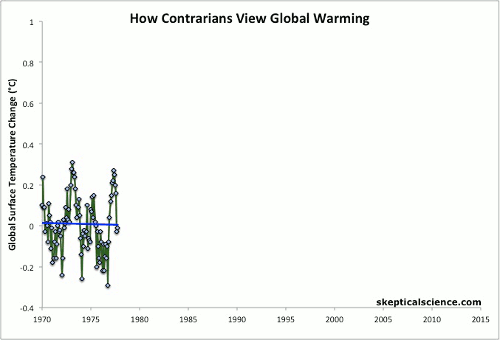
I can imagine that Skeptical Science will drag out their “Escalator” animated GIF graph and rightly so.
But at the end of the day, how much warming has there been since 1850 or1880 besides only about a degree or so? The weather here in Wisconsin has been gorgeous this summer. We had a good hard rain with some local flooding a week or so ago, but the corn crop sure liked it. There just isn’t anything to complain about.
Escalator? Funny, the UN IPCC CliSciFi models show essentially monotonic increases as a linear function of CO2. Its either one or the other: You can’t have your cake and eat it too.
Progressive or [unqualified] monotonic change. That said, in the modern model, it’s abort your baby, cannibalize her profitable parts, sequester her carbon pollutants, and have her, too, and they sincerely believe that it’s both logical and humane.
The argument is that GHGs retain more heat in the atmosphere relative to the GG concentration (well, there’s a factor for light interacting with molecules but that’s about the speed of light so it can be ignored on a daily basis). And the CO2 is known to rise continuously from Mauna Loa (with seasonal variation).
So to make the “escalator” work there needs to be something that stores heat as a form other than temperature and then releases it all at once.
What is the something? No-one knows. No-one seems to want to guess. No-one has a clue why it starts to store or why it releases.
But it must be a big enough store to hold over a decades worth of global warming heat. And it must be obscure enough that no climate model has been conceived of that contain it.
This is not science. This is back to belief in unseen mystical forces. T’is Zeus or Gandalf that control the weather in SKS-world.
Which at least is more plausible than IPCC projections.
“This is not science. This is back to belief in unseen mystical forces.”
It’s definitely not science. Alarmist climate science is made up of unsubstantiatied assumptions and assertions. It’s evidence free.
The world’s leaders are acting on these unsubstantiated assumptions and assertions to the detriment of us all. All thanks to dishonest alarmist climate scientists and their lies and distortions about the Earth’s climate.
Now there is a positive feedback loop.
CliSciFi -> Politicians -> $$$ – CliSciFi -> Politicians -> $$$
And on and on.
Mr. Courtney: Now it all makes sense!!! It’s Zeus!!!!! That’s why EVs will solve AGW!! He’s the god with the lightning bolts!!!!
We have had a very short summer so far on the West coast. We had snow on the local mountains in May. We went from winter to summer with almost zero spring this year.
I don’t know what west coast you’re on but here in the real PNW it’s been pretty normal. There is always snow on the local mountain well into May and sometimes early June.
Besides the pause, there is a negative trend in the data. Are we now in an era of cooling?
Live by the Super El Niño, die by the Super El Niño.
Despite a warm July, Earth is still in a cooling trend, begun 6.5 years ago in February 2016, at the peak of Super El Nino 2015-16.
Data mining balony
Yes — at least the Jan – Jul data says so … https://www.youtube.com/watch?v=rVbGdJzw8KQ
Global 150m depth-averaged Temperature (bom.gov.au)
Global 400m depth-averaged Temperature (bom.gov.au)
I have put 2 links to BOM Australia global ocean temperature maps for 400m and to 150m.
Go to the bottom of the pages for the anomalies.
It seems to me that the heat from the oceans has moved to the ocean surface and evaporated from there into the atmosphere causing the recent atmospheric warming.
These maps were published August 1st.
Yes, there was a surge of warmer water into the Nino areas which brought the index into the neutral position. You can see this with the animated graphs on the reference pages. Looks like that is over now and we appear headed back into La Nina territory for the foreseeable future.
If it is assumed that the GAT has been solely the result of the atmospheric concentration of CO2 as per the IPCC then the effect is declining as would be expected theoretically.

“I well remember the first time I drew the attention of the U.S. House of Representatives to the fact that, at that time (in 2007 or thereby), as now, there had been no global warming for seven or eight years: in fact, there had been a small cooling.”
I think Monckton’s memory is playing tricks. According to UAH data the seven years up to 2007 was rising at the rate of 0.15°C / decade. The eight years up to the start of 2007 was warming at the rate of 0.22°C / decade.
I think the cherry pick Monckton is referring to was from March 2009, when he made a mountain out of seven years of cooling since 2002.
Incidentally the UAH trend since 2002 is now 0.15°C / decade..
There is no pause in the Southern Ocean – It is still cooling. There is no pause in the Equatorial ocean. It has been steady for centuries. The Northern Oceans are continuing to warm and will do so for the next few thousands years until the ice mountains reform.
Unsynchronized phase shifts forcing the records to sustain catastrophic perturbations in what some believe to be a staircase to hell.
Can you show the whole SH, the whole NH and the whole tropics? Not just the bits you like.
Why would I need to do that. The climate models all show about 2.5C/century warming everywhere for every month of the year.
The best example of the model failures is the Nino34 region. It simply cannot get warmer than 30C for any period beyond a month or two and has averaged 27C throughout the satellite era.
Close analysis of all climate models shows they are of incompetent design produced by incompetent dullards. They have no relationship to what is being experienced on the surface of the planet. Even where they have jagged the average annual increase, they get the monthly trends way off.
Have you read the Confessions of a climate scientist by Mototaka Nakamure (free at Amazon)? You just hit about every point he makes about the models he was familiar with. His feeling is that they are good for academic studies of what changes might do but are worthless for predictions. The oceans and clouds are simply not modeled correctly and probably won’t ever be.
I have not read his book but have viewed some of his papers.
But the Church of Climate Change has a strong grip. Syukuro Manabe accepted the 2021 Nobel Prize in physics for his climate models that connect Global Warming to CO2. The faithful have massive influence. Observations are relegated to the naughty corner because they do not obey the models.
It is silly of Monckton to be pushing the “pause” barrow because he will be going up the staircase in a the next couple of years when the next El Nino occurs. The NH temperatures are bound to increase for a long time to come. The middle chart for the Nino34 region shows Jupiter’s orbital period that influences Earth’s orbit. It is close to a minimum in the cycle now and has been in an extended La Nina phase. The next big El Nino will probably be around 2031.
“The best example…” You mean cherry-pick?
To me it looks like a repeat of the head and shoulders pattern we had last year, only we’re a month ahead and last month’s shoulder was much deeper than last years.
If we look at the full record of the UAH data we get ;
https://www.woodfortrees.org/graph/uah6/from:1975/to:2022/plot/uah6/from:1975/to:2022/trend
The linear trend line slope is 1.35C per century. is that a catastrophe?
If the temperature of Detroit increased by a full 2C then it would be about like Indianapolis Indiana or Columbus Ohio. Is that a catastrophe?
Christopher Monckton of Baloney is back with his usual data mining of the UAH temperature record. The click bait headline man. He cherry picks a short term trend and fails to include the context of the long term UAH trend from 1979: “The linear warming trend since January, 1979 still stands at +0.13 C/decade (+0.11 C/decade over the global-averaged oceans, and +0.18 C/decade over global-averaged land).” (published today)
Momckton fails to discuss whether short term global average temperature trends have any predictive ability — they do not.
He correctly points out how climate computer games overpredict the rate of global warming. And they have done so for over 40 years. The obvious reason is that accurate predictions are not a goal. Scary predictions are the goal. That’s why 40+ years of “refinement” made the predictions for even faster global warming than prior predictions (CMIP6 versus CMIP5), which were already overpredicting the rate of global warming.
Even worse than 40 years of wrong predictions is failing to give 99% of the attention to the Russian INM model, that least overpredicts the rate of global warming. Who does that? Only people who do not care about climate model accuracy. Would a weather forecaster ignore the most accurate weather model? Of course not, if an accurate prediction was his goal.
Monckton claims there had been no global warming for seven or eight years: So what? That could be the start of a new trend or nothingburger.
No one knows.
But we do know that the 325 years of global warming since the cold 1690s during the Maunder Minimum period has had periods of no warming. The biased Monckton will forget to mention there were 35 years of global cooling, from 1940 to 1975, as CO2 levels rose, yet global warming continued in 1975, even faster than before.
Knowing climate history, a seven-year flat trend, helped by a starting period that included a huge El Nino heat release (2015 and 2016) unrelated to greenhouse gases. is just data mining … very likely to have no predictive ability of the future climate. And it is long past time for Monckton of Baloney’s data mining to stop. There are too many other good Climate Howler targets to focus on.
You can’t refute 50 years of climate scaremongering propaganda by pointing out a short term flat trend in a database (UAH) that Climate Howlers never heard of, which is not even funded by the government anymore.
The Climate Howlers love PREDICTIONS of climate doom. Their imaginary climate emergency is coming in the future. It has been coming in 10 or 20 years, for the past 50 years. It’s still “coming”, It will always be coming, in my opinion.
Climate Howler could not care less about the past or present climate, which is unrelated to their scary predictions of climate doom.
They are now howling that it is already here: “John Kerry, says President Joe Biden is considering announcing a climate emergency” (BBC).
It will be a hard sell to convince people
that now (2022) s a climate emergency with
8 billion witnesses to some or all of the
global warming since 1975. If the past 47
years of global warming was not an emergency,
why would 2022 suddenly be a climate emergency?
They are declaring a climate emergency now
for the predicted climate emergency imagined
in the futire. I can’t believe most people
would believe 2022 was a climate emergency.
According to Joe Dementia, the “climate emergency” is “oil rain” in his childhood that gave him skin cancer. Or some such blathering nonsense. The man is a mental train wreck. Nothing at all to do with “global average temperature” which is a highly massaged and meaningless statistic, anyway.
Mister Joe Dementia, please show respect !
FJB hasn’t earned any respect
But he has added enormously to the gaiety and amusement of the World with his surreal word salads.
Biden defines the US in one word:
If there is a trend, then the time-series is autocorrelated. That means that at least the last few samples have predictive value for the next temperature. That is, the definition of autocorrelation is that the old data has predictive value for new data. It isn’t like a deterministic system where the variables are known and well-characterized, but the trend does have a probabilistic predictive value. It is only a completely random series with a large range that lacks predictive value. Even for random events with a small range, one can comfortably predict that the new value(s) will have a similar range.
Thanks for the word salad, perfesser.
1910 to 1940 global warming did not predict 1940 to 1975 global cooling, which did not predict 1975 to 2022 global warming.
No, why would it?
You appear to not understand what autocorrelation is, nor the fact that it may only be a factor over short lags.
You seem to have no grasp of climate history and the failure of humans to accurately predict long term climate trends. Nothing else matters.
Autocorrelation, also known as serial correlation, is the correlation of a signal with a delayed copy of itself as a function of delay. Informally, it is the similarity between observations as a function of the time lag between them. The analysis of autocorrelation is a mathematical tool for finding repeating patterns, such as the presence of a periodic signal obscured by noise, … = mathematical mass-turbation
What Clyde tried to tell you was that “weather” is autocorrelated. My grandpa used to say “look at the day before yesterday, then yesterday, then today, you can bet tomorrow will be the same”. Well it was hot, hot, and will probably be hot today. We had no rain, no rain, but it rained this morning. No one forecasted it. Only the local weather monitoring real time radar had a clue and they didn’t forecast it yester either.
Autocorrelation only gives you a tool. There will be a point where it is wrong. Such is life. We have not reached the point where a deterministic set of equations can be used to forecast with any degree of accuracy. Not today, not tomorrow, not a century from now.
We have barely begun to scratch in the dirt as to how the surface, the atmosphere, and the sun interact on a millennia scale let alone a century or a decadal or an annual scale. Autocorrelation is what so-called scientists are using to predict what will occur and it will fail them at some point.
short term weather is not long term climate
The spiteful Richard Greene should be more respectful of those who, unlike him, have an elementary understanding of probability and statistics. Clyde Spencer is correct.
We only CO2 to blame for the current cooling … https://www.youtube.com/watch?v=rVbGdJzw8KQ
CO2 causes evet\ry problem in the world,
from cancer to warts.
“Even worse than 40 years of wrong predictions is failing to give 99% of the attention to the Russian INM model, that least overpredicts the rate of global warming. Who does that? Only people who do not care about climate model accuracy.”
That’s a good point.
How is starting at the endpoint and working backward in time “cherry picking”?
Monckton deliberately Ignores the context of the 43 year UAH rising temperature trend since 1979
His short term trend is influenced by the large El Nino heat release in late 2015 and early 2016
A short trend very likely has no ability to predict the future climate
Giving so much attention to a short term trend of a database that Climate Howlers reject, and governments do not fund, wastes valuable time and effort that should have been used to refute Climate Howler predictions of climate doom, and pointing out how they have been wrong for over 50 years so far.
What trend results would lead you to conclude that the trend has changed?
Who is trying to make predictions (oops soory “projections”) except the IPCC and ilk? “Very likely” sounds a lot like IPCC weasel words.
10 years of unusually cool weather would be a good start, with not one hottest year evah’ announcement. Of course that could happen and the government bureaucrats could fixed the books to claim it did not happen.
So if would have to be 10 unusually cool years that people would notice without needing to be told by NASA-GISS, HadCRUT etc.
The spiteful Richard Greene should read the head posting. I had shown the UAH trend not just for the eight years of the current Pause but also since 1990, the year of IPCC’s first assessment report.
The truth is that those not familiar with equations and suchlike arcana are at once capable of understanding that, notwithstanding our cumulative sins of emission, there has been no global warming for almost eight years.
Clarity is useful.
The important thing with these pauses is that they occur because since mid 1990s the long term velocity of warming (15 year avg ºC/year) has been decreasing. This is contrary to theory.
When a pause goes above 15 years the line in the graph goes below the zero line.
For UAH the trend over the last 15 years, is 0.29°C / decade, close to the fastest 15 year trend in the data set.
That is just a peak. There are peaks all over the place the same there are pauses all over the place.
No warming since Feb 2016 means 6.5 years of negative rate. The 15-yr moving average is going to drop very fast, keeping with the decreasing rate since the 1990s.
Global warming is still taking place, but it is decelerating, and it shouldn’t, should it?
These pauses should not take place with all the CO2 we continue putting in the atmosphere. They are really pushing down the long term warming rate that instead should be accelerating.
I’m just trying to figure out what your point is. You are claiming that global warming is decelerating, but I don’t see any evidence for that. You want to base it on 15 year trends, but then insist that although the current 5 year trend is a lot faster than the overall trend, and as fast as it’s ever been, you say that is just a spike and want to talk about a hypothetical future reduction.
I’m just not sure what test confirms that the rate of warming is decelerating. For example, comparing a quadratic smoothing with the linear, and there’s little difference, and no sign of a deceleration.
You are not looking where you should. Temperatures go up and down all the time. You need to look on the rate of change (first derivative) using a long enough moving average. That tells you if the warming is speeding or slowing.
15 years is long enough to smooth the decadal changes, but not too long to see what warming has been doing lately.
The graph reveals a small upward trend in warming that could be partly anthropogenic, and a large oscillation that is well known since 1994, and we are in the downward part of that oscillation since the mid-90s
Schlesinger, M.E. and Ramankutty, N., 1994. An oscillation in the global climate system of period 65–70 years. Nature, 367(6465), pp.723-726.
Nothing to worry really. The projected warming will fail. We will have less warming that it has been anticipated. This evidence is not being told, but global warming is decelerating.
“You are not looking where you should.”
Or maybe I’m trying to get an overall picture, rather than looking for some random change you can use as flimsy support for your deceleration hypothesis.
“You need to look on the rate of change (first derivative) using a long enough moving average.”
As I’ve said below, your method is not a good way of determining rate of change, and 15 years is not a long enough period. All you are effectively doing is comparing one year with a single year from 15 years ago, and ignoring everything in-between. The fact that the graphs fluctuate so much year to year should indicate that this is not a good way of seeing “what warming has been doing”.
Here is my version of your method applied to UAH data. I’ve used a 12 month period rather than 13 months as that’s the length of a year where I come from.
Not the only real negative trend happens in 2013, 15 years after the big El Niño of 1998.
Ovbiously you didn’t understand. I am comparing a 15-yr trend centered on one month, with the 15-yr trend centered on the nex month, and the next month. It is a succession of 15-yr trends, that has been trending down since the mid-1990s.
Exactly, we are right on the tail end of the 1995 AMO phase change and induced warming which was pumped up a little by the PDO phase change in 2014. With the current La Nina the PDO naturally fell back into a negative position. Hence, the pause.
The original pause was also the result of the PDO going negative from 2006-2014.
What happens next? Probably La Nina into 2023 and El Nino in 2023-24. Then, we could very easily see the AMO make its final fall into negative territory for the next 30 years.
This is close to three cycles of the solar magnetic field: 22×3=66. Perhaps a full cycle is about 130 years.
Aside from the spread of the Green Blight with renewable/intermittent/unreliable energy converters, and environmental rape to scavenge disparately distributed rare earth minerals, a net-zero climate effect to sustain redistributive change schemes in democratic dictatorships. Voters of the world, take a knee, beg, …
“Global warming is still taking place, but it is decelerating, and it shouldn’t, should it?
These pauses should not take place with all the CO2 we continue putting in the atmosphere. They are really pushing down the long term warming rate that instead should be accelerating.”
I don’t think atmospheric temperature anomaly alone is enough to draw those conclusions with any confidence. What does the SST velocity graph looks like? Wouldn’t that be a far better indication given 90% of the energy is accumulating in the oceans?
Data from here: https://www.data.jma.go.jp/tcc/tcc/products/elnino/cobesst/cobe-sst.html
I never heard that the dangerous warming limit was 2ºC of ocean warming. It has always been surface temperature. If the surface warming is decelerating then we have more time before the planet goes bang from overheating. That’s supposed to happen when we go from 1.99 to 2.00 ºC GSAT anomaly.
I might be wrong but I was assuming that SST would paint a less noisy picture of the rate of change; sitting on top of all that thermal inertia as it were and provide a smoother, less volatile indicator. To the nub of it: is the long term velocity of warming of the ocean’s surface decreasing?
Or more indicative still: is the rate of change of ocean heat content increasing of decreasing? If you demonstrated the rate is decreasing over decadal timespans then that would be a challenge to explain.
You might be wrong. SST in the open ocean is limited to 30ºC, but already at 27ºC deep convection starts to act. So SST is capped at that limit. And, as solar energy goes into the ocean, but non-solar energy goes out of the ocean, when you measure SST you essentially measure the energy flux from the ocean towards the atmosphere. The problem is you don’t really know what controls that flux, so you don’t know what you are measuring. Essentially 2/3 of the energy coming out if the ocean is latent heat, and evaporation is dependent mainly on wind speed, then on air humidity, and finally as a distant third on water temperature. How much control do you have over those factors?
Air pressure also affects evaporation. If air pressure is high on the surface of a body of water, then the water will not evaporate easily. The pressure pushing down on the water makes it difficult for water to escape into the atmosphere as vapor
How is plotting air temperature any less problematic given it’s largely a slave to ocean temperature.So go with OHC. I might be wrong… but I’ll wager your polynomial will look a lot different when you plot the elephant and not it’ flicky tail.
The attached image shows Figure 1 from AR6 SPM on the left – no warming until 1910 in either models or HadCRUT4 as presented by the best of the best of the best. The figure on the right shows the CMIP6 model re-baselined to the period 1961-1990 to illustrate how bad a fit it really is and that it is over-predicting current warming and under-predicting warming in the first half of the C20th.
UAH added to the plot on right for good measure.
“Observed”, my hindquarters.
Unbastardized charts from all over the world show it was just as warm in the Early Twentieth Century as it is today. Those are real observations.
Your Hockey Stick charts don’t show the Early Twentieth Century Warming. They are, in fact, a fraud perpetrated by dishonest people.
There’s a good book on the subject advertised on this webpage titled “The Hockey Stick Illusion”. You should read it.
Hi Tom, not sure why you are lambasting me – my points were directed at Loydo. and they actually support what you say (see Point (5).
The word “observed” doesn’t actually appear in my post.
Early 20th century temperature data are very rough and mainly a Northern Hemisphere average Anyone who claims good accuracy and a “global” average is lying.
Six charts showing distribution of land based weather stations in the old days:
Honest global warming chart Blog: Poor distribution of land-based weather stations (elonionbloggle.blogspot.com)
“Unbastardized charts from all over the world…”
Such as?
You didn’t answer any of my points Loydo. Cat got your tongue?
How did they know the SST without satellites in 1890?
The pauses occur for the same reason that humans see patterns in the random position of stars in the sky. It is cherry picking pure and simple. The temperature data consists of a long term upward trend with lots of short term noise. In the UAH data the long term trend is 0.13 degrees per decade. However the monthly change from June to July was 0.3 degrees which is over 270 times as large as the long term trend. Now try creating an arbitrary time series where the point to point fluctuations are 270 times as big as the long term trend and see how many “pauses” you are likely to find.
Izaak the Idiot drops another tab of acid.
Carbonic Acid?
The long term trend does not tell you if the warming is accelerating or decelerating. It should be accelerating because every CO2 molecule we put in the atmosphere does its job incrementally. But it is decelerating, as the first derivative of temperature shows. This should not be possible according to theory, so the theory is wrong.
“It should be accelerating because every CO2 molecule we put in the atmosphere does its job incrementally.”
CO2 becomes a weaker greenhouse gas as the concentration increases. Aso, there are many other causes of climate change — the exact effect of CO2 can not be known without knowing the exact effect of every other climate change variable.
If CO2 emissions remained constant, any warming effect of CO2 would not be accelerating. Each +100ppm CO2 increase would cause less warming than the prior +100ppm CO2 increase.
It doesn’t matter because we are adding it in exponentially increasing amounts. That is what the second part of the graph shows (red areas). Warming should be accelerating, yet it is decelerating. That is why this is not being told.
The greenhouse theory is correct, the CO2-hypothesis that CO2 changes control climate changes must be wrong because the evidence negates it. Other things must control climate change.
Baloney
The current amount of CO2 impedes Earth’s ability to cool itself by some unknown amount.
Increased CO2 increases that amount
Every +100ppm CO2 increase has less effect than the prior +100ppm increase.
You are wrong– that is not acceleration — not if the CO2 ppm growth per year remains the same from year to year.
No, the flaw is that you are basing all this certainty on the flimsiest of curve-fitted graphs of a very small, 5 years out of date part of the warming.
What decelleration? Oh, mean that purple bit?
Why do you insist on posting time and time again your entirely fatuous and invented ocean heat content graph?
There are many other factors that modulate the UAH TLT temperature. CO2 is only one among many. Anyway, when I do a second order polynomial regression I get a positive x^2 term albeit small.
Exactly, climate is complex and GHGs are only a part of the story. This means emissions reductions by some countries will achieve nothing. It is self-evident yet denied by so many.
Yes, there’s a long term upward, which IMO is also a part of a longer term oscillation/variability. However, at somewhat shorter multidecadal timescales, there’s a clear ~60 year cycle.
Here are some derivatives (scaled to °C/century) of the low-pass filtered (triple running mean, various lengths) HadCRUT4:
https://woodfortrees.org/plot/hadcrut4gl/mean:240/mean:168/mean:120/derivative/scale:1200/plot/hadcrut4gl/mean:360/mean:252/mean:180/derivative/scale:1200/plot/hadcrut4gl/mean:480/mean:336/mean:240/derivative/scale:1200/plot/hadcrut4gl/mean:600/mean:420/mean:300/derivative/scale:1200/plot/hadcrut4gl/mean:720/mean:504/mean:360/derivative/scale:1200
Not at all. The pauses align very well with natural ocean phase changes. The pause that started in 1997 started after the AMO moving into is warm phase and then the PDO into it’s cool phase. The current one started after the PDO went back into warm phase and then cooled due to La Nina.
One thing that doesn’t show up is any evidence of CO2 based warming.
Excellent graph Javier. Much appreciate your analyses.
Javier
Your chart, which appears to stop in 2016, suggests that the linear trend in the 181-month centred average of HadCRUT4 dipped below 0ºC some time in the early 2000s.
I can’t find any such 181-month centred average negative period, either in HadCRUT4 or the more recent HadCRUT5.
The last 181-month centred period with a negative trend in HadCRUT4 that I can find is from 1963/07-1978/08. Is this your own chart, and if so, may I ask which version of HadCRUT4 are you using?
It doesn’t. It is a 15-yr centered moving average, so the last point in 2014 includes data between 2006.5 and 2021.5
To exactly reproduce that graph do the following.
1) At HadCRUT 4.6 subtract the temperature of each month from the previous month to calculate the monthly changes.
2) Calculate a 13-month centered moving average to deseasonalize the data.
3) Calculate a 181-month centered moving average and multiply by 12 to get the 15-yr moving rate in ºC/year, not per month.
Calculated in this way the pause goes from November 1997 to September 2013 and the negative values are at its center in 2005-2006.
Are so that’s what you were doing.
All of the above is just saying you are basing each 15 year trend on the difference between one year (or 13 month period) with the 13 months 15 years earlier. Ignoring everything in-between. This inevitably makes your changing “velocity” more changeable and arbitrary. If the current year is warm, but there was a warmer spike exactly 15 years earlier, you see cooling, if that spike had been 16 years earlier and 15 years ago there was unusually cool, you have rapid warming.
As Monckton says, it’s much better to look at a linear regression over the period, and take into account all the data. Even so, 15 year trends are still liable to change, caused by natural changes such as ENSO, which is why I still don’t know what your evidence is for a deceleration.
How can you be not able to understand such simple procedure? I am calculating a 181-month trend centered on a single month, and sliding that window month by month over the entire series. This calculates the trend of 15-yr trends. It doesn’t ignore anything.
My point is that each of your 15-yr trends is based on the difference between one year and a year 15 years ago, ignoring everything in between. Yes, that data will be included in later trends, but only by comparing to a different year. That’s why the rolling trends are so noisy.
If you think any one of your 15-yr trends is including all the data, maybe you haven’t thought through the logic of averaging consecutive monthly differences. When you do that, all the middle terms cancel.
E.g, you start by averaging 13 differences to give you a year and a month. Say the monthly anomalies are x_1, x_2 … x_14. Each difference is given by x_i – x_{i – 1}. Add your 13 differences and you get
(x_14 – x_13) + (x_13 – x_12) + (x_12 – x_11) +… + (x_2 – x_1)
that is,
x_14 – (x_13 – x_13) – (x_12 – x_12) – … – (x_2 – x_2) – x_1 = x_14 – x_1.
It’s similar when you combine 181 of these annual averages to get your 15-yr trend, but there you will be left with just the last 13 months minus the first 13 months.
Your point is still incorrect. Each 15 year trend is the average of the temperature difference for each month with the previous month. So it is an average of 181 values and ignores nothing of the temperature changes that have taken place over those 15 years.
As the 15-yr trend moves over the temperature function month by month it constitutes a derivative where h is 15 years instead of approaching zero. It gives a derivative function that is represented in the graph and that informs how the 15-yr trend in temperature change has been changing over time. As it is trending down, global warming is decelerating. This is a fact, not an opinion.
And it is a fact supported by the scientific literature. When my graph is overlaid over Schlesinger & Ramankutty graph it can be seen clearly that the change in warming rate is followed by the change in temperature as it should.
Not something that believers in a climate crisis are ready to accept. Who’s denying reality now?
“So it is an average of 181 values and ignores nothing of the temperature changes that have taken place over those 15 years.”
You ignore the part of my comment where I show that when you take an average of differences you just throw away all the data in the middle and are just left with the end points.
“As the 15-yr trend moves over the temperature function month by month it constitutes a derivative where h is 15 years instead of approaching zero.”
A derivative with an interval of 15 years is just the difference between two points 15 years apart.
“It gives a derivative function that is represented in the graph and that informs how the 15-yr trend in temperature change has been changing over time”
Only for your limited definition of trend.
“As it is trending down, global warming is decelerating. This is a fact, not an opinion.”
Your fact is very dependent on your assumptions, as to when something is “trending down”. Different time frames, will give very different results, and you still haven;t provided any statistically significant evidence that anything is trending down.
That’s what happens when you give the temperature trend like for UAH between 1979 and 2022. But what I have done doesn’t do that because in the figure there are represented 1368 15-yr trends, so what the temperature has been doing every month is taken into consideration unlike in what you do when you calculate a single warming trend.
There are no assumptions, just definitions as in any study. As long as the results are presented according to the definitions the study cannot be questioned.
The choice of 15 years is as any other choice dependent on what one wants to see and study. Considering that there is a c. 60-yr oscillation chosing a 1/4 period is defensible, and shorter periods result in more noise.
If you don’t want to see what the analysis shows, that’s fine. Your supported hypothesis for climate change is destined for failure. I’m already working on a substitute hypothesis. Climate is complex. Simple answers like “CO2 did it” are for simple minds and result on lots of things unexplained.
“But what I have done doesn’t do that because in the figure there are represented 1368 15-yr trends, so what the temperature has been doing every month is taken into consideration unlike in what you do when you calculate a single warming trend.”
I’m not sure what you are getting at here. My point is that each of your 1368 15-yr trends, are only trends in the sense that they are comparing a straight line between two points, rather than the more useful trend derived from linear regression, which is the best fit for all the data over the period.
Of course, plotting the trend for every single month means that all months are covered in some way. It just means that the graph is very noisy, and it’s difficult to establish how you know that it shows a decelerating trend.
“As long as the results are presented according to the definitions the study cannot be questioned.”
I’m not sure this is the best website to make such a claim.
“Considering that there is a c. 60-yr oscillation chosing a 1/4 period is defensible, and shorter periods result in more noise.”
I just think there should be better ways of establishing if the 60 year oscillation is supported by the evidence.
“If you don’t want to see what the analysis shows, that’s fine.”
I’m not sure what your analysis shows, that is different to other oscillations.
Your graph implies you cannot use the oscillation to explain all warming. The “velocity” of temperature change over most of the oscillation is positive, and only rarely negative, hence something needs to be causing warming other than just the oscillation.
“Your supported hypothesis for climate change is destined for failure.”
Could be, but I’d prefer to wait to see the evidence, rather than making assumptions about destiny.
“And it is a fact supported by the scientific literature. When my graph is overlaid over Schlesinger & Ramankutty graph it can be seen clearly that the change in warming rate is followed by the change in temperature as it should.”
If you think the oscillation was a good predictor of the future, why not compare like with like, rather than all this messing about with 15 year trends?
Here is HadCRUT 4, detrended using a linear trend up to 1994, which I assume is what Schlesinger & Ramankutty were using.
The ability to predict future behavior in temperature is reduced by the chaotic nature of weather. However its fractal behavior indicates similar things may have happened in the past. The super El Niño of 1876 also temporally interrupted a pause. This second pause Mockton defends might indicate a similar situation is taking place after the super El Niño of 2015.
I do not pretend that. The world has been warming for 350 years. Neither GHGs nor the multidecadal oscillation can fully explain it. The 1975-2000 period of accelerated warming was the result of the cooperation by the multidecadal oscillation, GHGs increase, and the modern solar maximum. Now they are no longer cooperating the warming has decelerated. The observations clearly show it.
There is a role for every factor in climate change. Simple solutions, like “our emissions did it”, or “the sun did it”, are clearly wrong.
“The super El Niño of 1876 also temporally interrupted a pause. This second pause Mockton defends might indicate a similar situation is taking place after the super El Niño of 2015.”
Maybe updating the graph will indicate otherwise.
“I do not pretend that.”
Then I apologize. It’s just that most of the people who being up their cycle of choice are trying to claim that CO2 does not effect temperatures.
“The world has been warming for 350 years.”
Not as far as I’ve seen. Taking CET as the best indicator of global temperatures, there was a rapid warming phase as we came out of the Maunder Minimum period, then a bit of cooling, then more or less flat for the next 150 or more years, until the 20th century. From 1700 to 1930 the trend is flat, so, a 230 year pause in the middle of the 350 year period.
“Now they are no longer cooperating the warming has decelerated. The observations clearly show it.”
The do not clearly show it. If they did you wouldn’t need to be taking supposed 15-year derivatives and curve fitting.
The period from 1975 – 2022 is virtually identical to the period from 1975 – 2000. There’s no sign of a significant departure from a linear warming rate.
Why would you need to ‘deseasonalize’ monthly anomaly data? Each data point is the difference from a long term average for that particular month, so anomlies auotmatically deseasonalize. That’s one of the main reasons they are used in temperature series.
All step 1 of your process does is remove the linear trend from the data. You have de-trended the data, not de-seaonalized it.
That graph doesn’t seem to agree with Hockey Stick charts. The velocity of warming increases in the Early Twentieth Century while the Hockey Stick charts show cooling.
This graph is similar to the U.S. surface temperature profile where it is warm in the 1930’s, and cool in the 1970’s and the highpoints of 1998 and 2016 show up.
And the U.S. temperature profile is similar to all the unmodified, regional surface temperature charts from around the world.
That was the “old” climate history
We have new climate history now
It might be beneficial to the WUWT audience to describe how the time-of-observation bias, instrument/shelter change bias, etc. were corrected when making this graph.
As solar activity approaches that of the early 20th century, further decline is possible.
“new pause” Okley Dokely!
More than just a pause … https://www.youtube.com/watch?v=rVbGdJzw8KQ
“Yet, as Dr Roy Spencer has just brilliantly pointed out at his website, the anthropogenic forcings are continuing to follow a pattern that would lead to a forcing equivalent to a doubling of CO2 concentration by the end of the 21st century, approximately in line with Representative Concentration Pathway 4.5, and not the deliberately extreme 8.5”
This statement accepts the erroneous assumption that our emissions control the atmospheric CO2 content. They do not and it is important that those leading the “truth in climate” discussions get that fact straight. Even if CO2 increases were the cause of the anemic warming (no proof of that exists) humans are only minimally responsible for that rise.
So where did that additional trillion tons of CO2 come from and where did our 2 trillion tons go?
If only we could get rid of that pesky 0.0012% of man made CO² we could save the planet… or something.
CO2 is 0.042% (420ppm)
Manmade CO2 is 0.0139% (approximately 1/3 of 420ppm)
Your number is very wrong.
Nope!
Your number richard is egregiously wrong.
Mankind’s contribution of CO₂ to global atmospheric CO₂ concentration is approximately 4%, Perhaps as high as 5%.
The OCO-2 satellite proved where the CO₂’s true emissions came from.
https://wattsupwiththat.com/2015/10/04/finally-visualized-oco2-satellite-data-showing-global-carbon-dioxide-concentrations/
Mankind’s contribution to the emission flux (in ppm/yr) is about 4%. A 4% change in the emission flux (in ppm/yr) integrated over many years adds up to a significant change in the atmospheric concentration (in ppm). Remember, you have to multiple ppm/yr by yr to convert to units of ppm. That’s the step many people miss. Over the course of 170 years mankind emitted 310 ppm of CO2 into the atmosphere. That’s more CO2 than what the atmosphere originally started with prior to the industrial revolution.
Nature is still absorbing CO2
All CO2 increases, therefore, are manmade — up an estimated +50% since the 1800s.
I can’t correct stupid, so I won’t try any harder than my logical correct statement above, supported by an estimated 99.9% of scientists on this planet, based on my 25 years of climate science reading, finding only one scientist who claimed CO2 increases were almost entirely manmade in those 25 years. One crackpot.
the good news for them is no one can know for sure what will happen since most of the post-1979 warming signal is probably noise
the bad news is the temperature future they’re predicting is no more likely than the 2.5 degrees warming Hansen predicted we would get from 1988 till now
As said on this pause topic several times, I think there are much more robust ways to discredit the warmunists. The pause relies on a statistical argument relative to model warming outputs, themselves suspect. What warmunists cannot refute is stuff like the following:
These are easier ways than ‘pause’ to show the warmunists just wrong.
Show some evidence that any of these are not just your skewed opinion.
Maybe you could show some evidence where he is wrong…?
Carl Sagan said: “Extraordinary claims require extraordinary evidence.”
Not: “Dealing with crackpot claims should be like playing whack-a-mole.”
What warmunists cannot refute is 60+ years of 100% wrong predictions
of various types of environmental doom. After all, “climate change” means CAGW now, and CAGW is just a prediction, not reality — a prediction that has been wrong for at least 50 years so far.
I prefer the term Climate Howlers rather than warmunists, which is too offensive — the Climate Howlers are not all Marxists.
Also Computer Games, rather than climate models.
And Nut Zero, rather than New Zero.
RG said: “What warmunists cannot refute is 60+ years of 100% wrong predictions”
Not a single prediction was right? BTW…how do you objectively define right and wrong in the context of a prediction anyway?
Predictions are reflected in climate model simulations, which average 2x faster warming than actually happened since 1979, and even worse if they are back tested to 1940, when CO2 emissions first began rising significantly, as the world pulled out an economic depression.
CO2 emissions did begin in 1975 when warming began.
They happened from 1940 to 1975 too, when there was significant global cooling, now “revised away” by the smarmy government bureaucrat “scientists” that you worship
First, I think you have me confused with someone else. If I worship anything it is evidence; not scientists.
Second, do you think the prediction that the global average temperature would increase was wrong? Do you think the prediction that the cryosphere would lose mass was wrong? Do you think the prediction that the stratosphere would cool was wrong?
Third, It doesn’t look like climate model simulations average 2x faster than actually happened since 1979 to me. CMIP5 shows +0.23 C/decade whereas the 8 dataset composite is +0.19 C/decade. Since it wasn’t 2x higher does that mean it is right? Or is it still wrong? Can you provide an example of a prediction of the global average temperature on a monthly basis since 1979 that you feel is right?
I support “all of the above” including trolling the warmists with the pause.
Over the Australian land mass, UAH lower troposphere temperatures have now reached an easy-to-remember TEN YEARS of no warming in the linear trend. No resident Aussie child under 10 years of age has ever felt the savagery and existential threat of global warming!!!
Why to teachers tell fables to our school children?
Geoff S
To avoid accusations of cherrypicking, this plot shows the ordinary-least-squares trend for every possible start and end date. The data is Roy Spencer’s UAH MSU series from 1978 to date. You can judge for yourself whether those pauses are real features of the data or just cherrypicked end points.
That is an awesome visualization!
I’d say you safely avoided cherry-picking.
Perhaps I’m at the other end of the spectrum, but I like to look at specifics. They say we’re going to burn up, so I’m interested in the trends in summer daily high temperatures here in central Indiana.
The raw data from a local station don’t seem alarming to me.
I can see a kid with a red hat, holding his hands in front of himself, a cyclops dog, a strange clown, a bat and Mario. Not much else, unfortunately.
Can you see the chain of black rectangles in the background running up along the diagonal? Those are the pauses. The two ‘bow tie’ shapes between them are the jumps when El Nino peaked and dumped hot water into the global ocean circulation. The question is – is the red at the top-left/bottom-right corners solely the result of those bow ties, or is there a background red trend they’re superimposed on?
Mr. Wanderer: I’m told Truman Capote sees a baby’s arm holding an apple. His tunnel vision in that respect looks just like a CliSci.
So if there are steady/linear rises in CO2 concentration how does one reconcile that with pauses in temperature? Shouldn’t the temperature rise steadily along with the CO2 since that’s what’s causing the rise?
CO2 is not the only thing modulating the UAH TLT temperature. ENSO and volcanic aerosols force the bulk of the variability. CO2 forces the bulk of the trend.
As a 40-year member of the IEEE, I now get garbage like this in my mailbox. Recalling when the IEEE was a professional society instead of a left-wing advocacy mouthpiece, I now need to consider if it is time to walk away.
Yeah, it’s probably time to quit them.
Hmm, I don’t recall any leather motorcycle jackets in Lawrence of Arabia, except, perhaps the one Lawrence died in, in England. Although leather is a great insulator, it would seem that it would have to be loosely worn to provide any relief from the heat. Perhaps Your Lordship would provide a thermodynamic explanation without compromising his great pickup line, as we say in America.
Yes, loose robes, preferably white, have always been found to be more effective. I like my sweat to evaporate, too, which it can’t under heavy unventilated clothing.
Indeed, unless one is on the bike (in which event the passing air, even in 45-Celsius temperature, will keep the rider cool), one leaves the jacket on but open. The jacket prevents evaporation from occurring too fast, so that a constant and gentle cooling caused by the steady evaporation is the result. It is, of course, counter-intuitive, so few are willing to try it: but, here in rural Kent, during the 40 C heatwave, the only person among our large household who did not complain of the heat was me, because I had – as I have today, in 29 C indoor temperatures – a tweed jacket on but open. Not so good as a leather jacket, but a lot cooler than no jacket at all.
7 years 11 months = 95 months.
There are 430 consecutive, overlapping 95-month periods in the UAH_TLT data set.
Of these, 123 (~29%) have a linear trend that is equal to or lower than this most recent one.
The warming trend over the whole data set remains +0.13C/dec.
This tells us about the predictive value of 95-month periods in the UAH data.
The furtively pseudonymous Putin agent “TheFinalNail” has, as usual, misunderstood the obvious. Since long Pauses are a feature of the recent temperature record, they provide an easily-comprehensible indication of the fact that global warming is not happening at anything like the predicted rate.
Monckton mentions Roy Spencer’s model predicting doubling of pre-industrial CO2 during 2090. Observational estimates of ECS between 1.4 and 2.3 suggest only limited warming will occur by that time. This is the low end of the warming range that Charney (1979) estimated for ECS and half as warm as the 2021 IPCC 4.5 degree scenario Spencer mentions. A very cool projection.
‘Observational estimates of ECS between 1.4 and 2.3’
These estimates assume the observations are accurate and CO2 is the only climate change variable — this is a worst case estimate for CO2, including known and unknown feedbacks. I suspect the TCS estimate starts in 1975, since there was no warming in the 1940to 1975 period, but there was increasing CO2, so 1940 to 1975 usually gets ignored by the Climate Howlers.
Don’t forget the 1940 to1970 30 year pause
Everyone forgets.
It was more like 1940 to 1975
The BBC is a good thing, in principle. The UK is a small, anglophone media market. Left to market forces US product would squeeze out UK product entirely as the costs of manufacture would be spread over a larger consumer base.
This happened to UK film. This did not happen to UK paperbacks or pop music as the cost of manufacture is so much lower.
This did not happen to UK TV because of the BBC License Fee. The UK avoided total cultural colonisation by use of an hypothecated tax to preserve UK popular culture.
Nowadays, TV is less important than the internet, culturally. And the US websites dominate the older generation; Chinese websites watch the kids. The answer isn’t merely to surrender. It is to re-deploy our cultural weapon – the BBC – to the internet frontier. And arm it with more money.
In practice, it is clear that the BBC is scientifically illiterate and thus unable to contribute to half of the cultural world. But that is a flaw in execution, not concept.
The BBC is a thoroughly bad thing in principle, because its very heavily-subsidized market dominance makes it a focus of power – i.e., a target for both Russian and Chinese disinformation. It has been captured by Communism. The only thing that will now work is outright defunding. If it had to pay its own way, it would collapse under the weight of its Stakhanovite bureaucracy.
MoB is, of course, completely correct. Nuking from orbit is the only solution. BBC’s stance on Thermageddon, C-1984 and Brexit would be quite enough and that’s just scratching the surface. Many thanks MoB as ever for yet another splendid contribution and the patient attention to the comments. Response to ‘Griff’ is my particular favourite this time. It’s the only language they understand.