From the Cliff Mass Weather Blog
There is a lot of talk about the short-term European heatwave with some suggesting that the record-breaking warmth is the result of climate change/global warming.
Some of the media and climate advocates have been over the top in their claims (see below), stating that this event was the result of human-caused global warming.

The truth and overwhelming scientific evidence provide a different story: the recent European heatwave is mainly the result of natural processes but was enhanced modestly by human-caused global warming.
The situation is very much like the Northwest heatwave of last summer; with many of the same elements.
A Short But Dramatic Heat Event
As noted in the media, a number of locations broke all-time temperatures records, with some locations in England reaching 40°C (104°F). The map below shows the locations breaking records on July 18th, with the x’s showing locations exceeding all-time record highs.

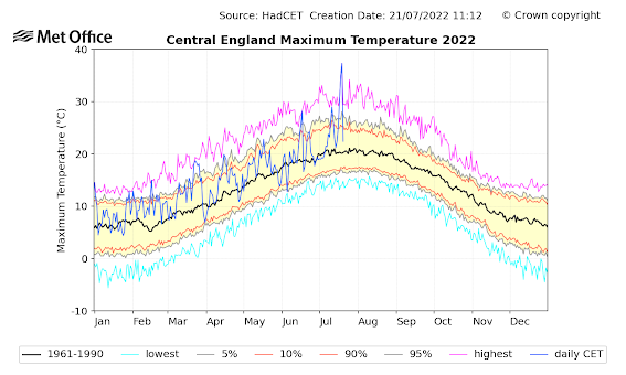
At some locations, the previous all-time record highs were smashed by several degrees, something illustrated by this plot of the central English temperatures (shown below). The blue line is this year’s temperature, the black line is the average value, and the pink line shows previous daily records.
The high this week for central England was absolutely unparalleled, particularly regarding the deviation from the previous record high. Also note that the heat wave was very short.
In many ways, this event was like last year’s heatwave in the Northwest, with previous records being absolutely smashed.
Ironically, such an extraordinarily extreme event is a sign that global warming played a very small role in this event. This reflects the
Golden Rule of Climate Extremes:
The more extreme a climate or weather record is, the greater the contribution of natural variability and the smaller the contribution of human-caused global warming.
Let me demonstrate how the “Golden Rule” applies in this event.
The Background Warming
Europe and England have been warming during the past decades and some of that warming is probably caused by increasing greenhouse gases such as CO2. To illustrate, below are the long-term changes in maximum summer temperatures over England from the UK Met Office.
Mean maximum temperatures had little overall trend from 1890 to around 1970 and then warmed around 1 C (about 2 F) during the last 50 years.

I can show you similar plots of other European locations, all of which suggest about 1-1.5C of warming.
Let us assume ALL of this warming is due to increasing CO2 and other greenhouse gases. Let us further assume that none of it was due to urbanization or changes in instrumentation (which can also produce warming temperatures).
That background warming of around 1°C is absolutely dwarfed by the magnitude of the heatwave, in which maximum temperatures were as much as 20C above normal (as shown by the figure above).
So why were the temperatures so extreme this week?
The reason is the development of a large ridge of high pressure, something called a ridge, which produces warming by sinking and moving air northwards on its western flanks.
Here is the upper level (500-hPa pressure level, about 18,000 ft) at 5 PM PDT July 17th. The ridging (high heights or pressure) are indicated by the red-orange colors. Note there was a trough (blue colors) of lower pressure on its southwest side. This feature increases southerly flow that brings up warmer air.

Now a shocker. Below is the same kind of chart for the great Northwest heatwave.
OMG! Very similar, including the low to the southwest!

Such a low center, by enhancing southerly flow moving into the ridge of high pressure, acts as a supercharger for the warmth.

High amplitude, wave patterns can be produced by natural variability and there is no evidence that the ridge in question resulted from global warming.
Ironically such a pattern also produces enhanced cooling to the east and west, something shown by the temperature anomalies (difference from normal) six hours later (red/brown above normal, blue below normal).

One should note that major heatwaves periodically hit Europe, such as in 2003 and 1976.

The bottom line is that the recent European heat wave was caused by an amplification of the northern hemisphere wave pattern, with global warming contributing perhaps 5-10% of the warmth. Natural variability of the atmosphere was the proximate cause of the warmth and does not represent an existential threat to the population of Europe.

“The situation is very much like the Northwest heatwave of last summer; with many of the same elements. “
Yes. it is. So is that a coincidence?
“One should note that major heatwaves periodically hit Europe, such as in 2003 and 1976.”
Yes, but note the UK max for 1976 in the graphic. 35.9°C. And 2003 was 38.4°C. Now we have 40.3°C. See the pattern?
Is there a pattern for the colder bits on either side of the hot bit? Or didn’t you look at that?
If they are setting increasingly colder temperatures each time then there would be a case for looking at it. But they don’t seem to be.
Is your plan to ki11 people?
The 1976 heat wave lasted more than two weeks. The 2003 heat wave was more than a week long, but during a much hotter summer overall. This heat wave lasted, what, three days?
Calm down. Drink some ice water, grab some sunscreen and enjoy yourself on the beach. Heat is not a catastrophe and the evidence shows that record highs are no more common today than at any time in recorded history, which is but a tiny fraction of our planet’s existence.
Another during 1999, in London and later Amsterdam was like being home in Australia mid summer.
“the evidence shows that record highs are no more common today”
Arm-waving and “evidence” are two quite different things. Stop it. Or prove me wrong by linking to some evidence. Don’t bother, here it is.
I think we all know the NOAA has been falsifying their records for a while now. They cherry-pick the past record, making sure to use stations that have seen more UHI effects to build their case. Posting one of their scare pictures is about as convincing as watching CNN to learn about news events.
We have a lot of data from the US regarding this question. Absolutely, there are fewer record lows in recent decades, but the new record highs are fairly consistent with the past.
Obviously, we’re talking about events in Europe. There’s nothing I can post that you wouldn’t react to the same way I react when I see the NOAA’s iniquity. But at this point, given the media campaign, I’m not sure it was within 10 degrees of 104 in England this week. If the media is willing to advocate ending any type of energy security in the name of politics, it’s not a huge leap to simply lying about temperatures now that temperatures are running a lot colder than the UN’s infamous RCP 8.5 hoax.
Just a pity you can’t find any plausible evidence to support that ‘knowledge’.
Are you writing that they never adjust records?
Are you writing that they never move temperature sensors?
Of course they adjust records. They openly publish the methods they use to adjust for things like UHI and the codes for accessing them. There’s not a shred of evidence to suggest they falsify them. Or if you have any, by all means present it.
Falsify or adjust…got it.
NASA’s UHI adjustment is a bad joke
It amounts to a tiny -0.05 degrees C. in a century, just so they can say they made a UHI adjustment
They have adjustments lower to subtract UHI, which makes sense, but they are partially offset by many adjustments higher for UHI. which makes no sense.
And it’s just a coincidence that the lower adjustments are concentrated in the past, while the warmer adjustments are concentrated in present and recent past.
It would seem to me that historical records would have less need for UHI adjustment than recent records. Yet, the graphs I have seen generally show cooling in the past, when little if any adjustment would seem necessary. On the other hand, recent records, such as derived from large airports, probably should be decreased. That doesn’t seem to be how it is being done.
if it was already recorded at one value why does it need adjusted to another ? kinda looks like to me that someone didn’t like the recorded numbers and changed them.
You can blabber on about the two terms falsify & adjust all you want but in this case they mean the same damn thing.Fact is the record was changed & should never have been.
I’m way over my head here as I’m just an over-the-hill English as a second language teacher and ex-amateur actress but I’m thinking this recent study (of which I’m posting a couple of extracts) might offer some compelling indications that past climate data has been not only adjusted, but falsified:
“<i>The analysis of globally averaged SSR data revealed a 22-year long steep cooling episode between 1962 and early 1980s that is absent from current institutional global temperature records (Fig. 1), but was a topic of intense public discussions during the 1970s…
;;;HadCRUT5 record also shows a satisfactory agreement with the SSR-based temperatures over the same time period. However, between 1962 and 1983, the SSR-based temperature reconstruction depicts a steep global cooling reaching a rate of -1.3 K/decade during the 1970s. This is drastically different from the mild warming claimed by HadCRUT5 over this time period. The cooling episode indicated by the SSR data is corroborated by more than 115 magazine and newspaper articles published throughout the 1970s as well as a classified CIA Report from 1974 all quoting eminent climatologists of the day, who warned the public that the observed worldwide drop of temperatures threatened the global food supply and economic security. Based on this, we conclude that researchers in charge of the HadCRUT dataset have likely removed the 1962 – 1983 cooling episode from the records before the publication of HadCRUT1 in 1994 in an effort to hide evidence contradicting the UN Resolution 43/53 from 1988, which proclaimed a global warming caused by greenhouse gases as a major societal concern, and urged Governments to treat it as a priority issue in climate research and environmental protection initiatives…”</i>
Ned Nikolov: Does a Surface Solar Radiation Dataset Expose a Major Manipulation of Global Temperature Records? | Tallbloke’s Talkshop (wordpress.com)
There’s masses of evidence to back that up. Contemporary NASA reports, NOAA reports, and newspapers all do for a start. Granted you have to look a bit harder for it now, but that’s only because attempts have been made to remove old data from the internet.
“There’s masses of evidence to back that up.”
Bs. So where is it? I’ve asked this question a hundred times here. and I only ask it when I know there is none. I asked Joe above and surprise, surprise the answer is just more arm-waving bs. Now you’ve done the same with a bonus conspiracy theory.
You make a claim, you back it up with the evidence. So where is it? Either put up or shut up.
Hundreds?
Almost all of the measured 1940 to 1975 cooling was “disappeared” by NASA-GISS. Inconvenient data.
They claim to have a global average in the 1800s with few weather stations outside of Europe and the US — and very few in the Southern Hemisphere.
They claim a ridiculous margin of error of less than +/- 0.1 degrees C. even though they make up numbers (infilling) for a large number of weather stations and even whole surface grids every month — especially before 1920. Numbers that can never be verified.
They spent over 40 years predicting rapid dangerous global warming that never showed up
NASA-GISS is a laughingstock, along with your tedious comments.
Well stated Richard, when warmist.alarmists change the data as you pointed out it is clear they KNOW they have to lie to maintain their delusions.
“Almost all of the measured 1940 to 1975 cooling was “disappeared” by NASA-GISS. Inconvenient data.”
Complete nonsense. NASA-GISS has never had custody of the data.
Complete nonsense on your part Nick Stokes ……One only has to examine the 1974 NCAR graph and compare the NASA 1999 US station network temperature series displaying the cooling undulation after 1940 with the tampered 2016 and thereafter versions where the trough is manifestly “disappeared ” – or smoothed away if you prefer…What a peculiar coincidence the homogenized steepling datasets parallel rising carbon dioxide levels almost as if the intent was to distort the data to make it fit a theory …..Of course Gavin Schmidt did reveal in an email exchange that ” its not our data ” – NASA gets the agency’s data from the custody of NOAA …So there we have it : the respective agencies and institutions [ HadCrut ; Berkeley NASA NOAA et al ] temperature datasets that remarkably look very similar are not ‘independently” derived after all
‘.Of course Gavin Schmidt did reveal in an email exchange that ” its not our data ”’
Exactly what I said
Nick Stokes is entertaining himself again with the standard sophistry and lies Nick Stokes..” Exactly what I said “…….At no point did you name Gavin Schmidt ……That really is a feature of intellectual exhaustion and a narcissistic personality
Once data have been adjusted (and many multiple times) any confidence that they are accurate is lost.
You no longer can refer to it as data, only new information that is THOUGHT to be better.
You seem to be tied to EVIDENCE. Give us evidence of any other scientific endeavor that allows MODIFICATION of past collected and recorded data in order to make it MORE ACCURATE.
Some examples might be:
Failure rate of ammunition for the military.
Chemical compositions of water samples.
Bank deposits.
Remember, we are talking about creating new information to replace past collected and recorded measurements. We are not talking about making new, more accurate measurements of past phenomena.
“Remember, we are talking about creating new information to replace past collected and recorded measurements”
It doesn’t replace past data. GHCN publishes both the adjusted and unadjusted data.
And how many studies use the raw data and make their own changes? How many use the “official” changed information?
You are trying to distract from the purpose of publishing “official” information for use in studies.
shut up ? how about you first dipstick
He’s not the one making the claim fool.
nothing that counters your AGW propaganda is ever considered plausible by you is it though … you religious fanatics are all the same … terrified and ignorant … shouting at the weather …
So you are comparing unadjusted present temperatures to those in the past that have been adjusted. Perhaps you have some evidence that the current temperatures won’t also be adjusted sometime in the future. Do you see the conundrum here that makes it difficult to accept the comparison?
IIRC, they adjust ARGO temperatures upward for “consistency” with past measurement methods. Since ARGO’s upward-adjusted pseudo data is becoming more and more of the record over time, an upward adjustment is being artificially inserted in the SST record.
“Remember, we are talking about creating new information to replace past collected and recorded measurements”
No, they don’t.
Nick, I don’t know who you are responding to, but IIRC ARGO temperatures are adjust upward for reporting purposes. I don’t care enough about your opinion to spend the time looking it up.
https://www.youtube.com/watch?v=vnmzOeG_N64&t=3s
Heller has dozens of other videos on NOAA’s manipulation of the temperature records.
The first thing good science does is look at natural variability changes as the baseline before any attribution from CO2 can be honestly claimed.
What seems odd about this graph is it is just cherry-picked for July and it is just for percent area, suggesting a bias of the northern hemisphere. Indeed since 1950s, The Atlantic Multidecadal Oscillation has swung from its most negative phase to its most positive warming the northern hemisphere and cooling the southern.
The framing of Loydo’s graph is typical for dishonest slimeball trolls. If the percent area was extended back to the 1920s, there would be seen a more oscillating pattern. By limiting it to the 1950s, it creates the illusion of a linear trend.
Not to mention landscape effects like UHI as populations doubled
I know you hate these plots, so here they are again. You think global warming is all about the atmosphere, its not.
This one clearly indicates where most of the stored heat is going: the ocean. But you want to believe that thin purple line is being influence more by uhi than the ocean? Thats plainly ludicrous.
It also shows that near surface oscillations like ENSOs and PDOs are just noise.
And if global warming is mainly oceanic warming this graph shows such an obvious, relentles trend that…well you stick with your PDO and your uhi if they give you comfort.
Only stupid dishonest slime ball trolls will show a graph of warming oceans down >2000 meters depth, despite the proven fact CO2 back radiation only penetrates a couple of microns into the ocean surface and is quickly radiated back to space, or lost via evaporation or via sensible heat to a cooler atmosphere.
There is clearly a better explanation for ocean warming. Watch GLOBAL WARMING DRIVEN BY PACIFIC WARM POOL,LA NINA & ITCZ: AN ALTERNATIVE CLIMATE CHANGE THEORY
“despite the proven fact CO2 back radiation only penetrates a couple of microns into the ocean surface and is quickly radiated back to space,”
Thats just a gross misunderstanding of the physics you’re parroting there. A blanket doesn’t heat you up but it sure slows down your cooling.
ROTFLMAO, Loydo you so easily validate my description of you as a stupid dishonest slime ball troll when you compare the insulating effects of a blanket to ocean heating. Do you think blankets evaporate too? Every thing happens at the ocean’s microns thick skin layer?
Unlike your blanky, the skin layer does not insulate but enables the oceans to cool. It is the solar energy that penetrates up to 100+ meters depth that warms the oceans. That deeper heat cant cool until convected up into the skin layer .
The skin layer is cooler the the subskin layers below due to evaporation, conduction with a cooler atmosphere, and radiation of infrared. Its that radiating heat that satellites detect to measure ocean temperatures
You really need to learn some science before you speak, otherwise you really look stupid.
stupid dishonest slime ball troll when you compare the insulating effects of a blanket to ocean heating.
lol, ask MarkW how it works.
It’s funny Loydo, You sound just like MGC. Either you are equally and totally brainwashed by the same troll factory, or just the same troll using a different pseudonym
The JMA plot is SST.
Wow, Jim. I hadn’t realized the extent of population increases in Asia and Africa since 1950. It may be AGW, just not CO2.
“If the percent area was extended back to the 1920s, there would be seen a more oscillating pattern. By limiting it to the 1950s, it creates the illusion of a linear trend.”
It’s interesting that for my little spot on the globe, Columbus Ohio, the all time recorded high is 106*F set in 1934 and tied in 1936 and the all time recorded low is -22*F set in 1994.
Not “global” but it fits.
Percent area?
How that plot was derived is part of your evidence. Looks convincing but meaningless with out more information.
There is the issue with hot records being the result of other things like UHI and equipment change, definitely in Australia. There are also old records that are ignored as unreliable, like the hottest day in Adelaide still being in 1939, but officially broken by a lower reading recently. Doubtful that an old cold record would be corrected up.
BOM have been sprung setting up instruments to not record very cold temperatures. https://joannenova.com.au/2017/08/bom-had-smart-cards-to-filter-out-coldest-temperatures-full-audit-needed-asap/. My old home town had three days at -2.7, 0.1 above the August record. The fourth day shattered the record. Another day at -2.7 would have been too suspicious. This could be an issue elsewhere.
Shattered 😉
Almost a degree lower, but if it was a heat record, it would be have been reported as
shattered.
If you want to talk about proof, let’s see you prove it’s not just natural variability. Hint: the Earth has been a lot warmer and a lot cooler in the past, hence it’s within the bounds of natural variability.
I await your proof…
But without hesitation you accept Joe’s arm-waving at face value?
When you’ve stopped your arm waving and histrionics , can you tell me which Joe you mean?
Brandon’s arm waving and histrionics?
you are the one waving your arms about … as all religious fanatics do … terrified and ignorant, shouting at the weather is no way to live life …
Nice evasion there. Have you been studying under Nick?
I apologize in advance for using Wikipedia to save time:
More US states have their all-time high temperature records in the 1930s than in any other decade.
SOURCE:
U.S. state and territory temperature extremes – Wikipedia
Other high-temperature records[edit]
SOURCE:
List of weather records – WikipediaCE:
What’s the point of the graph. If true, it shows some warming over the past 70 years. During the same period, weather disaster deaths have fallen by a factor of 10x. And, the standard of living for the vast majority of the world’s peoples has increased greatly. I’ll take a couple degrees of warming (most of which is not caused by human activities) in exchange for a huge drop in weather deaths and a huge increase in peoples’ standard of living. Also, loving the increase in CO2 …. my vegetable garden and other plants/trees around me are looking very, very nice and green again this year. Great times to be alive.
LoyD’oh’s graph has already been debunked as cherry picking. See Jim Steele’s post above.
Loydo,
Your nice little graph leaves out the 20’s, 30’s & 40’s. Why?
mebbe the same reason others don’t like to include the honest temp records from this period?
(Loydo, etal.: “Please show me the evidence. Wait don’t bother, I’ll prove what I am saying by providing more dishonest/misleading data.”)
CET data
Why start at 1878? What does the full dataset show? Is this just another confirmation of the gradual warming trend from the Little Ice Age? What, if any, adjustments are made for UHI?
This is from https://jdee.substack.com/p/my-garden-part-2 showing that although the temperatures may have been higher more recently but for shorter periods.
Loydo, thank you for confirming that the climate is getting milder, with less temperature extremes. UHI plays a big role in that pattern.
Most un-adjusted temperature records are from the 1930’s. Your cherry picked graph is meaningless by not including a full cycle.
And what does the graph look like from 1900 to 1950. Conveniently leaves out the terrible heat of the Dust Bowl.
Is it a coincidence? No. Both areas are in locations (the edge of a great ocean, and in the track of the jet stream) where weather can be expected to show occasional events, both of rainfall and temperature, that are extreme compared to the normal run of the seasons.
Is it alarming, and does it show a trend, that the UK max this year has been higher than in 2003 and 1976? Is it a basis for predicting that summer peaks will be as high as this or higher in future?
No. What we should conclude is that there will sometimes be very cool and wet summers in England, and there will sometimes be very hot and dry ones. There will be places which will have temperatures of 40C or so when the same rare combination of a blocking high with ridge + south westerly low occurs. But its rare, though irregular, and there is no evidence its getting either more intense or more frequent.
If you want to show the latest spike is due to global warming, you have to show some way in which that has caused the formation of the ridge + southwestern low. Its not plausible, there is no mechanism by which it could cause it.
“What we should conclude is that there will sometimes be very cool and wet summers in England, and there will sometimes be very hot and dry ones.”
That used to be the case until this happened.
A global 1C increase in a matter of decades. Now hot records out-number cold – exactly as climate science predicts. Surprise, surprise. Don’t be surprised when the increase reaches 3C – becasue that is what the science predicts for a doubling of CO2.
Until what happened? What is that graphic without any data supposed to represent? I changed the labels and used it to predict the chances of being able to spell the word “aeolian” if you increase the ratio of vowels to consonants in a tin of alphabetti spaghetti. Is this what you accept as “science”?
Mmm, its obvious which end of the bell-curve you occupy.
Haha! bell.. end. I get it! Insult me all you want, but you ridicule yourself with crap from your “Janet and John do climate science” kindergarten comics.
You think this audience is more sophisticated than that? But then you didn’t get it.
I see, Loydo. You are smarter than anybody frequenting WUWT; anybody that disagrees with you is of lesser mental capacity.
When instructing subordinate managers in dealing with the union and its membership, I told them that individual union members were at least as smart as they were, and there was more of them.
Loydo, you exhibit the traits of many Leftists (especially the younger ones): “My superior understanding (mental capacity) and education means that I don’t have to consider the opinions of anyone below my station.” Grow up.
I’ve had similar conversations. Mine generally consisted of telling supervisors that there a many ways to accomplish a goal. Your way is not the only way or even the best way. Set a goal and let the folks below you use their knowledge and initiative to accomplish the goal, whether it is your way or another way.
The old, my way or the highway, seldom works best.
OK, but I told my subordinate managers to consult the folks when setting the goals. If your people don’t buy into the goals, they won’t work towards them.
If the goals are set by outside influences, one informs the folks why and why they should work towards them. If you fundamentally don’t agree with the externally imposed goals, quit. I did.
And out come the standard left wing trope that anyone who disagrees with a socialist is stupid.
And out comes the political putdown from the man who moans that AGW is all political. Oh the irony.
TDS-boi goes to bat trying to save Loydodo, swings and misses.
I wasn’t aiming for Loydo to help him or otherwise. I was pointing out the ever increasing hypocrisy of Mark W. Always banging on about the left doing this and the left doing that. All the time telling up it’s all become tooooooo political.
You just had to go ad hom, didn’t you?
He’s working from the Guardian guidebook.
It’s not like he’s got anything else.
And yet another evasion, though nowhere near as neatly pulled of as his previous one.
It is people like YOU who chronically fail to post the link to the charts you post depriving people the ability to address the evidence/data behind them.
Normally I ignore it but with your snotty idiotic reply to Right Handed Shark maybe I will start deleting them until you start posting the links for them.
Loydo, your bell doesn’t ring true.
What happened to Australia’s mega fires?
Or the 50 million climate refugees?
Or the mountains in Wales that were supposed to be snow free in 2020?
Or the ice-free Arctic?
Shhh! Stop mentioning the thermageddonists massive fails!
If you keep hitting Loydo with data, he’ll start accusing you of being dumb.
He’s not the one who uses the word “dumb” as a putdown is he Dirge.
Colluuuuuusion TDS-boi chimes in, unable to sort out to whom he is replying.
Just try to keep up Carlo Moron.
They decide it would be easier to mess up global ag production and just stave that problem away. I’m not even kidding!
You are making a purely mathematical point. If a series is normally distributed, then an increase in the mean necessarily is due to to an increase in the values of the observations.
This can happen if, as your diagram suggests, all values rise by the same proportion or amount. Or the rise in the mean could happen because the lower values rise more than the higher ones, or vice versa.
This tells us nothing about the UK climate. The real question is how the UK climate is behaving. Is there an increase in the UK mean? Yes, about 1C over the last 50 years. This is an average value of all seasons for a full year.
But most or all of this is due to a rise in the lows. There is not in fact an increase in average temperatures or in numbers of very hot days or indeed in temps of the hot days. Two days does not make a trend.
And the distribution is not normal. Its long tailed. There are more extreme events on both sides of the distribution than if it were normally distributed.
Need to look up the different varieties of distribution. Also check out what has actually been happening to UK temps. You are making assumptions in pursuit of an agenda. Just look at the facts. They do not support the agenda.
Once in one hundred years an event with a probability of 1% will likely occur. That is what we are seeing now. The probability of 40 degrees has not changed, its frequency has not changed, its just a statistically unlikely event is happening with the frequency that was always probable. Its very unlikely to happen again any time soon.
“There is not in fact an increase in average temperatures or in numbers of very hot days or indeed in temps of the hot days.”
Prove you didn’t just make that up?
You prove it isn’t true! You want everyone else to prove a negative, so you should be able to do so.
Tell us the statistical descriptors of your data. FYI, that is the median, skewness, kurtosis, standard deviation, and variance of your data. An average (mean value) has no redeeming qualities by itself.
If you can’t provide these statistical descriptors of your data, then all you have done is grade school calculation of an average but provided no scientific information of value.
What is the relationship between temperature and absolute humidity in the occurrence of these high temperature events?
Where is YOUR evidence/data for the chart?
Prove that your chart is legitimate, or it will continue to be considered worthless.
If you want to go down the “science predicts” alleyway, let’s have a look at the past 50 years of predictions that weren’t quite so accurate.
Knock yourself out champ:
https://extinctionclock.org/
I particularly like these ones:
Climate scientists says we will all be extinct by 2026
Climate Scientist says we will be in a deep ice age by 2021
Climate Scientists say climate catastrophe will hit the tropics by 2020
Climate Scientists say East coast of US wiped out by 2020
and the last one I really love:
Climate scientists predicts Australian snow cover 60% down by 2020
Hmmm… I had a quick look at this year’s Australian snow cover. Turns out it’s had huge snowfalls Oops…!
Yet still you listen to the predictions these supposed “experts” make. Why on earth would you do that?
Have you stopped breathing yet?
Do your part!
and all that increase can be attributed to the “adjustments” made to the temperature records … in the real world its not happening …
To repeat
The first thing good science does is look at natural variability changes as the baseline before any attribution from CO2 can be honestly claimed.
What seems odd about this graph is it is just cherry-picked for July and it is just for percent area, suggesting a bias of the northern hemisphere. Indeed since 1950s, The Atlantic Multidecadal Oscillation has swung from its most negative phase to its most positive warming the northern hemisphere and cooling the southern.
The framing of Loydo’s graph is typical for dishonest slimeball trolls. If the percent area was extended back to the 1920s, there would be seen a more oscillating pattern. By limiting it to the 1950s, it creates the illusion of a linear trend.
Now loydo adds a statistical argument that would be true for changes caused by the AMO
In addition great landscape changes and UHI effect caused by world population growth
That graph was on the BBC website. Why would you expect a normal distribution?
A chart with no numbers. My granddaughter made one like that at preschool the other day. It was a horse.
Dishonest chartsmanship, LoyD’oh. Try plotting an honest plot on a scale meaningful to thermodynamics – the Kelvin scale. Use real data – you’ll find that the increase in the average temperature is barely visable – about one part in 300, or 3 tenths of one percent. You’ll also find that most of the increase is in winter and overnight temps, peak summer temps are rising even slower. You’ve exaggerated the change in the average by about 3,000 percent and exaggerated the change in extreme hot events by maybe 5,000 percent.
Of course, you know all that and are choosing to be dishonest. The question is why?
This is an excellent point. In all my thermodynamic classes we never used anything but Kelvin and only briefly dealt with the Rankin scale. These are both absolute temperature scales that should be used in climate science if thermodynamic processes are being modeled.
Loydo, you are confusing averages with peak temperatures. Higher winter and nighttime temperatures make for a more benign and productive climate for all flora and fauna.
Current data doesn’t support the UN IPCC CliSciFi climate model mental masturbation. Hell, they can’t even get the past correctly.
looks like a grade school kids art class drawing to me
Even if all of the warming since 1950 could be blamed on CO2 (Hint: It can’t), then and increase in CO2 concentrations from 280ppm to 420ppm has only caused a few tenths of a degree of warming.
Yet you want us to believe that that adding another 10 or 15ppm is going to cause over 1C in warming?
You really do seem to believe the fairy tales you preach.
I saw this chart in Stats 101 in college. Only without the dramatic reds and blues and Extreme hyperventilating. But it has nothing to do with the climate situation.
If it were on any kind of realistic scale, the two distributions would be so close to each other that there wouldn’t be room for the drama. Of course it’s true, temperatures are a bit hotter in 2022 than they were in 1980. But it’s close enough that it doesn’t result in the kind of hellfire the media fantasizes about. And there’s absolutely no evidence that CO2 drives temperature. It’s just one variable out of millions. Correlation, however weak (as this is – 1980 CO2 levels were higher than 1930 CO2 levels) is not causation.
It’s generally very cold in the UK in summer compared to summers in just about every other heavily populated area in the world. Do yourself a favor, stop listening to the Beeb, get out and enjoy what little beach weather the UK can offer.
You kinda hit on something that amazes me. I have asked several people to walk outside and tell me what the temperature is. Most are lucky to get within plus or minus 5 degrees. Generally it is nice, hot, or cold. I’ll guarantee that 1 or two degrees mean nothing.
Yep, 40 degrees recorded at Heathrow Airport. A few miles westward it was 2 degrees cooler. See a pattern?
London has seen 40 degree weather before: https://www.youtube.com/watch?v=yOdgUj6yFWE
Check your facts before making a fool of yourself.
Here is a link to Chapter One of the Australia Year Book 1995 with the unexpurgated extreme temperature records mentioned by Tony Heller in his video: Link.
The previous official UK record, 38.7C, was beaten at 39 separate locations on Tuesday, July 18th. Scotland and Wales aso set new warmest records. According to the UKMO, London has never officially recorded temperatures of 40C before, no matter how many ancient newspaper clippings Tony Heller digs up on the internet.
Today’s weather stations are automated and record conditions second by second, connected to the internet and miss nothing. In 1976, instruments were monitored at best hourly on the hour so spikes in temperatures could easily be missed. I’m not going to get over excited about a spike that in all probability lasted a matter of seconds and given the locations of the majority of these sites were caused by jet exhaust. Show me the temperatures and duration either side of the spike and let’s see what story they tell.
The first weather station to break the 2019 record on Tueday was Charlwood, reported by UKMO on Twitter at 11:47. Heathrow broke that new record at 12:50. Conningsby broke that new record at 15:12.
Dozens of other sites across southern England broke the 2019 record over the course of the day. The suggestion that this was some freak localised, short-term ‘spike’ isn’t exactly supported by the evidence.
The fact that it only lasted 2 days shows it was localised and short term. Meanwhile, temperatures in European Russia were below average.
So now answer the query I actually made:
“Show me the temperatures and duration either side of the spike and let’s see what story they tell.”
I’m more interested in Heathrow’s temperature prior to and including 12:49, and 12:51 and beyond. One data point is indicative of nothing.
I had my datalogger running in Fahrenheit at 1 minute intervals. I saw a peak of 100.9f for 4 minutes, then 21 minutes at 100.8f, and for 2hrs 10mins the temp was 100 or over starting at 14:45. By 3am it was 61f, and then it was all over for another summer.
Fantastic information. Now why don’t climate scientists deal with the same detailed information?
Have you ever seen a study that analyzed what a min/max LIG setup would have measured with that data in 1950?
The Nail probably has no idea what the hysteresis of a measuring instrument is nor the response curve.
If it is only one data point, how certain can we be that it wasn’t the result of electrical noise?
These folks try to “quote” statistics but never include the pertinent information that goes along with it.
Not % please.
Charlwood – a village next to Gatwick Airport, the busiest single runway airport in the world
Heathrow – an airport with 2 runways, 5 terminals, acres of car parking
Coningsby – RAF airbase
Living about 8 miles from Charlwood, my datalogger recorded a maximum of 38.3C for a period of just 4 minutes.
It is equally possible that there have been dozens of records over the years, not recorded because they didn’t happen at a recording site.
And the sites where records are broken always seem to be sites that are less than ideal for objective measurement!
My ‘proper’ (ie as good as I can get site) max today was 31. If that’s not good enough I can give you 49 in the sun trap beside the garage😏
Loydo and TFN will be along in a minute to tell us the “real” temperature was over 40.
So what?
If it wasn’t some “freak localised short term spike ” why did the 40C temperatures only last a few hours ” over the course of one day ” ?
Right-Handed Shark said: “In 1976, instruments were monitored at best hourly on the hour so spikes in temperatures could easily be missed.”
LiGs measure temperature continuously and set the high and low markers at the daily min and max the moment they occur.
Because of the conductivity and thermal mass of a LiG thermometer, they do not respond as quickly as electronic sensors. I question the validity of your “the moment they occur” claim.
I don’t think instrument response time was what Right-Handed Shark was referring to. Anyway, under no-ventilation conditions LiG response times are on the order of a couple of minutes with PRTs being about 1/2 or 1/3 that of LiGs. With proper ventilation LiGs can respond within about 1 minute. That’s still too high to meet the WMO CIMO specification of 20s. I doubt many of the deployed PRTs are actually meeting that spec as well. Either way it’s not like we’re talking about a 1 hour lag here with a LiG.
The crux of the response time issue is that older LiG thermometers are essentially blind to momentary gusts of wind that are much hotter than average. And, I don’t know why anyone would be interested in temperature spikes when talking about 30-year averages. The newer temperature sensors are not only over-kill, but they distort the temperature record because the daily ‘mean’ is actually the mid-point of the range. Therefore, a temperature spike of a few milliseconds biases the daily average upwards compared to a measurement by LiG that damps out such spikes.
Clyde Spencer said: “Therefore, a temperature spike of a few milliseconds biases the daily average upwards compared to a measurement by LiG that damps out such spikes.”
I don’t see how. The automated instruments report observations as 1 minute averages. An upward spike lasting a few milliseconds isn’t going to significantly alter the average. Nevermind, that downward spikes happen as well.
BTW…this averaging is done, in part, to reduce the uncertainty of the measurement. That will surely trigger a contrarian rant below by those who erroneously believe that the uncertainty of an average is higher than the uncertainty of the individual elements from which the average was calculated. I’m not interested in defending mathematics right now. I’m just telling it like it is.
No, you are just lying, again.
What happens if temperature is sampled once per microsecond? According to your fables, the measurement uncertainty goes to zero.
Absurd.
Whether you like it or not, averages of different measurands DO NOT decrease errors or uncertainty. You continually confuse the fact that those are two different things. The only way to reduce measurement errors is to have multiple measurements of the same measurand with the same device. Temperature measurements are single unique measurements and averaging different measurands will not reduce any errors or uncertainty in measurements.
You would not want a mechanic to average brake rotor measurements of all the rotors of those cars that are in for repair for any reason to decide if yours needed replacement or not would you? That is what you are trying to pawn off to folks about averages.
The point that you are missing is that the response time for digital versus LIG thermometers is vastly different. Creating new information that is generally lower in temperature to replace old data because of a readings from newer thermometers is a bias.
Really? What is the response time of an LIG thermometer? FYI, that means how long does a temperature need to exist in order for the instrument to accurately adjust to that temperature?
Could it have missed the 4 minute spike that England saw on his data logger?
What about data from before min/max LIG thermometers. Why are temps adjusted downward when they could easily need to be adjusted upward to measure these spikes?
Do you have an inkling of why thermometer data adjustments are ridiculous?
Have you ever compared a thermistor with a mercury-in-glass thermometer? Two weeks ago I had the opportunity to do just that on a warm, calm day on Davidstow Heath in Cornwall while attending a gliding competition. The thermistor with its low thermal inertia recorded temperatures varying from from 26 to 27.5 degrees Celsius, often within a few seconds, whereas the traditional thermometer simply did not have the time to react, and read 26.5 degrees throughout. What was the true maximum temperature that day? Was it 26.5, or 27.5?
According to the UKMO, synoptic stations like Heathrow all use platinum resistance thermometers (PRTs). Each screen also has four liquid-in-glass thermometers but these are used for check-readings only. The temperature reported is from the high-precision PRT, not the liquid-in-glass.
In other words, old ‘records’ were inherently smoothed by the LiG thermometers, and they are being compared to essentially unsmoothed PRTs.
I don’t know if there is a significant difference in the smoothing of the data between LiGs and PRTs. The LiG high and low markers are set the moment they occur so there is no averaging. I don’t know how the UK does it, but for ASOS stations the PRTs are often sampled once every 10 seconds and then a 1-minute average of the most recent 6 samples is reported as the official observation. This should, at least theoretically anyway, somewhat mimic the longer response time lag of the LiG which is on the order of 1 minute or so vs the PRT which is supposed to be 20 seconds. I’m guessing the UK does something similar. I’m not very knowledgeable about the details in this regard though. I’m trying to go off memory from the stuff I’ve read over the years. If someone has more information or knows of an error in my post here please chime in.
A LiG min-max thermometer is a complex mechanical system where the glass tube expands length and diameter as it increases in temperature. It starts to do so almost immediately with warmer air. However, it takes a finite amount of time for that heat to be conducted to the ‘liquid.’ The glass and liquid have different thermal conductivity, and different coefficients of expansion. That is why for calibration purposes one stirs the ice/water mixture for awhile — to allow everything to equilibrate. I imagine that the temperature vs. time curve is asymptotic. If one takes a reading after even a long perturbation, the temperature can’t be trusted if the system hasn’t had time to re-equilibrate. Even for a short-term perturbation, the reading will be affected, but it can’t be trusted if the system has been subject to heating for less time than it takes to re-equilibrate. So, any changes that are observed for perturbations are really invalid if the perturbation doesn’t last for several minutes. [Actually, the equilibration time will vary both with different thermometers and with the temperature perturbation.]
Also, for LiG min-max thermometers, there has to be a small amount of friction to keep the magnetic markers from falling when the temperature changes. That means there will be some mass and frictional inertia that has to be overcome. It is probably negligible for readings taken to 0.1 deg F, but still I doubt that the “markers are set the moment they occur.”
As Dirty Harry was want to say, “A man has to know his limitations.” The same is true with thermometers.
According to the ASOS User Guide the 1-minute averages are rolled up into running 5-minute averages each minute with the Tmin and Tmax being selected from the set of 1440 5-minute averages for that calendar day. That means the automated stations (at least in the US) are probably performing more smoothing than the manual LiGs since their response time is on the order of 1-2 minutes.
You truly don’t understand measurements do you? Do you think the averages over 5 minutes don’t include the maximum reading? You have seen info on this thread that should tell you that LIG response time can be much longer than 1 – 2 minutes. You also don’t address the shelter influence on response time. This is all uncertainty in measurements and must be addressed if you wish to quote anomalies to one thousandths of a degree.
Did the thermistors exist prior to 1980? Why are data prior to that being adjusted. Graeme is trying to tell you that the uncertainty in temperature measurements from the past are very, very large. Large enough that showing anomalies to the one thousandths digit prior to 1980 or even later is ridiculous.
Exactly. That day I was astonished by the amplitude and the rapidity of change of the temperature of the air. It makes me doubt the validity of measuring meteorological temperatures to two or three decimal places.
Heller really gets under your skin, doesn’t he?
Explain why you consider those old newspaper reports false. Could it be because they disprove your beliefs?
London has never had the amount of asphalt and concrete it has now.
It’s at least doubled in the last 30 years.
All the records were set in local conditions that pretty much didn’t exist 60 years ago
“London has seen 40 degree weather before”
When?
When?
At various times in the past, including the Paleocene, the Eocene, the Oligecene, the Miocene, and the Pliocene. Take your pick.
3 million years ago?
Yes. Before we were driving 4x4s and flying off on holiday.
Do you get the point?
No 4x4s, but the early Paleocene saw a period of massive and prolonged natural (volcanic) carbon release into the atmosphere as CO2. It’s often cited as evidence supporting current global warming theory. Interesting.
And at other much warmer times (Pliocene) CO2 levels were about the same as they are today. Hmmm.. that doesn’t fit the narrative, does it?
Over the course of geologic time, CO2 levels have been as high as 7000ppm.
Strange thing is, that when CO2 levels were high, there were times when temperatures were warmer than today, and times when temperatures were lower.
It’s almost as if CO2 has little to no effect on global temps, isn’t it? I bet Nailly wishes he hadn’t got involved in this discussion!
‘(PETM) is often cited as evidence supporting current global warming theory.’
The transitory PETM IS very often cited by Alarmists. Maybe you could comment on the rest of the 65 my period in the above graphic that trashes your pet theory.
Good point.
See my reply above and you’ll realise Nailly has in fact made a rather moot point
Summer 1911. London recorded 100 F.
https://www.youtube.com/watch?v=yOdgUj6yFWE at 2.39
100 F – 32 F * (5/9) C/F = 37.8 C. And 37.8 C < 40.0 C. Am I missing something?
Only a wider appreciation of dominant variables, leading even the IPCC to accept that the climate(s) are
“a coupled non-linear chaotic system”
Temperatures are not solely effects of atmospheric CO2 content at any particular time.
Just as rogue waves at sea can’t be attributed solely to say, the temperature of the water.
That could be a minor contributing factor, but nobody would claim that a rogue wave that nearly capsized cruise ships would or wouldn’t have occurred if water temp had been higher or lower –
Norwegian Dawn experienced three waves in succession, off the coast of Georgia, 16 April 2005: “The sea had actually calmed down when the 21-metre (69 ft) wave seemed to come out of thin air… Our captain, who has 20 years on the job, said he never saw anything like it.” “The water exerted enough force to shear off the welds for the aluminum rail supports on the [ninth and tenth level] balconies of two cabins, allowing the teak balcony rails to break loose and crash into the cabin windows. The broken glass filling the drains compounded the water damage by allowing a large amount of water to enter the two cabins and damage the carpets in 61 other cabins. The ship’s operating at reduced speed when the waves hit probably limited the damage.”
What does that have to do with Graemethecat’s assertion that London has seen 40 C before?
You asked – were you missing something?
I’m just trying to help your thought processes mate.
And I’m asking you what your post has to do with Graemethecat’s assertion that London has seen 40 C before. Are you trying to say that because CO2 is not the only thing modulating the temperature at London that necessarily means London has seen 40 C before? Does that mean every location on Earth must have seen 40 C at some point?
Yes, you are missing something. The 40 degree temperature was recorded at Heathrow Airport, not in London. Large expanses of concrete and asphalt, jet engines spewing tons of air heated to 1000 C might have some influence, perhaps.
Actually, the highest was at Coningsby, in a large grassy area, with much less plane activity. But then there are all kinds of other places where the temperature was very similar.
Which also suggests the special circumstances at Heathrow did not have much influence.
https://www.google.co.uk/maps/place/RAF+Coningsby/@53.0844287,-0.1648701,185m/data=!3m1!1e3!4m5!3m4!1s0x4878724361cba713:0x17ec5c5f02eb395d!8m2!3d53.0991209!4d-0.1701335?hl=en-GB
The Coningsby Met Station appears as the white rectangle towards the bottom of the image, located on a wide gravel road, and only about 3 meters from the asphalt-covered airfield peripheral road. This is hardly the “large grassy area” you claim it to be.
Let me make sure I’m understanding your argument. Because 40 C was observed at Heathrow on July 19th, 2022 that necessarily means 40 C was also observed in London during the summer of 1911 even though the paper only said 100 F?
And BTW…radiosondes observed 850mb temperatures of 25 C. That is a record high for England as well. Do you think jet engines heated up the entirety of the troposphere?
London reached 100 degrees on August 9, 1911.
LINK
100 F is 37.8 C. And 37.8 C < 40.0 C. What are Nick, Loydo, TheFinalNail, and I missing here?
So, you didn’t prove it didn’t happen in 1911 which is only 111 years ago, and CO2 was about 300 ppm.
It was weather event then with negligible human effect behind it…..
LOL.
Let me make sure I’m understanding your argument here. Are you saying that because the Queensland Times reported 100 F on August 9th, 1911 that necessarily means it actually got up to 40 C? Or are you saying that since it was only 111 years ago that it must have gotten up to 40 C? Or are you saying that since there was negligible human effect it must have gotten up to 40 C back then?
You are not so much understanding the opposing aguments as reducing them It is the thermometer instrumentation irregularities that are in question .. The instrumental record only extends to the 1860’s and 1850’s
That is the reasonably reliable instrumental temperature record…
Ok, let me make sure I’m understanding your argument. Because there are thermometer instrument irregularities and because thermometer instrument records only go back to 1850-1860 that necessarily means it actually got up to 40 C in 1911 even though only 37.8 C was reported by The Queensland Times?
Had Heathrow Airport existed in 1911, and had the temperature been measured with a platinum resistance thermistor rather than a mercury thermometer, it is more than likely a temperature of >40C would have been recorded.
That is exactly what is “missed’ in the debate
A negligible inconsequential difference of 2C when atmospheric carbon dioxide was just scratching over 300 ppm 112 years ago ? Is that what you and Loydo Nick Stokes et al are ‘missing ” in the equation ? ..Why did Nick Stokes elide the August 9 1911 100F London temperature high and the July 1808 London [ when the city was described as ‘an oven ‘ while atmospheric CO2 was in the range of 280 ppm ? ] temperature maximum – one that may have surpassed 100F to hit 40C given there was no recognized thermometer reading such as a Stevenson screen in use – to commence his distorted ‘pattern’ with the 1976 temperature maximum ? Is that a question you should be asking ? ………………. The question boils down to this : what heat contribution derives from atmospheric CO2 when London registered incredibly hot temperatures of 100F in 1911 and 1808 a century apart – possibly into the 40’s mindful of the thermometer instrumentation caveats back then ? …Extrapolating from the even warmer average temperatures during the Roman Optimum, how hot were summer temperatures in Londonium in the age of the Roman colonization absent of any thermometers ? Well we can tell from Greenland temperature reconstructions viticulture site locations in Europe and paleo – coastal sea lines [ for example the East Yorkshire Holderness coast has encroached two miles since the Roman occupation of Britain ] that the British Isles were warmer than this century . I actually crunched the figures Anthony if you are reading this and it would appear the Holderness coastline was swamped by the sea at a faster rate centuries ago than the 20th century if the estimates of an annual one metre loss in the modern era are correct It stands to reason occasional waves of North African air currents and ridge anomalies almost certainly forced 40+C temperatures in old Albion during the Roman Optimum and the Medieval Warming
No let him make a fool of himself, it’s probably the only thing he is any good at!!!
3 points a trend doth make?
I guess it’s better than one point. 🙂
As long as it’s the right 3 points.
The CET reached 37.3C, all the barely scraped 40s were the usual low grade dodgy airport and base sites also massively affected by conurbation UHI, either directly in or upwind from.
This freak weather event barely lasted 48hours, 1976 was above 90F for more than 2 weeks straight, only the crazy media hyped climate change propaganda lasted 2 weeks this time.
Which is by far the hottest daily max temperature in the CET data, which starts in 1878. It beats the next warmest daily max, which was set the previous day (Jul 18, 2022, 34.8C) by +2.5C, and the one before that, set in July 2019, by over +3C.
Colour me unimpressed.
Now, what about all the chilly air out East in Europe?
What significant new cold records have been set?
Well, quite recently at the South Pole
https://www.washingtonpost.com/weather/2021/10/01/south-pole-coldest-winter-record/
The laughable part of the article is when it quotes scientists saying this record cold was “a mere blip and curiosity”. So, a couple of days of hot weather is a major event, but when it gets cold it’s just a “blip”. I wish they’d make their minds up!
What happened to the predictions that there was an 80% chance of hitting 40C?
Last time I checked, there are a lot more buildings and streets in and around London compared to 140 years ago.
If the globe hits an average anomaly of 2°C, England will get 45°C?
Where is The Science that for every degree increase GTA that the record will be broken by 5°C? Especially when 1 degree increase in GTA is supposed to correspond with <1°C increase in maximum temperatures on hotter days.
The American Northwest heatwave last summer was fomented by hot dry natural air currents .That is the point Same phenomenon this time around … What I see Nick Stokes is a three day hot spell [ technically a ‘heatwave’ ] this summer – although not really a major heatwave and one that is not even remotely comparable to the longer duration consecutive day 1976 1911 or indeed the 1808 heatwaves ……Remember too that the Stevenson screen was only implemented as a standard temperature gauge sometime in the mid 19th century ….So we are left with one 40.3 C day in the United Kingdom resulting from North African desert air currents wafting across the channel over a reliable instrumental record timespan that does not even encompass 180 years..let alone the Roman Optimum or the Medieval Warm Period when there were no thermometers in existence and average temperatures were warmer Talk about special pleading .. But that is what we have come to expect from Nick Jokes ……. If it suited his ideology he would move the goalposts to the average temperature record set in 1976 and not single hot days were the time series reversed .. He can play this game indefinitely . Here he is truncating the chronology to the 1970’s when northern hemisphere temperatures were noticeably cooler as if this were somehow meaningful .The July 1808 Georgian heatwave temperatures – before the Stevenson screen standardized housed thermometer – were so intensely hot that birds dropped from the sky and farm animals and laborers died in the fields in droves …One diarists thermometer placed in the shade of a tree in July 1808 registered a temperature nudging close to 40C that could well have reached 40+ C temperatures in a standardized modern setting ..I do not see reports of those Australian conditions repeated this time around in England ……………………………..See the pattern ? ….. ..The pattern I see is the adherents of a secular millenarian cult ideology desperately searching for ‘signs and portents ” of an imaginary climate crisis contradicted by real world data …. Allow me to recommend a fascinating book on millenarian movements and their responses to extreme weather and natural disasters ..It is titled ” Disaster and the Millennium ” authored by Michael Barkun . I must say the chapters ‘ The Disaster Origins of Millenarian Movements and ‘Catastrophe and Conversion ” are most pertinent to the likes of you
Leaving aside any possible UHI effects, I have yet to see precisely how long these “record” temperatures endured. Was it hours? Certainly not. Was it minutes? Maybe, but I strongly suspect it was a matter of seconds. But the way it has been reported you would think it was 40.3 all day. Nor have I seen any reports of the maximum temperature and duration either side of the spike, which would be a much better indicator of conditions. Anyone from the Met office care to enlighten us?
Yes. The UK record fell before noon, which was beaten at 12:57 and again at 15:12, all at different locations. Dozen’s of other locations (39 in total) broke the previous UK record over the course of the afternoon.
You keep changing your story. Above you claimed it was 12:50, now you say 12:57. And these were spikes over a few hours at different locations, not sustained temperatures anywhere. If you’re not careful, people will start to think you’re making it up.
There’s always a link to the UKMO.
This appears to be the weather station at Kenley:
https://www.google.com/maps/place/Kenley+Aerodrome/@51.3017812,-0.0958766,49m/data=!3m1!1e3!4m5!3m4!1s0x0:0x74c46a297c931640!8m2!3d51.30531!4d-0.0951853
Well done Kenley, the set of instruments closest to black asphalt yet. And well done Met office, still trying to pass off spikes as meaningful data.
So what?
How old is the reliable instrumental temperature record in the United Kingdom ‘final nail ” ? ….At best 180 years and this hot phase lasted three days . Not a week or 13 consecutive days ……Three days ……Nick Stokes imagines this is tantamount to ” a pattern ” – signs and portents no less – that commenced with the maximum 1976 hot temperature of 35.9 C in the midst of the global cooling hysteria! An arbitrary, selectively conceived ” pattern” that does not exist in objective reality You see a 9 August temperature reading in London during the 1911 heatwave [that killed 40 000 Parisians in that city alone ] actually registered at 40C as reported in The Guardian at the time It is now apparently ‘adjusted ‘ downwards to 38C or thereabouts …What is so significant about a slight virtually negligible difference of 2C – or 0.3 C as the case may be – from 1911 to 2022 ? . Nothing at all to a rational ,thoughtful well researched person ….Tell us more about this pattern you see in your fevered mind Nick Stokes and why did you elide the August 9 1911 London reading and start your ‘pattern ‘ with the 1976 maximum ? ? Well ,you had to I supposed to maintain the delusion of this imaginary ‘pattern ” and ‘final nail ‘ has omitted it as well ……. Temperatures during the July 1808 Georgian heatwave prior to the Stevenson screen housed thermometer probably reached or surpassed 40C as well …Moreover ,there were no thermometers in existence for all of the previous warming periods namely the Roman Optimum or the Medieval Warm Period Yet we know those climate optimums were warmer on average thanks to the Alley /Kobashi Greenland temperature reconstructions vineyard elevations and so forth
Is it possible that those ‘records’ were a single small hot air parcel that was moving across the country?
Imagine that you have a shallow square box filled with marbles with numbers on them from 1 to 100. If one sums all the numbers they will get 5,050; the average will be 50.50.
Let the marble with 100 written on it represent a temperature spike. Shuffling the marbles in the box doesn’t change the sum or average. However, it appears that the temperature spike is moving all over the confines of the box, giving the impression that many locations are experiencing an extreme in temperature. Do this long enough, and it appears that every location has experienced an extreme temperature and one might be tempted to say that the box demonstrates that the entire box represents extreme temperature, even though the average hasn’t changed.
The issue people are getting at is that the old instruments would not respond quickly to a sudden, and short temperature change. When we used mercury thermometers to measure body temperatures, we would wait 3-4 minutes. It’s about 10 seconds with an electronic one.
With a smaller temperature rise, it’s still slow as the rate of expansion of mercury slows with smaller temperature differences. Then there is the problem with old min/max ones being even slower and the size of the screen shrinking buy 80%.
Temperature measurement and recording is a mess.
https://www.baranidesign.com/faq-articles/2020/3/18/what-is-the-wmo-requirement-for-data-reporting-time-interval-of-weather-stations
WARNING: Errors from reporting in 1 minute time intervalsDue to the misreporting of sensor time constants by many major meteorological sensor manufacturers (or omitting response time and tau τ62.3% time constants from data sheets), the reporting of 1 min averages as mentioned in the CIMO guide is NOT RECOMMENDED. In testing, we have found that time constants of many combined temperature/humidity sensors significantly exceed 2 minutes (120 s) in 1 m/s (2.2 mph or 3.6 kph) air flow. This translates to a greater than 10 minute sensor response time at this air speed. Thus every minute, the sensor has only reached 38.8% of the change in temperature. At a brisk 4 m/s (9 mph or 14.4 kph) the time constant decreases by half to 1 min (60 s) and sensor response time reduces to 5 min which far exceeds the WMO recommended 1 minute reporting time interval.
Additionally, the WMO recommended temperature sensor time constant of 20 seconds (page 65 of The CIMO guide: 2.1.3.3 Response times of thermometers) conflicts with the 1 minute reporting time interval simply due to the fact that by definition, if temperature sensor time constant is 20 seconds, its response time is five time longer, 100 seconds (20*5), which is 67% longer than the 1 minute reporting time interval. One minute equals three time constants, which means the sensor reading has only reached 95% of the change in temperature.
It is therefore easy to see that reporting air temperatures in 1 minute time intervals does not make sense when most sensor response times are greater than 1 minute.
Excellent summary. Note there are people posting to WUWT who believe that averaging more and more temperature measurements reduces measurement uncertainty—they have no real-world experience with the problems involved.
Now think about the uncertainty in LIG thermometers when compared to digital. The Tmax temps are probably low compared to a digital and the Tmin temps are probably warmer than a digital.
Makes for a really good bias. Why are we adjusting their Tavg readings down instead of leaving them alone?
I was in London when these max temps happened. What is relatively hot? Yes. Did it last very long? Nope. It was back to normal within two days.
So obviously the CO2 that caused it all pulled up tent stakes and left town for parts elsewhere.
I experienced the 1976 summer and it began before my college broke up for summer. On the way home I stopped off at a friends near Lyme Regis. The following day the thermometer hanging on a tree in his garden was showing 110F. It was not possible to do anything and everyone slept including all the animals. That night there was a large forest fire on the hills above that raged through forestry plantation. I returned home and spent just about the rest of that summer holiday under clear blue skies. The temperature felt much the same as this recent hot burst, or much like a hot summer day in Spain, Italy, Southern France, Greece or Portugal. It was only sleeping on the bed with no covers for at least 1 month. There were daily huge fires in the New Forest and rivers like the Thames almost ran dry. A friend described walking across Westminster bridge and the tarmac coming away on the soles of his feet. I swam in the sea every day and sometimes twice a day and the only time I have experienced the sea that warm was in Greece.
“…on the soles of his feet.” should read: “…on the soles of his shoes.”
If there is a pattern then it is only that these heat spikes are of shorter and shorter duration as time goes on – within a few years we’ll be getting them lasting no more than a couple of hours, by your ‘pattern.’
I see the pattern. You are picking three individual events over a 46 year period to suggest a CAGW climate change. Why don’t you explain the 40 meters higher and 150 meters lower sea levels, marking actual climate cycles, without anthropogenic input, which is the normal background?
Climate related deaths are down 97% in the last century…see the pattern!
Welcome to the Holocene Inter-Glacial!!! The only thing the inhabitants of Planet Earth is the next Ice-Age, which will come & theoretically overdue for one, so warmists should be grateful for the modest 1.1 degree Celcius rise over the last 150+ years!!!
So then what happens to those so-called “bomb cyclones”, as the media have taken to call them, that periodically cause cold waves in wintertime … did global cooling suddenly suck the thermal energy out of the the entire Earth’s lower atmosphere/biosphere, as you claim that global arming suddenly energized the Earth’s lower atmosphere/biosphere?
Or did naturally occurring high pressure and low pressure centers in the lower atmosphere cause thermal energy to be redistributed, making some areas colder than average while surrounding areas got warmer than average, and vice versa?
Yes, it’s a very clear pattern.
It’s called urban warming.
These records would only be significant if the weather stations today were identical to those in 1900. Of course they’re not even close. In 1900 most stations were probably rural and surrounded by grass and trees, which have a strong cooling effect. During the 1990’s huge numbers of rural stations were closed, probably to save money, thus pushing the balance even more towards urban.
Today most stations are urban and surrounded by tarmac and concrete, including car parks. And many stations are at airports, right next to the runways. A shot in the dark, but quite probably there weren’t many stations at airports in 1900. It’s hardly surprising that many claimed temperature records are at airports. Heathrow is practically a factory for manufacturing heat records.
Science should have nothing to do with records. What matters is the trend. And also what matters is that today’s stations should be isolated from spurious urban heating in order to know what the trend actually is.
So far the US network specifically designed to be isolated from urban heating has shown essentially zero warming since it was established.
The recent heatwave was extreme, but I have experienced worse ones many decades ago. Oh, yes, as I write this it’s cool, heavy clouds and pouring with rain. Heatwaves just aren’t what they used to be….
Chris
90% of global warming is oceanic. So f-all to do with “urban”.
” target=”_blank” rel=”noopener nofollow ugc”
what the..? that was a graph from Nuccitelli et al., 2012
” target=”_blank” rel=”noopener nofollow ugc”
yikes I wont post that again. link is
https://www.researchgate.net/figure/Land-atmosphere-and-ice-heating-red-0-700-meter-ocean-heat-content-increase-light_fig2_337075181
The thermageddonists only started to hang their hat on the “oceans ate my warming” excuse when the promised massive warming over land failed to turn up.
Holy shit Loydo, I think you just broke the display!!
I’ve had that happen. The site rejects direct links, as from WUWT, and gives that rubbish. But it looks OK to you, because you have been to the site, and so see the image from your cache on the WUWT page.
Anything from Nutyjelly is a massive load of incomprehensible rubbish, so I’m not surprised at what you’ve posted.
You bring up a good point. Why have I never seen a study using “old” style thermometers in locations similar to the environment where they used to be that could give an indication of what adjustments MIGHT BE warranted. Funny how most new information is created from using newer style screens and thermometers.
No. But if you look for patterns, you will probably find one, even in passing clouds. Oooh! That one looks like a bunny!
Why did the Tmax start increasing from 1970. Did the introduction of Clean Air Acts and hence reduction of SO2 cause insolation the increase which would increase Tmax. Afterall one of the proposed geoengineering solutions to cause cooling is to seed the atmosphere with SO2 to increase reflective cloud?
About an extra 10% over the last 40 years in W. Europe: https://klimaatgek.nl/wordpress/2022/06/05/europa-en-de-zon/
In Dutch..
Jan, Thanks for the link. Insolation and clean air acts rarely get mentioned anywhere. Are there academic papers as opposed to a Blog that confirm this stuff. I was amazed when they started to suggest climate change (CO2) caused record highs.CO2 is a blanket that reduces cooling. I remember 40 years ago my wife amd myself discussing how the sun felt hotter. I gave it no further thought then but as I became interested in the climate change argument and linked it to Clean Air acts it became clear that the powers that be don’t want to discuss it. It always has to be CO2 it seems.
According to mainstream science water vapor makes up 95% of the greenhouse effect. On the day in question (40C) humidity was 10% (water vapor was 4.5 grams) with each cubic meter of air at sea level 1113 grams. CO2 was 0.6g. (same every day). On a normal day temperature is 22C, humidity is 50% (water vapor was 8.23 grams) each cubic meter of air at sea level was 1,202 grams. Dry air is hotter (with high sun intensity) or colder (with zero sunlight) than colder moist air (with high sun intensity) and warmer moist air (with zero sunlight). Greenhouse gases was reduced at 40C not increased. The science of greenhouse gases is a failed hypothesis.
This is a graph of the annual number of days >=28 degrees Celsius and the number of days >=30 degrees Celsius between 1878 and 2022 from the HADCET data set.
This is a graph of the annual number of days with temperatures >=28 and number of days with temperatures >=30 for every year from 1878 to 2022. Although the recent temperatures may have been higher, they haven’t lasted as long. Also the same phenomenon that prompts these events if they occur in winter we get long cold winters due to the lack of cloud cover. Even Michael Mann has suggested a mechanism that produces pseudo standing atmospheric waves that could explain these events.
Don’t forget that at the moment the sun is as high in the sky at noon (1 pm) in the U.K. (approximately) as it is in the Tropic of Capricorn (23 degrees south) at noon and is above the horizon for substantially longer than it is in the southern tropical area, a situation that won’t change until the autumnal equinox.
The sun is active at the moment, particularly, I believe, in the ultraviolet region, although I’m happy for someone to contradict me on that.
I am reminded more of a very high reading that also came from Heathrow a couple of years ago. Hundreds of acres of paving and about 1 jumbo jet per minute landing as well as taking off. Some of those heat waves will literally knock you over. Much ado about nothing. It’s a big world and at any given time it will be hot somewhere.
Every time we see high temperatures, they are accompanied by dry air. This is never mentioned. The sun didn’t shine any brighter that day. There was the same amount of CO2 in the air as the day before. It was just dry. This is also why drought and high temperatures coincide. The hottest decade in history was the 30’s, when drought and high temperatures exacerbated each other. Our climate geniuses haven’t even twigged to the relationship between these two thing.
Why are high temperatures such a \ headline event in Britain? Because it is usually cool and wet? High temps are always associated with dry air, but this is never mentioned. It is a function of the latent heat, never mentioned in “climate” reports and almost completely not understood by the general public. Higher temps generally are probably related to atmospheric humidity and cloud cover changes. Huge and mysterious phenomena that are likewise never mentioned. If ever there was a blinder approach to a scientific question than we see with modern climate “science”, it could only be the study of head bumps in Nazi Germany.
I think that was a heat spike associated with a particular aircraft taking off or landing – after lauding it far and wide, an extremely embarrassed Met Office had to backtrack. I guess they got over the embarrassment fairly quickly.
Yes!The pattern seems driven by the warming AMO and landscape changes such as UHI driven by the addition of 15 million people since 1950
UHI trend
USA has the best long term data sets on heat waves. See the trend NIck?
Love these graphs. They show what the variation actually is and you can see the hint of cycles. Temps go up, temps go down.
The correspondence of that graph with Global Cooling and Global Warming hysterias is absolutely uncanny!
Nick, did the global (or even UK) average high temperature increase by 4.4 ℃ between 1976 and 2022? What pattern? Could UHI and measurement method changes have had any impact? Leaping upon factoids doesn’t prove anything.
Nick has a fever dream Dave ……As I pointed out above Stokes elided the 40C [ or alternately 38C adjusted reading ] recorded on August 9 ,1911 in London …There was another personal thermometer reading of 38 – 39 C chronicled in a diary during the July 1808 Georgian heatwave ..He has not leaped upon facts so much as omitted them
1976 and 2022 UK heatwaves cannot be compared, one was 2 days of high temps and 1976 was weeks of dry hot temps. I lived through both and 76 was a proper heatwave not a transitory hot spot. Funny how hot weather is climate change and cold weather is just weather. Well hot or cold they are both weather and climate conditions are 15 years or longer so we are told. 2 hot days proving climate change is Cakism.
Sweden recorded 38c as a record both in 1933 and 1947. Obvious the UK hadn’t been fulfilling its potential. Conversely Sweden is doing the opposite to the UK in terms of record high temperatures.
“The bottom line is that the recent European heat wave was caused by an amplification of the northern hemisphere wave pattern, with global warming contributing perhaps 5-10% of the warmth.”
In other words: caused the new record.
Expect increasingly higher heat records every few years for the forseeable future. So the UK can expect what, 41C then 42C by the end of the decade?
And what about hot cities where their record high is already in the high 40s? Like New Delhi’s with its 32 million mostly impoverished residents and new record high of 49C back in May – up from the previous record of 45.6.
I don’t care about temperatures in the UK. I live in Tasmania and it’s been effen colder here.
Extreme cold is also caused by global warming. Please try to keep up with “the science”.
So I was ‘messaged ‘ the other day ….. John Christy and Cliff Mass however have shown that cold waves are decreasing
A relative of mine said she ‘saw it on the television ” ……I couldn’t establish if it was Channel ‘bread and circuses ” 7 or the green Pravda ABC
I’m in East Anglia and the forecast high today is 19 deg C, panic over.
The point is this.
There has been a small rise in average temperatures in the UK over the last 50 years, about 1C.
This last two or three day heat wave had highs which were much higher than any others in the record. You can see this if you look at the chart headed ‘Central England Maximum Temperature 2022’.
We would expect highs in the mid thirties in England in July and August. If we look at this year’s dailies however we see a sharp spike going up into the high thirties for a couple of days, and there have been readings over 40.
The question is, what is the cause of this particular spike. It cannot be the small gradual rise in temperature over the last 50 years. There is no mechanism by which that rise could do it.
But there is a readily available weather mechanism which can do it, has been documented to be happening, and almost certainly has done it. That is a rare weather phenomenon, the development of a high pressure ridge with a low to the southwest of it.
The effect of this is that the low as it rotates draws hot air up from the south. This gives rise to the spike in temperatures. You can see this in the chart of pressure levels. You also can see it in the latest UK forecasts, where its predicted that temperatures will spike again on Sunday, as the low moves in from the Atllantic. This will produce rain in the west of England and Scotland, but it will also produce a spike in temperatures in the East of England, at least until it reaches there.
If you want to show that this particular ridge + low is caused by the slow rise in temps over the last 50 years, you have to identify a causal mechanism. No-one has done that. And its completely implausible, because the weather mechanism described above has happened before, in the absence of the slow rise.
The weather in Britain, indeed in Europe, is subject to a lot of variation due to fluctuation of wind patterns. Its an area on the edge of a great ocean, and to the north of a great very hot desert. Its subject to blocking highs, to lows blowing in from the West, and to a varying orientation of the jet stream which can bring marked variations of temperature and rainfall. This produces great variations in summers, some being long and dry and warm, others being cool and wet.
What has happened in the last few days has been the coincidence of some of these weather forces to produce a sharp temperature spike. There is no reason to think such spikes will become any more common, because there is no reason to think this coincidence of forces will. There is no link between it and the underlying slow rise in average temperatures. It is reasonable to expect slightly warmer summers and winters as a result of the underlying warming. But there is no reason to expect any rise in extreme episodes such as this one.
When will the next one come? Of this magnitude, at irregular intervals, a few times a century, as they always have.
People need to stop the hysteria. And by the way, one mark of the current hysteria is that temperatures which are exactly those that the UK population seeks en masse every summer in France, Portugal, Spain, Turkey and the Med are now being reported by the media as dangerous to life in Britain. This silly reporting has effects. There are people now who really think that exposure to 80F, a perfectly normal and indeed rather pleasant summer temperature, is seriously dangerous to life. Its complete national hysteria.
“There has been a small rise in average temperatures in the UK over the last 50 years, about 1C.”
— This rise of 1°C is a measure of sensible heat. According to the Clausius-Clapeyron equation, this means ~7% higher evaporation and water vapor transport into the atmosphere – !!! but only if this amount of water is actually present on the ground.
Looking to a global energy balance (GEB) you will note, that sensible heat together with evapotranspiration and thermal radiation up surface are cooling the surface.
If your region suffers a (“sensible”) heat wave it is primary due to low soil humidity and thus decreasing evaporation the longer the heat dome will last.
No clouds can form and air & soil temperatures rise and will strongly increase thermal radiation up surface.
Less clouds result in a decreasing albedo, more sun hours and solar radiation absorbed by the surface to squeeze the last drops of water out of soil and vegetation.
This can become a vicious cycle for many plants, but also for people and animals – if they are not supplied with enough WATER.
https://climate-protecion-hardware.webnode.page/english/
Well said. From the graphic: evaporation cools ‘Land Only’ by 38 W/m2, ‘Sea Only’ by 100 W/m2.
Further diminishing the evaporation of Land must have an enormous impact on surface cooling. Drainage means less water available for cooling, especially having an effect on surface temperatures during summertime when evaporation should be (!) highest. If no water available: firmly rising temperatures.
If you want a more stable climate: retain water.
“If you want a more stable climate: retain water.”
Not only climate would be more stable with increasing global water storage capacity: (i.e. ~1000km³/y)
In order for the Dutch and other coastal residents to keep their feet dry, this water retention should be practiced as far behind the coastal areas as possible. Within the river basins at the level of the smaller tributaries and streams, the retained water is also usually cleaner.
What about higher than normal UV radiation ? We know Earth’s magnetic field is declining and moving.
http://www.aemet.es/es/eltiempo/observacion/radiacion/ultravioleta?l=a-coruna&f=anual
What does the surface erythemal UV dose have to do with the topic other than a high number suggests cloudless skies?
Analogous to what are called “rogue waves” on the oceans.
Yes Clyde.
I tried to explain this analogy to SimonSays yesterday.
It’s not a difficult concept to grasp is it?
The BBC made a TV series of the Hitchhikers Guide to the Galaxy. The computer graphics were rather crude, but I thought that it was far superior to the Disney attempt.
There is a scene where the representatives of the Union of Amalgamated Philosophers are objecting to the computer Deep Thought, saying that it was infringing on their academic territory. Deep Thought interrupts them, and points out that he will be compute bound for 7 1/2 million years. That means they will have exclusive franchise to speculate on the meaning of “Life, the universe, and everything” for all that time — ultimate job security!
One of the philosophers says, as an aside to the other, “Blimey, why didn’t we think of that? The other philosopher says, “I guess our minds are just too highly tuned!”
SimonSays could easily be one of those philosophers.
Nobody can explain rogue waves either.
Lots of variables.
Sometimes some collide and collude to produce an extravaganza event.
They can be explained. They just can’t be predicted.
I have also noticed these exceptionally high temperatures don’t happen in the very best Summers. Maybe because the high isn’t over the UK reducing persistence?
I saw a graph that someone claimed to be from whatsupwiththat showing a 75% culling of weather stations from around 1990 and the temperatures shot up at the same time. Do you know what the original source of that data was?
UHI
Loydo doesn’t understand the Normal Distribution. Temperatures are normally distributed, thus any record will be broken eventually.
London has experienced 40 degrees in the past: https://www.youtube.com/watch?v=yOdgUj6yFWE
The problem is that weather phenomena have very long tailed distributions. This leads people to think that extreme events are much more abnormal and indicative of something new and different than they are.
It is perfectly normal to have, a few times in a century, summer temperatures of the kind seen now in England.
There is a sort of collective denial about this in the UK, not only about summer heat but also about flooding and about winter storms. Every time there is a cold winter the country seems to have lost its collective memory and behaves as if very cold spells are unheard of, out of the question, never happened before… Same in summer.
These events are rare, but they are perfectly normal, this is how the weather is when you live under the jet stream and on the edge of a large ocean. There will be blocking highs, there will be lows coming in off the Atlantic, they will combine to produce some weather patterns that are extreme by comparison with the usual summer or winter weather. But they are perfectly normal, are found in the historical record if anyone reads it, and they are not being caused by global warming.
Paul Homewood has done a great service by citing lots of instances from the historical record. Unfortunately no-one who needs to will read it or take it seriously. Hysteria is much more fun.
And, for an ND, the corollary to your statement is that the longer one observes, the higher the probability that one of the extreme, low-probability events will be observed.
Loydo
Exactly. 5% of the new UK maximum temperature record, 40.3 C, is ~2.0C. The old record was 38.7C; so, even taking the lower end of his CO2-influence estimate, without Cliff’s ‘bottom line’ of 5-10% caused by global warming, UK temperatures on Tuesday would have peaked at 38.3C and a new record temperature would not have been set!
Therefore Cliff Mass is actually suggesting himself here that the record-breaking warmth was indeed the result of the influence of climate change/global warming, irrespective of meteorological events.
I hope you don’t die 🙁
What about higher than normal UV radiation ? We know Earth’s magnetic field is declining and moving.
http://www.aemet.es/es/eltiempo/observacion/radiacion/ultravioleta?l=a-coruna&f=anual
Yet we have people telling us here that it’s cooling globally!
Well, TFN, UAH6 says it has been cooling.
Can you apply meaningful percentages to Celsius figures? Surely you’re not one of those who thinks 20°C is twice as warm as 10°C, are you?
Here is some good info on absolute temperatures. Some folks need to educate themselves.
Absolute Temperature Scale – an overview | ScienceDirect Topics
TFN genuinely thinks percentages can be applied to the Celsius temperature scale? If so, he’s even more scientifically illiterate than I thought.
Absolutely wrong TFN.
Read Prof Mass’ article on the NW Pacific heat event in June 2021.
He was quite clear that the temps reached then would still have occurred WITHOUT any global warming inclusion.
Just a rare confluence of normal atmospheric forces.
No, he was not. He was saying that the peak itself was due to meteorological events, but that a very small degree of its amplitude was due to the small background warming of the last 50 years.
It would have happened anyway, but its about 1F hotter than it would have been if the background temperature had been perfectly constant. Nothing remarkable or alarming.
You also make the following argument, which is completely confused:
Oh dear. I see that Cliff has not expressed himself at all clearly on this point, which is unfortunate. But you obviously cannot argue as you have in this para.
There is a small rise in average UK temperature in the last 50 years. This does probably mean that heat waves will likely have slightly higher peaks than they did 50 years ago. But you cannot take peak temps from any station in the UK, compare with previous peak temps from the same or any other station, and conclude that the difference is due to global warming or cooling. You could not do it with winter temps and you cannot do it with summer temps. Local conditions determine whether the peak will be one or two degrees either way at any one time – at any time, not just peaks, but including peaks.
You also cannot take the difference of a reading from the melting point of water and apply percentages to it in the way you do above.
There is no climate significance in the fact that the latest peak reading anywhere in the country was 40.3 rather than 38.7. All it means is that this particular blocking high plus south westerly low was a bit stringer than usual, and so got more Saharan heat up to some parts of the country than the previous one did. The next one may be of the same magnitude or a bit lower. Its very unlikely to be higher.
If you did this with winter temps, using (say) difference of a min reading from some arbitrary high you would get an equally invalid argument about alarming cooling.
If you want to make the argument from global warming about absolute temperatures, you have to show that the strength of the meteorological phenomenon was in some way caused by global warming. That means, the exact configuration of the highs and lows and their strengths. No way can you do that and no-one has made any attempt to show a causal chain of that sort.
And if you want to make the argument from global warming about the heat spike as a phenomenon, you have to show that the ridge and southwestern low as phenomenon was somehow caused by global warming. Again, hopeless, no-one in the hysterical coverage of this has suggested a way that could be. And hopeless because the same thing has happened before, outside the period of recent slight warming.
This is weather, its occurrence is entirely caused by meteorological phenomena, and the scale of its effect is almost entirely caused by meteorology.
By the way, just for some perspective. My friends read their thermostat at 7am this morning. It was 60F. This is supposed to be a life threatening harbinger of climate disaster? Its more like an epidemic of mass hysteria.
UHI!
Thank you, Nostradamus-Loydo.
A question where the temperatures reported the truth. I have a friend in the UK who has his own private screen and he says that in his opinion 3 to 4 degrees has been added to reported figures.
Surely they would not stoop slow low ?
UHI? Reporting stations next to runways at airports?
Selective stations would achieve the same but also dishonest
In Sydney Australia the original NSW Colonial Government weather station was located on Observatory Hill close to Port Jackson, Sydney Harbour, but today the Harbour Bridge is close along with the multi-lane roadway, new high rise buildings and other heat traps, but the BoM weather station remains in that location.
I looked at Kew Gardens data yesterday. It is about 8 miles east of Heathrow. Temperatures were about 1 deg cooler , peaked two hours later and did not show a spike at 13h recorded at the runway of Europe’s busiest international airport.
We keep seeing this claim being made. The weather station at Heathrow is set 150m back from and due north of the northern runway edge (the most frequent wind direction at Heathrow is westerly, so fumes/heat would not normally be directed towards it). Nor is it anywhere near a terminal, as I have seen at least one person here suggest.
It is an approved UKMO weather station and thus would meet minimal WMO site requirements. All new records are subject to investigation by the UKMO before verification, even at automated sites like Heathrow. Presumably any local issues that may have influenced this temperature will be identified (unless we’re back into conspiracy territory).
Given the fact that 38 other sites in England also broke the previous record high on Tuesday, I wouldn’t hold out much hope of this one being overturned.
You are incorrect on several points. First and foremost, it is a weather station for the airport, providing vital readings for the takeoff and landing of aircraft, which means that it must have readings from as close to the runways as possible. It does not conform to the Met Office minimum siting requirements because it (and all airport/airfield stations) were never intended for that purpose – that the Met Office is using them for a purpose for which they were never designed is disgraceful and mendacious. As to the siting itself, it is sandwiched between a busy access road and car park on one side, the side of a low building on another and a taxiway leading to the main runway on the other. It is not ‘set back 150m’ it is on a grass strip barely a few metres across, aircraft and cars frequently pass within 20-30m of it and it is frequently covered with jet exhaust from aircraft manouevring for takeoff. I suggest you visit the site before making uninformed statements.
According to Google Maps the screen is sited 148.97m from the runway edge (denoted by the white line). No aircraft could possibly pass within 20-30 m of that location unless it was on the grass. The small road south of the site is a service road for airport vehicles, not aircraft. The ‘taxiway’ to the left is obviously disused, as indicated by the bollards (plus the fact it doesn’t lead anywhere).
The other factors you mention would be taken into account by the UKMO and in any case would apply to the previous records already recorded there.
I’ll admit when I am wrong, when I said I thought it was around 30m clearly I underestimated, but I did not then know that google maps have a measure distance function. That said, the white line is a visual aid for pilots, the sensor is 127m from the edge of the black asphalt runway, 13m from the nearest black asphalt, 20m from the black asphalt road. Whatever. It’s still too close to give accurate regional data, only local data for air traffic.
Did you see the same marks on the grass that I did? The marks that show where light aircraft have taxied? Good. Next question – how far does heat travel from the back of a jet? 150m is nothing, it’d still be much warmer than the ambient air at a greater distance. Thirdly, I noticed you cut off the photo without showing the access road and car park further up and failed to notice the side of the building right next to the temperature station. It’s a heavily contaminated site and, even just from the cropped photo you used, fails to conform to the minimum siting requirements. Your own post shows up your ignorance.
See my correspondence with Nick Stokes above concerning the placement of the RAF Coningsby met station, which registered 40C for a few minutes on 20 July. He claimed it was surrounded by grass, whereas it is located on a gravel road, and only about 3 meters from an asphalt road.
https://www.google.co.uk/maps/place/RAF+Coningsby/@53.0844287,-0.1648701,185m/data=!3m1!1e3!4m5!3m4!1s0x4878724361cba713:0x17ec5c5f02eb395d!8m2!3d53.0991209!4d-0.1701335?hl=en-GB
Just two days ago I corrected these same statements from you and here you are repeating them. Again, the Heathrow weather station is only around 30m from the runway, and adjacent to the Northern Perimeter road:
https://www.google.co.uk/maps/@51.4792309,-0.4505824,58m/data=!3m1!1e3?hl=en-GB
The only person that mentioned terminal was you. Does the wind always blow from the west? Might not a landing 747 create some local turbulence? How long did that 40.2ºC last? What were the temperatures and duration either side of the spike?
Heathrow had lower 850mb temperatures over it than some areas of England that had similar 2m temperatures.
How did this location get to 40c at around 12.00pm? Would it had hit 43c/44c if it had not cooled later in the afternoon from the West.
Virtually all places rise another few degrees rest of afternoon after 12.00pm.
It is not suitable other than using for pilots.
You evidently haven’t been to Heathrow in the last 50 years.
Let’s check somewhere relatively nearby.
I had a look at Farnborough. It’s currently 19 degs there. The Met predict it will get to 22 degs by 4pm. That’s slap bang on the average for July. What happened to that life threatening heat?
Is it possible that an erratic wind gust did direct heat towards it for a short time?
Around 1977 a young German couple told us 16y olds that they drove here in Finland B/C they had to see the Sun! Told us that they were from Ruhr and Sun was not possible to see there. I do not trust that you can compare todays temperature to the old measurements (1960-1980) in the Cental Europe.
You can compare temperatures. What you cannot do is assume what the cause of any differences may be.
We are now in such collective psychosis that it is taken for granted that whatever you see: hotter , colder, wetter ,drier is always caused by CO2 and naughty human behaviour.
There is not longer any attempt at analysis.
I ran across this article that actually addresses part of the problem.
Study says depression not caused by chemical imbalance, raising questions about antidepressants (msn.com)
It has a quote that says:
It occurred to me that this is very similar to climate science.
How many climate science students are highly educated in thermodynamics and/or radiative physics? How many have taken vector calculus?
I suspect not many. They therefore are taught and never question the causation abilities of CO2 when it comes to temperature. I suspect few know anything about EM radiation and even less about isotropic EM radiation. They probably know nothing whatsoever about radiative heat transfer as shown in Planck’s thesis on heat radiation. Most probably wouldn’t know a cURL from a curl from a (∇ × F).
Paradigm Shift!
There is a human element in the heatwaves we experience: it is the lack of water to evaporate. When no water evaporates from the surface, surface temperatures will rise by many degrees. Evaporation cools the surface but enough water must be available. All northern hemisphere heatwaves take place against a background of a dry period and dry surroundings over which super dry air is transported from the warm South to the North. No moisture is available, not in the soil and hardly in vegetation which in dry periods already suffers from lack of water.
Man is draining the ground everywhere where water could be a problem: in agriculture, by deforestation, in cities (dryness is an important part of the urban heat island effect), in river flows, by canals, etc. Drainage is everywhere.
In order not to deplete the last water available for nature, in the Netherlands farmers are urged not to water their plants, further diminishing the moisture in the air and at surface level and (if practiced over a wide area) preventing a change in weather. Those ‘man-made’ dry environments coincide generally with less low pressure over continents and so coincide with more high-pressure areas over areas used by man: dry areas.
Man plays a big role in super high maximum temperatures. But not by CO2. By diminishing the quantity of H2O in soil and air. Wrong mainstream analysis: wrong solutions proposed.
Cliff Mass: once more a very good meteorological analysis. With the right maps: thanks!
“But not by CO2.”
No, anything but that.
You have hit the nail on the head Wim. Thanks for that. May I expand on this?
The science is theoretically simple but very complex in practice due to the number of variables involved.
In the presence of adequate amounts of water the prime variables which generate the evaporation process are “The Partial Pressure of Water” and the “Vapor Pressure of Water”. The RATE of evaporation being a function of the difference between these two variables; other variables being assumed constant.
Between about 22 and 30 deg. C the Vapor Pressure very rapidly increases; but the Partial Pressure remains fixed at around the 30 degC value; thus producing thereafter a RATE of evaporation which overwhelms any incoming solar radiation to convert it as below to “Latent Heat”.
Next we have that quirk in water shown in the phase diagram where absorbed energy or enthalpy (in engineering terms) results in a large increase in volume AT CONSTANT TEMPERATURE with the enthalpy being expressed as “Latent Heat” carried within the Vapor.
The increase in volume results in the Vapor being buoyant wrt. dry Air thus driving the Vapor with the Latent Heat UP through the atmosphere for dissipation in the clouds and also into space.
The above being, alongside upward radiation, a major means for Earth to balance its radiation budget over the years.
Overall it will be seen that it is easy to create an high temperature by merely extracting water from the local area. This having little to do with global temperature figures; but could easily happen naturally should any one of the other variables have cause to change.
Simple, elegant and wrong. The ocean is warming too.
Here we go: the ocean ate my warming
I live in middle Norway approximately where that isobar runs over and I can witness that we haven’t had any proper summer yet. Rain and cold trumped everything. This weeks summer was on Tuesday between 8 AM and 4 PM, then it was high time again for more rain. Front page of yesterday’s local newspaper headed that summer 2022 has been canceled.
Can heartily agree with you.
This summer has been miserable, cold and wet in the Baltic states, following an incredibly miserable and cold spring.
Now we have 3 days of normal weather, with maybe 30C today, then immediately a return to showers, thunderstorms and pouring rain, much as it was in Berlin the day I arrived there 2 weeks ago from a boiling hot Milan!
So much for global warming and whinging poms with their threat to life cobblers! One week of hot sunny weather in the UK is nothing to do with Europe as a whole.
I am urgently waiting to go back to sunny France!
The record UK temperatures enjoyed over last weekend and early this week, are in stark contrast to the summer we are experiencing here in the UK.
I live in the west central UK. The temperature on my max min never rose above 31 deg. C, over the period of warm weather. I can clearly say my readings are not scientific, or taken from a calibrated thermometer.
I have had to put the wood burner on more often this summer than any year in the time I have had it (twelve years).
We have had a glorious period of sunshine, that does not happen often in the UK. It was not anything like the endless heat of the 1976 summer and we are back to 20 deg. C on the day after the heatwave occurred. It is currently 20 deg. C and raining. That is a typical summer in England.
In my part of London (roughly the boundary of inner and outer) throughout the eight or so days before the hottest weather on the 18 & 19th, overnight temperatures fell to the teens meaning the heat was being lost which is normal for time of year.
On the nights of 17th and 18th the heat was retained (dropping only to mid twenties or higher) which resulted in the record breaking daytime temperatures. On the 19th I noticed a shift in the weather pattern early pm as a cooler wind seemed to pick up but it was not strong enough to bring temperatures down until late evening.
(My memory of all previous stifling hot weather occurences in London is overnight retention of heat which is weather related as the article explains and not necessarily down to significant climate change.)
He said: “with global warming contributing perhaps 5-10% of the warmth.”
In other words, according to Cliff, the record was “necessarily down to significant climate change”.
5-10% is significant?
Cliff made quite a few other points Loydo.
Downplayed the influence of AGW.
Check out his responses to comments.
There were a number of fires in the London area.
I don’t believe for a single moment these fires were spontaneous as hinted at by the Misleadia
Didn’t you know? Houses burst into flames when the air around them gets to 40 degs C.
The Merseyside Fire Brigade (Liverpool UK area) reported 71 fires as having been started deliberately over the two hot days.
I was in London from Saturday through yesterday.
I can confirm that nothing stopped, tourists going everywhere Monday and Tuesday the same as Sunday and Wednesday
Lots of locals out in the parks getting sun, not in the shade.
Not the end of the world
It’s a shame you could not find such a chart with a SCALE legend. What use is pretty colours if we don’t know what values they represent. This a 3D version of a sociologist’s graph.
Stop showing the blue bits!!! You’ll upset Nick and Griff!
It shows that CO2 only affects temperatures where it chooses. Throw Trillions of dollars in the collection plate to get it to give you the temperatures you want at your location.
This article misses the fundamental point that, in a current context where intellectual dishonesty and social media-fuelled alarmism prevail, it is useless to publish such reasonable assessments where people simply ignore the scientific method.
For those pundits, the hypothesis they so rabidly defend cannot be subject to any falsifiability or testing – in other words, if it is warm, this is due to global warming; if it is cold, this is also due to global warming.
So it becomes a matter of faith, not science.
Two days ago I contacted the Met Office enquiring about the “provisional” records at Heathrow and later RAF Coningsby,, 40.2 and 40.3 deg respectively.
I pointed out that both stations were close to the run way with a 15mph wind flowing from run way towards the sensors. I pointed out that primary reason for monitoring temperatures at air ports was to enable pilots to calculate lift on the runway, not to monitor climate.
Actually there is lots grass in UK which is not next to an airport.
I suggested he contact a pilot or ATC.
I guess they are checking for sexual and racial diversity when hiring. Not any competence in meteorology.
Since they got their new super-duper computer system, meteorology has been replaced by computer skills and models. I would doubt there is a single person left at the Met Office that would qualify as an honest-to-god meteorologist.
Geomagnetic storms (maximum solar activity is approaching) will end the Atlantic blockade.
http://en.sat24.com/en/eu/infraPolair
If the same pattern emerges in winter do we not get a colder winter? I was under the impression that this occurred in the winter of 1962-63 and again in 2017-2018 when the U.K. certainly had abnormal winters. U.K. winters are not as cold as other places on the same latitudes.
I have long written that the Sun’s low magnetic activity will result in extreme temperatures in both summer and winter, due to anomalies in the circulation.
I think the decreasing magnetic field strength if the earth is more important
Yes, when the solar wind weakens the circulation aligns with the Earth’s magnetic field.
It does as it’s often reversed, ie – colder air coming from the north or north-east.
Say: “Thank you, Gulf Stream.”
I was under one of those “X marks the spot” in rural East Mids the whole day, 36.8 was the hottest we got, until I went out in the car, which measured 40.0 outside temp, similar to the official record measured at an RAF base nearby.
I wasn’t about in 1858 in London, when even wikipedia recalls the London Evening Standard “Health of London During the Week”. London Standard. 10 June 1858. p. 2.
https://en.wikipedia.org/wiki/Great_Stink
I recall a recent WUWT article regarding a “double La Nina” which prompted me to investigate the general weather patterns to expect this year, the result of my investigations gave me the impression such events generally cause drought conditions for Western Europe.
The chances that these temps were “enhanced modestly by human-caused global warming.” are about equal for 1858 and 2022 IMO ^.^
Pete, was the sun hitting the metal car?
According to the UAH graph global temperature is where it was in 1998, having cooled nearly three quarters of a degree since the 2016 El Niño spike. Pause is now seven years six months. During our couple of days of mild discomfort I noticed Plymouth suffered a searing 26degsC with rain.
“Pause is now seven years six months.”
You’re watching the wagging, atmospheric tail, here is the oceanic dog. SST anomaly.
Oh look! The warming has been at a steady rate since 1900 (50 years before our CO2 emissions were supposed to make any difference to the GAT).
So, you’re telling us that the first 50 years of warming was just natural. Then, in 1950 nature suddenly turned itself off and handed all the warming over to us?
You’ve accidentally falsified your “anthro CO2 is burning us all!” narrative. Whoops!
OMG! A half a degree since 1890 (133 years) on what appears to be a linear trend (no exponential CO2 correlation). About 0.04 ℃/decade just using the old Mk1 eyeball method. I’ll put that number up against any one of the UN IPCC CliSciFi climate models you want to trot out. 0.4 ℃/century doesn’t seem alot, even if it is off by 100% or so.
Loydo uses the classic troll technique of expanding the y-axis enormously to exaggerate a tiny trend.
Loydo
Your graph clearly shows that it is natural warming trend! Thanks for prove yourself wrong again.
“the heat wave was very short”
In Southern England it lasted 3 days at most, Monday and Tuesday were the hot days.
The English summer can be summed up as 3 hot days and a thunderstorm
No change there
I have often wondered whether there is some human impact on the natural climate cycled to the shear mass of humanity and associated structures mostly located in the northern hemisphere. An increase of 6 billion? humans since 1900 could alter the movement of the planet. Any thoughts?
It hasn’t tipped over like a certain outer planet
We are only just realising that the UHI, which has been known about for a while, actually creates a microclimate over these built-up metropolitan areas which can affect weather systems moving across them. We know next to nothing about what happens at the boundary between weather systems and UHI, nor what effect increases in urban activity will have on that microclimate. It’s about time someone started looking though – urban and rural paired weather stations and investigations into exactly how the UHI behaves is essential; metropolitan microclimates will only get bigger and with far more urban activity so we need to know beforehand how this will change the UHI and surrounding weather patterns.
See the SST graph above, then come back and blame uhi.
I’ve just pointed out to you that your SST graph falsifies your “all the warming is because of our See-Oh-Toos!” narrative.
In fact, eyeballing your graph it can be seen that between 1910 and 1940 SST’s rose roughly 0.5 deg. After 1940 it then took another 80 years to rise another 0.5 deg. This graph really doesn’t look too good for you, does it?
Why wasn’t it blazing hot in Wales?
Don’t they have CO2 there also?
They do, but it’s all old CO2 that gathered in the valleys before the man-made stuff could get there. Boyo.
How dare they!
We’d noticed anecdotally that the UK summer up to those 2 days seemed cooler than previous ones.
Surely 2 days of record colder summer temperatures will pull averages down to ‘normal’ cancelling out these 2 days of 40.2C max. in Coninsby UK (I measured 37C in Manchester Airport of UK area in a sheltered spot, not a StevensonScreen). But Alarmists will be living off those 2 days for a long time as proof!
@calvinrobinson on GBNews said those 2 days were just proof of Summer 😉
Open question how do we know that mankind’s output of CO2 (not the only climate temp. variable) is reportedly somewhere between 1% & 5%(IPCC) often reported here elsewhere?
Here is the take on this from Eumetsat
Heatwaves across Western Europe 1-19 July 2022
What is clear from this analysis by Eumetsat is that the weather event took place over almost 3 weeks; from the initiation of the process in North Africa at the beginning of July that caused hot dust laden Sahara desert air to move north to the final delivery of this dusty desert air as a short-lived advection event over the British Isles on 19th July.
“So why were the temperatures so extreme this week?
The high this week for central England was absolutely unparalleled, particularly regarding the deviation from the previous record high.”
One very important part of the jigsaw that has not been mentioned on this article is the original source of the air. The location with the highest temperature will give the most extreme temperature when they reach the UK.
3rd July 1976 from Spain (35.9c)
https://www.wetterzentrale.de/reanalysis.php?uur=1800&var=2&nmaps=24&map=1&model=noaa&jaar=1976&maand=07&dag=03
https://www.wetterzentrale.de/reanalysis.php?uur=1800&var=2&nmaps=24&map=1&model=noaa&jaar=1976&maand=06&dag=29
10th August 2003 from Spain (38.5c)
https://www.wetterzentrale.de/reanalysis.php?uur=1800&var=2&nmaps=24&map=1&model=noaa&jaar=2003&maand=08&dag=10
https://www.wetterzentrale.de/reanalysis.php?map=1&model=noaa&var=2&jaar=2003&maand=8&dag=6&h=0&nmaps=24
19 July 2022 from North Africa (40.3c)
https://www.wetterzentrale.de/reanalysis.php?uur=1800&var=2&nmaps=24&map=1&model=cfsr&jaar=2022&maand=07&dag=19
https://www.wetterzentrale.de/reanalysis.php?map=1&model=cfsr&var=2&jaar=2022&maand=7&dag=13&h=0&nmaps=24
“African deserts are the sunniest and the driest parts of the continent, owing to the prevailing presence of the subtropical ridge with subsiding, hot, dry air masses. Africa holds many heat-related records: the continent has the hottest extended region year-round, the areas with the hottest summer climate, the highest sunshine duration, and more.”
Spain has hot Summers but they are cooler than North Africa. The air from Africa is very dry and low humidity promotes higher air temperatures. The high this week for central England was absolutely unparalleled bacause the source of air had come from a hotter and drier region of North Africa not Spain, like the other record high temperature events from 1976 and 2003.
Could this had occurred say 100+ years ago?
Yes, probably.
A warmer planet is likely to cause slightly higher temperatures but not needed in this case.
For example 35c/36c was widely recorded in England over the 1st and 2nd of September 1906. July is around 3c higher than September so 38c/39c could had been easily expected even back in 1906.
Was this source extreme like from North Africa?
NO
The source was from Spain again so even though still very hot not as hot as North Africa. This means that if the source was from North Africa back in 1906 then temperatures would had been higher still. One or two degrees higher than the possible July temperatures back in 1906 of 38c/39c would lead to the current 40c recorded today. That provides the scientific evidence that the hot weather was not caused by climate change, but via the extreme source of air by the temporary pressure pattern highlighted by the ridge of high pressure.
https://www.wetterzentrale.de/reanalysis.php?jaar=1906&maand=9&dag=1&uur=1800&var=2&map=1&model=noaa
The source of air from North Africa seems very rare in mid-summer so if this happens again like nature, it may happen shortly again in the near future or not happen again for decades.
Thus fuss these days over hot weather around the peak Summer time, but nothing about extreme hot weather that occurred over 115 years ago in September. There is no source of location for the UK that is hotter and drier than North Africa. When the next Siberian cold wave appears over the UK and records are broken shall we blame this on global cooling and the next ice age?
And the dust came from there also?
Eumetsat Dust Western Africa
(Unfortunately no long term archive appears to be available for these Dust images).
Saharan dust is fairly common in the UK often happening a few times a year when big dust storms in the Sahara coincide with southerly wind patterns.
The last one previously occurred in March 2022.
What are much rarer are sources of air directly from North Africa.
Matt,
My car windscreen here in Edinburgh has dust from the recent event. So the source has to be North Africa for at least one component of the multi-layered air mass in this mobile advecting shell we call the troposphere.
March 2022 was the previous one before July 2022.
There was dust from North Africa over the UK around the 18th/19 July. It caused lower solar radiation levels to be recorded despite being in full sunshine.
Worth noting that 7 out of the top 10 highest temperatures in the UK were at airports/ RAF aerodromes. While these are obviously places where met stations are likely to be located there’s no question the number is disproportionately higher than would be expected by chance, i.e. this is a statistically significant high number. Other records were largely in urban areas.
There’s very clear evidence here of the UHI effect. So, while the temperatures were undoubtedly very high, there’s little, if any doubt that the UHI effect is driving them higher. It’s pretty astonishing that no spokesperson pointed this out, which in itself is very revealing.
Kew Gardens are in a built up area – ie Kew
Built-up area = urban area
Kew Gardens and St James Park are both covered by London UHI and, as I’ve mentioned on previous posts, I think the “Gringley on the Hill” reading was actually taken at the nearby Robin Hood Airport in Nottinghamshire. It has certainly been stated as such in other reports, especially the earlier ones so I can’t imagine why the Met Office might get confused between an airport and Gringley on the Hill.
I can.
Oopsie, my bad – did I miss the sarc tag on the last sentence? Heh.
Yes with a cloudless high and circulation from the south, the built-up area heats up extremely. Concrete and asphalt absorb any kind of solar radiation, and so does rocky terrain.
Mmm, so does the ocean apparently.
No, the ocean uses energy for evaporation, and the surface temperature of the open ocean maxes out at 31 degrees C. Heat accumulation under the surface of the western Pacific occurs during La Niña, as a result of strong trade winds.
http://www.bom.gov.au/archive/oceanography/ocean_anals/IDYOC007/IDYOC007.202207.gif
…and is then released during El Nino. Thats why its called an oscillation: it oscillates.
Global warming IS oceanic. 90% of it.
Are you suggesting the fluctuations of that purple atmospheric warming is influenced more by uhi than the ocean?
Loydo is so clever he knows the exact temperature (to a thousandths of a degree Celsius) of every cubic meter of the ocean, everywhere on Earth, and this back to 1960.
There is no global warming. There are, however, ENSO fluctuations. ENSO depends on the strength of easterly winds at the equator. This is evidenced by the triple La Niña peak that will occur in November.
And yet the sea rises at the same rate…global warming indeed.
Oh indeed. What’s the thermal expansion rate of seawater again? What increase in volume should we be seeing with such a massive amount of heat warming it up? Perhaps Loydo forgot that bit as well – there is a measureable effect; if there isn’t, it ain’t happening.
Yes it’s happening:
https://sealevel.nasa.gov/understanding-sea-level/global-sea-level/thermal-expansion
Loydo, you really don’t understand the differences between heat and temperature, do you?
The same BS trolling trope is that “Global warming IS oceanic. 90% of it.”
No one has ever shown a mechanism where by CO2 back radiation that does not penetrate deeper than a few microns then warms the ocean to depths. ( A person’s hair is thicker.) The flow of heat from the skin surface is typically from thee ocean to the air, while solar heat from below rises to the skin surface
You can ask MarkW. I’ve seen him refute this highschool level misapprehension many times. One of the few things I agree with him about.
No science, just more stupid handwaving by Loydo
No, you mean hot air and hot water rise? That’s hard to believe.
/sarc
It is true that it is the tropical Pacific that provides the most heat through the production of water vapor to higher latitudes. When it is cool, as it is now, there is no question of global warming.
“…the recent European heatwave is mainly the result of natural processes but was enhanced modestly by human-caused global warming.”
Human-caused is as a result of increasing acreage of heat absorbing surfaces as well as the lowering of the water table across all continents. These changes and humans are not bad, but they will affect ground temperatures. If we don’t want hot ground temperatures then we need to use technology and/or better design to manage incoming solar heat. Managing and understanding water tables so that they are not emptied and managing and understanding forests so that natural fires can happen without them turning into massive conflagrations. All can be achieved without trying to roll back modern human achievements and western thinking and so that we don’t end up back as brutal hunter gatherer apes.
We are the most intelligent, creative and successful expression of life anywhere in the known universe.
Are this week’s fake England temperature readings higher than the fake 2019 records from Cambridge?
No idea but you can bring the heat over here please.
Try these:
URGENT – WEATHER MESSAGE
National Weather Service Denver CO
533 AM MDT Fri Jul 22 2022
533 AM MDT Fri Jul 22 2022
…HEAT ADVISORY REMAINS IN EFFECT FROM 10 AM THIS MORNING TO 8 PM
MDT THIS EVENING…
* WHAT…Temperatures up to 102 expected.
* WHERE…Northeast plains of Colorado.
* WHEN…From 10 AM this morning to 8 PM MDT this evening.
* IMPACTS…Hot temperatures may cause heat illnesses.
https://forecast.weather.gov/showsigwx.php?warnzone=COZ040&warncounty=COC001&firewxzone=COZ240&local_place1=2%20Miles%20SE%20Welby%20CO&product1=Heat+Advisory&lat=39.818&lon=-104.9467
It looks like the Hawarden weather station might have been moved nearer to the tarmac recently. Further investigation is required…