October 1st, 2021 by Roy W. Spencer, Ph. D.
The Version 6.0 global average lower tropospheric temperature (LT) anomaly for September, 2021 was +0.25 deg. C, up from the August, 2021 value of +0.17 deg. C.

REMINDER: We have changed the 30-year averaging period from which we compute anomalies to 1991-2020, from the old period 1981-2010. This change does not affect the temperature trends.
The linear warming trend since January, 1979 is +0.14 C/decade (+0.12 C/decade over the global-averaged oceans, and +0.18 C/decade over global-averaged land).
Various regional LT departures from the 30-year (1991-2020) average for the last 21 months are:
YEAR MO GLOBE NHEM. SHEM. TROPIC USA48 ARCTIC AUST
2020 01  0.42  0.44  0.41  0.52  0.57 -0.22  0.41
2020 02  0.59  0.74  0.45  0.63  0.17 -0.27  0.20
2020 03  0.35  0.42  0.28  0.53  0.81 -0.96 -0.04
2020 04  0.26  0.26  0.25  0.35 -0.70  0.63  0.78
2020 05  0.42  0.43  0.41  0.53  0.07  0.83 -0.20
2020 06  0.30  0.29  0.30  0.31  0.26  0.54  0.97
2020 07  0.31  0.31  0.31  0.28  0.44  0.26  0.26
2020 08  0.30  0.34  0.26  0.45  0.35  0.30  0.25
2020 09  0.40  0.41  0.39  0.29  0.69  0.24  0.64
2020 10  0.38  0.53  0.22  0.24  0.86  0.95 -0.01
2020 11  0.40  0.52  0.27  0.17  1.45  1.09  1.28
2020 12  0.15  0.08  0.22 -0.07  0.29  0.43  0.13
2021 01  0.12  0.34 -0.09 -0.08  0.36  0.49 -0.52
2021 02  0.20  0.32  0.08 -0.14 -0.66  0.07 -0.27
2021 03 -0.01  0.13 -0.14 -0.29  0.59 -0.78 -0.79
2021 04 -0.05  0.05 -0.15 -0.28 -0.02  0.02  0.29
2021 05  0.08  0.14  0.03  0.06 -0.41 -0.04  0.02
2021 06 -0.01  0.31 -0.32 -0.14  1.44  0.63 -0.76
2021 07  0.20  0.33  0.07  0.13  0.58  0.43  0.80
2021 08  0.17  0.26  0.08  0.07  0.33  0.83 -0.02
2021 09  0.25  0.18  0.33  0.09  0.67  0.02  0.37
The full UAH Global Temperature Report, along with the LT global gridpoint anomaly image for September, 2021 should be available within the next few days here.
The global and regional monthly anomalies for the various atmospheric layers we monitor should be available in the next few days at the following locations:
Lower Troposphere: http://vortex.nsstc.uah.edu/data/msu/v6.0/tlt/uahncdc_lt_6.0.txt
Mid-Troposphere: http://vortex.nsstc.uah.edu/data/msu/v6.0/tmt/uahncdc_mt_6.0.txt
Tropopause: http://vortex.nsstc.uah.edu/data/msu/v6.0/ttp/uahncdc_tp_6.0.txt
Lower Stratosphere: http://vortex.nsstc.uah.edu/data/msu/v6.0/tls/uahncdc_ls_6.0.txt
Prediction..
This winter the NH will get down to 2008 – 12 levels.
Better divert those biomass cargo ships to Australia to load with high quality thermal coal.
Somewhere I read, the summer and September are comparable to 1962, where the 3. coldest winter since the 40ies followed.
Well if you are talking about 11-12. that is a non winter, one of the warmest on records
actually a blend of 08-09,10-11 might be pretty good as 09-10 was an el nino and so that would be an antilog. The 11-12 winter was an anti winter
Heavens!
Thanks for this info about warmth surprisingly cooling the head of some Coolistas.
But as do many commenters here, you seem to privilege the view on your good old CONUS.
Depending on where Mike lives, he might be right, because the winters of 2010/12 were, for example, anything but warm in Germany.
I don’t have my desktop here, otherwise I could show the anomaly differences between CONUS and Western Europe at that time.
This La Nina looks locked-in.
– Major cold in four months (and sooner).
– Energy systems in the UK and Germany compromised by intermittent green energy schemes.
– The “”Perfect Storm”, brewed by idiot politicians
– What could possibly go wrong, with these energy-imbeciles in charge?
– Extreme cold and energy shortages. This will end badly.
I tried to warn them in 2002 and 2013, but they would not listen.
Regards, Allan

For the Southern Hemisphere I’m predicting extreme heat in 4 months or sooner. 37.6C at my place yesterday – 10C above the long-term average – a record for the date – so sooner rather than later.
Pardon my skepticism but what is your location?
10ks from Beerburrum.
http://www.bom.gov.au/climate/dwo/IDCJDW4010.latest.shtml
Loydo
Beerburrum weather station only since 2000.
Totally pointless.
Several older nearby stations show hottest October day 23rd 1988.
Looks like I live about 40 minutes away from Loydo.
It was nice weather yesterday and a welcome change coming out of the rather cool winter.
I’m in eastern Oz too. Yes, there were three hot days in a row, which was superb because it was during the long weekend. Even in lockdown, my family could have lot’s of fun in the pool, even my missus who never goes in because the water is too cold for her. Now it’s cool again, so I’m the only one who goes in the pool. It seems I need to get a pool heater.
What a perfect location for you Loy’
Beerburrum we’re told by Wikipedia means Green Parrot Mountain
You are a Green parrot and you dump a mountain of “stuff” here.
*SQUAWK! Gettin’ hot!
Loydo want a cracker
She hails from the country experimenting with Fascism, socialism and fantasy “science” at the moment. They seem intent on alienating their entire citizenry.
Beerburrum is a small town near the Queensland Sunshine Coast just north of Brisbane ….
http://www.bom.gov.au/places/qld/beerburrum/forecast/
I thought it was a strange-accented way of saying Birmingham – you know, a little bit South of Glasgow!
come on man glasgow is way north of birmingham, got the whole state of tennessee in between them…..lol
They are succeeding, the ring leaders being a majority of Premiers of State Governments under the influence of the Union controlled leftist Australian Labor Party (not Labour).
A recent blast of northerly winds, from the equator, caused that surge in Northern Australia. Meanwhile Southern NSW is running at a -1C anomaly for 2021.
“-1C anomaly for 2021”
Source?
Ignore the troll she will find some butchered BOM using acorn 2 trash data set to support “the cause”. You can argue this junk all day long but did it change anything for anyone in Australia … nope. Noone noticed or cared but if we all say don’t worry Loydo we will be net zero by 2050 she will be happy (just remember to cross your fingers) 😉
But you’re ok with it if Peter just made it up?
He might as well just make it because that is about what BOM data is. The bottom line is the data is so tortured who cares beside you a few mates. If you need evidence of how little it matters at this stage the PM isn’t going to even attend COP26 in Glasgow. Now all the little greentards will moan to Biden and he will ask Australia to attend and the PM will make a last minute trip to appease Biden.
http://www.bom.gov.au/climate/current/month/nsw/summary.shtml#recordsTminAvgLow
From your link:
So he linked minimum you linked maximum and so the made up numbers game rolls on ;=)
The lows made the average lower than normal.
Who on earth uses the 1961-1990 average? That included the end of the global downturn from 1940-1976. We are continually told climate is the average of the past 30 years. So, compared with the past 30 years, is it getting warmer (as predicted) or colder (also as predicted)?
That’s how averages work. They include higher and lower temperatures then mash the temperature into an amorphous number that conveys no information.
“I BLAME GLOBAL WARMING.”
IN THESE DAYS OF “CATASTROPHIC GLOBAL WARMING,” THE SOUTH POLE JUST SUFFERED ITS COLDEST ‘WINTER’ IN RECORDED HISTORY
October 4, 2021 Cap Allon
With an average temperature of -61.1C (-78F), the South Pole has just logged its coldest 6-month spell ever recorded (April-Sept).
Hopefully you and Stokes can use one less blanket for winter in your efforts to fight global warming.. climate change..I mean climate extinction.
Carry on stormtroopers
Mmm, you stick with Elder MacRae.
And you still think Man didn’t land on the moon…one trick pony indeed.
That’s about the fifth or sixth time you’ve repeated this silly lie, I guess that makes you the pony.
All you do is repeat lies.
Such as?
Pretty much everything you post on here.You’re not worth the money you’re getting.
Hiding behind baseless slurs? Name one.
Like that imaginary warmth hiding somewhere in the oceans?Try again,this time maybe show proof the earth is not cooling.And this time no doctored graphics and links that only suit the warmists narrative and are manipulated into oblivion.
THE GREENS’ PREDICTIVE CLIMATE AND ENERGY RECORD IS THE WORST
The ability to predict is the best objective measure of scientific and technical competence.
Climate doomsters have a perfect NEGATIVE predictive track record – every very-scary climate prediction, of the ~80 they have made since 1970, has FAILED TO HAPPEN.
“Rode and Fischbeck, professor of Social & Decision Sciences and Engineering & Public Policy, collected 79 predictions of climate-caused apocalypse going back to the first Earth Day in 1970. With the passage of time, many of these forecasts have since expired; the dates have come and gone uneventfully. In fact, 48 (61%) of the predictions have already expired as of the end of 2020.”
To end 2020, the climate doomsters were proved wrong in their scary climate predictions 48 times – at 50:50 odds for each prediction, that’s like flipping a coin 48 times and losing every time! The probability of that being mere random stupidity is 1 in 281 trillion! It’s not just global warming scientists being stupid.
These climate doomsters were not telling the truth – they displayed a dishonest bias in their analyses that caused these extremely improbable falsehoods, these frauds.
There is a powerful logic that says no rational person or group could be this wrong for this long – they followed a corrupt agenda – in fact, they knew they were lying.
The global warming alarmists have a NO predictive track record – they have been 100% wrong about every scary climate prediction – nobody should believe them.
The radical greens have NO credibility, make that NEGATIVE credibility – their core competence is propaganda, the fabrication of false alarm.
I keep track of your lies. Take off that blanket. And we really did land on the moon…
Of course Mann landed on the moon! It’s where he got his tree ring proxy data showing the hockey stick!
Haven’t seen Stokesy for ages he must be locked down and unable to get to the internet cafe.
Haven’t seen Stokesy for ages. He wrote on his blog that he would be out of action for a while. Hopefully he will be back in 2-3 months.
Well he did tell us how he fights climate change by turning his thermostat down really low during winter and using extra blankets. Maybe he is waiting for it to warm up?
Pretty weak. He plainly, repeatedly, told us, here and in Moyhu, that he had to take care of someone who’s ailing. He found time for 1-2 comments in the interim.
Kindly respect that…..
Why do I have to respect that? A true eco warrior would fight on we are talking about the end of the world 🙂
Is the smiley face a way of saying something without taking responsibility for it?
Without speaking for Mr. Stokes, this was never his view. For example, he explicitly minimized the damage from sea level rise. Things can be real bad, and practically remediable without the straw man manufactured denier hyperbole…
I take full responsibility for everything I post the smile because I find your post stupid given he is a serial troll. I certainly will not speak for Nick as he redefines everything it’s hard to even understand what his point is half the time.
If you are right he will be back in a couple of months to continue his trolling so I get a few weeks of less trolls .. what is not to enjoy about that.
“…..as he redefines everything it’s hard to even understand what his point is half the time.”
I have a different view of his comments, but I will double down on my intent to avoid speaking for him. I hope that we avoid cheap shotting him in his absence, but – predictably – it appears that is now starting….
If only we could cheap-shot some big oily boob in his absence.
His point is to win the argument, no matter how much he has to twist definitions and logic.
https://www.merriam-webster.com/dictionary/sophistry
How does one “minimize the damage” when no damage exists? That’s some special kind of trick.
+1 Rory
So you are predicting Summer will have hot weather?
Well yeah, it was in response to Crystal Balls MacRae predicting cold weather for Canada.
Might be warm up the top right but rather expletive deleted cool down the bottom left. So send us some of your above long term average heat.
It sounds like you are predicting that the southern hemisphere will surprisingly experience Summer.
”For the Southern Hemisphere I’m predicting extreme heat in 4 months or sooner. 37.6C at my place yesterday – 10C above the long-term average – a record for the date – so sooner rather than later.”
Predict what you like. The continent will be cooler than average this summer.
Any ”extreme heat” will have nothing to do with anything.
It is called weather lolly.
No show us how you came to forecast such temperatures?
Allan I have spent 15 years complaining to the BBC, sending endless emails to David Cameron Teresa May and my Conservative MP to whom I delivered an A4 file box with hundreds of pages of evidence which he looked at feigned interest but the response was I have stopped a number of wind farms but it has done nothing for my political career.
The most dangerous word in the English language is “belief” you cannot argue with a belief and politicians like the media have a vested short term interest in scaring people witless to sell product and this is true “The whole aim of practical politics is to keep the populace alarmed (and hence clamorous to be led to safety) by menacing it with an endless series of hobgoblins, all of them imaginary.”— H. L. Mencken US editor (1880 – 1956).
I have repeated arguments with my Son based upon my belief that when politicians say they came into politics because they wanted to make peoples lives better then proceed with witless policy initiatives based upon their personal beliefs and prejudices unsubstantiated by evidence which they wouldn’t understand because to the vast majority numbers represent difficulty. Recently I presented evidence of the nonsense of climate crisis to some friends who immediately recoiled at all of the numbers graphs and text in horror at the quantum. Politicians are only ordinary folk who like the idea of high salary combined with their infantile do good ideology – socialism bordering on communism – AOC is a classic example. Instead of doing what they say in public was the reason they went into politics instead of abiding by their own propaganda once in a position of power they immediately use that position to advance their own ideological agenda.
Climate change is just another leftist bandwagon and Boris Johnson has jumped on board because labour and Liberals are the same so it blurs the image at elections and what politicians want is to be in power at whatever the cost to the environment or to the electorate. Like the markets its all short term and as Margaret Thatcher said “socialism is fine until it runs out of other peoples money”. AOC doesn’t understand the quantum of American debt and Boris is a feckless intellectually diminished thick witted idiot. If millions die from hypothermia because of the way in which the media functions with a dysfunctional government Boris will always make sure its always some one else’s fault.
How many “unexpected” mortaiity events due to exposure to cold (no heat at home) might occur? Does anyone even dare to address that?
I keep wondering if this is how society starts to crumble.
Well, civilization was fun while it lasted, wasn’t it?
I am not sure how the whole southern hemisphere managed to be +0.33 when Antarctica had the coldest temperature ever last month.
It was 0.5 colder than the previous low record in 1976.
Antarctica only accounts for 5% of the SH area.
Land Area?
Here’s the UAH map for September
Not sure how this looks like Antarctica had the coldest month ever.
The upward trend continues smoothly.
Downward trend extends to five years and seven months. With another La Niña in the works, the cooling will extend at least into next year. With SC 25 looking weak, probably longer than that, despite still increasing plant food in the air.
Downward trend extending.
Yes, long term the very mild upward trend of about 0.12C per decade continues. This trend, measured from the coldest point of the last hundred years, is milder than the trend from the end of the 17th century. That means it is both well within natural range and far below the trend predicted by every model based on the hypothesis that changes in CO2 are a primary driver of temperature.
+42X10^42
Linear thinking again
Well, I thought your comment was funny.
Spock said something like it first in reference to Khan.
Yes it does. It’s called the baseline Alex.
What is normally the hottest month on a world scale is it when the earth is closest to the sun perihelion ?
how strong is this effect
Perihelion occurs around mid-January, Aphelion occurs around mid-July, & from I have read over the years, it makes damned all difference to the Earth’s temperature!!! For my own biased views, the big shiny ball thingamagigybob in the sky is what counts, it is a massive fusion reactor after all, converting hydrogen into helium constantly!!! Sceptically yours, AtB.
It is a good question and the answer will surprise most. Perihelion last occurred before the austral summer solstice in 1585. !2,500 years earlier, perihelion occurred on the boreal summer solstice. So from 12,500 years ago to 8,000 years ago the glaciers melted and the sea level rose 140m.
The beginning of the current precession cycle 400 years ago means that perihelion will move toward the boreal summer solstice over the next 12,000 years. That means the current phase of glaciation is under way.
In the present era, January is the month of maximum solar radiation over the oceans. That means the water cycle is in top gear and the ocean surface temperature is at its MINIMUM as cool water is being drawn from cooler depths due to the high level of surface evaporation and transport of water to land. Over the next 12,000 years the sunlight will be increasing over the northern hemisphere causing the water cycle to eventually spin up in June and July resulting in higher rainfall in the boreal summer and higher snowfall during the boreal autumn and winter. The snow will begin to accumulate as the next phase of glaciation sets in.
According to Berkeley Earth these are the 1951-1980 averages in degrees C.
Jan: 12.94 ± 0.03
Feb: 12.45 ± 0.02
Mar: 13.06 ± 0.02
Apr: 13.98 ± 0.02
May: 14.95 ± 0.03
Jun: 15.67 ± 0.03
Jul: 15.95 ± 0.03
Aug: 15.78 ± 0.03
Sep: 15.19 ± 0.03
Oct: 14.26 ± 0.02
Nov: 13.24 ± 0.03
Dec: 12.50 ± 0.03
So July is the warmest month of the year.
That’s because 2/3 of the Earth’s land mass is in the Northern Hemisphere. Land heats (and cools) faster than the ocean because of the ocean’s huge thermal capacity and the fact that the ocean brings up cooler water from a a bit deeper down in the summer, thus diluting the warmer surface. The planet’s average temperature peaks during the NH summer despite the fact that the Earth is closest to the sun in January. Anyone who has been to the SH in their summer can tell you that the sun is intense – ~7% more intense than in the NH during NH summer.
I call BS on those uncertainty intervals, no way they are that small.
Can you post a link to a peer reviewed publication with an analysis of the global mean temperature in absolute terms with an accompanying uncertainty analysis that comes to a significantly different conclusion?
I can give you a textbook reference which says that when you combine independent, random variables that you add their variances. Thus standard deviation grows (since it is the sqrt of the variance).
And single, independent, random temperature measurements of different things are a perfect example. In this case their uncertainty interval represents a variance. The variances add when you combine them.
Will you believe the textbook? I’m not going to waste my time typing it in if you are just going to ignore it.
Is that the one you used on another post, which I argued shows that uncertainties of the mean decreases with sample size?
https://wattsupwiththat.com/2021/10/01/confirmed-all-5-global-temperature-anomaly-measurement-systems-reject-noaas-july-2021-hottest-month-ever-hype/#comment-3360535
As you say when you add things the variance of the sum increases with the sum of the variances. As you should also know when you take the square root to get the standard deviation that means the standard deviation of the sum increases with the root sum square of the standard deviations of the independent variables. And finally when you multiply by 1/n to get the mean the standard deviation will be divided by n, which if all the uncertainties are the same means the standard deviation (uncertainty) of the mean will be equal to the standard deviation of the population divided by the square root of the sample size.
Not this nonsense, again. Please have mercy.
Do you have a point, or are you just going to tut from the sidelines?
Are you going to demonstrate how the average of a month’s worth of temperatures taking every minute by a thermometer with an uncertainty of 0.5°C can have an uncertainty of 6°C?
Are you going to do what you insisted I did, and go through the partial derivatives in the GUM in order to show how the uncertainty of the mean increases with sample size?
Or are you just going to make snide one liners?
Make those u(T) numbers as small as possible, this is your ultimate mission in life!
So your answer to my first three question is no, and to the last is, yes. Thanks for clearing that up.
You don’t like my answers, so why should I waste time repeating them?
You are STILL conflating the combination of independent, random variables with the combination of DEPENDENT, random variables.
The GUM tells you how to handle uncertainty of DEPENDENT, random variables, i.e. multiple measurements of the SAME thing.
The same statistical operations do not apply when you have independent, random, multiple measurements of DIFFERENT things.
You’ve admitted that when you combine independent, random variables that their variances add. The population standard deviation then becomes sqrt(Var). You just won’t admit that you can’t then find an “average” variance by dividing sqrt(Var) by n. The “average” variance is a meaningless metric.
All you do when you try to do this is come up with an average variance for each independent, random variable included in the population. That is *NOT* any kind of standardized metric I can find used anywhere.
If Var1 = 6, Var2 = 10, and Var3 =50 then the sum of the variances is 66 and that is the variance for the combined population. Thus the sqrt(66)=8.1 is the standard deviation for the population.
The *average* variance for the three members using your logic is 66/3 = 22. The standard deviation for an average variance would thus be sqrt(22)=4.7. But that is for each element, not for the population as a whole!
Please note that you can’t add the standard deviations for each element, not even the average standard deviation, and get the population standard deviation. 4.7 * 3 = 14.1, not 8.1!
You still quite get over the hurdle that the standard deviation of the mean describes the interval in which the sample mean might lie. That is a description of how precisely you have calculated the mean. It does NOT describe the accuracy of the mean you have calculated. More samples in the calculation means a more precise mean. That is *NOT* the same thing as the population standard deviation which describes the interval in which any value is expected to be found, including the mean value.
You continue to try and say these are the same thing — but they aren’t.
If you combine multiple, independent, random variables then you might be able to narrow the interval in which the mean will lie by adding more independent, random variables (that’s not a guarantee tho). But the accuracy of the mean is not the interval describing the accuracy of the mean, that is the population uncertainty.
This is a very important distinction. Yet it seems most mathematicians, statistician, and climate scientists simply don’t grasp it. You can’t lower the uncertainty of combining two independent, random temperature measurements by dividing by 2 or sqrt(2). The uncertainty of that mean will always be the RSS of the two uncertainties if not the direct addition of them. Just like you can’t lower the variance of a combination of a series of independent, random variables by dividing by sqrt(2).
Perhaps this text will make it more clear:
—————————————————
The standard deviation s (V ) calculated using the formula 3.3 is the standard deviation of an individual pipetting result (value). When the mean value is calculated from a set of individual values which are randomly distributed then the mean value will also be a random quantity. As for any random quantity, it is also possible to calculate standard deviation for the mean s (Vm ). One possible way to do that would be carrying out numerous measurement series, find the mean for every series and then calculate the standard deviation of all the obtained mean values. This is, however, too work-intensive. However, there is a very much simpler approach for calculating s (Vm ), simply divide the s (V ) by square root of the number of repeated measurements made:” (bolding mine, tpg)
——————————————————
“When the mean value is calculated from a set of individual values which are randomly distributed then the mean value will also be randomly distributed. ”
That’s called uncertainty! If you can’t make repeated measurements then you can’t use the sqrt(N).
And you STILL don’t understand what “independent variables” mean. It does not mean measuring different things as opposed to measuring the same thing, it means the variables are not correlated. You say the GUM tells you how to handle DEPENDENT variables, yet the GUM only uses the word dependent once, and that’s in relation to a measurand depending on parameters.
You are STILL confusing the issue of adding the value of variables to get a sum, with combining separate populations to get an new population.
You STILL haven’t done what you insisted I do and show how equation (10) can be used to show how you handle uncertainties of a mean. Note that this specifically deals with independent quantities.
And you STILL understand that “… the standard deviation of the mean describes the interval in which the sample mean might lie.” is exactly what I and I think everyone else means by the uncertainty of the mean.
“And you STILL don’t understand what “independent variables” mean. It does not mean measuring different things as opposed to measuring the same thing,”
Of course it does! Measurements of the same thing are all DEPENDENT! The values all depend on the measurand. Whether it be length of a board, a chemical analysis of a sample, or the weight of a lead weight.
Measurements of different things are INDEPENDENT! Different boards, different chemical samples, or different lead weights!
“You are STILL confusing the issue of adding the value of variables to get a sum, with combining separate populations to get an new population.”
No, I am not!
What do you think Y = X1 + … + Xn means?
Xi is an independent, random population!
And Y is not a sum of all the various elements. If that were the case then Var(Y) = Var(X1) + Var(X2) + …. + Var(Xn) would make no sense at all!
I think this applies directly here:
——————————————-
4.2.1 In most cases, the best available estimate of the expectation or expected value μq of a quantity q that varies randomly [a random variable (C.2.2)], and for which n independent observations qk have been obtained under the same conditions of measurement (see B.2.15), is the arithmetic mean or average q‾‾ (C.2.19) of the n observations:
_______________________________________
(bolding mine, tpg)
Same conditions of measurement actually means the same measureand and the same measuring device.
This also applies:
——————————————————
Section 5.1.2 (where equation 10 lies)
The combined standard uncertainty uc(y) is an estimated standard deviation and characterizes the dispersion of the values that could reasonably be attributed to the measurand Y (see 2.2.3).
——————————————————
(bolding mine, tpg)
You will note that it speaks to THE MEASURAND. Not multiple measurands. Meaning multiple measurements of the SAME THING.
You are still throwing crap against the wall to see if something will stick.
From “The Basic Practice of Statistics”, Third Edition, David S. Moore:
“The shape of the population distribution matters. Our “simple conditions” state that the population distribution is Normal. Outliers or extreme skewness make the z procedures untrustworth ….”
(same thing applies for t procedures)
There is no guarantee that a combination of independent, random variables will result in a Normal distribution. This applies directly to temperatures.
Here is the main point:
“More samples in the calculation means a more precise mean. That is *NOT* the same thing as the population standard deviation which describes the interval in which any value is expected to be found, including the mean value.”
I’ve been trying to help you to see that the issue here might just be one of definition. A more precise estimate of the mean is exactly how I define the uncertainty of the mean. If I say the mean is 100±2, I’m saying that the calculated mean is probably within 2 of the actual mean. (How probable depends on how the uncertainty interval is defined).
You are defining the uncertainty of the mean, as how good it is at defining the population. If you say the mean is 100±50, you mean that most of the population is between 50 and 150. If it makes any sense to define it like that is another matter, but it would avoid a lot of wasted time if you would be clear about your definition. As I’ve said before, and you threw in my face, I think the distinction is between a confidence interval, and a prediction interval.
“This is a very important distinction. Yet it seems most mathematicians, statistician, and climate scientists simply don’t grasp it.”
Has it ever occurred to you that if on a matter of mathematics and statistics, most mathematicians and statisticians disagree with you, it’s just possible you might be wrong?
Then mean of what, exactly?
It matters.
It’s the average number of meaningless one line posts you make under each comment.
Stop whining, if you don’t understand single sentences, you will never understand Tim’s careful lessons.
All I’m trying to establish here is what you and Tim and co mean when you say “the uncertainty of a mean”. I’m trying to get a careful response as I think this is the source of much of the confusion in these interminable threads.
If you have a statement that mean hight of an adult male in a country is 180cm, with a standard uncertainty of 5cm, do you think that is saying the actual mean is more likely to be somewhere between 175 and 185 cm, or do you think it should be read as most adult men are between 175 and 185cm?
“A more precise estimate of the mean is exactly how I define the uncertainty of the mean.”
The standard deviation of the mean describes the spread in values that the means calculated from various samples of the population will have. it does *not* mean that the mean values calculated from samples of the whole population get closer to any “true value”. Not when you are combining independent, random variables.
The uncertainty of those means takes on the value calculated for the uncertainty of the population. The mean is just one more random value and can fall anywhere in the uncertainty interval.
Remember, for a combination of independent, random variables there is no “true value”. There is no “expected” value like there is when you are taking multiple measurements of the same thing. The mean you calculate from a sample of the population is not a true value. As I keep pointing out the mean value may not even exist in reality, nor can you assume a Normal distribution for the population.
You keep wanting to ignore than variance goes up when you combine independent, random variables. That variance is a direct metric for the uncertainty of the population. The wider the variance gets the more uncertain the mean gets as well. The wider the variance of the population the higher the possibility you have of picking samples from that population that vary all over the place thus the standard deviation of the mean grows as the variance of the population grows. Every time you add an independent, random value to the population the variance gets bigger. So the mean also gets less certain. This doesn’t happen for dependent, random values which cluster around an expected value. But there is *no* expected value for a collection of independent, random variables that are not correlated.
I’m not wrong. There are too many sources, such as Taylor and Bennington that have written tomes on this. There are references all over the internet, many of which I have pointed out to you multiple times. But you stubbornly refuse to understand what they are saying.
You want to believe that taking multiple measurements of one piece of lead is the same as taking multiple measurements of many different pieces of lead. One has values clustered around an expected value and one doesn’t. You want to pretend that they both have distributions clustered around an expected value and you can use the same statistical approach to both. That’s just plain wrong.
“As you should also know when you take the square root to get the standard deviation that means the standard deviation of the sum increases with the root sum square of the standard deviations of the independent variables.”
So what? That’s no different than the root-sum-square Taylor uses when propagating uncertainties for independent, random variables.
“And finally when you multiply by 1/n to get the mean the standard deviation will be divided by n”
Why do you make that leap? The standard deviation of what? Dividing the sum of the VALUES by n to get the population average for a grouping of independent, random values doesn’t mean you divide the total variance by n!
This seems to be where you continue to get lost! Variance of the population is the variance of the population. It doesn’t change, you don’t divide it by n to get an average variance!
There is no requirement that I can find anywhere that says when you divide the sum of the values by n that you also have to divide the variance or sqrt(variance) by n as well.
Can you link to something that says you must do that?
“Why do you make that leap?”
I’ve already explained to you here, it follows from the equation you gave me
Var(Y) = a_1^2Var(X1) + … + a_n^2Var(Xn)
“It doesn’t change, you don’t divide it by n to get an average variance!”
Of course it doesn’t. I’m not looking for an average variance, I’m after the variance of the average.
“There is no requirement that I can find anywhere that says when you divide the sum of the values by n that you also have to divide the variance or sqrt(variance) by n as well.”
You divide the square root of the variance by the square root of n. The square root of the variance is otherwise known as the standard deviation of the population.
“Can you link to something that says you must do that?”
GUM 4.2.3
Why are you so dense?
This applies to multiple measurements of the same measurand, not time series measurements.
Who said anything about time series. We are trying to establish what happens when you take an average.
An average of what? It matters! And Tim already gave you this:
https://wattsupwiththat.com/2021/10/04/uah-global-temperature-update-for-september-2021/#comment-3361862
You desperately want to divide by sqrt(N) because it gives nice small numbers—this is a psychological bias.
I swear you can’t read. From your excerpt of the GUM:
“Thus, for an input quantity Xi determined from n independent, repeated observations Xik” (bolding mine, tpg)
What do you think this is talking about? REPEATED MEASURMENTS OF THE SAME THING!
Why do you always skip over that part in whatever you read?
““It doesn’t change, you don’t divide it by n to get an average variance!”
Of course it doesn’t. I’m not looking for an average variance, I’m after the variance of the average.”
The variance of what average? Variance isn’t an average, it is variance! It doesn’t change when you calculate the average of the values in the population!
“The variance of the average” does not mean that “variance is an average”.
So, to be clear, if I want to estimate the mean height of a human male, I should only measure a single person’s height? Because otherwise the uncertainty of the mean is just going to grow and grow.
The variance will grow as you add more and more people to the database. Not sure what the distribution will lok like but if it is a normal distribution, only 68% will fall within one standard deviation. The rest will fall outside that interval.
The variance does not necessarily increase as you add more people.
Here’s a graph showing the variance for different sample sizes taking from a normal distribution.
A total non sequitur—periodic temperature measurement sets are NOT normal, and you already know this but choose to deny reality.
It was an illustration that increasing sample size does not necessarily increase variance. The example was talking about men’s heights, not temperature, and you’d get similar results whatever the distribution.
(In fact rushing of to test this I notice that the above graph was using a uniform distribution, not a normal one. Sorry. Here’s one using a normal distribution.)
And here’s the same taking random samples from a sine wave.
BFD—has nothing to do with averaging temperatures or corrupting old data.
But it has everything to do with the claim I was addressing: “The variance will grow as you add more and more people to the database.”
Now do you agree with that remark or are you just going to try changing the subject?
I was never discussing people in a database, you must have me confused with someone else.
You *have* to be selective with the people you add or your variance *will* grow! Age, health, wealth, food supply, etc all impact the possible populations of “people”. As you add in more “people” the variance *will* grow – unless you restrict the possible people you add. In which case you are not analyzing independent, random variables.
This was exactly the point I was making to you a day or two ago. Combining two populations does not result in a new population with variance equal to the sum of the two variances.
Combine two populations with the same mean and variance and the variance of the new population will be roughly the same. Combine two populations with very different means but the same variance, and the variance of the new population will be bigger than the sum of the variances.
“Combining two populations does not result in a new population with variance equal to the sum of the two variances.”
Once you restrict the elements you add to the population you no longer have independent, random variables. I’m not sure you understand the definition of independent and random.
“Combine two populations with the same mean and variance and the variance of the new population will be roughly the same.”
Not if they are independent and random populations. The variance will add. I’ve given you quotes from two textbooks verifying this. Now you are just being willfully ignorant.
Why do you think I’m restricting anything. I’m describing the mean and variance of the two populations I have. I keep asking you to check the definition of random independent variables.
Let’s say I have a pack of 100 cards with the numbers 1 to 100 written on them, one unique number on each one. And I have another identical pack off cards. Are the two packs the same thing or different things? Is drawing a random card from each deck independent? Do each deck represent two random independent variables?
Then what of the decks goes from 2 to 101, does that make it more independent or less?
I’ll leave it as an exercise to the reader to determine what happens to the variance if I shuffle the two decks together in either of these examples.
A sine wave is not a probability distribution. Go look it up. It has no variance or standard deviation.
Again, as you’ve been told over and over, temperature measurements as a function of time cannot be considered a fixed population, another fact you are desperate to overlook. Your examples of sampling are meaningless.
No one ever said increasing SAMPLE size increases variance. Adding elements to the population increases variance of the population, at least for independent, random variables.
It depends on what people you are adding. They need to be from the same population. Add the heights of a few Watusis into a population of pygmies and you will get a vastly expanded variance.
So if I want to estimate the mean of a population is it better to have a large or a small sample size?
Temperature “populations” do not exist.
Can you answer the specific I question asked instead of deflecting?
The number of samples irrelevant, again:
—Sampling a fixed population—
IS NOT THE SAME AS
—Periodic time series sampling—
Until you understand this, you will remain hopelessly lost in the swamp.
More deflection. Can you directly answer the question? If I want to calculate a population mean, is it better to have a large or small sample size?
Even in a normally distributed population where the values have some measure of dependency, e.g. you are taking multiple measurements of the same thing, the size of the sample determines the standard deviation of the mean you calculate. You can either take more small samples or take fewer but larger samples.
What if you took many large samples? Would that be worse than many small samples?
Or the corollary…if you want to measure the mean temperature on a particular day make sure you only take one reading and make sure you are using a instrument that isn’t doing 1-minute averages like what AWOS and ASOS does otherwise the uncertainty is just going to grow and grow.
I can only imagine that Monte and the Gormans believe the old adage “measure twice and cut once” is sheer propaganda.
I think they have a lot of psychological tricks to ensure they never consider they might be wrong. Either the rules don;t apply if you are measuring the same thing, or uncertainty doesn’t mean what you think it does.
Currently Tim is arguing that there’s a difference between combining multiple measurements to estimate an area under a curve, and averaging them.
Take all the buildings in NYC and average their heights—what does this number tell you? Not much.
Pick 10-12 at random and average their heights, how close will you be to the average of all of them?
According to you lot, everything is normal, so you’ll be pretty dern close.
This has to one of the silliest comments you have made to date: averaging is NOT integration.
You can use an integral to find the average value of a function between a and b, it’s just the definite integral between a and b, divided by (b – a).
In this case, however, we are only approximating an integral by taking multiple measurements over a time period. Working out the area of each rectangle formed by the time between the readings and the temperature reading. (strictly speaking by the average of the two readings), and the adding together to estimate the area under the curve.
As we are measuring degree days the width of each rectangle is equal to the proportion of the day between the readings, so if they are taking every hour, the width of each rectangle is 1/24.
This to me is effectively averaging 24 temperature readings. But even if you don;t accept that it still means you are combining 24 uncertain thermometer readings, and by Tim’s and possibly your logic the uncertainties should increase.
But as far as I can tell Tim thinks that doesn’t happen here and that this method has less uncertainty than averaging the values.
(He also thinks you can get an accurate value for CDD’s by treating the day as a sine wave, when you only know the maximum value. Do you have any opinions on this you’d like to share?)
“You can use an integral to find the average value of a function between a and b, it’s just the definite integral between a and b, divided by (b – a).”
Of course you can! So what? That isn’t what a degree-day *is*. Again, do your dimensional analysis.
If the area is degree-day and you divide by day you wind up with degree, not degree-day.
This is very simple. Do they not even teach dimensional analysis any more?
“n this case, however, we are only approximating an integral by taking multiple measurements over a time period.”
You do not have to do this if you assume the temperature profile curve is a sine wave. Using that assumption you can do a direct calculation. In any case you still wind up with an AREA, i.e. degree-day!
“Working out the area of each rectangle formed by the time between the readings and the temperature reading.”
What do you think an integral is?
“(strictly speaking by the average of the two readings), and the adding together to estimate the area under the curve.”
I covered this in detail earlier. Let me work up another picture for you. I’ll attach it. You use the midpoint of the line between point A and point B. In doing so you get a good estimate of the area under the curve from A to B.
“This to me is effectively averaging 24 temperature readings.”
Again, learn how to do dimensional analysis! An average of temperature values gives you a dimension of “degree”, not degree-day! The area under the curve is height (degree) multiplied by the width (time – day). AREA! Each rectangle ADDS to the area under the curve!
“ But even if you don;t accept that it still means you are combining 24 uncertain thermometer readings, and by Tim’s and possibly your logic the uncertainties should increase.”
If you do it this way you are correct. It is *NOT* correct if you assume the temperature curve is a sine wave. Look at it this way. Assume a cloudless, windless day. The heating from the sun is then dependent on the angle of the sun and a point on the Earth. The maximum heat input is when the sun is directly overhead. The minimum heat input is when the sun is at either horizon. That describes a sine curve. If S is the amount of heat from the sun when it is overhead then the heat input is H = S * sin(t), where t is the time from sunrise. If the temp is dependent on the heat from the sun then T = Tmax * sin(t)
If you have changing conditions during the day then Tmax may be different for different periods. If you can identify those periods you can do a piecewise integration – no approximation.
” by Tim’s and possibly your logic the uncertainties should increase.
Why would you believe that uncertainty will grow when you involve multiple temperatures in an integration but it won’t grow when you add temperatures from different stations?
Let’s take four successive temperature measurements with stated values of 70.1, 70.2, 70.3, and 70.4, each with an uncertainty of +/- 0.5. Assume the intervals are separated by 1 to make the calculation simple. The midpts of the stated values are 70.15, 70.25, and 70.35. The max uncertainty temps are 70.6, 70.7, 70.8, and 70.9. The midpts for those are 70.65, 70.75, an 70.85.
So the areas are
70.15(1) + 70.25(1) + 70.35(1) = 210.75
70.65(1) + 70.75(1) + 70.85(1) = 212.25
So the positive uncertainty has gone from 0.5C to 1.5C. It has tripled. The original uncertainty for each temp was +/- 0.5C, an interval of 1C. The uncertainty has grown to +/- 1.5C, an interval of 3C.
Why wouldn’t these same temperatures from three separate measurement locations not see the total uncertainty grow from +/- 0.5C to +/- 1.5C?
If the three temperatures are independent, random measurements their uncertainties (variances) should add. Thus you get 0.5 + 0.5 + 0.5 = 1.5.
Are you trying to imply that the uncertainty when doing the approximated integration will *NOT* grow?
Apparently not, it must be racist now or something…
The value is the same if you talk about degree-days over 1 day, or the average degree over that same day. You could just as easily measure the average temperature over a day in degree-days. It would be the same as the length of time is 1.
Changing the dimensions does not change the uncertainty. You are calculating the cooling degree-days for a day by taking multiple measurements and combining them.
“You do not have to do this if you assume the temperature profile curve is a sine wave. Using that assumption you can do a direct calculation. In any case you still wind up with an AREA, i.e. degree-day! ”
You can approximate CDD or HDD by assuming temperature is a sine wave, in which case you only need to know the maximum and minimum values. Are you really saying this will give you a more accurate figure than making multiple measures throughout the day?
“If the temp is dependent on the heat from the sun then T = Tmax * sin(t)”
And you still don’t accept that this is not the formula for a daily temperature profile, even if you assume it follows a sine curve. You simply cannot get that just by knowing the maximum temperature. Your formula would mean that if the max was 75°F, then half the day would be below 0°F and would drop to a minimum of -75°F.
You would also get a completely different profile if you were using Celsius and had a max of 23.9°C. Does that not strike you as improbable?
(Continued)
“Why would you believe that uncertainty will grow when you involve multiple temperatures in an integration but it won’t grow when you add temperatures from different stations?”
I’m not the one claiming that combining samples increases uncertainty. I think the more measurements you take during the day the more accurate the resulting value will be. This is true whether you are taking a daily average or calculating CDDs. In part this is because measurement errors will tend to cancel out the more values you add. But as I said to monte, this assumes the measurement errors are independent, which might not be the case.
You on the other hand argue the more measurements you combine the more the measurement uncertainty increases, whether you are taking an average or summing.
“Are you trying to imply that the uncertainty when doing the approximated integration will *NOT* grow?”
I’m not implying it , I’m stating it. The measurement uncertainty of approximating the integral by taking multiple readings will *NOT* grow as the number of measurements increases. And if the measurement errors are independent the measurement uncertainty will decrease, just as with an average.
This is quite apart from the reduction in uncertainty of having a better fit for the actual temperature profile. If you base an average or integral on just two measurements you are assuming there is a straight line (or at least symmetrical) from one to the next. Adding more measurements between the two will give you a more accurate value.
Are you really saying that you think an estimate of a daily CDD would be less accurate if measurements were taking every minute than if they were taking every hour?
And once again your intuition is fooling you.
We aren’t wrong. You *still* can’t provide any specific reference that says independent, random populations, when combined, don’t have their individual variances add.
You keep trying to say that measuring DIFFERENT THINGS, is the same as measuring the SAME THING.
It isn’t.
And you *still* haven’t figured out what an integral is, have you?
When you integrate a velocity curve over time what do you get? Do you get an average miles/hour? Or do you get total distance travelled?
is it (miles/hour)(hours) = miles?
How does that become average miles/hour?
“We aren’t wrong. You *still* can’t provide any specific reference that says independent, random populations, when combined, don’t have their individual variances add.”
For the last time, when you say add, do you mean as in sum or as in union? You don;t need to see a reference to realize that putting together several populations with the same or different variance and means will not necessarily give you a population whose variance is equal to the sum of all the variances of the original populations. You can check it out yourself with the stats package of your choice.
“When you integrate a velocity curve over time what do you get?”
You get distance traveled, over wise known speed-hours. Once you’ve got that if you divide it by the time you get the average speed. Alternatively if you know the average speed and multiply by the time you get distance traveled.
Similarly if you have 60 degree-days measured over 30 days, you have an average of 2 degree-days per day, or 2 degrees. Or if you know the average temperature over the base line for the month has been 2 degrees, you can multiply by 30 to get 60 cooling degree-days.
None of this quibbling matters, because whatever units you are using, you are still getting them by combining multiple measurement, which you claim will increase uncertainty whether you average of add them.
“For the last time, when you say add, do you mean as in sum or as in union?”
I answered you. Twice actually.
It is a union. A sum would make no sense. You’ve been given the references to show this.
Y = X1 + … + Xn
Var(Y) = Var(X1) + … + Var(X2).
Y was a sum then why would the variances add? The sum wouldn’t have a variance.
Why is this so hard to understand?
“You don;t need to see a reference to realize that putting together several populations with the same or different variance and means will not necessarily give you a population whose variance is equal to the sum of all the variances of the original populations. “
I’ve given you at least five references, two of them textbooks, that say different. You have yet to give me a reference that says that isn’t true. You just say “you don’t need a reference”. Really?
“You get distance traveled, over wise known speed-hours. Once you’ve got that if you divide it by the time you get the average speed. Alternatively if you know the average speed and multiply by the time you get distance traveled.”
OMG! You *really* don’t understand dimensional analysis, do you?
What units does speed have? E.g. miles/hour
What units does time have? E.g. hours
What do you think you get from speed-time? You get (miles/hour) * hour = miles!!!!!!
The area under a curve IS NOT AN AVERAGE! The area under a curve is the area under the curve!
An integral does *NOT* give you an average. You have to do another calculation to get the average.
What do you get when divide degree-day by day? You get degree. An average TEMPERATURE, not an average degree-day!
Why is this so hard to understand?
Where does this dreck they claim come from?? Is the education system really this broken? Ack.
“It is a union. A sum would make no sense. You’ve been given the references to show this.
Y = X1 + … + Xn
Var(Y) = Var(X1) + … + Var(X2).”
Did you notice the “+” signs? This text, whatever it is, is talking about what the variance is of a random variable Y, when Y is the sum of multiple random variables, X, X2, … Xn.
It’s saying the variance of Y will be eual to the sum of the variances of all the Xs.This is the very basis of saying the standard deviation of Y (the uncertainty of Y), will be equal to the square root of the sum of the squares of the standard deviations of each X. And is of course how you get to the formula for the standard error / deviation of the mean.
If the author is claiming you can use this to determine what the variance of the union of different populations is, they are sadly mistaken. For multiple reasons I’ve already told you this cannot be correct, and I’ve all ready given you the correct formula.
But you don’t have to take my word for it, just do it in a stats package or spread sheet. Generate random populations with different means and variances and see what the variance of the combined populations is. See if the effects are the same if the means are identical as when they are completely different.
“You have yet to give me a reference that says that isn’t true. You just say “you don’t need a reference”. Really?”
Here’s one I found
https://www.emathzone.com/tutorials/basic-statistics/combined-variance.html
But in this case I really don’t need to know the exact formula to know that you are wrong. It just follows from thinking about what it would mean if you were correct.
“OMG! You *really* don’t understand dimensional analysis, do you?
What units does speed have? E.g. miles/hour
What units does time have? E.g. hours
What do you think you get from speed-time? You get (miles/hour) * hour = miles!!!!!!”
You do have this strange way of angrily repeating something I’ve just said as if I was wrong. I said the integral of the your velocity over time chart would be distance traveled, I didn’t think it necessary to specify that the distance would be measure in mile.
“The area under a curve IS NOT AN AVERAGE!”
The area under the curve is the average when divided by the range of the x-axis. If your graph was for 1 hour the distance traveled in miles would be the average speed in miles per hour.
“What do you get when divide degree-day by day? You get degree. An average TEMPERATURE, not an average degree-day!”
Again they are one and the same if you are looking at a single day.
And even if you don’t the the connection between integrals and averages, you still haven’t explained why you think the uncertainties will be different.
Gad, go back and take a real calculus course. I learned this stuff in high school. Seriously, who teaches such blatant nonsense?
“You *still* can’t provide any specific reference that says independent, random populations, when combined, don’t have their individual variances add.”
https://www.emathzone.com/tutorials/basic-statistics/combined-variance.html
Note the second formula means that if you combine two populations of the same size and mean, then the combined variance will be the average of the two variances, not the sum.
OMG!
“Suppose we have two sets of data containing n1 and n2 oservations”
Observations of the SAME THING!
50 male wages and 40 female wages, apparently working the same job. If you gathered the wages for 50 independent, male workers at random (pick 50 different jobs, i.e. dishwasher, welder, fireman, etc) *then* you would have independent, random variables to combine. Same for the female workers.
Then the textbook quotes I’ve given you would apply – the variances add.
“Observations of the SAME THING!”
Why do you think they have to be observations of the “SAME THING”™? The page starts by saying n_1 and n_2 have different means and variances. You really need to define what you mean by the same thing.
If you are saying 90 workers all earning different amounts are the same thing, then I think we are getting somewhere.
Projection time.
You imagine many things, being a subscriber to climastrology.
MEASURE THE *SAME* THING TWICE.
It won’t do you any good to measure board 1 and then go measure board 2 before you cut board 1!
This seems to be a subtlety that seems to elude you, Bellman, and bdgws.
Measuring the same thing multiple times and taking multiple measurements of different things require different treatment.
You can’t use the same hammer on both. One is a nail, the other is an ice cream cone!
So you agree that if I need to cut a board to fit, measuring the space the board needs to go into twice and taking the mean of both measurements will give me a better result? What if both measurements have an uncertainty of +/- 1mm? Should I then just be satisfied that a single measurement will yield the best estimate?
“So you agree that if I need to cut a board to fit, measuring the space the board needs to go into twice and taking the mean of both measurements will give me a better result?”
Of course it will. You are taking multiple measurements OF THE SAME THING! Those dependent, random measurements form a probability distribution around an expected value.
“What if both measurements have an uncertainty of +/- 1mm?”
So what? They still form a probability distribution around an expected value, the “true value”.
Do you think that the same thing happens when you measure the length of two different boards? Do those measurements form a probability distribution around a true value?
“Should I then just be satisfied that a single measurement will yield the best estimate?”
You only get one chance for a measurement when you are measuring temperature. Your measurand disappears into the universe never to be seen again once you have measured it.
What do you do in that case?
Even in these kinds of stations there is *still* uncertainty associated with the final averaged temperature. Did you somehow think that each sensor doesn’t have its own drift characteristic? It’s own aging characteristic, it’s own calibration variance?
And when you add that average temperature to the temperature measured by another station 20 miles away do you think those two temperatures do NOT somehow represent measurements of different things making them independent and random?
For if they *are* independent and random then their uncertainties add. Those uncertainties may be smaller than for a different kind of measurement station but they will still add. And when you combine enough of them that uncertainty will *still* swamp out any “differences* you are trying to measure.
No, that isn’t it at all! If you measure the height of a human male from ages 3 to 70 what will the mean tell you? The mean won’t tell you the height of a human male adult! The height of human males *is* age dependent, so in the population of all human males there are correlations between the data points meaning the data points are not independent. There is a confounding variable involved. Even if you measure the height of all human males 28 years of age you will be mixing populations such as pygmies and Watusis and etc. You will wind up with a multi-modal distribution and the mean you calculate won’t be very descriptive of anything.
If you are combining multiple temperature measurements of different things then you will probably have a non-Normal distribution population. You are not even guaranteed that what you calculate for a mean in such a distribution
even exists physically.
Most statistical tools, at least fundamental ones, are based on a Normal population distribution. But uncertainty doesn’t have a probability distribution for a single measurement. If you treat the uncertainty as the variance then those uncertainties *do* grow as you add more members since variances add when combining indiependent, random populations And variance *is* a measure of how uncertain your calculated mean is.
Suppose you combine temperature measurements from Chile and Kansas in July. What kind of distribution will you have? One will have temperatures clustered at a much lower value than the other. You will, in essence, have a double-humped, bimodal distribution. You pull a sample of that population in order to calculate a mean, assuming that sample will have a normal distribution. Will the sample have a normal distribution? Will the mean of the sample work out to be the same as the mean of the entire population? Will the mean of the entire population actually tell you anything about the entire population? If you consider these to be independent, random measurements then shouldn’t you be able to add the means of the two populations? Since the total variance will be large what conclusion can you reach about what that mean implies?
I’m sorry but standard deviation of the mean calculated from multiple samples, or even one sample, is not the same thing as the uncertainty of the mean. Calculating the mean more and more precisely doesn’t mean what you calculate is a “true value”, not for independent, random, uncorrelated variables.
It’s why the GAT is so useless. Everyone assumes that the standard deviation of the mean is synonymous with the uncertainty of the mean. It isn’t. And true scientists trained in metrology *should* recognize that. It is truly dismaying to me that so many scientists, including climate scientists, think that the theory of large numbers or the central limit theory or whatever you want to call it applies to *all* situations. It *ONLY* applies when you have one measurand with multiple measurements being analyzed.
Lol. Let’s simplify things. Suppose we want to estimate the mean of a population that follows a normal distribution. Will our estimate be improved if we take a large sample size versus taking a small one? Or will our estimate of the mean actually be more uncertain the larger our sample size?
You are correct. They aren’t that small.
The other issue is that MORE than 2/3rd of the stations monitoring the temperature is in the Norther Hemisphere.
Are you challenging Berkeley Earth’s data showing that July is the warmest month of the year for the planet as a whole?
It’s cold in the SH when it is hot in the NH.
What makes you think it can’t be colder in the SH than it is warmer in the NH?
Because there’s more land in the Northern Hemisphere.
I thought spatial krigging and weighting of grid squares took care of that.
Drop the ‘k’ and you have ‘rigging’.
Why would you think that?
I am now having grave doubts even of this data. With my own weather station I know as fact that I have just had the coldest September in the 18 years i have kept data. So just to the southwest of London must be totally at odds with the rest of the planet.
September 2021 globally was cooler than last year, at anomaly of 0.25 vs. 0.40.
September 2019 was even warmer, at 0.61, but in 2018 cooler, at 0.13.
September 2017 was a balmy 0.54, while in 2016 a less toasty 0.45.
So last month was the second coolest September of the past six years. From warmest to coolest: 2019, 2017, 2016, 2020, 2021 and 2018.
The warmest month in the dedicated satellite record was February 2016, at the height of Super El Niño, just pipping out peak of 1997-98 SEN.
John, do these anomalies take into account the change in baseline at the start of 2021?
Yes.
Your weather station is at odds with the rest of England, never mind the global satellite data. It was the 3rd warmest September in the past 18 years
Last month was the second coolest of the past six Septembers, globally.
It tied September 2015, and was cooler than 2014’s 0.29 as well. The Septembers of 2013 and 2012 were 0.34 and 0.39.
So this year tied for second coolest of past ten years.I didn’t go farther back.
Earth is cooling.
Maybe I wasn’t clear, but I was talking about the temperature in England. Not the UAH data. That’s why I said andy in epsom’s station was at odds with the rest of England. It was the 3rd warmest September in England in the last 18 years, actually tied with 2nd place.
As you say UAH was only the 5th warmest in the last 18 years, but given the uncertainty who knows the exact ranking.
Can I just ask what your weather station data came ouit to?
Do not have my own weather station and even if I did I doubt it would be as meaningful as Met Office data. I do know from my persoanl experience that there has been a lot of warm weather this September.
THank you. you have just proved that you are a waste of time discussing anything with.
Thanks, I have enough trouble keeping up with the Gormans. But just in case, could you give the figures for your weather station and how it compares with the past 18 years?
I use a Vantage Vue. It has a manufacturer stated uncertainty of +/- 0.5C – better than the Federal standard uncertainty of +/- 0.6C.
“It tied September 2015, and was cooler than 2014’s 0.29 as well. The Septembers of 2013 and 2012 were 0.34 and 0.39.”
I think you need to check your data. 2015 was 0.09°C, 2014 was -0.01°C.
2021 was 5th warmest of the last ten years, that is pretty much in middle.
Ranked order of last 10 Septembers:
Without two major cooling volcanos early in the record and warming Super El Ninos at the middle and on the end, there wouldn’t be much of a trend. Maybe a warming of 0.25 to 0.3 C over the period. A continuation of the post-Little Ice Age warming. It will get cold when that ends.
Compare sat data with 2m data ??? 😀
Here’s the graph of temperatures in England.
Looks like the global warming equivalent of a Rorschach test. People can see whatever they want to see in the graph. I see a cyclical temperature fluctuation with a period of approximately 30 years, with the last ten years or so representing the peak of a cycle.
..I see a 70 year cycle with max around 1940 and 2010, most likely governed by AMO, but also a slight increase between the cycles – the continuing recovery from the little ice age. https://en.wikipedia.org/wiki/Atlantic_multidecadal_oscillation
I’m saying nothing about the trend, just pointing out that this September was warm, and not as was claimed in the original comment the coldest in 18 years.
I find it a good indication of the skepticism here that andy in epsom’s claim has gone unchallenged and been awarded several up votes, whereas any attempt by me to present actual data is immediately jumped upon, down voted and we arguments about things unrelated to the simple fact I was making.
Still, I’d like to see you demonstrate a 30 year cycle on English September temperatures. You say the last ten years has been a peek. It seems odd that a cycle can have a peak lasting a 3rd of its duration.
Why is that odd? Deserts can have dry cycles with peaks that last a long time before it changes.The High Plains have dry/wet cycles where the dry part lasts a significant part of the cycle. That’s why the High Plains are classified as semi-arid and the prairie grass developed a root system that can go down 8 ft or more.
What’s that old Hamlet quote? More things in heaven and earth that dreamt of in your philosophy?
Bellend, you’ve unwittingly posted data that forms a compelling case against climate alarmism. Just like the whole planet, there was rapid warming from 1910 to 1940 (at low CO2 and low rate of CO2 increase), cooling from 1940 to 1970 (at rising CO2) and warming again from 1970 to the present. However, in the last ~ two decades, at the highest CO2 of the whole period, the rate of warming has been much less than it was from 1910 to 1940.
This is proof positive that CO2 is NOT the only control knob on the climate. It’s actually funny that you alarmists routinely post data that contradicts your one (phony) narrative.
Funny how people here will assume a graph showing one month in a small and highly changeable part of the planet, can be used as a proxy for the entire world.
Lets see. The trend from 1970 to 2001 is +0.24 ± 0.36°C / decade, faster than global value over that period, but not statistically significant.
The trend from 2002 to 2021 is -0.09 ± 0.80°C / decade. Cooling, but not statistically significant, nor statistically different from the previous 30 years.
How much of an effect has that cooling had on the underlying warming rate?
The trend from 1970 to 2021 is +0.29 ± 0.18°C / decade. Still warming, and now statistically significant (though I’m not accounting for auto-correlation). But the warming rate is now slightly faster than it was because of all that cooling.
Or,
What are you trying to prove?
I was talking about the whole planet not one month of local data, and you know it, Bellend.
The cooling period of the mid-century is a statistically significant thing – it’s why many were predicting an impending ice age in the early 70s. Claim it isn’t significant, and you’re lying.
Try not thinking so linearly. There’s NO reason to believe that the climate behaves linearly (not even CO2 as the effect of CO2 on temperature is known to be logarithmic). If the climate isn’t linear, it makes NO sense to fit a line. None at all. To see why you’ve been so badly misinformed, try to fit the data with a cubic function. You’ll get a better correlation coefficient than a line and and you’ll see that you’ve been brainwashed into thinking that rising CO2 concentrations explain all (or even most) of the warming.
“I was talking about the whole planet not one month of local data, and you know it, Bellend.”
Maybe I distracted by your by your witty play of words on my pseudonym, but I thought you were responding to my graph of English September temperatures, saying that I had unwittingly posted data that proved your point. If you weren’t talking about England in September, which of my many data points were you talking about?
“The cooling period of the mid-century is a statistically significant thing – it’s why many were predicting an impending ice age in the early 70s. Claim it isn’t significant, and you’re lying.”
What’s your null-hypothesis here? No warming, or warming at the current rate?
“If the climate isn’t linear, it makes NO sense to fit a line”
Mostly agree, and have pointed this out to Monckton several times when he tries to fit a straight line to the entirety of the HadCRUT data, when it clearly isn’t linear. However, it’s usually best to start with a straight line and only change when it’s clear that the data is not fitting.
“To see why you’ve been so badly misinformed, try to fit the data with a cubic function. You’ll get a better correlation coefficient than a line …”
Yes, that’s a given. More degrees of freedom lead to a better fit, which is one reason why you have to be cautious about fitting a polynomial. It might give you a reasonable smoothing, but it ‘s unlikely to be telling you what’s actually happening.
<sigh> okay, so proxy data shows the following ( except for in IPCC reports go figure )
Or
Here is the real Abrantes et al. 2017 publication. Notice that this graph does not appear anywhere in that publication as you have presented. The timeseries is real, but it actually comes from Luterbacher et al. 2016 which is focused not n the NH like what your graph says, but on Europe and is consistent with other studies including the pioneering work of Hurbert Lamb in 1965
By the way the charts I shared do NOT mean that CO2 would not have a modest warming effect on the earth. It would! However the question is not one of the warming effect of CO2 but the overall cyclical warming and cooling of the planet.
Let me place it another way, are you saying there is 0% chance that the warming that we are seeing could be caused by NATURAL processes and enhanced SLIGHTLY by CO2?
If your answer is that it is IMPOSSIBLE for that to be the case I ask why do over a thousand WORLD WIDE papers show that these warm periods existed?
And lest you think that I am using ‘debunked’ information here is one FROM James Hansen… which I believe is NOT as honest as it could be but whatever.
I don’t get it, what is the point of these graphs you post over and over and over? What exactly is their purpose? To lure people into pointless arguments about meaningless hundredths of a Kelvin?
Usually to illustrate the point I’m trying to make, or to proved a better context on someone else’s claim.
Show those temps with an actual temperature. With the y-axis starting a zero and a 15.? baseline, you won’t even be able to draw a line that shows. A graph showing anomalies is simply a propaganda device. Does anyone even think people would care if the temp was 16.5 rather than 15?
So are you saying returning to little ice age temperatures would not be a problem if it’s difficult to see on a graph showing K from 0?
The warming half of an approximately 70-year cycle. Added to the beneficial warming since the Little Ice Age.
You can’t truthfully state that his weather station is at odds with “the rest of England” – only that it is at odds with the “official” temperature” stations. Local conditions can vary wildly when measuring weather. If the “official” stations are mostly near buildings, parking lots, jet exhausts and other heat contributors then of course they will show warming as population and heat pollution rise.
I was replying in kind to his comment “So just to the southwest of London must be totally at odds with the rest of the planet”.
The UK has been warm this September. I know because I live here. If Epsom really was experiencing the coldest September in 18 years whilst everywhere in the country were experiencing the opposite, I’d be very surprised. But why would I, or anyone here trust a single account using their own weather station over all the professional weather stations?
Does that not strike you as being a more likely explanation than there being some vast conspiracy to inflate global temperatures?
‘Just to the southwest of London’ didn’t even reflect England or UK temperatures in September, let alone global.
The UK as a whole had it’s second warmest September in the Met Office record which starts in 1884.
It was the 7th warmest September in the Central England Temperature (CET) record, which starts 1659.
Because your weather station says it was cold where you are, it doesn’t necessarily follow that it must also have been cold everywhere else.
Sounds as though it’s at odds with the rest of London too.
Predictably the news weather services in Australia are preparing for their annual “heatwave” scare campaign, the hottest ever day, week, month.
Yes, only two months until summer.
It’s worth noting that it’s basically the North Pole and the high latitudes of the NH that are skewing the temperature up. The tropics are not warming. Neither is most of the Southern Hemisphere.
Not this month. Southern Hemisphere had a higher anomaly than the North.
The South Pole just set a record low in the continuous observations since 1958, breaking the old record low of 1968.
Earth is cooling, and liable to continue the trend for some time.
Earth is cooling, and liable to continue the trend for some time.
Ignore the oceans trend. Courageous.
Just keep on “adjusting” and “homogenizing”: you will get a still better fit and a higher slope…
Ah, the myth that GLOBAL MST has been adjusted to exaggerate the warming trend ….
Notice: 1) 1950s to 1970s cooling adjustments. 2) Late 1970s to 1990s warming adjustments. 3) No adjustments around the 1998 Super El Nino. 4) Warming adjustments since then, ending on some really big adjustments.
It is the “CO2 impacts temperatures since 1950” meme that is being supported; prior temperatures don’t matter to the CliSciFi practitioners. Pre-1950 temperatures are conveniently adjusted upward so the warmunists can say: “See, adjustments actually warm the past, nothing to see here – move along.”
I’m only paranoid because people (the government) are after me. I have over 73 years experience (including Federal government work) that tells me so. Prove that the U.S. government Deep State and politicians don’t lie.
HALF a Deg C – Per Century!!! Run for the hills!!
Here is a problem with doing a linear regression on what we know is made up of periodic functions. Look at your regression line, it is a straight line with a slope. Where does it end? Are we doomed to burn up? Have we passed the point where this interglacial will never end, thereby breaking the millions of years of alternating glacial/interglacial periods?
What is the probability of recent cooling being the harbinger of the next glaciation?
Does anyone see the futility of trying to judge the future by using such a short length of time especially when using linear progression?
The past is available thru reconstructions. These natural variations offered an insight to the periodic waveforms that control not only climate but temperature.
How do you know it is made up of periodic functions? Why would you assume that all physical processes were periodic rather than linear?
It damn well better be. If it is actually linear, we’re all f**ked.
And the question is just as legitimately asked in reverse: why would you assume it’s linear rather than periodic?
Wishful thinking isn’t a good substitute for evidence.
But to the point, I’m not claiming any linear trend will continue indefinitely. Nor would I claim that assuming the trend is linear means it is. It’s just the best first estimate.
Nor is there anything wrong with looking for periodic changes. But if you just assume that all the changes are cause by a combination of periodic functions, you can find a combination that fits the data perfectly, but will have no real meaning.
You are claiming that there is no single, unique Fourier decomposition that describes a waveform, and that there is an infinity of coefficients that will do an equally good job?
Like the old analog TV standard, NTSC: Never Twice the Same Coefficients!
No, I’m saying that if you can fit a large number of different arbitrary cycles you can reproduce any pattern, but it may not have any physical meaning. Just as you can find a high enough order polynomial to fit any data.
Even a Fourier that accurately describes the proper waveforms in the proper amplitudes and frequencies it only applies to a short period because none of the factors are stable. The oscillations vary in frequency and amplitude so the phases vary also.
Why do you think the IPCC says it is impossible to “forecast” climate. Climate models run off the rails after a short time because they don’t even have the correct functions developed. That is why they run a new iteration for each advancing year.
Periodic waveforms in combination never “run off the rails”, they are self-limiting. Completely in phase you get a fixed maximum and completely out of phase you get a fixed minimum. It is also why exponential functions are not self limiting and do run off the rails.
I have done more than I care to even think of trying to use exponential regression to forecast from data. I can find pretty good fits for the data I had but invariably when you extend beyond the data in either direction you get unrealistic projections. Linear regression is no better when dealing with non-linear phenomena.
It is a simple argument of probability. We live in a galaxy that is rotating, and on a planet the revolves around a sun with periodic changes in magnetic field and and intensity. Thus, we have daily changes in illumination, monthly changes in tides, seasonal saw-tooth changes in CO2, annual changes in insolation, more complex periodic astronomical changes known as the Milankovitch Cycles, and Earth probably experiences differences in galactic dust and cosmic ray intensities as our solar system moves around the periphery of the Milky Way Galaxy. Thus, all the obvious primary forcing mechanisms are known to be at least highly variable if not actually periodic. Gravity, light intensity, and electromagnetic forces vary inversely with the square of the distance.
Can you name any physical processes that are linear over long periods of time?
https://www.phys.uconn.edu/~gibson/Notes/Section5_2/Sec5_2.htm
Have you ever heard of ENSO (oscillation), PDO (oscillation), AMO (oscillation), Day/Night (oscillation), sunspots (oscillation), glaciation/interglacial (oscillation), summer/winter (oscillation), and on and on.
Time series analysis is a recommended method of looking at climate changes by the WMO.
Yes, though day/night and summer/winter aren’t relevant when you are looking at monthly mean anomalies. But oscillations are not necessarily periodic. And you can incorporate all these into your linear regressions, based on their measured values.
Where the problem is, is when people just combine lots of curves over fitted to a temperature record and claim they’ve explained something.
!!!!!!!!!!!
Do you know what the word means??
He doesn’t.
OMG!….1/2 degree C per century!….OH! THE HUMANITY!…WE’RE All gonna die!
Totally fake.
Phil Jones admitted that HadCRU warmed the oceans because they weren’t keeping up with the land.
There are no continuous measurements of SST in the same place since 1890.
Even ARGO floats move around.
OMG! About a half a degree per century coming out of the Little Ice Age. We’re all gonna die!
Since when did surface temperatures become ocean temperatures?
A sparse sporadic temperature measurement that lacks any scientific rigor.
Specious nonsense from lolly, as usual.
One location setting a record low does not a cooling earth make.
Similarly, one location setting a record high does not a warming Earth make.
Indeed. That’s why I prefer to look at long term global changes.
If you look at long-term changes, it is clear that they are cyclical.
Well, we’re all going to freeze to death because the earth has been on a cooling trend for the past 6 thousand years or so. Although for the past 300 years or so we have been on a warming trend. I’ll take the warming. BTW, since this morning we have been on a warming trend.
It’s indicative. There aren’t many stations in Antarctica, but their trend is cooling.
The planet has been cooling gradually since the Holocene Thermal Optimum. There’s no getting around it. Presently, Earth has warmed very slightly since the Little Ice Age, easily explained by natural variation. In the long term we’re headed for renewed glaciation. We’re fortunate to be living in an interglacial. Enjoy it while you can. There is no change of over heating at all … based on ALL available data.
What specific natural mechanism caused the planet to warm since the LIA?
The same complex combination of factors that caused the Medieval Warm period; the Roman Warm Period; the Minoan Warm Period; the Egyptian Warm Period and all the others right back to the Holocene Optimum.
Hint, it wasn’t CO2.
What was it?
It’s clear you have reading problems. You have been given an answer.
The mystery is why you still insist it’s possible to boil the most complex and chaotic system ever studied into a single, easily described set of factors. No one knows.
Maybe God just wanted it that way.
Who knows? It certainly wasn’t CO2 as the AGW alarmists claim.
As Freeman Dyson said about the climate models a number of years ago – the models are not holistic and the Earth’s environment *has* to be studied in a holistic manner in order to understand it.
The models don’t do clouds correctly, they don’t do enthalpy correctly, they don’t do the oceans correctly (see “the heat is hiding in the deep ocean”), they don’t do thunderstorms correctly, and after three to five years they become linear lines of mx+b. No natural variation, no “pauses”, no nothing. Almost all of them have the same approximate value for ‘m’ and only differ in ‘b’ value. This is a direct result of the use of “parameters” to try and account for what they don’t know. And they don’t even attempt to discover what they don’t know they don’t know. They just turn the CO2 knob to drive the ‘m’ value!
Then how can you be sure it was natural?
How can you be sure it wasn’t natural?
The oceans have been slowly warming for around 400 years due to natural salinity changes. Really very simple. The warming continues today for the exact same reason. Humans may have enhanced it somewhat due to ocean plastic pollution.
Now, aren’t you glad you asked? You will no longer need to fear the emissions of a little plant food into the air.
How does changing salinity cause the ocean’s heat content to increase?
I’ll try to keep it simple.
Pure water has the highest evaporation rate. Add anything to water and the evaporation rate decreases. Evaporation is a cooling process.
Do I need to go on? I suppose I better. Higher salinity water will evaporate at a lower rate maintaining higher energy levels. Hence, it will warm. Same happens with plastic pollution in water.
The warmer water will radiate more energy to the atmosphere which also warms it. That is why the world has been warming for the past 400 years. It is nothing to do with CO2.
It doesn’t need to be the entire ocean. Key areas in the Atlantic will lead to warmer water transported into the Arctic which magnifies the warming effect. In the Pacific the PWP can also magnify warming.
How does higher absolute humidity cause the enthalpy of the atmosphere to go up?
Take your pick out of many, with limitless combinations. Minoan warming, cooling, Roman warming, cooling, Medieval warming, Little Ice Age cooling and (not finally) modern warming.
UN IPCC CliSciFi models have all failed. The late 20th Century warming was no different in its rate of warming than those of the late 19th and early 20th Centuries. Get a grip.
“Take your pick out of many, with limitless combinations. Minoan warming, cooling, Roman warming, cooling, Medieval warming, Little Ice Age cooling and (not finally) modern warming.”
Ok, let me make sure I understand your statement. Are you saying that the MWP caused the warming during the MWP era and that the LIA caused the cooling during the LIA era?
“UN IPCC CliSciFi models have all failed.”
Can you define “failed” objectively? What criteria that you and can be replicated by someone else is used to assess whether there was failure or success?
Fair warning…make sure you define “failed” exactly the way you want it because we’re going to apply your definition and rules to climate models and test to see if the hypothesis “models have all failed” is false.
The various warming and cooling periods of the past 3,000 years or so cannot have been caused by variations in CO2. I assert nothing about possible other causes.
Gavin Schmidt tells us the UN IPCC CliSciFi models are running way too hot. Good enough?
I’m done playing now. Goodbye.
An entire continent is suddenly reduced to being a single location?
Bell clapper word twisting until words are meaningless.
Arctic station “data” are largely imaginary and adjusted beyond all recognition.
VERY IMPORTANT MESSAGE FROM DR. SPENCER (as of 10/2/21):
https://www.drroyspencer.com/2021/10/uah-global-temperature-update-for-september-2021-0-25-deg-c/#comment-891510
Here is the global mean temperature roundup from several different datasets through August 2021 including an equal weighted composite. UAH’s +0.135 C/decade trend continues to be the biggest outlier relative to the composite trend of +0.187 C/decade.
Your trend line runs from about a -0.4C to +0.4C. With a base uncertainty of +/- 0.6C your trend line lies totally within the uncertainty interval. Meaning that trend line could just as easily run from +0.4C to -0.4C, a significant cooling trend.
THERE ISN’T ANY WAY TO TELL WHICH IS RIGHT!
You are trending stated values while ignoring the uncertainty associated with those stated values. Put the uncertainty interval into your graph and see how much different it appears!
Excel’s LINEST reports the standard uncertainty of the trend as ±0.0098 C/decade (2σ). The trend is statistically significant at +0.177 C/decade and higher.
BTW…I ran the numbers. The z-score on your hypothetical trend from +0.4C to -0.4C using the same data was 76. If that is not a statistical impossibility I don’t know what is.
“Uncertainty” measured by standard deviations??? Sounds like fishy statistics…
Uncertainty is *related* to standard deviation but they are *not* the same thing. They can be handled somewhat in the same manner but, again, they are *not* the same. Uncertainty does not define a probability distribution which is unlike standard deviation of a normal distribution. That is the fundamental error that those not trained in physical science (or even in the trades like a machinist) always make. They get a hammer named statistics and literally *every* thing they see is a nail! You can lead them to the water of knowledge but it is almost impossible to get them to drink. To them, the central limit theorem is God and woe be unto them that don’t believe.
How does LINEST take into account differences in the inherent uncertainty of the individual data points that constitute the time-series? That is, are you claiming that low-precision data can provide the same information about a trend as high-precision data? Does LINEST make some unstated assumptions about the quality of the data that it uses for calculating the standard uncertainty of the trend?
He can’t answer questions like this.
Apparently not! He has responded to others, but ignored me.
“How does LINEST take into account differences in the inherent uncertainty of the individual data points that constitute the time-series?”
I’m guessing the same way any linear regression works, by assuming the uncertainties are already present in the data.
Try adding random fluctuations to the data and see what effect it has on the trend.
The uncertainties in the data should propagate to the trend line. You can show that by increasing the width of the trend line. When the width of the trend line exceeds the size of the graph paper then you can understand that the trend line is meaningless.
What do you mean by increase the width of the trend line? It’s a line, it has no width. If you mean increase the width of the line as drawn on a graph, that’s what the uncertainty bands are for.
But to your general point, uncertainties in the data propagate to the uncertainties of the trend line, in as far as they increase the the variation in the data. But in reality, the effect of measurement uncertainty will usually be trivial compared with the natural variation in the data.
Total hand-waving, you just make stuff up as you go along.
I did confirm that. With monthly uncertainties on the order of ±0.05C (2σ) there was no material impact on the uncertainty already provided by LINEST. As you said this is likely because the variation in the data is dominating the uncertainty here. I will say that when raising the uncertainty of monthly values to ±0.60C (2σ) instead I did see that it increased the uncertainty of the trend by about ±0.004 C/decade. Again though…the variation in the data is dominating the final uncertainty.
Shirley you can get to 0.000001C! Go for it!
Monthly uncertainties simply cannot have an uncertainty on the order of +/- 0.05C.
These are made up of a combination of independent, random variables. Variances add when you combine independent, random variables. Yet you are expecting us to believe that they go DOWN.
As usual you are trying to convince us that temperature measurements are multiple measurements of the same thing where you can cast the standard error of the mean as the uncertainty of the mean.
From Estimating and Combining Uncertainties 8th Annual ITEA Instrumentation Workshop Park Plaza Hotel and Conference Center, Lancaster Ca. 5 May 2004 Howard Castrup, Ph.D. President, Integrated Sciences Group
——————————-
The uncertainty in the measurement of 〈x〉 is equal to the uncertainty in the measurement error.
——————————————
(x) is the expected value of the distribution.
I simply cannot understand how the education provided today to students is so *bad* that students come out of university believing that measurements of different things generate a normal distribution! That there is no difference of treatment between multiple measurements of the same thing and multiple measurements of different things.
It doesn’t. For that we have to use a monte carlo simulation. I did this with the BEST data from 1979/01 to 2021/08. I took the BEST monthly anomaly and uncertainty (generally ±0.05 C 2σ) and created multiple timeseries that were consistent with both the monthly value and its associated uncertainty. For each timeseries I recorded the trend. These trends formed into a normal distribution with a standard deviation of 0.0005 C/decade. I even tested the scenario where the uncertainty on monthly values was not ±0.05 C but ±0.6 C instead. The result increased the standard deviation of the trends to 0.005 C/decade.
To summarize using the uncertainties provided by BEST for each monthly value the final uncertainty of the trend did not change from the LINEST value ±0.0104 C/decade even at the 4th decimal place. Even when using Gorman’s claimed uncertainty for monthly values of ±0.6 C this only increased the final trend uncertainty to ±0.0144 C/decade.
Don’t take my word for it. Prove this out for yourself.
You did *not* propagate the uncertainties of the data. You only propagated the fit of the stated values to the trend line. That is *not* the uncertainty of the data.
I propagated the uncertainties of the monthly values. I did not propagate the fit of the stated values to the trend line.
Did you do that using the root-sum-square method or the direct addition method?
What did you assume for the uncertainties of each measurement?
Neither. I let the uncertainties propagate organically. That’s kind of the point of a monte carlo simulation actually. If you don’t know how to algebraically compute the uncertainty or if you want to an independent check you let the monte carlo method do it organically. I assumed two different uncertainties: 1) the value published from multiple peer reviewed analysis of ±0.05 C 2σ and 2) the value you proposed of ±0.6 C 2σ. For #1 the effect was not detectable on the trend uncertainty at the 4th decimal place. For #2 the effect was detectable but only at the 3rd decimal place (specifically it was 0.004 C/decade).
Organically?? So you use GMO uncertainties?? Or are you growing weed??
More absurdities.
It means that uncertainties propagate naturally. The method is useful because it eliminates any confirmation bias that might arise due to how one might think the uncertainties should propagate.
A Monte Carlo simulation is only useful if it is randomly sampling a population that accurately represents reality.
Your simulations have no connection to averaging temperatures series data.
The simulation uses the monthly global average temperature and its associated uncertainty as inputs.
You totally ignored everything that Tim Gorman wrote.
Let’s be specific.
I ignored the claim that the uncertainty on individual monthly values is ±0.6C because 1) it is inconsistent with the peer reviewed analysis from others 2) it uses a methodology that is incorrect as documented by statistics texts including his own references and 3) it is inconsistent with the differences between datasets the analysis of which I provide here.
However, I did address the claim that the trend could have been -0.187 C/decade (+0.4C to -0.4C). The PDF calculation says the z-score on such a scenario is 76 which is so unlikely that it is effectively impossible.
Once again, you are treating the stated values as true values with no uncertainty. A violation of physical science protocol.
Plus the variances from all the monthly averages, which are way larger that any single temperature point, 10x or more. These are too uncomfortable so they just ignore them.
“Plus the variances from all the monthly averages, which are way larger that any single temperature point, 10x or more.”
No, they are not. We have just spoonfed you 2 temperature data sets that show that those variances don’t make a whit of difference to temp trending over statistically/physically significant time periods. We went thru the worst possible data to make this point. FYI, the same is true of distributed sea level data.
Since this is your claim, would you please provide us with the referenced variances that back it up? I know the Chris Hitchens rule is hardly even a guideline in WUWT, but hopefully you’ll at least back up this one claim…..
Who are “we”? The voices inside your huge head?
Malarky. Your variances are the distance from the data point to the trend line. That is *NOT* the uncertainty of the data.
If each data point has an uncertainty of +/- 2.5C then the trend line should have a width of the same width. You can do that in Excel. Go into the trend line options and set the line width.
See if it doesn’t subsume all your data points – meaning you actually don’t even know what the distance of all those uncertain data points to the trend line *is*.
Uncertainty is *NOT* a probability distribution. The true value can be *anywhere* in the uncertainty interval. The trend line might not even be linear for all you can know about it. It might zig-zag in-between the limits of the uncertainty interval and *still* be legitimate.
Again, you are using the stated values as “true values” and they aren’t.
“The true value can be *anywhere* in the uncertainty interval.”
True, but the probability of it being in any particular place in that interval, depends on HOW THE UNCERTAINTY INTERVAL IS DISTRIBUTED. Hence, the valid use of probability distribution to describe them….
Huh? Say what?
Some of bigoilbob’s best friends and co-workers are statisticians.
As are one of my brothers, the adult lifelong, well published econometrician, and one of his sister in laws, my fellow Missouri School of Mines grad, wife. Comes in handy, since she’s also a nurse and we nerd out over COVID statistics….
Mathematicians and statisticians typically have no knowledge of physical science and its protocols. To them statistics is a hammer and everything in the world is a nail.
Thus the belief that an uncertainty interval has a probability distribution associated with it.
Ask your relatives what the probability is of the mean of ten 2′ boards and twenty 10′ boards actually existing? There *is* an uncertainty interval around each board and its measurement. Those uncertainties propagate through to the mean in the form of an uncertainty interval.
Does that mean actually tell you anything about reality? Does the uncertainty interval actually have some kind of probability distribution?
My guess is that they will be totally lost in trying to come up with an answer. The most likely answer you will get is “the mean is the mean”. Circular logic at its best.
Duh, I forgot!
Are you joking? If I tell you you a temp is 75 +/- 0.5, just what do you think the actual temperature is or could be?
“Actual”? Only the Imaginary Guy In The Sky knows. It is most likely to be 75, assuming that the error distribution is symmetrical.
For temperatures, a parameter which is not discrete, but continuous, you are chasing a parameter that we will never know. We have to do the best we can, but we are not bounded in our temperature evaluations by not knowing what only The Imaginary Guy In The Sky knows…
“…just what do you think the actual temperature is or could be?”
If you are referring to a normally distributed parameter with an expected value of 75 and a standard deviation of 0.5, there is a ~68.3% chance that it’s between 74.5 and 75.5. But since normal distributions are statistically unbounded, theoretically, it “could” be any physically meaningful value. As long as you are willing to use probabilities closer, but greater than zero, and/or closer, but less than 1, You are limited only by physical realities.
FYI, there are standard terms in the “language of risk”, statistics. References to intentionally undefined, touchy feely terms, stop useful communication….
I’m sorry but you are totally wrong. Uncertainty means you don’t know what the measurement is within that interval. First, a single measurement is insufficient to determine a distribution for uncertainty. Secondly, uncertainty prevails even with multiple measurements of the same thing by the same device. Why? Because each measurement is uncertain by itself. That is why they must be added and do not cancel like errors do.
If you want to define uncertainty in terms of probability, then every value within the uncertainty interval is just as likely as any other value, i.e., a uniform probability of one for all values. A value of 75.3754987 is just as likely as 74.73296 or as 75!
From Cambridge Dictionary. Uncertainty is: “a situation in which something is not known, or something that is not known or certain:”
IOW, it is something you don’t know and can never know. Why is a temperature reading uncertain? Because it is an independent non-repeatable measurement whose ability to be measured again has faded into the past. Any future measurement is of a different thing.
The best way to explain it is to have someone read a thermometer and round it to the nearest integer, then try to guess what the temp was that was rounded. This works even better with a digital thermometer because you will have more digits to guess.
“f you want to define uncertainty in terms of probability, then every value within the uncertainty interval is just as likely as any other value, i.e., a uniform probability of one for all values. A value of 75.3754987 is just as likely as 74.73296 or as 75!”
True only for a uniform probability distribution. Temperature errors bands are NOT uniformly distributed. You apparently have some bad hard wiring that refuses to let you understand these basic concepts.
Errors and uncertainty are two different things. Talk about bad hard wiring!
Why have you not answered the question I asked?
IF I RECORD A TEMPERATURE OF 75 DEGREES +/- 0.5 DEGREES, WHAT WAS THE ACTUAL TEMPERATURE I READ?
“IF I RECORD A TEMPERATURE OF 75 DEGREES +/- 0.5 DEGREES, WHAT WAS THE ACTUAL TEMPERATURE I READ?”
Reading comp – again. I did so yesterday.
But you still haven’t answered my ?s.
I’ll answer.
“referenced temp data is not correctly distributed nor is it correlated. It can’t be because it is measurements of different things. Is the measurement of a 2′ board and a 20′ board “correctly” distributed? ”
Temp data is temperature data. Your “2 different boards” reference makes no sense. I.e., temperature measurements are measuring one parameter, temperature. Now, every measurement is weighted differently during the spatial interpolation. But that is taken care of separately.
“Are they correlated?”
Don’t know. But they could be, if a common measurement process mistake was spotted for a particular method. Bad news for you – if some/all of a data set was correlated, then the trend of it would actually have greater statistical durability.
“Spatial interpolation is a separate discussion. If the measurements used for the interpolation have uncertainty then the interpolated value will have the same uncertainty.”
The quality of the results of the evaluation will depend on the amount and quality of the input data. More is ALWAYS better. As with averages and trends, more data improves the results, and those results are, by definition, better than the error band of any one datum point.
What evaluations are you speaking of?
Trend evaluations over physically/statistically significant time periods.
You do not “average” variances.
Agree. I never did. If you wayback to my past posts, none of the statistical tools I used did that. The standard error of the trend equation does not do that, whether it includes the error bands of the individual data points, or just uses the their expected values.
Do you think that the standard error of the trend equation is invalid?
That’s right. Normal distributions have one equation for the probability density function while rectangular and triangular distributions have others. Monthly global mean temperature uncertainties are normal distributions so we use the normal PDF to determine the expected frequency of error magnitudes.
This is total BS, you just assume it to be true, which it isn’t.
I didn’t assume that. I got it from peer reviewed uncertainty analysis like those provided by Rhode et al. 2013 and Lenssen et al. 2019. If you have another publication you want me to review please post a link.
Regardless of your papers say, anyone who has ever actually performed serious temperature measurements looks as those values and scoffs.
“Regardless of your papers say….”
Trans:
Who you gonna’ believe? Me, or those lyin’ sheep.
Your hat size is enormous.
I believe in al the textbooks that say variances add when you combine independent, random variables. That means that the standard deviation increases and so does the interval within which the next measurement might fall (one, two, or three sigmas depending on how confident you want to be).
The only difference is that standard deviation applies to a probability distribution and uncertainty is not a probability distribution. You simply can’t say with any confidence where in the uncertainty interval where the true value might lie.
“I believe in al the textbooks that say variances add when you combine independent, random variables.”
Yes, they do. But what are your choices here? The values are either independent, or positively correlated. This is because a negative correlation between ongoing monthly global average temperature values makes no physical sense.
So, w.r.t. whatever point you’re trying to make, you had better hope that they are independent. If the data is positively correlated, then, they will tend to hug the tend line closer, and will therefore have MORE statistical durability…
“The values are either independent, or positively correlated. This is because a negative correlation between ongoing monthly global average temperature values makes no physical sense.”
Individual, random measurements generated by measuring different things ARE NOT CORRELATED! Thus the correlation factor goes to zero.
Correlation requires TWO different things to exist. If you are looking at the monthly global average temperature then what are you trying to correlate it to? What makes you think that two different monthly GAT values *have* to be correlated, POSITIVELY correlated?
Positive and negative correlation only determines the direction of the correlation. That’s why the GAT sometimes is above the trend line and sometimes below it – natural variation.
Positive correlation doesn’t require than the monthly GAT data hugs the trend line closer. Where do you get that from? With a negative correlation next months GAT may actually be closer to the trend line than if it had a positive correlation. It all depends on the distance from the data point to the trend line and positive correlation between two data points doesn’t guarantee anything, not when the trend line is based on *past* data!
Your papers are discussing the measurement distribution associated with measuring the SAME thing multiple times. I.e. the measurements are DEPENDENT and random. The dependency comes from measuring the SAME thing each time.
When you multiple measurements of DIFFERENT things you do *NOT* get a normal distribution around a mean. The measurements are INDEPENDENT and random.
Each measurement represents a random variable with a population of one. When you combine random variables that are independent and random you add their variances. I.e. the standard deviation GROWS. The variances in this case are the uncertainty in each measurement. And since uncertainty intervals for single measurements have no probability distribution neither does the uncertainty of their combination.
You HAVE to shake the notion that uncertainty intervals have a probability distribution, they simply do not. The true value has a probability of 1 and all the other values in the interval have a probability of zero. THE PROBLEM IS THAT YOU DON’T KNOW WHAT THE TRUE VALUE IS!
I disagree with Jim Gorman that the uncertainty interval has a uniform probability distribution. The chances of any specific value being the true value is not equal. For all but one value in the interval the probability of it being the true value is ZERO. There is only one value that has a probability of being the true value and its probability is ONE. But you simply don’t know what the true value *is*.
Thanks for the Lennsen tip. Found it, and they do indeed distribute the monthly and yearly values normally.
Now, unless you want to drill down into the error distributions of each datum point, every day, rolled up monthly, and the areal weighting of those points that form monthly global averages, you won’t be able to replicate the work they did to show that the data is (certainly by far) best represented by normal distributions. But (1) this crew couldn’t follow that drill down anyhow, (2) they are prewired to go hysterically blind with any suggestion that it is true, and (3) they have no tech rebut.
FYI, the expected value evaluation of post 1980 yearly data shows that the temp is increasing at ~1.73degC/century with a standard error of that trend of ~0.12degC/century. If you include the standard deviation of each annual value, that standard trend error increases to all of ~0.14degC/century. An increase of all of less than 0.02degC/century. AGAIN, BFD….
https://data.giss.nasa.gov/gistemp/uncertainty/
Click on annual global means csv.
Don’t be ashamed to aks bdgwx or me for help….
Oh nice. I didn’t know about that GISTEMP uncertainty csv file. Thanks.
“Now, unless you want to drill down into the error distributions of each datum point, every day, rolled up monthly, and the areal weighting of those points that form monthly global averages, you won’t be able to replicate the work they did to show that the data is (certainly by far) best represented by normal distributions. “
Jeesh, you bounce around from speaking about the error distribution of each data point to the data itself.
This doesn’t get done because it would invalidate all of the climate scientist studies. So they just ignore it totally.
I’ve downloaded monthly records, I assure you they are not normal! The one I found that was a normal distribution was Santa Barbara which is right by the sea and not representative of the rest. I have included an image. I would have to check but I believe this was June and July 1918″
The “Total avg” is actually a distribution created from 60 samples of 6 each. It pretty much shows that the Central Limit Theory will provide a normal distribution from a number of sample means (60).
However the individual distributions are FAR from normal.
Check this link for doing sampling. Please notice that the SEM (actually called std. dev in the statistics) times the sqrt of the sample size (not the number of data points) actually gives the SD of the original set of data points.
That’s great. I’m excited that you actually downloaded data and did some analysis. The type of analysis you did is not really relevant to what we are discussing here though.
Sure it is relevant! It just doesn’t match with *YOUR* viewpoint!
Monthly means can *not* have a Normal distribution. The mean is made up of independent, random measurements that are uncorrelated. Using your logic a population of ten 2′ boards (independent, random population 1) and a population of twenty 10′ boards (independent, random population 2) would combine to give a Normal distribution. Nothing could be further from the truth! You get a bimodal distribution, not a normal distribution.
Daily temperatures are quite similar. You have a cluster of values around the daily maximum and another cluster of values around a daily minimum. How can their combined population generate a Normal distribution?
Does a sine wave have a probability distribution?
I never said monthly mean global temperatures normally distribute.
“True, but the probability of it being in any particular place in that interval, depends on HOW THE UNCERTAINTY INTERVAL IS DISTRIBUTED. Hence, the valid use of probability distribution to describe them….”
How many times must you be told that an uncertainty interval for a combination of random, independent measurements of different things is *NOT* a probability distribution? It’s not even a uniform probability distribution.
The “true value” of such a dataset has a 100% probability of being the true value by definition. All other values in the interval have a 0% probability of being the true value.
THE PROBLEM IS THAT YOU DON’T KNOW THE TRUE VALUE!
Even if you have multiple measurements of the same thing generating a distribution around a mean, there is *still* an uncertainty associated with that mean. The wider the variance of the data set the more uncertain the mean becomes of being a true value. Go look up the definition of “confidence interval”. The wider the variance the wider the confidence interval becomes.
I did a comparison of HadCRUT5, GISS4, BEST, and ERA5 over this period. These are the only 4 datasets for which I have data and which estimate the near surface temperature over the entire globe. There were 3072 test cases. The differences between them fell into a normal distribution with a standard deviation of 0.053. This implies the uncertainty on each dataset is ±0.075 C (2σ). This is a bit higher than the published uncertainty of each of around ±0.05 C (2σ).
It seems to me that you and Excel are assuming that the data are exact, and what is being calculated is the standard deviation for a sample of exact data. How about considering the propagation of error when doing such calculations?
No. I’m not assuming the data is exact. In fact, it is precisely because the data isn’t exact and has uncertainty that the standard deviation of the differences ends being greater than zero. This is objective proof that these datasets do not estimate the global mean temperature with perfection.
Bullcarp! Your excel program assumes each data point is absolute. The regression line it computes is based on those numbers being exact. There is no place in there where you can enter an uncertainty interval let alone an error function for each measurement. And before you tell me it calculates errors, those errors are based on regression components and have nothing to do with the measurement inaccuracies of each data point!
Actually, it would be a nice enhancement to Excel if one could add a column of uncertainties for each x and y and have
Excel do the error propagations and display the nominal trend line along with the uncertainty envelope.
I agree that would be cool. It would save me the time having to it manually myself.
There is a way to approximate this: take the data points and add the (unexpanded) uncertainty interval for each point, then calculate the regression. Repeat by subtracting the interval. The difference between the upper and lower fits at any x value can be considered the S.D. at that point.
This is especially useful for general linear regression using prediction intervals.
Yes, it would. It’s easy enough to do it yourself, but if you wanted to get the extra statistics – over and above the easily obtainable standard error of the trend that includes both the sum of the variances from the differences between the individual computed and actual values and the sum of the variances from the “errors” – then an enhancement to the linest function would be useful.
A bonus would be having the scales fall from your eyes when it finally hits you how these “errors” actually “propagate”. It would be almost as life changing to you as it would have been to Rush, had he not caught cancer, but instead had another round of drug rehab that finally took, and after discharge and a month of sobriety, he became BFF’s with Al Franken….
Nasty you are.
Got me there. I stole that last point whole cloth from one of Al’s books. Plagiarism is indeed nasty….
No, my Excel spreadsheet does not assume each data point is absolute. If don’t understand why I’m saying this then you don’t understand what I’ve done. And, I didn’t even use a regression line for the analysis discussed in this subthread. You’re posts aren’t addressing or even relevant to what I did. Slow down…try to understand it by attempting a replication. And then if you have criticisms please make sure they are relevant.
Malarky! You are using the differences between your data point and the regression line as your uncertainty. That is *NOT* the uncertainty at all.
The uncertainty actually “smears” each data point into being a vertical bar surrounding a stated value. You are using the stated value to determine the regression line and the distance the stated value is from the regression line as your “uncertainty”.
As has been pointed out you are assuming the stated value is a “true value” when you do this.
If this were to be done properly your regression line should be at least as wide on the graph as the uncertainty of each data point. Meaning in most graphs, especially ones using anomalies, your line would be wider than the graph itself. Which would be appropo actually since the actual true values could be anywhere on the paper or even off it. The “true” regression line could have almost any slope you want to give it and it would still be within the width of the uncertainty.
“Malarky! You are using the differences between your data point and the regression line as your uncertainty.”
Nope.
Of course you are. If your data point uncertainty is +/- 2.5C, an interval of 5C. your trend line should be 5C wide.
I believe your Excel can print a trend line 5C wide. It’s in your chart options for trend lines if I remember it correctly. Try it. And see if that line isn’t wide enough to subsume your data points, meaning you have no idea of what the true trend line is.
I still didn’t use a trend line here. I also didn’t use a chart.
Did you print out a graph with a 5C wide trend line?
No. The analysis being discussed in this subthread has nothing to do with trendlines. I didn’t produce one. I didn’t think about producing one. And one did not magically appear without me knowing about it either. The same thing goes with the graph. I don’t know how to make this any more clear.
You have already been shown that including the standard deviations of each distributed datum point in any relevant evaluation, even of data over a century old, changes the standard error of the trend practically nada. So, the comparisons of different data sets are, for any practical purposes, identical when done for either expected value or distributed datum points.
Uncertainty is *NOT* standard deviation. Uncertainty adds when you either add or subtract data points, which includes the data point you created for the trend line.
Creating *a single* trend line using stated values and ignoring the uncertainty associated with each data point is simply wrong. It is assuming the stated value *is* the true value and that is simply not correct.
When the end points of the trend line are within the uncertainty boundaries you simply don’t know if the trend line is a “true trend line” (i.e a trend line of true values) or not because you don’t know the true values. Since the true value could be at either end of the uncertainty interval you don’t even really know the slope of the true trend line! In fact you might even need a 2nd or 3rd order regression to obtain the best fit – but again, YOU DON’T KNOW.
And this doesn’t even begin to address the fact that temperatures are a non-stationary data set where linear regression can give totally spurious results. I don’t see where this data is being differenced or detrended at all.
“Creating *a single* trend line using stated values and ignoring the uncertainty associated with each data point is simply wrong.”
The way you quantify and assess this “uncertainty” in trending is to use the statistical rules we have used for centuries. This means assessing how datum points are each distributed, and then dealing with that. Whether this involves standard deviations or statistical parameters needed to quantify other distributions you can’t do the work otherwise. How do you assess datum point “uncertainty” without these universal tools? Not rhetorical, how?
FYI, yesterday I spoon fed Clyde Spencer an example of how pitifully little even the uncertainty in the worst temp data now being discussed effects the statistical durability of trends over any statistically/physically significant time period. I sent him the data, evaluated the worst possible example, supplied him with the results, and offered to tute him on the (valid) methodology. He was totally wiped out and stuttering, which is why I later sent him a link that I thought he really needed to open. He has my tots and pears
Again, bullcarp. All you did was determine some regression parameters about how the “trend” line approximated the data. Go back and read Microsoft information about how linest works. The is no place to enter measurement uncertainty into that function.
Look at the temperature data before changing it to anomalies. What is the shape of the distribution? What is the variance? Now do the anomaly conversion. Is the shape of the distribution the same? Is the variance the same value? If they are not, then you can not claim that anomalies in any way represent the actual measurement data. What it means is that you are making a metric that means nothing.
Anomalies can not capture daily or monthly changes in absolute temperature. They can not demonstrate that NH and SH temperatures, are always out of sync.
What anomalies do is what I’ve said before. It is like taking height measurements from a herd of Clydesdale and Shetland horses and then calculating an anomaly. Will that anomaly tell you anything about the members of the herd. Is one growing while the other is static? Are both increasing/decreasing? The combinations are such that you can’t identify what is happening let alone why.
You need to answer what is happening with temperature anomalies. Is the SH (NH) warming more that the NH (SH) is cooling? Are they both warming? Are they both warming? You have no way to say.
A friend has done a lot of time series analysis on climate. I won’t violate any confidence by telling you that ENSO is a major player in temperature and CO2 concentrations. You simply will not find that using linear regression of anomalies. The sun and clouds pretty much control ocean heat collection, not CO2. People are barking up the wrong tree.
“The is no place to enter measurement uncertainty into that function.”
It is done for you, for expected value inputs. That uncertainty uses the sum of the variances between the individual values and the comparable calculated values in the standard error of the trend equation. I have built these values from zilch, and get exactly what excel gats. And if you know the standard deviations of each individual datum point, then they can also be rolled up into a separate sum of variances. Simply add that sum into the sum that excel uses in its overall standard error for the coefficient (that coefficient being for temperature trends in this discussion) and you have the correct standard error of a trend that properly considers the error bands of the individual datum points.
Here is that equation:
sb1 = sqrt [ S(yi – yi)2 / (n – 2) ] / sqrt [ S(xi – x)2 ], with the “x” value being the average date, for our purposes. Simply find the sum of the variances for each all of the data, add it to the S(yi – yi)2, and you will be correct in your answer. To check, use the norm.inv, rand, and linest functions to recalc that trend a gazillion times and find the average sb1. It converges perfectly on your calculated answer.
Snap out of it, guys…..
“That uncertainty uses the sum of the variances between the individual values and the comparable calculated values in the standard error of the trend equation.”
The standard error of the trend equation is based on assuming the stated values are TRUE VALUES. They aren’t.
If your stated values are daily mid-range calculated values then they probably have an uncertainty between +/- .8C and +/- 1.2C.
Unless your trend line takes that uncertainty band into consideration, and Excel has no method to do that which I can find, then it is useless. The trend line on any graph should be at least as wide as the data uncertainty, probably a width of at least 1C and perhaps as wide as 2.5C.
You would only be able to barely discern a 1.5C difference in a decade and if the line width was 2C then you couldn’t even discern a 1.5C difference!
The amounts of information these anomaly jockeys toss in the rubbish bin is massive.
I didn’t respond at all because it is best to let lying dogs sleep. Gorman adequately responded to your claims.
“When the end points of the trend line are within the uncertainty boundaries you simply don’t know if the trend line is a “true trend line” (i.e a trend line of true values) or not because you don’t know the true values.”
Sorry, missed this. Please find any use of the term “true trend line” in any of these discussions. Trends have error bands, like any other parameter. Thankfully, we already have the info to quantify them. In spite of your fact free arm waving about how we can’t use statistics to do so….
Gorman has never claimed that statistics can’t be used to characterize the error bands of trends. You are either purposely being obtuse to confuse the issue, or really don’t understand what you are talking about. Gorman’s position, and mine, is that you and those of your ilk are using statistics improperly to make it appear that the data sets have greater accuracy and precision than is statistically warranted.
Bingo.
“Trends have error bands, like any other parameter. Thankfully, we already have the info to quantify them. “
First off, uncertainty is not error. Write that on a piece of paper 1000 times, or as many times as you need to internalize it.
Second, uncertainty is not a probability distribution. Write that on a piece of paper 1000 times, or as many times as you need to to internalize it.
Thirdly, uncertainty is not the difference between a stated value and a trend line developed from those stated values.
Fourth, the uncertainty associated with a data point should be reflected in the width of the trend line. For temperatures you will find that the trend line with this width won’t even fit on most graphs used for temperature trending. I.e. temperature intervals of 0.1C when the uncertainty is a width of 1C to 2.5C.
Nailed it.
You are not testing the boundaries of uncertainties with this test. You are only finding the difference between the sets of data. Add 0.5 to all data points and find the mean. Then subtract 0.5 from all data and again find the mean. This will give you a minimum indication of uncertainty.
That’s because all the others are fake.
UAH and HadSST3 continue to track almost exactly. Everything else is nonsense.
https://woodfortrees.org/graph/uah6/from:1979/to/plot/uah6/from:1979/to/trend/plot/hadsst3gl/from:1979/to/offset:-0.35/plot/hadsst3gl/from:1979/to/offset:-0.35/trend
It’s the oceans, always has been the oceans and will continue to be the oceans no matter how much physics you deny.
Wow! A trend beginning at a cold period and ending on a Super El Nino, and the best you can get is 1.87 C/century. Color me underwhelmed.
A monthly measurement of a phenomenon of centuries and millennia. Just maintaining perspective on the zigs and zags revealed under the microscope of time.
“…from the 30-year (1991-2020) average for the last 21 months are:”
And just what is that average in real numbers? 15 C WMO, 16 C K-T, 21 C UCLA Diviner?
I believe the absolute temperatures are in the range of -10 to -9 C for UAH. They are weighted pretty high up with a mean height of maybe 6 km or so.
Right where the CO2 GHE is expected to manifest.
USHCN (raw data) graph shows summertime cooling.
What does it look like when you correct for the biases caused by station moves, instrument changes, time-of-observation changes, etc.?
You get altered data — someone else’s opinion of the original temperature data.
By “original” temperature do you mean that you believe that it is the “true” temperature and station moves, instrument changes, time-of-observation changes do not introduce any biases?
Altered data is no longer original data — it is transformed by the opinion(s) of the data editor.
Are you saying it is “true” because it is “original” and that biases do not exist in “true” data therefore the “original” data has no biases? Sorry, I’m just really confused by your answer. That’s why I’m asking for clarification.
He just told you, but you apparently didn’t like the answer—the data has been altered by third parties.
Maybe you can help me out then.
Is the original data “true”?
Does the original data have biases that contaminate the trends?
What would the graph above look like if the biases that everyone else acknowledges that exist had been addressed?
The original data have stated values with an uncertainty interval. Independent, random measurements of different things each have a “true value” but it is unknown.
When you alter that stated value then it is no longer data, it is someone’s view of what the true value *should* be.
The only legitimate way to change that stated value would be to increase the uncertainty interval to encompass the new value. But that *never* gets done with climate data.
No measured data are true values! Anywhere!
It is not up to anyone but you to prove bias exists and that is why recorded data has been changed rather than discarded. Here are some items to consider when deciding whether each change should be discarded.
By promoting changing records you need to be sure these are all answerable.
1) Did the NWS ignore their own guidelines by not checking the calibration at the stations you want to change at least every two years? Have the calibration records been checked to validate the periods? If the station was calibrated was a device failure ever noted by NWS personnel?
2) Were the calibration records checked for the stations that you are using to “correct” the station. How do you know their accuracy is appropriate to use for changing another station without doing this?
3)Why multiple changes on station records? These records don’t change thru time. One pass is all it should take for an algorithm to identify problems and to make “corrections”. Multiple and ongoing corrections should not be happening nor necessary.
4) Are the algorithms to check for “bias” run against already changed data? If so, are precautions built into the software to prevent propagating prior changes to other stations inturn?
5) If anomalies are used and calculated by station why does absolute temperature require changing? Were stations broken to the extent that anomalies are affected?
6) If “bias” is a problem, why not both increases and decreases in changes. The fact that changes are not random in nature leads one to question the algorithm programming being correct.
7) Prior to 1980 temperatures were recorded as integer values by rounding based 0.5 degrees. This means actual temps could be changed by as little as 0.1 degree (75.4 vs 75.5). This could appear as a large change of a whole degree. Are the changes taking this into account?
7) Were site surveys done to determine if the changed station data had some physical change in shading trees, new buildings or roads, or poor maintenance on shelters? Was this also done on stations used as calibrating stations to insure their accuracy?
Without meeting all these questions above, station temperature changes due to “bias” are basically being done based upon a programmers intuition of what is right or wrong.
Confusion is exactly what you get by altering original data. Altered data is no longer “data” — it is someone else’s “opinion” of reality.
Great. So we’ve established that you belive altering data creates confusion and is just someone’s opinion. But that still doesn’t tell us whether you believe the original data is bias free or not nor does it tell us what the graph above would look like had the biases that everyone else acknowledges exist been addressed. Can you provide insights into the questions I asked?
Understanding comes from data, not opinions … https://temperature.global/
I agree. Understanding comes from data. Let’s try to increase our understanding from the data without using opinion.
Does the data support the hypothesis that the graph you posted represents the true temperature of the US?
Does the data support the hypothesis that the graph you posted is not contaminated by biases?
I have no idea what https://temperature.global has to do with any of this so unless there was a relevant point in posting the link I’ll defer commentary on it for now.
The “true temperature of the US” cannot be measured!
However large these biases might be, they end up expanding the uncertainty range (assuming a few things about the person calculating the range, of course).
This is all that you can legitimately do with them.
Biased original data? How would you know if it was biased or not? Were you there? Answer: No, you were not.
All measurements have error! Changing the original measurements to conform to an analyst’s preconception of what the measurements should be is fraught with the risk that a different kind and amount of error will be substituted for the original — usually well characterized — error. Changing the data opens the possibility that someone with an agenda will introduce spurious changes that cannot be justified, and lack an audit trail with which to verify it.
Trying to turn an original dataset, unfit for purpose, into something that is useful, is akin to putting lipstick on a pig. It is more honest to work with the raw, original data, and simply state the known limitations, especially when there is no way to validate extensive changes.
“Changing the data opens the possibility that someone with an agenda will introduce spurious changes that cannot be justified, and lack an audit trail with which to verify it.”
Yes, and we have a lot of climate scientists with a Human-caused Climate change agenda. Adjusting past temperatures is made to order for scientific fraud. And, imo, that’s just what we have gotten from these adjustments. The adjusters turned a benign temperature profile into a computer-generated, “hotter and hotter and hotter” temperature profile in order to sell their CAGW narrative.
Without these bogus adjustments, the alarmists would have NOTHING to show as “evidence” of Human-caused Global Warming.
The alarmists whole scam is based on these bogus adjustments.
“and lack an audit trail with which to verify it.”
And that’s another thing. Where can we go to see the documentation justifying the changes in the temperature record that the Data Manipulators have made?
The truth is there is no documentation so when you see people claiming that changes to the temperature record are valid, just know that they have no idea what they are talking about. They couldn’t justify one change in the past because they have no idea why the value was changed.
They are basing their belief in the modified temperature record on faith. So whenever you see one of these people trying to justify the changing of the temperature record, just know that they don’t know what they are talking about. They are blowing smoke.
You still don’t understand. Changing research data to support claims is an ethical violation.
NWS required each station to be calibrated no more than every two years. For you to assume a lot of station data needs to be changed due to “bias” is pretty much saying that these schedules were not kept. Do you have information that would lead you to believe this?
Here is a website that has some pertinent information about discarding data rather than “correcting” it.
When you have to discard data – Charles Center Summer Research Blog (wm.edu)
A specific part is:
You’ll notice they don’t say use information from other sources to “correct” the data. The point is if you feel the data is wrong due to biases, not being calibrated, etc. then you should discard it. Ultimately you have no reason to change station reading other than, “Well other stations read this way.” That is not a valid reason for correcting scientific data. If you feel it is an outlier and may affect your results then discard it. Don’t compound the problem by fabricating data by changing through some “method” you have developed.
You were given legal reasons for not doing on another thread. Corrections tables can only be done by using licensed professionals using standards verified to meet international standards and then only going forward. That is why such concentration and vast sums of money are spent in insuring measuring devices are routinely calibrated.
Wether people believe it or not is immaterial. You are trying to get people to do your work. Tell us what physical evidence exists for “bias”. Not what an algorithm searches for and finds, but the physical reason that has been changed.
Remember you are basically saying the NWS didn’t do a very good job maintaining there equipment and site, nor did they recognize at the time that there was a problem. Are you familiar with the NWS documents that detail there processes and procedures.
This same claim that other countries did not adequately maintain their stations is also a pretty large claim.
No one is saying that biases don’t exist. However, by trying to identify them by comparing to other stations is not valid either. That is in essence, trying to calibrate a measuring device by hoping the others are calibration standards. Chances are they are not. I’ve shown you before how temps can change in very little distance. Why would you think nearby stations have a better record than another. A lot of “bias” identification is done in hindsight and is based on nothing scientific other than a hope and a prayer. When you can travel back in time to investigate stations, you might have a better chance of making correct decisions.
Fundamentally, from a metrology and scientific basis, if you don’t like a stations data, you should simply eliminate it, not change it.
In measurement science, all introduced biases remain biases. Attempting to remove biases is also introducing bias. You cannot reason your way to observation after the fact.
The proper way to deal with biases is to expand the uncertainty of the original data. If that makes the data unfit for the stated purpose, too bad.
“Attempting to remove biases is also introducing bias.”
Correct!
It has to be done carefully
Heller has not.
See my post below.
Are you capable of reading what was said?
Doonman said, “Attempting to remove biases is also introducing bias. You cannot reason your way to observation after the fact.”
I’ll repeat it and emphasize it. You cannot reason your way to observation after the fact! If you try you will undoubtedly introduce more bias.
You can not be careful, you can’t do it and maintain scientific integrity of the data. DISCARD IT.
Really? You expand the uncertainty to include the bias? How does that work exactly? And why would you not just subtract off the bias like everyone else including that what UAH does with orbital drift, instrument body temperature effect, etc.?
It depends on the kind of bias. A bias that is predictable (like orbital bias) can be removed with a high degree of confidence. Bias such as location effects, where each station may be affected differently is subjective. Best to just leave out any temperature station that is has a large amount of potential biases rather than trying to fix each one. So, temperature stations found in cities and airports – leave them out. Now you have a more consistent and accurate data set of what is actually happening to climate as opposed to unrelated effects of changes and heat sources around the measuring station.
I’m curious…how do you predict the bias caused by orbital drift?
GPS?
“You expand the uncertainty to include the bias?”
That’s not really what he said.
If you want to create a new stated value then the proper way to do it is to expand the original uncertainty interval to include the new stated value.
Assume the original data point is 1 +/- 2. The true value is between -1 and +3, an interval of 4.
If you want to change the stated value to 2 then you should expand the uncertainty to 2 +/- 3. The true value could then range from -1 to +5. An interval of 6. The new uncertainty interval includes the original interval and includes an offset for the new stated value as well.
Of course the climate scientists don’t want to admit to an increasing uncertainty from doing data manipulation so they just pretend the uncertainty interval doesn’t exist all. The stated value just becomes the “true value” all of a sudden.
An incorrect and unethical data manipulation.
Yes, really. Read the GUM, it tell you exactly how to construct Type B uncertainty intervals.
I did read the GUM. Here is what it says.
It says when there is a systematic error (bias) a correction can be added algebraically to the uncorrected value. The correction is the negative of the systematic error.
It also says when you apply a correction the combined uncertainty changes and becomes the RSS of the uncertainty of the measurement and the uncertainty of the correction.
Note that you do NOT include the systematic error (bias) in the final uncertainty or expand the uncertainty by the systematic error (bias). The GUM contradicts Gorman and Doonman.and anyone who has claimed as much.
Don’t take my word for it. Read your own source.
Somehow, being a self-declared expert on expression of uncertainty, you are completely ignorant of Type B uncertainty evaluations.
Incredible.
I’m ignorant of a lot things and I definitely do not think I’m an expert of uncertainty. But my competence level does not change the fact that you can subtract the bias from the measurement and expand the uncertainty not by the bias itself, but by the uncertainty of the bias via RSS just like you would do for any value added/subtracted to the measurement.
The ONLY persons qualified to perform calibration adjustments are those who are/were responsible for generating the data, i.e. the original owners.
YOU do not know the magnitude of these alleged biases, so if you are making subtractions like these, YOU are committing fraud.
So Dr. Spencer and Dr. Christy are committing fraud?
That you believe performing adjustments to historic data reduces error is a big red flag which indicates you don’t understand uncertainty.
And if Spencer and Christy also believe the same, they are as ignorant as you are.
They are making adjustments.
Which only INCREASES uncertainty…
And removes the bias…
Impossible, you have no information about the alleged biases.
Yes we do. See Hubbard 2006 and Vose 2003 as examples.
I absolutely believe that applying a correction to offset a systematic offset reduces the error of the measurement. Are you tell me you don’t believe that?
What is the uncertainty of your correction?
ar = R – A.
u(R), u(A)
u(ar) = RSS[ u(R), u(A) ]
They are wrong, and you are wrong.
Neither you nor they know ANY true values.
That’s a good question. Instead of arguing that you should never apply corrections you should be arguing that the correction itself comes with an uncertainty that needs to be combined with the measurement uncertainty via RSS. I mean think about it…if it is never okay to apply a correction then how would we perform calibration?
Duh! This is about third parties such as yourself rooting through old data and making arbitrary adjustments bases on your intuition. Calibration is a completely different subject.
Do you really think you can “recalibrate” old thermometer data from 1930s?
Nobody is making arbitrary adjustments. And no I don’t think you can recalibrate old thermometers individually at least not to the extent that could be done with certification level precision. But we don’t really need to since errors on many different instruments considered together tend to be randomly distributed cancel out. It is the changes to stations over time and the need to analyze the data over long periods to assess trends that is the problem. This includes instrument changes, station moves, time observation changes, etc. which are not randomly distributed and introduce systematic errors that contaminate the analysis.
You still choose to ignore the difference between error and uncertainty.
“ But we don’t really need to since errors on many different instruments considered together tend to be randomly distributed cancel out. “
This only happens if you are measuring the same thing. In such a case you wind up with dependent members of the population whose population describes a random distribution around the true value.
When you have different measurands you simply cannot assume that a “true value” even exists let alone a random distribution of measurements around that “true value”.
Again, if you have ten 2′ boards and twenty 10′ boards in your population how can the measurements cluster around a “true value” on a random basis. Yet there is an uncertainty associated with each measurement. And when you add those values together to generate an “average” those uncertainties do not cancel either (at least not totally). Thus your average is going to have an uncertainty which is a sum of those individual uncertainties. Some of the uncertainties may cancel but not all will. That’s why you many times calculate the sum of uncertainties using root-sum-square.
Unless the error is greater than the uncertainty then how do you know it is an error?
Repeat a 1000 times in front of a mirror:
UNCERTAINTY IS NOT ERROR. ERROR IS NOT UNCERTAINTY.
The problem is determining that systematic offset. You can’t just “assume* you know what it is!
You can remove parallax errors from liquid thermometer readings taken 80 years ago? You are GOOD.
I think you have me confused with someone else. I’ve never discussed parallax errors on the WUWT site.
Your words.
What it does is make it more accurate. However you have not even identified the source of the “systematic error” therefore you can not assume that it is systematic!
Hubbard 2006 and Vose 2003 are examples of systematic errors that contaminate the trends with errors.
These people are climastrologers, they can and do assume many things.
Why do you not add a bias?
See, you already displayed a bias that cooling the past is the only game in town!
What are you going to change if you find a mud-dauber built a nest in your measuring station air flow tube?
Your problem that you have no evidence for a systemic bias. Most Weather Services have strict procedures for installing and maintaining temperature measurement devices. You are claiming that they did not follow their guidelines for maintenance or for monitoring stations. That’s a very big claim and you need information from their log sheets that this wasn’t done. I assure you that NWS offices kept records on calibration of thermometers and maintenance records on enclosures. Have you done a site survey to see if that turned something that could introduce bias? Has anyone done that prior to changing data.
One of the big biases is trees growing and new buildings shading enclosures. How come few if any records have been changed upwards because of this?
I do have evidence of biases. See Hubbard 2006 and Vose 2003 as examples. Do you have evidence that biases do not exist?
duplicate post
Sorry, the GUM does *NOT* contradict *anything* you’ve been given. It’s not even apparent that you understand what “systemic uncertainty is.
If you can show that a wrong resistor value was used in a measurement device and can calculate the *exact* bias it caused in the readings *then* that is a systemic bias that can be adjusted for. The issue then becomes trying to calculate *exactly* what bias that wrong resistor caused in the readings. Since most electronic measuring devices have numerous components, each with their own uncertainty (e.g. 10% resistors vs 1% resistors) trying to calculate *exactly* what bias one resistor might cause gets to be time consuming and difficult as all git out!
Another example might be a bent needle in an analog meter. If you can determine *exactly* how much the bend affected the readings then you can adjust for that bias.
But in *each* of these cases it is not “uncertainty” that you are correcting for. The uncertainty of each remains the same. And when you combine the measurements from that station with other stations the uncertainty ADDS. Correcting calibration bias doesn’t change uncertainty.
It contradicts the advice that the correction itself should be added to the uncertainty.
No.
No, it doesn’t! The issue is how do you determine that calibration error in a field sensor? When did the calibration error start? How big was it at the beginning? Did it grow over time? How do you decide where to start adjusting and how big the adjustment should be over time?
And exactly what systematic error have you found in these stations?
Don’t tell what the corrections were. Tell us what was causing the error. Did the glass expand? Did the liquid deteriorate? Was the enclosure compromised? Was their a site modification? Why did the responsible people not notice it? Did the “error” persist after a calibration was performed? Did a calibration cause a step change?
Ultimately, should a new record be started and the old one stopped?
You are the one defending corrections. Surely you have investigated some of these issues before just making assumptions that creating data is ok!
“There are none so blind as those who refuse to open their eyes and see.”
Instrument changes, station moves, are time-of-observations are examples of systematic errors.
And I’m definitely defending corrections. I am very skeptical of global mean temperature timeseries data that has not been adjusted to correct for errors mentioned above. And if I’m doing any type of analysis on that data that might be compromised by these errors I’m going to use the corrected data. I do this because it is unethical to do otherwise at best and if I knew my results were compromised by errors and did tell people then that might rise to fraud at worst.
“ I am very skeptical of global mean temperature timeseries data that has not been adjusted to correct for errors mentioned above.”
And how do you adjust bucket data when the data gets taken by different ships at different times using different thermometers?
You are assuming you can identify what the error is, when it started, how it acted over time. Really?
And how do you separate out a measurement device issue from a measurand change?
Because they are dealing with immediate information that can be used to alter their calculations. Remember, satellite data like UAH is a calculated metric. It IS NOT a direct measurement. It’s kind of like creating anomalies using different baselines isn’t it? It’s a calculated metric that you are able to change if you so wish.
Doonman,
good post.
It is raw data, as recorded. Maybe you know where to find WHY each and every station data change is made, but I have never been able to find it recorded anywhere. Without that, there is no way to gauge whether they are correct or not.
If you dig into the NWS manuals you will find a replaced station should have at least a year of parallel running until sufficient time elapses to make a correction sheet that is applied to the new station in order to maintain a long record. If this wasn’t followed, then the record should stop with the old and an entirely new one should be started. This “need” to develop changes so long records are “available” is not a scientific reason for homogenization or changing data at all.
That’s how BEST does it already and their result is consistent with the others.
Two wrongs don’t make a right. Adjusting data purely so you can have a “long” record to help your calculations look good is not what research is about. That is pseudoscience where the ends justify the means.
Are you going to go back and change Newton’s data about gravity to make it better because his is biased? I bet you can make enough changes to maybe even make it agree with Einstein’s theories. I await your book where you correct all the past data in important fields because you find biases in the data.
Re that Heller graph:
You cant just plot the stations that have the longest records and assume that they represent the truth of an areal trend.
The stations need to have all existed THROUGHOUT the period in question and all have the same observational practises, and be geographically weighted.
Many more stations from the western half of the US (which is warmest at any time) have closed over time to leave a weighting skewed to more (cooler) eastern stations.
That graph is not comparing apples with apples.
Same without adjusting for instrument changes (mercury-in-glass to ERTs and time of obs of max temp)
If you don’t like that – how about we go back to reading (and resetting) the max temp in the evening (when it is often still hot) and not make corrections for it?
Hint: quite often it will result in 2 consecutive hot days as cooler air arrives overnight and the max is repeated again on a cooler day.
You would be deservedly outraged if that was done. Yes?
This is Anthony Watts’ view (or was then) of Goddard’s (now Heller) statistical practises ..
From: https://wattsupwiththat.com/2014/06/26/on-denying-hockey-sticks-ushcn-data-and-all-that-part-2/
“Goddard is wrong to say we can use all the raw data to reliably produce a national average temperature because the same data is increasingly lossy and is also full of other biases that are not dealt with. [ added: His method allows for biases to enter that are mostly about station composition, and less about infilling – see this post from Zeke ) BELOW
http://rankexploits.com/musings/2014/how-not-to-calculate-temperatures-part-3/
“My disagreement with Steven Goddard has focused on his methodology. His approach is quite simple: he just averages all the temperatures by year for each station, and then averages all the annual means together for all stations in each year.”
“I’ve been critical of this approach because I’ve argued that it can result in climatology-related biases when the composition of the station network changes. For example, if the decline in reporting stations post-1990 resulted in fewer stations from lower-latitude areas, it would introduce a cooling bias into the resulting temperature record that is unrelated to actual changing temperatures.”
“Stations that stopped reporting in recent years have systematically higher average climatologies than those that continued reporting, resulting in a spurious cooling bias in the record due to changing composition of stations.”
“Goddard’s chosen approach is highly susceptible to bias due to changing station composition, and he has chosen to incorrectly blame this bias on infilling rather than recognizing that it is an artifact of his approach. Using a commonly accepted method like anomalies and/or spatial gridding would help ameliorate this issue. There are interesting discussions to be had on the real adjustments made to U.S. temperature records; unfortunately, Goddard’s methodological errors have by-and-large distracted us from more substantive discussions.”
Can you reply in 25 words or less?
I didn’t know that was a requirement.
Of course not — only a request. You’re welcome to summarize the reply. I’m a senior citizen — life is too short to read complaints about others.
Yeah, that is about the attention span of the unsceptical “sceptics” on here I know.
However knowing that they wouldn’t want to be confronted with the necessity to do more cognitive dissonance than necessary – I post relevant parts where I can.
At least then there is no need for them to click on a link.
BTW: I note your lack of any substantive reply.
Temperature data is being altered.
Banton will never admit these frauds are being perpetrated.
It’s amazing how far folks will go to blindly support government leaders who say climate change is an existential threat — when no one has ever died from climate change — yet never mention increasing crime from illegal crossings.
Absolutely. And they are unable to physically sense a 1-degree change of ambient temperature.
The “man-made” part of global warming is not tangible. The only existential threat is climate alarmism and returning humanity to the stone age.
The adjustments you see with USHCN here are done for a good reason. The transition from LiGs to MMTS creates a cooling bias in the assessed trends. On average MMTS-max reads 0.5C cooler than LiG-max (Hubbard 2006). And in the US the time-of-observation transition from PM to AM creates a particularly acute cooling bias in the assessed trends. Specifically if the TOB is not midnight this can introduce a carry-over bias of up to 2C and the switch from PM to AM can introduce a drift bias of up to 1.5C (Vose 2003).
There are so many ways to alter data and create alternative realities — intellectual tyranny. Dr. Richard Feynman said, “We live in an unscientific age in which almost all the buffeting of communications and television–words, books, and so on–are unscientific. As a result, there is a considerable amount of intellectual tyranny in the name of science.”
One guaranteed way of creating an alternative reality is to analyze historical data known to be contaminated with biases without doing anything about it.
How do YOU know the magnitude of these values?
You don’t.
I can think of 3 ways. NOAA uses pairwise homogenization method. BEST uses the scalpel and jackknifing resampling method. ERA uses the 4D-VAR method. I’m sure there are others.
They are all fraudulent, and they cannot reduce “error”, which you don’t even understand the meaning of.
So what? None of this lessens the uncertainty associated with the temperature measurements. In fact, no matter what assumptions they make doing such interpolation smears uncertainty all over creation as well as smearing UHI impacts all over as well.
I you think there is a problem with a piece of data — you get rid of it — just like you get rid of a cancer cell. If you try to alter that cancer cell you may end up with something like the China Flu.
I’m not saying that at all John. In fact, I’m saying the opposite. If there is a problem with the data then you deal with it. You don’t ignore the problem nor do you throw the data away.
If you change reality (RAW data), you then create a false reality — a twilight zone. It’s like wrapping a bad apple in candy. If it’s bad, flag it, or remove it. I don’t know if we have more illegals running around of fake weather data in NOAA.
Let me make sure I’m understanding your position John…you think the raw data best represents reality and that data that has been corrected for known biases is a false reality? That is your position in general?
What makes you such a special and highly evolved person who is able to make these changes?
I’m not the making the changes. Nor do I think I possess the skills required to make the necessary changes. But if I did I would certainty do so because my moral compass tells me that ignoring errors when analyzing data especially when you know they exists is unethical at best.
And you still refuse to see that these corrections only increase uncertainty
When you alter raw data — you gain altered data which is no longer reality. Not only is NOAA creating hundreds of thousands of alternative reality data points, but they are also creating fake data …
Here is my takeaway I’m getting from your posts. The raw data contaminated with errors as it is represents reality and the adjusted data that has corrections applied to address these errors does not represent reality. Furthermore none of this matters because it is all fake anyway. Did I summarize your position adequately?
To make things worse, NOAA fabricated nearly 1/3 of million monthly temperature records over the last 100 years — and it increases each year …
More climastrologer spin.
Error is not uncertainty.
Uncertainty is not error.
Why is this so hard for you lot to comprehend?
I never said error was uncertainty or uncertainty was error.
Don’t run away from it, embrace your error.
Of course you throw it away! Like you’ve already been told you can’t adjust your way into a true value!
You do throw it away. You can not go back in time and find the reason for a bias.
If you measured the heights of 100 people and kept records and you found bias in the data, you could change your methods and remeasure. NOTE: You don’t change the old data, you obtain new data. Too bad, so sad, you can’t do that with temps since they are long gone!
“You do throw it away. You can not go back in time and find the reason for a bias.”
You might not be able to, but others can and have.
“If you measured the heights of 100 people and kept records and you found bias in the data, you could change your methods and remeasure.”
Or you could just apply a correction to the data you’ve already collected like everyone else does.
Bzzzzzt—appeal to the masses: “the lurkers support me in email!”
You can apply a correction if you can figure out what caused it and can show it.
When you are using multiple stations to measure multiple things (i.e. temp) how do you develop a correction factor you can apply to all of the different measurements you have combined to make a population?
Say you measure the length of a piece of rebar multiple times and all the data points but one cluster around 20′? That one data point has a measurement of 10′. How do you determine what the correction value for that one measurement should be? You can’t go back in time and view what was done that caused the measurement to be wrong.
You discard that measurement and remeasure the rod and add the new data point.
It’s exactly the same with sea temp data garnered from using the “bucket” method and the newer Argo floats. How did they develop a correction factor to apply to the Argo data to make it match the old bucket data? They didn’t have any “true values” for the bucket data, only stated values with an uncertainty probably greater than +/- 1C, or a total interval of 2C. So the “correction factor” would have to take this into account in some manner. How would it do so?
They should *never* have tried to adjust the data. A brand new series of data should have been generated from the beginning. Trying to “adjust” data just to make the record longer was an ethical lapse as well technical mistake.
Really? They know what biases a mercury thermometer at Phillip Billard Airport in Topeka, Kansas had twenty years ago so they can correct its readings?
I call malarky! They may *think* they know something about that particular station but it’s all subjective!
You are so wrong. The idea for that example came from a research laboratory general training. I suggest you do some research into what laboratories require. Corrections are not allowed. Discard it and live with what you have or remeasure. In other words, start a new series.
Montana Technological University’s “Policy to Insure the Integrity of Research and Scholarly Activity” says this:
“Falsification is manipulating research materials, equipment, or processes; adjusting data or measurements; or selectively choosing data to report, such that the research is not accurately represented in the research record.” (bold by me)
“Falsification is manipulating research materials, equipment, or processes; adjusting data or measurements; or selectively choosing data to report, such that the research is not accurately represented in the research record” (bold by me)
Which is exactly what the climastrology adjusters do.
Exactly. These folks need to read about research ethics and what dictates certified labs must follow.
Maybe this is the core issue. Maybe you and other contrarians work with a different set of ethics than rest of the world. The rest world believes it is unethical to publish data contaminated with known errors without making any attempt to address those errors especially if you knew that there was a possibility of errors. This principal applies to the entirety of science. I know I’m not going to convince you otherwise. I know you’re going to disagree with the rest of the world on this. I’m just letting you know how it is.
Define “contrarian”.
And another appeal to the masses you hope exist out “there”.
A contrarian is anyone who thinks that a good faith analysis to identify, quantify, and correct for errors is fraudulent or even just unethical.
Here is your problem: “good faith”.
What you seem to be addressing is calibration error. Again, error is not uncertainty. Calibration of field units begins to degrade the moment the calibration protocol is finished. Any measurement after that will have an uncertainty interval. This uncertainty can include field contamination, drift, environmental changes, and station degradation at a minimum. And this will be different at each individual site.
When the so-called “errors” are within the uncertainty interval for any station then it is impossible to identify and correct. The baseline unethical behavior of ignoring uncertainty in data analysis gets more prevalent day after day in science. It is dismaying at the very least and aggravating beyond understanding to those who have had to physically work with metrology in the field, especially classically trained engineers.
All you have thrown out is the argumentative fallacy of False Appeal to Authority. You should seek the council of a professional engineer that is personally liable for designing something to be used by the public just how uncertainty plays into their designs. Everything from joining plates for bridge struts to component tolerance in heart monitors requires uncertainty to be accounted for. Climate scientists have no such personal liability, their only requirement is getting more grants, not handling uncertainty in measurements properly.
Do they really think these corrections can be applied to multiple reporting stations? This is absurd, but it apparently what is done. There are far too many stations for them to evaluate each one separately.
Yes. The traditional dataset evaluate each one. There’s only a few ten thousand of them so that is hardly a challenge with todays computing resources.
With every reply you reinforce my estimation that all this climastrology temperature analysis is totally corrupt.
How do you evaluate them if you don’t first consider the uncertainty intervals? You can’t evaluate a measurement device from afar. You have no idea what is true and what isn’t when you are remote from the measurement device.
Again, if the “adjustment” is less than the uncertainty interval of the measuring device then all you are doing is shifting what you *think* the stated value should be. In other words you are “creating” data, not recording it.
Nobody here has advocated putting out published data with “known errors”. What we are attempting to educate you about is just what are “known errors”?
Errors are normally considered to be either randomly distributed or constant. Removing random errors require measuring the same thing multiple times with the same device. Random is defined as generating a normal distribution and an average can remove them when this is the case.
Systemic errors (constant) in a given device can not be determined by statistical analysis. It has to be determined by calibration methods and corrections applied. Using other devices to use as comparable requires them to be considered calibration sources. Unless you have evidence that the other devices have this ability, then they are just as likely to be as incorrect.
Ultimately you are accusing the NWS of not following their guidelines for calibration when long periods of time are being corrected. Using other stations that are as just as likely to be inaccurate because of this proves nothing. You have no evidence that I have seen that disproves this.
Lastly, you need to consider the uncertainty intervals as published by the NWS. Early 20th century temperature records carried a ±2 degree uncertainty interval. Later ones carried ±1 degree. These are the OFFICAL intervals. They are the ones that should be used unless you have other evidence proving a larger or smaller interval. They were established using the best methods of the day.
Why are uncertainty intervals important? Because they establish the boundary of what can be considered to be doubtful. If your “biases” remain within these boundaries, and most adjustments I have seen do, then you can not consider them as a bias.
You obviously see a recorded temperature as a number. Most of us who have practiced real world measurements see them as an unfocused object that isn’t clearly defined. They are smeared lines that cover a large area. That is uncertainty. You really can’t tell what the true value is.
Even when “step” changes appear and they are outside the uncertainty interval of what “you think” should be the true value you haven’t identified a BAD thermometer. It is only a starting place. There are any number of environmental things that can change a temperature reading. A tree reaching shading height. A new building or a growing windbreak some distance away changing prevailing winds. Even converting a nearby field from grass to crops can have a large effect. All of this must be examined and ruled out.
You mention new mmts thermometers reading lower than old ones. Are new housings involved? A slight distance move? There are numerous things to be investigated. New and different replaced enclosures can affect the temperatures that are displayed. All of this important.
I don’t think you understand calibration procedures either. Calibration is not done by dragging a “calibration standard” out to the enclosure and verifying a reading. Calibration includes specific air flow, humidity, temperature, and other things to be controlled in an accurate chamber in order to achieve an accurate calibration.
What biases? Do you have those historical measurement devices available in order to run them through a licensed calibration lab?
This is what UNCERTAINTY intervals are meant to address! You simply can’t *assume* you know what kind of offset must be applied. If you properly propagate and treat the uncertainty intervals then YOU DON’T NEED TO ADJUST ANYTHING!
That is not a reason to change data! It is a reason to stop the old and begin a new.
You just don’t get it do you? You don’t adjust, correct, change recorded data. That is in essence creating new data and that is a BIG no, no anywhere you go in research. If the data is corrupt, throw it away. If you lose a “long” record in the process, too bad. You deal with the hand you are dealt, you don’t change the cards to what you want.
How many research doctors have suffered the consequences over the past decade for falsifying research data by creation of new data fraudulently?
go here: https://naturalsociety.com/scandalous-scientists-and-doctors-falsifying-data-for-research-to-be-published/
“A survey of nearly 2,800 scientists and doctors in the UK has found that 13 percent of them admitted to witnessing the falsification and fabrication of data created by their colleagues. Additionally, 6 percent of the nearly 2,800 individuals surveyed were aware of research misconduct at their own workplace which had never been properly investigated to looked into. Needless to say, there could very well be more scientists or doctors not speaking up, further increasing the scandal rate.”
Tip of the iceberg. This is one reason for why so much research today cannot be duplicated.
I have personally witnessed research people, with contracts on the line, take advantage of known weaknesses in measurement systems to get themselves across the line.
These each indicate that a new record should be started and the old one stopped. If the old one was in a calibrated state then its temperature readings should not be changed.
You keep over looking the fact that there are uncertainties involved. LIG’s had a minimum uncertainty of +/- 0.5. Any temperature within that range does not indicate a bias.
You do realize that the 0.5 degree cooler temp could mean a less than or equal change of 0.1 degree because of rounding.
Also, 0.5 degrees is well within even the WMO requirement of +/- 1 degree accuracy. So in essence you are overriding what the NWS and WMO required for older stations. In other words you are trying to identify a bias where the standards say there is no bias.
It is another LARGE AND BOLD reason the old record should be stopped and a new one started.
Again…BEST has already used the method you suggest. Their result is not substantially different than the other datasets.
Irrelevant.
This argument is facetious. There are so many “biases” involved that you simply can’t cover them all. Does a tree shade one station and not others? Does a river valley end up cooler than a plateau a mile away? Can windbreaks a mile away alter humidity and wind? On and on and on. To focus on spatial incongruities of station density is just taking the top apple off the barrel. There are so many left that you are unable to deal with them all.
The UAH LT weighting function is as follows.
LT = 1.548*MT – 0.548*TP + 0.010*LS
This results in an LT warming trend of +0.135 C/decade.
But what if instead of adding 0.01*LS cooling we subtract off 0.03*LS cooling and add 1.578*MT of warming instead to keep the weights balanced at 1.
LT = 1.578*MT – 0.548*TP – 0.030*LS
Now all of a sudden the UAH LT warming trend is +0.150 C/decade. A 4% change in the weighting function translated into an 11% increase in the trend.
I’m not saying UAH’s choice of weighting function is necessarily wrong, but what I am saying that the warming trend is very sensitive to the tuning. I also question why they are using a one-size-fits-all weighting function to begin with. The atmospheric profile isn’t the same everyone so trying the model as if it were the same might be introducing a bias. Maybe this is why UAH is an outlier?
As you’ve been told many times, the current function matches the oceans almost perfectly Why would you want something that disagrees with the high heat capacity oceans?
The UAH ocean trend is +0.12 C/decade whereas the land trend is +0.18 C/decade. So why would the global trend match the ocean trend. In other words, UAH says that land is warming 50% faster than ocean while at the same time it says land+ocean is warming at the same rate as the ocean. Do you see the problem?
There is no meaningful difference between these two numbers; if you think there is, you are fooling yourself. The uncertainty intervals easily swamps them.
If you think UAH land and ocean is actually measuring the land and the oceans then I can see your problem. It’s nothing but an arbitrary value. The only meaningful numbers are the global numbers.
Think about it. We already know UAH lags ENSO by 4-6 months. How could a land or ocean number be meaningful?
If think UAH isn’t doing what they say they are doing then why are you so confident that the UAH global trend matches the SST trend to begin with?
I didn’t say they are NOT doing what they say. I’m simply pointing out the meaning is not useful because of things like 200 mph jet streams, etc.. This is obvious to anyone who follows the ENSO – UAH lag.
So the land and ocean trends are not useful but the global trend is even though the global trend is computed from the exact same grid as the land and ocean trends separately and even though the global trend is the sum of the land and ocean trends?
Yes, the global trend averages it all out because there is no where else for the energy to go. Good grief.. That should be obvious. Once again it appears you are intentionally spewing disinformation. Do you really believe constantly lying is helping your case?
So the average of two useless metrics yields a useful metric?
Yes, because they still add up to a useful total. It is the split that is unknown. Once again, are you really this stupid or are you being intentionally obtuse?
You just can’t use UAH to justify or criticize other surface temp land/sea temps. UAH shows measurements of different things than surface thermometers. Deal with it!
If the climate scientists are *truly* worried about the Earth turning into a cinder from increased CO2 then why don’t they just concentrate on maximum temps?
No more mid-range values. No more anomalies. Just take all the max temps around the globe and create a mean max temp for the Earth. Then tune the models to forecast what max temps will be in the future?
If there are scientists that think the Earth is going to turn into a cinder anytime soon then they are few and far between.
Analyzing only Tmax is a useful metric, but Tmax alone would not necessarily tell if the planet was warming. You’d need to analyze Tmin and eliminate to eliminate the possibility that it was decreasing enough to offset the increase in Tmax.
Global average temperature contains very little information.
Really? Then what is all the hoopla about getting rid of fossil fuels? What about the tipping point AOC, Greta, and Kerry speak of? They are getting their talking points from the climate scientists like Mann!
As Freeman Dyson pointed out long ago, the Earth environment needs to be analyzed holistically. Warming minimum temps have a vastly different impact on the environment than do warming maximum temps.
Why do you suppose so many predictions from the climate scientists have turn out to be so wrong? It isn’t decreasing min temps that are always blamed for food destruction and species extinction.
There *is* a lot of data out there showing that maximum temps are not going up. Go look up cooling degree-day values around the globe. Nor is it increasing max temps that are causing energy shortages around the globe.
Another interesting fact is that the LT equation can also be calculated by substituting the trends for the MT, TP and LS time series. For example, using the global trends, MT = 0.09, TP = 0.02 and LS = -0.28, one can calculate:
LT = 1.538*(0.09) – 0.548*(0.02) + 0.010*(-0.28)
LT = 0.138 – 0.011 – 0.003 = 0.124
Compare this value with the reported LT trend of 0.13 deg C/decade.
The original reasoning for the adoption of the LT was to correct the MT for the known cooling influence found in the stratosphere. What this calculation shows is that a warming trend around the tropopause results in a cooling when included in the LT equation. Since we have no information from Spencer and Christy documenting ther method used to compute their LT equation, we are left to wonder why a warming a the tropopause would appear as a cooling trend.
I wonder how they are going to spin the story when the smoothed line is on the decline. Is that when they start attacking UAH and anyone who cites it?
The current reading is about the same level as the one for 2004 which was about the end of the thirty year warming period which began in the mid 1970’s. If the mid 2030’s reading is similar then another thirty year pause in warming will have occurred.
CDAS. which is an initialization based for US modeling is at .39 which would figure because we are using 1981-2010 means an the warming has been about that over the last decade. That figure though in the CDAS since 1981 is THE WARMEST SEPTEMBER in its records. I wonder what the .25 is here, because that is against the latest means, To put this in perspective, if we are warming .12/decade then against the 1951-80 means we are at .75. In any case I hope Dr Roy gives us a September ranking vis other Septembers vs the means that are used here, I suspect its darn close to the warmest on record
“darn close to the warmest on record”
No, that can’t be right, it just can’t be. Et tu Joe?
“In any case I hope Dr Roy gives us a September ranking vis other Septembers vs the means that are used here, I suspect its darn close to the warmest on record”
I’ve already said UAH is only the 6th warmest on record. Nobody seems to believe me though.
Top ten warmest Septembers in UAH data set
Of course, uncertainties could mean it was a slightly different ranking.
“Of course, uncertainties could mean it was a slightly different ranking.”
Would they? A ranking is a discrete event, and can only be found using discrete values. In this case, the expected values for those Septembers. I.e., any of the Septembers you list, will have over a 50% chance of being warmer than the next coolest one, even if they have different error bands. That’s enough to “rank” them higher.
The whole “hottest” back and forth is just another way to describe the warming. The trending you do so well is the best way….
For USA only, UAH has this as the 5th warmest, but a long way of the 1998 record.
NOAA also has the USA in 5th place, but that’s including 1931, which won;t be in the UAH data.
You can see some interesting changes, a decrease in anomalies in the northern hemisphere and an increase in the southern hemisphere. When the stratospheric polar vortex is strong, stratospheric intrusions into lower latitudes are less frequent.
“Global Temperature Report: September 2021
(New Reference Base, 1991-2020)
Global climate trend since Dec. 1 1978: +0.14 C per decade
September Temperatures (preliminary)
Global composite temp.: +0.25 C (+0.45 °F) above seasonal average
Northern Hemisphere: +0.18 C (+0.32 °F) above seasonal average
Southern Hemisphere: +0.33 C (+0.59 °F) above seasonal average
Tropics: +0.09 C (+0.16 °F) above seasonal average
The global temperature departure from average inched up from August’s value to +0.25 C (+0.45 °F) due in large part to an increase in the Southern Hemisphere temperature from +0.08 C to +0.33 C. The Northern Hemisphere cooled slightly and the tropics were essentially unchanged from August. Of interest in terms of change is the Southern Hemisphere land areas that, though small compared with the NH, saw increased warmth especially in South America. The tropics were largely near average with a few below average pockets around 20°N latitude. We will be watching for a further drop in the bulk atmospheric temperature in this region as the sea water temperatures are projected to decline as part of the La Niña episode.
The coldest grid cell was centered on the Greenland Icecap dropping to -4.2 C (-7.5 °F). Cooler than average regions were also found either side of the Dateline north of 50 °N, far western Russia and east of Northern Japan.”
https://www.nsstc.uah.edu/climate/
Temperatures in the northern hemisphere will still drop in October as we can already see a blocking of the circulation to the north.
One must be aware of how rapidly the temperature anomaly in the troposphere changes as a function of air circulation and insolation of continental surfaces.
It is important to remember that radiation is measured from orbit, not at individual pressure levels.
For example, changes in temperature anomalies over the Arctic and Australia from May to September 2021.
ARCTIC AUST
2021 05 -0.04 0.02
2021 06 0.63 -0.76
2021 07 0.43 0.80
2021 08 0.83 -0.02
2021 09 0.02 0.37
One thing is for sure, lowering the height of the tropopause always results in a decrease in surface temperature.
SEPTEMBER 2021 :: MAPS AND GRAPHS
https://www.nsstc.uah.edu/climate/
The stratospheric polar vortex in the south was strong throughout the winter.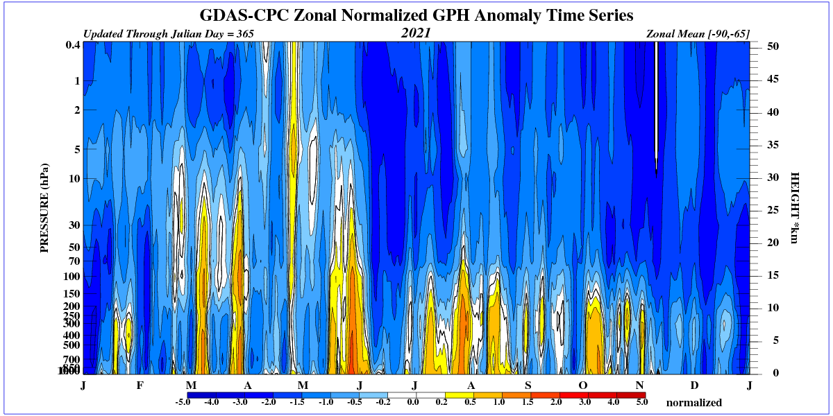
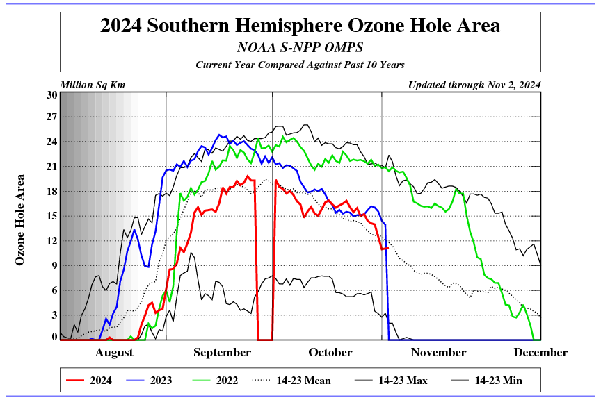
It will be different in the north when QBO goes negative in early 2022.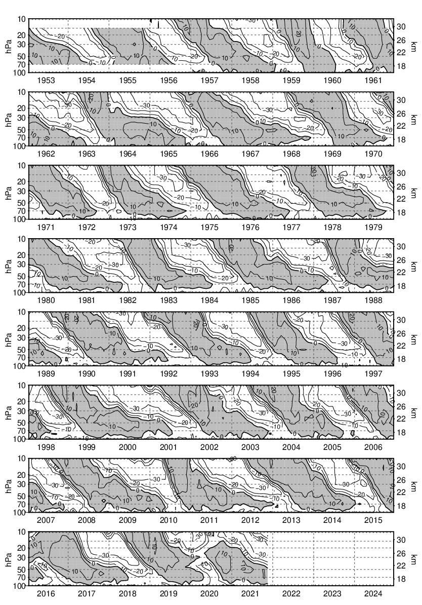
SST Anomaly Time Series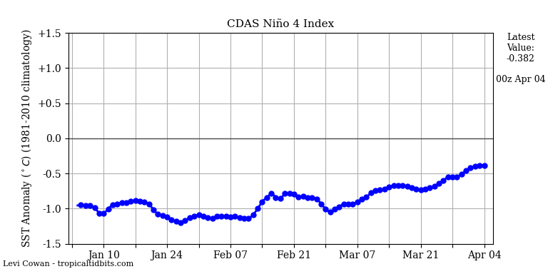
Current SST anomalies in the Pacific.
OMG it was the hottest September in the last 365 days! And October on track to do the same! We’ve got to do something!
Around October 12, Arctic air will fall into Europe and cause a dramatic drop in temperature and snowfall in the mountains.
https://i.ibb.co/XFV7ryY/hgt300.webp
Bookmarked!
ren’s predictions were until now up to 95 % wrong.
We’ll see. I don’t see much sun here.
https://earth.nullschool.net/#2021/10/12/0000Z/wind/isobaric/850hPa/overlay=temp/orthographic=-349.96,56.43,1490
That, ren, is the major problem with you.
You look into the wind and see … no sun.
How could it be otherwise?
Do I hear ankle biter barking ?