Guest Post by Willis Eschenbach
I see that there’s a new post up on WUWT claiming that eeevil humans are responsible for the increase in earth’s energy imbalance, which is denoted as ∆EEI in their paper. (The delta, “∆”, means “change in”.) The underlying paper discussed in the post is entitled Anthropogenic forcing and response yield observed positive trend in Earth’s energy imbalance
What do they base this claim of anthropogenic forcing on? Curiously, it’s not the usual claim that it’s due to CO2 absorbing more longwave. Instead, according to their press release, the cause is that:
…we are receiving the same amount of sunlight but reflecting back less, because increased greenhouse gases cause cloud cover changes, less aerosols in the air to reflect sunlight — that is, cleaner air over the U.S. and Europe — and sea-ice decreases.”
I’ve NEVER heard the claim that increased greenhouse gases cause “cloud changes”. How would they possibly know that?
Well, the same way they claim to know everything in their paper—haruspicy, except they use computer models instead of animals. They examine the entrails of climate models, and they compare them to the CERES and other satellite datasets. Color me unimpressed.
In any case, let’s take a closer look at their claims. They are correct that the CERES satellite dataset does indeed show an increasing imbalance. We can start by looking at the relative size of the imbalance. Figure 1 shows the actual size of the changes in incoming and outgoing energy, the two energy fluxes that are compared to give us the changes in Earth’s Energy Imbalance (∆EEI).

Figure 1. The earth receives and radiates about 240 watts per square meter (W/m2)on a globally averaged 24/7 basis.
As you can see, the change is quite small. It’s far less than one percent of the fluxes themselves.
Uncertainty
So … given the tiny size of the imbalance compared to the underlying energy fluxes, can the CERES dataset even be used for this question? As you might imagine, this question has been studied. From here we find:
However, the absolute accuracy requirement necessary to quantify Earth’s energy imbalance (EEI) is daunting. The EEI is a small residual of TOA flux terms on the order of 340 W m−2. EEI ranges between 0.5 and 1 W m−2 (von Schuckmann et al. 2016), roughly 0.15% of the total incoming and outgoing radiation at the TOA.
Given that the absolute uncertainty in solar irradiance alone is 0.13 W m−2 (Kopp and Lean 2011), constraining EEI to 50% of its mean (~0.25 W m−2) requires that the observed total outgoing radiation is known to be 0.2 W m−2, or 0.06%. The actual uncertainty for CERES resulting from calibration alone is 1% SW and 0.75% LW radiation [one standard deviation (1σ)], which corresponds to 2 W m−2, or 0.6% of the total TOA outgoing radiation. In addition, there are uncertainties resulting from radiance-to-flux conversion and time interpolation.
With the most recent CERES edition-4 instrument calibration improvements, the net imbalance from the standard CERES data products is approximately 4.3 W m−2, much larger than the expected EEI. This imbalance is problematic in applications that use ERB data for climate model evaluation, estimations of Earth’s annual global mean energy budget, and studies that infer meridional heat transports.
So that is the uncertainty in the imbalance … ± 4.3 W/m2. Makes determining the top-of-atmosphere (TOA) energy imbalance somewhat problematic, given that it is less than 1 W/m2 …
Then there’s the question of drift. Over time, satellites shift slightly in their orbits, instruments age, and reported values drift slowly over time. Basically, the authors of the paper just shine this on, in the following fashion:
Although there is excellent agreement between the individual satellites CERES derives its data from, there is, however, the potential for systematic errors associated with the observed trend due to instrument drift. We attach an estimate of 0.20 Wm−2decade−1 (assuming a normal distribution) to CERES trends, based on best realistic appraisals of observational uncertainty (N. Loeb, CERES Science Project Lead, personal communication)
Call me skeptical, but I find that far less than satisfying … seems to me that the CERES dataset is not at all fit for looking for the purpose of diagnosing trends of less than half a W/m2 per decade in the residual difference of two large values.
Data
Setting that large uncertainty aside, let’s look at the two datasets that make up the EEI. These are the top-of-atmosphere (TOA) outgoing longwave and incoming solar radiation. I often use “breakpoint analysis” to investigate what is going on. There’s a description of the breakpoint analysis functions that I use here. Figure 2 shows the breakpoint analysis of the outgoing longwave.
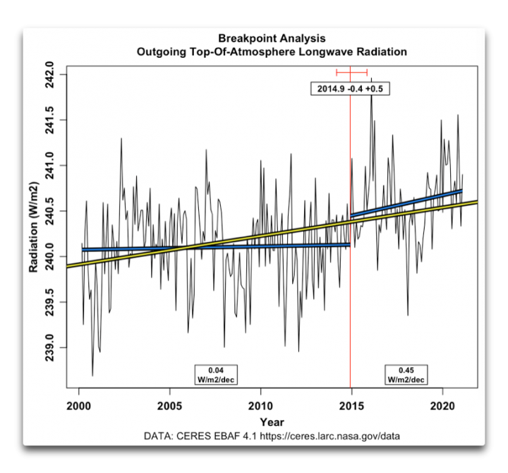
Figure 2. Breakpoint analysis, TOA longwave radiation. Blue lines show individual trends of sections of the data, yellow line shows the overall trend.
Now, this is interesting. Outgoing longwave runs basically level up until about 2015 (plus or minus about half a year), when there is a shift upwards combined with a rapidly increasing trend.
Why? I can’t guarantee that nobody knows … but that is certainly my belief. We can speculate, but cause and effect in the climate system are like sand in your hands …
How about the incoming solar? Figure 3 shows that result.
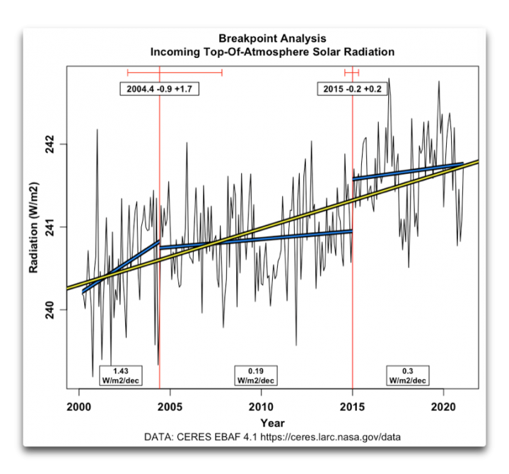
Figure 3. Breakpoint analysis, TOA solar (shortwave) radiation. Blue lines show individual trends of sections of the data, yellow line shows the overall trend.
This one is a bit more complex. Initially, incoming solar was increasing rapidly. Then it went level, followed by an upwards jump around 2015 (the same time as the jump in the longwave).
Why would the solar and the longwave fluxes both have breakpoints at the start of 2015? It may be related to the large 2015-2016 El Nino/La Nina … or it may not be related, given that there are more Nino/Nina alternations during the period of record, and given that the El Nino peak is not until the very end of 2015. It may be due to a change in instrumentation. Again, a very elusive question.
We can take a couple of other kinds of looks at the energy imbalance. First, here’s a graph showing both incoming and outgoing energy, along with LOWESS smooths of the two datasets.
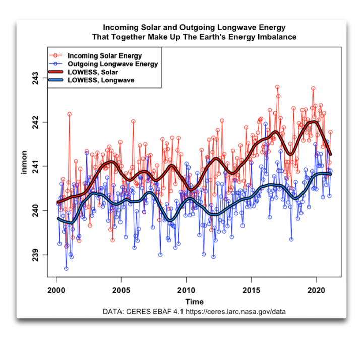
Figure 4. Same datasets as in Figure 1 but at a different scale, including LOWESS smooths of both datasets.
This is curious. At times the incoming and outgoing radiation fluxes move in harmony, and at other times they move in opposition. In particular, they move in harmony after the breakpoints in 2015. At a minimum, we can say that we are looking at some complex processes in both cases …
Finally, here’s the difference between the LOWESS smooths, which give the actual changes in the TOA earth energy imbalance (∆EEI). Figure 5 shows those changes.
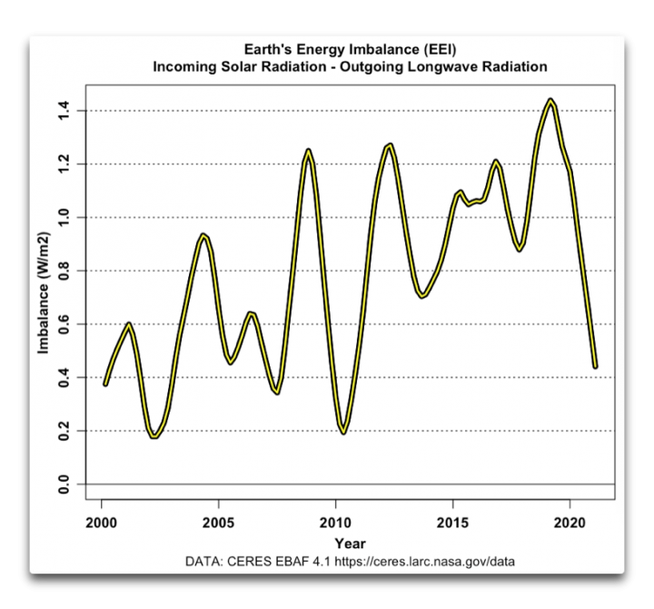
Figure 5. Earth’s Energy Imbalance, March 2000 – February 2021
Now, this is most interesting. The imbalance starts out at about 0.4 W/m2. Shortly thereafter, it drops to half of that amount. It then goes up, down, and back up to 1.2 W/m2 … before rapidly dropping all the way back to 0.2 W/m2. Then it jumps all the way back up to 1.2 W/m2, wanders around for a bit, goes up to a peak at 1.4 W/m2 … and then drops all the way down to about 0.4 W/m2. So it ends up right about where it started.
I’m sorry, but anyone claiming to see a “human fingerprint” in Figure 5 has curious fingers.
Let me close with a map showing the complexity of the overall energy imbalance.
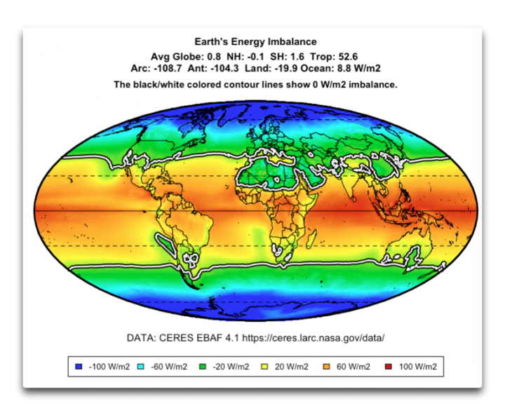
Figure 6. Energy imbalance at the top of the atmosphere, on a 1°latitude by 1° longitude basis.
Some things of note. The numbers involved are very large. In the tropics, there is much more solar energy entering the system than longwave energy leaving the system. The opposite is true near the poles, where far less solar energy enters the system than longwave energy leaving the system. This is an indication of the “advection”, the huge constantly ongoing horizontal movement of sensible and latent heat from the tropics to the poles. In addition, the ocean generally receives more solar energy than it loses in longwave, and the reverse is true for the land. This difference is visible, for example, around the Mediterranean.
Me, I find it highly unlikely that our instruments can determine the overall total of that to the nearest tenth of a watt per square meter … yes, that’s the answer we get, but the slightest error, the slightest drift in the system, the slightest shift in the line of zero imbalance, and we’d be out by much more than the imbalance itself, much less the even smaller change in the imbalance.
My best regards to everyone,
w.
Nota Bene: PLEASE quote the exact words that you are discussing. This makes it clear who and what you are talking about, which avoids much misunderstanding.
The map of the “energy imbalance” in Figure 6 is very telling. The energy imbalance can be upwards of +100 W/m2 in the tropical oceans, less than -100 W/m2 at more than 60 degrees latitude (north or south), and we’re supposed to be able to integrate this function over the entire globe and detect an overall imbalance of less than 1 W/m2, or less than 1% of the amplitude between the tropics and the poles? Lots of noise, not much signal!
On Figure 6, it’s also interesting that the subtropical deserts of the Sahara and Saudi Arabia have negative radiational energy balances (even though they can be extremely hot), while the more forested India, southeast Asia, and Mexico (at about the same latitude) have positive energy balances. This would tend to indicate that forests on tropical land tend to trap heat more than dry deserts.
Would this imply that if the Amazon valley were deforested, that area would have a negative energy balance, and lead to a cooling of the climate? I’m not recommending this, because the Amazon forest provides lots of oxygen for man and beast, but what about those who claim that deforestation of the Amazon is contributing to global warming?
Willis, thanks for wading through all the comments. There is much to be gleaned from your response. Given my lack of knowledge, I did a bit of digging. I came across this paper
Observational Evidence of Increasing Global Radiative Forcing (whiterose.ac.uk)
Why the graphs I wanted to attach don’t show up is beyond me. They are also measuring the TOA imbalances. They look at both LW and SW imbalances. Their conclusion is that increasing GHGs explain the imbalance. So many questions, but I am curious why the fact that the ENSO index has trended mostly positive during this period isn’t an equally good explanation. At least this paper seems to confirm that the .05 imbalance you report is the sum of the instantaneous imbalances through time.
I think the longwave explanation on greenhouse warming was abandoned many years ago among scientists with some insight. Even if it could have some small effect on distribution of energy and some warming of the lowest atmosphere. It was only the sunshine and the clouds that counted for global warming.
From Timothy Myers on radiation:
“Meteorological cloud radiative kernels quantify the response of top-of-atmosphere marine low cloud radiative effect to local large-scale meteorological perturbations. They were developed by Scott et al. (2020) and applied in Myers et al. (2021). These kernels are derived using cloud-controlling factor (CCF) analysis, which is based upon theoretical and high-resolution model evidence that marine boundary layer properties, including cloudiness, are predominantly determined by large-scale meteorological environmental factors. In our analysis, these CCFs include sea-surface temperature (SST), estimated inversion strength (EIS), horizontal surface temperature advection (Tadv), relative humidity at 700 hPa (RH700), vertical velocity at 700 hPa (ω700), and near-surface wind speed (WS).
The meteorological cloud radiative kernels are calculated by applying multi-linear regression of detrended interannual monthly anomalies of satellite-derived low cloud radiative flux onto anomalies in CCFs from a reanalysis and a standard SST dataset. The resulting coefficients are the meteorological kernels.
Four sets of meteorological kernels are available for download, each based on a different passive satellite dataset. For each set, the response of the radiative anomalies is the sum of shortwave and longwave radiative anomalies and further broken down into the total response, the response due to changes in low cloud amount, and the response due to changes in low cloud optical depth. The total radiative response is overwhelmingly dominated by shortwave radiative anomalies and the sum of changes in cloud amount and optical depth. The sign convention is such that a positive radiative anomaly is directed downward (i.e., causing planetary heating). The cloud radiative responses represent changes exclusively due to low-level clouds and not due to changes in upper-level clouds that may reveal or obscure low-level clouds. “
Facebook says this article goes against Community Standards…Hmmm!!!
“and sea-ice decreases” arctic sea ice insulates the ocean. The sae is much warmer than the air, ice prevents heat loss.
Even NOAA state this.
Energy out does not have to equal energy in if energy is ‘held’ in biomass.
Except for the blah, blah:
0.8 w/m2 is 0.8/1360 (-ish) times 100 amounts to a variation of ~0,059 percent.
But the argument of “imbalance” doesn’t hold up to the very first smell test: We are building a crust. Hence outgoing is higher than incoming. Always has been higher, always will be higher.
No need to take a closer look at their claims.
Oddgeir