Guest Post by Willis Eschenbach
I got into a discussion about polar sea ice in the comments to my post Where Is The Climate Emergency?. In the process I noticed some mysteries.
To start with, here’s the Arctic sea ice area record.

Figure 1. Sea ice area anomaly, Arctic
The mystery for me in this record is the decade from about 1998 to 2008. There’s very little month-to-month variation in the record over that period, and the ice area is dropping steadily … followed by ~ thirteen years of very large month-to-month variations with little overall change in ice area. Is this real? Is it an artifact? Unknown.
Then we have the Antarctic ice area record …
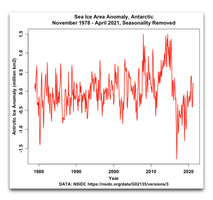
Figure 2. Antarctic ice area anomaly
Here, the obvious mystery is, just what the heck happened around 2015-2017 to cause the Antarctic ice area to drop so precipitously?
And finally, putting both poles together, we get the following:
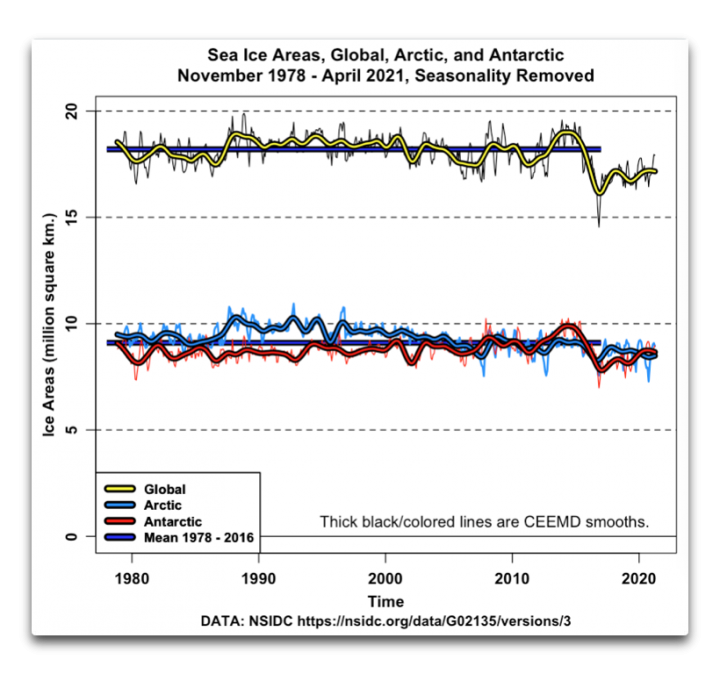
Figure 3. Global, Arctic, and Antarctic sea ice areas.
Figure 3 reveals a number of mysteries.
• There is no overall increase or decrease in total global sea ice for the entire ~ forty-year period from November 1978 until 2015 or so. This is despite increasing CO2 and general gradual global warming. Why?
• Up until 2015 or so, when the Arctic had more ice area, the Antarctic had less ice area, and vice versa. Why?
• Around 2015, after forty years of global ice stability, both Arctic and Antarctic ice areas dropped, leading to a very visible drop in global ice area. Why the drop, and why then and not earlier or later?
• After the drop, the global ice area seems to be starting to recover … again, why?
• At the North Pole, there is an ocean covered with sea ice. At the South Pole, there’s a high rocky plateau covered with land ice and surrounded by sea ice. Yet despite these totally different situations, the area of sea ice is almost exactly the same at both poles … say what?
Other than saying that equal ice areas at the poles MAY be a result of my hypothesis that the climate is a giant thermoregulated heat engine with a host of emergent phenomena that tend to stabilize the temperatures and equalize the hemispheres, I fear I have no answers to these curious polar questions … all comments welcome.
I will say that I am overjoyed that the world of climate contains far more mysteries than answers …
When nothing is for sure, we remain alert, perennially on our toes. It is more exciting not to know which bush the rabbit is hiding behind than to behave as though we knew everything.
—Carlos Castaneda, in The Teachings of Don Juan
My best to all adventurers in this most marvelous universe,
w.
You Might Have Heard This Before: I can defend my own words. I can’t defend your interpretation of my words, particularly when I don’t know what you’re referring to. So please, when you comment, quote the exact words you are discussing. Thanks.
As a 30 yr plus student, observer and teacher of environmental issues, including a stint at Columbia’s LDEO I work with key data that makes clear observable changes in the cryosphere. What makes sense to me and my colleagues is the general operating principles behind the noise and the kernals of truth.
Since you do not seem to define what you observe; i.e.sea ice cover, sea ice thickness, sea ice volume, etc. I can only conclude that you have wandered into the weeds. WUWT?
What is certain is that we’ve lost or are loosing every glacier except for two.(James Blalock); polar amplification occurred in the Arctic almost a decade ago, occurred in the Antarctic more recently; loss of permafrost (with release of methane) has been increasing exponentially for decades (International Permafrost Assoc, National Geographic); the Keeling Curve is consistently moving upward (currently at 419.4 with 350 ppm acknowledged as the safe upper limit (Scripps, DOE, etc.); sea levels are rising (NASA, European Space Agency, Chesapeake Bay Foundation, US Navy.)
It is well known that, as of now, there is no way to reverse this tipped point, along with nearly a dozen more. Recent research indicates humanity has less than a decade before significant die back (McPherson, etc.).
We would do best to immediately reduce carbon emissions starting with eliminating the 65% of energy waste, if only to buy time for the children. Listen to the chidren’s voices, including Greta Thunberg’s because they are the ONLY authorities in this matter. We adults who have screwed up everything have nothing much to contribute to the “solution” except for supporting the children. When your homes and businesses achieve net-zero CO2 status you may be worth listening to. Roll up your sleeves, shut up, and get to work as if our livs depend on it. THEY DO!
There is no way to reverse the tipping point but we have to reduce carbon emissions? Makes no sense.
Larry Menkes CSBA May 5, 2021 9:33 am
Since EVERY graph and EVERY caption in my post clearly says “Sea Ice Area“, I can only conclude that you are so hopelessly biased that you’ve gone blind.
As a result, I read no further. Guess what? I’m not interested in what a blind man says about how things look to him.
w.
Willis, I love how you go all Big Billy Goat Gruff on the troll living under the bridge.
P.S. I learned from William Happer that Gretta Thunberg is the great grand daughter of Svante Arrhenius. I know you don’t like videos but others may enjoy.
https://youtu.be/jIMpjh_7-bw
Hahaha, you had me for a while. Good parody — it can’t be serious, unless it’s a child’s post….
(You have been caught once again for sneaking in, you have been banned yet again) SUNMOD
You were as good as your word Willis. Published on the dot of 6 PM BST!
However you don’t seem to have addressed the main point I raised on the previous thread, so restating it slightly.
What do you suppose the effect of ice-albedo feedback will prove to be over the next 10 years or so? Or if you prefer over the last 10 years or so?
And why “remove the seasonality”. As you correctly pointed out over there, “When the ice is mostly there the sun mostly isn’t”.
Thanks, Jim. I just put it in the queue, and WordPress publishes it at the time specified. As to your questions:
1) The issue of ice-albedo feedback is a complex one. I keep telling myself I should look into it, but then life intervenes. Some of the complicating factors are:
a) Clouds tend to have about the same albedo as sea ice. So it’s not just the interplay between ice vs no ice, it’s also changes in clouds when there’s ice vs. changes in clouds when there’s no ice.
b) Clouds in the Arctic tend to warm the surface. This in turn tends to melt the ice.
c) Although evaporation is minimal near freezing, it still occurs. Ice cuts down on evaporative heat loss.
d) The ice surface can get much colder than the ocean surface.
e) On the other hand, ice tends to insulate the underlying water.
f) When there’s more ice there’s less sun, and vice versa. So the effect is not as great as it might appear at first sight.
g) At low sun angles, the ocean has high albedo. Think about looking out over the ocean towards the sun at sunrise or sunset …
You don’t get much more reflection than that off of sea ice, often less … and near the poles the sun angle is usually low.
h) Likely more complications … Willis’s Rule Of Climate states:
So as with much of climate, it’s far more complex than ice –> increased albedo –> cooling –> more ice …
2) I remove the seasonality because the wide summer-to-winter swings tend to obscure what’s happening.
w.
“b) Clouds in the Arctic tend to warm the surface. This in turn tends to melt the ice.”
Does this, by itself, disprove the hypothesis that solar+CO2 heating causes polar and glacial ice melt?
“g) At low sun angles, the ocean has high albedo. Think about looking out over the ocean towards the sun at sunrise or sunset …”
This effect is visible as early in the day as 3 p.m., even when viewed from cliffs well above sea level. A lot depends on the amount of chop, too.
“…ice tends to insulate the underlying water.”
Yes, this has been observed in ponds. So-called F1 largemouth bass, a mix of warm-loving Florida & cold tolerant Northern strains, survive cold winters better in ponds that freeze over. Not what was expected, but makes sense thermodynamically.
Question – I am curious as to why Jim Hunt has been banned. It was the interaction between Willis and Jim in the prior post Willis referenced that motivated Willis to create yet one more excellent post. While I may disagree with Jim, I find it odd that he has been banned.
(He was banned a long time ago, he had several chances to clean up his act but failed to heed the warnings) SUNMOD
Thanks for the clarification, SUNMOD, and much appreciation to you and all of the moderators for your excellent work. Because the reach of WUWT is worldwide, moderators are needed to cover all the time zones, and ALL of them are volunteers.
Couldn’t do it without y’all, thanks heaps.
w.
Thanks SUNMOD.
Also, Willis, did sea level jump at the same time as both polar ice masses dropped sharply. If not, where did the water go??
I have to say that I read every contribution you make with the greatest interest as you seem to have a mountain of common sense in your approaches to these issues. Please keep up the good work.
BJ in UK
The combined amount of meltwater, including the floating ice, is merely a drop in the ocean
(Pun intended)
By Archimedes principle, change in floating sea ice has NO impact on sea level. The two main SLR contributors are loss of Greenland and Antarctic ice sheet, and thermosteric rise. See the discussion in guest post here Sea Level Rise, Acceleration, and Closure.
Rud, there are three main contributors to sea level rise, not two. Aquifer extraction is already adding 0.6 mm to annual sea level rise and this is forecast to rise to 0.8mm. Given sea level rise of 2 mm per year, this means that aquifer extraction already makes up 30% of the rise in sea level.
https://www.nationalgeographic.com/news/2012/6/120531-groundwater-depletion-may-accelerate-sea-level-rise/
Surely aquifer extractionis leading to land subsidence not sea level rise ?
The water extracted from aquifers eventually finds its way to the oceans. This is not a controversial statement.
Here on our land and all the parcels around us, the water comes from a well, and most of it goes into a septic tank and then back into the aquifer …
w.
Willis, the scenario I am talking about is water being pumped from aquifers to irrigate crops, then the water is lost by evaporation to the atmosphere and then rain takes it into the ocean.
Thanks, Bill, but that’s NOT what you said. You made an unqualified statement that wasn’t true.
w.
Not sure about the Arctic but those one-two punches in Antarctica are not to be overlooked.
Record-low 2016 Antarctic sea ice was due to a ‘perfect storm’ of tropical, polar conditions – not ‘climate change’ – Watts Up With That?
Consider Blackjack players at a casino. Analysis of the anomaly of the player’s chips will show large variations. Analysis of the Casino’s income will show that it is quite steady. Prediction of the Casino’s income from the chip records of 2 players is impossible unless they play for a long long time with identical betting strategies. We only have 2 players, Arctic and Antarctica.
“…the climate is a giant thermoregulated heat engine with a host of emergent phenomena that tend to stabilize the temperatures and equalize the hemispheres…”
Considering the almost miraculous fact that the planet is a big rock moving through freezing space (2.7K ??)- with a flaming ball called the sun beaming down on us- and despite that not so promising scenario- the planet’s climate has been incredibly stable for billions of years. Stable enough for life to start and evolve- despite setbacks. So when I hear people cry that we’re in a climate emergency- I know I’m dealing with mass hysteria and mass panic. Then to top it off- they say we must spend countless trillions to fix the problem! The real emergency is this hysteria and panic. I think all these terrified people should relax, smoke a bowl, put on some nice mellow music and enjoy life. If they want to spend a lot of money- they can volunteer their own funds.
oops- I mean this as a reply to Willis- not DMacKenzie- but I don’t know how to cancel or move a comment
“…smoke a bowl…” and even if all the governments of all the world paid for the “bowl” of each of their citizens, it would total about 1/1000th the cost of their “Green New Deals” and “Infrastructure” bills and “renewables” and on and on and on!!! There’s an entitlement plan I could get behind… free grass for everybody as long as you forget all these $trillions in “transforming” and “build back better” and…
Perhaps some answers might be found using data prior to 1979. I find it hard to believe that 1979 is the start of the satellite record. The US has landed men on the moon 10 years prior, and had launched Pioneer 10, 11, Voyagers, and Viking to Mars before then. Surely someone had the bright idea to create Earth orbiting satellites well before 1979, and, you know, take some pictures.
https://seaice.uni-bremen.de/data/amsr2/today/extent_n_19720101-20191231_amsr2.txt
Starting 1972 – daily record
To complete the data
https://seaice.uni-bremen.de/data/amsr2/today/extent_n_2020_amsr2_smooth.txt
https://seaice.uni-bremen.de/data/amsr2/today/extent_n_2021_amsr2_smooth.txt
Willis will like this extension in years. I hope he will produce a graphic.
Thanks, Wim. I use ice area rather than ice extent. Ice extent just draws a dotted line around the furthest extension of sea ice away from the poles, and calculates the enclosed area.
However, there are frequent large areas poleward of that line that are ice-free. Ice area is a measure of the actual amount of the sea covered by the ice, and thus to me is a much more valid measure.
So I fear that extension doesn’t assist me.
Regards,
w.
Thanks Willis, I never realized the difference. Interesting. But what I wanted to say was that the Bremen data went further back: to 1972, adding some years that can have interesting information. Often is said that at the start of the satellite data (1979) the quantity of Arctic sea ice was at its top. I wonder what the Bremen data can add to the years from 1979.
One other factor rarely addressed: Sea ice area is a function of variable wind circulation patterns, not just temperature. The wind moves pack ice down wind. That ice accumulates as pressure ridges and thick ice that becomes multi year ice. It causes pack ice to move offshore, creating open water during freezing temperatures, leading to more net ice creation. Thus thick ice tends to accumulate in the gyre north of Greenland.
Yes, Parkinson also reported on satellite data of arctic ice back to 1973. Would you be surprised that this year’s maximum extent was higher than that of 1974? I didn’t think so.
What Grishna Gans said, and then there’s this: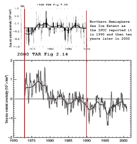
The IPCC increased the downward slope of the Northern sea ice over a ten year period as shown above. Later editions the IPCC’s assessment repots dropped the earlier data and started at 1979.
To quote an old ’50s TV show, “Will the real Sea Ice please stand up.
I can’t see it clearly, but the two graphs use different units on the Y axis.
I don’t understand why the two graphs are so different, unless the data have been “adjusted” to conform to the warming narrative.
The classified Corona satellite program was in operation in the 1960s, but I don’t know if anyone has looked at the de-classified imagery to see if Arctic ice was captured.
The first Landsat satellite was launched in 1972. Again, I don’t know if anyone has attempted to use the early imagery to map ice cover. There was typically an area of missing imagery over the poles.
I used to have big coffee table-type picture books of Landsat photograhs of the Earth.
Willis
This is a question about your methodology. In these plots you have used CEEMD smoothing, but in previous posts you have used LOWESS smoothing.
What aspect of a dataset determines the smoothing protocol?
Cheers from northwest Ontario.
Good question. While the results of the two methods are quite similar, CEEMD tends to be more faithful to the underlying data at the beginning and end of the dataset. However, it’s computationally slow, so unless that’s an issue, I often use LOWESS. A LOWESS smooth of this amount of data takes about a second on my computer, where a CEEMD analysis takes 5-10 minutes …
w.
Antarctic sea ice maximum, unconstrained by land, is higher than Arctic, and its minimum lower.
Since Antarctic sea ice extends to so much lower latitudes, its effect on albedo is far greater.
Arctic sea ice extent yesterday was higher than on that date in every year since 2014, with which it was about tied.
John Tillman: “Since Antarctic sea ice extends to so much lower latitudes, its effect on albedo is far greater”
WR. Correct.
Maximum sea-ice since 1979 was for the Arctic about 15.5 million km2 and for the Antarctic about 18.5 million km2. https://ads.nipr.ac.jp/vishop/#/extent
The Antarctic however has in the center of its 18.5 million km2 of sea ice another 14 million km2 of land-based ice sheet. So the total ice and snow area is about 32.5 million km2 maximum. Even when adding Greenland’s 1.7 million km2 to the total ice and snow area the Arctic’s total of 17.2 million km2 (maximum) is just a little bit more than half the Antarctic surface area. Indeed the Antarctic sea ice must reach much lower latitudes and affect more the albedo. But because of the much lower sun angle much less energy will be reflected than in the tropics. The same sunbeam spreads over a much larger surface area.
It seems that the insulating factor by sea ice plays a larger role than the reflecting one. At least for the Arctic, given the numbers above. Jim Steele had an interesting post about the heat loss of polar areas. From this post: https://wattsupwiththat.com/2020/01/02/when-warming-is-cooling/ the following:
“Heat a large covered pot of water. Measure the air temperature above the pot’s lid. If you don’t have a thermometer, simply hold your hand above the lid. Then remove the lid and feel the escaping heat. In a similar fashion, Arctic sea ice (and a surface layer of fresher water) act like the pot’s lid. Remove the ice and the air dramatically warms. Conversely, extensive ice-cover will cool the air but warm the underlying ocean.”
WR: The Southern Hemisphere is much colder than the Northern Hemisphere. Therefore the SH has far more ice coverage: to keep the ocean energy better conserved.
“The Southern Hemisphere is much colder than the Northern Hemisphere. Therefore the SH has far more ice coverage: to keep the ocean energy better conserved.” but which came first? Jim Steele said, “…Conversely, extensive ice-cover will cool the air but warm the underlying ocean….” so is the colder atmosphere a result of the greater ice cap area, or is there a greater ice cap area because of the colder temperatures? Is this one of those positive feedbacks the Warmunists are always looking for, but can’t exist or else this old Earth would not have been supporting Life for as long as it has? In other words, if this world’s climate has a “tipping point” it would have tipped a long time ago.
Well of course it has tipped, many times. Oscillating between stadials and interstadials. What I suppose you mean is that if it could tip toward out of control warming, it would have done so long ago?
Red94ViperRT10: “which came first?”
The oceans cooled first. See: https://wattsupwiththat.com/2018/06/15/how-the-earth-became-a-hothouse-by-h2o/ After the production of warm deep water stopped about 35 million years ago and the production of cold water became dominant, the oceans cooled and an ice cap could form over the Antarctic islands at the South Pole. The high ice cap resulted in a strong high-pressure area above the ice sheet, resulting in constantly descending air that found its way over the surface equatorward. The ice-cold descending air forms lots of sea ice on its trip to the north, aided by upwelling ice-cold Arctic water. That already ice-cold water surfaces because of the wind direction along the edge of the South Pole ice sheet in combination with Ekman forces that cause the deep water to come to the surface and flow to the North: perfect circumstances for the formation of a lot of sea-ice.
So it all started with cooling oceans, enabling an ice cap to form over the South Pole. And the resulting sea ice prevents the further cooling of polar oceans: sea ice is a stabilizing mechanism on the low range of [ocean] temperatures.
John who do u use for ur sea ice info / graphs …. I don’t think DMI is showing the same thing but I could be wrong … just curious who u use.
Thanks.
Compare with cooling clouds in the Pacific?
Simultaneous Arctic and Antarctic volcanoes? Unlikely.
Hot air out of DC? Miniscule.
Let’s ask the permafrost….
Cave deposits reveal Pleistocene permafrost thaw, absent predicted levels of CO2 release — ScienceDaily
You can also ask this tree stump.
I’m getting quite fond of that treestump. We do seem to be seeing an awful lot of him these days, don’t we?
Has a lot to add to the current discussion, I particularly like it’s opinion of the hockey stick.
Thanks Willis. Good stuff as usual, great even. The canary in the coal mine is still chirping, while the dead parrot is still being nailed to its perch frantically.
How’s the paper going?
“The Norwegian Blue prefers kippin’ on its back.”
Figure 3 plainly shows the global loss 2015-2017 was mainly Antarctica sea ice. I went to NSIDC and read their analysis, expecting a global warming claim of some sort. Nope, because not supported by any change in Antarctica winter surface air temperatures for the period.
They (NASA) said it was probably just ‘pushing the envelope’ of natural variability. Storms, winds, waves, overturning, …
In other words, even NASA admits sometimes stuff just happens. No macro explanation needed.
Super El Niño not followed by a strong La Niña, combined with weakened winds off the continent double-punched Antarctic sea ice in 2016:
https://www.sciencedaily.com/releases/2017/08/170831092650.htm
How is sea ice measured and have there been recent changes starting about 10 years ago? It would be entirely consistent for NOAA or NASA to do that just to show declining ice.
All sea ice is calculated using satellite sensors, computers and algorithms. It’s hard to tell between ice and clouds at times and just how do they come up with 15% coverage? Like everything else in “climate” it’s computer modeled, not fact.
Also hard to tell between open water and melt water on top of ice?
To your question about change in methods, not to my knowledge, NSIDC is different than MASIE different from DMI (Arctic). DMI did change their land mask resolution a few years ago, but they warn about that prominently in their data products.
Maybe there was strong deep ocean warming in 2015 caused by an undersea magma flow/eruption. The SS may not have been affected much if the heat went into melting ice? Just layman speculation here.
Perhaps the random errors [or variations from year to year] are just overwhelming the trend.
In Figures 1 and 2 you plot anomalies, but in Figure 3 you seem to plot the actual extents, although the y-axis [wrongly] says ‘anomalies’. Figure 3 shows that trends are not significant.
Thanks, Leif. All three figures are anomalies. The only difference is the scale.
w.
Look again at Figure 3. All values are positive. Anomalies would be a mix of negative and positive values. The global values the around 18 million km^2. This is clearly not an anomaly.
Sorry for the confusion, I see your point. Those are the anomalies shown in the other figures plus the mean of each dataset. I’ll be more careful with my labeling in the future. They should be labeled “data minus seasonal variation”.
w.
OK, I replaced the graphic with a new one. Thanks, Leif.
w.
May I add an observation, as an internet schlub in violent agreement with much I read here.
A proponent offered up data and some thoughts
A reviewer pointed out issues with the data
The proponent graciously accepted their mistake and corrected it.
“Science”, as I have come to understand it.
What would our world look like if a Michael Mann had learned this basic lesson a quarter century ago?
When your “science” has a cause, and you exclude people from analysing your “study” because you feel they don’t support your “cause”, then its not science that you are doing. It’s promoting an agenda.
Science has no agenda other than to falsify hypotheses. Period.
from about 1998 to 2008
≠=======
That was the super el nino, the start of The Pause.
Unfortunately the record is so short only one such event has been captured so you cannot rule out sensor failure.
Alternatively, the decade of decreased variability suggests that Arctic wind patterns were significantly more regular for the decade following the super el nino, perhaps as a emergent mechanism to dump heat to the arctic and thus to space.
from about 1998 to 2008
========
The 1998 super el nino released significant heat into the Pacific. This increased the convection towards the equator which was carried poleward at altitude.
Eventually this increased volume of warmer than normal air descended at the poles, when it reduced the variabilily in the low altitude polar winds and thus reduced polar ice over time. This reduction would be due to warming and outgoing winds carrying sea ice out of the arctic to lower latitudes.
This emergent phenomenon, apparent in the reduced variability in the arctic sea ice, continued for a period of about 10 years until the extra heat from the super el nino had been fully radiated to space.
from about 1998 to 2008
≠======!
At a guess. The arctic and antarctic ice are out of phase because of geography. When el nino causes increased convection towards the equator the resulting increased outgoing low altitude winds in the north pole carry ice out of the arctic ocean reducing sea ice.
In the antarctic the increased outgoing low altitude winds cannot carry away the land ice. Instead the winds carry the extremely cold antarctic temperatures further out to sea than normal, increasing the area of antarctic sea ice.
Is a clue to the answer hidden in the terminology?
First, you present records of sea ice: “…here’s the Arctic sea ice area record.”
Aren’t these records estimates that are subject to adjustments, or instrument changes? The record is not the reality.
After presenting the records, you switch to calling the records “total global sea ice”.
Are the records actual measurements, stable and accurate over decades, of total global sea ice?
It would seem that a more fruitful avenue of exploration would be consider why the records show the fluctuations you describe.
Isn’t it possible that the records do not reflect the reality of sea ice?
These records are too short to be able to draw meaningful conclusions.
What was the ice doing since 1900? No one really knows although there is historical news articles suggesting a loss of ice at times. What was the ice doing from 1950 to 1978? That would be very interesting to know as I suspect the ice was building up until at least the mid-1970’s.
Without any of this historic data, you cannot match it up against CO2 emissions – which in themselves are suspect until 1957. All you can do is use proxies which people interpret however is most convenient to their bias.
I suspect the sea ice may be growing for a few years… It’s just a hunch, not scientific, but if it does it will be fun to watch the clowns trying to cover it up or explain it away.
Cannot speak to Antarctic sea ice, but can for the Arctic sea ice extent back to about 1900–qualitatively, not quantitatively. Extensive analysis in illustrated essay Northwest Passage in ebook Blowing Smoke. There is something like an about 50 year full cycle qualitatively, presently in an upswing.
Maybe,
because the global energy load shed to space, is the same for both regions at the point in time.
The polar regions!
Maybe.
cheers
Just a clarification.
Apologies Rud.
My comment reply to you was meant, intended, as only a stand alone comment… not a reply to your comment.
Sorry.
For as long as that still ok with you, will be fine for me too.
🙂
cheers
The ice in the Arctic was certainly doing something in the early 20thC. Hubert Lamb notes that
“In Spitsbergen the open season for shipping at the coal port lengthened from three months in the years before 1920 to over seven months of the year by the late 1930s. The average total area of the Arctic sea ice seems to have declined by between 10 and 20 per cent over that time.”
Climate, History and the Modern World p260
Why does anyone believe anything that comes out of NASA these days.
What about the integrity of the instruments being used, we know there have been problems before.
NASA uses reflected microwave signatures to distinguish ice from water. This works fine in winter. It doesn’t in summer, when melt water can pool on top of ice ‘fooling’ the sensors. I explained with many illustrations in the aforementioned essay Northwest Passage.
That is current and started at a particular place in time.
Before that, they used whatever pieces of information they could locate.
“There’s very little month-to-month variation in the record over that period”
.
Figure 1 does not have enough resolution for you to see any “month to month” variation.
The month-to-month variation is visibly larger in the time before and after that period, so I have no idea what you’re meaning might be.
w.
polarportal.dk/fileadmin/polarportal/sea/SICE_curve_extent_LA_DK_20210503.png
Here You can see the narrow band month to month year from year.
I am also surprised of the grey area. It cant be the same method used.
The Ice Albedo Theory….
The Arctic and Antarctic are very different, because all the land masses and industry are in the northern hemisphere. That is why EVERY interglacial warming era is associated with a northern Great Summer (a northern Milankovitch Maximum) rather than a southern one. The poles are polar-opposites.
So what if Arctic sea-ice extent is actually governed more by industrial soot and the resulting lower ice-sheet albedo, rather then CO2? If this were true, then Arctic ice would have decreased after about 1995, when China started pumping out industrial smog. But Antarctica would not be effected by this.
And this is exactly what we see in the data-record.
And if you want to see what China’s industry has done to the Arctic, do a search for ‘Dark Ice Project’ website.
https://www.darkiceproject.com
Hmm, 404, site not found. Why is that?
Oh, yes, it is because the Dark Ice Project never did get a government ir educational grant, and was privately crowd-funded – because they had the audacity to never mention CO2. That is the state of modern ‘science’ – you are de-funded if you do not follow the consensus.
Unfortunately, most of rhe Dark Ice images have gone from the web too. So take a look at this article instead.
https://ensia.com/features/black-carbon
Ralph
Willis, could the problem be either or a combination of the following?
1) Satellite change
2) Sensor change over
3) Algorithm change
4) Model change
5) Team membership change
You work spotting the sea level satellite change was excellent.
Not Willis, but know some answers to your questions. Satellites have changed, but the MSU sensors have not. NSIDC pixel level MSU processing algorithms have not changed. NSIDC does not use a model—that is MASIE, aimed at near icefield ship navigation at 30% ice (if I recall correctly). The NSIDC team naturally has had some turnover over now 4 decades, but it is surprisingly slow because government job sinecures. First three points are illustrated in essay Northwest Passage, with footnote references.
Same sensors over four decades?
Seriously?
From a systems level, I find that claim difficult to accept.
Even bottom level junk cameras greatly improved sensors during that span and prices were less than for the older equipment.
Considering satellite launches where every gram is counts, it would be absurd to believe designers refused to upgrade their sensors.
Failure to update program processing, I do believe. Many in government facilities are loathe to move to newer code and compilers.
Satellites have changed…
That is, the equipment itself changed. New sensors, new optics, new satellite in likely a new orbit, new transmission equipment and likely faster transmission speeds, possibly newer transmission algorithms.
Once again, another climate related fiasco that pretends data sources are linear where equipment processing is joined.
Are you going to tell us that all received data is still stored on sequential magnetic tape reels? The storage media of choice circa 1978?
No, likely the data storage and retrieval systems were updated as well as the computing systems themselves.
Every active component in a data stream is a source for error.
NASA, NOAA, NSIDC all have bad habits where errors are not identified or aggregated. Let alone errors caused by new equipment, new computational systems, new transmissions, new storage systems, new visual systems, etc.
“There is no overall increase or decrease in total global sea ice for the entire ~ forty-year period from November 1978 until 2015 or so.”
Willis, JAXA mark that period down as a net loss of about 2 million km², if I’ve read it right.
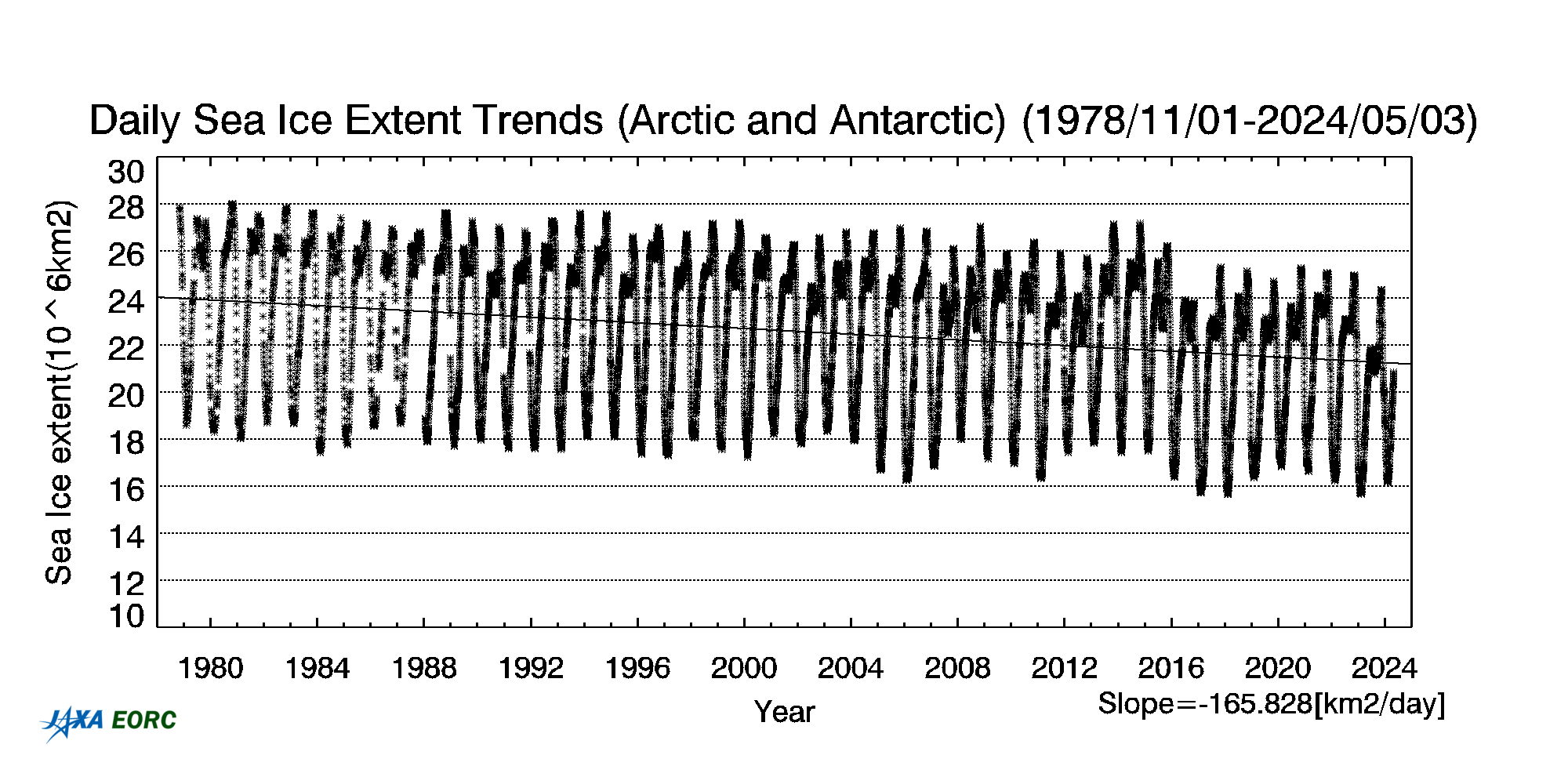
They’re looking at ice extent, and I’m looking at ice area, which are quite different. Also, different groups have different measurements.
w.
Doh! apologises, that completely passed me by, so used to looking at extent.
One thing I would do is link the to polar areas with a 6 month offset and see what the yearly change really is. I am not sure this would show anything, just that I would compare winter with winter and summer with summer.