By Christopher Monckton of Brenchley

The miniature La Niña that has recently ended is now working its magic on lower-troposphere temperatures. The UAH monthly global mean lower-troposphere anomalies for April 2021 show a further drop, lengthening the New Pause by two months, from 5 years 10 months last month to 6 years this month.
The HadCRUT4 data show no warming in the 6 years 9 months May 2014 to January 2021, and there has been no update since January. Though HadCRUT is usually tardy, it is not usually this late. However, it does provide error-bars, which are shown here:

It is likely that the temperature anomalies will remain below the trend-line for another month or two, lengthening the New Pause still further. It will be interesting to see how long the Pause becomes by the time of the Glasgow climate gabfest in the autumn.
See? Told ya. Step 1 in the Warmunists arsenal is to “Deny the Pause”. How long before the “dog-ate-my-global-warming excuses start?
The HadCRUT on the graph above ends in January 2021, but the UAH data through March shows further declines since January 2021, and April has been unusually cold in the USA and Europe.
We’re probably looking at cyclical fluctuations around a constant mean, with peaks in early 2016 and early 2020, and troughs in early 2018 and (so far) 2021.
Hi Christopher,
I’ve been idly perusing recent articles here whilst I await Willis’s new post, and then I stumbled upon this one.
I instantly raced over to Wood for Trees, and came up with this graph. How do you explain the differences from your own?
Clearly, you do not understand what a Pause is, how it is generated, or what it means. It is not a trend, nor does it claim to be one. At this point, it is just a Baby Pause, and only of interest because of the prospect that it very likely will lengthen. Just how long it will get to be is anyone’s guess. But suffice it to say, the longer it gets, the more nervous the Alarmists will get. I think that a good break point would be a length of 20 years. Then, the Alarmists will really have their knickers in a twist, which will be fun.
The real point is that CO2 IS NOT a control knob for temperature. Ruining economies in search of ways to reduce CO2 in order to prevent CAGW is a waste of time and money.
There are other things involved than just CO2 and we have wasted 30+ years trying to prove that CO2 is the only culprit.
The graph you have shown is for a period longer than 6 years. Didn’t you read the original article?
Bill – I read the original article. Did you?
It said “The HadCRUT4 data show no warming in the 6 years 9 months May 2014 to January 2021”
Bruce – The HadCRUT4 graph above includes a trend line. Can you see it?
Jim Hunt – once again you don’t understand the meaning of the word BANNED – you used another email and url to get around moderation. You even gloat about it.
“N.B. I am delighted to discover that my comment “Awaiting for approval” earlier today has now somehow slipped past Anthony’s eagle eyed mods and emerged into the cold light of day at WUWT!”
You and “blowtorch Reggie” were in cahoots over that at the Arctic discussion sewer known as The Great White Con and I had the police show up at his door due to his continued harassments and threats. You egged him on by allowing his insane comments about me at your website.
I don’t know how I can say this any clearer: Get the hell off my website and stay off. In Brit parlance: BUGGER OFF!
Also, for the record, your Woodfortrees comparison is irrelevant – different time period. It just goes to show that you are either ignorant, trolling, or both. Either way, I don’t care.
Any further comments from you will be deleted.
So? He merely uses the HadCRUT4 graph to show the Pause. No claim about a trend is made, because that isn’t what the Pause is about. With the previous Pause, the Alarmists eventually became more and more desperate as the Pause grew longer and longer, as it threatened the CO2 control knob ideology.
Thanks for this Christopher,
These updates are valuable in pointing out that the temperature is not following carbon dioxide in the short term, but more importantly they illustrate the inanity of this kind of “science”, if you want to call it that, by the comments you elicit.
It reminds me of another post I read about vaccinations in Chile.
An initial commenter asserted that the national vaccination campaign was effective because the number of active cases had fallen by 10% over the last week and that the crisis was abating.
Then a second commenter objected, adding: that it you look at the last two days, active cases are up by 8.5% proving the ineffective nature of the vaccines and that the crisis was getting worse.
The first commenter asserted that the second commenters observations were invalid, because you needed at least a week to make that kind of determination.
Then a third commenter jumped in (using the “at least” opening) and stated that if you looked at the figures from November 2020 (~8000) and compared them to the current numbers (~40,000), active cases have increased by 500% !
I can’t even remember what the first commenter objected to about that… but you get my point and it is analogous to what is going on with climate change.
—–
I think your post really zeros on one of the greatest fissures in the whole CAGW movement, that of the “fixed time frame”. And shows that the claims are on “very thin ice”, being completely dependent on the time frame selected. Hence, the objections to your post… and the need for CAGW proponents to “flatten out” Eras like the Medieval Warm Period and Little Ice Age, etc… (lol)
Keep stirring the pot !!! …and with luck this pause will go on long enough to throw another spanner in the works and force another binge of temperature record adjustments. (lol)
This is (more) cherry-picking.
(a) month-to-month changes in rate of increase are pretty meaningless when assessing climate change. Also, a reason this graph in in a blog post on a denier website, rather than, say, on FoxNews, et al. is that the Man On The Street does not understand 2nd derivatives.
(b) The starting date of the graph is the reddest of the cherries picked in this post. It is basically the day after years of dramatic increases (measured year-to-year, rather than month-to-month.
such bald exploitation of cognitive biases and population innumeracy, it seems to me, is detrimental to the author’s motive to demonstrate – yet again and again invalidly – “empirically” (yes, those are “scare quote” :-)) that Global Warming is going away.
suggest the author stick with sun spots, coronal mass ejections, and other red herrings that are harder to see through.
cheers!
The reason this article is not on msm is because the science is settled, but you knew that right ,any opposing view is censored .the starting date of the graph shows a cooling trend within a larger data set ,we have data sets in temperature readings to see if there are any changes, thats the point right, seems to me you just don’t like the fact that warming is not linear, temperature is not following co2 rises , sorry if that bursts your AGW bubble , your tone is desperate your writing is patronizing , overall a pretty pore attempt at dissuading anyone who reads your post,
What is MSM? I see that a lot but I’m not sure what it is?
Edit – Never mind, I figured it out. Main stream media. So you only believe Fox news? Or maybe only Q?
Not really a intelligent, comprehensive reply is it,
Perhaps. But then it’s pretty much par for the course on this denialist site.
There no perhaps about it ,,care to explain what a denialist is.
Mr Tillinghurst should mind his language. The word “denialist” is unacceptable and, in countries with hate-speech laws (soon to be joined by the United Wokes of America), it is prosecutable. Must try harder. Perhaps think of some scientific arguments in support of the Party Line.
Another resident of Wokeastan shows itself.
“Chris” appears terrified by the notion that global warming is not happening as fast as had originally been predicted by the profiteers of doom. Well, he had better get used to it. This new Pause may lengthen quite a bit more.
Due to the strong south polar vortex, it is unlikely that the temperature of the Peruvian Current will increase.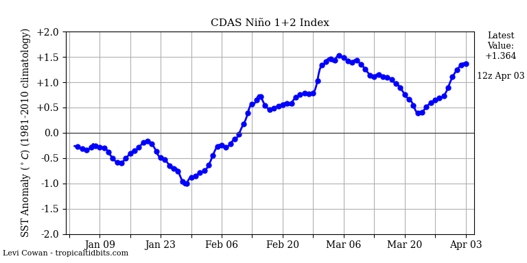
http://ds.data.jma.go.jp/tcc/tcc/products/clisys/STRAT/gif/pole10_sh.gif
Given the recent conditions, is this good news for Peruvian anchovy fishing?
The anchovies are certainly happy.
The global temperature is the lowest it has been in 6+ years
Rate of change of CO2 still tracking temp anomaly.
This is a time series is it not? Have you detrended each to see if the changing variables track each other? In essence do a first derivative to evaluate how well they track! I think you’ll find that either the changes are not coherent, or more likely that a rise in CO2 consistently follows a rise in temperature.
Of course CO2 lags. Because this is a plot of the rate of change of CO2 and temperature anomaly. That means CO2 is lagging temperature by 90 deg of phase. Which indicates that temperature is the cause, and CO2 is the effect.
Mr. Monckton why is your pause sandwiched between warmings?
Looks terribly like a pause to me.
Poor, desperate Weekly_Rise does not appreciate that in a staircase if the runs are longer than the rises the gradient will be small, and the longer the runs and the shorter the rises the smaller the gradient. The rate at which the world is warming is about a third of what had been predicted. There is a reason for that.
Interesting to see no warming in the tropics.
My prediction is that next month will see the pause starting in March 2015, for a length of 6 years 3 months, with a 5 month overlap of the two pauses.
This will be the case if May 2021’s anomaly is between -0.19 and 0.00°C.