Reposted from Dr. Roy Spencer’s Blog
April 2nd, 2021 by Roy W. Spencer, Ph. D.

The Version 6.0 global average lower tropospheric temperature (LT) anomaly for March, 2021 was -0.01 deg. C, down substantially from the February, 2021 value of +0.20 deg. C.
REMINDER: We have changed the 30-year averaging period from which we compute anomalies to 1991-2020, from the old period 1981-2010. This change does not affect the temperature trends.
Right on time, the maximum impact from the current La Nina is finally being felt on global tropospheric temperatures. The global average oceanic tropospheric temperature anomaly is -0.07 deg. C, the lowest since November 2013. The tropical (20N-20S) departure from average (-0.29 deg. C) is the coolest since June of 2012. Australia is the coolest (-0.79 deg. C) since August 2014.
The linear warming trend since January, 1979 remains at +0.14 C/decade (+0.12 C/decade over the global-averaged oceans, and +0.18 C/decade over global-averaged land).
Various regional LT departures from the 30-year (1991-2020) average for the last 15 months are:
YEAR MO GLOBE NHEM. SHEM. TROPIC USA48 ARCTIC AUST
2020 01  0.42  0.44  0.41  0.52  0.57 -0.22  0.41
2020 02  0.59  0.74  0.45  0.63  0.17 -0.27  0.20
2020 03  0.35  0.42  0.28  0.53  0.81 -0.96 -0.04
2020 04  0.26  0.26  0.25  0.35 -0.70  0.63  0.78
2020 05  0.42  0.43  0.41  0.53  0.07  0.83 -0.20
2020 06  0.30  0.29  0.30  0.31  0.26  0.54  0.97
2020 07  0.31  0.31  0.31  0.28  0.44  0.26  0.26
2020 08  0.30  0.34  0.26  0.45  0.35  0.30  0.25
2020 09  0.40  0.41  0.39  0.29  0.69  0.24  0.64
2020 10  0.38  0.53  0.22  0.24  0.86  0.95 -0.01
2020 11  0.40  0.52  0.27  0.17  1.45  1.09  1.28
2020 12  0.15  0.08  0.22 -0.07  0.29  0.43  0.13
2021 01  0.12  0.34 -0.09 -0.08  0.36  0.49 -0.52
2021 02  0.20  0.32  0.08 -0.14 -0.66  0.07 -0.27
2021 03 -0.01  0.12 -0.14 -0.29  0.59 -0.79 -0.79
The full UAH Global Temperature Report, along with the LT global gridpoint anomaly image for March, 2021 should be available within the next few days here.
The global and regional monthly anomalies for the various atmospheric layers we monitor should be available in the next few days at the following locations:
Lower Troposphere: http://vortex.nsstc.uah.edu/data/msu/v6.0/tlt/uahncdc_lt_6.0.txt
Mid-Troposphere: http://vortex.nsstc.uah.edu/data/msu/v6.0/tmt/uahncdc_mt_6.0.txt
Tropopause: http://vortex.nsstc.uah.edu/data/msu/v6.0/ttp/uahncdc_tp_6.0.txt
Lower Stratosphere: http://vortex.nsstc.uah.edu/data/msu/v6.0/tls/uahncdc_ls_6.0.txt
The global temperature seems to go up in a stepwise manner with El Ninos. I’m guessing that when it starts going down, it will be in a stepwise manner with La Ninas. I think we’re overdue for that.
La Niña finally kicked in last month.
commieBob, a La Nina is not the opposite of an El Nino.
The overall process of ENSO acts as a chaotic, sunlight flued, recharge-discharge oscillator. With El Nino events acting as the discharge phase and La Nina events acting as the recharge phase.
For further info, see the post here from a little over 2 years ago:
Does The Climate-Science Industry Purposely Ignore A Simple Aspect of Strong El Niño Events That Causes Long-Term Global Warming? | Bob Tisdale – Climate Observations (wordpress.com)
Or the WUWT cross post here:
https://wattsupwiththat.com/2019/01/20/does-the-climate-science-industry-purposely-ignore-a-simple-aspect-of-strong-el-nino-events-that-causes-long-term-global-warming/
Regards,
Bob
So how do you see the temperature going down?
El Niño releases the heat.
Bob’s overall ENSO analysis is correct but fails to sufficiently consider any longer term drift in the relationship between La Nina and El Nino events.
My contention is that global cloudiness variations will alter that balance.
So, if global cloudiness reduces then El Ninos will dominate and one sees a stepwise increase in global temperatures from one ENSO cycle to the next.
If global cloudiness increases then La Ninas will dominate and one will see a stepwise decrease from one ENSO to the next.
Currently, the system is finely balanced and possibly on the turn.
Changes in global cloudiness appear to be solar induced via changes in the balance of ozone creation / destruction above 45km and over the poles:
https://joannenova.com.au/2015/01/is-the-sun-driving-ozone-and-changing-the-climate/
In order to test my hypothesis we need to see a longer period of solar inactivity sufficient to create La Nina dominance and thereby produce a downward step.
I have been pushing the idea for some time that the ENSO responds to changes in sunspots and in which hemisphere of the sun is sunspot dominant. Today’s picture is interesting. The last of the northern sunspots have disappeared around the eastern limb of the sun. At the same time southern sunspots are just about to face the earth in the next day or so. As a result of the southern sunspots appearing the ENSO temps stopped dropping today as shown on TT’s chart. …
Stephen: I think you said it well. I read Bob’s book, and he went into a lot of detail about la nina, and cooler water–> less evaporation, fewer clouds, more heating etc… There’s a loyt more there and I think it’s perhaps the best source for understanding where the heat went!
If there were good measurements of overall cloud formation overlaid with the supercharging effects of ENSO, I could imagine we’d learn something new.
Solar “activity” has nothing to do w/ENSO.
I know that it is all coincidental, but the coincidences never seem to stop. Anyone can watch this for themselves.
That is correct. But its effect is controlled by the amount of dimming aerosol pollution in the atmosphere.
You may as well claim that the sun has no effect on the planet through the course of the day.
The La Nina isn’t that strong yet really anyway. I guess one could argue that they are not opposites despite the fact that one is characterized by warmer surface water and the other by colder surface water in the eastern Pacific. And the effects on various areas are the opposite. And one portends a good Anchovy harvest an the other a poor Anchovy harvest.
Bob Tisdale:
La Ninas and El Ninos are random events primarily caused by volcanic eruptions. Every volcanic eruption of VEI4 or larger, will cause a La Nina, unless it erupts during an El Nino .Its maximum cooling effect usually occurs 12-18 months after the eruption, as its SO2 aerosols circulate around the globe.
These aerosols eventually settle out of the atmosphere, after about 18-30 months, and form an El Nino, because the descending aerosols flush out other existing aerosols in the atmosphere, increasing insolation.,
Industrial SO2 aerosols have the same effect. If they increase, temperatures decrease, and if they decrease, temperatures increase. (Temperatures being average anomalous global temperatures) .
These events are superimposed upon a rising background of decreased industrial SO2 emissions (and hence, rising temperatures) caused by global Clean Air efforts..
This is the origin of your “steps”, which really do not exist
For your further enlightenment, see
http://www.skepticmedpublishers.com/article-in-press-journal-of-earth-science-and-climatic-change/
.
Wow! Seems volcanic eruptions are as regular as clockwork!
Thankfully, yes. Keeps temperatures “bearable; If they are separated by more than about 3 years, temperatures start to spike..
I disagree with your volcanism hypothesis. I suspect, but cannot prove that El Nino events are mostly precipitated by the slackening of the large, haline-density forced cold current that upwells along the Peruvian coast, which means that the amount of very heavy, very salty water that’s sinking below the Southern Ocean due to sea ice formation around Antarctica is lower than usual. Or at least happening in the “wrong” portions of the Southern Ocean for a stronger current… I wish someone would attempt to measure the strength and volume and temperatures of that current with actual instruments. It’s clearly a very difficult thing to do. I’m not too interested in anyone’s statistical proxies of the current’s strength, other than perhaps a long term record of the fishing failures extracted from Peruvian fishermen that can be directly attributed to failure of the up-welling.
I am NOT offering a hypothesis. My graphs are of factual data.
Especially note Figure 2, which shows that every volcanic eruption not during an El Nino causes a La Nina. .
You’re claiming causality where you have only a weak, and I would say VERY weak correlation. I guess I agree that that level of presumption doesn’t even rise to the level of a scientific hypothesis. A hypothesis is, after all, a statement that can actually be attacked by scientific experiments that attempt to falsify. Your graphs are, IMO so much sophistical nonsense, just like the output of CMIP climate models.
Micky Reno:
A weak correlation? Are you blind? Between 1850 and the present, every observable decrease in atmospheric SO2 aerosol levels, of either volcanic or industrial origin, resulted in a temperature increase. And vice versa.
That is 100% correlation.
And every instance is effectively .a scientific attempt at falsification, with no instances of the hypothesis not being correct.. ,
There is always an El Nino at the end of a La Nina
Yes, as I have ALWAYS maintained, although there are rare exceptions, as when another eruption occurs before the El Nino has a chance to form.,
ENSO and IOD are clearly lead by atmospheric convection oscillations. If anyone wants to understand the ocean oscillations they need to start by finding out why the convection cells oscillate.
LOL.First, ENSO is caused by sunspots, and now by volcanoes? It’s caused by ocean energy balancing/rebalancing by distribution/redistribution of currents.
“Ocean energy ”
??. What is that?
ENSO is the oceanic response to changing amounts of incoming solar radiation.
You don’t understand that??? Obviously, ocean energy refers to the heat it contains.
Really? The only energy that it contains is what is absorbed from solar radiation.
Burl, you said the other day that the reason it gets real hot underneath a high-pressure system is because the aerosols settle out of the dome of air contained within the high-pressure system, which in turn allows more sunlight to penetrate into the high-pressure dome and this is the cause of the temperatures being hotter inside the high-pressure dome than outside the high-pressure dome.
I’m wondering if this “settling out” has been measured in this context, and I’m wondering what is the difference between the settling out of aerosols and natural or human sources adding aerosols at the same time?
Tom Abbott:
No, there have been no intentional measurements of SO2 aerosols within high pressure areas that I am aware of.
But it might be a good question to pose to Research Gate.
However, nullschool images of global wind directions do show stalled high pressure weather systems. If a large one is identified within one of the SO2 monitoring satellite “boxes” , it might be possible to compare SO2 levels within that area, with another area, since the amount of SO2 observed is given for each box.
I know of no other aerosols with a similar dimming effect that might interfere with the SO2 settling out process.
Thanks, Burl.
Bob, you’re too modest – weren’t you talking about this ten years ago on here? Well maybe 8 or so, I can’t remember exactly.
Can we pretend it was only 2 years ago otherwise time passes worryingly quickly!
tonyb
It has been 13 years since I started reading climate related material. It does seem like it was just a few years ago when I started down this path.
The overall process is driven by oscillations in atmospheric convection cells near Indonesia. The convection cells are reversed during the positive and negative phases, I’d call them opposites of each other. No one is sure what causes the oscillations in convection but I’m pretty sure the cart is not pushing the horse.
The steps are there all right, but maybe we are coming down from the last one.
 ?w=1000
https://rclutz.com/2021/02/27/updated-global-warming-ends-2021/
Here’s the UAH results updated to March 2021

Ron… what is link to the above UAH graph? What is the 0 baseline T in °C?
UAH is now using 1991-2020 baseline mean global T. The previous 1981-2010 baseline was 14.3°C per PD Jones. I can’t find the new baseline T° on Google.
UV, I have never found UAH baselines in absolute C.
UV a more complete response to your question. The graph simply shows the UAH monthly reported anomalies since 01/1995 according to the current baseline. When the new baseline became 01/1991 to 12/2020, the baseline anomaly for each month was averaged for that period and set to zero C. AFAIK The satellites are inferring temperature changes from microwave readings of oxygen, and do not attempt to estimate what a thermometer would read were it to be suspended in the sky. The mean temp in graph is close to zero since it is nearly the same as the current baseline period.
I did find a P.D. Jones paper online saying 1981-2010 global baseline was 14.3°C. But can’t find the 1991-2020 baseline.
Link to paper… scroll down about 15% to paragraph beginning in “Surprisingly,…”
https://www.realclimate.org/index.php/archives/2017/08/observations-reanalyses-and-the-elusive-absolute-global-mean-temperature/
UV, following your link I see an article at RealClimate talking exclusively about surface station datasets, which use as raw data absolute temperature readings at particular locations. Since temperature is an intrinsic quality of objects, temperatures themselves cannot be averaged. You can only deal statistically with a derivative of temperature, of which one example is “anomaly”. My own analyses have used a different derivative of temperatures from stations, namely trends (or slopes in Excel). IMO it is more realistic to compare trends (changes) than to attempt to estimate average temperatures.
Well… the sooner this changes to absolute the better. This source has been doing it with over 45000 global stations monitored real time: https://temperature.global/
They are only 6 years old so far… and use 14.0°C as their 30-year baseline. We are now at -0.13°C anomaly to 14.0°. Scroll down to see graph and station and data links.
They don’t attempt to spatial or temporal adjust T’s… so GISS and Berkeley of course don’t like them! But I do.
This satellite data actually correlates pretty well with temperature.global ‘s 6 year land + air-above-sea averages. I believe both those more than any GISS, etc anomalies.
https://pbs.twimg.com/card_img/1378935583456681989/BUODTaOy?format=png&name=small
Here is article link fyi:
https://wattsupwiththat.com/2021/04/04/the-new-pause-lengthens-by-three-months-to-5-years-10-months/
Downtrend intact for five years and one month La Niña will extend this worrisome slope.
Ouick! adjust, adjust, 🙂
UAH ? Nope
There are climate scientists at work !
I mean real ones !
Snow is forecast for next week here in Antwerp, Belgium. Unusual for April.
Germany may start Monday is told.
But on the west side of that 1049-millibar anticyclone, the winds are out of the south and the edge of the Greenland ice cap may melt, and there will be panic among the global-warming crowd, while the British, Dutch, and Germans shovel snow.
Yes there is snow in the forecast for the UK as well for Easter Monday. The 3rd time it snowed at Easter this century, the others been in 2018 and 2008.
That reminds me of an amazing weather event in the UK. It was many years ago, probably in the 1970’s. Good Friday was extremely warm and we were actually sunbathing on Worthing beach. But just two days later, on Easter Sunday, there was snow on the ground!
Chris
The only thing that would be weirder would be if Madrid got another snowstorm out of this current outbreak. How amazing would that be? Lol!
Unusual but not unheard of. We were married here in the UK 40 years ago this April. We had our reception in blazing hot sun, went abroad for a week and came back to find the pipes frozen and the garden covered in snow.
tonyb
Not when I was young. In Haarlem (Netherlands) we had a saying: Sweet little April sometimes wears a white hat. (‘Aprilletje zoet heeft nogwel eens een witte hoed’).
We have a saying ‘ne’er cast a clout until May is out.”
Translation; “Never discard warm clothing until May is finished.”
There is some dispute over whether that means the month of May or until the May blossom is finished. looking back through my records April is often quite chilly
tonyb
” ‘ne’er cast a clout” is a reference to Spring cleaning. A ‘clout’, or cloot in Scotland, is a cleaning cloth.
I lived in France for 11 years, and there they say “Au mois d’avril, on ne quitte pas le fil” (in the month of April, don’t leave your threads).
The French also thought that a mild winter sometimes leads to a cold spring, as in “Noel au balcon, Paques aux flocons” (Christmas on the balcony, Easter in the snowflakes).
I suppose most people know that April weather can be fickle, and planting might need to wait until late April.
Heavy snow is forecast for Liverpool,UK. Heaviest of the winter!!
Most every year there is (some) snow first week of April here in the US central Appalachian Mnts. No exception this early April, 18F (-8C) this morning after heavy snow squalls/gale winds Thursday.
Let’s not forget what Nasif S. Nahle said regarding the so called greenhouse properties of CO2, “The result of my calculations is that carbon dioxide reduces the total absorptivity/emissivity of the water vapor, working like a coolant, not a warmer of the atmosphere and the surface.”
At least for so called “norm atmosphere” the direct effect of CO2 is very well measured and understood, but maybe Nasif is talking about something else?
But there’s more … https://jennifermarohasy.com/2011/04/determining-the-total-emissivity-of-a-mixture-of-gases-containing-overlapping-absorption-bands/
Well, user cohenite describes IMHO best, what Nasif is calculating “quote from Perry’s Chemical Engineering Handbook page 5-23 “Carbon Dioxide-Water Vapor Mixtures – When these gases are present together, the total radiation due to both is somewhat less than the sum of the separately calculated effects because each gas is somewhat opaque to radiation from the other”
In presence of water vapor the direct effect of additional CO2 is a bit diminished, but it always results in additional absorption.
You just contradicted yourself.
Never-the-less, CO₂’s miniscule 0.04% atmospheric composition is additionally constrained by CO₂’s minimal IR interactivity.
CO₂’s flea sized atmospheric composition and minimal IR interactivity is overwhelmed by H₂O’s up to 30% atmospheric composition.
H₂O is Highly and broadly IR interactive, in all three physical states.
Water, including water vapor are efficient highly productive atmosphere heat transport mechanisms via evaporation, convection, condensation and light spectrum absorptions and emissions.
CO₂ is barely interactive within a few specific IR wavelengths.
Einstein’s Quantum Theory of Radiation published in 1917 would suggest otherwise. Gases do not simply absorb incident radiation because that would violate the Law of Conservation of Momentum. Additional CO2 in any mixture of gases that is primarily non polar gases such as N2 and O2 results in increased emissivity and cooling via thermal conductivity between CO2 and those non polar gases.
>> Gases do not simply absorb incident radiation
You are very confused! This happens all the time!
>> increased emissivity and cooling via thermal conductivity
That depends if thermalization or emission happens first after the absorption, depending on the density of the gas (aka height in the atmosphere)
Also, the height of emission of characterisitc CO2-Radiation has increased over the last decades. Lower atmosphere therefore does not directly emitt along this pathway anymore and has gotten warmer.
Not ever in the atmosphere.
Bottles filled with CO₂ exposed to energy emissions from unmeasured emission sources, yes. Atmosphere, never, only preached and fantasized.
Well, please cite me in full and expose you have no idea what you are talking about!
>> You just contradicted yourself.
Where and how?
You said: In presence of water vapor the direct effect of additional CO2 is a bit diminished, but it always results in additional absorption.
I have no idea what this means. My heat transfer book shows a correction factor subtracted from the WV- CO2 combination for emissivity. How does a lower emissivity result from your claim of “additional absorption”?
And further address Hoyt Hottel’s work showing CO2 has emissivity of almost ZERO below 33 C.
>> I have no idea
That much seems pretty obvious, I also cited a textbook
“When these gases are present together, the total radiation due to both is somewhat less than the sum of the separately calculated effects because each gas is somewhat opaque to radiation from the other”
It’s not “bottles” filled with CO2, they are very thin tubes of low pressure CO2 which are oriented perpendicular to the incident radiation which negates the effect of stimulated emission. Whereas in a CO2 laser the gas chamber is oriented parallel to the reflector and output coupler in order to enhance the effect of stimulated emission. In a randomly moving gas such as the atmosphere there is equal absorption and stimulated emission.
NOT measured.
Never been detected, let alone measured. And understood? clearly not..
You can add more scientists to the list of those publicly rejecting the greenhouse gas back radiation hypothesis – https://www.researchgate.net/publication/276048562_Scrutinizing_the_atmospheric_greenhouse_effect_and_its_climatic_impact
The list is growing every year.
Where its been coldest to account for this drop is northern central Russia where its been well below the average. But there has also been cooler temps in western Russia,the near East and N Africa along with Alaska and northern Canada.
The cold below average swapped to Germany at least for several days
A look at April 6. It won’t get warmer until April 10.
This graphic shows how the state of the stratospheric polar vortex has a huge impact on winter weather. The state of the winter polar vortex is beyond human control. This is shown in the graphic below. Winter pressure changes over the Arctic Circle can be very rapid.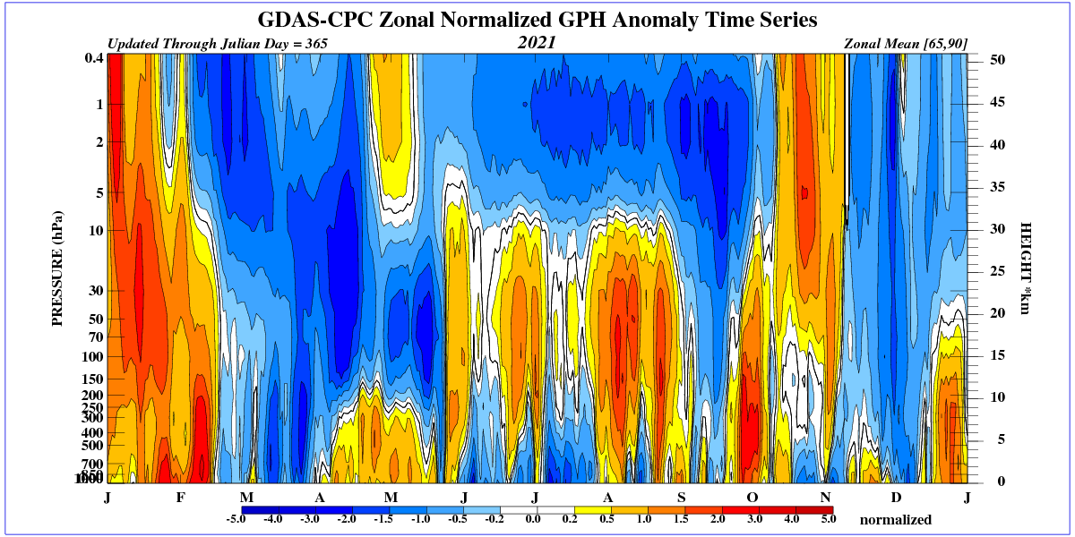
The NOAA NCEP satellite data interpolated with the tropical buoys is a more reliable indicator of surface conditions than the UAH TLT. It went into La Nina state about 6 months ago – per attached. Two months ahead of UAH, which is still showing an upward trend in a region where there is none:
itlt_60_-170–120E_-5-5N_n.png
Clearly UAH needs another correction down to align with surface data.
Except UAH is not surface temperature data. It seems to me much better that it report what it measures than that it adjust measurements to pretend to be something else.
It is not a temperature measurement. It infers a temperature. It has already gone thriough numerous adjustments. It is now at version 6. By version 7 it may be closer to a true reflection of surface temperature like NCEP optimally interpolated with moored buoys.
But again, UAH is measuring tropospheric temperature from near the thermopause to about 6 meters above the surface.
UAH lags the ocean SST data by about 6 months. Once you account for the lag then it will make more sense.
The 18th warmest or 26th coldest March in UHA history. Coldest March since 2015, and the coldest anomaly since September 2018.
Under the old 1981-2010 baseline this would have been 0.12°C, a drop of 0.24°C from February.
The Monckton Pause will now start in June 2015, making this a 5 year 10 month pause.
Yet CO2 emissions continue to rise unabated. So much for never ending warming trends.
The climate liars have known this was coming for a while, so I’m sure they have something up their sleeves to dupe the scientifically-challenged with. Global warming causes global cooling can only work on some such individulas, but not all of them.
I think it’s why there has been several “AMO weakening ate my global warming” papers published this year.
uh oh… Need to re-fudge the models again
Something interesting is going on with the jet stream at the moment. l have rarely seen it so wide spread across the NH. The jet stream in places is now well over a 1000 miles wide and its part trend l have been noticing since at least 2017.
“its part of a trend”
I have noticed that as well over the last several months, and at both poles.
lts something that has got my interest due to the fact its turning up during low sun spot activity and its the sort of jet stream patterning that would help to explain the swings in the weather during the LIA.
The thermosphere is cooler and shrinks while the sun is less active and UV radiation is reduced,
Could it be that the cooling affect of increasing CO2 is indeed in progress ?
https://jennifermarohasy.com/2011/04/determining-the-total-emissivity-of-a-mixture-of-gases-containing-overlapping-absorption-bands/
What’s the cause of it am not sure. But its turned up during low sun spot activity so that made me think there could be a link. lt certainly could lead to cooling as it likely to increase the amount of cloud cover. Because it leads to the increase in the suface area over which warm air and cold can mix.
Also its the type of patterning that l could see leading to the sort of wide swings in weather between the seasons like that we saw during the LIA.
taxed, right you are. Image from Dr. Judah Cohen at AER

So now we can measure 1/100th of a degree accuracy in a global wide temperature? Sigh.
How many times does this need to be addressed? The published UAH global temperature anomaies are not direct measurements. The global surface temperature anomalies published by the various groups (NASA, HADCrut, NOAA) are not direct measurements. They are averages of measurements.
When you average a set of numbers, even a small set of whole numbers, you immediately get degrees of precision that are smaller than the whole numbers you started with. Try it yourself on a spreadsheet. Is this such a hard concept to grasp?
Sigh.
Once again, no. Averaging a bulk of temperatures from here, yon, and Mars is not the same as making repeated measurements of the same quantity.
Why is this so hard to grasp?
Hate to be a broken record but some things bear repeating.
Actually, averaging repeated measurements of the same thing does not increase precision. It only allows a more accurate calculation of the “true value” by eliminating any random errors introduced in readings.
One should ask themselves how does averaging increase the precision of the original measurements. If averaging can not do that, and it can not, then there is no way the average can be more precise than the original measurements.
This is what the rules of significant digits is based upon. TFN needs to find university level references that contradict the sig fig rules when it comes to precision. Statistical texts that discuss the “uncertainty of the mean” do not apply to precision of measurements. That statistical parameter only applies to the interval within which the mean may lie. It is not a parameter that applies to the precision of the mean.
In fact, the calculation of the average AND the “error of the mean” should be done within the rules of significant digits which will automatically provide the correct precision for both.
This is the reason that anomalies are meaningless when calculated to precision not justified by the precision of the measurements. Some day, climate scientists will be called to task to explain why such calculations were done when dealing with real world measurements. Proper metrology is required in many fields and hopefully climate science will evolve to require the same.
You are correct, I was over-simplifying.
Another way uncertainty is ignored is assuming that because an “anomaly” (I hate this term) is subtracted, error is reduced.
Yep. It doesn’t matter if you have A+B or A-B, the uncertainty adds as root sum square. If A and B each have a +/- 0.5 uncertainty then whether you add or subtract the total uncertainty becomes +/- 0.7.
“the uncertainty adds as root sum square”
Is it also important to say this is only when individual errors are statistically independent?
Averaging discrete information is about as useful as averaging telephone numbers or street addresses. “Degrees of precision” is unimportant and meaningless. Who cares about finer and finer divisions of the wrong information? With temperature we need greater accuracy.
What you claim is an “average” is a hodgepodge of unrelated numbers forced into an alleged average.
Producing an image simulation of precision that is neither precise nor accurate. Precision is meaningless without accuracy.
The error bounds for the original measurements are retained.
Indeed, they are magnified by the wide variety and differences in methods, equipment, data handling, temperature measurement, locations, altitudes, adjustments, infills, etc.
When are people going to learn that important distinction?
You still maintain that the average of an intensive variable like temperature means something?
Significant figures is what, a 6th grade concept?
What’s a whole number? Do you mean integer numbers? And how do you get fractional numbers out of averaging integer numbers?
“Do you mean integer numbers? And how do you get fractional numbers out of averaging integer numbers?”
Yah FN, The average of 15, 16, 17, and 18 just CAN’T be 16.5. Where’d you get the bogus significant figure? Gotcha!!
Only someone with absolutely no proper education in the relevent subject matter could ever say something as idiotic as what TFN says here.
“Do you mean integer numbers? And how do you get fractional numbers out of averaging integer numbers?”
Yah FN, The average of 15, 16, 17, and 18 just CAN’T be 16.5. Where’d you get the bogus significant figure? Gotcha!!
Well.. if one corrected for seasonality, you wouldn’t have to change the period for anomaly calculation. The ignorance of proper statistical methods in climate science is breathtaking.
But seasonality is isn’t part of the monthly anomaly. The anomaly for March 2021 is the departure from the average of all the MARCH temperatures in the period 1981 to 2010.
REMINDER: We have changed the 30-year averaging period from which we compute anomalies to 1991-2020, from the old period 1981-2010. This change does not affect the temperature trends.
BobM
Right you are! And I knew that. Just couldn’t believe the past 10 years had gone by so fast. Doesn’t change the fact that there is no seasonality in anomaly plot.
The reason for changing the reference period is because climate is defined as the 30 year average of weather conditions for a given location.
Should we just use some particular 30 year period in the past because of some random factor like when a certain methodology originated?
No, we should not.
The conditions of the planet change.
The conditions of every region change.
The conditions of every exact point on the surface, or at some altitude on the atmosphere, change.
The only thing that is constant with regard to weather is this constant flux.
Everything changes, all the time, in every location, and on every scale.
Every scale of space and area, and every scale of time.
Things change from minute to minute, hour to hour, day to night, day after day, every single week, of every single year, of every century and every millennium, from the biginning of time to the present…and they do so on every single inch of the surface and under the ocean and up into the sky.
The questions are how much they are changing, and how fast they do so, and within what range.
What is plain to see is that the scale of variances of each parameter, and particularly of temperature, vastly exceeds the small changes in the medium and long term averages over time on the scale of the global, the regional, and even the local.
Huge excursions from long term averages are a common occurance, especially in the middle and higher latitudes, and particularly over the land.
It would not make sense to use a reference period that is way out of date, any more than it would make sense to panic over tiny changes that are inconsequential and entirely normal.
In fact, these satellite records began at what was the culmination of 30-40 years of global cooling.
By the 1980’s, all of the early 20th century warming had been erased.
It never made much if any sense to use the late 1970s/early 1980s as the starting point of any sort of reference period.
But it is best to keep the reference period consistent with what is reported as the averages for a given location and date, which is and has always been adjusted to the most recent 30 year period.
It would make no sense to tell people it will be much cooler than everage next week, based on average values obtained during the Dust Bowl years.
The most recent 30 years is the most relevent period to everyone’s life.
Expanding out a bit, I am compelled to point a few things out, for the record:
The entire alarmist narrative is ridiculous nonsense, made up out of whole cloth.
Nothing unusual is happening anywhere at all.
Everything that has been measured is entirely within the range of variations seen in the most recent century.
But nothing that has happened comports whatsoever with what the alarmists’ religion tells them should be occurring, and so they have resorted to overwriting measurements from the past, and distorting present day readings and values.
By now, their “adjustments” have removed their graphs and charts (of past and present time series records of temperature) beyond any semblance of reality, and these charts are now in stark contrast to what has been, and what can be, observed to be occurring, and with what has been photographed and documented as having occurred, regarding such things as growth and melting of sea ice, advances and retreats of mountain glaciers, patterns of plant growth and their range, and of the yields of every crop on Earth, and even of such things as global sea level, droughts, floods, cold snaps, and heat waves.
Alarmists want to compare current conditions to what was typical during the coldest period in the past 12,000 years, the climatically disastrous period called The Little Ice Age.
They want to convince everyone that the extremely and dangerously low levels of CO2 in the air in the recent geological past are some sort of ideal value, and any increase must be bad.
Just like they want to convince everyone that having our planet in as frigidly frozen of a state as we can find in human recorded history, is somehow the perfect condition.
And that vast stretches of our planet being frigidly frozen polar wastelands is somehow imperative to our survival, even though any rational look at the subject has to conclude the precise opposite.
In fact, every single thing the warmistas say is either exactly or very close to exactly the opposite of what is true.
The things which they claim are getting worse, are actually getting better.
The things they say are changing, are mostly staying pretty much the same.
Watch what happens next with this UAH graph.
Compare it to the rhetoric and lies spewing from the mouths of alarmists.
We had some warm years.
If we are lucky, these will continue.
But personally I think we are gonna get a real lesson on exactly what bad weather is.
Sudden sharp cooling…that is bad weather.
But it is still just weather, unless it persists for long enough to alter 30 year averages.
Thanks for your post, Nicholas!
Sometimes, it’s good to get things off your chest……and I’m not trying to be a smart a$$ here.
I rage at the mainstream media, worthless, innumerate Politicians and the distressing nexus of climate catastrophists and opportunistic financiers & business leaders on a daily basis. The second part of your post expressed my own views clearly and concisely. Thanks, again!
Run away! Run away! It’s global cooling!
Well, is La Nina a hot babe….or a cold one? And, will those X-rays from Uranus cause any…any global warming?
Well she doesn’t rise to the level of the Rodney Dangerfield joke where she was so ugly when she was born that the delivery nurse slapped her mother.
………. but, mother nature is having a bit of a laugh. Even just a bit colder would’ve hastened the shutting up of the climate liars.
According to the back radiation hypothesis yes, x-rays from Uranus are warming Earth lol. The CMB is even warming Earth. The entire universe is a perpetual-motion machine of the 2nd kind.
This is a consequence of the widely anticipated downturn in relative global temperatures that always follow from La Nina conditions. Below average temperatures (where ‘average’ is 1991-2020, as in UAH) will probably continue for a couple of months, then up-tick again by late summer 2021.
There is commonly a 5 to 6-month lag between ENSO variations and UAH lower troposphere temperature response. SSTs in the NINO 3.4 region are already on the rise and have been since December 2020.
Notice that the long term warming trend in UAH has hardly budged; nor is it likely to do so for the foreseeable future.
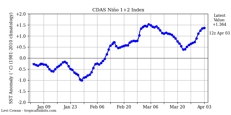
Sorry to disappoint you. The Nino 1-2 area has taken a big dip in the last two weeks and that is almost certainly going to head over into the Nino 3.4 area in the near future. It looks like the La Nina is regenerating itself. Could be a long, cold couple of years.
Trends aren’t going to help you when people begin noticing.
Yes the rate of warming stands at ~1.4C per century and hasn’t varied in the entire UAH record.
https://www.woodfortrees.org/plot/uah6/plot/uah6/trend/plot/uah6/to:2011/trend/plot/uah6/to:2001/trend/plot/uah6/to:1991/trend
At this rate the dreaded + 3C would be reached around 2230.
However you slice it, fudge the numbers or shift the goal posts, there is simply no evidence that we’re experiencing anything but natural variation.
Yes. Trying to use linear trends with a chaotic continuous function is a waste of time. Like it or not a linear increase in temperature correlated with a mathematical transformation of CO2 increase in ppm just isn’t the way the atmosphere works. Natural variation in long term temperature does mean that temperature measurements will follow that continuous function and you won’t be able to use a simple statistical analysis to arrive at a simple linear trend.
Amen. Climate change is NOT an existential threat. No matter how many times Bernie and AOC and and the deluded idiot Kerry say it is, it’s NOT. Debate on the issue among rational people is over.
FinalNail-san:
Most of the global warming we’ve enjoyed since UAH records began in 1979 has been from the respective PDO & AMO 30-year warm ocean cycles.
When the PDO & AMO ocean cycles reenter their respective 30-year cool cycles (likely within the next 5 years) global temps will unfortunately start to fall again for 30+ years as they did from 1880~1912 and 1945~1978…
Yes , sure; hard sell
TheFinalNail
Here is the actual ENSO forecast of the Tokyo Climate Center:
http://ds.data.jma.go.jp/tcc/tcc/products/elnino/elmonout.html#fig2
I can’t recall them having ever been wrong in that.
When I see all these La Nina fans here thinking a big cooling coming soon, I get a big, big laugh.
J.-P. D.
I’m sure our favorite pause announcement will be along soon. In the meantime it might be fun to contemplate where this La Nina will take us in the future.
If you examine the SST and UAH trends you can clearly see that SST movements predict where UAH will go in about 6 months. This lag lets us make some educated guesses. In addition, UAH usually drops more than the SSTs. You can see it here:
https://woodfortrees.org/plot/uah6/from:1979/to/plot/uah6/from:1979/to/trend/plot/hadsst3gl/from:1979/to/offset:-0.35/plot/hadsst3gl/from:1979/to/offset:-0.35/trend
The UAH anomaly typically extends about .2 C lower than the normalized SST minimum.
We only have SST data through January where we see another .18 C drop from where it was 6 months ago. If this is added to the current UAH value we can foresee a value of -.19 in another 4 months.
Now add in the extended .2 C drop seen in UAH data and we could see a value near -.4 C.
There’s one big caveat to this exercise. Normally, we see La Nina minimums in fall and winter. We are already past that point in 2021. It will be interesting to see if the typical pattern also occurs moving into summer.
The stronger than average tradewinds have not abated which favors redeveloping La Nina. Most models have ENSO returning to average and then starting another cooling trend around August. And models are also favoring a negative IOD developing this summer which often leads the development of La Nina. A back to back La Nina on par with the back to back El Nino in 14-16 could return the pause to 20+ years but would certainly suck for North American weather.
If this does develop then prepare for “drought is the new normal” and more “polar vortex means global warming” from the climate cult – whom are far more easily predictable than these oscillations are.
Extreme Easter holidays for Europe: A historic Arctic cold blast with damaging frost increasingly likely, massive snow for central Europe on Tuesday
https://www.severe-weather.eu/europe-weather/historic-cold-blast-europe-snow-easter-sunday-mk/?fbclid=IwAR1jH4HWVSy3CxgtAPRhhUWVt-dwhbM6hISE7ui3whdl95dzLC2hukTkMgE
I wonder how The Guardian will spin this cooling?
Oh, that’s easy, climate change -> extreme weather…
However, at some point the truth does finish putting on its boots.
Edim
Your catastrophic Arctic blast cooling ‘event’ to be soon expected in Europe is absolutely laughable.
https://www.wetteronline.de/wetter/europa
Look at the night temperature forecasts for the next 10 days.
OK, it’s a bit cooler than usual, I would prefer an April with a bit over 20 °C, but that is all far from the weather catastrophe you try to insinuate.
Wanna see how really cold it has been some weeks ago, Edim?
https://tinyurl.com/ydt96ucz
J.-P. D.
Oh, goody….
Global temps are now back down to 1750 levels and global Leftists want to waste 100’s of Trillions on Global Warming mitigation boondoggles to starve the world of cheap, abundant, reliable, stable and high energy-density fossil fuels and nuclear energy…
Just wait until the PDO & AMO ocean cycles reenter their respective 30-year cool cycles in a few years and global temps start falling as they did during the ocean cool cycles of 1880~1912 and 1945~1978…
Global debt is currently $281 TRILLION (355% of global GDP) and Leftists think they can spend their way out of economic collapse….
The Weimar Republic tried that…. it didn’t turn out so well and gave us Adolf Hitler….
The world has gone insane…
The PDO was negative for much of 2020 due to La Nina. In the last couple of months the Pacific Ocean structure has been changing to the more common negative PDO format. As a result it is reasonable to think the PDO will stay negative even after the La Nina ends. This is likely a big part of the extra cooling during the current La Nina.
The AMO will probably take longer. My own estimate is 2024-2027.
Richard-san:
it also looks like there is a small chance we could have a double-dip La Niña cycle like 1974~76 and 1998~2000.
There is currently very cold water of the coasts of Ecuador and Peru which is re-cooling the La Niña cycle. It will be interesting to see how this develops.
I also notice NOAA has two La Niña models simulations showing a double-dip La Niña cycle this year, although most model projections do predict a weak El Niño developing later this year.
Another interesting phenomenon over the past year, is the 3,000 KM string of cold deep-water plumes poking through the Gulf Stream from the coast of South Carolina to the southern tip of Greenland which is helping cool the North Atlantic. This could be an indication the AMO is in the early stages of reentering its 30-year cool cycle.
We’ll see soon enough, but things are not looking good for Leftist CAGW cultists..
They spin it whichever way they can; sustainability, blah…
It’s too much to hope for, but I dream of seeing that chart’s monthly trendline making a new low. That would stick a spoke in the wheel of the big fraud bandwagon and discomfit those who richly deserve it.
Roger Knights – you may enjoy seeing that chart’s monthly trendline making a new low, but I’m sure that the MSM will be given a different chart to show the general public. Or maybe no chart at all, just David Attenborough saying that Polar Bears are having to swim all the way to Iceland because they are so hungry (with no mention of how short a swim it was, of course).
Michael Mann has already said that a few decades of cooling would not mean Human-caused Climate Change is invalid.
The alarmists cover all their bases.
Agreed. But it’s a tough sell for the public especially when what you’re selling is pain. And poverty.
La Niña will return.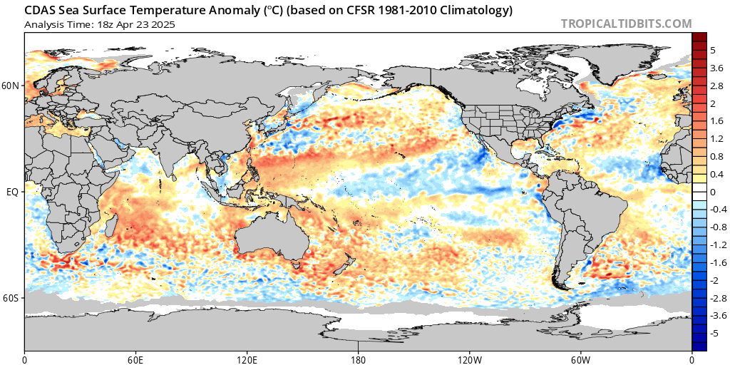
Short, medium, and long-run cycles can occasionally stack up on themselves like wave theory. But with debate-has-ended non-science of Al Gore and Obama they will not get past the short run cycles.
So, the average global temp for March equal the average global temp of the last 40 years. I’d say that’s completely consistent with the anthropogenic global warming theory quite nicely, don’t you think? /sar
What does the Sun say about all this? You can debate, and I’ll still do my thing.
A powerful mass of Arctic air will now fall over the UK into Western Europe.
This alleged downtrend for the fifth year in sequence is a pure Tillman invention.
It should be evident that the trend for a period in a time series, starting with the highest value of the entire time series in over 40 years
2016 3 0.64
hardly will be positive.
You really don’t need to be a statistician to understand such trivial things.
Thus, here is a little ‘correction’:
A look at a simple graph with the UAH plot, together with the corresponding two trend lines might convince:
https://www.woodfortrees.org/graph/uah6/plot/uah6/from:2016/trend/plot/uah6/from:2017/trend
It is really not necessary to speak about global cooling that does not exist.
Better would be to be prepared, in CONUS, for an increase of sudden stratospheric warming events, leading to harsh stratospheric intrusions down to the lower troposphere, with brutal consequences for both inhabitants and needed services.
That is REAL cooling.
J.-P. D.