From Dr. Roy Spencer’s Global Warming Blog
by Roy W. Spencer, Ph. D.
The Version 6.1 global average lower tropospheric temperature (LT) anomaly for March, 2026 was +0.38 deg. C departure from the 1991-2020 mean, statistically unchanged from the February, 2026 value of +0.39 deg. C.

The Version 6.1 global area-averaged linear temperature trend (January 1979 through March 2026) remains at +0.16 deg/ C/decade (+0.22 C/decade over land, +0.13 C/decade over oceans).
The following table lists various regional Version 6.1 LT departures from the 30-year (1991-2020) average for the last 27 months (record highs are in red).
| YEAR | MO | GLOBE | NHEM | SHEM | TROPIC | USA48 | ARCTIC | AUST |
| 2024 | Jan | +0.80 | +1.02 | +0.57 | +1.20 | -0.19 | +0.40 | +1.12 |
| 2024 | Feb | +0.88 | +0.94 | +0.81 | +1.16 | +1.31 | +0.85 | +1.16 |
| 2024 | Mar | +0.88 | +0.96 | +0.80 | +1.25 | +0.22 | +1.05 | +1.34 |
| 2024 | Apr | +0.94 | +1.12 | +0.76 | +1.15 | +0.86 | +0.88 | +0.54 |
| 2024 | May | +0.77 | +0.77 | +0.78 | +1.20 | +0.04 | +0.20 | +0.52 |
| 2024 | June | +0.69 | +0.78 | +0.60 | +0.85 | +1.36 | +0.63 | +0.91 |
| 2024 | July | +0.73 | +0.86 | +0.61 | +0.96 | +0.44 | +0.56 | -0.07 |
| 2024 | Aug | +0.75 | +0.81 | +0.69 | +0.74 | +0.40 | +0.88 | +1.75 |
| 2024 | Sep | +0.81 | +1.04 | +0.58 | +0.82 | +1.31 | +1.48 | +0.98 |
| 2024 | Oct | +0.75 | +0.89 | +0.60 | +0.63 | +1.89 | +0.81 | +1.09 |
| 2024 | Nov | +0.64 | +0.87 | +0.40 | +0.53 | +1.11 | +0.79 | +1.00 |
| 2024 | Dec | +0.61 | +0.75 | +0.47 | +0.52 | +1.41 | +1.12 | +1.54 |
| 2025 | Jan | +0.45 | +0.70 | +0.21 | +0.24 | -1.07 | +0.74 | +0.48 |
| 2025 | Feb | +0.50 | +0.55 | +0.45 | +0.26 | +1.03 | +2.10 | +0.87 |
| 2025 | Mar | +0.57 | +0.73 | +0.41 | +0.40 | +1.24 | +1.23 | +1.20 |
| 2025 | Apr | +0.61 | +0.76 | +0.46 | +0.36 | +0.81 | +0.85 | +1.21 |
| 2025 | May | +0.50 | +0.45 | +0.55 | +0.30 | +0.15 | +0.75 | +0.98 |
| 2025 | June | +0.48 | +0.48 | +0.47 | +0.30 | +0.80 | +0.05 | +0.39 |
| 2025 | July | +0.36 | +0.49 | +0.23 | +0.45 | +0.32 | +0.40 | +0.53 |
| 2025 | Aug | +0.39 | +0.39 | +0.39 | +0.16 | -0.06 | +0.82 | +0.11 |
| 2025 | Sep | +0.53 | +0.56 | +0.49 | +0.35 | +0.38 | +0.77 | +0.30 |
| 2025 | Oct | +0.53 | +0.52 | +0.55 | +0.24 | +1.12 | +1.42 | +1.67 |
| 2025 | Nov | +0.43 | +0.59 | +0.27 | +0.24 | +1.32 | +0.78 | +0.36 |
| 2025 | Dec | +0.30 | +0.45 | +0.15 | +0.19 | +2.10 | +0.32 | +0.37 |
| 2026 | Jan | +0.35 | +0.51 | +0.19 | +0.09 | +0.30 | +1.40 | +0.95 |
| 2026 | Feb | +0.39 | +0.54 | +0.23 | +0.03 | +1.91 | -0.48 | +0.73 |
| 2026 | Mar | +0.38 | +0.33 | +0.42 | +0.07 | +3.74 | -0.48 | +1.14 |
| YEAR | MO | GLOBE | NHEM | SHEM | TROPIC | USA48 | ARCTIC | AUST |
Record Warmth in the Contiguous U.S. (Lower 48)
For the Lower 48, the March 2026 temperature anomaly was easily the record warmest of all months in the 47+ year satellite record: +3.7 deg. C above average for all Marches. Second place goes to March 2012, with +2.2 deg. C above the mean, while 3rd place goes to December 2025 at +2.1 deg. C.
Interestingly, December through April are periods of large variability for the Lower 48. All 6 of the warmest months (in terms of departures from normal) since 1979 occurred in December through April. Furthermore, all 8 of the coldest months occurred in December through April.
————————-
The full UAH Global Temperature Report, along with the LT global gridpoint anomaly map for March, 2026 and a more detailed analysis by John Christy, should be available within the next several days here.
The monthly anomalies for various regions for the four deep layers we monitor from satellites will be available in the next several days at the following locations:
are we acting like individual region measurements mean something again? cause i remember the coldest february i had ever lived thru, about 10-15 years ago, came in at -0.02.
usa48
February 2015 in the northeast? See my https://wattsupwiththat.com/2015/03/08/1934-2015-a-tale-of-two-februaries/
i’m in the upper midwest. t remember montana and wyoming being beaten especially hard.
Wow, when you brought up the USA48 I said, hey, I have my own plotting system that automatically updates various global climate metrics, with proprietary visualization system, with automated ENSO Cycle banding… Why have I not looked at the US48 From Top Down, with Atmospheric Transmission with annotated known stratospheric aerosol anomalies. So I did, and your memory is from 15 years ago, and it is more than likely associated with the Redoubt Volcanic Eruption. The dip is quite anomalous, the only thing in the entire dataset that rivals it, is ironically, right before the Pinatubo eruption. You solve a mystery and two more appear.
Post Hunga Tonga submarine eruption stratospheric water injection cooling continues, exactly as climate realists predicted.
Apparently, climate realists are the real volcano worshipers.
Hunga Tonga had (and has) nothing to do with the global temperature anomaly. That stratospheric water injection amounted to one ppm. If you think that caused the recent temperature spike, you are worse than the CO2 cultists.
The Tongan eruption increased stratospheric water by 10%. Why do you lie?
Explain please why in your alternative universe, Earth’s atmosphere warmed after the eruption, then cooled as water fell out of the stratosphere.
CACAlarmists attribute catastrophic warming to one more ppm of CO2 in the troposphere in the past 170 years. But abrupt insertion of massive amounts of the far more potent GHG water into the stratosphere had no effect?
Clearly it did, far more than one molecule of CO2 more per 10,000 dry air molecules.
The proof is in the chart picture.
Is that what you intended to say? If so, are you willing to stand behind it?
“The Tongan eruption increased stratospheric water by 10%. Why do you lie?”
The 10% increase was equal to about 1ppm. He didn’t lie – Milo was mistaken.
“Explain please why in your alternative universe, Earth’s atmosphere warmed after the eruption, then cooled as water fell out of the stratosphere.”
The null hypothesis is the HT-HH eruption had no effect. The full amount of HT-HH water vapor equaled 3:40 minutes of rainfall on an average day in China in 2022. Do you really think the entire climate hinged on such a small amount of H20? How?
Futhermore, the entire HT-HH water vapor quantity was only about 1/4000 of the maximum vertical scale on this ECMWF tropospheric water vapor plot.
Again, how did this tiny HT-HH WV blip cause the ocean to warm? How, exactly?
Even the OHC blip for the HT-HH grid cell was orders of magnitude less than the whole ocean heat content increase.
If you think this had such a climate impact you have an uphill climb to show the null hypothesis was overturned. How did a tiny stratospheric amount of WV overwhelm the troposphere WV, and what ability does any of the WV have to warm the ocean?
“The proof is in the chart picture.”
The UAH chart picture is not proof of your assertions.
Bob, I also add the following:
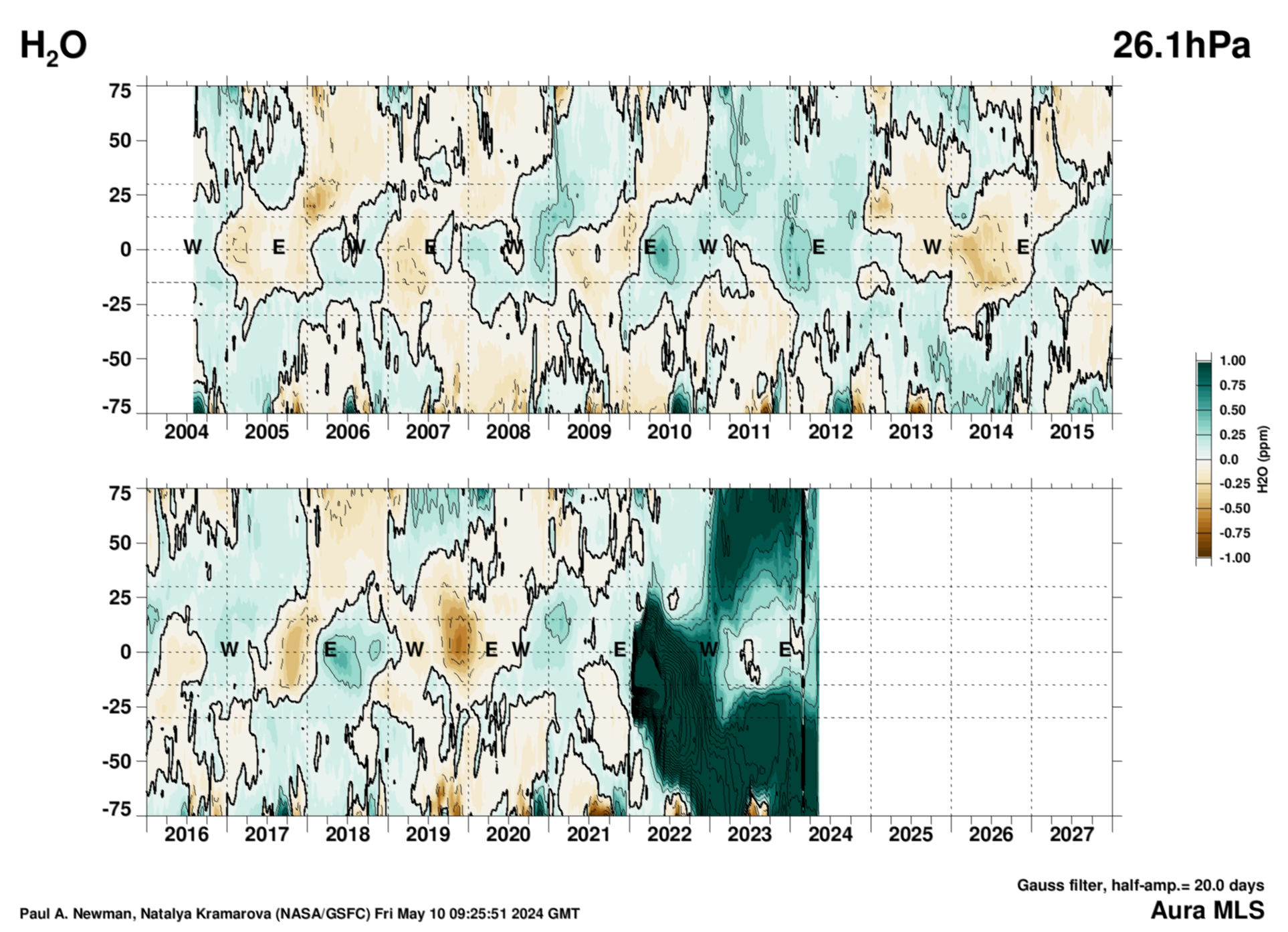
1) The Aura MLS contour plot of water vapor content at 26.1 hPa pressure altitude that you posted is NOT representative of the entire stratosphere . . . similar contour plots at other pressure altitudes show much different variation in water vapor concentration for identical times.
2) The Aura MLS contour plots of stratospheric water vapor content have obvious (unexplained) defects, such as the approximately every-other-month sharp oscillations in indicated water vapor content that appear in your presented plot starting in the second quarter of CY2024. This leads one to question if the presented data is accurate to even +/- 0.5 ppm H2O.
3) The H-T eruption that injected a “large” quantity of water vapor into the stratosphere started on January 15, 2022 and occurred within one day. However, the presented Aura contour plot (again for a single pressure altitude) shows that that water vapor suddenly (within about one month) expanded from about 30-deg to 90-deg North latitude about a year later, starting around January 2023, whereas in the southern hemisphere the “excess” water vapor concentration had reached 90-deg South latitude in gradual fashion by the beginning of fourth quarter 2022. I’ve seen no credible explanation for this difference in stratospheric H2O spatial distribution over time.
Furthermore, your presented Acura MLS contour plot shows the stratosphere (at the 26.1 hPa pressure altitude) over 10-deg S to 10-deg N latitudes recovering back to pre-eruption H2O concentration levels starting in 2023 and continuing to the second quarter of 2024, followed thereafter by a rather strange (IMHO) rise in H2O concentration over that latitude range to levels that exceed the pre-H-T eruption levels. I have not seen any scientific explanation for this “pogo-ing” behavior of stratospheric water vapor content, which again causes me to question the overall accuracy of any Acura MLS contour plot.
4) There has been no credible scientific explanation for the 14-16 month delay from the date of the H-T volcano ejection of water vapor into the stratosphere until there was the onset of an out-of-trend-line peaking of GLAT (starting in the second quarter of CY2023 as indicated in the posted UAH graph posted in the above article by Dr. Spencer). Lots of handwaving about this time delay—even disagreement between published scientific papers as to whether the H-T water vapor injected into the stratosphere causes warming or cooling of GLAT—but AFAIK nothing definitive.
Finally, I observe that the UAH plotted “peak” in GLAT starting second quarter of 2023 and continuing to today is similar to the plotted “peak” for the time interval of CY1997 to CY2000 (which happened without a preceding undersea volcano eruption), indicating the most recent “peak” is just statistically “in family” with climate history and has no coupling whatsoever to the H-T eruption.
“Finally, I observe that the UAH plotted “peak” in GLAT starting second quarter of 2023 and continuing to today is similar to the plotted “peak” for the time interval of CY1997 to CY2000 …”
I am more of a “visual” person, and generated an initial version of the attached graph several months ago to help me “get” what people were claiming about 1997-8 versus 2023-4 El Nino comparisons, along with the HT-HH timing relative to the 2023 “rising edge”.
Hopefully this, updated with the March 2026 numbers, will prove useful to both “newcomers” to the issue as well as all the “lurkers” out there following the discussion(s).
NB : “UAH LT (version 6.1)” is not a GMST (= GLAT ?), or surface, temperature reconstruction.
Odd, the link gives me a “504 Gateway Timeout” error, despite other PNG files on “i0.wp.com” displaying OK on this page …
Test if it was just a “glitch” …
By injecting the water vapor into the normally dry stratosphere instead of the troposphere.
It does not warm it directly, it delays the radiation loss to space.
That 10% increase amounts to about 1 ppm in stratosphere so I’m not sure where the lie is.
ENSO
It was 150 MtH20. Hardly massive.
As a point of comparison…since the HT eruption about 15,000 MtCO2 got added to the stratosphere. That is 100x more CO2 by weight than H2O.
Anyway, that miniscule amount of H2O did have an effect. It’s just that it isn’t as much as you insinuate.
The lower stratosphere is around 25 km with temperatures between -80C and -40C. Per 25 km column has 110 grams of water vapor. That’s a total of 204 joules.10% would’ve added an extra 21 joules. Heat capacity is low in the stratosphere, this is why temperature rises with height despite air mass being much thinner. In the lower stratosphere it is very cold, -56C to -76C global average. UAH is one of many datasets. Independent data says no warming since the eruption. ECMWF showed a weak El Nino warming last year. So the jury isn’t out on this.
I have previously commented that the range in global temperature anomaly for the northern hemisphere, trough-to-peak for 2024 is the largest observed since the 1998 El Nino, which appear to be similar. However, the full-width half-max for the 2024 temperature event is about 2.5X that of 1998. Furthermore, all of the previous peaking events appear to be approximately sinusoidal, whereas the 2024 event decline is looking more like an exponential decline every month. That is what one would expect for an injection of water vapor that is clearing out with time, despite Intelligent Dasein‘s denial reminiscent of the Wizard of Oz’s advice to Dorothy and friends.
I have previously commented that the range in global temperature for the northern hemisphere, trough-to-peak for 2024 is the largest observed since the 1998 El Nino, which appear to be similar. However, the full-width half-max for the 2024 temperature event is about 2.5X that of 1998. Furthermore, all of the previous peaking events appear to be approximately sinusoidal, whereas the 2024 event decline is looking more like an exponential decline every month. That is what one would expect for an injection of water vapor that is clearing out with time, despite Intelligent Dasein‘s denial reminiscent of the Wizard of Oz’s advice to Dorothy and friends.
You can say that again!
“That is what one would expect for an injection of water vapor that is clearing out with time,”
Why would anyone expect this from such a small amount of water vapor, or any amount?
What is the mechanism for this WV to warm the ocean? No one answers this question.
If the HT-HH WV spike didn’t warm the ocean, then it hasn’t cooled from the WV decline.
There is no solid case here – everyone is just handwaving. It’s time to check yourselves.
Why would 150 MtH2O have such a huge effect?
Why does the upward spike and subsequent decline match expectations from ENSO?
If HT is the cause of the warming spike and not ENSO then why did ENSO suddenly stop having an influence on UAH TLT?
Sometime it isn’t the size of something that matters, but where or the manner it is applied.
And the next time someone posts about how CO2 is only 0.04% of the atmosphere you’ll remind them of this?
Anyway, what about ENSO?
“whereas the 2024 event decline is looking more like an exponential decline every month.”
Exponential decline….. really? Please explain….it looks to me like the decline was 0.01c over the last month. Is that really an exponential decline….or did you just use the expression for effect?
Compare the decline after 1998 to the decline since 2024.
As if anyone with experience in empirical science truly believes UAH temperature measurements really do have accuracy to +/- 0.1 C, let alone to +/- 0.01 deg-C.
I can appreciate that UAH/Dr. Spencer are reporting mathematically-averaged GLAT readings to +/- 0.01 deg-C precision in order to show possible time-averaged temperature variability, but I wish like heck they would always include a disclaimer in their monthly updates that the calculated end-to-end accuracy of their individual data points is no better than +/- x.x deg-C, with the x’s replaced by scientifically/statistically supportable numerals.
When water boils in a pot without a kitchen exhaust fan, the entire kitchen is filled with hot water vapor.
Is it the hot water vapor from the Hunga Tonga submarine eruption that warmed the Earth’s atmosphere?
How much heat energy was in the boiling water vapor?
5th warmest March in the UAH data set.
UAH released the gridded data quicker than usual, so here’s my version of the global anomalies.
Interesting to look at the lower stratosphere for the USA for this month. At -3.28°C it mirrors the warmth in the lower troposphere, but the graph for March really shows how cold it was.
And I clicked the button before linking to the graph.
Yawn.
CO2 cannot have caused this spike in the USA temperature
Nothing humans have done could have caused this spike in the USA temperature.
It was just a strange WEATHER EVENT
Do you find graphs of lower stratosphere anomalies boring? Boy are you on the wrong website.
Whoopty doo.
Thanks. I’m glad you appreciate my work.
I look at your version and say to myself, “Wow, look at the warm streak across the U.S., but also look at the cold streak across Canada and Alaska. They pretty much offset each other.
It is not scientific to expound on the warmth over the western U.S. but then not also expound on the extreme cold experienced elsewhere. Just pointing to one place and saying look what CO2 has done is ignoring what CO2 has not done in another place.
The question I would be asking is why there is a heat dome over the western U.S. but there is a cold dome over Canada. CO2 can’t cause both. There must be other processes at work that allow such large differences to occur.
Look closely at the cold dome over Canada. The coldest part is much larger than the hottest part over the U.S. There is a range of about -6 to +7 or 13 degrees total. Geez! How does the climate partition itself such that such a variance can occur. CO2 has never been theorized to result in that range of changing temperatures.
“I look at your version and say to myself, “Wow, look at the warm streak across the U.S., but also look at the cold streak across Canada and Alaska. They pretty much offset each other.”
Yes, that stood out for me.
“It is not scientific to expound on the warmth over the western U.S. but then not also expound on the extreme cold experienced elsewhere.”
Take it up with Spencer, he’s the one who wrote an entire article about it. Not surprising Americans tend to be more interested in their own weather, and like to keep going on about how their country is the “hottest”.
“Just pointing to one place and saying look what CO2 has done is ignoring what CO2 has not done in another place.”
Almost as if you want to look at average global temperatures.
” CO2 can’t cause both.’
Nobody has said it has. What may be claimed is that the fact that the global average temperature is increasing, then extreme heat will be hotter than it would have been without that warming.
But I’m not sure you are right in any case. The effects of global warming caused by CO2 might cause local changes.
“Nobody has said it has. What may be claimed is that the fact that the global average temperature is increasing, then extreme heat will be hotter than it would have been without that warming.”
Except the US has *NOT* been seeing increased maximum temperatures (i.e. “hotter” days). Most states in the US have fewer annual 100F days presently than in the late 20th century.
Do you have a clue as to why that is? (hint: it’s not higher CO2 levels)
“Most states in the US have fewer annual 100F days presently than in the late 20th century.”
Not sure that has to do with the average March temperatute, but how many > 38°C days do yiu usually get in March in the US?
Looking at CRN data since 2005, there were only 5 such readings in March, and never more than 2 in a year. But in March 2026 there were 20 such records.
you said: “ global average temperature is increasing”
You didn’t offer up any distinction as to “month”.
“But in March 2026 there were 20 such records.”
So March, 2026 is supposed to define the trend over time? ROFL!!!
“You didn’t offer up any distinction as to “month”.”
The context was about tecord US temperatures for March. You should know this, it was Jim who brought it up.
“So March, 2026 is supposed to define the trend over time? ROFL!!!”
You’re deranged. You just keep arguing with your own hallucinations.
GHG theory revolves around a constant, ever increasing baseline temperature. This does not account for rapid and shortterm temperature fluctuations.
This is one reason a “global” temperature anomaly is perverse. Both of the U.S. and Canada extremes are outliers and should be discarded.
Funny how no one has even discussed using the interquartile range (IQR) to identify outliers in the range of anomalies.
Just keep on trending.
“GHG theory revolves around a constant, ever increasing baseline temperature.”
Do you have a non-AI reference for that? Everything I’ve seen suggests the rise will mot be constant.
“This is one reason a “global” temperature anomaly is perverse.”
Funny. this isn’t about the global average, it’s about one small part of the globe.
“Both of the U.S. and Canada extremes are outliers and should be discarded.”
Make you mond up. First you want to ignore the average, then you want to ignore local extremes.
I do wonder how WUWT would report this month if the temperatures had been the other way round – record cold in the USA, record highs in Canada.
Do you have a non-AI reference for that? Everything I’ve seen suggests the rise will mot be constant.
Maybe you need to refresh your science. GHG theory is based on GHG concentration of primarily CO2. As CO2 rises, so will temperature.
Make you mond up. First you want to ignore the average, then you want to ignore local extremes.
The average should be ignored because the variance associated with it is never quoted. The two local extremes illustrate the variance that is included in the mean value.
Why don’t you address the main point, including outliers in the calculation.
“Maybe you need to refresh your science.”
Or you could provide a reference.
“Climate model air temperature projections are just linear extrapolations of greenhouse gas forcing. Therefore, they are subject to linear propagation of error.”
See WUWT: A skeptic attempts to break the ‘pal review’ glass ceiling in climate modeling – Watts Up With That?
“Everything I’ve seen suggests the rise will mot be constant.”
You are correct in saying that climate science believes it *is* constant.Take a look at the ensemble of the climate models. It’s linear. As Pat Frank showed using a simple linear model. Meaning a constant slope.
Quoting Pat Frank rather than what climate science actually says. Typical.
And this isn’t even about a constant slope – it was about the rise being constant across the globe.
Here’s a graphic from the IPCC 2021 – The Physical Science Basis, Chapter 4.
Not constant across the globe.
What climate science says is garbage. It assumes that all measurement uncertainty is random, Gaussian, and cancels — just like you.
The ensemble of the outputs from the climate models for global temperature *is* linear with a constant slope. Of course you try to refute that by showing an image of regional temperature changes. The ensemble of the outputs from the climate models is *NOT* regional, it is GLOBAL.
Nice try at moving the goal posts. But it’s a BIG FAIL!
“Nice try at moving the goal posts. But it’s a BIG FAIL!”
This whole discussion was about the record warmth in the US and record cold in Canada. Of corse it was about regional variation.
The discussion was about you saying: “What may be claimed is that the fact that the global average temperature is increasing, then extreme heat will be hotter than it would have been without that warming.”
Yet it doesn’t seem to be hotter based on the number of 100F or greater days in the US.
Again, you FAIL on the moving of the goalposts.
The context of my statement was the record warmth in the US this March. Nothing about this goal post of number of stations reaching an arbitrary temperature in summer.
But if you are going to claim “Most states in the US have fewer annual 100F days presently than in the late 20th century.”, you should present some evidence.
This chart may not be exactly what you are after (and you’ll probably just say it’s wrong), but it suggests the largest number of days where 100°F was exceeded across the US was in 2022, with 2021 being equal second, and 2013 and 2024 being close behind.
go to the current “Open Thread”. David Dibbell has a set of graphs for CONUS that shows exactly what you are looking for.
I’ve attached the one for the average number of days greater than 95F. The 2020’s are nowhere near the “hottest evah!” based on the average number of days where the temp was greater than 95F. That record is held by the 1930’s – by a *big* amount. Tom Abbott has been posting graphs literally for years here showing the same thing globally.
Here is the applicable graph.
You have a strange definition of constant. Those lines are wobbly – i.e. “rapid and shortterm temperature fluctuations.”
The overall slope is linear and constant. Otherwise Frank couldn’t have emulated it with a simple linear equat ion.
For comparison here’s the ERA5 data.
Similar patterns in the north, but there’s an odd difference over Australia. UAH has it as being 1.1°C above average, but ERA shows it mostly below average.
This is still a work in progress, but I’m trying to break the the data into country wide estimates.
Here are the ten warmest anomalies by country.
And here are the coldest anomalies
None of this is particularly meaningful, given the difference in country sizes, but it does show how cold Canada was.
As well as the USA – Estonia, Finland, Latvia, Lithuania, Norway, and Sweden, all had their warmest March in the UAH data set (i..e since 1979).
Canada was the only country to have it’s coldest March since 1979.
The warmth in the USA48 was skewed by the massive heat dome over the Western US, which itself was the last gas-out of the unusually warm Pacific SSTs from the last bygone El Nino.
By the way, the Colorado Rocky Mountain snowpack is at an all-time minimum right now, and it’s not even close. There is no time left in the accumulation window, either. Look for Lake Powell to hit minimum power pool this year. The desert southwest is starting to become unviable for the massive population centers unwisely located there.
Yes, it is low but that is not unusual. Same basic pattern occurred in late 50s, early 60s. It was very dry. Matches very closely to the natural 60-70 year climate cycle.
Kinda like what happened to the Anasazi 800 years ago.
El Nino conditions haven’t existed in the Pacific since April 2024.
Meaningless. It has no meaning. It is without meaning.
Wait, are you saying UAH is meaningless?
Is the temperature anomaly alone the best parameter for characterizing what is happening? What about things like the slope of the increase and subsequent decline? Or the range from trough-to-peak? Or the width of the peaking event?
A warm period in winter or early spring in Northern USA or Canada must surely be considered a blessing !! 😉
I give you this: “Interestingly, December through April are periods of large variability for the Lower 48.”
If the variability of the temperatures (i.e. the standard deviation) is large then so is variability of the anomalies. That means that any mean calculated from the anomalies should have its components weighted based on the standard deviations in order for the mean to have any statistical meaning. It’s not apparent that UAH does such weighting let alone climate science as a whole.
Large variability also means large uncertainty in the actual mean value. So does the actual difference of 0.01C actually exist?
“If the variability of the temperatures (i.e. the standard deviation) is large then so is variability of the anomalies. ”
Do you accept you can have a standard deviation of temperature? How do you square that with your assertion that you can’t have a mean of temperature?
“That means that any mean calculated from the anomalies should have its components weighted based on the standard deviations in order for the mean to have any statistical meaning.”
I’ve explained to you before why that’s wrong. Variance weighting only makes sence when you are measuring the same quantity and the variance is due to measurememt uncertainty. The monthly variance over the USA is not the result of random errors, it’s caused by actual temperature differencies.
” It’s not apparent that UAH does such weighting let alone climate science as a whole.”
Have you tried asking Dr Spencer about it?
I am using what the discussion is about. Whether that actually exists or not is irrelevant to the point. As variance increases so does uncertainty, and anomalies generated from a linear transformation using a constant *does* inherit the variance of the parent distribution!
You *still* don’t live in the real world! The variance generated from jamming data from Pikes Peak and Colorado Springs together to form something to “average” generates a data set with a *MUCH* larger variance than either one standing alone. That is *NOT* from measurement uncertainty, it is from data variability! Since the colder temperatures from Pikes Peak will have a wider variance then the warmer temperatures than from Colorado Springs, the temperature data from Pikes Peak will bias the average unless some kind of weighting is done. And AGAIN, this has nothing to do with measurement uncertainty. Measurement uncertainty just makes the accuracy of the mean even worse!
Which is the EXACT point I’m trying to get across to you! Cooler temperatures typically have a wider variance than warmer temperatures. Yet *YOU* and climate science think it is ok to just jam’em all together with no regard to the actual contribution to the overall result.
You won’t even admit that Var_total = Var1 + Var2 and that variance is a metric for uncertainty. Jam random variables with different variances together, whether it is from measuring the same thing or different things, and the variance goes UP, it ADDS – meaning that the uncertainty of the mean goes HIGHER when jamming unrelated variables together – regardless of whether or not actual measurement uncertainty is zero or greater than zero! That means that the regional and global “averages” have HUGE uncertainties after you finish adding all the variances of all the random variables together. Which you won’t admit either!
A “best parameter” depends on what it is used for. For the climate apocalypsists the temperature anomaly alone is the best parameter for scaring the most people.
“What about things like the slope of the increase and subsequent decline? Or the range from trough-to-peak? Or the width of the peaking event?”
After problems replying to “ToldYouSo” above (see post above timestamped “April 5, 2026 5:07 am”) 24 hours later my image file has suddenly appeared (twice !).
People, like myself, who prefer “visualising” things rather than limited themselves to only words may (?) find it useful.
The new Monckton Pause extends to 38 months starting in 2023/02. The average of this pause is 0.56 C. The previous Monckton Pause started in 2014/06. It lasted 107 months and had an average of 0.21 C. That makes this pause 0.35 C higher than the previous one.
+0.156 ± 0.038 C.decade-1 k=2 is the trend from 1979/01 to 2026/02 covering 566 values.
+0.026 ± 0.010 C.decade-2 k=2 is the acceleration of the trend.
UAH TLT values continue to behave in a manner that is consistent with expectations particularly as it relates to the ENSO cycle.
Inconsequential crap.
Completely ignores the upward trend in absorbed solar radiation..
Makes baseless assumptions of CO2 warming…
Hence, doesn’t even rise to the level of junk science.!
Meaningless drivel.
wrong place…
You sound serious about your position. The question is…how serious? If Monckton starts his monthly pause updates again will you let him know that your feel it is “meaningless drivel”?
Regional temperatures are far more pertinent, they are measurements, than the artificial and logically nonsensical idea of a global mean temperature.
In regional northern rural NSW we have had the coldest summer in 20 years.
Life is an anomaly.
A sharp comment Scissor (:-))
I feel cold, then I feel warm….
The March anomaly for CONUS shows just how insane the ridge and resulting temperature anomaly was over the southern and central Rockies. The anomaly left prior months in the dust, and despite much of the upper Midwest and New England still receiving persistent troughing. I can only imagine what it would have looked like if the exact opposite pattern had set up. Pueblo Reservoir would still be frozen…
That’s the problem in a nutshell. Averages hide information. Warmunists use averages in a very Orwellian way to try to convince people that cold is warm, wet is dry, and 2 mm SLR/year is catastrophic flooding.
Postulated: one cannot look at the UAH plots of monthly GLAT—even the running, 13-month centered average line fit of such—and conclude anything scientifically without considering the simultaneous variations in global areal cloud coverage, the key variable that determines Earth’s average albedo.
Since it’s Easter, a hot-crossed bun to anyone who can spot the difference between Roy Spencer’s presentation of this update and the one shown by WUWT!
Check out the article as presented above then compare to Roy’s (shown below) and see if you can ‘spot the difference’.
Hint: ‘Hide the incline!’
🤣
Yep….. definitely, there’s an incline.
To deny it is self -imposed blindness. “There is none so blind as those who do not want to see”!
I’m still not convinced that CO2 is the culprit, however….. equally not at all convinced that it isn’t 😅
One is always free to ignore this text immediately below the UAH graph posted in the above article:
“The Version 6.1 global area-averaged linear temperature trend (January 1979 through March 2026) remains at +0.16 deg/ C/decade (+0.22 C/decade over land, +0.13 C/decade over oceans).”
which, of course, specifically acknowledges there being a a long-term and continuing “incline” in GLAT as measured by orbiting satellites.
Similarly, one can choose to ignore what is visually obvious to most other people.
Nothing is being hidden . . . but some people are just not as observant as others, or perhaps only “see” what they want to see.
Good grief
So why did WUWT censor Spencer’s clearly stated introduction to his monthly update?
‘Free speech‘ and all that…. (when it suits).
Neither graph shows an “incline” for this month’s post. If you enlarge WUWT graph above, you’ll see the most recent monthly dot/point is layered slightly over and below last months. As mentioned, unchanged.
Arctic, Tropics and N Hemisphere on a slow cooling trend. USA lower 48 very warm. Interesting that N Hemisphere still cooling down despite massive warm anomaly over the US lower 48.
The tropics have a disproportionate influence on the the other regions. Good to see Arctic temperatures staying slightly below the average. Very low sea ice maximum for second year running. Arctic freeze ran out of pace mid February but has since plateaued out. Again very similar to last year. If El Ninõ ever arrives, we should see a warming trend. Quite interesting recent monthly recordings.
I find it really difficult to figure out why there has been a persistent warm blob in the Davis Strait/Labrador Sea, despite persistent temperatures in that region of around -20C. This coupled with strong N or NW airflow should have caused that blob to disappear. A similar phenomenon going on north of Svalbard all winter.