Guest essay by Eric Worrall
How close can scientists adjust us towards the 1.5C global warming bogeyman temperature without people noticing its just not that big a deal?
Earth may be even closer to 1.5°C of global warming than we thought
ENVIRONMENT 15 December 2020
By Adam VaughanGlobal carbon emissions may have warmed Earth by 18 per cent more than previously thought, raising the prospect of the world having less time than expected to meet the goals of the Paris Agreement and avoid catastrophic climate change.
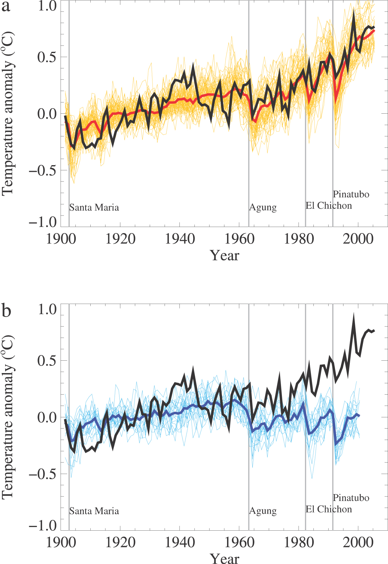
The global average temperature is thought to have climbed about 1.07°C since the industrial revolution, up from a previous estimate of 0.91°C. This update brings all three of the world’s key temperature data sets in line, suggesting the true temperature rise is at the upper end of previous ranges.
…
“Climate change hasn’t suddenly got worse. It’s just our estimate of how much warming has taken place has improved,” says Tim Osborn at the University of East Anglia, UK, who today published a paper with Met Office colleagues on the fifth update to the data, known as the Hadley Centre Climatic Research Unit Temperature (HadCRUT5).
…
Read more: https://www.newscientist.com/article/2262953-earth-may-be-even-closer-to-1-5c-of-global-warming-than-we-thought/
The CSIRO is playing even closer to the fire. According to the CSIRO, Australia is even closer to the dreaded 1.5C climate apocalypse than the world in general;
AUSTRALIAN CLIMATE TRENDS
The Bureau of Meteorology and other science agencies employ a range of atmospheric, terrestrial and marine sensors to track climatic trends.
For example, the Australian Climate Observations Reference Network – Surface Air Temperature dataset is based on a network of over 100 stations, with data for more than half starting in 1910.
The following information is taken from the 2020 State of the Climate report, produced every two years by CSIRO and the Bureau of Meteorology.
Australia’s climate has warmed since national records began in 1910, with most warming occurring since 1950. Australia’s mean surface air temperature has increased by more than 1.4°C since 1910. Since 1950, every decade has been warmer than it’s predecessor. Australia’s warmest year on record was 2019, and the seven years from 2013 to 2019 all rank in the nine warmest years. This long‑term warming trend means that most years are now warmer than almost any observed during the 20th century. When relatively cooler years do occur, it is because natural drivers that typically cool Australia’s climate, such as La Niña, act to partially offset the background warming trend.
…
All this presents a difficult dilemma for climate scientists.
If the adjusted temperatures keep rising at their current pace, pretty soon they’ll blow through the magic death line milestones, and people will start asking what the big deal was.
But if the adjusted temperature series begin to flatten, skeptics will point and laugh, and even mainstream media personalities might start talking about a new pause.
Thankfully there are a few years to go until crunch time, so the most senior scientists of today will all be safely retired long before this aspect of the global warming scare hits the fan.
Uni of E A, yeeeeessss…….
Tim Osborn 😀
“Also we have applied a completely artificial adjustment to the data after 1960, so they look closer to observed temperatures than the tree-ring data actually were…”
https://www.masterresource.org/climategate/climategate-fifth-anniversary/
https://groups.google.com/g/sci.physics/c/CoCD8bQgC7I
worth again a look 😀
You gotta love the “18 per cent more than previously thought, ” line. The reality is that the new figure is 1/3 of a degree F more than before. And that is since the industrial revolution started. Normal human temperature is given at 98.6 F. If it went to 98.93 F you wouldn’t even notice.
Fight Climate Fear. Warmer is Better
Yep.
I thought I’d try to get a handle on what’s happened with the weather over the course of my three score + 10 allotted lifetime. Because apparently, global warming has been the defining influence for my generation.
So, according to one of the many published average global temp graphs, it’s gone down by 0.4C in the first half of my life, and then gone up 0.6C in the 2nd half of my life.
In my father’s lifetime, it went up 0.6C in the first third of his life, then down 0.4C in the second third of his life, and then up again by another 0.4C in the final third of his lifetime.
How did we both manage to survive these human-caused climate crises over the courses of our lifetimes, you no doubt ask.
Even if I had any truck for the notion of a “average global temperature” construct, based on our family’s “lived experience”, I’d rationally have to conclude –
nothing to see here.
Celsius and Fahrenheit are arbitrary scales.. If we are going to be Scientific we need to use an Absolute scale…Kelvin.. In that case then a change from an Av Temp of 14C to 15C would be a change from 287K to 288K an increment of 0.35%
See above. Fully agree. I’ve always considered this. The CAGW religion requires us to limit average global temperature rises to 1.5 degrees C by 2100. Given a present day average global temperature of roughly 15 degrees C, or 288 degrees K, that means a rise of only 0.5% in 80 years – hardly measurable, and not reliably so!
1°C is about 1/30th of the spread of sea surface temperatures.
I was once chastised for criticising SST (see below) because they reconstruct using krigging in the mining industry and it works. Apart from predicting the amount of minerals recovered to within 5% is a good job, they sample uniformly something constant with time that actually is an intensive property. Temperature of a thermometer might be an intensive property of the probe, but it’s not of the region. What is measured is the effects of wind (evaporative cooling), circulation, cloud cover etc. Then you have vast swathes of oceans with not enough data to know what the trend is, filled with calculated values from ship measurements thousands of kilometers away that were not meant for the purpose.
Mike,
Being scientific is all well and good but as I have said many times, the average joe on the street has no clue about Kelvin or any other technical stuff. You have to address these people in language they can relate to or you will lose them.
““Climate change hasn’t suddenly got worse. It’s just our estimate of how much warming has taken place has improved,” Aha, it’s always worse than we thought because now that we’ve taken a better look we’ve been wrong, but our ESTIMATES are better now. That’s why climate modeling is so important. It can change instantly when needed.
And we continuously work toward the most expensive Climate Modeling money can buy with the “no credit limit” Treasury Charge Cards that Uncle Sugar and the Central Authoritarians have at their disposal.
How to lie using statistics….Living in Manchester, England, the Industrial Revolution is kind of our thing…but they don’t ask what was it like in 1760 to cause us to industrialise. Well, we were in a whole series of mini ice-ages. In London the Thames froze so badly you could have winter fairs on the ice. So these idiots want to go back to a time to when we had frozen rivers…idiots the lot of them. Now regarding the 1C increase, thank goodness it happened but as usual, if you want to cheat, always measure warming from the coldest point in time for the last two thousand years…
As far as I know, the first hundred years or so of the “Industrial Revolution” was water powered. Not sure how that caused the so-called modern warming. If some water-powered weaving in a small part of an island smaller than California can cause a world-wide warming trend we are in serious trouble.
We also know they are lying because the so-called “Hockey Stick” graph shows cooling up to the modern era, defined as starting in 1950! Dr. Mann still insists that his paleoclimatology reconstruction has been verified, so how are they suddenly saying the warming started in 1760??? One of these things is not like the other! Only two centuries off…
They used to say in the IPCC holy writ that man-caused warming started in 1950, around the time they started measuring CO2. Convenient. But now they all say it started with the “Industrial Revolution”.
The paradigm shift clearly shows what it is really all about – canceling industry. All of Karl Marx’s fever dreams of resurrecting the Terror were canceled by unprecedented prosperity based on fossil fuels. So naturally, the fossil fuels have to go, forcing the world into crushing poverty so the elites can get back on top. Karl Marx can’t be wrong!
1760 was the depths of the LIittle Ice Age. It is trickery to begin any warming from there. From the bottom of an ice age the only way to go from there is UP. Duh.
They did this same thung from the beginning of the Global Warming period, by starting graphs from 1979, a 20th century low. (IMHO the low was the winter of 1976-77). Of course the slope is positive coming out of a low.
Ome of the main trickery by Michael Mann was to massage his data to eliminate not only tge LIA, but also the Medieval Warm Period, the Roman Warm Periid, and the Holocene Maximum, to create a non-existent faux flat curve going back as far as they wanted. Some flat curves even were flat well back into the Last Glacial Maximum, which is total horse manure. They had it flat, even across the Younger Dryas Boundary, when Greenland ice cores show a drop of a full 9°C.
I for one lived through that mid-1970s cold, and if that is what GW folks think is a desirable climate, I say, “No thank you. I am happy with warmer, myself.”
I’ve never been able to get an answer from them about what the climate SHOULD be.
“defined as starting in 1950”
Any version of mickey mann’s hockey stick I’ve seen, starts the warming around 1905
Coldest point in the last 8000 years
It is remarkable in the Greenland ice cores how freaking out the temperatures were from about 50,000 to aboit 8,000 years ago – and especially how constant after 8,000 y.a. the climate has been.
For my money, we owe the very existence of civilization to this flat time since 8,000, with a couple of millennia before that, that started to flatten out the climate. It is rightful to call this flat period by a different name – the holocene – because the Pleistocene was no time for human prosperity. Not if the ice core record is to be believed.
[I screwed up my email address when sybmittung this. I am re-submitting it, with mud on my face. – Steve]
…1760 was the depths of the Little Ice Age. It is truckery to begin any climate curve from that point – the only way for tge curve to go is UP. DUH.
They did this same thing for the glibal warming period. They started so many of the curves from 1970, a local minima. (The coldest IMO was the winter of 1976-77.)
One big trickery was the curve flattening done by Michael Mann, who massaged his data to eliminate not only the LIA, but also the Medieval Warm Period, the Roman Warm Period, and the Holicene Maximum. After he waa done, none if those sizable fluctuations existed anymore.
As I recall, he flattened it all out to well into the Last Glacial Maximum. Total horse manure.
It’s just our estimate of how much warming has taken place has improved,” says Tim Osborn at the University of East Anglia, UK
Riiiiiight. “Improved”, as in, “it’s worse than we thought”, which is always the case with Alarmoscience.
Improvement via data manipulation and fabrication 🙂
It’s worse that we thought 🙂
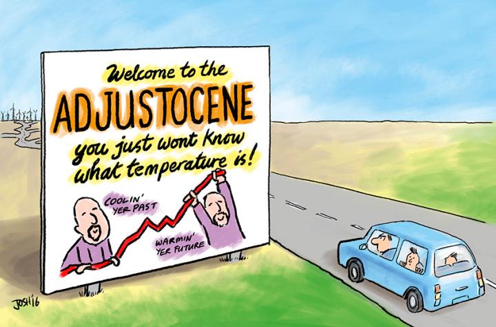
We need Josh to make an Epoch Timeline; Holocene, Anthrocene, Adjustocene, Datanotscene, etc.
I like to refer to the GIS, BoM etc fabrications as being “Once-was-data” 🙂
Because it sure doesn’t remotely resemble what was actually measured. !
That’s true. The CSIRO cites the ACORN-2 “data”.
https://www.csiro.au/en/Research/OandA/Areas/Assessing-our-climate/State-of-the-Climate-2020/References
The huge problem staring them in the face right now is the on-going La Nina.
It appears this will be a strong enough La Nina to push down their GMST estimations coming into IPCC AR6 next year, thus threatening the Alarmist message they are prepping the propaganda machines for.
This is the corner that they are painting themselves into. The clock is ticking against them all the time, which is why they create an alternative reality with their models and cataclysmic projections to try and cause panic.
The extremists of this religion will hopefully be the ones to finish it off.
I wish to propose a new geologic era: The Bolognacene Epoc – defined as when the Earth became covered in so much BS that most intelligent life became extinct. A few sub-groups of intelligent life escaped annihilation by burrowing into their blankets and refusing to come out until the Greenasaurs (who produced the mountains of BS) taxed-and-spent themselves into extinction.
The problem is the Greenasaurs are playing with matches and can burn down the economy that built the economic house (capitalism) we live in. The key is take away their ability play with fire.
I assumed they knew what they were talking about back in 2000 when they said that the line in the sand was 5.0ºC above pre-industrial, so I’m not unduly concerned. Wake me up when it gets to 4.99ºC
When it became obvious that temperatures would never reach 5.0C above pre-industrial, they started adjusting the number down so the level of panic could be maintained. Just a few years ago, they were touting 2.0C as the drop dead number. I guess their internal research has convinced them that 2.0C isn’t going to happen either. Which is why 1.5C is the new go to number.
Which is also what most of the luke warmers said. The only way you can get it higher is by using models and inventing imaginary tipping points for which there is no actual evidence.
These climate scare yo-yos are sticking to their beloved 1.5 deg. C threshold claim but still never produce any scientific study or other evidence that there is any justification for that threshold. No mention of the fact that we’ve been coming out of a Little Ice Age for the past 150-175 years or so, so no mention of natural warming.
No mention of the W&H study stating that CO2 is logarithmically saturated (or close to it). And they call skeptics the deniers? Waiting patiently for the you-know-what to hit the fan unless the whole CAGW scare just quietly dies out.
And who knows how many untold billions of $$$ have been thrown at this scare? Human stupidity is our own worst enemy.
“stating that CO2 is logarithmically saturated (or close to it)”
Energy absorption by CO₂ has actually been reasonably accurately measured.
Its not quite log, and it levels out at 280ppm
Note. curves on the chart are offset vertically so they don’t all collide with each other.
Thanks Fred. If I understand you and the graph correctly, it means most or all of the warming coming out of the LIA has to be natural if CO2’s heat absorption capacity levels off at 280 ppm, correct? The IPCC lines seem to suggest that absorption capacity is not met at 280 ppm. If so, where do they get that from?
“If so, where do they get that from?”
The log curves of the IPCC are purely “theoretical” based on “assumptions” of one sort or another.
Fred — Very interesting!
Do you have references for the Leckner and Eggert curves?
Sorry, lost a lot of links in a computer HDD “end-of-life” incident.
Graphics survives because they were on a different drive.
https://tallbloke.files.wordpress.com/2010/07/agw-an-alternate-look-part-1-details-c.pdf
d’oh..
No idea where I got the number 280ppm from
The graphs clearly show the leveling off starting at around 200ppm.
possible read in the bottom right corner and rounded it off… or just….
……. pre morning coffee !
Nice. But none of this is proof the co2 can cause any warming at the surface whatsoever. Or if it can, that it is not swamped by natural processes.
How true.
The governing energy transfers within the atmosphere are bulk movements of energy between pressure, density and temperature differences
These ABSOLUTELY SWAMP any tiny theoretical warming by atmospheric CO2, within seconds.
Lets make that “The global average temperature has climbed about 1.07 deg C since the start of the Industrial Revolution AND SINCE GLOBAL TEMPERATURES WERE VRECOVERING FROM THE LITTLE ICE AGE” and we are seeing some reality. On the other hand I see about a foot of Global Warming fell on New York City, probably ending the policy of only allowing Resturants to serve outside tables.
Or as another article today demonstrates, temperatures have warmed up 1.07C since the coldest period in the last 8000 years.
BTW, only a total imbecile, or a climate scientist, believes we can measure the temperature of the entire planet to 0.005C bank in the 1800s.
Climate activists routinely abuse, not only the science, but even the Queen’s English, in their contortions to try to not to sound quite as silly as they really are.
When they claim that we must limit “warming” to 1.5°C, they’re being deceptive, because, contrary to the common English usage of the word “warming,” what they call “1.5°C of warming” does not actually mean “getting 1.5°C warmer.” It means only, very roughly, 0.5°C of actual warming, since the baseline temperature which they use is a guesstimate of average “preindustrial” (Little Ice Age) temperatures, instead of the current climate optimum.
They do that because if they used a normal English definition of “warming” (i.e., “getting warmer”) they’d have to say that they think more than “0.5°C of warming” (or, now, “0.43°C of warming”) would be catastrophic, and anyone with any sense would probably laugh out loud.
Of course, since we don’t actually know what preindustrial temperatures were, using that as the baseline means that their target is ill-defined. But that’s okay, they are happy to sacrifice precision for the sake of propaganda, because the real purpose is just to support parasitic climate industries:
Contrary to the New Scientist article, there are not just three “key temperature data sets.” They are ignoring the satellite measurements. The reality is that the warming trend is so slight and difficult to measure that how much warming there’s been depends on what temperature index you use, even for recent decades, for which we have measurement data: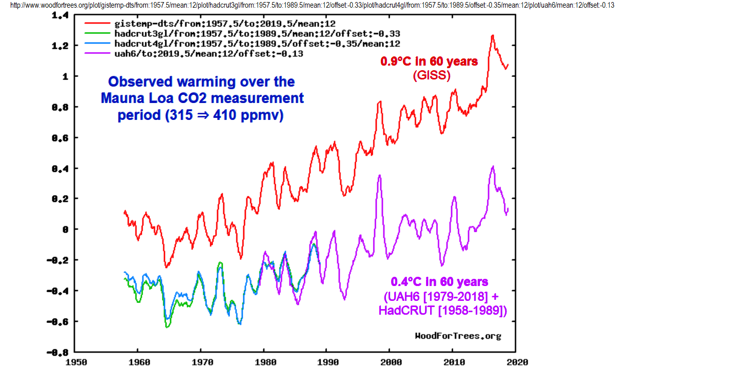
Redefining the word “warming” to mean “in comparison to the chilly LIA” is not the only way climate activists use language that deliberately obfuscates their meaning, to try avoiding sounding silly. Another example is “ocean acidification.”
It’s both a misnomer and a red herring. It’s a red herring because the effect is both minuscule and benign, and it is a misnomer because it doesn’t even acidify the oceans according to any dictionary’s definition of the word:
acidify v. To make or become acid.
Merriam-Webster Dictionary: https://www.merriam-webster.com/dictionary/acidify
Oxford Dictionary: http://www.oxforddictionaries.com/us/definition/american_english/acidify
American Heritage Dictionary: https://www.ahdictionary.com/word/search.html?q=acidify
Collins Dictionary: https://www.collinsdictionary.com/dictionary/english/acidify
etc.
All the world’s oceans are alkaline, rather than acidic, everywhere. So-called “ocean acidification” just makes the most alkaline part of the ocean (the surface layer) slightly less alkaline.
But to claim that is a problem is so obviously silly that the activists needed a scarier name: “acidification.”
George Orwell’s ideas around totalitarian language, Doublethink, Doublespeak and the like are as relevant as ever. These words need to be challenged at every turn so more people will come to understand how the Emperor is clothed.
What they’re really saying is that ” the Little Ice Age was worse than we thought!”
Unfortunately , the BoM Australian temperature data is so corrupted by UHI effects, bad/useless station siting and rabid agenda-driven data manipulation, as to be totally worthless.
Even then, the 40 or so years before 1910 were probably quite a bit warmer than any time since.
Lets look at the UAH data from Australia..
From 1980-1996
A step up at the 1998 El Nino then from 1998-2020 (the title says 17 years, I’ll have to fix that later)
If you look , you can see the step up accoring around 2016 from another major El Nino events
So, essentially NO WARMING OVER AUSTRALIA in the satellite era except from at those two El Nino events
“accoring” => occurring
That is an interesting point and revives memories of Josh’s ‘adjustocene’ cartoon.
 In terms of maintaining the climate change™ hype there will always be extremes of one kind or another to maintain the momentum of hysteria.
From the article: “Australia’s climate has warmed since national records began in 1910, with most warming occurring since 1950. Australia’s mean surface air temperature has increased by more than 1.4°C since 1910. Since 1950, every decade has been warmer than it’s predecessor.”
How does this claim square with the Australian regional surface temperature record, which shows it was just as warm in Australia in the Early Twentieth Century as it is today?
Australia Tmax chart:
Australia chart:
The claim about Australia does not match the actual temperature readings. Those making these claims conveniently ignore the actual temperature readings. Their computer-generated “hotter and hotter” temperature science fiction does not match the facts, so they ignore them, otherwise, they couldn’t carry out their Human-caused Climate Change scam.
Oh, boy! The chart shows up in the post!!!
Bob, does Berkeley use BoM “once-was-data” or original raw measurements?
If so, why is that a bad thing?
A new post on “real climate”: “An ever more perfect dataset?
”http://www.realclimate.org/index.php/archives/2020/12/an-ever-more-perfect-dataset/
“Finally, they have started to produce an infilled data set which uses an extrapolation to fill in data-poor areas (like the Arctic)….”
duh! I posted this in another article earlier- but here again in case you missed it. I find it mind boggling.
“…an extrapolation to fill in data-poor areas…”
In other words, “making up more data than ever before attempted.”
According to the IPCC there is a background global cooling trend supposedly offset by human-caused warming:
IPCC uses “once-was-data” with the 1940s peak heavily redacted.
Fact is, that nearly all the REAL warming since the 1970s have come from the natural cycles of the AMO, PDO, and a series of strong El nino events in 1979/1980, around 1998, and the 2015 El Nino Big Blob events…
…… NONE of which had any human causation..
Using highly homogenised and adjusted surface data deliberately hides this fact
Any temperature chart that does not show the Early Twentieth Century as being just as warm as it is today, is a bogus, bastardized chart. That’s how you spot them.
It’s warmed more than we thought, and we still can’t find any measurable difference in climate.
“We’re Closer to 1.5C Global Warming than You Think” Yay!!!!!! Lets all go out and build nice big fires and cook beef and chicken while consuming beer!
To whomever wishes the challenge:
Please post a graph of only the weather stations reporting in Aus. since 1910, and only the raw, unadjusted TMAX and TMIN actual measurements. No estimates, tweaks, homogenization, please. And no “mean.” Just graph the raw daily for each station.
An examination of the graphs, one station at a time, spaghetti-wise, will not support 1.4 C, is my claim.
GHCN is fine for this challenge.
Why restrict it to 1910, there were several good solid stations using Stevenson screens before then.
For eg Deniliquin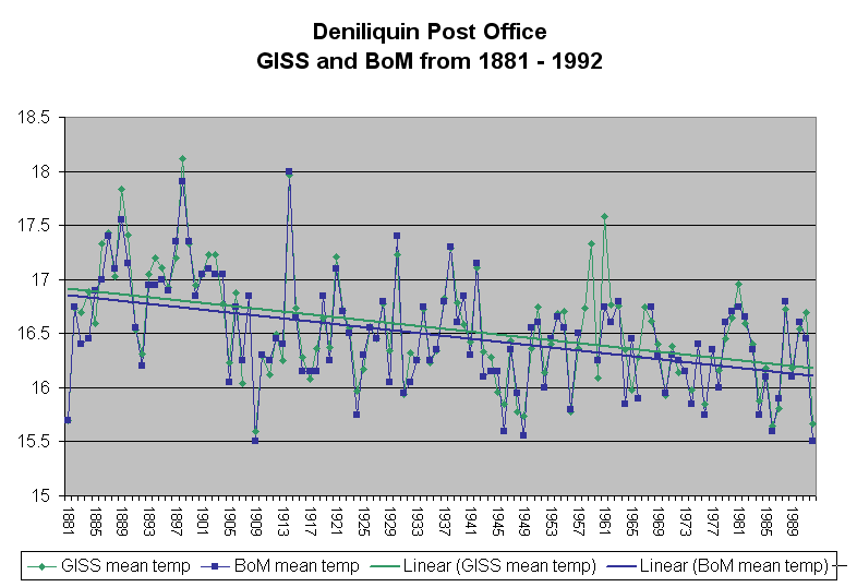
(note, this is data before the BoM data hacks)
Fred, which Deniliquin did you post?
better image …
Note to all: There are only 17 stations in Australia that have reported at least 100 years, and reported in 2018 (at least)
pretty sure its from Bill Gray.
Can’t read you images
Gotta make sure you are using original data
Australia data from BoM is a total corruption of original data.
Click on the image, it will open with readability. I can’t figure out what resolution or size this blog wants.
This is verbatim TMAX from NOAA’s GHCN. My spreadsheet shows the number of “missing” and “ees” (estimated) out of all readings. I truly do not know if … aside from the “ee” posts … the unflagged data from GHCN is the actual TMAX recording or not.
You are exactly correct. The sum of the parts must add to the whole. It is where anomaly averaging shows its problem. For every station with no cooling there must be one with 3 degrees of warming. Make sure and use absolute temperatures. Also track Tmax and Tmin separately.
Warmists would like you to think Tmax is going crazy and will cook everyone. In reality it is Tmin that is increasing and makes it much harder to explain why longer growing seasons are bad.
Raw shows half of 1.4C The BOM claims are noting but political garbage.
From the article: “The global average temperature is thought to have climbed about 1.07°C since the industrial revolution, up from a previous estimate of 0.91°C.”
It is claimed that the “hottest year evah!”, 2016, was 1 degree C above the average temperatue for the period from 1850 to today.
Which would mean we are now at about 0.7C above the average, since it has cooled about 0.3C since 2016.
The year 1934 was said by Hansen to be 0.5C warmer than 1998 (in the US), which would make 1934, 0.4C warmer than 2016, the so-called “hottest year evah!”
So, according to this calculation, we won’t hit the 1.5C “tipping point” temperature until we again get as warm as it was in the 1930’s. We are currently about 0.7C cooler than in the 1930’s.