By Andy May
My last post compared actual sea-surface temperature (SST) estimates to one another to see how well they agreed. It was not a pretty sight; the various estimates covered a range of global average SSTs from ~14°C to almost 20°C. In addition, some SSTs were declining with time and others were increasing. While I did check the latitude range of each of the grids I averaged, John Kennedy (HadSST climate scientist in the UK MET Hadley Centre) pointed out that I did not check the cell-by-cell areal coverage of the HadSST grid, relative to the NOAA ERSST grid. He suspected that the results I presented were mostly due to null grid cells in HadSST that were populated by interpolation and extrapolation in the ERSST dataset. The original results were presented in Figure 6 of my previous post which is Figure 1 here.
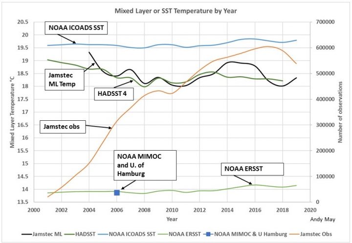
Figure 1. The original comparison of ERSST and HadSST from my previous post.
I asked Kennedy if he had a mask of the populated area in his SST grid, but he didn’t, which was unfortunate. A mask is a latitude and longitude enclosure that can be digitally overlain on a map and used to clip any data that falls outside it. Further Kennedy pointed out that the mask changes month-to-month since much of the data are from ships, drifting buoys and floats. Too bad, more work for me.
HadSST is a five-degree by five-degree latitude and longitude grid and ERSST is a two-degree grid. They are not even multiples of one another, so creating a mask of null areas in HadSST that can be used to clip ERSST data is complicated and time consuming. Fortunately, after programming two “clever” solutions that failed, I was successful in my third attempt, although my computer may never be the same again. The “clever” methods would have saved computer time, but neither worked. In the end I used a “brute force” method, which was an awful looking five-deep computer loop, comparing every grid-cell to every grid cell. Ugly, but it worked, and it is relatively safe from errors.
The results of my ugly logic are show in Figure 2. This figure shows the original NOAA ERSST record, which is identical to the line in Figure 1, the “HadSST masked” ERSST record, and HadSST itself, which is also the same as in Figure 1. At least HadSST falls in between the two NOAA lines.
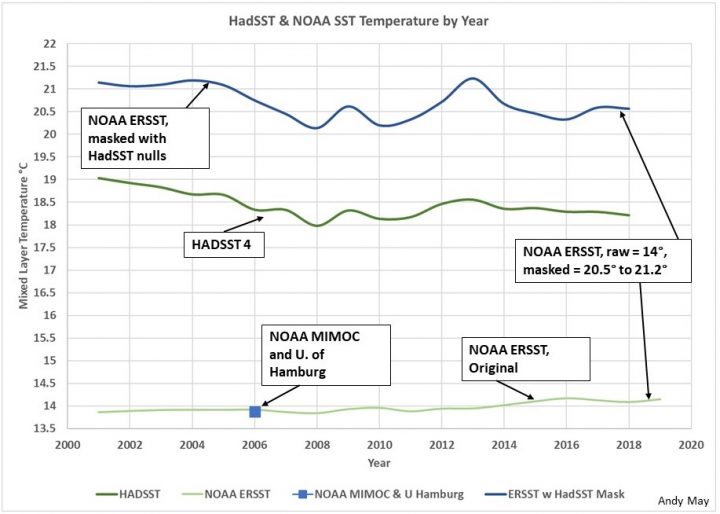
Figure 2. The NOAA ERSST global average temperature before the HadSST mask is applied original) and after it is applied. HadSST is also shown.
We remember from the first post that HadSST is constructed by averaging the points within each 5-degree grid cell. If there are insufficient points in a cell, the cell is left null. NOAA starts with essentially the same data but use a different method to populate their cells. They use a gridding algorithm that populates each of their 2-degree cells with interpolation and some extrapolation. In this way they get a grid that has many fewer null cells and nearly global coverage. Since most of the HadSST null cells are near the poles, the NOAA ERSST record has a lower temperature, as seen in Figures 1 and 2. To illustrate the difference, it is instructive to look at a portion of the original 2-degree ERSST grid, see Table 1. The area shown is in the Arctic ocean, north of Russia and Alaska.
Table 1. A portion of the ERSST 2-degree grid of 2018 SSTs in the Arctic Ocean, north of Alaska and Russia. Notice the constant “fill” value of -1.8°C over much of the area.
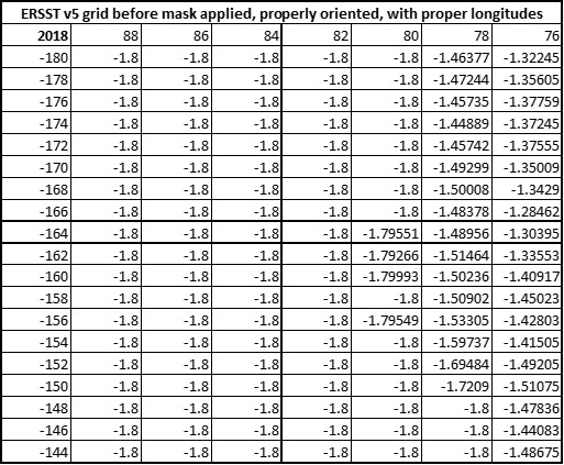
Next, we will look at the HadSST grid over the same portion of the Arctic Ocean in Table 2. These values are not temperatures, but the number of 2018 null months for that cell. Using our methodology of only allowing one null month in a year, only one of these cells, latitude = 62.5 and longitude = -177.5, would be used in our average. While the portion of the Arctic Ocean shown in Table 1 is fully populated in the ERSST grid prior to our applying the HadSST mask, all the values become null after applying the mask.
Table 2. Arctic Ocean HadSST grid cells. The values are the number of missing monthly values in 2018.

Figure 3 is the original ERSST average temperature map for 2018. As you can see, it has values over most of the globe, the nulls are generally in the polar oceans under sea ice. The blue patch in the far northwest, north of Alaska and Russia, is the area shown in Tables one and two. Figure 3 is the map representing the lower ERSST line in Figures 1 and 2. The line shows an increasing temperature trend of about 1.6°C per century.
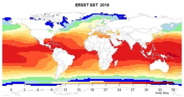
Figure 3. The original 2-degree latitude and longitude ERSST grid cells. White regions are null.
Figure 4 is the same data shown in Figure 3, but every HadSST cell that has more than one month with no value in 2018 has been nulled. Notice that the blue patch north of Alaska and Russia, in the Arctic Ocean, is gone. The null cells are shown in white. We subjectively allowed one month to have no value, but two was considered to be too much. The wide seasonal variations in temperature in the polar regions could have caused more than one null month to affect the average. The uppermost line in Figure 2 is represented by Figure 4. The line lies between 20°C and 21.5°C. By masking the exact cells where HadSST had more than one null month, the ERSST average jumped from 14°C to 21°C, an increase of 7°! Further, the new line is more than 2°C warmer than HadSST. The new ERSST line has also reversed its trend, it now shows a declining temperature trend of 3.5°C/century, almost exactly the same as HadSST (3.48°C/century).
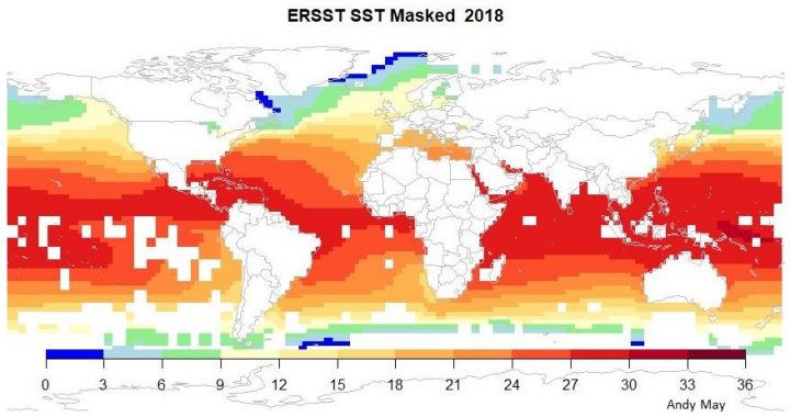
Figure 4. The ERSST map with a HadSST null grid-cell mask applied. White regions are null.
Figure 5 shows the mask used to null the HadSST null cells in the ERSST map in Figure 4. The colors in Figure 5 represent the number of HadSST missing monthly values. We allowed one missing month, so some of the blue cells are nulled, those that represent “1” and some are not, those that represent “2.” All other colors are nulled. White regions have no missing months. Please be aware that the shapes in Figure 4 will not match the shapes in Figure 5 exactly. The ERSST grid is a 2-degree grid and we are applying a 5-degree grid mask to it. To do this I had to search 2.5 degrees in all directions from every cell and populated a two-degree cell grid with the missing months from a five-degree grid. This process is as exact as possible, but it can distort the null areas by up to one two-degree cell. There is no more accurate way to do it without having two grids with matching grid-cell sizes.
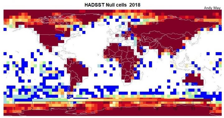
Figure 5. The HadSST mask applied to Figure 3 to get Figure 4. We accepted cells that had one monthly null (deep blue) or no monthly null values (white). Two monthly nulls or more were rejected. The colors represent the number of months in 2018 that have no values. Thus, most of the colored boxes are nulled in Figure 4. Some of the deep blue boxes are accepted, those that represent “1,” some are not, those that represent “2.”
Discussions and Conclusions
John Kennedy was quite correct that applying the HadSST null mask to the NOAA ERSST record made a difference, the average global temperature jumped 7°C! Perhaps more importantly, the trend reversed from a warming trend of 1.6°C/century to a cooling trend of 3.5°C/century. Since the polar regions contain most of the newly nulled cells, one could conclude that the polar regions are warming quite a lot and the rest of the world ocean is cooling. This is consistent with observations, especially in the region around the North Pole. But it is not consistent with the “CO2 control knob” hypothesis (Lacis, Schmidt, Rind, & Ruedy, 2010). If rising CO2 is causing recent warming, why would most of the world be cooling?
We will not judge which estimate of global ocean surface temperature is superior, both have utility. The HadSST estimate accurately reflects the underlying data, averages represent data better than interpolation and extrapolation. Yet, if the goal is to try and provide the best global average temperature estimate possible with the data we have, then the ERSST grid is better. Our goal was to compare the two grids without using anomalies, which are not needed here. Kennedy’s comments helped us do that and we are grateful for the help. The result shows that while the ERSST estimate, which falls on the University of Hamburg and the NOAA MIMOC multiyear estimates, is probably the best estimate of global ocean surface temperature, it is speculative. The true ocean measurements, well represented by HadSST, do not support ERSST. Thus, while ERSST’s estimate is logical, it does not derive from the underlying data. Just because a map looks like you think it “should” look, doesn’t make it right.
We can also conclude that we have no idea what the global average surface temperature of the oceans is or whether it is warming or cooling. The data plotted in Figures 1 and 2 show a huge range of temperatures, and all based on essentially the same the raw data. The error implied by the estimates is, at least, ±3.5°C. The HadSST/ERSST estimated warming, via unnecessary and misleading anomalies, is 1.7°C/century for this 19-year period. Yet both HadSST and ERSST actual temperatures show cooling of 3.5°C/century over the same period.
Anyone who thinks they know what the climate is doing today or will do ten years in the future, just isn’t paying attention. It should be obvious to everyone that the oceans are the single most important driver of our long-term climate and the records that we rely upon to tell us what sea-surface and mixed layer temperatures are doing are not up to the task. You might as well use dice to choose a temperature.
I processed a lot of data to make this post, I think I did it correctly, but I do make mistakes. For those that want to check my work, you can find my R code here.
None of this is in my new book Politics and Climate Change: A History but buy it anyway.
Works Cited
Lacis, A., Schmidt, G., Rind, D., & Ruedy, R. (2010, October 15). Atmospheric CO2: Principal Control Knob Governing Earth’s Temperature. Science, 356-359. Retrieved from https://science.sciencemag.org/content/330/6002/356.abstract
“We can also conclude that we have no idea what the global average surface temperature of the oceans is or whether it is warming or cooling.”
Just another in an endless series of why you should never average absolute temperatures. They are too inhomogeneous, and you are at the mercy of however your sample worked out. Just don’t do it. Take anomalies first. They are much more homogeneous, and all the stuff about masks and missing grids won’t matter. That is what every sensible scientist does.
So it is true that the average temperature is ill-defined. But we do have an excellent idea of whether it is warming or cooling. That comes from the anomaly average.
Nick, All the temperatures are (supposedly) corrected to a 20 cm water depth. I took care of the areal distribution differences. What possible excuse is there to make an anomaly and remove youself one more step from the measurements?
Point 2: Why do the measurements show cooling and the anomalies show warming?
Point 3: Why the huge spread in measurements? If the spread is so big, how can the anomalies mean anything?
Andy,
Every temperature is the sum of an expected value Te, which could be a long term average, and an anomaly Tn, which contains the information about whether it was a warmer month than usual, and cumulatively, whether it is warming. Space averaging is linear, so the space average A is the sum of Ae and An. But with missing values, Ae is not constant, even though Te is. It varies greatly, in a way that has nothing to do with climate changes. An, the average of anomalies, does not vary much as missing cells change, and it does express what you want to know – the change due to climate (or weather) variation.
There is a simple test of all this. Just repeat you averaging calcs with long term averages replacing the monthly data. Your graphs will look much the same. They are not telling you about climate difference, but just the vagaries of which cells you happened to include in the average.
Andy,
“Point 2: Why do the measurements show cooling and the anomalies show warming?
Point 3: Why the huge spread in measurements? If the spread is so big, how can the anomalies mean anything?”
For completeness, to answer these points:
2. The absolute temperatures show cooling because the coverage of cold regions is improving over time. That just reweights the average towards cold. Nothing to do with climate change.
For anomalies there isn’t an Arctic bias. The warming is due to climate.
3. The huge spread in measurements is because absolute temperatures do have a huge spread, and you are sampling. The spread is the sampling error. The more homogeneous anomalies are within a degree or two of zero, but even better, and spatially more coherent. You don’t learn anything from the sampling error (missing cells etc) of a known latitudinal variation. Take it out.
OK, lets mentally graph our measurements of temperature alongside of our calculated anomalies to put every in perspective. Add in error bands for temperature measurements. How do those error bands compare to the calculated anomalies? Extra points are added to the grades of students who conclude “who gives a shit.”
I, as a free human, will not allow ideology to lower my standard of living. Dancing on the head of the scientific pin is no way to guide our lives. To CliSci: Prove it or stuff it!
Nick,
“The absolute temperatures show cooling because the coverage of cold regions is improving over time. That just reweights the average towards cold. Nothing to do with climate change.”
So having more coverage of warm regions doesn’t “reweight” the average toward warming? If increasing coverage of cold regions has nothing to do with climate change then higher coverage of warm regions also has nothing to do with climate change!
“The spread is the sampling error.”
No, he spread of the absolute temperatures is the VARIANCE of the data! When you ignore the variance of the data then you also ignore the biggest factor in actually determining climate!
“2. The absolute temperatures show cooling because the coverage of cold regions is improving over time. That just reweights the average towards cold. Nothing to do with climate change.”
But that is exactly the point. Your comment ASSUMES that the current distribution is the one that should be used. How do you know this? It may very well be that warmer coverage is too much. What you are saying has nothing to with climate change. Proper measurement scheme and process is the issue.
The huge spread in absolute temps is what should be shown. You forget and don’t mention that the variance is important to know so any growth/decrease that is within the variance can be properly evaluated for natural change versus CAGW.
Here is just one explanation of why the arithmetic goes so wrong for this SST data. Suppose you have a set of data representing locations, eg HADSST, and you average. What about missing cells? If you just leave them out, you can check with some elementary arithmetic that that is equivalent to replacing them with the average of the cells for which you do have data. I describe the consequences of that here, and in the linked preceding post. Replacing with the overall average is often very wrong. With SST, the missing cells are very likely to be Arctic. Replacing them with global average values makes the result much warmer. How much warmer is variable, depending on how many cells are missing in each month.
This is basically why you get HAD so much warmer than ERSST. ERSST is interpolated, so doesn’t have that artificial warming from missing Arctic cells. The discrepancy is due to inhomogeneity, which in this case is mainly that polar regions are predictably a whole lot colder.
With anomalies, there is no equivalent big difference between what you expect a cell to have and the global average. Both are much closer to zero. So you don’t have nearly such a big problem resulting from the fact that the data being compared covers different regions.
If you really must average temperatures, you should have a proper infilling scheme for replacing missing values. You should replace them with a proper expected value given where they are; either a long term average if you have one. or something calculated from neighboring values.
Use of words like “expected temperature” are dangerous and reveal how much of the thinking has been poluted by the desire for a particular result. Simillarly, the use of “anomaly” shows a desire to make it sound dangerous and unusual. In normal use, the words would be “baseline” and “difference”. Until climate “scientists” stop thinking in this way, we will never make progress to finding the truth about our climate.
OK, let’s take the best temperature estimates we currently have. Over the Holocene, world wide temperature averages have gone both up and down significantly. Over the last few millennia, again with obvious ups and downs, the world has been cooling. Over the last few hundreds of years, again with obvious ups and downs, from the coldest period of the Holocene, the Little Ice Age, up until now we have had slight warming.
One must ignore everything before 1950 to ascribe temperature increases to CO2. Nitpicking over tenths to hundredths of degree C using different methods of calculation distracts us from the con game being played by CAGW schemers. Attack the liars’ foundations, not their margins.
Stokes
Image processing specialists have found that ‘salt & pepper’ noise is best addressed with convolution with a weighted kernel in the form of a median filter. Null map cells are a good analog for ‘pepper’ in the image.
Nick – what makes an anomaly (a difference between a measured temperature and a base temperature) more homogeneous than a measured temperature?
A pretty humorous exchange between Andy and Nick….based on their beliefs about temperatures NOT actually taken, and when they were, it was from exactly 1 foot under the sea surface….which was moving up and down 15 feet or so at the time, in changing weather conditions…..so you can read the thermometer to 0.1 C but repeat readings are often 0.5 C different, sometimes 2 C different, cuz, you know, both the boat and current have moved along…. And thinking that averaging 1000 readings makes you accurate to a hundredth of a degree is statistical folly. So really whether your current reading is the difference between it and the average of the last hundred readings at that point on the planet, or the difference to the freezing point of water at the thermometer factory is splitting hairs.
DM,
You pretty much nailed it. Averages of absolute temperatues have huge uncertainties. Those uncertainties don’t lessen when you use anomalies. The higher the quantity of uncertain averages you use to create a new average the larger the uncertainty gets. Nor can you reduce uncertainty by averaging cells, interpolating, or extrapolating.
Nick views the data, even averages, as the tablets given to Moses by God. 100% accurate with no uncertainty.
“If you just leave them out, you can check with some elementary arithmetic that that is equivalent to replacing them with the average of the cells for which you do have data.”
This only works if you have *accurate* data from the cells you use to create the average! If that data has an uncertainty interval then that uncertainty interval grows as you create your average and thus using the average in null cells just carries the uncertainty right along with it! It simply cannot result in a more accurate estimate! No amount of statistical finagling can change this.
What is missing here is validation.
Take a cell that has values, delete the values then run the system to generate values. Compare the generated values to the actual values. Do this for every cell in the system, there are not that many in computer terms.
The result can be the min/max/mean errors of your infilling algorithm(s). This tells you the accuracy of your system and that should guide the precision with which results are generated. If the algorithms are only accurate to within +/-2C then displaying results with a precision of 0.01C is close to malpractice.
It is probable that an AI system could take these validation errors and generate a new infilling algorithm. The current system of assuming that generated figures are close without validation seems a little suspect.
Ian,
“If the algorithms are only accurate to within +/-2C then displaying results with a precision of 0.01C is close to malpractice.”
It’s not just “close” to malpractice. It *is* malpractice.
Why don’t peer reviewers require such simple calculations to show the possible errors of infilling methods? I’ve spent years reviewing scientific, engineering, economic and financial studies and always questioned assumptions and methods. Why is CliSci such a loosey-goosey field of study?
Becuz it is more politics than science.
Tim,
Yes, ignoring uncertainty in the chain of calculations seems to be the preferred approach of climate alarmists. Yet, those same individuals will use words like “may” or “could” to describe possible, but improbable, future events.
What makes them more homogeneous is that an appropriate value is subtracted for each cell. If every observation is reduced by 16C, then the observations do not become any more homogeneous. But if 6C is subtracted from a cell in the Arctic and 23C is subtracted from a cell in the Persian Gulf and so on, then the expected anomaly can be made roughly zero in every cell. In that case, if you have observations in a cell, the values will be close to zero, and if you do not have observations the value will effectively be infilled by the average, which is zero. As a result, irregular patterns of missing data have very little effect on the final result. (And if you want the average original temperature, just add back the base values in each cell after averaging the anomalies.)
We will never get this perfect, as some commentators have pointed out, but the closer we get to making the average anomalies zero the more accurate the result will be. The error in the average falls off much faster than the error in the base values that we assume for the respective cells.
paul,
“We will never get this perfect, as some commentators have pointed out, but the closer we get to making the average anomalies zero the more accurate the result will be.”
You can’t make the anomalies more accurate through finagling the values, not even by using averages. How do you know that 6C is the correct base to use in one case and 23C in another when the temperatures have uncertainty intervals of +/- 0.5C?
That’s the point, Tim. You do not need to know the exact base values to get results which are much less biased by data in missing cells. If you use a base of 7C in a cell where it shoud be 6C, and 25C in a cell where it should be 23C, you will get slightly biased averages. But if you use the actual temperature data, you are implicitly using a base of 0C in every cell, and that produces much larger errors when there are many cells with no data.
Once you realize that “using the original data” means the same as “computing anomalies assuming a base value of 0 in every cell”, you realize that there is no way to avoid using anomalies for the calculation that Andy has done. The only choice is between using fairly good anomalies and using very bad ones.
paul,
I can only say “huh?”. If you do not know the exact base then how do you get an exact anomaly? The issue is the uncertainty. The uncertainty follows the data no matter where you use it. If you have an uncertainty of 1C (i.e. the difference between 6C and 7C) then you will have an uncertainty *larger* than 1C when you combine it with other measurements – i.e. create an average.
When you average the *actual* temperatures you are not using any kind of an anomaly “base”, Certainly not zero. If anything the base is -273C, absolute zero! On a percentage basis using the -273C base gives you a *smaller* difference than using a different arbitrary base.
Here is the deal. If I record 70 deg +/-0.5 and use an average of 70, my anomaly is 0+/-0.5. That simply swamps your anomaly to the point that you can’t reliably say what the true anomaly is. The uncertainty interval is +/-0.5 regardless of what you do further.
Uncertainty is what you don’t know, AND CAN NEVER KNOW! What should be done is to black out the whole interval so nothing shows except what is outside the interval. You would have a much better indication of what you truly know.
This sounds really dodgy. Putting an “anomaly” of zero instead of a null value creates data that is almost certainly wrong. Pushing wrong data through any sort of averaging algorithm will produce the wrong average.
Hivemind, that seems to be the intent as long as the ‘wrong average’ fits with the narrative.
pauldunmore, Your arguments seem to use the term “accurate” incorrectly. What you are saying is that if you use anomalies, infilling the map looks better. Of course it is no more accurate, in fact depending upon how the “infilling” is done or the Te is computed, it is probably less accurate. The only advantage of using anomalies is that error is harder to detect, and the appearance of the product is better.
Paul
If your goal is to reduce the ‘anomalies’ to zero, then the appropriate approach is least squares regression, not subtraction of a trial-and-error dummy value.
Curious,
If you use -273C as the base then the measured temperature *is* the anomaly as well.
George,
Yes, the base temperature is arbitrary. One could justifiably use the freezing point of water as the base line, which is fundamentally how Celsius temperatures are defined. As it is, a 30-year period is used commonly, and different periods are used by different researchers. Different researchers use different temperature records to calculate the baseline. Researchers update their baseline as years pass by. So, we end up with Heinz 57 anomalies that are often difficult to compare directly, unlike ‘absolute’ temperatures. Further, if the researchers rationalize higher precision in the baseline through the Law of Large numbers, as Stokes is want to do, then, when one takes the difference between temperature measurements, the precision of the anomaly should default to the least precise measurements, the ‘absolute’ temperatures.
Probably a better way to handle the data is to fit a trend line to the historical data of interest, subtract the trend line from the data to obtain what is more commonly called residuals, and use that as the ‘anomalies.’ That would provide a better estimate of the natural variance. Then alarmists can compare the slope of sub-periods to the entire historical period.
Clyde,
Not a bad suggestion about using the residuals. You still have the issue of the uncertainty intervals carrying through from the absolute temperatures into the residuals. Plus the fact that ‘m not sure what using the residuals as anomalies will actually tell you anything. What does an average of the residuals actually represent?
Tim,
It seems to me that the residuals represent the natural variation for the particular time period, with a min & max (range) and a calculable average variance; the average should be zero. It tells us what the uncertainty is because the range is +/-2 or 3 standard deviations, depending on how conservative one wants to be.
The uncertainty isn’t defined by a standard deviation. A graph of residuals coupled with uncertainties would look like the the attached graph. The uncertainties would cause the lines to be wide rather than nice lines through 100% accurate data points. The average would be a band, not a line. Same for the temperature residuals. The residuals would be positive as the temperature warms past the average and would be negative as the temperatures cool past the average.
I’m still not sure what this would actually tell you other than the seasonal variation of maximum and minimum temperatures.
I have always been a fan of tracking the cooling degree-day values and the heating degree-day values. These tell you more about what is happening with the actual climate. And they represent an actual integral of the temperature profile above/below a fixed point, e.g. 65degF, and no averaging is involved. You can actually do the integral using the positive uncertainty and also the negative uncertainty and get values to plot on a graph. You’ll wind up with the integral actually being an interval rather than a fixed data point. You can then track the daily values from year to year for each day. In fact, your residuals could actually become the difference between daily values across the years. E.g. did the daily heating degree-day value for Jan 2 between 2000 and 2020 go up or down from year to year A trend line through those residuals would actually tell you if Jan 2 is getting warmer or cooler over time.
Something to think about.
Tim,
You said, “The uncertainty isn’t defined by a standard deviation.” It is SOP to add a suffix of +/- 1 (or 2) SD to the estimate of a value. The precision is implied by the number of significant figures. How do you interpret the SD if is isn’t an uncertainty?
Clyde,
The use of standard deviation only applies if you have a probability distribution associated with the data points in a set. A probability distribution is the function that gives the probability of occurrence of the different values.E.g. a Gaussian or Poison function.
An uncertainty interval has no probability distribution describing the possibility of any specific value in the interval. There is no mean. There is a median, it is the stated value. But where the “true” value lies in the uncertainty interval is unknown.
Standard deviation applies when you have dependent multiple measurements of the same measurand. The measurements define a probability distribution. If that distribution approaches a Gaussian then the mean of the distribution has the highest probability of being the “true” value. Standard deviation, or better the variance, gives an indication of how much the different measurements vary from the mean. It gives you an indication of the spread of the data values, i..e do you have a low, broad peak at the mean or a high, narrow peak. If you are doing multiple measurements of the same thing and wind up with a wide variance in values it’s a pretty sure bet something is wrong in the measurement process, e.g. using a caliper with a lot of slop in the gears.
It’s easy to confuse uncertainty with standard deviation because they look so similar. But they are most definitely not the same. I should note that when I am talking about uncertainty here I am talking about systemic uncertainty, not error or bias. Statistical tools can be used with error and bias. Measurement results affected by error and bias *are* correlated.
This is all why a “global average temperature” to me is just meaningless. Because of all the independent, uncorrelated measurements that go into calculating that average, the uncertainty of the result is so large that the average tells you nothing.
This is apparently not a subject that is taught much in university much any more. Ask new engineers about their digital multimeter and they will tell you that the reading is the reading without ever knowing that digital multimeters have tolerances (i.e. uncertainty) just like analog meters.
Tim,
Even for non-normal distributions, one can make estimates of the number of samples within a given number of standard deviations, thereby assigning a probability that the correct value lies within the range.
To whit, “Tschebysheff’s Theorem applies to any set of measurements, and for purposes of illustration we could refer to either the sample or the population.” So, any sample large enough to calculate the variance will allow us to set bounds on the number of measurement falling within an interval.
“Tschebysheff’s Theorem : Given a number k greater than or equal to 1 and a set of n measurements y1, y2, …. yn, at least (1-(1/k^2)) of the measurements will be within k standard deviations of their mean.”
[Mendenhal, W. (1975), Introduction to Probability and Statistics, Duxbury Press, p. 33]
Clyde,
Nice try but you miss the point. There *is* no probability distribution for an uncertainty interval, not a normal distribution or a non-normal distribution. There are no samples inside an uncertainty interval so there can’t be a standard deviation or variance.
A single temperature measurement is not a “set of measurements”. Or, better yet, it is a set of one data point. So there can be no sample size greater than 1, the exact size of the set. Since there is only one member of the set there can be no variance.
You are stuck in trying to see uncertainty as error. By making multiple measurements of the same measurand using the same measurement device you can calculate a standard deviation for the measurement set and if the probability distribution is a normal one (which it probably will be due to random error) you can determine the mean pretty accurately using the central limit theory.
Think about it: “a set of n measurements y1, y2, …..yn”. When a weather station reports a maximum daily temperature then exactly what is (y1, y2, ….yn)? Looks to me like there is just y1. A set of one, a population size of one, and a mean equal to y1. You can’t go back and take another measurement because the measurand has moved on in time – i.e. no measuring in the past. Your second measurement becomes a different, independent set of size one based on a different measurand.
Now y1 *will* have an uncertainty interval but there is no probability distribution for that one single value in the set of 1 value. If u is the uncertainty then the *true* value might be y1 + .5u or y1- .25u or something else in the uncertainty interval. You just don’t know and statistics won’t help you figure it out when there are not multiple measurements in the set.
Nor will having two measurement devices help. Each will be measuring a slightly different measurand and therefore all you will have is two independent measurements of independent measurands, each with a set size of one. Their uncertainties will still add root sum square.
I see that I have a ‘secret admirer!’ I ask a question and receive a negative vote. I must be doing something right!
If I stick my head in a 450 degree oven while standing in a bucket of liquid nitrogen at -320 degrees the average is a balmy 65 degrees, perfect for comfort by average temperature seeking people worldwide.
And if you take one foot out of the bucket the Greenland Ice sheet will melt.
Hi Nick,
Anomalies have their uses, no doubt. I will look at your posts and perhaps comment.
There are problems with relying solely on anomalies, or saying that the trend, from anomalies, is superior to the trend from measurements. These are mobile measurements, within a cell, one day it’s a ship, the next day a drifting buoy. We are talking about a reference period of 30 years! Buoys are changed out, ships change, Argo floats are replaced. How can you compute an anomaly from a single moving ship or buoy? How can you compute an anomaly from a cell when the measuring devices within it are constantly changing? The anomaly has no real meaning, especially over 30 years. A single, anchored buoy, like a single fixed terrestrial weather station makes some sense, but even then 30 years is a long time. Equipment is replaced, the environment changes, etc.
How can you be sure you know what the anomaly is measured from? What does it mean? At least a measured temperature uses an objective standard.
Andy,
“How can you compute an anomaly from a single moving ship or buoy? (etc)”
You work out an expected value for that place and time. It doesn’t have to be perfectly accurate (else why measure?); it just has to express the variation due to fixed effects like latitude. You take those out. The anomalies then represent changes due to weather/climate and you can figure whether those are up or down.
It will still matter a little bit that you aren’t measuring in the same place each time, within a cell, say. But that is the point about anomalies and homogeneity. The difference caused by varying the location are much much smaller.
The thing is, everyone does it, and says everyone should do it. There really is a reason. You are not doing it, and finding all sorts of things going wrong. See?
Nick,
How do you know what the EXPECTED VALUE actually is? If it’s not perfectly accurate, i.e. it has an uncertainty interval, then you *must* process the uncertainty interval right on through any subsequent calculations.
Again, climate is the ENTIRE temperature profile, maximums, minimums, and seasonal. Averages hide all that. You simply can’t tell what climate is from an average. It’s impossible. As someone else point out, stick your head in a 425deg oven and your feet in a bucket of liquid nitrogen, your but will be a perfectly survivable average. The average simply tells you nothing. And an anomaly calculated from that average will tell you even less!
Nick, Are you really saying I should do it because “everybody does it?” I have some teenage grandchildren I want you to meet! I also want to hear about your magical Te values and where they come from. I don’t see any value from subtracting a magic number from measured temperatures, supposedly corrected to a uniform depth below the ocean surface.
The more I learn about measuring SST, the more disappointed I am.
“Are you really saying I should do it because “everybody does it?””
No, I’m saying there are reasons why it is essential, which are well understood by appropriately educated scientists. You are just not understanding it, and so everything is going wrong, as expected. It isn’t just done for SST, but for all temperatures. Satellite measures have to do it too.
Paul Dunmore is explaining it well above.
It appears to me, Nick, that the use of anomalies obscures the significance of the magnitude of numbers which represent physical phenomena. For example, the difference of 0.01 in a quantity of a magnitude of 0.1 is of vastly more significant than the same variance in a quantity of magnitude 10. The conclusion? A 1C increase in assumed global temperature over 300 years pales in comparison to the large variations in temperatures over the past 10,000 years.
Nick,
“No, I’m saying there are reasons why it is essential, which are well understood by appropriately educated scientists.”
That isn’t an answer. It’s an argumentative fallacy called a False Appeal to Authority.
Please elucidate the *actual* reasons if you can. If you can’t then admit it.
Dave,
“For example, the difference of 0.01 in a quantity of a magnitude of 0.1 is of vastly more significant than the same variance in a quantity of magnitude 10.”
Not with temperature. Unless you deal with K, there is always an arbitrary offset. You can add any constant to temperatures and it doesn’t change anything. Going from 0 to 0.01 C is going from 32 to 32.18 F.
Nick,
Going from 1C to 1.01C is a 1% change.
Going from 274.15K to 274.16K is a 0.00364% change.
Going from 32C to 32.01C is a 0.5% change.
The absolute value *does* have a significant impact of the magnitude of the change.
This is so self-evident how can you possibly argue otherwise?
Nick, you are like the guy standing on a boat rail peeing into the wind and insisting your pants are wet from the sea water.
The numbers you are dealing with ARE NOT JUST NUMBERS, they are PHYSICAL MEASUREMENTS. They are imprecise. Nothing you can do with statistics or anomalies will change the interval of impreciseness. And, let me reiterate, that uncertainty IS NOT the variance in the data stream. Each data point is imprecise by itself and you can not go back in time to figure out a better measurement. The 30 year average also has uncertainty and it is probably larger than the current measurement which means you have an even larger resultant uncertainty.
And, don’t even get me started on how imprecise measurements are when considering ocean currents, upwellings, and other events.
Nick, my comment should have been clearer; I’ll try another way: The anomaly base is the average of, presumed, in situ measurements over a determined period of time. Over time, the accuracy of measurements changes and, as a practical matter, the locations of the measurements change, especially in the case of SSTs. The consequence is that, from the sense of the present technology, the magnitude of errors grow as we go farther back in time. The base divisor of the anomaly must then vary in accuracy based upon the time period of the averages of the measurements. More-accurate (presumably) recent measurements would, therefore, be polluted by older (less accurate) average measurements.
It works both ways; If the base average for anomalies is more accurate today, then the past measurements compared to those averages are more inaccurate. If the older base averages are less accurate than today’s measurements, then the current anomalies are still inaccurate in comparison.
My conclusion? Get a grip. The world is wonderful. Fear is a corrosive emotion.
Nick, I do not dispute that when dealing with terrestrial temperatures, especially those built from measurements that have fixed locations, like weather stations or satellite measurements, anomalies can be useful. But, an SST dataset is built mostly from moving instruments, ships, drifting buoys, Argo floats. Satellites don’t work due to the skin effect, that I already described. There is too much error in your reference value (Te or 30 year average subtracted from the estimated temperature to get an anomaly). In essence, I believe, SSTs have twice as much error as actual measurements corrected to 20 cm depth.
What anomalies do is make the error harder to see. It is there in all its glory, when actual temperatures are used, but obscured when anomalies are presented.
Nick
This is beginning to sound like a joke, “Pick a number, any number as your *expected* starting point”. It makes people cringe when so-called experts invent a starting point and then tell you, every day of every year for decades, that you’re going to die any second now – and we’re all still living. Not a sign of disaster on the horizon but these experts keep modelling guessed-at numbers to prove that something will happen, sometime, perhaps.
If you don’t have a starting point, you don’t have one. Don’t invent it so that you can create an anomaly that suits your point of view. Anomalies are what you use when you don’t have real numbers to work with. Norwegian cod fishing records going back to the 16th Century are more reliable indicators of sea temperature variations than your throws of the dice.
It isn’t a starting point. It is an observed long term mean.
What is the 10,000 year long term mean?
” It is an observed long term mean.”
Ha, yes, a mean calculated through vastly different methods, over different changing areas, with many instrument changes over decadal time scales, run through evidently warm biased programs ( hence the change in historical records and what was done with bucket readings)
In other words, FUBAR, “whole sell conjuncture based on little facts”.
+1000
Anomalies are useful when you are dealing with a subject that has a “normal”, otherwise they are arbitrary. Climate and weather have no “normal”.
+10
The use of anomalies assumes “everything else is equal.” I’ll leave the detailed analyses of changing historical physical temperature measurements related to “everything else is equal” to those of you addicted to mental masturbation. Extra points will be awarded to those that use millennial timescales.
+100!
In other words, you have to properly cook your data before using it in order to show what you have been paid to show.
Nick Stokes:
What was the GMST for 1980, 1990, 2000, and 2010?
An anamoly is not the GMST. How can you reference the GMST.
You argued you cannot. You proved the GMST does not exist.
“Take anomalies first. They are much more homogeneous”
Also more erroneous.
Subtracting two values increases the error. Often, hugely.
But you have no idea, Nick, what caused the past, post Little Ice Age, minor warming. The use of anomalies in the tenth, hundredth and even thousandth of a degree C disguises the magnitude of the errors of the base temperature measurements. Additionally, combining ocean and land temperature anomalies is scientific malpractice.
Nick, there is real evidence that “global” (a summation of discrete points) temperature changes by second, by minute, by hour, by day, by week, by month, by year, by decade, by century, by millenium, etc., all using differing measurement methods. Nothing bad (climate-wise) has happened since the Little Ice Age, nor is it happening now. The minor warming (about 0.13C/decade during the current warming cycle since 1979) is noise considering the magnitude of natural changes over time. Dicking around with numbers, anomalies and statistics is fodder for charlatans.
Interesting as always. Thanks Andy
Does anyone know the break down (proportions) of the sources of heat that enter the ocean from various sources through time. Its easy to find sources that point to SW solar radiation as the major source, but I have yet to find hard numbers on other sources such as LW radiation, conduction, geothermic, etc. In the same vien, I would also like to find hard data on heat outflow by source. Any citations would be appreciated.
Nelson, I have not seen any hard data, but I have read some estimates, so the data must be out there.
All you need to know is that the ocean temperature is thermostatically controlled. Open ocean water can never exceed 305K because the heat rejection, primarily through cloudburst, increases dramatically above 299K and the shutters are tight by 305K. Cyclones and monsoon, that result from cloudburst, cause transfer of latent heat from oceans to land as observed by rainfall on land. But a large proportion of the rejected energy never gets to the surface because it is reflected from high in the atmosphere.
https://1drv.ms/b/s!Aq1iAj8Yo7jNhAv8U6pUAUXPX3nB
A cyclone can leave the ocean surface 3C cooler in its wake and that wake can cover vast area of the ocean. Cyclones are a significant means of energy rejection from ocean surface.
The information to do your own analysis is readily available from the NASA NEO site. For example:
https://neo.sci.gsfc.nasa.gov/view.php?datasetId=CERES_NETFLUX_M
There is a whole range of global data that can be downloaded at selected surface resolution.
Being satellite data it is subject to a whole raft of measurement errors but it gives global coverage and has merit for comparative analysis to build a comprehensive understanding of what the thermostat does and insight into how it works. If you understand the processes of sea ice forming and cloudburst (producing highly reflective atmospheric ice) you will have a very good understanding of climate on Earth. Certainly far more valuable than the thoroughly trivial aspects of anything to do with CO2.
Geothermal on average is trivial. A large volcano can spew out enough dust to perturbate the thermostatic control but it recovers within a few years at most.
Nelson says ” Its easy to find sources that point to SW solar radiation as the major source, ”
In affect GHGs are said to increase the residence time of LWIR radiation in the atmosphere.
The oceans are, in affect, a Green House Liquid, increasing the residence time of SW radiation entering the oceans. That residence time has far greater affect on Earth’s ( land, oceans, atmosphere) energy content, then the relatively very small change in residence time due to GHGs.
Indeed the residence time of SWR entering the oceans can vary from micro seconds ( reflection) to centuries, penetrating up to 800 feet deep. Now, even though total TSI varies little over solar cycles, the wavelength varies considerably, and therefore the energy input into the oceans, likewise varies considerably. And some of that flux can accumulate for years, as the residence time of that energy flux may be years. Thus a small watt per sq meter flux, may make a large contribution over time.
Unfortunatelyy, AFAIK, nobody has attempted to quantify this.
It is a curious thing to attempt to quantify the Earth’s energy content and flux from simply measuring atmospheric T, when , in fact, the oceans hold 1000 times the energy of the atmosphere, and we live on a water planet with the oceans having vastly greater energy residence time, vastly greater total energy, and much greater residence time flux.
As an example the earth revieves about 90 watts per sq meter more radiation during the S.H. summer, absolutely dwarfing any possible CO2 affect, yet the average global T drops! Why, well the average residence time of solar insolation in the NH is reduced due to increased albidio from increased snow on the ground, and much of the increased solar insolation in the SH is also lost to the atmosphere, as it penetrates the sea surface for disparate residence times, lost to the atmosphere but not the earth, or said SW energy is also used up in the phase transition of liquid to vapor over the vastly larger SH oceans.
Does the Earth’s ( land oceans atmosphere) energy content increase or decrease in the Southern Hemisphere summer while receiving plus 90 watts per sq’meter?
I don’t know, do the ” climate scientists?
Perhaps we should have definitive answers about this 90 watts per sq’meter change, before we have the arrogance to think we know what the earth does with a theoretical plus 2 watt per sq meter CO2 induced change in LWIR energy.
Oceans cover ~70% of the Earth’s surface and transpiring plants cover a further 20%
Infrared in the CO2 wavelength will be absorbed by the first water molecules they hit. This will add energy to the water molecules and assist their evaporation.
When water molecules evaporate they take the latent heat of vaporization with them which is why the top ‘skin’ of ocean surface is cold. It is why transpiring plants are cooler than their surroundings.
Humid air is lighter than dry air so will convect upwards even if at the same temperature this has the effect of drawing in drier air over the water surface increasing evaporative cooling.
When the humid air convects upward it cools and eventually the water in the air will condense out into droplets and the latent heat of condensation is released warming the surrounding air and increasing/maintaining convection, The cloud of droplets increases albedo reflecting solar short wave light/heat energy away to space.
So from the foregoing it will be seen that “downwelling infrared at (say) 3.7watts per square meter” from CO2 in the atmosphere will COOL 90% of the Earth’s surface.
The Anthropogenic Global Warming hypothesis is falsified.
Ja. Ja. I told you. The warming in the SH is not the same as in the NH.
https://woodfortrees.org/plot/hadsst3gl/from:1979/to:2021/trend/plot/uah6/from:1979/to:2021/trend/plot/hadsst3nh/from:1979/to:2021/trend/plot/hadsst3sh/from:1979/to:2021/trend
In the arctic is not the same as in the NH….
so you have DIFFERENT populations…so we have to follow the rules in Statistics. You cannot average globally…
HenryP, I’m thinking along similar lines. Anomaly from what? If you don’t have a solid baseline reference, aren’t you just confusing things when you make an anomaly?
“Anomaly from what?”
Always, the anomaly of each reading from its locally expected value (for that time).
Nick,
Again, how do you know what the locally expected value is at any one time? Averages won’t tell you that!
Nick, is there any information on the computation of your Te value in the links you put in here? Or is there another source?
Andy,
Te? It is usually some long term average for that location and month. Usually over a stated period, like 1951-80 for GISS, or 1969-90 for NOAA. If a location doesn’t have enough information in that period, you need to use information from outside the period, and possibly from neighbors. Again, you don’t need absolute accuracy; you just need consistency, so as to avoid bias.
I use a different method, where I use all available years at that point, and then correct for bias. There is a summary here.
Nick,
<blockquote>If a location doesn’t have enough information in that period, you need to use information from outside the period, and possibly from neighbors. Again, you don’t need </blockquote>
I read your post as well.
The result of your mapping process will “look” better. The infilling of missing values with zeros will ensure that. It also increases “n,” so the statistics will look better. But, this process is cosmetic. Accuracy is not improved, no useful information is added, and real errors, both systemic and random are obscured.
At least when real temperatures (again at a fixed depth) are mapped you see the actual picture, warts and all. You see how bad it really is. After you put lipstick on a pig, it is still a pig.
The real problem with anomalies is that the reference value for the cells contains as much error as the measurement, perhaps more. It is the average of random ships, buoys, floats and whatever that moved through the cell at different speeds, depths and times.
Climate is determined by the temperature profile, i.e. the variance of the temperature around a so-called “average”. Just using the average totally hides this variance and therefore hides the “climate”.
The climate “scientists” would be far better off mapping the variances rather than the “anomalies”. If the variances change, e.g minimum temps go up while max temps don’t, then you would have a true picture of the actual impact on climate.
As you say: “After you put lipstick on a pig, it is still a pig.”
Nick,
“so as to avoid bias”
Bias is ERROR. It is *NOT* uncertainty. As has been pointed out to you over and over and over and over again.
“The first thing done in TempLS is to take a collection of monthly station readings”
With no uncertainty associated with the measurements, right? You just ASSUME they are the Word of God, right?
“I’m going to average this over time and space.”
When you calculate an average you have to add independent, non-correlated data points, right?
Sums of independent, non-correlated data points have their uncertainties calculated as root-sum-square. Where do you do this in your analysis? You simply don’t care what the uncertainty is, right?
“The estimate for each cell is the average of datapoints within, for a particular time.”
Again, where is the uncertainty calculation for averaging independent, non-correlated data points?
“I’ve described the mechanics of averaging (integrating) over a continuum”
Averaging is not integrating.
“The difference, anomaly, then has zero expected value.”
Once again, you are creating an “expected” value out of thin air.
“Always, the anomaly of each reading from its locally expected value (for that time).” Compared to what period, Nick? I expect one would get vastly differing impressions from comparing today to the Medieval Warm Period versus the Little Ice Age.
“I expect one would get vastly differing impressions…”
No, you wouldn’t, any more than you get a different impression from temperature in °F vs °C. Well, OK, maybe you do there, but they are both legitimate, and you just have to get used to that. In fact, the base period is ideally that which gives the best estimate for the reading concerned, but the effect of a sub-optimal period is vastly less than not using anomalies at all. Different base periods just shifts the whole dataset up or down; it doesn’t change trends.
But it does affect significance. Miniscule % changes are just that. Recent changes must be put in historical perspective.
OK, I’ll get crude: If you can’t identify the gnat during the Little Ice Age, what is the significance of the bacteria on the gnat’s ass today? Anololies tell you nothing about significance.
And the trends today are no different than the trends of yore.
Jaysus, Nick. The use of averages of temperature anomalies obscures the whole sense of proportion in the sense of energy transfer and balances. A one degree anomaly at the arctic is vastly different than a one degree anomaly at the equator in the terms of energy. Use energy, not temperatures. If you do, we can’t even measure any changes in the global energy balance in relation to theoretical CO2 energy enhancements.
But if each location has its own baseline, you can’t add their differences. It’s an invalid operation.
I’m going out for a walk. Should I ask my wife what the temperature is ? Or what the anomaly is ?
If I want to know if it’s nice out, I use the normal scale.
If I want to know if it’s better or worse than usual, that’s anomaly….
The temperature will tell me if its summer or winter, and if I should put a coat on.
Anomaly tells me nothing at all.
Andy,
Another excellent post. A few years ago I spent some time looking at HadSST3 after observing the difference between northern and southern hemispheres for the SST anomalies, which stands out like a sore thumb. The same characteristics show up on HadSST4 and HadSST2 (though NH and SH are labelled incorrectly for the latter on WFT).
Here is HadSST3 on WFT: http://www.woodfortrees.org/plot/hadsst3nh/from:1990/plot/hadsst3sh/from:1990
While the SH data show a reasonable (non-annual-cyclic) monthly trend with peaks and troughs largely reflective of ENSO variations, the NH data show a sharp and increasing influence from the annual temperature cycle starting in early 2003. In addition, the low values of the annual NH cycle (usually in March) seem to track the SH data reasonably well (as did all NH values prior to 2003), whereas the peaks (usually in August) would indicate a much faster warming trend (roughly double the March rate, based on 1990 to present). As you can see on the WFT plot, the size of the NH annual cycle forms ‘rabbit ears’ each side of the SH maxima reflecting the El Niño of 2009-10 and 2015-16, which would seem to me to a major problem when trying to interpret the global trends and the correlation with ENSO events. These plots reflect anomalies, of course, and it would appear that the annual cycle in terms of SST max and min difference is much larger (and increasing) than the climatology of 1961-1990.
Another point: as you know, cells without any observations do not have (or are not supposed to have) an anomaly value reported. Oddly (or so it seems to me), there are cells in the 1961-1990 climatology period that do not have a single observation in 30 years and yet a value is assigned to every single non-land cell for each month used to define the climatology. Thus the exclusion of cell anomalies lacking in observations only seems to work in one direction despite them being computed, by definition, as a difference between two sets of observations. I suspect that these climatology cells lacking in observations are those assumed or believed to have been ice-covered and are meant to set as -1.8C, at least as a minimum temperature. In reality, a significant number of climatology cells have temperature values that are below this, e.g. -2.0C. As the Met Office states: “SST observations were compared to the climatological average and rejected if they were more than 8 degrees from it. Observations below the freezing point of sea water, -1.8°C, were also rejected.” Average climatological temperature values below -1.8C are clearly in error, therefore, and will lead to computed anomalies which are too high. One might also argue that current ice-covered cells (with no observations) should also have a value of -1.8C assigned to them, leading to an anomaly of zero!
Jim Ross, excellent point.
I have pointed out the NH SST problem in the past. The most likely cause is the loss of Arctic sea ice. In the reference period areas that were covered in ice had temperatures far below freezing maybe even -20 to -30 C. The water was never that cold, these were air temperatures above the ice.
If, as Jim Ross suggests, these cells were given a baseline value of -1.8 C, I suspect the seasonal swings would disappear but even more important, the trend would be significantly reduced.
Thank you, Richard. I certainly acknowledge that others have also referred to this problem in the past, though I have yet to see any satisfactory explanation. Since the SST data are incorporated into HadCRUT4/5, it should be a serious concern.
There are several issues arising from the WFT plot of NH and SH anomalies that I linked to. First, we are told that the Arctic (air) warming is predominantly in the winter whereas the HadSST anomalies would appear to suggest that the NH summers are warming twice as fast as the NH winters (which, in turn, appear to be warming at essentially the same rate as the SH winter and summer). Second, the emergence of the annual cycle in the anomaly data suddenly appears in spring of 2003, prior to which NH and SH anomalies tracked each other closely. I believe this is primarily a problem with data coverage bias, but this requires further analysis to evaluate fully. I would certainly not recommend using NH or global HadSST time series data for investigating correlations with ENSO, for example.
This problem also provides support for Andy’s approach of analyzing the temperature data, given that the anomaly data look, well, anomalous!
“They use a gridding algorithm that populates each of their 2-degree cells with interpolation and some extrapolation. In this way they get a grid that has many fewer null cells”
This is the sort of thing that drives scientists from other fields crazy. You fill location without data with fudged data and then say look at all the great data I have.
If you want an actual surface temperature you must:
1) Divide the earth into equal areas,
2)Place one temperature station in each area at average altitude and NOT in and urban heat island affected location,
3)At each location collect a reading every second, convert all seconds into minute averages, convert all minute averages into hourly averages, convert the hourly averages into daily averages, covert the daily averages into an annual average,
4) From the annual average for all locations you calculate the annual surface temperature,
5) periods of calibration are excluded, a minimum amount of data to be collected for valid minute and hourly averages is establish,
6)Periods of missing data are reported as missing data and no data substitution is performed.
When you all come up to the basic data collection standard you can begin to talk about a surface temperature, but all of this interpolation, extrapolation, harmonization, correction, is not science. And don’t tell me this is too much data to handle; there are a multitude of facilities that collect data in this manner for process QA and regulatory purposes. This is what is normal; what “climate science” does is not.
Exactly we should be debating and funding how to create a good dataset of the Earths climate over the next 300+ years, instead of endless interpolation and model fudging.
+1
Thomas,
You are probably close to being accurate with collecting data each second and creating an average for each minute. The further you get from this the more your uncertainty grows.
Each measurement, even from second to second is an INDEPENDENT measurement of a different measurand. . There is no guarantee that they are correlated. Being independent measurements means there is no probability distribution associated with the measurements and therefore statistics do not apply to the data.
As independent measurements their uncertainty grows as the root-sum-square of the individual uncertainty intervals. Even if you assume that 60 measurements at one second intervals can give you an minute average with the same uncertainty interval as each individual second measurement that certainly doesn’t carry through when you are using 60 different minute averages to create an hourly average or 24 hourly averages to create a daily average. At some point your uncertainty begins to grow by root-sum-square.
This gets even worse when combining locations. Again, since this data is independent and not correlated (at least not directly) any uncertainty must grow as root-sum-square.
If you *really* want to study climate then you must look at the maximum and minimum temperatures on a seasonal basis. it’s the only thing that makes sense. And you need to do this on a localized basis, not on a global basis. DeMoines, Iowa has a different climate than Topeka, KS even they they are close geographically.
Tim, how dare you! Trying to apply the hard learned standards from metrology that create the modern world to the standards used by climateers!
I believe the NOAA Climate Reference System does just what Mr. Gasloli suggests for CONUS land surface temperature and Alaska and Hawaii as well. For CONUS, the system shows little or no change since it was started up 15 years ago. You can see this at https://www.ncdc.noaa.gov/temp-and-precip/national-temperature-index/ While it seems true, at least to me, that the oceans are the fundamental regulator of atmospheric temperatures, it also seems true that the temperature of ocean water varies so enormously with depth, location, time, currents and so forth that it is not possible to come up with a valid average useful for determining the resultant air temperature. There are simply not enough argo buoys, ships, and what-not to get a good number and there never will be. The answer seems then to expand the US Climate Reference System to worldwide so we can measure what we want to know.
Andy – re your “the polar regions are warming quite a lot and the rest of the world ocean is cooling“: I wonder whether the rest of the world ocean is cooling is driven solely by the southern oceans (?).
 ?resize=472%2C276&ssl=1
(from https://wattsupwiththat.com/2019/04/10/the-curious-case-of-the-southern-ocean-and-the-peer-reviewed-journal/)
Mike, Could be. I want to look into that.
“driven solely by the southern oceans”
Well, if so, it is just driven by the dumbness of using absolute temperatures. What it means is that in recent times we have better coverage of the southern ocean. More cold cells are included and this brings down the average. It has nothing to do with the climate.
Nick – Not so. Please read my paper and you will see that I was careful to avoid any distortion by change in coverage.
Mike,
You may have been careful, but I don’t think you were successful.
Nick, You have have still not explained why anomalies are needed in this process, or what they add. I’ve looked at your links, they don’t explain it. As far as I can see the only reason you’ve given is “that’s what everybody does.” Sorry not enough. We need to stay as close to the measurements as possible, don’t add any unnecessary complexity. Making anomalies from Te? Sounds exactly like making stuff up to me.
Andy,
I have explained in great detail. But it comes back to this. Everyone says, don’t average absolute temperatures, you’ll get crazy results.
So you average absolute temperatures, get crazy results, and say – what’s up with that?
Nick, you just doubled down on Andy’s criticism; you exemplified it.
Anomalies for SST’s, corrected to a constant depth, but with their measurement location constantly changing, obscure and hide the errors, aka “crazy results.” Averaging the real measurements, in cells, which have the ships and buoys moving through them, brings the true errors to light. I don’t believe anomalies improve the measurements, I believe the anomalies hide the errors.
Nick,
“Everyone says”
Another use of the argumentative fallacy False Appeal to Authority.
*WHY* do you get crazy results?
“More cold cells are included and this brings down the average.”
This is no way to do science. This is just wrong on so many levels.
found an error in the R code . .
apologies first . . . never read R code before as not that intelligent
Found errur :-
correct spelling of “grenwich” is Greenwich” !
apart from that . . . Brilliant (although my head hurts now from trying to understand it)
With R all reading causes headaches. R causes headaches! You get used to it after a while.
Andy,
There was a time in my life when I was writing a program for an Atari, in BASIC. I called it Galactic Travel. It was an emulation of an animation shown on Carl Sagan’s COSMOS program where a space ship circumnavigated the Big Dipper. It was probably the most intellectually challenging project I have ever completed. I did frequently get severe headaches from straining to understand the star patterns on the screen and linking them to the code.
Quote of the day: “The thing is, everyone does it, and says everyone should do it. There really is a reason. You are not doing it, and finding all sorts of things going wrong. See?”
I have a 16-year-old granddaughter that you should talk to.
I know for certain that tropical ocean temperature will not have a long term heating or cooling trend inside the next millennia. It is stuck where it is by powerful thermostat. The shutters go up hard once SST rises above 26C:
https://1drv.ms/b/s!Aq1iAj8Yo7jNhAv8U6pUAUXPX3nB
I previously provided this as scatter plot for the tropical oceans from Equator to 20S. Here it is the average value of reflected power with temperature for both north and south tropical waters.
The reflected power rises so rapidly that the net power input peaks at 28.5C then drops to nothing as 32C is approached. This is the proportion of the net energy intake with temperature:
https://1drv.ms/b/s!Aq1iAj8Yo7jNhArF7wOhjkSkQWa-
The consequence is that there is not much ocean surface warmer than 30C.
I also know that the ocean surface will never be cooler than 271.3C because it turns solid at that temperature. The consequence is that the ice dramatically reduces the rate of cooling from the water below. So ice extent may vary slightly from year-to-year based on the temperature regulation limiting heat loss but is nothing more than an indicator of the powerful negative feedback afforded by the sea ice.
Fundamentally climate is stuck where it is for now until the orbital geometry shifts enough to begin ice accumulation on land masses.
If you see a temperate trend across multiple decades or even centuries, look closely at the measurement system – well done Andy May. You have lifted the hood on the SST data sets and it is an ugly sight. It is criminal that this garbage is driving mal investment of biblical scale.
Thanks.
“I know for certain that …Fundamentally climate is stuck where it is for now”
Um…unless of course the warm zones increase in area and the cool zones decrease; which is exactly what the observations show. The observations also show that far from being “stuck”, global average SST are rising rapidly and land temperatures even faster.
https://www.data.jma.go.jp/gmd/kaiyou/english/long_term_sst_global/glb_warm_e.html
http://www.bom.gov.au/climate/updates/articles/a015.shtml
Andy is not looking under the hood, he is marooned on the side of the road and can’t even be bothered looking for the hood release. He is tranparently setting out to muddy the water: “we have no idea what the global average surface temperature of the oceans is or whether it is warming or cooling”, only to be schooled, again, by Nick Stokes. Thank you Nick.
Loydo, Maaaate you are confusing data homogenisation with something that has relevance to the global energy balance.
Rather then take the rubbish you linked to, cast a critical eye over data that is not being fiddled. Like the moored ocean buoys:
https://1drv.ms/b/s!Aq1iAj8Yo7jNg3j-MHBpf4wRGuhf
I know climate models are rubbish because they show open ocean water higher than 32C. That is physically impossible on planet Earth.
Start to think for yourself rather than regurgitation rubbish. The Earth is not warming up because it cannot. It is thermostatically controlled. Has been for a billion years or more and will remain so for the next billion excepting an asteroid hit that wipes the water from the surface.
It there was such a thing as “greenhouse Effect” it would have created a positive feedback eons ago and Earth would now look like the moon. – Think man – think.
“climate is stuck where it is for now”
The point I am making Rick, the point you are assiduously avoiding is that whether the SST is constrained as you suggest (it seems to be) or not, that does not constrain the global average because warm areas can expand and cool areas contract. So nothing is stuck.
In an attempt to refute that the ocean is on average warming you show that a patch of the Pacific (Nino 3-4) has wild swings, but that the average in that area hasn’t changed much. Could you possibly be relying on a noisier data set? But anyway, so what, the oceans aren’t homogenous, part of the North Atlantic has cooled, but I think you’ll find cool patches are rare and getting rarer.
You hastily dismissed the evidence I linked to, but never the less, apart from nino3-4, are there any other regions or data sets where you do trust the temperature record? If so can you link to them?
I did not “suggest” that the SST in open ocean can never exceed 32C – I know for a fact that it cannot. There is only one significant body of water on the globe regarded as the sea surface that regularly exceeds 32C. It is the Persian Gulf. Once you know why that is the case you know why no open surface can exceed 32C.
I will provide a clue. There is only one place on the globe that has sea surface above 28C, its latitude is higher than 10 degrees AND has never experienced a cyclonic storm. Cloudburst is also rare, only experienced on the south and southwestern shores. Guess where?
If you knew anything about long range weather forecasting you would know how important the Nino34 region is for the Pacific Rim countries. Also show me all the other places in a 10 degree latitudinal band that have not varied more than 5 degrees in the past 40 years! The ocean surface adjacent to land masses in the northern hemisphere swing 6 degrees C in a month:
https://1drv.ms/u/s!Aq1iAj8Yo7jNg0lXWzyccVHItf34
I did not dismiss what you put up as evidence. I know it is homogenised garbage from the BoM. I have provided some actual recorded data below that shows reality rather than a fairytale that you appear keen to promote.
This is the point I am unsuccessfully attempting to get you to address: “…that does not constrain the global average because warm areas can expand and cool areas contract. So nothing is stuck.”
That is called noise. Sure the circulations vary. There are three largely separate oceans and one that has good connection to all three; the southern ocean. These circulations are not seasonal but the heat blobs in them are. Their arrival in the southern ocean can be additive, subtracting or just in between other heat blobs.
Then there are other processes such as plankton outburst that can affect heat take-up or release.
Then there is rainfall on land and runoff. This water does not mix well so warms faster than well mixed water.
Then there are volcanos that spew ash over wide areas that perturb ate the temperature control system
There are numerous process that make noise contributing to the 5C swing over decades that you see in the Nino34 data.
Earth’s rotation produces an acceleration known as Coriolis acceleration. That means that the air flow from the high pressure tropics to the lower pressure at higher latitudes do not travel in a straight line but circulate. The air circulation forces the oceans to circulate. That causes mixing across the extent of the oceans.
If the tropical water surface is at 30C and the poles are at -2C then the average across the globe is never going to be much different to 14C.
Before Drakes passage opened to enable the southern ocean circulation Antarctica adjacent to the Pacific was not ice so the Pacific on average was warmer than it now and the Atlantic was a little cooler than it is now. However in both cases the tropical waters never exceeded 32C.
Bering Strait is also an important waterway because it transfers heat from the northern Pacific to the Atlantic. It is likely the flip-flop that enables glaciation on land around the North Atlantic. It is only 50m deep so the heat transfer is vulnerable to reducing sea level.
Once again Loydo judges the quality of a report based on whether it matches his religious beliefs.
The second link referred to from the BoM purportedly shows Australian SST from 1900 to 2015.
I would like to see how the “Australian Region” is defined. Then I would like to see the actual measured data with locations and time of day for 1900.
Here is some coastal data from the BoM that has a long history:
http://www.bom.gov.au/jsp/ncc/cdio/weatherData/av?p_display_type=dataGraph&p_stn_num=085096&p_nccObsCode=36&p_month=13
You may doubt the first few readings but go back to 1880 and it was as warm as now. It is a land based measurement but basically surrounded by water.
Note that the BoM Australian Region SST data conveniently starts in 1900. More than a degree cooler than 1880 according to Wilsons Prom.
The guys and gals at BoM are paid to tell a fairytale aimed at parting people from them money – it is utter garbage as Andy has pointed out.
Another one with a long history – Cape Moreton:
http://www.bom.gov.au/jsp/ncc/cdio/weatherData/av?p_display_type=dataGraph&p_stn_num=040043&p_nccObsCode=36&p_month=13
Moruya heads:
http://www.bom.gov.au/jsp/ncc/cdio/weatherData/av?p_display_type=dataGraph&p_stn_num=069018&p_nccObsCode=36&p_month=13
Albany WA:
http://www.bom.gov.au/jsp/ncc/cdio/weatherData/av?p_display_type=dataGraph&p_stn_num=009500&p_nccObsCode=36&p_month=13
Cape Leeuwin:
http://www.bom.gov.au/jsp/ncc/cdio/weatherData/av?p_display_type=dataGraph&p_stn_num=009518&p_nccObsCode=36&p_month=13
The BoM have such low regard for the public that they have the raw data readily available that shows no trend but publish homogenised rubbish that bears no meaningful relationship with actual measurements so they can spin their fairytale – all for the lazy and gullible.
Rick, your last sentence –
“It is criminal that this garbage is driving mal investment of biblical scale” is what is alluded to ”
gets to the very heart of what this issue is all about.
With all the survival / developmental challenges humanity is facing today, how can we be wasting generational national taxpayers’ treasure on dodgy alternative energy sources based on “science” that doesn’t stand up to the most elementary scrutiny of its probity.
As explained here daily . . .
The saddest aspect is that the younger generations are being taught this nonsense through their schooling. They learn it without any critical thought.
I know one high school teacher who applauds the work JoNova does in Australia to offer a forum to discuss weather, politics and the religion of Climate Change. She is an avid follower but never contributes for fear of being spied on. It would certainly mean loss of employment if her views went beyond her closest friends or other skeptics who understanding her position.
The modern church of Climate Change is garnering greater proportion of global output than the Roman Catholic Church managed at its peak. The ego maniacs at the UN will cream off enough in administration fees from the “ambitions” to maintain their luxurious lifestyle without ever having to come cap in hand to sovereign states.
I find it instructional to look at the original source for the ERSST data – ICOADS.
https://icoads.noaa.gov/index.shtml
According to Judah Cohen (AER) the deep cold in Central Asia now could set in train a SSW (sudden stratospheric warming) which could eventually k look wad to Arctic blocking highs and prolonged deep cold at some places in the NH.
That could be nicely times after Biden’s inauguration on 20 Jan.
http://www.meteo-tv.ru/news/Prirodnye-proisshestviya/Kazakhstan-i-Srednyaya-Aziya-popali-v-moroznyy-plen/
https://www.aer.com/science-research/climate-weather/arctic-oscillation/
Is algore going to be at the inauguration? Think of the compounding effect and resulting extreme cold.
Lloydo,
Your hood metaphor/analogy is followed by a very distinct & separate muddy water metaphor, without benefit of a tie-in.
It is very shoddy lead-up to the side insult in your reply to RickWill. It lacks continuity & clarity.
My advice, given in the hope that you will learn from it, is that you need to focus on one thing at a time. Some are good at handling numerous communication en devours at the same time … it appears that you are not one of them. Keep your insults short & separate from other rantings; realize that the analogies that you offer (however convoluted) may be coming from a place of self-recognition, and try to use that knowledge to better yourself; and finally, stop touching yourself.
😀😀😀😍😍😍😍
Anyway, it is back to square one now with a new hadcrut5. Global temperatures up due to more heat in the ocean than previously thought.
https://notalotofpeopleknowthat.wordpress.com/2020/12/16/hadcrut5-adjusts-temperatures-upwards-again/#more-47983
Andy, your comment:
“We remember from the first post that HadSST is constructed by averaging the points within each 5-degree grid cell. If there are insufficient points in a cell, the cell is left null”
raises the question as to how many observations for a specific cell/month are “sufficient”. In some cell/month combinations there are more than 10,000 observations. However, it seems that a single observation is a sufficient number to derive an anomaly value!
For example, July 2013, shows a single observation for the cell 165-160W/65-60N, and an anomaly of 3.33C. There are a number of other examples for this month alone.
A good question. I need to look into that detail.
Just a reminder that the Hadley Centre was set up by Margaret Thatcher to find scientific support for the Man Made Global Warming scare she was promoting at the time. She was the one who pushed it into international politics.
https://www.margaretthatcher.org/document/108102
Oh, FFS, Nick. You are exhibiting the obstructionist traits of an idealogue. I’ll just leave it at: When looking at a rat’s ass, you can’t tell one gnat’s ass from another’s.
You can’t understand the actual data; we must add our CliSci Special Sauce for you to understand our sublime brilliance.
There are anecdotal but widespread signs that oceanic cooling may be established in the southern hemisphere, as well as the north Atlantic which is the part of the NH most directly connected to the SH via transequatorial heat piracy:
https://ptolemy2.wordpress.com/2020/09/12/widespread-signals-of-southern-hemisphere-ocean-cooling-as-well-as-the-amoc/
Well, not really “oceanic”. From your page; “surface cooling” and “subsurface warming”.
I’ll do another drive-by mauling [credit the comic Tundra]: If the base number doesn’t use all “data” over the the entirety of the Holocene, the anomalies indicate nothing but cherry-picking. In other words, nothing unusual is happening and false precision just fools the rubes.
Andy,
Next time you publish something like this, how about adding a legend to the maps to interpret what the colors mean quantitatively?
According to Samuel Clemens (Mark Twain), there are lies, damned lies and statistics. Human Nature 101: Human Beings lie. People lie and groups of people (associations, bureaucracies, schools, businesses and governments) lie. Whenever I am asked to believe something, do something or spend money, I ask myself if what they are telling me is actually the truth and are they leaving out things that could be pertinent to the truth.
After I began looking into global warming a couple of decades ago, I was swayed by Mann’s Hockey Stick. A bit of inquiry, however, led me to the truth that Mann had “disappeared” the Medieval Warm period. It took a Canadian economist to show the world how Mann & company misused statistics to purposefully lie. Climategate and CliSci’s continued acceptance of the Hockey Stick, along with my professional expertise in electric power system facts, led me to the conclusion that CliSci is full of liars.
>end rant<
Lies, damned lies and statistics. The real question is if mankind is better off today than 50 years ago. Please leave real entrepreneurs alone to make our lives better. There is zero chance that politicians, bureaucrats and activists will better the human condition.
Your description seems to make sense. Is there a subset of statistical analysis that describes the concepts?