Reposted from Jennifer Marohasy’s Blog

February 6, 2020 By jennifer
It is not disputed that Blair Trewin under the supervision of David Jones (both working at the Australian Bureau of Meteorology) remodel all the historical temperature data generating trends and statistics that look quite different from the actual measurements.
The remodelled series are then passed on to university and CSIRO climate scientists who base much of their climate research on these ‘second-hand’ statistics.
So, when Michael Mann and David Karoly tell you it’s getting hotter and hotter, this is their interpretation of Blair Trewin’s statistics, not their interpretation of the actual data.
When I say there needs to be more scrutiny of what Blair does to the actual measurements, I’m simply making a request.
As Andrew Bolt explains in his column yesterday harshly entitled ‘On the deceit of Paul Barry’:
Marohasy does not say the Bureau is “part of a huge conspiracy”. What she does say is undeniably true: the Bureau has repeatedly adjusted its data, with the result that the past looks cooler and therefore the warming greater.
The only dispute is over whether the Bureau has done this correctly, to make the data more accurate. It says yes, Marohasy says no.
What evidence does Barry offer that she’s wrong? None. No interest. All he has is mockery and an appeal to his mob.
Thanks Andrew, for explaining the situation so succinctly.
It is the case that none of the adjusting is denied by Blair at the Bureau.
To help Paul Barry and others explore what Blair has actually done, my colleague Jaco Vlok has created a table with an interactive drop-down menu for each of the 112 weather stations with remodelled data.
The adjusting is laid-out, and explained here:
https://jennifermarohasy.com/acorn-sat-v1-vs-v2/
Go and have a play!
For example, if you click on the link, and scroll down (the 112 stations are listed alphabetically) all the way to Wagga, and then across to TMax you will find a chart that shows the raw data, and then the Blair Trewin reconstructions for this weather station that is used to calculate national averages and global warming.
 One of the charts from the drop-down table created for Paul Barry by my friend and colleague Jaco Vlok.
First Blair created ACORN V1, that was back in 2011.
ACORN V2 is the data reworked to further increase the rate of warming.
Thanks Jaco. Thanks Andrew.
Now, Paul … go and have a look, and play. It is not a conspiracy, nor is it rocket science. But understanding can take time, especially when it is not what you might expect Bureau employees to be doing to the historical temperature data.
****
The feature image shows Jaco Vlok (far left) backing me up in a dispute about the value of remodelling historical temperature data.
Of course they lie, cheat and misrepresent the truth. They must keep the narrative from collapsing which they can only delay, but never prevent.
Funny how those who preach sustainability use unsustainable arguments to support their position …
“And somewhere or other, quite anonymous, there were the directing
brains who co-ordinated the whole effort and laid down the lines of policy which
made it necessary that this fragment of the past should be preserved, that one
falsified, and the other rubbed out of existence.”
George Orwell 1984
As per Democratic rules, data will be adjusted on the desired results are achieved.
If it has all the appearances of a conspiracy to defraud the public, smells like a conspiracy, and has all the outward elements of a conspiracy…….
Why not call it what it is? It looks like a duck, quacks like a duck. What is it?
Surely in Australia altering government temperature data sets to mislead and thus helping other researchers obtain grants for work using that altered data is illegal. Here in the US, the NIH for certain takes such actions quite seriously in biomedical research that they fund with NIH (federal money) grants. They have a legal staff that coordinates with appropriate US DOJ attorneys (federal prosecutors) when such things are discovered.
The understanding of what was happening between those at BoM going from ACORN-V1 to -V2 and how that alteration would help sell the climate change narrative, and secure funding for future research,….
In my experience (40 years running a lab), data adjustment is simply that the person really believes they are better expressing the TRUTH. No conspiracy theory is needed.
FranBC – when people in your lab adjusted data, did they record the adjustment and the reason for making it?
+1
+2
+3 and did every adjustment over 40 years all go in the same direction?
When you think of a bunch of cigar chomping goons in a back room as a conspiracy, what’s going on falls far short of being an actual conspiracy.
A whole bunch of people can do the same thing without having to discuss what they’re doing before hand. So, there’s no conspiracy that would stand up as such in a court of law.
This led to the murder of the Archbishop of Canterbury without Henry II having to actually issue the order. Again, you couldn’t call it an actual conspiracy. In fact, Henry could have claimed that his underlings went far beyond his wishes.
When someone complained about the MWP and LIA, Dr. Mann invented his hockey stick. Nobody had to closet him and tell him, “You have to invent the hockey stick.” Again, no actual conspiracy in the sense of a secret plan.
When the person complained about the MWP and the LIA, and Mann subsequently and unilaterally invented the Hockey Stick it did not end there. After the fact the first person did not expose Mike’s Nature trick, but remained silent and both benefitted from the deception.
That is by legal definition a criminal conspiracy (say, deception through the use of public funds) even though each person did not participate materially in every step from planning to execution, or was even aware of what the other was doing at the time.
CB,
I played a knight in a college performance of “Murder in the Cathedral”…quite the story. And later in life was fortunate enough to visit Canterbury myself. It’s interesting to read about the impact this indirect direction had on English law.
rip
@FranBC I expect you’re considering transformations (e.g. logarithmic, etc.) or perhaps using different software suites to interpret data in other ways (canonical correspondence analysis, etc.). Those are perfectly fine and legitimate because while the data is ‘altered’ with respect to the outcome, the original data is intact and can be reviewed rather easily were there a need.
What is happening with climate data is that the hard data is being changed. Adjustment is a euphemism in the instance of climate science.
Let me put it another way: presuming you supervise graduate students let’s suppose a Ph.D. candidate came to you and said I want to change my data. You ask why. They answer I’m not getting the conclusion I expect (want). You ask how they want to transform the data and they reply no, they want to ever so slightly alter the data so that the analysis will become significant. Drop this value here or raise that value there.
Your response should be absolutely not because data is just data, not to be altered or you’re just making stuff up. If your answer is to allow them to change (literally) the data then you’re not actually doing science any longer.
It’s inconceivable for scientists to accept that this is what is happening, but once you dig you find out that yes indeed they are actually changing the data. The rationals are various, the most dubious being that “old people weren’t reliable at reading thermometers” and the like. Condescending and arrogant is the appropriate view of that approach.
Then what do you make of SST adjustments?
Australia is a tiny percentage of the world
Land is only 30%
SST is 70%
The SST adjustments WARM THE PAST
the SST adjustments dwarf the land adjustments
By your logic the people who warm the past SST are in a conspiracy
Intentionally not including pre 1910 data may or may not have a stastical impact on local or world temperature data BUT it definitely has had an impact on the ability to discredit anti propaganda arguments.
It has allowed alarmist to discredit legitimate pre 1910 heatwaves.
Sorry Mosh,
I know the sad history you want to ignore.
The Japanese truncation error is one reason to warm the past SST.
and:
“Correcting historic sea surface temperature measurements —
Research corrects decades of data and suggests that ocean warming occurred in a much more homogenous way”
https://www.sciencedaily.com/releases/2019/07/190717142639.htm
Mosh,
I understand the SST problems of the first half of the 20th Century and why they were adjusted warmer. Stop trying to blow smoke up my …
When land records like those in Australia far flung sites of the early 20th Century that came be “homogenized” and infilled colder across vast areas by an algorithm and thus cool an interior if just the one or two site can be adjusted, that is fraud because it is an intentional effort to deceive to create a warmer trend to the present. Pretty basic stuff.
regards,
Joel
The link/URL source for my blockquote passage:
https://www.sciencedaily.com/releases/2019/07/190717142639.htm
What “conspiracy”? They do it *openly* and claim that it’s “robust”. This whole “conspiracy” thing is just a diversion from others pointing out their mistakes.
“What “conspiracy”? They do it *openly*”
As was famously said on this site about eight years ago, “No conspiracy is necessary when a carrot will suffice.”
Oh BS. There weren’t even enough measurements made in the oceans in the past to adjust. It’s all one big guess at what the ocean temperatures were. There were millions of square kilometers of open ocean never measured but that sure as heck didn’t stop you from publishing temperatures to the hundredth of a degree.
How does the BOM manage to adjust the 1941 daily temps of Kalumburu using 4 other stations that are inland (not coastal like Kalumburu), are up to 600km away and only one of the 4 stations was actually recording temperatures before the mid 1950s?????
Novel statistics?
But it’s OK, Australia is only a small part of the planet.
But we didn’t have any temperatures for Antarctica before the 1950s, it’s OK, Antarctica is only a small part of the planet.
But the same is true for most of South and central America, Siberia, the Arctic, Asia and Africa. Relax each of them is only a small part of the planet.
Wait, the oceans are much bigger! Look over there!
But we have hardly any decent reliable coverage of the oceans beyond trade routes until recently?
No matter, I’m sure we can produce an accurate planetary temperature reconstruction back to 1850 with close to zero temperatures for the entire southern hemisphere and just some parts of Europe and the NE Americas.
So you are claiming that your utterly unprovable adjustments justify another set of utterly unprovable adjustments?
Because…er…er…well…?
Unless you can show that the instruments or those recording the data had a systematic bias, you would expect the adjustments to make no difference to averages – because the too hot data would be cancelled out by the too cold data. Yet that doesn’t happen. Why not? Random errors should cancel, so you can’t have random errors. So what do you have?
John , conspiracy and propaganda go hand in hand,
“Propaganda is information that is used primarily to influence an audience and further an agenda, which may not be objective and may be presenting facts selectively to encourage a particular synthesis or perception”
https://en.wikipedia.org/wiki/Propaganda
joel.
No conspiracy required.
They all suffer from a psychological disorder, that has been induced by their own bunker mentality, maybe that bunker mentality is part of the disorder.
The disorder is Noble Cause syndrome NCS.
It is very easy to spot the pathology as almost all progressives display the symptoms publically.
Virtue signalling passion intense anger and sophistry, or lying without conscience.
It is why they are seen as NPR’s,…
They all act the same stressed or un-stressed, they all sound the same stressed and un-stressed,
The tribal pathology of noble cause is induced and a product of Pavlovianism…..
These people are sick .. ill .. and dangerous, And it has been done to them quite maliciously imo.
Now they are trying to induce the illness in younger and younger kids, with the resulting media coverage of younger and younger kids showing all the signs of eco stress .
Mad-Mickey-Mann a prime example with his doomsday book for 4yr olds, they are ill and they are dangerous, they belong on a mental ward, a secure one.
Did they learn the tricks from Gavin Schmidt?
Here is an Australian temperature record that no-one bother to ‘optimise’ before I had a good look at it, 130 years no up or down trend, just does what temperature was meant to do in the ‘good old days’
http://www.vukcevic.co.uk/Echuca.htm
What Vuk has just done is to highlight another aspect of all this data “manipulation”, homogenisation”, “fabrication”.. or whatever else you want to call it…
… Is that you lose all the signals in the data as to what is actually happening, what is actually affecting the weather.
It becomes one big bowl of meaningless spaghetti, with absolutely zero flavour.
link to data:
http://www.bom.gov.au/jsp/ncc/cdio/weatherData/av?p_nccObsCode=36&p_display_type=dataFile&p_startYear=&p_c=&p_stn_num=080015
“Here is an Australian temperature record that no-one bother to ‘optimise’ before I had a good look at it”
And, as usual, where is that data found? Currently on the BoM site.
So why doesn’t the BoM use it as is?
Because they know there have been changes for which adjustment is required. I can just imagine the story if they hadn’t adjusted, and then sceptics would be trotting out accounts of all the station moves for which no adjustment was made.
I really feel sorry for all those meteorologists of yesteryear that just couldn’t figure out how to read a thermometer. You would think after years and years of trying, they would have figured it out.
And thank goodness for all the electronic automated measurements we have now, especially since all the readings coming into the databases from these are 100% on the button. And since most of the data stations are now around airports and in urban areas, they no longer have to adjust for UHI since it is already included in the readings. Easy Peasy.
Am I reading this correctly?
Temps and magnetic cycle spike when sunspots are down?
Hi Mike
Sunspots have 11 year cycle, however sunspots magnetic field changes polarity orientation from one cycle to the next, i.e. sunspots’ MF has 22 year cycle. This field is carried by solar wind throughout heliosphere and modulates Galactic Cosmic Rays. During the positive polarity GCRs impact the Earth afterthey are deflected by sun’s magnetic field but during the negative polarity on their way towards the sun (see link below). Svensmark and his followers think that GCR’s have an effect on global temperatures, hence possibility of the link between two sunspots magnetic field polarity change and the temperatures as it appears to be in the Echuca data.
http://www.vukcevic.co.uk/GCR-ClimateChange.htm
Thank you Vuk
Thanks Vuk, interesting graph indeed… Why Echuca? Central location or length/quality of data record or??
What is the go with Solar cycle here? Presume this is why you produced this chart in the first place? Looks like some pretty interesting correlations going on here… From the chart it looks like approximately 10/11 year lag between Solar/Sunspot minimum and Temperature minimum (and concordantly similar lag in the other direction with maximum temperature following Solar maximum?) – am I reading that right? If so, can we expect some pretty cool weather in Echuca in about 10 years from now? 🙂
Hi Lewis
“What is the go with Solar cycle here?”
See my comment above in response to Mike’s question.
“… cool weather in Echuca in about 10 years from now?”
Maybe not, things have fallen out of quilter in the last decade, why? have no idea. There is a break in the data in 2012, maybe they change instrumentation, or something to do with station moving its location or the Echuca Aerodrome usage (Aerodrome in 1882 not likely)
“Why Echuca? Central location or length/quality of data record or??”
Settled early inland being on the Murray River and became a river port with large wharf for the early riverboat trade in agricultural produce. When paddle steamers were replaced by rail and road transport it would stagnate as a rural service town surrounded by agriculture so not much UHI but a long temp record- https://www.travelvictoria.com.au/echuca/
Look it up on Google Maps and you’ll see the temp wouldn’t have changed much provided it wasn’t measured in the main street nowadays but it’s out at the airport which would be light plane stuff. Still it would have copped Eucalypt clearing early on as you can see some remaining reserves nearby.
Yes, good choice for relatively “undisturbed” site I think…
Vuk,
That’s a remarkable graph. The warming is completely insignificant.
I was also struck by the dramatic correlation with solar activity – I’m sure Willis would have something to say about that!
One obvious question: how many other stations show a similar solar cycle correlation? I would expect all stations around the world to have a similar correlation on average, it’s difficult to think how one station should be special with respect to the sun.
If Willis looked at this he would probably do a R2 correlation test – and quite possibly find a very low value, thus disproving the correlation. Have you done an R2 test on this data?
But even if R2 is low, it’s not very significant. There are lots of warnings about the use of R2, it can be very misleading. R2 assumes a linear relationship, which may make it unsuitable for many climate-related applications.
I’m reminded of sea-level data from Holgate some years ago that seemed to show a remarkable correlation with the solar cycle (more specifically, the rate of sea level change). Willis “disproved” it with R2, which showed very low correlation. And yet, the solar correlation in Holgate’s graph looked rather similar to yours. In fact, Steve McIntyre remarked that the correlation in Holgate’s graph looked stronger than in most climate research.
I’d be very interested to know if any other station data shows a similar correlation.
Chris
Hi Chris
R2 is indeed very, very low, therefore from statistics point of view it is a coincidence not worth further attention.
On the other hand if you take a look at link above in my reply to Mike, spectral analysis shows strong 22 year peak in the land temperatures.
I have come across another station at some small town in planes of Texas, data are somewhere among all the junk on my pc’s drive. I didn’t look specifically for either but if an interesting place is mentioned here or elsewhere, and if I spot it, I sometime but not always, I take a look.
Love your work as always Jennifer.
As long as you keep inciting spittle-flecked rants from “The Movement”, you know you’re hitting the right vulnerabilities in their doomsday mantra.
Totally agree. Getting Paul Barry into his typical sanctimonious lather is a badge of honour. It is very easy to do because he is generally so far up himself he cannot see the wood or the trees, he just hears the chanting of the clinate chaonge druids and thats enough for him.
a 10th degree C….ok, that you might be able to justify
…but there are spots where they have adjusted down 1 1/2 degrees C
Not only they are not ashamed, no, in contrast, seems they are even proud of their fraudulent work…
In the Climategate emails, Jones from BoM was in fact skiting to other members of “The Team” how he was doing stuff to foil attempts by ‘outsiders’ to access temps data archives.
But apparently, all the official “enquiries” found nothing wrong with these kinds of antics.
Maybe the members of the enquiry panels should have been directed to a dictionary to look up what “perfidy” means?
As far as I can determine, the technical Advisory Forum (TAF) weren’t asked to comment on whether homogenisation was good or bad, only on the algorithms used. However, it was interesting that the TAF were unable to determine the homogenisation process from the documentation they were supplied – that had to ask the staff to explain the process. This seems to indicate that the process is not fully documented nor quality controlled.
A Stevenson screen has been used since the 1880’s, that is now still used today.
History
“It was designed by Thomas Stevenson (1818–1887), a Scottish civil engineer who designed many lighthouses, and was the father of author Robert Louis Stevenson. The development of his small thermometer screen with double-louvered walls on all sides and no floor was reported 156 years ago in 1864.[2] After comparisons with other screens in the United Kingdom, Stevenson’s original design was modified.[3]
The modifications by Edward Mawley of the Royal Meteorological Society in 1884 included a double roof, a floor with slanted boards, and a modification of the double louvers.[4] This design was adopted by the British Meteorological Office and eventually other national services, such as Canada. The national services developed their own variations, such as the single-louvered Cotton Region design in the United States.[5]”
There are zero excuses to alter historic data covering this period when all had these shelters in place. If there were any faults with any instruments these were replaced suddenly and had no influence on monthly data. The scientists involved with measuring data were professional using meteorology standard rules and didn’t become bad all of a sudden.
The key issue being that most stations started rural or semi-rural and over the decades they may have even become urban, leading to occasional station moves and temperature rises caused by the changing environment.
What should happen to the data is that the modern stations are most likely to record higher temperatures than in the past due to the environmental changes that had occurred especially affected in strong sunlight and during cool/cold nights retaining heat. Therefore cooling the past stations adds additional errors to the data making it actually worse than when it was. What should happen with any changes are that cooling should occur covering modern stations to reflect the more rural environment that stations had in the past.
The only thing that this does it make the data worse and doesn’t reflect what actually happened. I am hugely against dishonest science and this can only be described as that.
I agree wholeheartedly with you, except for the “scientists”.
Lived some years on a tiny island in Denmark. It was the lighthouse master’s duty to check the instruments in the Stevenson Screen, exchange the film strip behind the crystal ball at the top of the lighthouse, etc. The data would then go to DMI in Copenhagen once a month.
He was not a scientist, but all these guess all over the country, who did these recordings, did so timely and accurately.
Modern electronic thermometers can do thousand of samples a day and thereby make an integral of the temperature, but that is beside the point. The modern electronic thermometers and small round screens with and without electric fans, are no better or worse than the old min-max thermometers.
I have tried myself to compare measurements with calibrated Pt1000 ohm sensors with various simultaneous screening and setup – it is difficult to get the individual deviation under 0.2K.
The Australian measurements throughout history is probably within an accuracy about 0.5K for each individual station. This more than good enough and does not deserve a 1K adjustment as in the graph in the article, unless Blair Trewin and David Jones can prove a systematic measuring error, which I am convinced they can’t.
Half my professional life I have done and used measurement in electronic engineering and I tell you, heads would role, people get sacked in the event of doctored data. But okay, I have only been in the private industry, it is another thing to work for government financed institutions I suppose.
it would have to be a progressive systematic measuring error
each time a little more
Yes, I agree.
Scientists or more accurately meteorologists involved usually meant giving instructions to other people to measure the instruments and not necessarily do it themselves. These people would be dedicated, do them timely and accurately as you implied. Although the standards in different countries varied especially compared with US, UK and some parts of Europe.
“There are zero excuses to alter historic data covering this period when all had these shelters in place. “
So when do you think “all had these shelters in place” in Australia?
I the Brits had them Australia had them. Indeed, Nigeria, South Africa, Canada….
But when?
What does it matter none of us where there to tell/one way or the other and we have no data to measure what the difference was.
So you gain nothing by making adjustments based on a whim a guess and a prayer.
Its quite simple, mandate that whenever the data is published provide both the adjusted and unadjusted data with footnotes explaining both. That way its out in the open and everyone knows what they are looking at.
it’ll never happen of course, since the agenda is political and not science.
How about Rutherglen since 1913?
Maybe the brutal reality is that given the changes in temperature reading devices, locations and other factors it is simply not possible to obtain a meaningful ‘global’ temperature value from a system of intsruments (and I use the term ‘system’ very, very loosely) that was never designed for said global task rather was just intended to yield local temperatures. This is particularly so when we are looking at a degree or so or even a few degrees range ove many decades or a century or two. The instrumentation systm is simply not up to the task and all this ‘adjustment’ stuff is just desperate attempts by certain parties to somehow change that reality with an incentive to appear to produce some holy grail of temperature data.
All the sites since 1911 had Stevenson screens which covers all this timeline except the first year. Before then they were recorded on screens, sheds and shades.
https://researchonline.jcu.edu.au/38584/
“Gillham then analysed the 1933 CSIR data base of 226 stations from 1855 to 1931. Much of the oldest data in the 1800s was recorded on screens, sheds and shades until the Stevenson screens were introduced across Australia over the 20 year period but two thirds of the temperatures were recorded on Stevenson screens, and are therefore fully reliable . The average is about 0.5ºC less than what it is now from 2000 to 2014, further confirming a warming rate of about 0.5ºC over a century.”
“As the sites from 1911-1940 were all recorded with modern Stevenson Screen equipment.
Therefore, there should be no reason to correct these data. The data recorded before the
Stevenson Screen equipment was introduced are certainly less reliable, but their correction
downward is not legitimate. ”
https://researchonline.jcu.edu.au/38584/1/38584%20Parker%202015.pdf
Matt,
all of the original data still exists and is available for anyone to download from the BoM website.
Hence you are perfectly free to take that data and produce your own temperature record for Australia
and even publish it. But you will need to address all of the issues you mentioned above (moving stations,
urban heat island effect, changing thermometers etc) and provide a justification of why you did what you did. And unless you do that you would appear to have zero reason to criticise others.
While a fair response this has already been challenged before regarding cooling the past in Australia and support my claim.
“We previously discussed as the warming of Australia evidenced by the Australian Climate
Observations Reference Network (ACORN) data set is artificially created by the arbitrary correction
of the truly measured temperatures making cooler the temperatures of the past [1-4]. Gillham [5]
has freshly brought to the attention of the scientific community two old data sets that further support our claim, proving once more how the ACORN corrections are wrongly set up to magnify the warming trend where actually they should rather cancel the urban heat island effect reducing the trend.”
https://researchonline.jcu.edu.au/38584/1/38584%20Parker%202015.pdf
Oh yeah, cooling the past is a serious problem.
https://phzoe.wordpress.com/2019/12/30/what-global-warming/
https://phzoe.wordpress.com/2020/01/30/north-and-south-hemisphere/
You need to get yourself a degree in climatology and publish a paper.
That is the most concise smack down of the AGW data I have yet seen on the internet, and simple to boot. If only you could get a handful of serious climatologists to duplicate your work and publish it.
On what basis are these “adjustments” made? Were the instruments that provided the measurements faulty?
Unless there is some actual measurable reason to make these adjustments, they are 100% bias from assumptions, not facts.
The data doesn’t match the models so of course the data from reality must be at fault because their models are always correct.
Same reason Dr Mears gave for adjusting the RSS dataset. It was different from the other ones so it must be wrong. LMAO. Lost all respect for the man at that point.
There are legitimate reasons for doing adjustments, but if you decide to do that, it needs to be manually applied to each dataset for the correct period of time reflecting the change (eg change of site, local conditions or guage type for example. There will be more valid reasons for doing adjustments), not the automated blending of data done to merge values between nearby screens as seen in the adjusted record. eg if there was only a single change made to a particular record for say 20 years beginning 1 March 1923 I would expect to see an offset applied that ran the same value for 20 years, not something that changes on a daily basis. Once you start doing adjustments incorrectly you may as well not have bothered and just used the raw data as is.
I have a simple explanation of the temperature increase in Australia:
Obviously a growth in population affects the amount of heat pollution which affects the measurements. This is a well know effect called “Urban Heat Island” Effect. Also quite obviously, I can predict that most of the increase in population occurred in cities and towns where most temperature measurements occur. Remove UHI and you remove as much as half of the measured heating. Remove natural global warming and you get rid of most the remaining heat. What’s left over – and it isn’t a lot – could be caused by an increase in CO2 and other unnamed factors, or could be noise.
OR: There is an alternative hypothesis…Increasing CO2 leads to increasing temperatures which causes more people to be popped up out of the dirt. So an increasing population is a proxy for increasing CO2.
THen there is the switch to electronic devices which recor every little tempterature spike ar a mini heat swirl passes by and hey presto its the HOTTEST TIME OF THE DAY and on a hot day ITS THE HOTTEST DAY EVAH!!! as distinct from a mercury or alcohol thermometer which automatically, naturally registers some sort of moving average over a period of many seconds or even minutes. There are two bias mechanisms, the technology bias upwards and the heat island effect from every road, footpath, tennis court, bulding, runway etc etc.
The big quetsion is how much increase has there been in bitument, concrete, bricks and steel on the earth’s surface since the 1800’s say compared to increase in atmospheric CO2?
These people are not scientists but I don’t know what to call them cos ‘scientology’ has already been taken by a religion.
Note that in Australia, most of the early temperature measurement sites were on the cooler coast. Over the years, more measurement sites were added in the warmer inland areas.
So what is their scientific reasoning and methodology for adjusting the data?
The Data Manipulators don’t want to discuss their manipulations. They want to hide them from the public so the Human-caused climate change hoax can continue.
If it was just as warm in the recent past as it is today then that destroys their CAGW theory. And since it *was* just as warm in the recent past, the Data Manipulators have been busy trying to obscure that fact by manipulating the temperatue records.
Their fraud has cost human society Trillions of dollars with many more Trillions to follow if Western governments continue to chase the delusion that CO2 is the problem. The real problem are those people who lie to us about the temperatures and the climate and mislead us into taking counterproductive actions.
One good thing about that graph above, you can see the “before” and “after”. You can see *how* they have changed the record but we are not told why the record was changed. Those who change these records should be required to document and explain these changes just like any other scientist documents and explains their work.
With Trillions of dollars and western economies at stake, it is time the public demand these answers. The unmodified charts show we have nothing to worry about from CO2. We should get a good explanation for why we should consider CO2 to be dangerous.
The Technical Advisory Forum in 2017 recommended that the Australian BOM release the details of their homogenisation process to the public. This has never been done.
The Data Manipulators don’t want any scutiny of their work. That alone ought to raise questions in the minds of the public as to why the Data Manipulators don’t want their work predicting an existential threat to the population of Earth from CO2 to be scutinized.
One constructive thing politicians could do would be to require the Data Manipulators to show their work. This requirement can’t be that controversial amongst the public, they would think it to be simple logic. The only place this would be controversial is in the world of the Data Manipulators and we know the reasons why.
The Data Manipulators should be required to show why their computer simulations of the historic temperature record are more accurate than the actual temperature readings done by human beings. The actual temperature readings done by human beings show it was just as warm in the recent past as it is today, which means CO2 is a minor player in the Earth’s climate and is nothing to fear.
If the computer simulations of the historic temperature record don’t agree with the actual temperature readings, then the computer simulations are wrong. And they don’t agree, and they are wrong, and we should not form policy based on faulty computer simulations. We should form policy based on actual temperature readings. That’s the only record we have. The computer simulations are flights of fancy.
1984: …who controls the present controls the past. Of course the catastrophic alarmists will cool the past, as they control the narrative of the present. Complaining about it will only get you labeled Denier with severe consequences . George Orwell was only a few decades off on the title of his novel novel!
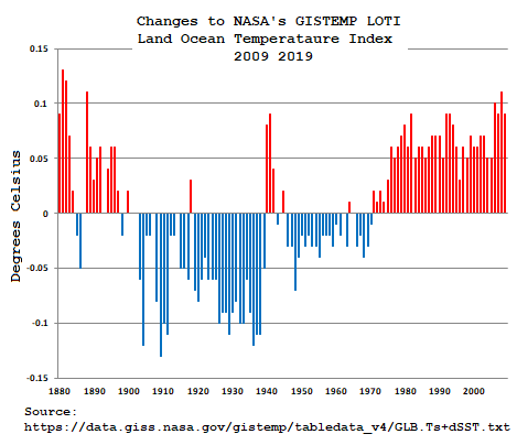
Here in the United States, NASA’s GISTEMP adjusts the anomalies to the base every month here’s the number of adjustments made to their Land Ocean Temperature Index (LOTI)
https://data.giss.nasa.gov/gistemp/tabledata_v4/GLB.Ts+dSST.txt
for all the months since 1880 this past year:
Number of Changes to GISSTEMP’s LOTI for 2019:
Jan Feb Mar Apr May Jun Jul Aug Sep Oct Nov Dec
843 370 481 633 1359 566 281 400 674 284 284 341
6516 Changes for 2019 and this has been going on every month like a steady drone for years.
Here’s what the then and now deltas look like for all those changes since 2010:
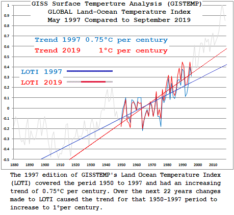
Here’s the LOTI data Graphed out with trends for the overlapping time series since 1997:
OMG It’s worser than we thought and it’s getting more worser every day
Worster.
The Acorn V2 report that came out had glaring typos on like page 2. Doesn’t exactly inspire confidence that it was reviewed thoroughly.
Who needs temperature records when you have the worst wildfires evah!!!!!
Some of the V1 to V2 changes don’t seem to make much sense, but it is easy to see how the combination of the two stations was combined based on the common period in the 1940s.
Those in charge of keeping the earth’s temperature records could actually do humanity a big favor. They could adjust all future temperatures downward a degree and eliminate the CO2/global warming scare. And the best thing is nobody would even notice, just as nobody has noticed the one degree supposed global warming over the last century. There would be a Nobel in store for them.
Jen Merohasy was the person who first called attention to the ‘pristine’ research weather station at Rutherglen. Proper siting, excellent maintenance, no moves since 1913, accurate reporting since at the center of a long active ag research station. No warming trend until homogenized by BoM. One of several major similar ‘world tour’ examples in essay When Data Isn’t in ebook Blowing Smoke.
Posted years later here a novel visual analysis of the 14 WUWT Suface Stations Project weather stations rated CRN1. GISS Homogenization removed at least some UHI from the three usable Urban stations (how well, dunno), but added spurious warming to all but but one of the suburban and rural stations. Small sample but crystal clear results. The root problem likely is that homogenization also uses all the crappy CRN2-5 regional stations. They are not weighted by quality, since until AW’s Surface Stations project nobody knew what the individual station quality was.
“no moves since 1913, accurate reporting since at the center of a long active ag research station”
Just not true. There was a gap of a few years in the 1960’s. And there is ample evidence of station moves, set out by the Bureau here.
Nick, not according he lead scientists who ran Rutherglen then Their testimony is first hand, and video archived on the internet. Jen’s site is probably a link. I put then hot direct Merohasy links in the extensive footnotes to the essay. Specifically, footnotes 17 and 18. 18 completely refutes your pseudoclaim. What you posted was merely a version of the BOM excuse rational when they got caught red handed. Problem is, isn’t true.
Jen then went back in response to BOM and tracked down the retired but then directly responsible lead research people and put them on record.
I tracked all this down and supplied ‘link’ footnotes before the essay was every published in late 2014. If you had read it, you would have seen thru the BOM false obfuscation. You cannot win this, so the first rule of holes should apply.
Rud
“not according to the lead scientists who ran Rutherglen then”
Rutherglen was a rural weather station. It was not run by “lead scientisis”. I think you are referring to Bill Johnston. He describes his status as:
“I used to have a project at Rutherglen and was a regular blow-in there.”
He had nothing to do with weather measurements, and has knowledge of only a brief period of the Rutherglen history. Rutherglen was an Ag research station.
He says, among other things (second hand info)
“Official temperatures were recorded from the ‘hollow’. However, temperature was also measured at the office. The office temperatures were reported for the locals on local radio (but not to the BoM); the official ‘hollow’ temperatures were reported to BoM, but not to the locals.”
That does not match your claim of “Proper siting, excellent maintenance, no moves since 1913”.
But the fact is that Marohasy has no evidence that the station was not moved. BoM has produced detailed, documented evidence that it was.
“produced” being the key word.
I’m thinking Nick Stokes also thinks The Royal Society minutes provide clear evidence that Isaac Newton came up with the idea of the square law for gravitational attraction all on his own. Doctoring of “official” records has been going on for centuries.
Another BoM cheat is that some ACORN stations are more equal than others when it comes to national and regional averaging; under a system of area weighting factors which have changed over time.
Alice Springs is famously located in the hot centre and currently has a factor value of 0.033. In comparison for instance, Mount Gambier near the coast has less impact on national average at a trivial 0.0027. (In total, the 112 stations add to a value of 1). In the early years, there were only 57 ACORN stations and Alice Springs had a higher value of 0.88. However, as more stations were progressively added, individual values fell and they included an increasing proportion of sites that are typically hotter (than for example, even Alice Springs). A notable example is Giles in WA that was opened in 1957. It has a current value of 0.061 or almost double the factor for Alice Springs but it is also typically significantly hotter…
“under a system of area weighting factors which have changed over time.”
Of course. Area weighting is essential. Alice Springs is the sole representative of a large area around. Mt Gambier has many nearby stations. Without area weighting, the average would reflect SE Australia only. And if more stations are added near Alice, then of course its weighting diminishes.
Yes Nick,
The thinking behind area-weighting is blindingly obvious.
However, putting aside the question as to whether an average Tmax for a continent that is mostly unpopulated hot desert is an important statistic…..
The problem I’m highlighting is that there is a significant bias in the adding of some typically hotter stations, increasingly from 1957. For instance, Learmonth opened in 1975 has a standard climatology average Tmax for D/J/F (summer) of 37.0/37.9/37.6 C, whereas full term Alice Springs, that previously had the greatest of all impact, is around 1.9 C cooler through summer at 35.6/36.2/35.1 C
“significant bias in the adding of some typically hotter stations”
That is exactly the reason why they use anomalies. Even where they quote an overall temperature, they average the anomalies first, to avoid that bias. Only then do they add a climatological region average.
Nice try Nick,
Your help with a couple of other points would be appreciated:
1) The BoM homogenised only 57 stations in the early post 1910 years, with the inference that they provide an accurate long-term record through to today (although many of them were originally in townships but were later relocated to very different airports). If those 57 were OK, why did they go to the trouble of adding more stations in subsequent years to reach a total of 112? Why for instance did they NOT use Cook SA (#18110) which has full QC data from 1922 to 1996, which goes beyond the introduction of e.g. Learmonth, or for 74 years? Why did they prefer the much hotter Learmonth from 1975 with a record of only a mere 36 years when it was set-up for v1 in 2011? I’ve picked Cook SA because in averaging for the State of SA it only has 5 valid full-term ACORN stations (Adelaide is excluded by the BoM on the grounds of UHIE). Five is a very small sample given their variety (check Jaco Vlok’s tables) and their distribution within 983,482 km². So why were the 74 years of data at Cook excluded?
2) In the averaging of Tmax for Australia, 104 ACORN stations out of the 112 are deemed usable by the BoM. The typically hottest month is February. When ACORN v1 averages were subtracted from ACORN v2 there was an increase in long-term February Tmax warming of about 0.5 C! Atypically of the BoM, v2 did not merit a media release BTW. Of most remarkable interest was that in the final 3 years of available v1 data to compare, there was a warming in v2 of 0.34, 0.33, & 0.30 C respectively to 2018. What makes it remarkable is that there are no grounds for homogenization of 104 stations in recent years, and in fact, none of the individual stations have any data differences between v1 and v2 (or raw CDO)! The v2 program description in Trewin October 2018, does not provide clarification of this paradox. Can you?
“So why were the 74 years of data at Cook excluded?”
Well, they have Forrest, the next station down the line (220 km), with similar climate. And Eucla, a similar distance.
Nick,
In your one response, it’s true that Forrest and Cook probably share a similar climate, both being in the arid Nullarbor at around 120 Km from the coast, but Forrest only has full data from 1947 compared with Cook from 1922. Also, Forrest is in the State of WA, so the woefully small sampling for SA averaging is not helped by the exclusion of Cook (and from the preferred earlier date). WA had 12 valid stations in 1910 compared with only 5 for SA.
Eucla is also in WA but is still more irrelevant because it is in a very different climate system perched on high cliffs above the south coast. BTW, while it does have data starting from 1910 there are surprisingly many years with no data, and the manipulations of raw CDO are grossly different between v1 and v2 in Jaco Vlok’s Tmax graph:
In my view, the linear trends obtained in this particular case are meaningless. Notice that the inconveniently high early values that passed QC in raw have been eliminated in v1 and v2. (Raw, v1 & v2 are identical 1998>)
Bob and Nick, the Eucla measurement site surely would have been moved, since the old telegraph station has long gone, and the newer motels were then built on the bluff, a fair way inland from the coast. So surely Eucla could never be regarded as having a continuous temp record.
You still haven’t figured out that averaging intensive properties (measurements from different stations) is a no-no. Nothing physically meaningful comes out of it.
An area-weighting is just another way of saying “infilling”, which is “making stuff up”. The temperature at one location is usually different from any other location. Spreading the weight around is simply bogus.
His science is sketchy and he has never got that point or really thought about why it goes wrong. He simply won’t do any reading or even try to understand the issue because it would undermine all his crazy writings.
Cooling the past. Warming the future. Homogenizing the present. Nature is skeptical. Some may even label her a “denier”. How dare She!
It’s such a vital part of the process this deceit by “respected “ institutions without which the global warming illusion would collapse. I often hear sceptics say “ we agree there’s been some warming a natural warming since the 16th century, but….Whilst that statement is clearly true it’s not so clear if one looks at the last 150 years. Unaltered data suggests that the 1890s , 1910s , 1930s have all been warmer than today. Without the adjustments there would be a very minor if any overall trend , which is the relevant CO2 increasing period. There is virtually zero correlation between CO2 increase and temperature. The hypothesis is null and void and the whole AGW theory has been debunked.
When my alarmist friends say are you telling me that NASA, CSIRO, BOM and many other well known academics are lying .? I say “ That’s exactly what I’m telling you” .
The evidence through the adjustment of raw data, the hockey stick graph, the climate gate emails, various comments by high ranking UN officials , cherry picking data, creation of false narratives through selective editing and creative special effects in films and documentaries all point to one thing. If this evidence does not point to a conspiracy to deceive it is the most amazing set of coincidences driven by confirmation basis you will ever see.
The BOM is at the epicentre of the warmist cause , without the adjustments a very different story would be told ( or shown) . With global warming a true picture would tell a thousand words.
“Unaltered data suggests that the 1890s , 1910s , 1930s have all been warmer than today.”
It doesn’t. These “lying” institutions publish unadjusted data as well as adjusted. People here don’t seem to want to acknowledge that. You can analyse the unadjusted data just as easily as the adjusted. Again sceptics never seem to want to produce a global analysis to show the difference. I do, and it makes very little difference. None of those claims is true.
Weird. In the US we have many record highs from the 30s. Maybe they were record lows?
Hansen said 1934 was the warmest year in the U.S.. 1934 was 0.5C warmer than 1998, which makes it 0.4C warmer than 2016, the so-called “hottest year evah!”.
All U.S. states show the same temperature profile where it was warmer in the 1930’s than it is today. But it should be noted that the Data Manipulators are in the process of bastardizing not only the U.S. surface temperature record but the State temperature records, too. These liars are causing TRILLIONS of dollars to be spent unnecessarily on CAGW mitigation. Someone ought to call them on it before they bankrupt all of us.
https://realclimatescience.com/2020/02/the-superbowl-of-data-tampering/#respond
Refute that, Nick. Tell us how all those bastardized Hockey Sticks are justified.
So, why are the very little differences you cite are all in the same direction and together comprise the bulk of the presumed trend, moreover; the trends created by these ‘adjustments’ are not limited to flaky adjustments to one site managed by one institution, but to a large number of sites world wide.
You can dance around the raging elephant in the room all you want, but it’s eventually going to stomp on you. That elephant is that the IPCC’s presumed ECS of 3C +/- 1.5C per doubling couldn’t be more wrong where even their low end of 1.5C exceeds the maximum supportable by first principles physics based on the presumed forcing of 3.7 W/m^2 said to arise from doubling CO2.
“and together comprise the bulk of the presumed trend”
It does not comprise the bulk of the presumed trend. There is in fact
very little difference between adjusted and unadjusted trend.
IPCC and ECS has nothing to do with temperature adjustment.
The IPCC’s readily falsified ECS has everything to do with it because it’s this broken science that comprises the sole rationalization for blaming any presumed trend on CO2 emissions and is the reason why adjustments reinforcing the expected trend are never questioned by the faithful while adjustments counter to the narrative are categorically dismissed.
But then again, denying the scientific truth is the only way the faithful can rationalize their belief in magic, because only magic can make the next Joule of forcing do so much more work at maintaining the surface temperature than the average Joule of forcing.
‘very little difference’ … so why bother adjusting ?
“so why bother adjusting ?”
The purpose of adjusting is not to reach some prescribed trend value. The purpose is to get it right.
That’s right, the good people at the BoM know what The Science™ tells them the data should be showing and if it isn’t it needs to be adjusted — obviously.
Nick,
“The purpose is to get it right.”
Getting it ‘right’ according to a narrative driven by fake context is not science, but is how politics works and politics must have no role in establishing what is and what is not proper science. The IPCC has destroyed the integrity of science by replacing the scientific method with conformance to a political narrative. Those who are blinded to this obvious reality have been fooled into becoming the useful idiots for the UN and it’s transparent anti west agenda.
Getting it right according to science means adhering to the scientific method which your alarmist comrades don’t recognize as a legitimate requirement for establishing the scientific truth. This fatal deficiency is going to catch up with the alarmist cult sooner or later because the scientific truth will always prevail and the IPCC’s fake science is so incredibly wrong, it’s an embarrassment to all of science.
Yes they have the unadjusted data but when a Climate Scientist (TM) or MSM does an article and graph on warming and especially the Australian trend we all know which one they will use.
So are we clear without the Stokes BS the issue isw
(i) WE THE PUBLIC don’t get to choose which set the Climate Science (TM) and Media use in pushing a headline whether the unaltered set exists is not even an issue.
(ii) I don’t think many think the world has not warmed (it has been warming for a long time) and as you say the unaltered data shows that then why adjust it? The answer why it gets adjusted is because of the models and I don’t have an issue with the models using adjusted data. However what is happening is that adjusted data is being used RAW by statistical analysis like the BS you do. So you have natural warming, mixed with adjustments and you think you can just connect that all to Human Activity.
So now comes the serious question we both agree the Earth has warmed and now using your amazing analysis (that works on adjusted and unadjusted data) … so how do work out how much is caused by Man and how much is Natural?
The extension to that question is based on a 1 ppm of CO2 created “by man” give me the increase in heat (the forcing you probably call it).
“and as you say the unaltered data shows that then why adjust it?”
For the obvious reason, they want to get it right.
For everybody, not just GCMs. In fact, recent surface temperatures are not an input to GCMs.
“so how do work out how much is caused by Man and how much is Natural?”
Unrelated to the task of measuring average temperatures.
They aren’t getting it right they are doing “invent a number” lets guess what it should have been. There is simply no way to it is “right” … Oh this is climate science and this is a Nick definition where right means something different to actual science.
Great we have an average temperature which is about as meaningless as the average family of 2.3 children … because 0.3 child is always fun to work out what to do with that.
This stuff may be a statistician wet dream but to the rest of us it is about as useful as knowing the winning numbers to last weeks Lotto draw.
I should add an example to show you the absolute flaw in what is being done.
If physics treated data like Climate Science does GR would never have overturned Newtonian Gravity because the deviations were so small you would just say they are an error and average them back to the rest as experimental error.
Now seriously think about that and explain how you are guarding against that problem that there is a small but important deviation at play?
How do they know it is right? It is literally unprovable. You cannot go back in time with a more accurate thermometer, so how can you know?
You can use experiments to correlate dat from different stations, to see if you are doing it right but that would require hundreds of stations and years of data. Has that been done ? No.Just a few tests here and there over short periods. And even if you did that, it would not produce a reliable, consistent adjustment than can be used on all the data.
zigmaster wrote: ““Unaltered data suggests that the 1890s , 1910s , 1930s have all been warmer than today.”
Nick replied: “It doesn’t.”
Short, sweet, and wrong, Nick. I ought to just leave my reply at that, the way you do. Trust me! I’m right!
All one has to do is actually look at the chart at the top of this post to see that Nick is wrong. It obviously shows that unadjusted temperatures in the recent past were just as warm as today. Nick wants to deny what we can see with our own eyes. Don’t know why Nick can’t see it but I sure can. CAGW is dead. Actually, it never lived except in the fevered imaginations of some people.
All the unaltered Tmax charts from around the world and in both hemispheres show the very same temperature profile as the chart at the top of this post, i.e, that temperatures in the recent past were just as warm as they are today.
There is no CO2 problem.
“All one has to do is actually look at the chart at the top of this post to see that Nick is wrong”
I’m used to having to inform people that the US is not the globe. It’s not so often that I have to inform them that Wagga Wagga is not the globe.
“I’m used to having to inform people that the US is not the globe. It’s not so often that I have to inform them that Wagga Wagga is not the globe.”
I think this just shows you didn’t read my post very thoroughly. I mentioned that Wagga Wagga’s unaltered, human-derived chart’s temperature profile resembled every other unmodified, human-derived chart from all around the globe and in both hemsipheres, with all of them showing that the 1930’s were just as warm as it is today. So Wagga Wagga really *is* the globe in a way. If every regional human-derived surface temperature chart shows a profile where the 1930’s was just as warm as today, then *that* is the global temperature profile.
Do you have any unmodified, human-derived Tmax charts that show a different profile, Nick?
Why should we think that computer processing has made the unmodified, human-derived temperature record better or more accurate? Why is a computer geeks guess better than an actual temperature reading?
This is all about the “global” temperature average to Nick. That’s why we need the computer simulations, to turn regional readings into global readings. But we shouldn’t be using computer simulations to find the average global temperature because all they are just guesses. Instead, we should use the actual human-derived regional temperature charts as our model ot the Earth’s temperature profile at that time, where the 1930’s were just as warm as today, and then depend on the satellite data from 1979 forward to be the measure of the global average temperature.
The politically inspired computer simulations are screwing up the whole field of climate science because they are lies and we can’t find the truth searching around in the lies.
Human-derived temperature readings are not lies. We can depend on them. We cannot depend on the bastardized global surface temperature record. It’s a political document.
The one correction not being accounted for properly is UHI. All these temperature histories are incorrect if the recording devices are near roads, buildings, parking lots or air conditioners. Take a look at rural temperature histories “only” for an idea of what is really happening in the world of climate trends.
Nothing to see here.
https://climateaudit.org/2007/08/04/1859/
Pisses me off that we are even still discussing CAGW. if not for fanatics like Blair Trewin it would have died years ago.
Charles
Hope this might gain some traction
A new “Ship of Fools”?
We can only hope.
–
“not a bad route.
The temptation is to sneak along the lee polynya north of FJI. However the Kapitan isn’t going to do that as it could easily slam shut, pushing the ship onto the rocks as the wind changes causing the ice to form a lee polynya south or west of FJI.
I don’t expect the Barents to freeze over: too warm, too shallow, too mixed, too much Atlantic Water. Every year people get fooled into thinking new ice is forming when the satellite mp4 show the wind has merely blown the ice pack through the island gaps”
This is the resupply mission for the Polarstern Mosaic expedition, Deliberately stuck in ice near the North Pole for 8 months th study the shrinking, drifting ice.
Only it has been extending. The Kapitan D is a small ice breaker and easily reached it before.
Now?
Probably OK.
–
Or not.