This week at the big 100 year anniversary shindig of the American Meteorological Society (AMS) there was a press release session that featured NOAA and NASA GISS talking about how their climate data says that the world in 2019 was the second warmest ever, and the decade of 2010-2019 was the hottest ever (by a few hundredths of a degree). Graphs like this were cited:
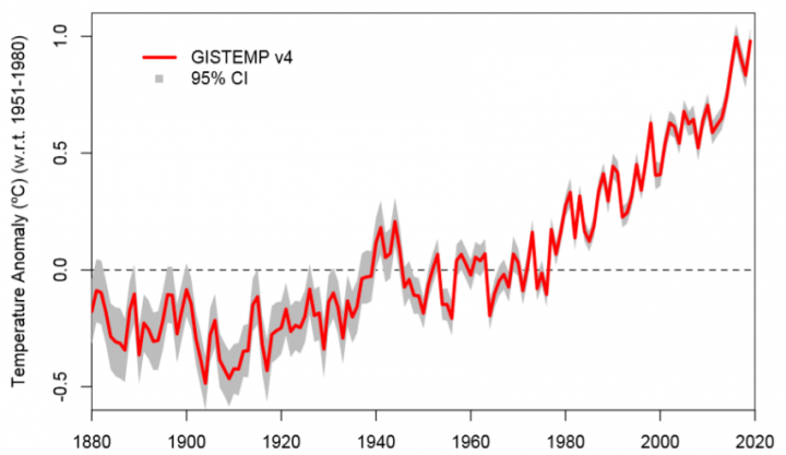
Of course, that made front page news. What didn’t make front page news is that when you look at other data, that isn’t exactly true. It’s all about perspective in time:

A couple of years ago, Ed Hawkins came up with idea to make a meme-style temperature art piece for the graph-challenged. I’ll have to say that it was brilliant, because serial regurgitators all over the world shared the hell out of it. They even got TV weather people to wear ties depicting it.

However, Josh, creative as ever, decided to make a new set of stripes that went back in time a little further, for some…uh perspective that time myopic climate scientists like Hawkins seem to miss.

Since Ed Hawkins blocked me, I’ll leave it to you all to make sure he sees it on Twitter.
Be sure to visit Josh’s website and buy him a pint! Or, buy his book.
The colour choices are interesting, obviously blue indicates too cold for Ed, red too hot and white just nice.
Many ask the question ‘what is the ideal av. global temperature’ and Ed has the answer, what looks like 14°C, or around the time of the 1953 North Sea flood that killed 2,551 people and the atmospheric CO2 concentration was ~310 ppm.
The colour choices are interesting, obviously blue indicates too cold for Ed, red too hot and white just nice.
Many ask the question ‘what is the ideal av. global temperature’ and Ed has the answer, what looks like 14°C, or around the time of the 1953 North Sea flood that caused the demise of 2,551 people and the atmospheric CO2 concentration was ~310 ppm.
Well the drought that was never going to end, has certainly broken in “our” part of Aussie, the Gold Coast and SE Queensland. 10 inches overnight (255 mm, some reports of 300 mm in the hinterland) and it has not stoped raining. Not much joy for “hot and dry” M.Mann or “never going to rain again” Flannery. So the old wisdom of “droughts and flooding rain” comes around again and our dams are filling up nicely! (Surely good old Nick will lecture on some obscure place where the BOM has fiddled the data to make the rain go away😉
When I saw his picture at the end I could have sworn it was Alfred E. Neuman. But that would negate the “What, me worry?”
Very nice.
I assume we have permission to download and use the stripes as facebook backgrounds and the like. It may generate a few talking points.
Averaging daily temperature for the globe is largely meaningless. Its more useful to know max and mins, or if possible, median temperature. A day in tropics of 25C, max 27, min 23. Is a different experience to desert climes still 25C, but max 47C min 3C,…same average. Also a different experience if the amount of time close to max or min varies – hence reference to changes in median versus average. Coping with rising mins is probabky less harmful.
There’s about 30 climatic zones around the globe. Averaging them is meaningless to those that live in each of them.
What are ‘stipes’? 😀
MarkMcD
“Stipes” are what come before “stip-ends.”
Unfortunately the article doesn’t provide a link to the press release. This appears to be it: https://www.nasa.gov/press-release/nasa-noaa-analyses-reveal-2019-second-warmest-year-on-record
I’ve looked through it and nowhere can I find the claim that 2019 was the second warmest year “ever”. It states that 2019 was “… the second warmest [year] since modern record keeping began in 1880.”
Likewise re the decadal claim. They don’t say the last 10 years was the warmest decade “ever”. What they say is quite specific: “The decade that just ended is clearly the warmest decade on record …” Note: they specify ‘on record’, not ‘ever’.
Putting words in your perceived antagonists mouth then shouting them down on that basis is a classic ‘straw man’ argument. It’s an informal fallacy, not skepticism.
Are there any alarmists sites that don’t block all alternative views?
ABC, BBC, CBC, SMH etc etc…this list is endless.
“Are there any alarmists sites that don’t block all alternative views”
There are plenty that block crackpot views that show graphs with not reference.
So you consider the temperature plots of the last 250 years are just fakes.
But you then consider the plot for the last 10,000 years are spot on
this is just weird!
I just tweeted it to him, lets see how quickly I get blocked.
Anthony/Josh
Are you going to put out T-shirts? I’ll take a dozen!
Okay, if you want to make an impression on the average citizen and any grade school, high school, or college student Include the first graph (red line) and the second graph (green line) plotted against a Y axis in actual temperature. Maybe even show Fahrenheit and Centigrade. Now people, real people can relate to those graphs. AND, they would laugh their butts off at the insane climatologists that are trying to tell is that we are destroying the planet . The graphs would tell the whole story. Show them on a scale they can relate to! GAME OVER – WE WIN!! Learn to communicate clearly and succinctly with plane language. But only if you want to win this argument with the general public. Otherwise we will loose. I hate loosing!!