Some heated claims were made in a recently published scientific paper, “Recent Global Warming as Confirmed by AIRS,” authored by Susskind et al. One of the co-authors is NASA’s Dr. Gavin Schmidt, keeper of the world’s most widely used dataset on global warming: NASA GISTEMP
Press coverage for the paper was strong. ScienceDaily said that the study “verified global warming trends.” U.S. News and World Report’s headline read, “NASA Study Confirms Global Warming Trends.” A Washington Post headline read, “Satellite confirms key NASA temperature data: The planet is warming — and fast,” with the author of the article adding, “New evidence suggests one of the most important climate change data sets is getting the right answer.”
The new paper uses the AIRS remote sensing instrument on NASA’s Aqua satellite. The study describes a 15-year dataset of global surface temperatures from that satellite sensor. The temperature trend value derived from that data is +0.24 degrees Centigrade per decade, coming out on top as the warmest of climate analyses.
Oddly, the study didn’t compare two other long-standing satellite datasets from the Remote Sensing Systems (RSS) and the University of Alabama at Huntsville (UAH). That’s an indication of the personal bias of co-author Schmidt, who in the past has repeatedly maligned the UAH dataset and its authors because their findings didn’t agree with his own GISTEMP dataset. In fact, Schmidt’s bias was so strong that when invited to appear on national television to discuss warming trends, in a fit of spite, he refused to appear at the same time as the co-author of the UAH dataset, Dr. Roy Spencer.
A breakdown of several climate datasets, appearing below in degrees centigrade per decade, indicates there are significant discrepancies in estimated climate trends:
- AIRS: +0.24 (from the 2019 Susskind et al. study)
- GISTEMP: +0.22
- ECMWF: +0.20
- RSS LT: +0.20
- Cowtan & Way: +0.19
- UAH LT: +0.18
- HadCRUT4: +0.17
Which climate dataset is the right one? Interestingly, the HadCRUT4 dataset, which is managed by a team in the United Kingdom, uses most of the same data GISTEMP uses from the National Oceanic and Atmospheric Administration’s Global Historical Climate Network. Among the major datasets, HadCRUT4 shows the lowest temperature increase, one that’s nearly identical to UAH.
Critics of NASA’s GISTEMP have long said its higher temperature trend is due to scientists applying their own “special sauce” at the NASA Goddard Institute for Space Studies (GISS), where Schmidt is head of the climate division. But what is even more suspect is the fact that while this is the first time Schmidt has dared to compare his overheated GISTEMP dataset to a satellite dataset, he chose the AIRS data, which has only 15 years’ worth of data, whereas RSS and UAH have 30 years of data. Furthermore, Schmidt’s use of a 15-year dataset conflicts with the standard practices of the World Meteorological Organization, which states “as the statistical description in terms of the mean and variability of relevant quantities over a period of time… The classical period is 30 years…”
Why would Schmidt, who bills himself as a professional climatologist, break with the standard 30-year period? It appears he did it because he knew he could get an answer he liked, one that’s close to his own dataset, thus “confirming” it.
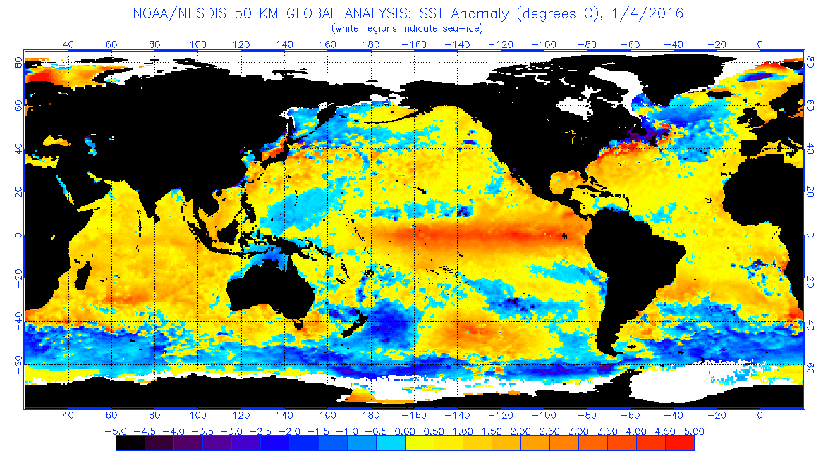
The 15-year period in this new study is too short to say much of anything of value about global warming trends, especially since there was a record-setting warm El Niño near the end of that period in 2015 and 2016. The El Niño event in the Pacific allowed warm water heated by the Sun to collect, dispersing heat into the atmosphere and thus warming the planet. Greenhouse gas induced “climate change” had nothing to do with it; it was a natural heating process that has been going on for millennia.

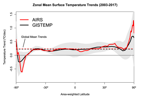
Figure 1: At left, Panel A NOAA sea surface temperature data showing peaking of the 2015/2016 El Niño event in the equatorial Pacific Ocean. Panel B is Figure 1 from Susskind et al. 2019 with annotations added to illustrate correlation with the peak of the 2015-16 El Niño event in AIRS data.
As you can see in Figure 1 above, there has been rapid cooling from that El Niño-induced peak in 2016, and the global temperature is now approaching what it was before the event. Had there not been an El Niño event in 2015 and 2016, creating a spike in global temperature, it is likely Schmidt wouldn’t get a “confirming” answer for a 15-year temperature trend. As you can see in the figure above on Panel B, the peak occurred in early 2016, and the data trend before that was essentially flat.
It appears that the authors of the Susskind et al. paper were motivated by timing and opportunity. It was crafted to advance an agenda, not climate science.
Anthony Watts is a senior fellow for environment and climate at The Heartland Institute.
It’s my understanding that the IPCC acknowledges El Niño and La Niña as weather events, unrelated to climate.
I stand to be corrected of course by knowledgeable contributors as I’m not a scientist.
HotScot,
You are correct. The Bureau of Meteorology in Australia acknowledges El Niño as part of ENSO, El Niño Southern Oscillation, to be a naturally occurring climate phenomenon.
The claim by mainstream climate scientists is that global warming “exacerbates” ENSO.
If weather events are unrelated to climate, could someone give us the new IPCC definition of ‘climate’, please?
It used to be that weather and climate were intrinsically linked, climate being an average of weather.
Right foot in a bucket of ice water.
Left foot in a bucket of hot water.
On average, you feel fine.
Vegetation integrates climate. Learn about biomes and you start to understand climate.
Start: https://blueplanetbiomes.org/climate.php
You sure won’t be detecting any genuine climate-changing trends for periods less than those within the sedimentary palaeo-climate records.
Sorry Mr. Gavin Schmidt, the planet does not have a fast-forwards climate change CO2-button just because we have multispectral satellites overhead, and you want a slightly bigger citation list.
The planet’s climate-change processes do not operate at the piffling insignificant timescales of your minor career and life span. Deal with it as simply corruptly relying on biased ‘adjusted’ past surface records to try and connect to a case in satellite that you’re ‘right’, is wearing really thin with anyone familiar with your paper touting and cli-sci trolling.
Satellites CAN NOT detect an actual planetary climate-change trend, they can only detect overprinting inconsistent weather cycle changes, which for the recent decades is slow warming (same as in earlier centuries actually) or rather, nearly static for two decades (no change) after the hysteria of ENSO cycles is filtered from the flat-lining ‘trend’.
Whoopdee-do!
Almost but not quite nothing, and just as the actual palaeoclimate data trend (i.e the actual climate record) indicates is ‘situation normal’ for this planet. There’s no CO2 fast-forwards changingness button, so quit trying to pretend we’re in fast-forward ‘change’. Satellites see overprinting weather-cycle noise only even over 30-year observational records. Because the time scale of real climate-change is a minimum of about 10 to 20 times longer than the Satellite data records exist for.
That should be a bit of a hint to anyone, including yourself that you’re a crank and a time and resource waster barking up the wrong tree.
The modern surface warming period is mostly a product of urban-heat-island data accumulation corruption, and human advocate’s data ‘adjustment’ corruption, and the resulting (and also corrupt) faked interpolations. While the satellite data is simply showing the on-going re-emerging from a “Little Ice Age” (LIA), with overprinting oceanic circulation cycle phases, weather variability, and ENSO overprinting this on-going LIA amelioration. In fact these factors alone are enough to explain the observed slight net modern warming (without even invoking the Sun or geomagnetism as another potential control on weather or even climate time-scale variability).
Again, it’s a big NET whoopdee-do!
”the time scale of real climate-change is a minimum of about 10 to 20 times longer than the Satellite data records exist for.”
Well put and I agree 100%! Like ants contemplating Mt Everest.
Not to mention the ludicrous “accuracy” to a few hundreths of a degree. 7/100 ths between the fastest and slowest temperature increase. Angels and pins.
WXcycles and Mike wrote: ”the time scale of real climate-change is a minimum of about 10 to 20 times longer than the Satellite data records exist for.”
Great! “Real climate-change” can’t be detected for 400-800 years. A wonderful way to make a problem disappear. Define it as something that can’t the detected for 20-40 generations. That way, you won’t need to deal with it.
Boeing can’t be sure its MACS units caused the Indonesian Air crash. At least 100,000 MAX flights have taken off and landed safely.
Many cars catch fire in accidents, including some Ford Pintos. That didn’t mean that the Ford engineer was right when he warned that a re-filling gas tank would be more hazardous.
Good comments WX. A frivolous report.
I call BullSchmidt.
Regards, Allan
It’s flat all the way up to the El Nino….the the usual slow come down
….take out the El Nino and it’s flat again..and that blows their trend line
I just wish they’d make up their minds about it. I think all the talk about it – all the argumentation – is producing large volumes of hot air, throwing off the weather cycle and sending us back into the cold.
The middle of April, we had a snowstorm of many inches, and more shoveling. That finally melted and turned my tiny yard into a bog. Then the end of April, another snowstorm of about three inches, which finally melted and sank into the bog. It’s May and should be in the upper 60s, but instead, it’s in the 40s with cold, cold rain that would like to turn to snow if it had the chance. This is confusing all the birds, never mind me.
I don’t want to shovel any more of that white stuff. (Yes, I have photos of it, always.)
Unrelated to climate, yes. But extremely handy if you need to show a warming trend to prove your theory.
There are a number of reasons why I am on the sceptical side of most of these arguments, HotScot, but I have never understood why warming provoked in the short term by El Nino events can be taken out of the equation when AGW is being discussed.
The position that says, No – it’s an El Nino, not AGW, is at the least questionable, and at the worst, nonsense. The best that could be argued is that Ninos are returning to the atmosphere heat that was sequestrated centuries, or millenia, before, and therefore separated from the current warming we discuss. If we aren’t claiming this as ‘ancient’ heat, then we still have to treat it as part of the current atmospheric processes which are the subject of the debate.
The world is ending in less than 12 years now, so we will only see 0.29C warming by then and this is not enough to make any difference. So either they are wrong and the world is not ending, or it is and this study is worthless.
I really wish they would make up their minds.
I wonder what they do if the world actually cools down a bit?
They would say that it was expected that there would be cooling, models had already shown that the Earth would cool and it was due to human emissions of CO2. The Earth will enter an ice age in 12 years unless people pay more tax.
Remember: the solution touted for the New Ice Age in the 70s was… more government power and less fossil fuels.
It’s nothing to do with climate and everything to do with unearned power and wealth.
No matter what the problem, the solution is always more government. Even for problems that were caused by government in the first place.
That’s why they changed the name from global warming to climate change. That way they have it covered no matter what happens.
You mean … it … changes?
That’s bad!
Cherry picking data and timeframes to suit your pre-ordained conclusion has NOTHING whatsoever to do with Science. It’s nothing more than propaganda with charts and graphs.
There are some very big question marks connected with this study.
First it measures the skin temperature of the Earth, not the air temperature. These are usually close over ocean, but over land large differences occur.
Second, measuring skin temperature is only possible in the absence of clouds, and cloudiness is very uneven in both time and space. Data quality for Sahara is probably excellent, for much of the Southern ocean it is probably extremely spotty. Note that it is by no means certain that temperature changes in cloudy and cloudless conditions must match over time. Cloudiness also varies strongly with season so the temperatures will be seasonally biased.
As a matter of fact since the AIRS result is a rather extreme outlier it seems very likely that the results are affected by the cloud problem.
Results near the Poles are also unreliable since AQUA is in a 98 degree inclination orbit and cross-track range is insufficient to extend to the poles.
“As a matter of fact since the AIRS result is a rather extreme outlier it seems very likely that the results are affected by the cloud problem.”
>>
Except AIRS is designed to minimize/negate the cloud obscuration issues and improve resulting temp data at multiple levels. But this can only be seen as a questionable recon indication (especially given the known bias) as it does not meet even half the time-scale needed for such an analysis to produce a significant conclusion. So, any conclusion = not even climate science.
“Not even climate science!”
“That’s an indication of the personal bias of co-author Schmidt”
No, it’s an indication of what his topic is, which is surface warming. The abstract starts:
“This paper presents Atmospheric Infra-Red Sounder (AIRS) surface skin temperature anomalies for the period 2003 through 2017, and compares them to station-based analyses of surface air temperature anomalies (principally the Goddard Institute for Space Studies Surface Temperature Analysis (GISTEMP)). “
But anyway, on the figures presented here, with GISTEMP at 0.22°C/decade, RSS LT at 0.2, and UAH at 0.18, there isn’t even much of a discrepancy.
“Critics of NASA’s GISTEMP have long said its higher temperature trend is due to scientists applying their own “special sauce” “
There is no special sauce. The GISS code has been available for years. It is a simple calculation; I have been doing a similar calculation monthly for years (April here). And I get very good agreement with GISS, using unadjusted GHCN data.
Nick I stand by my comment about Schmidt’s bias. He’s shown it publicly on many occasions, just as you have. Both you and Gavin are of a particular bias when it comes to this GISS data. You both suffer from confirmation bias.
As for your agreement with GISS data: so what?. It means nothing in the grand scheme of things than you get agreement with GISS by running their code.
As for the “special sauce”, I stand by that comment too. GISS does their own special set of calculations in the GISS code, different than any of the other data sets, and that’s why it is always warmer than NOAA and HadCRUT4, not to mention UAH and RSS.
That GISS special sauce could be called “hot sauce”.
In other news, it looks like Dr. Roy Spencer has found an error in the AIRS data, so it looks like yet another “GISS MISS” for agreement in a long series of hot messes.
Anthony, it’s rather unreasonable comparing Nick our Gav. Nick comes here are is prepared to have sensible scientific discussions with skeptics. He does not refuse to debate and walk off in childish sulk.
If we had more like him on the warmist side, things may get further.
BTW
2018 – 1978 30 !
Don’t forget Steven Mosher, even though he called me an amateur, which I am, because I used Excel, which makes prettier graphs than does R.
The 1 graph that demolishes CO2 global warming. 47 years of satellite data.
https://twitter.com/ATomalty/status/1126020927173611520
That is very interesting,
Maybe this is a simple visual indication of temperature, that is less prone to error and bias than homogenising hundreds of incomplete thermometer readings ?
How do the Great Lakes demolish global anything?
They made short work of the Edmund Fitzgerald.
NOAA are onto it
“GLERL scientists are observing long-term changes in ice cover as a result of global warming.”
https://www.glerl.noaa.gov/data/ice/#overview
If there was any downward trend they would be singing it from the rooftops as proof of global warming.
Yet 4 out of the last 7 years are well above average.
This is an extremely useful approach. Its value lies in the fact that it provides a variable that clearly relates to temperature over seasonal timescales with fluctuations large enough to be easily measurable.
By contrast monitoring the average global temperature over long timescales is a fools errand because the large temperature variability in temperate latitudes is lost by lumping it together with equatorial temperatures which vary very little resulting in an overall variable (metric) that varies so little that errors in measurement are sufficiently significant to render the value of the end result questionable at best. This would be especially problematic when making comparisons over long timescales reaching back to the invention of the thermometer.
While looking at great lake ice cover may or may not be of limited value depending on how far back and how well records were kept different ways of determining temperature variability based on this approach should be possible by identifying robust long-term temperature records, such as the central England temperature. (Although post war data would need to be checked for ‘improvements’.)
I would be surprised to learn that I’m suggesting anything new.
It’s just my way of pointing out that way the average global temperature as currently defined and determined is ideal if one wanted to be able to argue that one or two degrees is really important while also being able to argue convincingly that it is one or two degrees higher or lower than it really is because of statistical methods employed while determining its value.
But you didn’t answer the question: Does NASA’s Latest Study Confirm Global Warming?
As if we needed *further* confirmation.
This post is not about a “study” or about “confirming” anything, its just personal about Schmidt.
“In other news, it looks like Dr. Roy Spencer has found an error in the AIRS data”
For years the acolytes have been using the fact that an error was found in Dr. Spencer’s calculations years ago, as an excuse to ignore his results.
I wonder if they will apply the same standard to their own idols?
It depends on the magnitude, type and impact of the error(s).
“Hot sauce”; In the days of dear old Pachauri, it was called “GISS Vindaloo” /sarc
When I look at the graph, I see ‘noisy’ data. Of course, the scientists involved will protest that their analysis shows that the data is accurate within one percent, The trouble is that if you want to calculate a long term trend, you have to be able to explain the ‘noise’. Is the ‘noise’ truly random? The chances of that are miniscule. Does their analysis implicitly assume that the ‘noise’ is random? That’s almost guaranteed.
Mother nature tends to throw red noise at us. Red noise has high low frequency content. If you examine a low frequency signal over a sufficiently short period, it looks like a trend (also called drift).
The error bars that should be applied to the calculated trends for the various data sets mean that those calculated trends are essentially the same. To say otherwise, you have to be able to explain the nature of the ‘noise’ which is evident in the graph above. For sure, you can’t just assume that it is random.
As in the Climate Gate exposure at UK CRU using email communications, it is going to take an insider’s knowledge to convincingly expose the intentional and continuous alterations of the adjusted temperature data.
The problem is any financial incentive for an individual to be a whistle-blower inside NASA/GISS is insignificant to the subsequent income loss of ability to work in the field ever again. It is going to take someone with their own “F-U money” working at GISS to finally get tired of the compromised integrity in the continuous alterations of historical adjustments.
I have been hoping they will catch the eye of the President, since the administrator is worthless.
Is GISS still peddling their Global Warming garbage. NASA, stop wasting money, you should be doing spaceflight.
The methods used to sell a man-made climate crisis continue to be the same methods used by con artists, and not at all similar to the methods used by scientists.
Without of obtaining insider info, the only way for an outsider to show what is going on in an objective manner is to do the Tony Heller-style Residual of(Adjusted- Raw data) versus annual-averaged MLO CO2 record plotting.
If you can independently verify an r^2 > 0.95, that is a pretty powerful, independent argument of what they are doing.
I suggest you take a really good look at the work that E M Smith has just done on the various GHCN datasets.
He has a database of older datasets and the latest versions compares them.
His latest effort starts here
https://chiefio.wordpress.com/2019/01/18/mysql-server-sql-and-ghcn-database/
If you search GHCN tag is will bring them all up.
The global average temperature is a statistic, not a measurement of a temperature.
There must be hundreds of ways to compile a global average.
There’s no way to know which compilation is “the best”, or even if any of them are accurate, and a good representation of the actual climate.
If one compilation keeps adjusting data, without good explanations, that could be a problem.
Especially “adjustments” made years, or decades, later.
If a compilation requires wild guess infilling for a majority of it’s surface grids, that’s a potentially large problem.
There’s no way to know what a “normal” global average is.
Using 1750 as “normal” makes no sense — that was not long after the coldest decade of the Little Ice Age ( central England real time temperature measurements reflect +3 degrees C. of warming since the coldest year in the 1690s ).
Why start with a cool 1750 climate, that was not liked by people at the time?
Using a cool weather starting period is useful for climate change propaganda ?!
All averages obscure details.
A global average obscures a lot of details.
Even more important, is that no one lives in an average temperature.
People live in local temperatures — if they are ever going to be harmed by climate change, then it will be from changes in local temperatures.
But local temperature changes, that people did not like, might not even be visible in a global average.
Or the global average might change in a way that leads to climate scaremongering, while people are very happy with their local temperatures.
The single number global average temperature is a propaganda tool.
Considering that 99.999% of the past 4.5 billion years have no real time data.
So people are looking at less than 0.0001% of this planet’s temperature history,
with very questionable numbers before World War II, and declaring that 1750 represents a “normal”, or good, temperature … and anything warmer (which people love) is bad?
What people really need to know is WHERE the warming is happening
In the upper half of the Northern Hemisphere, warming is good news!
What people really need to know is WHEN the warming is happening
In the coldest six months of the year, warming is most likely to be good news.
What people really need to know is in WHAT HOURS warming is happening?
Nighttime warming, while most people are sleeping, is much less noticeable than daytime warming, when people are much more likely to be outdoors.
If the warming was mainly in the northern half of the Northern Hemisphere, mainly in the coldest six months of the year, and mainly at night, then what we have is very pleasant global warming — the few people who live in those high latitudes would want more of that !
How much of the above details would anyone know from a global average temperature?
None.
The length of the growing season is important.
Farming productivity is important.
Sea level relative to ocean side homes, and businesses, could be important.
The global average temperature, especially changes of less than one or two degrees C., over a century or two, is NOT important.
Except as a propaganda tool for climate scaremongering.
If we knew the exact global average temperature, that everyone agreed was accurate (if that was possible), that would provide no useful information about the future climate — we would still have NO IDEA if the future would have global warming, or global cooling.
The global average temperature serves one purpose — it keeps skeptics busy arguing about meaningless tenth of a degree C. changes !
Meanwhile, the evil climate alarmists are finally revealing their “Climate Plans”, which was the goal of decades of climate scaremongering — leftist central planning “to save the planet for the children” (nonsense, of course, the planet does not need saving — the current climate is wonderful).
The leftists can’t sell socialism by claiming lower unemployment, or faster
economic growth — so they have created a fake climate crisis, and they claim only they can prevent it.
Sounds stupid, but it works on gullible people.
The climate on our planet has been warming, and improving, for over 300 years since the coldest decade of the Little Ice Age (1690s) — only a fool would want that mild global warming to stop.
Meanwhile, climate alarmists ignore the past 78 years of adding lots of man made CO2 to the atmosphere.
They keep predicting a FUTURE global warming rate that will be QUADRUPLE the actual global warming rate from 1940 through 2018 (their +3 degrees C. per century FANTASY, versus +0.77 degrees C. per century REALITY, from 1940 through 2018).
Their predictions have made no sense for 30 years — over 6o years if you start with Roger Revelle in 1957 — so why should government policies be based on consistently wrong climate predictions?
What a bizarro world we live in — with people afraid of the staff of life — CO2.
My climate science blog,
if anyone is interested:
http://www.elOnionBloggle.Blogspot.com
Richard: Great comments and a firm sense of reality.
The single number global average temperature is a propaganda tool
Boy, and how! And let me add that The Drought Monitor is guilty of similar statistical nonsense that uses questionable “averages” to declare CA just had the “WORST DROUGHT IN HISTORY”. The last CA drought was OVER nearly two years before The Drought Monitor said it was. Rubbish. It’s all colorful charts, graphs and FEAR … based on LIES. It took TWO years of HISTORIC snowfall and rainfall to extricate CA from DROUGHT terror?! Just imagine if our last two years were just … “normal”, “average” years of precipitation? … then The Drought Monitor would STILL have us in a “drought”.
In my own limited 63 year lifetime in CA, I’ve experienced several droughts … which are NORMAL, “average” occurances in our ocean adjacency Mediterranean climate. Selling FEAR with statistical manipulation and colorful charts is … frankly … EVIL. Just as EVIL as Bernie Madoff “investing” your total net worth in a FAKE scheme promising “guaranteed” 15% return. Sadly, the general public are gullible rubes who want something for nothing, with all their might. And they love being frightened about their own existence. Love being told that the “End is nigh”. “Repent!!!” And “save” yourself! “Bow to the force of Gaia”. It’s all a giant scam for CONTROL of wealth. CONTROL over every aspect of your life.
Oh! But it’s “science” don’t you know? I am just a “simpleton denier”. Ad hominem attacks on the straw men the Warmists construct are as worthless as their cherry picked data.
“The global average temperature, especially changes of less than one or two degrees C., over a century or two, is NOT important.”
Phew, I thought a 2C increase would see hippos in the Thames, like last time. You’ve reassured me that is NOT going to happen.
It was a lot more than two degrees in England, more like 4 C.
2 C is a global average which includes the tropics where there was little change, often no more than 1 C warmer than now. On the other hand it was 10+ C warmer in Eastern Siberia, and 5-8 C warmer in Greenland.
“… If the warming was mainly in the northern half of the Northern Hemisphere, mainly in the coldest six months of the year, and mainly at night, then what we have is very pleasant global warming — the few people who live in those high latitudes would want more of that ! … ”
>>
There is also warmer and more humid minimums at night in the (local) tropics which are quite unpleasant until a land-breeze kicks-in to reduce the humidity, after midnight, into the early hours. It does not make for good sleeping conditions without an aircon. And electrons for aircon use do not come cheaply any longer, as before the wind and solar subsidies and network infrastructure overbuild incentives.
But I’ve also seen periods where this was not the case, where there were not as many hot and humid nights (more consistent trade-wind flow), yet in the decades before this there were hotter conditions recorded during the 1930s and 40s, and also in the 1890s. So this is just multi-decade scale weather cycling that’s been overprinting a general slow-warming that’s occurring since the low or ‘end’ of the Little Ice Age.
Tropical nights have gotten warmer since about 1985, and they have got more humid also, and that combination is quite significantly unpleasant. But that is not actual climate change. Yet coming out of the Little Ice Age is an actual climate-change process.
But that climate change process is natural, as are these cyclic multi-decade warmings and coolings over printing it. So yes, climate and weather are both changing, but no one with any understanding of either would have expected any different than what’s been occurring in the past 100 years.
The only issue in question is, IF ANY PART OF IT was caused by humans? And the LOCAL answer is YES!
UHI is a persistent human effect on the localized weather and Temperature.
But UHI is NOT an effect on GLOBAL climate trajectory even if local UHI affects thermometers that are distributed globally, and are (for some reason) averaged to show a human affect on local warming, which occurs in all cities.
But for >99% of the planet’s surface area, UHI it is NOT occurring at all. So what’s the point of a global surface data ‘average’? There’s none!
Or in claiming there’s a human warming of the planet, i.e. which means for <1 % of it, and only in the lower-most troposphere layer.
UHI is NOT planetary climate-changing, it’s only local weather changing.
A satellite global average however might at least be globally applicable (sort of), but can such then show a gradual slow lingering warming trajectory out of the Little Ice Age’s actual climate change once ENSO and other broad weather cycle peaks and troughs are winnowed out?
Over the past 20 years the answer is NO, the satellites could not show such.
So why is anyone still pretending that satellites are global gauges of climate-change then? When they're obviously incapable of unambiguously resolving slow-scale global change even out of the LIA at present? And even if it did detect any slow NET rise it would still be just the amelioration of the Little Ice Age!
Give it up climate worriers and citation list touters, you’re simply delusional and chasing your own tail if you think you're seeing global climate-change within a NET 20-year flat-line of a global T trend.
Plus Gavin Schmidt seems to be implying he has the Holy-Grail of satellites in his little mit, and thus all prior satellite data is now defunct and can be ignored. Who's going to accept that?
” indicates there are significant discrepancies in estimated climate trends”
…
No, they all look pretty much to be in agreement.
…
The average is 0.20 per decade. A significant discrepancy would be if one of the datasets showed a negative trend over a decade.
It depends on the standard error of those means. If it’s ±0.01°C, it’s very significant; if it’s ±0.1°C, it’s not significant at all.
But we’re not told, so we can’t tell.
“But we’re not told, so we can’t tell.”
You’re not told here. But you could read the paper. Table 1: AIRS 0.24±0.12°C/decade. GISS 0.22±0.13. But those errors mainly represent variability of the random component of temperature (weather) rather than measurement error, so they aren’t independent. AIRS and GISS were measuring the same weather.
Thanks for posting those, Nick.
Nick, this is right for big areas of the globe. However, the zonal trends have some remarakable differences:
In the polar/subpolar areas the AIRS trends are steeper. AFAIK the AIRS record suffers from stable cloudcover (CC) and it’s well known that in the areas in question the CC is well above gkobal average. Therefore the result of AIRS needs some more attention there. One would wish some more describtion of this issue in the AIRS paper.
Schmidt is merely acting like a ‘good climate scientists’ reflecting the fact he was hand-picked to carry on the ‘good work ‘ of Hanson. That was this means in practice is poor scientific practice and regarding headlines not truth has being the most important factor in ‘research’ is just normal for the area .
Let us be clear climate ‘science ‘ is nothing without climate ‘doom’ , this goes so does the funding , so does their influence and power and so does all those freebies , and for most so like Schmidt , so does their career.
They have no choice but the double down for otherwise its total bust.
The real shame in this is not their behaviour, but that the gatekeepers that should be stopping this BS have chosen to either say nothing or spend their time working out how they to can get on gravy train of ‘climate doom research funding ‘
Who decided that the new definition of “climate” is 15 years, NOT 30, and when figuring anomalies, use the previous 15-years as baseline?
Let’s just use 15 days, so that “climate” becomes equal to “weather”. Who’s gonna notice?
Special sauce goes best with re-fried definitions.
When a pause seen over 15 years, then 30 years must be chosen. But when a pause is not seen over a 15 year period, then 15 years must be chosen. In short: heads they win, tails you lose.
The 30-year period was established by the meteorological society for purposes of developing weather almanacs, but for purposes of measuring quantifiable changes in “climate” no one ever bothered with any kind of standard limiting what kind of statistics count as “climate” and over what period of time such statistics must be averaged. That would be too dangerous. If too short a time is established, then historical temperature plots won’t show any kind of stable statistics to claim that we’re disrupting. If too long a period is used, then researchers would have to wait too long to trumpet their alarmism.
So basically they just wing it, picking statistics on the fly to suit their narrative. Five year running means on the same graph that has to use a 30-year average to measure the baseline climate to plot anomalies might not make logical sense, but as long as it paints the picture the researchers want, that’s what counts. Linear trend lines through what climate researches admit is just noise may not make sense to any person who knows what a derivative is, but then again the audience usually isn’t technically versed enough to ask that, if a graph uses a 30-year average as a baseline of “climate” from which to measure anomalies, why doesn’t the graph just chart the slope of that 30-year average over time, to visually display how “climate” has changed through the years.
This is a big if, but if the major ocean indexes change in approximate 60 year cycles, then the climate period really needs to be something greater than that to get the whole cycle in the picture. Of course the fact the various ocean cycles are never in sync means that to measure climate could be a thousand year process and no one has instrumental data at pristine, unmoving sites going back a tenth of that (maybe one or two.) Proxy data can’t wiggle match like instruments as they are all too low frequency to see many of the short term changes we are worried about today (ok, I’m not worried but some are!)
I suspect the 15 years was used since that is how long the satellites have been operational for.
Would you prefer no data for 30 years or updates on a more regular basis?
I’d prefer to wait not only 30 years, but actually to wait at least 150 years because that’s about the minimum length of time I would expect to be required to gain any meaningful data. A temperature graph of only 15 years is just noise. The right hand side of FIG. 1 proves that, since it’s the single event of the El-Nino at the end that accounts for virtually all of the trends in both data sets.
Okay, so now we seem to need to make a distinction between “skin temperature” and “air temperature”.
Is this paper even comparing the same sorts of data?
Is this just adding to the confusion, instead of clarifying anything?
But more importantly, are hundredths of a degree really deserving of so much hype?
My confusion was stirred by this paper from 2003, after I went internet hunting for some explanation of Earth’s … “skin temperature” [thanks to Nick S]:
http://www.geo.utexas.edu/courses/387H/Lectures/1-Land%20Surface%20skin%20temperatures%20from%20a%20combined%20analysis%20of%20microwave%20and%20infrared%20satellite%20observations.pdf
When there are multidecadal and longer-scale cycles of various bandwidths in play, mere comparison of 15-year “trends” of intrinsically different, far-from-strongly coherent temperature metrics is a foolhardy exercise. It provides stark indication of how tendentious the analytically primitive conclusions of “climate science” are.
BTW, satellite sensing of atmospheric temperatures is now in its 40th year, which is still far from adequate for detection of truly secular trend.
“mere comparison of 15-year “trends” of intrinsically different, far-from-strongly coherent temperature metrics is a foolhardy exercise”
The point of their paper is that they are coherent, and they don’t rely on trends to show that. They aren’t intrinsically different, in that both methods are trying to measure the same quantity, so the fact that they get consistent answers over 15 years is relevant.
I’m addressing not only the paper, but also Anthony’s trend comparison with UAH LT temps, which are not strongly coherent with near-surface temps. Moreover, skin temperature is intrinsically a different metric than air temperature, with different physics in play. Consistency over 15 years is hardly decisive.
Climate and temperature need to be determined over thousands of years, not 15 or 30, and only well after the fact.
I’m sure everyone has been waiting with bated breath the results from my method, hereafter to be known as SIMPTEMP.
SIMPTEMP: +0.07
AIRS: +0.24 (from the 2019 Susskind et al. study)
GISTEMP: +0.22
ECMWF: +0.20
RSS LT: +0.20
Cowtan & Way: +0.19
UAH LT: +0.18
HadCRUT4: +0.17
TempLS says 0.21 °C/decade from 1/2003 to 12/2017.
Correction, I used the trend for the entire series. For 1/2003 to 12/2017 the value is 0.29°C/decade
And to my own surprise, my little evaluation of GHCN daily gives for this period:
0.165 ± 0.03 °C /dec
i.e. the same as HadCRUT4…
Well of course it shows an uptrend. The data set starts with a trough and ends with a crest. Data conforming to a pure sine wave with zero trend would do the same. What kind of imbeciles are doing this childish rubbish?
Climate “scientists.”
The el nino spike has come and well and truly gone. The trend is unequivocal, the agreement between the data sets is excellent.
From DEC 1978 to 2019 UAH V6 is 0.13 c a decade. Fully 40 years or am I missing something?
So where does the 0.18 c decade come from? Just asking.
Trend from Jan 2003 to Dec 2017. It’s right.
Roy’s take on this:
http://www.drroyspencer.com/2019/05/the-weakness-of-tropospheric-warming-as-confirmed-by-airs/
Looking at Roy’s latest post seems to confirm little warming from RSS and UAH at the 10 to 12 klm height.
So where’s the fabled HOT SPOT so loved by the CAGW religious fanatics?
http://www.drroyspencer.com/2019/05/the-weakness-of-tropospheric-warming-as-confirmed-by-airs/
Using York Uni tool from 2002 shows about 0.13 c Decade warming for UAH V 6 and that’s the same as full record starting in DEC 1978.
Where does the 0.18 c dec come from? Just asking ?
http://www.ysbl.york.ac.uk/~cowtan/applets/trend/trend.html
Has anyone ever quantified the amount of heat from below? There are thousands of submarine volcanoes comstantly spewing lava and superheated water along the mid-ocean ridges. Do they include those in their climate models?
I have yet to see a single study that claims to have measured the rate of temperature change that complies with the “ISO Guide to the expression of uncertainty in measurement” which requires any reported numerical measurement result to be accompanied by the measurement uncertainty and the applicable coverage factor (confidence limits). If the MU of these various reported trends is on the order of +/- 0.05 C there’s not clear difference.
From another angle, I look at this fixation on 15, 30, or 100 year trends as similar to gamblers who look at roulette wheel results and see trends in “red/black” or “even/odd” outcomes and think they can beat the odds. Of course some think the trend will continue and others think it will surely reverse. Casinos love them both.