Below is a plot from a resource we have not used before on WUWT, “RIMFROST“. It depicts the average temperatures for all weather stations in Antarctica. Note that there is some recent cooling in contrast to a steady warming since about 1959.

Data and plot provided by http://rimfrost.no
Contrast that with claims by Michael Mann, Eric Steig, and others who used statistical tricks to make Antarctica warm up. Fortunately, it wasn’t just falsified by climate skeptics, but rebutted in peer review too.

Data provided by http://rimfrost.no
H/T to Kjell Arne Høyvik on Twitter
ADDED:

No warming has occurred on the South Pole from 1978 to 2019 according to satellite data (UAH V6). The linear trend is flat!
“No warming has occurred on the South Pole from 1978 to 2019”
This is one station isn’t it?
“The linear trend is flat!”
With the actual trend line omitted it is not easy to tell given the variability, but eye-balling it says there is a rise.
It’s all academic as we just need to do sumpink. Anyfink just do sumpink or we’re all doomed!
https://www.msn.com/en-au/news/world/refreeze-polar-regions-to-reverse-climate-change-expert-says/ar-AABbThW
Whoa!!!
Hey, everybody, click on Bindidon’s first link! It shows ten degrees (10°C) of cooling in the 1950s, i.e., just before the start of that first RIMFROST graph.
It shows that during the 1940s and early 1950s Antarctic temperatures were about 6°C warmer than at present. Can that be right?!?
Anthony, interestingly, that image “embedded” in the email alert I received, which is why I noticed it. I got all excited, thinking that embedding images in comments is working again! Unfortunately, it’s apparently only working in the email alerts, not on the web page.
I sure miss that feature! (hint! hint!)
And I’m sure you’ve noticed that some people can post images.
Besides that, after I click on [Post Comment] it takes a very long time, 20 minutes to an hour, before my post appears and sometimes my post never appears.
Dave Burton
I didn’t show that in my graph above because it looked a bit too strange, like a harsh measurement anomaly (this time the word is correctly used, haha).
But… the data after all successfully passed GHCNM correction.
“What we continue to do, what we do that is new, and what we plan to do over the next 10 to 12 years will determine the future of humanity for the next 10,000,” says our Cambridge Don.
You can say that again but these boofheads don’t do irony.
Antarctica is a natural control for the effect of CO2 on temperature.
1) There is no H2O in the air
2) Its temperature in near the IR temp of 13 to 18µ that CO2 absorbs
3) It is far removed from any Urban Heat Island Effect
What do you find when you control for all the factors corrupting temperature data? No warming.
Isolating the Impact of CO2 on Atmospheric Temperatures; Conclusion is CO2 has No Measurable Impact
https://co2islife.wordpress.com/2018/08/01/isolating-the-impact-of-co2-on-atmospheric-temperatures-conclusion-is-co2-has-no-measurable-impact/
” the IR temp of 13 to 18µ ”
…
Sorry, IR has no temperature.
Sorry for the confusion. A black body of temperature -80 deg C emits LWIR of peak wavelength 15µ. You can verify that at Spectral Calc.
CO2isLife wrote, “Sorry for the confusion. A black body of temperature -80 deg C emits LWIR of peak wavelength 15µ. You can verify that at Spectral Calc.”
First of all, Antarctica is very atypical, because the Antarctic interior has an upside-down lapse rate. That makes it the worst possible place on the entire planet to look fingerprints of so-called “greenhouse” warming.
Second (although blackbody spectral peaks seem off-topic to this discussion), it is worth noting that the location of a blackbody’s emission peak depends on how you denominate your “color” axis (typically the horizontal axis).
If you use wavelength for the “color” axis, the blackbody emission peak is as you described:
At -80°C (193.15K), the emission peak is at 15.00 µm.
At 300K (26.85°C), the emission peak is at 5.056 µm.
But look what happens if you use wavenumber (or frequency) for the “color” axis:
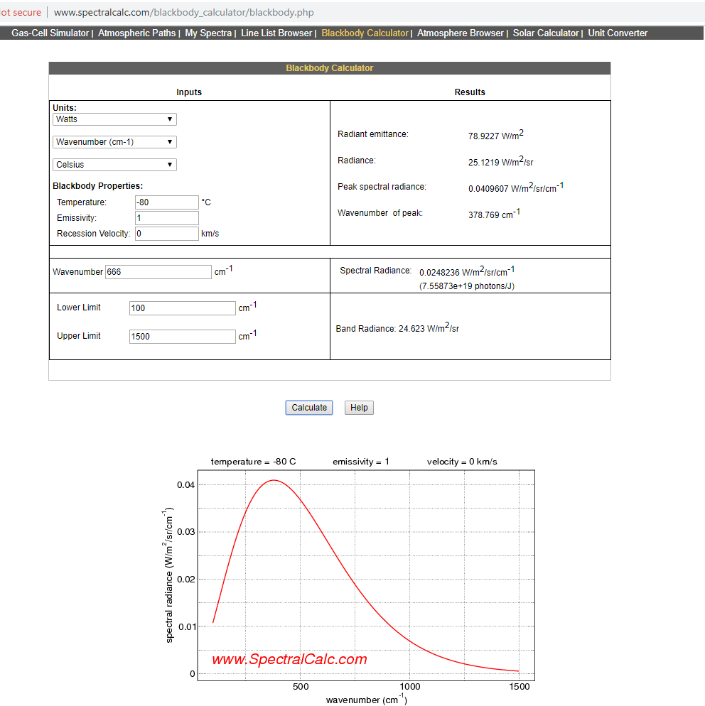
At -80°C (193.15K), the emission peak is at 378.769 cm⁻¹, which is 26.40 µm.
At 300K (26.85°C), the emission peak is at 588.303 cm⁻¹, which is 17.00 µm.
Dave,
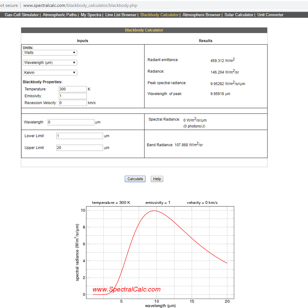
At 300 K the emission peak for wavelength distribution is at 9.659 µm.
You’re right, teerhuis. Thank you for the correction. I don’t know how I botched that.
-80C by wavelength, peak is at 15 µm, as CO2isLife mentioned.
300 K by wavelength, peak at 9.659 µm (not 5.056 µm); screenshot:
-80C by wavenumber, peak is at 378.769 cm⁻¹, which is 26.40 µm; screenshot:
300 K by wavenumber, peak at 588.303 cm⁻¹, which is 17.00 µm; screenshot:

More precisely, photons do not have “temperature” no matter what frequency/wavelength they are.
“First of all, Antarctica is very atypical, because the Antarctic interior has an upside-down lapse rate. That makes it the worst possible place on the entire planet to look fingerprints of so-called “greenhouse” warming.”
Antarctica is the ideal location to identify the CO2 signature. You need very dry air, even distribution of CO2 and no urban heat island effect, high albedo on an even color background, a surface that readily absorbs the back radiation. What difference does the lapse rate matter when you are dealing with temperatures measured 6 ft off the ground? None.
The color axis is irrelevant, CO2 absorbs 13 to 18µ LWIR, that isn’t a calculation, that is an observed measurement. Snow is white anyway so reflection is more important. The black body reference was simply to explain my original comments.
If the Antarctic isn’t the perfect control, where is? The high deserts? Same result, no warming with an increase in CO2.
High albedo places like Antarctica should be less affected than low albedo places like the ocean from an increasing greenhouse effect. And when measured, Antarctica is indeed warming more slowly than higher albedo places.
Antarctica is ideal to show how much the albedo effect matters in relation to countering the greenhouse effect.
Since we are talking about “Global Warming”, are there similar statistics for the Arctic ?
For a bit of balance, take a look at
https://www.theguardian.com/environment/2019/may/16/thinning-of-antarctic-ice-sheets-spreading-inland-rapidly-study
and the references therein.