Guest Post by Javier
February is not over, and Arctic sea-ice extent is already over half a million square kilometers higher than last year at this day.
The growing season has not ended, and 2019 Arctic sea-ice extent is already higher than the previous four years and six out of the last 14 years.
 Figure 1. Arctic sea-ice extent. Note the left edge of the graph is February 1, not January 1. http://nsidc.org/arcticseaicenews/charctic-interactive-sea-ice-graph/
Arctic sea-ice has stubbornly resisted the very warm years between 2015-2017 caused by the big El Niño. Are we going to see an increase in Arctic sea-ice over the next few years? Only time will tell, but the idea cannot be discarded.
Antarctic sea-ice is also growing this year with respect to last year, so global sea-ice extent is going to see an important jump this year.
Stay tuned for the March results but the “Arctic melting pause” is alive and kicking 12 years later. It started the year Al Gore said Arctic sea-ice was doomed. Talk about timing.
You still have not understood the problem. If you see the plot today then the ice surface has just risen. When you saw the same plot in 2015, the trend seemed to be clearly down. That’s all natural variation. Whether the ice goes back in time or increases you can not conclude. Real changes become relvant after 50 or 100 years. And even then, such a trend can also tip over at any time.
Stratospheric intrusion will attack in the northeast of the US within 12 hours. It’ll be cold.

Ice tsunami
High winds had raised water levels on the eastern end of Lake Erie in a phenomenon known as a seiche and then, according to the New York Power Authority, driven ice over a boom upstream from the river. The National Weather Service in Buffalo warned that winds along neighboring Lake Ontario could reach 75 mph, causing “extensive damage to trees and power lines, widespread power outages, and property damage to roofs and siding.”
Pictures are incredible.
Worth a post with oicyptures on its own on Fox News at moment
Stupid people are still falling for this WUWT quackery? This post is now being distributed across the internet as a demonstration as how to cherry pick data and be a climate denier. Lol, what a terrrible attempt at denial, btw.
Edwin:
Translation,
I have no cogent argument against the posted article, instead will make a data and evidence free babble that will impress no one here who expects something more mature and rational.
Lets see if this is the usual drive by comment as most of this type usually are.
Reply to Edwin,
Yeah, but Skeptical Science.
Defense rests.
@ur momisugly Edwin: You refuse to see reality. That’s why you’re blind.
That’s great! Thanks Edwin.
DWR54: Dr. Spencer, UAH says, and I agree. All the current evidence points toward UAH being closer to “reality” ….not real common in the co2 as control knob debate.
Diurnal Drift Effects in the RSS Dataset
We have long known that there were differences in the resulting diurnal drift adjustments in the RSS versus our UAH dataset. We believed that the corrections in the older RSS Version 3.3 datasets were “overdone”, generating more warming than UAH prior to 2002 but less than UAH after 2002 (some satellites drift one way in the diurnal cycle, other satellites drift in the opposite direction). This is why the skeptical community liked to follow the RSS dataset more than ours, since UAH showed at least some warming post-1997, while RSS showed essentially no warming (the “pause”).
The new RSS V4 adjustment alters the V3.3 adjustment, and now warms the post-2002 period, but does not diminish the extra warming in the pre-2002 period. Hence the entire V4 time series shows more warming than before
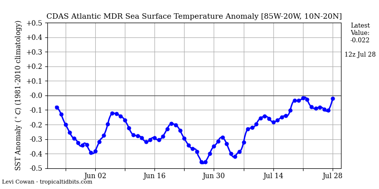
Very low temperature of the equatorial Atlantic. No impact of El Niño.
http://tropic.ssec.wisc.edu/real-time/mtpw2/product.php?color_type=tpw_nrl_colors&prod=natl×pan=24hrs&anim=html5
I have to ask a very stupid guy question: Why is 1981-2010 the median line? Most data that is charted is below the median line. What years are above? I’m thinking the charted numbers are satellite data? Observations before 1981, were acquired some other way?
Earl,
NOAA uses a moving 30-year baseline average. In 2021, it will move to 1991-2020.
Dedicated satellite observations began in 1979, but satellite imagery goes back to the ’60s.
Chavie,
my boss asked me
” why do you talk “February is not over,””
when you spell “Jänner”.
Jänner, Februar, März, April, Mai, Juni, Juli
instead of
Januar, Februar, Marcius, neugeborene Länmchen springen, maius, June, Jule, August, Sept ember, Oct ober,
My boss. Der alte Fischkopf.
Asks me.
“Why is it Jänner, Februar, März
and not jannuary, february, marcio, aprilos . ..
Guess. Why.
Antarctic sumer sea ice minimum will also be higher this year than for the past two, super El Nino-affacted seasons.
http://nsidc.org/arcticseaicenews/charctic-interactive-sea-ice-graph/
“El Nino-affacted seasons”
…
Is english your 2nd language?
No, but I’m prone to typos on laptops and phones. “A” for “e” maybe because I was being sure to type “affected” rather than “effected”.
It may be very interesting for some to look at a change between two consecutive years, and to draw conclusions.
I prefer to have a more global look over longer time periods.
1. Arctic sea ice extent and area from SIDAS, colorado.edu (*), Jan 1979 – Jan 2019:
https://drive.google.com/file/d/1J1_KobBchTT43J_y_0Lff-KHs4VNSavM/view
2. Arctic sea ice volume from PIOMAS, washington.edu (**), Jan 1979 – Jan 2019:
https://drive.google.com/file/d/1xtRgxklJN4GT0kGp7We_J3ZbxdIajaSi/view
Maybe Javier still knows what he told us in Feb 2015, in Feb 2008 and in Feb 1996…
(*): ftp://sidads.colorado.edu/DATASETS/NOAA/G02135/north/monthly/data/
(**): http://psc.apl.washington.edu/wordpress/wp-content/uploads/schweiger/ice_volume/PIOMAS.2sst.monthly.Current.v2.1.txt
Thanks you just showed we are near the trend line…LOL!!!