Guest Post by Javier
February is not over, and Arctic sea-ice extent is already over half a million square kilometers higher than last year at this day.
The growing season has not ended, and 2019 Arctic sea-ice extent is already higher than the previous four years and six out of the last 14 years.
 Figure 1. Arctic sea-ice extent. Note the left edge of the graph is February 1, not January 1. http://nsidc.org/arcticseaicenews/charctic-interactive-sea-ice-graph/
Arctic sea-ice has stubbornly resisted the very warm years between 2015-2017 caused by the big El Niño. Are we going to see an increase in Arctic sea-ice over the next few years? Only time will tell, but the idea cannot be discarded.
Antarctic sea-ice is also growing this year with respect to last year, so global sea-ice extent is going to see an important jump this year.
Stay tuned for the March results but the “Arctic melting pause” is alive and kicking 12 years later. It started the year Al Gore said Arctic sea-ice was doomed. Talk about timing.
As I view it, the increase in Arctic ice is a sign the system is trying to hold on to some heat. After all, ice is insulation at the pole, protecting the water from subzero temps. Couple with the half hearted El Niño …… we may be heading into some cooler times. Granted, I said “may”, as I think the whole system is mostly chaotic.
The relative increase in precipitation we’ve had over the last few years transported too much heat out of the system. Now the system is reversing phase. It needs to soak up some heat, but factors are hindering that process.
That’s your canary.
This sudden growth in ice is very different from a few years ago.
I propose that we call it ‘Arctic Ice Weirding’ and blame it on CO2…
What were the predictions made by Girff and Tony McLeod again? Oh dear! The great think about prodictions, especially of the near future, is that we usually don’t have to wait long.
Where is Griff? I’d love to hear what the resident WUWT troll has to say.
It’s David’s shift.
Tony predicated and bet that the North Pole would be ice free in 2017, he lost. The bet was that he would never post again if he lost, of course he welched on the bet. Griff agreed with him but was unwilling to take the bet.
Yes, that was the guy!
I had a bet with him, a monetary bet.
Made right here.
And golly was he rude as all get out.
He never had any intention of paying.
Total sleaze.
Daily mean temperature in the Arctic (per Danish Meteorological Institute) hasn’t yet risen above 250K, any day in 2019 and one needs to go back to 1993 to find another year when this was true, although a couple of other years in the 90s came close.
No big deal. More ice, less ice, ho hum.
I just hope that Punxatawny Phil got it right, this year.
signed- Sick O Winter
The growth in sea ice is what the Russian studies had predicted, with the growth to continue for another 20 years . This is based on the 60 year cycle identified in their sea ice studies which are based on evidence going back a long way
Arctic Sea ice has been declining since 2014. The trend is declining.
2014 is after 2012 so the trend is in decline.
It’s a two year natural cycle!
November, 1922 Monthly Weather Review
The Changing Arctic
By George Nicolas Ifft
Under date of October 10, 1922, the American consul at Bergen Norway submitted
The following report to the State Department, Washington DC
The Arctic seems to be warming up. Reports from fisherman, seal huners, and explorers who sail the seas about Spitzbergen and the eastern Arctic, all point to a radical change in climatic conditions and hitherto unheard-of high temperatures in that part of the earth’s surface.
The Arctic is warmer in winter but cooler in summer. Check it at DMI. And then try to come up with an explanation. I already did. It is a sign of more efficient cooling by the planet and a big contribution to the pause. Just the opposite of what Arctic amplification is supposed to do.
Arctic Sea Ice Extent (ASIE) may have scientific value, but the media runs with this metric without regard to its scientific value. That’s because its easy to use ASIE to support Climate Alarmism. To the uninformed, ASIE is equivalent to “how much ice is there”. That isn’t the case. ASIE, with its 15% threshold is massively deceiving if it is used to indicate volume.
Sea ice is important because it reflects sunlight (incoming energy). The more the Arctic ocean is covered, the greater the reflection. The less the “extent” the more that energy is absorbed by the ocean. However, ASIE treats 100% coverage the same as 15% coverage. I’m not sure it helps with understanding ocean cover, but that is what it is supposed to do. I don’t find it to be a very useful metric for anything. I prefer Arctic Sea Ice Volume (ASIV). Its modeled, but it gives a better indication of how much energy is being transferred to the atmosphere as ice is made. It tells us about the energy state of the atmosphere to be able to make that volume of ice.
ASIV doesn’t give us any reason for alarm – therefore it is not often reported. Here is a graph of the latest data from DMI for 1/02/2003 to 2/23/2019.
https://imgur.com/IEdae0h
Data: http://ocean.dmi.dk/arctic/icethickness/txt/IceVol.txt
Also, the age of the age and temperature of the ice are important. As ice ages its trapped salinity decreases and its melt temperature goes up. As its temperature goes down it’s albedo goes up.
To get a scientific picture of the ice we need to know the extent, thickness (volume), temperature and age – all in one picture.
The temperature of the ice is very important, I agree. The bottom of the sheet in contact with the water is probably always about the same temp at any given time of year.
And any ice that is very thick is probably close the average air temp for the majority of the mass.
I believe the thermal conductivity of ice is higher than for water, and also that it can vary quite a bit.
And highly irregular ice has more surface area for the cold air to conduct away heat, so there is that. Although a snow layer seems likely to inhibit thermal conductivity.
So crumpled ice seems likely to be colder, because more surface area, and snow is less likely to adhere and accumulate on vertically oriented surfaces.
And I agree that this focus on extent, when extent has that very odd way of being measured, seems almost nutty. At the very least there ought to be a separate number for unbroken coverage, to which the part that has partial coverage is added but kept separate.
Wind changes direct and compacts the ice or spreads it out, and extent changes by a huge amount with no change in actual amount of ice. How is that scientific or a measure of anything to do with temperature/ global warming.
Imagine if snow or rain was reported as the area over which it is falling or fell, rather than the amount that fell?
Is there a graph showing annual trend for peak ice extent? All of NSIDCs graph seem to want to show a biased view compared with some arbitrary and cherry-picked reference period, with no indication of annual trend.
Didn’t Gore say the ice would all be gone (By 2013)? Ice is just not cooperating with all that CO2 induced warming.
David: ” satellites aren’t the only way that the ice extent can be measured. “
..
LOL
…
They are the best way to measure it as they have the best coverage.
Note: to help assure that you are open mined about “climate change” Please confirm that you agree that satellite temperature data is better than the land based recordings more warmists prefer using.
Dennis Sandberg
The disagreement in trend among the TLT satellite producers is far greater than that between the surface data producers over the period of their common record. Here are UAH and RSS, with RSS offset to the UAH 1981-2010 base period: http://www.woodfortrees.org/graph/rss/offset:-0.14/plot/rss/offset:-0.14/trend/plot/uah6/plot/uah6/trend
And here are GISS and HadCRUT4 over the same period and set to the same anomaly base as above: http://www.woodfortrees.org/graph/gistemp/offset:-0.42/from:1979/plot/gistemp/offset:-0.42/from:1979/trend/plot/hadcrut4gl/offset:-0.29/from:1979/plot/hadcrut4gl/offset:-0.29/from:1979/trend
If the satellite temperature data is superior to the surface data then why do the different satellite sets disagree with one another so much?
DWR54: You seem to prefer land/sea records. I don’t because of area gaps and heat islands. It gets down to who’s data manipulation do you trust. I have to go with Spencer/Christy. In the meantime for lack of sound data we need to stop the insane attack on fossil fuels and the hopeless investing in wind/solar/ethanol.
Version 6.0 of the UAH Temperature Dataset Released: New LT Trend = +0.11 C/decade
April 28th, 2015 by Roy W. Spencer, Ph. D.
by Roy W. Spencer, John R. Christy, and William D. Braswell
Abstract
Version 6 of the UAH MSU/AMSU global satellite temperature dataset is by far the most extensive revision of the procedures and computer code we have ever produced in over 25 years of global temperature monitoring.
Any particular reason why you “have” to go with them? They’ve been wrong plenty of times in the past: https://en.wikipedia.org/wiki/UAH_satellite_temperature_dataset#Corrections_made
Often the revisions made to UAH have been forced as the result of corrections suggested by personnel still at RSS.
DWR54:”have” to go with UAH because over the years they have proven to be the most accurate/reasonable. your statement:…revisions…forced…. Is a good example of their commitment to excellence. wikileaks not so much, liberals on that site, ijke desmog and skeptical science, seem to have a lot more time to spin data than conservatives.
DWR54: Dr. Spenser, UAH says, and I agree. All the current evidence points toward UAH being closer to “reality” ….not real common in the co2 as control knob debate.
Diurnal Drift Effects in the RSS Dataset
We have long known that there were differences in the resulting diurnal drift adjustments in the RSS versus our UAH dataset. We believed that the corrections in the older RSS Version 3.3 datasets were “overdone”, generating more warming than UAH prior to 2002 but less than UAH after 2002 (some satellites drift one way in the diurnal cycle, other satellites drift in the opposite direction). This is why the skeptical community liked to follow the RSS dataset more than ours, since UAH showed at least some warming post-1997, while RSS showed essentially no warming (the “pause”).
The new RSS V4 adjustment alters the V3.3 adjustment, and now warms the post-2002 period, but does not diminish the extra warming in the pre-2002 period. Hence the entire V4 time series shows more warming than before
Javier
NSIDC monthly data suggests that Arctic sea ice extent has continued to decline over the past 12 years (since Jan 2006). The trend since 2006 is around -0.7 million km^2 per decade: http://www.woodfortrees.org/plot/nsidc-seaice-n/from:2006/plot/nsidc-seaice-n/from:2006/trend
Looking at each individual month over the past 12 years, the linear trend in Arctic sea ice extent is negative in all of them, including September (-0.5 million km^2 per decade).
How do you get an “Arctic melting pause” out of that?
When El Niño occurs, the extent of the ice drops, because there is more water vapor in the atmosphere.
http://tropic.ssec.wisc.edu/real-time/mtpw2/webAnims/tpw_nrl_colors/global2/mimictpw_global2_latest.gif
El Nino episodes drive major warm pulses to the AMO peaking around August after the El Nino peak:
https://www.esrl.noaa.gov/psd/data/correlation/amon.us.data
Easy. This winter there is more ice than 2006 winter, and last summer there was more ice than 2007 summer. Ergo there is more ice than in the 2006-2007 season. What has happened in between doesn’t affect that fact.
If there is more ice than 12 years ago, there has not been effective melting in 12 years. Irrefutable fact. We start the future from a better position than in March 2006.
I see. To get the great “Arctic melting pause” you simply ignore the trend and run with individual values.
Trends depend on starting and ending point. Trends are not, therefore, facts. Just a changing illusion out of the data. The loss of one third of Arctic sea ice between September 1996 and September 2007 is a fact. No further loss since 2007 is another fact.
By contemplating the illusion of a 1979-2019 trend you are not making the right questions:
Why it melted so much between 1996-2007?
Why it has not melted since 2007?
You think you already have the answer to why the Arctic has melted, that is also illusion. That illusion prevents you from finding the truth. But then, you have no interest in the truth.
If 12 years ago we had peeked into our crystal ball and seen how much ice there is right now, would we have talked about this for 12 years?
Or would it have been cast aside as an issue?
If in 1998 we had peeked ahead to now and seen UHI temp anomaly where it is now, would we have been talking about this for the past 21 years?
If we had peeked ahead in 2005 and seen a 12 year major hurricane drought in the US, ow might that have changed the conversation in the intervening years?
It is not just what we are seeing now, it is what we have been subjected to by people who were wrong, over and over again…and despite this, despite nothing substantial to point to as out of the ordinary, we have now before us a 12 year countdown to doomsday!
The extent of ice may increase this year to the end of March, because the temperature above the pole is low compared, for example, to 2017 and 2018.
http://ocean.dmi.dk/arctic/plots/meanTarchive/meanT_2017.png
http://ocean.dmi.dk/arctic/plots/meanTarchive/meanT_2018.png
http://ocean.dmi.dk/arctic/plots/meanTarchive/meanT_2019.png
Are changes in arctic sea ice extent driven by agw? and can they be moderated by cutting emissions?
https://tambonthongchai.com/2018/08/04/does-global-warming-drive-changes-in-arctic-sea-ice/
At the top of the troposphere, ozone competes with water vapor. You can not see the effect of CO2.
Compare this with the layout of the fronts and the temperature of the air. Where ozone displaces water vapor the temperature drops.


David Dirkse wrote
“The probability of that happening is equal to tossing a coin 15 times” is a false statement.
I think we can safely say
– This is just not a coin-tossing problem. Thinking that it is, is really a layman fallacy.
– We don’t know what ‘the probability’ is
– Future will show what happens
– I’m not going to see Arctic ice free, not even for a brief moment
– If summer melt happened, it wouldn’t make that big a difference. The polar night is dark.
– You ended up in a stupid contest
HANG ON A MINBUTE!!!
Last year was the lowest winter extent on record… so this year being greater than it is not quite the recovery this seems to be putting forward!!
https://forum.arctic-sea-ice.net/index.php/topic,2533.250.html
Today the extent is at 12th lowest in the record… and you will note that the last 10 years all feature in the top 14 years…
The ice this year is also particularly mobile and has grown and receded over the last couple of months.
Honestly, with the ice in 12th worst place, how is there any ‘recovery’ showing here?!
The maximum is due any day – so saying the season ‘hasn’t ended yet’ is a bit of a stretch too
Griff, you have been missed.
March 2018 being 99.17% of March 2006 it is not significantly different.
I didn’t say recovery, I said pause.
You don’t get any prize for being 12th, particularly among only 40.
The season ends when it ends, and not a day before.
I suppose you are disappointed with the behavior of Arctic sea-ice, that refuses to melt further despite all your gloom and doom. From being the main talking point of dangerous anthropogenic climate change it has become a painful issue. Followers abandoning sea-ice forums in droves. Hey who wants to watch grass growing or Arctic sea ice not melting.
Griff, thanks for pointing out that the alarmists have recently changed the goal posts from Arctic summer extents to winter extents. It is solid evidence you guys are in a total panic.
Griff, you and your buddy David are missing the point – there is no more decline. The levels are bottomed out and will be increasing.
The thread troll had been focusing on minimum extent…the minimum extent has been higher than 2007 for all years since except for 1. That’s the absurd probability of 10 heads to 1 tails in coin flips according to him if there is no underlying trend, so his methods claim there is a recovery even though he won’t admit that. Maybe you two should get together under the bridge and get your stories straight.
The International Ocean Discovery Program (previously named the Integrated Ocean Drilling Program) are struggling drilling in the Amundsen Sea, now during summer-time, in the Antarctic. Some of their targeted sites for drilling prove to be out of reach because of too much moving ice! The irony is that they were targeted to find out more of the ice history of West Antarctica.
Read the ship reports here. See especially the weekly report for Week 4 and 5.
http://iodp.tamu.edu/scienceops/sitesumm.html
If I understand Mr. David Dirkse correctly, there was no Minoic Warm Period, no Roman Warm period, no Medieval Warm Period, no warm 20-40’s and subsequent low Arctic ice levels – because they had no satellites then.
I.e.: After the invention of satellites all historical data from all other empirical sciences had to be rejected.
The scientific end seems to be nigh….
we will not get rid of the polar bears!
Add on that Summer temps in the Arctic have been below average for the last 20 years according to the DMI.
The polar jet stream becomes too weak during around summer, so energy plumes from the South have great difficulty reaching Arctic areas above 80N. The result in Summer means temperatures stay cold especially with evaporative cooling and ice melting producing latent heat.
Around winter the polar jet stream becomes strong enabling energy plumes from the south reaching the Arctic and giving large positive temperature anomalies at times when especially in meridional form. The DMI has been showing this behaviour for recent decades.
Climate alarmists over recent years have been moving goal posts to winter sea ice extent because of this highlighted behaviour above. This is clearly a tactic of desperation as it is very clear that Winter sea ice extent doesn’t have any influence on Summer ice extent. The reason being no sunlight dwarfs any variation in climate and is always too cold to prevent the entire polar ocean from freezing over in Winter in its current form.
One thing that has happened more than once (especially 2012) is that large winter extents lead to low summer extents and vice versa. This seemingly strange relationship actually makes sense when one considers the winter extent is often a factor of the winds in late February/early March.
The thought is if the winds spread out the ice you see a higher extent but that ice is then easier to melt than when winds push it together. Just something to keep in mind.
Return of frost with strong wind over the Great Lakes.

Meh. I don’t get into the sea-ice thingy. Much of today’s sea-ice is next month’s sea-water, or depending on the time of year, vice-versa.
beng …. you pretty much sum up my perspective on it. Sea Ice is meaningless at the levels that people are quibbling about. Everyone is trying to make trends and meaning out a completely chaotic phenomenon on the time scales they are using, just to try and make some point. After reading all this Climate stuff for 20 years … I’ve concluded there is no evidence to support that:
– CO2 is any kind of major player in temperature
– solar is the driving force of earths climate
– that sea ice is any kind of canary.
– that cows are destroying the climate.
– that polar bears will be extinct in the next decade
– that goofy little cartoon depicting how GHGs and climate operate
…. or for that matter, just about ANY claim made …….
What the data do support …. IS :
– The globe has warmed a little but is still well within its normal range.
– sea ice comes and goes
– the globe has greened a little thanks to more CO2
When I retire, I’d like to explore that the whole thing is controlled by the ocean acting as a capacitor of sorts. Data do suggests that clouds and solar affect the “charging” side of that equation, and the ocean currents do carry heat around, including to the arctic where it melts a little ice 1/2 of the year …. but the whole thing is chaotic.
Dr Deanster — exactly. The elevation of & focus on the inane — tiny, fractional temp changes in temperatures, changes in an intrinsically rapidly-changing phenomena like sea-ice, on & on & on, and then ignoring the daily benefits that fossil fuels provide, and those from increasing CO2 (while benefiting from every day) on food-crops & the biosphere.
Not so sure chaotic is the right word.
There is a randomness superimposed on cyclical trends on many scales.
Global greening is more than a little bit.
0.85 degrees of warming since 1880 is a little bit.
There can be big swings year to year in Arctic sea ice, but averaged over decades, it is indeed cyclic, not chaotic. Same for longer time intervals. As for continental ice sheets.
Javier
Using JAXA data so far this year the extent is following almost the exact same path as for 2012 which turned out to be a record low year.
Before making your rash claims it may be worth looking at the data in another month! And perhaps not cherry pick old data?
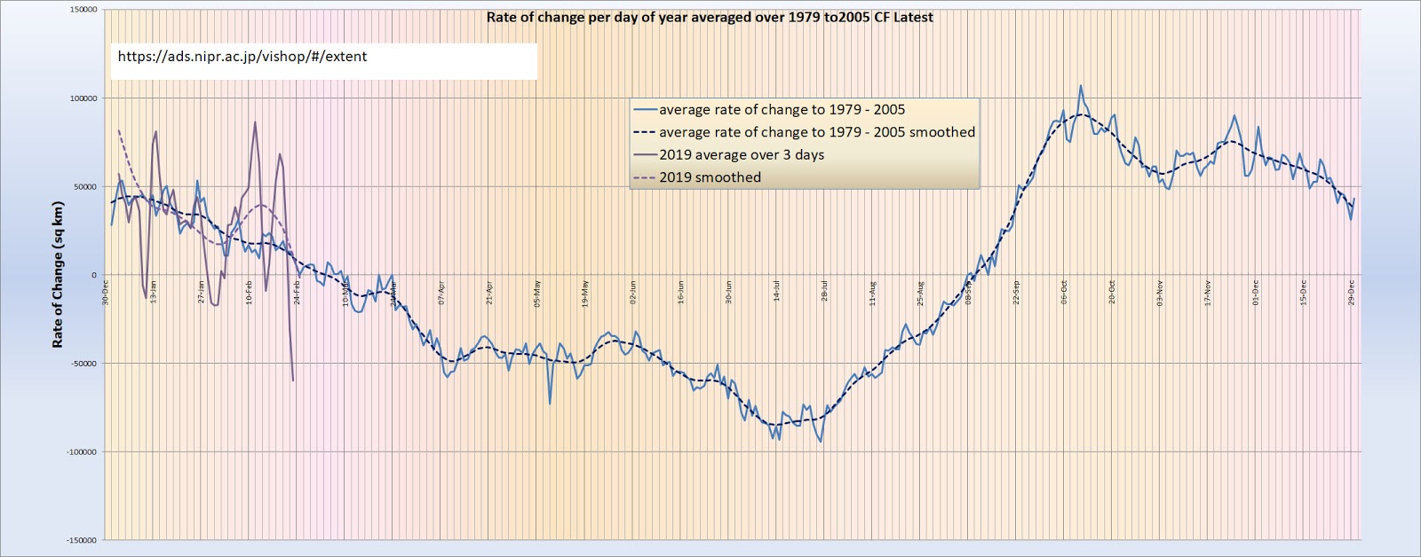
I have plotted the rate of change of extent from JAXA. This shows wild fluctuations but in general is following the averaged rate of change as from 1979 to 2005. Minimum ice will not be obvious until nearer the time it occurs.
And what exactly are those rash claims that according to you I am making?
Javier
Here is another plot of maximum extent per year from jaxa (and IPCC – but ignore this if you like). Obviously the minimum for this year is only the minimum to date – so is way high!
Do you see a recovery forming? I do not!
Why don’t you read the article to see what I am saying?
What is the significance of the drop when within a year the ice coverage returns to the previous area? Call it a trend? The sunny minimum is not over yet.