Guest Post by Willis Eschenbach
Over in the Tweeterverse, someone sent me the link to the revered climate scientist James Hansen’s 1988 Senate testimony and told me “Here’s what we were told 30 years ago by NASA scientist James Hansen. It has proven accurate.”
I thought … huh? Can that be right?
Here is a photo of His Most Righteousness, Dr. James “Death Train” Hansen, getting arrested for civil disobedience in support of climate alarmism …

I have to confess, I find myself guilty of schadenfreude in noting that he’s being arrested by … Officer Green …
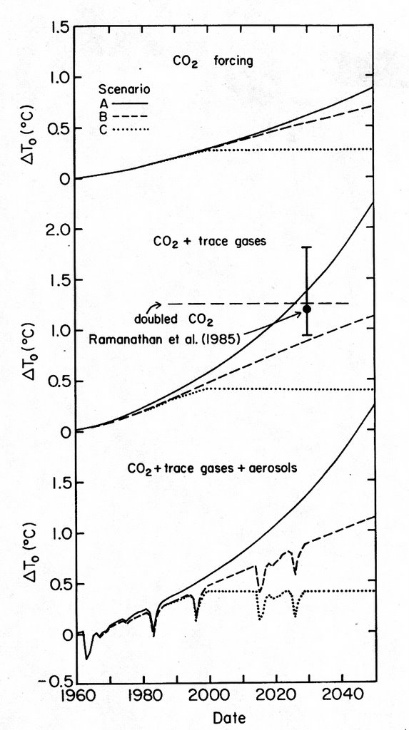
In any case, let me take as my text for this sermon the aforementioned 1988 Epistle of St. James To The Senators, available here. I show the relevant part below, his temperature forecast.

ORIGINAL CAPTION: Fig. 3. Annual mean global surface air temperature computed for trace gas scenarios A, B, and C described in reference 1. [Scenario A assumes continued growth rates of trace gas emissions typical of the past 20 years, i.e., about 1.5% yr^-1 emission growth; scenario B has emission rates approximately fixed at current rates; scenario C drastically reduces trace gas emissions between 1990 and 2000.] The shaded range is an estimate of global temperature during the peak of the current and previous interglacial periods, about 6,000 and 120,000 years before present, respectively. The zero point for observations is the 1951-1980 mean (reference 6); the zero point for the model is the control run mean.
I was interested in “Scenario A”, which Hansen defined as what would happen assuming “continued growth rates of trace gas emissions typical of the past 20 years, i.e., about 1.5% yr-1“.
To see how well Scenario A fits the period after 1987, which is when Hansen’s observational data ends, I took a look at the rate of growth of CO2 emissions since 1987. Figure 2 shows that graph.

Figure 2. Annual increase in CO2 emissions, percent.
This shows that Hansen’s estimate of future CO2 emissions was quite close, although the reality was ~ 25% MORE annual increase in CO2 than Hansen estimated. As a result, his computer estimate for Scenario A should have shown a bit more warming than we see in Figure 1 above.
Next, I digitized Hansen’s graph to compare it to reality. To start with, here is what is listed as “Observations” in Hansen’s graph. I’ve compared Hansen’s observations to the Goddard Institute for Space Studies Land-Ocean Temperature Index (GISS LOTI) and the HadCRUT global surface temperature datasets.

Figure 3. The line marked “Observations” in Hansen’s graph shown as Figure 1 above, along with modern temperature estimates. All data is expressed as anomalies about the 1951-1980 mean temperature.
OK, so now we have established that:
• Hansen’s “Scenario A” estimate of future growth in CO2 emissions was close, albeit a bit low, and
• Hansen’s historical temperature observations agree reasonably well with modern estimates.
Given that he was pretty accurate in all of that, albeit a bit low on CO2 emissions growth … how did his Scenario A prediction work out?
Well … not so well …

Figure 4. The line marked “Observations” in Hansen’s graph shown as Figure 1 above, along with his Scenario A, and modern temperature estimates. All observational data is expressed as anomalies about the 1951-1980 mean temperature.
So I mentioned this rather substantial miss, predicted warming twice the actual warming, to the man on the Twitter-Totter, the one who’d said that Hansen’s prediction had been “proven accurate”.
His reply?
He said that Dr. Hansen’s prediction was indeed proven accurate—he’d merely used the wrong value for the climate sensitivity, viz: “The only discrepancy in Hansen’s work from 1988 was his estimate of climate sensitivity. Using best current estimates, it plots out perfectly.”
I loved the part about “best current estimates” of climate sensitivity … here are current estimates, from my post on The Picasso Problem …

Figure 5. Changes over time in the estimate of the climate sensitivity parameter “lambda”. “∆T2x(°C)” is the expected temperature change in degrees Celsius resulting from a doubling of atmospheric CO2, which is assumed to increase the forcing by 3.7 watts per square metre. FAR, SAR, TAR, AR4, AR5 are the UN IPCC 1st, second, third, fourth and fifth Assessment Reports giving an assessment of the state of climate science as of the date of each report. Red dots show recent individual estimates of the climate sensitivity
While giving the Tweeterman zero points for accuracy, I did have to applaud him for sheer effrontery and imaginuity. It’s a perfect example of why it is so hard to convince climate alarmists of anything—because to them, everything is a confirmation of their ideas. Whether it is too hot, too cold, too much snow, too little snow, warm winters, brutal winters, or disproven predictions—to the alarmists all of these are clear and obvious signs of the impending Thermageddon, as foretold in the Revelations of St. James of Hansen.
My best to you all, the beat goes on, keep fighting the good fight.
w.
In a related story … N. CA is getting DRENCHED in rain this weekend … standing water in my front yard … after Uuuge early season Nov. and Dec. rains. Thus confirming Jerry Brown’s “accurate assertion” of a “Neverending drought” in CA due to runaway global warming. I believe this is the 4th season in a row of substantial rainfall and snowfall in CA.
Here’s the TRUTH- CA has always had, and will continue to have periods of abundant precipitation … and periods of sparse precipitation. Same as it always was … same as it … always was. Despite what a mouth-foaming hysteric Jerry Brown has to say.
“N. CA is getting DRENCHED in rain this weekend … standing water in my front yard … after Uuuge early season Nov. and Dec. rains.”
Which proves how well and how fast California’s carbon tax is working…
Does that mean they’ll have to back the carbon tax off to overcome the next drought?
Speed of response might be problematic.
Here’s the 2006 Vinther et al study of Greenland’ s long instrumental temp record. This is a very long study over 200 years and co-authors are prominent alarmist UK scientists Dr Jones and Dr Briffa.
Looking at temps over this long period we find that much earlier decades are warmer than the last few decades and they even hold up well against some of the decades over one hundred years ago, back in the 1800s.
So what will be their excuse when the AMO changes to the cool phase, perhaps sometime in the 2020s? Or has it started already? Who knows?
https://crudata.uea.ac.uk/cru/data/greenland/vintheretal2006.pdf See TABLE 8 from the study comparing decades
Willis:
The CO2 change per year doesn’t integrate linearly, so taking the mean of each year’s change doesn’t add up. Or else I’m being stupid, which is entirely possible.
You have the actual as 1.9% and Hansen’s as 1.5%. For an annual increase of 1.9% over (2018-1988) = 30 years, I would expect the total increase to be 1988’s measured value to be 1.019^30 more, or 1.76 times more.
However, the 1988 concentration was 352 and 2018 was 408, which is an increase of 408/352 = 1.16x. Taking ln(1.16)/30 yields an annual increase of 0.5%.
What am I missing?
references:
ftp://aftp.cmdl.noaa.gov/products/trends/co2/co2_annmean_mlo.txt
https://www.co2.earth/
https://sciencing.com/calculate-exponential-growth-8143625.html
Ooops, you are referring to emissions, not concentrations!
However the numbers still don’t add up:
Global CO2 Emissions Millions of Metric Tons:
1967: 3393
1987: 5725
2014: 9855
Applying the same analyses, (ln(ratio)/period), I get a percentage increase of 2.6% for 1967-1987, and 2.0% for 1987-2014. (I note the rate of emission increase is dropping over time).
I’m amused that the CO2 concentration is only going up 0.5% per year when the emissions rate is 2.0%. I wonder where all that CO2 went.
references:
https://cdiac.ess-dive.lbl.gov/ftp/ndp030/global.1751_2014.ems
To use an engineering term — the regular, rhythmic seasonal behavior of [CO2] swings in the NH demonstrate quite clearly the global CO2 sinks are far from a saturated state.
The sinks would still take up their capacity even if saturated, wouldn’t they?
“The only discrepancy in Hansen’s work from 1988 was his estimate of climate sensitivity. Using best current estimates, it plots out perfectly.”
Too bad they didn’t let us know in 1988 that their estimate of climate sensitivity was wrong.
Here’s an attempt at calculating the climate sensitivity vs. Hansen’s prediction with the wildly wrong assumption that the entire temperature change from 1988 to 2018 is due to CO2.
Temperature anomaly in 1988: 0.2degC
Temperature anomaly in 2018: 0.8degC
CO2 concentration in 1988: 352
CO2 concentration in 2018: 408
climate sensitivity constant = deltaT*ln2/(ln(Cn/Co) = 0.6*ln2/ln(1.16) = 2.8degC
Which is far less than the 4.2 degC that Hansen used in his model per fah (above).
Peter
References:
http://www.roperld.com/science/globalwarmingmathematics.htm
ftp://aftp.cmdl.noaa.gov/products/trends/co2/co2_annmean_mlo.txt
https://www.co2.earth/
and the temperatures estimated from the plots above.
“he’d merely used the wrong value for the climate sensitivity, viz: “The only discrepancy in Hansen’s work from 1988 was his estimate of climate sensitivity.”
The only relevant scientific question for climate science and any worry over climate change is the sensitivity value of the climate to [CO2]x2.
Nothing else matters if that value used is grossly wrong. And it was grossly wrong for decades as claimed at > 2.5 K to 4.5 K by climateer-rentseekers. We now know it must be < 2 K/CO2x2, and probably closer to 1.5 K.
So no problem, turn off the alarms, the +CO2 is net beneficial. That is the problem the carnival-barking climateer-rentseekers have; they have sold a bad bill of goods to the public and politicians for decades and now they can't backtrack to save their grants or their reputations.
“he’d merely used the wrong value for the climate sensitivity, viz: “The only discrepancy in Hansen’s work from 1988 was his estimate of climate sensitivity.”
Hansen did not select a climate sensitivity; his model calculated one. All of the crap assumptions he put into the model resulted in an ECS. Get real; he screwed around with different versions and parameters until he got the result he wanted.
Joel O’Bryan January 6, 2019 at 6:24 pm
“now know it must be < 2 K/CO2x2, and probably closer to 1.5 K."
Is that using adjusted data, or unadjusted data?
Seeing as at least half the increase in temperatures is due to adjustments, how sure are you of the 1.5K.
Back in the summer this subject was addressed on Climate etc. by McKitrick and Christy and in a video by Yale Climate Connections. I wrote this note to my discussion group:
“I have trouble with the dichotomy between these two reviews Of the James
Hanson model predictions at 30 yr. .
https://judithcurry.com/2018/07/03/the-hansen-forecasts-30-years-later/
https://www.youtube.com/watch?v=UVz67cwmxTM
The video seems to imply that he “got it just right” and we have only
improved models since then. The Climate Etc. article says he missed
radically and it stands as proof of the models not using settled
science. Which one makes their point more believably for you?”
The discussion group really wanted to accept the video and went to quite some lengths to downplay McKitrick to do it.
I noted an interesting fact while reviewing Hansen’s paper. His Model has a resolution of 8 degrees of latitude and 10 degrees of longitude. My rule of thumb it a minute of lat or long in Montana is about 1 mile.( 1′ Lat is about 1.2 mi and 1′ long. Is about .8 mi.) so his resolution is a grid about 500 mi square. Less than 2 grid cells for all of Montana. It is hard for me to imagine how that model handles convective mixing or latent heat transfer of phase changes of water.
DMA – He had to use a coarse grid of 8 x 10 degrees to make the model work on the best computers of the time.
Now that supercomputers are that much more powerful, models can use a finer resolution (IIRC the CMIP5 models use a 1 x 1 degree grid, still far too coarse to model weather events). But, after tweaking to make them fit the past and averaging the multiple runs of multiple models, they give essentially the same predictions as Hansen 1988.
Makes you wonder whether all that investment in computer hardware was worth it. A disinterested observer might conclude that the input parameters were wrong in 1988 and are still wrong now.
Look at the input forcing assumptions Hansen used. Scenario B and C are not even close.
With climate alarmists when the future doesn’t turn out as predicted it’s not their fault. It’s the history that’s out of whack . Let’s adjust the past data so that it fits the narrative of our predictions and then we will always be right.
Where’s Nick?
“Where’s Nick?”
On holiday, with limited internet access. But all this was rehashed just 6 months ago, on the 30-year anniversary. A full analysis of the scenarios is here. The outcome was between B and C. It is true that CO2 was not far from Scenario A. But A and B were virtually the same for CO2 over the period. Scenario B was actually closer, but that made little difference.
The big effects on scenario were the slow rise of CH4 and the big restriction of CFC’s, neither anticipated by A (which was actually an older scenario). The other factor was that A made no provision for volcanoes at all. Scen B postulated big eruptions in 1995 and 2015. Pinatubo fulfilled the first, but the second hasn’t really happened yet.
Incidentally, it isn’t just my assessment that the scenario that was followed is between B and C. Here is Steve McIntyre:
“As to how Hansen’s model is faring, I need to do some more analysis. But it looks to me like forcings are coming in below even Scenario B projections.”
Those are emission scenarios. The CO2 emissions have grown even more than scenario A!
“Those are emission scenarios. The CO2 emissions have grown even more than scenario A!”
No, not true. Oddly enough, Willis was calculating them correctly back in 2006 when he said
“However, after 1988, all three scenarios show more CO2 than observations. C drops off the charts in when it goes flat in 2000, but A and B continue together, and they continue to be higher than observations. “
That relation continued to be pretty much true.
Nick, it’s crazy that you deny this. The average annual growth in CO2 emissions since the prediction was 1.9%. Hansen’s scenario A (BAU) assumes 1.5% average annual growth. You cannot deny this.
Nick, the average annual growth in anthropogenic CO2 emissions since the prediction was 1.9%. Hansen’s scenario A assumes 1.5%. How can you D E N Y this?
Sorry for the “double” comment.
No Nick is probably right , Willis has taken the average of the estimated annual average emissions for the period. That gives him the average of the annul linear growth of the accumulated total sum for the whole period, and if I remember correctly Hansen’s 1.5% was his estimate of the exponential growth rate so that would be equivalent to a liner growth rate of ((1+1.5/100)^30-1) /30 = 0.0188 which rounded up to 0.019 given as a ratio or 100*0.019 = 1.9 % . It is the same number as Willis gets for actual growth for the annualy calculated estimate numbers tha CDIAC puts out.
” It is the same number as Willis gets for actual growth for the annualy calculated estimate numbers that CDIAC puts out.”
It isn’t the exponential arithmetic. It’s the difference in physical quantities between that CDIAC figure for amount of C burnt, and the quantity Hansen identified with emission, which was the increment of CO2 in the air. It just happened that one increased at about 1.9%pa and one at about 1.5%pa. The difference is due to ocean absorption, mainly.
Hansen used the annual increment for good reasons
1. It is the figure that the GCM and the real world responds to. If he had used amount of C burnt, he would still have had to predict the amount that would remain in the air.
2. He didn’t have reliable figures for amount of C burnt anyway. Those need to be collected by governments via tax data etc, and this was an outcome of the UNFCCC.
The actual predictions of CO2 by Hansen’s model from ’88 are archived, the actual values for 2018 are as follows:
Scenario A 410ppm Scenario B 404ppm
Global measurements September 2018 405ppm
Predictions from 30 years ago were rather good.
“The big effects on scenario were the slow rise of CH4 and the big restriction of CFC’s, neither anticipated by A (which was actually an older scenario).”
Yeah, that’s what I remember being said in my discussion of this over at SkS.
The website analysis you link to merely engages in post-hoc cheating. Like I said above, Hansen’s original paper presented “emissions” scenarios that posited a causal relationship where rising CO2 emissions would cause temperatures to increase. That was the whole thrust of of his 1988 paper, and his corresponding Congressional testimony where he used that paper to try to persuade Congress that his research supported the need to reduce emissions. About 20 years after the fact, he (and that site you linked to) tried to re-cast his “scenarios” as being merely for possible future atmospheric CO2 concentration increases.
But that kind of forecast can’t be used to establish a causal relationship between CO2 and temperature. All it can do is confirm correlation. If all you’re doing is firing a shotgun and saying that if CO2 concentrations are A, temperatures will be X, if concentrations are B then temperatures will be Y, and so forth, then any later validation of one of those associations says absolutely nothing about whether the concentrations caused the temperature, or vice versa, or some mixture of the two.
Hansen’s original 1988 paper claims that his “emissions scenarios” are “designed to yield sensitivity experiments for a broad range of future greenhouse forcings.” It can’t very well be a “sensitivity experiment” if the anticipated result isn’t going to tell you how much of a temperatures would be caused by an increase in CO2. Its not an “experiment” for “forcing” at all.
” Like I said above, Hansen’s original paper presented “emissions” scenarios that posited a causal relationship”
That is nonsense. The scenarios are just possible future paths of gas concentrations. The causal relationship, if any, will be established by the GCM, taking the scenarios as input. Of course the intention is to carry out sensitivity experiments to see if temperatures increase with GHG. But that isn’t part of the scenario.
In Hansen’s papers, emissions are identified with the annual concentration increase. It was the only data he had, or at least the only data he used. The revisionism comes from people (like Willis above) who want to claim that he was talking about the emissions in Gtons that are calculated from government figures, collected by agreement as part of the UNFCCC process. That all postdates 1988. Hansen’s scenarios were of concentration, which is anyway the required input for the GCM. The formula that generates the scenario A he used was
CO2 ppm = 235 + 117.1552*1.015^n n=years
The numbers he used, in full detail, are in a file given by the link.
Steve McIntyre got all that right here in 2008. He shows the graphs.
If Hansen is going to revise his predictions downwards, due to current knowledge, he should also revise his apocalyptic hyperbole down.
So we would have ‘ serious illness’ trains, instead of ‘death trains’
‘Say thank you and smile’ instead of ‘water by request only’
‘Nice new flower garden’ instead of ‘ different trees’
And all the things that have been banned, shut down, wrecked, subsidised should be half-unbanned half reopened half fixed and py us half our money back.
Half baked predictions from a half baked theory spouted by a half baked man.
Climate Sensitivity stems from the Planck Equation relating absorbed energy to a resultant temperature dF = K*dT where K is the coefficient and relates to Sensitivity.
Where water is concerned, at phase change K is zero as the absorbed energy goes into the Latent Heat without change in temperature.
IMHO most, of not all models have ignored this thermodynamic fact and have thus concluded that water enhances the Greenhouse Effect when the opposite is true.
I suggest this explains a great deal.
As the math professor might say to Eric Morecambe/ Hansen.
” You are playing with all the wrong numbers!!”
To which he replies.
” No sunshine, I am playing with all the right numbers, but not necessarily in the right order…”
Dr Hansen’s 1988 testimonial to Congress
“My last viewgraph shows global maps of temperature anomalies for a particular month, July, for several different years between 1986 and 2029, as computed with our global climate model for the intermediate trace gas scenario B. As shown by the graphs ……… at the present time in the 1980s the greenhouse warming is smaller than the natural variability of the local temperature. So, in any given month, there is almost as much area that is cooler than normal as there is area warmer than normal. A few decades in the future, as shown on the right, it is warm almost everywhere.” ie by 2018
Hansen et al 1988
(2) The greenhouse warming should be clearly identifiable in the 1990s; the global warming within the next several years is predicted to reach and maintain a level at least three standard deviations above the climatology of the 1950. ie by 1995
How is this working out?
The models of median global temperature anomalies have certainly behaved as predicted. HADCRUT4.4 reached +3 Standard Deviations in 1990 and maintained >+3 Standard Deviations since 1997.
However Dr Hansen predicted that by now it should be ‘warm almost everywhere’.
Is this happening?
Looking at the Mean Annual Central England Temperature (CET) Record. By 2016 Mean Annual CET has only TWICE (2006 & 2014) exceeded +3 Standard Deviations from Climate Normal in the 1950s (1921 – 1959) as defined in Hansen et al 1988
In the UK Meteorological office Historical data 9 of the published 37 long term data records allow calculation of 1921-1950 Climate Normal. 5 out of 9 stations have exceeded 3 Standard Deviations since 1950, 4 for 1 year (3 in 2014, 1 in 1920), 1 in 2 years (2006 & 2014).
So no anthropogenic signal at the local nor regional level.
In this small corner of the world natural variability rules.
“Looking at the Mean Annual Central England Temperature (CET) Record. By 2016 Mean Annual CET has only TWICE (2006 & 2014) exceeded +3 Standard Deviations”
He didn’t say it would. He said the global average would exceed 3 sd (of the global average). Individual locations have a much higher sd, with no corresponding expected increase in mean.
Dr Stokes, there was an expected increase in regional means -“A few decades in the future, as shown on the right, it is warm almost everywhere.”
The UK mean annual temperature remains within natural variability.
“The UK mean annual temperature remains within natural variability.”
That may be. It doesn’t mean that UK is showing less warming that you would expect. It just means that small area averages are much more variable than big areas. That is why people go to the trouble of aggregating as large a sample as possible.
Dr Stokes, this is the weakness of geostatistics. The concept of climate is a regional (not global) emergent feature from weather measurement . Global models of temperature have only limited applicability as their level of aggregation mask the variability in the real world. If the warming is global, through CO2, climates (regional aggregates) should show similar behaviour to that modelled for the globe, as Dr Hansen suggested.
Looking at the red dots in Willis’s Figure 5 makes me think of the “convergence” with time of the published values of the charge on the electron, following Millikan’s oil-drop experiment. The fact that the climate sensitivity estimates still appear to be “trending” downwards suggests, to this cynic, that there may still be some way to go before we have anything like an accurate value.
Willis
When you compare his prediction with GISS and HADCRUT temperature reconstructions, and showing the period running from the late 1950s, are you using current versions of these data reconstructions, or are you splicing on current versions with the versions that were current in the late 1980s?
Don’t forget that at the time that Hansen made his predictions, the current versions of the temperature reconstructions showed considerable cooling into the 1970s that is absence from current versions.
Don’t forget the considerable changes that have been made to both GISS and HADCRUT over the years.
Hansen was working with versions as they stood in the late 1980s, and these versions should be used as the starting point at which his prediction is grounded.
Let us not forget the other prediction,m Manhattan underwater, yet another gem.
I also took a look at Hansen’s 1988 predictions six months ago.

A trivial point I would pick up on Willis’s analysis is his estimate of average annual emissions growth. Exponential CO2 emissions growth might be 1.9% per annum in the last 30 years, but GHG emissions growth is nearer 1.3%. The reason this is a trivial point is that actual emissions growth is closest to Scenario A whether CO2 or GHG emissions is used. This is my chart based on total GHG emissions in IPCC CO2 equivalent units.
Please note the assumptions behind the scenarios.
Scenario A – Emissions keep on growing at current rates. The business as usual (BAU) scenario.
Scenario B – Global emissions are stabilized at late 1980s levels. The zero emissions growth scenario.
Scenario C – Global emissions are reduced to near zero by 2000. The emissions elimination scenario.
The two policy scenarios B & C gave an important political message. What Hansen was effectively saying was
Hansen, (and nearly all the alarmists since), missed out the global when advocating what we should do.
Just to emphasize the last point about climate alarmists missing out the “global” when advocating cutting emissions, I have produced a chart comparing CO2 emissions in 2017 with 1988.

Global emissions increased by 69% – a compound growth rate of over 1.8%. But the 30 year growth rates between the 5 blocks.
USA +8%
EU -20%
India +369%
ROW +57%
China +342%
As a result of the different growth rates the combined US & EU share of CO2 emissions has reduced from 42% to 24% in the last 30 years. This is mostly due to CO2 emissions growing in the rest of the world.
It is called outsourced production.
Only a small part of it is from goods produced in developing countries and shipped elsewhere. There are three factors at play in the growth shifting shares of emissions since 1988.
1. Higher economic growth in developing countries than developed countries. China & India v Japan & EU are the best examples
2. Collapse of communism lead to a 30-60% drop in emissions. Some of those countries still have lower emissions than in 1988 despite being a lot richer.
3. Many countries reach peak emissions per capita. USA in 1973 and EU in 1980. This is partly due to transfer of low value manufacturing industries to developing countries (steel, shipbuilding, textiles etc).
I thought Comey was St. James.
People are being distracted by the accuracy – or lack thereof – of Hansen’s predictions and do not question the untenable underlying assumption that a control knob controls the planet’s temperature. Any input parameter that has increased over the last 30 years, such as my waist line, would predict rising temperatures.
The only question is did global warming increase your waist line or did your waist line increasing cause global warming?
John perhaps a feedback mechanism …. Francois’s waist line increases which makes the earth hotter which causes Francois to drink more beer to cool off, increasing his waist line again ….
In other words: It’s worse that we thought 😉
Now we just need a list of all the legit science knowledge attained since that time on AMO, PDO, solar cycle, etc. to see just how flimsy that straight edge forecast was.
https://wattsupwiththat.com/2012/05/10/a-blast-from-the-past-james-hansen-on-the-global-warming-debate-from-13-years-ago/
Last week I placed a bet on team A winning 4-0 against team B. Now I know the actual score was Team A 1 – Team B 2. I went back to the betting shop to tell them that my bet was actually spot on correct, all I had to do was incorporate the latest data and alter 2 parameters in my model and hey presto I’m 100% right! Funnily enough they wouldn’t give me my money back or indeed the winnings that were so rightfully mine…
The Gambling industry is very very scared
The Gamblers are very very happy
Twitter Guy: “Hansen was right!”
Willis: (compares Hansen’s predictions to measurements) “It sure doesn’t look right”
Twitter Guy: “Well, yeah, but if you take Hansen’s wrong predictions and change them, he becomes right!”
He said that Dr. Hansen’s prediction was indeed proven accurate—he’d merely used the wrong value for the climate sensitivity
Yeah, if I’m speeding down the highway and get pulled over, I doubt the police officer would accept that I accurately calculated that I was driving a legal speed only that I’d merely used the wrong value for the speed limit of that particular road. I’d have better luck waving my hand and suggesting “this isn’t the speeding car you are looking for” in my best Alec Guinness impression.