By Dr. John Christy, Alabama State Climatologist
Meteorological summer (June, July and August) is now over and it’s time to check how the summer temperatures compare with other years. For a research project a few years ago we developed a statewide summer temperature index for four 100-mile diameter regions centered on the major cities of the state, Mobile, Montgomery, Birmingham and Huntsville going back to 1883. This summer will go down in that database and in NOAA’s official records as being slightly cooler than average.
Somewhat related to this, a reader sent me a link to a New York Times interactive website that claims to provide the number of days above 90°F each year for cities across the country. The results are produced for the Times by an outfit (some might call it an environmental pressure group) called the Climate Impacts Lab.
Since I build numerous datasets of this type, I took a look. The website asks you for the town and year in which you were born, then provides a time series purportedly showing the number of 90°F days per year since your birth and how that has increased.
Though a native of California, I have lived in Huntsville more years than any other place, so I put in my birth year and Huntsville as my hometown. Immediately I became suspicious when their dataset started only recently in 1960 (and a few years after my birth!) Evidently the Times and the Climate Impacts Lab don’t want to deal with folks older than 58.
For Huntsville and Montgomery, here are their results – kind of scary. It appears that the number of 90°F days has risen to their highest levels ever. I’m told that in 1960 Huntsville had about 45 days above 90°F but by 2017 it was 57 days and rising.


Then, to make matters even scarier, they use climate model projections to 2090 to tell me that when I’m “80” in 2040, there will be 73 such hot days in Huntsville as seen below. Yikes!

Before you sell your house and move to Canada, let’s take a look at the real story. Having built many climate datasets of Alabama, some starting as early as 1850, I knew the Times story was designed to create alarm and promote the claim that humans who use carbon-based energy (gasoline, natural gas, coal) to help them live better lives are making our summers ever more miserable. Be aware reader, this webtool is not designed to provide accurate information.
First of all, climate data for Alabama began in the 19th century, not 1960. In 2016 Dr. Richard McNider (Alabama’s former State Climatologist) and I published a carefully constructed time series of summer temperatures for the state starting from 1883 that utilized numerous station records, some that even the federal government had not archived into its databases (which is the most common source for outfits like the Climate Impacts Lab.) I’ve updated that work to include summer temperatures through 2018 – the result is below. Not only are summer daytime temperatures not rising, they have actually fallen over the last 136 years. Hmmm … after looking at the graph, why do you suppose the Climate Impacts Lab decided to start their charts in 1960?

We went a step further in that paper and demonstrated that climate models failed completely to replicate the downward temperature trend in Alabama over the past 120 years – 76 different models with a 100% failure rate. Would you trust these same models to tell you about the future as the Times does? Why did they not check the models for validity?
Now, what about the number of “hot” (or in Alabama we would say “typical”) 90°F days? For Alabama and the nation, I’ve calculated the average value per station each year since 1895. The results below speak for themselves (there is no increase of days hotter than 90°F) and expose the misinformation provided through the Times.


Providing accurate information on Alabama’s climate is what we do in our office. In fact, using real data, I can’t even come close to reproducing the images that the Climate Impacts Lab did which show 2010’s as having the most 90°F days in Alabama – I’m guessing they are using some theoretical output rather than sticking with observations. Notice how smooth their graph is compared to real data – it doesn’t look real to me. I’ll check and follow-up as I can, but something is fishy.
This is a great state in which people can enjoy life and in which businesses can operate – and our climate resources are one of the reasons we are doing so well in recruitment. Occasionally though the time comes when I must address claims made by those whose intention is not to inform but to promote false alarm – this usually happens when an environmental pressure group generates a press release whose dramatic statements are published by a willing media (without any fact-checking.) This is one of those times, and I’m sure it will not be the last.
Citation:
Christy, J.R. and R.T. McNider, 2016: Time series construction of summer surface temperatures for Alabama, 1883-2014, and comparisons with tropospheric temperature and climate model simulations. J. Applied Meteor. Climatology, DOI: 10.1175/JAMC-D-15-0287.1.
Data from the New York Times website accessed on 5 and 6 September, 2018.
– John Christy
The Alabama State Climatologist
I found a very interesting climate data sheet on the website of my local National Weather Service office in St. Louis:
https://www.weather.gov/media/lsx/climate/uin/temp/temp_uin_ranked_90_100_occurrence.pdf
The data is for Quincy, Il. Here the list the actual number of days at or above 90 degrees recorded, and rank the top 50 years with the most, and the 50 years with the least. They also do the same for just the summer months. The top 10 years with the most 90 degree or hotter days all occurred before 1938! Of the 10 years with the least amount of 90 degrees or more, all of them happened after 1950, and 3 of the top 10 in the last 10 years!
Still, when i typed Quincy, IL into the New York Times calculator, it showed data that didn’t match the actual numbers recorded at Quincy at all!
Curious, I typed in Troy, MO in the New York Times Calculator, knowing full well that there are no reliable temperature records for Troy, MO. This didn’t phase the TImes in the least. The very precise graph came up in an instant showing very precise numbers for Troy, MO.
I have a new advertising branding scheme for the Grey Lady: “At the New York Times, We Make it UP!
“All the news that’s fit to print” used to be the NYT’s moniker.
Now with Krugman writing Economy porn, and Brad Plumer (a former senior editor at the hyper-Leftist Vox) writing climate science porn, their moniker is:
“All the propaganda we want you to believe.”
“At the New York Times, We Make it UP!” They are a wing of the game show “Whose Line is it Anyway?”.
Maybe the NYT’s is trying to atone to its base of environmental whacko’s for the sin of hiring Brett Stephens (someone they call a denier) as an op-ed writer?
You’d think they would just replace him.
Thanks Dr. Christy, I spent a few minutes checking Conroe, Texas, a small city in SE Texas. It has a long temperature history in the NCDC climate database. I checked it against the New York Times plot, which is calculated from the Berkeley Earth 1×1 grid and the Princeton Meteorological Forcing dataset, then smoothed apparently. To emphasize the difference between the real measurements versus the New York Times garbage I overlaid the two plots. The blue dots are actual measured data and the orange curve is from the NY Times.
Here is all of the Conroe data to 1900, if anyone can find a trend, let me know:
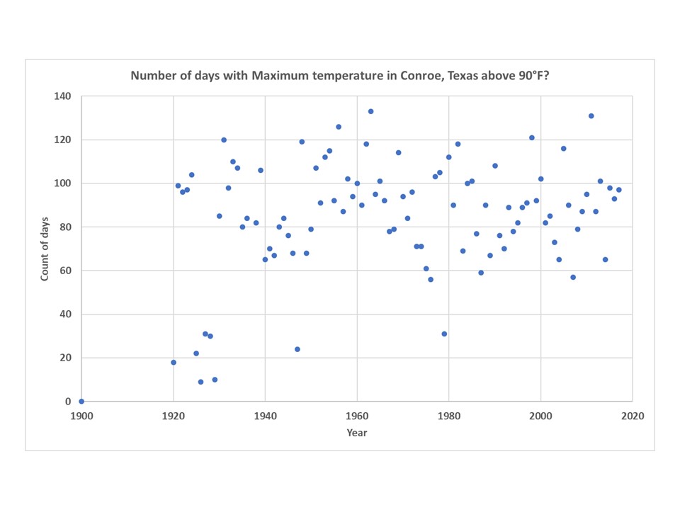
Perhaps a slight decline since 1960? In any case this is one station, in a grassy and forested area. It has been relocated three times, 1947, 1952, and 1963. The only major relocation was in 1947 (6 miles).
It MUST be warmer, because Harvey!
These are the sort of shell games I’ve found in almost every alarmist story I’ve ever read. You dig long enough it’s always there… and usually you don’t have to dig far.
Yeah… if you tell people there were more hot days in the 1930s that might give them the idea all these lurid AGW fears are a bit exaggerated.
Check the FAQ at the bottom of that page. It sheds some light on this. It’s like reading the fine print. I don’t agree with the assertion that there were not good measurements before 1950.
Entered my town, Ann Arbor, into the NYT app and found we’ve been on a cooling trend, well, except for the future!
Dr. Christy ==> Thanks for exposing another total hash of reality by the New York Times’ Climate Team. They have a special team of propagandists churning out all kinds of nonsense to match the papers editorial Narrative on Climate Change. Real world reality is not involved.
I tried the interactive propaganda mill. Initially, I put San Jose (CA) in, which was where I spent most of my teenage and adult years. It said that there was no database available. Then, just for kicks, because I had lived in Phoenix briefly as a child, I entered Phoenix as my birthplace. It came back telling me that it only had data since 1960. It looks suspiciously like their database has been truncated to start after the post-war cooling trend in order to accentuate the recent warming.
Climate warmists call that “cherry-picking”. Oh, wait, they did it, so never mind……
Thanks John Good post!
Its very disturbing of how often climate data is being manipulated. The cooling in Alabama is not restricted to the Heart of Dixie. For the most part, the southeast USA has experienced what several papers have labeled a “warming hole” where temperatures have cooled for the past 100 years. Of course if all the data is presented then the public must realize that natural variability exerts a huge influence on climate.
http://landscapesandcycles.net/image/126096406_scaled_612x190.png
Figure from Mascioli et. Al. (2017) Mascioli et al (2017) Timing and Seasonality of the United States ‘Warming Hole’; Environ. Res. Lett. 12
It gets worse, and it is not just the NYT.
Today, the Washington Post went so far as to blame Trump for a storm which has not even hit yet, and other have blamed him for not responding to the aftermath appropriately…even though the storm is still days away from land!
https://www.washingtonpost.com/opinions/another-hurricane-is-about-to-batter-our-coast-trump-is-complicit/2018/09/11/ccaed766-b5fb-11e8-a7b5-adaaa5b2a57f_story.html?utm_term=.5ad1e4735b10
TDS runs rampant in the media. Not that derangement wasn’t rampant before, of course. It’s just now named and has a target that is clear and simple.
I think they attempted to lie by ommission by using the end of a thirty to 40 year cooling trend in 1960, but the results still weren’t scary enough, so they decided to just lie by lying…
Saw the same article and checked my hometown. The NYT claims Albuquerque had 37 summer days over 90 when I was a kid versus 56 now. That is horsepucky. Way more over 90 days when I was young, like all of June, Juky and August.
I don’t know about others, but I never considered days over 90 to be a heat wave. Only if the temperature exceeded 100F did I think it was truly a heat wave. I grew up in southern Iowa, so there was both heat and humidity. The bar for “heat wave” gets lower and lower. Soon, over 65F will be a heat wave.
It’s also interesting that people in very warm climates, like southern Arizona, will put on coats when it’s 45F out and those of us from cold climates are running around in shorts still. “Heat wave” really has ZERO meaning.
That’s because of acclimation. I am a born and raised Southerner. We, who have lived here for a long time, are used to high temps and humidity (absolute humidity). As such, we are geared to limit heat gain from the environment and maximize heat loss to the environment. We put on jackets when it is cool because we are adapted to warm. I am an old man now and I don’t tolerate cold nearly as well as I did when I was a young whippersnapper. I’ll put on a jacket if it is cooler than 60F. Why? That’s cool enough to make me feel cold, and if I don’t do it and persist, I’ll reach the point where I show signs of and have symptoms of hypothermia.
Isn’t the real story … who stole the NYT credibility ?
Biased , tabloid garbage from a paper that is peeing all over it’s heritage .
Who buys it ? Not me that’s for sure .
Evergreen college grads are going to be holding a piece of wall paper
now that their PC white racism is taking their attendance off a cliff .
New enrollment down 30 % , layoffs , trashed budgets for what?
To feed a hate the white people mob .
Why would anyone send their kids to a shit show like that ?
Trump may be easy to dislike by many but he got it right on the climate con game .
I wonder if the NYT climate reporter, Hiroko Tabuchi, had anything to do with this? I caught her red-handed just yesterday:
https://twitter.com/scute1133/status/1039341398238093314?s=21
She was manipulating plain, honest facts to further her agenda that Kansai Airport in Japan, a man-made island, is sinking way more rapidly than engineers had predicted back in 1987 at the commencement of construction. She did this by trawling a Kansai Airport technical page for cherries to pick. The highly informative page she found made it very clear that the subsidence was entirely in keeping with the engineers’ projections.
The several data points she surgically removed from the page served her alarmist purpose very well and when woven in between two different and irrelevant links (both to a single page) it made it appear that her spurious additional statements were valid. And the ultimate goal was of course to show how the alarming airport subsidence exacerbated the alarming sea level rise from global warming.
This was really intricately planned. That’s why I call it a Black Art in the tweet above.
Firstly, she excised the info she wanted without the copious, well-written context and then DIDN’T link the page she’d used. That way, the reader couldn’t see that context.
Secondly, she chose a link that appeared at first blush to look relevant because it was another Kansai Airport technical page about the subsidence. But it was only about subsidence in general and made no reference to the alarmist claims in the NYT paragraph in which it was linked.
Thirdly, it was linked twice, right next to two of the alarmist claims as if to show us that Tabuchi had done her reasearch (that’s if anyone cared to click on it).
And finally, the actual words in the hyperlink are innocuously referring to what the page actually says (subsidence). But this is secondary to the main thrust of the sentence in which the link is placed. The main thrust is that the subsidence was unexpectedly fast and that it’s continuing to sink (presumably still unexpectedly fast).
Of course, the Kansai Airport technical page was long and very helpfully technical! This page, from which Tabuchi got her data, said that the fast initial subsidence was expected because it was *desirable and engineered in*. She also neglected to say her “last measurement” of 43 feet subsidence was at a rate of 6cm/year thus showing that the subsidence was tending towards an asymptote of less than the 50 foot projection .
A Black Art indeed.
You can tell Tabuchi used the longer, unlinked page because her “over 30 feet” and “43 feet” correlate with the subsidence table values (given in metres) on that page. And her “first seven years” correlates exactly to the time frame in that table for the “over 30 feet”.
And how did I smell a rat? I know the exponential behaviour of subsidence. Fast subsidence in early years would never be a surprise to a competent engineer.
The mainstream media and the left (but I repeat myself) are always dishonest, and often maliciously and malignantly so. I appreciate the record being set straight. Why oh why can’t they just tell the truth instead of lying to push an agenda?
If the Radical Left doesn’t lie, they lose.
Dr. Christy-san:
NOAA deleted the following graph from their website in June 2017 (after Trump announced US pulling out of Paris agreement) showing the huge amount of heat they’ve added to USHCN’s raw temperature data between 1900~2000:
Has anyone calculated how much additional heat NOAA added to the USHCN raw temp data between 2000~2017, especially the huge adjustments made after the KARL2015 paper?
I wouldn’t be at all surprised if total adjustments to raw temperature data now exceeds +1.0F.
TIA.
Tony Heller keeps a very good accounting of all of the fake adjustments on his blog site.
I put my hometown in Smithtown NY….so in 1960 they show 5 days….in 2017 they show 4 days….the climate models zoom to 15 days by 2089….hmmmm…odd thing about the graph is that it showed decimal days…..has to be integer value. Therfore it has to be fake
Mmmm, something seems to be missing here?
Where’s Nick and Mosher?
Hmm,…John, I can see why you are a sceptic! One manipulation that BEST climate folk do is remove such big step changes as the drop in 1960. They would have slid the curve vertically upwards at 1960 to “even” the record out, thereby having the recent decades the highest. Boy there is a lot of rehab of datasets needed when climate wroughters retire.
Yet the manipulators yell “cherry-picking” every chance they get. Projection, anyone?
Put a pin in the map; Alabama is protected.
John-can your data be used on another blog if it is attributed to you?
Methinks this is a random number generator. Picking the places I have lived:
Missouri Valley, Ia 23 past 25 future
Rock Rapids, Ia 16 past 12 future
Casper, Wy 16 past 24 future (guess it’s punishment for oil industries…..)
I also put Council Bluff, Ia in since that’s very close to Missouri Valley 30 past 27 future
Somehow, a town just a few miles away cools 3 degrees and another warms 2 degrees. How can that be?
For fun, I checked Jackson, WY. Present is 0, future is 4 with a range from 1 to 8. Really? A chimpanzee with a dart board can do that well. And they call this garbage science????
I also checked temperature records for 2001, an exceptionally hot year in Casper. There were 49 days above or equal to 90F in June through August. Fun with statistics and illustrating the magic of homogenization (great for milk, not so much other things).
Thank you, Dr. Christy. Though I was not born in AL, I have lived in AL since January 1962. Question for the audience (no peeking and don’t call Dr. Christy 😉 ): “What is the average daily high temperature in most of AL from May 15th through September 15th?”, and again, no peeking and don’t call Dr. Christy.
Okay, I’ll relent. The answer is a number between 85F and 95F. 😛 Where I am in AL, the average high temperature reaches 90F near the end of May and runs though the early part of September. Indeed, in an average year, I can expect to see 90F or higher about 100 times.
As Dr. Christy says, it has been getting a bit cooler here over the last 120 years or so; and especially so away from the bigger urban areas.
A bit of history, for you. Mobile has been one of the larger areas for most of the state’s history. Birmingham didn’t even exist when the state was admitted into the Union. Huntsville was smaller than Tuscaloosa 60 years ago. Now, Tuscaloosa is about 2x its size then and Huntsville is about 4x its size then, and is the fastest growing city now. Birmingham was founded just after the end of that nasty war, and almost didn’t survive a cholera outbreak. Around the turn of the century (19th to 20th), Birmingham boomed and was dubbed “The Magic City” because of its rapid growth from the 1890s to about 1920. Birmingham’s population peaked in the 1950s and early 60s, at about the same population as Oakland, CA, then. It has steadily declined since then, while the metro population has continued to grow to about 1.2 million today. Montgomery was not always the state’s capital, too.
I know this is bunk as I specifically remember the summer of 1988, marked by breaking a record for the number of days about 90. I remember the TV station in Kirksville, MO, reporting on that record. The number of days was in the 60’s. So I put Kirksville into the NYT site and see that the highest number of days above 90 in Kirksville happened in 1981, at 25 and a half. I don’t know where they get the half, either. But nowhere, even when I’m 80, will it get anywhere near the 1988 record.