By Christopher Monckton of Brenchley
Commenters on my recent threads explaining the gaping error my team has found in official climatology’s definition of “temperature feedback” have asked whether I will update my series pointing out the discrepancy between the overblown predictions in IPCC’s First Assessment Report of 1990 on which the climate scam was based and the far less exciting reality, and revealing some of the dodgy tricks used by the keepers of the principal global-temperature datasets to make global warming look worse than they had originally reported.
I used to use the RSS satellite dataset as my chief source, because it was the first to publish its monthly data. However, in November 2015, when that dataset had showed no global warming for 18 years 9 months, Senator Ted Cruz displayed our graph of RSS data demonstrating the length of the Pause during a U.S. Senate hearing and visibly discomfited the “Democrats”, who wheeled out an Admiral, no less, to try – unsuccessfully – to rebut it. I predicted in this column that Carl Mears, the keeper of that dataset, would in due course copy all three of the longest-standing terrestrial datasets –GISS, NOAA and HadCRUT4 – in revising his dataset in a fashion calculated to eradicate the long Pause by showing a great deal more global warming in recent decades than the original, published data had shown.
![clip_image002[4]](https://i0.wp.com/wattsupwiththat.com/wp-content/uploads/2018/08/clip_image0024.jpg?quality=83&ssl=1 "clip_image002[4]")
[Fig 1.] The least-squares linear-regression trend on the pre-revision RSS satellite monthly global mean surface temperature anomaly dataset showed no global warming for 18 years 9 months from February 1997 to October 2015, though one-third of all anthropogenic forcings had occurred during the period of the Pause. Ted Cruz baited Senate “Democrats” with this graph in November 2015.
Sure enough, the very next month Dr Mears (who uses the RSS website as a bully-pulpit to describe global-warming skeptics as “denialists”) brought his dataset kicking and screaming into the Adjustocene by duly tampering with the RSS dataset to airbrush out the Pause. He had no doubt been pestered by his fellow climate extremists to do something to stop the skeptics pointing out the striking absence of any global warming whatsoever during a period when one-third of Man’s influence on climate had arisen. And lo, the Pause was gone –
![clip_image004[4]](https://i0.wp.com/wattsupwiththat.com/wp-content/uploads/2018/08/clip_image0044.jpg?quality=83&ssl=1 "clip_image004[4]")
[Fig 2.] Welcome to the Adjustocene: RSS adds 1 K/century to what had been the Pause
As things turned out, Dr sMear need not have bothered to wipe out the Pause. A large el Niño Southern Oscillation did that anyway. However, an interesting analysis by Professor Fritz Vahrenholt and Dr Sebastian Lüning (at diekaltesonne.de/schwerer-klimadopingverdacht-gegen-rss-satellitentemperaturen-nachtraglich-um-anderthalb-grad-angehoben) concludes that his dataset, having been thus tampered with, can no longer be considered reliable. The analysis sheds light on how the RSS dataset was massaged. The two scientists conclude that the ex-post-facto post-processing of the satellite data by RSS was insufficiently justified –
![clip_image006[4]](https://i0.wp.com/wattsupwiththat.com/wp-content/uploads/2018/08/clip_image0064.png?quality=75&ssl=1 "clip_image006[4]")
[Fig 3.] RSS monthly global mean lower-troposphere temperature anomalies, January 1979 to June 2018. The untampered version is in red; the tampered version is in blue. Thick spline-curves represent the simple 37-month moving averages. Graph by Professor Ole Humlum from his fine website at www.climate4you.com.
RSS racked up the previously-measured temperatures from 2000 on, increasing the overall warming rate since 1979 by 0.15 K, or about a quarter, from 0.62 K to its present 0.77 K –
![clip_image008[4]](https://i0.wp.com/wattsupwiththat.com/wp-content/uploads/2018/08/clip_image0084.jpg?quality=83&ssl=1 "clip_image008[4]")
[Fig 4.]
You couldn’t make it up, but Lüning and Vahrenholt find that RSS did
The year before the RSS data were Mannipulated, RSS had begun to take a serious interest in the length of the Pause. Dr Mears discussed it in his blog at remss.com/blog/recent-slowing-rise-global-temperatures. His then results are summarized below –
![clip_image010[4]](https://i0.wp.com/wattsupwiththat.com/wp-content/uploads/2018/08/clip_image0104.jpg?quality=83&ssl=1 "clip_image010[4]")
[Fig 5.] (Orig Figure T1) Output of 33 IPCC models (turquoise) compared with measured RSS global temperature change (black), 1979-2014.
Dr Mears had a temperature tantrum and wrote:
“The denialists like to assume that the cause for the model/observation discrepancy is some kind of problem with the fundamental model physics, and they pooh-pooh any other sort of explanation. This leads them to conclude, very likely erroneously, that the long-term sensitivity of the climate is much less than is currently thought.”
Dr Mears conceded the growing discrepancy between the RSS data and the models, but he alleged we had “cherry-picked” the start-date for the global-temperature graph:
“Recently, a number of articles in the mainstream press have pointed out that there appears to have been little or no change in globally averaged temperature over the last two decades. Because of this, we are getting a lot of questions along the lines of ‘I saw this plot on a denialist web site. Is this really your data?’ While some of these reports have ‘cherry-picked’ their end points to make their evidence seem even stronger, there is not much doubt that the rate of warming since the late 1990s is less than that predicted by most of the IPCC AR5 simulations of historical climate. … The denialists really like to fit trends starting in 1997, so that the huge 1997-98 ENSO event is at the start of their time series, resulting in a linear fit with the smallest possible slope.”
In fact, the spike caused by the el Niño of 1998 was almost entirely offset by two factors: the not dissimilar spike of the 2010 el Niño, and the sheer length of the Pause itself.
![clip_image012[4]](https://i0.wp.com/wattsupwiththat.com/wp-content/uploads/2018/08/clip_image0124.jpg?quality=83&ssl=1 "clip_image012[4]")
[Fig 6.] Graphs by Werner Brozek and Professor Brown for RSS and GISS temperatures starting both in 1997 and in 2000. For each dataset the trend-lines are near-identical. Thus, the notion that the Pause was caused by the 1998 el Niño is false.
The above graph demonstrates that the trends in global temperatures shown on the pre-tampering RSS dataset and on the GISS dataset were exactly the same before and after the 1998 el Niño, demonstrating that the length of the Pause was enough to nullify its imagined influence.
It is worth comparing the warming since 1990, taken as the mean of the four Adjustocene datasets (RSS, GISS, NCEI and HadCRUT4: first graph below), with the UAH dataset that Lüning and Vahrenholt commend as reliable (second graph below) –
![clip_image014[4]](https://i0.wp.com/wattsupwiththat.com/wp-content/uploads/2018/08/clip_image0144.jpg?quality=83&ssl=1 "clip_image014[4]")
[Fig 7.] Mean of the RSS, GISS, NCEI and HadCRUT4 monthly global mean surface or lower-troposphere temperature anomalies, January 1990 to June 2018 (dark blue spline-curve), with the least-squares linear-regression trend on the mean (bright blue line), compared with the lesser of two IPCC medium-term prediction intervals (orange zone).
![clip_image016[4]](https://i0.wp.com/wattsupwiththat.com/wp-content/uploads/2018/08/clip_image0164.jpg?quality=83&ssl=1 "clip_image016[4]")
[Fig 8.] RSS lower-troposphere anomalies and trend for January 1990 to June 2018
It will be seen that the warming trend in the Adjustocene datasets is almost 50% greater over the period than that in the RSS dataset that Lüning and Vahrenholt find more reliable.
After the adjustments, the RSS dataset since 1990 now shows more warming than any other dataset, even the much-tampered-with GISS dataset –
![clip_image018[4]](https://i0.wp.com/wattsupwiththat.com/wp-content/uploads/2018/08/clip_image0184.jpg?quality=83&ssl=1 "clip_image018[4]")
[Fig 9.] Centennial-equivalent global warming rates for January 1990 to June 2018. IPCC’s two mid-range medium-term business-as-usual predictions and our revised prediction based on correcting climatology’s error in defining temperature feedback (white lettering) are compared with observed centennial-equivalent rates (blue lettering) from the five longest-standing datasets.
Note that RSS’ warming rate since 1990 is close to double that from UAH, which had revised its global warming rate downward two or three years ago. Yet the two datasets rely upon precisely the same satellite data. The difference of almost 1 K/century in the centennial-equivalent warming rate shows just how heavily dependent the temperature datasets have become on subjective adjustment rather than objective measurement.
Should we cynically assume that these adjustments – up for RSS, GISS, NCEI and HadCUT4, and down for UAH – reflect the political prejudices of the keepers of the datasets? Lüning and Vahrenholt can find no rational justification for the large and sudden alteration to the RSS dataset so soon after Ted Cruz had used our RSS graph of the Pause in a Senate hearing. However, they do not find the UAH data to have been incorrectly adjusted. They commend UAH as sound.
The “MofB” hindcast is based on two facts: first, that we calculate Charney sensitivity to be just 1.17 K per CO2 doubling, and secondly that in many models the predicted equilibrium warming from doubled CO2 concentration, the “Charney sensitivity”, is approximately equal to the predicted transient warming from all anthropogenic sources over the 21st century. This is, therefore, a rather rough-and-ready prediction: but it is more consistent with the UAH dataset than with the questionable Adjustocene datasets.
The extent of the tampering in some datasets is enormous. Another splendidly revealing graph from the tireless Professor Humlum, who publishes a vast range of charts on global warming in his publicly-available monthly report at climate4you.com –
![clip_image020[4]](https://i0.wp.com/wattsupwiththat.com/wp-content/uploads/2018/08/clip_image0204.jpg?quality=83&ssl=1 "clip_image020[4]")
[Fig 10.] Mann-made global warming: how GISS boosted apparent warming by more than half.
GISS, whose dataset is now so politicized as to render it valueless, sMeared the data over a period of less than seven years from March 2010 to December 2017 so greatly as to increase the apparent warming rate over the 20th century by just over half. The largest change came in March 2013, by which time my monthly columns here on the then long-running Pause had already become a standing embarrassment to official climatology. Only the previous month, the now-disgraced head of the IPCC, railroad engineer Pachauri, had been one of the first spokesmen for official climatology to admit that the Pause existed. He had done so during a speech in Melbourne that was reported by just one newspaper, The Australian, which has long been conspicuous for its willingness faithfully to reflect both sides of the climate debate.
What is fascinating is that, even after the gross data tamperings towards the end of the Pause by four of the five longest-standing datasets, and even though the trend on all datasets is also somewhat elevated by the large el Niño of a couple of years ago, IPCC’s original predictions from 1990, the predictions that got the scare going, remain egregiously excessive.
Even IPCC itself has realized how absurd its original predictions were. In its 2013 Fifth Assessment Report, it abandoned its reliance on models for the first time, substituted what it described as its “expert judgment” for their overheated outputs, and all but halved its medium-term prediction. Inconsistently, however, it carefully left its equilibrium prediction – 1.5 to 4.5 K warming per CO2 doubling – shamefully unaltered.
IPCC’s numerous unthinking apologists in the Marxstream media have developed a Party Line to explain away the abject predictive failure of IPCC’s 1990 First Assessment Report and even to try to maintain, entirely falsely, that “It’s worser than what we ever, ever thunk”.
One of their commonest excuses, trotted out with the glazed expression, the monotonous delivery and the zombie-like demeanor of the incurably brainwashed, is that thanks to the UN Framework Convention on Global Government Climate Change the reduction in global CO2 emissions has been so impressive that emissions are now well below the “business-as-usual” scenario A in IPCC (1990) and much closer to the less extremist scenario B.
Um, no. Even though official climatology’s CO2 emissions record is being hauled into the Adjustocene, in that it is now being pretended that – per impossibile – global CO2 emissions are unchanged over the past five years, the most recent annual report on CO2 emissions shows them as near-coincident with the “business-as-usual” scenario in IPCC (1990) –
![clip_image022[4]](https://i0.wp.com/wattsupwiththat.com/wp-content/uploads/2018/08/clip_image0224.jpg?quality=83&ssl=1 "clip_image022[4]")
[Fig 11.] Global CO2 emissions are tracking IPCC’s business-as-usual scenario A
When that mendacious pretext failed, the Party developed an interesting fall-back line to the effect that, even though emissions are not, after all, following IPCC’s Scenario B, the consequent radiative forcings are a lot less than IPCC (1990) had predicted. And so they are. However, what the Party Line is very careful not to reveal is why this is the case.
The Party realized that its estimates of the cumulative net anthropogenic radiative forcing from all sources were high enough in relation to observed warming to suggest a far lower equilibrium sensitivity to radiative forcing than originally decreed. Accordingly, by the Third Assessment Report IPCC had duly reflected the adjusted Party Line by waving its magic wand and artificially and very substantially reducing the net anthropogenic forcing by introducing what Professor Lindzen has bluntly called “the aerosol fudge-factor”. The baneful influence of this fudge-factor can be seen in IPCC’s Fifth Assessment Report –
![clip_image024[4]](https://i0.wp.com/wattsupwiththat.com/wp-content/uploads/2018/08/clip_image0244.jpg?quality=83&ssl=1 "clip_image024[4]")
[Fig 12.] Fudge, mudge, kludge: the aerosol fudge-factor greatly reduces the manmade radiative forcing and falsely boosts climate sensitivity (IPCC 2013, fig. SPM.5).
IPCC’s list of radiative forcings compared with the pre-industrial era shows 2.29 Watts per square meter of total anthropogenic radiative forcing relative to 1750. However, this total would have been considerably higher without the two aerosol fudge-factors, totaling 0.82 Watts per square meter. If two-thirds of this total is added back, as it should be, for anthropogenic aerosols are as nothing to such natural aerosols as the Saharan winds that can dump sand as far north as Scotland, the net anthropogenic forcing becomes 2.85 Watts per square meter. Here is how that makes a difference to apparent climate sensitivity –
![clip_image026[4]](https://i0.wp.com/wattsupwiththat.com/wp-content/uploads/2018/08/clip_image0264.jpg?quality=83&ssl=1 "clip_image026[4]")
![clip_image028[4]](https://i0.wp.com/wattsupwiththat.com/wp-content/uploads/2018/08/clip_image0284.jpg?quality=83&ssl=1 "clip_image028[4]")
[Fig 13.] How the aerosol fudge-factor artificially hikes the system-gain factor A.
In the left-hand panel, the reference sensitivity (the anthropogenic temperature change between 1850 and 2010 before accounting for feedback) is the product of the Planck parameter 0.3 Kelvin per Watt per square meter and IPCC’s 2.29 W m–2 mid-range estimate of the net anthropogenic radiative forcing in the industrial era to 2011: i.e., 0.68 K.
Equilibrium sensitivity is a little more complex, because official climatology likes to imagine (probably without much justification) that not all anthropogenic warming has yet occurred. Therefore, we have allowed for the mid-range estimate in Smith (2015) of the 0.6 W m–2 net radiative imbalance to 2009, converting the measured warming of 0.75 K from 1850-2011 to an equilibrium warming of 1.02 K.
The system-gain factor, using the delta-value form of the system-gain equation that is at present universal in official climatology, is the ratio of equilibrium to reference sensitivity: i.e. 1.5. Since reference sensitivity to doubled CO2, derived from CMIP5 models’ data in Andrews (2012), is 1.04 K, Charney sensitivity is 1.5 x 1.04 or 1.55 K.
In the right-hand panel, just over two-thirds of the 0.82 K aerosol fudge-factor has been added back into the net anthropogenic forcing, making it 2.85 K. Why add it back? Well, without giving away too many secrets, official climatology has begun to realize that the aerosol fudge factor is very much too large. It is so unrealistic that it casts doubt upon the credibility of the rest of the table of forcings in IPCC (1990, fig. SPM.5). Expect significant change by the time of the next IPCC Assessment Report in about 2020.
Using the corrected value of net anthropogenic forcing, the system-gain factor falls to 1.13, implying Charney sensitivity of 1.13 x 1.04, or 1.17 K.
Let us double-check the position using the absolute-value equation that is currently ruled out by official climatology’s erroneously restrictive definition of “temperature feedback” –
![clip_image030[4]](https://i0.wp.com/wattsupwiththat.com/wp-content/uploads/2018/08/clip_image0304.jpg?quality=83&ssl=1 "clip_image030[4]")
![clip_image032[4]](https://i0.wp.com/wattsupwiththat.com/wp-content/uploads/2018/08/clip_image0324.jpg?quality=83&ssl=1 "clip_image032[4]")
[Fig 14.] The system-gain factor for 2011: (left) without and (right) with fudge-factor correction
Here, an important advantage of using the absolute-value system-gain equation ruled out by official climatology’s defective definition becomes evident. Changes in the delta values cause large changes in the system-gain factor derived using climatology’s delta-value system-gain equation, but very little change when it is derived using the absolute-value equation. Indeed, using the absolute-value equation the system gain factors for 1850 and for 2011 are just about identical at 1.13, indicating that under modern conditions non-linearities in feedbacks have very little impact on the system-gain factor.
Bottom line: No amount of temperature-tampering tantrums will alter the fact that, whether one uses the delta-value equation (Charney sensitivity 1.55 K) or the absolute-value equation (Charney sensitivity 1.17 K), the system-gain factor is small and, therefore, so are equilibrium temperatures.
Finally, let us enjoy another look at Josh’s excellent cartoon on the Adjustocene –
![clip_image034[5]](https://i0.wp.com/wattsupwiththat.com/wp-content/uploads/2018/08/clip_image0345.jpg?quality=83&ssl=1 "clip_image034[5]")
[Fig 15.]
I still don’t know why people bother to do any calculations…today
..we won’t know what today’s temperature is for at least another 50 years
Ha ha ha ha ha ha ha ha!
Good one!
well…put yourself in the shoes of these people that run the climate models
It takes a lot of effort to put all that data in there….then takes a long time to run them
…and they will never be right
No matter what temp history they feed into the model today….it won’t be the same tomorrow
The climate models are total junk…
They hyped up the temp history to show a faster rate of warming..to try and scare everyone…..and are so stupid didn’t realize that permanently screws up the models
…and the models reflect that….by showing the same fake faster rate of warming
Honest or effective, honest or effective… which one should we choose?
“which one should we choose?”
Apparently it’s “D: none of the above”.
But it keeps the cash rolling in and the climate hysterics hysterical.
Next year I’ll maybe know what the temperature was when I was born! 🙂
No, you still won’t because the following year it’ll be different again
retired military officers have been getting into the ‘green’ industry in big numbers… following the money and the “State of Fear”
The Viscount Monckton writes,
“Note that RSS’ warming rate since 1990 is close to double that from UAH, which had revised its global warming rate downward two or three years ago. Yet the two datasets rely upon precisely the same satellite data. The difference of almost 1 K/century in the centennial-equivalent warming rate shows just how heavily dependent the temperature datasets have become on subjective adjustment rather than objective measurement.”
Here is a selected excerpt from a published paper worth reading showing HOW and WHY corrections are made for RSS and UAH, from Taylor Francis,
Examination of space-based bulk atmospheric temperatures used in climate research
This was done because these residual trend differences were very likely due to the changing impact of solar heating on the relatively rapidly drifting p.m. instruments. With the truncation of NOAA-14 data in 2001 and the trend adjustment based on simultaneous comparison with NOAA-12 and NOAA-15, the NOAA-14 trend difference in UAH data was considerably reduced. NOAA-12 was not impacted, however, as it was assumed to be stable. The fact that the US VIZ comparison indicates the relative warming of the satellites begins with NOAA-12 is a strong indication that it too was characterized by a spurious warming trend that was not accounted for in the UAH trend adjustment. In any case, this adjustment procedure is a partial explanation for the result that relative to the other satellite datasets in nearly all comparisons, UAH correlates highest, has the lowest magnitude of differences and the least difference in trends.
On the other hand, RSS (and likely NOAA and UW in some manner) choose to retain the relatively warm trend of NOAA-14, which they termed an ‘unexplained mystery’ (Mears and Wentz 2016).
Mears, C. A., and F. J. Wentz. 2016. “Sensitivity of Satellite-Derived Tropospheric Temperature Trends to
the Diurnal Cycle Adjustment.” Journal of Climate 29: 3629–3646. doi:10.1175/JCLI-D-15-0744.1.
[Crossref], [Web of Science ®], [Google Scholar]
This, combined with a likely spurious warming of NOAA-12, produces the effect of ‘lifting’ the post-NOAA-14 time series up, producing a more positive trend.
https://www.tandfonline.com/doi/full/10.1080/01431161.2018.1444293
“This was done because these residual trend differences were … “. I haven’t looked for the detail, but this could be dodgy. You can’t change the data to make the trend behave as you think it should, and then derive any conclusions from the data about the trend.
Analysis of the RRS changes by Christy and Spencer were reported by Roy Spencer in two articles on his website
http://www.drroyspencer.com/2016/03/comments-on-new-rss-v4-pause-busting-global-temperature-dataset/
http://www.drroyspencer.com/2017/07/comments-on-the-new-rss-lower-tropospheric-temperature-dataset/
The conclusion was that, while some aspects were not revealed by RSS, 80% of the increase was due to adding data from a older, dying satellite that UAH has discontinued using about a decade earlier. UAH could no longer make useful corrections to the instrument readings resulting from the satellite’s decaying orbit and resulting instrument heating by the increasing atmospheric friction. RSS seemed to have also taken the position that since there were so many unknown factors with that satellite, they were not going to even try to correct anything, thus adding an even larger warming bias.
The other 20% of the increase comes mainly from changes in the climate model RSS uses to adjust (calibrate) the satellite data. Unlike UAH, RSS uses only model projections, not real measured data, to verify the calculations.
The comments by AndyHce and Sunsettomy are most helpful in explaining just why UAH’s dataset is to be preferred to that of RSS, and how the discrepancy between the two came about.
Actually, Spencer and Christy don’t have a single evidence that NOAA-15 is right and NOAA-14 wrong. They just “know” what is right and pick the satellite that give the desired low trend (based on their preconceived beliefs, I presume).
The RSS team have lengthy discussions in their method papers on this issue, they can’t find any error in either of the satellites, and keep both to split the error.
The UAH team sneeks their significant satellite “choice” through peer-review with a subordinate clause in figure text.
RSS say that they want the satellite data to be independent, so they don’t use radisondes, reanalyses, etc to decide which of NOAA 14 and 15 that is right.
I have looked into the matter and ALL other data; radiosondes, reanalyses, nearby AMSU-channels, water vapour, surface temps, etc, etc, suggests that NOAA-14 is (mostly) right and NOAA-15 wrong.
Here is one example:
https://drive.google.com/open?id=0B_dL1shkWewaSkpnOUxBVGNpWm8
UAH drops like rock compared to the neighbour channels during the period when NOAA-15 runs alone. The drop stops when the non-drifting Aqua satellite is introduced (actually UAH:s diurnal drift correction is based on the difference between NOAA-15 and Aqua, so NOAA-15 gets drift corrected by Aqua).
RSS is only “half wrong” since they have split the error.
The nonscientific UAH cherry-pick of satellites have produced a dataset with the absolutely lowest trend of all in the AMSU-era. The lower stratosphere trend has become so low so a mighty hotspot pops up all over the globe, and of course especially in the tropics. (Quite ironically since the UAH team don’t believe in hotspots)
https://drive.google.com/open?id=0B_dL1shkWewaZl9UdEEzc00zVGM
Olof – I looked at your graphs and I reject your story as biased and hostile.
The magnitudes of the differences you claim in your first graph are tiny.
So is the magnitude of the “mighty hotspot” you allege in your graph 2.
Your obvious bias against the good people at UAH is apparent in you choice of words – for example:
“Actually, Spencer and Christy don’t have a single evidence that NOAA-15 is right and NOAA-14 wrong. They just “know” what is right and pick the satellite that give the desired low trend (based on their preconceived beliefs, I presume).”
and
“The nonscientific UAH cherry-pick of satellites have produced a dataset with the absolutely lowest trend of all in the AMSU-era.”
I suggest this is not science – it is slander.
Oh yes? So you haven’t noticed that the tone has been set by good Lord Monckton when he disingenuously accuses all honest scientists of wrongdoing, more precisely all keepers of temperature datasets except UAH. “Slander, “bias”, and “hostile” is just the the middle name..
You have no problem with that, I suppose..
When it comes to facts, actual data..
The “tiny” difference shown by UAH in my first graph matches the residual difference between AMSU and MSU, shown by RSS in their method paper (Mears and Wentz 2016, fig 7c).
Take-home-message: NOAA-14 is supported, but not NOAA-15
(NOAA 14 vs 15 is the single largest uncertainty in the satellite series)
About the second graph, if you can’t see the AMSU-era hotpot (in blue), ie that the trend in the upper troposphere is twice as high compared to that of the lower troposphere, then you would probably not find any hotspot anywhere, not even in model data.
I am not saying that the UAH team are cherry-picking satellites intentionally. They may be blinded by confirmation bias. They have a long story of contending very low temperature trends against all others, long before NOAA-15 flew into orbit, and they have been forced to correct their datasets for errors (found by others) several times.
So until anyone can show any kind of evidence supporting that NOAA-15 is right and NOAA-14 wrong, I will claim that UAH TMT and TLT are flawed datasets due to a biased pick of data, which isn’t a sign of sound scientific practice..
Prior to updating UAH, S and C had a much better grasp on positioning than Mears. As you know Mears employs modelling to derive his deliverables. So Mears would have no way of distinguishing drift between 14 and 15. UAH was positioned to distinguish and did inform Mears, who has not implemented the correction. As well, both RSS and UAH have accepted correction from the other. This relationship has been long and fruitful. So which dataset is most accurate? Neither is particularly accurate as both teams will attest; with error bands dwarfing ARGO.
Something else, “RCP8.5 is not business as usual”. It’s a statement of relative certainty. Are you aware of this?
@ur momisugly Olof,
I remember the discussion on the satellite data. Nothing you’ve said makes any sense. On the the one hand there is plenty of evidence that NOAA/NASA has altered past data sets showing the past was colder, and warming the present in a continuous moving wave.
And contrary to what AGW believes, I haven’t forgotten that the original temperature data is rotting in a landfill. And as far I know, still, there is no way of knowing how much the data was altered. From other sources, newspapers, magazines, and other papers, it looks like the data was altered quite a bit.
Either the temperature record is consistent and verifiable or it’s all fiction.
They are changing the co2 record as well…. although it looks like lately, NOAA has changed some of it back.
After 20 years AGW is pretty much fiction whether the data is cherry picked, derivative to death, tortured data, analysis to ad infinitude…. and nobody on the street cares.
rishrac
“….there is plenty of evidence that NOAA/NASA has altered past data sets showing the past was colder, and warming the present in a continuous moving wave.”
____________________
You could say exactly the same thing, only in reverse, about UAH.
UAH made a much bigger adjustment, in terms of its effect on trend, than any of the surface data sets ever have when it introduced its v6 to replace v5 in 2016.
I wonder why you don’t object to that adjustment?
Namely I have print outs of what the temperatures were. And secondly and most importantly, as I think that co2 follows temperature, what’s the difference between 1998 and 2017 ? Man made co2 was 12 BMT (at least) more in 2017 than in 1998 and the ppm/v in 1998 was 2.93, and in 2017, 3.05 . Production in 1998 was about 18 BMT short of causing the 1.5 ppm/v that showed up. ( atmospheric co2 that’s 9 BMT ).
Despite increasing production of co2 , the yearly ppm/v did not. The yearly ppm/v does follow temperature and has for the last 60 years.
NOAA/NASA did have the co2 ppm/v per year going all the way back to 1890 at one point. There were no negative numbers.
Marxstream Media! Perfect. They have been so truth-challenged for so long that most of us call it the lamestream media, but your term is more spot-on.
Oops…nm.
The Yellow Stream Media
Populated with urinalists.
With all due respect Mr. Monckton, while I agree with using terms such as Marxstream Media because it is accurate, how would this sway independent minds who are genuinely interested in researching climate? I ask this because the left won’t concede, even if we decended into an ice age tomorrow. The right is generally skeptical, so the real need is for those undecided and unlearned, but who have fatigue from the narrative.
I’m listening to Alex Epstein discussed methods for discourse, and as we all know you are quite the wordsmith, so I’m wondering if rather than talk in borderline condescending tone (which is certainly justified), we ought to remove all frustration and emotion from our tone.
Our frustration is aimed at the virtue signallers who haven’t done an iota of research, the blind faithful to the goddess GAIA, but those on the fence will see such tactics as similar to the warmists.
Granted, I’m guilty of exactly what I’m saying we shouldn’t do when blasting such antagonists as Mosher and Chris et. al., which I need to reign in, but I’m also not contributing such incredible work as yourself in essay form.
Thank you for your continued efforts and I hope you have not taken offense to my suggestion.
This is a sensible request – but applied to a stupid world.
Humans operate like sheep, so once a divide is established, the vast majority select one side or the other. Those independent minds in the middle are attacked alike by both sides, and rapidly shrink into insignificance.
Any attempt to produce cogent but bland statements of fact will simply be presented by the other side as a collapse of support, and they will redouble their efforts to have any such statements removed from public view entirely.
The voice of moderation is drowned by extremists. It’s always been so….
Agree.
If one side in a contentious debate moderates their tone, and the other side makes no change, the result is that the ones making their points more forcefully come off as having more conviction.
In a perfect world, calm and cool and perfectly polite would win out over brash hyperbole.
But we are not living in that perfect world, and there are no signs we are heading in that direction.
Besides for that, the science of persuasion dictates that emotional arguments are what gets peoples’ attention.
If you are citing bland facts and the person you are debating is making impassioned appeals to emotion, you lose the battle of persuasion.
The Senate hearings were an excellent example of this effect.
The sad fact is, what we have is more like a fight, a brawl, than a discussion.
The way you win a fight is, if someone steps on your toes, you punch them in the throat.
If they poke you with an elbow, you throw them down the stairs.
Just ask President Trump.
Lol, all is fair in love and war. Principles be damned, it’s about winning!
You can do that if you want, but you can’t then pretend to care about principles.
Good point. One problem. Gaia by water vapour is the dominant controlling effect of our two state climate. The oceans keep us in the narrow band between ice age GHE-limited stable state and the 100Ka maximum perturbation interglacial, limited by clouds, in a very small range of a few degrees since there were oceans to control things.
The variation of 340W/m^2 solar insolation possible naturally by our smart lagging adaptive water vapour atmosphere is over 140W/M^2, very obviously. That’s the GAIA control, the few W/m^2 stuff is noise. Easily mopped up, in a few hunded years. What CO2? Nothing to see here, unless you stare down a microscope and believe you are looking at the big picture.
If you believe in Gaia, you can’t believe in CO2, or any other small effect, as significant within the level of the awsomely powerful controls that power Gaia. That’s cognitive dissonance.
Welcome to the Adjustocene
Welcome to the Obscene …
In the “Adjustocene” climate temperature data is adjusted every month. Of the 1656 Monthly entries GISSTEMP’s Land Ocean Temperature Index (LOTI) published in June, 460 were adjusted in the July edition. Fully 177 of those adjustments were made to data from the 19th century. This goes on every month. It does add up:
Comparison of 2002 and 2018 GISS LOTI and Trends:
For the “Y” Axis GISS says to “Divide by 100 to get changes in degrees Celsius (deg-C).
“Comparison of 2002 and 2018 GISS LOTI and Trends:”
Looking at the chart, 3rd one down in the head post, appears they didn’t start adjusting much until 2002…..did something happen in 2002 that they use as an excuse for that?
Latitude,
2002 is the oldest edition (in the current format) that can be found on the Internet Archives WayBack Machine. The Red 2018 plot & trend is only shown to 2002. It does of course continue for the next 16 years.
The data is changed every month and appears to follow a pattern. Here’s another plot that compares 2002 to changes made since then to GISSTEMP’s LOTI:
Each plot represents the average of the changes made for that year. As you can see, since the early ’70s all of the changes increased global temperatures. Prior to that date, most of the changes lowered global temperatures.
That the changes follow a pattern is a matter of fact. Why those changes follow a pattern is a matter of opinion.
I think I remember several posts about that here a while back…..Don’t they run some algorithm that adjusts past temps every time they enter a new set of temps?..and that adjusts the past every time
These adjustments are exactly the opposite of what they scientifically should be.
Consider a single weather station being put into service in the early 1900’s. It was known then that the appropriate place to take weather measurements was in an open, grass field, away from any vertical features (trees, building, ect.) that would have an impact on the radiational environment surrounding the site. Typically, these stations were put at airports, because they were usually in grassy fields away from human populations, with all their buildings and pavements.
There is nothing that can cause this well-placed, brand new weather station to produce temperatures that are too warm. Over time however, the gradual addition of buildings, pavement and vegetation growth would lead to that exact same station showing an artificial warming trend.
As this describes that majority of reporting stations that are at least 50 to 100 years old or more, there is no doubt that there is a warm-bias in the temperature data. The corrections should be to adjust the latest temperatures down and leave the oldest temperatures bloody-well alone.
While UHI is not the only reason to adjust the temperatures, it is by far the greatest! Our cities are routinely 3-5 degrees are more warmer than the countryside that surrounds them, and from whence they came. Because UHI has always been underestimated, the surface temperature record was already too warm before they started adjusting it for political purposes it to make it even warmer.
Ignores ‘time of observation bias’ and the fact that many if not most airport stations were added later in the series, the result of Met services trying to remove the UHI effect from stations previously located in town centres.
Steve,
Yes, the later trend is bigger than the earlier one. But by how much? We must be talking hundredths of a degree C per decade at most. No person looking at either trend could deny that both are warming to a very similar degree. Why would they corrupt the data to achieve such a minimal effect? It’s not reasonable.
The “adjustments” to RSS were so blatant, all the explanations are as lame as the excuses for Climategate in Wikipedia.
I am still astonished by the ugly answers I received from Lord M on my last comments.
However, for those interested here, I would recommend reading my post on this
http://breadonthewater.co.za/2018/05/04/which-way-will-the-wind-be-blowing-genesis-41-vs-27/
especially my results on minima.
It appears globally cooling already started …?
hence more cooling and precipitation at the lower lats and more dryness at the higher lats
which will continue in the years to come.
most of USA and Canada still in the dark about the next > dust bowl drought’ coming up soon
We already have drought in Western Canada but it is unlikely that we will have a “dust bowl” as farming practices have changed for the better since the 30’s. Time will tell!
You make a valid point but there has been a major reduction of fallow/rotating land due to corn for ethanol conversion. It has a detrimental effect on wildlife as the tall grass in the fallow acreage offered cover and food during the winter. In the event of such a major dust-bowl these conservation plots would probably offer some capture of drifting soils. Certainly a level of salvation to wildlife.
Also large amounts of windbreak trees which were planted decades ago are being removed in order to increase planted acreage.
I am certain a day will come in which the people that own these lands rue the day they cut and plowed their windbreaks.
Just a matter of time.
John
Hope you r right,
as for the topic here, on this post
I found an uncanny relationship between RSS, UAH, GISS and Hardcrut.
I do know the sats were completely out a few times and had to be ‘recalibrated’
but how?
it seems to me they used the terrestrial sets to re-calibrate on….
but we know we cannot trust those data……
All my data for the past 43 years( ending 2015) show a half curve ,
which confirms the sine wave for the 87 years Gleissberg cycle
2 more decades of cooling coming up….
i.e.
more rain and precipitation at the lower lats
more dryness at the higher lats
First, they denied the existence of the “Pause”. Then, when that didn’t work, they tried to get rid of it, not unlike their campaign against MWP. The mendacity of the Climate Liars knows no bounds.
On the Guardian they call skeptics liars, and then when you give them scientific papers and articles (or even sound logic) to support your argument, negate theirs, and show that you are not lying or misinformed, they make you and your links disappear. They ‘unperson’ you! True evil. Any thoughts on whether it is better to ignore the Guardian altogether and leave the little echo chamber of toxic morons – they get very nasty – to stew in each other’s juices, until they realize that very few people are listening? Or, is it better to battle on in the hope that some might have the curiosity and intelligence to break free from the cult and investigate the issue? I do hate giving them ‘clicks’.
Sylvia,
The Guardian may have prominence on WUWT but it is not particularly influential in the UK, aside from among true believers of the left, whose views are unbending. Its print circulation is a puny 150,000. OK, so many times this number read it online, but you get the point. So, it’s worth looking at to see what the AGW proponents are minded to believe, but no more than that.
Sylvia
Doubtless you have encountered RockyRex if you have been on the guardian Comment is Free section, which is anything but free.
An odious character who, I understand, is an unannounced moderator. He’s an ex Geography scoolteacher I believe and maintains his own little database of “facts” he just regurgitates whenever anyone presents a reasonable argument. Of course many posts opposing his pronouncements simply disappear, and I challenged him on it a number of times. Eventually, my account was deleted.
My desire in reading the guardian, was to maintain as balanced a perspective as I could. Not interested any more as I recognised so many lies on there even before I pitched up at WUWT expecting a rough ride for asking questions. Nothing could be further from the truth. Unlike the alarmist sites, my questions were answered with patience and humour no matter how stupid or contentious they were.
Humor I can manage, patience I’m still working on.
Yes Ol’ Rocky Rex. There are a few regulars. Erik Friedrikson is another, who seems to have convinced commenters that he knows what he’s talking about by simply quoting large passages of IPCC reports and statements by Mann and Hansen and any alarmist who gives the most frightening predictions. He does this with authority and politeness but he seems to be completely lacking in basic scientific knowledge. He seems to place absolute faith in people in authority, and I get the sense he doesn’t know how to cope when there is peer reviewed evidence which refutes his belief system. The tactic they all take then is to dismiss it as ‘denialism’ and it must have been paid for by the FF industry! Dense, the lot of them.
Monckton of Brenchley says:
I predicted in this column that Carl Mears, the keeper of that dataset, would in due course copy all three of the longest-standing terrestrial datasets –GISS, NOAA and HadCRUT4 – in revising his dataset in a fashion calculated to eradicate the long Pause by showing a great deal more global warming in recent decades than the original, published data had shown.
Sure enough, the very next month Dr Mears (who uses the RSS website as a bully-pulpit to describe global-warming skeptics as “denialists”) brought his dataset kicking and screaming into the Adjustocene by duly tampering with the RSS dataset to airbrush out the Pause.
Similar predictions were made about Colorado University’s Sea Level Research Group. They hadn’t updated their chart for over a year, but they published papers explaining that the rate of sea level rise should, or was expected to, show acceleration, and sure enough this past January, Dr. R. Steve Nerem adjusted the data from the early ’90s which accomplished exactly that.
By the way their web page
http://sealevel.colorado.edu/
has been down for nearly a week now, so it will be interesting to see what they’re cooking up.
Mann-made SLR, just like mann-made global warming.
Ah. Heark back to Trenberth’s lament in the original Climategate emails, “the data must be wrong.” This attitude is the downfall of science and the beginning of a new Dark Age. Philsophy and religion start with unprovable postulates and proceed to make arguments for how things “ought” to be. Science starts with observation and measurements. The entire purpose of this is to limit the influence of “theory” on the scientist’s consluions according to Sir Francis Bacon himself. Doyle had Holmes observe that “… It is a capital mistake to theorize before one has data. Insensibly one begins to twist facts to suit theories, instead of theories to suit facts. …” Post-normal science accepts that data is theory “laden,” that the observer has an assumption in mind to begin with. And evidently, post-normal scientists believe it is OK to adjust data because, well, it has already been “polluted.” Oddly, they never object to correction that make the data look as they expect it should.
“Philsophy [sic] and religion start with unprovable postulates and proceed to make arguments for how things “ought” to be.”
Yeah. Like how smart scientists said that the universe was eternal & without beginning, unlike those stupid Jews & Christians. Or that time was an absolute, rather than that “One day is as a thousand years” Bible nonsense. Or that life could easily come about from non-life via random processes. Or that any old universe was likely to host life, no special fine tuned initial conditions, constants, nor laws necessary. Or that life would very gradually change over time in a tree of life, not in sudden bursts.
Of course, all this ignores the small matter that science was invented only in a philosophical & religious worldview that the universe is rational, uniform, and law-following because it was created by a rational, law-giving God.
The bible is true, it says so in the bible.
Since RSS revised temps. upwards at about the same time as UAH revised them downward, it is obvious that one of the data sets has been changed to suit the views of the scientists who produce it. Obviously people need to decide for themselves which adjustment is based on sound science and which isn’t. Personally I find it highly suspicious that RSS, as well as sea surface temps. and hence the thermometer based data sets were adjusted upwards not long before the Paris Climate Conference. If it had been pointed out in Paris that there had been a pause of nearly 20 years it would surely have been an inconvenient truth.
CM,
To hear you put it in their own words is classic! ….. “It’s worser than what we ever, ever thunk”.
Lord Monckton, KISS. You don’t need a million charts and graphs to explain that a linear model won’t explain a curvilinear variable. The absorption of energy by CO2 shows a logarithmic decay, so one would not expect a linear trend in temperatures. The very fact that the “adjusted” temperatures are becoming more linear actually rule out CO2 as the cause. Here is a list of simple arguments that almost anyone could understand. We have to start making arguments that the man on the street can understand.
Comprehensive Climate Change Beatdown; Debating Points and Graphics to Defeat the Warmists
https://co2islife.wordpress.com/2018/08/11/comprehensive-climate-change-debating-points-and-graphics-bring-it-social-media-giants-this-is-your-opportunity-to-do-society-some-real-good/
There was a debate on the Guardian the other day. The skeptic was saying the effect of CO2 diminishes and plateaus; that there is no evidence of the linear relationship claimed by alarmists between CO2 and temperature in the historical record or the present. The alarmist was insisting that the IPCC has always claimed a non-linear, logarithmic relationship between temperature and CO2? Huh? Is that true? This is what they wrote “Successive doublings of CO2 cause the same amount of warming – currently thought to be about 3C . Only an exponential rise in CO2 will cause linear temperature rise”. Why are all the graphs linear then?? What is runaway warming?? Are they saying the point at which the levelling in the graph would start is at 3C? Or are they talking total rubbish (that’s my guess!)
Thanks for the up votes, but…were they talking total rubbish? Can somebody explain the “successive doubling” and logarithmic argument SUPPORTING alarmist claims, or is it nonsensical?
They are talking rubbish in a practical sense. If and when the atmospheric co2 concentration reaches 800 ppm a couple hundred years from now it should be x degrees warmer than now. If and when it reaches 1600 ppm it will be x degrees warmer again. So in a practical sense there is no call for alarm.
Of course, that is if the hypothesis this is all based on is correct, and it could be completely over ridden by natural variation one way or the other.
They don’t seem to understand the implications of the numbers. The skeptic is correct that the effect will diminish. If the hypothesis is correct then most of the warming comes during the first portion of the increase of co2 concentration. That means that most of the warming has already happened. Any additional atmospheric co2 concentration becomes less and less significant. At about 400 ppm we are already at about 70% of the doubling over the estimated pre-industrial level and we have only seen a fraction of degree increase. An additional 2 plus degrees by the time we reach the doubling over the pre-industrial level several decades from now cannot happen because the additional increase in temps will be less than what we have already seen. And the equilibrium sensitivity estimate already includes the estimated impacts of feedbacks. This observation essentially proves that the ECS is not 3 degrees and is much closer to 1 degree, or even less.
A plateau over the passage time is relative to the early increase in temp during the increase in atmospheric concentration. There will still be an increase in temps but that will occur at an ever slower rate as time passes.
“There will still be an increase in temps but that will occur at an ever slower rate as time passes.”
Which was the skeptic’s original point. So, you’re saying in order for temperature to hit 3C in the next few decades, following a logarithmic curve, the temperature rise to date would have had to have already been far higher, right?
I found this:
“Therefore climate sensitivity is expressed as a certain amount of warming … for every doubling of the CO2 concentration. You get that amount of warming (probably close to/somewhat above 3 degrees) from 280 (pre-industrial CO2) to 560 – and again from 560 to 1120 ppm of CO2
“You’d have to keep doubling the CO2 concentration for every 3 degrees of further temperature rise (please let’s not).
True. In a sense that’s good news. You need massive emissions (or should we say runaway carbon feedbacks) to get from 3 to 6 degrees warming. But it also leads to a skewed perception of climate change, as in fact climate change is an accelerating process”
Again, huh? Why is it an accelerating process; I thought it would, logically, be a decelerating process, if you need more of something to get an effect?? Feedbacks? I don’t understand why the CO2/temperature relationship only applies to the post-industrial era. If the assertion is that you get 3 degrees of warming from each doubling of CO2, is it historically accurate that the temperature increased by that amount when CO2 doubled from 140ppm to 280ppm, because that’s what his graph shows.
http://www.bitsofscience.org/do-the-math-climate-sensitivity-logarithmic-1-5-degrees-400-ppm-7237/
They are doing quite a dance there, trying to create the impression that it is an imperative that we still need to decrease co2 concentration when the math indicates that we do not. Their hypothesis that a doubling of co2 causes x amount of warming has created a problem for sounding the alarm that it will get “worser and worser and is worser than we thunk,” because proper application of the math, backed up by observation indicates the opposite.
They claim that we should already be at 1.56 degrees warming but we are not. Measured it is less than 1 degree. They are basing their claim that it is about 51 % of the 3 degrees (as if the 3 degrees is a robust figure when its just made up figure anyway). A ECS estimate based on empirical observation is far more scientific, instead of based on a wild guess made by Hanson back in 1979. Additionally, they are not taking into account the diminishing effect but give each portion of the co2 increase from 280 ppm to 560 ppm equal effectiveness. Yes, I am saying that the temp increase to date would need to be far higher.
Another sleight of hand is that they claim feedbacks and the potential warming to date have just not fully kicked in yet. How do they know that? They don’t. The climate sensitivity to co2 before feedbacks accepted by most is an insignificant 1.16 degrees. So to get a scary scenario they must claim that the feedbacks will surely be significantly positive, and that assumption is built into their models that are always wrong in their predictions both going forward or backwards. Observation indicates that feedbacks are not significantly positive. Now they are adjusting observations instead of resetting the hypothesis or starting over with a different one.
http://www.remss.com/research/climate/
But….
The troposphere has not warmed quite as fast as most climate models predict. Note that this problem has been reduced by the large 2015-2106 El Nino Event, and the updated version of the RSS tropospheric datasets.
http://images.remss.com/figures/climate/RSS_Model_TS_compare_globev4.png
http://images.remss.com/figures/climate/RSS_Model_TS_compare_trop30v4.png
Great work as always, m’Lud.
Thank you very much.
It’s a pleasure! Just look at the snarling and sniveling of the climate Communist trolls here. They don’t like the facts, do they?
It’s a theoretical concept that has no basis in reality.
We have been banging in and out of glaciation for the last half million years. We see that the conditions during the latest interglacial have been extraordinarily clement. That’s nice for us however we will almost certainly bang back into glaciation.
Show me an equilibrium anywhere in the paleo record. The Earth’s climate system is not time invariant. There is no equilibrium. Period. End of story.
Hopefully Viscount Monckton copies this excellent essay to Ted Cruz.
It would be nice to see it pop up on his Twitter!
https://twitter.com/SenTedCruz
I hope he doesn’t. Ted Cruz will understand this kind of work is an effort to enshrine CO2 warmism that flagrantly violates physics.
Don’t be silly. If the furtively pseudonymous “coolclimateinfo” can make a proper scientific case against radiative forcing from greenhouse gases, let it submit that case for peer review at a respectable journal.
Any climate system gain over unity is a free-energy device, a perpetual motion machine.
No energy in the system exists without being put there by the sun first, outside of volcanism.
The law of conservation of energy must be observed. Over-unity systems are in violation of it.
You can’t get something from nothing. CO2 isn’t capable of producing heat, and if it stores any, it was heat put there by the sun. Climate change is reducible to daily 1au TSI/insolation.
Therefore all system gain estimates over unity including the lowest are impossible fantasies that ignore the laws of physics.
The idea of climate over-unity system gain is Orwellian double-think, it’s promotion is double-speak.
Furthermore there is no such thing as an equilibrium temperature in the climate.
So radiative forcings are a big nothingburger.
Are you saying that an atmosphere and changes in its composition make no difference?
For example:
The mean surface temperature of the Earth is 15C (288K).
The mean surface temperature of the Moon is -23C (250K).
(I am not a scientist).
My solar climate work is about solar supersensitivity of the ocean and climate.
Energy in the atmosphere first came from the sun; climate change follows solar changes.
2014-15 I did a study that assumed only a variable solar input over a 26 year tuning period, where I found empirically-derived solar input decadal warming/cooling equivalent thresholds of 94 v2 SIDC SSN, 120 sfu DRAO F10.7cm radio flux, and 1361.25 W/m^2 LASP SORCE TSI. Then I tested it in 2016-now with real-time solar climate data by making successful prediction(s), to find sea surface temperatures after the tuning period responded precisely as predicted with only ongoing solar forcing, to date.
The sun and not CO2 caused the warming of the 20th century.
The OLR (outgoing longwave radiation) emitted from the ocean, detectable in the air, originates from variable incoming sunshine having been absorbed at depth, which then upwells and emerges at the surface. Solar energy produces tropical evaporation with it’s latent heat, that adds more energy to the atmosphere.
Non-condensing gases can only pass around this heat before it finally escapes upward.
It’s a mistake in TOA (top of atmosphere) calculations attributing the OLR to radiant warming from higher concentrations of CO2.
There’s a time element – air’s OLR and WV latent heat are delayed solar responses.
Are you saying that an atmosphere and changes in its composition make no difference?
=====
The lapse rate enhances surface temps by 33C while reducing upper tropospheric temp. Nowhere does CO2 appear in the equation for lapse rate. Water does appear via condensation which moderates the lapse rate. Atmospheric composition affect the energy required to compress air so it has some effect but nothing like what is put forward under GHG theory.
Putting a coat on doesn’t generate energy either.
True, but try staying out in a coat, below freezing, for a week without food (energy).
In a week you’re not even going to be room temperature, no matter the coat…
…well, no, but if the earth didn’t have gaseous coat on, we wouldn’t be here discussing it.
All I was trying to do was help with an an analogy. Stabilising at a higher temperature by putting on a heavier coat is not “a perpetual motion machine”.
The next stumbling block might go something like:
but how can a cooler object (the sky) heat up a warmer one (the ground), thats against the…?
Stabilising at a higher temperature by putting on a heavier coat is not “a perpetual motion machine”.
That’s not what I said.
There’s no stabilizing at a higher temperature by CO2.
The next stumbling block…
I think you are still enamored by a false idea, CO2 “warming”.
Here’s my real world analogy:
If CO2 warming is a real thing, then why did temperatures drop from the 1940s into the 1970s when CO2 was rising?
If CO2 warming is a real thing, then why have both atmospheric and ocean temperatures fallen since the 2016 El Nino peak, with such ‘extreme’ CO2?
coolclimateinfo
“If CO2 warming is a real thing, then why did temperatures drop from the 1940s into the 1970s when CO2 was rising?”
_________________________
Perhaps because CO2 warming is not the only forcing on climate. Did anyone claim that it was?
“If CO2 warming is a real thing, then why have both atmospheric and ocean temperatures fallen since the 2016 El Nino peak, with such ‘extreme’ CO2?”
_________________________
Perhaps because there is always an expected dip in global temperatures after an El Nino. It was pretty widely expected that temperatures would fall back a bit from the 2016 peak, wasn’t it?
coolclimateinfo makes the same mistake as official climatology: it neglects to take into account the fact that the Sun is shining continuously, wherefore its analogy breaks down before it gets its boots on.
Ya try to help an’ all yendup with is negatived.
RyanS
You’re alright. It’s a contentious issue. The heart of the debate.
I will say this about the blanket and coat analogies – CO2 ‘warming’ hasn’t appeared to prevent any cold extremes during the winters, nor crop losses, nor hail nor winter storm damages. Seems powerless.
The fact is the idea of the CO2 climate control has been drilled so deeply into the pysche of the average person that any deviation from it produces extreme dissonance, even in scientists, and some skeptics…
This ‘work’ is ‘unreal’.
CO2 doesn’t control the climate, but it (along with other GHGes) does play it’s part in providing us with a livable temperature on this little mudball.
I make no such mistake. The sun shines but the energy is variable, every day.
We live within this variation. What you say about solar is based on ignorance.
No barbs from you are going to change the absurdity of over unity CO2 gain.
Here’s a little experiment for you to try. All you need is a sink (bathroom or Kitchen will do) Faucet and a mesh stopper/drain cover and somekind of gunk (putty, clay, or the like) that can be used to clog the mesh.
Turn the faucet on without a stopper in the sink. Water rushes in from the faucet and as quickly rushes out the hole at the bottom. The sink will never fill up as the inflow and outflow are equal (the system gain, ie amount of water in the sink, is unity).
Now put a clean mesh stopper in without changing the amount of flow from the faucet. Immediately you will notice the sink retains a little bit of water as the mesh lets the water through at a slower rate than before causing the water flow to back up that little bit.
Now use they gunk to cover some of the holes in the mesh and notice the sink retains even more water as the flow through the mesh impedes more of the outgoing water. You’ve achieved a system gain (the amount of water in the sink) “over unity” even though the flow of water into the sink remains the same as it always was.
That is an incorrect statement as far as the Earth’s surface is concerned.
The Sun shines all the time, but it only shines on the surface and the atmosphere during daylight hours, which is not “all the time”.
It continuously shines on the surface 24 hours a day, there isn’t a single hour of the day where the sun isn’t shining on the surface of the Earth somewhere. It just not shining on the same spot continuously.
The source of energy for the earth is the sun. (A tiny bit of geothermal, but far enough below rounding error to be ignored for most practical applications.)
MarkW,
There is not enough observational data to support the conjecture as to how much geothermal energy is and has been pumped into the oceans, 70% of the earth’s surface to an average depth of over 12, 000 ft, which are much more efficeint at storing it than the earth surface or atmosphere. It may be, also a conjecture, a much more important factor than it is considered to be. The real answer is that we do not know.
MarkW
“The source of energy for the earth is the sun.”
______________
No one’s disputing that.
But official climatology leaves out the emission temperature when considering feedback. It forgets the sunshine.
Could a small change in a parameter, like inobtanium concentration, lead to a large change in another parameter like temperature? Sure. For sake of argument.
The thing is that it isn’t precisely like an amplifier where a change in voltage or current on the input leads to a change in current or voltage on the output. If you change the CO2 concentration, and that’s your system input, how can you say that you have any particular gain if your output is temperature?
I really don’t think the feedback amplifier analogy is valid for the climate. It’s just Jim Hansen’s concoction to try and increase the effect of CO2.
I really don’t think the feedback amplifier analogy is valid for the climate.
This has been my main point. It’s an open system. In a true Bode analogy, the sun is the power supply and the input, while CO2 responds like everything else to the output, the heat moving out of the ocean from the sun in the form of OLR and water vapor.
CO2 doesn’t generate feedback, positive or negative, to the input, the power supply, the sun.
CO2 doesn’t have the thermal capacity of the ocean, which is the real store of solar energy.
CO2 enhances life but doesn’t warm or cause climate change or any weather events.
“how can you say that you have any particular gain if your output is temperature”
You can if you analyse it properly. The correct method is as a two port network, as I expand on here. There are two inputs to an amplifier – current and voltage, and two outputs, and the device model makes two linear equations connecting them. It can easily happen that a mostly voltage input, say, produces a mostly current output, as with a triode valve. You can then convert that to a voltage output with a load resistor.
The key is the impedance change. If the temperature increase can then, by say evaporating water, create a larger flux increase, without the increase being totally quenched, then you have a loop gain.
Feedback isn’t a Hansen “concoction”. He commented that Bode theory gives a way of looking at the linearised equations relating flux and temperature. That exists independent of Bode analysis. If you think Bode helps, fine, but it isn’t needed.
Without Hansen’s postulated positive feedback, there is no reason to believe that enhanced atmospheric CO2 will have more than a small beneficial effect.
In that regard, Hansen’s analysis is no different than Mann’s analysis that sought to eliminate the very inconvenient Medieval Warm Period. It is a hallmark of activists that they indulge in motivated reasoning rather than the dispassionate search for truth.
“In that regard, Hansen’s analysis is no different than Mann’s analysis that sought to eliminate the very inconvenient Medieval Warm Period.”
Hansen’s analysis of atmospheric physics has nothing to do with Mann’s statistical analysis of paleoclimate proxies.
It’s pretty obvious that they are both examples of motivated reasoning.
commieBob
“It’s pretty obvious that they are both examples of motivated reasoning.”
___________________
Whereas Lord M’s previous continued referencing of the RSS TLT v3 data set, in the teeth of its producers’ long term warning that it contained an obvious cool bias, is what exactly?
Mr Rice, obviously a partisan rather than a dispassionate observer, should really direct to Dr sMear the question why he continued to issue global temperature that he knew to be incorrect. On several occasions I reported that dr sMear had stated that he preferred the terrestrial datasets to his own dataset. He could and should have made corrections sooner. Don’t blame me for using his data, coupled with his own statement that he preferred other datasets, coupled with the data from the other datasets. In short, don’t be prejudiced. Try to look at these things with an open mind.
“On several occasions I reported that dr sMear had stated that he preferred the terrestrial datasets to his own dataset. He could and should have made corrections sooner. “
This is silly. Terrestrial datasets measure surface temperature, reliably. Microwave sounders measure tropospheric temperature, less reliably. There is no reason why RSS should not continue doing their best to measure TLT, even if surface temperature can be assessed more accurately.
Mr Stokes is silly. If Dr Mears thought the terrestrial datasets better than his own dataset, he should have made corrections sooner.
“He could and should have made corrections sooner.”
My understanding was that Dr Mears waited until the new version of RSS had passed peer-review before announcing the results, whereas Dr Spencer announced version 6 of UAH as a beta a long time before it had been published.
“In short, don’t be prejudiced. Try to look at these things with an open mind.”
Always good advice. Difficult to see how to do it if you continually use names like “Dr sMear”.
Dr sMear calls skeptics “denialists”. That is a sMear.
Coolclimateinfo is wandering off topic. The presence of greenhouse gases inhibits the escape of solar radiation displaced to the near-infrared at the Earth’s surface and emitted. There is no violation of the second law of thermodynamics in the greenhouse theory.
From 1850 to 1930 the trend in global mean surface temperature was zero. That is known in physics as a “local equilibrium”.
Radiative forcings are changes in the net down-minus-up radiation at the Earth’s emission altitude. To some extent, these changes can be measured from space, and their causes deduced. Since the changes are in fact measured, there is no point in trying to deny that they exist unless one can explain what the satellites have done wrong.
Let us try to keep on topic and not make wild, unsupported, anti-scientific statements.
there is no point in trying to deny that they exist
This is a strawman argument, as I mentioned OLR many times before, and the true relationship of OLR to solar forcing.
Radiative forcing is not the root cause or the original source of the energy driving temperature change, as is implied. It is a nothingburger because the energy in the atmosphere derives from the sun via the ocean, with a time delay.
If you need proof of that statement, UAH says the globe temp correlates 97% with ocean temperature, and a land temperature 76% correlation to the ocean.
From 1850 to 1930 the trend in global mean surface temperature was zero. That is known in physics as a “local equilibrium”.
…is an invention of the climate establishment. An local equilibrium “point” should be a year or less, not 80 years. What a joke.
The physics is not there for a positive system gain, over-unity, perpetual motion atmospheric temperature increase from CO2. The structure of your system is wrong. There is no positive feedback amplifying incoming solar energy.
All that is entirely on topic.
Coolclimateinfo is not approaching these questions scientifically. Sub specie aeternitatis, or “in the light of geological time”, an 80-year equilibrium is indeed a local equilibrium, but it is an equilibrium.
If you and Nick are so keen on electronic analogies, the oceans are an enormous capacitor. These also contribute to amplification. Perhaps coolclimateinfo overplays the case a bit, but the paleo correlation of CO2 and temperature is sooo poor, if you relied on this to build your stereo, you would be listening to white noise.
From 1850 to 1930 the trend in global mean surface temperature was zero. That is known in physics as a “local equilibrium”.
That 80 year period, dark thick arrow below, glosses over major solar-induced changes:
I would hardly call that an equilibrium period. If solar was relatively constant throughout it, maybe, but it wasn’t.
So where does the lack of warming from 1850 to 1930 fit in with “recovery from the Little Ice Age”, and why wasn’t this lack of warming replicated in the period since the solar peak in the early 1960s? Clearly something other than solar influence is affecting the climate.
“CO2 isn’t capable of producing heat, ”
Correct, it doesn’t produce heat, the sun does that. What it does do, is slow the loss of that sun-produced heat by a little bit.
Here’s another way to look at it. imagine a coin machine. You put in coins at one end and the other end spits those coins out of multiple slots depending on the type/size of the coin. Inside the machine, where the coins are sorted is a chamber that can hold thousands of coins if need be. Further imagine that the rate you put the coins in matches the rate it spits out the coins. unity.
Now, let’s imaging that the machnine’s inner workings has a flaw. The coins bounce around in the inner chamber while being sorted such that sometimes a coin misses its slot and continues to bounce in the machine a bit longer than it’s fellow coins. Say this equates to putting coins in at the rate of 100 per unit of time and the machine is spitting them out at a rate of 99 per unit of time.
Time Unit 1: you are feeding the machine 100 coins, 100 coins are in the machine, 99 coins come out of the machine leaving 1 in the machine
Time Unit 2: you are feeding the machine 100 coins, 101 coins are in the machine (100 you just fed it plus the 1 left over from the previous Time Unit), 99 coins come out of the machine leaving 2 in the machine
Time Unit 3: you are feeding the machine 100 coins, 102 coins are in the machine (100 you just fed it plus the 2 left over from the previous Time Unit), 99 coins come out of the machine leaving 3 in the machine.
and so on. Why the machine is creating money in violation of the conservation of money, it’s a perpetual money making machine, by your logic! But no, it isn’t. It’s simply that some of the money is held back while additional money is being added.
Great analogy.
What it does do, is slow the loss of that sun-produced heat by a little bit.
How can anyone tell if or by how much CO2 slowed the escape of heat? The concentration has changed so little overall since 1850, ie, from a low level to a bit less low level. It brings me back to the following questions in the context of exactly how long does CO2 hold on to heat?
If CO2 warming is a real thing, then why did temperatures drop from the 1940s into the 1970s when CO2 was rising?
If CO2 warming is a real thing, then why have both atmospheric and ocean temperatures fallen since the 2016 El Nino peak, with such ‘extreme’ CO2?
How long did it really hold onto the heat while the ocean was cooling?
The next question is how much of the .04% CO2 of the atmosphere is really in play, is readily available? How can it be all of it when the plants are consuming it year-round? So how much CO2 is really available to do all this magnificent heat transfer into the ocean while simultaneously keeping up the air temperature?
CO2 does not “hold on to heat”. It absorbs and re-emits it. It does this continuously for as long as it’s in the atmosphere. As long as the sun shines, CO2 will act as a warming influence on the atmosphere. It’s not the only forcing on climate; other forcings can surpass it’s effect over shorter terms, but it’s a long-lived forcing due to its atmospheric residence time.
So we should expect to see things like ENSO dominate climatic conditions over shorter periods and things like enhanced greenhouse gases to dominate over longer periods. The pattern should be one of gradual temperature increase set against ups and downs caused by ENSO fluctuations. That’s exactly what’s observed. It’s quite simple, really.
Not so simple at all. The rate of warming is about half what IPCC had originally predicted in 1990. Perhaps the chief reason for IPCC’s over-predictions is now clear: it had misdefined “temperature feedback”.
Thank you for using Kelvin.
He needs the work to feed his family.
Has Christopher and his team bothered to to submit this to any reputable body ?
He clings to the cherry picked pause (please look at the long term rise ) and ignores inconvenient facts.
As a matter of fact, all the datasets showed the Pause until, one by one, they were altered so as to airbrush the Pause away. Perhaps WTF disagrees with railway engineer Pachauri, formerly of IPCC, who admitted in a speech in Melbourne that the Pause existed and that it raised legitimate questions about IPCC’s predictions. Perhaps WTF also disagrees with NOAA’s State of the Climate report for 2008, which said that a period of 15 years or more without global warming would indicate a discrepancy between prediction and reality. The Pause was 18 years 8 months long in the UAH dataset and 18 years 9 months long in the RSS dataset (before it was tampered with, that is). Those, like it or not, are the inconvenient facts.
Inconvenient Pachauri . . .
http://www.thegwpf.com/ipcc-head-pachauri-acknowledges-global-warming-standstill/
You write . . .
“He clings to the cherry picked pause (please look at the long term rise ) and ignores inconvenient facts”.
Ok thanks WTF, which period would you prefer for a non cherry-picked factually correct picture of global warming caused by man?
Also would you be kind enough to confirm the following which would allow us to understand your understanding of global warming:
1. Do you believe additional CO2 causes additional global warming?
2. Do you believe man is responsible for most of the additional CO2 in recent history?
3. If so, between which two dates has man primarily been responsible for emitting the additional CO2?
Thanks in advance.
WTF, do you honestly believe today’s temp is warmer than the 30s?
There was never anything cherry picked about the pause.
If you look at the long term rise, over the last 200 years, and compare it to CO2 levels, you will see that there is no correlation.
It’s only when you cherry pick the last 30 years that an apparent correlation appears.
PS: According to your “scientists”, a pause was supposed to be impossible while CO2 levels were rising.
The question is: If CO2 drives temperature, (AGW),


How does a persistent upward trend in CO2 as illustrated by the Keeling Curve
produce such an erratic temperature record full of step changes?
Just 3 things:
1. Your bottom chart shows the old version of RSS (v3), which its producers had been saying for some time contained a cooling bias. They updated it in 2016.
2. Your bottom chart also stops in 2014, which is before the recent upsurge in temperatures.
3. Given the above, how is anyone expected to take you seriously?
So answer the question: How does a persistent upward trend in CO2 as illustrated by the Keeling Curve produce such an erratic temperature record full of step changes?

Once again, using your own reference graph,: If CO2 drives temperature, (AGW), how does a persistent upward trend in CO2 as illustrated by the Keeling Curve produce such an erratic temperature record full of step changes?
Another graph, same question.
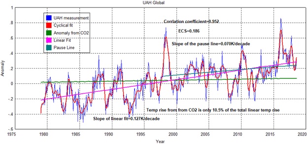
Still looking for a correlation between CO2 and temperature.
http://www.biocab.org/Geological_TS_SL_and_CO2.jpg
Mr Rice should read the head posting, and look at the graph to which he refers. It is plainly dated “September 2014”, and it is also made clear in the text of the head posting that Dr sMear had displayed that graph the year before the tampered version of the RSS dataset. The point of showing the graph was, as stated in the head posting, to show that Dr sMear had begun to take an interest in the discrepancy between his own dataset and the IPCC models.
If by this you mean one of the mainstream climate journals then I fear you seriously misinterpret what reputable means.
Why do I get a feeling of déjà vu?
Monckton quotes two IPCC mid-range medium-term business-as-usual predictions, which he compares with data from 1990 to 2018.
He doesn’t state which of the 5 IPCC reports these come from, but going by previous example he’s probably taking both from the first IPCC report from 1990. Neither of the figures he quotes to two decimal places appear in the report. In fact as I pointed out in his previous article, the graph from that report predicts only slightly more warming up to 2018 than the HadCRUT data set shows.
Asked and answered, comprehensively, in a previous thread.
And I disagreed with all your “comprehensive” answers in a previous thread. Hence my déjà vu. For the record this is the Monckton’s answer from apreviosu thread:
The simple answer is it doesn’t matter how much warming there has been since pre-industrial. The warming IPCC predicted since 1990 is starting at the point where 1990 is on the graph.
If you want to say that their prediction of how much warming there will have been in 2025 since 1765 is wrong you would have a point. But how much warming they expected since 1990 is independent of the starting temperature.
The furtively pseudonymous Bellman is, as usual, incorrect. IPCC had incorrectly represented the actual, observed warming rate from 1850-1990. One must correct for that before deriving IPCC’s predictions.
Why must one correct for differences prior to 1990? We are not talking about what their prediction was since 1765, we are talking about how much warming they expected since 1990.
Moreover, if one must correct for this, why didn’t you do that when you claimed they predicted warming at 2.78°C / century? I assume this is derived by taking their approximate claim of 1°C of warming from 1990 to 2025 and dividing it by 36. But if you want to be consistent you should have divided 1.55°C by 36 to get a predicted warming rate of 4.3°C / century.
The furtively pseudonymous Bellman again tries to find petty fault, and again fails. Bellman should read, very carefully, the two separate IPCC medium-term predictions. It will find that one is compared with the pre-industrial era, and the other is compared with the then present, i.e., 1990.
Nope. Both of the predictions you site are compared with the pre-industrial era.
Page xxii
My emphasis.
It goes on to say that the projections are are shown in Figure 8, the graph I used above, and that “Because of other factors which influence climate,
we would not expect the rise to be a steady one.”
Figure 8 is described as
As I noted before, the best estimate line of that graph shows 0.8°C warming between 1990 and 2025, suggesting that the 1°C figure they quote is a only meant to be a rough estimate.
They then go on to discuss patterns of change by the year 2030, and summarize regional variation in a box on page xxiv, where they state
For values consistent with other estimates of global temperature rise, the numbers below should be reduced by 30% for the low estimate or increased by 50% for the high estimate.
This figure is puzzling as it doesn’t agree either with the value given two pages previously, or the graph. The graph suggests 1.8°C warming above pre-industrial by 2025 and more like 2.0°C by 2030.
But as you say there are probably many inconsistencies in the report and I doubt they expected 28 years later people would be trying to calculate exact rates of change based on uncertain estimates.
I’m writing to the hospital I was born in and asking them to correct my birth temperature 1 degree less!
Is that the right link. I don’t see any analysis in the news article, just a lot of unsubstantiated claims of data massaging and fraud.
So stop being lazy and contact the authors.
It would be a lot easier if you simply provided a link to their analysis.
Am I the only one amused at the irony of being called lazy for asking for a reference?
I can imagine how that would have gone with any of my professors, if I told them they were lazy when they expected me to provide proper references.
Phillip – No, you are not. Omitting sources is a common Monckon M.O. – makes it laborious to fact-check.
As of now, he has four up votes for his comment (down from 5 a moment ago). I’m not sure I’d call that amusing. Rather sad, really.
And so the good Lord uses a work of fiction by two Energy executives with no Physics/climate expertise, whereby they enumerate all the usual climate myths, as supporting evidence of his repetition of said climate naysayer myths by dint of his lack of physics and climate expertise.
The only relevant connection/reasoning between the good Lord and these authors is the overarching ideologically driven need to push ABCD “science”, coz of course we cant be told that we, humanity, may just be polluting the planet in any way at all, and that there is no need to stop. Like hundreds of years of enlightenment and scientific advance can be boiled down to a conspiracy theory born of abject hatred of some imaginary project by “Lefties”.
There may be just the odd person who actually does not buy Monckton’s rabid snake-oil selling, and as such the link below effectively rebuts the bollocks that Monckton links to, as though validation for his own badge of biased ignorance.
https://ourchangingclimate.wordpress.com/2012/06/11/response-to-fritz-vahrenholt-and-sebastian-luning/
Oh, and well done Christopher – you managed to reply to the “firtively pseudonymous” Bellman without using ad hom.
Learning some manners are we? (sarc)
Anthony Banton,
That link to criticism to Vahrenholt and Lüning is from 2012. It’s irrelevant to any of their analysis supposed of the RSS and UAH data sets.
It is though worth pointing out that neither of them has any expertise in satellite data. It’s also ironic that Christopher Monckton is quoting the work of a Social Democrat. This would usually result in him being dismissed as a communist totalitarian if his views on global warming were different.
I’d also like to echo your last paragraph, without the sarcasm.
BREAKING NEWS: Magnitude 7.3 earthquake shakes the northern coast of Venezuela; widespread destruction, but nothing of monetary value destroyed. 😉
Christopher, thanks for a most interesting post. And the title was to die for …
w.
Many thanks to Willis for his kind comment. I seem to have made the true-believers angry again …