People send me stuff. h/t to WUWT reader “Theyouk”
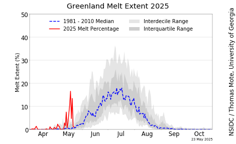
Here we have a graphic from the Danish Meteorological Institute that shows Greenland has increased it’s surface melt dramatically in a very short time.

Source: http://www.dmi.dk/uploads/tx_dmidatastore/webservice/e/n/i/b/m/Melt_combine.png

The question is: is it real, or some measurement artifact or processing error?
The temperature at the Greenland summit station on June 10th was well below freezing, with a daytime high of 17°F, so it doesn’t seem the conditions are conducive for a widespread melt.
We have seen dramatic events before (in 2012) that turned out to be real, but the study behind that event suggests it doesn’t happen except about 100 to 150 years apart and is a special combination of events.

We’ll see what DMI does on the next update. Meanwhile, if anyone has any explanations, feel free to leave a comment.
Seems consistent with the NSIDC data but not updated for a few days.
Sorry.

Typically a refreeze in mid-June.
Temperature today in Nuuk will hit 49 F, less than two degrees above average. Temperature over the unmelted Northern Dome doesn’t mean much.
Well that’s about 9ºC so that will be above freezing up to ~2km.
Too good. True
Phil.
You are saying the sun is hot. Is it not?
What has melted will soon freeze.
https://earth.nullschool.net/#current/wind/surface/level/overlay=temp/orthographic=-48.65,71.97,1369
https://earth.nullschool.net/#2018/06/14/1500Z/wind/surface/level/overlay=temp/orthographic=-48.65,71.97,1369
There has been a long period of easterly winds which created a Foehn effect warming in western Greenland. That could be the reason
Now. That is some coincidence. Change to easterly wind.
It should be noted that the volume of sea ice in the Arctic has exceeded the average of 2004-2013.

Arctic sea ice minimum extent has been growing since 2012. From 1979 to 2012, there was never a five year interval without a new low, but no year in 2013-17 came close to the record 2012 low, although 2016 about equaled 2007.
Is it warm enough to farm in Greenland now?
Sheepfarming is possible in the southernmost fiords, and potatoes can be grown in favorable locations. No cereals, which were grown during the MWP.
Even so the sheep and few cattle ranchers there still have to import fodder in most if not all years. The amount of native grass severely limits their ability both to graze and make hay.
Importing fodder wasn’t an option for the Norse dairymen during the Medieval WP.
Melt or mass loss? True or untrue? Melting/glacial acceleration, or reduced accumulation? true or untrue?And over what, carefully selected, time period?
I apologize for not having the time and energy to read it all, or all of the comments.
But I have been lied to so often before, and so comprehensively, that it now takes an extra special effort to even read more claims about the liquid-death of Greenland.
The sun is hot
And that old clock is moving slow….
Gee, this NOAA graphic from June 10th, 2018 shows greenland has lost almost no ice since winter:
http://www.natice.noaa.gov/pub/ims/ims_gif/DATA/cursnow_asiaeurope.gif
-JPP
Oh, I guess the white represents snow cover…
Over the last 30 days on average southern Greenland has had below average temps. lts only over the last 7days where temps have been above average.
What l think is of more interest is the fact that Arctic temps are still slightly below there average for the time of year. This despite the fact that there has been a large amount of warm air from northern Russia pushing into the Arctic over the last 2 to 3 days. Which has now been joined with a push of warm air from N America as well. With all this warm air moving into the Arctic it should have pushed temps above the average in the Arctic.
This is a trend l have noticed recently that seems to be linked with increased jet stream activity in the Arctic. lt seems that increased jet stream activity in the Arctic also increases the rate at which heat is lost over the Arctic as well.So l will be watching this summers Arctic temps with interest.
this is when accurate measures of atmospheric moisture content would come in really handy. despite having a long dry spell with lots of sunshine on the east coast of scotland recently it hasn’t been as warm as one would expect in such conditions.
any cloud cover sees a remarkably rapid drop in air temp that suggests to me humidity is low,with the air being unable to store much in the way of heat. time will tell but the winter past has seen a return to late eighties early nineties regimes for things like first buds on trees, snowdrops appearance, the shore crab moulting cycle, the estuary spawning herring and the size of north sea juvenile sandeels for the time of year. all off the back of a sustained change in prevalent wind direction.
around 5 weeks later than last year for all these things. this happened in the space of one year, and people want me to get excited about less than a degree celcius in a century,really !
Not yet.
The sun is hot but globally the air gets cooler.
It is a paradox.
Not too many of us have figured out how it works.
It is like figuring out Trump….
It takes some time but most of the time he is right.
Why have any import taxes at all? On anything,
True. It is a paradox. Local it can be hot but globally the hot sun it causing cooler air.
“The cold content, i.e., the energy required to heat the snow and ice mass to Tf, in each layer is used to freeze liquid water, transferring mass to the ice fraction. Refreezing is assumed to be instantaneous, thereby freezing as much water as is available or as cold content allows within a single time step. The temperature of the layer is raised by latent heat release to conserve energy. Superimposed ice formation occurs when liquid water resides in a temperate layer above an impermeable layer (description below) with a temperature below the freezing point. A downward heat flux at the layer interface is then calculated assuming that the cold, impermeable layer has a linear temperature profile between Tf at the interface and the mean layer temperature at the layer mid-point. This downward heat flux allows superimposed ice to form in the temperate layer and heats the impermeable layer beneath.”

so that’s where all the atmospheric moisture that was floating around the northern hemisphere has gone 🙂
Satellite recalibration, I’d say, which they do at start of summer & winter — and it’s the start of summer now.
According to the DMI page “….this process is included in the calculations of surface mass balance….” any time I get a vertical line on a chart that includes “calculations”, I generally find the calculations are NFG.
Hi Tony – Next door. Back in early April I emailed DMI seeking a response/correction to this:
—
On your web site – the DMI page in the Arctic section, there’s a page headlined, “The Frozen Sea.” It states:
“During the past 10 years the melting of sea ice has accelerated, and especially during the ice extent minimum in September large changes are observed.”
—
I provided a chart plotted from NSIDC’s summer min data – which shows no downward trend over the past decade. Their 2nd, or 3rd communication requested more information as to what I was requesting (can you say dense?) and several since then have sounded apologetic and asked for more time to look into this (how difficult can it be?). Here’s today’s:
Hej Gary
Vi har ikke glemt dig. Der er for øjeblikket lidt længere ekspeditionstid end normalt. Din henvendelse vil blive besvaret så hurtigt som muligt.
Med venlig hilsen
DMI
Kundeservice
—
Just asking for my patience and for more time. Keep an eye on your email – and I’ll forward what the ultimate decision happens to be, if and when it comes around.
Thanks
Arctic sea ice melt hasn’t accelerated over the past ten years. The lustrum 2008-12 averaged lower than 2013-17.
The graph with the apparent vertical line is area of melt, not total melt!
As far as where they observe or measure this melt:
“The model has been updated in 2014”,
“again in 2015”,
“it has been updated again in 2017”.
Apparently, it is a model that is a work in progress. All it would take for spurious results is a minor input error.
My error; I copied the images addresses from the DMI sites. I overlooked changing http:// to https://.
Albedo. How fast does cyano bacteria grow?
What is “melt” actually a measurement of ? What are its units and how is it being measured / estimated ?
Greg,
Fernando L below linked to the explanatory page here. It means the percentage of Greenland’s area that had melting of >1 mm in a day. The melt may not last; it could simply refreeze after percolating through snow. It is a modelled result, so it isn’t just an instrument error. It seems that you could rather easily get spikes. People have commented that it seems the same for several days, but that may just be because they don’t have new information to put into the model.
Talking of seasonal melt, the results for this years NH spring snow extent are now in.
This year’s spring snow extent is slightly higher then 2017. Making it the first time we have had at least 2 years in a row, where the extent has been well above the trend line since around 1980.
This is looking like a early sign from the real world, that for the moment at least. The NH has moved into cooling
How does the smb sharp increase over the last 8 days fit in to this story?
due to the different metrics being displayed as per atheok above , area vs weight of melt ?
This probably shows the area where water appears (due to, for example, rainfall). Only that this water freezes immediately.
It’s probably an artifcial (man-made) ‘adjustment’ gone awry.
Nothing new about rapid melts in Greenland … same happened in 2012
https://nsidc.org/cryosphere/icelights/2012/12/what-caused-last-summer%E2%80%99s-greenland-surface-melt