Greenland is halfway through its current (2025-2026) melt season. So far it’s not looking good for the alarmist narrative.

Image Source: Polar Portal
For perspective, there is more ice and snow on Greenland today than for nearly any other period in the last 10,000 years.

Then it will be ignored, but there are records made every day, and those that do support the narrative will be picked like cherries.
Most likely because of Trump! Everyone up there has grown COLD to the idea of him wanting to buy Greenland. /snark, snark, snork!
If the Jet stream blocks south – leading to all those nice juicy alarming headlines in the media on being pan-fried at home and still not feeling guilty enough about it (the modern Oliver Twist – Please sir I want some Aircon… Whaaat?!)
The jet stream also blocks north and that is completely overlooked in the meteorological ‘facts’ we are given.
All you receive from the media mouthpieces is a storyline. And if you don’t buy into it, well, you are an evil person – obviously.
See? Climate Change!
I don’t know much about the Greenland cycles, but riddle me this: If Greenland is melting, why are they finding WW2 aircraft 200 ft. down in the ice?
Because the snow still falls. Glacier girl has sunk 200 feet into the ice, the glacier did not get 200 feet higher.
Hiya Mark-always a pleasure. I was being a wee bit sarcastic in my question-I know the glacier didn’t rise, and I know it’s about the snow…but it just seemed appropriate to imply-strongly- that Greenland is growing, not shrinking as some here would say. I know very little about Greenland, overall, my point was badly attempted. My Pleistocene education was over 50yrs. ago, and mostly about soils,moraines and the geographic landscape in the Midwest. Much -so much-has changed and been added to, and I stumbled. Heartfelt apologies.
ice flows
That too.
Let’s do a quick google search for fun:
I guess nasa is woke alarmist now?
https://sealevel.nasa.gov/understanding-sea-level/key-indicators/greenland/
NOAA?
https://arctic.noaa.gov/report-card/report-card-2022/greenland-ice-sheet/
oops, from the very L. J. Larocca (et al.) quoted in the article, but this is from 2023:
https://www.nature.com/articles/s41558-023-01855-6
I leave it to you explaining away this reality, I go back to energy topics
Can you tell time? Somehow 2024-2025 is years ahead of your links from 2022 and 2023. Additionally, you can’t read the study and see that the TOTAL ice and snow has increased over time?
If you want to use time, at least use the correct time.
You miss the brilliance of the diversion. Just like they changed to climate change from global warming when the world failed to warm as it was supposed to.
They are now talking about glacial change instead of glacial melting now that glaciers are failing to melt on cue.
I grew up in an area known for glacial moraines. It’s quite remarkable geology and amazing to consider that the area was under a mile of ice only some 10 millennia ago. Thank God for melting ice.
I come here to experience glacial morons, such as MUR.
12 miles west of me is a slope* composed of six end moraines of >500,000 years ago, the Middle Pleistocene. Because they have had much time to weather, erode, and be blanketed by loess the geology/geographer researchers have had to make this known to us mere mortals.
*Swauk Prairie Subdrift of the Kittitas Glacation
You’re fortunate. That’s beautiful country!
I guess we are all fortunate for the present interglacial, without which we wouldn’t be here.
And remember, MUR uses FF every minute of every day!
What a HYPOCRITE he is.
That’s true, but hypocrisy is a natural part of the human condition. Everyone is a hypocrite to some degree.
Leftism, on the other hand, is just stupid. Many people, including myself, can grow out it. We can mature and gain knowledge. I don’t think that’s the case with MUR.
‘Leftism, on the other hand, is just stupid.’
Not stupid, not ignorant, just evil.
One needs to face the facts that socialism is robber barons stealing your work and parsing it out how they see fit. It is a return to feudalism.
I trust a baron far more than some Far Leftie.
MUN is obviously not using temporal data only temple data. Just what the Church of Climate Orthodoxy stores in their Temple.
One is Nasa, one NOAA and one from the very same author the article uses as source – and newer than the source used in the article at that too.
Be at least creative when dismissing reality.
Previous data has what to do with current data? Just curious who’s ‘dismissing reality’ pray tell?
It’s nice to know that there is yet another subject, in which you are absolutely ignorant.
Says he will go back to “energy” topics.. on which he is also profoundly ignorant. 😉
From 2023? That is Soooo 3 years ago! That Cherry is just the Pits now!
Any loss is minuscule compared to the total. You can’t even tell.
Quote is garbage. If a writer writes that many words they might be scared to write the simple words they wanted to write.
The current Greenland ice area is only a tiny bit down from the peak in the LIA, and larger than it was for most of the last 8000+ years.
note , the chart below includes all the islands in the archipelago and cannot be compare to the mainland-only Greenland ice area, as some kooky klimate klowns try to do.
A copy of part of the Briner et al. graph with fake additions to it, why should anyone pay attention to it!
Secondly , the graphs or ice mass loss as in munr’s second link need to be put into context…
… firstly, measured by GRACE, a gravity based satellite , over an area of active volcanic activity… who knows what it is actually showing.. if graphed using the total Greenland ice mass, it is totally insignificant.
..
And thirdly, Greenland SMB was at a lower level in the 1930s,40s. than it have been recently, sopretending it is anything to do with human CO2 is a mugs game.
This is the abstract of the paper that the above graph was drawn from:
https://tc.copernicus.org/articles/2/117/2008/tc-2-117-2008.pdf
”Abstract. Results from a regional climate simulation (1970–2006) over the Greenland ice sheet (GrIS) reveals that more than 97% of the interannual variability of the modelled Surface Mass Balance (SMB) can be explained by the GrIS summer temperature anomaly and the GrIS annual precipitation anomaly. This multiple regression is then used to empirically estimate the GrIS SMB since 1900 from climatological time series. The projected SMB changes in the 21st century are investigated with the set of simulations performed with atmosphere-ocean general circulation models (AOGCMs) of the Fourth Assessment Report of the Intergovernmental Panel on Climate Change (IPCC AR4). These estimates show that the high surface mass loss rates of recent years are not unprecedented in the GrIS history of the last hundred years. The minimum SMB rate seems to have occurred earlier in the 1930s and corresponds to a zero SMB rate. The AOGCMs project that the SMB rate of the 1930s would be common at the end of 2100. The temperature would be higher than in the 1930s but the increase of accumulation in the 21st century would partly offset the acceleration of surface melt due to the temperature increase. However, these assumptions are based on an empirical multiple regression only validated for recent/current climatic conditions, and the accuracy and time homogeneity of the data sets and AOGCM results used in these estimations constitute a large uncertainty.”
It is modelling – which of course is fine when it does what you want but verboten when it does the opposite.
Again classic “do as I say but not as I do” hypocrisy.
Also a graph (again no questioning of the process which produced it ) depicting mass balance 1000’s of years ago tells us nothing about modern warming …. Other than the Earth’s orbital eccentricities altered TSI in the high northern latitudes over a very slow time scale …. And that is not warming the region now.
Earth’s orbital eccentricities had nothing to do with the 4 previous warm periods since the end of the Holocene Optimum. Why should we assume that whatever caused the previous 4 warm periods is not also causing the current one?
I know you know the answer but the guy to whom you are responding doesn’t. All of the carbon dioxide crap science is a violation of the Scientific Null Hypothesis.
You know full well that I was referring to the HCO.
And also that bnice posted it for that reason, else there are graphs that do not extend back 10k years to obfuscate their existence.
But then some peeps in this place have to throw whatever scraps of mud they can invent back in order to not have their cognitive dissonance challenged – like Mr California below.
Government agencies do not equal reality. They equal politics. Top it off with a Nature political advocacy article. UserLoser comedy at its best!
Using NASA’s own measurements, a gigaton (gigatonne) of ice would extend 341 meters over Central Park in NYC. Eyeballing the graph, the ice loss would need to be over 100 GT more to reach the mean or at least 34,100 meters tall (111,900 feet).
https://nsidc.org/sea-ice-today
Meanwhile, Arctic sea ice is looking interesting!
On the one hand, there’s probably going to be an early ice-free NE Passage. Conversely, the NW Passage will probably not become navigable at all during this melt season – likely remaining choked with substantial sea ice throughout.
Probably too early to be sure, but that’s the way it’s looking for now.
Yes, Arctic sea ice seems of have a sort of cycle where its high on one side for a few years, then higher somewhere else..
But it remains stubbornly high compared to most of the rest of the Holocene.
LIA and the high sea ice extent around 1979 drove a lot of sea life out of the Arctic..
It is only just starting to return.
Arctic is slowly recovering from the effects of the LIA… quite a way to go though to reach more normal Holocene extents.
Not this old tosh again.
It most certainly is melting rapidly this year, indeed the melt extent is exceptionally high.
However, because of unusually heavy precipitation, which is obviously accumulating as snow at higher elevations, it is being offset in the surface mass balance. And obviously that does not include ice mass loss from other causes such as calving.
Evidence of ice mass being lower in the past is however pertinent to supposed CAGW. Why not just stick to that?
If you were to look at any loss on a graph with the total ice, you wouldn’t be able to see it. So fretting about “rapid melt” is even more tosh.
“Melting more rapidly” but offset by higher snowfall. So net balance, or am I missing something?
Its amazing that some people don’t realise that glaciers are actually rivers of ice,
Fed from snow and ice at the top of their catchment area, and flowing very slowly to the sea or lake. More snow at the top, eventually more flowing into the sea or lake.
And they’re always advancing or retreating, never static.
As I understand it, Greenland is more like a bowl of ice. The mass in the middle pushes the edges over the rim to spill into the ocean. Correct me if I am in error.
It would be useful if more people studied the Greenland Ice Core Records, It would be useful if more people studied the Antarctic Ice Core Records, the ice accumulations are most in the warmest times. It takes work, it takes energy, to evaporate Polar Oceans and place that mass as ice at higher elevations. Overall, Greenland loses ice mass in the coldest times when the Arctic Ocean is covered with sea ice, there is not enough evaporation to support enough snowfall. Overall, Greenland gains ice mass in the warmest times when the Arctic Ocean is open, when it is not covered with sea ice, when evaporation does occur to support more than enough snowfall to replenish the ice.
Ice Age Ice gained the most ice volume in the warmest times when the Arctic Ocean was deep and warm, when enough energy was available to promote evaporation and snowfall, colder followed the warmest times because more ice spread faster, cooling by reflecting and thawing over increasing areas.
Ice Age Ice lost ice volume during the long cold of ice ages, it got colder because the area of ice increased, the area of reflecting and thawing increased until twenty thousand years ago, but the ice volume was decreasing as the great ice sheets spread and thawed and thinned, from twenty to ten thousand years ago, ice sheets retreated rapidly because they were thinned and depleted.
If ice was thawing, if ice volume was decreasing, why did the oceans not rise? Heavy ice was still in the far north, that depressed the land, that made it downhill into the Arctic Ocean, the Arctic Ocean filled with fresh water during the long cold, the sudden warming events in Greenland Ice Core Records during the long cold of the last ice age were caused by meltwater surges into the Arctic. Those warming events ended rapidly when the new meltwater became covered with sea ice.
During the rapid warming from twenty to ten thousand years ago, the sudden changes in temperature were caused by the meltwater surges rushing out of the Arctic Ocean.
I suggest this as a Story Tip, there is a lot of consensus about ice ages that is not only wrong, much of it is impossible.
” meltwater surges into the Arctic.”
A more complete story would include flows down the rivers: Mississippi, (incl. the Missouri, Wabash, & Ohio), St. Lawrence, and Hudson via the Mohawk Valley.
Or are you saying these events are wrong or impossible?
We’re told that there are no dumb questions, just dumb answers, so here goes –
of the ~8 billion people on this planet, approximately how many give a flying fvck about how much ice there is in Greenland at any given time?
bingo! 🙂
The 56,500 inhabitants of Greenland, a couple thousand Socialist Celebrities and 74 of 77 Climate Scientist who make up the 97% number
The inhabitants of Greenland would probably prefer much less ice.
42
great! More ice for my pangalactic gargleblaster
If you run out of ice, you can always have that old Janx Spirit served neat.
Fun fact.
Hot springs are a common natural phenomenon in Greenland but only those on the Island of Uunartoq are warm enough to bathe in.
Sounds like the first place we should invade.
ROFL!
Pro tip.
Always be suspicious of any warm patches in any kinds of bathing pools.
Especially if they have a yellow-ish tinge.
The graphic shown is only of the surface mass balance. The total mass balance should be included for context. I’ll just go ahead and do it now.
I don’t have a mousewheel…
Does this mean CO2 is melting ice?
So YOU’RE that one who gives a flying fvck about how much ice there is in Greenland?
(there’s always one, isn’t there? 🙂 )
I’ll bite. What’s included in ‘total’ mass that isn’t included in ‘surface’ mass?
As a guess: Floating ice around the edges?
Beats me. Arguably, if it’s floating, it’s on the surface.
Solid ice discharge at the grounding line and basal mass loss underneath the ice.
tiny , insignificant number compare to the ice mass of Greenland..
Greenland still recovering , a bit, from the LIA…..
SMB etc was lower in the 1930s, 40s.
See my post above
Story Tip:
If another advanced civilization lived on Earth before us, would we know?
https://www.cnn.com/2026/07/25/climate/silurian-hypothesis-another-civilization-before-humans
Interesting, but never questions the premise that human greenhouse emissions drive climate change.
Maybe it was the Krell! And maybe they’ve returned in the form of today’s ‘Progressives’. I have proof:
The Krell –
Were an advanced race of superior beingsBuilt a powerful machine capable of materializing thoughtBecame extinct overnight when their machine accessed their primitive subconscious thoughts to murder them
The Progressives –
Just ask them!Built a powerful machine capable of extracting any resource they wanted from othersTo be determined…
Spoiler alert:
https://en.wikipedia.org/wiki/Forbidden_Planet#Bibliography
Everyone has heard of Gaia. This CNN piece is guano. Schmidt and Frank are between them the very definition of hubris. I might believe that Naomi Oreskes is part Silurian, however.
If you listen closely, you can hear the arctic screaming : “Oh, for the love of god, just stop! You tweedlebrains worried about the ice here are worried about nothing. Whatever changes there are aren’t going to matter, and they mean exactly diddly. Maybe try counting four-leaf clovers for a change. Then at least you can sing the song “I’m looking Over”. “
Actic temperatures are also well be the average, from early May temperatures are the lowest since records began in 1958
You’re referring to DMI, which covers only the upper Arctic from 80 Degrees, north to the Pole.
Yes that is right, that area is generally refered to as the Arctic.
The Arctic is more usually defined as the region north of the Arctic Circle which is ~66ºN, not 80ºN.
The Arctic Circle Is generally used, as regarding daylight hours, and not usefull for measuring temperature, as the North Atlantic always has warm temperatures due to the Gulf stream. The Arctic above 80 degrees, Gives a much more realistic measurement of temperature and is where most of the sea ice is, and the media are always refering to how much thinner sea ice is in this region.
Unfortunately due to the way the data is averaged it is significantly biased to the Pole itself.
More torturing of the data in search of imaginary trends. Boring. Minor fluctuations in Greenland melt rates over the last 1000 years or the next 1000 years doesn’t matter, so “I just don’t care”.
“For perspective, there is more ice and snow on Greenland today than for nearly any other period in the last 10,000 years.”
Weird sentence to write below a chart with a line that was a little higher a few months ago.
I’m afraid to say that announcing that idiomatic English can be weird quite often would be spilling the beans.
Idiomatic is defensible but both the words and the chart that disagrees with the words fit on my tiny laptop screen at the same time.
Gee whiz “-6”.. maybe it was just a jerky thing to point out. Looking at the last chart again: Yeah, the line is higher for early June than for late July. Maybe the word “period” could be replaced with the word “July”. In that case a different chart would be needed (line graph of 10,000 consecutive Julys).
What I was trying to point out, was that today on a geological time-scale or even, say a Holocene time-scale, “today” in idiomatic English could mean 50 or a 100 years.
Pst! Signs in the real world that maybe the warming has stopped and the mild cooling has started as predicted by the solar magnetic cycle studies of the past.
Summer is coming to an end at the North Pole.
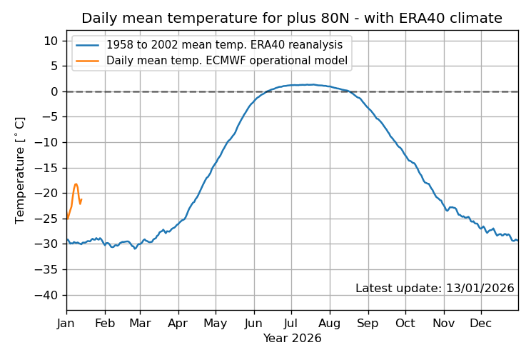
Just under that graph on the DMI’s “Daily mean temperatures for the Arctic area north of the 80th northern parallel” webpage (direct link) there is a declaration that :
“All data from this site are available here.”
Unfortunately the “data” is “available” as a smorgasbord of “one file per year, with 1958 to 2019 in a tar file you have to extract manually and process one-by-one” information.
Note also that while most of the (ASCII text / “*.txt”) files are in a “space-separated-variable” format, some of them are tab delimited while just one is in the more standard comma delimited (CSV) format.
This put me off going through the process of importing all their (reanalysis) “data” into a single spreadsheet for a long time, but two or three weeks ago I finally got round to it.
Updating the data to the 25th gave me the attached graph.
.
The “warm pulse” at the end of February / beginning of March this year actually set a few “warmest day-of-year on record (since 1958)” values (I counted seven from 27/2 to 9/3).
2026 has also consistently seen “coldest DOY on record” values being set since the 24th of May.
This qualifies as “interesting / eyebrow-raising-level curious”, but no definitive conclusions can be made on “climate” (30+ years) timescales.
I downloaded Python to my PC. Just a little trouble getting the path variables set properly with online help on Python with Windows.
CoPilot and I’m sure other AI’s can help give you Python scripts to decode all this and present CSV files to put into excel or other spreadsheets. CoPilot can also invoke the graphing (sometimes not well) modules in Python without needing to use the interim step of excel. Part of the learning process and productivity enhancement of AI.
I am what is known in some circles as “an old fuddy-duddy”, and have been since (at least) my 30s.
While I have seen arguments for using AI as “a very fast and wide-ranging search engine” for both scientific papers and old datasets, I have avoided them for other (mostly privacy) reasons for now, and intend to continue doing things “manually / the old-fashioned way” for now.
NB : I am also what is known as either “a cheapskate” or “a skinflint” …
.
I personally have found historically that I usually learn the most from my mistakes.
While “playing around with the data” with an Excel-clone spreadsheet (Libreoffice Calc on a Linux laptop in my case) takes more time, I find that I get a better “feel” for the numbers when doing so, and working out the formulae when adding a new column (or row) to extract an “interesting” subset of the data forces me to think more carefully about what I am actually trying to “see” in the end.
I still usually start by generating a graphic that is extremely “busy / crowded”, which I react to with “Well … I definitely don’t want to do it like that !”, but analysing exactly why it is so “bad” will often … not “always” (!), but “often” … point me in the direction of how to generate a “clean / clear” graph showing just the “essential” (at that time) parameter relationships.
I find that I (usually) have to go through the “messy” initial stage(s) before things suddenly “click” into place and I can simplify the final graph (sometimes radically, along with the intermediary calculation steps).
This often results in me being “late to the party” in WUWT comments … but occasionally gives me a head start when the same, or a closely related, topic comes up a few weeks (or months, or years) later.
.
PS : My apologies for both the length and tone of this reply.
After re-reading it I clearly needed to “vent” at someone, and you just happened to be in the wrong place at the wrong time.
Hey, no problem, I didn’t even think about your post being a “vent”. I understand where you are coming from. I started in ham radio when you used a 100-watt soldering iron and discreet components like tubes, resistor the length of your thumbnail and capacitors the size of batteries. My last rig, an oscilloscope is a wasted tool. Same with autos, I remember stacking air filters and reaming carburetor jets to get the little extra. Now you just use a $10,000 scan tool to fiddle.
I just find diddling with data bases to get the correct arrangement is tedious and time I could spend doing something else and CoPilot helps with that.
You should do whatever gives you joy. If diddling with data does that more power to you. Time is too short to do stuff that brings no joy.
Tell me in which year the temperature north of the 80th parallel reached its peak. I’d like to see that.
https://ocean.dmi.dk/arctic/meant80n.uk.php
Neither I nor anyone else is at your beck and call.
Please consider rephrasing such “requests” in the future … to anyone at all, not just me !
I provided links allowing anyone, including you, to download the data for themselves and extract whatever information they needed to satisfy their whimsy.
Since you have demonstrated your technical incompetence (and/or laziness ?) , and I already have the basic spreadsheet on my PC, I took pity on you and added a few “Conditional Formatting” equations.
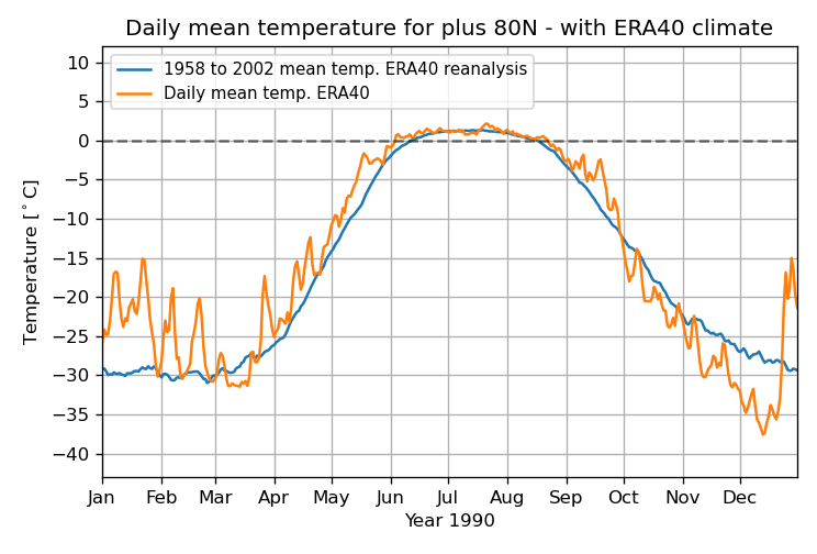
There are actually two almost identical … 2.4249 +/- 0.0006°C … “hottest days” in the DMI record (see the attached image file, and note the “precision” of the selected cell’s contents).
22/7/1991 : 2.425494 [°C]
16/7/1995 : 2.424289
NB : Remember that DMI is a reanalysis product, built on a combination of extrapolation and interpolation. Actual physical, and correctly calibrated, scientific temperature measuring devices are few and far between in the Arctic circle (~67°N), let alone the 80°N “polar cap” region.
Maybe in 1990? When was the peak?
Do the Milankovitch cycles work?
The project used observations by NASA and DLR’s Gravity Recovery and Climate Experiment (Grace) mission. By 2016, the satellite’s data began to reveal a slowdown in net ice loss.
According to the study’s lead author, Marlen Kolbe, this slowdown switched to a net gain at a rate of roughly 68 gigatonnes per year, between 2020 and 2024. As of late 2025, there is no clear indication of a return to net mass loss, though whether the trend will continue or level off remains unclear and will also depend on changes in dynamical discharge.
“What makes this remarkable is that the ice sheet isn’t losing less ice – it’s actually losing more. Ice discharge by iceberg calving has increased by nearly 100 gigatonnes per year compared to the previous two decades. The snowfall surge has simply outpaced it – for now,” explained Marlen.
https://www.esa.int/Applications/Observing_the_Earth/FutureEO/Space_for_our_climate/Why_is_Antarctica_s_mass_increasing
The snow refused to stop falling well after it usually does in many places around the world. Me thinks that Mother Nature is doing a great job of exposing the claptrap told by climate story tellers who are gifted fortunes from the public purse so they may feed wrong info to the public.
In the face of these blizzards the morons are out trying to convince people that although the planet is seeing more severe cold weather, the planet is still rapidly warming. Mainstream science has sold its integrity for easy money.
Looking at the last year or 30 years or 10k years tells us very little about the current Icehouse State the planet is in. When analyzing deep-time geological records, a seasonally ice-free Arctic pales by comparison to the historical events involved in the catastrophic melting of continental ice sheets kilometers thick, followed by massive structural recoveries.
The geological record highlights several periods over the last 33.9 million years where the Greenland Ice Sheet (GrIS) and Antarctic Ice Sheet (AIS) suffered massive mass loss, only to dynamically rebuild. Yet never did the ice age end.
So no return to the widespread farming on Greenland that the Vikings were able to do anytime soon.
“Greenland’s Ice Sheet Was Supposed to Be Rapidly Melting Away. It Hasn’t Been.”
With that title and yet there is no mention of any data about melting! Data from the same source indicates that there has been extensive melting.
The map illustrates how the surface of the Greenland Ice Sheet gains and loses mass on a daily basis. This difference between snowfall and runoff is known as the surface mass balance It is always positive over the course of a year as not all fallen snow runs off the ice sheet again.

https://polarportal.dk/en/greenland/surface-conditions
The curve under the map shows how large a percentage of the total area of the ice sheet has seen melting. The blue curve shows this year’s melt extent while the dark grey curve traces the mean value over the period 1981-2010. The light grey band shows differences from year to year. For any calendar day, the band shows the range over the 30 years (in the period 1981-2010), however with the lowest and highest values for each day omitted.
Note, when comparing with the surface mass balance under ”Daily change”, that melting can occur without surface mass loss since the meltwater can refreeze in the underlying snow. Likewise, surface mass loss can occur without melting due to sublimation.
https://polarportal.dk/en/greenland/surface-conditions
I’m well aware of what is plotted on the maps and graphs, my point was that to have a title referring to melting and focussing on increased precipitation rather than melting (which as I showed is rather high) is rather absurd.