Guest analysis by Mark Fife
This is the state of the world’s surface temperatures according to NASA’s Goddard Institute for Space Studies from 1880 through 2017. It is indeed a very bleak picture. As I see it, this is showing an exponential rise in temperatures starting at the beginning of the 20th century.

Of course, I am curious as to what this means exactly. As I have said before, looking at an average over time is certainly a valid way to do things, but it often fails to tell the full story.
Fortunately, NASA provides a visualization of the five year average variation of global surface temperatures. It doesn’t show what years you are looking at specifically within the time series, but you get the general idea.


The time series certainly does depict a bleak picture as well, especially for the most northerly areas of the northern hemisphere. Obviously, I don’t know how accurate this truly is or how accurate it is meant to be. However, taken at face value it would appear the US, Canada, and Europe are all facing temperature increases of 2° F to 3° F above the 1951 – 1980 average. Which is fortunate for me, because the long term data I have pulled from the GHCN covers those areas, though mainly the US. A dramatic trend such as this which heavily affects the very area where most of the data originates should be easily discernable.
The following charts cover 490 stations in the GHCN reporting continuously from 1900 through 2011. Most of these stations are in the US, though Canada, Australia, and Europe are represented. This is a substantial sampling of stations which indicate the number of warm days and extremely hot days have been steadily declining since the early 1940’s.


The next charts cover the daily high and low temperatures for the hottest month of the year and the coldest month of the year for 1067 stations reporting continuously from 1920 through 2011. Both charts also show high temperatures steadily declining since the early 1940’s just as the preceding charts. Both charts also show a steady increase in the daily low temperatures.
What is interesting to me is the 1930’s warming shows quite clearly in the chart of the annual warmest month but it does not do so in the chart of the coldest month. It appears that period of extreme high temperatures was accompanied by a series of extremely harsh winters. Winters cold enough to rival the coldest of the 1970’s. Similarly, the 1950’s through the 1970’s cooling period shows quite clearly in the chart of the coldest month but is not apparent in the chart of the warmest month.
One other interesting observation is how the coldest month varies so much more than the warmest month. The amount of year to year variation for the coldest month is nearly double that of the warmest month. I intentionally scaled the two graphs to the same 13° interval to highlight just how different the variation is.


The preceding charts from the GHCN depict data which simply does not accord with the GISS data. They certainly do not accord with the time series representation of the history of the US, Canada and Europe. GISS appears to have mostly done away with the 1930s warming. The 1950s through 1970s cooling appears to be gone. The post 1980s warming has disappeared as an individual trend in time, it has been now become just a portion of a curve proceeding uninterrupted from the mid 1940’s.
The post 1940’s warming shown by GISS is not reflected in the temperatures of the warmest month or the coldest month of the year. The post 1980’s warming trend evident in the coldest month does not follow the exponential pattern in the GISS chart. The rate of warming during this month clearly slowed down past the mid 90’s and appears to show a decided cooling trend since 2006. There has been no increase in warm or hot days.
So how, exactly, have the more northerly latitudes warmed in the exponential and supposedly dangerous fashion depicted by GISS? The indication is the hottest months of summer have become milder instead of hotter. It does appear the number of excessively harsh winters has fallen to practically zero, at least as of 2011. Perhaps, in addition to becoming milder, summer is now lasting longer. Perhaps, since winter has also become milder, spring is arriving sooner. Longer, milder summers and shorter, milder winters would usually be considered good things. If that is indeed the case any resulting increase in annual temperature averages should likewise be considered in the same light.
I am not really seeing good weather as a valid reason to increase taxes, drive up energy costs, degrade economies, cede our sovereignty to some world government, cover huge plots of land with bird and bat shredders, or to forbid the poorest nations on the planet the means to lift their people out of poverty.
Keep in mind that you’re looking at tampered data in which the 1930s warmest decade of the century has been erased, as well as the 1950 to 1980 cooling. A Climate-gate email confirms that this was done deliberately because it was ’embarrassing.’ Also bear in mind that the warmest areas shown have almost no real data because of lack of weather stations over huge areas (the Arctic, Africa, central South America). The temps in these regions are fiction with no real data to substantiate them.
On his blogsite, Tony Heller has been documenting the NOAA-GISS temperature adjustment fraud for years now. Paul Homewood now too.
One day the corruption at GISS will be exposed by an insider sick of the lies. Let’s hope that person doesn’t end up like Seth Rich.
The Alarmists would have us believe that we are going to boil ourselves in our own pot — based on problematic global average temperature increases. However, there is little to no evidence that the warmest months are getting significantly warmer. Instead, the global average is being increased primarily by increases in the nighttime temperatures and increases in the wintertime temperatures. As pointed out by Fife, that is exacerbated by increases in the length of the warm seasons and a decrease in the length of the cold seasons. All the more reason to not try to simplify the problem to a single number. Averages are a convenient way to lie, especially when dealing with a variable instead of a constant.
I’ve always wondered about the claim of the “modern era”,…”since records began in 1880 etc”,… ‘Global temperatures’ were never measured in the 1880s or 1940s,… or even later. (And at the nadir of the LIA.) Temperature records in the early industrial era were spotty globally and the ‘cutting edge’ technology was mercury temometers and ‘sea bags’ drawn from ships then tested with the same. How accurate was eyeballing little lines in a thermometer? 1/2 or 1/3 a degree? What were he ‘error bars’ for such readings? Since AGW-ists argue about 0.1-0.3 deltas per “decade” it seems like signal to noise confusion. The true “modern era” is measured with hi-tech accuracy using thermistors/radiosondes that are truly accurate and began with measurements in 1979 just after the ‘cooling period’ scare and are the only accurate global records we have. No warming news (beyond natural variation there). Since modern technology intended to measure true warming says there is no ‘there there’ it’s discarded for crappy models that are roundly conflicted and proven erroneous at every run. Some just don’t like true empirical science and revert to ‘social climate hypo-studies’.
GISS = Garbage In, Same, S… out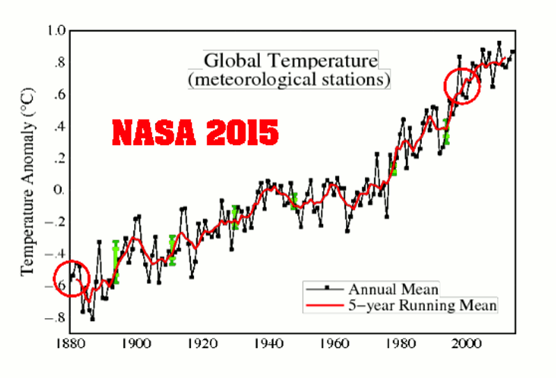
They lost me when they revised the past… and they revised it n-times, always in the same direction: cooling the past, disappearing decades of cooling.
Sorry, I do not think that this ‘temperature index’ is suitable for anything than being alarmist.
The obligatory reminder chart of what they are doing year after year to achieve that hockey stick:
from here:
https://realclimatescience.com/2015/12/a-closer-look-at-giss-temperature-fraud/
Important to note that the 2001 starting position was itself already vastly adjusted.
In 1999 that graph showed that the 1930-1940s spike was higher than the 1998 spike.
And in the late 1980s a careful analysis by Karl showed that there had been NO WARMING as of that date, that was detectable in the historical data.
Hansen admitted the same, in writing, a decade later: It was still true.
It was just around then, just before the turn of the millennium, that the pork barrel gravy train began in earnest.
The adjustments since then are off the scale…literally.
The graphs have on multiple separate occasions been adjust outside of their own error bars.
Think about that and let it sink in nice and deep.
The original graphs had error bars, put there by the people who made the graphs to denote the limitations of the data set used.
Back when it was still possible to refer to these graphs as scientifically derived.
The graph as it is presented now is outside off the boundaries which denote the limitations of the data.
If you are unsure what this means, you can be forgiven for that…it is not clear what it means, beyond the simple fact that it is just a cartoon, bearing no relationship to reality and having nothing to do with any scientific method of compiling and presenting data.
Let’s see that first graph in degrees Kelvin, in scale. ‘Anomolies’ exaggerate change.
‘the average annual temperature for the globe between 1951 and 1980 was around 57.2 degrees Fahrenheit (14 degrees Celsius). In 2015, the hottest year on record, the temperature was about 1.8 degrees F (1 degree C) warmer than the 1951–1980 base period.’ – UCAR
From 287.15 degrees Kelvin (1951-1980*), to 288.15 degrees Kelvin (2015). About 0.35 percent increase. Not very scary.
*Since Man didn’t have the actual ability to measure an average annual temperature from 1951 to 1980 – before the satellite era – I don’t even believe their baseline.
Exactly how have the GISS data been adjusted, aggregated… Exactly how have the GHCN data been adjusted, aggregated… Until then, there are a lot of higher quality SF books I prefer to read…if only because they have far better plots.
Never you mind!
It’s obvious that thermostats are a poor way to measure temperature across the earth. Due to the extremely intermittent coverage over a relatively short period the usefulness of this information is highly suspect. The fact they have to adjust it so radically suggests the underlying data is not very accurate.
The idea of averaging temperature over land areas of a million square miles based on one thermostat shows the ludicrousness of this effort. So much time and energy spent and for what? We have satellites. They measure the bulk of the atmosphere. This should be the primary source used by all researchers. It is unimaginable that given the satellite data so much effort would be placed on 500 or 5000 thermostats.
So, what do we do about data before 1979? Well, first off we shouldn’t be looking much before then anyway. The period of concern is after 1945 since 96% of all the CO2 ever produced by man has occurred since 1945 we should be looking for results after that date. We are pretty sure that averaging it all together that the period 1945-1975 was essentially down by a small amount, maybe 0.2C or something, but it wasn’t up.
Therefore, the total heat reported by the satellites appears to be roughly the total response of the atmosphere to 100ppm of CO2 in the last 70 years. According to the satellites about 0.4C in 70 years (maybe 0.3 if you include the small drop earlier. Let’s assume 0.4C and give the 0.1C as error buffering for the potential it was more.
So, a 30% increase in co2 in 70 years produced 0.4C. This is less than half the amount of change predicted by the models.
The models missing for a decade might be excusable. There might be some explanation for 2 decades of missing. SEVEN decades at half the rate they predict is clearly proof that the sensitivity of the atmosphere to co2 is NO MORE than 1/2 what they predicted.
We also won’t be getting to 1000ppm of co2 as that would require producing another 600ppm of co2 into the atmosphere in the next 80 years which is absurd considering we put in 100 in the last 70+ years. Even if we assume a generous increase in co2 output from current levels there is no way to get beyond 600 or so ppm in the atmosphere which means another 30% increase in CO2 in the next 70 years.
Therefore, for the same input the atmosphere over a long period will produce a similar result. This is the only scientifically justifiable result. Any other prediction would have to be based on the idea of energy storage. No-one has shown where or how energy stored could be released or why. It’s stupid. So, 0.4C is the result for the next 80 years. END OF STORY. CASE CLOSED. ISSUE RESOLVED.
0.4C in the next 80 years will produce no significant environmental impact positive or negative.
This is verified with numerous new studies.
I think it is criminal what the climate community has been doing to the temperature record. This is worse than all the other crap they are spewing. Changing our history to reflect their biases is a sickness our society is suffering. The liberal mind is so filled with guilt it can’t think rationally anymore.
The higher CO2 goes, the more efficiently and rapidly it can be removed by organisms and chemical processes.
Plants are growing far more rapidly at 400 than they did at 350.
By 600 you will be able to stand back and watch some plants grow…to hear them increasing in size if it is quiet.
That is not even an exaggeration.
This is the state of the world’s surface temperatures according to NASA’s Goddard Institute for Space Studies from 1880 through 2017.
In this statement the author makes the mistake of confusing an Index with something that relates to the energy level in Earth’s climate system. Index as used by GISS is an output from a computer algorithm. It has no relationship to the energy of the climate system. It is part of a fairy tale that included radiant energy transfer from a cold body to a hotter body – pure fantasy.
If the chart was ever challenged they could rightly claim they were not referring to Temperature as it relates to energy in the climate system. It should be obvious to anyone who has even a slight understanding of physics that it has no relationship to temperature as a measure of energy level in a system.
I am not sure what you are trying to say. I never mentioned energy. I assume what NASA means by a temperature index is what they say it means.
“This graph illustrates the change in global surface temperature relative to 1951-1980 average temperatures.”
I also assume they mean it when they say “The time series below shows the five-year average variation of global surface temperatures. Dark blue indicates areas cooler than average. Dark red indicates areas warmer than average.”
There is no mention of energy anywhere.
Temperature of matter in a stable state is a measure of its internal energy. An Index is not temperature. If GISS meant temperature they would not call it an Index. It would just be Temperature and it would require a scale. They are using an expanded scale with an arbitrary zero. It is not temperature. Describing it as such is incorrect.
If GISS use shorthand to refer to their Temperature Index as temperature then they are being imprecise and/or deceptive; as you are.
Clearly their Temperature Index bears no relationship to recorded temperate data over the surface of the earth. How could it possibly be representative of the energy in Earth’s climate system with such poor sampling. The only locations consistent with steadily increasing temperature trend over the last 140 years are those subject to urban heat.
Deceptive? Please explain.
I don’t claim to be a scientist. I didn’t even stay at a Holiday Inn Express last night. But as an interested person I always thought that the only way to truly measure warming or cooling is by comparing each location only to itself over the specified time frame.
It seems to me that this experiment is the closest that I’ve seen to what I would like to see measured.
Several commenters have complained that this method is not comparable to the GISS method. It was never was supposed to be but it could be an interesting experiment to see how close the GISS method comes to each data point in this experiment. Just to pick some names out of the air (and I don’t know if this location is one of the 499) how close is the GISSTemp estimate for Goodland, Kansas to the actual thermometer reading for that site. There are 137 warmest months and 137 coolest months with thermometer readings for each of the 499 sites or 136726 total data points that ought to be comperable.
By making those comparisons we ought to be able to see if GISS is close all the way through the 137 years, whether it gets better or worse over time, whether it is better for some parts of the Earth, or whether it is total male bovine excrement.
Thanks to any who either may already have this information or who may be able to find it.
I have made several posts which cover that.
“how close is the GISSTemp estimate for Goodland, Kansas to the actual thermometer reading for that site. “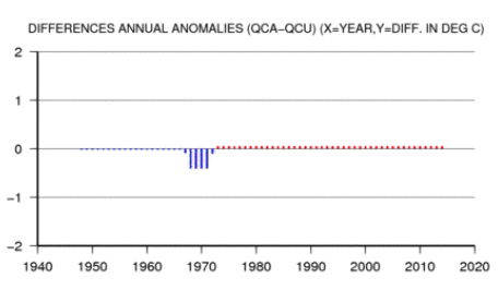
That is here. You can look up any GHCN-M site via here. GISS doesn’t, despite much talk here, homogenise data. It uses the GHCN homogenisation, which is described on the attached sheet. And the adjustment is slight, about four years around 1970 lowered 0.5°C.
Hmmm. 1884. Why is that year ringing a bell? Oh yeah Giss’s base year was the year after the Krakatoa eruption – so global world temperatures would have been at a freakish unnatural low wouldn’t they. An anomaly just like 1979 in the Arctic. Does Giss think we are all retarded now or do they think they are so untouchable that it doesn’t matter.
Rising temperatures = bleak?????
In most places, especially those northern climes coloured red, rising temperatures = rising food production, more comfortable living, less winter deaths.
Exactly! We are living under the best weather conditions since the medieval warm period. As in all warm periods food is abundant and famine and epidemics are low. These are good times! The worst weather in the modern era was in the early decades of the 20th century. Extreme heat waves and bitter, cold winters.
Isn’t it typical that GISS does not show what has been happening as the most recent El Nino fades. By this time next year, the pause post 2000 will become more obvious and GISS might have to post something that is half way real:
The plot here is Mark Fife’s, from GISS annual data (so no 2018). GISS itself shows this just fine, eg
petroalbion says May 2, 2018 at 10:16 pm :
By this time next year, the pause post 2000 will become more obvious and GISS might have to post something that is half way real:
By this time next year GISS will post an updated chart where the 1998 el Nino max will be 0.1 lower then the 2007 max. 1998 max will be at the same level or even lower then 2010 max.
Make a hard copy of the plot Nick just did as a reply to you and compare it with a new plot 2-3 years later and remember my words.
You can have the same fun looking retroactively any GISS plots.
Again, the data presented is worthless. There are basic requirements for conducting a time series study.
“A time series is a collection of observations of well-defined data items obtained through repeated measurements over time.”
As anyone familiar with conducting a times series study know, the biggest mistake you can make comes from changing the data items mid stream. If you do that, your study is worthless. If you are studying retails sales, you follow the same stores. You do not start off looking at Sears, Dick’s, and Targets then just for kicks throw in Walmart and throw out Sears about halfway through,
Now you could argue you have been creating a model of retail sales using regional based spatial analytics. You could then show highly details charts and graphs. You could even enlist the aid of high powered economists, actuaries, an accountants to pour over your data and your methods. You could formulate a consensus of these people.
And yet, the basic data has been compromised because you changed which stores you were looking at. So when someone shows you the data from Sears, Dick’s, and Targets showing sales have been flat to falling for the past 30 years and the economic outlook isn’t exactly are good as you say it is because no one else is doing nearly as good as Walmart and you threw out the biggest loser what do you say? You are wrong because you didn’t do it like we did.
No. That is using bad data to refute good data. The basics matter.
Typical. Consensus white knights rebutting that the underlying data hasn’t been altered. Has not been altered enough. There is an organic trend somewhere in there, but only discoverable…..after the data has been altered. Because, “raw” aka measured, empirical data is unreliable. Whereas measured data filtered through about half a dozen “justifications” for altering, with the totality being irreducibly complex in that not every change to every station can be accounted for and verified.
Climate consensus defenders are almost offended that someone would seek the best data and simply plot the results.
Almost?
The temperature at the equatorial Pacific falls.
http://images.tinypic.pl/i/00964/53p5j01cskju.png
What does Global Temperature mean? Can it be measured to within 0.1 Deg.C?
Finally: How useful is it if/when you have got it.?
Global land-ocean average known in 1880? Really?
Mr. Fife,
There can be little doubt that within the past fifty years anthropogenic global warming has raised global temperature by nearly one centigrade degree, particularly during the 24-year period 1975 to 1998. Conventional thought attributes this AGW to increasing anthropogenic carbon dioxide in the atmosphere, and there is a pervasive sense within the scientific climate community that consideration of other possible forcing agents is unnecessary.
Nevertheless, there are three considerations that call this general complacency into question. The first of these is the peculiar fact that the peer-reviewed climate literature appears to lack any hard-data-based studies that prove the theoretical link between CO2 and global warming. Even the often-cited “landmark” paper by Feldman, et al., 2015 resorts to theoretical arguments to “prove” that link. There are also a few hard-data-based studies, including one of my own, that actually disprove it.
Second, it is apparent that the link is heavily dependent upon correlation. This works well during the period from 1975 to 1998, mentioned above, but prior to and following this interval, correlation is poor, and of course, correlation cannot be taken as proof of causation. Especially problematical is the so-called “global warming hiatus,” of elevated, but little-increasing temperatures, since 1998. This new trend was interrupted by the strong El Niño weather event of 2015-16, but global temperature appears to have returned, now, to “hiatus” conditions.
Third, the MODTRAN6 database reveals that CO2 absorbs and emits radiation significantly only within the band from 13 to 17 microns with a maximum intensity at 14.95 microns. This is a line spectrum, but if it were to be pressure-broadened into a continuous Planck spectrum, the maximum would correspond to a Wien black body temperature of -79 degrees C, which is well below normal Earth surface temperatures and also well below the minimum tropopause temperature (-36 degrees C) due to the lapse rate. Common experience and the second law of thermodynamics confirm that cooler objects (here, atmospheric CO2) cannot transfer heat to warmer ones (here, Earth’s surface), consequently any back-radiation from atmospheric CO2 is simply reflected away.
It appears, then, that due to these issues, CO2 is unlikely to function as a greenhouse gas in the Earth environment. I thought it would make sense, therefore, to search in the aforementioned interval from 1975 to 1998 during which a sharp increase in global temperature occurred, for some alternative anthropogenic forcing agent.
This was the same period in which chlorofluorocarbons (CFCs) were sprayed and leaked into the atmosphere before the Montreal Protocol was ratified in the 1990s to stop CFC production. It was recognized at the time that the photodissociation of CFCs on polar stratospheric clouds released monatomic chlorine, which depleted Earth’s ozone shield. This is still happening, since 1) the depletion is catalytic and 2) both CFCs and chlorine have long residence times in the atmosphere. A thinned ozone layer allows more solar ultraviolet-B radiation to reach Earth’s surface, where it is known to cause severe sunburn and genetic defects, but clearly something that can cause these can also cause global warming.
In support of this, total atmospheric equivalent chlorine, mainly derived from anthropogenic CFCs, is well correlated with the full temperature record, including the “hiatus” since 1998, which can be seen as being due to ratification of the Montreal Protocol through the ‘90s. Also, non-aerosol-producing basaltic volcanoes, such as Iceland’s Bárðarbunga, which, in 2014-15, underwent the world’s largest basaltic eruption since Laki in 1784, emit chlorine and bromine in the form of HCl and HBr, and these emissions likely also depleted ozone, which would then have led to the great El Niño of 2015-16. This concept, too, conforms well to the record of global temperature.
To my knowledge, ozone depletion is the only credible alternative mechanism to CO2/warming, and it does a far better job than the latter of accounting for the actual behavior of Earth’s recent global temperature record. Consequently, efforts to mitigate CO2 emissions, though well-intentioned, are likely ineffective, and should probably therefore be discontinued and replaced by a concerted effort to mitigate further atmospheric emission of halogen-bearing compounds.
I can send you supporting materials for the above, or they can be found by searching online for “B01N7ZXTID.”
I would welcome your comments.
Respectfully,
David Bennett Laing
I have a different perspective on NASA’S surface temperature graph from 1880 to 2017. I don’t see a “very bleak picture.”
The vertical and horizontal scales on two graphs below, the HadCRUT4 data and the NASA data, are the same and vertically aligned in time. The higher temperature data on the NASA graphs near the El Nino peak dominate the most recent data points on the graph. The rapid decline in temperatures from the peak temperature of the El Nino is conveniently not plotted on the NASA graph of annual temperatures (blue line) and the 5-year running average (red line) because the declining 2018 temperatures are not included in the NASA dataset. The monthly HadCRUT4 data (open circles) show the rapid decline of monthly temperatures into 2018 after the El Nino peak and a 15-year projection of HadCRUT4 temperature trend-line.
The rate of increase (first derivative-green dashed line) of the global mean temperature trend-line (red-dashed curve*) of the HadCrut4 data has been constant or steadily decreasing since October 2000. The HadCRUT4 temperature anomaly has decreased by nearly 40 percent from March 2016, the El Nino peak, to July 2017. The rate of change of the trend-line will likely become negative within the next 20 years, reaching the lowest global mean trend-line temperature in almost 40 years. (draft ref: An-Analysis-of-the-Mean-Global-Temperature-in-2031 at http://www.uh.edu/nsm/earth-atmospheric/people/faculty/tom-bjorklund/)
Lower temperatures could persist for decades. The point of this commentary is that too many climate scientists do not publish all the relevant data. This is sometimes called cherry-picking or leaving out critical data. I call it lying.
* 6th degree polynomial with R2 = .0.80