Guest Post by Willis Eschenbach
People have asked about the tools that I use to look for any signature of sunspot-related solar variations in climate datasets. They’ve wondered whether these tools are up to the task. What I use are periodograms and Complete Ensemble Empirical Mode Decomposition (CEEMD). Periodograms show how much strength there is at various cycle lengths (periods) in a given signal. CEEMD decomposes a signal into underlying simpler signals.
Now, a lot of folks seem to think that they can determine whether a climate dataset is related to the sunspot cycle simply by looking at a graph. So, here’s a test of that ability. Below is recent sunspot data, along with four datasets A, B, C, and D. The question is, which of the four datasets (if any) is affected by sunspots?

Figure 1. Monthly sunspot numbers, and comparison data.
If you asked me which of those look like they are related to the sunspot data at the top, I’d have to say “None”. Not one of them shows any obvious sunspot-related signature.
In fact, one of those datasets is strongly affected by sunspots, one is weakly affected, and two show no signs of being affected by sunspots. Here they are under their real names.

Figure 2. Monthly sunspots and UAH MSU atmospheric temperature anomalies.
From the bottom up, first we have the lower troposphere in violet. This is the part of the atmosphere nearest to the surface. Moving up we have the middle troposphere in blue.
Above that is the tropopause, which is the relatively thin layer that separates the troposphere from the overlying stratosphere. And finally, we have the lower stratosphere, the atmospheric layer just above the tropopause.
So let me start seeing just what periodograms and CEEMD analysis can show about these signals. I’ll start by looking at the periodogram of the sunspot cycles.

Figure 3. Periodogram, sunspot data.
As you can see, the ~ 11-year signal in the sunspot is quite large. It covers 60% as much as the total range of the sunspot data.
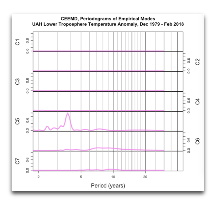
Having seen that, let’s see what the periodograms of the four levels of the atmosphere look like. Figure 4 shows all of them together.

Figure 4. Periodograms, sunspot data and UAH MSU atmospheric temperature anomaly data
Now, this is most interesting. In the lower stratosphere (red) there is a clear solar signal at the ~ 11-year mark. The signal even has the same shape as the solar periodogram, with a “shoulder” at around nine years. It is relatively strong, about a quarter of the size of the variations in the underlying lower stratosphere data.
This is not a surprise to me because I am a ham radio operator, H44WE. So I know that sunspots change the upper atmosphere, particularly the ionosphere, enough to mess with radio reception during parts of the sunspot cycle. And this lower stratosphere data confirms that the known solar effect from extends the upper reaches of the atmosphere down to the lower stratosphere.
Moving lower in the atmosphere, at the tropopause (orange), the boundary layer between the stratosphere and the troposphere, we can still see a weak solar signal. However, it is not as strong as the solar signal in the stratosphere. It is only about a tenth of the size of the underlying troposphere data.
Moving lower yet, there is a tiny hint of a hump in the middle troposphere periodogram (blue), at about 12 years. But by the time we get down to the lower troposphere, the sunspot signal has disappeared entirely. Instead, these signals are dominated by a cycle at about 3.8 years, which may or may not be related to El Nino changes.
Now, before I go on to look at the CEEMD analyses of these five datasets, I want to highlight a curiosity. People say that because we know that the sunspot cycle affects the upper atmosphere, that it is therefore likely that the sunspot-related solar variations also affect things at the surface like the ocean, or the river flow, or the like.
However, as this analysis shows, the effects of the solar variations are unable to even propagate from the lower stratosphere down to the lower troposphere, much less down to the surface. Go figure.
Next, I’ll turn to the CEEMD analysis. Here are the underlying empirical modes of the sunspots.

Figure 5. CEEMD empirical modes, sunspots 1987 – 2018
As you can see, the major empirical mode is mode C6, which contains the ~ 11-year main cycle. There is very little power in any of the other cycle lengths.
We can understand the actual empirical modes better by looking at the periodograms of each of the empirical modes. Figure 6 shows those periodograms.

Figure 6. Periodograms of empirical modes of the sunspot data.
As we saw above in the periodogram of the whole sunspot data, the sunspots have one major frequency, which peaks at around 11 years.
Now, let’s look at the CEEMD analysis of the lower stratosphere data. Here are the empirical modes, and their periodograms.

Figure 7. Empirical modes of the lower stratosphere UAH MSU temperature anomaly data.

Figure 8. Periodograms of the empirical modes, lower stratosphere UAH MSU temperature anomaly data
Here again, we have the clear sign of a solar signature, with a strong signal at the ~ 11-year period. However, there is some strength in shorter cycles.
For the next three datasets, I’ll just show the periodograms to show the decay of the sunspot-related signal as we move downwards towards the surface.


Figures 9. Periodograms of the empirical modes of the tropopause, middle troposphere, and lower troposphere UAH MSU temperature anomaly data
You can see how as we get closer and closer to the surface, the sunspot signal gets weaker and then disappears entirely.
Finally, there is one more very valuable thing that we can do with CEEMD that we cannot do with an ordinary periodogram or Fourier analysis. This is to look at the actual empirical modes, the signals themselves. For example, Figure 10 shows a comparison of the ~11-year empirical modes of the sunspot data and the lower stratosphere.

Figure 10. Approximately eleven-year empirical modes of the sunspot data and the UAH MSU lower stratosphere temperature anomaly data.
As you can see, this provides a lot of support for the idea that we are looking at a common signal. In lockstep with the sunspot signal getting smaller and smaller over time, the response in the stratosphere is also getting smaller and smaller.
In addition, you can see that the two signals have the same phase structure, with the sunspots leading the stratospheric response by a generally stable amount of about a year and four months.
All of this taken together means that it is extremely likely that the changes in the stratosphere are a result of the changes in some parameter related to the sunspot cycles (e.g., TSI, solar wind, cosmic rays, far UV, heliomagnetic field, etc.).
CONCLUSIONS:
• Both the periodogram and the CEEMD analysis are quite capable of identifying a sunspot-related signal in a climate dataset.
• Both the periodogram and the CEEMD analysis are quite capable of distinguishing between a dataset which is even weakly affected by solar variations and a dataset which is not significantly affected by solar variations.
• The CEEMD analysis allows us to verify whether or not two signals which both contain an ~11-year signal are actually related. We can compare the actual signals in the two datasets to see if they agree in phase and in changes in amplitude.
• Although there is a clear solar signal in both the ionosphere and the lower stratosphere, for unknown reasons it does not propagate downwards to the lower troposphere.
Th-th-th-that’s all, folks. Sunshine to you all, unless you need rain, in which case make the obvious substitution. You are welcome to join me at my blog, or on Twitter @WEschenbach, for discussions on … well … lots of strange and interesting things.
w.
The Usual: I politely request that you quote the exact words you are discussing. I’m tired of people claiming I took a position I’ve never taken. Quote the words so we can all decide who is right. I ask politely, but I get crabby if people don’t follow my polite request. You are now forewarned, forewarned is forearmed, and forearmed is half an octopus, so please, quote the words you are referring to.
The Data: Sunspots, Lower Stratosphere, Tropopause, Mid Troposphere, Lower Troposphere
“All of this taken together means that it is extremely likely that the changes in the stratosphere are a result of the changes in some parameter related to the sunspot cycles (e.g., TSI, solar wind, cosmic rays, far UV, heliomagnetic field, etc.).”
The solar wind does not always relate to the solar cycle, in some cycles they are anti-phase.
Thanks, Yogi. Citation?
http://www.leif.org/research/Climatological%20Solar%20Wind.png
w.
http://cosmicrays.oulu.fi/webform/onlinequery.cgi?station=OULU&startday=02&startmonth=04&startyear=1964&starttime=00%3A00&endday=30&endmonth=03&endyear=2018&endtime=23%3A30&resolution=1440&outputmode=default&picture=on
The climatological solar wind cycles Leif shows here are not in reality so perfectly regular in time.
Bob Weber March 30, 2018 at 7:55 pm
Bob, we were discussing solar wind, not cosmic rays …
I fear “climatological” doesn’t mean what you think it does. In climate science, for whatever reasons, the term “climatology” has come to mean the average variation in some parameter. Here’s an example of how it is used:
So the “cloud climatology” would be the month-by-month long-term averages for cloud variables for the specified ten-year period.
So of course they repeat exactly, they are long-term averages.
Regards,
w.
Weber: The climatological solar wind cycles Leif shows here are not in reality so perfectly regular in time.
The left-most cycle is the average of 11 cycles (SC13-SC23). It is repeated five more times to show the behavior better. Of, course, the amplitudes of real cycles vary, but the typical behavior is found in all cycles for physical and understood causes. E.g. the speed maximum just before the minimum is due to large coronal holes found at that phase of the cycle. The dip in the density at such times is due to the high-speed streams being less dense than the ambient solar wind.
As I read it, Willis gave a list – including an ‘etc’ – of POSSIBLE drivers of these phenomena. He did not specify which, if any is most important or important at all.
Really? The way I read it, Willis is showing some things that do trend with the sunspot cycle, and some things that don’t, as a means of showing HOW he looks for a solar “signal” in a given phenomenon. He’s frequently said that he hasn’t seen a correlation between tropospheric or surface temperatures (as in, climate & weather) and solar activity, hence he is skeptical that solar processes drive climate change.
His post is more a description, or a display, of his method, than a commentary on drivers, I thought.
Ah Leif’s little ‘standardised’ cartoon that isn’t a real historic data series.
Hi Willis. Cool. Here’s my first stratospheric solar plot from a couple weeks ago, showing some TSI correspondence in the Arctic stratosphere: ?dl=0
?dl=0 ?dl=0
?dl=0
The new cool tool I use is cross correlation analysis of climate indices with solar indices, which all show a clear solar cycle dependence over 144 months, and corresponding lags:
The first plot is of CO2, indicating it is pulsed by TSI, either by direct ocean warming, or biologically, or both.
That first plot of 18 shows the other TSI datasets in other colors in thick lines other than the CDR TSI deep red line, showing real temporal and magnitude differences between the various TSI datasets.
All the other 17 of 18 plots show the deep red thick line CDR TSI from 1979 vs climate indices.
I’ll be posting links and a spreadsheet for it pretty soon.
One thing to realize is the solar signal is so aperiodic that you can’t usually get super great coefficients. But I was surprised at how high the CO2 coefficient is over time, better than the rest, identifying a fundamental solar driven process that produces CO2..
Bob Weber March 30, 2018 at 5:49 pm
Thanks, Bob. Using periodograms and CEEMD the aperiodicity is generally not a problem …
w.
“People say that because we know that the sunspot cycle affects the upper atmosphere, that it is therefore likely that the sunspot-related solar variations also affect things at the surface like the ocean, or the river flow, or the like.
However, as this analysis shows, the effects of the solar variations are unable to even propagate from the lower stratosphere down to the lower troposphere, much less down to the surface. Go figure.”
This is the reason to not use TOA TSI. Ocean indices respond to 1AU solar variation all year. Go figure.
Bob Weber March 30, 2018 at 6:09 pm
Handwaving. Provide links to whatever you are calling “1AU solar variation” and “ocean indices”, because I have no clue what you mean.
w.
“Handwaving”, … really …
“Provide links” Yes sir commandante!!! Willis do you want all 25 links?
Willis Eschenbach March 30, 2018 at 7:01 pm
Bob Weber March 30, 2018 at 7:24 pm
Yes, really. You speak of something you call “ocean indices” and expect me to discuss them or respond to your claims. But neither I nor anyone reading it can tell which ocean indices you are talking about, or even which ocean. That’s called “handwaving”.
Bob, if you don’t wish to provide a single link, I couldn’t give a rodent’s fundamental orifice. It’s not an order. Do what you want. You’ve mistaken me for someone who cares.
But if you wish for anyone to respond to your claim that the sunspot related variations are affecting some ocean somewhere, we’ll need, you know, links to the data and the study before anyone can even consider responding.
It’s part of what’s called the “scientific method”, you might try it sometime …
w.
Bob , you are failing to realise what cross-correlation function is. It in no way depends upon periodicity, it simply measures the degree of correlation at various lags. There is no reason that you can not have a high correlation with totally aperiodic data. If there is periodicity this will be reflected in CCF but it is not a precondition and is not a part of finding a correlation.
In fact Bob, it is exactly the aperiodicity which makes CCF a useful tool in this case. Irregular periods will mess with frequency analysis leading to , at best, broad and fuzzy peaks which are not consistent across subdivision of the dataset.
If you get a low CC it is because there is a low correlation ( duh ).
This means that there is a lot of noise or other contributions to one or both datasets that are not common to both of them. Maybe some well designed filter can remove any noise and enable a more focussed detection of an effect but care is needed since filtering reduces the number of independent data points and raises the correlation meaning the CC level which is “significant” against a random signal will be higher.
Anecdotally, you could’ve seen the indice data names on my cc plots:
HadSST3
OHC
Tropics
AMO
WPac
Nino34
MEI
ONI
PNA
PDO
CPac
CP OLR
RSS WV
Precipitation
Sea Level
Solar indices
F10.7cm
v2 SSN
CDR TSI
SORCE TSI
RMIB TSI
PMOD TSI
ACRIM TSI
A data hound like you can find the data.
If that’s not enough right now, oh well.
Why be so passive aggressive? You cite data, make claims but can’t be bothered to list the links. Instead you expect your audience to go find them as if you’re some kind of mystical guru. Really?
One thing to realize is the solar signal is so aperiodic that you can’t usually get super great coefficients.
Bob , you are failing to realise what cross-correlation fn is. It in no way depends upon periodicity, it simply measures the degree of correlation at various lags. There is not reason that you can not have a high correlation with totally aperiodic data. If there is periodicity this will be reflected in CCF but it is not a precondition and is not a part of finding a correlation.
Rainfall cycles with bidecadal periods in the Brazilian region
http://www.geofisica.unam.mx/unid_apoyo/editorial/publicaciones/investigacion/geofisica_internacional/anteriores/2004/02/Almeida.pdf
Seriously? That’s another study that when the “cause” and the “effect” suddenly go 180° out of phase, they simply say something like ” It was also noted that after 60 years the relationship between the rainfall and double cycle at Fortaleza changed phase.”
You can’t explain away a total phase change from negative to positive correlation by simply pointing it out, Chimp. And that’s all they do.
I also can’t figure out how they are graphing what they call the “double sunspot cycle”. It appears that they have simply flipped alternate sunspot cycles when they hit the minimum … which is strange because the magnetic field actually flips at the sunspot maximum.
Pass … Chimp, you seriously need to turn up the dial on your skepticity …
w.
Willis,
I’d have thought that it was obvious that the double sunspot cycle in the ~22 year Hale cycle.
You ought to dial up your objectivity. Your True Belief in the role of the sun in Earth’s climate system is anti-scientific. Your faith makes you immune to evidence of reality.
What do you suppose drives the tropical thunderstorms which so attract your attention? Why do you consider only TSI and not its constituent component which actually does fluctuate widely, ie UV, which makes and breaks ozone and penetrates seawater. I assume you’re aware that ozone specifically and the expansion and contraction of the atmosphere by solar heating affect air pressure, hence winds like the trades, which control the ENSO.
All the evidence in the world supports the critical role of the sun, and there is none against it.
Chimp March 30, 2018 at 7:17 pm
Please provide a graph showing whatever it is that you are calling the “double sunspot cycle”. I understand that the Hale cycle involves one sunspot cycle positive and one negative. I’ve just never seen anyone who could show me how to graph it.
I don’t think that it can be done the way that your author appears to have done it, by simply flipping alternate cycles at solar minimum. But I await your graph.
w.
Willis,
This is hilarious. Now you want a graph instead of numerical raw data.
Here for your further education and amusement is a plethora of Hale Cycle graphs:
The heliospheric Hale cycle over the last 300 years and its implications for a ‘‘lost’’ late 18th century solar cycle
https://www.swsc-journal.org/articles/swsc/pdf/2015/01/swsc150038.pdf
Dunno how a student of solar activity could have missed them.
Willis,
All sunspot counts are positive numbers. To convert an 11 year cycle into a 22 year cycle you need to add the missing low frequency signal to your 11 year cycle data set.
The plot you require can be achieved by simply choosing to convert all odd number sunspot cycles to negative sunspot numbers by multiplying the sunspot count by -1 for odd number cycles (and multiply all even number cycles by +1 to keep the even number cycles as positive sunspot numbers). Then plot the resulting set of negative and positive sunspot numbers to see the 22 year Hale cycle.
Why not? The converted set of negative and positive sunspot numbers now carries the low frequency information about the magnetic signature of each solar cycle.
Some further thoughts:-
Suppose I supplied you with an 11 year set of continuous sunspot data from maxima to adjacent maxima chosen at random from the complete record and asked you to determine the magnetic signature of the sun at the time these data were collected. Is it possible to do this if you do not know the sunspot cycle number of the data? Well no of course not. But if I supplied a set of sunspot data calibrated to the Hale Cycle by incorporating +ve and –ve sunspot numbers into my dataset would you now be able to achieve this?
Well yes of course you would because the data would either go from a large positive peak to a large negative peak in sunspot count (or vice versa). As long as you know how the data has been calibrated to the 22 year magnetic signature of the Sun (and that is simply a matter of agreed predetermined signal processing convention) then you can determine the magnetic signature of the Sun at the time because you know what the sign of the sunspot number count means.
When modelling any data it is critically important to know both the high frequency signal and the low frequency signal. With sunspot data by choosing a make all sunspot numbers as positive data for each consecutive sunspot cycle then the information as to the low frequency magnetic signature of the sun at the time of data collection is no longer in the data, instead it is in the metadata (the odd/even count of sunspot cycle number). Converting sunspot counts to a sequential series of positive and negative cyclical measurements restores the low frequency Hale Cycle from the metadata back into the sunspot data.
Chimp I really appreciate the paper you linked to, here’s their conclusion
“A bidecadal periodicity in annual rainfalls was found
for several littoral regions of Brazil. The amplitude of the
variation reaches ~80%, that makes this result important
not only from a scientific point of view, but for forecasting
aim also. The best correlation with a 22-year solar magnetic
filed cycle is obtained with the assumption that the
phase of the correlation is changed once during the whole
150 years of observations at Fortaleza and during the 100
year’s observations at Pelotas. The phase of the correlation
is different and even opposite for various regions. The phase
change occurred mostly during even 16th and 18th solar
cycles, first at higher latitudes, later in the equatorial region.
In the same time this result can not be considered as a
definitive proof that bidecadal variations are really caused
by solar phenomena. The rainfall series considered also demonstrate
sufficiently high correlation with a 24-year periodicity
probably connected with the atmosphere ocean coupling
and without suggestion about phase change.
Analysis of short-term rainfall variations also shows a
significant increase in rainfall level several days after MSB
crossing that is an argument in favor of relation of rainfall
variations with the solar cycle. The analysis did not show
CR or solar CR influence on rainfalls at low latitudes.”
The two years over the 22 year solar magnetic cycle periodicity is probably ocean upwelling lag time.
Also of note is their correlation phase change time window, covering the start of the solar modern maximum in sunspot activity, 1935. Imo, the correlation curve in Fig 1 is tracking tsi driven ohc, driving rain variations.
See the “Precipitation” cross correlation plot over 12 years of solar activity from 4 solar cycles in my Figure 18 posted in the comment above. Similar concept. Brazilian rainfall data likely shows a solar cycle influence.
They are scientific enough to allow as how other natural cycles of similar period could be involved.
For going on two centuries now, scientists have found solar signals in meteorological data. Only in the post-modern period is the question in doubt.
Here is a good example of correlation between the sunspot cycle and rainfall/drought in Capetown, South Africa.
Drought yr …Sunspot Cycle …Solar Max …Solar Minimum
1851/54-4yr. #9 ………………….1850 ………..1856
1864/66-3yr. #10 ………………..1862/63 ……1867
1894/97-4yr .#13 ………………..1892/93 ……1900/01
1926/31-5yr .#16 ………………..1926/27 ……1932/33
1963/67-5yr .#19 ………………..1958/59 ……1965/66
1971/73-3yr .#20 ………………..1968/69 ……1975/76
2015/?? …….#24 ………………..2013/14 …….???? 2019/20?
All of the droughts occur after the solar max, and all but 2 occur in what I would term as cool trends. The exceptions are in 1864/66 and 1926/31. My forecast, one more year of drought for certain, highly probable for 2 more years as this look like the mid 1960s as an analog, imo. This is one of my forecasts, or my way of seeing if I am am seeing a good picture.
goldminor March 30, 2018 at 7:48 pm
More handwaving. Provide a link to the data used to prepare your summary or it’s just an anecdote.
w.
@ur momisugly Willis… I am ok with anecdotal. The analysis is all done in my head, or sometimes with a bit of scribbling of the basic numbers. That is why I think forecasts and longer term predictions are the way for me to find out If my thoughts are right or wrong. This is one of a current group started this year. Then there are also some still in progress from early 2014. My rate of success in recent years is the only reason why I have continued this line of thought, or I would give up on the base premises from which I derive my forecasts.
goldminor March 30, 2018 at 8:24 pm
I didn’t ask, nor do I care, about your views on anecdotes. I asked for a link to your Capetown precipitation data so I can see if your claims are true.
Thanks in advance for the link,
w.
@ur momisugly Willis…here is the site where I found the drought history of Capetown as described above in my earlier comment. …https://briangunterblog.wordpress.com/2018/02/14/capetown-rainfall/
Chimp, I realized that I’d already analyzed one of the three rainfall datasets in your link, the Fortaleza record. Here is the CEEMD periodogram analysis:
The problem is clear. The length of the period in the Fortaleza record is not 22 years, it is 26 years. And as a result, it will go out of sync with the sunspots, which show a ~ 22-year Hale cycle.
As a result, of course the two go into and out of phase. Remember that your link said:
So … let’s look at the twenty-two and twenty-six year cycles in the sunspots and Fortaleza rainfall data …
Note that this clearly shows why there is a “phase reversal”. It agrees with their claim of a negative correlation between 1849 – 1940, and a positive correlation 1952 – 2000.
But all that that means is that the Fortaleza data is not related to the 22-year Hale cycle. It has a 26-year cycle, so you can guarantee that there is going to be what they airily dismiss as a “phase reversal”.
This is the kind of garbage that passes for peer reviewed sunspot science these days. They don’t do a proper analysis of the length of the cycles in the Fortaleza data. As a result, the Fortaleza data goes into and out of phase with the sunspots. But nooo, that doesn’t serve as a big flashing red sign saying “SOMETHING’S WRONG! SOMETHING’S WRONG!”, they just wave their hands and say something like:
That’s it? That’s the explanation? No explanation, just a bald statement that there has been a “correlation phase change”?
Read the document you linked to, Chimp. It’s a joke, and if you don’t see that … the jokes on you …
w.
Oh, Chimp, I forgot to mention. If you think that the Fortaleza rainfall data has a 22-year cycle in it, the data is here. I look forwards to your results.
w.
“Rainfall cycles with bidecadal periods in the Brazilian region”
Remember when willis showed ireland? No signal. And I joked that he had to slice and dice the record?
Here is the clue: when we say c02 warms the planet, we mean it raised the AVERAGE global temperature over long time spans. During short time spans and in some regions you may see cooling. But over long time spans you will see the global average go up, not down. And if you regress c02 against temperature you get a pretty good corelation. Now corelation is not cause, but physics tells us that c02 will cause warming. The correlation confirms what we already know from physics.
In the case of the sun we know that if the sun got significantly warmer, the planet will warm. What we dont know is if the small change from min to max is large enough to propagate to an ENTIRE SURFACE METRIC.
What willis shows if that the cycle does show up in the upper layers, clearly, cleanly, everywhere. And for the entire record.
When you get to the surface, well, the cycle doesnt show up everywhere or globally. There no physics to tell us it has to, in fact the physics tells us it is likely to be drown out by other more prominant signals and noise.
can you see something in some isolated temperature records? yup sure, there are 1000s of records, go look and you will find some that have the cycle, chance tells you that you’ll find some. Will you se it in rain records? Sure, yup, here and there. You will see it and then it will disappear. rivers, ya sure.
what you wont find is the signal in any GLOBAL CLIMATE RECORD… so when you do find it in a isolated instance: A) correlation aint causation. B) it would be odd if you look in 1000s places NOT to find some sort of cycle. C) even having found a cycle you still have to supply the MECHANISM.
Mosher, what about the Gleissberg cycle?
There it is Steven.
Willis, I completely agree with your sunspot analyses, Just an observation. Beating a dead horse doesn’t make it deader, even if doing so makes one feel better. I moved on from sunspot intellectual curiosity some years ago based on your posts, with but two possible published ‘dead horse’ exceptions to watch for predictions matching futures. (Those are Australians Wilde and Evans). Now that will take another decade…That I might not outlast. So be it.
The deeper one goes in the atmosphere, WATER RULES! Dinky assed forcings are just that; 1% of energy flows (man’s contribution) will not dictate climate. Absolute uncertainties in all the major drivers (clouds, anyone?) overwhelm any postulated anthropogenic forcings.
On a Friday evening, I’m tempted to use the Grand Canyon as the example of WATER RULES! Wrong analogy, but what the heck?
WATER RULES at whatever metric. Modelturbation can’t change that fact. “Forcings” are a poor construct that uses minuscule aberrations to drive larger systems in models.
Rud, there are still lots of folks out there claiming that sunspots have some huge effect on surface weather. This is the first time I’ve seen anyone show the progressive loss of the solar signal as you move down in the atmosphere from the lower stratosphere down to the lower troposphere.
So I’d deny strongly that I am “beating a dead horse” …
w.
Temperature is not weather, although you haven’t actually analyzed the statistical significance of the signal at each level.
Weather also includes air pressure, wind, precipitation and other phenomena in which solar signals have been recognized for two centuries.
That phase reversal again…
http://snag.gy/MTnui.jpg
Willis, I will agree with you. Remember, there are many of us reading WUWT that are not equipped to deal with the highly technical aspects of the subject matter discussed here and we look for clues that can augment and satisfy our need for understandable data to make a decision one way or another, in this case, about sunspots. And this analysis is powerful. Haven’t made up my mind, but this analysis does strike a chord that should be heard.
Sorry, should have said agree with you about not “beating a dead horse.”
I agree. If you had actually established you had a “solar signal” in TLS, it may be have been novel and noteworthy. What you have is two large bumps caused by volcanoes which happen to be about 11 years apart and are being confounded with the solar cycles which peak a year or two earlier. The recent cycles are badly phase shifted which does not accord well with the idea of direct causation.
This phase shift problem is one you have highlighted and criticised quite strongly in the past. I’m curious as to why you are ignoring it yourself now.
Greg Goodman. March 31, 2018 at 3:25 pm
You truly need to do your homework before uncapping your electronic pen. You can’t just squint at a graph from across the room and start making claims. Case in point, the two peaks in the stratospheric record are 8.9 years apart, not 11 years as you claim.
Nor do these two isolated peaks at 8.9 years apart show up in the analysis, viz:
See the red line? See any peak at 8.9 years? NO. See the peak at 11 years? That’s a solar peak.
When the sunspot cycles get small enough, it looks like the solar signal starts getting lost. However, we can’t really tell what is happening because it is at the very end of the record.
Regards,
w.
Thanks for the reply.

There really is not the resolution in that graph but there is a bump around 9y. That very broad peak is at least two unresolved peaks, not just 11y .
Sorry: two bumps, two downwards steps. There may possibly be a little solar in the remaining wiggles.
The decomposed C7 looks like circa 9y + circa 11y forming a beats pattern.
Looks like one of these:
p1=9.1;p2=10.8;
cos(2*pi*x/p1)+cos(2*pi*x/p2)
OK, I just did a quick power spectrum on SLP @ur momisugly Tahiti and agree there is not much sign of 11y. Strong peaks at 9.07 ( ubiquitous lunar ) and 12.2 years, whatever that is. Fairly clear 5.57y which could be solar related .
My analysis gives clear resolution and the 9 and 12y peaks are totally resolved . I’ll redo the CCF if I have time and compare to previous results.
Artificially reduce the two peaks and see what happens to C7 then.
Yogi Bear March 31, 2018 at 6:56 pm
You don’t like the results, so we should “adjust” the data? Been hanging out with the climate modelers?
In any case, I have no idea how I could “artificially reduce” the data. To do so, we’d have to remove the volcano signal but leave all other cycles intact … how do you plan to achieve that?
w.
“See any peak at 8.9 years? NO. See the peak at 11 years? That’s a solar peak.”
The sunspot cycle maximums were Nov 1979, Nov 1989, Nov 2001, and Apr 2014, so the sunspot cycle max to max length was only 10 years nearest to when the two eruptions occurred.
Ristvan,
Quite agree, two posts in a week on the non-discovery of sun-spot cycle in unrelated datasets. I thought this article would be how to do the CEEMD analysis, but alas its another “not” proving a negative. As you say, beating a dead horse is unproductive.
At this point, I’ll take any excuse that halts the erection of any more windmills, and starts a conversation towards the inevitable….. nuclear power.
I don’t care what type.
The front-end costs are astronomical, but I have faith that it will get figured out.
Willis wrote, “What I use are periodograms and Complete Ensemble Empirical Mode Decomposition (CEEMD). Periodograms show how much strength there is at various cycle lengths (periods) in a given signal. CEEMD decomposes a signal into underlying simpler signals.”
Just speculating, because it’s been a very long time since I’ve done any of this sort of work, but my intuition suggests that Bob Weber is on the mark. The problem might be that sunspot cycles vary considerably in length, which means that things correlated with them won’t show a strong signal at any particular frequency.
I like the idea of calculating cross-correlations between a dataset being tested and a few signals derived from the sunspot cycle, like smoothed sunspot number, or, for long period data, smoothed cycle peak-magnitude and cycle length.
Or… I wonder what would happen if you ran a preprocessing step on the data that you’re testing, to “distort” its time axis, to match the varying lengths of the sunspot cycles? In other words, “stretch” the time axis during long-period sunspot cycles, and compress it during short-period sunspot cycles. Then do your frequency domain analyses, and see if you find spikes (correlated with the solar cycles) which aren’t otherwise apparent.
daveburton March 30, 2018 at 7:05 pm
Say what? Look at either the periodograms or the CEEMD analysis. There is a clear. strong sunspot signal. It is reflected in a clear, strong signal in the lower stratosphere. Looking at that, how can you possibly claim that “things correlated with them won’t show a strong signal at any particular frequency”??? I just demonstrated that they DO show a strong signal. Not only that, but as Figure 10 shows, the sunspot signal and the response in the lower stratosphere vary in parallel regarding both phase and amplitude.
w.
They look pretty smeared, to me, Willis.
daveburton March 30, 2018 at 7:37 pm
Dave, what is “they”? Periodograms? CEEMD? Figure 10? This is why I ask people to QUOTE WHAT THEY ARE DISCUSSING.
And what does “smeared” mean?
w.
Sometimes an analysis of one thing can show things that are interesting but not relevant to the analysis itself. Any idea where the signal just short of 4 years comes from in the troposphere? It’s in the tropopause too. Enso related?
My thought, like yours, is that it might be enso related … although it seems a bit regular for that. If I get time, I’ll take a look.
Thanks,
w.
Willis,
I am curious as to why you seem to ascribe a physical reality to the empirical modes? You claim that you
can look at the “signals themselves”. You can do that with Fourier analysis or any other decomposition of
the signal into orthogonal modes. Is there any physical basis for comparing two empirical modes from two
different signals? The sunspot number is unitless for example while the temperature deviations have units of
K and so clearly should not be on the same graph.
Also is there any advantage to doing a CEMD before taking a periodgram? The two operations commute
so you might as well just take the periodgram of the whole signal and then analyse that?
Germinio March 30, 2018 at 7:15 pm Edit
Thanks, Germinio. That is true. The advantage of CEEMD over Fourier is that it does NOT decompose the signal into sine waves. This lets us look at the variation in the empirical modes over time, as I did in Figure 10. Note that in my analysis above, I’ve used both.
There’s no requirement that two compared items have the same units. We can compare, for example, the angle of the sun above the horizon and the total perpendicular sunlight that makes it through the atmosphere. If they are highly correlated we can say that the average amount of light coming through the atmosphere can be expressed as a function of the solar altitude, despite the fact that one is in degrees and the other is in W/m2.
In this case, the signals are all standardized to a mean of zero and a standard deviation of 1. This allows direct comparison of different signals.
Regards,
w.
Willis,
while you can look at the empirical modes against time my question is whether or not there is any
physical meaning you can ascribe to the mode and if not what can you gleam from comparing two empirical modes?
More generally for example a Fourier analysis would have a physical meaning in Optics when the Fourier expansion corresponds to real frequencies present in light but an empirical mode decomposition of an optical signal would not have a physical meaning but would still mathematically valid. A fourier decomposition of sunspot numbers does not I am guessing have a physical significance but then again neither does an empirical mode so it makes no sense to compare them.
Note that Geronomio/Germinio/Germonio
Is changing their name in every post which signals a troll.
actually Bill all it signals is that I can’t spell.
I was watching a weather report which related the NAO to High and Low pressure systems over the North Atlantic forcing the jet stream either up or down over the US and Europe creating very different weather patterns..
Could sunspot activity impact the lower stratosphere and/or tropopause and cause the creation or location of the pressure areas and impact the weather?
Most anything is possible, Gary. I just haven’t found the surface weather dataset that shows such a signature of sunspot activity.
w.
Have you looked for the 11-yr cloud cycle within the 30 N to 30 S latitude where the Hadley Circulation occurs? Isn’t air cycled from the ITCZ away from the equator – some through the lower stratosphere and back down towards the ocean/land surface where clouds would form?
Good question Gary. For reference the NAO is cross correlated to solar indices in my Figure 18 shown above in a prior comment, 2nd from right on the bottom row, here too: ?dl=0
?dl=0
The spike at lag zero and the very close grouping of the SSN in red, F10.7cm in blue, and CDR TSI in dark thick red indicate a close NAO solar influence.
Eleven-year solar cycle signal in the NAO and Atlantic/European blocking
“The 11-year solar cycle signal in December–January–February (DJF) averaged mean sea-
level pressure (SLP) and Atlantic/European blocking frequency is examined using
multilinear regression with indices to represent variability associated with the solar cycle,
volcanic eruptions, the ElNino–SouthernOscillation (ENSO)and the Atlantic Multidecadal
Oscillation (AMO). Results from a previous 11-year solar cycle signal study of the period
1870–2010 (140 years;∼13 solar cycles) that suggested a 3–4 year lagged signal in SLP over
the Atlantic are confirmed by analysis of a much longer reconstructed dataset for the period
1660–2010 (350 years; ∼32 solar cycles). Apparent discrepancies between earlier studies
are resolved and stem primarily from the lagged nature of the response and differences
between early- and late-winter responses. Analysis of the separate winter months provide
supporting evidence for two mechanisms of influence, one operating via the atmosphere
that maximises in late winter at 0–2 year lags and one via the mixed-layer ocean that
maximises in early winter at 3–4 year lags. Corresponding analysis of DJF-averaged
Atlantic/European blocking frequency shows a highly statistically significant signal at ∼1-
year lag that originates primarily from the late winter response. The 11-year solar signal in
DJF blocking frequency is compared with other known influences from ENSO and the AMO
and found to be as large in amplitude and have a larger region of statistical significance.”
Stratospheric Response to the 11-Yr Solar Cycle: Breaking Planetary Waves, Internal Reflection, and Resonance
“Abstract
Breaking planetary waves (BPWs) affect stratospheric dynamics by reshaping the waveguides, causing internal wave reflection, and preconditioning sudden stratospheric warmings. This study examines observed changes in BPWs during the northern winter resulting from enhanced solar forcing and the consequent effect on the seasonal development of the polar vortex. During the period 1979–2014, solar-induced changes in BPWs were first observed in the uppermost stratosphere. High solar forcing was marked by sharpening of the potential vorticity (PV) gradient at 30°–45°N, enhanced wave absorption at high latitudes, and a reduced PV gradient between these regions. These anomalies instigated an equatorward shift of the upper-stratospheric waveguide and enhanced downward wave reflection at high latitudes. The equatorward refraction of reflected waves from the polar upper stratosphere then led to enhanced wave absorption at 35°–45°N and 7–20 hPa, indicative of a widening of the midstratospheric surf zone. The stratospheric waveguide was thus constricted at about 45°–60°N and 5–10 hPa in early boreal winter; reduced upward wave propagation through this region resulted in a stronger upper-stratospheric westerly jet. From January, the regions with enhanced BPWs acted as “barriers” for subsequent upward and equatorward wave propagation. As the waves were trapped within the stratosphere, anomalies of zonal wavenumbers 2 and 3 were reflected poleward from the stratospheric surf zone. Resonant excitation of some of these reflected waves resulted in rapid growth of wave disturbances and a more disturbed polar vortex in late winter. These results provide a process-oriented explanation for the observed solar cycle signal. They also highlight the importance of nonlinearity in the processes that drive the stratospheric response to external forcing.”
Willis, The two spikes in the lower stratosphere in the early 80s and 90s were caused Mt St Helens, El Chichon and Mt Pinatubo. It’s likely that the subsequent drop in ozone caused the drop in temperature from 1980 to the mid 90s. As to why the LS temperature has not recovered is another question, possibly due to lower UV raditaion from the drop in SSN ?, The fact we don’t see a spike in 2001-2003 kind of proves there is no LS temperature modulation from the solar cycle.
Serge,
See here:
http://www.newclimatemodel.com/must-read-co2-or-sun-which-one-really-controls-earths-surface-temperatures/
The volcanic events are just disruptions in he solar induced background trend.
Note that you need MORE ozone over the poles, not less, to make the jets more wavy and the globe more cloudy. Lower UV from a less active sun actually reduces the ozone destruction process above 45km and above the poles so as to warm those regions and allow more polar stratospheric warming events which is the opposite of established climatology.
I really miss this tool.
https://stereo.gsfc.nasa.gov/status.shtml
It was very helpful.
If interested.
https://sdo.gsfc.nasa.gov
Test
Thanks willi, very interesting.
Two questions , many years ago i read a book called ” the jupitor effect” it stated that about every 11 years the planets lined up & their combined gravertational pull onto the surface of the sun caused the sunspots.
Second is their anny connection with the peaks in your graph & the strength of the solar wind & its effect on the earths magnetic field ?
Michael
Willis, it would have been really interesting if you could repeate the analysis by dividing the dataset into two (three would be pushing it) and applying CEEMD to each set. Comparing the two outcomes would be a metric for the robustness of your findings. I
ChrisB March 31, 2018 at 12:27 am
Thanks, Chris. Normally I would, but the trouble is that the data is only 39 years. Half is less than 20 years, far too short to say much of anything about ~ 11-year cycles.
w.
I understand, but there is an imperfect solution that you might consider. After splicing the data 1/3 and 2/3 as one set, 2/3 and 1/3 as the second set, you may use the 2/3rd sets to get 24 years of data with an overlap of just 11 years in the middle. I am curious if the analysis will still hold between the early part and the late part.
Willis – fig 10 appears to show some form of the dreaded “phase reversal” after first 3 cycles. Either that, or a change that happens after sunspot peak amplitude falls below some threshold… lower strat goes more chaotic? Curious…
Wilis’s analysis is fine but the interpretation is not.
It is clear that some aspect of solar activity, not necessarily sunspots as Willis concedes, affects the temperature of the lower stratosphere but apparently fails to yield a thermal signal at the surface on a single solar cycle timescale.
That is hardly surprising given the thermal inertia of the oceans which contain multiple thermal cycles which constantly shift in and out of phase with each other and with solar activity.
You have to look across several solar cycles and then take account of the oceans being in and out of phase to different extents at different times.
In my opinion the meteorological data contained in historical records does indicate a background solar effect over multiple solar cycles but heavily and inconsistently modulated by the oceans.
However, I have previously put forward a meteorological means of quickly identifying a solar effect from the change in the lower stratosphere which shows up a decade or two before a significant thermal effect on global temperature as a whole gets past oceanic thermal inertia.
Quite simply, the important feature is a change in jet stream behaviour which impacts global cloudiness and eventually feeds through into a warming or cooling world.
We have seen very recently how sudden stratospheric warmings can immediately disrupt jet stream tracks making them far more wavy, flooding middle latitudes with cold air and allowing warmer air to reach the poles.
Such increased air mass mixing creates more clouds and eventually cools the oceans.
To get that effect one needs an increase in ozone formation above the poles when the sun is less active and there is evidence that that does happen. Such an increase would affect the frequency, intensity and duration of stratospheric warming events and have the observed effect on jet stream tracks.
A quiet sun produces more polar stratospheric warming events of greater intensity and duration than does an active sun.
Full details here:
http://joannenova.com.au/2015/01/is-the-sun-driving-ozone-and-changing-the-climate/
Interesting subject Willis, however, I’m very surprised to see you making the basic error or confusing correlation and causation. Just because there is a similar bump in the periodograms does not imply there is ANY causational link, so this is NOT a “clear solar signal, it is temporal coincidence, not proof of causation.
Those two bumps in the TLS were caused by volcanic eruptions, not the roughly coincident solar peaks.
This is the big problem with all mutlivariate linear regressions which have been done over the years. There is no control of whether these bumps get attributed to solar or volcanic forcing. They will almost inevitably get mis-attributed on way or the other.
It is also important to note the persistent downwards step after each of these events .TLS (stratosphere) cools implying more solar radiation getting into the lower climate system. This will induce surface warming. The surface record is far more complex and much of the last 30 or 40 years has been dedicated to attempts to “prove” this warming was caused by GHG.
It is the much clearer and less ambiguous lower stratosphere which gives us a clear indication of the true cause. of these changes.
Greg
The charts could support EITHER a solar induced background trend temporarily disrupted by volcanic activity as I say OR a trend created by volcanic activity as you say.
However, on the basis of your interpretation repeated volcanic activity over aeons would have continually and unsustainably cooled the lower stratosphere to even lower levels than those now observed of the volcanic effect is deemed to be persistent as you suggest.
Instead we see the change in stratospheric temperature trend coinciding with the decline in solar activity towards the end of active cycle 23 and at the same time the jets became more wavy and global cloudiness stopped falling.
If we look at the start of the LIA in the 13th century the Lombok eruption was not as significant as first thought.
https://phys.org/news/2017-01-ready-massive-volcanic-eruption.html
A couple of years of gloom, with the spike clearly visible in Greenland and Antarctic cores. It was big, but not a trigger for the LIA.
Icebergs were already drifting south accompanied by wild sea storms in the North Atlantic. What was the cause if not volcanic?
Thanks for the comment Stephen. I think we have to be careful not read too much into limited data records and then assume and project across eons. I consider it quite possible that the changes we see here are at least partly related to natural processes which cleared the volcanic aerosols having also purges a build up of anthropogenic stratospheric pollution mainly from commercial aircraft.
I think it would be premature and unfounded to project this back and ASSUME that the same thing would have happened in the geologic past. It certainly does not count as a refutation of the cause of what we see in the detailed satellite record.
This is the problem that infests the whole of climatology: the idea that there are “trends” ( implicitly understood as mean linear trends, ie straight line fitting). My whole point with the TLS data is that it is NOT a “linear trend” but two step changes. That step nature is recognised by NASA (see links).
The trend obsession is partly due the naivety of much of the work which is done which seems limited to straight line fitting in Excel but also due to the upward “trend” in CO2 to which they seek to establish a link. If all you have is a hammer, everything starts to look like a nail.
I should have linked the article that graph comes from. I suggest you read it, you may find it informative in replying or assessing my interpretation of the TLS effects.
https://climategrog.wordpress.com/uah_tls_365d/
Recognition of the step nature of the changes in 80s and 90s and its remarkable flatness since puts the lie on the UN claims that this was CFC driven decline and recent “recovery” thanks to Kofi Anan saving the world with the Montreal treaty.
Again, this is unwarranted extrapolation and is not what I suggest. When I say persistent, I mean on the timescale of the evidence presented. I do not pressume persistence over geological time without any evidence.
@ur momisugly Stephen Wilde
Stephen, you sat that jet stream meander is increading, and clouduness with it, correlated with ozone increase, stratospheric heating induced pushing down of polar tropopause.
Have you created a meander INDEX that clearly quantifies this meander and cloudiness phenomena, linked to ∆SST data?
That would be interesting, sans clear-cut cooling elsewhere.
In the end, only thst plus sustained cooling with a quiet sun will convince.
Cheers.
It is anecdotal that the jets have become more meridional in recent years. As far as I know there is no data set that calculates jet stream waviness.
Sorry typos, pads suck.
Top analysis Greg, even Willis can see solar cycles where there are none.
Steve Wilde,
“As far as I know there is no data set that calculates jet stream waviness.”
quote:
==============
DYNAMICS OF CLIMATIC AND GEOPHYSICAL INDICES
“nother single index of climate change is the Atmospheric Circulation Index (ACI) that characterizes the periods of relative dominance of either “zonal” or “meridional” transport of the air masses on the hemispheric scale.
http://www.fao.org/docrep/005/y2787e/y2787e03.htm
==============
Many may be unfamiliar with the stand-up comedy of Pam Ann (Airline hostess to the stars).
She has a famous stage routine “Last passenger” in which the over-weight slovenly passenger is released to blunder up and down the aircraft isle after everyone else has boarded, mumbling “Can’t find my seat. Can’t find my seat.” while all economy class passengers with a free seat next to them cringe in the fear that their next few hours of air transport horror will involve acrid body odour, cellulite incursions over the armrest and unsolicited conversations with someone so far along “the spectrum” that even qualified aspergers carers would struggle to cope with.
“Can’t find my seat. Can’t find my seat …”
“Can’t find solar influence on climate. Can’t find solar influence on climate …”
Well, some of us have heard this (not so) comedic routine too many times before.
There’s a reason the TSIS-1 instrument package was rushed to ISS on an unmanned Dragon 9 capsule. ISS in LEO is not the appropriate platform for solar spectral variance observations. But if that is all you’ve got to provide observation overlap prior to better instruments to be launched to figure 8 semi geostationary …
If you don’t understand how solar spectral variance controls ocean heat content, then you are never going to find your seat, let alone solar influence on climate.
“If you don’t understand how solar spectral variance controls ocean heat content, then you are never going to find your seat, let alone solar influence on climate.”
My work indicates TSI is driving tropical OHC, not just UV. The spectral question can be partially understood by examining the power in UV wavelengths vs the rest of the spectrum at depth. It is a very open question whether UV energy is partially driving the temperature/evaporation right at the surface.
UV is able to penetrate saline water so the principal makes sense but AFAIK the UV power flux is very small itself, let alone the variation in power flux. How do you see that being significant?
Rather than just looking for similar bumps ( which is fine as far as it goes ) another way to check for correlation between two datasets is the cross-correlation function, ie calculating the cross-correlation of the data at various time lags.
I did this with some data from Tahiti a few years ago. There are strong similarities in all three variables in the positive lag direction ( which would be expected if there were some causal link ). Since data are not purely periodic the correlation does not work backwards. This is further indication that this shows a true causal relationship.
https://climategrog.wordpress.com/tahiti_ssn_slpmatsst_cc/
When I posted this some years ago when W was running his “show me proof of solar” series he scoffed at this graph because of the magnitude of the effect, sadly missing the point of the post.
My point was : here is the solar effect in Tahiti and it looks very small. That seemed more informative than an endless series of “can’t see anything here” articles. As Willis has frequently pointed out here, you can’t prove a negative. So finding a positive result with a small magnitude is in fact more informative.
There is a clear signal there that would be worth further examination, I think. Neither should it be assumed that this single site is indicative of the global effect of solar variation. There may be other, extra tropical zones which are more strongly affected: all due deference to Willis’ observations about the strong negative f/b in the tropics with resist changes in radiative forceing.
BTW , the axis is in months ( missed on that quick graph I produced at the time ) . We can see the periodicity of effect by noting the time between the peaks in the CC function: 5 peaks in about 650 months.
650 / 5 / 12 = 10.8 years !
Without going into to much detail here the power spectrum can be found by taking the Fourier transform of the CCFn. That is pretty standard theory.
see the link below the graph for data refs and explanation of the data processing. Initial correlation showed a lag of a quarter cycle , so the above graph was derived using rate of change of the measured variables. These seem to correlate directly with SSN. eg d/dt(SST) vs SSN
This is consistent with the initial response to a radiative forcing. ie the dynamic response , rather than the long term equilibrium effect.
The cross correlation coefficients are small because of aperiodic solar activity.
Nothing to do with aperiodic.CC does not measure periodicity, it measures correlation. Quite the opposite. if there is ANY change of any nature that is common it will show up . That is the advantage over direct Fourier analysis. FA can be done on CCF afterwards, if we are interested in the periodic components.
The CC is small because there is a lot of short term ( high frequency ) “noise” that is not related to the response to solar forcing. This needs more analysis before making sweeping conclusions.
I may take another look at this if I have time.
I would also remind that this was done on the rate of change. That will act as a high pass filter and augment the relative magnitude of the HF weather ” noise”.
No sweeping conclusions can be made without understanding solar indice progression wrt solar cycle.
The aperiodic solar magnetic field evolution and ocean upwelling time help produce the noise w/2 lags.
Bob, if you are trying to suggest some other solar variable is more relevant than SSN that may be interesting if you back it up with some work or evidence. I give zero importance to affirmations made by arbitrary persons on internet blogs.
“This is the big problem with all mutlivariate linear regressions which have been done over the years. There is no control of whether these bumps get attributed to solar or volcanic forcing. They will almost inevitably get mis-attributed on way or the other.”
I appreciate your saying this Greg. The climate’s overall upward climb in all timeseries is misattributed to CO2 because of overinterpreting multi-variate regressions, imo.
MV regression is just being used to try to explain the wiggles on the false assumption that they already “know” where the long term trend is coming from.
As we all know, if you introduce enough random datasets you can always get a reasonable fit to the data and pretend you know how it all works. It’s more red scarf trickery.
If , as I am suggesting, there is not only an immediate surface cooling from major eruptions but also a longer term warming. This unrecognised warming effect will get attributed to something else in the regression stack. Guess what that will be.
Greg, from figure 9 below, F10.7cm (SSN, SSA vs TSI daily not shown have very similar curves) vs TSI daily in the SORCE TSI record exhibited a non-linear relationship that has been well-understood by solar specialists for decades. ?dl=0
?dl=0 ?dl=0
?dl=0
The monthly ccf of F10.7cm vs TSI shows 4 months max lag, and the daily ccf shows 54 days with definite solar rotational produced auto-correlated spikes. The correlation changes significantly, by ~2X upon the passage of large sunspot groups at zero lag, but F10.7cm (SSN proxy here) appears to always lead TSI.
Greg that means temporal noise is in play when using the solar visual indice, SSNs, versus using the solar heating mechanism indice, TSI.
thanks for those graphs Bob. I’ll have a closer look later.
Bob, fig 11. I really don’t see any obvious relationship from the spikes in the LH panel. RH panel is just a messy spaghetti graph. If there is some info there it needs some data processing and stats to show it, otherwise you are just going to seeing faces in the clouds.
The CCF of Tahiti data I showed was from monthly data so the circa 27 day equatorial rotation will be largely averaged out. It is possible that some other proxy of solar “activity” may be more suitable but records are too short to help much with decadal scale analysis since they only cover a few cycles. The several satellite data sets for TSI are not particularly consistent from one platform to another.
Roy Tomes has pointed out that the %age noise level is rather consistent across the Hale cycle if the square root of SSN is taken. This may indicate that this proxy is related to the square of the underlying cause. This may also account for the non linearity in the SSN / TSI plot that you show.
The fig 11 is simple, it’s for illustrating these points: The total change in SST is always within the maximum total change in TSI, ie bounded. The SST variation can exceed the monthly TSI variation, but only short-term.
Said another way, a plus or minus 1 watt change in monthly CDR TSI didn’t produce or coincide with since 1979 a monthly change in HadSST3 exceeding plus or minus 0.2C, staying most of the time within +/-0.1C.
AFAIK the HadSST3 timeseries within solar cycles back to the 1800s stay within this limit too.
Summarizing the two points about SSNs: the 1) non-linear and 2) lagged relationship TSI has with SSN will create problems interpreting any solar influence on weather or climate when using SSN alone.
excuse me that is figure 12, right next to figure 11 in the graphic above that we are talking about.
Greg, I for one am impressed.
Is this happenstance or are there similar lines for Hawaii, Seychelles, and let’s say, St Helena?
Given the article yesterday about ocean affected and ocean sheltered MAT numbers, there may be confirmations of the coincidence in similar environments.
Thanks Crispin, I don’t think CCF does happenstance.
I have not looked at other locations though clearly that would be interesting . I chose Tahiti because it is one end of the Tahiti-Darwin SLP difference used to calculate the southern oscillation and thus contributes to ENSO . Sometimes all these detrended fudgy “indices” seem to get a little too non physical for my liking so I wanted to get back to some geographically specific, physical variables.
I should revisit Tahiti and do a more thorough analysis. The data were in the form of “anomalies” which contain significant residual annual signals since the subtracted “climatology” cycles are not constant from year to year. This introduces significant noise. This is further amplified by my using rate of change which attenuates longer periods and amplifies short term noise. The CC values are artificially low because of this.
The form of the CCFs suggest a clear signal is present and may be more significant than it appears.
Greg Goodman March 31, 2018 at 1:18 am
Once again, some charming fellow attacks me WITHOUT quoting what I said …
As to the cross-correlation function, if what I said back then was to point out “the magnitude of the effect”, I’d double down on that. It shows a correlation of less than 0.01, which means an R^2 value of 0.0001 … seriously? You’re hyping a relationship with an R^2 value of 0.0001???
And when you have an R^2 that infinitesimal, you’re not looking at “a clear signal … that would be worth further examination”. You are looking at a cross-correlation of the sunspot signal with noise.
However, Greg, there is a more subtle problem. In your post you say:
You seem to think that this is evidence that there is a solar connection. Let me suggest that you try a cross-correlation with a dataset containing a single peak, something like 0,0,0,0,0,0,10,0,0,0,0,0. There is clearly no solar signal in that, but despite the total lack of a solar signal, you will find that the cross-correlation analysis shows “a strong peak around 10.5 years”. This is because the strongly cyclical nature of the sunspot data ensures it will go into and out of correlation with any peak and it will have a cycle length of around 10.5 years. So rather than proving a solar effect, all it does is show what happens when you do a cross-correlation with solar data.
As a result, Greg, whenever you do a cross-correlation analysis where one of the signals is strongly cyclical, you need to do a carefully designed Monte Carlo Analysis to determine if your results are significant. (Of course, if the correlation is only 0.01, you can safely move on without further analysis …)
Finally, there is not a “strong peak” in the cross-correlation at 10.5 years, there is a pathetically weak, “lost in the noise” peak with a correlation of 0.01 at 10.5 years.
Here are the periodograms of the two datasets:
As you can see, there is no solar signal in the Tahiti atmospheric pressure.
Now, will you get a peak at 10.5 years or so in the cross-correlation of those two signals? Absolutely, because as long as there is ANY peak in the target dataset itself, even only one peak, you’ll see a cross-correlation peak at 10.5 years … but it will be a meaningless artifact.
w.
Your technical points are reasonable Willis but if this was just correlation with noise due to the quasi-periodic nature of SSN there would not be the clearly repetitive pattern on the lag side and no such pattern on the lead side. It would be similar throughout.
There is a strong annual component in SLP which seems to be the reason for the very low CC values. I’ve just been reviewing what I did last time and will filter out the annual cycle to see how this looks. As I remarked above the CCF was done using first diffs : so d/dt(SLP); d/dt(SST) etc.
Greg Goodman. March 31, 2018 at 5:44 pm
Again I say, do your homework before posting. Here is a cross-correlation of sunspots and plain old random normal data …
“Similar throughout”? Hardly … also, note that a cross-correlation of sunspots with random data give correlations on the order of 0.01, the same as your correlations with Tahiti pressure that you claim are so strong and significant …
w.
Thanks Willis, it appears that you may right about this being an artefact.
??
You remember the one about quoting what someone says; it avoids mis-characterising what they said:
Greg Goodman March 31, 2018 at 8:55 pm Edit
If a “clear signal is present” and it “may be more significant than it appears”, how is not that a claim that your results are “strong and significant”? That’s not a mischaracterization, that is the clear meaning of your words.
Should I have quoted you? Yes, my bad, my apologies.
Did I mischaracterize your claims? Not even slightly.
Regards,
w.
…. by skilful use of selective editing.
I said “… suggest a clear signal is present”, which is not a a claim there IS a “strong and significant” signal. I had already pointed out the very small magnitude of the CC , then pointed out some possible reasons and said “and may be more significant than it appears.”. So that is clearly not a claim the results are “so strong and significant” , it is saying they are very weak but reanalysis MAY show they are more significant than very weak.
I thought the idea of quoting someone was ;
. You are selectively editing to twist my words and maintain that you were right with your initial mis-representation when you failed to quote my words.
Well done.
On the technical side , I have done a power spectrum of TLS and it don’t find much other than a circa 11y periodicity. I don’t see any sign of the circa 9y bump or unresolved peaks that appeared in your processing. So despite my initial scepticism, I think there may be something in your claim of a solar component. The phase drift is worrying and presence of other common periodicities other than a single single peak and cross-correlation would help corroborate.
Also it would be worth looking at the fitted magnitude of this 11y component in relation to the TLS data.
Dear Willis.
Can you please explain just what CEEMD is, how it works, and why it is applicable in this instance?
Just askin’…..
Hey, Leo. I put a link up in the head post, it’s here. CEEMD is another way to decompose a signal into a series of simpler signals that add up to the original signal. It’s applicable to most signals, just as Fourier Analysis is. You could think of it as a series of bandpass filters with the bands empirically chosen based on the inherent characteristics of the signal.
w.
Hi Willis:
Where the heck is that callsign from, the Solomon Islands?
Frank WS1MH
Hey, Frank. Yes, it is from the Solomon Islands, where I got my ham license. You get to pick the last two letters there, because there are only about three hams in the country. I picked Whisky Echo for my initials …
H44WE
w.
Svensmark, if I understand it correctly, thinks that sunspots (or rather the effects of sunspots) deflect galactic cosmic rays from striking earth’s atmosphere and cosmic rays that actually reach the troposphere produce ionization that enhances cloud formation. Clouds increase albedo which reflects away more of the incoming solar radiation. In short, when there are few sunspots there should be more clouds. Is that a fair summary?
If so, the independent variable is cosmic rays in the troposhere and the dependent variable is cloud cover.
What I would like to understand is whether there has been any study directly measuring and correlating the two variables? If not, why not? Is that impractical to do for some reason?
I get that Willis makes the case that there MAY be other observable effects if solar activity really has the effect that Svensmark expects, and that the lack of evidence he finds for those other effects seems to undermine the theory. Isn’t it conceivable though, that the only effect of cosmic rays that is not overwhelmed by noise in the chaotic system would be an increase in cloudiness? That would mean that looking for secondary effects would be futile even though Svensmark could be correct. For example, rainfall in Ireland may not vary much at all due to additional cloudiness induced by additional cosmic rays, but in places where cloud cover is less frequent and solar flux is greater than in high latitude Ireland, an increase in albedo could be very significant to cooling?
I guess what I am asking is why there does not seem to be an effort to directly measure the proposed mechanism? Isn’t it reasonable to say that if the Svensmark effect is too difficult to measure in the places where it is most likely to have an impact, it can’t be a significant enough cause of cooling to for example explain the Little Ice Age or predict near-term cooling?
As you can see, this provides a lot of support for the idea that we are looking at a common signal. In lockstep with the sunspot signal getting smaller and smaller over time
Sorry Willis, “lockstep” is one of my trigger words. Almost every time I this unscientific term used, I find that it masks the fact that things are not really remaining locked in phase as it attempts to suggest.
In particular I draw your attention to then end of fig. 10 where the solar peak is almost in anti-phase with the dip in TLS. As you have often pointed out yourself acclaimed solar signals usually drift out of phase after a while and this problem escapes the bounds of bias confirmation in the eye of the beholder.
Your TLS empirical modes go from phase lag around the 2002 peak to phase lead around the 2010 peak. Not encouraging for attribution.
Willis, first thought at looking at the lower stratosphere data is “threshold”, where the response increases rapidly above a threshold. This may be similar to tropical storm formation when the SST goes above 26-30C.
Here’s a graph a la Dr Spencer of the sunspot cycle represented in the temperature record:
http://www.drroyspencer.com/wp-content/uploads/TSI-est-of-climate-sensitivity2.gif
~detrended temperature data, smoothed three years to cancel out el ninos & la ninas
And here is the same data in a time series:
http://woodfortrees.org/graph/plot/sidc-ssn/mean:12/normalise/from:1959/to:2004/scale:0.2/plot/hadcrut3gl/mean:36/detrend:2.06/from:1959/to:2004/offset:1.625
I’ve seen those graphs before and never understood them. Here are my questions:

1) How do you average out a cycle which has varying lengths and turn it into a very neat 11-year cycle?
2) Why use reconstructed TSI when we have perfectly good sunspot data?
3) Why a 51 year period, and in particular that 51-year period, when we have 150+ years of HadCRUT and sunspot data?
4) How many parameters were used to fit the model?
5) The three (only three!) sunspot cycles in that 51 years time-span have periods of 11.4, 10.1, and 10.1 years. Why choose an exact 11-year cycle to squeeze them into?
6) The chosen time period both starts and ends in the middle of a sunspot cycle … why? And did they throw away the half cycles, or did they average them into the magical 11-year formula?
I’ve asked questions like these before and never gotten an answer … can you answer them, fonz?
And if you can’t … why believe them, other than confirmation bias?
w.
PS—Here’s why they cherry-picked the time period (1954-2004) instead of using the full overlap of the sunspot and HadCRUT datasets (Jan 1850 – Jan 2018). First, the periodogram of the time period for the sunspots and the HadCRUT data, containing a mere 3 sunspot cycles …
Gosh … it sure looks like there is some kind of solar effect in the HadCRUT data (red), a bit of a hump there at about ten years, what’s not to like? …
Now see what happens when we look at the whole dataset.
There are a couple things of interest. First, notice how with three times as much data, the resolution of the periodogram has increased greatly. Now we can see the strong peak of the ~10.8-year sunspot cycle, as well as the side lobes showing that there is some strength in periods both above and below that central peak.
More to the current point … notice how what looked like a solar effect has disappeared entirely. Obviously, it just happened to vary with about a ten-year period during that much shorter time span.
Willis, nothing for now. This insomniac has got to get back in bed soon or Easter’s gonna be a mess… Though, I thought I’d leave you with a reproduced comment from Dr Roy (and you, as this graph came from your 2014 Solar Periodicity post) for your good pleasure:
Willis Eschenbach April 11, 2014 4:27pm
Roy Spencer says:
April 11, 2014 at 3:27 pm
I don’t remember doing a post on this…so I went back and read it. Sure sounds like my writing. But I still don’t remember it very well. Jeez, I’m getting old. Must have been one of my 1-day studies. 🙂
I know exactly how you feel, Dr. Roy. After a while, the old posts start to fade together …
All the best, thanks for the comment,
w.
Have a great Easter, Fonz.
w.
“Obviously, it just happened to vary with about a ten-year period during that much shorter time span.”
Indeed, the peak in SST is much nearer to 9 years, this should even be obvious in the less resolved plot. This lunar driven periodicity is found in many ocean basins individually and BTW the Tahiti SLP data and atlanitic hurricane ACE
With the notable exception of N. Scafetta hardly anyone discusses this in climatology. This is the main reason why to so-called solar cycles which people selectively see, go in and of phase. Much of it is 9y not 11y so sometimes it works and then it doesn’t …
The graph I linked above is a combination of circa 9.1 and 10.8y cycles. The bumps this produces may be the origin of the famous “60y” cycle so often noticed.
Test…
Willis, this graph, of course, is from one of Dr Spencer’s posts which critiqued a paper that attempted to calculate ecs from tsi. So there are quirks in there because of what Dr Roy (and the paper’s authors) were trying to accomplish. The tsi values were yearly averages, so presumably Dr Roy could only assign a year from 1 to 11 to each of those values. So what it gives us are ballpark numbers. Not exact, but not high either. Such a method can only flatten the sign curve, so if anything, the values from min to max are underrepresented. Bottom line is that we get a solar signal in the temp data (albeit perhaps spurious). TSI was used simply because it suited the purpose of the paper’s authors. Even if the values are suspect, i would think they would give us similarly timed max and mins to that of sun spot numbers which is all we really need to compare with the temperature data. (we’re trying to ascertain temp change from min to max)…
Willis, continued in another comment as i don’t want to trip spam filter~
The period of time comprised just 46 years, not 51 (but don’t worry ’bout dat, Willis, cuz you is one busy dude… ☺). The paper is going on about ten years so the very last min or max would have been around ’04. Why they didn’t go back further is anyone’s guess. (mine would be accuracy going back in time) It appears that Dr Spencer used all of their data, all the years. Seeing how they roughly started at a max they also stopped at a max, too. Not quite sure if any of your objections here really matter, Willis. (and i would think that they largely get cleared up with the time series, i just like the visual of Dr Roy’s graph). The big kahuna, as you have rightly pointed out, is the lack of a correlation with a larger time scale going back to the beginning of the temperature record…
And, that i’ll cover in yet another comment (battery is low, so i must go)…
afonzarelli April 2, 2018 at 8:31 am
I’m sorry, afonzarelli, but I still don’t understand the procedure. Dr. Roy couldn’t answer my questions about it either. How do you shoehorn a cycle which varies in length from 9 to 14 years into an 11 year cycle? And what would it mean even in you were able to do it?
Best regards,
w.
Willis, looking back over my last couple of comments: to be clear, the tsi figures that Dr Roy used were yearly averages. So he took those yearly averages and simply assigned 11 per cycle. (that was his magical 11 year formula) A bit crude to be sure, but that was what he had to work with and, as i said, it does give us ballpark numbers. Not sure if i made that crystal clear…
i do want to write one more comment (or two) about your concern over not using the whole hadcrut data set. That is the one concern of yours that i think really (and rightly) matters. i’ll be including yet another comment of Dr Roy’s from your 2014 piece with that. (and maybe even a gotcha comment of yours for fun if i can find one) Not sure if i’ll do that with my crappy old iphone now or wait til the tablet’s been charged. (i’ve nic named my iphone hal, jr. with good reason… ☺)
Willis, didn’t see your comment before posting my last. (computer tag) As you’ve mentioned, the 3 complete cycles are all within a year of 11 years. So, the numbers won’t be exact, but won’t be that far off either. The effect will be to flatten the sign curve because the assigned numbers won’t be as high as the real highs and as low as the real lows. (we’ll get a smaller amplitude and not a larger one) Sloppy? Sure. But, that’s what the good doctor did. He really didn’t have much choice given that he was using their yearly averages. And what he got was the sign curve that we see in both the solar and temperature data…
Oops… sign should read sine
afonzarelli April 2, 2018 at 9:57 am
I still don’t understand. Suppose the sunspot cycle lasts 14 years. How do you cram that into 11 years? And what would it mean if you did so?
Alternatively, suppose the sunspot cycle lasts 9 years … do you just stretch that out to 11 years? And again, what would that mean?
Finally … why not just look for an ~ 11 year cycle in the HadCRUT4 data?
Um … well … perhaps they’re not looking because there is no ~ 11-year cycle in the HadCRUT4 data …
w.
Here you go, Willis… Dr Roy corrected the yearly tsi averages by dividing by 4 (curvature of earth) and multiplying by .85 (UV). In the composite graph we get .18 watts per meter squared from trough to peak. Multiply that by 4 & uncorrect for the UV and we get about .85 watts per meter squared. That’s just under the 1 watt/m2 value that we typically know. Of course, if the cycle lengths were even more varied than they were, then we would have gotten an even more compromised value than that…
Willis, still coming with the lengthier (and hopefully more interesting) comment that i promised. Also, try doing a peridogram of hadcrut4 from 1959 to 2004. (let’s see what happens)…
afonzarelli April 2, 2018 at 3:15 pm
You are missing my point, likely my lack of clarity.
Suppose we have cycles of something that vary between fifteen years and fifty years … how can we cram them into an even 11-year cycle?
When you can explain that, I’ll understand how a cycle that varies from nine to fourteen years can be crammed into an even 11-year cycle.
It’s not the amplitude that is the problem, and your answer only deals with the amplitude. It’s the length of the cycle.
w.
afonzarelli April 2, 2018 at 3:15 pm
Pass … when looking for an 11-year cycle, cherry-picking 45 years out of a 167-year record is meaningless. It’s doubly meaningless when you’ve cherry-picked a segment which only contains three complete cycles, far too few for any kind of serious analysis. Transient pseudocycles that short are common in natural datasets, and they are worse than insignificant—they are actively misleading.
w.
No, your being crystal clear, Willis. It’s just that i’ve got overlapping ideas and i ain’t quite ready to get one out before the other. So, to your point…
This is my best guess as to how he did it in this particular graph. Every year had an average tsi value in the paper that Roy critiqued. There were 46 years. That would make for four 11-year cycles plus 2 extra years. Every year starting with 1959 gets assigned a number 1 thru 11. Since 1959 is the year before a solar max, it gets assigned to say year number 8. 1960 gets 9. ’61 gets 10. ’62 gets 11 & ’63 starts in with year number 1. (and so on and so forth) Eventually you reach 2004 which is a year after a solar max. It would get assigned to year 9. Then you add up all the numbers assigned to each year and divide by 4. (in the case of years 8 & 9 you would have an extra year, so divide by 5) Plot your numbers on the graph year by year. Ditto with the temperature data…
(i hope that does it… ☺)
Willis Eschenbach April 2, 2018 11:35 am
… why not just look for an ~ 11 year cycle in the HadCRUT4 data?
Um … well … perhaps they’re not looking because there is no ~ 11-year cycle in the HadCRUT4 data …
Willis, we already know that the record in its entirety shows no solar signal in the hadcrut3 data set. By doing the same thing with hadcrut4, you’re telling us nothing new whatsoever. (now if you did it with the same time frame that they used, then that might tell us something new) Using just the recent data, as they did, is not necessarily a cherry pick. In the comment that i’ve been promising you, i intend to explain why that might be the case. Won’t be able to get to it tonight, perhaps tomorrow. As a parting thought, throwing out recent data just because it’s transient (and thus constitutes a cherry pick) may well be a cherry pick in and of itself…
As well, to part with a little levity ~
nasrudin: i was in the bathroom when a female fly flew in the window
how do you know, mulla, that the fly was female?
nasrudin: because she landed on the mirror
afonzarelli April 2, 2018 at 7:00 pm
I don’t understand. Why would I want to use their cherry-picked data? But at your insistence, I looked at it and found a 9-year pseudocycle … so what? It disappears when we look at the full dataset, and in addition, it doesn’t match the sunspot data for the same cherry-picked data, which shows an 11-year period.
When you have a full dataset and you just use part of it, you certainly open yourself to that charge. At that point, unless you have a good ex-ante reason to not use the full dataset, you’re picking cherries.
I am not “throwing out recent data”. I’m saying we should use all of the data, including the recent data.
This is particularly important when we are looking for a long-period signal. As we can see in the cherry-picked data, if we only have a few cycles of the putative signal in the data it is very easy to get fooled by a pseudocycle that only shows up in that short dataset or part of a dataset.
Regards,
w.
Fonz, your WTF plot is typical of this problem. The cycles at the beginning and end are almost in anti-phase but people manage to avoid seeing that because the middle three line up fairly well. We have a terrible tendency to see what we want to see and not notice the bits that don’t quite work.
It is part of the human condition and the anti-dote is Richard Feynmann. 😉
Test…
Now for something completely unscientific, from me!
I took the challenge without reading the entire post.
Using Mk1 eyeball, dataset D had peaks in the troughs
and with a slight tilt towards the angle of the trend and a little lag, it seemed to show a promising correlation – of some sort!
I have no idea what it means, they just look like they belong together! 🙂
http://i66.tinypic.com/1ooz69.jpg
Scott, i think you might have the dates a tad off. The first solar min should match with the preceding temperature trough circa 1985. The other two solar mins correlate with anomalous el nino peaks. See my comment above, particularly the wood for trees graph…