Guest essay by Dale Leuck
“Fake news” is the process of misleading the public through an inaccurate or incomplete depiction of reality, either deliberately or unintentionally. Often the fake news involves the use of statistics, particularly graphic illustrations of complex processes, as discussed in a February 2017 Forbes article. Such has long been the case with the issue of “global warming”, as, for example, in a January 2018 New York Times article, in which the following graph was presented, showing a 1.2 degree Celsius increase in annual global surface temperature data since a “base” period of 1880-1899. The chart is deceptive both for what it contains, what it hides, and what it excludes. Thus, the New York Times article is fake news.

As NASA, GISS notes at the top of it’s webpage, the data are from “…current data files from NOAA GHCN v3 (meteorological stations), ERSST v5 (ocean areas), and SCAR (Antarctic stations),” where NOAA is the National Oceanic and Atmospheric Administration.
First, for what the above chart contains. Kip Hansen, at “Watts Up With That” notes the Time’s doctoring of the NASA GISS data. The data, updated through December on January 17, are available in both text and csv formats, at the NASA, GISS website under the heading “Tables of Global and Hemispheric Monthly Means and Zonal Annual Means.” Clearly stated under that heading is that the data are “…deviations from the corresponding 1951-80 means. Nowhere on either the NASA, GISS or the NOAA websites are such data presented as deviations from 1880-1899. Kip Hansen explains why, and why the New York Times doctored the data:
“NASA never ever made a graph of global temperature anomaly with a base period of 1880-1899 — two decades, during which Global Average Temperature and its [nearly imaginary] anomaly are based on rough guess-work at best. The NASA standard is 1951-1980, the usual 30-year climatic period. The clever little eager-beavers at the Times have moved the zero point down to the 1880-1899 level thereby increasing the “anomaly” to nearly 1.2 °C.
Apparently, NASA’s official figures of “1.62 degrees Fahrenheit (0.90 degrees Celsius) warmer than the 1951 to 1980 mean, according to scientists at NASA’s Goddard Institute for Space Studies (GISS) in New York” did not seem “hotter” enough, so they felt it necessary to sex-it-up.”
Ed Straker promptly (AT, January 19) identified “adjustments” in raw NOAA data that hide a reality of little or no temperature increases, since 1890, and, as well as periods of temperature declines, including from the late 1990s, until about very recently. The USHCN data, of which the below chart is comprised, is from the U.S. Historical Climatology Network, and quantify “…temperature changes in the contiguous United States,” which is to say that it excludes data from Alaska, Canada, and the entire rest of the world, including the oceans.

Moreover, the percentage of missing station data that is “fabricated” has been rising in recent years, reaching 42 percent in 2016, in an article on Tony Heller’s Real Climate Science website, with discussion starting at the sixth chart down. The remainder of the article is an esoteric discussion of NOAA’s defense of using such data. The important point is that only a small percentage of the public is even aware that data are adjusted at all. And if adjustments of such magnitude occur for the continental United States, how reliable are presented data for the rest of the world at representing temperatures? This is only one of many questions a blue-ribbon appointed congressional committee should investigate.

Annual data itself hides extremely important information. Charting the NASA, GISS monthly data, for example, from 2013 through December 2017 reveals 2016 to have been a record hot year entirely because of a very hot period the first four months early that year, a phenomenon that began in late-2015. Notice in the chart below that temperature anomalies the first four months of 2017 were significantly below those of 2016; that the June anomaly was below those of the previous four years; and anomalies from August through November were below those of 2016. So, nine of the twelve months of 2017 were below those of 2016; one month of 2017 was below those of the previous four years; and one month (September) was below that of three of the previous years (2013, 2014, 2016). One could argue that the real “anomaly” in this data is the aberration of a few months of hot temperatures in late-2015 and early-2016, as 2017 anomalies appear on the same downward trend begun in late-2016.

Indeed, the graphical depiction of alternate facts, hidden by the main stream media such was the New York Times, supports such a more benign conclusion. The below chart depicts monthly anomalies, centered on the NASA, GISS 1951-1980 base period, but only from January 1998 through December 2017, a period some have argued, such as Sheldon Walker (January 17, 2018), has been a hiatus in global warming, and others that warming began again after 2012. While Walker uses an acceptable statistical technique to correct for what is known as “autocorrelation,” this is unnecessary to reach the conclusion of a hiatus if one only removes the “anomalous” data for the months of December 2015 through April 2016, above the red line. Intuitively, the anomalies for the succeeding months appear only marginally above the range of remaining values between January 1998 and November 2015 around the 1998 – 2017 average.

Aside from all of the above, the New York Times, other main stream media, and indeed many climate researchers themselves exclude exculpatory data in their quest to prove global warming. Surface temperatures have only been widely recorded since 1880, the year the NASS, GISS data set begins, and as noted earlier data for the earliest years are considered sufficiently unreliable that NASS, GISS uses an average calculated over 1951-1980 as its base for comparing anomalies. Also noted is the paucity of data from some stations in the continental United States, not to mention the rest of the world and a significant part of the globe that is not covered because there are no measurement stations. Moreover, the some-120 years dubiously reliable data is therefore not sufficient for drawing conclusions over geological time measured in terms of thousands of years.
A September 16, 2017 AT article discussed some of the above issues, starting with the need to show current temperatures setting records since at least early civilization. The 1990 United Nations Intergovernmental Panel on Climate Change (IPCC) published such a chart showing temperatures during the twentieth century below those of the medieval warm period. By the 2001 IPCC report, a “hockey stick” shape showed modern temperatures at a record, largely attributed to the work of Michael Mann and his use of proxy data, itself of dubious reliability, as well as data “adjustments of the sort summarized above, and recounted in the AT article.

With all of the complexity of the topic and potential costs of policies, there need to be more hearings, such as the one chaired by congressman Lamar Smith, of the Committee on Science, Space, and Technology. That hearing featured Judith Curry, John Cristy, Michael Mann, and Richard Pielke, all experts in the field. Appointment of a blue-ribbon commission would also seem advisable.
Dale Leuck retired from over 38 years of research and forecasting for the U.S. Dept of Agriculture in September 2017, having completed his Ph.D. in Agricultural Economics at the University of Tennessee in 1979. He has written some for “American Thinker”, a farm magazine, and to various senators and congressmen.
OT.. OUCH…. Thank goodness Queensland still has some good coal fired power.
Well, I stayed out of this argumentation fest, because arguing data, whether raw or adjusted to fit an agenda, is arguing religion and politics combined. However, the following sentence caught my eye:
“The timing of spring onset is advancing in about three-quarters of parks (76%), and longer term projections suggest that all regions containing parks will experience advances in the timing of spring onset by mid-century….:”
Now, this is a generalized statement applied to ALL parks, which makes it invalid because it fails to take into account that NOT ALL parks in that 76% are experiencing early-onset spring advance, and projecting it to include ALL parks is equally invalid. Local variations such as topography, snow load, rainfall, and wind currents have everything to do with seasonal spring onsets, NOT average mean temperatures. It is hogwash.
I do a lot of photography in the forest preserves in this area, particularly in the spring onset periods. When I find myself on a trail in mid-April with not ONE tree beyond the budding stage, and find that this applies to almost the entire forest preserve district, including those parts NOT heavily forested, it refutes a blanket statement like that, hands down. And yes, I do have pictures, so don’t start with me.
If this happens once, it’s an anomaly. If it happens twice, it’s an odd event, but could simply be an anomaly that happens twice. When it happens four to six years running, and the common birds such as grackles, cowbirds, and redwinged blackbirds appear at my feeding station because there is NO FOOD FOR THEM, for those four to six years in a row, it is NO LONGER an anomaly. It is a trend.
It is also NOT an anomaly when northern birds of prey like snowy owls visit this county repeatedly in the winter. This has also been going on for several years now. These are realities, recorded and measurable.
To ignore this kind of thing in favor of suiting a political agenda, which is what Nick Stokes is arguing for (accept or be flayed), is to ignore reality.
This is not MY problem. It is Nick’s problem and a problem for others like him who think it’s all about a ridiculous averaging of tenths of a degree over a period of XX years, when it is NOT/\.
Nick Stokes, you are utterly ridiculous and out of touch with the real world. A failure to acknowledge real-world reality, something that is easily provided, is an issue that you will have to deal with. Stubbornly arguing about tenths of a degree in an averaging calculation or that someone altered data to suit a political agenda is a denial of the reality that YOU have no control over any of this, period. You don’t have an argument. You only have anger issues, a losing argument, and a desperate need to control everything, which is physically impossible
You and others like you have no control over what this planet does. The sooner you understand that, the better for all concerned.
The BBC assures us that St. Mark of Zuckerberg has got his Facebook angels working to assure us which versions of the temperature adjustments are the truth.
http://www.bbc.co.uk/news/technology-42755832
But whether the old, but previously ‘correct’, data is then labeled as “fake news” after the adjustments, is not made clear. I expect they’re probably going to have to get those feersum A.I. endjinns working on the problem…
OT
Oh dear, seems the FBI can’t find its own emails either (ala Hillary) and is also rife with Trump derangement syndrome.
“was incomplete because the FBI, for technical reasons, had been unable to preserve and retrieve about five months’ worth of communications..”
https://www.yahoo.com/news/more-texts-turned-over-fbi-agent-taken-off-161343170–politics.html
Democrat deep state protects its own….
Here is Cape town Sout Africa’s inadjusted temperature chart, pretty well the same as that of the US. Other similar records can be found for Canada, Greenland, Scandinavia, Siberia, Uraguay, etc. Paul Homewood has some of these.

These corroboratory graphs from both North and South hemispheres supports the unadjusted graphs as real global temperature patterns. Disgusting trickery.
Reykjavik vs AMO

Ireland vs AMO

Bangalore, India (early 20thC peak a bit earlier)
Journal Atmospheric Sciences

Texas raw temps (note the earlier peak like India.

Couple more Alaskan places

Bangalore, India.

http://oi60.tinypic.com/w9h6s3.jpg
Cape Town was dealt with here. The story is very simple and there is no trickery. In 1961 the station moved from Observatory to the airport, which is a cooler place, hene the dip. Unuaually, the Observatory continued as a station with a different ID, so the continuing record is on GHCNM. And if you use the continuous record for that site, as HADCRUT does, there is no dip.
“Cape Town was dealt with here”
Sorry Nick, you will have to do better than a rabid AGW propaganda site.!
Try this one.
Still the same rabid AGW source.
Who know how much the data has been twisted and mal-adjusted.
Its that guy’s speciality.
Nearby Calivina shows the same post 1940s drop as real capetown data
http://climatereason.com/LittleIceAgeThermometers/CapeTown_South_Africa.html
And here is a nice one for y’all
http://oi62.tinypic.com/2drrrs7.jpg
and, funny how these AGW nutters will do everything they can to change real data to a warming trend, regardless of what the real data says.
http://oi60.tinypic.com/w9h6s3.jpg
6 Arctic zone sites


Greenland December temps

Ililissa, Greenland

Tanana, Alaska

US maximum July temperatures

US temps as of 1982
PDO 5 year filtered
http://i29.tinypic.com/1rf8r7.jpg
Tobs grouped USHCN temps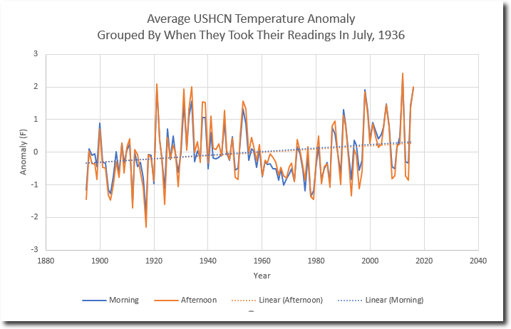
Ellsworth Kansas
http://www.free-the-memes.net/writings/warming2/ellsworth-kansas.gif
last one for now
Arkansas from NOAA.
http://2.bp.blogspot.com/_Lxqre8hMG3M/SxsbBdkfWzI/AAAAAAAAAxw/Fp230JpGyXQ/s400/weatherArkansasTemperature.gif
Here’s another one for you AndyG55. Has a graph in the article.
“In Germany there is one weather station that has be intact and unchanged for some 138 years.
It has never been moved and never been corrupted by the urban heat island (UHI) effect. Moreover it has consistently used the same instrumentation and computation method over the entire period, thus making it rare indeed. Few station can boast having those instrumentation qualities.
That measurement station is one operated at the Klostergarten of the St. Stephan Abbey in Augsburg just northwest of Munich.
44-year veteran German meteorologist Klaus Hager reports the following results of this station…”
http://notrickszone.com/2018/01/19/rare-weather-station-unchanged-over-138-years-data-show-no-co2-impact-on-temperature/#sthash.L9Y6XdIb.dpbs
Clearly somebody needs to apply Mike’s Nature Trick, at least, to this graph.
You might notice in the comments that I have seen that one 🙂
So why to they only show January temperatures?
I will take John daly’s data over anything from that clown.

“I will take John daly’s data over anything from that clown”
So from here we have what the “real data” says
http://oi60.tinypic.com/w9h6s3.jpg
And here we have what the sainted John Daly says

“real data” seems to speak with many voices.
They are somewhat similar. But no sources given. Who actually gathered that data?
Do your own research, petal !!
You are the one trying to pass yourself off as a guru.
And FAILING completely.
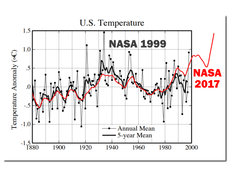
Here’s a good example of the real temperature pattern versus the manipulated Hockey Stick/Hotter and Hotter chart that CAGW advocates have created out of whole cloth in an effort to make the temperature profile match the CO2 chart profile: Up, up, up.
The black is the 1999 Hansen chart, and the red is what dishonest CAGW advocates changed it into to promote their cause.
Not just individual weather stations, but global temperatures and Arctic sea ice too, match the AMO hugely significantly.
http://www.woodfortrees.org/plot/nsidc-seaice-n/from:1979/normalise/plot/esrl-amo/from:1979/plot/uah6/from:1979
Any thoughts on this?
“The 2014-2017 El Nino “warm blob” was likely created, maintained, and partially recharged on two separate occasions by massive pulses of super-heated and chemically charged seawater from deep-sea geological features in the western North Pacific Ocean. This strongly supports the theory all El Ninos are naturally occurring and geological in origin. Climate change / global warming had nothing to do with generating, rewarming, intensifying, or increasing the frequency of the 2014-2017 El Nino or any previous El Nino.”
http://climatechangedispatch.com/further-proof-el-ninos-are-fueled-by-deep-sea-geological-heat-flow/
Warm blob quite probably,
El Nino seems too cyclical/semi-regular, so most likely more of a charge and release mechanism.
Certainly All NATURAL, and as noted, the ONLY warming in the satellite data.
Got your point about El Ninos doing all the recent warming. This explanation makes a lot of common sense to me – especially that persistent blob – and things couldn’t be more natural if that was this is the case. Though I suppose somebody will then try to blame fracking or white male capitalism or something like that for these undersea flows…
Ian Wilson predicted the 2015-16 El Nino with his lunar hypothesis, which may tie in with this new development.
The team which accurately predicts ENSO behaviour a couple of years in advance would save agribusiness billions of dollars on a regular basis.
“Ian Wilson predicted”
Link?
There’s your link Nick.
Posted: May 31, 2015 by tallbloke…
“This repost of Ian Wilson’s Jan 1st article at his Astro-Climate-Connection blog continues development of his hypothesis that the Moon triggers El Nino events. This is relevant as we are currently on the cusp of El Nino, which may develop as the year goes on. Ian predicted El Nino for later this year in a comment here last year, based on his investigations.”
https://tallbloke.wordpress.com/2015/05/31/ian-wilson-the-el-ninos-during-new-moon-epoch-5-1963-to-1994/
There’s a lot of text I could not find the meat in. When will the future El Niños be? I guess the next super El Niño comes in 2035. Prove me wrong 🙂
Nick I’m nominating Ian Wilson for my Red Team, along with Stephen Wilde.
““The 2014-2017 El Nino “warm blob” was likely created, maintained, and partially recharged on two separate occasions by massive pulses of super-heated and chemically charged seawater from deep-sea geological features in the western North Pacific Ocean. This strongly supports the theory all El Ninos are naturally occurring and geological in origin.”
My understanding is warm water underneath these high-pressure systems only reached a few meters deep. The high-pressure system caused the heat. From above, not below. I don’t have a link handy.
Christ, this was one of worst foodfights over some global warming art.
I”d like to mention a couple of things.
First, the adjusted vs. unadjusted foodfight is of not much value. The question is do you trust the tobs adjustment which is definitely necessary to reveal any warming in the US post 1950, particularly do you see the assumptions behind the statistical removal of breakpoints valid?
I have had some hard time with this, but I admit people with a lot of intelligence and dedication say that they’re valid. I’m personally conserned with asymmetrical saw teeth signals in station records, could they cause a significant bias. I see a lot of potential in them to find more (or less) warming.
Another thing is the baseline of 1880, which is, in my opinion OK if you visualise the assumed CO2 effect instead of implicitly claiming that 100% of the warming since 1880 is anthropogenic. It is more that 50% since 1950, according to the IPCC. This kind of art is a liar’s tool.
TOBS
Its all they have.. and its EMPTY !!
This looks convincing if you can trust there are no biases hidden. I don’t. There is no information on station count or distribution. Or tobs breakpoint dates. After tobs, the warming doubles or so, and is more pronounced after 1950.
But as I said, the complex statistics is creating so convenient warming as a function of time and CO2, that a confirmation bias is probable. It is just above my paygrade.
There is at the original site. And its all done straight from raw USHCN data
https://realclimatescience.com/2017/05/the-wildly-fraudulent-tobs-temperature-adjustment/
A video you should watch
https://youtu.be/-oxKF6rW-W0
I’m still more concerned on unrecognised, asymmetric signals mixing the automated tobs adjustment statistics tool. Mosher has many times told how he trusts the antitobsed results. The trust makes me just suspicious. A bias sneaks in by unverified assumptions the statistical tool requires in order to not generate new biases. Mosher is not skeptical enough. Neither is Zeke Hausfather who went to great length at Climate Etc in explaining why tobs adjustment is needed in the first place. But, at least Zeke did try explain what it is about in simple terms. Says he’s honestly trying.
My concern in short. Imagine a sawtooth with a positive derivative almost everywhere.
Add that to a large portion of station records. How well breakpoint analysis can avoid detecting breakpoints and keep the anomaly from slowly climbing?
The reason for sawtooth might be site deteriorating, and it can in principle be upwards or downwards, or depend on sites so that rural sites behave differently, or sites with good management have more steps or smaller steps. I don’t know. There are many factors that can cause sawtooth changes, like shelter washing or painting, trees and bushes growing, tobs changing undocumentedly in a pattern caused by, for example, daylight and traffic jam induced ways, you name it.
The assumption is that the record can be spliced without breaking it, there are no jumps that should be included. I challenge this.
Hugs, look at the Charts by Zeke up post that I posted. They attempt to show what is wrong with using What we measure ie RAW Absolute Temperatures in averaging and Charting.
Those RAW Absolute Temperatures are exactly what we as humans experienced at the time, they include your saw tooths BIG style, they show that tempearures have not progressed with a nice CO2 induced trend.
They jump up about 1.5C in the Global Data a few times and 0.75C in the USA over very short periods of time and then slowly decay back to or even lower than when they started, very much like El Nino events.
Why do none of those Step changes show up in the current “adjusted data”?
Because the current data has been smoothed out, especially by adding Sea Temps, so that the data better follows the CO2 trend.
A C Osborn
I’ve tried to answer your question above, but it seems to have been held up in moderation.
I see you are now acknowledging that the graph showing a mean of absolute temperatures was produced to illustrate why it is wrong to use absolute values.
You seem to think this graph is more accurate because it’s closer to human experience, but don’t you think it’s odd that global temperatures are jumping by 1.5C in a year, whereas US only temperatures only change by half that?
I am not acknowledging it now, I new all along where those graphs came from and why Zeke did it, he was trying to debunk the use of Absolutes.
But he shot himself and you in the foot, because he showed that there was very little difference in those Step changes that you are questioning whether you use Absolutes or gridded Anomalies.
So why aren’t those steps in the Current Global Data, when they were in his graph of official data?
Because the current “Adjustment Process” is designed to remove them of course.
Do you now understand why I question what was done to the 1997/98 values in our previous discussion?
No, the assumptions in breakpoint analysis are not valid. The breakpoint methods being used assume non-auto-correlated and non-periodic data, and at the windows used for breakpoint analysis for temperature histories there’s definitely auto-correlation and periodicity.
See this references:
http://www.variation.com/cpa/tech/changepoint.html
http://www.homogenisation.org/files/private/WG1/Bibliography/Method_Description/Climate/lund_et_al.pdf
Several years ago I pinged BEST on this issue but got no response: See comments at:
http://berkeleyearth.org/understanding-adjustments-temperature-data/
But periodic, symmetric signal would decrease, not increase trend-creating breakpoints?
Why not just forget all the surface readings crap. How the hell can you trust ANY of it? More people, bigger cities, more heat from them, easily manipulated data from dodgy weather stations in dodgy places, no coverage over gigantic areas, open to adjusting by countless people (eg BOM in Australia) ….etc etc etc. Go with the satellite data only. It’s a lot easier, more accurate and shows a downward trend. Also does not show 2017 the hottest year at all.
To answer Nick Stokes, “so, why do they only show January temperatures.” question. Well, if the claim is that the globe is heating up, why would it matter which month was graphed in annual succession? Wouldn’t you expect to see a trend line supporting a rise in temp? Or, are the effects of CO2 selective in the months impacted?
Let’s face it C8 is a hoax. What’s that you say? What is C8? It’s my shorthand for Cash Crop Caucasian Caused Catastrophic Carbon Climate Change. A silly name for a silly game. The Cash Crop part is the act of climate scientist farming governments to keep their salaries safe. Now, let’s not have any more of the nonsense unless and until AGW can be proven. So far, there is no proof.
“Well, if the claim is that the globe is heating up, why would it matter which month was graphed in annual succession?”
People cherry-pick you know. It’s a real question. They say they have 137 years of pristine data. So why do we see only January? I can just imagine what folks would say if a met Office did that.
“Yep, like starting Arcticsea ice in 1979 which was the HIGHEST extent since the LIA, and similar in extent to that COLDEST of times in 10,000 years.
The El Nino spike of 1878 never gets a mention, it was the hottest year evah, but BoM has little interest in the 19th century.
Isn’t that the year that “birds fell out of the Air stone dead”?
Setting aside the issue of cherry picking, the question remains, “why would it matter which month was graphed in annual succession? Wouldn’t you expect to see a trend line supporting a rise in temp? Or, are the effects of CO2 selective in the months impacted?”
There has been plenty of cheery picking among the C8 proponents. By the way, even the aborigines recognized the caucasian connection to Climate Change long ago. Tony Heller recognizes that the truest reflections on historical climate data are those written contemporaneously for reasons other than to propagandize.
/Users/pblasz/Downloads/Image730_shadow.png
By the way, even the aborigines recognized the caucasian connection to Climate Change long ago. Tony Heller recognizes that the truest reflections on historical climate data are those written contemporaneously for reasons other than to propagandize.
Tony Heller’s Realclimatescinece.com
From the Maitland Mercury, March 11, 1846. On the Change of Climate
That great changes have taken place in the climate of Australia all testimonies satisfactorily prove. It is evident to any observer, at some period, that country has ben subjected to the mighty action of heavy rains, and of sweeping, deluging floods. The mountains and hills are cut and furrowed into the deep ravines; the parting ridges are at acute angles, and frequently washed bare of vegetable mould; and all so precipitous, that the waters are no sooner showered from the blessed heavens than they run off with rapidity and fury through the gullies into the recipient creeks, . . . the aborigines say that the climate has undergone this change since white-man came in country.
Mike January 22, 2018 at 12:32 am I go along with your comment, we have all this media hype in Australia over tenths of a degree supposed records When large cities mostly have a UHI of between 3 and five degree C due to urban concentration of population – sure we live in cities, but common sense says that old historical temperature records to be “exceeded” is not a tenth of a degree thing, as if we take away the UHI the records under comparison become a better test of cooling or warming.
With The Australian homogenized data that is now automatically produced with old LIG records down graded this is a recipe for gross deception and exploitation. The challenge for the likes of Nick Stokes is to produce a World or Global temperature after removing large cities and airport measuring sites and see if UHI contamination is the only significant factor boosting so called anomalies.
We need strong governance and outside audits to examine this media driven nonsense once and for all.
Nick was part of the problem, so expect him to deny common sense! and his defence of a corruptible science that seems to be challenged by the very extremes of cold weather as John Coleman states.
I beg your pardon for my quite obviously ignorance. But if the choose of 30 years is what Nick said:
It seem to me that the Global Climate is just a probability joke. As someone would guess the 500th number extracted based on the first 30 extractions from a lottery of 90 numbers.
Maybe not the exact number but, saying, number 5 +/- 1!
Is it this that the SuperComputers are doing?
“Maybe not the exact number but, saying, number 5 +/- 1!”
They keep coming up with 150 +/- 40. !!
I see all this arguing over this data and that data and this graph and that graph and how NASA GISS or the NYT or whoever else is manipulating or misrepresenting the global temperature. I prefer to watch the UAH for that.
Though the distortion of manipulation of the data is disturbing in the end it really doesn’t phase this layman much. In the end, if the world was warming to the extent being claimed by so many the rate of SLR would be skyrocketing. The graphs of global SL would show a hockey stick. It isn’t there. The rate of SLR has remained pretty consistent. That is until recently when it seems to have stopped rising completely for a time.
https://climate.nasa.gov/vital-signs/sea-level/
RAH, the only problem I have with UAH is that it is not measuring where we are and quite often does not reflect what is happening “on the surface”.
What it is doing is measuring how much heat is escaping to space, so higher values may not be good news for us down here as there is only so much of it to go around.
Phil Jones has been mentioned regarding producing data where there wasn’t any and adjusting data arbritrarily. Clearly they did and were going to add temperatures to locations where no measurements had ever taken place:
This e-mail from Jones to colleague Alan Kendall describes it:
date: Mon Oct 20 14:09:27 2008
1. The Arctic issue. We’re getting SST data in from ships travelling around in regions where we haven’t had any data from for the 1961-90 base period. We’re still figuring out how to use these. However we do it, it will only raise temperatures.
2. SST is being measured differently now than it was in the 1980s. Before about 1990 it was almost exclusively from ships. Automatic instruments called drifters began to be deployed (by both research and some merchant ships). They do what the name implies – drift around – and send SST an sea-level pressure measurements back to ground stations by satellites. They work for a few years till they pack up or get beached.
The issue is that they now (2008) form about 85% of the SST data coming in. With now about 15 years of overlap, we are learning that their SST measurements are about 0.1 deg C cooler than the ships -probably because on average they measure at slightly different depths than the ships. Any way the 1961-90 base period is a ship-based base period, so when the adjustments have been completed we will likely raise SST values by about 0.1 deg C now, reducing to zero gradually back to the mid-1990s.
This type of adjustment has to be made, and it can only be made in retrospect. How the temperature is measured is as important as the temperature value itself.The drifters are giving us much better spatial coverage – especially the Southern Oceans. We will probably have to revise our 1961-90 averages for these regions, now we have many more observations for them – not just drifters but satellite estimates as well.
The late oceanographer, Dr Robert Stevenson, described how temperatures were measured from ships, in his critique of Levitus et al 2000, http://www.21stcenturysciencetech.com/articles/ocean.html.
It is those already uncertain temperatures that Jones was using to add another 0.1 deg to current Argo data:
“when the adjustments have been completed we will likely raise SST values by about 0.1 deg C now, reducing to zero gradually back to the mid-1990s”.
“Sources of 20th Century Ocean Temperatures” – Stevenson
“The archived data used by Levitus, and a plethora of other oceanographers, were taken by me, and a whole cadre of students, post-docs, and seagoing technicians around the world.
I can’t remember how many bottle casts I made, or how many bathythermographs I deployed. There had to be thousands in the waters off coastal California. Other students and post-docs were doing the same farther offshore in the eastern Pacific, from the E.W. Scripps. In the westernmost Atlantic, a similar cadre worked from the Atlantis.
Many cruises were dedicated to the geophysics of the sea floor, where deep-ocean casts for water and temperatures were few and far between.
Surface water samples were taken routinely, however, with buckets from the deck and the ship’s engine-water intake valve. Most of the thermometers were calibrated into 1/4-degrees Fahrenheit. They came from the U.S. Navy. Galvanized iron buckets were preferred, mainly because they lasted longer than the wood and canvas. But, they had the disadvantage of cooling quickly in the winds, so that the temperature readings needed to be taken quickly.
I would guess that any bucket-temperature measurement that was closer to the actual temperature by better than 0.5° was an accident, or a good guess. But then, no one ever knew whether or not it was good or bad.”
This one is not fake news: “Top climate scientists’ consensus – global warming is a great swindle”
https://www.researchgate.net/publication/237288047_The_Great_Global_Warming_Swindle_a_critique
“Summary The Great Global Warming Swindle does not represent the current state of knowledge in climate science. Scepticism in science is a healthy thing, and the presence of orthodox scientific scepticism in climate change is ubiquitous. Many of the hypotheses presented in the Great Global Warming Swindle have been considered and rejected by due scientific process. This documentary is far from an objective, critical examination of climate science. Instead the Great Global Warming Swindle goes to great lengths to present outdated, incorrect or ambiguous data in such a way as to grossly distort the true understanding of climate change science, and to support a set of extremely controversial views.”
Re Toneb:
**Instead the Great Global Warming Swindle goes to great lengths to present outdated, incorrect or ambiguous data in such a way as to grossly distort the true understanding of climate change science, and to support a set of extremely controversial views.”**
You have not made one point here. Let’s see some facts.
**the true understanding of climate change science**
I understand it. Now when are you going to show me ONE study which MEASURES the amount of temperature change caused by CO2.
Waiting………………………..
“Now when are you going to show me ONE study which MEASURES the amount of temperature change caused by CO2.
Waiting………………………..”
You will be waiting a long time my friend.
Because there is none and what’s more there CAN be none.
So we throw our hands up in the air and walk away?
Splendid.
As you were.
However……
The climate science community I’m sure would appreciate a tip as to how one could if you know one.
The Earth’s a tad to big to put in a lab and study minutely.
Beyond a tad to complicated to model perfectly, even if we had the computing power.
So what do we do (if we dont want to give up and ignore the issue)?
Examine what we can in the lab.
In the field.
Via observation and theory explain those observations > now built-up over ~150 years (called empirical science).
We have.
Everything checks out to the extent that researchers cannot gainsay that empirical science – that GHG’s do what they do in terms of slowing heat loss to space.
We have measurements of increased DWLWIR at the surface – this converted to forcing by atmospheric radiative transfer models.
We have measurements of a TOA imbalance of Solar SW in vs LW out.
We know the OHC is increasing (the 93% of the heat stored in the climate system).
That I know denizens here reject the above you can take as read.
“We have measurements of increased DWLWIR at the surface – this converted to forcing by atmospheric radiative transfer models”
Those models are useless for climate forecasting. Radiation is just one mode of heat transfer in the atmosphere. GCMs cannot model accurately the clouds and fluid dynamics of the Navier-Stokes equations. Ask Chris Essex on how bad the models are.
“We have measurements of a TOA imbalance of Solar SW in vs LW out.”
Have they found the AGW signature – the tropical troposphere hot spot? Ask Lindzen why they can’t find it.
“We know the OHC is increasing (the 93% of the heat stored in the climate system).”
How many degrees is the increase in deep ocean temperature? How come they never tell this in the media? Is it because it’s incredibly small? Ask Carl Wunsch why increasing OHC is not catastrophic.
More on climate model wonderland
toneb, just lost the whole CO2 argument with “We know the OHC is increasing (the 93% of the heat stored in the climate system).”.
Because CO2 can’t do that, only Solar Radiation can do so.
DWIR, can only evaporate a few microns of the surface.
QED
“toneb, just lost the whole CO2 argument with “We know the OHC is increasing (the 93% of the heat stored in the climate system).”.
Because CO2 can’t do that, only Solar Radiation can do so.
DWIR, can only evaporate a few microns of the surface.
QED”
Except it isn’t demonstrated.
One of oft repeated myths surfaces (again) …..
Of course it can.
It is extra energy directed at the ocean surface.
No thermodynamical process is 100% efficient.
It is not all redirected into greater evaporation.
There is turbulence present at the surface (unless you are proposing a glass-like surface over the entirety of oceans).
The extra heat is mixxed down a few mill, which then reduces the deltaT between the warmer waters below by which the oceans heat escapes to space (as LWIR cannot be emitted by the body only at the surface via radiation and sensible/LH exchange). So the flux being reduced (2nd LoT ) less energy is available to escape.
Just basic thermodynamics and not open to pseudo-science sky-dragon slaying. Sorry.
Been observed apart from being common-sense.
This from Nick Stokes
https://moyhu.blogspot.co.uk/2010/10/can-downwelling-infrared-warm-ocean.html
and
http://home.earthlink.net/~drdrapp/ocean.heating.v3.pdf
and
http://onlinelibrary.wiley.com/doi/10.1029/2008JC004825/pdf
This is the “sister” to the “GHE effect is non-existent”.
Do you “deny” that also?
Both work by reduction in cooling and not heating.
“Ask Chris Essex on how bad the models are.”
The science is not the “models”.
The models are a tool to learn with.
Models were not needed when Arrenhius and Tyndal et al did their science. Or as it was developed and proven in the lab following.
The models try to integrate the radiation balance at TOA with the variations due to NV.
It is no surprise that they cannot do so (as a mean) as they are an ensemble of individual iterations and so MUST average out NV.
Focusing on the mean of the models is a convenient straw-man for sceptics, when in fact the error-bounds are the proper metric.
As they bound the NV for each individual model run which, as I say, cannot be projected.
That we do not know the full extent of NV to test a model ensemble is not important to determine that the physics is basically correct in them.
So here we have the latest (and yes it compares with a surface series of GMST) – as that is where we are both interested in and projecting for.
If you are not happy with the obvious constraints on models and you somehow expect the impossible then explain why OHC keeps rising, even through the “Hiatus”. Science can – it was the increased SW absorbed by the equatorial Pacific because of reduced cloud cover/convection in the lower SST’s during that time) IOW the reduced cloud was an effect (feed-back) of the -ve PDO/ENSO regime that largely existed during that time. Just like the GMST has not come fully down after the recent EN. Because the PDO is still +ve.
http://www.realclimate.org/images/cmp_cmip3_sat_ann.png
“You have not made one point here. Let’s see some facts.”
Well tell me something I don’t know.
I know perfectly well that ANY point I make here will not “be accepted”.
It is a self-fulfilling prophecy.
It matters not what replies I get, it is the silent viewers who I post for to give them the alternative of looking to the science and not what passes for (most of it) here.
I am almost certain that the vast majority will not even follow the link and see the criticism – much from people who’s science was actually used to the producers end.
It was certainly not a balanced one.
Just like here.
But….
On the contrary.
You have made another point by that statement BTW.
I made the point that “The Great Global Warming Swindle” cherry-picked data and did not represent the science honestly.
That is very, very big point.
And what do denizens here do?
Lap it up uncritically.
Because the scince is a fraud?
Because they know more than the scientists?
You tell me?
I think the answer is quite obviously neither of those.
I think it boils down the ever increasing polarisation of society on political grounds.
“Instead the “Great Global Warming Swindle” goes to great lengths to present outdated, incorrect or ambiguous data in such a way as to grossly distort the true understanding of climate change science, and to support a set of extremely controversial views.””
toneb January 24, 2018 at 2:29 am
I am not and have not argued that GHGs reduce the speed of cooling, it is patently obvious in day to day and day to night weather.
Let me ask you a few questions about your belief in CO2 as the prime mover of GHG warming.
1. What it the ratio of CO2 molecules compared to H2O?
2. What is height where the main CO2 window is ie no H2O?
3. What is the Time taken to release a photon from an “Excited” CO2 Molecule?
4. What is the Time taken to lose the energy from an “Excited” CO2 Molecule due to a collision with another molecule?
5. What is the Mean Free Path of an IR photon?
6. What is the “Energy” in Electron Volts of an IR Photon?
7. What is the Energy in Electron Volts of Solar Radiation?
There are of course clearer cases of fake news like inventing millions of fraudulent votes out of thin air. Data distortion and manipulation pales by comparison.
Not when Trillions of Dollars are tied up with it.
They are depriving the poor of the world better living standards, better health and longer lives.
Actually,all said i think is right , the theory of Greenland’s ice is restored in the perennial average slightly better, but strange is to take a look at the arctic sea ice, did I want to know is this data being manipulated, why the range of maximum small year by year, and I have a hunch just think this year’s summer will not particularly good, this kind of feeling a little frightening
The NYT graft on earlier data onto a graph, attributed to NASA, clearly for editorial effect.
The second problem is “annual global surface” temperature, which is not a temperature measurement. They are convenient for highlighting small differences between numbers.
Graphs such as the NYT one automatically show a biased result. They do not contain any context for either the rate or magnitude of the change shown. The hump after 1970 could be a continuing rise. It could be a continuing cycle, it could be an artifact of the data used. In any case, it implies an unsubstantiated, continuing increase in temperature into the future, without further explanation.
To put the graph in context would require showing at least 1000 years, preferably 10,000 in light of the interglacial period we are in.
Measuring temperature before about mid20th century was a haphazard process. The first actual temperature standar was 20C, established in 1931 for measuring lengths. It applied to glass thermometers primarily because it allowed standarization of the scale length and uniformity. Measuring any temperature, prior to 1920, was only slightly more accurate that asking groups of people to dip their hands into two water buckets and decide which was hotter- the Fahenheit scale. So going back to 1880 the deviation range(not standard deviation) was several degrees F for a particular lab, and roughly twice that for different labs or measuring station. The measurement error is roughly 5X the anomaly prior to about 1920 increasing to about 10X for 1880 and earlier.
The earth-space-sun-galaxy is a heat engine. The appropriate scale to measure is the Kelvin temperature. It at least approximates the relative heat energy of whatever is being measured. That has some bearing at least on what it means to climate change.
True, only that which has been physically measured can be called “true”. Everything that’s conjured up, adjusted, homogenized etc is NOT true. Unless it matches that which was measured.
Adjusted surface temperatures = fake news = academic impropriety.
And that’s the truth.
I read a few things from the NYT graph.
-from 1880-1910 (30 years), there was a .3 degree C temp drop.
-From 1910-1940 (30 years), there was a .6 degree C temp increase.
-from 1940-1970 (30 years), there was a .00 degree C temp increase.
-From 1970-2000 (30 years), there was a .65 degree C temp increase.
Since we are talking climate and CO2, I see these periods as a good test of CO2 influence.
– In the first Co2 rose a small amount (about 0-5 ppm)
– In the next CO2 rose a small amount (about 2-6 ppm), and temp anomoly rose .6C.
– in the next CO2 rose a touch more (about 12-15 ppm), and temp anomoly didn’t change.
– In the last Co2 rose alot (about 130 ppm) and the temp anomoly rose a touch more at .65C (eyeball readings, could argue up to .7C).
Based on this, the effect of rising CO2 on temp, is small. Since one can have a similar increase in temp with only a small increase of Co2 as one sees from a large one. One can have no change from a slightly larger increase as well, completely negating CO2 as the proabably cause of the first increase.
The only real outliers in that whole graph that went for 137 years and spanned from little Co2 change to large Co2 increases, is the last 4 years. To be fair, there was somewhat similar walk up from 1939-1944, that fell away again. And I suspect we will see a drop here again back down to around 2010-2014 range (assuming that adjustments don’t assume any drop is wrong and a “correct”). If this will be the case, then it will be very little changed from the past temp record events.
Frankly, I see a repeating temp. anomoly history graph, that slowly rose in temp spanning 137 years with very little place for influence from CO2. You can’t have it both ways, if co2 was a big cause in 1910-1940, then why did it’s effect diminish so much in 1970-2000 when CO2 rose so much faster? If CO2 wasn’t a big cause in 1910-1940, then why is the 1970-2000 event so similar to the earlier graph if Co2 is having a big effect now? You will never convince actual science educated sceptics without dealing with this dichotomy. And repeatedly adjusting the past “data” until it no longer looks recognizable only causes more scepticism.
“From 1970-2000 (30 years), there was a .65 degree C temp increase.”
People love to quote this as if it ended in 2000. But it didn’t. It kept rising. Another 0.35°C, and shows no signs of stopping.
“It kept rising.”
Not in any REAL temperature series. GISS is a FABRICATION, and you know it.
No warming from 2001 – 2015.. Then the NON-CO2 El Nino transient, which has all but dissipated.
Even the small rise from 1970 -2000 was mostly an El nino in 1978 and then in 1998
(pity we don’t have any reliable untammpered data before 1979, hey Nick)
There was no warming between 1980 and 1997 in any REAL temperature series.
How can any so called statistician justify calculating or putting a trend line on data that so obviously has dramatic Step Changes in the data.
Nick should hang his head in shame.
That is why I keep bringing up the Zeke charts of the RAW data, where have those Step Changes gone in the historic data?
I wonder by what mechanism CO2 stores up the heat and then releases it bursts of activity.
“Showing temperatures” implies that the IPCC chart is taken from real (proxy) data. In fact it was not and was not presented such. It was presented as a schematic for a general (global?) temperature trend. The above representation of the chart suggests that the IPCC schematic chart is derived from a chart by HH Lamb. This is true in the sense that it is derived from a chart by Lamb for Central England. It is not true that Lamb ever suggested that this trend was global. Indeed, he has other charts suggesting (on a winter severity index) that the medieval warm period was truncated at the same latitude in eastern Europe. Any suggestion that this chart, as an expression of a general (NH or global) trend, is based on real data remains with the IPCC (and the chapter lead author). Thus, if we interpret this as the claim of the 1990 IPCC report then it is a false claim that has no more scientific integrate than the suggestion of the 2001 report that the Hockey Stick graph gives the general trend.
See: https://enthusiasmscepticismscience.wordpress.com/2013/09/22/hubert-lamb-and-the-assimilation-of-legendary-ancient-russian-winters/
Sorry
https://www.google.ca/search?complete=0&source=hp&ei=iIhmWvKWAYTu_Qaz967wCA&q=inurl%3Ahttp%3A%2F%2Fdi2.nu%2Ffoia%2F+jones&oq=inurl%3Ahttp%3A%2F%2Fdi2.nu%2Ffoia%2F+jones&gs_l=psy-ab.12…3211.67286.0.73131.0.0.0.0.0.0.0.0..0.0….0…1c.1.64.psy-ab..0.0.0….0.puid4BwNFYw
[This takes second prize for the most irregularly typed reply. .mod]
I just want to know why the arctic ice cap is getting smaller and smaller and scary?
“I just want to know why the arctic ice cap is getting smaller and smaller and scary?”
It isn’t. Your information is obsolete. It was getting progressively smaller after reaching (recent) peak extent in the 1970s – when most graphs you see start – but that trend is turning now.
If you found that scary you were probably reading too much fake news and/or junk ‘science.’
Spend more time on this site and you’ll learn all about it.
The first question is: just like the temperature in 1880 is without actual measurement, is likely to have been adjusted, I can understand the things, but before 1979 years ago, the arctic ice is not measured, who all don’t know if it“s big or small
In addition, the situation is the condition of the Greenland in changes in these two years, The ice is not lost, and even the South Pole is not lost. but in the arctic ice, the maximum has become more and more small, it is actual measurement,Even in 1998 and 2016 of the el nino phenomenon The arctic ice is not so small as they are now。What happened now?
Extreme Hiatus January 22, 2018 at 9:32 pm
“I just want to know why the arctic ice cap is getting smaller and smaller and scary?”
It isn’t. Your information is obsolete. It was getting progressively smaller after reaching (recent) peak extent in the 1970s – when most graphs you see start – but that trend is turning now.
Actually the Arctic sea ice extent is currently the lowest value for the date and the previous low was last year.
i agree with you If you look at the chart you will know that this year’s point is lower than last year’s.
That depends on who’s chart you look at.
As to your statement ” but before 1979 years ago, the arctic ice is not measured”, you are of course wrong.
It has been “measured” for decades before Satellites started doing so.
But even Satellites started before 1979, but they do not like to show the data, but as usual they did make the mistake of doing so.
Take a look for yourself
https://www.bing.com/images/search?view=detailV2&ccid=5ymqyf7x&id=4C15C8A3E7EFEDDAE82504942728CDE83C7BE15D&thid=OIP.5ymqyf7xBaOTvoGKPuPIXgEsDH&q=original+IPCC+Arctic+Ice+graph&simid=608028678058934672&selectedIndex=0&ajaxhist=0
Or this version
https://www.bing.com/images/search?view=detailV2&ccid=nhqrX84A&id=70100E824942CC909CDE1B6A05AE2A5EAA8F53D1&thid=OIP.nhqrX84A7VkpWK3EEDqp6AHaFb&q=original+IPCC+Arctic+Ice+graph&simid=608044758417801700&selectedIndex=7&ajaxhist=0
Or how about a reconstruction based on known data
https://www.bing.com/images/search?view=detailV2&ccid=WuVkIZ%2bM&id=93219643CA213197D2FC3D0A2516B78E77B9DA03&thid=OIP.WuVkIZ-MifAB43oR6KinzgEnDT&q=original+IPCC+Arctic+Ice+graph&simid=607994520188160556&selectedIndex=30&ajaxhist=0
A C Osborn January 23, 2018 at 4:19 am
That depends on who’s chart you look at.
As to your statement ” but before 1979 years ago, the arctic ice is not measured”, you are of course wrong.
It has been “measured” for decades before Satellites started doing so.
Yes it has, here for example.
Over the last few years the winter max has consistently dropped, currently it is at the lowest value for the date and is ~3 sds below average. There’s a distinct possibility that this year will see the lowest maximum (in ~50 days time).