Guest essay by Sheldon Walker
Introduction
In my last article I attempted to present evidence that the recent slowdown was statistically significant (at the 99% confidence level).
Some people raised objections to my results, because my regressions did not account for autocorrelation in the data. In response to these objections, I have repeated my analysis using the AR1 model to account for autocorrelation.
By definition, the warming rate during a slowdown must be less than the warming rate at some other time. But what “other time” should be used. In theory, if the warming rate dropped from high to average, then that would be a slowdown. That is not the definition that I am going to use. My definition of a slowdown is when the warming rate decreases to below the average warming rate. But there is an important second condition. It is only considered to be a slowdown when the warming rate is statistically significantly less than the average warming rate, at the 90% confidence level. This means that a minor decrease in the warming rate will not be called a slowdown. Calling a trend a slowdown implies a statistically significant decrease in the warming rate (at the 90% confidence level).
In order to be fair and balanced, we also need to consider speedups. My definition of a speedup is when the warming rate increases to above the average warming rate. But there is an important second condition. It is only considered to be a speedup when the warming rate is statistically significantly greater than the average warming rate, at the 90% confidence level. This means that a minor increase in the warming rate will not be called a speedup. Calling a trend a speedup implies a statistically significant increase in the warming rate (at the 90% confidence level).
The standard statistical test that I will be using to compare the warming rate to the average warming rate, will be the t-test. The warming rate for every possible 10 year interval, in the range from 1970 to 2017, will be compared to the average warming rate. The results of the statistical test will be used to determine whether each trend is a slowdown, a speedup, or a midway (statistically the same as the average warming rate). The results will be presented graphically, to make them crystal clear.
The 90% confidence level was selected because the temperature data is highly variable, and autocorrelation further increases the amount of uncertainty. This makes it difficult to get a significant result using higher confidence levels. People should remember that Karl et al – “Possible artifacts of data biases in the recent global surface warming hiatus” used a confidence level of 90%, and warmists did not object to that. Warmists would be hypocrites if they tried to apply a double standard.
The GISTEMP monthly global temperature series was used for all temperature data. The Excel linear regression tool was used to calculate all regressions. This is part of the Data Analysis Toolpak. If anybody wants to repeat my calculations using Excel, then you may need to install the Data Analysis Toolpak. To check if it is installed, click Data from the Excel menu. If you can see the Data Analysis command in the Analysis group (far right), then the Data Analysis Toolpak is already installed. If the Data Analysis Toolpak is NOT already installed, then you can find instructions on how to install it, on the internet.
Please note that I like to work in degrees Celsius per century, but the Excel regression results are in degrees Celsius per year. I multiplied some values by 100 to get them into the form that I like to use. This does not change the results of the statistical testing, and if people want to, they can repeat the statistical testing using the raw Excel numbers.
The average warming rate is defined as the slope of the linear regression line fitted to the GISTEMP monthly global temperature series from January 1970 to January 2017. This is an interval that is 47 years in length. The value of the average warming rate is calculated to be 0.6642 degrees Celsius per century, after correcting for autocorrelation. It is interesting that this warming rate is considerably less than the average warming rate without correcting for autocorrelation (1.7817 degrees Celsius per century). It appears that we are warming at a much slower rate than we thought we were.
Results
Graph 1 is the graph from the last article. This graph has now been replaced by Graph 2.

Graph 1

Graph 2
The warming rate for each 10 year trend is plotted against the final year of the trend. The red circle above the year 1992 on the X axis, represents the warming rate from 1982 to 1992 (note – when a year is specified, it always means January of that year. So 1982 to 1992 means January 1982 to January 1992.)
A note for people who think that the date range from January 1982 to January 1992 is 10 years and 1 month in length (it is actually 10 years in length). The date range from January 1992 to January 1992 is an interval of length zero months. The date range from January 1992 to Febraury 1992 is an interval of length one month. If you keep adding months, one at a time, you will eventually get to January 1992 to January 1993, which is an interval of length one year (NOT one year and one month).
The graph is easy to understand.
· The green line shows the average warming rate from 1970 to 2017.
· The grey circles show the 10 year warming rates which are statistically the same as the average warming rate – these are called Midways.
· The red circles show the 10 year warming rates which are statistically significantly greater than the average warming rate – these are called Speedups.
· The blue circles show the 10 year warming rates which are statistically significantly less than the average warming rate – these are called Slowdowns.
· Note – statistical significance is at the 90% confidence level.
On Graph 2 there are 2 speedups (at 1984 and 1992), and 2 slowdowns (at 1997 and 2012). These speedups and slowdowns are each a trend 10 years long, and they are statistically significant at the 90% confidence level.
The blue circle above 2012 represents the trend from 2002 to 2012, an interval of 10 years. It had a warming rate of nearly zero (it was actually -0.0016 degrees Celsius per century – that is a very small cooling trend). Since this is a very small cooling trend (when corrected for autocorrelation), it would be more correct to call this a TOTAL PAUSE, rather than just a slowdown.
I don’t think that I need to say much more. It is perfectly obvious that there was a recent TOTAL PAUSE, or slowdown. Why don’t the warmists just accept that there was a recent slowdown. Refusing to accept the slowdown, in the face of evidence like this article, makes them look like foolish deniers. Some advice for foolish deniers, when you find that you are in a hole, stop digging.
Discover more from Watts Up With That?
Subscribe to get the latest posts sent to your email.
The trajectory of chaotic systems, being stuck on the attractor, cannot exhibit a trend. It’s impossible.
Even a random walk can exhibit a trend. Whether the trend is predictable or have known causes is another thing.
you mean, a significant trend. A trend is nothing more than the result of a math operation you can do whenever you have 2 points.
None of the many temporal chaotic ODE systems that have been studied exhibit a trend; because they cannot. If you do not agree, provide a URL. Chaotic trajectories are stuck on the attractor and cannot depart from it. Random is not stuck, and covers all of phase space.
Earth’s climate is a chaotic system but the average global temperature is bounded. Let’s say in the past four billion years, global temperature ranged from -20 C to 30 C. Since the temperature is not constant, it is oscillating between these two boundaries. In between these oscillations you can identify trends. Glacial and interglacial periods are cooling and warming trends. If ODE systems do not exhibit a trend, it is a failure of math to model chaos. Math is a representation of reality. It is not reality itself.
Not true, it depends on the nature of the stationary state, if it’s an unstable node you could certainly see a trend, if it’s an unstable focus it could even be an oscillatory trajectory.
Provide URL to reports or papers about temporal chaotic trajectories that show trends.
Its interesting how the peaks and troughs of the warming and cooling graph presented correlate very well the solar cycles.
Seems really awful to me.
Various flaws already pointed out by good faith commentators (by which i mean: not Griff, Toneb, Nick Stokes).
The kind of data torturing by which you can have it confess whatever you like, usually used to “prove” AGW, but doesn’t gain any validity in my eye just because used to disprove it.
“Various flaws already pointed out by good faith commentators (by which i mean: not Griff, Toneb, Nick Stokes).”
Eh?
The stats were redone on the basis of Nick Stokes’ critique. And you do not agree that atmospheric LH release can be directly attributed via direct knowledge of the planet’s annual rainfall mass?
https://wattsupwiththat.com/2018/01/17/proof-that-the-recent-slowdown-is-statistically-significant-correcting-for-autocorrelation/#comment-2720421
Toneb: I cannot be bothered with you – you keep changing your story, there are huge gaps in your illogic, etc.
You are not addressing my points, you are merely writing false propaganda for the imbeciles who might believe you.
RE your BS about Aerosols: Read these conversation between me and Dr. Douglas Hoyt.
[excerpted}
http://wattsupwiththat.com/2015/12/20/study-from-marvel-and-schmidt-examination-of-earths-recent-history-key-to-predicting-global-temperatures/comment-page-1/#comment-2103527
Hi David,
Re aerosols:
Fabricated aerosol data was used in the models cited by the IPCC to force-hindcast the natural global cooling from ~1940-1975). Here is the evidence.
Re Dr. Douglas Hoyt: Here are his publications:.
http://www.warwickhughes.com/hoyt/bio.htm
Best, Allan
http://wattsupwiththat.com/2015/05/26/the-role-of-sulfur-dioxide-aerosols-in-climate-change/#comment-1946228
We’ve known the warmists’ climate models were false alarmist nonsense for a long time.
As I wrote (above) in 2006:
“I suspect that both the climate computer models and the input assumptions are not only inadequate, but in some cases key data is completely fabricated – for example, the alleged aerosol data that forces models to show cooling from ~1940 to ~1975…. …the modelers simply invented data to force their models to history-match; then they claimed that their models actually reproduced past climate change quite well; and then they claimed they could therefore understand climate systems well enough to confidently predict future catastrophic warming?”,
http://wattsupwiththat.com/2009/06/27/new-paper-global-dimming-and-brightening-a-review/#comment-151040
Allan MacRae (03:23:07) 28/06/2009 [excerpt]
Repeating Hoyt : “In none of these studies were any long-term trends found in aerosols, although volcanic events show up quite clearly.”
___________________________
Here is an email received from Douglas Hoyt [in 2009 – my comments in square brackets]:
It [aerosol numbers used in climate models] comes from the modelling work of Charlson where total aerosol optical depth is modeled as being proportional to industrial activity.
[For example, the 1992 paper in Science by Charlson, Hansen et al]
http://www.sciencemag.org/cgi/content/abstract/255/5043/423
or [the 2000 letter report to James Baker from Hansen and Ramaswamy]
http://74.125.95.132/search?q=cache:DjVCJ3s0PeYJ:www-nacip.ucsd.edu/Ltr-Baker.pdf+%22aerosol+optical+depth%22+time+dependence&cd=4&hl=en&ct=clnk&gl=us
where it says [para 2 of covering letter] “aerosols are not measured with an accuracy that allows determination of even the sign of annual or decadal trends of aerosol climate forcing.”
Let’s turn the question on its head and ask to see the raw measurements of atmospheric transmission that support Charlson.
Hint: There aren’t any, as the statement from the workshop above confirms.
__________________________
IN SUMMARY
There are actual measurements by Hoyt and others that show NO trends in atmospheric aerosols, but volcanic events are clearly evident.
So Charlson, Hansen et al ignored these inconvenient aerosol measurements and “cooked up” (fabricated) aerosol data that forced their climate models to better conform to the global cooling that was observed pre~1975.
Voila! Their models could hindcast (model the past) better using this fabricated aerosol data, and therefore must predict the future with accuracy. (NOT)
That is the evidence of fabrication of the aerosol data used in climate models that (falsely) predict catastrophic humanmade global warming.
And we are going to spend trillions and cripple our Western economies based on this fabrication of false data, this model cooking, this nonsense?
*************************************************
Reply
Allan MacRae
September 28, 2015 at 10:34 am
More from Doug Hoyt in 2006:
http://wattsupwiththat.com/2009/03/02/cooler-heads-at-noaa-coming-around-to-natural-variability/#comments
[excerpt]
http://www.climateaudit.org/?p=755
Douglas Hoyt:
July 22nd, 2006 at 5:37 am
Measurements of aerosols did not begin in the 1970s. There were measurements before then, but not so well organized. However, there were a number of pyrheliometric measurements made and it is possible to extract aerosol information from them by the method described in:
Hoyt, D. V., 1979. The apparent atmospheric transmission using the pyrheliometric ratioing techniques. Appl. Optics, 18, 2530-2531.
The pyrheliometric ratioing technique is very insensitive to any changes in calibration of the instruments and very sensitive to aerosol changes.
Here are three papers using the technique:
Hoyt, D. V. and C. Frohlich, 1983. Atmospheric transmission at Davos, Switzerland, 1909-1979. Climatic Change, 5, 61-72.
Hoyt, D. V., C. P. Turner, and R. D. Evans, 1980. Trends in atmospheric transmission at three locations in the United States from 1940 to 1977. Mon. Wea. Rev., 108, 1430-1439.
Hoyt, D. V., 1979. Pyrheliometric and circumsolar sky radiation measurements by the Smithsonian Astrophysical Observatory from 1923 to 1954. Tellus, 31, 217-229.
In none of these studies were any long-term trends found in aerosols, although volcanic events show up quite clearly. There are other studies from Belgium, Ireland, and Hawaii that reach the same conclusions. It is significant that Davos shows no trend whereas the IPCC models show it in the area where the greatest changes in aerosols were occurring.
There are earlier aerosol studies by Hand and in other in Monthly Weather Review going back to the 1880s and these studies also show no trends.
So when MacRae (#321) says: “I suspect that both the climate computer models and the input assumptions are not only inadequate, but in some cases key data is completely fabricated – for example, the alleged aerosol data that forces models to show cooling from ~1940 to ~1975. Isn’t it true that there was little or no quality aerosol data collected during 1940-1975, and the modelers simply invented data to force their models to history-match; then they claimed that their models actually reproduced past climate change quite well; and then they claimed they could therefore understand climate systems well enough to confidently predict future catastrophic warming?”, HE IS CLOSE TO THE TRUTH.
_____________________________________________________________________________
Douglas Hoyt:
July 22nd, 2006 at 10:37 am
Re #328
“Are you the same D.V. Hoyt who wrote the three referenced papers?” Yes.
“Can you please briefly describe the pyrheliometric technique, and how the historic data samples are obtained?”
The technique uses pyrheliometers to look at the sun on clear days. Measurements are made at air mass 5, 4, 3, and 2. The ratios 4/5, 3/4, and 2/3 are found and averaged. The number gives a relative measure of atmospheric transmission and is insensitive to water vapor amount, ozone, solar extraterrestrial irradiance changes, etc. It is also insensitive to any changes in the calibration of the instruments. The ratioing minimizes the spurious responses leaving only the responses to aerosols.
I have data for about 30 locations worldwide going back to the turn of the century. Preliminary analysis shows no trend anywhere, except maybe Japan. There is no funding to do complete checks.
________________________________________________________
RE Aerosols, read this – my conversations with Douglas Hoyt:
http://wattsupwiththat.com/2015/05/26/the-role-of-sulfur-dioxide-aerosols-in-climate-change/#comment-1946228
We’ve known the warmists’ climate models were false alarmist nonsense for a long time.
As I wrote (above) in 2006:
“I suspect that both the climate computer models and the input assumptions are not only inadequate, but in some cases key data is completely fabricated – for example, the alleged aerosol data that forces models to show cooling from ~1940 to ~1975…. …the modelers simply invented data to force their models to history-match; then they claimed that their models actually reproduced past climate change quite well; and then they claimed they could therefore understand climate systems well enough to confidently predict future catastrophic warming?”,
http://wattsupwiththat.com/2015/09/28/wild-card-in-climate-models-found-and-thats-a-no-no/#comment-2036857
http://wattsupwiththat.com/2009/06/27/new-paper-global-dimming-and-brightening-a-review/#comment-151040
Allan MacRae (03:23:07) 28/06/2009 [excerpt]
Repeating Hoyt : “In none of these studies were any long-term trends found in aerosols, although volcanic events show up quite clearly.”
___________________________
Here is an email received from Douglas Hoyt [in 2009 – my comments in square brackets]:
It [aerosol numbers used in climate models] comes from the modelling work of Charlson where total aerosol optical depth is modeled as being proportional to industrial activity.
[For example, the 1992 paper in Science by Charlson, Hansen et al]
http://www.sciencemag.org/cgi/content/abstract/255/5043/423
or [the 2000 letter report to James Baker from Hansen and Ramaswamy]
http://74.125.95.132/search?q=cache:DjVCJ3s0PeYJ:www-nacip.ucsd.edu/Ltr-Baker.pdf+%22aerosol+optical+depth%22+time+dependence&cd=4&hl=en&ct=clnk&gl=us
where it says [para 2 of covering letter] “aerosols are not measured with an accuracy that allows determination of even the sign of annual or decadal trends of aerosol climate forcing.”
Let’s turn the question on its head and ask to see the raw measurements of atmospheric transmission that support Charlson.
Hint: There aren’t any, as the statement from the workshop above confirms.
__________________________
IN SUMMARY
There are actual measurements by Hoyt and others that show NO trends in atmospheric aerosols, but volcanic events are clearly evident.
So Charlson, Hansen et al ignored these inconvenient aerosol measurements and “cooked up” (fabricated) aerosol data that forced their climate models to better conform to the global cooling that was observed pre~1975.
Voila! Their models could hindcast (model the past) better using this fabricated aerosol data, and therefore must predict the future with accuracy. (NOT)
That is the evidence of fabrication of the aerosol data used in climate models that (falsely) predict catastrophic humanmade global warming.
And we are going to spend trillions and cripple our Western economies based on this fabrication of false data, this model cooking, this nonsense?
*************************************************
Reply
Allan MacRae
September 28, 2015 at 10:34 am
More from Doug Hoyt in 2006:
http://wattsupwiththat.com/2009/03/02/cooler-heads-at-noaa-coming-around-to-natural-variability/#comments
[excerpt]
Answer: Probably no. Please see Douglas Hoyt’s post below. He is the same D.V. Hoyt who authored/co-authored the four papers referenced below.
http://www.climateaudit.org/?p=755
Douglas Hoyt:
July 22nd, 2006 at 5:37 am
Measurements of aerosols did not begin in the 1970s. There were measurements before then, but not so well organized. However, there were a number of pyrheliometric measurements made and it is possible to extract aerosol information from them by the method described in:
Hoyt, D. V., 1979. The apparent atmospheric transmission using the pyrheliometric ratioing techniques. Appl. Optics, 18, 2530-2531.
The pyrheliometric ratioing technique is very insensitive to any changes in calibration of the instruments and very sensitive to aerosol changes.
Here are three papers using the technique:
Hoyt, D. V. and C. Frohlich, 1983. Atmospheric transmission at Davos, Switzerland, 1909-1979. Climatic Change, 5, 61-72.
Hoyt, D. V., C. P. Turner, and R. D. Evans, 1980. Trends in atmospheric transmission at three locations in the United States from 1940 to 1977. Mon. Wea. Rev., 108, 1430-1439.
Hoyt, D. V., 1979. Pyrheliometric and circumsolar sky radiation measurements by the Smithsonian Astrophysical Observatory from 1923 to 1954. Tellus, 31, 217-229.
In none of these studies were any long-term trends found in aerosols, although volcanic events show up quite clearly. There are other studies from Belgium, Ireland, and Hawaii that reach the same conclusions. It is significant that Davos shows no trend whereas the IPCC models show it in the area where the greatest changes in aerosols were occurring.
There are earlier aerosol studies by Hand and in other in Monthly Weather Review going back to the 1880s and these studies also show no trends.
So when MacRae (#321) says: “I suspect that both the climate computer models and the input assumptions are not only inadequate, but in some cases key data is completely fabricated – for example, the alleged aerosol data that forces models to show cooling from ~1940 to ~1975. Isn’t it true that there was little or no quality aerosol data collected during 1940-1975, and the modelers simply invented data to force their models to history-match; then they claimed that their models actually reproduced past climate change quite well; and then they claimed they could therefore understand climate systems well enough to confidently predict future catastrophic warming?”, he close to the truth.
_____________________________________________________________________________
Douglas Hoyt:
July 22nd, 2006 at 10:37 am
Re #328
“Are you the same D.V. Hoyt who wrote the three referenced papers?” Yes.
“Can you please briefly describe the pyrheliometric technique, and how the historic data samples are obtained?”
The technique uses pyrheliometers to look at the sun on clear days. Measurements are made at air mass 5, 4, 3, and 2. The ratios 4/5, 3/4, and 2/3 are found and averaged. The number gives a relative measure of atmospheric transmission and is insensitive to water vapor amount, ozone, solar extraterrestrial irradiance changes, etc. It is also insensitive to any changes in the calibration of the instruments. The ratioing minimizes the spurious responses leaving only the responses to aerosols.
I have data for about 30 locations worldwide going back to the turn of the century. Preliminary analysis shows no trend anywhere, except maybe Japan. There is no funding to do complete checks.
Here is a list of publications by Douglas V Hoyt. He is highly credible.
http://www.warwickhughes.com/hoyt/bio.htm
Allan, please no more huge comments like that, let your spat with tone drop
OK Anthony – but I’m buying a Tomohawk missile if he slags me with his BS one more time… 🙂
Sheldon,
Why did the model change reduce everything?
The average warming dropped from ~ +1.8 deg C/cent to ~ +0.7 deg C/cent. And the range of values about the average reduced from ~ -0.3 to ~ +4.2 deg C/cent to ~ -0.2 to ~ +1.8 deg C/cent.
Thanks.
I believe you are doing the wrong test.
You should be testing against the null hypothesis that the variation due to internal oscillations.
This paper describes how they did the null hypothesis test for detecting El Nino in SST. (TL;DR – they detect El Nino/La Nina but no other significant signals are present)
http://paos.colorado.edu/research/wavelets/bams_79_01_0061.pdf
Peter
Anthony this post and associated comments are fine examples of the contribution that WUWT makes to the climate debate and raises serious questions of importance to other areas of science in general. (Cosmology and particle physics) Especial thanks to Allan for his deconstruction of Hansen’s methods.
Various approaches to improve the precision of multi-model projections have been explored, but there is still no agreed strategy for weighting the projections from different models based on their historical performance so that there is no direct means of translating quantitative measures of past performance into confident statements about fidelity of future climate projections. The use of a multi-model ensemble in the IPCC assessment reports is an attempt to characterize the impact of parameterization uncertainty on climate change predictions. The shortcomings in the modeling methods, and in the resulting estimates of confidence levels, make no allowance for these uncertainties in the models. In fact, the average of a multi-model ensemble has no physical correlate in the real world. When dealing with complex systems standard statistical
measurements do not add any meaning or certainty. They are entirely tautologous repetitions of the of the sample lengths or areas and parameterizations chosen by the authors . They basically assume that the algorithim used is structured correctly- and that structural uncertainty is ignored in model outputs.
The climate model forecasts, on which the entire Catastrophic Anthropogenic Global Warming meme rests, are structured with no regard to the natural 60+/- year and, more importantly, 1,000 year periodicities that are so obvious in the temperature record. The modelers approach is simply a scientific disaster and lacks even average commonsense. It is exactly like taking the temperature trend from, say, February to July and projecting it ahead linearly for 20 years beyond an inversion point. The models are generally back-tuned for less than 150 years when the relevant time scale is millennial. The outcomes provide no basis for action or even rational discussion by government policymakers. The IPCC range of ECS estimates reflects merely the predilections of the modellers .The only test of any working hypothesis is its ability to make successful predictions. For an example see Fig 12 from
http://climatesense-norpag.blogspot.com/2017/02/the-coming-cooling-usefully-accurate_17.html
Fig. 12. Comparative Temperature Forecasts to 2100.
Fig. 12 compares the IPCC forecast with the Akasofu (31) forecast (red harmonic) and with the simple and most reasonable working hypothesis of this paper (green line) that the “Golden Spike” temperature peak at about 2003 is the most recent peak in the millennial cycle. Akasofu forecasts a further temperature increase to 2100 to be 0.5°C ± 0.2C, rather than 4.0 C +/- 2.0C predicted by the IPCC. but this interpretation ignores the Millennial inflexion point at 2004. Fig. 12 shows that the well documented 60-year temperature cycle coincidentally also peaks at about 2003.Looking at the shorter 60+/- year wavelength modulation of the millennial trend, the most straightforward hypothesis is that the cooling trends from 2003 forward will simply be a mirror image of the recent rising trends. This is illustrated by the green curve in Fig. 12, which shows cooling until 2038, slight warming to 2073 and then cooling to the end of the century, by which time almost all of the 20th century warming will have been reversed. Easterbrook 2015 (32) based his 2100 forecasts on the warming/cooling, mainly PDO, cycles of the last century. These are similar to Akasofu’s because Easterbrook’s Fig 5 also fails to recognize the 2004 Millennial peak and inversion. Scaffetta’s 2000-2100 projected warming forecast (18) ranged between 0.3 C and 1.6 C which is significantly lower than the IPCC GCM ensemble mean projected warming of 1.1C to 4.1 C. The difference between Scaffetta’s paper and the current paper is that his Fig.30 B also ignores the Millennial temperature trend inversion here picked at 2003 and he allows for the possibility of a more significant anthropogenic CO2 warming contribution.
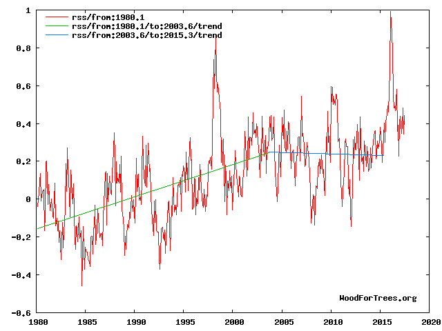
For the current situation see Fig 4
Fig 4. RSS trends showing the millennial cycle temperature peak at about 2003 (14)
Figure 4 illustrates the working hypothesis that for this RSS time series the peak of the Millennial cycle, a very important “golden spike”, can be designated at 2003.
The RSS cooling trend in Fig. 4 was truncated at 2015.3 because it makes no sense to start or end the analysis of a time series in the middle of major ENSO events which create ephemeral deviations from the longer term trends. By the end of August 2016, the strong El Nino temperature anomaly had declined rapidly. The cooling trend is likely to be fully restored by the end of 2019.
.
There is a great deal I could say in response to other comments, but I will focus on the article.
I have a problem with the way people make free use of scientists’ data in order to disparage climate scientists without even bothering to add a citation, as the NOAA data website requests. The internet is filled with statistician wannabes using Excel to play with others’ data and making lots of pretty graphs
It is a violation of the t-test if the data are not normally distributed. Are they? Did you test for that? I thought when it came to using a t-test for regressions, it was to test whether the regression slope is different from zero, not from another regression, especially one that isn’t independent of the ones being tested. Or are you testing which of the values (representing regressions) in the population of values is different from a “zero” that is actually the slope of the regression line for the whole period? Are you sure the t-test is meant for that, or for whatever it is you’re testing????
According to your analysis, in all but two 10-year-intervals there was an overall warming trend. Is that really true?. Your graph simply shows there was variation in positive rate of an overall warming trend. Who would deny that but “deniers”?
The reason that some scientists are so interested in the “hiatus” isn’t because it upset their ideas of what they think should happen, but because they want to understand it in order to be able to use that understanding for research, from theory to data handling to predictive modeling.
Anyone who uses GISTEMP data should be well-versed about what goes into the dataset. You are not using “raw data,” as so many people insist are the only trustworthy data. Can you explain to these people your decision? Can you also explain to them the ways in which GISTEMP is adjusted, just to get it cleared up? Or perhaps it would be better to guide them directly to a brief synopsis: https://data.giss.nasa.gov/gistemp/ (It has always seemed to me that the people who complain most vociferously about “alteration” of data are the ones that have no idea how it happens or why, and no curiosity to find out.)