Guest Post by Werner Brozek, Excerpts from Des and Edited by Just The Facts

At Dr. Roy Spencer’s site, regular commenter Des posted a very interesting analysis with respect to September 2017 on UAH6 and the Top 10 first-9-months-of-the-year. Des has graciously allowed me to use their work. Everything that appears below is from Des until you see the statement “Written by Des.” below:
Top 10 Septembers on the record:
1. 2017 (+0.54)
2. 2016 (+0.45) … EL NINO
3. 1998 (+0.44) … EL NINO
4. 2010 (+0.37) … EL NINO
5. 2009 (+0.27) … EL NINO
6. 2005 (+0.25) … EL NINO
7. 2015 (+0.25) … EL NINO
8. 1995 (+0.22) … EL NINO
9. 2012 (+0.22)
10. 2013 (+0.22)
2017 0.32 above 2nd highest non-El-Nino-affected September.
Top 10 first-9-months-of-the-year:
1. 1998 (+0.558) … EL NINO
2. 2016 (+0.554) … EL NINO
3. 2010 (+0.394) … EL NINO
4. 2017 (+0.342)
5. 2002 (+0.241) … EL NINO
6. 2015 (+0.217) … EL NINO
7. 2005 (+0.204) … EL NINO
8. 2007 (+0.199)
9. 2014 (+0.159)
10. 2003 (0.157)
Highest non-El-Nino-affected year by 0.143.
Average for last 5 years (Oct 2012 – Sep 2017): +0.278
Average for “last 5 years” at same point after 97-98 El Nino
(Oct 1994 – Sep 1999): +0.106
When I wrote “EL NINO”, it was not necessarily an El Nino month. There is a 4-6 month lag between ENSO events and their associated anomalies. The months marked “EL NINO” are either an El Nino month or they fall within that lag period.
Written by Des
———
The general expectation is that La Nina years are cooler than average; El Nino years are warmer than average; and that ENSO neutral years are in between. The year 2017 has been an ENSO neutral year all year. On top of that, the last five months of 2016 were week La Nina months, so there is no carry over from 2016 to help explain 2017. A single hot month may be just a fluke, however as Des showed above, the first nine months of 2017 were also much higher than expected for a neutral ENSO. The numbers are puzzling to me. Do you have any thoughts as to why September was so warm and/or why the first nine months of 2017 were so warm?
In the sections below, we will present you with the latest facts. The information will be presented in two sections and an appendix. The first section will show for how long there has been no statistically significant warming on several data sets. The second section will show how 2017 compares with 2016, the warmest year so far, and the warmest months on record so far. The appendix will illustrate sections 1 and 2 in a different way. Graphs and a table will be used to illustrate the data.
Section 1
For this analysis, data was retrieved from Nick Stokes’ Trendviewer available on his website. This analysis indicates for how long there has not been statistically significant warming according to Nick’s criteria. Data go to their latest update for each set. In every case, note that the lower error bar is negative so a slope of 0 cannot be ruled out from the month indicated.
On several different data sets, there has been no statistically significant warming for between 0 and 23 years according to Nick’s criteria. Cl stands for the confidence limits at the 95% level.
The details for several sets are below.
For UAH6.0: Since September 1994: Cl from -0.010 to 1.778
This is 23 years and 1 month.
For RSS4: Since May 2009: Cl from -0.037 to 7.997 This is 8 years and 4 months.
For Hadcrut4.5: The warming is statistically significant for all periods above five years.
For Hadsst3: Since May 2001: Cl from -0.002 to 2.563 This is 16 years and 4 months.
For GISS: The warming is statistically significant for all periods above five years.
Section 2
This section shows data about 2017 and other information in the form of a table. The table shows the five data sources along the top and other places so they should be visible at all times. The sources are UAH, RSS, Hadcrut4, Hadsst3, and GISS.
Down the column, are the following:
1. 16ra: This is the final ranking for 2016 on each data set. On all data sets, 2016 set a new record. How statistically significant the records were was covered in an earlier post here: https://wattsupwiththat.com/2017/01/26/warmest-ten-years-on-record-now-includes-all-december-data/
2. 16a: Here I give the average anomaly for 2016.
3. mon: This is the month where that particular data set showed the highest anomaly. The months are identified by the first three letters of the month and the last two numbers of the year.
4. ano: This is the anomaly of the month just above.
5. sig: This the first month for which warming is not statistically significant according to Nick’s criteria. The first three letters of the month are followed by the last two numbers of the year.
6. sy/m: This is the years and months for row 5.
7. Jan: This is the January 2017 anomaly for that particular data set.
8. Feb: This is the February 2017 anomaly for that particular data set, etc.
16. ave: This is the average anomaly of all available months.
17. rnk: This is the 2017 rank for each particular data set assuming the average of the anomalies stays that way the rest of the year. Of course they may not, but think of it as an update 45 minutes into a game.
| Source | UAH | RSS4 | Had4 | Sst3 | GISS |
|---|---|---|---|---|---|
| 1.16ra | 1st | 1st | 1st | 1st | 1st |
| 2.16a | 0.511 | 0.737 | 0.798 | 0.613 | 0.99 |
| 3.mon | Feb16 | Feb16 | Feb16 | Jan16 | Feb16 |
| 4.ano | 0.851 | 1.157 | 1.111 | 0.732 | 1.34 |
| 5.sig | Sep94 | May09 | May01 | ||
| 6.sy/m | 23/1 | 8/4 | 16/4 | ||
| Source | UAH | RSS4 | Had4 | Sst3 | GISS |
| 7.Jan | 0.325 | 0.578 | 0.739 | 0.484 | 0.97 |
| 8.Feb | 0.382 | 0.661 | 0.845 | 0.520 | 1.12 |
| 9.Mar | 0.225 | 0.563 | 0.873 | 0.550 | 1.13 |
| 10.Apr | 0.272 | 0.544 | 0.737 | 0.598 | 0.93 |
| 11.May | 0.441 | 0.628 | 0.659 | 0.564 | 0.88 |
| 12.Jun | 0.213 | 0.486 | 0.640 | 0.540 | 0.70 |
| 13.Jul | 0.286 | 0.594 | 0.653 | 0.540 | 0.81 |
| 14.Aug | 0.407 | 0.713 | 0.715 | 0.606 | 0.84 |
| 15.Sep | 0.540 | 0.841 | 0.561 | 0.436 | 0.80 |
| 16.ave | 0.343 | 0.623 | 0.711 | 0.535 | 0.91 |
| 17.rnk | 3rd | 2nd | 3rd | 3rd | 2nd |
| Source | UAH | RSS4 | Had4 | Sst3 | GISS |
If you wish to verify all of the latest anomalies, go to the following:
For UAH, version 6.0beta5 was used.
http://www.nsstc.uah.edu/data/msu/v6.0/tlt/tltglhmam_6.0.txt
For RSS, see: ftp://ftp.ssmi.com/msu/monthly_time_series/rss_monthly_msu_amsu_channel_tlt_anomalies_land_and_ocean_v03_3.txt
For Hadcrut4, see: http://www.metoffice.gov.uk/hadobs/hadcrut4/data/current/time_series/HadCRUT.4.5.0.0.monthly_ns_avg.txt
For Hadsst3, see: https://crudata.uea.ac.uk/cru/data/temperature/HadSST3-gl.dat
For GISS, see:
http://data.giss.nasa.gov/gistemp/tabledata_v3/GLB.Ts+dSST.txt
To see all points since January 2016 in the form of a graph, see the WFT graph below. Note that it shows RSS3.

As you can see, all lines have been offset so they all start at the same place in January 2016. This makes it easy to compare January 2016 with the latest anomaly.
The thick double line is the WTI which shows the average of RSS, UAH, HadCRUT4.5 and GISS.
Appendix
In this part, we are summarizing data for each set separately.
UAH6.0beta5
For UAH: There is no statistically significant warming since September 1994: Cl from -0.010 to 1.778. (This is using version 6.0 according to Nick’s program.)
The UAH average anomaly so far is 0.343. This would rank in third place if it stayed this way. 2016 was the warmest year at 0.511. The highest ever monthly anomaly was in February of 2016 when it reached 0.851.
RSS4
For RSS4: There is no statistically significant warming since May 2009: Cl from -0.037 to 7.997.
The RSS average anomaly so far is 0.623. This would rank in second place if it stayed this way. 2016 was the warmest year at 0.737. The highest ever monthly anomaly was in February of 2016 when it reached 1.157. (NOTE: In my last report, I used TTT by mistake. I apologize for that.)
Hadcrut4.5
For Hadcrut4.5: The warming is significant for all periods above five years.
The Hadcrut4.5 average anomaly for 2016 was 0.798. This set a new record. The highest ever monthly anomaly was in February of 2016 when it reached 1.111. The HadCRUT4.5 average so far is 0.711 which would rank 2017 in third place if it stayed this way.
Hadsst3
For Hadsst3: There is no statistically significant warming since May 2001: Cl from -0.002 to 2.563.
The Hadsst3 average so far is 0.535 which would rank 2017 in third place if it stayed this way. The highest ever monthly anomaly was in January of 2016 when it reached 0.732.
GISS
For GISS: The warming is significant for all periods above five years.
The GISS average anomaly for 2016 was 0.99. This set a new record. The highest ever monthly anomaly was in February of 2016 when it reached 1.34. The GISS average so far is 0.91 which would rank 2017 in second place if it stayed this way.
Conclusion
The RSS4 numbers are very close to the UAH6 numbers in terms of the September ranking and yearly ranking. To have the warmest September in an ENSO neutral year that is warmer than all El Nino years seems odd. Do you have any reasons why this has occured?
(P.S. Thank you very much for all well wishes on my last post!)
Werner I think you have already explained it.
You said
” When I wrote “EL NINO”, it was not necessarily an El Nino month. There is a 4-6 month lag between ENSO events and their associated anomalies.
See SOI at
http://www.bom.gov.au/climate/enso/#tabs=SOI
Global temperatures tend to lag the SOI by about 4-6 months.
This graph shows the SOI within El Nino range for parts of May through July. This would explain temperatures high temperatures from Sept- Nov. I would anticipate a rapid cooling from end January 2018 on. Maybe extreme cold end March into April.
It is not possible to understand what is going on unless we start by knowing where earth is relative to the natural millennial and 60 year cycles . See Figs 1 – 12 at
https://climatesense-norpag.blogspot.com/2017/02/the-coming-cooling-usefully-accurate_17.html.
For practical purposes we are still vey close to the peak of the millennial cycle and even small EL Nino type deviations from the cooling trend which began in 2003/4 will produce temporary high temperatures on top of the overall cooling trend.
That was from Des.
Bit 2015 had much higher ENSO numbers all year, however its October was 0.2 lower than the 2017 October.
September: a series of massive solar flares pointed in earth’s direction and multiple geomagnetic storms.
Also September: an unexpected shift upward in atmospheric temperature recordings (which are based on detecting radiation).
Gee, I wonder what the connection is.
The year in which late spring frosts have caused global wine production to be the lowest since 1945:
https://www.iceagenow.info/france-worst-wine-harvest-since-1945/
And also record ice accumulation in Greenland, early snow and cold in China and eastern USA, anomalous cold in Brazil. Also an Adelie penguin breeding failure due to excessively thick and extensive Antarctic sea ice.
All in a record warm year?
Y e a h R u y y y y t
One wonders what an average year would look like.
@ur momisugly ptolemy2 November 6, 2017 at 3:20 pm
You see, this is what I keep asking myself. All these record cold breakers–skiing way early all over the world–record cold spells down under, early snows all over Europe and Russia… Seems strange that it is a record warm year. It is a bit warmer in AK right now and I’m in AZ–where it was warmer this year–but taken as a whole, I do not understand how it is the warmest. I know that Dr. Spencer has been kind enough to explain it to me before and others on this forum, but it is like something is just out of my reach–something is wrong–and I’m waiting for it to be revealed. Not that worming is bad–I just don’t buy “its the hottest”. And anyway, we know it’s not hotter than the late thirties–
One thing that drives me crazy is we keep accepting the narrative that this is the “hottest” anything –when in fact we know it was in the 30s since the last LIA. If we accept that narrative (post adjustments) we’ve allowed a compromise of the data. And then we are defending a false narrative anyway. Sigh.
Keep in mind we are just talking about satellite data that started in 1979.
All I know is I have to trust the weather men and we’re all gunna fry-
https://www.msn.com/en-au/news/australia/science-says-temperatures-of-more-than-50c-are-coming-to-australia/ar-AAuustA
But apparently you lot are gunna fry a bit later-
“This escalation of warming should be sending alarm bells to all Australians, as Australia is over 10oC hotter than the global average, and there is an upper limit to human tolerance to heat,”
Didn’t the aborigines survive the Holocene Optimum? So why can’t modern Australians survive something LESS HOT?
Equatorial Pacific and the Atlantic gave away a lot of heat into the atmosphere. There is no temperature anomaly in the western Pacific. Similarly, the equatorial Atlantic.
http://www.ospo.noaa.gov/data/sst/anomaly/2017/anomp.11.6.2017.gif
http://www.ospo.noaa.gov/data/sst/anomaly/2017/anomw.11.6.2017.gif
Yup. Compare and contrast with June and July situation.
Mean and anomalous equatorial temperatures
http://www.cpc.noaa.gov/products/analysis_monitoring/ocean/weeklyenso_clim_81-10/wkteq_xz.gif
The cold waters off West Australia and the Bight are of interest, and this blocked high pressure feels like a regional cooling signal.
http://www.bom.gov.au/australia/charts/synoptic_col.shtml
SST Anomaly 7/31/2017
http://www.ospo.noaa.gov/data/sst/anomaly/2017/anomw.7.31.2017.gif
Time series
monthly NINO3.4
http://climexp.knmi.nl/data/ihadisst1_nino3.4a_2017:2017.png
UAH and RSS both were blamed as being “too cold” and the favourite fodder for skeptics and ‘deniers’ alike. Then both changed their algorithms and now appear to be running too warm (as judged from significantly higher anomalies than either GISS or HadCRUt.) This begs a simple but serious question:
If UAH and RSS were deemed unreliable for being out of agreement to the cooler side with other global temperature data sets, why would it be deemed reliable for being out of agreement to the WARMER side of global temperature data sets?
The volume of data in pursuit of an answer, with all the adjustments and patchwork short- to mid-term length proxies, says to me that we really don’t know where we were, where we are, or where we’re going.
But the money is still going to keep on a’flowin’ . . . . . . .
Yep. My point exactly.
Sorry to be the usage N@zi, but misuse of “begging the question” annoys me. That is the name of a logical fallacy, which means assuming that which you intend to demonstrate. The proper word for “begs” in your sentence is “raises”.
If “begging the question” means “assuming that which you then aim to demonstrate”, then it would be hard to find a more fitting description of the whole narrative of AGW.
Climate computer simulations built on the assumption of CO2 warming, show CO2 warming. Therefore CO2 warms, the science is settled.
Ocean floor volcanic activity? What would the lag time be for that to hit the atmosphere and work its way up to where UAH/RSS could detect it?
Do we have any monitors (i.e. ARGO) from that period of time that we can check for any activity at depth?
Just my SWAG 🙂
Another idea just entered my mind. Is there any tracking of water vapour in the atmosphere and has it increased? That too could warm things up substantially.
From the article: “On all data sets, 2016 set a new record.”
How about the data set that includes the 1930’s?
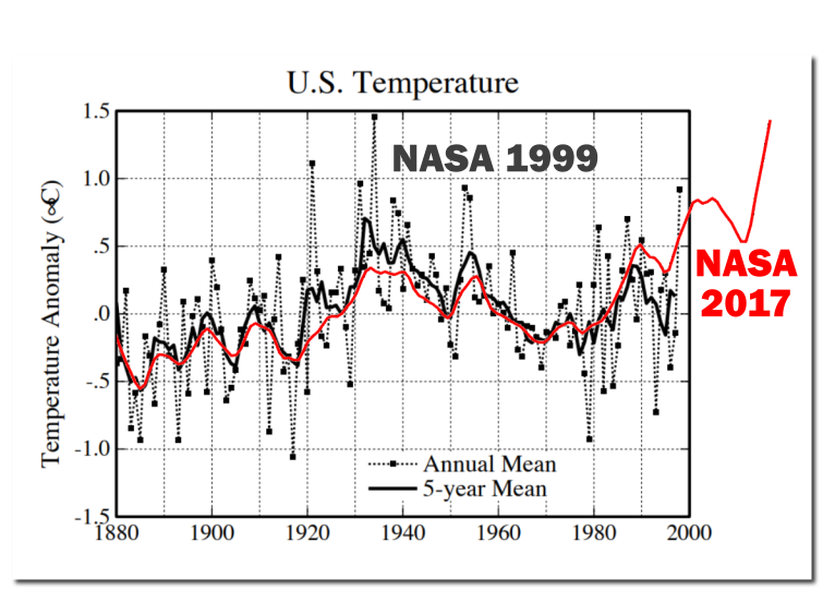
Climate God Hansen shows the 1930’s as 0.5C hotter than 1998, which makes the 1930’s 0.4C hotter than 2016.
The Trump administration just released a new report on the climate that says the 1930’s are still the hottest era in recent U.S. history.
Here’s Climate God Hansen’s 1999 chart showing the 1930’s as 0.5C hotter than 1998:

And here is the unadjusted U.S. chart brought up to date
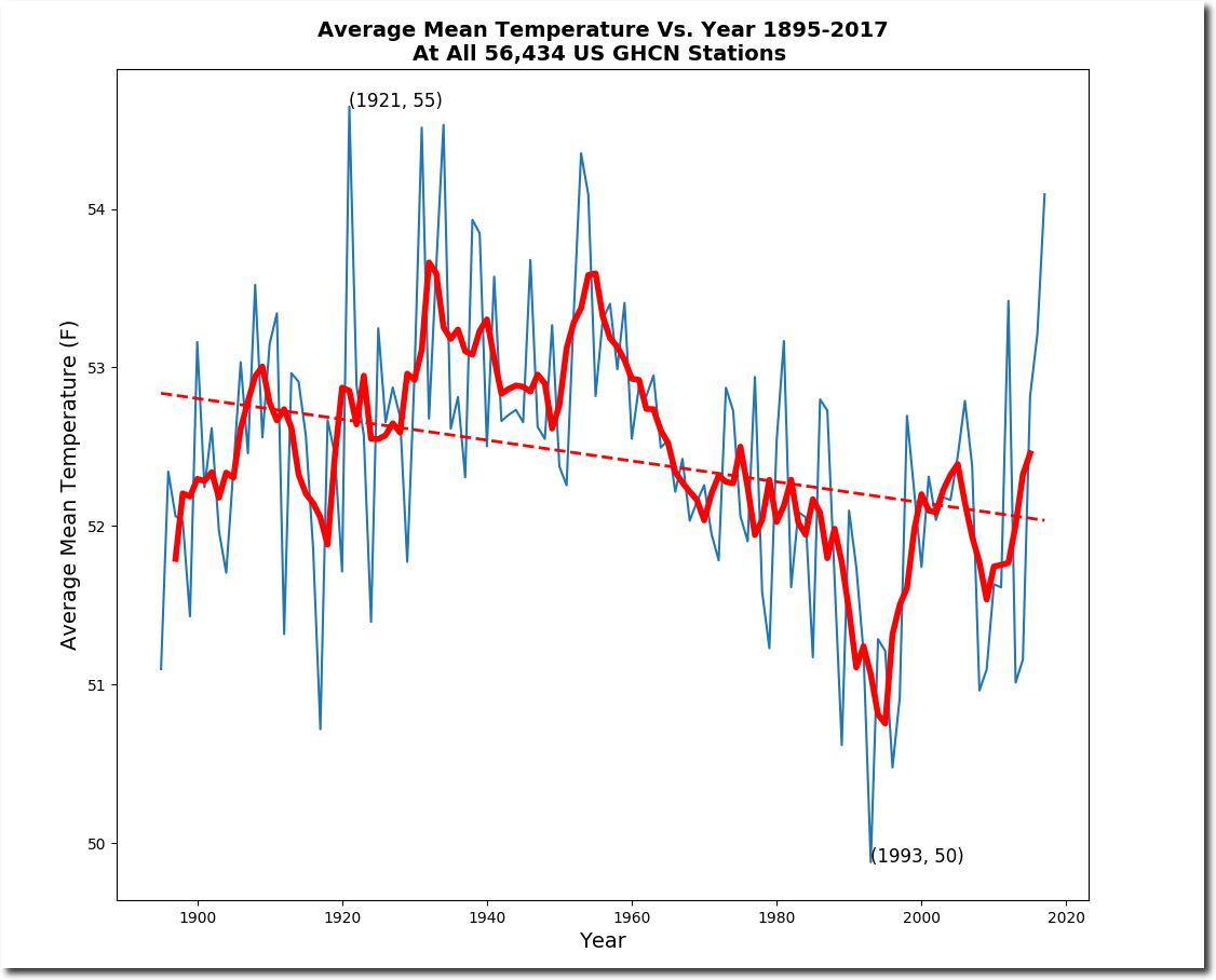
Someone will probably claim the U.S. unaltered chart does not represent the whole world. Wrong!
Granted, the global data sets may have problems, but that is what I went by and not the US data.
Again–my point exactly. The Trump administration is right.
Yes Shelly, did you see the report the Trump administration just released?
..
http://www.npr.org/sections/thetwo-way/2017/11/02/561608576/massive-government-report-says-climate-is-warming-and-humans-are-the-cause
…
You are correct, this report proves your point.
Easy fix remove all the humans 🙂
TA
Not sure when Hansen’s chart dates from. The data looks like it ends in the late 1990s. According to the latest NOAA data, which also appears to be supported by BEST team’s work, the current decade is by far the warmest on record for the lower 48 states. the 2000s were also warmer than the 1930s in the US.
http://oi65.tinypic.com/2n9wbib.jpg
NOAA link: https://www.ncdc.noaa.gov/cag/time-series/us/110/0/tavg/12/12/1895-2017?base_prd=true&firstbaseyear=1901&lastbaseyear=2000
best is not a data set, it is a prediction product. steve mosher will confirm that 🙂
“Not sure when Hansen’s chart dates from.”
It’s from 1999. I have the link to the NASA page it is on, if you are interested.
Here’s Tony’s new chart comparing Hansen’s 1999 chart to the NASA 2017 chart, demonstrating just how much the Climate Charlatans have dishonestly adjusted the historic record in order to make it look like things are getting hotter and hotter with each successive year, when in fact, the 1930’s was hotter than 2016, the year NASA claims was the “hottest year evah!”. The Climate Charlatans have tried to dupe the whole world with their “hotter and hotter” mantra, and have done a pretty good job of it.
WB asks, “Can you explain UAH6 (Sept 2017 anomaly)?”
Yes.
http://www.solen.info/solar/images/solar.png
Not the big jump in F10.7 and sunspot in first half of Sept.
This is why the Lower troposphere (via AMSU and surface readings) produced a T +anomaly while the much higher thermal inertia ocean SSTs kept trending downward.
The sun is now back to behaving itself and settling back into its descent to minimum. No lasting effect of that solar bump other than a 2 month LT-surface anomaly. Cold winter and spring ahead as La Nina’s tightens her grip on the NH.
Now you only have to show how good is the correlation between temperatures and solar F10.7
WB asked for a mechanistic explanation of this current +ive anomaly. Not all historical +ive anomalies.
If there is no short term correlation between temperatures and solar activity, during other episodes of increased solar activity, then the explanation cannot be correct.
Javier,
Of course I know you know the Earth doesn’t have a single temperature.
But when you say “temperatures” that is imprecise.
Temperatures turned into anomalies: AMSU LTs, the highly manipulated surface readings, and ocean SSTs from buoys. All are temperatures (before being made into anomalies). All record something different.
When trop Pacific SSTs are anomalously high, then it is easy to see that (El Nino typically) effect on NH LT temps. The anomaly Septembers are El Nino years, usually.
But when a La Nina is forming and global SSTs are trending downward, but a spike in LT readings occurs, one must look elsewhere for where the heat came from. It didn’t come from some magic atmospheric trace gas.
Enter Mr Sun.
The issue here in Sept-Oct 2017 is the discordance between the jump in LT anomaly and downward trending SSTs during that time.
If there was a relationship between peaks in solar activity and temperature peaks we would know by now.
I will not say you are wrong. But if you are right, why was October even warmer with no spike?
SC24 > one last gasp from an old man.
early Sept. multiple large X-ray events and solar magnetic storms SSN jumped > heating in the upper troposphere and stratosphere.
Like here:
ftp://ftp.swpc.noaa.gov/pub/warehouse/2017/2017_plots/xray/20170912_xray.gif
and here:
ftp://ftp.swpc.noaa.gov/pub/warehouse/2017/2017_plots/xray/20170907_xray.gif
The elevated magnetic activity extended into October. Too brief to bump SSTs. Cooling will resume.
And again, the UAH6 plots are of anomalies, not temperatures.
Looking at Ap Index.
The Ap Index excursion of early Sept 2017 is quite notable:
(all data from: http://wdc.kugi.kyoto-u.ac.jp/kp/ )
September 9, 2017 Ap index had 2 readings over 200 with a 106 average for the day.
data:
20170908 8 5-4+5 8+7+6+5-49- 207 39 32 48 236 154 94 39 106
Some other Ap jumps in SC24.
Mar 09, 2012 had a single value over 200 (87 average for the day):
20120309 5-6+8 7+7-6-3 2+44 39 94 207 154 111 67 15 9 87
And in March 2015, the only day in SC24 with a higher daily avg Ap than 9/9/2017:
20150317 2 5-6-5+8-8-7+8-48 7 39 67 56 179 179 154 179 108
And again in June 2015, 1 reading over 200, daily avg 57:
20150622 1 3+4+3 5-5+8+5+35+ 4 18 32 15 39 56 236 56 57
The Earth had it’s Geomagnetic bell rung in Sept 2017, as big as anything in SC24 to date.
Joelobryan. You are right cooling will resume. As I said above “It is not possible to understand what is going on unless we start by knowing where earth is relative to the natural millennial and 60 year temperature cycles .” See Figs 1 – 12 at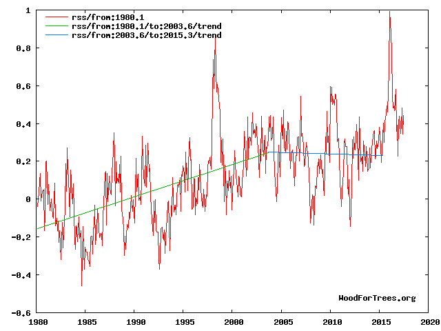

https://climatesense-norpag.blogspot.com/2017/02/the-coming-cooling-usefully-accurate_17.html.”
For practical purposes we are still vey close to the peak of the millennial cycle and even small EL Nino type or solar activity spikes will produce temporary deviations from from the cooling trend which began in 2003/4.
“Fig 4. RSS trends showing the millennial cycle temperature peak at about 2003 (14)
Figure 4 illustrates the working hypothesis that for this RSS time series the peak of the Millennial cycle, a very important “golden spike”, can be designated at 2003/4………..
The RSS cooling trend in Fig. 4 and the Hadcrut4gl cooling in Fig. 5 were truncated at 2015.3 and 2014.2, respectively, because it makes no sense to start or end the analysis of a time series in the middle of major ENSO events which create ephemeral deviations from the longer term trends. By the end of August 2016, the strong El Nino temperature anomaly had declined rapidly. The cooling trend is likely to be fully restored by the end of 2019.”
This 2003/4 temperature peak correlates with the solar activity driver peak in 1991 in Fig 10
Because of the thermal inertia of the oceans there is a 12/13 year delay between the solar activity driver peak and the RSS temperature peak.
For another neat example of the early 21st century inflection point see Fig 11.
For the short term See SOI at
http://www.bom.gov.au/climate/enso/#tabs=SOI
Global temperatures tend to lag the SOI by 4-6 months.
This SOI graph shows the SOI within El Nino range for parts of May through July. which would account for the Aug-Sept -October bump. I would anticipate a rapid cooling from end January on. Maybe extreme cold end March into April
Dr Norman Page
You back up your assertion that a “cooling trend” began in 2003/4 by showing a chart of RSS v4.0 temperatures with a trend line starting 2003.6 and mysteriously ending at 2015.3. I say ‘mysteriously’ because in fact the latest RSS data runs to October 2017 (2017.75), about 2-1/2 years on from your selected end point.
When you run the RSS trend line from 2003.6 to its current latest month you find that, far from showing a “cooling trend”, temperatures have risen at a slightly *faster* rate than they did through the earlier part of the data!
The trend in RSS from 1980.1 (your chosen start date) to 2003.6 is 0.20 C/dec; the trend from 2003.6 to 2017.75 is 0.21 C/dec.
http://oi67.tinypic.com/91l3d0.jpg
So there actually is no ‘cooling trend’ starting in 2003/4 and the only way you can manufacture one is to stop the data 2-1/2 years before its latest monthly value.
note, not “not”
This is just (a little higher than normal) internal climate variability.
This is what my model for UAH (extended back to 1958 using the comparative measure from HadAT). Yes, it is off some, but only by about 0.3C (common enough on a very short-term basis).

What people need to understand is that the AMO, has just jumped to a very high number at +0.436C in October, 2017 which is also a main internal climate variability driver just like the ENSO is.
https://www.esrl.noaa.gov/psd/data/correlation/amon.us.long.data
Even with this blip in Sept/Oct 2017, there is still is very low warming after adjusting for the ENSO, Volcanoes and the AMO. The 0.3C variance is not that uncommon in this record although it is normally +/- 0.2C and does last long at the higher variances.

It is still a ridiculously low warming trend at 0.029C per decade (ENSO and AMO variability people).
Or, as I like to say, the effect of 400 ppm v 280 ppm of CO2 isn’t a pimple on the posterior of natural climate variability.
Control knob, control schnob!
Or, as the late, great Father of Climatology Reid Bryson famously observed, “You can go outside and spit and have the same effect as doubling carbon dioxide.”
He further said, “All this argument is the temperature going up or not, it’s absurd. Of course it’s going up. It has gone up since the early 1800s, before the Industrial Revolution, because we’re coming out of the Little Ice Age, not because we’re putting more carbon dioxide into the air.”
“Drivers of ocean variability off SE Greenland
The comparison of our new SST record with a reconstruction of past changes in total solar irradiance (TSI) (Fig. 3a,b) indicates that episodes of warmer SSTs occurred during periods of low solar activity. It is particularly striking that SST maxima are largely concurrent with the well-known Wolf, Spörer, Maunder and Dalton solar minima of the LIA.”
https://www.nature.com/articles/s41598-017-13246-x?lipi=urn%3Ali%3Apage%3Ad_flagship3_feed%3B6eVTPblGSxi7z1mpaX0IAg%3D%3D
So much ado about ‘random walk’…
I guess I am alone in supporting Janice Moore.
I have seen, as in this days post, that everyone is cheery picking the last few years.
Why????????????????????
We are going through CLIMATE CHANGE!!!!!!!
This takes decade/centuries.
Everyone, take a pill!!!!!!
Remember we are on the decline of temperatures in the Holocene era, soon to go into the next bout of ice age.
We right now are in climate paradise for Pete’s sake.
Enjoy it while you can!!!!!!
Hans
“Soon” is relative. Opinion is sharply divided on upon how soon we’re likely to enter the next glacial phase. Some, like Javier, who consider axial tilt to be the ruling Milankovitch cycle, say something like 3000 years. Others, who favor the eccentricity cycle, think not for some 30,000 years or more, making the Holocene a super interglacial.
Yep, it looks like the AMO. I wonder how BAD is the coverage for that part of the ocean WRT temperature measurements in the non-sat series???
http://www.woodfortrees.org/plot/uah6/from:1980/scale:1/plot/esrl-amo/from:1980/scale:1/plot/hadcrut4gl/from:1980
Let us see what October, November and December bring before getting hysterical.
NH atmospheric pressure rose in late August through September displacing atmosphere and temperature pole ward – look at where the increases are.
The pressure rise was instrumental in producing an increase in cyclone activity.
As an aside my forecast on this site in the size of the Antarctic ozone hole at lower than 2012 levels was correct, and the forecast of global ACE being below mean appears reasonably close.
Dr Ryan Maua’s strong forecast on twitter with a post on WUWT of high imminent hurricane major activity in the Atlantic, which I immediately contradicted also proved to be a good call on my part.
Temperature travels, who would have thought.
Regards
One of the things we notice in Texas is the Southerly wind carrying high moisture Gulf air northward through the state, often going all the way to the canadian border and beyond. We get these from time.
In october UAH reported high temp anomaly between Chicago and the mouth of the St Lawrence. Winding Earth.Nullschool back and reviewing day-by-day total precipitable water for the month, plumes of moist gulf air intersected cold fronts in that area, resulting in record-setting amounts of rain measured over a large swath of land. Heat that entered the air in the Gulf wended its way to much higher latitude in those conditions than it would otherwise.
With meridional jet stream patterns, I think we will see more of this effect from time to time, with gulf heated moist air being ferried farther north than would be occurring during a zonal jet pattern.
I confirm that September and October were wonderful and warm in Waterloo. I wish we could have that every year. In a few days we will have a high for the day below zero, unfortunately. The top to bottom change is 25 degrees in less than a week. Oh well.
Crispin in Waterloo: I have family in your area, who now are ‘enjoying’ the blase of Arctic air, just like you are. How quickly things change.
I was reading an article today, from the end of October, that cites the record-breaking rainfall in Ottawa this year. As of Oct 30, there had been 1218 mm, exceeding the previous yearly accumulation record. That, and there were 2 months yet to go on the calendar.
Some of that came up the Gulf route I mentioned. One storm, though, was a tropical system that just marched North up the North American coast and waltzed right up through your area. I think those sorts of cloud-cover events, and the rain that comes with them, affect avg temps in the months when they occur. Still researching that idea to see how it holds up.
Stay warm!
Mr Brozek, what a waste of time! Satellites don’t measure temperatures, they try , with varying degrees of error to measure atmospheric conditions which are then modeled to infer temperatures. Not content with this , the modelers then attempt to show something they call ‘anomalies’ which are completely incorrectly stated as single numbers as if magically all the error bands around the original data has been removed.
Its garbage, its numerology gone mad.
It is worse than a random walk of numbers, because it incorporates the bias of the modelers.
Nothing is perfect. Can you point me to a better source that lets is see if the lower troposphere is warming or cooling relative to other years?
No offense, Werner, but my take on it is that if we have to parse out hundredths of a degree and argue about UHI and altitude variance for weather stations, then any temperature change is inconsequential and very, very likely to be within the limits of natural variability. I can’t tell the difference between today’s weather and the 1970’s.
A Rapid drop in real surface temperatures because of lower solar radiation could explain it .We should expect winters to be more blocked and dominated by high pressure then they have been in recent years and not look to having mild winters in the coming years, that’s my theory that it is a change in weather patterns .
Water vapor:
http://www.climate4you.com/GreenhouseGasses.htm#Atmospheric water vapor
If the antarctic is 1 degree warmer than usual and the tropics are 1 degree cooler than usual, does that balance out?
If you look at ‘anomalies’ the answer is yes.
But if the antarctic is -60C and goes up to -59C while the tropics went from 35C to 34C there is an enormous difference is the energy of those two changes. What would the graph look like in joule anomalies rather than degree anomalies?
Good question! By the way, I plan my next post to discuss this.
Other than the humidity component of this comparison, which is not defined, why would there be a huge difference in heat content between these two events?
It is the humidity that determines the energy content. Two air masses can have the same temperature changes, but very different enthalpy changes due to different relative humidities.
Specific heat for air at the two temperatures in less than 1% different while the density of the colder air is approx. 60% greater.
Sorry. ?oh=da71b6b9098f9e820c7ac4ad290b9646&oe=5AA478C9
Agung waiting for geomagnetic storm? It is ready for eruption.
They are mining sand near the mountain, that is the signal you see. The break is lunch.
Mac
Werner,
the explanation is that the same shift phenomena as at 1987/1988 and 1997/1998 had happened at 2015/2016 years:
https://www.researchgate.net/publication/319643019_A_staircase_signal_in_the_warming_of_the_mid-20th_century
Please contact me if you have read this comment and interested in details.
Thank you! Bob Tisdale has often mentioned this.
We had two years of warmer than normal Pacific temperatures with a slow onset and continued build up.
It faded and temperatures slowly followed suit and fell but then it did rise again to a small pre El Nino earlier this year causing a new temperature rise.
The Pacific warming has now gone again. The temperatures should drop very shortly if this is the case as there is a lag in warming and cooling.
If it does not drop for November/December everyone will have to take a more critical look at the GHG effect.
This month was a surprise but it is obvious from all the failed warming cooling predictions in the past that we are still very poor at assessing surface ocean heat content and how long it takes to dissipate.
–
Werner,
“Do you have any reasons why this has occurred?”
One as above.
The other is as old as the hills.
Cloud cover and albedo is the major variable that is poorly assessed and is independent from the OHC.
One would suspect that the last 2 months have had less cloud cover to a significant degree with a drop in albedo which would explain the increase in temperature.
This might be checked from satellites or from the back radiance of the earth over the last 2 months neither of which I can do easily.
2 points:
1. The author claims:
This appears wrong. According to BOM there was no La Nina in 2016.
See, their historic ENSO wrap ups http://www.bom.gov.au/climate/enso/wrap-up/archive.shtml
I have read them all, and La Nina was never declared.
2. Irrespective of ENSO conditions, the oceans are still warm, and the satellite appears more sensitive to El Nino than it does to La Nina, the reason for which is not clear but it may well be due to convection. With El Nino conditions the there is increased convection up to the high altitude (approx 14,000 feet) at which the satellite takes its measurements.
richard verney
BOM and NOAA have different thresholds for La Nina (and El Nino) conditions. According to NOAA, conditions during the 3-month averages centred on August to December 2016 all satisfied official La Nina criteria: http://origin.cpc.ncep.noaa.gov/products/analysis_monitoring/ensostuff/ONI_v5.php
SST is but one of a number of parameters that determine whether an event is a La Nina event or not.
Yes, but as you can see from the link, NOAA has deemed the second half of 2016 to have been a period of La Nina conditions, so all such parameters were met.
I went by:
http://www.cpc.ncep.noaa.gov/products/analysis_monitoring/lanina/enso_evolution-status-fcsts-web.pdf