Guest Post by Willis Eschenbach (NOTE UPDATE AT END)
There’s a recent and good post here at WUWT by Larry Kummer about sea level rise. However, I disagree with a couple of his comments, viz:
(b) There are some tentative signs that the rate of increase is already accelerating, rather than just fluctuating. But the data is noisy (lots of natural variation) and the (tentative) acceleration is small — near the resolving power of these systems (hence the significance of the frequent revisions).
(c) Graph E in paper (5) is the key. As the world continues to warm, the rate of sea level rise will accelerate (probably slowly).
This question all revolves around whether the rate of sea level rise is relatively steady, or whether it is accelerating … so how do we tell the difference?
Well, how I do it is to fit two models to the data and see which one works better. The first is a straight-line model (a linear fit), and the other is an accelerating model (a “quadratic” fit). Figure 1 shows an example of some pseudo-tidal data which in fact has an accelerating rate of sea level rise. I’ve created it by simply adding an accelerating trend to an actual tidal record.

Figure 1. Artificial pseudodata of a tidal gauge recording an accelerating rate of sea level rise.
As you can see, the blue line showing an accelerating (quadratic) fit matches the data much better than the linear fit (red). How much better? Well, that’s measured by something called “R-squared” (R^2). This is a value between zero and one which measures how well the given line explains the dataset.
The R^2 for the blue line (0.88 ± 0.02) is much larger than the R^2 for the red line (0.77 ± 0.02). And since the difference between the two values is greater than the sum of the standard errors of the two values, we can say that the difference between them is statistically significant. In other words, in the Figure 1 case, we can say that there is a statistically significant acceleration in the dataset.
So that is what I planned to look at—whether the difference between the R^2 for the linear and the quadratic fits is greater than the sum of their standard errors.
With that as prologue, let me discuss my methods. I took the full tidal dataset from the Permanent Service for Mean Sea Level. It has 1,505 tide station records in it. However, as with most historical datasets, there are lots of gaps and stations with short or spotty records.
So I had to use a subset of the data. Because the long lunar tidal cycle is just over fifty years, you need at least that much data to get a serious estimate of the rate of sea level rise. And we are interested in any recent acceleration. So I limited my analysis to tidal stations with data starting before 1950 and ending after 2015. This cuts the list down to 171 stations which cover the period of interest.
However, some of these are missing a lot of data, some with over half of the data gone. I wanted enough data to have faith in the analysis, so I further limited the dataset to those stations having 95% or more of the data during 1950-2015. This further reduced the number of tidal stations to 63. Figure 2 shows a sample of 10 of these.

Figure 2. Typical records which fit the criteria of the ex-ante data selection process (95% data coverage from 1950-2017)
Now, my Mark 1 Eyeball says that if there is acceleration there, it is minor … but let’s look at the numbers. Here is a scatterplot of the R^2 values of the linear fit versus the R^2 values of the quadratic fit:

Figure 3. Scatterplot, R^2 of the linear fit vs. the R^2 of the accelerating (quadratic) fit. Dots above the diagonal line are stations where the R^2 of the accelerating (quadratic) fit is larger than the R^2 of the linear fit.
As you can see, in almost all cases the gain in the goodness of fit when we go from linear to quadratic fits is trivially small, invisible at this scale. And when I examined the gain in R^2 versus the standard errors for each of the 63 stations, in every single case the accelerating fit was NOT statistically better than the linear fit.
In other words, not one of these datasets shows statistically significant acceleration.
And that is why at the top I said that I disagree with the following statement from the other post, viz:
There are some tentative signs that the rate of increase is already accelerating …
Simply not true. Figure 3 shows clearly that the tidal gauges contain no such “tentative signs”. NOT ONE of these 63 full tidal datasets shows statistically significant acceleration, and more to the point, most of them show only a trivially small difference between acceleration and a simple linear fit.
The other statement I disagreed with was:
As the world continues to warm, the rate of sea level rise will accelerate (probably slowly) …
Look, this is just the same nonsense that the alarmists have been peddling for the last thirty years, that in the future the sea level rise will accelerate, that New York will be underwater, and the like … but it has been thirty years since the first bogus prognostication was made, and there is still no evidence that the sea level rise is accelerating.
Look, I’m all in favor of taking care about the future … however, call me crazy but I need EVIDENCE before I start hyperventilating about Miami sinking into the ocean.
5 PM, the dreaded global warming has cooled down now. Me, I’m going to post this and then go outside to lay some pavers in the new level space I just made with my own sweat. Plus a rented backhoe. I could have hired someone, but why should illegal immigrants have all the fun? I like living in the hills … but this is the first and only flat spot on my land, so I’m making it nice.

What a universe!
Best to everyone,
w.
PS—The Usual: When you comment, please QUOTE THE EXACT WORDS YOU ARE DISCUSSING, so that we can all be clear about your precise subject.
DATA—I’ve put the 63-station data here, as a CSV file so that anyone can use it in Excel or any other program.
[UPDATE] Over at Tamino’s website, where since about 2009 I’m barred from commenting because I was asking inconvenient questions, he points out that there is a simpler and more accurate method for finding out if a dataset contains acceleration. This is to see if the squared term in the quadratic equation is statistically significant after correction for autocorrelation, duh … he is correct.
My thanks to him for pointing this out, although I do have to deduct points for his repeated ad hominem attacks on me in his post … haters gonna hate, I guess.
Using his method I identified seven of the sixty-three stations as having statistically significant acceleration and three stations with statistically significant deceleration. However, the average value of their acceleration is 0.015 ± 0.012 mm/yr2 … which is not statistically different from zero. Here are the stations and their accelerations:
       VLISSINGEN         BALTIMORE            SMOGEN          KEY WEST         KETCHIKAN

           0.0605            0.0542            0.0676            0.0477           -0.0543

WEST-TERSCHELLING        SANDY HOOK            JUNEAU             SITKA         KWAJALEIN

           0.0979            0.0510           -0.1052           -0.0573            0.1258
I note that one station he says has significant acceleration doesn’t appear in this list (Boston). I find that the p-value of the acceleration term for Boston is 0.08, not significant. I suspect the difference is in how we account for autocorrelation. I use the method of Koutsoyiannis, detailed here. I don’t know how Tamino does it.
I would also note that the average acceleration of the entire 63-station dataset is 0.014 ± 0.008, still not statistically significant. And if this turns out to be the long-term acceleration, currently the rate of rise is on the order of a couple of mm/yr, or 166 mm (about 7 inches) by the year 2100. IF this increases at 0.014 mm/yr2, this will make a difference of 48 mm (under two inches) this century.
Curiously, in the previous fifty-year period 1900-1950 there are only three sites with significant acceleration out of 38 datasets covering the period, and none are in the first list:
NEW YORK (THE BATTERY)              HARLINGEN                SEATTLE

                0.0976                -0.1182                 0.0959
Whatever any future sea level acceleration turns out to be, it is very unlikely to put the Statue of Liberty underwater anytime soon …
Man, I love writing for the web. All my errors get exposed in the burning glare of the public marketplace of ideas, I get to learn new things, what’s not to like?
Your more likely to see the water control systems break down and South Florida return to Everglades before the sea swamps Miami
Willis
Typo?
data starting before 1950 and ending after 1915.
Thanks, Ian, fixed.
w.
The Jevrejeva data derived from tide gauges was discussed in a post by David Middleton a few days ago. That data goes back to 1820 and also reports an acceleration.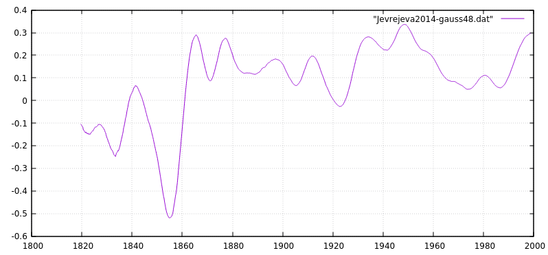
I used a 48 month gaussian filter on the rate of change of mean sea level to remove the short term fuzz.
As Jevrejeva 2014 reports there is an acceleration but it happened BEFORE 1900 and thus had nothing to do with human CO2 etc. In fact, it was almost a step change from decreaseing sea level ( negative change ) to rising sea levels which occurred around 1860.
Jevrejeva 2014 confirms that there is NO acceleration in the 20th century.
So looking at that data we see that if you blinker the analysis suitably ( eg. post 1950 because you are looking human attributable effect, and don’t want to to find anything contrary to that idea, as IPCC does with global temps ) you will find evidence of acceleration.
However, it is abundantly clear that this is no more that the preceding wiggles which can only be attributed to natural causes.
There was a notable ( natural ) acceleration around 1860 but the last 150y has basically being hovering around the same steady rate of rise, oblivious to the alleged effects of AGW, GHE etc.
If we chose to study 1920 – 1950 we can find a deceleration which is probably a little stronger than the later acceleration. There are no grounds for suggesting the later variability is due to human causes.
Since attempts to explain the lack of catastrophic global warming over the last two decades seems to centre on the idea that all the heat is hiding in the oceans, it is BIG problem that the oceans don’t seem to have noticed yet.
This is sea level week (-:
There’s been a flurry of “sea level is accelerating” stories in the “Popular Press” in the last week or so, most cite that the rate of sea level rise has doubled or more since 1970 or thereabouts. Prior history seems to be ignored. So what do long running tide gauges say about the rate for the last several decades?
http://oi66.tinypic.com/1zv7rwg.jpg
The median value shows a tiny increase compared to 1950.
Thanks, Steve, but only seven tide gauges? Put some error bars on the average and you’ll see the problem.
w.
Good job, Mr. Eschenbach. But Steve Case got to the heart of the matter. Yes, you can find acceleration if you take the right interval and the right data set.
But, as Mr. Case recognized, you could have found that much acceleration half a century ago, too–and it was followed by deceleration. In other words, the question isn’t whether there’s been some acceleration. Of course there has been, if you pick the right interval and time scale. The question is whether that acceleration gives us much insight into the future, which is what we’re really concerned with. The answer is no.
‘Twas ever thus. As Mark Twain said over a hundred years ago:
Love the Twain quote, Joe. Thanks! The ‘money’ line: “One gets such wholesale returns of conjecture out of such a trifling investment of fact.” That describes man-made climate change science to a ‘T’.
Despite the obvious flaws, probably still a better rough temperature proxy there than GISS models, too.
What a quandary! Do I side with Willis or Larry?


I’m gonna lean towards not accelerating…
And, it wouldn’t matter if it was…
David these are purportedly from a Liverpool University study, please could you show us the graph from the original paper, as you did in 2008 , The abstract of this 2014 paper stated that the sea level acceleration was calculated to be small 0.02 mm /yr^2.
Also the dip at 1860 does not appear in the Liverpool , Stockholm or Amsterdam data, nor in the data from Jevrejeva in 2008
Your dip states that the sea behaved differently in northern Europe to the rest of the data.Yet you in a post earlier lauded Liverpool as one of the best tidal study group in the world.
Ref SJevrejeva st al Global and Planetary Change vol113, p11 (2014)
“Liverpool” has nothing to do with anything. You keep asking why individual tide gauge stations don’t look like a eustatic sea level reconstruction. That’s like asking why a 2×4 doesn’t look like a house.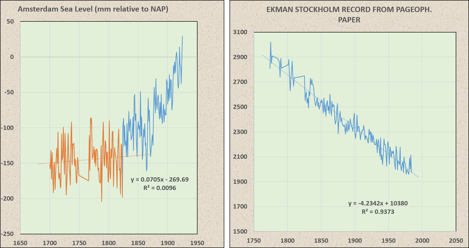
Tide gauges reflect eustatic (water moving up and down) and isostatic (land moving up and down) sea level changes.
A reconstruction of global eustatic sea level is an average of many tide gauges after the isostatic component has been removed.
The tide gauge at Amsterdam shows no sea level trend before 1823, a step-shift up, and then no trend until 1875. Stockholm exhibits a steady 4 mm/yr drop in sea level.
Jevrejeva 2008 looks like this…
http://www.psmsl.org/products/reconstructions/figure1.gif
http://www.psmsl.org/products/reconstructions/jevrejevaetal2008.php
Jevrejeva 2014 looks like this…
http://www.psmsl.org/products/reconstructions/jevrejevaetal2014.php
It’s not *MY* dip. The “dip” is in the reconstruction…
http://nora.nerc.ac.uk/504181/1/1-s2.0-S0921818113002750-main.pdf
Here’s an animated comparison of Jevrejeva 08 and 14…
The pre-1850 error range is large in both reconstructions. The error ranges generally overlap. The difference appears to be in the data selection pre-1850.
If you go to this PSMSL page
http://www.psmsl.org/products/reconstructions/gslGPChange2014.txt
and plot out column “D” from 1861.29 the trend is flat, no acceleration.
Quick & dirty – Here’s what that looks like:
http://oi66.tinypic.com/iz1g2g.jpg
Yep.
Spot on Willis, but that’s not surprising since you usually are !!
Sea levels rose sharply some 12,000 years ago as we
came out of the last ice agebegan using trendy SUV’s. It seems the only way to solve this catastrophic dilemma is to have millions of wind-powered snow making machines create another mile-high glacier over Canada (sorry).Gotta keep the SUV’s though.. Station wagon’s are just so yesterday.
Since the manipulate the land based temperature records, why have they not started manipulating and adjusting the tide gauge records? With terrestrial temperature readings they “adjust” the station data but leave the satellites alone. With sea level measurements they now adjust the satellite measurements but leave the tide gauges alone. It won’t be long before they control all of the data and there will be no sanity check.
The ever upward adjustment of their data is in correlation to their bank accounts.
Having done quite a bit of stats in my time as a undergrad psych, I found two things, guilt is a strong motivator for behaviour change (and I sat through a number of lectures about how guilt could be used to get people to be ‘more green’) and that stats can be massaged to produce a result. Even if you don’t get a statistically significant result, you can always throw in the line that the data is “trending towards significance” and that’ll probably be good enough for people with an agenda to push. Nice to see some numbers here reflecting some cold math and not bias
Forrest, I don’t see the issue. Perhaps you’d see the question clearer if you take a tide station which is decreasing, and you add acceleration to it … you’d get a quadratic curve, but it wouldn’t look like Figure 1.
w.
Forrest Gardener July 20, 2017 at 8:02 pm
No, it’s not “fine”. It means you haven’t explained your point well enough for the other person in the discussion to understand it.
I know that. But once again, I don’t see your point.
Thanks,
w.
Forrest Gardener July 20, 2017 at 8:02 pm
A further note. Forrest, I’m sorry, but an exponential function will not work at all in this application. Inappropriate choice. Think about it. If you can’t say why it won’t work, just ask.
w.
Not everyone thinks so (-:
Paleoclimate Implications for Human-Made Climate Change
James E. Hansen and Makiko Sato
http://www.mahurangi.org.nz/wp/wp-content/uploads/2014/12/Figure-7-v2.jpg
Fig. 7. Five-meter sea level change in 21st century under assumption of linear change (Alley, 2010) and exponential change (Hansen, 2007), the latter with a 10-year doubling time.
Steve Case July 21, 2017 at 3:56 am
The difference is that Hansen is looking at models for global sea level rise, which is known to be increasing. I’m looking at individual tidal records, some of which are decreasing …
w.
Excellent post.
Thanks Willis.
So Willis, you did some sailing. Probably using charts surveyed well over 100 years ago. More likely 200+. So in all that time did you ever see a chart datum corrected for sea level rise? Did you ever see any chart that was obviously wrong due to what you now recognize as sea level rise?
Ferd, interesting question. However, we have a couple of difficulties. First off, older charts are often in fathoms (6 feet, 1.8m) and half fathoms … so if sea level has gone up by 8″ (200 mm) in a century, the general average over the last hundred years, you couldn’t see it on the chart. Lost in the noise.
The second problem is that the old navigators had no exact idea where the zero point of the tide is at their particular location … or where “mean lower low water” (MLLW) is, which is the current zero point. This adds another couple of feet to the uncertainty.
Finally, NOBODY trusts a chart to anything like a fathom. You’d be mad to do so. If the boat draws three feet and the charts say there’s a fathom of water … well, you damn well better keep your eyes open.
So no, I don’t think there has been enough change to invalidate the old charts.
w.
Hi Willis, fathom charts were drawn to the nearest foot for water less than one fathom. It has been my experience they were drawn to a level of accuracy few could duplicate today. Bligh’s charts of Tonga are astounding accurate, drawn in the 1773? While aboard the Bounty.
But what really interested me was drying and awash rocks as we sailed, which are of course extremely dangerous so you pay attention to any errors. The problem is there were none. which suggests sea level rise is a non event.
Thanks, Ferd. Different charts from different countries used different minimum measures. And IF someone stays in one harbor for some months as Bligh did in Tonga, you can take a reasonable guess at MLLW.
But in many instances that was not the case. If you sail into a harbor and you only spend a few days there taking depths, you do NOT know MLLW with any kind of accuracy.
However, I’m still not following the story. Bligh went to Tonga in 1773. We do NOT know what the sea level was then. The PSMSL graph shows a steady decrease in sea level from 1807 to 1860 … is this accurate? We don’t know. What did sea level do from 1773 to 1807? If sea level fell as it fell in the following half century, it would have been about at the level it is today.
But the fact that the sea level in 1773 MIGHT be about the same as it is today does NOT mean that the sea level currently is not rising …
Finally, the idea that Admiralty charts are not adjusted vertically is not correct. With each new printing, they MAY be adjusted to a more accurate datum. Here’s what the Brits say (from a giant PDF not worth downloading):
My point is that we know a lot less than people think about these questions.
w.
I’ve worked one particular field in the Gulf of Mexico for 4 different companies since 1988. Neither the water depth of the platform nor any of the wells drilled from it has changed. Of course, we only measure to the nearest foot… So Gorebal Warming-related sea level rise is below our resolution… 😉
I would expect sailors 200+ years ago could tell you within a foot MLLW. Anything your life depends on you tend to get very good at (those that don’t die). And this applied in spades for those sailors that charted the earth. I expect every sailor appreciates what it is like sailing uncharted waters. The level of skill involved. Even back 15 years, after 20 afloat I routinely predict the change in weather better than our local weather service, without even thinking about it.
ferdberple July 20, 2017 at 7:46 pm
As a lifelong swabbie and a blue-water sailor, I find that doubtful. The problem is that the tide varies radically around the planet. For example, most places have two high tides and two low tides per day.
Then there are other spots with one high and one low tide per day.
And in the Solomon Islands, there are two high and low tides per day for half the year and one high and low tide per day for the other half of the year. Go figure.
This doesn’t even include the question of the “amphidromic points” …
Finally, tidal analysis in Britain didn’t even begin as a formal study until 1867.
So no, with all of that, if you sailed into an unknown port, your errors will not be small. Remember, it’s not just as simple as determining MLLW. You then need to reduce your observations to MLLW … which means that you need the height of the tide at each of your soundings …
Best regards, stay safe on the big ocean,
w.
Also, Forrest, I run by Occams Razor, “Don’t multiply causes unnecessarily”. A cubic equation has one more parameter than a quadratic, which in turn has one more than a linear regress.
THEREFORE, we need to show a SIGNIFICANT difference at each step in complexity to justify taking that step.
And looking at the data, I’m guessing that a cubic equation would NOT meet that test.
w.
I’ll take adjusted r-squared for $1000, Alex.
“With four parameters I can fit an elephant, and with five I can make him wiggle his trunk.” – John von Neumann
“String Theory is just power fitting the Universe.” – Tsk Tsk
Tsk Tsk
+6.022 X 10^^23 & Supersymmetry died at CERN
Forrest Gardener July 20, 2017 at 8:03 pm
Again, yes, but so what?
w.
Forrest Gardener July 20, 2017 at 10:33 pm
Since I’m only interested in the domain that I’m fitting … so what?
I always enjoy it when someone runs out of answers and starts thinking up excuses for not answering. The variety of excuses provided is always good for a laugh …
w.
Forrest, one other comment.
If you think an exponential is a better function to use than a quadratic, how about you ACTUALLY USE IT ON THE DATA THAT I GAVE YOU and post your results here. That way we can see if you actually have a point.
You talk the talk … but can you walk the walk? So far, you’re all hat and no cattle.
And before you start the project, you might consider the difficulty in fitting an exponential curve to the record for Juneau in Figure 2 …
w.
I have thought that an exponential function is the best choice for acceleration. It`s like putting money in the bank and let it grow (with constant interest). Most scientists talk about exponential growth when it comes to acceleration. So I cannot see why it will not work.
nobodysknowledge July 21, 2017 at 2:12 am
Nobodys, thank for the question. Take a look at the Juneau record in Figure 2, and consider fitting an exponential to that …
w.
Forrest,
Willis said; “If you think an exponential is a better function to use than a quadratic, how about you ACTUALLY USE IT ON THE DATA THAT I GAVE YOU and post your results here. That way we can see if you actually have a point.”
The data is available so show us how an exponential, a cubic, or whatever function you choose has a better fit. Otherwise, what is your point?
So the world authority on sea level rise is in Colorado, about as far from the sea as any place on earth. Pretty much describes the results they generate.
Hmm, have you read this per chance …
“Is the detection of accelerated sea level rise imminent?” doi:10.1038/srep31245
https://www.nature.com/articles/srep31245
Since using their own numbers the mean acceleration is currently negative (and utterly meaningless anyway given the noise) we can presumably safely assume the answer is emphatically no.
I guess we’ll just have to rely on rulers and numerological barking dogs for an opinionated coin flip having first deducted the odd volcano, etc. here and there by whatever dubious means. Meanwhile the world keeps on turning and churning, just as it did yesterday.
http://www.realclimate.org/images//sea_level_rise_vs_temperature.png
The rate of sea level rise is tied to the surface temperature above an equilibrium state temperature. Seeing how global temps have paused, the rate of sea level rise has also paused. The future largely depends on the success of AGW theory. (don’t bet the beach front house on that)…
So what is the quantitative rise or fall in sea level for a temperature change of 1 deg C?
For the 3 cases when that 1 deg C is from satellite microwave, from surface air temperature and from sea temperature.
Why can there not be a simple equation linking rise/ fall to temperature somewhere?
Why cannot the oceans emulate a liquid in glass thermometer?
Geoff
Fonz, the data from the PSMSL disagrees entirely with your graph. It looks like this:

w.
Hi, Willis, graphs like rahmstorf are dime a dozen. Here’s another one albeit much more crude. (rahmstorf is highly smoothed to get what they got) Remember, these are derivative plots, the RATE of sea level rise, not the accumulation there of. i can at least see the rate of accumulation speeding up and slowing down and then up again in your graph. Is that particular data set available in a derivative plot?
Let me know, if possible, where you think rahmstorf (and the rest) might be going wrong here. Thanx…
Thanks, Afonz. The problem is that you get very different answers depending on when and how much you smooth.
Best regards,
w.
Geoff,
That’s a bit difficult to work out.
The oceans are a bit more complicated than liquid in a thermometer.
Varying depths, currents, bits of land that poke out into them, how long it takes to warm up…
First how much ocean are you warming by 1 degree C ..a column of 1 metre, 10metres, 100 metres, 1000 metres, 6000 metres?
It’d take a while to warm up 6000 metres of water by 1 degree C
Here’s a go at it…page 6 is the immediately relevant bit but includes lots of assumptions
[The author admits it’s a very simplistic approach but it gives you an idea of what’s involved]
The calculations suggest a 17cm rise if temperature increases 3 degrees.
http://cosmo.nyu.edu/Shoshana_Sommer.pdf
Greg K
Thanks for he references, though I note I did a Google months ago and found some of same.
Fundamentally, when a photon enters the sea it will change the energy of the sea almost instaneously. In this state, it expand or contracts. If you select a vertical column of water from a larger region of systematic change, that should emulate a LIG thermometer. Mixing, stratification, density, salinity should not really influence this emulation. Therefore, it should be possible to derive said equation linking sea level and temperature changes.
I would have thought this a fundamental equation for oceanography, but despite several searches I have not been able to find that equation. Most papers go straight to Their change with time. I want time out of the equation like it is when you stick a thermometer under your tongue. You do not have to wait hours to your tongue to equilibrate.
The oceans do not have temporary energy storage buffers where the effect of a photon can be stored, hidden, until the ocean works out what to dobwith it.
BTW, I have similar lack of success when I try to find out if oceans cool at night, how fast, and by what mechanism: and the reverse case in daytime.
Geoff
The red curve in Fonz’s graph from Rahmstorf 2007 is based on Church & White (2006), a PSMSL reconstruction… I don’t think any two PSMSL reconstructions have looked alike. Jeverejeva et at, 2014 does indicate local variations in the rate of SLR which could be due to fluctuations in the rate of warming…
The long-term rate since ~1860 has been about 1.9 mm/yr. There have been alternating 20-40 year sequences of ~3 mm/yr and ~1 mm/yr.
Geoff Sherrington July 21, 2017, at 5:31 am
Regarding your question, viz: “So what is the quantitative rise or fall in sea level for a temperature change of 1 deg C?” and your further comment:
Good question, Geoff. Well, yes, the info is there … but it’s a 75-term equation with variables of salinity, temperature, and pressure. See here and here for further details and further links. Since these variables change from the surface downwards, analyzing a water column is not a simple task.
It also explains why the results change over time. Heating goes on at the surface. As the heat spreads and mixes downwards, it sequentially affects waters of different temperature, salinity, and pressure … which have different coefficients of expansion than did the original heated surface water.
Nor is this a difference that makes no difference. Here’s the coefficient of expansion with salinity = 35 PSU, temperature = 35°C, and pressure = 0 dbar (surface).
> gsw_alpha(SA = 35,CT = 35,p = 0)
[1] 0.000367
And here is the same, but with salinity = 34 PSU, temperature = 4°C, and pressure = 100 dbar (about 100m depth).
> gsw_alpha(SA = 34,CT = 4,p = 100)
[1] 0.000101
The coefficient of expansion differs by a factor of three between the two situations.
Sorry, but there’s no simple answer.
Regards,
w.
PS—This is why I program in the computer language R … because there are packages for just about everything. This package is called “gsw”. It provides an interface to the TEOS-10 / GSW (Gibbs Sea Water) library. This contains functions to calculate a whole host of oceanic properties (e.g. enthalpy, freezing temperature, density, latent heat of evaporation) from the underlying variables.
Geoff Sherrington July 20, 2017 at 8:06 pm
If (a big If) MSL has in fact risen 350 mm since 1850, and if (an even bigger If) average global temperature has indeed increased 1.0 degree C since then, then the answer to your question should be about 350 mm.
However the effect is probably not a direct linear relationship, so who knows? Sea level was higher in the past when it was warmer during the Holocene and previous interglacials, with the continents in about their present arrangement, and if prior epochs, periods, eras and eons, when the continents were arranged differently, so there is at least a general relationship.
The high sea level of the Cretaceous however owed to thermal expansion and ridge growth due to rapid sea floor spreading, as well as to the hot and equable climate of that period.
Sea level rise from the depths of the last glacial until the present interglacial is about 130 meters(!) Being generous, if we divide that number by 5C (thought to be the maximum global temperature difference from the last glacial to this interglacial) we get about 25 meters per degree celsius. That means it takes a long time for everything to equilibrate with a change in surface temps…
The world ocean is all connected, and so sea level change in one place is propagated to every other location over some period of time, but how fast does this occur?
At the same time this is occurring, currents are moving water around, as are the tides. And the wind is doing so as well. And all three are doing so in a separate and different and complicated manner, which is constantly changing for every point on Earth and for every second of every day (take a look at a detailed representation of the eddies and curlicues of the Gulf Stream, frinstince).
On top of this, going on at the same time, the Sun is shining on some areas of the ocean, some places brightly and at a direct angle, some places not so brightly and not as direct an angle, and this changes constantly due to clouds and the turning of the Earth, and varies as well by latitude, and the effect of latitude is constantly varying as the Earth proceeds in it’s orbit.
Near Antarctica this time of year, little Sun is hitting the southern ocean, and it is being swept by roaring winds of a cold temperature and varying humidity, which is sucking varying amounts of heat from the water from conduction and evaporation.
Near the Tropic of Cancer, the Sun is shining directly down and strongly warming the Ocean.
So the water is all the time contracting in some places, expanding in others, moving around, mixing up, and swirling hither and yon…and each of this changes is causing the volume and the level of the water to change, and these changes are being propagated outward at some speed or another…which speed probably varies as well.
So…you want an amount of rise or fall of the ocean for a certain change in temp?
Which temp is that?
Is that the average global surface temp?
The one which does not measure enthalpy but just a thermometer reading? Which takes no account of wind? Or anything else. And this temp…is it the fiddled with temp, or the straight reading?
Is there a “true” global average temp, which we would know if we were smarter and less smarmily political and had more thermometers and read them more accurately…or is the entire concept of global temp hokum, as some say it is?
Or are we comparing some local temp with some local sea level?
Plainly, given the above motions and variations, doing such locally would be a fools errand to try and measure.
Theoretically speaking, and all else being equal…is that the basis of the question (How much does the ocean height vary with a certain change in temp?)?
All else is not equal, and never will be on a round planet which is spinning and rotating and warmed on one side and cooled on the other and subject to all manner of jostling and pushing and pulling.
The dance may be too complicated to ever make into a diagram that can be eyeballed and reckoned with at a glance.
http://3.bp.blogspot.com/-euS8dNkoD7g/Uv3LDkxy2TI/AAAAAAAAAso/ObWFGy7BHBI/s1600/DanceSteps.jpg
“Sea level rise from the depths of the last glacial until the present interglacial is about 130 meters(!) Being generous, if we divide that number by 5C (thought to be the maximum global temperature difference from the last glacial to this interglacial) we get about 25 meters per degree Celsius. That means it takes a long time for everything to equilibrate with a change in surface temps…”
There is no equivalence between global average temp and sea level.
At some points in time, water from the oceans is accumulating on land and the ocean falls, and at other points in time, the water frozen onto land is melting, on average, and the volume of the ocean is increasing and presumably sea level is rising.
But wait a second there…we can look at temp reconstructions and see that at some certain “global temperature”, the Earth may be heading towards a glacial maximum and ice is increasing, or heading into and interglacial and ice is melting.
I think that trying to picture the Earth as an idealized cartoon diagram and drawing sweeping conclusions is silly, personally. Too many things are going on in too many places which may or may not be directly correlated or not, and the degree or lack thereof may be changing over time.
Besides…do we actually know if Antarctica and/or Greenland are gaining or losing ice?
Are there some years yes and some years no?
Ya gotta be crazy to think the people who purport to be studying this and telling everyone “the facts” are even able to know, let alone credible enough to believe.
Great analysis
Thanks
I would hazard that the Alarums, are more interested in issues of belief and spirituality than issues of measurement and the portrait of measurement by graph [Chart] (a method of René Descartes [Latin, Renatus Cartesius])!
“(c) Graph E in paper (5) is the key. As the world continues to warm, the rate of sea level rise will accelerate (probably slowly).”
Indeed! And Not! In this statement there is the presumption given without evidence or proof, “As the world continues to warm”.
Evidence shows this presumption false!
Only the Believers and Spiritualist will ignore evidence (i.e. measurement) because their God does not communicate Truth by measurement or Observation. For them “Truth” is revealed! … late at night … in a closet … sitting on a toilet … having sexual intercourse with a same-sex partner … watching a re-run of “Seinfeld” at 04:30 GMT (their way of getting instructions from God before the sun rise)!
But is not … TOPEX POSEIDON … measurement? … the monk cries.
Ah Ha! The “adjustments” … “the adjustments” … to confirm the desired … belief! Belief Must Rule! and Belief will be fed … to appease … Belief!
Belief
JBom –
I would politely ask that you rethink what you’ve said, ’cause a lot of truth has been discerned over the years while sitting on a toilet.
/grin
When a trend is essentially linear as Willis’s analysis indicates, fitting higher order polynomials will produce equations with very small coefficients for the higher order terms (x^2, x^3, …). Often these coefficients will be on the order of 10^-5 or -6. The result is essentially to approximate a simple linear fit.
Forest
Quaint Forest? What an old-fashioned word to use.
A little upset you didn’t pass the Willis test?
Forrest Gardener July 20, 2017, at 8:07 pm
Forrest, it was not obvious from what you wrote that you did understand this issue, and Rick is not a mind reader.
In addition, I and others often write for the lurkers, so I explain things in simpler terms than if it were just you and I discussing the issue. Don’t like it? Well, after your hissy fit … who cares?
TL;DR version? Get a grip, you are currently ruining what up to now was your decent reputation.
w.
Actually, sea level rise is very similar to global warming. Just like temperature, the daily change in sea level height due to orbital mechanics is much greater than any observed effect that might be due to humans.
It is only by removing mathematically the daily and seasonal variations in temperature and sea levels that one can claim that what remains is in any way significant. Otherwise it would be too small to notice.
If a single tree can prove “global” warming, why not a single tide gauge?
http://www.psmsl.org/data/obtaining/rlr.monthly.plots/145.png
Jevrejeva reported in her 2014 article an average rise of 1.9 mm/year/, with an acceleration of 0.002 mmyear/year, using a quadratic equation to get the acceleration. I took her data and verified the 1.9 mm/year, as well as the 0.002 mm/year/year acceleration. (I used a different method, not a quadratic equation but a fit to the first differences, which should give the same answer.) However, the uncertainty of the fit to the first differences was more than half of the value, meaning the acceleration was not significantly different from zero.
https://dl.dropboxusercontent.com/u/75831381/Jevrejeva%20sea%20level%20change.xlsx
I took ALL the tide gauges in the PMSL database and how each individual one changed each year from 1909 to 2009 (recognizing that they come and go.) 30,966 individual annual measurements
What you see is that there GROUPS which are either dropping fast, or rising fast or staying stable. This is glacial isostatic adjustment. Some tide gauges are rising at 12 mms per year and at least one is falling at 12 mms/year (and then some which have eroneous readings and vary too much to be valid).
This means that by simply cherrypicking which tide gauges to use, you can get ANY number you want and any acceleration value you want.
This is what Church and White have always done (a large number of gauges but picked in just the right way and never the same from study to study). The best method is to adjust each individual one for GPS land movement (which appears to be fairly stable) and then use as many as you can and use the same gauges over as long a time as possible.
That is why the only correct sample is the subset of PSMSL that is both long record (>60 years) and diff GPS corrected for vertical land motion. There are about 70 such tide gauges out of about 148 with diff GPS. NH bias, but no reason to think that matters to global SLR given the bathtub effect. They show 2.1-2.2mm/year and most definitely no acceleration.
Use Australia for the SH component. Little to no postglacial land adjustment there, thanks to so little glaciation during the last “ice age”.
“…0.002 mm/year/year acceleration.”
“…meaning the acceleration was not significantly different from zero.”
0.002 millimeters is 2 micro meters. 2 millionths of a meter.
Per year.
Or zero.
Hmmm…
Well just how big is two micrometers?
Can we think of some familiar objects of this size?
Well, a red blood cell is about 2 to 4 times this size…too big.
One wavelength of visible light is between about 1/3 and 2/3s of a micrometer…too small.
A human hair? Varies…are we talking blonds or brunettes? But at an average of 80 micrometers, we are way off anyways.
In any case, a micrometer is a distance too small to see.
Which means it might as well be zero for all the effect it will have on anything real.
But what gets me is this…someone trying to claim, with a straight face, that the body of water pictured below and extending clear around the never still Earth, the change in height of this, over a year, can be discerned to a level comparable to lining up ten virus particles in a row?
http://archive.sailingscuttlebutt.com/photos/04/bigwaves/1.jpg
This is actually pretty funny.
I wonder if it was an intentional joke?
https://youtu.be/i7WWrGxv1eg
Let’s see … if the annual 2 mm rise continues consistent with the last 150 years of data, and the top of the Statue of Liberty is 326 feet above water or 99,365 mm, then best calculation is that it will be under water in 49,683 years if you extrapolate current conditions.
Only problem is that we will be halfway into the next ice age by then with a mile of ice above where Chicago is now, so do not see from where the water could come being locked on land. Maybe you could walk in the cold from Manhattan to Statue of Liberty which would be on a big hill, but also enough time for another species of humans to evolve.
http://lh3.ggpht.com/-xi4vhYwxuGE/UJAZrxRnYHI/AAAAAAAABVI/isS6k-W6Qrk/NewImage.png
And of course the world is not going to continue warming steadily for tens of thousands of years. There will be ups and downs, then descent into the next glacial epoch.
“Killer AGW” activists claim we have defeated the glacial – interglacial oscillation. Endless interglacial. That’s what they purport.
““Killer AGW” activists claim we have defeated the glacial – interglacial oscillation.”
Sounds like UK Chancellor of the Exchequer Gordon Brown’s 2003 claim that he had eliminated ‘Boom and Bust’.
That ended badly…
I always think back to Akasofu’s 2010 temperature graph – if you have an oscillation superimposed on a linear trend – there will be times when it appears that there is acceleration and times that there appears to be a deceleration. The underlying trend is linear, ie not accelerating and sinusoidal, ie not accelerating.
As far as I see – this apears to be the same here, with the sea level data. 75-80 year oscillation superimposed on linear trend.
You would need to extract both those trends to see if there is a significant divergence.
Perhaps it’s at least partly cyclical, so likely not going logarithmic.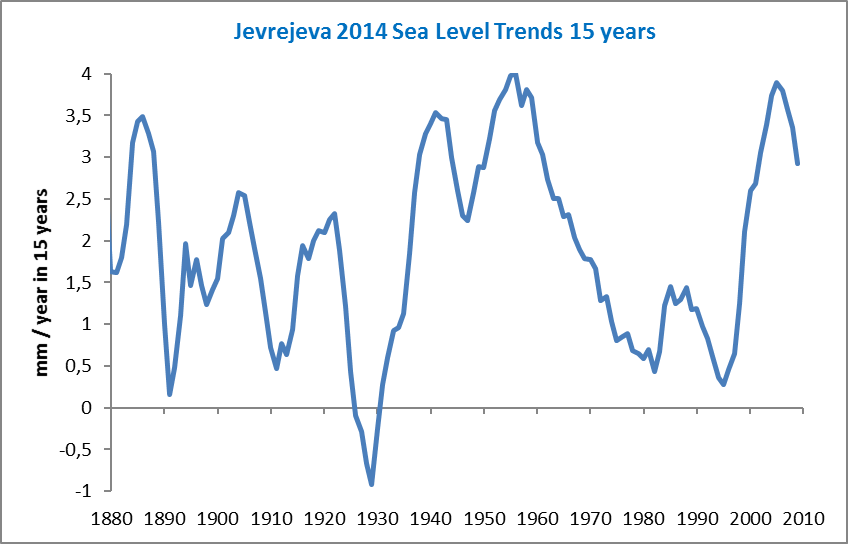 [/img]
[img
how do I add an image/graph to my post?
I’ll have to spell it out because if I use all the bits and parts WordPress tries to make it an image …
I use
img src=”IMAGE_URL” width = “640”
with a “<" at the start of the line and a ” />” at the end of the line. Replace IMAGE_URL with the actual URL of the image.
w.
Mydrrin’s graph …

Also, there is a link to a “Test” page in the bar under the image at the top of every page, where you can test this stuff. It contains info on how to do bold, italic, quotes, and all the rest.
Thank-you.
Sliding averages are a kind of running mean and bear all the same defects: a lot of noise shorter than filter period gets through ( look at all those spikes ) ; spurious peaks and troughs because of on inverted lobes in the filter frequency response.
If you want to filter that data you get a better result with a 48 month guassian. Compare.