Guest Post by Werner Brozek, and Edited by Just The Facts
| Source | UAH | RSS | Had4 | Sst3 | GISS |
|---|---|---|---|---|---|
| JFM17ave | 0.277 | 0.399 | 0.517 | ||
| JFM15ave | 0.215 | 0.334 | 0.423 | ||
| JF17ave | 0.793 | 1.01 | |||
| JF15ave | 0.697 | 0.85 | |||
| diff | 0.062 | 0.065 | 0.096 | 0.094 | 0.16 |
| months | Aug | Sep | Oct | Nov | Dec |
| ENSO16 | -0.6 | -0.8 | -0.8 | -0.8 | -0.7 |
| ENSO14 | 0.0 | 0.1 | 0.4 | 0.5 | 0.6 |
| diff | -0.6 | -0.9 | -1.2 | -1.3 | -1.3 |
ENSO data above from NOAA.
Based upon NOAA’s methodology of defining La Niñas and El Niños, they have concluded that the last five months of 2016 were La Niña months. My understanding is that following on the heels of five La Niña months, anomalies should be below average as there is a certain lag between ENSO numbers and global anomalies. The bottom part of the above table provides ENSO numbers for the five months from August to December of 2016 as well as the ENSO numbers for the five months from August to December of 2014.
Additionally, the differences are provided for each month. Note that all numbers are negative, so the ENSO numbers for the last five months of 2016 were significantly below those of 2014. The top part of the table provides January to March averages for the two satellite data sets and HadSST3 that followed on the heels of the 2014 and 2016 ENSO numbers. As well, the January and February averages are given for two surface data sets. So these numbers are for the years 2015 and 2017. Then the differences are given. Note that all differences are positive! This is exactly the opposite that is expected to happen with the ENSO differences being negative for the preceding five months! What is going on?
Analyzing the numbers further gives more unusual information. The HadCRUT4.5 average for January and February is 0.793. This would set a new record if it stayed this way as it would beat the 0.773 mark for 2016. That is of course ignoring statistical significances for now. As well, the January and February anomalies are the second highest on record. These numbers would normally be expected to follow a very strong El Niño. The 2017 numbers for January and February are even higher than those for 1998 for HadCRUT4.5.
For GISS, the situation is similar. The GISS average for January and February is 1.01. This would set a new record if it stayed this way as it would beat the 0.98 mark for 2016. As well, the January and February anomalies are the second highest on record. The 2017 numbers for January and February are also even higher than those for 1998 for GISS.
The sea surface numbers are a bit more reasonable since 0.517 would put HadSST3 in third place. But even this would normally be expected after a few El Niño months.
The numbers for the satellite data sets are still a bit high, but much better than for the surface data sets. UAH6.0 would rank in fourth place if its three month average were to hold for the whole year. The 2017 numbers for January, February and March are lower than those for 1998, which is what one would expect. RSS would also rank in fourth place if its three month average were to hold for the whole year. The 2017 numbers for January, February and March are also lower than those for 1998, which is again also what one would expect.
In my mind, this brings up the question as to whether or not the criteria for deciding when to declare a La Nina is correct. Should a different part of the ocean be considered? Or should the threshold be lowered to -1.0 C rather than -0.5 C? If you wish, please give your answer to the multiple choice question in the conclusion.
In the sections below, we will present you with the latest facts. The information will be presented in two sections and an appendix. The first section will show for how long there has been no statistically significant warming on several data sets. The second section will show how 2017 compares with 2016, the warmest year so far, and the warmest months on record so far. The appendix will illustrate sections 1 and 2 in a different way. Graphs and a table will be used to illustrate the data.
Section 1
For this analysis, data was retrieved from Nick Stokes’ Trendviewer available on his website. This analysis indicates for how long there has not been statistically significant warming according to Nick’s criteria. Data go to their latest update for each set. In every case, note that the lower error bar is negative so a slope of 0 cannot be ruled out from the month indicated.
On several different data sets, there has been no statistically significant warming for between 0 and 23 years according to Nick’s criteria. Cl stands for the confidence limits at the 95% level.
The details for several sets are below.
For UAH6.0: Since December 1993: Cl from -0.009 to 1.776
This is 23 years and 3 months.
For RSS: Since October 1994: Cl from -0.006 to 1.768 This is 22 years and 5 months.
For Hadcrut4.5: The warming is statistically significant for all periods above four years.
For Hadsst3: Since May 1997: Cl from -0.015 to 2.078 This is 19 years and 10 months.
For GISS: The warming is statistically significant for all periods above four years.
Section 2
This section shows data about 2017 and other information in the form of a table. The table shows the five data sources along the top and other places so they should be visible at all times. The sources are UAH, RSS, Hadcrut4, Hadsst3, and GISS.
Down the column, are the following:
1. 16ra: This is the final ranking for 2016 on each data set. On all data sets, 2016 set a new record. How statistically significant the records were was covered in an earlier post.:
2. 16a: Here I give the average anomaly for 2016.
3. mon: This is the month where that particular data set showed the highest anomaly. The months are identified by the first three letters of the month and the last two numbers of the year.
4. ano: This is the anomaly of the month just above.
5. sig: This the first month for which warming is not statistically significant according to Nick’s criteria. The first three letters of the month are followed by the last two numbers of the year.
6. sy/m: This is the years and months for row 5.
7. Jan: This is the January 2017 anomaly for that particular data set.
8. Feb: This is the February 2017 anomaly for that particular data set if available, etc.
10. ave: This is the average anomaly of all available months.
11. rnk: This is the 2017 rank for each particular data set assuming the average of the anomalies stay that way all year. Of course they won’t, but think of it as an update 10 minutes into a game.
| Source | UAH | RSS | Had4 | Sst3 | GISS |
|---|---|---|---|---|---|
| 1.16ra | 1st | 1st | 1st | 1st | 1st |
| 2.16a | 0.503 | 0.574 | 0.773 | 0.613 | 0.98 |
| 3.mon | Feb16 | Feb16 | Feb16 | Jan16 | Feb16 |
| 4.ano | 0.828 | 0.995 | 1.070 | 0.732 | 1.32 |
| 5.sig | Dec93 | Oct94 | May97 | ||
| 6.sy/m | 23/3 | 22/5 | 19/10 | ||
| 7.Jan | 0.298 | 0.409 | 0.738 | 0.484 | 0.92 |
| 8.Feb | 0.348 | 0.440 | 0.851 | 0.520 | 1.10 |
| 9.Mar | 0.185 | 0.349 | 0.550 | ||
| 10.ave | 0.277 | 0.399 | 0.793 | 0.517 | 1.01 |
| 11.rnk | 4th | 4th | 1st | 3rd | 1st |
| Source | UAH | RSS | Had4 | Sst3 | GISS |
If you wish to verify all of the latest anomalies, go to the following:
For UAH, version 6.0beta5 was used.
http://www.nsstc.uah.edu/data/msu/v6.0/tlt/tltglhmam_6.0.txt
For RSS, see: ftp://ftp.ssmi.com/msu/monthly_time_series/rss_monthly_msu_amsu_channel_tlt_anomalies_land_and_ocean_v03_3.txt
For Hadcrut4, see: http://www.metoffice.gov.uk/hadobs/hadcrut4/data/current/time_series/HadCRUT.4.5.0.0.monthly_ns_avg.txt
For Hadsst3, see: https://crudata.uea.ac.uk/cru/data/temperature/HadSST3-gl.dat
For GISS, see:
http://data.giss.nasa.gov/gistemp/tabledata_v3/GLB.Ts+dSST.txt
To see all points since January 2016 in the form of a graph, see the WFT graph below.
 - 1979 to Present")
As you can see, all lines have been offset so they all start at the same place in January 2016. This makes it easy to compare January 2016 with the latest anomaly.
The thick double line is the WTI which shows the average of RSS, UAH, HadCRUT4.5 and GISS.
Appendix
In this part, we are summarizing data for each set separately.
UAH6.0beta5
For UAH: There is no statistically significant warming since December 1993: Cl from -0.009 to 1.776. (This is using version 6.0 according to Nick’s program.)
The UAH average anomaly so far is 0.277. This would rank in fourth place if it stayed this way. 2016 was the warmest year at 0.503. The highest ever monthly anomaly was in February of 2016 when it reached 0.828.
RSS
For RSS: There is no statistically significant warming since October 1994: Cl from -0.006 to 1.768.
The RSS average anomaly so far is 0.399. This would rank in fourth place if it stayed this way. 2016 was the warmest year at 0.574. The highest ever monthly anomaly was in February of 2016 when it reached 0.995.
Hadcrut4.5
For Hadcrut4.5: The warming is significant for all periods above four years.
The Hadcrut4.5 average anomaly for 2016 was 0.773. This set a new record. The highest ever monthly anomaly was in February of 2016 when it reached 1.070. The HadCRUT4.5 average so far is 0.793 which would rank 2017 in first place if it stayed this way.
Hadsst3
For Hadsst3: There is no statistically significant warming since May 1997: Cl from -0.015 to 2.078.
The Hadsst3 average so far is 0.517 which would rank 2017 in third place if it stayed this way. The highest ever monthly anomaly was in January of 2016 when it reached 0.732.
GISS
For GISS: The warming is significant for all periods above four years.
The GISS average anomaly for 2016 was 0.98. This set a new record. The highest ever monthly anomaly was in February of 2016 when it reached 1.32. The GISS average so far is 1.01 which would rank 2017 in first place if it stayed this way.
Conclusion
What is the most important thing that determines anomalies?
A. Changes in ENSO numbers
B. Changes in the sun
C. Changes in CO2
D. A thumb on the scale
E. Other (Please specify)
What is the most important thing that determines anomalies?
A. Changes in ENSO numbers
E. Other (Please specify) _the calculated anomalies
E: Stadium Wave
To be honest I don’t know how to read this graph:
http://www.wyattonearth.net/images/392_stad_wave.png
Unfortunately Wyatt and Curry only presented data through 2000 from what I see, but as I see it the major global energy waves would have peaked around 1985 on average and have been headed down the last 30 years, thus offsetting AGW. Now the average energy from the Stadium Wave would have bottomed out and be starting on its way back up.
If so, we will have the effects of Stadium Wave + AGW for a couple decades starting soon.
Since I really don’t know what that graph is supposed to be telling us, can someone who understands it lay it out for us?
Also, if anyone knows of an update to the graph, that would be interesting as well.
FYI: The home page for all things Stadium Wave is: http://www.wyattonearth.net/, but there isn’t a lot layman’s updates there in the last 2 or 3 years.
The AMO did not go positive until around 1995 and should remain that way until about 2025. Not sure what your chart is showing but as far as the AMO and its rather large impact on global temperatures, we are still seeing a strong warming influence.
Richard, looking more at the background of the graph, it agrees with you.
== details
I have a lot of respect for Judith Curry. I’ve decided to familiarize myself with the Stadium Wave theory which she has pushed as a potentially important mechanism driving natural variation. The graph is Fig 3 from the 2013 paper:
http://www.wyattonearth.net/images/9Wyatt_Curry_2013_author-version_manuscript.pdf
They show it more clearly in Fig 7 (pg 57), but I don’t see that available standalone on the Internet.
In the 2013 paper they chose to graph ngAMO which is the inverted AMO. As I view the graph, the red diamonds representing ngAMO cross zero around 1991, so a few years before your stated 1995, but not drasically different.
I have read with interest the many comments on recent temperature observations/guesses/estimations/snapshots. Concentrating one’s attention on the most recent values of noisy time series is not necessarily the most reliable method for understanding how the whole series is behaving. I would recommend some patience before committing to “conclusions” in these circumstances. Atmospheric and Sea temperatures have been known to wobble about for reasons not understood. Let’s wait until July before discussing April’s data too seriously.
On the other hand, there is fun in giving our opinions now as to what will happen in the future and then waiting three months to see who was closest to the truth in this matter.
You just gave me an idea for a future post. I could title it “La Nina revisited (Now Includes July and August Data)”. Then I could ask all commenters on this blog post to either defend their comments here or admit they were wrong here.
I think we have to declare the numbers for 2017 are nothing but fake news. 2017 is the first year in maybe the last 25 that on April 11 there are no flowers in Canada or northern US. This was a very long winter and unless they have super hot days in Russia I don’t see how those numbers can be correct. Does anybody from WUWT follow the average flowering time of hyacinths??
I do not claim any expertise but it immediately strikes me as odd that one should assume that the timeline of any natural pattern should be based on the human calendar. Why compare figures for each month in 2014 and 2016. Why should the cycle – if it is a regular cycle in the first place – have a periodicity of a whole number of months? Suppose it is 24.7 months, or 23.6? Good starting point obviously, but if you get strange results shouldn’t that assumption be reviewed?
That is a good point. It just happens to be the case that the last 5 months of 2016 were all La Nina months according to NOAA.
Does any one have the ability to plot the ENSO numbers since 2000 versus RSS on the same graph? It may look interesting!
I haven’t read the comments closely or the post regarding La Niña questions. In Oregon we have a pretty smart fella who serves the agriculture community quite well. Without spending time waffling on cause, he gets right to the meat, telling farmers what to expect in the coming months. And he doesn’t use models.
https://www.oregon.gov/ODA/programs/NaturalResources/Documents/Weather/dlongrange.pdf
Pacific SST and SSTA are definitely different animals…

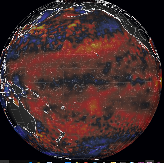
@Phil Salmon April 11, 2017 at 10:34 am and others: 2014-16 was definitely some sort of Modoki, plus the Blob. Two large-ish energy fluxes to space at 3K. It has been noted that the equator is cooling now, overall. Ridiculous claims of boiling at the polar regions are just that, and ignore Holder’s Inequality. By such means are false non-pauses maintained while the real pause was never breached. That is what honest statisticians say. And Mann has just lied again, before gimlet-eyed Texans at the Congressionals. Game is nearly up, sonny boy.
Bob Tisdale showed us how the kelvin waves flow, also charge and discharge sequences. I have been wondering if lowered input would bring that cycle to a near-standstill. That is, long Las Nadas, more or less. Are we seeing this, or could it be starting now?
One item that occured to me, re: the really warm northern winter…
* Reduced Arctic sea ice cover, at or near record low levels means…
* Arctic areas that would normally be covered by ice approx -23C or -33C in winter, instead are open water at approx -3C (the freezing point of salty water).
* Net result is that many areas of the far north are literally experiencing (sea) surface temperatures 20 or 30 Celsius degrees above their normal (ice) surface temperatures.
* thanks to the Stefan-Boltzmann law https://en.wikipedia.org/wiki/Stefan%E2%80%93Boltzmann_law energy is radiated away proportional to the 4th (yes; fourth) power of temperature in Kelvin degrees.
* Methinks Dr. Trenberth is looking in the wrong direction. His “missing heat” is not going down into the oceans, but rather is being radiated away into space. This is not rocket science. Compare heat loss for a bald guy with a tuque, versus the same bald guy without a tuque, outdoors on a really cold day.
You (correctly) identified one heat transfer mechanism (increased long wave radiation to the atmosphere, then into the cold of outer space) that is gretaer for an equal area of open ocean compared to an ice-covered ocean. The open ocean (surface temperature of +1 to +4 degrees C) will radiate more energy that an ice-covered surface that will approximate the air temperatures of -5 deg C to -25 deg C. This increased LW radiation loss occurs over the entire 24 hour day. But the (much-feared) short wave absorption of solar energy occurs during the daylight hours only, and the low solar elevation angles of the summer sun between 6:00 PM and 6:00 AM produce light, but very little heat energy that is absorbed.
But an open ocean will also lose more heat than an ice-covered surface through increased evaporation, through increased convection losses from the wind-blown sea, and through reduced conduction losses (no “insulating” sea ice between the 2 degree ocean water and the -25 degree air.
That then, in a round about way, can be used to explain why GISS is so much higher than all others, namely by how it treats the Arctic. Thank you!
Good point! And we cannot forget the Antarctic also had low ice cover recently.
Werner Brozek
What can be shown is that reduced Antarctic sea ice coverage means increased heat absorption into the Antarctic ocean water nine months of the year, which then flows north towards Chili and Peru and “feeds” the waters off of the more tropical coastal areas measured as El Nino’s.
On the other hand, reduced sea ice in Arctic waters means increased heat losses (8 months of the year) from the now-open Arctic waters, and (slightly) more heat absorbed in Arctic waters 4 months of the year (April, May, June, and July).
So, the question must be opened: Does the sudden decrease in Antarctic sea ice measured in August and September of 2015 “cause” the 2015-2016 El Nino to begin?
Or, once the ice loss begins, does the continued Antarctic ice loss “cause” the 2015-2016 El Nino to increase in intensity and duration?
Or the reverse? Did the increase in tropical surface water heat content “cause” the decrease in ice further south near the Antarctic ocean waters?
I guess that would depend on the direction of the ocean currents down there. And do these ocean currents change during the year?
Werner wrote: “On several different data sets, there has been no statistically significant warming for between 0 and 23 years …”
The absence of statistically significant warming for any period is not evidence FOR COOLING or FOR STATIONARY TEMPERATURE.
For example, mathematicians can’t prove the Goldbach conjecture, which states that every even integer can be written as the sum of two primes. That doesn’t mean that we know of any even integer than can NOT be expressed as the sum of two primes. The absence of proof is not proof of absence. Saying we can’t prove something doesn’t prove anything (except our ignorance about the subject).
The absence of statistically significant warming for a short period of time is evidence of our IGNORANCE about warming OR lack thereof. This ignorance is due to natural variability in climate. If you don’t want to be ignorant, look at warming over the last 40 or more years. It is statistically significant. Werner and WUWT WANT you to be ignorant, so they only tell what we aren’t sure about. That is like teaching your children to add by saying 2+2 is not 5 or less than 100. The statements are factually correct, but not useful for learning.
I beg to differ. It was climate scientists and neither me nor WUWT who came up with the 95% rule for statistical significance. And keep in mind that both Nick Stokes and “skeptical science” come up with very similar numbers here.
E other
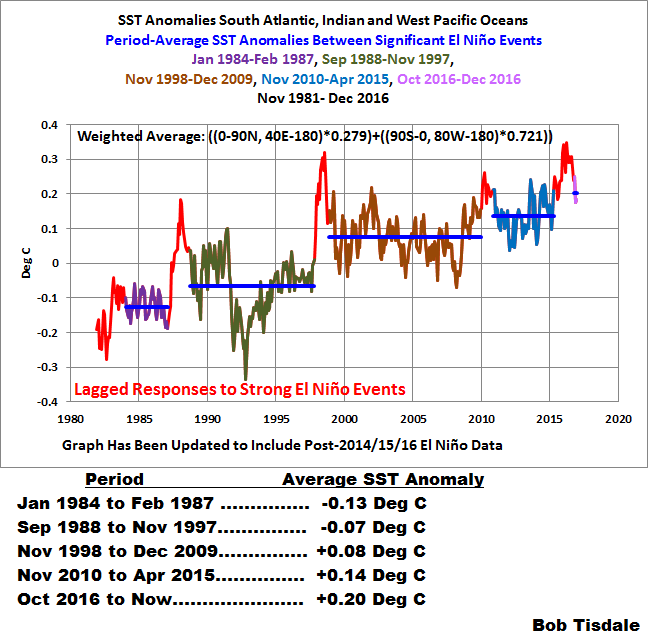
i would refer to Bob tisdale’s magnificent research on el nino. He came with very interesting theories that match the data.
the word Oscillation in ENSO is actually a wrongly chosen word, as la nina is not the opposite of El nino.
In this context the la nina we see does not tip the scale it’s to weak.
you need to look at the “running sum” of El nino and la nina, and this latest el nino did push the last 20 years from equal el nino and la nina to “el nino dominated, thus a new “step rise on the ladder” hence the end of the pause
unlike the PDO or AMO index the heat doesn’t return to it’s original place with ENSO, it starts to linger around in the currents and gyres. the only “uncommon” part is that this hot water of el nino did go predominantly south instead of north.
the low in antarctic ice is the result of that.
here you see the start of that “new step” each huge el nino is marked in red
 ?w=640
What drives the warming of the el nino pool? the sun and changes in cloud cover there.
or in short: a weak nearly noticeable la nina won’t erase a back to back el nino. it would have cancelled out the weak 2014/2015 part only but not the 2015/2016 part.
A strong back to back la nina is the only answer to your equation, if that doesn’t come w’re on step up. so as long as there is no ENSO it will hoover around +0.3-0.4°C anomaly on RSS and UAH.
the big lull in tropical cyclone activity in the south didn’t help a lot to this neither: with an ACE of only 34% of the normal for the whole southern hemisphere the heat release pump didn’t do a good job there this year….
in fact if there won’t be a good strong hurricane there it will be the weakest southern hemisphere season since records begun there….
so that’s also heat that did stay, that didn’t release.
Thank you! You could be right, but that last point is very premature at this time.
when looking at tropical cyclones worldwide it’s too premature to say that, i agree. but not for the southern hemisphere. that cyclone season is in it’s last month. Why is that an important detail in the equation? This el nino was also unusual as most of the warm el nino waters deviated south instead of the usual north-south distribution;;;
i do agree that there is still one month to go in the southern hemisphere, and in that month, we still can have cyclones , but the cold indian ocean and warm southern pacific is generating an unusual wind shear in the southern hemisphere. so the chances are really small this year
but i see 2 main motions in the south: antarctic waters went from colder then normal with sea ice records to suddenly “hot” with record sea ice melt. and then unusually cold waters around first eastern australia which are now west.
all SST loops show that unusual cold patch moving around. in that region, but is it really coming from the antarctic? i would leave that question to someone that is more knowledged in SST and currents, all i know is: it would be interesting to see it investigated.
When I responded to your first comment, I was not aware of your reply to your first comment. What I thought was premature was the “0.20 C from Oct 2016 to now”.
sorry for the missunderstanding. you are right and i forgot to add that too: Bob tisdale also mentioned that this last point on his graph is still in “assumption stage” thus not entirely certain yet because it is too early.
he also uses there the words “it appears we see another uptick” which points to the fact it is a possibility, but not entirely sure yet, that it is only certain after a series of years.
Enso can indeed swing suddenly to a La nina dominated episode of 20-30 years and then we will see it go into a down-slope as then all the el nino heat can be released, and then the uptick will disappear in time or become a downslope
It hapened before from 1945 till 1975. So it can and will happen again in the future, we just don’t know when.
it are very interesting times ahead 🙂
Very true! I wonder what the situation will look like in 4 years when the next U.S. Presidential election is due.