Guest Post by Werner Brozek, Edited by Just The Facts
The table below ranks the warmest ten years according to the five data sets I cover. For each of these ten years, the year is given followed by the average anomaly for that year. In all cases, 2016 set a new record. The year 1998 appears on all five data sets as one of the top ten, but 2008 does not appear on any.
| Source | UAH | RSS | Had4 | Sst3 | GISS |
|---|---|---|---|---|---|
| 1year | 2016 | 2016 | 2016 | 2016 | 2016 |
| 1ano | 0.505 | 0.573 | 0.774 | 0.614 | 0.99 |
| 2year | 1998 | 1998 | 2015 | 2015 | 2015 |
| 2ano | 0.484 | 0.550 | 0.760 | 0.592 | 0.87 |
| diff | 0.021 | 0.023 | 0.014 | 0.022 | 0.12 |
| 3year | 2010 | 2010 | 2014 | 2014 | 2014 |
| 3ano | 0.335 | 0.475 | 0.575 | 0.477 | 0.74 |
| 4year | 2015 | 2015 | 2010 | 1998 | 2010 |
| 4ano | 0.260 | 0.383 | 0.556 | 0.416 | 0.71 |
| Source | UAH | RSS | Had4 | Sst3 | GISS |
| 5year | 2002 | 2005 | 2005 | 2010 | 2005 |
| 5ano | 0.217 | 0.334 | 0.544 | 0.406 | 0.69 |
| 6year | 2005 | 2003 | 1998 | 2009 | 2007 |
| 6ano | 0.199 | 0.319 | 0.536 | 0.395 | 0.66 |
| 7year | 2003 | 2002 | 2013 | 2003 | 2013 |
| 7ano | 0.186 | 0.315 | 0.512 | 0.393 | 0.65 |
| 8year | 2014 | 2014 | 2003 | 2005 | 2009 |
| 8ano | 0.178 | 0.273 | 0.508 | 0.389 | 0.64 |
| 9year | 2007 | 2007 | 2009 | 2013 | 1998 |
| 9ano | 0.160 | 0.252 | 0.506 | 0.376 | 0.64 |
| 10year | 2013 | 2001 | 2006 | 2002 | 2012 |
| 10ano | 0.132 | 0.247 | 0.505 | 0.368 | 0.63 |
| Source | UAH | RSS | Had4 | Sst3 | GISS |
Below the second year of data, I give the difference between the record setting year and the second warmest year for that data set. For the satellite data sets, 1998 is the second warmest year. The others have 2015 as the second warmest year.
The margin of error for the average yearly anomaly is about 0.1. This means that to be statistically significant, the difference must be at least 0.1. As can be seen, only the GISS record is statistically significant meaning there is a greater than 95% that 2016 is the real record. For UAH, RSS, HadCRUT4.5 and Hadsst3, we have a statistical tie between the 2016 record and the second place year. However there is still a greater than 50% chance that 2016 is indeed a record. It is something like 57% for HadCRUT4.5 and about 60% for the other three.
The year 2016 started very warm but cooled off at the end. You may find it interesting where the December anomaly would rank if the December anomaly were to be the 2017 average anomaly. Of course, that will not be the case, but just for the fun of it, here are the rankings using the December anomaly on the later table in conjunction with the table above. UAH would be ranked 5th; RSS would be ranked 13th; HadCRUT4.5 would be ranked 3rd; Hadsst3 would be ranked 4th; and GISS would be ranked 3rd.
In the sections below, we will present you with the latest facts. The information will be presented in two sections and an appendix. The first section will show for how long there has been no statistically significant warming on several data sets. The second section will show how 2016 compares with 2015 and the warmest years and months on record so far. For three of the data sets, 2015 also happens to be the warmest year. The appendix will illustrate sections 1 and 2 in a different way. Graphs and a table will be used to illustrate the data.
Section 1
For this analysis, data was retrieved from Nick Stokes’ Trendviewer available on his website. This analysis indicates for how long there has not been statistically significant warming according to Nick’s criteria. Data go to their latest update for each set. In every case, note that the lower error bar is negative so a slope of 0 cannot be ruled out from the month indicated.
On several different data sets, there has been no statistically significant warming for between 0 and 23 years according to Nick’s criteria. Cl stands for the confidence limits at the 95% level.
The details for several sets are below.
For UAH6.0: Since November 1993: Cl from -0.009 to 1.784
This is 23 years and 2 months.
For RSS: Since July 1994: Cl from -0.005 to 1.768 This is 22 years and 6 months.
For Hadcrut4.5: The warming is statistically significant for all periods above four years.
For Hadsst3: Since March 1997: Cl from -0.003 to 2.102 This is 19 years and 9 months.
For GISS: The warming is statistically significant for all periods above three years.
Section 2
This section shows data about 2016 and other information in the form of a table. The table shows the five data sources along the top and other places so they should be visible at all times. The sources are UAH, RSS, Hadcrut4, Hadsst3, and GISS.
Down the column, are the following:
1. 15ra: This is the final ranking for 2015 on each data set.
2. 15a: Here I give the average anomaly for 2015.
3. year: This indicates the warmest year on record so far for that particular data set. Note that the satellite data sets have 1998 as the warmest year and the others have 2015 as the warmest year.
4. ano: This is the average of the monthly anomalies of the warmest year just above.
5. mon: This is the month where that particular data set showed the highest anomaly prior to 2016. The months are identified by the first three letters of the month and the last two numbers of the year.
6. ano: This is the anomaly of the month just above.
7. sig: This the first month for which warming is not statistically significant according to Nick’s criteria. The first three letters of the month are followed by the last two numbers of the year.
8. sy/m: This is the years and months for row 7.
9. Jan: This is the January 2016 anomaly for that particular data set.
10. Feb: This is the February 2016 anomaly for that particular data set, etc.
21. ave: This is the average anomaly for all twelve months.
22. rnk: This is the final 2016 rank for each particular data set. All five data sets set a record in 2016.
| Source | UAH | RSS | Had4 | Sst3 | GISS |
|---|---|---|---|---|---|
| 1.15ra | 3rd | 3rd | 1st | 1st | 1st |
| 2.15a | 0.261 | 0.381 | 0.760 | 0.592 | 0.87 |
| 3.year | 1998 | 1998 | 2015 | 2015 | 2015 |
| 4.ano | 0.484 | 0.550 | 0.760 | 0.592 | 0.87 |
| 5.mon | Apr98 | Apr98 | Dec15 | Sep15 | Dec15 |
| 6.ano | 0.743 | 0.857 | 1.024 | 0.725 | 1.11 |
| 7.sig | Nov93 | Jul94 | Mar97 | ||
| 8.sy/m | 23/2 | 22/6 | 19/9 | ||
| Source | UAH | RSS | Had4 | Sst3 | GISS |
| 9.Jan | 0.539 | 0.681 | 0.906 | 0.732 | 1.17 |
| 10.Feb | 0.831 | 0.994 | 1.070 | 0.611 | 1.35 |
| 11.Mar | 0.732 | 0.871 | 1.069 | 0.690 | 1.30 |
| 12.Apr | 0.713 | 0.784 | 0.915 | 0.654 | 1.09 |
| 13.May | 0.544 | 0.542 | 0.688 | 0.595 | 0.93 |
| 14.Jun | 0.337 | 0.485 | 0.731 | 0.622 | 0.76 |
| 15.Jul | 0.388 | 0.491 | 0.728 | 0.670 | 0.83 |
| 16.Aug | 0.434 | 0.471 | 0.770 | 0.654 | 0.98 |
| 17.Sep | 0.440 | 0.581 | 0.711 | 0.606 | 0.87 |
| 18.Oct | 0.407 | 0.355 | 0.584 | 0.601 | 0.89 |
| 19.Nov | 0.452 | 0.391 | 0.526 | 0.490 | 0.93 |
| 20.Dec | 0.243 | 0.229 | 0.592 | 0.447 | 0.81 |
| 21.ave | 0.505 | 0.573 | 0.774 | 0.614 | 0.99 |
| 22.rnk | 1st | 1st | 1st | 1st | 1st |
| Source | UAH | RSS | Had4 | Sst3 | GISS |
If you wish to verify all of the latest anomalies, go to the following:
For UAH, version 6.0beta5 was used.
http://www.nsstc.uah.edu/data/msu/v6.0/tlt/tltglhmam_6.0.txt
For RSS, see: ftp://ftp.ssmi.com/msu/monthly_time_series/rss_monthly_msu_amsu_channel_tlt_anomalies_land_and_ocean_v03_3.txt
For Hadcrut4, see: http://www.metoffice.gov.uk/hadobs/hadcrut4/data/current/time_series/HadCRUT.4.5.0.0.monthly_ns_avg.txt
For Hadsst3, see: https://crudata.uea.ac.uk/cru/data/temperature/HadSST3-gl.dat
For GISS, see:
http://data.giss.nasa.gov/gistemp/tabledata_v3/GLB.Ts+dSST.txt
To see all points since January 2016 in the form of a graph, see the WFT graph below.

As you can see, all lines have been offset so they all start at the same place in January 2016. This makes it easy to compare January 2016 with the latest anomaly.
The thick double line is the WTI which shows the average of RSS, UAH, HadCRUT4.5 and GISS.
Appendix
In this part, we are summarizing data for each set separately.
UAH6.0beta5
For UAH: There is no statistically significant warming since November 1993: Cl from -0.009 to 1.784. (This is using version 6.0 according to Nick’s program.)
The UAH average anomaly for 2016 is 0.505. This sets a new record. 1998 was previously the warmest at 0.484. Prior to 2016, the highest ever monthly anomaly was in April of 1998 when it reached 0.743. The average anomaly in 2015 was 0.261 and it was ranked third but will now be in fourth place.
RSS
Presently, for RSS: There is no statistically significant warming since July 1994: Cl from -0.005 to 1.768.
The RSS average anomaly for 2016 is 0.573. This sets a new record. 1998 was previously the warmest at 0.550. Prior to 2016, the highest ever monthly anomaly was in April of 1998 when it reached 0.857. The average anomaly in 2015 was 0.381 and it was ranked third but will now be in fourth place.
Hadcrut4.5
For Hadcrut4.5: The warming is significant for all periods above four years.
The Hadcrut4.5 average anomaly for 2016 is 0.774. This sets a new record. Prior to 2016, the highest ever monthly anomaly was in December of 2015 when it reached 1.024. The average anomaly in 2015 was 0.760 and this set a new record at that time.
Hadsst3
For Hadsst3: There is no statistically significant warming since March 1997: Cl from -0.003 to 2.102.
The Hadsst3 average anomaly for 2016 is 0.614. This sets a new record. Prior to 2016, the highest ever monthly anomaly was in September of 2015 when it reached 0.725. The average anomaly in 2015 was 0.592 and this set a new record at that time.
GISS
For GISS: The warming is significant for all periods above three years.
The GISS average anomaly for 2016 is 0.99. This sets a new record. Prior to 2016, the highest ever monthly anomaly was in December of 2015 when it reached 1.11. The average anomaly in 2015 was 0.87 and it set a new record at that time.
Conclusion
The three hottest years for HadCRUT4.5, HadSST3 and GISS are 2016, 2015 and 2014 in that order. So when people talk about the last three years being the hottest, they are NOT talking about the satellite data. According to the satellite data, 2016 sets a new record with 1998 dropping to second place. However the difference is so small that we could say that 2016 and 1998 are in a statistical tie.
As I indicated in my last post, I had expected HadCRUT4.5 to be very close. As it turned out, HadCRUT4.5 is the only data set of the five that I cover that went up from November to December. The other four went down from November to December. In terms of where December would rank if its anomaly were to hold for 2017, RSS is the odd man out. How long do you think that this will be the case?
Much ado about nothing.
The data under investigation ignores the greater picture.
A small part of the greater picture would address the last 2.6 million years, at least.
One of the big problems is the composition of our data sets.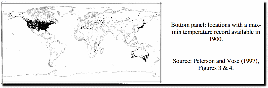
The satellite data has a number of issues (eg orbital drift, sensor degradation, how it converts microwave measurements to temperature) with its main issue being its short duration, and in particular that it does not extend back to cover a known warming period 1920 to 1940 and then a known cooling period 1940 to mid 1970.
the land based thermometer record as compiled is a joke due to the lack of spatial coverage and fact that the precise stations used to assess temperature do not remain constant throughout the time series. They continually change, new stations are added, old stations drop out, there has been a significant change in general composition with more rural stations dropping out, and stations in high latitudes dropping out, and becoming more skewed towards stations which may be impacted by UHI, and in particular airport station data.
It is worth having a look at the collection of data, see the Peterson & Vose paper which shows extant stations going back to 1900:
Look at how little spatial coverage exists in the station siting, and how heavily it is skewed towards the US. Given the skewing towards the US, it is not unreasonable to look at only US data, and when this is done the warmest 10 year period on record is the 1930s/1940 period.
I ought also to have posted a plot showing how the number of stations has fluctuated over the years. The composition of GISS is continually changing.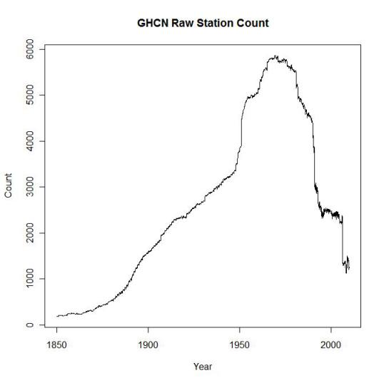
One cannot construct a meaningful time series, as GISS attempts to do so, when the input station data is altering every year. One is never making a like for like comparison from one year to the next.
v’
Way more warmth than change. And not that much warmth.
Or 60 years ago, for that matter. I went through this exercise for Ottawa, where I live, and made a graph from the airport weather station that showed largely a straight line from the 1920s until the 1998 El Nino, then it was about half a degree warmer after that. I haven’t checked the result of the 2015/2016 El Nino yet. So there is definitely no AGW in Ottawa. (El Nino is not anthropogenic.)
As far as I can tell, these adjusted graphs that Nick and GISS come up with do not correspond to any location on our actual planet. Maybe they are from Mars or something.
Sooo, refresh us, again on exactly what equations are used/abused to get from many thousands of point temperature readings are homogenized, extrapolated, interpolated, and digested into these “one true global aggregate” temperatures and temperature “anomalies” (and how the bases were chosen for those anomalies)?
This is what keeps getting forgotten and neglected in the blizzard of daily news…by me, at least (and the same goes for the economic indicators; what is the weighted mean tariff charged on goids and services from the USA, from UK, from EU…? What of “non-tariff barriers”? By how much does the Fed dilute the value of the dollar each day?…).
Bob Tisdale may not answer all of your questions, but go here for a good start:
https://wattsupwiththat.com/2017/01/23/december-2016-global-surface-landocean-and-lower-troposphere-temperature-anomaly-update-with-a-look-at-the-year-end-annual-results/
Thanks, but that appears to discuss only the results after the data have passed through most of the massive digestion process, and what happens when you dink with it a bit more, if you get my drift.
I can only do so much in one post. However below the last post, there is a
Search WUWT:
Search
Punch in whatever you want, such as “GISS base years”. Then press the enter button and see what comes up.
Menicholas on January 27, 2017 at 1:43 pm / Gunga Din on January 26, 2017 at 3:35 pm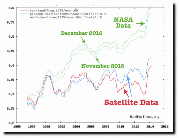
This is the graph as displayed by the Real Climate „Science“:
This the same graph produced by Wood For Trees, after having computed their correct offsets wrt UAH’s climatology for 1981-2010 (RSS land: -0.139; GISS land: -0.533)
http://fs5.directupload.net/images/170128/utg7z352.png
Caution has to be applied here: WFT mentions for GISS land: „extrapolated“, as you can see here on the data source for „Series 3“:
http://www.woodfortrees.org/plot/uah6-land/from:1995/mean:60/plot/rss-land/from:1995/mean:60/offset:-0.139/plot/gistemp-dts/from:1995/mean:60/offset:-0.533
And this is the graph I obtain from the ORIGINAL sources below, without any modification else than shifting the RSS and GISS anomalies by the correct climatology offsets:
http://fs5.directupload.net/images/170128/e83p2lic.jpg
This is not only science, Menicholas: this is what everybody can reproduce by downloading the sources and managing to get them into Excel.
Sources (downloaded January 28, 2017 at 02:30 am MET)
1. RSS land only (column 1: 70S-82.5N):
http://data.remss.com/msu/monthly_time_series/RSS_Monthly_MSU_AMSU_Channel_TLT_Anomalies_Land_v03_3.txt
2. UAH6.0 land only (column 2: Global land):
http://www.nsstc.uah.edu/data/msu/v6.0/tlt/uahncdc_lt_6.0.txt
3. GISS land only:
https://data.giss.nasa.gov/gistemp/tabledata_v3/GLB.Ts.txt
Menicholas: it is not the first time I see graphs originating from that „Science“ site. They were ALL wrong.
Wether it is intention or incompetence I don‘t know.
Gunga Din: in your reply to Menicholas (January 27, 2017 at 2:34 pm), you referred to GISS land+ocean; my answer would have been the same if Menicholas‘ „Science“ graph had reproduced that data instead of the land-only variant.
Guess I wasn’t clear.
Here’s some of TheWayBackMachine’s archived GISS land only.
http://web.archive.org/web/20120601000000*/https://data.giss.nasa.gov/gistemp/tabledata_v3/GLB.Ts.txt
The oldest is Feb, 2012. Just a quick glance shows the value for January, 1880 is -54.
Following the link you provide the value is -90.
Now, maybe I don’t understand how to read the table (very possible), but to this layman it sure looks odd.
What happened to change the value?
How would the 1930’s line up with the “warmest 10 years” using the values from the older tables?
PS If there is something I don’t understand about reading the tables, please tell me. I do not wish to deceive myself.
Gunga Din on January 28, 2017 at 6:19 am
PS If there is something I don’t understand about reading the tables, please tell me. I do not wish to deceive myself.
Gunga Din, you were perfectly clear and understood. And you read and understood the stuff correctly as well.
I would not like to repeat here the investigation undertaken by Nick Stokes whose results you see here (they concern lan+ocean instead of land only but that doesn’t matter):
Let me at least tell you that it makes few sense to always exclusively concentrate on anomalies having been lower / higher at a given period: you must build the sequence of their differences over the entire record and inspect the sequence as a whole.
Below is a chart comparing a plot of the archive dataset with that out of the actual one:
http://fs5.directupload.net/images/170128/4zytokw7.jpg
To the blue plot (archive) and the red one (2016) I added a green one (2016 bit with the archive’s baseline offset). The difference between red and green is due to those corrections which were applied between 1951 and 1980 and thus had as consequence a shift over the entire dataset, as this period is the dataset’s baseline (also proudly named „climatology“, hmmmmh).
I know: the preferred opinion of many skeptics is here that „GISS made the past lower to get the present higher“.
Yes, of course. I’m sooo sure they are all right.
Thank you, Bindidon.
I can’t help but wonder what the numbers were before Hansen got his hands on a keyboard.
And how anyone could think that, if the original numbers aren’t to be trusted, the output from a keyboard would be more trustworthy.
If the original numbers (probably written in pencil) can’t be trusted, why not just admit, “We honestly don’t know.”?
Site stats: 300,279,356 views
Oops, it’s now really time to go to bed here in Europe, but before shutting down I see a little detail!
Congratulations to Mr Watts / Anthony for having silently bypassed the 300,000,000.