by David Rose
New official data issued by the Met Office confirms that world average temperatures have plummeted since the middle of the year at a faster and steeper rate than at any time in the recent past.

Cooling: New Met Office world data shows a big fall from heat spike caused by El Nino this year
The huge fall follows a report by this newspaper that temperatures had cooled after a record spike. Our story showed that these record high temperatures were triggered by naturally occurring but freak conditions caused by El Nino – and not, as had been previously suggested, by the cumulative effects of man-made global warming.
The Mail on Sunday’s report was picked up around the world and widely attacked by green propagandists as being ‘cherry-picked’ and based on ‘misinformation’. The report was, in fact, based on Nasa satellite measurements of temperatures in the lower atmosphere over land – which tend to show worldwide changes first, because the sea retains heat for longer.

It is true that the massive 2015-16 El Nino – probably the strongest ever seen – took place against a steady warming trend, most of which scientists believe has been caused by human CO2 emissions
However, now the drop in temperature is also showing up in the authoritative Met Office ‘Hadcrut4’ surface record, compiled from measurements from more than 3,000 weather stations located around the world on both sea and land.
To the end of October, the last month for which figures have been released, Hadcrut4 had fallen about 0.5C from its peak in the spring.
The reason is the end of El Nino. The natural phenomenon, which takes place every few years and has a huge impact on world weather, occurs when water in a vast area of the Pacific west of Central America gets up to 3C hotter than usual.
It has now been replaced by a weak La Nina, when the water becomes colder than usual. This means temperatures may still have some way to fall.
El Nino is not caused by greenhouse gases and has nothing to do with climate change. It is true that the massive 2015-16 El Nino – probably the strongest ever seen – took place against a steady warming trend, most of which scientists believe has been caused by human emissions.
But when El Nino was triggering new records earlier this year, some downplayed its effects. For example, the Met Office said it contributed ‘only a few hundredths of a degree’ to the record heat. The size of the current fall suggests that this minimised its impact. When February produced a new hot record for that month, at the very peak of El Nino, newspapers in several countries claimed that this amounted to a ‘global climate emergency’, and showed the world was ‘hurtling’ towards the point when global warming would become truly dangerous. Now, apparently, the immediate threat has passed. It would be just as misleading to say lower temperatures caused by La Nina meant the world was into a new long-term cooling.
The Mail on Sunday’s report was picked up around the world and widely attacked by green propagandists as being ‘cherry-picked’ and based on ‘misinformation’
But the big question is: what will happen when both El Nino and La Nina are over and the Pacific water returns to its ‘neutral’, average state?
Professor Judith Curry, of Georgia Tech in Atlanta, who is president of the Climate Forecast Applications Network, said it would take years before it was clear whether the long-term warming trend was slowing down, staying the same or accelerating.
‘The bottom line is that we can’t read too much into the temperatures of a year or two,’ she said. ‘We will need the perspective of another five years to understand what is going on.’
Full story Mail on Sunday, 11 December 2016
But it’s quite okay to ramp up policy and politics in one or two years of data when it’s going up. Got it.
How dare they plot the global Temperature anomaly using 273.15 kelvin as the base period Temperature ??
How the hell are we supposed to compare that to the usual anomalies referenced to the 30 year period starting in 1066.
Well that’s the sorry state of climate science today.
We could be headed below 14.5 deg. C anomaly before Christmas.
G
George… I do not think that is an anomaly-based chart. I think it is an average temp reconstruction chart.
“I think it is an average temp reconstruction chart.”
Well the problem is just that Steve: we don’t actually know what that graph is supposed to be, because there is no reference to the data nor even any indication more specific than “New Met Office world data”.
OH, it’s “world data” . May pass with your average Tory housewife Daily Mail reader but won’t pass muster on an award winning science blog.
So if WUWT is going to reproduce this tabloid crap, can we at least have a proper reference for the data. It actually looks like a quite important change that needs to be communicated far and wide. But I will not be referring to it nor copying a meaningless, non scientific graph to anyone I know. I’d be embarrassed.
Maybe our host could ask David Rose what the data shown is and post a proper attribution.
Replying here to Greg, because WordPress won’t indent any further.
The HadCRUT4 data is available at http://www.metoffice.gov.uk/hadobs/hadcrut4/data/current/time_series/HadCRUT.4.5.0.0.monthly_ns_avg.txt
Here’s monthly data from July 2015 through October 2016. It rises to a peak in February+March 2016, and then drops off
2015/07 0.696
2015/08 0.738
2015/09 0.792
2015/10 0.837
2015/11 0.836
2015/12 1.024
2016/01 0.906
2016/02 1.068
2016/03 1.069
2016/04 0.915
2016/05 0.688
2016/06 0.731
2016/07 0.728
2016/08 0.770
2016/09 0.712
2016/10 0.587
Thanks, I know how to find data once I know what dataset it is.
My point was there is NO indication of what “world data” is being plotted here. Is it land , sea, land + sea … ?
Now we could start guessing by look at the form but that is not the way science is done. Like I said, this may be good enough for a rag like the Daily Mail, but not on a science blog.
Now I congratulate David Rose on give thing some air time in MSM, more power to him. But if I’m going to cite this it needs a proper attribution, preferably on the graph, if not right next to it in a caption.
“However, now the drop in temperature is also showing up in the authoritative Met Office ‘Hadcrut4’ surface record”
If that is the “also” , what was the other one ?!
Reply to Greg December 13, 2016 at 1:43 am
The article mentioned satellite data had previously shown a sharp drop. The 2 best-known satellite data sets are…
* RSS at ftp://ftp.ssmi.com/msu/monthly_time_series/rss_monthly_msu_amsu_channel_tlt_anomalies_land_and_ocean_v03_3.txt
* UAH at http://www.nsstc.uah.edu/data/msu/v6.0/tlt/tltglhmam_6.0.txt
***NOTE*** The UAH URL has changed this month. Ignore the location you see listed in my previous postings here. See Dr. Roy Spencer’s blog post http://www.drroyspencer.com/2016/12/new-location-for-uah-version-6-text-files/
george e smith on December 12, 2016 at 9:32 am
Well that’s the sorry state of climate science today.
Climate science? What climate science? Do you see any of that here? That’s nothing else than worst “Fox News-like” journalism, made by one of these newcomer specialists in solely apparent information, which drops upon analysis down to simple-minded desinformation.
Below is an anomaly based chart with a correct, sharp-lined monthly plot of HadCRUT4 from january 1979 till today:
http://fs5.directupload.net/images/161213/h6sudpbh.jpg
You easily find the “peak-drop” line, it is that from march down to october 2016, with an anomaly difference of 0.482 °C.
But a closer look at the plot should convince anybody that
– around 2007, a very similar drop-down of even 0.666 °C occured from january 2007 till february 2008, and that above all (!)
– nobody actually knows wether or not the actual drop will continue.
Instead of hearing some people shouting
„Temperatures going straight up! Something happens!“
we hear here somebody shouting
„Temperatures going straight down! Nothing happens!“
This kind of sensationalism in whichever direction is nothing else than useless alarmism.
It is in my opinion bare garbage, lots of levels below what WUWT is often enough able to present us, and then is worth a sound debate.
I now have a beautiful nickname in mind: „Plummeting“ Rose.
Yep, and very cold spells are just weather when just a day or so of hot weather is climate change.
Gerry… cold spells occur when the missing atmospheric or oceanic heat has in fact been transported to the bottom of the ocean where it is busy cooking the bottom dwelling crustaceans whose shells have already been dissolved by the highly acidic waters.
It’s a travesty that is beyond debate. It also makes for a great seafood buffet.
Yes, Greg, it would be nice to see the reference to the data. No matter how much one might want to agree with this point of view, it weakens our case to let such bad journalism in the door.
‘But it’s quite okay to ramp up policy and politics in one or two years of data when it’s going up’
It is when it’s simply a pretense to agenda-driven legislation.
+1
Aaack — I thought that was going to appear directly below Resource Guy — sorry. THAT WAS FOR YOU, RESOURCE GUY! 🙂
“El Nino is not caused by greenhouse gases and has nothing to do with climate change.”
This is a bit hyperbolic, I’d say it has “little to do with climate change.”
Or better yet, “little to do with AGW.”
Everything can be linked to climate change…as long as it is a negative!
The word “freak” is a poor choice, too emotional.
The larger spatial extent and precision of tropical Pacific ocean temp monitoring of only the past 40-50 years prevents knowing how much of an outlier event the 15-16 ENSO event really was.
I concur, we wouldn’t want to graft a instrument record onto the end of a proxy series now would we? That would be bad science. Now, putting on the same graph and showing it is a distinct different high-resolution time series plotted beside a low resolution and low pass filtered proxy could be interesting, but not particularly informative.
Amazing how an El Nino, which is a sea surface effect, creates a GLOBAL temperature peak.
The data includes both land and sea surface temperatures.
Maybe just as “amazing” how the burner flame in my forced air HVAC can warm my 2700 sqft home as the air circulates?
Or as “amazing” as a NewEngland oil burning furnance circulating warmed water to radiators throught a home?
Never thought of ENSO/AMO/PDO as a global HVAC system before. What can I say? Amazing.
Well sea surface is perhaps 73% of global surface, and sea surface is in intimate contact with the lower troposphere; AKA “Atmosphere” whereas deep ocean heat storage is not.
But then el nino, is just a very small spot of the total ocean surface, so it is still weird to talk of global effect.
G
The surface energy doesn’t suddenly disappear if by magic over a short time, but is transported away from this area across other regions by ocean circulation. In other words it also warms the atmosphere of regions not just where the ENSO is based on it’s way towards the Arctic ocean for example. The energy involved is much greater than any changes in the atmosphere due to the specific heat capacity of air and water.
@ur momisugly Matt G…and transported by surface winds which is why land temps also warm during an El Nino.
Well Matt G, I didn’t say it would vanish but there is one little Gorilla in your wood pile.
If el nino ocean surface heating is carried everywhere by ocean current, howcome it doesn’t take its elevated surface temperatures along with it.
Or are you saying they are lying to us, and those bright red streaks across the near equatorial region like around the Galapagos for example, are actually transported all over the globe, even into the Atlantic oceans.
Can’t have it both ways. Either el nino locations are warmer surface temperatures than elsewhere or they are not. If they were transporting much heat elsewhere there wouldn’t be much of a temperature gradient to show up as different colors.
G
Which goes to show how ill conceived a global temperature is. Even more ridiculous when you see the spatial distribution of contributing regions to the “anomaly” – it isn’t evenly distributed across the globe at all, so why do we look at a global average?
Few people realize this.
Yes, surface winds play a part.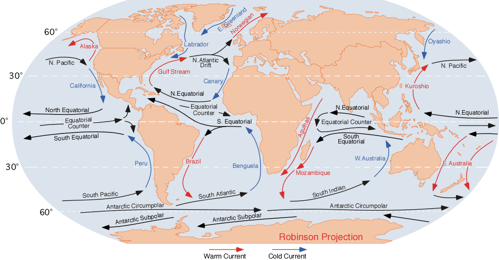
“If el nino ocean surface heating is carried everywhere by ocean current, howcome it doesn’t take its elevated surface temperatures along with it.”
The further away from the sub-tropics and tropics, the less surface area of the planet is able to be affected.
“Or are you saying they are lying to us, and those bright red streaks across the near equatorial region like around the Galapagos for example, are actually transported all over the globe, even into the Atlantic oceans.”
There are 3 main currents which transports ENSO surface energy (~100m depth) or lack off it depending on the phase.
One is the Kuroshio towards the north, the South Equatorial towards the Atlantic ocean and finally East Australia towards the south.
“Can’t have it both ways. Either el nino locations are warmer surface temperatures than elsewhere or they are not. If they were transporting much heat elsewhere there wouldn’t be much of a temperature gradient to show up as different colors.”
The energy source in ENSO regions is always generally much higher than most other regions what ever there anomaly. There is a huge difference to warming water in the top 100m for example at 27c to 31c, than warming say air temperatures on land by -10c to -2c for example near the Arctic circle. Temperature gradients don’t show up the energy gradients, as these are much different and the sub-tropics and tropics cover about 50% of the planets surface. Whenever the current is moving away towards the poles it slowly loses energy with time.
ok this WAS on spaceweather.com until a few hrs ago now superceded
tell me how come they can admit supercold air wipes out ozone layers?
and yet?
never a word prior
its always US and our cfs or whatever they want us to have to replace globall for their agendas n profit!!!
++++++++++++++++++++
“Polar stratospheric clouds are back in the subarctic,” reports photographer Mia Stålnacke. “They were brilliantly beautiful today.”
Icy polar stratospheric clouds (PSCs) form in the lower stratosphere when temperatures drop to around -85ºC. That’s how cold it has to be for ice crystals to form in the very dry stratosphere. High-altitude sunlight shining through tiny ice particles ~10µm across produce the characteristic bright iridescent colors.
“Once seen they are never forgotten,” says atmospheric optics expert Les Cowley. “Polar stratospheric clouds have much more vivid colors than ordinary iridescent clouds, which are very much poor relations and seen frequently all over the world.”
Once thought to be mere curiosities, some PSCs are now known to be associated with the destruction of ozone. Indeed, an ozone hole formed over the UK in Feb. 2016 following an outbreak of ozone-destroying Type 1 PSCs.
“Last winter we had these clouds almost daily for long periods of time,” says Stålnacke. Arctic sky watchers are encouraged to be alert for more in the days ahead. The best time to look is just before sunrise or after sunset
Matt G; apparently my English is not two good.
I completely agree that ocean currents transport water all over the place. You could say that the oceans are well mixed, just like CO2 in the atmosphere.
my problem is that the surface Temperature s in the recognized El Nino regions ARE NOT transported all over the globe.
Either El Nino regions are warmer than other places, or ocean currents distribute El Nino surface heat all over the oceans. it cannot be both. And I don’t see any red streak surface temperatures moving anywhere else.
G
“I completely agree that ocean currents transport water all over the place. You could say that the oceans are well mixed, just like CO2 in the atmosphere.
my problem is that the surface Temperature s in the recognized El Nino regions ARE NOT transported all over the globe.
Either El Nino regions are warmer than other places, or ocean currents distribute El Nino surface heat all over the oceans. it cannot be both. And I don’t see any red streak surface temperatures moving anywhere else.”
The oceans aren’t well mixed at all, but the surface (top 100m) interacts with many channels. Most of the surface energy in the central Pacific ocean is transported around most of the globe eventually, if not all.
The red streak surface temperatures don’t generally move elsewhere in ocean circulation because they are diluted and ENSO only affects these anomalies there. Upwelling of the ocean in the ENSO region during La Nina causes these large anomalies so the energy moving further west is diluted as an anomaly because there is much less upwelling there.
The SST’s below show the warmest region on the planet is the area west of the ENSO, where surface water has moved from NINO 4 and NINO 3 before for example. The ENSO fuels up the surface waters to the west and slowly cools down itself after the process with El Nino.
http://weather.unisys.com/archive/sst/sst-161030.gif
But the oceans have 1000X the heat capacity of the atmosphere…
It is worse than that: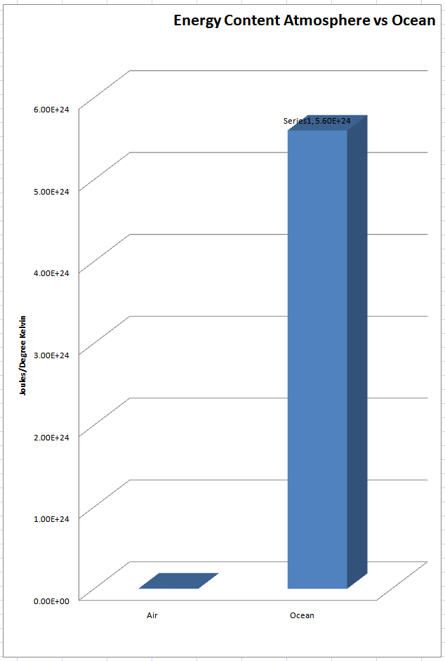
the energy content of the atmosphere is – 1005 *5×1018 kg =5 x10^21 Joules/Degree Kelvin
Energy content of the ocean is – 3993 *1.4×1021 =5.6×10^24 Joules/Degree Kelvin
https://wattsupwiththat.com/2011/04/06/energy-content-the-heat-is-on-atmosphere-vs-ocean/
co2islife, 5.6 x 10^24 is roughly 1000 times greater than 5 x 10^21. So I’m confused by your comment about it being “worse than that.” Yes, 1120 times greater heat capacity is worse than 1000 times, but not that much worse.
Oooops, my bad.
You will also find if you look deep enough that the oceans are warmed from the bottom. If they were not we would be a very cold planet. Check out the amount of what the universe is missing according to those that are supposed to know. It is energy in a different form that circulates thew the entire universe, what we get comes in the poles and out the equatorial regions. That is why tropical waters are so warm, not because of the sun. The world the galaxy and the universe is not as we are told.
Lesson learned – most of the energy In the weather-climate system is in the oceans, not the atmosphere.
Amazing how an unshielded nuclear reactor 93 million miles away makes it rain in Brazil.
Our magnetosphere and our stratospheric ozone layer shield us from high speed protons/nuclei and EUV, respectively. If they didn’t we wouldn’t be having this conversation.
David Rose,
I love facts. Nothing like temperature profiles as facts.
The graphs are not labeled properly for the y-axis. The first graph looks like estimated global average surface air temperature. I am not sure what is in the second graph, but it whatever it is, it does not match the first graph in pattern. It shows the latest month much lower relative to previous months than the first graph. I’m guessing the second graph is estimated land-only surface air temperature anomaly or possibly estimated sea surface temperature anomaly. Did I miss something? Please clarify.
First graph is land/sea avg temp reconstruction. The 2nd is land-only anomaly from RSS satelite data.
Thanks Steve, I think you’re right, but it would be nice if this information was shown directly on the graphs or at least in the test of the post.
Typo: test>text
“it would be nice if this information was shown directly on the graphs”
Rose doesn’t like to burden his readers with information.
“The graphs are not labeled properly for the y-axis. The first graph looks like estimated global average surface air temperature. I am not sure what is in the second graph, but it whatever it is, it does not match the first graph in pattern.”
Compare the year 1998 on both graphs. One is much lower than the other.
Always check where 1998 is on the graph. If 1998 is not equal to 2016 with every year in between lower, then you are looking at a bogus, manipulated temperature chart.
I say 1998 and 2016 are equal but 2016 exceeded the high of 1998 by one-tenth of a degree in Feb. 2016 and then declined ever since, so 1998 and 2016 are for all intents and purposes, tied, and should be essentially the same height on the graph. That makes both years *almost* as hot as it was in the 1930’s, which was reported to be 0.5C hotter than 1998.
See the UAH chart at drroyspencer.com for the real deal. (I keep getting a 403 when I try to access the actual chart page)
“If 1998 is not equal to 2016 with every year in between lower, then you are looking at a bogus, manipulated temperature chart.”
Well, here is UAH6 shown with UAH5.6 (12 month running average, 1981-2010 anomaly base). Is UAH5.6 a bogus, manipulated chart?
“See the UAH chart at drroyspencer.com for the real deal.”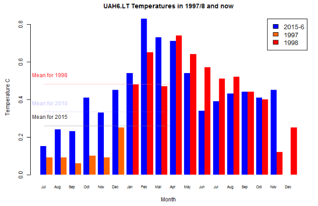
I notice that, with all this beat-up of plummeting temperatures since mid-year, for the first time in ages Roy Spencer’s monthly report for November has not appeared at WUWT. Perhaps because it tells a diffrent story. Here is the monthly 1998/2016 comparison. November is highest since May (June lowest).
Which one is much lower than the other ??
G
“Well, here is UAH6 shown with UAH5.6 (12 month running average, 1981-2010 anomaly base). Is UAH5.6 a bogus, manipulated chart?”
No, it’s not. I did say 2016 was one-tenth of a degree hotter than 1998, so it would show as slightly higher than 1998, which both charts show. The adjustment between the two does not change that, nor my description of what is and is not a bogus chart, specifically that all points in between 1998 and 2016 are lower and as you can see, that is the case on both charts.
““See the UAH chart at drroyspencer.com for the real deal.”
I notice that, with all this beat-up of plummeting temperatures since mid-year, for the first time in ages Roy Spencer’s monthly report for November has not appeared at WUWT. Perhaps because it tells a diffrent story.”
Sounds like you are suggesting some kind of conspiracy, Nick. What exactly is the effect of Dr. Spencer not doing his normal thing on WUWT this last month? Does that change anything? Perhaps there is a non-sinister explanation.
TA on December 12, 2016 at 12:53 pm
Always check where 1998 is on the graph. If 1998 is not equal to 2016 with every year in between lower, then you are looking at a bogus, manipulated temperature chart.
Aha. TA business as usual 🙂
TA, I started from the assumption that you know that UAH – be it 5.6 or 6.0, be it tlt, tmt, tls or ttp – exists in several zonal and regional expressions. One of them is “Tropics”.
Moreover, UAH exists also in 2.5° grid format, out of which you may extract temperature series for an arbitrary region of the Globe between 82.5S and 82.5N.
Maybe the following graph helps you in getting rid of this strange obsession:
http://fs5.directupload.net/images/161215/86mdzjx7.jpg
1. In blue, you see your lovely UAH Globe data, with 1998 already less than 2016 by 0.1 °C (that’s still quite OK for you I guess);
2. In red, you see UAH’s Tropics zone, with 1998 far higher than 2016 (hope you’ll manage to live with it);
3. In green, you see, out of UAH’s grid data, the ENSO area (5S-5N — 170W-120W), where – oh no!!! – 2010 has the cheek to surpass 2016! That’s now definitely too much, isn’t it?
What would you have told us if (2) and (3) hadn’t been extracted out of original UAH, but out of some bogus, horribly manipulated surface temperature data?
Shall we send UAH ENSO data to some punishment park for appropriate reeducation?
The temp of the entire globe drops because of one hot spot in the pacific cools off?
No… NH winter arrived, the No. pacific cool blob developed and other effects.
I didn’t think winter had anything to do with it as these are “anomaly” measurements, am I wrong then?
The Pacific is massive and the Tropic’s drive the entire planets energy flow inward.
Not a small patch
John Boles, that’s what happens when one calculates a “new average” for a number “set” when one (1) [or more] of the numbers in said “set” decreased or decreases.
Iffen one (1) number in the “set” decreases …… and another number in the “set” increases the same amount, …… the “new average” for that number “set” will remain the same.
The average temperature of the globe increased when one large portion of the Pacific warmed up.
The average temperature of the globe then decreases when that same large portion of the Pacific cools back down.
Happens every time there is an El Nino. Perhaps you could read up on it.
Well since all Temperature graphs stop at zero K instead of -infinity, then one should NOT be differencing Temperatures at all, but should be ratio-ing them, since they all follow straight lines to zero K.
Another reason I detest anomalies; they aren’t even meaningful on a scale that as a real zero.
G
The temp of the entire globe drops because of a massive change in climate circulations, of which the most obvious symptom is a hot spot in the pacific, cooling off.
Next thing you will be claiming that a 0.00001% change in CO2 concentration makes a difference.
1) How could you ever have a record drop in temperatures if CO2 was the cause of the warming? CO2 continues higher.
2) Now that the Met Office has confirmed the drop, will all the warmists apologize for attacking the skeptics that were correct?
3) Now, will the warmists accept that the oceans control the atmospheric temperature?
co2islife: re 2) hahahahahahahahahahahahaha
Do soothsayers ever apologize to anyone for being wrong?
What happened to all the heat ? If it dropped that much, that is an enormous amount.
Heat is always being radiated to space.
Remember the high temps in the Arctic recently…. The heat moved their, on its way to space.
@ur momisugly rishrac…I think that “all of that heat” is what caused the warmth over the last 3 months. For example where I live {100 miles inland from the Pacific} this has been the warmest Fall pattern yet. Temps were well above average Sept through November with no freezes. In all of the fall/winter seasons prior to this one over the last 5 Fall seasons, there would be a sharp drop in temps typically by the end of September where temps dropped below freezing for one week or longer. The lowest temp drop went down close to 20F around the 3rd week of September 3 years ago.
In answer to: “What happened to all the heat ? If it dropped that much, that is an enormous amount.”
My Q.: Has anyone got a quantum on this ‘enormous’ amount?
If so, how does that stack-up against AGW Joules (whatever)?
I think the ongoing debate is missing a BIG POINT here … thet AGW is a very small proportion of other energy fluxes at work which have nothing to do with homo sapiens.
PUHLEASE …. tell me!
“Heat” (noun) is NEVER radiated to space. No thermal means of getting it there.
Only EM radiant energy can arrive or leave; not counting the minuscule cosmetic rays and space dust.
G
EM radiation IS heat.
“1) How could you ever have a record drop in temperatures if CO2 was the cause of the warming? CO2 continues higher.”
This question is going to be asked more and more as we go into the future. Assuming the temperatures will continue to decline, which I do. My guess is the aftermath of the 2016 El Nino will look like the aftermath of the 1998 El Nino.
NO NO NO they are preparing us for the coming Ice age. https://www.google.ca/search?q=montreal+snow+storm&biw=1024&bih=514&tbm=isch&tbo=u&source=univ&sa=X&ved=0ahUKEwiIqtbAn-_QAhXRdSYKHeWvBooQsAQITg
El Niño’s are a temporary heating of the atmosphere but lower the overall stored heat in the system (water, air, land). When the air temps drop back after an El Niño where does that heat go? It doesn’t just disappear. It get’s radiated to space and leaves the system.
The unusually strong El Nino may have been hiding global cooling that was occurring. As soon as it diminished a major temperature correction took place. Seems as though the oceans were hiding all the heat in El Nino.
[sarc]
Permit me to borrow a word from Mr. Tisdale.
Burrrrrr !
Reblogged this on Climatism and commented:
“When February produced a new hot record for that month, at the very peak of El Nino, newspapers in several countries claimed that this amounted to a ‘global climate emergency’, and showed the world was ‘hurtling’ towards the point when global warming would become truly dangerous. Now, apparently, the immediate threat has passed. It would be just as misleading to say lower temperatures caused by La Nina meant the world was into a new long-term cooling.”
Hot = climate and is all your fault. Cooling = weather, and nothing to see here. The climate change alarmist farce/scam in a nutshell.
It will be interesting to see how low the temperature gets by next February and how the climateers will react to what is shaping up to be a steep year-on-year decline.
And especially with Gavin having the Trump acid poured on him over at the ministry of truth – NASA GISS. (We hope)
Scientifically speaking, the whole el Nino spike/collapse is not surprising or that interesting.
All the hub-bub is just political postering.
The only reason why it is interesting is that the warmists were busy proclaiming this year and last as the warmist years ever, and proof that CO2 was causing the earth to warm.
Now that the inevitable is happening, and the earth is cooling as the El Nino fades away, the rest of us are busy rubbing their noses in that fact.
” the whole el Nino spike/collapse is not surprising or that interesting”
Nor news, despite Rose’s beat-up. It was over by May. But it is still warm.
Not where I live, it isn’t.
Nor in South America, where I’m headed next month, despite summer a-coming in there.
“Not where I live, it isn’t.”
Or here. A couple of weeks ago the local Greenies were telling us the world was ending because the temperature was ten degrees above normal for the time of year. Now it’s ten degrees below normal, and has been for over a week. But that’s just weather.
“A couple of weeks ago the local Greenies were telling us the world was ending because the temperature was ten degrees above normal for the time of year. Now it’s ten degrees below normal, and has been for over a week. But that’s just weather.”
Yeah, hottest temps in 50 years is just standard, vanilla weather. http://www.9news.com.au/wild-weather/2016/12/13/02/21/early-summer-scorcher-to-hit-parts-of-australia-from-today
http://wermenh.com/wuwt/elninometer-current.gif
based on this, the current La Nina is so small, we are essentially in a neutral state.
I have stated this elsewhere in another thread. La Nina is just an enhanced version of the normal tropical Pacific SST pattern. Look up SST maps and you will see the cool tongue of cooler SSTs running along the equatorial Pacific region. This remains in place whether a strong Nina, weak Nina or neutral. It is simply the strength of the cool anomalies that determine the Nina category.
In all of these Nina/neutral SST states, the tropical convection (thunderstorm clusters) are shifted away from the tropical Pacific, usually towards Indonesia. This convection acts as a massive pump transferring heat from the oceans into the atmosphere and distributes it around the globe. Hence why global air temps spike in El Nino events where this tropical convection becomes stronger and more widespread over the tropical oceans.
The precipitable water content over Indonesia is high…https://earth.nullschool.net/#current/wind/surface/level/overlay=total_precipitable_water/orthographic=-233.80,5.24,497/loc=117.507,-4.017
It reminds me of two years ago when there were mixed signals and opinions on whether there was an El Nino or not. I think most of the differences stem from the definitions being defined by arbitrary temperatures in an arbitrary area. This is like trying to diagnose someone having infuenza based on their temperature alone, and defining a positive or negative evaluation based on an arbitrary temperature.
It would be more useful to measure ENSO by looking at the big picture, like the multivariate index.
http://climexp.knmi.nl/data/imei.png
Wouldn’t it be interesting if a double dip La Nina occurred following this double dip El Nino?
We have yet to have a La Nina. It is not certain that there will be one, but it may happen in 2017. If it does then that would complete the El Nino/La Nina cycle which commenced in 2015, peaked in early/mid 2016 and is presently fading.
I’m sorry but this is totally incorrect and a result of lagged statistics. The criteria from NOAA is that you need to have 5 consecutive months where Nino 3.4 index which is a 3 month mean value and is -0.5 or below. This is their latest 2016 below. Note that we have been in a weak La Nina since last NH summer….but due to their lagged criteria it is not showing up yet.
See Ocean heat anoms which best show the transition.
http://www.cpc.ncep.noaa.gov/products/analysis_monitoring/enso_update/heat-last-year.gif
Nino 3.4 index
Jan to Oct 2016
2.2
2.0
1.6
1.1
0.6
0.1
-0.3
-0.6
-0.7
-0.8
IMO
The Nino 3.4 index is too ridgid because like this recent Nino, the main warm SST anoms fell outside the 3.4 index box.
If I relied on Nino 3.4 index to tell me when we were officially in a La Nina or El Nino then I would be about 3-6 months too late.
until you integrate it over how long it has lasted in negative territory
Bingo!
Data showing cooling must be due to Russian hacking.
That’s what we get for storing it on Hillary’s bathroom server.
So if a relatively small area of the globe (Nino 3.4) being 2 or 3 degrees above ‘normal’ can have such a major effect on Global Temperature – what sort of effect do large cities have, being up to 10 degC above ‘normal’
What sort of effect do ploughed fields and burnt bits of forest have on what the satellite sees?
If I shone a blue laser up into the sky as the satellite went over, or it caught sight of an exploding firework, would *that* create a Global temperature spike/Nino/Nana/Lala/spewing/hurtling/catastrophe?
Griff – we need answers!
Large cities or plowed fields do not generate circumglobal jet streams that warm the planet atmosphere. Where do you think arctic heat comes from. Certainly not from the sun. It gets transported in from the tropics whether by air or water.
Peta in Cumbria on December 12, 2016 at 10:54 am
So if a relatively small area of the globe (Nino 3.4) being 2 or 3 degrees above ‘normal’ can have such a major effect on Global Temperature…
Griff is tired of giving so many answers to everybody.
Peta, the 5N-5S–170W-120W is the area chosen to measure. The major effect is created by a huge area around (and above all below) it.
No idea about fires’ influence on troposphere measurements. So let’s talk about cities.
You can separate the GHCN land stations according to various criteria, among them:
– rurality factor (rural, suburban, urban)
– nightlight (low, medium, high).
Let’s take pure rural as rural + low nightlight, pure urban the inverse; the rest is all inbetween.
That gives for the CONtiguous US (USA48) the following chart during the period 1979-2016:
http://fs5.directupload.net/images/161214/9kc5pn6v.jpg
In black on top: the troposphere measured by UAH.
The differences between the four plots couldn’t be more tiny…
How long before the record drop in temperature is “adjusted” out of the Hadcrut4 data?
“How long before the record drop in temperature is “adjusted” out of the Hadcrut4 data?”
It already has been in UAH6.0(beta5) (sarc)
http://www.drroyspencer.com/wp-content/uploads/UAH_LT_1979_thru_November_2016_v6.gif
Tonedeaf
“It already has been in UAH6.0(beta5) (sarc)”
that’s OK you don’t trust UAH anyway
That’s where the joke lies my friend.
Bob Boder on December 12, 2016 at 12:18 pm
that’s OK you don’t trust UAH anyway
Interesting reaction!
It seems that exactly those people who don’t trust in surface measurements anyway think that who trusts in them automatically doen’t trust satellite measurements!
Wow Bob Boder… sorry: that’s a bit simple-minded. The situation is by far more complex than you think.
For example, I very well trust in UAH: because despite the tremendous changes applied between june 2011 and june 2015 (which were in either direction far bigger than those of GISS), I trust in Roy Spencer’s integrity (but in his chief’s I unfortunately can’t).
October 2016, the last data point in that top chart, was still the 5th warmest October since 1850 according to the database used (HadCRUT4). HadCRUT4 has poor coverage of the Arctic, which probably accounts in part for why its October value was low compared to other months this year. The Arctic was unusually warm; whereas parts of Asia, which are well covered by HadCRUT4, were unusually cool.
Still being missed by some here, possibly because, for whatever reason, this site has decided not to post its usual link to Roy Spencer’s monthly UAH satellite lower troposphere temperature estimate update, is that November 2016 was the warmest November in the satellite LT record, according to UAH: http://www.drroyspencer.com/2016/12/uah-global-temperature-update-for-november-2016-0-45-deg-c/
“2016 Almost Certain to be Warmest in 38 Year Satellite Record” [Roy Spencer]
Warmest.. I should hope so. When you combine the warming of the last 300 years with a giant El Nino, one should expect it to be the warmest. Human caused? There is no evidence of that, as the ‘hot spot’ is AWOL.
There is little in the way of Arctic measurements, so no one knows what the Arctic temperature was. In other land based data sets, it is mainly guess work otherwise referred to as infilling.
richard verney on December 12, 2016 at 4:03 pm
There is little in the way of Arctic measurements…
Are you sure? The Arctic regions are covered by UAH up to 82.5° N (the only measurement instance WUWT’s skeptic commenters seem to trust in).
And even if the troposphere isn’t the surface (the latter is warmer and has higher trends), UAH’s Arctic readings give a good feeling about the overall situation there.
Trends 1979-2016 in °C / decade:
Arctic region
– 60N-82.5N: 0.25 ± 0,023
Three topmost latitude stripes
– 75N-77.5N: 0.28 ± 0,034
– 77.5N-80N: 0.35 ± 0,038
– 80N-82.5N: 0.42 ± 0,044
Source: within http://www.nsstc.uah.edu/data/msu/v6.0beta/tlt/:
tltmonamg.1978_6.0beta5 through tltmonamg.2016_6.0beta5
Where is Bernie telling this is just some right wing fake news story yet again!
Forget Bernie. Here is the Daily Mail telling you that. Not mentioning David Rose, of course.
I already knew about the steep drop by looking out my window.
From 115 F to 0 F in a few months.
And the El Nino snow drought is so over. Much to delight of snow sports fans. Although it’s really too cold to enjoy.
Soon another attack of arctic air.
https://earth.nullschool.net/#2016/12/14/1800Z/wind/isobaric/500hPa/orthographic=-102.82,54.98,596
Abstract
It has been suggested that the Sun may evolve into a period of lower activity over the 21st century. This study examines the potential climate impacts of the onset of an extreme “Maunder Minimum‐like” grand solar minimum using a comprehensive global climate model. Over the second half of the 21st century, the scenario assumes a decrease in total solar irradiance of 0.12% compared to a reference Representative Concentration Pathway 8.5 experiment. The decrease in solar irradiance cools the stratopause (∼1 hPa) in the annual and global mean by 1.2 K. The impact on global mean near‐surface temperature is small (∼−0.1 K), but larger changes in regional climate occur during the stratospheric dynamically active seasons. In Northern Hemisphere wintertime, there is a weakening of the stratospheric westerly jet by up to ∼3–4 m s−1, with the largest changes occurring in January–February. This is accompanied by a deepening of the Aleutian Low at the surface and an increase in blocking over Northern Europe and the North Pacific. There is also an equatorward shift in the Southern Hemisphere midlatitude eddy‐driven jet in austral spring. The occurrence of an amplified regional response during winter and spring suggests a contribution from a top‐down pathway for solar‐climate coupling; this is tested using an experiment in which ultraviolet (200–320 nm) radiation is decreased in isolation of other changes. The results show that a large decline in solar activity over the 21st century could have important impacts on the stratosphere and regional surface climate.
https://www.ncbi.nlm.nih.gov/pmc/articles/PMC4758621/
One thing I learned when I was taking an upper division mathematics course called “Numerical Analysis” was that any arbitrary series of numerical data can be exactly fitted with a numerical model of sufficient complexity. The theoretical implication is the following: Even if one is able to exactly account for all the data within a given set, it is impossible to reliably predict the exact value of the next data point to be acquired. Numerical methods are excellent for interpolation (estimating a value between two successive data points) and all but useless for extrapolation (forecasting).
The only time extrapolation is even remotely reasonable is when the underlying physical model for the data is known and well characterized, which is certainly NOT the case for climatological data.
You are right, extrapolation is the devil. Here’s my favourite quote on curve fitting.
Here’s a link to a demo including Python code. I had to install numpy and matplotlib. Matplotlib contains pylab. YMMV
As to a tmperature drop being a real thing, there has been rather cold weather in the Northern hemisphere, and a rather cold late spring in Australia and New Zealand. From various reports, this might even be a real thing, not just panic over a .1 C increase.
84% of the solar energy enters the atmosphere only after first going into and out of the ocean. It enters the ocean via radiation and exits the ocean via evaporation. This flow of energy is very uneven, that is why Hot spots on the ocean surface can indeed heat the atmosphere temps above average and create step changes in Global temps.
Clouds or lack of clouds ultimately control the worlds atmospheric temperatures. . . by regulating the incoming radiation. All the other energy flows are rounding errors by comparison.