By Andy May
In a comment to my earlier post on ocean cycles, Nick Stokes challenged my interpretation of a quote from the new Nature Climate Change paper by Meehl, et al. The quote is from the abstract:
“Here we show that the largest IPO [Interdecadal Pacific Oscillation] contributions occurred in its positive phase during the rapid warming periods from 1910-1941 and 1971-1995, with the IPO contributing 71% and 75% respectively, [to the difference between the median values of the externally forced trends and observed trends.]”
Immediately after the quote, I wrote “This directly contradicts the IPCC conclusion that man caused most of the warming between 1951 and 2010.” Nick posted more of the quote, adding the part in bold. He also contested my interpretation that this contradicts the IPCC conclusion that man caused most of the warming from 1951 to 2010. We were both working from the abstract only and couldn’t reconcile our differing interpretations without the full paper. Professor Curry has kindly sent me the full text, so I will summarize it and try to resolve the issue in this post. There are two lessons here. The first is, it is dangerous to draw conclusions from an abstract. The second is that abstracts should be written as stand-alone documents. They should not include jargon, for example “median values of externally forced trends” that cannot be understood without reading the whole paper. Many people are only able to see the abstract.
Indeed, reading the entire paper, we can see what the authors mean. The authors compare observed global mean surface temperatures from HadCRU 4.4, GISS and NOAA to two global climate models. The first model, shown in figure 1a (the author’s Figure 2a) as a black line and in figure 1b as a black dot, is the normal multi-model CMIP5 ensemble mean used in the 2013 IPCC WG1-AR5 report. The observations are shown in yellow (HadCRU 4.4), blue (GISS), and red (NOAA).
As pointed out in my previous post, I want to draw your attention to the poor fit between the model and the observations between 1910 and 1945. This period of warming is very similar to the recent warming from 1975 to 2009, but the ensemble model mean matches the later observed trend and does not match the earlier observed trend.
To produce the data shown in figure 1b, the authors used a computer model (CCSM4) that has
“…been analysed the most extensively of any current climate model with regards to IPO processes and mechanisms, and compares favourably in those aspects to observations.”
They support this statement by referring to four papers here, here, here and here. Once the CCSM4 model output was generated they added the “IPO-mediated trend distributions” from it to the multi-model ensemble of CMIP5 simulations. The ensemble mean includes both the CMIP5 natural and anthropogenic forcings. But, as we saw in figure 3 of the last post, the CMIP5 natural forcings are essentially zero.
Figure 1b then compares the IPO (Interdecadal Pacific Oscillation) warm and cold phases to the observations (colored dots) and to the multi-model ensemble mean (gray boxes). The gray boxes contain the CMIP5 “unadjusted” median value as a heavy black line and encompass the 25th to 75th percentile values. The whiskers encompass the 5th to 95th percentiles. The IPO-adjusted values are shown as red boxes when the IPO is in a warm phase and blue boxes in the cold phase. Again, the median value is a line, the colored box encompasses the 25th to 75th percentile and the whiskers the 5th to 95th percentile.
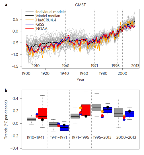
Figure 1
In both warm IPO phases the IPO-adjusted model results match observations much better than the standard CMIP5 ensemble mean. In fact, the observations lie between the 25th and 75th percentile values in both cases. This is not the case for the CMIP5 unadjusted ensemble mean. For the 1941-1971 hiatus (or colder) period, the unadjusted model fits observations on average better than the IPO adjusted, but not by much. For the 1995 to 2013 period the IPO-adjusted model is better, but again not by much. Thus, we see a significant improvement in the warm phases, but not so much in the cooler phases. The table below summarizes the results:

Table 1
Comparison to the IPCC estimate of man’s influence
The estimate of man’s influence was made by comparing the CMIP5 ensemble mean (the “unadjusted trend” above) to a run that only included natural forcings. The “natural forcing” temperatures are listed in the column labeled “Median Natural only.” The difference between the “Median Obs” in table 1 and the “Median Natural” is given in the “Total Difference” column of the table. This approximates the IPCC WG1 AR5 attribution to mankind. Next to the “Total Difference” column is the Meehl, et al. estimated IPO influence. This number is the difference between the IPO-adjusted median value and the unadjusted CMIP5 value. The percentage of the total difference attributed to the IPO is in the column labeled “% IPO.” Next to that is the non-IPO percentage. In WG1-AR5 the IPCC attributes all the non-IPO difference to mankind. This can be seen in figure 3 of my previous post, here, or in the WG1 AR5 report figure 10.5 (page 884).
So, using the data and the models in Meehl, 2016, we can see that for the critical period from 1971 to 1995 60% of the warming was due to the IPO and 40% was due to other causes. Of the 40% probably some was due to man, but some of it could be due to other ocean oscillations (or cycles) or other natural causes. In short, this paper appears to support the idea that man is not the dominant cause of recent warming.
Comments and criticisms are very welcome. Vigorous debate is critical to good science, it is how we learn. But, please be polite to each other.
If you spend time responding to half of Nick Stokes’ shifts then you’ll end up on a totally different wavelength.
Why the “f” and “s”?
Sheer compassion?
No Nick Stokes is highly competent in maths and even if I don’t always agree with him, he is a useful check on WUWT not being a right wing echo chamber largely fuelled by scientifically ignorant rants. So thanks to Andy for researching this and considering Nick’s points.
The SOLE function of an abstract is to allow an academic to determine whether the paper is relevant to what he is looking for, on the basis that he does or will have access to the full paper should he wish.
It is not a short version for the general public who do not subscribe to journals.
It has to be short and will contain jargon which anyone in the field will readily follow.
… Neither is it a means of determining whether the scientific content of the paper supports , accepts or refutes the AGW meme, either explicitly or implicitly.
So Cook’s frawdulent [sic] study would not have been valid even if they had not rigged it.
I agree.
I like to see Nick here. It adds balance. being sceptical, one should be sceptical both ways and Nick often raises some interesting points to consider.
Greg, when you said this – by scientifically ignorant rants – were you by some chance referring to your contributions here?
Yes – but this was a most excellent response and well worth a read. THX Andy. GK
Without evidence it’s better to acknowledge questionable observations as cause “unknown” than to guess. Citing possible causes is relevant but shouldn’t be done to the point of leading. Even a calculated guess is still a guess. Probabilities are for betting.
+10
markl
Yes – “Probabilities are for betting.”
Too right.
And do you have any idea why the bookmaker holidays in the Bahamas or Monaco, twice a year, a month at a time, and the punter is lucky to be able to afford a night under the railway arches?
If you don’t set the odds, leave betting for the mugs.
Auto
[I’m Ok, but a relative has seen the industry from inside – and left.]
Do leave betting for the mugs.
“The first is, it is dangerous to draw conclusions from an abstract.”
I think the first is, at least quote what the abstract says in full. I think it was clear enough, and my interpretation was right.
“we can see that for the critical period from 1971 to 1995 60% of the warming was due to the IPO”
No, I think that is wrong. They are saying that, for that period 1971-1995, of an observed trend 0.19 C/dec, 0.09 was natural. The IPCC said it was confident that for 1951-2010, AGW was at least 50%, so that does not contradict (remembering the difference in periods, too). They say 0.11 was externally forced, which would be mostly GHG. I’m not sure whether the difference between .19 and .09+.11 is rounding or different estimates. Then they say the IPO adjustment came to .17-.11=.06 C/cen. Hence it is .06/(.19-.11)=75% of the difference between forced and observed. It is .06/.19= 31.6% of the observed warming.
Quote in full. The IPCC also said that the best estimate is that the anthropogenic contribution is equal to all the warming observed. If it turns out to be 51% then their best estimate will be the worst possible, with a 49% difference. As bad as saying that anthropogenic warming is only 2%. This whole thing is so stupid that it is not worth discussing it. The IPCC does not do science. They claim they interpret science, but they are not good even at that. A waste of money if you ask me. The papers are there for all to read, and we don’t need no interested interpreters.
“Quote in full”
No, I quoted what is relevant. They gave the bottom of a range and that is within it.
I also noted that the periods are quite different.
Nick, yet you made it sound as if that was their best estimate, you didn’t state it was the bottom estimate. So, you admit it does contradict what their best estimate was.
“Nick, yet you made it sound as if that was their best estimate, you didn’t state it was the bottom estimate.”
I did say exactly that:
“The IPCC said it was confident that for 1951-2010, AGW was at least 50%”
But Chap 10 Exec Summary has a variety of relevant statements. take your pick:
“More than half of the observed increase in global mean surface temperature (GMST) from 1951 to 2010 is very likely1 due to the observed anthropogenic increase in greenhouse gas (GHG) con- centrations.”
“It is extremely likely that human activities caused more than half of the observed increase in GMST from 1951 to 2010. “
“It is virtually certain that internal variability alone cannot account for the observed global warming since 1951.”
or if you like a bit of detail
“GHGs contributed a global mean surface warming likely to be between 0.5°C and 1.3°C over the period 1951–2010, with the contributions from other anthropogenic forcings likely to be between –0.6°C and 0.1°C, from natural forcings likely to be between –0.1°C and 0.1°C, and from internal variability likely to be between –0.1°C and 0.1°C. Together these assessed contributions are consistent with the observed warming of approximately 0.6°C over this period.”
That last is the full statement of the “about 100%l” estimate.
Thanks Nick. So that is verbal equivalent of the candle plot that Javier has been referring to.
From the above I see that ‘worst case’ natural warming could be 0.1+0.1 = 0.2 deg C out of 0.6 observed.
That is not consistent with the other claim: “AGW was at least 50%” . According to their figures they should be claiming AGW was at least 67% .
the IPCC’s claims are not even self consistent.
“That is not consistent with the other claim”
No, they have grades of likely. The last is just likely, the others are respectively “very likely”, “extremely likely” and “virtually certain”. It could consistently be very likely >50% and likely >67%, for example. The grades are quantified on that page.
Nick,
You don’t decide what is relevant. They use their best estimate in their graphs and propaganda. By not quoting it you are doing much worse than Andy May, and on purpose.
I see that .09 and .11 are independent figures, not constrained to add to .19, so it isn’t rounding. For 1910-1941, the corresponding figures are .13 and .05, which don’t add to .13.
I think the logic is that they have a calculated forced trend of .11 (1971-95), and when they count IPO as a forcing, that is boosted to 0.17. I can’t really see the logic of partioning observed-natural between IPO and other, and as a %, it clearly breaks down from 10-41, where obs-nat=0, which is the denominator. They solemnly write down 0.05 as 100% of that, but of course the arithmetic says it should be ∞.
It seems the bottom lines are
1. IPO correction is .06, which is 31% of observed warming.
2. Adjusted forced trend is .11+.06=.17 C/dec, which is reasonably close to .19. And that seems to be the purpose of the exercise. The Median IPO Adjusted trends are closer to Obs than anything else.
See below. I’m now not sure that it is ,i>their logic.I can’t find it in the paper.
Andy,
I rented a copy of the paper, and I have looked through the SI, but I can’t find Table 1 anywhere. Is it theirs?
I was trying to track down the median natural (second column). You say it comes from the single run of CCM4 that they use to identify IPO. I couldn’t see a reference to it in the paper, nor any of the arithmetic that leads to the 60% calculation. IOW, I can only see reference in their text to the data in cols 1,3,4 and 5 of that table. Here is their discussion of the period 1971-1995:
They only give the IPO as 75% of the discrepancy noted in the abstract. And the only other ratio you can really derive from that is that the IPO adjustment is 31% of observed warming. Again, I see no reference to the number in col 2, or anything derived from it.
I was puzzled as to why they tried to partition IPO as a fraction of “observed – natural”. Now I’m wondering if they did it at all.
Nick, I made the spreadsheet and table. The “Natural only” values are estimated from the plot in WG1-AR5, I was unsuccessful at locating the actual IPCC data, but the estimates are close. I wanted to compare Meehl’s work to AR5.
Speaking about 1971-1995, 0.19 (obs)-0.09(Natural) is 0.1. The AR5 (CMIP5, unadj) is 0.11, adjusted (+IPO) is 0.17. 0.06 is the IPO add. The IPO adjusted value is very close (0.02) to observed, suggesting the IPO internal variability is important. The model difference (CMIP5-Nature, what is used in AR5 to get man’s influence) is 0.02, but this is a false comparison, the models are way off.
Observed is 0.19, the only nature value we have is a model which is different by 0.1. The IPO adjusted number is 0.17 only off from observed by 0.02. So we could say (I didn’t in the post, but thought about it) that the IPO is 80% of the warming! I suspect that the IPO is 60% to 80% given this data and these models, can’t prove it, but that is what this data and analysis shows. I still say that this paper (if correct) invalidates the IPCC conclusion that man is mostly responsible for recent warming. The paper is fairly amateurish, to be sure, but Ben Santer is a co-author and he is the father of AGW. See here: http://www.greenworldtrust.org.uk/Science/Social/IPCC-Santer.htm
Andy,
” The “Natural only” values are estimated from the plot in WG1-AR5,”
Why I originally started looking into it was that the “natural” trends are all positive. That is still a puzzle.
” The IPO adjusted value is very close (0.02) to observed, suggesting the IPO internal variability is important.”
Yes, that is their point.
” So we could say (I didn’t in the post, but thought about it) that the IPO is 80% of the warming”
I really don’t understand where you get these figures from. On their numbers, and Table 1 for that matter, the matter is simple. For the period 1971-95, the IPO trend was 0.06, warming was 0.19, so IPO was 31% of the warming. That’s it. There is no basis for trying to derive other numbers to put into the denominator.
” I still say that this paper (if correct) invalidates the IPCC conclusion that man is mostly responsible for recent warming. “
Absolutely not. This is where the difference in periods becomes important. What they have shown is that MMM+IPO tracks observed better than MMM. But IPO is approx sine with period about 60 years. They chose 1971-95 as the rising part of the period, during which it contributed to warming.
But over the IPCC’s period of 1951-2010, IPO has a whole cycle. It makes a zero contribution to warming. So it leaves the IPCC statement unaffected.
” The paper is fairly amateurish”
I thought so too when I saw the stuff about partitioning the difference observed-natural between IPO and non-IPO. But when I read the actual paper and saw that that was not what they did, the paper made perfect sense. It identifies the IPO component and shows that it is a reasonable approx to observed-MMM. I think that is a good and useful result, and the paper is fine.
Nick,
First, we are not talking about the real values for natural variability or man’s influence on climate. These are unknown, regardless of what AR5 says. This paper certainly makes that clear. Our debate is really on what the paper claims and how it compares to the WG1 AR5 claims that man has caused more than half of the recent warming.
You are comparing the IPO addition to the CMIP5 ensemble mean to observed warming. That is not what the IPCC did in AR5. They compared two model runs, the same CMIP5 ensemble mean used in this paper to another run that left out the anthropogenic forcing (see pages 882 and 883 of WG1AR5, link in the post). They did not use observations for anything other than a check on the CMIP5 model. To compare like to like, when the only thing the two studies have in common is the CMIP5 ensemble mean, we must compare the AR5 value of 0.02 (CMIP5-Nature) to either observations versus nature (0.1) or IPO adjusted versus CMIP5 (0.6). In both cases IPO is over 50%. The first comparison is 80% and second (more valid IMO) is 60%.
The study is only important because of the authors, especially Ben Santer, and it demonstrates internal variability is not zero and may have a large effect. It also shows that CMIP5 does not match observations very well and that adding at least one source of internal variability improves the result. I hope this is clear. Your comparison is a good comparison, it just cannot be compared to AR5 directly. CMIP5 should be the basis of comparison, because that is what is used in AR5.
Andy
” In both cases IPO is over 50%.”
You keep saying this. You take the IPO, divide it by something and say, see, it’s 50%. Or 60% or 75% or whatever. And then, after leaving out “of what”, you say later, of warming. But it isn’t. It’s 50% of whatever you divided by.
As to AR5, you need to quote exactly what it is you are following. There is a lot in pp 882-883, and also in nearby pages. Yes, they compare runs with and without forcing. But how does this connect with what you are doing? I guess you could say that they take the difference as a measure of AGw. But when they want to express that as a fraction of something, they divide by observed warming (as in their 50% statement). I can’t see any use of the denominators you are constructing.
The other thing you’ve skipped over is the difference in timing periods. You have quoted the figures for the 25 years when the IPO cycle is warming. But IPCC is talking about 1951-2010. That includes a cooling phase as well. So your conclusions about IPO as a % of warming don’t apply to the whole cycle.
Nick, the IPCC compared two model runs, one with nature only and the other with nature + man. Nature only is 0.09 for 1971-1995. Observed is 0.19. CMIP5 is the unadjusted number of 0.11, way off from observed (0.19). CMIP5 median adjusted is close to observed, differing only 0.02. The IPCC computation is with unadjusted-nature=0.02, the model difference. Substituting observed for the unadj model is not appropriate. But, either way, this paper proposes that the IPO adjusted number is closer to observed and the IPO is at least 60% of the warming in the period. You can also use the ratio of CMIP5-Natural and adjusted-natural (75% IPO). No matter how you look at it, the models are poor and IPO is dominant.
“But, either way, this paper proposes that the IPO adjusted number is closer to observed and the IPO is at least 60% of the warming in the period.”
The paper does not say that. It’s numbers are simple. IPO warming 1971-95 0.06, observed warming 0.19.
” the models are poor and IPO is dominant”
No, models deal well with IPO – that’s where their result here comes from. But they have it in arbitrary phase, so in the averaging for MMM it cancels. Meehl how that if you take the model-identified IPO and add it back in matched phase, MMM+IPO is close to observed.
IPO?? Are they talking about the PDO? If so, forget the modeling crap and go to the real data. The PDO fits the global temp curve very well and could explain all of the changes, not just 60-70%
Yes, and those HADCRUT, GISS and NOAA zigzags aren’t the real measurements either but the post-adjustment products.
“HADCRUT, GISS and NOAA”
There’s lots of different versions of Little Red Riding Hood, and The Three Little Pigs, too.
NOAA was the little piggy that went, “Weee, wee, wee!!”
“The PDO fits the global temp curve very well and could explain all of the changes, not just 60-70%”
________________
The University of Washington JISAO standardized values for the PDO index runs from 1900. The trend in PDO from Jan 1900 up to October 2016 is practically flat (in fact, slightly negative at -0.02C/Century). The highs in the PDO are cancelled out by the lows over the longer term, as one might expect from an oscillation: http://www.woodfortrees.org/graph/jisao-pdo/mean:12/plot/jisao-pdo/trend
Over the same period, all the global surface temperature records show a warming trend of at least +0.8C/century. For instance, HadCRUT4 vrs PDO shown here (running 12-month averages used to reduce clutter): http://www.woodfortrees.org/graph/jisao-pdo/mean:12/plot/jisao-pdo/trend/plot/hadcrut4gl/from:1900/mean:12/plot/hadcrut4gl/from:1900/trend
While PDO may have a short term warming or cooling effect, clearly global temperatures do not correlate well with PDO over the longer term.
I read this as a longer period oscillation than PDO. PDO is decadal and IPO is interdecadal.
I do not assign much value to this type of research. When the conclusions are based on model outputs without any empirical confirmation, i get the chills. Models reflect scientists opinion on how things work, and therefore do not constitute empirical evidence.
But it is even worse to try to get a budget from such poor knowledge. The 60% contribution by IPO is as good as if they had pulled it out of the hat. What is the contribution of AMO?, and SAM?, Arctic Oscillation?, Solar variability? Do they think their response has any chance of being close to reality?
Compared to temperatures, sea level rise appears a much simpler process. We know it has to be a mixture of thermal expansion, Greenland melting, Antarctic melting, Glaciers contribution and underground water contribution. Of course they have a budget, but it is a fake one. The are constantly finding out that it is wrong, and probably they haven’t even got the total right as satellites are giving a higher rise than gauges.
With temperatures is even harder as there are known unknowns and probably unknown unknowns contributing. I am really surprised that these people (I have difficulties calling them scientists) can claim that IPO contributed 60% to the last warming period.
“The 60% contribution by IPO is as good as if they had pulled it out of the hat.”
I queried above whether it is their number at all, or Andy’s/
It doesn’t matter if it is 60% or 30%. That number is meaningless.
I don’t think the authors calculated any such number, of any amount.
“Here we show that the largest IPO contributions occurred in its positive phase during the rapid warming periods from 1910-1941 and 1971-1995, with the IPO contributing 71% and 75% respectively, to the difference between the median values of the externally forced trends and observed trends.”
Am I quoting correctly?
The problem is they don’t show what the contribution is. They show that those are the numbers that they obtain from their methods using a multi-model CMIP5 ensemble. As models disagree I would argue that using an ensemble is a sure way of getting it wrong. The relationship between what they do and the reality is tenuous at best. These papers get reviewed by other modellers, as a serious reviewer would challenge any other use of their results but as hypothetical.
Next time I recommend you ask Andy for the article. He can ask me if he doesn’t have it. It is really not worth paying those outrageous rates for publicly funded science, and even more if it is this bad.
“Am I quoting correctly?”
It’s not a quote about the 60%. That was Andy’s estimate, based on the ratio to difference of observed and natural. But that natural number is his own estimate, and is not in Meehl. And your not observing the originally omitted bit. They aren’t saying it was a contribution to the “last warming period”, but to the difference they specify.
I have the paper. That’s how I found that the natural numbers quoted were not in it.
A yes is enough, thank you. I am quoting correctly.
I guess you agree with me that what they claim refers only to their calculations and models, and not to real world evidence. This looks a lot like IPCC claims. They should come with a disclaimer that any resemblance to actual events is purely coincidental.
“I guess you agree with me that what they claim refers only to their calculations and models, and not to real world evidence”
Not at all. They have model results, which individually have an IPO cycle, but when combined in a MMM, lose that through averaging, with phase not matched. So they restore the IPO component in the MMM. That is just a matter of model consistency. Then they compare that with real world evidence – observed GMST. And it matches quite well.
I find these papers immensely frustrating. If their model is wrong, then their conclusion is wrong. Yet we know the model is wrong – the only question is how wrong is it? So we also know that their conclusion is wrong, at least to some extent (unless it is right by sheer luck).
All this shows is that you can build a plausible model in which 60% of the warming is man-made. But how does that advance the science?
Rather then these seemingly endless runs of models, we need to understand how climates work and what drives the cycles. Until we do, nothing is advancing.
Science has a very good response to that. Stick to what the empirical evidence shows. Models are good for learning what is not working, so we have it wrong. I understand that current models are a huge investment of time and money and they need to be published. But conclusions from models should be limited to negative results, because there are multiple explanations to why the model gets something right, but only one of why it gets something wrong. By attaching a deprecating value to negative results science is setting herself for failure. Negative results have an important and neglected role in science.
Javier, I agree with you. Models are poor evidence for any claim like this. But, what I find fascinating is that Benjamin Santer is a co-author of this! Remember he was lead author of the notorious 1995 second assessment report. He deleted statements from the report that said there was no clear evidence that man had caused warming and inserted statements saying man was responsible after the reviewers had signed off. Even Nature was critical of this. See more here: http://www.greenworldtrust.org.uk/Science/Social/IPCC-Santer.htm
Santer has obviously had a change of heart.
“Santer has obviously had a change of heart.”
I think you are totally misinterpreting the paper.
Whenever you have an issue with shaky foundations but widespread repercussions, you always get people willing to advance the cause at the expense of the truth while getting their reward in silver coins.
I also think that the situation is changing. Now we have Lewandowski and Cook publishing on the pause not been real, and being refuted by Fyfe, Mann and Santer. Unless warming resumes with renewed vigor after the possible La Niña, things are going to get really interesting. Scientists will start breaking ranks once the evidence mounts against the catastrophic hypothesis.
Nick, we do disagree on what the paper is saying, but most of the disagreement is pretty academic. It basically boils down to “what is the most valid way to compare the numbers in this paper to AR5.” Regardless of how we do the comparison, the effect of internal variability is non-zero. Even using your numbers it is >30%! This is a huge movement in the so-called “consensus opinion.” Plus, the paper admits that they only considered one source of variability, the IPO. We still have the AMO and maybe others. I see a weakening of the “consensus.”
‘ This is a huge movement in the so-called “consensus opinion.”’
I think that’s the basic misinterpretation of the paper. There was a difference between observed and the MMM. We knew that. In this context, it is 0.19-0.11 for 1971-95. Meehl et al aren’t suddenly discovering that. They are explaining a large part of it (75% of that difference). It’s not finding a cause. But instead of saying just that the difference is “natural variation”, you can say 75% is IPO, a known pattern with periodicity. That is progress.
Of course, there may be more to be discovered. But they have closed most of the gap.
The trick is to distinguish natural warming from anthropogenic warming. Many people have pointed out that the warming from 1910 to 1940 is very similar to that from 1970 to 2000. Trying to argue, that one is natural and the other isn’t, is disingenuous.
Having said the above, I don’t think we can say the IPO caused anything. It’s like saying that the natural change was caused by the natural change. It sounds like a logical fallacy.
You don’t understand. Nearly all the heat comes from the Sun, but then moves with changing patterns through the system with changing delays before leaving the Earth. Those changes are what cause the cooling or warming that our thermometers measure. When there is an El Niño, a good portion of heat accumulates on the sea surface of a certain area of the Pacific and then moves to the atmosphere increasing the temperatures on most places of the world. We can say that El Niño caused warming in 2015-16 in the same sense that we can say that IPO caused warming during 1971-1995. That is believed to be one of the channels where the heat moved towards the lower atmosphere, warming it.
The trick is to define warming. Are we talking total energy increase? Or are we talking thermometer’s only on land near the surface going up? Or is it something else?
Originally we were told it was the thermometer, then when they stopped we were told to look at heat in the ocean. I am so confused, Nick perhaps you help me out what is the definition?
In this paper, it is just GMST. Surface (land/ocean) temperature as expressed in the indices HADCRUT 4, Gistemp and NOAA.
It’s like saying that the natural change was caused by the natural change. It sounds like a logical fallacy.
Er no, its a pretty decent way to describe a system with internal feedback, like an oscillator.
As you well know, it is possible to construct an oscillator that happily sits at an operating point and does not oscillate. It will oscillate if you give it a kick. Do we say that the kick causes the oscillation? For most oscillators, the kick is the turn-on transient. One of my professors held that kTB noise was sufficient to start oscillation in a properly designed oscillator. Do we say that the cause of the oscillation is kTB noise? The problem is that transients and kTB noise don’t always cause oscillation. An oscillator is necessary. We quickly get into a can of worms. link
How about two things with the same cause? For example, we observe that Bob fell over and shortly thereafter Bill fell over. Do we say that Bob caused Bill to fall over? We can’t say unless we have more information. Perhaps there was an earthquake which caused both to fall over.
I would say it is more correct to say that the IPO explains the warming. It leave the possibility that both the IPO and warming have the same cause.
“Having said the above, I don’t think we can say the IPO caused anything.”
They aren’t saying that. They have a multi-model mean, observations and a discrepancy. It is acknowledged that the IPO won’t appear properly in the MMM, because models have it at different phases and it cancels. So they try to identify it in a single model run and add it in to MMM in the right phase, and it does indeed greatly reduce the discrepancy. Not claiming a cause; just that the discrepancy has a pattern that appears in individual runs, but at different phase.
Thanks Nick. I think that is a good concise explanation of this effort.
So they take dozens of ‘random’ samples ( the PDO phase is apparently arbitrary in the models ) they deliberately select one that does ( by chance ) match the phase in observations and add it back into the MMM.
By definition that will reduce the difference between MMM and Obs.
I don’t see that this processing tells us anything. Nor is it a reason have any more faith in the models being realistic, which is presumably the underlying intent and implication of the result.
Similarly, if you take a take a series of random walks on top of fixed trend that have been ‘tuned’ to match the 100y trend in GMST, take the MMM ; then find one series whose random variations are the most similar to Obs IPO and add it back into the MMM, it will reduce the difference between the MMM and Obs.
It seems to me that the whole excerise is meaningless and the authors are fooling themselves ( or hoping to fool others ) if they think this ‘helps’.
” It sounds like a logical fallacy.”
In science we are taught a causal approach to understanding the world as in F=Ma. However, the real world is practically non-causal in the sense that effects like the Butterfly effect make it impossible to link a cause to every phenomenon. “Natural variation” is a way of creating a causal model out of non-causal behavior in the sense we create a pseudo “thing” with known properties and behaviours and then put it into our causal models.
Usually we say natural variation is some form of random fluctuation – because usually in systems like a resister, the individual fluctuations are far too small for us to see how they each operate and so we model them as an ensemble.
However, in the case of climate, these individual fluctuations are large enough for us to observe them individually. So, we could model them as an “ensemble” – so a random variation of some kind, or we can break down the individual contributions somewhat, model each one, but eventually we still need a bucket into which to “dump” all the smaller unmeasured contributions which need to be modelled as an ensemble.
However, the reality is that everything that happens in the universe happens as a result of “logical fallacies” – in that everything stems at some point from “random variation” and “butterfly effects” too small to be measured and which cannot be causally predicted. But “Science” ignores all this non-causality, instead focussing only on the way things behave when they do so causally. So, science focusses on the orbits of the planets because these are causal (as far a science is concerned) but in reality, their current behaviour is the result of “natural variation” in the way the solar system was built so they are entirely non-causal for all practical purposes.
Scottish sceptic says
No: the configuration of the solar system, which is the result of “natural variation” in the way the solar system was built, is now more or less fixed and only changes within its own cycles. And it has a causal relationship with the earth’s climate. If this were not obvious from observation, it would be obvious from thinking about the fact that (almost) all the heat that warms the surface comes from the sun.
In discussing global climate, there is a difference between natural variation which is caused by definable features that may be external to the earth (orbital cycles) or internal (ocean cycles), and natural variation that is essentially random which is the butterfly effect, and can easily be seen in the spikiness of data at the annual level.
“definable” means capable of being defined in principle, but not necessarily defined at the present level of knowledge.
I may be reading your comment wrong, but you seem to be conflating the two to make a point.
The result of a century of runaway global warming:
The MEI is the driving factor.
https://thsresearch.files.wordpress.com/2016/09/wwww-ths-rr-091716.pdf
John,
Unfortunately, the section VII contains misleading graphs in that the red lines on the three graphs are labeled “trends” whereas they are two horizontal line segments. The term “trend” implies it is a best fit regression line of the data including a slope, rather than a horizontal line through the average of the data.
Figure VIII-1 shows the tropical 200 mb balloon temperature anomaly with horizontal red lines from 1959 to 1976 and from 1977 to 2015. This curve is labeled “Step Trend”, implying that the 2 line segments are regression best fits, but they are not.
Figure VIII-2 shows a red line consisting of two horizontal red lines, each through the average of the data point corresponding to the two line segments, but the curve is labeled “Step Trend”.
Just pixels in the big picture. Just sayin……
The question might be,,,,,,, did our evolution as a species follow the melting ice North over time?
Think about it………
On the contrary. Our species took advantage of the ice. Without the last glacial maximum there wouldn’t have been humans in America and when the Europeans got there there probably would have been mammoths far North. Now we would be worried that global warming could drive mammoths extinct.
No
Our evolution as a species was sorted out about 200,000 years ago in southern Africa.
While everybody is connected to everybody else any evolution will be due to gradual genetic drift
To get evolution in humans moving along again we would require isolated populations heading off in their own directions; after a catastrophe on Earth or perhaps in colonial populations [want a trip to Mars?]
Greg K,
You must not be a biologist as I am, Evolution never stops and genetic drift is just one of many mechanisms. In the past 10,000 years our brains have shrink significantly, and we have seen the spread of lactase persistance, among a score of changes that paleoanthropologists are studying since we now have thousands of years old sequences. We are quite different to humans 10,000 years ago, and to humans 10,000 years from now. That is the nature of evolution.
You can certainly see the damage done by coal fired power stations between 12,000 and 2,000 BC.
Nah ’twasn’t coal then, ’twas purely Biomass
I don’t know if you were the original poster of this image but I’ve stolen it and used it several times. It gives an excellent representation of the real world and makes people think because it refers to a well known area.
From 1983 the total cloud cover over the equatorial region (mostly ocean) was observed to decrease from ~66% to ~61% by 2000, levelling off thereafter, apparently corresponding with the tropical sea surface temperature and global surface air temperature (see climate4you).
Got a source for that? I believe you, but thousands wouldn’t….
Leo, you may have seen my previous posts about a phenomenon I saw while flying to Madeira a few years ago. Thousands of square miles of ocean surface were smoothed with breaking waves greatly reduced. Fewer waves, fewer aerosols, less cloud cover, increased warming. But how could the surface pollution endure for any length of time if it was anthropogenic? Oil and or surfactant would oxidise pretty quickly in films a few molecules thick. Was it natural, some sort of phytoplankton bloom? Increased venting from down deep? Do smokers leak oil?
I’d really like to see some studies about if we are altering the surface of the oceans and if there’s anything else in play.
BTW, last week I saw the OCGTs fire up on Gridwatch. (www.gridwatch.templar.co.uk) I wonder how that will increase our bills next year. The French nukes being offline must be causing headaches for the Grid engineers.
JF
a propo PowerPoint presentations shortcut
no green prove no green vote
John Bills says The MEI is the driving factor.
John, many thanks for this reference.
https://thsresearch.files.wordpress.com/2016/09/wwww-ths-rr-091716.pdf
Unfortunately, the section VII contains misleading graphs in that the red lines on the three graphs are labeled “trends” whereas they are two horizontal line segments. The term “trend” implies it is a best fit regression line of the data including a slope, rather than a horizontal line through the average of the data.
Figure VIII-1 shows the tropical 200 mb balloon temperature anomaly with horizontal red lines from 1959 to 1976 and from 1977 to 2015. This curve is labeled “Step Trend”, implying that the 2 line segments are regression best fits, but they are not.
Figure VIII-2 shows a red line consisting of two horizontal red lines, each through the average of the data point corresponding to the two line segments, but the curve is labeled “Step Trend”.
IPO isn’t the only oscillation out there contributing to natural variation. So, anyone asserting manmade = observed – natural and then claiming manmade is bigger than natural when only using one of the sources of natural variation is talking nuts.
I agree, but if you think the “Stadium wave” hypothesis has any merit then it is not a question of individual contributions, but of the “heat content” of the wave that moves through all the oscillations.
I consider all of this discussion, in the end (the near end), to be basically worthless, and academic.
It ignores the real potential disaster for the planet : too little atmospheric CO2.
It doesn’t require much effort to see that a revoution is almost at hand for both transportation and energy, in the form of electric cars and molten salt nuclear reactors. Lithium ion battery costs
curently stand at $150 per kWhr (GM) or$190 (Tesla, fully configured), and we have at least 4 major developers rushing towards commercialization of molten salt, including the entire Chinese govt
and it’ll be here by 2020 time frame for sure, but not right here if our ignorant Federal govt continues to neglect the research and continues to put obstacles in the past of new nuclear technology in the form of an inefficient, slow moving NRC (Trump has promised to eliminate that, enough reason by itself to applaud his victory) . For the planet, we can only make estimates of the effects of CO2 levels on temperatures, but we can be quite certain what the effect of lower levels wil be on our ability ot grow crops and feed the planet’s population. So what happens when most mankind generated carbon emission apparatus permanently disappears? How is a sufficient
level of atmospheric CO2 going to be maintained? Crickets. I hear crickets.
The absurdity of the billions of research being spent to control life (CO2) when we are trudging along at a barely life sustaining level is mind boggling.
What is the optimum level for natural CO2?
0 ppm
10 ppm
100ppm
500ppm
1000ppm
Unlike the quackery of the greenhouse effect, the required CO2 level for photosynthesis is well known. Yet, even scientists who know plants need more are devising solutions that are “carbon neutral”. We are living in a post-science Kafkaesque parody.
“It takes more than delivering nutrients to a plant to grow indoors. Plants thrive on carbon dioxide. The atmosphere typically offers 300-600 parts per million (ppm) of carbon dioxide (CO2) for plants to absorb and process into oxygen. That’s about the amount needed to sustain growth, but there is a distinction between surviving and flourishing. An abundant amount of CO2 can increase growth by up to 30%. EDEN will pump CO2 from a tank at around 1200-1400 ppm based on calculations from PID and CO2 sensors. A gas solenoid will close approximately 2 hours before the night cycle begins respiration, so no CO2 goes to waste. EDEN definitely isn’t carbon neutral, carbon enrichment of plants devours carbon dioxide at a much higher rate than what outdoor plants are capable of.”
https://hackaday.io/project/6148-project-eden
“What is the optimum level for natural CO2?”
For whom or for what?
e.g. http://glandorehydro.com/article/co2-an-explanation/
https://www.ncbi.nlm.nih.gov/pubmed/6107383
Imagine how bad reduction in photosynthesis from a comet strike or a really bad nuclear war would be if we were below 300PPM. That might be it for the biosphere.
Hi Andy May.
First of all, Meehl et al. (2016) are using the IPO Index as a proxy for ENSO. They have to be, because…
Second, there is no physical way the IPO can be responsible for any warming or cooling of Pacific or global surface temperatures. ENSO, on the other hand, as a process is responsible.
Third, for clarification, the IPO represents how closely the SPATIAL PATTERN of sea surface temperature anomalies of the Pacific at any given time match the dominant SPATIAL PATTERN of sea surface temperature anomalies of the Pacific. The IPO does NOT represent the sea surface temperature anomalies themselves. The IPO Index basically represents the spatial pattern created by ENSO (the dominant form of natural variability globally)…the higher the positive IPO Index value, the better the match to the spatial pattern created by an El Nino and vice versa for La Nina. BUT, the IPO Index can differ from standard ENSO indices because the spatial pattern of the temperature anomalies in the Pacific are also affected by sea level pressures and resulting wind patterns.
For further clarification see Chapter 3.6 of my ebook “On Global Warming and the Illusion of Control – Part 1”.
https://bobtisdale.files.wordpress.com/2015/11/tisdale-on-global-warming-and-the-illusion-of-control-part-1.pdf
Cheers.
Hi Bob,
In the text (paywalled and not worth the $32), they say that rather than inferring “total variability” from a difference, they instead model the IPO effect and add that to the CMIP5 ensemble model mean, then compare that to observations. And whala, the fit is better. They do not discuss trying to model all of the other natural ocean oscillations. I guess the best source for that is Wyatt and Curry. This is a bit of an amateurish attempt to look at natural variability, but a co-author is Benjamin Santer, that really got my attention. He is the guy who stuck man-made global warming into the second assessment report. Given this paper I think the “more than 50%” claim is DOA.
Thanks for the link Bob. Chapter 3.6 is a helpful summary of the IPO and what it means. I like this part:
Positive numbers are El Nino like and negative numbers are La Nina like. In essence you are saying the largest source of internal climate variability is the ENSO oscillation which makes sense. It is not the only long term ocean oscillation that causes warming or cooling, right?
I like the name Tri Pole Index or TPI better than IPO. To clarify the acronym soup:


It compares the three regions. It is NOT analogous to PDO.
correlation=.652.
As Bob says, it is analogous to ENSO.
correlation=.875
gymnosperm: I like the name Tri Pole Index or TPI better than IPO.
Good post. How about the extreme South Pacific?
You’re right. Another big blob. Dunno how to answer except they were trying to match something; they picked ENSO.
Who are all these people, what are their credentials and why do they have so much time to spout off? I suspect they aren’t doing research because then they wouldn’t have time for this.
SL, read my ebooks and learn how wrong you are about some commenting here. AM is a petrophysicist. You make the same wrong credentials aspertion here that was leveled at McIntyre while he destroyed all the ‘credentialed’ paleoclimate experts with their bad math and goofy proxies. ‘Credentialed’ Dessler in his 2010 paper claimed strong positive cloud feedback from a correlation r^2 of 0.02! And so on. Some of these people do this in their spare time trying to expose/counter all the really bad science behind CAGW. For a good IPCC example of faulty and misrepresented meta-analysis based in reality on a single badly flawed paper see my essay No Bodies in ebook Blowing Smoke. Hang around and you might learn interesting things from us uncredentialed deplorables.
Andy, thanks for going the extra mile. I don’t think you can draw meaningful conclusions (1971-from Meehl because of its reliance on CMIP5. The parameterization tuning was expressly to best hindcast GAST from YE 2005 back to 1975. That incorporates substantially all of the period analyzed, where the observed target parameter T already incorporates the IPO or whatever. The logical circularity means the analysis is probably invalid.
This suggests a better interpretation for the 60% is simple model inadequacy/error. This can also be observed in other ways. Observational ECS is 1.5 (Lewis with Stevens new aerosol estimates) 59 1.65 Lewis and Curry 2014). The CMIP5 median ECS is 3.2. Again off by ~ half. The 2000-2016 T CMIP5 ensemble mean T is (per the latest warmunist paper ~2x observed after suspect stratosphere adjustments , or (Christy) 2.5x. Again, off by halfish.
“Observational ECS is 1.5 (Lewis with Stevens new aerosol estimates) 59 1.65 Lewis and Curry 2014). The CMIP5 median ECS is 3.2. Again off by ~ half.”
There is no observational ECS. You can’t observe it without equilibrium. Nic Lewis calculates an effective CS, which is not the same. The fact that there is a discrepancy does not mean that CMIP ECS is off by half. It just means there is a difference.
The 60% is a spurious figure. It is not in Meehl’s paper.
” the observed target parameter T already incorporates the IPO”
The target, observed GMST, incorporates IPO. The model mean does not, because of cancellation in averaging. They are restoring the IPO component with consistent phase. There is no circularity thre.
Nick, check this comment where I explain the 60% number. https://wattsupwiththat.com/2016/12/12/a-summary-of-meehl-et-al-2016-and-the-interdecadal-pacific-oscillation/comment-page-1/#comment-2370420
As for the time period, 1971-1995 captures most of the warming and we are only talking about the positive IPO phase anyway. IPO doesn’t seem to help much in the negative periods that we have to work with.
Also, check this one: https://wattsupwiththat.com/2016/12/12/a-summary-of-meehl-et-al-2016-and-the-interdecadal-pacific-oscillation/comment-page-1/#comment-2370436
“Nick, check this comment where I explain the 60% number.”
I think the spuriousness is shown by the table 1 line above, 1911-1940, where you try to express IPO as a % of difference between obs and nat, but obs=nat.
Andy,
Just one last thing here – I do think your “Median natural only” in Table 1 is seriously wrong. From 1910-2010 the trends are .13, .12, .09 and .1 C/decade. That averages about 0.11 C/decade, a rise of 1.1C over the century. Yet as you say, the curve in AR5 10.1b is basically flat. Your natural forcing MMM is rising faster than observed, which is definitely not what the graph shows.
@ur momisugly Javier
December 12, 2016 at 7:54 pm
“I do not assign much value to this type of research. When the conclusions are based on model outputs without any empirical confirmation”
Puff on puff. I do hope Santer has to answer for his mendacity….. and soon.
Andy May, thank you for the essay.
My impression is the Kosaka and Xie paper from the summer does a better job of a siimlar type of analysis
http://www.nature.com/ngeo/journal/v9/n9/full/ngeo2770.html
I don’t see where it got reviewed at WUWT. Did I miss it?
v’