Guest essay by Javier*
Arctic sea ice has been on a declining trend since at least 1979, and probably since the bottom of the Little Ice Age. 2007 was a bad year for Arctic sea ice. It got to a low maximum in March, although not as low as the previous year that still holds the record, and then it proceeded to melt an impressive 1.5 million km2 more (15% ice extent data) than a year earlier, reaching values that were not expected to happen until the 2030’s. This gigantic drop, the biggest on record, triggered a concerted campaign on the media that surely didn’t hurt Al Gore’s chances of winning his Peace Nobel Prize over Irena Sedler, a Polish lady that saved 3,000 babies during WWII, that died the next year.
Ever since we have been subjected to a fear campaign over a “dying”, “screaming”, or “in a death spiral” Arctic sea ice. Such campaign chose the polar bear for an icon, as a supposedly immediately threatened species by climate change and more specifically Arctic sea ice melting. It is very ironic that in a letter to the journal Science in 2010 by a group of scientists over their integrity on climate change issues, the editors chose a fake picture of a lone polar bear over a tiny iceberg on an open sea to illustrate it (figure 1).
 Figure 1. Announcement (Top) by the Science Journal that the letter to the editors of Science “Climate Change and the Integrity of Science” had been published with a fake picture. The picture (bottom left) was also available with a penguin in case it was needed to illustrate Antarctic melting (bottom right).
The fear campaign increased considerably when in September 2012 the Arctic sea ice took another beating establishing the current low record. That was the year that Greenpeace started its “Save the Arctic” campaign for donations. And while establishing an Arctic natural sanctuary is a worthy goal that deserves the support of all conservationists, the end does not justify the means of collecting money through misrepresentation and fear.
The last episode in this fear campaign has been the curious announcement from the National Snow an Ice Data Center (NSIDC) that “2016 ties with 2007 for second lowest Arctic sea ice minimum“, that has been widely circulated despite being preliminary data. The announcement was dated on September 15th and referred to the minimum reached on September 10th, Although their data shows it taking place on September 7. It is curious that when skeptics are told that the Pause is not significant because it is only 20 years long, the NSIDC is making the headlines with a climate claim based on one day’s data.
But the NSIDC is forced to recourse to daily data because the monthly data supports the opposite interpretation, that Arctic sea ice has been increasing since that fateful September of 2007 (figure 2).

Figure 2. Average Arctic sea ice extent during the month of September between 2007 and 2016 with linear trend.
While for someone worried about Arctic sea ice loss an increase should be better than a decrease, almost everybody would say that a 9 year long trend is not significant. However I’m going to present evidence that suggests that a change of trend might be under way.
So how can we identify a change of trend without having to wait 30 years? Trends are very important in the stock market, so investors have tools to indicate when the chances of a trend change are increasing, and technical analysis of stocks includes a figure, the symmetrical triangle, that looks similar to what Arctic sea ice is showing (figure 3). This figure indicates that the force that was driving the previous trend is debilitating and the new equilibrium of forces is increasingly constraining the values. At some point the triangle is broken and the trend resumed (figure 3 A) or a new trend started (figure 3 B). With this figure it is important to wait for a confirmation of the breaking, because false breaks do happen, as in 2012.

Figure 3. Maximum (March) and minimum (September) Arctic sea ice extent trends according to the Ocean and Sea Ice Satellite Application Facilities (OSI SAF) of EUMETSAT. Purple and blue lines help define triangles of progressively decreasing range variation with two possible scenarios. Scenario A is a downward break with a continuation of the previous trend, while scenario B is an upward break with the confirmation of a new trend. September 2012 constitutes a false break because it was not confirmed afterwards. Source: OSI SAF Ice Graphs.
Technical analysis has a weak predictive power, that is why it is used, and while a symmetrical triangle cannot predict the direction of the breakup or its timing, it does predict a continuation of the figure until the break happens. Based on that, last June when Arctic sea ice set a new record low for May, I had the following to say here at WUWT:
“Arctic sea ice is getting constrained in its variation, waiting for a definitive break of one of the lines. We will know in just a few years. In the meantime it is more probable that we do not have a record low in summer Arctic sea ice this year. Once again the alarmists have gone to the newspapers too soon”. Javier at WUWT, June 14, 2016.
That is the reason they had to rush the “tied with 2007” claim to the media with preliminary data, because the monthly data was going to show different and all the baseless hoopla of June was going to be exposed.
Although I got it right, obviously this is not scientific method. Even if I personally will be convinced that a change of trend has taken place if the triangle is broken towards the up side and confirmed, we will be needing empirical evidence that the situation for the Arctic sea ice has changed. However we already have a consilience of evidence supporting the claim that a change of trend is taking place in Arctic sea ice.
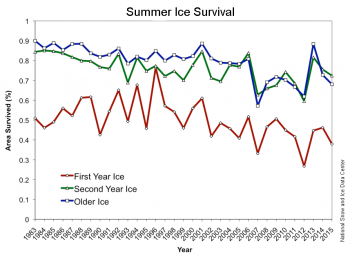
First it is not only ice extent that it is increasing since 2007, but also ice age. A lot of importance has been placed on the disappearance of old ice, so it should be a motive for celebration that since 2007 summer ice survival in the Arctic has been on the increase (figure 4).

Figure 4. Summer Ice Survival has also increased since the 2007 minimum. Source: NSIDC.
In a recent article at Climate Etc., “Is the Arctic sea ice ‘spiral of death’ dead?“, Greg Goodman showed that something else has also changed in Arctic sea ice: Since 2007 the date of the minimum extent stopped increasing and started decreasing (figure 5). It appears that since 2007 the melting season might be ending sooner, and the 2016 melting season is significantly shorter than average. According to Tony Heller, 2016 has the shortest Arctic melt season on record, and the previous record was in 2015. Now here are some climate records that are not being reported by the media.

Figure 5. Variation of date of sea ice minimum also shows a change of trend in 2007. Source: Greg Goodman at Climate Etc.
The shortening of the melting season is not the only evidence besides sea ice extent and age that something new is going on in the Arctic since 2007. Arctic waters main exchange is with the North Atlantic Ocean, and since 2007 the heat content of the North Atlantic has been dropping as fast as it increased in previous decades, having already given up all the heat gains since the mid-90’s (figure 6).

Figure 6. North Atlantic heat content anomaly (0-700m) also shows a change of trend in 2007. Source: Climate4you.
But we do not only have strong evidence from ice extent, ice age, melting season length, and North Atlantic heat content, we also have a theoretical framework that links Arctic sea ice to the Atlantic Multidecadal Oscillation (AMO). Miles et al., 2014 show that AMO proxies and Nordic Seas ice proxies, although not a perfect inverted match, display a high degree of synchrony in their phases since at least the 1570’s with sea ice usually slightly ahead of AMO (figure 7).

Figure 7. Persistent multidecadal fluctuations in sea ice linked to the AMO. Original time series (gray) and multidecadal 50–120 year component (blue) reconstructed from wavelet decomposition: (Top) AMO proxy index, not detrended, 10 year running average. (Bottom) Western Nordic Seas sea-ice extent proxy reconstruction. The numbers in parentheses indicate the amount of variance in the nonsmoothed time series that is explained by the multidecadal component. The color bar in bottom panel indicates periods with reduced ice (red) and cold periods with increased ice (blue) inferred from the wavelet-filtered signal. The reduced ice periods are marked by light red shading and are seen to correspond to warm AMO periods. Source: Miles et al., 2014. Red arrows have been added to mark the two big known Arctic melting events of 1920’s and 1980’s.
As Miles et al., 2014 put it:
“We establish a signal of pervasive and persistent multidecadal (~60–90 year) fluctuations… Covariability between sea ice and Atlantic multidecadal variability as represented by the Atlantic Multidecadal Oscillation (AMO) index is evident during the instrumental record. This observational evidence supports recent modeling studies that have suggested that Arctic sea ice is intrinsically linked to Atlantic multidecadal variability.
Given the demonstrated covariability between sea ice and the AMO, it follows that a change to a negative AMO phase in the coming decade(s) could —to some degree— temporarily ameliorate the strongly negative recent sea-ice trends”.
This last phrase, indicating that despite a found natural correlation between Arctic sea ice and AMO, this can only reduce the trends imposed by the overwhelming effect of the atmospheric increase in greenhouse gases, is designed to bow to the current dominant hypothesis to increase the chances of the article being accepted. It does not affect what the evidence showed in the article demonstrates. We are already seeing since 2007 that the natural variability is strong enough to revert the previous trend, not produce some degree of temporary amelioration.
I have already shown here in some of my comments at WUWT that the correlation between AMO and Arctic sea ice is clear also in modern data (figure 8). It is not clear to me what causality underlines this correlation. According to the Stadium Wave hypothesis of Wyatt and Curry, 2014, both Arctic sea ice and AMO are in the same temporal group of the climate signal that travels the Earth’s oceans, sea ice, and atmosphere with a periodicity of 60-90 years. However in Wyatt’s data, as in Miles’ data sea ice changes appear to slightly precede AMO changes. We should not conclude that Arctic sea ice depends on AMO, but that both appear to change together. Wyatt and Curry conclude:
“But according to stadium-wave projections… this trend should reverse… Rebound in WIE [West Eurasian Seas Ice Extent], followed by ArcSib [Arctic Seas of Siberia Ice Extent] should occur after the estimated 2006 minimum of WIE and maximum of AMO.”
Looks like they also nailed it, like Miles et al., 2014, except that as scientists should do, Wyatt and Curry only bowed to the data.

Figure 8. September Arctic sea ice extent (green) inverted and superimposed over Atlantic Multidecadal Oscillation non-detrended anomaly. Source: Arctic sea ice reconstruction Cea-Pirón and Cano-Pasalodos 2016, AMO graph Trenberth and Shea, 2006, updated to 2011 by NCAR.
To contrast all the evidence that we are witnessing a change in Arctic sea ice trend with the official projections of a continuous decline, I have chosen a figure from NSIDC scientist J. C. Stroeve et al., 2012, as displayed in the “Melting Ice” chapter of “Our Changing Climate” report by the National Climate Assessment. Over that figure (figure 9) I have extended the Arctic sea ice reconstruction based on Russian aerial charts to 1935 by Cea-Pirón and Cano-Pasalodos 2016, that should not be very controversial as it lays squarely within the grey band of uncertainty of the original figure. And I have added an exponential fit in red that was very much in fashion between alarmists around 2012 based on Piomas ice volume modeling, and an AMO model fit in orange using the AMO trend and data from figure 8.

Figure 9. Reconstructed (1935-1979), measured (1979-2016), and projected Arctic sea ice extent between 1890-2090. Source of original figure: NCA. Red dashed line, 1979-2011 exponential fit. Orange dashed line, 1935-2015 sinusoidal AMO fit with AMO trend from figure 8. Red box, satellite data window. Forward projections are completely different, and AMO model is the only one predicting two or more decades of no significant Arctic ice melting or even ice growth.
Based on exponential fit or linear acceleration a group of scientists headed by Peter Wadhams and Wieslaw Maslowki, and parroted by Al Gore, defended a complete melting of Arctic sea ice by 2012-2020. They are completely discredited already in scientific circles, which doesn’t prevent them from reaching to the media and contributing to the fear campaign without being contradicted.
Based on accelerating melting, more mainstream ice scientists like Mark Serreze, director of NSIDC, defend 1 million km2 ice free conditions by 2030.
IPCC defends an Arctic essentially free of ice by 2050, and its followers, like notorious commenter Steven Mosher, accept that claim uncritically.
The CMIP5 ensemble of climate models projects an ice-free Arctic by 2060 in the unrealistic RCP 8.5, and by 2080 in the intermediate RCP 6.0 and 4.5 scenarios, as figure 9 shows.
But the evidence indicates that they are all wrong because they have based their analysis in the satellite window that by chance coincides exactly with the downward phase of AMO and Arctic sea ice. There is evidence that a very big Arctic melting took place in the 1920’s (first red arrow in figure 7), and Tony Heller has made a good job of unearthing it from newspapers reports. It is surely reflected in the scientific literature of the time, but climate scientists appear to be too lazy to walk to the library and use the photocopier in these days of internet. By using only recent data and by blatantly ignoring the evidence of the relationship between AMO and Arctic sea ice they have set themselves for failure. Climate models are essentially demonstrating the ignorance of climate modelers of the very same thing they are trying to model. They have either failed to read the relevant scientific literature or failed to understand its consequences.
While a linear extrapolation of the AMO model suggests that the Arctic could be reduced to 1 million km2 by 2200 AD it is unwise to make climate projections from extrapolation over such long periods. Lets just say that there is a significant probability that Arctic sea ice will not significantly melt over the next few decades and could even grow. Whether that is positive or negative depends on personal opinion on the importance of Arctic sea ice.
Conclusions
Empirical evidence supports the notion that a change of trend in Arctic sea ice took place in 2007. Due to that change, Arctic alarmists have been reduced to make climate claims based on daily data. It is very likely that Arctic sea ice might not significantly melt or even grow during the next few decades. The pause in Arctic melting was predicted in the scientific literature by 2014 before it was evident in the data. The pause in Arctic melting that started in 2007 is hereby officially inaugurated.
*Javier is a first name only. He has also published on Dr. Judith Curry’s site. Both she and I know his full identity. While normally we require guest authors use their full name, Javier’s employment situation is such that he’s likely be penalized in some way for posting at Curry’s and especially here. He has satisfied my need and Dr. Curry’s need for this exception, and is a well published scientist in a non climate related field that requires similar statistical analysis skills.
UPDATE: 10/18/16 by Anthony
Methods and Data for Evidence that multidecadal Arctic sea ice has turned the corner
Figure 2 data was downloaded on October 2nd, 2016 from:
ftp://sidads.colorado.edu/DATASETS/NOAA/G02135/Sep/N_09_area_v2.txt
year mo data_type region extent area
2007 9 Goddard N 4.32 2.79
2008 9 Goddard N 4.73 3.22
2009 9 Goddard N 5.39 3.72
2010 9 Goddard N 4.93 3.29
2011 9 Goddard N 4.63 3.18
2012 9 Goddard N 3.63 2.37
2013 9 Goddard N 5.35 3.75
2014 9 Goddard N 5.29 3.70
2015 9 Goddard N 4.68 3.37
2016 9 NRTSI-G N 4.72 2.81
Data on Arctic Sea Ice extent was graphed with Excel, using the display linear trend
option.
Figure 3 graph was downloaded from:
http://osisaf.met.no/p/new_ice_extent_graphs.php
Symmetrical triangle technical analysis was performed graphically by joining with a
straight line the most recent maxima and with another the most recent minima.
2012 minima was not accounted because according to technical analysis, a break
that is not confirmed is a false break.
Figure 4 graph was downloaded from:
http://nsidc.org/arcticseaicenews/2015/10/2015-melt-season-in-review/
Link:
http://nsidc.org/arcticseaicenews/files/1999/10/survival-350×259.png
A linear trend with an arrow was traced between 2007 and 2015 data.
Figure 5 was copied from Greg Goodman’s article at Climate Etc.
https://judithcurry.com/2016/09/18/is-the-arctic-sea-ice-spiral-of-death-dead/
He provides an adequate description of how he made it.
Figure 6 was copied from Climate4you:
http://www.climate4you.com/SeaTemperatures.htm#North%20Atlantic%20(60-
0W,%2030-65N)%20heat%20content%200-700%20m%20depth
Figure 7 was copied from:
Miles, Martin W., et al. “A signal of persistent Atlantic multidecadal variability in Arctic
sea ice.” Geophysical Research Letters 41.2 (2014): 463-469.
http://folk.uib.no/ngftf/CV/PDF_Furevik/miles_et_al_grl_2014.pdf
For clarity the two relevant panels were retained, and Little Ice Age maximum was
indicated. Red arrows were added to mark the two big known Arctic melting events of
1920’s and 1980’s.
Figure 8 was copied from NCAR:
http://www.cgd.ucar.edu/cas/catalog/climind/AMO.html
Artic sea ice data from:
Pirón, Miguel Ángel Cea, and Juan Antonio Cano Pasalodos. “Nueva serie de extensión
del hielo marino ártico en septiembre entre 1935 y 2014.” REVISTA DE
CLIMATOLOGÍA 16 (2016).
http://webs.ono.com/reclim11/reclim16a.pdf
Was graphed, inverted and overlaid over the figure.
Figure 9 was downloaded from NCA:
http://nca2014.globalchange.gov/report/our-changing-climate/melting-ice
Arctic sea ice observed data was corrected and extended towards the past with data
from:
Pirón, Miguel Ángel Cea, and Juan Antonio Cano Pasalodos. “Nueva serie de extensión
del hielo marino ártico en septiembre entre 1935 y 2014.” REVISTA DE
CLIMATOLOGÍA 16 (2016).
http://webs.ono.com/reclim11/reclim16a.pdf
And was extended towards the future with data from NSIDC (see figure 1 origin).
The red quadratic exponential fit to sea ice extent or volume predicting an end (< 1
million sqkm) to summer sea ice between 2020 and 2025 was popular in 2011-12:
https://tamino.wordpress.com/2012/11/22/sea-ice-forecasts/
http://neven1.typepad.com/blog/2011/04/trends-in-arctic-sea-ice-volume.html
The orange curve was obtained by the opposite procedure to figure 8. The AMO data
and trend were inverted and overlayed and a sinusoidal curve was fitted to the trend
and data.
This person is quite good and I am in agreement more often then not.
Signori Del Prete,
Perché il bacio della morte?
/end joke
Is the linear trend in Figure 2 statistically significant?
I think I know the answer to this. Is it no?
I was wondering about the “almost everybody would say that a 9 year long trend is not significant”, it either is or it isn’t, regardless of what people say.
I’ve used some algorithms for piecewise linear modelling before (there is a good R package), but this symmetric triangles approach is new to me, and would appreciate a reference explaining the details.
Seems that this is simply trying to apply time series analysis to a system for which you have other information, such as what ice does when you add energy, but more information would certainly be interesting.
To be fair the author of the post does say these methods have weak predictive power, so we have a non-significant trend and a method from finance with weak predictive power. Personally, I’ll stick with my Gaussian Process model that has performed pretty well in the ARCUS sea ice prediction exercises over the past few years, considering it is just interpolating the September extents from previous years.
Please tell us more about your Gaussian method, dikranmarsupial .
BTW fig 2 is entitled Sea Ice Extent but the data source seems to be for ice area.
Greg, the most recent ARUC report is here, my method is listed under my real name (Cawley), there is an information sheet here. It is basicaly just a physics free statistical curve-fitting exercise that interpolates the September mean extent from previous years, using a squared exponential covariance function which just imposes an appropriate degree of smoothness on the output. The interesting thing is that it gives (large) error bars that grow the further away from the data you get. It provides a simple baseline method, but doesn’t tell you anything much about the physics. There is a good book on GPs here which also has the MATLAB toolbox that I used.
Thanks for the reply. I don’t think this kind of method gives anything much beyond auto-correlation. Fine for giving a ballpark guess one year ahead. I suspect that within 5y Arctic ice extent will be outside ( above ) error margins of the ARCUS submission you submitted this year.
From a quick scan , it just seems to be treating the process as a Gaussian-Markov random walk on top of a linear downward trend, though it would seem odd not to regard the current downward trend as part of that random walk, in which case I would not expect a continued downward bias.
It may be interesting to see what that method does to dates of turning point which I derived for the graph which Javier reproduced in figure 2. The numbers are the foot of the article explaining the method.
https://climategrog.wordpress.com/2016/09/17/the-death-spiral-is-dead/
Greg, there is no linear trend built into the model. Essentially the GP says that any two observations have a joint Gaussian distribution, where the covariance is specified by a “covariance function”. In this case the covariance function is a squared exponential, which means that the covariance decreases the further apart in time the observations happen to be, which basically means the model should be smooth to some degree. Essentially datapoints that are close together in time are more constrained in how different they can be. The shape of the regression depends purely on the data and has no pre-specified form (it is non-parametric), which is why it is of interest (at least to me).
” I suspect that within 5y Arctic ice extent will be outside ( above ) error margins of the ARCUS submission you submitted this year.”
It wouldn’t be too surprising if that happened in one year within five years as those error margins basically reflect the year to year variability in Arctic sea ice. I don’t think there is any reason to expect the long term trend to go back up, but if you do, then make a submission to the ARCUS exercise for the next five years and see how your predictions fare (ISTR WUWT submitted an entry a few years ago).
We do expect the rate of sea ice loss to slow down at some point because the ice will still get blown towards the Canadian archepelago and Greenland, where it will compact and be less easily melted (ISTR Walt Meier making some comments about that), so it is the easily melted ice that gets lost first.
I agree that my model is mainly useful for short term predictions, but that is the object of the ARCUS challenge.
OK, I get it. The exponential srq is the gaussian bell. It’s a kind of two way progressively diminishing auto-correlation, so the downward trend which dominated 1997-2007 will influence near future projections, finally fanning out as random walk takes over.
That implies that there is some kind of inertia in the system beyond AR1 auto-correlation.
That may be applicable if the main driver is OHC, it probably will not work too well if there are strong negative feedbacks from open water and that is the way I’m inclined to read strong rebound after 2007 and 2012 minima.
My grounding is in physics rather than abstract number theorems and that colours the way I analyse things. Other ways of analysing things are always interesting.
IMO climatology has been too heavily influenced by statistical analysis derived from econometrics. This largely reflects a basic, a priori, assumption that all climate change can be surmised as a “carbon” driven “trend” plus random internal variation. With an added assumption that the trend is dominant.
I think we need to apply more physics than single wavelength radiometry.
Anyway, thanks for bringing this method up and taking the time to explain. It’s rate to get any two way interaction on this site. A pleasant and informative one is even rarer.
BTW What is the parameter that your method attributes to the gaussian distribution? Presumably the regression finds the best parameter for the distribution with respect to the data and this tells something about the temporal range of the auto-correlation. If you have a number that would be of interest.
Glen, there is no random walk, the noise process is simple additive Gaussian noise with no autocorrelation. The reason the credible interval gets wider is that there is uncertainty in estimating the model due to the limited amount of data, and the effects of this uncertainty in estimating the model get larger as you extrapolate out from the data. The noise process is homoskedastic, so it doesn’t increase as you extrapolate. This is similar to the parabolic uncertainty on a linear regression (see e.g. the skeptical science trend estimator tool).
My method is only really intended as a sensible statistical baseline that doesn’t have a great deal of a-priori control of what the model looks like (mostly just that it is fairly smooth). It has performed fairly well, (better than Prof. Wadhams’ method ;o) but then again it is a fairly bland model. The best approach to understanding what is going on will be phsyical models. It is interesting to see how statistical and physical models fare in the ARCUS exercise.
“BTW What is the parameter that your method attributes to the gaussian distribution?”
GPs don’t really have parameters as such. Essentially the data (extent) is assumed to be from a joint Gaussian distribution where the covariance matrix is a function of the input data (in this case the year). The model fitting procedure basically involves deciding on the parameters of the covariance function (in this case it is just a scaling parameter deciding how “wiggly” the model can be, an amplitude and the variance of the additive noise. These are found by maximising the Bayesian evidence for the model (the marginal likelihood). It is a rather counter-intuitive way of looking at statistical modelling and it took a while for me to get my head around it properly.
Presumably the regression finds the best parameter for the distribution with respect to the data and this tells something about the temporal range of the auto-correlation. If you have a number that would be of interest.”
I don’t think there is a straightforward equivalence between the scale of the covariance function and the autocorrelation, but if you look at the picture of the model in the link I gave, you can see that the model is pretty smooth and is treating variability on anything less than the scale of a decade+ as pretty much noise (which suggests that the apparent “levelling off” of the last few years is probably just an illusion).
Most of the dramatic melting happened between 1997 and 2007, so we could equally dismiss that decade as an “illusion” as well. I don’t see any reason to do either, both are equally valid data of similar duration. Clearly there are not enough degrees of freedom in GP to properly capture the rapidity of the 1997-2007 decline which started the panic about Arctic ice coverage, nor to capture the recent change. The result is quite similar to fitting a quadratic model or a gaussian bell with 3 d.f.
Though I understand that this is not what it is actually doing , it appears that the fitted function is like a gaussian bell itself but with a zero well below zero ice extent. Maybe just coincidence.
The error margin of your graph goes into negative ice around 2032, so is physically inapplicable at least from that point onwards. How capable is this method of representing a cyclical process should one be present? It would be interesting to throw some test data at it and see what it does.
It seems fine for the ARCUS guessing game, but that does not imply any real skill. I could do as much by squinting and sticking a pin in the graph paper. It seems comparable to fitting a spline. If limited to a year or two ahead it provides a mathematically objective alternative to squinting but I don’t accept that any method is capable to projecting to 2050 , that is extrapolating 100% outside the calibration data. That is a mathematical fantacy.
As soon as you draw that kind of thing, some less well endowed people are going to start imagining it may actually mean something. You would have done better to cut it off 5 years hence. It may have a chance of still being within the error bars in that range.
There is far too much spurious projection going on in this whole field and it has no mathematical or scientific merit.
If you look at the adaptive anomaly which uses ALL the data, not just 5 days per year, it’s hard to imagine that 2007-2017 will not end up being a positive trend. At some stage, the annual minimum is going to have to reflect that change.
The drift in the date of the minimum show in fig 2 indicates that is already starting to happen.
I’m not really interested in playing the ARCUS guessing game because it is based on a totally useless metric, so being right is really just luck of the draw on what the weather does in any particular year, and being wrong does not mean you have not got understood the underlying variability. It makes it rather pointless.
It’s a bit of fun, like betting on the horses, but does not provide a test of any predictive skill or understanding of the underlying processes.
Greg wrote “Clearly there are not enough degrees of freedom in GP to properly capture the rapidity of the 1997-2007 decline which started the panic about Arctic ice coverage, nor to capture the recent change.”
No, quite the opposite in fact. The GP with the squared exponential covariance function is a universal approximator, i.e. it can realise any continuous mapping (it can exactly interpolate any set of points in general position) so it is not limited at all by the degrees of freedom. Maximising the Bayesian evidence essentially limits the complexity of the model to match the informativeness of the data (to avoid overfitting), so the reason you get a smooth model is that there isn’t enough information in the data to justify anything more complex. This is a bit like a Bayesian changepoint analysis choosing not to put in a breakpoint, it means there is insufficient evidence that one exists,
Thanks for your reply.
The key point would seem to be: what assumptions are you imposing on the process by adopting the prior of using a exponential gaussian kernel?
AFAICT, you cannot get an oscillating result by using the exp sqr kernel. There are many gaussian processes and many kernels but the choice of kernel you have adopted means that you will not capture any ( possibly ) cyclic component in the process. That is why I raised that question earlier.
This exchange about GP is very interesting but would be easier to conduct more directly rather than stringing along here in comments. If you wish, you can drop a comment on the About page of my blog and
we can converse more directly.
https://climategrog.wordpress.com
I’m going to see whether I can find some GP package for octave.
The choice of a symmetrical kernel eliminates the possibility of accounting for a negative or positive feedback from increased open sea since 2007. The change in drift of date on min, the significant increase in annual variability since 2007 and the massive increase in ice volume following the 2012 minimum all provide clear empirical evidence that this is not a valid assumption.
This may possibly addressed by adopting an asymmetric kernel.
I do not think that causality is bi-direction in a time series of melting ice. The prior needs to include this kind of physical information or it will just smooth out everything.
As with all Bayesian methods the choice of a suitable prior is paramount in getting a valid result.
It is true that if there is a 60y periodicity in the driver there is not enough data for this have a significant impact on any fitted result. This is a significant problem in ANY method of making predictions of how this will evolve. It seems likely that AMO should have some impact but with barely half a cycle we have no means of evaluating that. which makes it equally impossible to determine to what extent the changes have been a general warming trend mixed with a cyclic variability.
OK, having read up on GP a bit, it basically assumes time and iice coverage are correlated. This is essentially like fitting a straight line trend. What the parameter adjustment part of GP does is find what localised range of fitting produces the least deviations statistically, so it’s like a thinking man’s linear regression.
Looking at the graph in your ARCUS submission it is not fundamentally different from my decadal trend analysis in that both show an initial acceleration followed by a later deceleration. Yours more heavily damped so the deceleration is less marked.
If you reduced the sigma parameter of the gaussian, I think it could produce something very similar.
The more short term ‘noise’ there is, the more the Bayesian method will smooth the result. I identified a circa 5y periodicity in the data and used that to avoid trough to peak or peak to trough fitting which would distort the trend fitting operation. Not doing so will insert greater uncertainty and blur the result.
Since the GP method , as you applied it, does not account for the periodicity it simply adds to noise and causes heavier smoothing of the result. It seems that the machine still has some learning to do.
It is interesting however, that the two methods are essentially agreed that there is a deceleration later in the data. I think that GP analysis, being very simplistic and non physical, is over damping the fitting process but it is interesting that such a purely statistical, localised trend fitting method produces something of essentially the same form as my decadal trend analysis.
Thanks again for bringing this up and taking the time explain some of the basics to me. It’s always interesting to compare different methods.
Greg wrote ” This is essentially like fitting a straight line trend”
No it isn’t. It is like fitting an infinitely wiggly line that adapts its wiggliness to suit the information content of the data. I have already pointed that out – a GP with a squared exponential covariance function is potentially a universal approximator. The reason you get a fairly straight line is because that is what the data suggest unless you provide a stronger prior on what the model should do.
I did not say it was like fitting a single straight line to the whole of the data, clearly it is not, but starting by regarding the two variables, time and ice, as being linearly correlated with gaussian errors is to do a linear regression. This is then done at each point via the tensor algebra over a limited range which is determined by the baysian minimisation.
The problem with this is that it regards the data as iid and allows no for no physical meaning in the data. That removes potential information which could inform the fitting process and regards everything as random noise.
Firstly the data is not a random draw, it is auto-correlated , there is a rough 1y anti correlation and a circa 5y periodicity.
The fit is heavily smoothed because of the large variability, yet a lot of that variability comes from taking a jerky 5d running average which includes a lot of weather driven variation. This does not represent the underlying physical processes driving long term change. This is the fallacy of the September min obsession: it is taken to be indication of this “climate canary”: the inter-annual evolution of the state of ice but much of the variability is weather driven noise.
This gives the occasional OMG moment then a few years when avoid taking about it. Mostly it is noise, which is confirmed by your analysis.
That is why my adaptive anomaly, which uses ALL the data manages to better detect the steepness of the 1997-2007 drop and recent levelling. It is less noisy and uses about 2 orders of magnitude more data points.
I’ll have to get GP processing set up, I can see some instances where it may be useful.
OK I have GPML on octave and have a first rush at fitting the data from fig 2. It’s giving close a straight line so not I need to learn how to use it.
If I can master it, I’ll try applying GP to the adaptive anomaly data see how it interprets the slow down.
Thanks for bringing this up. I’m sure it will be of use somewhere.
NO! A slope of this sort would occur by chance with a probability of about 80%. I had to read the numbers from the diagram, so they are not accurate, but for the purpose of answering your query they are perfectly adequate. The slope is 0.01667, its Std Error 0.06363, giving t ratio of 0.262 which with 8 D of F has a probability of 0.80. For what it’s worth (not much) RSq is 0.0085. The more informative adjusted RSq is -0.1154.
All these statistics tell a statistician that belief in a “real” slope is totally unjustified.
Hope this helps.
Ah, but it is not a question of believing in a slope. You are losing focus. We have an Arctic ice situation from 2007-2016 that is completely different to the previous period 1998-2007. Does it reflect a real change or not? What are the chances of it being simultaneous to the precipitous drop of North Atlantic heat content and not related? What are the chances of it being also simultaneous with a change in AMO? The theoretical framework is providing a lot of information that is missed by a blind statistical analysis out of context. This change was predicted in the scientific literature and it is taking place. Statistical analysis can only tell you the probabilities of it occurring by chance, if the link between AMO and Arctic sea ice is real as some scientists show, then the probabilities of this change being real are 100%.
Javier, thanks for the link to my recent article at Climate Etc. One of the key points of the method I adopted is to get away from the obsession with single day minima ( or NSIDC’s 5d running mean ) which are heavily affected by weather.
I applied progressively longer filters until I got one, unique change of direction for each summer. That removed the weather “noise” and makes the long term change clear.
One should not expect a direct match with AMO even if it is the driver. Indeed if SST or OHC can be considered the driver, we should NOT be using AMO which is a “detrended” index , but actual N. Atlantic SST with its trend intact.
In the same way that summer max air temperatures lag behind length of day ( NH max is usually in August while the longest day is in late June ) the long term minimum in ice coverage will lag by something less than a 90 phase of the AMO cycle. With a cycle of circa 60y we may expect a lag of about 10y, certainly less than 15y.
I would add that I have investigated linking rate of change of sea ice extent to AMO and the similarity is only in the most general decadal tendency, the shorter term cycles in each are quite different.
I also did a decadal trend analysis of Arctic ice area in2013 and updated it last year:
/https://climategrog.wordpress.com/2013/09/16/on-identifying-inter-decadal-variation-in-nh-sea-ice/
Unfortunately U. Illinois have not maintained this data set since the satellite failure in February, so there will not be any update possible this year. That method would require another full year of data to complete the next segment but it looks very likely to be positive. ( The article explains how the periods are chosen avoid being disrupted by the circa 5y periodicity in ice exent ).
This sounds a lot like “it works until it doesn’t ” and seems typical of a lot of the rather desperate techniques used in econometrics. Since economists are notoriously bad a predicting anything, I don’t spend much time trying to adopt there methods.
Just out of interest, is there an objective method for picking the points used in drawing the triangle?
But a statistician would not be throwing away 360 days of data every year and basing thier analysis on a 5 day running average of the trough.
Using all the data you get the trend analysis that I produced.
I was addressing the data you showed. I would not remotely contemplate trying to infer something from such a ridiculous set of numbers. I simply did the arithmetic, which I am sure you could have done yourself and commented numerically on in a few minutes.
Why the obsession with the trough ? It’s not statistics, it’s not science, it’s not physics, but it’s more dramatic.
It’s political propaganda not science.
Greg,
“This sounds a lot like “it works until it doesn’t””
As I said, it has weak predictive value. Some investors scan hundreds of stocks looking for these signals. Technical analysis specifies the conditions to draw the triangle. A symmetrical triangle indicates that the conditions that drove the previous trend have changed and the stock has entered a trendless state that will usually resolve before the triangle figure ends. It is a good situation to place a bet or to enter or exit the market.
Miles et al., 2014 and Wyatt & Curry, 2014 have already placed their bets. The Official team is in the market betting for a continuation of the trend and not recognizing that conditions have changed. The rest of us just have to wait. If you have insider information then you know which side the trend will go. The AMO-Arctic sea ice is insider information.
Thanks Javier. What I was hoping for was some explanation of how the triangles are constructed or a reference which explains the method.
Greg,
They are everywhere. For example:
http://www.investopedia.com/university/five-chart-patterns-you-need-know/symmetrical-triangle.asp
http://www.investopedia.com/ask/answers/013015/how-effective-creating-trade-entries-after-spotting-symmetrical-triangle-pattern.asp
Javier wrote “Statistical analysis can only tell you the probabilities of it occurring by chance, ”
If you mean traditional frequentist statistics that is the one thing frequentist statistics fundamentally cannot tell you. The truth of a particular hypothesis is either true or false, and has no “long run frequency” so frequentist statistics cannot assign a probability to it. The p-value is the probability of observing a result at least as extreme IF it occurred by chance, which is not the same as the probability that it did occur by chance (i.e. p is p(x>X|H0), not p(H0|x>X)). This is a very common error called the p-value fallacy.
Of course a Bayesian analysis can tell you the probability of it occurring by chance, but only if you privide the prior probability of that being the case, and with only nine years of data, you will essentially just get the prior repeated back to you as there isn’t enough evidence to change it very much.
“Ice has been recovering since 2007” is the new “No global warming since 1998” !
Yep, now we just need to wait for someone to “correct” Arctic sea ice data which is clearly “biased” by some kind of measurement error. Maybe we should only be using nocturnal sea ice measurements 😉
Alternatively maybe we can just stop maintaining the datasets as satellites fail and quietly go divert attentions to the next climate “catastrophe” somewhere else in the world.
Trends in the stock market come about because of human psychology and mob behavior.
Trends in the physical world come about because of the physical properties of matter.
It is not valid to take tools that are somewhat useful in the stock market and apply them to the physical world because the underlying mechanism have no commonalities.
The validity is only given by the results. stock prices are the result of two opposing forces, buying and selling pressures. That they have a psycological origin doesn’t make them less real. If Arctic sea ice is responding to two resulting opposing forces, one to increase melting and another one to reduce melting, the response to an equilibrium of forces could be similar to stock prices in that situation, whether you consider it valid or not. Complex systems sometimes display similar properties.
“The validity is only given by the results.”
That’s one kind of validity test. So where are the results which validate this method?
It seems from your presentation that it says : this trend will continue until it stops, at which point it could go either way. This does not seem to be a very useful kind of claim. Maybe you are not expressing it well.
Interesting method of analysis. I work in European power trading and this method is used all the time to work out when is a good time to buy or sell. In terms of this analysis since 2007 there has been fewer lower sea ice extents than higher. Hence the term constrained range. What this analysis has shown is that the fast downward trend has ceased…for now…and Javier has offered fairly good reasons as to why this is so. So the analysis has served it’s purpose. It has identified a change, now we have to work out if it will be sustained. If you were a trader trading this signal, you would go long as the risk to the downside looks small but the risk to the upside is more likely. However, as always only time will tell.
PbWeather. I don’t see where it has identified a change. I am not sure how these lines are constructed, but it looks to me that the only change identified by breaking out of the triangle was a negative one for 2012, which would indicate a continuation of the downward trend. This is rejected as spurious I think because the next points are not outside the triangle. I am sure this sort of analysis has some good reasoning behind it, but I m not sure how useful it is here.
I will have stab at describing what seems to be going on – please correct me if I am wrong. You look at the graphs. Taking the March one, we can see that if we connect the highest dots we get a line approximately parallel to the trend line. The same if we connect the lowest dots, until twenty o seven , when we get an upward slope in the join the dots. So if we extend the upper and lower lines after twenty o seven, we get a triangle. The dada must break out either above or below this triangle. If above, we have new trend, if below, we have continuation of the old trend.
We could have done this earlier – if we join up the lower dots from nineteen ninety six to two thousand we also get an upward slope. We can see that the later data breaks out through the lower line, indicating that there has not been a change in trend and the upward slope of this lower line is just spurious.
Looking at the September data, I do not see why would even suspect a change in trend. Joining up the lower dots we get a continuation approximately parallel to the trend. I don’t see why we would reject 2012 and use 2011 as the dot to join instead. Anyway, if the existing trend continues it will break out through the lower line anyway. We will see soon enough.
Why do you believe a simple linear trend in the arctic sea is correct?
Climate is cyclical. Weather and the seasons are cyclical.
NO sea temperature or rainfall record is linear. NONE.
The AMO, the PDO, ENSO all oscillate about their minimums and maximums.
I don’t believe that. The triangle analysis seems to be looking for a change so this method seems to assume that – until a change is detected.
From the link posted by Javier: “You’ll recognize the symmetrical triangle pattern when you see a stock’s price vacillating up and down and converging towards a single point. Its back and forth oscillations will become smaller and smaller until the stock reaches a critical price, breaks out of the pattern, and moves drastically up or down.”
There does not appear to be such a pattern in the sea ice minimum data unless you ignore 2012. It is easier to see on the graphs posted by Javier on the May post
http://s1039.photobucket.com/user/Knownuthing/media/osisaf_trend_zpsxohjvcbu.png
The Match data could be homing in on a point, but the minimum data is not really.
Try the link again
http://s1039.photobucket.com/user/Knownuthing/media/osisaf_trend_zpsxohjvcbu.png.html
Validity from results is nothing more than luck. It works until it doesn’t.
Very high ionizing radiation to the northern hemisphere.
http://sol.spacenvironment.net/raps_ops/current_files/rtimg/dose.15km.png
could you explain the significance of this ren ?
The decrease in the speed of the solar wind increases the ionization of atoms and rain.
Re: Science
“Climate Change and the Integrity of Science”
P. H. Gleick et al
Fake climate scientist and fake picture. No integrity involved, no correction necessary.
I didn’t spot the name of that, well done. Peter Gleick as in the ex-head of ethics at AGU, lecturing on integrity, just before admitting having committed wire fraud to impersonate Heartland directors and circulating false documents to deSmeg Blog. . LOL.
That’s the sort of integrity Lew and Cook can only dream of .
They aren’t useful in the stock market either.
They are to some people. I used to participate in investment contests for a few years. I was average but there was a guy who won three times and was second two. He was a great expert in Technical Analysis. After all it is the application of a statistical method (what has happened most often in the past under similar conditions) that gives you a small advantage.
I think there needs to be better attempts to reconstruct sea ice data from before the satellite era, as the piecemeal efforts thus far are indicating a tendency for a cyclicity in sea ice, but there is inadequate evidence.
Someone needs to examine the records of the Japanese, Russian, British and American navies. Ship Captains maintain extensive and detailed records of the conditions through with they sail. Often locals communicate with sailors as well.
You have made a case that the years 2007 and 2013 were unusually different from the trend, as were some earlier years (those in a positive direction), and that the downward trend is persisting. The evidence for a change is slim to none.
No, the downward trend is easing off.
Climate is a complex coupled, non linear system, If you want to insist on fitting a single linear model to the data you need to explain why you think that best represents the data.
The graph from my article that Javier reproduced here also shows a clear change in the dates of minimum since 2007. I would not say what that signifies in isolation but it clearly is a change in the pattern from the earlier part of the record which did display accelerating melting.
Greg Goodman: I would not say what that signifies in isolation but it clearly is a change in the pattern from the earlier part of the record which did display accelerating melting.
All you have is a trend with autoregressive noise. The earlier part of the record that “[displayed accelerated melting]” was little to no evidence of a change in the overall rate of summer ice loss. The acceleration was overhyped by some climate scientists, and this “correction” (analogous to a correction in a financial index time series) is overhyped by Javier.
Climate is a complex coupled, non linear system, If you want to insist on fitting a single linear model to the data you need to explain why you think that best represents the data.
Well sure. And if you insist on fitting a series of straight lines to a “trend” with autoregressive residual noise, you should be aware that selecting change points by the appearance on graphs is an unreliable approach to change points. Same for complex coupled nonlinear systems: modeling them by fitting a series of short straight lines between points chosen by eyeball is extremely unlikely to reveal anything fundamental about them.
Earlier dates of the minimum favor higher averages for the month of September, because the refreezing 2 weeks after minimum is normally faster than the melting 2 weeks before minimum.
I would like to see extents for the 30 day or 31 day periods centered on maximum and minimum – I expect less upward slope for 2007-onward for the 30-31 day period centered on minimum than for the month of September.
Well like King Obama said in June 2008, in true King Canute-like fashion, “this was the moment when the rise of the oceans began to slow and our planet began to heal; …”.
He may have got the date right, and should have said Arctic sea ice began to heal too. But of course it all having nothing to do with any arresting anthropogenic CO2 emissions, as the elitists-globalists need the common folk to believe for their economic control schemes.
(Note: if anyone wants to read real eye-opening howler, just Google (or Bing if you prefer) your way to Obysmal’s 2008 DNC nomination speech. Examine every promise in his speech he made about how his Presidency would govern. You’ll see the exact opposite actually happened in every case, sort of like “most transparent admin ever” claim actually being the exact opposite, and something entirely within Presidential control.)
Joel, left handed people have a tendency to promise more than they can deliver. (that’s why they make “great” politicians… ☺)
That argument would even more convincing if you tried to link it to his skin colour, wouldn’t it?
Discussing corollary behavior of left handedness is unrelated to racism, as all agree that left handedness occurs in all races, Greg.
SR
We need more data going back to for a meaningful conclusion.I think that the annual number of days of frozen sea data from a locations in Greenland, Siberia, Alaska and Canada going back to early 1900s would give a far better insight for future trend projections.
On the other hand
.Experts said Arctic sea ice would melt entirely by September 2016 – they were wrong
“Scientists such as Professor Peter Wadhams, of Cambridge University and Prof Wieslaw Maslowski, of the Naval Postgraduate School in Moderey, California, have regularly forecast the loss of ice by 2016, which has been widely reported by the BBC and other media outlets.”
http://www.telegraph.co.uk/science/2016/10/07/experts-said-arctic-sea-ice-would-melt-entirely-by-september-201/
apologies for typos (to, a, etc)
Good post by Javier.
I think some climate “scientists” will take strong exception to this welcome (partial) quote though:
“… we will be needing empirical evidence that the situation for the Arctic sea ice has changed.”
Hmmm, By this “IPCC defends an Arctic essentially free of ice by 2050” do you (or the IPCC) mean 5 consecutive years with less than 1 million km2 as the minimum in September? They don’t really expect there to be no ice in winter, do they?
Yes. In the words of Steven Mosher an Arctic essentially free of ice means:
“the Metric of interest is 5 CONSECUTIVE years of seasonal ice falling below 1m sqkm”
Applying that metric today puts us at 5.4 m sqkm (see figure 2), very, very far from that 1 m and only 35 years left. Last 35 years haven’t seen a drop as big as the one they need to make that prediction.
We do not have the same standards for the evidence in support of IPCC hypothesis as the required for the evidence against it. It is science turned backwards.
Mosh cited IPCC as saying :
although he did not provide a clear source.
AR% ch 12 says:
I suspect the change I detected in 2007 indicates that this was due more to such negative feedbacks than being soley a result of N. Atl. SST.
Those wailing about “tipping points” and “death spirals” are anticipating postiive feedbacks which are just not backed up by the existing data.
since 2007 the heat content of the North Atlantic has been dropping as fast as it increased in previous decades..
well…less than 10% is exposed to air
“Technical analysis” does not have a good reputation in economics or finance. Just show me a LOESS regression, and I’ll draw my judgments about trends from that.
“Irena Sedler, a Polish lady that saved 3,000 babies during WWII, that died the next year.”
Apologies for being a grammar Nazi but this bit makes my eyes water.
“Irena Sedler, a Polish lady that saved 3,000 babies during WWII, that died the next year.”
Is it just me or this an appalling form of words?
I wouldn’t call it appalling. It is a little imprecise. The writer is not a native English writer, is my understanding. Offering an alternative sentence structure, would be more appropriate than criticism. I’m sure the author would appreciate the assistance.
Ah, I apologise unreservedly. I was far too harsh.
The “that” in the last clause refers to “babies” in the preceding clauses; but the “that” was intended by the author to refer to the “Polish lady.”
It looks to me like the set of commas isolates the babies from the “that”, making the antecedent refer to Irene Sedler. If you must find error, it was using “that” instead of “who”.
SR
I’m sorry for that. I do my best. Now reading that phrase on its own it is clear that it doesn’t read well but I didn’t realize at the time. As a non-native speaker I do realize that my choice of words and phrase construction is going to be incorrect or at least strange a lot of times. Most people seem to at least understand what I say judging by their reaction to what I say 😉
I do welcome corrections as learning is a never ending task.
I am actually now quite ashamed at the criticism and apologise again, I will also even admit to not having read fully the article.
To add insult to my self injury I can’t even speak one word of Polish.
That’ll teach me….
Hey don’t worry. No problem on my side.
“I can’t even speak one word of Polish”
Nor do I. My first language is Spanish 😀
I learned about the Polish lady on the internet. Those Peace Nobel Prizes are shameful. If I get one I am planning on rejecting it.
“If I get one I am planning on rejecting it.”
..
..
LMAO @ Javier rejecting over $1,5 million dollars.
..
..
https://en.wikipedia.org/wiki/Nobel_Peace_Prize#Awarding_the_prize
The point really is that the Polish lady died the next year so was no longer eligible for the prize.
How about we take Gore’s prize back and give it to her heirs? Let Gore wait til next year.
=============
Irena Sendler (not Sedler) is the subject of https://wattsupwiththat.com/2008/05/16/i-hope-al-gore-is-hanging-his-head/
An amazing person.
http://www.auschwitz.dk/sendler.htm
…It’s just you.
Commenters. No mention of the horror of someone being in the position where they cannot publish research because of fear of loss of employment or public ridicule. I know this isn’t the first instance of this censorship but that it happens even once just makes my flesh crawl. As much damage as the idiotic CGW meme has wrought on the environment and the scientific method, the worst long time effect may well be this odious political correctness. The UN has just taken over the internet. Will this kind of unspeakable nonsense censor the internet? Will WUWT go away because the website doesn’t echo the politically correct climate attitude, which we all know as idiotic? Only time will tell, but we freedom lovers should be very afraid. Will the next censorship be against the NRA because of the gun control lunacy. The point is that we can disagree about the climate and/or gun control, but stifling the dissention from whatever directions is the death of the precious First Amendment and the death of freedom itself.
As for Anthony’s decision to allow publication under a non de internet I initially recoiled, but on further thought I agree completely I completely Ignore in spite of my great pride in posting here under my own real name. As usual Anthony is right. The man is a paragon of virtue, he should win a Nobel prize . On s second thought maybe that is insufficient since the Nobel’s have become so tarnished.
I tried to correct that completely I completely gibberish but spellcheck and/or grammar check thwarted my best effort.
Nice analysis. As for ATTP and others, there is substantial and growing qualitative evidence supporting this analysis. DMI August ice Charts. Russian summer ice records. Whaling captain reports from the US, just now being digitized for analysis. The qualitative stuff you try to discount counts for much. Viking Greenland burials now encased in permafrost. That sort of stuff.
lets see.
1. No data.
2. No code
3. No error bars or statistical tests.
4. Anonymous author, who cannot be held accountable for his work. Gore is wrong about the ice. As is Wahdams. But at least we can hold them accountable for their mistakes. When Javier is shown to be wrong, he can merely change his name and move on to his next hair brained idea.
[Maybe 95% of papers published today have no data or code or SI, they usually leave it to interested parties to ASK. You might try asking Javier first in comments if he’ll provide it rather than condemn him with another one of your drive-by comments texting from a cell phone. I think he’d be happy to provide it. Many of Mr. Moshers drive by comments have no data or code or error bars or stat tests, perhaps we should start holding Mr. Mosher to the same standard he expects of others? – Anthony]
Steven,
No data was abused in the making of this article. Everything showed is coming from official sources or published scientific literature adequately sourced. No statistical significance is claimed, so none is showed.
As with the anonymity, considering that one favorite sport of some climate alarmists is to personally attack and try to destroy the reputation of any scientist that dares to speak against the consensus is only a prudent measure. Until I retire or the consensus breaks down, whatever comes first.
You are a clear example of somebody who likes to attack those that held a contrary view, as your first comment to me was:
“Javier is just a Goddard clone guys. not very good for WUWT credibility”
Steven Mosher August 14, 2016 at 12:43 pm
Sorry but if you ask for my last name, I ain’t giving it to you cause you are no friend of mine.
That’s spelled ‘cuz.
==============
>>Javier is just a Goddard clone…
Is Goddard Spanish? This is Javier’s analysis of Holocene temperatures and influences.
https://judithcurry.com/2016/09/20/impact-of-the-2400-yr-solar-cycle-on-climate-and-human-societies/
Javier:
That is a terrific compliment from Mosher! Topping it will be difficult, but not impossible.
Excellent article and post.
Boilerplate Mosher
“… hair brained idea. …”
Did you mean hare?
Why not just give the snide comments a rest?
Hare thee well, oh fleet foot snarker,
Urps his hairballs, feels much smarter.
==============================
For someone who is supposed to have a degree in English, Mosh’s grammar and syntax is appalling. But ‘hair-brained’ is icing on the cake. A bit like telling me I ‘cant read’ (sic).
R
An update to the head post was made at my request to Javier to add his methods and data. Unlike Steve Mosher, all I had to do was ask nicely, and it was provided,
Personally, I don’t see a problem with an “Ice Free” Arctic, but I do see many benefits for Canada and the U.S…….
The problem is that it means something has CHANGED and that is always bad.
when something changes it is obviously caused by MAN interfering with climate. Nothing ever changed in God’s universe until man came along. CO2 has CHANGED, that is a scientific fact. So when anything else changes this means that it is due to our CO2 emissions. It is just the basics physics enshrined in the physical LAW of correlation means causation that any high school student knows.
Anyone who can’t understand that is just anti-science and is not fit to hold office ( or be a film director ).
😉
Whether it is a problem is one question. Whether it will occur relatively soon is another. Most comments here are arguing that it will not occur, not that it will be a benefit.
Nice article that I agree with, but I now expect Antarctic ice to start declining (no idea why) but when one is growing the other is always declining.
“…it proceeded to melt an impressive 1.5 million km2 [in 2007] more (15% ice extent data) than a year earlier [2006]…”
Like most of climate “science,” Arctic Sea Ice is an extremely noisy signal and is affected by many causative factors, such as air temperature, wind velocity and direction, air humidity, precipitation, deposition of carbon, water temperature, water currents, salinity, subsea volcanic action, and, probably, oceanic plankton content, Much of the the drop in 2007 ice extent was not from melting, per se, but from ice being blown out of the relevant area and into warmer waters where it did, of course, actually, technically melt.
You can’t really compare one year with another unless you correct for all these factors, only one of which is clearly related to global warming. Moreover, Arctic Sea Ice is upwardly constrained by geography–once ice extent in any area reaches a shoreline, it won’t go any further. The downside is unconstrained. Good luck trying to prove anything with Arctic Sea Ice as your measured variable.
Javier knows all this and all the limitations of his analysis, so there’s no point in my saying more, other than briefly mentioning “wiggle matching.” There, I’ve done it. Thanks, Javier.
“it did, of course, actually, technically melt”
As in change from a solid to a liquid? Just want to clarify that technicality.
Yes, in layman’s terms, the ice “melted.” In more sciency terms, it changed phase from solid to liquid. This should not be confused with regelation, of course, which is similar, but takes place at higher pressures. It is left to the student to determine what process is involved in a blender.
While there appears to be some kind of change in the trends from 2007 the ‘Summer Ice survival” graph could only be described as inconclusive at best. Pick a start point years either side and the opposite trend is apparent.
I agree it seem arbitrary. Hopefully Javier will explain the method ( this should have been included ).
Every piece of evidence by itself is inconclusive at best. That is why you are reading it here and not in Science daily. Taking all the pieces together however makes the hypothesis of a change of trend very suggestive.
Summer ice survival, or its cousin, sea ice age, show a lowest value in 2007 like the minimum extent date.
Anyone can really take each piece of evidence presented separately and proceed to claim it is not significant, but it is the temporal coincidence of all of them what becomes significant.
Javier
Excellent post as always.
In general I agree with your conclusions, my own analysis identifies the same trend. However I am not a scientist, merely a kindergarten dropout.
My observations.
The same day as the formation of Hurricane Matthew 28th Sept. 2016 the Arctic ice growth stalled and remained at a near constant volume until the 5th October. During this time TS Nicole formed to the East taking pressure out of the system and sea ice appears to be growing. The ice growth stall was due to air flow into the Arctic, from the same air flow origination that supplied the hurricanes. It is a repeating pattern. It is no coincidence that the hurricane season average peak is the 10th September and the average Arctic sea ice minimum on the 12th.
Both are effectively influenced by the same signal (not discussed here), a release of pressure that allows movement southward. I made comment at the time that the formation of TS Nicole would lessen the impact of Matthew as there is only a certain level of energy available at any time. Especially the location of Nicole, almost upwind, then becoming an H1. Then both downgraded within the last 24hours at near the same time. Sailors will note the interference when another vessel crosses the wind source.
The year 2012 was notable in that the hurricane season started early particularly in the Pacific signalling atmospheric transport – pressure related causing atmosphere to flow up into the Arctic because of pressure barriers. The decline of Arctic sea ice started in June along with the start of hurricane activity and then the great Arctic cyclone in August and further ice loss. Sea temperatures will “soften” the ice but it is primarily the wind that breaks up or spreads the ice, the volume movements up and down are too rapid and sea temperatures appear to not vary that quickly.
The AMO is a key driver not only for sea temperatures but NH atmospheric temperatures, and higher atmospheric temperatures have greater volume = greater volume of transport. There appears also to be a link between the NH temperature anomaly profile, with 2012 the anomalies dropped quickly in June and July causing air movement. Of note in 2016 the anomalies did not decline during July, August and September (UAH). Hurricane activity was lower and I believe that this also saved the Arctic minimum being broken by reducing air transport into the Arctic.
Your post is very compelling, however seasonal atmospheric transport needs to be considered and the factors that control it. It is the atmospheric flow that appears to be the key influence on sea ice area both at peak and minimum season. This would complete the analytical picture, IMHO.
Ozonebust,
I cannot talk about what I know very little. It is very clear to me that air temperatures, water temperatures, wind, and the many other factors that jorgekafkazar mentions affect Arctic sea ice and make it a very noisy parameter. I am reading your comments with interest and taking good note, while keeping my eyes open to whatever bibliography comes my way on the issue. It is only recently that I got interested in atmospheric pressure changes in relation to climate changes. Climate is so complex that one could spend all his days just reading.
Winter of 2012-2013 was also a very special season to Arctic sea ice, as a surprising recovery took place. Most probably a rebound effect for having so much surface exposed without ice. The melting in 2013 was also below average.
Javier
In your fig. 5 from Greg Goodman, there is a general trend towards an earlier Arctic sea ice minimum noted since 2007. That is, minimum occurring earlier in September. During this same period there has also been a general change in the trend in the profile of the NH temperature anomalies. During the second six months of the year the general trend has been higher anomalies and a retention of both temperature and as a result atmosphere volume in the NH. The “urgency” is taken out of the system. How many times have you heard the weatherman say “the system is loaded”.
This appears to have taken some of the “pressure” out of the system. Hence the lower number of extreme Hurricane events over the same period. There is no known empirical conclusion for hurricane formation, I believe I read this on the NOAA website. Ocean temperatures are a fuel, not a trigger. I believe a key factor is atmospheric transport contained by pressure barriers. Hurricane Alex in January in the far North Atlantic in cold water was the result of rapid atmospheric transport going into the Arctic region from a cold snap / wave in mainly Europe displacing air, The Arctic ice deviated that same day.
Much is to be learned and due consideration given to current climatic and weather events, caused by the atmospheric displacement of the seasonal, and rapid Tropopause movements, from both cooling in the Troposphere and warming in the stratosphere. There are some excellent papers on the subject.
You seem to be pointing to relationships I have long suspected exist. Not too long ago, I nearly got into an argument with a guy, he started telling me about the U.S. government “suppressing” hurricane activity. I told him that if true, it is a horrible mistake. A hurricane is an energy transport device, or maybe I should say, is energy transport made obvious. It exists because it is necessary for some reason(s) I can’t fathom, and probably no one else can either, at least not entirely, but it is necessary, or it wouldn’t exist. If we have the ability to stop or even reduce a hurricane – well, just because we can doesn’t mean we should – if we stop this energy transport, WHERE DOES THAT ENERGY GO? (I wish I knew html so I could make that italics.) Suppressing a hurricane is not just pointless, I consider it dangerous. On a global scale!
A simplistic answer as I am running out the door, is that a Hurricane (TS and above) is a regional up welling. It is only ever basically as strong as the energy feeding it. Different ocean and regional atmospheric gradients will have an effect. This is a very simplistic answer.
For italics use for on and for off, but without the spaces. Have a go on the Test pages on the menu bar at the top.
Sorry, it was too smart for me and removed the spaces I put in. That is less than sign i greater than for on, and less than /i greater than for off.
Cyrus
When a Tropical Storm starts and increases in magnitude through to various Hurricane status, the effect of the removal of energy is from the system is recorded and recognized, and has been for many years. All Hurricanes that go to H5 to H4 and then back up to H5 occur before the 19th September for that very same reason as detailed above. There is a release of pressure and easing of atmospheric transport that occurs in September.
Consider the pressure over the polar circle and jumping solar wind. Strong ionization ozone causes pressure changes.
http://www.cpc.ncep.noaa.gov/products/stratosphere/strat-trop/gif_files/time_pres_HGT_ANOM_ALL_NH_2016.png
http://www.cpc.ncep.noaa.gov/products/stratosphere/strat-trop/gif_files/time_pres_HGT_ANOM_OND_NH_2016.png
Ren – Thank you, it is a continuous learning process. This would keep a lid on it
“He has satisfied my need and Dr. Curry’s need for this exception, and is a well published scientist in a non climate related field that requires similar statistical analysis skills.”
..
..
..
In other words, he’s just another anonymous coward.
That’s none of your business. I see you like judging people of whom you know very little.
I know you are an anonymous coward. That is not a “judgement” it is a fact. If you can’t attach your name to your work, you have serious problems.
My work has my name attached to it. This is not my work but my hobby that I share on my conditions. You are welcome to skip my articles since you don’t agree with my policy. I owe you no explanation and you have no right to judge others. If you have a problem you go talk to your psychologist about it.
That is a judgment.
In fact it is shallow self serving narcissism on your part.
You are pretend to place yourself as the bold hero, solely under your own false pretense.
Javier has given us a name. He uses that name here repeatedly.
Javier’s posts are articulate, intelligent and well stated.
Plus Javier will defend his posts and others, without doubling down on some nonsense, fake websites or alarmist rhetoric.
” I share on my conditions” which you have chosen to be anonymity. Obviously if your real identity was revealed, it would impact your day time job. Hence you’re afraid of that being revealed. If you put the these FACTS together, you get anonymous + coward. You claim I don’t agree with your “policy?”……you are wrong, you have every right to be anonymous, and you have every right to be fearful of losing your lively hood. I agree 100% with your choices, and I’m not being judgemental. I’m just pointing out the facts here.
But Richard, what do you have to say of his analysis? Come, come, he has shared his methods and his data, has he made an error that you can show us? He has responded to requests for clarification and his admitted the weaknesses in his analysis, surely you can find something to pick apart in that? *sigh* Frankly, if his analysis is good he could be the ghost of Jack the Ripper for all I care, and that’s all you can think about?
@richard Baguley
Mr. Tidy Bowl.
“In other words, he’s just another anonymous coward.”
A totally inappropriate, unjustified comment. Not appreciated.
Which Richard Baguley are you?
@ Clipe , I looked those are mentioned as “professionals”, so this one probably isn’t on that list.
Richard is a perfect example of “when you have nothing credible to say, you insult the messenger”
Javier did not attack anyone but posted a well analyzed situation in spite of Moshers’s comments as well. I have not posted on this but my analysis of the Arctic ice situation is the same. It had about a 70 year cycle and will began (or has begun) to trend upward. We may also begin a cooling cycle soon in spite of NASA temperature adjustments.
@ Richard Baguley, Oct 7, 2016, 6.00 pm:
– ( that is a MINUS) many, totally unacceptable comment. I can fully understand Dr Curry’s and Anthony’s vetting of this gentlemen and allowing his cover.
sorry “gentleman”, not gentlemen. ( just a little upset and typing to fast).
If Anthony is satisfied, I’m satisfied.
Actually he’s another grownup whose parents warned him about the terminal mistake of exposing one’s identity to *known criminal elements trying to damage scientific truth* through character assassination like you’re attempting instead of science.
Unlike Richard Baguley, who is bravely mouthing off from the safety of his computer keyboard .
In other words, he’s just another anonymous coward.
Several commenters upthread have disagreed with him on various points, and he has been responsive. There is value in that. Your comment, not so much.
Well, another school bully pretends to bravely call out a hidden hero.
Only because the bully has zero skin into the game and certainly zero credibility or reputation to lose.
So pitiful is the flaccid plastic coward trying to draw out a mysterious person who just happens to have published some serious analysis.
It seems to me,Richard Baguley, that you are here for the sole purpose of attacking the person,not what he posted. This means you are a troll,who fails to engage in a rational discussion, on what Javier writes about the subject.
You are pathetic person,Richard.
Is the extent of ice at one pole valid on its own ?
I was fascinated in a recent article here which explained the obliquity of the earth in relation to the sun. As the angle of the earth to the sun changes back and forth over years and decades either one or other pole receives more light and heat energy from the sun.
That seems to mean that as the ice at one pole expands, as the antarctic has been doing, then the ice at the other (arctic) shrinks and vice versa. Assuming that is correct then the measurement of ice at just one pole as an indicator of “global warming” aka climate change is simply a red herring.
Seems to me that the closest one can get to using polar ice as a CC indicator would be to take the combined extent of both poles. Any thoughts on that ?
Old England,
The changes in obliquity and precession are very slow and probably its effects cannot be noticed over the course of a human life. But you are correct in two things, that there appear to be teleconnections between the poles as this is the basis of some theories like the bipolar see-saw, and that sea ice is not a very good indicator of climate change, as it has a lot of noise and displays multidecadal oscillations.
Total sea ice is surprisingly constant for the entire satellite period so we cannot use it as CC indicator because we would have to conclude that there has been none.
Javier,
thanks for that – I guess that explains why the focus is almost entirely on Arctic ice extent – as I was thinking might be the case.
With total ice levels remaining fairly constant then, as you say, it cannot be used as a CC indicator because it shows none.
Javier
October 7, 2016 at 7:31 pm: None. Yep, you’ve nailed it there, mate.
Antarctic sea ice extent this year had its 10th-lowest maximum and earliest maximum date (only time occurring in August) in the satellite record.
Old England
I have recently and remain diligent in the study of polar sea ice. After studying the previous 35 year records using raw data, plus introducing other key controlling and influencing factors, and producing at least 300 charts, on an individual seasonal basis I have found that there is a specific link in the September period. The same sequence occurs, with any variation in timing bought about by the same factors.
It is almost like the Antarctic maximum and the Arctic minimum are connected by a spongy umbilical cord, an atmospheric umbilical cord. Note that the second and final Antarctic dip occurred at the same time as the Arctic minimum this year, although they are 20,000 kilometers apart. The same signal appears to control both on an annual basis. During the Arctic High and Antarctic low in March the relationship is less precise
ozonebust,
thanks for that.
I wondered if that might be the case and it seems to illustrate that there has been no real change in either temperature or atmospheric heat energy, and that would apparently indicate there has been little or no effect from any GHG.
“That seems to mean that as the ice at one pole expands, as the antarctic has been doing, then the ice at the other (arctic) shrinks and vice versa. Assuming that is correct then the measurement of ice at just one pole as an indicator of “global warming” aka climate change is simply a red herring.
Seems to me that the closest one can get to using polar ice as a CC indicator would be to take the combined extent of both poles. Any thoughts on that ?”
Yes.
You are presuming that both poles have the same constraining conditions (geography).
The two poles are vastly different.
The only thing they have in common is the fact that they are “poles”.
Antarctic sea-ice is completely open to ocean, having a vast icy continent at its centre with an average altitude of 8,000ft.
Frigid air spills constantly from that out over the Antarctic seas.
The Arctic is virtually land-locked, and is subject to air heated over land during the NH summer, and to warm air advected in from the Pacific and Atlantic in winter. FI: the air temp at the pole rose above 0C for a short time this last winter.
The arctic is constrained in it’s maximum ice extent and has fresher water.
Antarctic sea-ice isn’t constrained by land, only by wind fields – those wind fields having an effect on deeper waters reaching to the surface and via thermohaline stratification.
OldEngland: You’re looking at the Milankovitch cycles, in particular the one for earth tilt. That takes about 41,000 years to cycle, so isn’t significant for changes over the last few years or decades. The precession (timing of spring relative to perihelion) has periods of 19,000 to 23,000 years. So, again, too slow for current changes. But most interesting in their own right.
For theories of ice ages, the fact that the tilt affects the poles oppositely has been one of the major challenges. Rather than continental ice advancing on one pole while retreating on the other, it generally does the same on both poles. (Note: continental ice. Sea ice doesn’t leave the nice record that continental ice does.)
For studying climate change, my own take is that it’s desirable to collect the largest domains that we can expect to vary in the same way and analyze them together. By going to larger domains, we’re protected against squiggles that affect only the one point but nowhere else. On the other hand, we also know that oceans respond differently than atmospheres, that high latitudes respond differently than tropics. And that the Arctic responds differently than the Antarctic. So lumping those different areas together obscures our understanding rather than aiding it.
algae
That’s the only thing we have to worry about. If algae exist then humidity exists at one time a metor hit this planet we came to and a lot of different things was in our atmosphere preventing the sun’s solar power ⛮ to heat primarily the weekest area space can come close to the Arctic. The water with no algae froze for so many centuries and now we have a colder year it will recover. Wow who are we fooling.
If you want to know why algae is bad it’s because if you take slush and put algae into it, it will freez but as soon as the sun hits the algae it breaks apart quickly because of the non water elements. But I’ll try to be positive and say your right were OK the Arctic is just pure clean water. No oil spills no algae no pollution no change in water current flow it’s all good.
QED!
My comment should have appeared below Javier’s at October 7, 2016 at 7:31 pm
Something funny going on here!
And, given warming, you’d expect there to be less. So what’s up, eh?
===================
Nowt. There never was.
Heh, it’s a travesty we don’t know what’s going on in the oceans.
==========
Here’s another thing look at the ships that their finding and lol alien space ships that’s under the ice even pyramids ohhhh no was that a knock at the door men in black. The ice will melt unfortunately this planet is not God’s freezer
Since nobody knows what the ice level should be and why it should be there and why more or less ice is abnormal why don’t we all just accept that the ice level is exactly the perfect level given all the conditions that go into the creation of sea ice? Once we accept that the level is what the level will be we can try to understand what all the conditions are that affect sea ice. We need to start saying “we don’t know” when we don’t know why things are what they are rather than imagining that conditions of our manufacture but which we can’t quantify, test, or model are to blame.
In a very important way, one of the SOLE MEASUREMENTS of whatever’s postulated as ”science” is
”HOW does it FARE in analysis, once the NAMES are removed?”
Believers in the GHE INVENTED connecting scientific truthfulness to the reputation of the name associated with it.
*How’s that working out, CLIMASTROLOGY? LoL.
All our reputations who told the world climastrology is pure trash – they’re still perfectly intact.
The reputations of the NAME WORSHIPPERS
is through the floor.
NOT
the other way around.
“[Arctic sea ice] got to a low maximum in March [2007], although not as low as the previous year that still holds the record…”
_____________________
According to which data set? According to NSIDC and NASA 2016 holds the record for lowest maximum Arctic sea ice extent in March, followed by 2015: http://www.nasa.gov/feature/goddard/2016/2016-arctic-sea-ice-wintertime-extent-hits-another-record-low
Where does this author’s claim come from?
NSDIC has the ice extent for March tied for lowest between 2006, 2015 and 2016 within 0.5% variation.
However the Danish Meteorological Institute and OSI SAF seem to think that 2006 was the lowest of the three:
http://osisaf.met.no/quicklooks/sie_graphs_new/osisaf_nh_iceextent_monthly-03.png
In any case if three years are statistically tied, it is not incorrect to say that the first one established the record.
Javier,
“In any case if three years are statistically tied, it is not incorrect to say that the first one established the record.”
_________________
Thanks, but your article states that Arctic sea ice in March 2007 was “not as low as the previous year that still holds the record”. The DMI chart shows 2007 as the lowest March extent on record. What previous record low March extent did your original comment refer to?
DWR54,
Look at the DMI graph better. The inside ticks correspond to January 1st of the year. The lowest value in that graph corresponds to March 2006.
I think it is clear to all that March 2006 showed one of the lowest if not the lowest value for the month of March in the entire series since 1979. I fail to see a problem with this.
Stock market trend analysis is based on long term moving averages, minima, and maxima whereby a triangle indicative of a breakout is based on market sentiment and market positioning, and is not correlatable to natural systems tending to be based on parameterized interactions, You can take a natural system and do principal component analysis to see subsignals, but this is not done in market trend analysis. Often, up and down momentum is measured by stacking all the ups, then starting the next column stacking all downs, etc with each price change, compressing the horizontal time scale with breakout signals such as triangles and types of tops/bottoms, I find none of that useful in natural systems. The best fit for Arctic Ice so far is sinusoidal and not a breakout function at all.
Note that Science Magazine suppressed the image that clearly demonstrated cooling in the tropics….
OMG, sea level rise had flooded the Sahara and dromedaries are clinging the last bits of the east Antarctic ice sheet floating by.
It’s worse than we thought.
I just find it hilarious that a fake picture would be chosen to illustrate a letter on scientific integrity. They were really inspired that day.
I must say that I do think a great majority of scientists are honest and integrous. Perhaps not 97% because there is quite a lot of irreproducibility going on in science and a lot of pressure to publish or perish, but a great majority nonetheless. Problem is scientists are wrong as often as the rest of the people but they don’t acknowledge it.
BTW, that PB has a scientific name, Ursus bogus. It provided some good comic relief during the Gleick affair.
https://wattsupwiththat.com/2010/05/12/new-bear-species-discovered-ursus-bogus/
There’s also a three penguin version:
Thank you, Ralfellis, that provided a burst-out-laughing and sheer fun moment for me. 🙂
And thank you, Javier, for an excellent article. This is important stuff that clearly upsets the trolls and those who can only denigrate. Keep up the excellent work and don’t ever let the b*ggers get you down.
Really? We are supposed to take this seriously?


Lets look at the latest NSIDC update:
http://nsidc.org/arcticseaicenews/
“Through 2016, the linear rate of decline for September is 87,200 square kilometers (33,700 square miles) per year, or 13.3 percent per decade.”
Here’s the diagram:
http://nsidc.org/arcticseaicenews/files/2016/10/monthly_ice_09_NH.png
And:
“Despite the generally unfavorable weather conditions, the seasonal minimum of 4.14 million square kilometers (1.60 million square miles), reached on September 10, ended up in a statistical tie with 2007 as the second lowest in the satellite record.”
(the author by the way needs to look at the way NSIDC calculates and presents extent data -his claims are based on a clear misunderstanding of it)
And:
“there has been an overall decline in ice age, particularly the oldest ice types—ice that has been in the Arctic for more than four years. Near-real-time updates (which are preliminary) indicate that at this year’s minimum, only 106,000 square kilometers (41,000 square miles) of 4+ year old ice remained, or 3.1 percent of the total ice extent. This is in stark contrast to the mid-1980s when over 2 million square kilometers (33 percent, or 772,000 square miles) of the summer minimum extent was composed of old ice that had survived at least four summer melt seasons.”
Also you might like to look at how that ‘rapid refreeze’ is tailing off:
and you might like to compare these two thickness charts:
Really? We are supposed to take this seriously?
You think cherry picking one month of the year from 37 years worth of daily data and drawing a straight line through it is most informative analysis of what is happening. That’s your best shot, that’s it?
And I suppose you consider that irrefutable evidence that the straight line will continue until there is not ice left and is formal proof that it’s all being driven by CO2.
+/- 2 SDs missing from the graph. Any significance in that?
Sea Surface Temperature Anomalies, Ice and Snow Cover.
Great essay. One of the early signs that the climate consensus is hype was the consistent ignoring of historical data. The Arctic is very dynamic, caused by Arctic amplification. The climatocracy is mistaken in thinking that Amplification is new or only works one way. The consensus claims about Arctic ice importance are also, based on the evidence, wrong. We have had a big 30 year decline in sea ice, and what impact has it had on the world, or even the Arctic?
I am to the point now where now it is a wait and see game. Let’s see how quiet the sun becomes going forward and if it does become quiet let’s see what climatic impacts may come about.
Everything over the last several years all of the angles from solar to AGW warming have been exhausted in my opinion.
I am now in the reaction stage meaning where I go from here will be dictated by the climate with the solar and AGW angles in mind.
How I go about arguing my points which I have made many times over, will depend on what course the climate takes and why.
For the record I think prolonged minimum solar conditions will if they materialize has been shown in the historical climatic data will once again result in global cooling.
Then again as I have said let’s see what the climate does from here.
Now that the increases GCR looks like a bad forecast for the winter.
http://www.cpc.ncep.noaa.gov/products/stratosphere/strat-trop/gif_files/time_pres_HGT_ANOM_ALL_NH_2016.png
I used to say the next 15-20 years will be interesting. Now I say the next 5-10 years will be.
First major event will be the AMO going negative.
Next, solar cycle 24 sinking into an extended minimum.
There will not be a persistent decline in global temperatures until the AMO goes persistently negative. The recent persistent decline between 0-700m in the North Atlantic ocean is just the first sign of this happening.
This link may not work?
Global temperatures warm and cool in phase with the AMO and is flat with this removed.
http://s772.photobucket.com/user/SciMattG/media/RSS%20Global_v_RemovedAMO2_zpsssrgab0r.png
http://s772.photobucket.com/user/SciMattG/media/RSS%20Global_v_RemovedAMO2_zpsssrgab0r.png.html
AO very low.
http://www.cpc.ncep.noaa.gov/products/precip/CWlink/daily_ao_index/ao.obs.gif
Am I correct in thinking that the negative AO behaves with response to the decreasing solar wind and ionization strengthening? If this persists through winter with low solar activity then a cold/severe winter may lie ahead for NE America and most of Europe. Especially when the signs for weak La Nina are more favourable so far than a stronger one. The North Atlantic cold pool is also becoming resilient again.
You said.
“The pause in Arctic melting that started in 2007 is hereby officially inaugurated”.
Unless, as appears highly likely, the next couple of summer extents also drop into the 4 million km level or below… then of course the so-called “pause” will be as inconsequential as any other blip when looked at such a short period.
Why doesn’t the author mention sea ice volume, the true measurement of the sea ice?
Why don’t you tell us,David?
Volume doesn’t give you the area of the high albedo surface, and that’s important do track how much sunlight the poles reflect/emit to space.
As for the volume this changing rapidly, even within one year.
http://ocean.dmi.dk/arctic/icethickness/images/FullSize_CICE_combine_thick_SM_EN_20161005.png
Alarmist climate scientists have ignored ocean cycles and indices like the AMO for decades. The irony when only the changing of these cycles actually brings about any change to global temperatures with any underlying signal not detected.
The AMO and Arctic go hand in hand and observed changes in this gate way around the deeper oceans of the North Atlantic ocean, have huge clues what we can expect in the future. Therefore it Is more likely with recent changes here, that we will continue further what currently only seems a number of years of recovery.
It is does seem recently that Arctic ice and volume has recovered slightly with a stabilizing over a number of years. Don’t forget it was Hansen 1988 after only 8 years of slight global warming that this scare evolved from. Those claiming 8 to 10 years is not enough, it was for the alarmist scientists in the first place.
Dead cat bounce and that is being generous.
Not sure why you’re showing the March PIOMAS data?
Here is last month’s data:
http://psc.apl.uw.edu/wordpress/wp-content/uploads/schweiger/ice_volume/BPIOMASIceVolumeAnomalyCurrentV2.1.png
The length of the illustrated graph only covers the warm phase of the AMO generally. Therefore the AMOC during it’s quickest and warmest phase, moving increased energy into the North Atlantic Ocean and Arctic ocean waters. There is no surprise there and expected to do so in this scenario.
Hansen had more than 8 years when he said that. The 80s were warmer than the 70s, were warmer than the 60s, were warmer than the 50s.
That said, at the time most of the community, including me, thought he was wrong in saying that we were going to see continued warming from that point. Almost 30 years on, he was right. 1988 would now be considered a cool year.
Not true, the planet cooled from the 1940’s until the 1970’s not too dissimilar from the northern hemisphere example shown below at the time. The planet had only warmed for around 8 years in 1988 after a minimum point in the 1970’s with the scare of an ice age. Older data didn’t show the 1950’s to be cooler than the 1980’s.
http://s772.photobucket.com/user/SciMattG/media/NH%20temperatures%201982_zpsplh6gz9e.png.html
Older data didn’t show the 1950’s to be cooler than the 1980’s including the Arctic too.
http://s772.photobucket.com/user/SciMattG/media/ArcticTempsSurface1936_zpspod7pd2i.png.html
The shape of the NSIDC sea ice curve has been simultaneously uncharacteristic in both The Arctic and Antarctic been and followed instrumentation failure in satellite F17 and change to F18. Here is part of a warning note from their website:
However, NSIDC is still working on the calibration of the F18 data so temporarily the F18 data will be uncalibrated and using F17 tie points.
https://nsidc.org/data/docs/daac/nsidc0081_ssmi_nrt_seaice.gd.html
There are a slew of metrics used for tracking polar ice: depth, extent, old ice v new ice, summer ice, winter ice, etc. Every chart seems to have a slightly different story to tell.
I have to recall a point my father once made to me: “A man with one watch knows what time it is. A man with two watches can never be sure what time it is.”
The data clearly can tell you WHEN something is going on that is different from the past, but it cannot itself tell you WHAT is going on, nor WHY it is happening.
Until was have an *empirically verifiable* theory of climate with extensive confirmed predictions (which will require a much larger database of observations), long-range forecasts are an exercise in futility.
Anomalous melting of Arctic sea ice is strongly affected by significant pulses of super-heated and chemically charged fluid flow the Mid-Arctic Rift. Although data on this geologically induced activity is scant, there is enough to demonstrate its importance. Woods Hole institute and others have shown that the Rift “pulsed” in the 2007 to 2008 time frame. This event likely continued in limited form into the 2009 to 2010 time period.
This heating is here contended to be the root cause of the 2007 to 2012 melting trend.