
Guest essay by Eric Worrall
Despite a hostile audience and a panel stacked with climate advocates, One Nation Federal Senator Malcolm Roberts did a credible job of holding his own, when questioned about his climate skepticism.
Source: http://www.abc.net.au/tv/qanda/txt/s4499754.htm
My favourite Roberts quote at 4:02 in the excerpt:
I’m absolutely stunned that someone [Brian Cox] who is inspired by Richard Feynman, a fantastic scientist who believes in empirical evidence, is quoting Consensus.
Brian Cox attempted to embarrass Roberts with a copy an unnamed “Global Land Ocean Temperature” graph. Unfortunately for Cox, Roberts has expert knowledge of climate datasets. Roberts challenged the validity of the graph on the basis that it showed 1998 as being significantly cooler than 2015/16, and challenged Cox to provide details of the dataset, and the original unadjusted temperature records.
In my opinion Brian Cox came across as arrogant and unprepared – he obviously thought he would effortlessly trample Roberts with the help of some half baked assertions, an appeal to his authority as a “Physicist”, and a sympathetic audience. I doubt Cox will make the same mistake twice.
” I doubt Cox will make the same mistake twice.” Quite right, next time he will make some new mistakes.
AP: Extending your list a bit, I think there are some other tactics that would work as well, but require some anticipation of the opponent’s talking points and graphics.
For example, when the temp anomaly chart shows up, it is not necessary to refute it at first as Fabricated. It is a far better tactic rhetorically to make your opponent defend his own chart. The easiest place to do that, is in the first 60 years of it.. The 1880 to 1940 period.
Point out that the first period contains ia temp change from 1898 to 1908, and ask the opponent to read the numbers for the high and low years, and not the rolling average. Answer: just a bit above –.1 to just above -.5, a span of -.4 degrees C. So far just what the chart says. Now to make the point with a question, ‘What caused that -.4C change in temperature?’
While the opponent may try a volcano dodge, or refer to the LIA, the answer is still natural variation.
Then, do the same for the swing from 1908 to 1940, the swing is up from -.5 to just about .3 in 32 years. In other words UP .8C The question: what caused that?
The summary that can be made is that wide changes in temp occur naturally, and can occur fairly rapidly over decades, and can stay fairly constant, too.
This is one of the reasons that I am skeptical about global warming claims which say, with 95% confidence, that humans are responsible for more than half of the warming. Nature teaches us in the beginning of the 20t century that she is quite capable of doing it all herself, and looking back farther into history, shows us periods of both very warm and very cold in the last 3000 years.
Neither Cox nor Roberts ever answered the original question about what component of warming is man made. Roberts and all skeptics should embrace that warming is happening, so temperature is going up, records are being broken, etc., etc., but we don’t know how much is man caused and it isn’t correlating with CO2 rise.
I know that temps are rising according to all the vast areas of estimated temp data.
Lord Monckton often asks skeptic audiences, scientific or not, to raise their hands if they believe we are in a warming trend. Invariably, the response is overwhelmingly yes. The question that sparks debates is “how much?.”
the question should be – is the change in environment leading to an increase in temps.
The WMO flag up in a paper that the climate may not be changing but microclimates are.
This is a correct approach.
except it precisely correlates with c02
Well, both are generally increasing, but CO2 has been steadily increasing while the temp still fluctuates, pauses, etc.
Cary,
Really? You think CO2 and temp don’t run together? What do you make of this then?
http://static.berkeleyearth.org/pdf/annual-with-forcing.pdf
“except it precisely correlates with c02”
No, it does nothing of the sort, as you damn well know.
Everyone on that panel, with the exception of Mr. Roberts, revealed himself or herself to be a deeply silly person. Islands sinking? Really? I think she meant atolls. And even there Willis E. has explained that what she said is absurd. Appeals to authority? Consensus? And then of course, the gaggle of youthful nitwits in the audience. And this panel is comprised of “experts” we are supposed to defer to? What a pack of clowns. And Cox! Talking about cyclones? He’s a fool. I’ve talked with chemists and physicists in the U.S. and the sadness I have to report is that many of them are as ignorant about climate change as the average ditch digger (no offense to ditch diggers). The herd instinct, another name for consensus, is real. “Paris conference was such a shining moment.” Good Lord. Any scientist, most especially that absurd math woman, who insisted on hiding behind authority and tried to use said authority to tell Mr. Roberts he was an ignorant fool to question the bosses, is not a serious scientist. Makes me think of that stupid remark of Kevin Trenberth’s when he refused to give up his data. The logic she used is the logic people like her employ to discredit men like Steve McIntyre. Ugh. If this is the best the funded mob can do, they may be in trouble indeed.
The absurd maths woman is a ditz who reveals answers on a quiz show.
So on the panel we had two entertainers masquerading as scientists and an applied scientist masquerading as a politician, two politicians masquerading as humans and a biased pannelist masquerading as an impartial host.
Exactly where did “Roberts Own” anyone. He allowed the host and the hippie to bully him at will…
What a load of rubbish. Malcolm Roberts made himself look like a total dick!
I’ll take reality TV over this. Bring back the Kardashian reruns.
No one could have presented effectively in this sort of phony panel discussion, with 5 (self-righteous, self-indulgent, uninformed) loonies, and a packed audience of the like-minded shouting down one moderate voice of reason. We should applaud is gladiatorial effort, but the senator was doomed.
I agree with the need for debates between scientists and other scientists, which have fair moderation – and they can bring all the graphs and video of polar bears they like.
There’s a reason why Richard Lindzen scores points – and in my view, wins – panel discussions and debates on this topic. He refuses to be bated by emotionalism, and sticks to the facts, including the fact that “there is no study that shows that 2 degrees warming will make the world more dangerous.” (and) “It’s like a bunch of children who lock themselves in the dark closet and scare themselves with stories.”
What the [pruned]?
“In my opinion Brian Cox came across as arrogant and unprepared – he obviously thought he would effortlessly trample Roberts with the help of some half baked assertions, an appeal to his authority as a “Physicist”, and a sympathetic audience”
And he succeeded totally. They totally ridiculed the senator.,I was impressed how polite he was—they did not even let him ever finish a statement.
Note to self: bone up on on the 49 former astronauts and NASA scientists who have been critical of NASA’s climate research. He should not have let them have that laugh at his expense about him probably being a “moon landing denier”
Held his own??? What drugs are you on? He looked like the idiot he truly is and by claiming he “owned” Cox, you look no smarter
Its grotesque; to invite a alarmist scientist but not a scientist on the other side of the debate.
This does give the impression that this media tried their best to make Malcolm look wrong.
He did an ok job, but obviously, a scientist from both sides of the debate would have lived up to journalistic standards and ethics. And Cox would have been run over.
I repsect Brian Cox for his effort to being science to the common public. He didnt argue well against this senator. However he is right, the graph he presented is a combination of many studies, nicknamed the hockey stick chart. The chart changes depending on which studies are included. However each study still indicates an anthropogenic influence on global increases in temperature. It is anthropogenic full stop. If you dont agree look at solar system harmonics and techonic evidencial influence. Yes climate does change naturally but the rate of change at the present in too extreme for it not to be human influenced.
It’s hard to know whether to laugh.
In all sincerity, Derrick, I never understood the arguments of people like Ferdinand Englebeen, which claim to know the dividing line between how much CO2 the Earth produces, how much humans produce, and which then extrapolate how much the human-caused part of that mix actually results in an increase in temperature.
My gut feeling is that this is NOT known with any great accuracy at this time, but perhaps you can explain this balance, and give the level of sensitivity we should use in modeling its impact. You seem very certain about things. Perhaps you would fill out with some specific details some of Mr. Cox’s insinuations about Climate catastrophe, such as the whopper about how Middle Easterners would certainly need to move if temps cross a certain (oft-changing) threshold.
Engelbeen (sorry… mangled the “el” out of that).
No Derrick,the “hockey stick” paper is garbage that did away with decades of published science and history that showed clearly the existence of the MWP and the LIA periods.That it was worldwide
It has been shown to be garbage by the NAS and the Wegman report.By Andrew Montfort and his book the Hockey Stick Illusion and MCKitrick/McIntire who published the paper showing serious flaws in the use of data and the misuse of statistical methods.
The chart he presented is from the WORST temperature datset of GISS. Why didn’t he use the more accurate Satellite data,in fact why do warmists stay away from Satellite temperature data so much,could it because they don’t support your AGW conjecture?
The point that Malcolm Roberts got in at the start, in the face of the badger-baitingly Vishinsky-esque partisan AGW mob, was a strong one – that the CET (and other sources) show a larger warming in the 17th century than the 20th century warming. He should have stuck to that point when Cox flourished his 20th century chart. He could have said that the 17th century would have almost the same graph, and why? No industry, no CO2 rise. Repeat the point every time recent warming is mentioned.
The most important point was missed – climate is always changing. The Holocene has seen nearly 20 such warming episodes. Why is the latest one special?
In such an officially sanctioned public lynching one will have the chance only to make one major point, needing repetition if it is to be remembered. It needs to be the right one. But it was a brave effort from Malcolm Roberts.
” that the CET (and other sources) show a larger warming in the 17th century than the 20th century warming”
Except… the 17th century data set was very unreliable and was only for one tiny area of the planet. Hardly worth hanging an argument on.
Prof. Brian Cox’s Ketamine shame http://www.arrse.co.uk/community/threads/prof-brian-coxs-ketamine-shame.222217/.
A Google search for; “prof brian cox” + ketamine; gives 172 hits and there’s also this extract under +activist from this Interview: http://www.avclub.com/article/professor-brian-cox-59892
It’s simple, I like Brian Cox… you’re all doomed!!!
Fantastic satire, thanks man! Needed a laugh today.
I hope next time Roberts brings at least two of his own graph printouts, one showing temps from the last 100 years showing before/after manipulation and another showing models used by the IPCC over the last thirty years with projection vs reality.
That’s Mosher’s point. It makes little difference. Both show warming.
He fails however because the warming rate is well blow the several times published temperature projections from the IPCC. NONE of the data sets even garbage GISS reach the minimum .20 C per decade rate.
Warmists continually fail to understand why the small warming trend destroys their AGW conjecture and they absurd far into the future modeling scenarios.
“Warmists continually fail to understand why the small warming trend destroys their AGW conjecture and they absurd far into the future modeling scenarios.”
You consider this small?
https://en.wikipedia.org/wiki/Global_warming#/media/File:Global_Temperature_Anomaly.svg
I think I see our problem.
Sunsettommy – ‘zactly.
“He fails however because the warming rate is well blow the several times published temperature projections from the IPCC. NONE of the data sets even garbage GISS reach the minimum .20 C per decade rate.”
.2C isnt the minimum.
The models run a little bit hot, maybe .05C per decade hot.
you can think of them as providing an upper bound.
Fact remains… its warming since 1896 when warming was first predicted.
harkin1,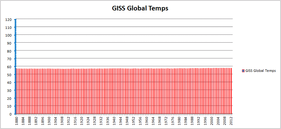
That was my thought while watching the video.
Cox won hands down. Why? Because Roberts was unprepared, and Cox was.
The public is not up to speed on the subject. So, what to do?
Roberts should have had his own charts ready. He should have had the dozens of statements available from numerous physicists, ‘climatologists’, and others in the hard sciences regarding the ‘Pause’, and trying to give 60 or 70 different explanations for why global warming stopped for so many years. He could have had a long list of scientists who disagree with the runaway global warming scare. But just telling people what you think doesn’t win debates.
Visual aids are the most effective tactic with an audience like that. Cox had his NASA charts. Roberts could have shown how NASA diverges from satellite data, and from most other data sources. He could have shown the audience the non-corellation between CO2 and temperature. Roberts could have shown a chart showing the abject failure of 90+ climate models versus reality. He could have had other charts like this one handy:
But Roberts had nothing except his opinion. He was right, but that doesn’t win hearts and minds. He lost the debate because he expected the public to understand. They don’t; they have to be shown, not told.
And people like Roberts had best demand that they pick half the audience. Obviously, this was a heavily Cox-friendly audience. That’s like a lawyer allowing the opposing lawyer to pick the jury.
These debates can be won. It’s not hard; I have a folder full of debates that were won by skeptics against people like Cox. But going into a venue like this and expecting people to understand what you’re saying is a fool’s game. The public is like a bunch of children. You can’t just tell them. You have to show them.
I hope Roberts learned a lesson here. He came unprepared, and he didn’t understand his audience — critical errors on his part.
dbstealy said:
“He could have had other charts like this one handy:”
Yeah, but then he’d be guilty of the same deception you are, pretending that the fact that a large enough scale makes the warming hard to see also means that the warming doesn’t matter. Now you can argue that the warming doesn’t matter, but your graph does nothing to support that argument. To do that you need to specify how much warming would matter, and compare it to how much warming we’ve had, and are likely to have in the future. The answer will be the same regardless of the scale of your graph.
DB
I’ve sad this before but Ill say it again. I think you have a problem with scale on this graph. You see with graphs like this you need to use numbers on the sticky up axis…. oh never mind.
Fine use simple degrees, which is how just about everyone looks at temperature.
http://4.bp.blogspot.com/_BsNAUboeko4/TLWp3FpcG0I/AAAAAAAAAYE/WT80q2s2z00/s400/NASS+GISS+Global+Land-Ocean+Temperature+Index+%281880-2009%29.jpg
Phillip Schaeffer said:
Now you can argue that the warming doesn’t matter, but your graph does nothing to support that argument. To do that you need to specify how much warming would matter, and compare it to how much warming we’ve had, and are likely to have in the future.
As usual, the climate alarmists don’t understand the Scientific Method. Here’s how it works:
What you and the rest of the alarmist crowd are saying is that current observations of global T indicate AGW. For the umpteenth time: scientific skeptics have nothing to prove. The onus is entirely on you folks. You need to support your AGW hypothesis with more than baseless assertions like that.
But since there’s nothing either unprecedented or unusual happening, your side uses tiny tenth- and hundredth-degree wiggles to try and support your belief system. You like those scales because they weren’t available a century or more ago, thus they cannot be compared with today.
NASA posts global temperature data since the 1880’s. The chart I posted above is produced using their data. So the only way to compare earlier temperatures to “how much warming we’ve had” recently is by using one-degree scales for the time frame in question.
Since the only apples-to-apples comparison that can be made is by using the same scale, that’s what I posted. You cannot refute it by using current instruments, because they didn’t exist back then. But if you won’t abide by the Scientific Method, you wouldn’t use tenth-degree scales even if they existed during the MWP, because they would show that nothing unusual is happening now. That’s made clear when consistent charts are used.
Next, you want it specified “how much warming would matter, and compare it to how much warming we’ve had, and are likely to have in the future.” See your problem? You cannot produce what you assert using tenth-degree chart scales, so you’re just speculating.
To be credible, we have to use the same metrics for comparison. That requires a one-degree axis, since that’s all that is available for this time frame. That’s what I posted. Since your job is to try and credibly defend your alarming hypothesis, you must be consistent; baseless assertions are only opinions. Since you don’t have the measurements you believe in, your opinion is that you know that the tiny wiggles of centuries ago are smaller than now, and you understand what the future will bring. That’s not science, that’s just hand-waving.
But by using the only consistent scales, everyone can see that the NASA chart above indicates nothing to be worried about. As you wrote: “The answer will be the same regardless of the scale of your graph.” I agree. The chart I posted confirms that nothing unusual is happening.
And as usual, Simon founders on the same data. Since he cannot refute the data posted, he also hand-waves: …you need to use numbers on the sticky up axis…
What’s the definition of a ‘sticky up axis’? That’s just more deflection. But as usual, I have more charts that contradict Simon’s unalterable belief:
http://i1.wp.com/www.powerlineblog.com/ed-assets/2015/10/Global-2-copy.jpg
I have more such charts. Just ask, and I’ll post them.
Next, I know both sides of this interminable debate play ‘gotcha!’ when someone uses a regional chart instead of global T. But the CET is the oldest consistent temperature record in existence, and the 2nd Law says that one region cannot be substantially different from the rest for hundreds of years. So here is the Central England record:
Finally, I notice that Poptech posted a chart using a different dataset. That also shows there is nothing to worry about, since global T has fluctuated by tens of whole degrees in the past—over only a couple decades. What’s been observed over the past century is only unusual in its lack of variability; a “Goldilocks” century, which we are very fortunate to be in.
Alarmists look at our good fortune, but they always manage to find something that scares them. No matter how often the points made by skeptics are repeated, alarmists fall back on their eco-religion. There are reasons for that which I won’t go into now, but Simon is a casebook example. And that’s also why Marcott et al charts give eco-religionists such a thrill:
http://www.realclimate.org/images//Marcott.png
Of course, the Marcott chart is completely bogus. It’s in the alarmist crowd’s catechism, so they use it. But contradicting Marcott is the Real World.
Which one should we believe? Mother Earth? Or Marcott? Because they cannot both be right.
The data set I used was the same one Cox used – NASA GISS. Just scaled to how the average person looks at temperature.
To see what the original “Right Stuff” NASA engineers found on climate see The Right Climate Stuff
.
http://www.therightclimatestuff.com/
“Physicist” Brian Cox appears unfamiliar with the actual evidence, the scientific method, and how the climate models actually compare with the evidence in the “anthropogenic signature” of the mid tropospheric tropical temperatures. e.g., See John Christy Feb 2nd 2016 testimony.
they look pretty good
No they don’t, and they certainly don’t make the case for CO2 driven warming. CO2’s increase is linear, temperatures follow steps related to ENSOs. Your chart shows flat temperatures between 1980 and 1996, then a step up spike due to an ENSO, and then flat temperatures between 1997 and 2015, and then another ENSO spike. CO2 doesn’t cause ENSO’s, CO2 and IR between 13 and 18µ won’t warm the oceans. If you can’t tie CO2 to ENSO, there must be another reason for the warming. It is that simple.
“Steven, when were the model projections made? If they were all made in 1980 you are right that they look pretty good. If they were retrofitted then the test will be what they project for the next 20 years.”
They are AR5 projections.
hansens projections from the late 80s look just as good
Callendars projections from the 1930s with a simpler model also look good.
who knew?
We knew in 1896 that adding c02 would warm the planet and the data support that.
here forrest
Hansen.. 1981 predictions..
Spot on
https://tamino.wordpress.com/2016/08/16/crystal-serenity/
Hiding the divergence? By shifting the baseline 10 years forward from 1979? Contrast dramatic divergence of models vs satellite & balloon data using the 1979 baseline over the ENTIRE satellite era.
Stephen Mosher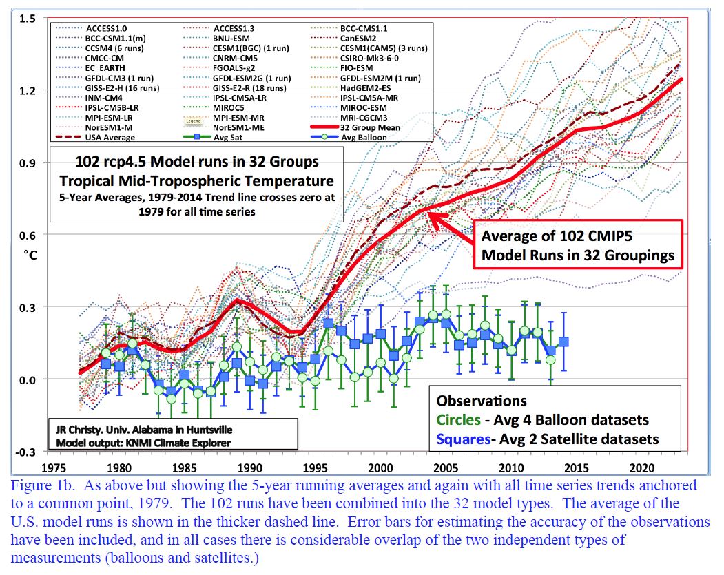
Comparing model predictions from 1979 to 2015 versus all satellite and balloon evidence shows a clear 300% divergence.
Climate Predictions vs Data 1979-2015
Hansen’s ’88 miss predictions
Even after fitting to historic temperatures, AR5 / CMIP5 models are all running hot – unable to accurately predict future temperatures.
Actual temperatures by satellite and balloon measurements are running below even Hansen’s 1988 prediction of stopping ALL anthropogenic CO2.
See: Did James Hansen Unwittingly Prove The Null Hypothesis Of AGW?
Temperatures vs Hansen’s ’88 predictions
See Did James Hansen Unwittingly Prove the Null Hypothesis of AGW?
Fig. 3 Temperatures vs Hansen’s ’88 predictions
Possibly already shown: https://youtu.be/EYPapE-3FRw?t=40
Cheers, Mark
*************************************
My favorite part was when Malcolm responded to the withering attacks and repeated interruptions by politely waiting for his turn to speak and then driving a bus through his opponents logical fallacies. Cheers, mate, nicely done!
I don’t know how you could characterize the Senator as “owning” Brian when, in your own words, the senator “did a credible job of holding his own”? Sounds a bit contradictory to me. I listened to the entire discussion and thought quite the opposite was true. In case anyone is interested, the entire broadcast is available here: https://www.youtube.com/watch?v=jguarSWDcrM and is entitled “Professor Brian Cox exposes & destroys One Nation’s Malcolm Roberts – Q&A full episode 15/8/2016”. I guess “owning” and “destroying” is a matter of perspective just like decisions to remain inside a burning building depend on how high or how hot the flames are and if the data support the conclusion that the building is, in fact, on fire, the smoke and flames leaping from the top floors notwithstanding.
Roberts did incredibly well given he was up against it. He said some undeniably false things.
…. 40’s were warmer than today.
…..we are still pausing. ( I mean for goodness sake this July is the hottest month in the modern record)
But, you have to respect a man who can hold it together in the face of a hostile audience like that.
As for “owning Cox” well that is just nonsense. Roberts came across as a passionate amateur who really didn’t know his stuff, but kept his chin high. Fancy quoting Goddard though? No one quotes Goddard who wants to be respected in this field any more. And I can’t believe (and he called on it by Cox) that Roberts trotted out the idea that the CO2 increase is a result of temp changes. We have know for quite some time now that the increased CO2 in the atmosphere is man made. And yet here he is trying to convince people on national television that this increase is somehow not us. Was fun watching it though. Been a while since we had a good debate like this on TV.
One month doesn’t make it the hottest year, even if it were the hottest month, which it is not ( before all the adjusting)
This year is almost certain to be the hottest in the temp record. Every one of the first seven records. That is hard to beat.
The whole problem in my view, is that we sceptics, Malcolm Roberts included, are approaching the debate in the wrong way. If one of us is lucky enough to get a spot on a national TV show, then we have to make the most of it. Trying to ‘educate’ the audience with facts about this or data about that, is just a waste of that valuable opportunity. The debate is not about the facts. People don’t care about the facts. They care about the emotions. That is why the warmists love to use terrifying graphs, and scary doomsday scenarios, and pictures of poor drowning poley bears. That grabs the audience because of the emotions. And then we think that the best way to counter this is by explaining the intricate details of competing data sets? ZZZZZZZ. There is only one way to go, and that is to fight fire with fire, propaganda with propaganda, and emotion with emotion. If we can take that approach, and still be truthful, then we can beat these idiots at their own game.
I hate to agree. Arguing data is a complete waste of time. The Alarmists don’t concern themselves with the phony data displayed in the ground measurements and Hockeystick, they use the adulterated charts to make their points. They are the ones altering the data and creating the deceitful charts to make their case. How can you possibly win by arguing data when your opponent simply makes up or alters the data to fit their case? You can’t. They will immediately call you a conspiracy nut. We need to put the argument into cost and benefits. Pulling 1 ton of CO2 out of the atmosphere costs society x# of schools and hospitals, drives up your utility bill x$. John Christy does a great job of that in a video below.
It’s pretty testing being on camera and coming up with concise comments even when you know your subject inside out.
Cox does a good job of explaining science matters to the lay-man. I disagree with his ideas about the Coriolis effect causing the intensity of typhoons but that’s just how science works, – one person makes a comment and others add or subtract bits of information and “the body of knowledge” nibbles forwards.