Guest Post by Werner Brozek, Excerpted from Professor Robert Brown from Duke University, Conclusion by Walter Dnes and Edited by Just The Facts:

A while back, I had a post titled: HadCRUT4 is From Venus, GISS is From Mars, which showed wild monthly variations from which one could wonder if GISS and Hadcrut4 were talking about the same planet. In comments, mark stoval, posted a link to this article, Why “GISTEMP LOTI global mean” is wrong and “HadCRUt3 gl” is right“, who’s title speaks for itself and Bob Tisdale has a recent post, Busting (or not) the mid-20th century global-warming hiatus, which could explain the divergence seen in the chart above.
The graphic at the top is the last plot from Professor Brown from his comment I’ve excerpted below, which shows a period of 19 years where the slopes go in opposite directions by a fairly large margin. Is this reasonable? Think about this as you read his comment below. His comment ends with rgb.
rgbatduke
November 10, 2015 at 1:19 pm
“Werner, if you look over the length and breadth of the two on WFT, you will find that over a substantial fraction of the two plots they are offset by less than 0.1 C. For example, for much of the first half of the 20th century, they are almost on top of one another with GISS rarely coming up with a patch 0.1 C or so higher. They almost precisely match in a substantial part of their overlapping reference periods. They only start to substantially split in the 1970 to 1990 range (which contains much of the latter 20th century warming). By the 21st century this split has grown to around 0.2 C, and is remarkably consistent. Let’s examine this in some detail:
We can start with very simple graph that shows the divergence over the last century:
http://www.woodfortrees.org/plot/hadcrut4gl/from:1915/to:2015/trend/plot/gistemp/from:1915/to:2015/trend
The two graphs have widening divergence in the temperatures they obtain. If the two measures were in mutual agreement, one would expect the linear trends to be in good agreement — the anomaly of the anomaly, as it were. They should, after all, be offset by only the difference in mean temperatures in their reference periods, which should be a constant offset if they are both measuring the correct anomalies from the same mean temperatures.
Obviously, they do not. There is a growing rift between the two and, as I noted, they are split by more than the 95% confidence that HadCRUT4, at least, claims even relative to an imagined split in means over their reference periods. There are, very likely, nonlinear terms in the models used to compute the anomalies that are growing and will continue to systematically diverge, simply because they very likely have different algorithms for infilling and kriging and so on, in spite of them very probably having substantial overlap in their input data.
In contrast, BEST and GISS do indeed have similar linear trends in the way expected, with a nearly constant offset. One presumes that this means that they use very similar methods to compute their anomalies (again, from data sets that very likely overlap substantially as well). The two of them look like they want to vote HadCRUT4 off of the island, 2 to 1:
http://www.woodfortrees.org/plot/hadcrut4gl/from:1915/to:2005/trend/plot/gistemp/from:1915/to:2005/trend/plot/best/from:1915/to:2005/trend
Until, of course, one adds the trends of UAH and RSS:
http://www.woodfortrees.org/plot/hadcrut4gl/from:1979/to:2015/trend/plot/gistemp/from:1979/to:2015/trend/plot/best/from:1979/to:2005/trend/plot/rss/from:1979/to:2015/trend/plot/uah/from:1979/to:2015/trend
All of a sudden consistency emerges, with some surprises. GISS, HadCRUT4 and UAH suddenly show almost exactly the same linear trend across the satellite era, with a constant offset of around 0.5 C. RSS is substantially lower. BEST cannot honestly be compared, as it only runs to 2005ish.
One is then very, very tempted to make anomalies out of our anomalies, and project them backwards in time to see how well they agree on hind casts of past data. Let’s use the reference period show and subtract around 0.5 C from GISS and 0.3 C from HadCRUT4 to try to get them to line up with UAH in 2015 (why not, good as any):
http://www.woodfortrees.org/plot/hadcrut4gl/from:1979/to:2015/offset:-0.32/trend/plot/gistemp/from:1979/to:2015/offset:-0.465/trend/plot/uah/from:1979/to:2015/trend
We check to see if these offsets do make the anomalies match over the last 36 most accurate years (within reason):
http://www.woodfortrees.org/plot/hadcrut4gl/from:1979/to:2015/offset:-0.32/plot/gistemp/from:1979/to:2015/offset:-0.465/plot/uah/from:1979/to:2015
and see that they do. NOW we can compare the anomalies as they project into the indefinite past. Obviously UAH does have a slightly slower linear trend over this “re-reference period” and it doesn’t GO any further back, so we’ll drop it, and go back to 1880 to see how the two remaining anomalies on a common base look:
http://www.woodfortrees.org/plot/hadcrut4gl/from:1880/to:2015/offset:-0.32/plot/gistemp/from:1880/to:2015/offset:-0.465
We now might be surprised to note that HadCRUT4 is well above GISS LOTI across most of its range. Back in the 19th century splits aren’t very important because they both have error bars back there that can forgive any difference, but there is a substantial difference across the entire stretch from 1920 to 1960:
http://www.woodfortrees.org/plot/hadcrut4gl/from:1920/to:1960/offset:-0.32/plot/gistemp/from:1920/to:1960/offset:-0.465/plot/hadcrut4gl/from:1920/to:1960/offset:-0.32/trend/plot/gistemp/from:1920/to:1960/offset:-0.465/trend
This reveals a robust and asymmetric split between HadCRUT4 and GISS LOTI that cannot be written off to any difference in offsets, as I renormalized the offsets to match them across what has to be presumed to be the most precise and accurately known part of their mutual ranges, a stretch of 36 years where in fact their linear trends are almost precisely the same so that the two anomalies differ only BY an offset of 0.145 C with more or less random deviations relative to one another.
We find that except for a short patch right in the middle of World War II, HadCRUT4 is consistently 0.1 to 0.2 C higher than GISStemp. This split cannot be repaired — if one matches it up across the interval from 1920 to 1960 (pushing GISStemp roughly 0.145 HIGHER than HadCRUT4 in the middle of WW II) then one splits it well outside of the 95% confidence interval in the present.
Unfortunately, while it is quite all right to have an occasional point higher or lower between them — as long as the “occasions” are randomly and reasonably symmetrically split — this is not an occasional point. It is a clearly resolved, asymmetric offset in matching linear trends. To make life even more interesting, the linear trends do (again) have a more or less matching slope, across the range 1920 to 1960 just like they do across 1979 through 2015 but with completely different offsets. The entire offset difference was accumulated from 1960 to 1979.
Just for grins, one last plot:
http://www.woodfortrees.org/plot/hadcrut4gl/from:1880/to:1920/offset:-0.365/plot/gistemp/from:1880/to:1920/offset:-0.465/plot/hadcrut4gl/from:1880/to:1920/offset:-0.365/trend/plot/gistemp/from:1880/to:1920/offset:-0.465/trend
Now we have a second, extremely interesting problem. Note that the offset between the linear trends here has shrunk to around half of what it was across the bulk of the early 20th century with HadCRUT4 still warmer, but now only warmer by maybe 0.045 C. This is in a region where the acknowledged 95% confidence range is order of 0.2 to 0.3. When I subtract appropriate offsets to make the linear trends almost precisely match in the middle, we get excellent agreement between the two anomalies.
Too excellent. By far. All of the data is within the mutual 95% confidence interval! This is, believe it or not, a really, really bad thing if one is testing a null hypothesis such as “the statistics we are publishing with our data have some meaning”.
We now have a bit of a paradox. Sure, the two data sets that these anomalies are built from very likely have substantial overlap, so the two anomalies themselves cannot properly be viewed as random samples drawn from a box filled with independent and identically distributed but correctly computed anomalies. But their super-agreement across the range from 1880 to 1920 and 1920 to 1960 (with a different offset) and across the range from 1979 to 2015 (but with yet another offset) means serious trouble for the underlying methods. This is absolutely conclusive evidence, in my opinion, that “According to HadCRUT4, it is well over 99% certain GISStemp is an incorrect computation of the anomaly” and vice versa. Furthermore, the differences between the two can not be explained by the fact that they draw on partially independent data sources — if this were the case, the strong coincidences between the two across piecewise blocking of the data are too strong — obviously the independent data is not sufficient to generate a symmetric and believable distribution of mutual excursions with errors that are anywhere near as large as they have to be, given that both HadCRUT4 and GISStemp if anything underestimate probable errors in the 19th century.
Where is the problem? Well, as I noted, a lot of it happens right here:
http://www.woodfortrees.org/plot/hadcrut4gl/from:1960/to:1979/offset:-0.32/plot/gistemp/from:1960/to:1979/offset:-0.465/plot/hadcrut4gl/from:1960/to:1979/offset:-0.32/trend/plot/gistemp/from:1960/to:1979/offset:-0.465/trend
The two anomalies match up almost perfectly from the right hand edge to the present. They do not match up well from 1920 to 1960, except for a brief stretch of four years or so in early World War II, but for most of this interval they maintain a fairly constant, and identical, slope to their (offset) linear trend! They match up better (too well!) — with again a very similar linear trend but yet another offset across the range from 1880 to 1920. But across the range from 1960 to 1979, Ouch! That’s gotta hurt. Across 20 years, HadCRUT4 cools Earth by around 0.08 C, while GISS warms it by around around 0.07C.
So what’s going on? This is a stretch in the modern era, after all. Thermometers are at this point pretty accurate. World History seems to agree with HadCRUT4, since in the early 70’s there was all sorts of sound and fury about possible ice ages and global cooling, not global warming. One would expect both anomalies to be drawing on very similar data sets with similar precision and with similar global coverage. Yet in this stretch of the modern era with modern instrumentation and (one has to believe) very similar coverage, the two major anomalies don’t even agree in the sign of the linear trend slope and more or less symmetrically split as one goes back to 1960, a split that actually goes all the way back to 1943, then splits again all the way back to 1920, then slowly “heals” as one goes back to 1880.
As I said, there is simply no chance that HadCRUT4 and GISS are both correct outside of the satellite era. Within the satellite era their agreement is very good, but they split badly over the 20 years preceding it in spite of the data overlap and quality of instrumentation. This split persists over pretty much the rest of the mutual range of the two anomalies except for a very short period of agreement in mid-WWII, where one might have been forgiven for a maximum disagreement given the chaotic nature of the world at war. One must conclude, based on either one, that it is 99% certain that the other one is incorrect.
Or, of course, that they are both incorrect. Further, one has to wonder about the nature of the errors that result in a split that is so clearly resolved once one puts them on an equal footing across the stretch where one can best believe that they are accurate. Clearly it is an error that is a smooth function of time, not an error that is in any sense due to accuracy of coverage of the (obviously strongly overlapping) data.
This result just makes me itch to get my hands on the data sets and code involved. For example, suppose that one feeds the same data into the two algorithms. What does one get then? Suppose one keeps only the set of sites that are present in 1880 when the two have mutually overlapping application (or better, from 1850 to the present) and runs the algorithm on them. How much do the results split from a) each other; and b) the result obtained from using all of the available sites in the present? One would expect the latter, in particular, to be a much better estimator of the probable method error in the remote past — if one uses only those sites to determine the current anomaly and it differs by (say) 0.5 C from what one gets using all sites, that would be a very interesting thing in and of itself.
Finally, there is the ongoing problem with using anomalies in the first place rather than computing global average temperatures. Somewhere in there, one has to perform a subtraction. The number you subtract is in some sense arbitrary, but any particular number you subtract comes with an error estimate of its own. And here is the rub:
The place where the two global anomalies develop their irreducible split is square inside the mutually overlapping part of their reference periods!
That is, the one place they most need to be in agreement, at least in the sense that they reproduce the same linear trends, that is, the same anomalies is the very place where they most greatly differ. Indeed, their agreement is suspiciously good — as far as linear trend is concerned – everywhere else, in particular in the most recent present where one has to presume that the anomaly is most accurately being computed and the most remote past where one expects to get very different linear trends but instead get almost identical ones!
I doubt that anybody is still reading this thread to see this — but they should.
rgb
P.S. from Werner Brozek:
On Nick Stokes Temperature Trend Viewer note the HUGE difference in the lower number for the 95% (Cl) confidence limits between Hadcrut4 and GISS from March 2005 to April 2016:
For GISS:
Temperature Anomaly trend
Mar 2005 to Apr 2016
Rate: 2.199°C/Century;
CI from 0.433 to 3.965;
For Hadcrut4:
Temperature Anomaly trend
Mar 2005 to Apr 2016
Rate: 1.914°C/Century;
CI from -0.023 to 3.850;
In the sections below, we will present you with the latest facts. The information will be presented in two sections and an appendix. The first section will show for how long there has been no statistically significant warming on several data sets. The second section will show how 2016 so far compares with 2015 and the warmest years and months on record so far. For three of the data sets, 2015 also happens to be the warmest year. The appendix will illustrate sections 1 and 2 in a different way. Graphs and a table will be used to illustrate the data. The two satellite data sets go to May and the others go to April.
Section 1
For this analysis, data was retrieved from Nick Stokes’ Trendviewer available on his website. This analysis indicates for how long there has not been statistically significant warming according to Nick’s criteria. Data go to their latest update for each set. In every case, note that the lower error bar is negative so a slope of 0 cannot be ruled out from the month indicated.
On several different data sets, there has been no statistically significant warming for between 0 and 23 years according to Nick’s criteria. Cl stands for the confidence limits at the 95% level.
The details for several sets are below.
For UAH6.0: Since May 1993: Cl from -0.023 to 1.807
This is 23 years and 1 month.
For RSS: Since October 1993: Cl from -0.010 to 1.751
This is 22 years and 8 months.
For Hadcrut4.4: Since March 2005: Cl from -0.023 to 3.850
This is 11 years and 2 months.
For Hadsst3: Since July 1996: Cl from -0.014 to 2.152
This is 19 years and 10 months.
For GISS: The warming is significant for all periods above a year.
Section 2
This section shows data about 2016 and other information in the form of a table. The table shows the five data sources along the top and other places so they should be visible at all times. The sources are UAH, RSS, Hadcrut4, Hadsst3, and GISS.
Down the column, are the following:
1. 15ra: This is the final ranking for 2015 on each data set.
2. 15a: Here I give the average anomaly for 2015.
3. year: This indicates the warmest year on record so far for that particular data set. Note that the satellite data sets have 1998 as the warmest year and the others have 2015 as the warmest year.
4. ano: This is the average of the monthly anomalies of the warmest year just above.
5. mon: This is the month where that particular data set showed the highest anomaly prior to 2016. The months are identified by the first three letters of the month and the last two numbers of the year.
6. ano: This is the anomaly of the month just above.
7. sig: This the first month for which warming is not statistically significant according to Nick’s criteria. The first three letters of the month are followed by the last two numbers of the year.
8. sy/m: This is the years and months for row 7.
9. Jan: This is the January 2016 anomaly for that particular data set.
10. Feb: This is the February 2016 anomaly for that particular data set, etc.
14. ave: This is the average anomaly of all months to date taken by adding all numbers and dividing by the number of months.
15. rnk: This is the rank that each particular data set would have for 2016 without regards to error bars and assuming no changes. Think of it as an update 20 minutes into a game.
| Source | UAH | RSS | Had4 | Sst3 | GISS |
|---|---|---|---|---|---|
| 1.15ra | 3rd | 3rd | 1st | 1st | 1st |
| 2.15a | 0.261 | 0.358 | 0.746 | 0.592 | 0.87 |
| 3.year | 1998 | 1998 | 2015 | 2015 | 2015 |
| 4.ano | 0.484 | 0.550 | 0.746 | 0.592 | 0.87 |
| 5.mon | Apr98 | Apr98 | Dec15 | Sep15 | Dec15 |
| 6.ano | 0.743 | 0.857 | 1.010 | 0.725 | 1.10 |
| 7.sig | May93 | Oct93 | Mar05 | Jul96 | |
| 8.sy/m | 23/1 | 22/8 | 11/2 | 19/10 | |
| 9.Jan | 0.540 | 0.665 | 0.908 | 0.732 | 1.11 |
| 10.Feb | 0.832 | 0.978 | 1.061 | 0.611 | 1.33 |
| 11.Mar | 0.734 | 0.842 | 1.065 | 0.690 | 1.29 |
| 12.Apr | 0.715 | 0.757 | 0.926 | 0.654 | 1.11 |
| 13.May | 0.545 | 0.525 | |||
| 14.ave | 0.673 | 0.753 | 0.990 | 0.671 | 1.21 |
| 15.rnk | 1st | 1st | 1st | 1st | 1st |
If you wish to verify all of the latest anomalies, go to the following:
For UAH, version 6.0beta5 was used. Note that WFT uses version 5.6. So to verify the length of the pause on version 6.0, you need to use Nick’s program.
http://vortex.nsstc.uah.edu/data/msu/v6.0beta/tlt/tltglhmam_6.0beta5.txt
For RSS, see: ftp://ftp.ssmi.com/msu/monthly_time_series/rss_monthly_msu_amsu_channel_tlt_anomalies_land_and_ocean_v03_3.txt
For Hadcrut4, see: http://www.metoffice.gov.uk/hadobs/hadcrut4/data/current/time_series/HadCRUT.4.4.0.0.monthly_ns_avg.txt
For Hadsst3, see: https://crudata.uea.ac.uk/cru/data/temperature/HadSST3-gl.dat
For GISS, see:
http://data.giss.nasa.gov/gistemp/tabledata_v3/GLB.Ts+dSST.txt
To see all points since January 2015 in the form of a graph, see the WFT graph below. Note that UAH version 5.6 is shown. WFT does not show version 6.0 yet. Also note that Hadcrut4.3 is shown and not Hadcrut4.4, which is why many months are missing for Hadcrut.

As you can see, all lines have been offset so they all start at the same place in January 2015. This makes it easy to compare January 2015 with the latest anomaly.
Appendix
In this part, we are summarizing data for each set separately.
UAH6.0beta5
For UAH: There is no statistically significant warming since May 1993: Cl from -0.023 to 1.807. (This is using version 6.0 according to Nick’s program.)
The UAH average anomaly so far for 2016 is 0.673. This would set a record if it stayed this way. 1998 was the warmest at 0.484. The highest ever monthly anomaly was in April of 1998 when it reached 0.743 prior to 2016. The average anomaly in 2015 was 0.261 and it was ranked 3rd.
RSS
For RSS: There is no statistically significant warming since October 1993: Cl from -0.010 to 1.751.
The RSS average anomaly so far for 2016 is 0.753. This would set a record if it stayed this way. 1998 was the warmest at 0.550. The highest ever monthly anomaly was in April of 1998 when it reached 0.857 prior to 2016. The average anomaly in 2015 was 0.358 and it was ranked 3rd.
Hadcrut4.4
For Hadcrut4: There is no statistically significant warming since March 2005: Cl from -0.023 to 3.850.
The Hadcrut4 average anomaly so far is 0.990. This would set a record if it stayed this way. The highest ever monthly anomaly was in December of 2015 when it reached 1.010 prior to 2016. The average anomaly in 2015 was 0.746 and this set a new record.
Hadsst3
For Hadsst3: There is no statistically significant warming since July 1996: Cl from -0.014 to 2.152.
The Hadsst3 average anomaly so far for 2016 is 0.671. This would set a record if it stayed this way. The highest ever monthly anomaly was in September of 2015 when it reached 0.725 prior to 2016. The average anomaly in 2015 was 0.592 and this set a new record.
GISS
For GISS: The warming is significant for all periods above a year.
The GISS average anomaly so far for 2016 is 1.21. This would set a record if it stayed this way. The highest ever monthly anomaly was in December of 2015 when it reached 1.10 prior to 2016. The average anomaly in 2015 was 0.87 and it set a new record.
Conclusion
If GISS and Hadcrut4 cannot both be correct, could the following be a factor:
* “Hansen and Imhoff used satellite images of nighttime lights to identify stations where urbanization was most likely to contaminate the weather records.” GISS
* “Using the photos, a citizen science project called Cities at Night has discovered that most light-emitting diodes — which are touted for their energy-saving properties — actually make light pollution worse. The changes in some cities are so intense that space station crew members can tell the difference from orbit.” Tech Insider
Question… is the GISS “nightlighting correction” valid any more? And what does that do to their “data”?
Data Updates
GISS for May came in at 0.93. While this is the warmest May on record, it is the first time that the anomaly fell below 1.00 since October 2015. As for June, present indications are that it will drop by at least 0.15 from 0.93. All months since October 2015 have been record warm months so far for GISS. Hadsst3 for May came in at 0.595. All months since April 2015 have been monthly records for Hadsst3.
There is something weird going on with the data bases, and only a real, outside investigation could reveal what.
As such “derived” or “deranged” data have accumulated political significance, political, agenda driven choices have to be made; how interesting.
What on earth could stray light from low powered LED lighting do to global or local Temperatures ??
As far as I a aware, no current LED lighting technology emits energy in LWIR bands, other than the much reduced thermal radiation due to their case Temperature, and that is peanuts compared to incandescent lighting.
G
* “Hansen and Imhoff used satellite images of nighttime lights to identify stations where urbanization was most likely to contaminate the weather records.” GISS
* “Using the photos, a citizen science project called Cities at Night has discovered that most light-emitting diodes — which are touted for their energy-saving properties — actually make light pollution worse.
I think you missed the point. LED lighting may not do anything to the actual temperature. The referenced GISS press release at http://www.giss.nasa.gov/research/news/20011105/ states that nighttime brightness is used by GISS to ADJUST MEASURED TEMPERATURES. The question is not “what do bright LEDs do to real temperatures?”, but rather “what do bright LEDs do to the GISS temperature adjustments?”. If the adjustments are invalid, the GISS “adjusted data” is invalid.
“What on earth could stray light from low powered LED lighting do to global or local Temperatures”
It appears lights are used as a marker to indicate population centers for UHI avoidance? My best swag is more LEDs in some cities might skew a relative brightness scale, making incandescent rich urban areas appear less populated?
Jeez. Nightlights are not used to correct the data.
nightlights are used to CLASSIFY the stations as urban or rural.
nightlights are used to CLASSIFY a station. Notthing more. read the code
The dataset used , Imhoff 97, is Not a very good source,
Basically it captures what stations were urban in 1997 and which were rural.
As a proxy of urbanity nightlights is ok.. but it really measures electrification.
The actual Adjusting of stations happens by comparing urban and rural and urban are forced into agreement with rural stations.
Well, you’re the only one to say “correct”, everyone else said “adjust”. So assuming you meant “adjust”, your typically condescending comment contradicts itself at the end. If you actually meant “correct”, then you just battled your own strawman, and lost. Good job!
FANTASTIC !!!!
There is very little doubt in my mind that the historic temperature record prior to the advent of satellite-based measurement is absolutely worthless.
I doubt that the historical temperature data are worthless, though I would agree regarding the “adjusted” data and the anomalies produced from them.
Thing is, the raw data needs to be adjusted. Especially during that period of frequent TOBS PM-AM shifts and MMTS conversion. Those will spuriously decrease the warming trend, esp. for the well sited stations. And then there are station moves.
But there are other biases, too. Poor microsite (affecting 77% of the USHCN) is a net warming trend bias on the level of TOBS and is not accounted for at all.
That is Anthony’s Great Discovery.
Not to mention the CRS unit, itself. Tmax trend is way to high and Tmin trend is too low. (It nets out at maybe 25% too high for Tmean.) That is not accounted for by anyone. And it’s a moving bias — by now, a great majority of the USHCN CRS units have been replaced, so the bias is diminished. But CRS units are all over the place in the GHCN. Not only is that not accounted for in any metric, but MMTS is adjusted to the spuriously high level of CRS.
So raw data won’t do. Just won’t. But the fact that it must be adjusted makes it extremely important to apply those adjustments very carefully. And, as much of the GHCN metadata is either flawed or missing, even many adjustments must be inferred. And if BEST can infer from a data jump, we can infer in terms of trend and graduality. Sauce for the goose. And it’s very, very important not to leave out any geese. Viz microsite; viz CRS bias.
Sounds like an argument for a global CRN – real data rather than “adjusted” estimates.
When I think about “adjusting” data, I am reminded of Rumpelstiltskin spinning straw (bad data) into gold (good data). Then I think of GISS, spinning nothing (missing data) into gold (good data). I suspect the Brothers Grimm would be impressed. 😉
“And if BEST can infer from a data jump, we can infer in terms of trend and graduality. Sauce for the goose. And it’s very, very important not to leave out any geese. Viz microsite; viz CRS bias.”
Sorry. but if you do any adjusting you had better double blind test it.
The test dataset is available, so you can apply yoru adjustment code to blind data
and see how it does.
here is a clue. remember your Mcintyre.
IF you introduce a new method you need to do a methods paper first to show the method works
mixing up a new results and new method paper is just asking for trouble,
Second we dont infer adjustments from data jumps. so get your ducks in line.
You find a data jump by pairwise comparisons and infer that the jump is spurious. In many cases, correctly, I would say.
I think BEST is a very good first step in methodological terms. But I think it cannot ferret out systematic, gradual biases in its present form. This is correctable, however.
Sounds like an argument for a global CRN – real data rather than “adjusted” estimates.
It certainly is a — strong — argument for a GCRN. However . . .
When I think about “adjusting” data, I am reminded of Rumpelstiltskin spinning straw (bad data) into gold (good data).
There is some gold in that-there straw. Yes, it’s a pity we have to dig for it and refine it through demonstrably necessary adjustments.
Thing is, we are stuck with whatever historical data we have. We can’t go back in time and do a GCRN. We have to do the best we can with what we have.
Then I think of GISS, spinning nothing (missing data) into gold (good data). I suspect the Brothers Grimm would be impressed. 😉
Infill in the USHCN is less of a problem than for GHCN. Less missing data, far superior metadata (at least going back to the late 1970s, which covers our study period). Dr. Nielsen-Gammon did us some excellent work on infill — and how to cross-check it. We will address that in followup to our current effort.
The problem here is the mangled, systematically flawed adjustments applied to the GISS and NOAA surface data, and, yes, also to Haddy4. In order to ferret anything meaningful out of the historical non-CRN type data, adjustments do need to be applied. But the trick is to get it right. (Devil, meet details.)
Adjustments must be fully accounted for, clear, concise, replicable, and justifiable by clearly explained means. One must be able to say how and why any adjustment is made.
At least BEST does that, although I dispute their results (again, for easily explained, demonstrable reasons). BEST is a great first shot, but fails to address at least two gradual systematic biases that take it/keep it off the rails.
But with those factors included, the results would be hugely improved, and the stage set for further improvements as they are identified and quantified. Yes, Mosh and I are barking up different trees, using different approaches, but at least he is barking in the right direction. (GISS, NOAA, Haddy, not so much.)
Any researcher or layman must be able to ask why any particular station was adjusted an get a good answer. A “full and complete” answer that can be examined and found correct or wanting. (Not currently forthcoming from the creators of the main surface metrics.) And one may be equally certain that even if an adjustment improves accuracy, it will not result in perfection. Not even the excellent USCRN (i.e., little/no need to adjust) can give us that.
One must also be aware that this effort is in its adolescence. Our team (Anthony’s team) has identified at least two first-order factors which result in systematic, gradual diversion that makes complete hash out of any attempt at homogenization: Microsite and CRS bias. But there may be more. And, therefore, any system of adjustment must be done top-down and amenable to correction and improvement as our knowledge improves.
It is an ongoing effort. We, ourselves, have traveled that path. First, we upgunned our rating metric from Leroy (1999) to Leroy (2010). (And who knows what further refinement would bring?) Then we addressed, step by step, the various criticisms of our 2012 effort. Each step brought overall improvement — we think. And if we thought wrong, then independent review will follow publication and we will continue to address, refine, and improve.
Finally, homogenization, correctly applied, will improve results. But it is tricky to apply correctly, and, if done wrong — which it is — makes the problem worse rather than better.
Individually, no, not worthless. But averaged all together, yes, worthless.
Except when your tree rings become worthless and then they become worthwhile again.
Well we know for sure that the 150 odd years of data from 73% of the globe; namely the oceans, is total trash since it is based on water Temperature at some uncontrolled depth, rather than lower tropospheric air Temperature at some allegedly controlled height above the surface.
Christy et al showed, that those two are not the same, and not even correlated, so the old ships at sea data is total baloney, and not correctible to lower troposphere equivalent.
G
I don’t know about useless. So long as they put proper error bars on the data.
+/- 20C should be about right.
Exactly right. I also believe the error bars used for all the data is wrong; I suspect proper error calculation using instrumentation limits etc. would create larger error bars. Further I question the use of 95% confidence levels rather than 99%.
cool, skeptics disappear the LIA and the MWP.
Further I question the use of 95% confidence levels rather than 99%.
(*Grin*) What Mosh said. (You don’t even need the 20C.)
Look, I been there and done that. There is no 99%. Fergeddaboutit. One is lucky to get 95%, and even then only in the aggregate (far less the regionals). Heck, even station placement is a bias.
Yeah, we took what we could get. (And you ain’t seen nothin’ yet.) But the results are not meaningless, either — or war colleges wouldn’t stage wargames.
Error spec. on the type of commercial temperature gauges used on ships’ engine inlet temperature is no better than ±2°C, and may be as much as double that. Further, it is highly unlikely that the gauges are ever checked for calibration.
It is fascinating to note that certain climate database “experts” appear to prefer them to the ARGO buoys.
Steven Mosher: “cool, skeptics disappear the LIA and the MWP.”
Sceptics? Really?
You know, I always thought that was what you real climate “scientists” have done.
He was obviously referring to:
Which of course would not disappear them, but simply say for all we know they were far more extreme, or far less. (Saying “I do not know”, is never an assertion in any direction.
To all the foregoing – pretending accuracy that is not true is not science. Sorry, as David A. states, the proper answer is “We DON’T KNOW.” You can all pretend that you can use shoddy, spotty, measurements to say what the earth’s temperature was x years ago, and you can all pretend that somehow 95% confidence levels is meaningful. But a real scientist recognizes when their data is useless and accepts that using poor data (if that’s all they have) means their theory remains just that, a theory.
Anyone want to try new pharmaceuticals or a new bridge structure based on the type of data climate scientists use? How about a computer that works with the accuracy of 95% confidence levels?
Different things need different degrees of accuracy.
well…I do agree that the use of anomalies should be abandoned. This will in itself show just how small the temperature changes are.
In an average year, global average temperatures vary by 3.8 C between January and July. So anomalies are actually way less, therefore I do not see anomalies as a problem.
Without anomalies we would go insane, our eyes would never stop waving and we’d probably miss the seasonal trend comparisons. Please don’t take my anomalies away. (Besides, I anomalize each station to itself, not some arbitrary baseline.)
I see a need for both, and consider that a part of any comparison between disparate data sets may find that using absolute GMT is helpful in finding differences. (BTW, the IPCC models produce some interesting absolute GMTs.)
Also, do not forget that GISS deletes polar SST data…
https://bobtisdale.wordpress.com/2010/05/31/giss-deletes-arctic-and-southern-ocean-sea-surface-temperature-data/
Well they have to be viewed in light of a typical global Temperature range on any ordinary northern summer day, is at least 100 deg. C and could be as much as 150 deg. C.
So looking for a one deg. C change over 150 years in that is just silly.
G
– George
From freezing to boiling in the same day? Where do you live?
Ah! Globally! Never mind, lol.
If you go just by the hemisphere having summer, the swing isn’t that great, but if you include the winter lows in Antarctica with the highs in the NH, then, yeah, even 150 degrees C on some days is possible. Let’s say a blistering but possible 57 C somewhere in the north and the record of -93 C in the south.
No place in the NH gets anywhere nearly as cold as Antarctica.
“well…I do agree that the use of anomalies should be abandoned. This will in itself show just how small the temperature changes are.”
BerkeleyEarth doesnt use anomalies. The answer is the same. its just algebra.
What Mosh said.
Anyway, anomalies are much easier to deal with if you’re making comparisons on graphs. We only have two eyes and they don’t even have adjustable microscopes. Our team uses anomalies.
And, yeah, you can do it to the degree C, even over a century. (Tenths, hundredths, thousandths, is problematic.)
1/10, /100th, 1/1000s are not a problem
you fundamentally dont understand what it means. it is not a measure of precision.
I will do a simple example.
I give you a scale. it reports pounds, integer pounds.
I ask you to weigh a rock
you weigh it three times.
1 pound
1 pound
2. pounds
Now I ask you the following question:
based on your measurements PREDICT the answer I will get if I weigh the rock with a scale that reports
weight to 3 digits?
When we do spatial statistics the math underlying it is Operationally performing a prediction of what
we would measure at unmeasured locations IF we had a perfect thermometer.
It’s an estimate.
So lets return to the rock weighing.
You average the three data points and you come up with 1.33
That doesnt mean you think your scale is good to 1/100th.
What it MEANS.. is this.. IF you predict 1.33 as being the true weight, then your prediction will MINIMIZE the error.
So what would you predict? would you predict 1 lb? well that’s just 1.000000
would you predict 2 pounds? or 2.000000
The point in doing a spatial “average” is that you are doing a prediction of the points you didnt measure.
And you are saying 1.33 will be closer than any other prediction, it will never be correct, it will just be LESS WRONG than other approaches. and you can test that.
Same thing if you weigh 100 swedes. suppose I weighed 100 swedes with a scale that was only good to a pound. I average the numbers and I come up with 156.76.
Whats that mean? Well, if we want to USE the average to make predictions it means this.
Go find some swedes i didnt weigh.
Now weigh them with a really good scale…
I will predict that my error of prediction will be smaller if I choose 156.76 than if I choose 156 or 157
or pick the same 100 and re weigh them with a really good scale
Its not that I know the weight of the 100 to 1/100th. I dont. Its rather this: I use the weight of the known
to predict the weight of the unknown and then I can test my prediction and judge it by its accuracy.
A spatial average is nothing more and nothing less than a prediction of the temperature at the PLACES
where we have no measurement. by definition that is what it is.
So for example. we can create a field using all the BAD stations and PREDICT what we should find at the CRN stations..
we can use the bad and predict.. and then check.. what did the CRN stations really say?
And we can use the CRN stations to predict what the other stations around it should say..
and then test that.
i know we call it averaging.. but thats really confusing people. its using an “averaging” process to predict
http://www.spatialanalysisonline.com/HTML/index.html?geostatistical_interpolation_m.htm
“Steven, isn’t the principle that intermediate and final results should not be given to a greater precision than the inputs?”
Of course it is, Forrest. In absolutely every scientific and engineering discipline apart from climate “science”, that is.
Steven suffers from False Precision Syndrome, along with the rest of his disingenuous ilk.
I know, Mosh, I know.
I agree with you.
We do the same kind of thing.
Regarding: “Within the satellite era their agreement is very good,”: I think there is a problem even within the satellite era. If one splits the satellite era into two periods for obtaining linear trends, pre and post 1998-1999 El Nino, with the split being in early 1999 (ends come closest to meeting without adding an offset), and one compares GISS, HadCRUT4 and either of the main satellite indices (I chose RSS), one gets this:
http://woodfortrees.org/plot/rss/from:1979/to:1999.09/trend/offset:0.15/plot/rss/from:1999.09/trend/offset:0.15/plot/hadcrut4gl/from:1979/to:1999.09/trend/plot/hadcrut4gl/from:1999.09/trend/plot/gistemp/from:1979/to:1999.09/trend/offset:-0.05/plot/gistemp/from:1999.09/trend/offset:-0.05
What I see: HadCRUT4 and the satellites agree that warming was rapid from 1979 to 1999 and slower after 1999, and GISS disagrees with this.
After NOAA came out with their pause buster, GISS promptly followed. My earlier article here compares GISS anomalies at the end of 2015 versus the end of 2014 in the first table:
https://wattsupwiththat.com/2016/01/27/final-2015-statistics-now-includes-december-data/
Donald Klipstein says: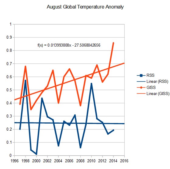


…GISS disagrees…
Here’s a look at RSS vs GISS:
And this shows Michael Mann’s prediction versus Reality:
http://s28.postimg.org/c6vz5v2i5/Hadcrut4_versus_Something.png
Another comparison:
One more showing GISS vs RSS:
NASA/GISS is out of whack with satellite data, and GISS always shows much more warming. But do they ever explain why?
dbstealey wrote: “NASA/GISS is out of whack with satellite data, and GISS always shows much more warming. But do they ever explain why?”
They never explain why because if they did they would have to admit to manipulating the data for political purposes.
I agree, this is my take on it.
http://i62.tinypic.com/2yjq3pf.png
Something changed.
This is one I made last summer around the time everybody was talking about the Karl “Pausebusters” paper.
https://andthentheresphysics.wordpress.com/2016/03/08/guest-post-surface-and-satellite-discrepancy/
Isn’t that the paper many many scientists believe to be fraudulent?
The satellite series has a break when they switch to AMSU.. around may 1998.
Well, they do know that. (And they discuss it and tell us how they deal with it.)
However, one must expect natural surface trend — both warming and cooling — to be somewhat larger than satellite: Natural ground heat sink will have that effect. Thats why Tmax generally comes ~4 hours after noon, and the ground is still flushing its excess heat at sunrise. Indeed, it is this effect that causes spurious warming due to bad microsite. UAH 6.0 for CONUS shows a 13% smaller trend than the reliable USCRN from 2005 to 2014 (a period of cooling: i.e, UAH cools less).
“Well, they do know that. (And they discuss it and tell us how they deal with it.)
Actually there is a debate on how to handle it. My post got thrown in the trash.
but if you handle AMSU correctly the discrepancy vanishes.
http://www.atmos.uw.edu/~qfu/Publications/jtech.pochedley.2015.pdf
the differences between satellites and the surface are Limited to those regions of the earth that have
Variable land cover— Like SNOW covered areas. The satellite algorithms assume a constant emissivity and well.. thats wrong.
GIS (via Hansen et al., 1981) showed a global cooling trend of -0.3 C between 1940 and 1970.
http://www.giss.nasa.gov/research/features/200711_temptracker/1981_Hansen_etal_page5_340.gif
Then, after that proved inconvenient, it was “adjusted” to show a warming trend instead.
Hansen et al., 1981:
http://www.atmos.washington.edu/~davidc/ATMS211/articles_optional/Hansen81_CO2_Impact.pdf
“The temperature in the Northern Hemisphere decreased by about 0.5 C between 1940 and 1970, a time of rapid CO2 buildup. The time history of the warming obviously does not follow the course of the CO2 increase (Fig. 1), indicating that other factors must affect global mean temperature.”
“A remarkable conclusion from Fig. 3 is that the global mean temperature is almost as high today [1980] as it was in 1940.”
I don’t think CO2 buildup was all that rapid from 1940 to 1970. In 1970, CO2 was around 325 PPMV. The Mauna Loa record did not exist in 1940, but CO2 was probably around 300 PPMV then. It is around 405 PPMV now.
http://woodfortrees.org/plot/esrl-co2
CO2 was 310 ppm in 1940. It was 300 ppm in 1900.
CO2 emissions rates rose rapidly during 1940 to 1970, from about 1 GtC/yr to 4.5 GtC/yr. And yet global cooling of -0.3 C occurred during this period.
Made a mistake. The 0.3C difference is in the Hansen ’81 global chart. That’s the one you eyeballed to get that value, kenneth (it’s the difference between 1940 and 1965). The “about 0.5” difference was NH land, as quoted by Hansen.
For completeness, here’s the current global (land) comparison.
1940 = 0.06
1965 = -0.17
1970 = 0.07
Worth noting: Hansen ’81 had “several hundred” land stations. GISS current has 10 times that many. One check to see any changes in processing/adjustments would be to use the same land stations for both.
NASA/GISS (1981): “Northern latitudes warmed ~ 0.8 C between the 1880s and 1940, then cooled ~ 0.5 C between 1940 and 1970, in agreement with other analyses. .. The temperature in the Northern Hemisphere decreased by about 0.5 C between 1940 and 1970. … A remarkable conclusion from Fig. 3 is that the global mean temperature is almost as high today [1980] as it was in 1940.”
In 1981, NASA/GISS had the NH warming by 0.8 C. They’ve now removed half of that NH warming, as it’s down to 0.4 C.
In 1981, NASA/GISS had the NH cooling by -0.5 C between 1940 and 1970. It’s now been warmed up to just -0.2 C of NH cooling.
In 1981, NASA/GISS had 1980 almost -0.1 C cooler than 1940. 1980 is now +0.2 C warmer than 1940.
Apparently you find these “adjustments” to past data defensible, barry. What’s happened to all this recorded cooling? Why has it been removed?
Agee, 1980
http://journals.ametsoc.org/doi/pdf/10.1175/1520-0477%281980%29061%3C1356%3APCCAAP%3E2.0.CO%3B2
The summaries by Schneider and Dickinson (1974) and Robock (1978) show that the mean annual temperature of the Northern Hemisphere increased about 1°C from 1880 to about 1940 and then cooled about 0.5°C by around 1960. Subsequently, overall cooling has continued (as already referenced) such that the mean annual temperature of the Northern Hemisphere is now approaching values comparable to that in the 1880s.
Cimorelli and House, 1974
http://ntrs.nasa.gov/archive/nasa/casi.ntrs.nasa.gov/19750020489.pdf
Aside from such long-term changes, there is also evidence which indicates climate changes occurring in contemporary history. Mitchell (1971) among others, claims that during the last century a systematic fluctuation of global climate is revealed by meteorological data. He states that between 1880 and 1940 a net warming of about 0.6°C occurred, and from 1940 to the present our globe experienced a net cooling of 0.3°C.
http://www.pnas.org/content/67/2/898.short
In the period from 1880 to 1940, the mean temperature of the earth increased about 0.6°C; from 1940 to 1970, it decreased by 0.3-0.4°C.
Schneider, 1974
http://link.springer.com/chapter/10.1007/978-3-0348-5779-6_2#page-1
Introduction: In the last century it is possible to document an increase of about 0.6°C in the mean global temperature between 1880 and 1940 and a subsequent fall of temperature by about 0.3°C since 1940. In the polar regions north of 70° latitude the decrease in temperature in the past decade alone has been about 1°C, several times larger than the global average decrease
Mitchell, 1970
http://link.springer.com/chapter/10.1007/978-94-010-3290-2_15
Although changes of total atmospheric dust loading may possibly be sufficient to account for the observed 0.3°C-cooling of the earth since 1940, the human-derived contribution to these loading changes is inferred to have played a very minor role in the temperature decline.
Robock, 1978
http://climate.envsci.rutgers.edu/pdf/RobockInternalExternalJAS1978.pdf
Instrumental surface temperature records have been compiled for large portions of the globe for about the past 100 years (Mitchell, 1961; Budyko, 1969). They show that the Northern Hemisphere annual mean temperature has risen about 1°C from 1880 to about 1940 and has fallen about 0.5 °C since then
Those reports were based on a few hundred land stations. Current data is based on 6000+. The big picture is much the same, only the details have changed.
\Mid-century is still showing cooling. 1965 is still much cooler than 1940, 1970 is still cooler than 1940. 1980 is now warmer. No reason every annual offset should be the same or even in the same direction with 6000 more NH weather stations added, nor any reason why the trends should be expected to remain exactly the same.
Another check one can make on GISS (or any of the global surface temperature data) is to compare with products from other institutes.
NOAA, HadCRUt, JMA, for example.
I’ll nominate the JMA (Japanese Meteorological agency).
http://ds.data.jma.go.jp/tcc/tcc/products/gwp/temp/ann_wld.html
Unfortunately, NH land-only data is not available from JMA, so we’ll have to make do with this global land+ocean plot. Looks very similar to the other products. And 1980 is warmer than 1940.
4 institutes producing very similar global plots.
Could it be that the plots from 40 years ago were worse estimates than the current ones? Have you considered that possibility at all?
If not, why not?
barry: “Those reports were based on a few hundred land stations. Current data is based on 6000+.”
So…what does the current number of stations have to do with the modern-day adjustments to temperature data available from the 1940 to 1970 period that showed a global-scale cooling of -0.3 C that has now been removed to show about a -0.05 to -0.1 C cooling at most? Answer: absolutely nothing. We can’t add stations to the historical record. Is that really the logic you’re using here?
I will ask again. And, likely, you will ignore it again. Why was the -0.3 C cooling removed from the global record, since that’s what the 1970s and 1980s datasets showed with the temperature data available at that time? Why is 1980 now +0.2 C warmer than 1940 when it was -0.1 C cooler as of 1981 (NASA)? Adding stations has absolutely nothing to do with these questions. It’s hand-waving.
As for your claims about station data being so much better now — which, again, has absolutely nothing to do with altering past temperature datasets from the 1970s and 1980s — were you aware that thousands of land stations have been removed since the 1980s — mostly in the rural areas, as these didn’t show enough warming?
http://realclimatescience.com/2016/01/the-noaa-temperature-record-is-a-complete-fraud/
NOAA has no idea what historical temperatures are. In 1900, almost all of their global min/max temperature data was from the US. Their only good data, the US temperature data, is then massively altered to cool the past.
NOAA has continued to lose data, and now have fewer stations than they did 100 years ago.
This is why their [NOAA] data keeps changing. They are losing the rural stations which show less warming, causing the urban stations to be weighted more heavily.
http://realclimatescience.com/wp-content/uploads/2016/01/Screenshot-2016-01-21-at-05.06.48-AM-768×444.png
As was clear in Figure 1-1 above, the GHCN sample size was falling rapidly by the 1990s. Surprisingly, the decline in GHCN sampling has continued since then. Figure 1-3 shows the total numbers of GHCN weather station records by year. Notice that the drop not only continued after 1989 but became precipitous in 2005. The second and third panels show, respectively, the northern and southern hemispheres, confirming that the station loss has been global.
The sample size has fallen by about 75% from its peak in the early 1970s, and is now smaller than at any time since 1919.As of the present the GHCN samples fewer temperature records than it did at the end of WWI.
barry: “Those reports were based on a few hundred land stations. Current data is based on 6000+.”
So…what does the current number of stations have to do with the modern-day adjustments to temperature data actually available from the 1940 to 1970 period that showed a global-scale cooling of -0.3 C that has now been removed to show about a -0.05 to -0.1 C cooling at most? Answer: absolutely nothing. We can’t add stations to the historical record. Is that really the logic you’re using here?
I will ask again. And, likely, you will ignore it again. Why was the -0.3 C cooling removed from the global record, since that’s what the 1970s and 1980s datasets showed with the temperature data available at that time? Why is 1980 now +0.2 C warmer than 1940 when it was -0.1 C cooler as of 1981 (NASA)? Adding stations has absolutely nothing to do with these questions. It’s hand-waving.
http://static.skepticalscience.com/pics/hadcrut-bias3.png
barry, can you provide an explanation for why land and sea temperatures rose and fell largely in concert from 1900 to 1975, and then, after that, land temperatures rose by about +0.8 or 0.9 C, but SSTs only rose by 0.3 C? What could scientifically explain this gigantic divergence, and what scientific papers can support these explanations?
You can’t add more historical data as you find it and increase the pool of information?? What nonsense.
In the 1990s Researchers for the GHCN collected and digitized reams of weather data from thousands of non-reporting weather stations around the world and published a paper on it in 1997. That’s why the number of stations dropped precipitously thereafter. The off-line station data they collected was dated only up to the time the project finished.
Stations weren’t taken away. They were added.
http://www.ncdc.noaa.gov/oa/climate/research/Peterson-Vose-1997.pdf
Can’t imagine why this should be a problem. More information is better.
The cooling between 1940 1970 and wasn’t “adjusted to show a warming trend.” It’s still there.
http://www.woodfortrees.org/plot/gistemp/from:1930/to:1980/mean:12/plot/gistemp/from:1940/to:1971/trend
This is a global data set. WFT doesn’t have GISS NH separately. But it would show even more cooling than global, as the SH cooled very little in that period.
Temperature data from that era indicated that the cooling was -0.3 C globally.
Benton, 1970
http://www.pnas.org/content/67/2/898.short
Climate is variable. In historical times, many significant fluctuations in temperature and precipitation have been identified. In the period from 1880 to 1940, the mean temperature of the earth increased about 0.6°C; from 1940 to 1970, it decreased by 0.3-0.4°C. Locally, temperature changes as large as 3-4°C per decade have been recorded, especially in sub-polar regions. … The drop in the earth’s temperature since 1940 has been paralleled by a substantial increase in natural volcanism. The effect of such volcanic activity is probably greater than the effect of manmade pollutants.
The GIS temp now says the cooling was only about -0.05 C to -0.1 C. In other words, the cooling period was warmed up via “adjustments”.
http://www.woodfortrees.org/plot/gistemp/from:1940/to:1970/mean:12/plot/gistemp/from:1940/to:1970/trend
And why are you using the 1930 to 1980 plot and 1940 to 1971 trend when it was apparently your point to specify the 1940 to 1970 period?
At WFT, if you run the trend to 1971, that means the trend runs to Dec 31 1970. But it makes little difference to Dec 31 1969, if that’s what you meant. The cooling trend is still there and slightly steeper.
The extra 10 years extra in the plot either side of the period was so I could get a visual on a few years before or after: makes no difference to the trend result for the specified period. Cooling trend is still apparent in GISS after adjustments.
Also, if you look carefully at Hansen’s 1981 graph, the eyeballed temperature difference from 1940 to 1970 is about 0.1C. Slightly less in the current GISS data. There is a bigger dip in Hansen ’81 around 1965 that looks more like a -0.3C difference from 1970. Perhaps that’s what you eyeballed?
In the current GISS data, there is a -0.5C difference in temps globally from 1945 to 1965.
None of these are trends of course, just yearly differences. Original assertion: “[GISS] was “adjusted” to show a warming trend instead” is completely wrong. I note you have changed the point to the period being less cooling. You seem to think it was deliberate. Same accusation could have been flung at the UAH record at certain times.
All data sets, satellite included, undergo revisions. Except for UAH in 2005 applying corrections that produced a clear warming signal after no-warming prior, the big picture has remained quite similar. Looks like someone has noticed (yet again) that there are differences between the data sets and decided (yet again) that those differences are supremely meaningful.
http://realclimatescience.com/wp-content/uploads/2016/06/2016-06-10070042-1.png
This is what I was referring to when I wrote that the global cooling period of about -0.3 C to -0.4 C (1940 to 1970) was adjusted out of the long term trend. Sorry if this wasn’t clear.
http://realclimatescience.com/2016/06/the-100-fraudulent-hockey-stick/
Isn’t it interesting that NASA had 1980 temperatures as almost -0.1 C cooler than 1940.
Hansen et al., 1981: “A remarkable conclusion from Fig. 3 is that the global mean temperature is almost as high today [1980] as it was in 1940.”
And yet the current NASA/GISS graph has essentially no cooling between 1940 and 1970, and 1980 is now +0.2 C warmer than 1940.
http://data.giss.nasa.gov/gistemp/graphs_v3/Fig.A.gif
The adjustments have removed the -0.3 C cooling between 1940 to 1970 and replaced them with a warming of almost +0.3 C between 1940 and 1980.
This is what was meant by “adjusted to show a warming trend.” Sorry if this wasn’t clear.
barry: “Also, if you look carefully at Hansen’s 1981 graph, the eyeballed temperature difference from 1940 to 1970 is about 0.1C.”
I’m not “eyeballing” this, barry. I’m using the words of Hansen himself from his 1981 paper:
“Northern latitudes warmed ~ 0.8 C between the 1880s and 1940, then cooled ~ 0.5 C between 1940 and 1970, in agreement with other analyses”
To have only cooled by -0.1 C between 1940 and 1970 – which is apparently your claim – this would require that the -0.5 C NH cooling was counterbalanced by a +0.3 C SH warming. Do you have evidence that the NASA data showed a +0.3 C warming during the 1940 to 1970 period, or are you just “eyeballing” this claim?
Where did the -0.5 C of NH cooling as reported in 1981 go, barry?
kenneth, the Hansen quote is about NH temps, land stations only. Let’s compare apples with apples.
GISS provide NH land-only surface temperatures in their current list of indexes. I’ll compare anomalies and link to the data set below to check for yourself.
I think it’s a waste of time, because in 1981 there were fewer stations in the GISS database. Far more have been added since then (including with data 1940-70), and processing has changed. It’s utterly unsurprising that the plots will be different, and niggling over it is practically futile. For the sake of argument, however….
Current NH GISS land only:
1940 = 0.10
1970 = 0.02
Difference of about -0.1C, quite similar to the Hansen plot.
From the Hansen chart you have clearly selected 1965 as the coolest point – that’s the point at which the numerical difference from 1940 is about 0.3C (1970 is much warmer than 1965 on that graph – it’s only 0.1C or so different from 1940: look again carefully, the low spike is NOT at 1970). You described this numerical difference between one year and another as a “trend.” It is not. Trends are calculated using all data between two years.
If we take 1965 as the low point WRT Hansen 1981 and use that as a reference for the current GISS data.
Current NH GISS:
1940 = 0.10
1965 = -0.20
A difference of about 0.3C, quite similar to the difference between those years in Hansen ’81.
Well. I’m actually surprised they are so similar, but consider it partly coincidence.
Here’s the GISS data page. Make sure to select Northern Hemisphere Land-Surface Air Temperature Anomalies. Otherwise you’ll be comparing apples to oranges WRT Hansen ’81.
http://data.giss.nasa.gov/gistemp/
Or you can go directly to the table of NH, land-only anomalies by clicking the link below.
http://data.giss.nasa.gov/gistemp/tabledata_v3/NH.Ts.txt
kennethrichards June 16, 2016 at 8:30 pm wrote:
“Isn’t it interesting that NASA had 1980 temperatures as almost -0.1 C cooler than 1940.
Hansen et al., 1981: “A remarkable conclusion from Fig. 3 is that the global mean temperature is almost as high today [1980] as it was in 1940.”
And yet the current NASA/GISS graph has essentially no cooling between 1940 and 1970, and 1980 is now +0.2 C warmer than 1940.”
This is more properly described as blatant alarmist fraud.
GISS has 10 times more land stations now as they had 35 years ago, and improved methods.
But in the spirit of understanding, here is a map of the world you would probably prefer to the fraudulent “modern” maps they have nowadays.
And people believe that Sydney actually exists!
From that graph it warmed 0.6 degrees in 10 years, was that runaway catastrophic global warming?
And the following lost about 0.3 C in under a month:
https://moyhu.blogspot.ca/p/latest-ice-and-temperature-data.html#NCAR
Neither is “runaway catastrophic global warming”. That is due to the cyclical nature of things. If either change were to hold steady for a century, then we could talk about whether or not we have “runaway catastrophic global warming”.
different data sources in 1981, different method..
Yes, and prior global records from earlier show an even greater drop and a higher 1940s blip, and records of NH ice decrease and extremes are a confirmation of this, as well as the “Ice Age Scare” which was very much real, if also inconvenient to CAGW enthusiasts.
The climate-gate emails openly talk about removing the blip, and how that would be “good”. (Good for what? Good for funding? Good for scaring people?) Remember this, no paper has been produced explaining the major changes that comprise the historic changes in the global record, and simple hand waving of we have better methods and compilation now, are not adequate or even reasonable explanations.
Cimorelli and House, 1974
http://ntrs.nasa.gov/archive/nasa/casi.ntrs.nasa.gov/19750020489.pdf
Aside from such long-term changes, there is also evidence which indicates climate changes occurring in contemporary history. Mitchell (1971) among others, claims that during the last century a systematic fluctuation of global climate is revealed by meteorological data. He states that between 1880 and 1940 a net warming of about 0.6°C occurred, and from 1940 to the present our globe experienced a net cooling of 0.3°C.
Benton, 1970
http://www.pnas.org/content/67/2/898.short
Climate is variable. In historical times, many significant fluctuations in temperature and precipitation have been identified. In the period from 1880 to 1940, the mean temperature of the earth increased about 0.6°C; from 1940 to 1970, it decreased by 0.3-0.4°C. Locally, temperature changes as large as 3-4°C per decade have been recorded, especially in sub-polar regions. … The drop in the earth’s temperature since 1940 has been paralleled by a substantial increase in natural volcanism. The effect of such volcanic activity is probably greater than the effect of manmade pollutants.
Central Intelligence Agency,1974
http://documents.theblackvault.com/documents/environment/potentialtrends.pdf
“Potential Implications of Trends in World Population, Food Production, and Climate”
According to Dr. Hubert Lamb–an outstanding British climatologist–22 out of 27 forecasting methods he examined predicted a cooling trend through the remainder of this century. A change of 2°-3° F. in average temperature would have an enormous impact. [pg. 28, bottom footnote]
A number of meteorological experts are thinking in terms of a return to a climate like that of the 19th century. This would mean that within a relatively few years (probably less than two decades, assuming the cooling trend began in the 1960’s) there would be brought belts of excess and deficit rainfall in the middle-latitudes; more frequent failure of the monsoons that dominate the Indian sub-continent, south China and western Africa; shorter growing seasons for Canada, northern Russia and north China. Europe could expect to be cooler and wetter. … [I]n periods when climate change [cooling] is underway, violent weather — unseasonal frosts, warm spells, large storms, floods, etc.–is thought to be more common.
“…Finally, there is the ongoing problem with using anomalies in the first place rather than computing global average temperatures. ”
An excellent point.
This should be the only issue that realists talk about.
Don’t get pulled in to the faux debate about comparing anomalies. You’re arguing with charlatan con-men about their techniques for pulling the wool over your eyes, and pretending the issue is valid and meaningful.
It is not.
Look at other important statistical averages that are commonly used:
Stock market averages
Baseball: pitchers’ earned run average, batters’ batting average, etc.
Football: runners’ yard per game average, quarterbacks’ completion average, etc.
Basketball: shooters’ points per game average, shooters’ free throw completion average, etc.
And on, and on…..
“Anomalies” are a con game created to confuse the masses with a complicated faux-statistical manipulation.
The measured “global average temperature” (which is in itself meaningless, but that’s a whole ‘nother issue), even accounting for all the “homogenization,” and other manipulations by the charlatans, has risen by 1.8 degrees F!
From 57.2 degrees average from 1940 to 1980 to 59 degrees average in 2015!
That’s “averaging” the deserts of the Empty Quarter of Saudi Arabia, the Gobi, Death Valley, the Sahara, and others (130 F) with the Arctic and Antarctic (-50 F) over a year.
That’s not too scary.
But an “anomaly” can be made much scarier, and is more easy to manipulate.
Forget anomalies, don’t get sucked into the con-men’s game.
Well the total range of global Temperature on any day like today is at least 100 deg. C and can be as high as 150 deg. C from -94 deg. C in the Antarctic highlands to +60 deg. C in dry North African deserts or the middle East.
And EVERY possible Temperature in such a daily extreme range can be found some place on earth, in fact in an infinity of places.
Nothing in the real universe besides human beings responds in any way to the average of anything; it cannot even be observed; simply calculated after the fact, and adding no information to what we already know from the real measurements.
So just what the hell is global climate anyway ??
G
george says:
So just what the hell is global climate anyway ??
That’s easy. It’s the opening scene of a science fiction thriller, in which all of human existence is threatened with extinction by a slightly warmer, more pleasant world.
It just needs a little work before they sell the movie rights.
I hear Leo and Matt are already interested…
Yes, George. That’s the point.
Realists have allowed ourselves to be pulled into the con-men’s terms of reference. Big mistake.
“Global average temperature anomalies” are the tools of a con game–designed to obfuscate the reality that you described–a global range of daily temperatures from -50 F to +130 F.
“Global average temperature” is meaningless to begin with. “Global average temperature anomalies” just further obfuscate reality.
Don’t get sucked in to the con-men’s faux-reality.
That basically boils-down how Climate Inc. so easily spreads propaganda to the masses. The general every-day citizen/simpleton/idiot/laymen doesn’t even understand that climate change over at least the past 200 years is only apparent on high resolution (too high) temperature graphs of something that’s not even tangible. Climate, by its very definition is a statistical concept, and who would actually expect that the moving average of an inherently variable system not to change over time?
If Climate Inc., instead concentrated on biome change, the tangible affect of climate change, then they would have much more credibility, maybe even traverse the divide from pseudoscience to science. But scientifically attributing local biome shifts to an anthropogenic signal is much more difficult than creating an easily manipulated data set of something abstract and passing it off as real. Concentrating on actual biome change would also draw too much attention to the positives of a warmer climate, and it would be very difficult to call any of it “global” considering very few places outside the Arctic are showing biome changes.
anomalies?
http://static.berkeleyearth.org/pdf/decadal-with-forcing.pdf
http://berkeleyearth.lbl.gov/auto/Regional/TAVG/Figures/global-land-TAVG-Trend.pdf
anomalies?
http://berkeleyearth.org/wp-content/uploads/2015/03/land-and-ocean-baseline-comparison-map-large.png
we dont use anomalies.
If you dont like anomalies just add a constant.
the constant to add for each month is in this file.
http://berkeleyearth.lbl.gov/auto/Global/Land_and_Ocean_complete.txt
the answer doesnt change
Yes, that would work. But would you not then have to plot all things with a 12 month mean to even out the natural 3.8 C variation every year?
http://berkeleyearth.lbl.gov/auto/Global/Land_and_Ocean_summary.txt
Add 14.762 to every year.. Annual absolute temperature.
According to NAOO it was 62.45 degrees F in 1997 and even hotter in 1998.
Short time periods tend to show more variation in trend between GMST data sets. They use different methods/coverage after all (GISS interpolates Arctic, which has warmed more strongly according to UAH, while Had4 doesn’t).
(First graph in the OP links to the second, BTW)
Run 1960 to present and the trends converge. Not exact, but then we don’t expect them to be.
http://www.woodfortrees.org/plot/gistemp/from:1960/plot/hadcrut4gl/from:1960/plot/gistemp/from:1960/trend/plot/hadcrut4gl/from:1960/trend
Had4 = 0.135C/decade
GISS = 0.161C/decade
A better comparison would be to mask those parts of the globe HadCRUt doesn’t cover that GISS does. Then the area being measured would be apples to apples at least.
Yes. A good clue is this.
ANYTIME you see people using woodfortrees to do analysis you can be pretty certain that something
is wrong with the analysis. Its bitten me so many times that I just stopped.
1. Its a secondary source— like wikipedia
2. it doesnt allow you mask data to insure the same spatial coverage.
“1. Its a secondary source— like wikipedia”
Disingenuous – mendacious even, like most of your evasive efforts.
Woodfortrees data sources are the industry standard ones, as can be readily checked, so are anything but secondary sources.
It’s a good basic tool.
But I wouldn’t use it if I’m going to do serious work on that sort of stuff; I want the raw and adjusted data, at least. I want a site survey or exact location so I can do the survey. And I may want separate stages of adjustment data, for that matter (or not, depending on what I’m doing). And that’s not even touching on the metadata (so important and so much missing).
cat weazel..
did you VERIFY that WFT uses the exact data that BEST publishes?
that CRU publishes
that GISS publishes
forget that they dont have current versions of UAH did ya?
Ask Evan this… Did he get his data from WFT. Nope. Why not?
There is NO VALIDATION. No documentation. no code no traceability. just a random ass website.
Regarding Steven Mosher’s note about comparing WFT to original-source data such as HadCRUT, etc: I have done that enough times to see that WFT is real. Also, WFT does not use UAH 6 because that version is still in beta status according to Spencer until a relevant paper passes peer review. Meanwhile, UAH 6 is similar enough to RSS 3.4 (the version used by WFT) for most meaningful purposes of finding trends.
“Regarding Steven Mosher’s note about comparing WFT to original-source data such as HadCRUT, etc: I have done that enough times to see that WFT is real. Also, WFT does not use UAH 6 because that version is still in beta status according to Spencer until a relevant paper passes peer review. Meanwhile, UAH 6 is similar enough to RSS 3.4 (the version used by WFT) for most meaningful purposes of finding trends.”
Funny how did you check of Best go?
its even funnier since IF you really checked then you would know how to get the real source data
and nobody who had the real source data would ever take the chance that a secondary source might
change month to month.
In short, even IF you checked a few times a good skeptic who always questions would not simply trust
the next month to be right because the check was right the month before.
By the way.. did you check the calculation of trends? the filtering? the averaging?
Nope.
“I am not an academic researcher and hence have no need for formal references. However, if you’ve found this site useful, an informal ‘mention in dispatches’ and a Web link wouldn’t go amiss.
This cuts both ways, however: The algorithms used on this site have not been formally peer reviewed and hence should not be used unverified for academic publication (and certainly not for policy- making!). This site is only intended to help find interesting directions for further research to be carried out more formally.”
Only skeptics would just use stuff without checking.
Hint.. If we change the URL or file format his stuff breaks.. which means he doesnt maintain the site.
Paul updated some things a year ago after I emailed him, but WFT hasn’t updated since, and half the temperature data is now outdated. BEST data is outdated, HadCRU4 is previous version, UAH is not yet updated (version 6 is still ‘Beta’). Etc etc.
It’s a handy tool for big picture stuff, but not so great for detailed analysis. Uses basic Ordinary Least Squares trend analysis, which doesn’t account for autocorrelation. There’s no uncertainty interval output.
Apply caveats when using.
Ask Evan this… Did he get his data from WFT. Nope. Why not?
Because surviving peer review is a Good Thing.
Getting back to a more simplistic query.
I’ve often wondered, if the entirety of the AGW adventure is derived from a global temperature change of 1 degree, or so, isn’t the reliability in the ability to accurately measure the temperature of the planet over 100 years, or so, vital to every assertion?
It appears as though the global temperature measuring is a bit more sloppy than we have been led to believe and it’s not so reliable?
There must be some margin of error. Do scientists know?
If climate scientists are incapable of determining the margin of error doesn’t that further diminish reliability in the global temperature.
From my view the AGW seems more like a chaos of unreliable presumptions being repeatedly massaged by unscrupulous “experts” who had mistakenly invested their entire careers in a tall tale.
I see constant contradictions like this.
SHOCK WEATHER FORECAST: Hottest August in 300 YEARS on way …
http://www.express.co.uk › News › Nature
Daily Express
Jul 31, 2014 – Britain faces record temperatures as the heatwave is fuelled by the jet stream … say the UK heatwave in August will be the hottest in 300 years …
SHOCK CLAIM: World is on brink of 50 year ICE AGE and BRITAIN …
http://www.express.co.uk › News › Weather
Daily Express
Oct 27, 2015 – BRITAIN faces DECADES of savage winters driven by freak changes in … SHOCK WEATHER WARNING: Coldest winter for 50 YEARS set to bring. … winter whiteouts and led to the River Thames freezing 300 years ago.
And when I look at this I want to dismiss the entirety of climate science as worse than useless.
http://www.longrangeweather.com/global_temperatures.htm
I just want to know what is going on. Is that too much to ask?
My BS detector has been buzzing for so long I fear it is either broken or the climate change crusade is the biggest fraud in human history.
The express is awful for alarming weather scaremongering that never come off and are not based on science. These headlines are equally bad as the alarmist climate so called scientists.
Steve Oregon:
“I see constant contradictions like this.”
No contradiction.
Do not confuse ANYTHING regard weather/climate in the Daily express as anything other than garbage. Dangerous garbage at that with it’s potential to cause distress to the elderly. Here are some thoughts on what the Meteorological community think of it. The chief journalist involved is one Nathan Rao. And the chief expert, James Madden.
BTW: most of the your quotes are of short-term seasonal weather which cannot be accurately predicted in any case, AGW science or not.
http://www.bbc.co.uk/blogs/paulhudson/entries/756e3a7a-74c6-3e6f-8c6a-646ddc9f39d5
http://www.smh.com.au/entertainment/tv-and-radio/british-weather-presenter-at-war-with-newspaper-journalist-over-forecasts-20160122-gmbo5t.html
As for …
“And when I look at this I want to dismiss the entirety of climate science as worse than useless.
http://www.longrangeweather.com/global_temperatures.htm
I just want to know what is going on. Is that too much to ask?
My BS detector has been buzzing for so long I fear it is either broken or the climate change crusade is the biggest fraud in human history.”
Then try Googling.
And then go to the sources of the science and not to a conduit who’s only concern is making money via the use of sensationalism.
The Express/Rao care not a jot – they justify it by saying that they merely asked the expert. Except that they aren’t. There has to be a certain high enough probability of success for something to be called a forecast. Otherwise it is merely speculation – which this is and what’s more harmful and distressing to the uninformed and vulnerable.
Regarding the “longrangeweather.com” – Just a pair of con merchants who proclaim expertise beyond the credible in order to “make” a living.
Same as the “sources” Rao and the Express use in the UK
http://www.hi-izuru.org/forum/General%20Chat/2011-12-20-Climatologist_%20-%20Cliff%20Harris.html
Toneb says:
Regarding the “longrangeweather.com” – Just a pair of con merchants who proclaim expertise beyond the credible in order to “make” a living.
How does that make them any different from the folks at HadCRU?
And:
Do not confuse ANYTHING regard weather/climate in the Daily express as anything other than garbage.
OK, let’s see how your government’s weather experts’ predictions are doing:
http://randomlylondon.com/wp-content/uploads/in-drought.jpg
☺
“I’ve often wondered, if the entirety of the AGW adventure is derived from a global temperature change of 1 degree, or so, isn’t the reliability in the ability to accurately measure the temperature of the planet over 100 years, or so, vital to every assertion?”
err No.
The science of global warming predates any attempt to estimate the global temperature.
The ability to measure the temperature accurately is not as important as folks seem to think
and its way more accurate than most skeptics think..
Steve Oregon.
“There must be some margin of error.”
Yes, both statistically and structurally.
“Do scientists know?”
Of course. Structural uncertainty and margins of errors are well-discussed in the studies behind the data sets.
What I’d like to see is critics who then use those data sets to apply the same amount of scrutiny, apply uncertainty intervals to trends, and be familiar with the structural differences (ie, coverage) before commenting.
Instead, it’s as if we start from scratch every time a difference between data sets is noted. Reminds of the definition of insanity – keep doing the same thing and expect a different result. When does progress in understanding happen? The papers are easily accessed on the net.
But maybe the point is not to enhance understanding but continually cloud the issues? How it looks, anyway.
Looking at it logically: Even though the data-metadata is kinda bad, the change is gradual over time. With PDO (etc.) flux, it works out to a set of ramps and landings. rather than a sine wave (which we would see without any warming).
If the changes were abrupt or if the sample was tiny, that would be different. For USHCN, the sample is large and good. GHCN is also large (though coverage and metadata are generally lousy).
The warming may be less, owing to CRS or microsite bias. But both of those biases do not even show up unless there is a real and genuine trend. And, let me tell you, they most definitely show up.
Patent that B.S. detector. It’s working!
Your BS detector is NOT broken, Steve.
The margin of error for an average thermometer is about plus or minus one degree. The members of the “AGW Adventure” are arguing over tenths, and hundredths of a degree.
One word: Oversampling. If you are just going to roll one die, all you can predict s it will be between 1 in 6.
But what about a hundred die rolls? A thousand? That good old ~3.5 result will be lookin’ pretty good.
The cooling between this period have been increasingly reduced with new versions since the 1980’s. There is no scientific reason for these deliberate adjustments and only done to increasingly support the bias agenda. The error just in the Northern Hemisphere is at least 0.4c (+/-) over recent years because the latest HADCRUT version adjusted monthly NH temperatures by up to 0.4c. Even if either are correct it concludes there is a error at least 0.4c previously or currently.
http://i772.photobucket.com/albums/yy8/SciMattG/NHTemps_Difference_v_HADCRUT43_zps8xxzywdx.png
When monthly hemisphere temperatures are nearly adjusted by half of the observed warming, it just shows how bad the tinkering with data can have a big influence on the overall process. Bad science practice is easily seen in this process and to get these little adjustments for certain periods they use different samples for convenience. They are never comparing similar historic stations to current periods and the changing of these constantly to suit their agenda leaves errors considerably larger than the current accuracy of thermometers used now.
When it comes to surface data the difference is large between GISS and the rest thanks to making up data in polar regions that do not reflect their environment. HADCRUT has also been recently trying this bad science practice in a different way and including extra hundred of stations to show more warming in the NH. After thousands were removed in the first place to show more warming.
http://i772.photobucket.com/albums/yy8/SciMattG/GlobalvDifference1997-98ElNino_zps8wmpmvfy.png
Using the same stations and not cherry picking out of many thousands available not used over different periods show a different story. The surface data is generally not showing the change in same stations, but mainly showing the change in different stations and techniques.
http://i772.photobucket.com/albums/yy8/SciMattG/ArcticTempsSurface1936_zpspod7pd2i.png
There are serious questions need to be answered in the surface station data, when it can be observed Arctic station temperatures are generally cooler in positive NAO periods and warmer in negative NAO periods. Historical surface station data many years ago doesn’t observe this because it has been missed, not included and/or adjusted away.
When the adjustments to your data are greater than the signal you claim to have found, then you are no longer doing science.
Funny. I just finished a version with 10000 unadjusted stations….
guess what?
“Funny. I just finished a version with 10000 unadjusted stations….
guess what?”
I guess that depends on what your definition of “unadjusted” is.
My definition of “unadjusted” is “meaningless pap”.
It’s as bad as the way they currently adjust it (also meaningless pap).
A good start is to work on getting the adjustments right. Then, at least, there may, in the fullness of time, be some meaning. And if you leave out badly needed adjustments, your results remain meaningless pap.
The problem is not adjustment. The problem is underadjustment. And bad adjustment.
“I guess that depends on what your definition of “unadjusted” is.”
simple we go to the primary source, typically daily data which is not adjusted.
we read it in.
We perform QC to remove records (<1%) that fail QC (like readings of 15000C)
we use the data as is.
no changes.
un adjusted.
We never went that far. We are perfectly content to let NCEI tag the outliers, semis, infills, subs, and fix the transcription errors.
And then what? You average or mean it all together, right? That’s the problem. Your output is physically meaningless.
“There is no scientific reason for these deliberate adjustments and only done to increasingly support the bias agenda.”
__________________
The scientific reasons for the adjustments between HadCRUT3 and 4 are clearly set out in peer reviewed publication: http://onlinelibrary.wiley.com/doi/10.1029/2011JD017187/abstract;jsessionid=F5A3CC068B2632ABA609AB54F2BD261B.f02t04
If you feel they are unjustified than you can challenge them via the normal channels.
I have written several posts on this. Whenever the adjustments are made and the last 16 years’ anomalies are compared to the anomalies on the earlier version, about 98% of the time, they go up.
For example, see:
http://wattsupwiththat.com/2014/11/05/hadcrut4-adjustments-discovering-missing-data-or-reinterpreting-existing-data-now-includes-september-data/
http://wattsupwiththat.com/2014/10/05/is-wti-dead-and-hadcrut-adjusts-up-again-now-includes-august-data-except-for-hadcrut4-2-and-hadsst3/
Werner cuts to the chase. All the apologizing, rationalizing, and attempting to explain how the government’s ‘adjustments’ are necessary and proper founders on the rocks of Werner’s observation.
When 49 out of 50 ‘adjustments’ end up showing greater and/or more rapid global warming, that pegs the meter:
http://americandigest.org/sidelines/bullshitdetector.gif
Good one!!
except he is wrong DB.
The difference between had3 and had4 is
a) had3 had CRU adjustments
b) had4, CRU switched from doing their own adjustments and use NWS data
c) had4 changes stations
The changes can all be tracked back to the complaints we had in climategate.
you need to stop with the conspiracy stuff. It does nothing good for the reputation of this site.
Here are some numbers:
If you wish to argue that all changes were justified, that is one thing. But you cannot argue with the end result of the direction of the numbers that pegs the meter.
[modified table format. .mod]
Thank you!
The problem with your argument is that you mistake CHANGES for ADJUSTMENTS.
read harder
Let me help
‘I have written several posts on this. Whenever the adjustments are made and the last 16 years’ anomalies are compared to the anomalies on the earlier version, about 98% of the time, they go up.”
See the word “ADJUSTMENTS”
Then you try to make this argument by pointing to CHANGES
Clue: not all changes are the result of adjustments.
CRU dont do ADJUSTMENTS for the most part. They ingest data from NWS and just processs it.
So the Changes are not the result of adjustments necessarily. You actually have to do the detective work.
I will put it simply for you.
Lets say the candian NWS updates its temperature series. They add stations, drop stations, adjust for instrument changes… CRU have NOTHING TO DO WITH THIS. Monthly they download that canadian series and just run with it. In climategate we critycicized them for doing adjustments so they changed.
They know take data from NWS and just processs it.
Thank you for trying to explain the difference. I have an engineering degree so I love dealing with numbers as my posts show. And a punishment for English majors is to make them teach engineers English.
To me, the two words are synonymous and splitting hairs between these two words is just not my thing. Perhaps others wish to weigh in on this.
“To me, the two words are synonymous and splitting hairs between these two words is just not my thing. Perhaps others wish to weigh in on this.”
Mosher is just being disingenuous and argumentative. It’s what he does. He even claims to believe that averages can be expressed to many times greater degrees of precision than the actual measurements, for example a dataset accurate to ±0.5deg can be averaged and give valid results to two or even three or more decimal places, and comparing these results between two datasets somehow gives a useful result. I am absolutely certain he was not taught that at school.
Just thank your lucky stars the likes of him are never employed on stuff like aeroplane design. Or even supermarket trolley design, come to that.
He perfectly epitomises Upton Sinclair’s observation “It is difficult to get a man to understand something, when his salary depends upon his not understanding it!”
If you feel they are unjustified than you can challenge them via the normal channels.
Deal. Sold. Shake.
(Easy for me to say.)
At this point, so many researchers are using so many different data sets and proxies to produce varying models that I don’t really believe there’s any accuracy left anywhere in what the temperature was, and even what the temperature is.
There is consistency between 1979 and 2003, when GISS and RSS have the same slope. After 2003 RSS shows the pause, while GISS busts the pause, starting the temperature database wars.
http://i1039.photobucket.com/albums/a475/Knownuthing/Doubletrend_zpssq4dejir.png
As two temperature datasets from the same planet cannot diverge indefinitely, the satellite temperatures will be adjusted up, the same way HadCRUT 3 was adjusted up to HadCRUT 4.
“After 2003 RSS shows the pause, while GISS busts the pause, starting the temperature database wars.”
This is what they used to make 1998, an also-ran as the hottest year. It was part of their effort to make it look like things were getting hotter and hotter every year of the 21st century. But the satelllites tell a different story. GISS is propaganda.
Remember, Jan Hendrik Schön was rumbled not by skeptical minds being able to prove simple fabrication of his results, but that the ‘noise’ in some of his data was too similar to be genuine.
https://en.wikipedia.org/wiki/Sch%C3%B6n_scandal
Nice post. The
Speaking of paradoxes in Warmism, I’ve always thought the Levitus analysis on ocean heat content to be a clear divergence from reality as well.
The ocean heat content record supposedly varies by up to 2*10^22 J within months, sometimes more. If the ocean were to release that much energy into the atmosphere, that would result in about 6.3 degrees C warming of the troposphere. This seems like far too much heat loss in a relatively short amount of time for the extra heat to be in the form of latent heat, or it would be too obvious and clearly shown in CERES data (even if CERES is not accurate it can be assumed that it is precise with a 3-month span) as large acute negative energy balances. The heat has got to go somewhere.
The apparent discrepancy between the purported ocean heat content and reality break down even more if you look at longer periods, i.e. late 2001-2004. In that time, ocean heat content supposedly increased by more than 6*10^22 J. With that much energy going into heating the oceans, one would reasonably expect the temperature of the atmosphere to have cooled or at least stayed stagnant over that period, but that is not what was observed. Instead, the temperature of the troposphere rose by about 0.4 degrees over that same period. The bottom line is, the extreme variability in ocean heat content cannot be corroborated with any other data.
Just for discussion sake, let us assume a number of huge under sea volcanic eruptions actually caused 2*10^22 J to be released. Whatever temperature change this may be for the ocean, let us assume 0.05 C, then the air can only be warmed by 0.05 C as a result.
Not true. Earth is an open system and the heat is not evenly distributed. Ocean currents move a lot of heat around the planet, especially to the poles.
Here is an easy to understand description of heat transfer between the ocean and atmosphere.
http://eesc.columbia.edu/courses/ees/climate/lectures/o_atm.html
I am fully aware of the fact that the situation is way more complex than my single line. As a matter of fact, I had a post on this topic here:
http://wattsupwiththat.com/2015/03/06/it-would-not-matter-if-trenberth-was-correct-now-includes-january-data/
Thank you for the excellent article on the complexities of heat transfer. But allow me to say what I wanted to say in a slightly different way:
Even though the energy would be conserved if the oceans were to get 0.01 C colder and the air were to get 10.0 C hotter, a change in this direction simply cannot happen as long as the ocean is colder than the air, which it is.
Most energy entering the planet penetrates the ocean to 0-200 m — though UV penetrates much deeper. It’s this heating that is the source of most heat in the atmosphere. The energy going into the oceans must be removed or it would be much warmer. Outer space is the heat sink that removes energy from the atmosphere, which must remove it from the ocean, which receives most of its energy from the sun.
The overall average temperature of the atmosphere or ocean is irrelevant, total heat energy and the distribution of this energy is.
RWT;
The overall average temperature of the atmosphere or ocean is irrelevant, total heat energy and the distribution of this energy is.
LOL. The same could be said for water. Good luck getting the ocean to flow uphill in order to cause a mountain lake to overflow. You’ll be no more successful at that than you will be getting the heat to jump out of the oceans into the atmosphere for the very reason that Werner already tried to explain to you.
The oceans take up heat from sunlight and warmer air temperatures. The oceans give up heat to cooler air temperatures. They also give up heat even to warmer air via evaporation- lots of it!
“Even though the energy would be conserved if the oceans were to get 0.01 C colder and the air were to get 10.0 C hotter, a change in this direction simply cannot happen as long as the ocean is colder than the air, which it is.”
At the interface of heat transfer – the ocean surface – that is not so.
I believe you have misconstrued the point – where does the heat go that was released from a reduction of 2*10^22 J in ocean heat content within months? It is no longer in the oceans so where is it?
If there was a mixing and overturning in the oceans and some deeper parts got 0.05 C warmer from about 3.0 C, you would never even be able to measure it.
Yes Werner, that is the only plausible explanation, the the heat energy went into depths below 2,000 m where it is not measured. However, the OA scam relies on claims that the mixing with the deep ocean takes thousands of years.
https://www.whoi.edu/page.do?pid=83380&tid=3622&cid=131410
Even at the surface, the Argo floats are so far apart that different parts of the surface can warm up without it being noticed. However one thing I know for sure is that there never was
“Obviously, they do not. There is a growing rift between the two and, as I noted, they are split by more than the 95% confidence that HadCRUT4, at least, claims even relative to an imagined split in means over their reference periods. There are, very likely, nonlinear terms in the models used to compute the anomalies that are growing and will continue to systematically diverge, simply because they very likely have different algorithms for infilling and kriging and so on, in spite of them very probably having substantial overlap in their input data.”
1. Err No. The methods for computing anomalies for both GISS and Hadcrut are documented in their
code. there are no “non linear” terms. It is mere simple addition. For both of them you compute an
average jan, average feb, average march… etc.. during the base period.
2. They have different base periods and different variance consequently.
3. They use different data sources and have different stations.
4. Neither of them uses Krigging, both use IDW on gridded data
5. They have different coverage.
6. GISS creates reference stations which can cause differences
“In contrast, BEST and GISS do indeed have similar linear trends in the way expected, with a nearly constant offset. One presumes that this means that they use very similar methods to compute their anomalies (again, from data sets that very likely overlap substantially as well). The two of them look like they want to vote HadCRUT4 off of the island, 2 to 1:”
1. Err no. We compute our field in absolute temperature. No anomalies are used.
2. After computing the actual absolute temperature we can compute an anomaly.
3. The anomaly is computed over the same period as GISS.. but you can compute it over any period
you like. Just pick a period ( 10,15,30, 60, 72, 101, 234 year…. any number ) and then average
by month.
4. GISS use different datasets than BE. They have roughly 7K stations drawn from GHCN 3 and
USHCN. BE, has 43K stations drawn from GHCN daily, GSOD, FSOD, etc.. in other words
we rebuild everything from the daily sources, some small amount of monthly data is used but only
in those cases where there is no daily data. So, GISS would use 1000 or so USHCN monthly files
we would go to the Daily data daily GHCN, Daily coop,, etc and build our own monthly versions
with the raw data.
If you want to compare Products ( GISS, HADCRUT and BE ) then you have to do it in a CONTROLLED and scientific manner. With the input data being different.. you really can get a good view of things.
So here is what you do.
First.. here is a quick high level primer on the different approaches
http://static.berkeleyearth.org/memos/visualizing-the-average-robert-rohde.pdf
then with idea data you do the following
http://static.berkeleyearth.org/memos/robert-rohde-memo.pdf
The clue to why CRU diiverges at that time period is there.
errata ‘With the input data being different.. you really can get a good view of things.”
Should be
With the input data being different.. you really CANT get a good view of things.
“All of a sudden consistency emerges, with some surprises. GISS, HadCRUT4 and UAH suddenly show almost exactly the same linear trend across the satellite era, with a constant offset of around 0.5 C. RSS is substantially lower. BEST cannot honestly be compared, as it only runs to 2005ish.”
wrong.
Woodsfortrees is a horrible source for data.
The version they have for BEST is not even our published data.
The site maintainer doesnt respond to mails.
dont use secondary sources
I will let Professor Brown respond to your other points, but you are certainly correct about WFT and BEST! If people want graphs of BEST to December 2015, they can go to:
https://moyhu.blogspot.ca/p/temperature-trend-viewer.html
wrong
url<- http://berkeleyearth.lbl.gov/auto/Global/Land_and_Ocean_complete.txt
read.table(url, comment.char="%")
through April 2016
The very last line on that link says:
2015 12 1.034 0.062 NaN NaN NaN NaN NaN NaN NaN NaN
http://berkeleyearth.org/wp-content/uploads/2016/05/Land_and_Ocean_complete.txt
pictures if you like them
http://berkeleyearth.org/temperature-reports/april-2016/
Steven,
“/auto/Global/Land_and_Ocean_complete.txt”
As a user I do wonder, is there a regular place to find the latest BEST? The first link you gave looks like it should be, but has land/ocean only to end 2015. The second link would be hard to use, with a month-dependent URL. But looking back to previous months similar URL, corresponding files aren’t there.
Werner,
Do you know which version of HadCRUT4 is being used at WfTs? I see that you stop all your charts at 2015 (i.e. they all end at Dec 2014).
According to the ‘raw data’ section of the WfTs version of HadCRUT4,the data runs to May 2015. This is at odds with the current HadCRUT4 version, which ends (as of this date) in April 2016.
The version used by WfTs is therefore about a year old and seems to have been replaced at least once since it was last updated.
Clearly this will affect not just the best estimate monthly values, but also the offset value used to compare GISS and HadCRUT4 on a like-for-like basis.
Have you considered this in your analysis?
Thanks.
I am aware that WFT uses an older version and that they have not updated things for a long time. I believe it is 4.3. I use the latest which is 4.4 accessed here:
http://www.metoffice.gov.uk/hadobs/hadcrut4/data/current/time_series/HadCRUT.4.4.0.0.monthly_ns_avg.txt
Hadsst3 is also not shown anymore on WFT. To see Hadsst3 numbers, go to:
https://crudata.uea.ac.uk/cru/data/temperature/HadSST3-gl.dat
WFT also shows UAH5.6 and not UAH6.0beta5. To see beta5, go to:
http://vortex.nsstc.uah.edu/data/msu/v6.0beta/tlt/tltglhmam_6.0beta5.txt
By the way, Nick Stokes also has all the above at:
https://moyhu.blogspot.ca/p/temperature-trend-viewer.html
As for this analysis, we had to use the old 4.3, but I checked my top graph against 4.4 using Nick’s graphs and there was not much difference. If there would have been a huge difference since May 2015, that would have looked really suspicious as well!
stop using WFT.
Looks like someone has noticed (yet again) that there are differences between the data sets and decided (yet again) that those differences are supremely meaningful.
Yet again.
Happening a lot, lately.
“Who’s title” should be “whose title”.
From the OP:
One would expect both anomalies to be drawing on very similar data sets with similar precision and with similar global coverage.
HadCRU doesn’t cover much the of the Arctic. GISS does.
Both process data differently.
HadCRU uses about 4500 stations, GISS about 6300.
For a full apples to apples compariosn, use only the common land stations/SSTs. Then you’ll have a better idea of what effect their different processes have. Failing that, use only common regions (masking).
But I think this question has been done to death. Skeptics that have put real effort into combining raw data and coming up with their own time series have corroborated the ‘official’ records. As BEST seems to have been disowned by the skeptic community, have a look at the result Jeff Condon (Jeff ID) and Roman M came up with at the Air Vent.
https://noconsensus.wordpress.com/2010/03/24/thermal-hammer/
No critic has done a thorough analysis and come up with differences of any significance. Time to look at more controversial issues (like climate sensitivity).
RomanM was in fact my inspiration. As was Willis. and other guys at climate audit who all made fantastic
suggestions.
1. From Roman we took the idea of not “stitching” together stations and treating the space time problem
simultaneously.we read everything he wrote and took it to heart.
2. From Willis we took the Idea of “splitting” which is really nothing more than fixing station metadata.
3. From Climate Audit guys we took the idea of using known methods, Krigging.
here is another thing:
using Nic Lewis approach in sensitivity studies and Berkeley Data I get
ECS = 1.84 Adjusted data
ECS = 1.76 Raw data.
In short, where it counts we are arguing over nothing since the uncertainty in ECS goes from about 1.2-4.5
MEANWHILE… skeptics have not even begun to scratch the surface of the real uncertainties..
Instead, they waste time and say all sorts of silly things about the temperature record..
Mosh, I wouldn’t ever buy a used car from you..
And I certainly wouldn’t buy anything from WORST, who hire you as a low-end salesman.
So what do you think of this, Andy?
https://noconsensus.wordpress.com/2010/03/24/thermal-hammer/
Can you point to any other critic who did made a comprehensive effort and came up with a significantly different result?
What AndyG55 seems to produce nearly everywhere, Germans use to describe with the idiom: ‘Unter der Gürtellinie”. Yeah: below the belt!
What about facts and opinions instead of half injury, AndyG55? Do you have anything really meaningful to propose?
I do find it amusing that people will produce and argue for results using data from secondary sources, and have to be dragged kicking and screaming to the primary sources. Why on earth wouldn’t you start with the primary sources in the first place?
Because the secondary source gives them the conclusion they want to reach.
Secondary sources who refuse to respond to emails from the primary sources.
[how do you know they refused? for all we know they could be ill, email broken, etc. your assumption simply fits your bias .mod]
That’s fair enough. I don’t know for certain that they refused. Perhaps Mosher could shed some more light on the situation.
I thought the science was settled! Maybe 97% of these guys made a mistake. Maybe they turned the wrong charts upside down! Sometimes hockey players skate with their sticks upside down.
There is uncertainty in gravity theory. We are still able land vessels on the moon and weave them through the planets.
Gravity theory is “settled” enough to spend billions on spacecraft.
Major components of climate science are “settled.”
Be specific about what is and isn’t “settled.” Because if any uncertainty = “we know nothing!”, then modern technology is magic.
Avoid the stock market.
And unspecified talking points.
These guys are using the best data money can buy.
Werner Brozek June 17, 2016 at 2:29 am wrote:
except he is wrong DB.
Whenever the adjustments are made and the last 16 years’ anomalies are compared to the anomalies on the earlier version, about 98% of the time, they go up.
Here are some numbers:
“From 1997 to 2012 is 16 years. Here are the changes in thousandths of a degree with the new version of HadCRUT4 being higher than the old version in all cases. So starting with 1997, the numbers are 2, 8, 3, 3, 4, 7, 7, 7, 5, 4, 5, 5, 5, 7, 8, and 15. The 0.015 was for 2012. What are the chances that the average anomaly goes up for 16 straight years by pure
chance alone if a number of new sites are discovered? Assuming a 50% chance that the anomaly could go either way, the chances of 16 straight years of rises is 1 in 2^16 or 1 in 65,536. Of course this does not prove fraud, but considering that “HadCRUT4 was introduced in March 2012”, it just begs the question why it needed a major overhaul only a year later.”
And how do you suppose the last 16 years went prior to this latest revision? Here are the last 16 years counting back from 2013. The first number is the anomaly in Hadcrut4.2 and the second number is the anomaly in Hadcrut4.3:
2013 (0.487, 0.492),
2012 (0.448, 0.467),
2011 (0.406, 0.421),
2010 (0.547, 0.555),
2009 (0.494, 0.504),
2008 (0.388, 0.394),
2007 (0.483, 0.493),
2006 (0.495, 0.505),
2005 (0.539, 0.543),
2004 (0.445, 0.448),
2003 (0.503, 0.507),
2002 (0.492, 0.495),
2001 (0.437, 0.439),
2000 (0.294, 0.294),
1999 (0.301, 0.307),
1998 (0.531, 0.535).
Do you notice something odd? There is one tie in 2000. All the other 15 are larger. So in 32 different comparisons, there is not a single cooling. Unless I am mistaken, the odds of not a single cooling in 32 tries is 2^32 or 4 x 10^9. I am not sure how the tie gets factored in, but however you look at it, incredible odds are broken in each revision. What did they learn in 2014 about the last 16 years that they did not know in 2013?
If you wish to argue that all changes were justified, that is one thing. But you cannot argue with the end result of the direction of the numbers that pegs the meter.”
What, no comment on this post from the peanut gallery?
Do any of those who promote the accuracy of the current surface temperature data sets care to refute the assertion that 98 percent of the adjustments end up warming the temperature record?
Maybe you guys missed this post way up thread. I thought it important enough to repost it.
How do you justify a 98 percent warming rate for these adjustments? Coincidence?
Difference between 4.3 and 4.4
http://www.metoffice.gov.uk/hadobs/hadcrut4/data/current/update_diagnostics/global_n+s.gif
Bugger all.
The difference to trends for all revisions to HadCRU4 is so minimal as you wouldn’t notice. 1000ths of a degree, huh?
Have you tried emailing HadCRU to find out why subsequent revisions have warmed so many of the recent years? Next logical step, eh?
Could it be that the latest change was small because they were shamed by the spotlight on earlier changes?
As for their earlier changes, that was covered in my post here a long time ago:
https://wattsupwiththat.com/2014/11/05/hadcrut4-adjustments-discovering-missing-data-or-reinterpreting-existing-data-now-includes-september-data/
Here is an excerpt from that post:
“A third aspect of the HadCRUT4.3 record and adjustments that raises questions can be found in the Release Notes, where it notes the “Australia – updates to the ‘ACORN’ climate series and corrections to remote island series”. However, as Jo Nova recently wrote;
“Ken Stewart points out that adjustments grossly exaggerate monthly and seasonal warming, and that anyone analyzing national data trends quickly gets into 2 degrees of quicksand. He asks: What was the national summer maximum in 1926? AWAP says 35.9C. Acorn says 33.5C. Which dataset is to be believed?””
“Could it be that the latest change was small because they were shamed by the spotlight on earlier changes?”
I highly doubt it.
Why haven’t you contacted them for information about this? What’s stopping you?
” Unless I am mistaken, the odds of not a single cooling in 32 tries is 2^32 or 4 x 10^9.”
You are mistaken. The numbers are not independent. Far from it. A new version shifts not only the current values but also the anomaly base temperatures. The same anomaly base is applied to each of those 16 years. They all change together due to that.
I could understand that if they switched in 2021 from (1981 to 2010) to the next 30 year period of (1991 to 2020).
But to switch base temperatures during two consecutive years around 2014 seems to me to be just asking for one’s suspicion to be aroused.
Werner,
It’s not switching base years. A new version may show a lower average for the base period relative to modern times. And OK, you might say that there is only a 50% chance that it will be lower. But if it is, it will raise all modern anomalies. The fact that 16 years rose simultaneously is not a wondrous chance. It happened because one number, the base average, was lowered.
I have five different anomalies for 2012. The first from Hadcrut3, the next from Hadcrut4, the next from Hadcrut4.2, the next from Hadcrut4.3, and the last from Hadcrut4.4. Their numbers are, respectively, 0.406, 0.433, 0.448, 0.467 and finally 0.470. With the later one always being higher, the odds of that happening 5 times by chance are then 1 in 2^5 or 1 in 32. Granted, it is lower than the other number, but still very suspicious.
Steven Mosher says:
“stop using WFT”
The article uses WoodForTrees (WFT), and the authors posted at least eleven charts derived from the WFT databases. The authors also use Nick Stokes’ Trendviewer, and other data.
Why should we stop using the WoodForTrees databases? Have my donations to WFT been wasted? Please explain why. Do you think WFT manipulates/adjusts the databases it uses, like GISS, BEST, NOAA, UAH, RSS, and others?
Correct me if I’m wrong, but as I understand it WFT simply collates data and automatically produces charts based on whatever data, time frames, trends, and other inputs the user desires. It is a very useful tool. That’s why it is used by all sides in the ‘climate change’ debate.
But now you’re telling us to stop using WFT. Why? You need to explain why you don’t want readers using that resource.
If you have a credible explanation and a better alternative, I for one am easy to convince. I think most readers here can also be convinced — if you can give us convincing reasons.
But just saying “stop using WFT” seems to be due to the fact that WFT products (charts) are different than your BEST charts. Otherwise, what difference would it make?
I’m a reasonable guy, Steven, like most folks here. So give us good reasons why we should stop using WoodForTrees. Then tell us what you think would be the ‘BEST’ charts to use. ☺
Try to be convincing, Steven. Because those hit ‘n’ run comments don’t sway most readers. Neither does telling us what databases, charts, and services we should “stop using”.
WFT is great for those data sets where it is up to date. For the 5 that I report on, that only applies to RSS and GISS. Steven Mosher was responding to my comment just above it here:
https://wattsupwiththat.com/2016/06/16/can-both-giss-and-hadcrut4-be-correct-now-includes-april-and-may-data/comment-page-1/#comment-2238588
In addition to what I said there, WFT is terrible for BEST since there was a huge error in 2010 that has long since been corrected but WFT has not made that correction 6 years later.
As well, it does not do NOAA.
If you can use any influence you have to get WFT to update things, it would be greatly appreciated by many!
“Correct me if I’m wrong, but as I understand it WFT simply collates data and automatically produces charts based on whatever data, time frames, trends, and other inputs the user desires. It is a very useful tool. That’s why it is used by all sides in the ‘climate change’ debate.
But now you’re telling us to stop using WFT. Why? You need to explain why you don’t want readers using that resource.”
As I explained. WTF is a secondary source. Go read the site yourself and see what the author tells you about using the routines.
As a secondary source you dont know
A) if the data has been copied correctly
B) if the algorithms are in fact accurate.
You also know just by looking that one of its sources is bungled.
and further since it allows you to compare data without MASKING for spatial coverage you can be pretty
sure that the comparisons are…… WRONG
SO, if you are a real skeptic you’ll always want to check that you got the right data. if you are trusting WFT
you are not checking now are you?
yes I know its a easy resource to “create’ science on the fly.. but only a fake sceptic would put any trust in the charts. I used it before and finally decided that it was just better to do things right.
dbstealey on June 17, 2016 at 10:57 am
Why should we stop using the WoodForTrees databases? Have my donations to WFT been wasted? Please explain why. Do you think WFT manipulates/adjusts the databases it uses, like GISS, BEST, NOAA, UAH, RSS, and others?
1a. No, db, your donations (not to to WFTbut to Woodland Trust) weren’t wasted, nor did mine. Simply because Paul’s Charity Tip Jar never was intended to be a source of revenue helping him in continuing his pretty good work.
1b. No, db, Paul Clark never manipulated anybody. Much rather was his work unluckily misused by people who clearly intended to manipulate.
2. But the slight difference in output between e.g.
http://www.woodfortrees.org/plot/hadcrut3gl/from:1880
and
http://www.woodfortrees.org/plot/hadcrut4gl/from:1880
might be a helpful hint for you to think about what happens there since longer time…
Even HadCRUT4 was halted at WFT in 2014, but it seems that nobody notices such ‘details’.
And what many people still ignore: Paul Clark’s UAH record still is based on V5.6.
It’s simple to detect: the trend visible from 1979 on the charts is about 0.15 °C / dec.
Ignored as well, especially in this guest post: the BEST record (I mean of course Berkeley Earth’s) is at WFT land only since beginning !!!
Thus comparing this record with GISS and HadCRUT by using WFT is bare ignorance.
3. There are many other reasons not to use WFT when one is not aware of basics concerning temperature anomaly series.
One of the most important ones, discarded even in this post at many places, is the fact that you can’t barely compare two temperature series when they don’t share a common baseline.
Even Bob Tisdale has repeatedly told about the necessity to normalize chart output to have all components on the same baseline.
Thus when I read: We can start with very simple graph that shows the divergence over the last century:
http://www.woodfortrees.org/plot/hadcrut4gl/from:1915/to:2015/trend/plot/gistemp/from:1915/to:2015/trend
I can only answer that this is simply inaccurate: while HadCRUT has an anomaly baseline at 1961:1990, GISSTEMP has it at 1951:2000.
That’s the reason why e.g. Japan’s Meteorology Agency, while internally still handling anomalies based on 1971-2000, nevertheless publishes all data baselined w.r.t. UAH (1981-2010).
And so should do at WUWT every person publishing information on temperature records.
Not because UAH’s baseline would be by definition the best choice, but simply because this 30 year period is the only one meaningfully encompassing the entire satellite era. RSS’ period (1979-1998) is a bit too small.
Thus everybody is kindly invited to publish WFT charts (if s/he can’t do else) with accurate offset information making comparisons meaningful, by normalizing all data e.g. wrt UAH.
GISSTEMP and Berkeley Earth: -0.428
HadCRUT: -0.294
RSS: -0.097
4. And everyone also is invited to produce running mean based charts instead of often useless trends:
http://www.woodfortrees.org/plot/uah/from:1979/mean:37/plot/rss/from:1979/mean:37/offset:-0.097/plot/gistemp/from:1979/mean:37/offset:-0.428/plot/hadcrut4gl/from:1979/mean:37/offset:-0.294
simply because it tells you much more than
http://www.woodfortrees.org/plot/uah/from:1979/trend/plot/rss/from:1979/trend/offset:-0.097/plot/gistemp/from:1979/trend/offset:-0.428/plot/hadcrut4gl/from:1979/trend/offset:-0.294
5. But… the better choices for good information are in my (!) opinion
https://moyhu.blogspot.de/p/temperature-trend-viewer.html
http://www.ysbl.york.ac.uk/~cowtan/applets/trend/trend.html
(though Kevin Cowtan unfortunately didn’t manage to introduce UAH6.0beta5 yet: he awaits peer review results still to be published by Christy/Spencer).
… GISSTEMP has it at 1951:2000.
Wow, apologies: should be read 1951:1980!
It was a clash with NOAA’s good old baseline (1901:2000).
Keep in mind that a change in baseline will not change a negative slope into a positive slope. See the graph at the very start.
Steven Mosher,
Your statement (“stop using WFT”), applies to everyone who uses WFT charts, correct?
But as Werner wrote, the example he posted had already been resolved:
As for this analysis, we had to use the old 4.3, but I checked my top graph against 4.4 using Nick’s graphs and there was not much difference.
If and when the authors of these articles, like Werner Brozek, Prof Robert Brown, Walter Dnes, and other respected scientists who comment here also tell us to “stop using WFT”, then I’ll stop, too.
Their expert opinion sets a reasonable bar, no? That would be convincing to me. But simply finding that a data set needs updating or that a mistake was made and since corrected is no reason to give up the excellent resource that Paul Clark maintains. And as he says, he takes no sides in the climate debate.
But someone who doesn’t want folks to use WFT can’t just say something is wrong, and instruct everyone to stop using that “secondary” data source. They have to post their own chart and show where and why the other one is wrong.
It also needs to show a significant difference. Because as Werner wrote above, “there was not much difference” between the two. And then there are spliced charts like this Moberg nonsense that are so clearly alarmist propaganda that it’s just nitpicking to criticize WFT for using data that isn’t the most up to date version.
And unfortunately, Steven Mosher doesn’t understand scientific skepticism. Sorry, but that’s apparent from his constant taunts. A skeptic’s position is simply this: show us! Produce convincing, empirical, testable evidence to support your hypothesis (such as Mr. Mosher’s statement that CO2 is the primary cause of global warming).
But there’s no observed cause and effect, or other evidence showing that human CO2 emissions cause any measurable global warming. I’ve said many times here that I think a rise in CO2 has a small warming effect. But AGW is simply too small to measure with current instruments. So while AGW may well exist, unless it makes a discernable difference (the Null Hypothesis), it’s just as much a non-problem as if it doesn’t exist.
A multitude of measurements have shown that current global temperatures have not come close to reaching past temperatures, even during the earlier Holocene, when global temperatures varied far more and rose higher than during the past century.
Compared with past temperature records, the fluctuation of only ≈0.7ºC over a century is just a wiggle. If CO2 had the claimed effect, the past century’s one-third rise in CO2 (from below 300 ppm to over 400 ppm) would have caused an unusually large rise in global warming by now, and that global warming would be accelerating. But instead of rising, global warming stopped for many years!
I often think of what Popper and Feynman would have said about that contrary evidence. Even more to the point, I think Prof Langmuir would apply his “Pathological Science” test questions to AGW, which has no more evidence to support it than ‘N-Rays’, or the ‘Allison Effect’, or the ‘Davis-Barnes Effect’, or other examples of scientists believing in things that seem to appear only at the very edge of perception — and which disappear entirely when direct measurements are attempted.
The basic debate has always been over the hypothesis that the rise in human-emitted CO2 will cause runaway global warming. But after many decades that hypothesis has been falsified by empirical observations, and as a result ‘runaway global warming’ has morphed into the vague term ‘climate change’. But the claimed cause of the ‘carbon’ scare remains the same: human CO2 emissions. That, despite the fact that human activity accounts for only one CO2 molecule out of every 34 emitted; the other 33 are natural.
A skeptic should also compare past CO2 and temperature changes with current observations. If the cause and effect is not apparent, it is the skeptics’ job to question the basic premise: the hypothesis that CO2 is the control knob of global temperatures.
But again, where is the evidence? Where are the corroborating observations? They are nowhere to be found. The CO2=CAGW scare is a false alarm because the hypothesis that CO2 is the primary driver of global temperatures has been falsified by decades of real world observations.
So why are we still arguing about a falsified hypothesis? I suspect that the $1 billion+ in annual grants to ‘study climate change’ is a much bigger reason than its proponents will admit.
Werner Brozek June 17, 2016 at 4:53 pm
To be honest: that’s a point I don’t need to be reminded of, I guess.
But what I mean I had underlined more than once (but probably still not enough) is that not using correct baselines when presenting concurrent time series leads to confusion and even to manipulation, be it intended or not.
When having a look at
http://fs5.directupload.net/images/160618/ngwgzhl7.jpg
everybody lacking neccessary knowledge will cry: “Woaaahhh! Oh my…! Look at these manipulators, these GISSes, NOAAs and other
BESTsWORSEs! They make our world much warmer than it is!”How should they know that it in fact looks like this?
http://fs5.directupload.net/images/160618/znpoexoe.jpg
But I’d well agree with you if you answered that there are many more subtle ways to manipulate!
The best example this year was a comparison between radiosondes and satellites, made in order to show how good they fit together, by not only restricting the comparison to the USA, but moreover silently selecting, among the 127 US radiosondes within the IGRA dataset, those 31 promising the very best fit…
Perfect job, Prof. JC!
Hi Bindidon,
Thanks for your charts, which clearly show the planet’s recovery from the LIA. It’s all good!
Adding charts that cover a longer time frame gives readers a more complete picture. More data is always helpful for reaching a conclusion. So in addition to your charts, I’ve posted some that cover a longer time frame, show longer trend lines, or provide other data such as CO2 comparisons, etc.
First, notice that global warming is rising on a steady slope with no acceleration.
Conclusion: CO2 cannot be the major cause of global warming.
In fact, CO2 might not be a cause at all; we just don’t know yet.
But we DO know that like NOAA, NASA also ‘adjusts’ the temperature record — and those manipulations always end up showing more global warming:
http://icecap.us/images/uploads/NASACHANGES.jpg
NOAA does the same thing:
NOAA has changed the past anomaly record at least 96 times in just the past 8 years.
James Hansen began the GISS ‘adjustments’ showing fake warming more than 35 years ago:
http://realclimatescience.com/wp-content/uploads/2016/05/2016-05-09050642.gif
And NASA/GISS continues to alter the past temperature record by erasing and replacing prior records:
http://realclimatescience.com/wp-content/uploads/2016/06/2016-06-10070042-1.png
We would expect USHCN, which is another gov’t agency, to follow suit. This shows that as CO2 rises, so do USHCN’s temperature ‘adjustments’:
And despite your charts, it seems that GISS and NOAA are still diverging from satellite data:
http://oi62.tinypic.com/2yjq3pf.jpg
Claiming that there is no manipulation sounds like Bill Cosby protesting that all the women are lying. That might be believable, if it was just one or two women. But when it becomes dozens, his believability is shot.
Like Bill’s accusers, I can post dozens more charts, from many different sources, all showing the same ‘adjustments’ that either adjust the past cooler, or the present hotter, or both. Just say the word, and I’ll post them.
And finally, your WFT charts are appreciated. Almost everyone uses them.
WUW Goddard? He’s overlaid NCAR Northern Hemisphere land-only temps with what? Probably the global record with SSTs.
I made a plot with current GISS NH land-only temp plot with 5 year averages like the NCAR ’74 plot, from 1900-1974, 5-year averages centred on 1902, 1907, etc. NCAR ’74 appear to have centred their 5 yr averages on 1900, 1905 etc, so there will be some differences, but the basic profile is similar…
http://i1006.photobucket.com/albums/af185/barryschwarz/giss%205%20year%20average%20land%20only%20stations%20nh_zpsaejz0c1v.png?t=1466223028
The cooling through mid-century is still apparent. I don’t know what Goddard has done, but he hasn’t done it right, as usual.
(Straight from current GISS data base – divide by 100 to get degrees C anomalies according to their baseline)
One major difference is that there is now 10x more data for weather stations than they had in 1974. Is anyone contending that 10x less data should produce a superior result? That seems to be the implication in many posts here.
And finally, your WFT charts are appreciated.
Cool, then you’ll appreciate this plot of UAH data from 1998 to present.
http://www.woodfortrees.org/graph/uah/from:1998/plot/uah/from:1998/trend
Linear trend is currently 0.12C/decade from 1998.
You’re not going to change your mind about WFT now, are you?
UAH has revised its data set more than a dozen times, sometimes with very significant changes. For example, the 1998 adjustment for orbital decay increased the trend by 0.1C.
UAH are not criticised by skeptics for making adjustments. They are congratulated for it. Skeptics think:
GHCN adjustments = fraud
UAH adjustments = scientific integrity
Skeptics aren’t against adjustments per se. It’s just a buzzword to argue temps are cooler than we think. And to smear researchers. Spencer and Christy seem to be immune. Animal Farm comes to mind. Some pigs are more equal than others.
Some commenters, losing our time by always suspecting that GISS or NOAA temperaure series would be subject of huge adjustments, should be honest enough to download UAH’s data in the revisions 5.6 and 6.0beta5, and to compare them using e.g. Excel.
It is quite easy to construct an Excel table showing, for all 27 zones provided by UAH, the differences between the two revisions, and to plot the result.
Maybe they then begin to understand how small the different surface temperature adjustments applied to GISS, NOAA and HadCRUT were in comparison with that made in april 2015 for UAH…
A look at this comment
https://wattsupwiththat.com/2016/06/01/the-planet-cools-as-el-nino-disappears/comment-page-1/#comment-2234304
might be helpful (and I don’t want to pollute this site by replicating the same charts all the time in all posts).
I do not consider getting rid of the 15 year pause virtually over night as “small”. And besides, UAH6.0beta5 is way closer to RSS than 5.6 was, so it seems as if the UAH changes were justified, as contrasted to the others.
Your answer perfectly fits to barry’s comment on June 18, 2016 at 7:22 pm.
GISS adjustments are fraudy by definition whereas UAH’s were done are by definition “justified”.
It does not at all look like sound skepticism based on science. You are in some sense busy in “lamarsmithing” the climate debate, what imho is even worse than “karlizing” data.
Moreover, you might soon get a big surprise when the RSS team publishes the 4.0 revision for TLT. They will then sure become the “bad boys” in your mind, isn’t it?
It would depend to a large extent how the people at UAH respond to their latest revisions. Who am I to judge this?
Most people publishing comments here seem to believe that homogenisation is a kind of fraud.
I’m sorry: this is simply ridiculous.
I guess many of them probably never have evaluated any temperature series and therefore simply lack the experience needed to compare them. That might be a reason for them to stay suspicious against any kind of posteriori modification of temperature series.
And that this suspicion is by far more directed toward surface measurement than toward that of the troposphere possibly will be due to the fact that the modifications applied to raw satellite data are much more complex and by far less known than the others.
Recently I downloaded and processed lots of radiosonde data collected at various altitudes (or more exactly: atmospheric pressure levels), in order to compare these datasets with surface and lower troposphere temperature measurements.
{ Who doubts about the accuuracy of radiosondes should first read John Christy concerning his approval of radiosonde temperature measurements when compared with those made by satellites (see his testimony dated 2016, Feb 6 and an earlier article dated 2006, published together with William Norris). }
The difference, at surface level, between radiosondes and weather stations was so tremendous that I firsdtly argued some error in my data processing. But a second computation path gave perfect confirmation.
Even the RATPAC radiosondes (datasets RATPAC A and B, originating from 85 accurately selected sondes) show much higher anomaly levels than the weather station data processed e.g. by GISS, and that though RATPAC data is highly homogenised.
The comparison between RATPAC and the complete IGRA dataset (originating from over 1100 active sondes for the period 1979-2016) leaves you even more stunning:
http://fs5.directupload.net/images/160623/q3yoeh95.jpg
In dark, bold blue: RATPAC B; in light blue: the subset of nearly raw IGRA data produced by the 85 RAPTPAC sondes; in white the averaging of the entire IGRA dataset.
And now please compare these radiosonde plots with those made out of weather station and satellite data:
http://fs5.directupload.net/images/160623/ckhbt779.jpg
You clearly see that not only UAH but also GISS data are quite a below eveb the homogenised RATPAC B data.
Trend info (in °C / decade, without autocorrelation):
– IGRA (complete): 0.751 ± 0.039
– IGRA (RATPAC B subset): 0.521 ± 0.031
– RATPAC B homogenised: 0.260 ± 0.012
– GISS: 0.163 ± 0.006
– UAH6.0beta5: 0.114 ± 0.08
The most interesting results however you see when you decompose your IGRA data processing into the usual 36 latitude stripes of 5 ° each…