Guest essay by Jim Goodridge, former California State Climatologist
Hidden in the sunspot numbers are long-term trends. See the graph below.
Orbiting observatories since 1978 show solar irradiance and sunspot number are associated.

Sunspots have increased by 1 percent per year since 1700. This suggests recovery from the Little Ice Age of 1660 to 1710. A major increase in sunspot trend was observed from 1940 to 2002.
This is coinciding with the atmospheric CO2 increase. This suggests that the temperature-CO2 correlation is spurious, rather than causal.
Thanks to Dr. Leif Svalgaard for help in revising sunspot numbers.
Reports from others at the National Solar Observatory NSO and the NASA Marshall Solar Physics Center have said cycle 24 is the smallest sun spot number for 100 years. Looks like the California guy has got it very wrong. Russian solar physicist Abdussamatov agrees with low solar sunspots
T,
it (SC25) probably will be a lower cycle than 24. the solar models on magnetics and hemispherical readings will likely get broken and their adherents backpeddling to “eat crow.”
I’ve been musing on the sunspot number, TSI and solar activity correlations, particularly in light of the current cycle.
This cycle has had the fewest earth-directed x-class flares of any since we started monitoring flaring. Geomagnetic storm conditions at earth have been weaker as well.
At this stage it’s just a musing, but what if the effect on climate is not merely the amount of energy reaching the earth, but also the form that energy takes. If we’re taking fewer, weaker shockwave events, and having fewer, weaker plasma penetration events in the upper atmosphere, what effect does that have on our climate?
If the suns polarities remain at the geographical north and south for an extended period we’ll find the answer to that question, the precision in which we can time actual events will be impressive.
Instead of SSN, it seems like sunspot area may be better to look at for a potential link. See data below.
http://solarscience.msfc.nasa.gov/images/bfly.gif
You likely wont see the real trend until you have data that spans the suns complete orbit around the center of the milky way…. But thats just my opinion. Im sure the galaxy has negligible impact on the sunspot numbers 😉
a quarter of a billion years is a tad too long to wait for humanity.
Steven Mosher May 3, 2016 at 2:44 pm said
“temperature is increasing ( Yes there was an LIA)
TSI is NOT increasing ( yes Leif did fantastic work)
So, we agree that it must be “something else” driving the temperature.”
Yes, because it is right in front of your collective noses – but you just don’t want to see it!
It is the lunar tidal modulation of the seasonal variations in the solar flux.
In the long term, this is coupled with the hemispherical asymmetry of the Earth’s surface properties (i.e. Nth Hemisphere – dominated by continents, St Hemisphere – dominated by oceans).
On inter-annual time scales
There are periodic slow downs in the Earth’s rotation rate every 13.66 days. These slows downs are caused by the passage of the lunar tidal bulge across the Earth’s equator once every half lunar tropical month = 13. 66 days. The ratio in the magnitude of the increase in Length Of Day (LOD) at one crossing with respect to the magnitude of the increase in LOD at the next is primarily governed by the orientation of the lunar line-of-apse with respect to the seasonal cycle as marked by the solstices and equinoxes (there is also a secondary effect caused by the 5 degree tilt of lunar obit with respect to the ecliptic). Please see:
http://astroclimateconnection.blogspot.com.au/2016/03/there-is-natural-gleissberg-like-cycle.html
On decadal time scales
The climate variation is driven by the ratio in strength and frequency of El Nino to La Nina events – This is dominated by the 31/62 year lunar tidal cycle. For 31 years, El Ninos start in years when lunar line-of-apse is pointed at the Sun near the Winter/Summer solstices, then for next 31 years, El Ninos start in years when lunar line-of-apse is pointed at the Sun near the Vernal/Autumnal equinoxes.
On centennial to millennial time scales
The climate variation appear to be correlated with variations in the overall strength of the Sun’s magnetic field as indicated by Be10 and C14 proxies. These primarily occur at 88.5 years (Gleissberg cycle), 208 years (de Vries Cycle), 354 years, 510 years, 708 years, 980 years (Eddy Cycle) and 2300 years (Hallstatt Cycle). It just so happens that these cycles in the Sun’s magnetic field strength are matched by the times at which the lunar line-of-apse points at the Sun at either the solstices or equinoxes of the Earth’s seasonal calendar (in a reference frame that is fixed with the Earth’s orbit).
This produces a long term 21,000 year climate forcing which when coupled with the Milankovitch orbital forcings and the formation and melting of ice sheets at the Earth’s poles, produces the ice-age cycles.
@ur momisugly Ian Wilson
Very nice Ian.
it was never as simple as 120 k yr cycles glacial-interglacial. Even during the Pleistocene in the paleo-records, we see rapidly warmer D-O events and Heinrich cold stadial events interspaced during Glaciations. D-O events still happen in interglacials, but today’s Climate priests cannot (by church canon and dogma) acknowledge they are likely natural variation or else their offering plates (grants from political authority) would most assuredly go bare. So today, the dishonest climate priests have sold their integrity for a a bauble of gold and use a natural D-O event as “unprecedented” to extract offerrings to “appease the climate gods for salvation from their prophesied thermageddon.”
“TSI is NOT increasing ( yes Leif did fantastic work)”
And like Tom Wiggly.. he told us was going to do it, BEFORE he found a way to do it.
I always wonder about “revised datasets”. Do they now represent “concretely, empirically, objectively” verified data (i.e. the absolute truth). Or, are they merely questionable data altered by “informed opinion” — that may be altered in the future by even “better informed opinions” (i.e. a guess).
Unless we know the genuine, accurate empirical data, we can’t really say much about genuine cause and effect. Given how poor the data collection relevant to AGW was in antiquity and even 40 years ago (versus recently) and the questions surrounding most proxy data, I think there is very little we can say with genuine confidence that confirms possible AGW or clarifies much else about what causes global warming/cooling in the relatively short term of hundreds of years.To me, its all “thoughtful educated guesses” — but, guesses nonetheless.
Are you suggesting that carbon dioxide proxies, as measured by fossil foramanifera, aren’t precise to 1 ppm (atmospheric)? By golly and by gosh! What were you thinking?
“Two Hundred and Fifty Eight Thousand Dead”.
Two Hundred and Fifty Six Viet Cong Captured is the correct citation.
Prisoners in Nigertown, It’s a dirty little war.
Thousand. Two Hundred and Fifty Six Thousand Viet Cong Captured. And that was just 40 years ago. Now, let’s discuss the precision of CO2 measurements 800,000 years ago shall we?
“Facing a dying nation of moving paper fantasy. Listening for the new told lies.”
I always wonder about “revised datasets”. Do they now represent “concretely, empirically, objectively” verified data (i.e. the absolute truth).
Of course not. They are best estimates at the time. If you want the absolute truth down to the last molecule you’ll find it in nowhere in science. You might have better luck in a church.
It is not 1% per year. It is under 0.1per year, or 30 in 300+ years.
What is the meaning of that graph about the orbital change of Jupiter? What does the graph show? The orbital inclination on the ecliptic? In what units? Degrees? Then it is not possible that the inclination was 30 degrees about the year -4000.
That’s an excellent question Jean, have a cookie 😀
There’s a clever bit of mathematics involved as the inclination of Jupiter changes about + or – 3.6 degrees over a period of 8 thousand years to the elliptic, and as we are dealing with whole numbers where you subtract the small integer from the larger one, I have done the conversion on a scale of 360 degrees instead of -180 or +180 with the deliberate intention of measuring the difference of change in a planets orbit as it travels around the sun and moves up and down in relation to other planetary bodies and the sun itself, it’s a technique I’ve developed called ‘orbital subtraction’ using very basic mathematical principles.
The values are correct and the graph is accurate in the way I have chosen to present it 🙂
I don’t understand how you got those values. According to Simon et al. (1994), of the IMCCE (Institut de Mécanique Céleste et de Calcul des Ephémérides), the inclination of the orbit of Jupiter on the ecliptic of the date, in degrees, is given by
i = 1.303267 – 0.0054965*T +0.00000466*T2 -0.000000002*T3
where T is the time in centuries from AD 2000, and T2 stands for the square of T, and T3 for the cube of T. That gives the following values
year inclination
-4000 1.6503
-2000 1.5307
0 1.4151
+2000 1.3033
+4000 1.1952
Jean Meeus
The values you have there look incorrect, the formula seems okay, it’s pretty straightforward, I’ll give you specific dates and you can double check.
1/1/4000 BC is 32° 58′
1/1/4000 AD is 9° 48
When looking for trends in solar cyles to temprature on Earth, one should look at the cycles themselves. Not for statistical correlation to those pieces which make up a cycle. Breaking a trend upwards would take greater exponent.
So we are prepared to believe the peeps counting sunspots by eye from the year 1700 on have been consistent throughout in that endeavour.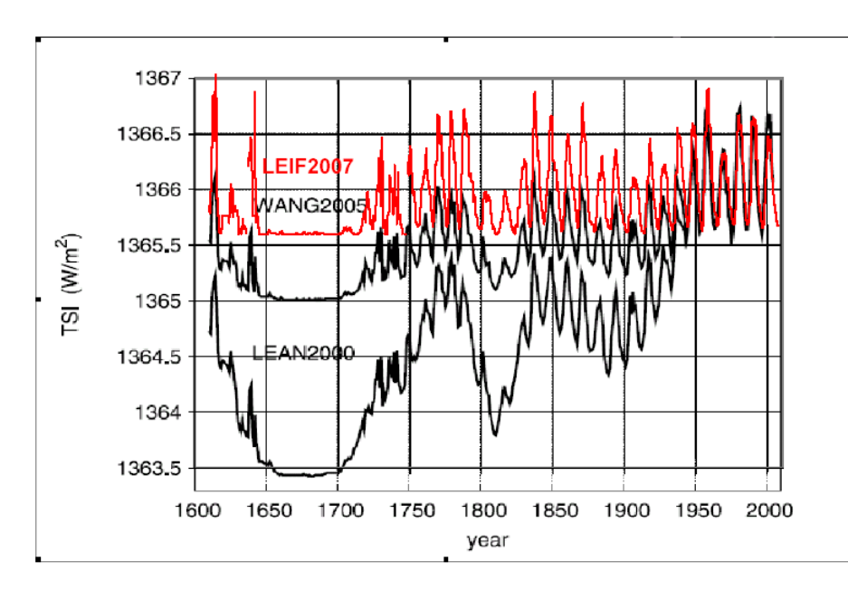
And that a 0.1% trend is statistically meaningful.
What, do you imagine, are the error bars here.
I would guess that they easily outway that trend, even allowing for Leif’s re-imagining of them.
(heck – they’ve *homegenised* them).
That aside, TSI has cycles and drawing any sort of linear trend through ~300 yrs of them is meaningless, false *science*.
TSI changes through them do not amount to more than 0.2 W/m^2 and the climate system responds quickly to them.
Sunspots and TSI have been in decline for ~35 years now. Completely contrary to the trend in average GMT.
There was not a “major increase in sunspot trend” from 1940 to 2002. Sunspots reached a maximum of 269 in 1957, and declined in number from there on.
According the Leif’s TSI reconstruction there hasbeen a variance of ~1.5 W/m2 in TSI since 1600.
“This suggests that the temperature-CO2 correlation is spurious, rather than causal.”
In no way does it.
http://solar-center.stanford.edu/sun-on-earth/600px-Temp-sunspot-co2.svg.png
So we are prepared to believe the peeps counting sunspots by eye from the year 1700 on have been consistent throughout in that endeavour.
And that a 0.1% trend is statistically meaningful.
What, do you imagine, are the error bars here.
We know what the error bars are, as you can see here:
http://www.leif.org/research/Estimate-of-Group-Number-Big.png
The graph shows the number of groups [the sunspot number is larger by a factor of 20] which is easier to determine back in the 18th century.
Can I have the data for that graph, The 1660 to 1700 looks different… and I’m curious…
Apologies… I meant 1600 to 1700…
http://www.leif.org/research/gn-data.htm
Correction:
TSI changes through them do not amount to more than 0.2%
It’s not only TSI, there are magnetic connections between earth and the sun, as studied by NASA, calling them magnetic ropes
magnetic connections between bodies require energy transfer too via energy waves. This area is very poorly understood at present.
Lets not get carried away.
Obviously CO2 emissions cause sunspots 😉
Obviously!!
Here’s how to fit the CO2-curve.
http://tinyurl.com/WoodForTrees-CO2-Model
With the first integral being the basic global temperature waveform, without (oceanic)oscillations,keeping Henrik Svensmark’s theory in mind.
And the second integral being the CO2 waveform, the temperatures integral as prof. Salby suggested.
Maybe one should take more notice of Leaf Stomata calibrations and air flask measurements than Antarctic ice cores?
What are the physical interpretations of the offsets, & why were those values used?
This is curve fitting, never mind the physics.
First offset: best fit to HADCRUT 4, second offset :best fit to CO2
From Warren Meyer about a week ago:
http://www.coyoteblog.com/wp-content/uploads/2016/04/Slide90.png
No, it has not:
http://www.leif.org/research/The-Waldmeier-Effect-Levi.pdf
Look closer, the sunspot number anomaly time-integral as shown on Figure 8 at http://globalclimatedrivers.blogspot.com clearly shows more solar activity after about 1945.
The old sunspot number used in your graphs was contaminated by the weighting of sunspot count by the Zurich observers introduced in the 1940s. This increased the sunspot number by some 20%.
http://www.leif.org/research/Effect-of-Sunspot-Weighting.pdf and
http://www.leif.org/research/Sunspot-Weighting-and-Group-Counting.pdf
Perhaps not unusually active, but clearly more active in the second half of the 20th century than in the first. The average monthly sunspot number is 30% higher as the figure shows (78 versus 102).
Leif – I used your SSN in determining R2 as noted in Table 1 of http://agwunveiled.blogspot.com . I still have that EXCEL file and looked at that graph (source of pre 1850 data is uncertain). It shows what looks like the same slope increase in about 1945. Wouldn’t that be expected with a “20% increase”?
This looks like the old sunspot numbers”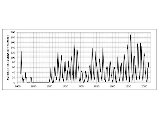
Leif – Doesn’t the longer uptrend starting in about 1945 in the chart above titled “Accumulative departure from average sunspot numbers” indicate higher solar activity?
Leif – The graph you posted is the Brussels Int as the caption, Fig 5 in http://globalclimatedrivers.blogspot.com states. I added the graphs that I used for ‘your’ SSN to http://agwunveiled.blogspot.com . Note the slope increase in about 1945 which I perceive indicates increased solar activity.
The slope depends on your choice of ‘average’ sunspot number.I could choose another value and get a negative slope, even.
Such cherry-picking is rather meaningless. The cosmic ray record shows that the 20th century was less active than the 18th:
http://www.leif.org/research/Comparison-GSN-14C-Modulation.png
What is important isn’t how hot the sun is, how many sun spots or cosmic rays, what is important is how much visible radiation reaches the surface of the earth. You can have a very hot sun, but a cloud layer that blocks the radiation from reaching the oceans. You can have a cool sun and clear skies and a great deal of warming. Unless there are solid ground measurements of the W/M^2 reaching the surface, the sun, cosmic rays etc etc will only be telling part of the story. Warmists always point to the stability of the sun as reasoning to rule it out as the cause. That is pure nonsense, even a stable sun can warm the earth much like lifting a blind can warm a room.
Not meaningless. It also shows the second half of the 20th century being more active than the first.
And sure there was global warming between the Maunder minimum and the Dalton minimum in the 18th century. The 18th century was quite good compared to the awful 17th century. Between 1695 and 1697 one third of the population died in Finland from famine due to failed crops (can you imagine that today?), and in Scotland the ill years at that time killed about 15% of the population and were one of the main reasons to join the UK putting and end to their independence. The start of the 20th century was quite bad climatically, although not as bad as the start of the 19th century, when failed crops contributed decisively to the French Revolution.
That graph reads as a climatic history. Food for thought.
I would say that except for the period 1910-50 when another factor might have become relevant, the fit of your graph to temperature reconstructions is also remarkably good:
http://i1039.photobucket.com/albums/a475/Knownuthing/Comparison-GSN-14C-Temp_zps3g7gauzw.png
So temperature reconstructions, climate history and solar activity all nicely fit for most of the period analyzed.
Javier May 5, 2016 at 4:49 am
Yet the world warmed strongly during the first half of the 20th century – and cooled just as solar activity was peaking.
.
The French Revolution kicked off in 1789 – towards the end of a series of strong solar cycles. Perhaps the crops failed in anticipation of weaker solar activity.
It doesn’t read quite as you describe.
I agree. The temperature record for all of the 20th and so far for the 21st go in opposite direction of solar activity. This is well-known and need not be flogged anymore. But true cult-believers are fully capable of overlooking this fact, as we see here. So, I say, let them as they are lost anyway.
co2islife May 4, 2016 at 4:05 pm
” What is important isn’t how hot the sun is, how many sun spots or cosmic rays, what is important is how much visible radiation reaches the surface of the earth. You can have a very hot sun, but a cloud layer that blocks the radiation from reaching the oceans. You can have a cool sun and clear skies and a great deal of warming. Unless there are solid ground measurements of the W/M^2 reaching the surface, the sun, cosmic rays etc etc will only be telling part of the story. Warmists always point to the stability of the sun as reasoning to rule it out as the cause. That is pure nonsense, even a stable sun can warm the earth much like lifting a blind can warm a room.”
Once again you seem to be confusing TSI and insolation. You have pointed out insolation changes due to cloud cover but that does not have anything to do with the stability of the Sun’s energy output. Keep in mind that in your window example the energy hitting the window is the same whether the blinds are up or down. The position of the blinds only determines how much energy is let in not how much is available from the source.
John Finn:
“Yet the world warmed strongly during the first half of the 20th century – and cooled just as solar activity was peaking.”
You talk as if the Sun should be the only factor affecting climate and the correspondence should be perfect. Logical Fallacy of Argument by Demanding Impossible Perfection. The general agreement of solar activity and climate is undeniable, but I don’t see why we should expect it to be perfect.
“The French Revolution kicked off in 1789 – towards the end of a series of strong solar cycles. Perhaps the crops failed in anticipation of weaker solar activity.”
1789 falls in the deep prolonged minimum between cycles 4 and 5. Look at the graphs above.
“It doesn’t read quite as you describe.”
Just review the climate history and take notice of when most of the bad periods have taken place.
The general agreement of solar activity and climate is undeniable
It is herewith denied.
You point out yourself that the agreement broke down in the first half of the 20th century. Sine the 1950s, solar activity has been decreasing while temperatures have soared.
I dissent. Let’s make it more simple:
http://i1039.photobucket.com/albums/a475/Knownuthing/Sunspot-Activity-Temp_zpsmjipiser.png
Above average periods would cause warming, while below average periods would cause cooling. As we are recovering from a very cold epoch, the general trend is upwards and recent warming periods have caused temperatures to be higher than previous warming periods.
If current below average trend prolongs for a couple of decades, as expected, we might see some cooling.
The accumulative deviation from the average depends on what value you use for the average. So is a free parameter that you can vary a you want, hence has no physical meaning.
My EXCEL file allows easy changing of the average SSN. I have several with different SSNavg. The overall slope of the graphs changes with the value of SSNavg but the abrupt increase in slope at about 1945 is consistent in all of them.
Look at this plot:
and you’ll not see any special increase in 1945 different from other increases in earlier centuries.
Furthermore solar activity is now down to where it was 100 years ago, and temps are not. In every century since 1700 there has been the same sort of increase and decrease.
As warming fails to progress we will see even more dismal attempts from few zealots to eliminate out sun from the climate change, but when it all fails I suspect ad home and personal abuse might be the next stage.
Attempts to write out solar influence on the climate change are doomed to failure !
‘ad hom’
Auto spell correct is a pain !
As warming fails to progress we will see even more dismal attempts from few zealots to eliminate out sun from the climate change, but when it all fails I suspect ad hom and personal abuse might be the next stage
This has already started by using phrases like “dismal attempts from few zealots”.
Sparks:
Sorry, but your values for the orbital inclination of Jupiter seem absurd. Remember that in the formula T is expressed in centuries from the epoch 2000.0. For the year 4000 BC (that is the year -4000), we therefore have T = -60. This gives i = 1.6503 degrees. I cannot understand how you obtain the improbable value of about 33 degrees.
And it’s all the fault of humans.
Made me smile. From the history of the discussion it was foreseeable that the 10 sentences, that I counted , would get discussed against their content. So
“Thanks to Dr. Leif Svalgaard for help in revising sunspot numbers.”
– and for patience!