Guest Post by Werner Brozek, Comment Included From David Hoffer, Edited by Just The Facts:

In the above graphic, the green line is the slope since May 1993 without consideration of error bars. When including error bars, the range could be as low as zero as indicated by the blue line. It could also be an equal amount above the green line as indicated by the purple line.
The numbers that were used to generate the above graphic are from Nick Stokes’ Temperature Trend Viewer site.
For RSS, the numbers are as follows:
Temperature Anomaly trend
May 1993 to Feb 2016
Rate: 0.871°C/Century;
CI from -0.022 to 1.764;
t-statistic 1.912;
Temp range 0.118°C to 0.316°C
So in other words, for 22 years and 10 months, since May 1993, there is a very small chance that the slope is negative.
For UAH6.0beta5, the numbers are as follows:
Temperature Anomaly trend
Jan 1993 to Feb 2016
Rate: 0.911°C/Century;
CI from -0.009 to 1.830;
t-statistic 1.941;
Temp range -0.001°C to 0.210°C
So in other words, for 23 years and 2 months, since January 1993, there is a very small chance that the slope is negative.
As mentioned in my January post, there is now no period of time going back from February 2016 where the slope is negative for any period worth mentioning on any of the five data sets I am analyzing.
As a result, my former Section 1 will not be shown for the foreseeable future.
My last post had an excellent comment by David Hoffer that I would like to share to give it wider exposure and for you to give your thoughts:
davidmhoffer
March 2, 2016 at 10:11 am
1. The “Pause” hasn’t disappeared. It now just has a beginning and an end. But it is right there in the data where it always was, and it doesn’t cease to exist merely because we can’t calculate one starting from the present and working backwards.
2. The “Pause” was never significant in terms of showing the CO2 doesn’t heat up the earth. It only became significant because the warmist community (Jones, Santer, etc) said that natural variability was too small to cancel the warming of CO2 for more than a period of 10 years…er 15…er 17 and made a big deal out of it.
So regardless of the “Pause” having ended or not, what we have is conclusive evidence that the models either:
a) grossly under estimated natural variability or
b) grossly over estimated CO2 sensitivity or
c) both
In all three scenarios above, natural variability dominates in terms of any risk associated with a changing global temperature. That’s what we should be studying first and foremost. Once we understand it, then we can determine how much CO2 changes natural variability. Trying to determine CO2 sensitivity without first understanding the natural variability baseline that it runs on top of is a fool’s errand. Unfortunately, fools seem determined and well funded, and so they continue to try and do just that.
The world has been warming for 400 years, almost all of it due to natural variability. It will continue to warm (I expect) and most of the warming will be due to natural variability, which we just learned from this last 20 years of data is a lot bigger deal than CO2.
(End of David’s post)
In the sections below, we will present you with the latest facts. The information will be presented in two sections and an appendix. The first section will show for how long there has been no statistically significant warming on several data sets. The second section will show how 2016 so far compares with 2015 and the warmest years and months on record so far. For three of the data sets, 2015 also happens to be the warmest year. The appendix will illustrate sections 1 and 2 in a different way. Graphs and a table will be used to illustrate the data.
Section 1
For this analysis, data was retrieved from Nick Stokes’ Trendviewer available on his website. This analysis indicates for how long there has not been statistically significant warming according to Nick’s criteria. Data go to their latest update for each set. In every case, note that the lower error bar is negative so a slope of 0 cannot be ruled out from the month indicated.
On several different data sets, there has been no statistically significant warming for between 11 and 23 years according to Nick’s criteria. Cl stands for the confidence limits at the 95% level.
The details for several sets are below.
For UAH6.0: Since January 1993: Cl from -0.009 to 1.830
This is 23 years and 2 months.
For RSS: Since May 1993: Cl from -0.022 to 1.764
This is 22 years and 10 months.
For Hadcrut4.4: Since October 2001: Cl from -0.016 to 1.812 (Goes to January)
This is 14 years and 4 months.
For Hadsst3: Since May 1996: Cl from -0.002 to 2.089
This is 19 years and 10 months.
For GISS: Since March 2005: Cl from -0.004 to 3.688
This is exactly 11 years.
Section 2
This section shows data about 2016 and other information in the form of a table. The table shows the five data sources along the top and other places so they should be visible at all times. The sources are UAH, RSS, Hadcrut4, Hadsst3, and GISS.
Down the column, are the following:
1. 15ra: This is the final ranking for 2015 on each data set.
2. 15a: Here I give the average anomaly for 2015.
3. year: This indicates the warmest year on record so far for that particular data set. Note that the satellite data sets have 1998 as the warmest year and the others have 2015 as the warmest year.
4. ano: This is the average of the monthly anomalies of the warmest year just above.
5. mon: This is the month where that particular data set showed the highest anomaly. The months are identified by the first three letters of the month and the last two numbers of the year. The 2016 records are not included here.
6. ano: This is the anomaly of the month just above.
7. sig: This the first month for which warming is not statistically significant according to Nick’s criteria. The first three letters of the month are followed by the last two numbers of the year.
8. sy/m: This is the years and months for row 7.
9. Jan: This is the January 2016 anomaly for that particular data set.
10. Feb: This is the February 2016 anomaly for that particular data set.
11. ave: This is the average anomaly of all months to date taken by adding all numbers and dividing by the number of months.
12. rnk: This is the rank that each particular data set would have for 2016 without regards to error bars and assuming no changes. Think of it as an update 10 minutes into a game.
| Source | UAH | RSS | Had4 | Sst3 | GISS |
|---|---|---|---|---|---|
| 1.15ra | 3rd | 3rd | 1st | 1st | 1st |
| 2.15a | 0.263 | 0.358 | 0.745 | 0.592 | 0.86 |
| 3.year | 1998 | 1998 | 2015 | 2015 | 2015 |
| 4.ano | 0.484 | 0.550 | 0.745 | 0.592 | 0.86 |
| 5.mon | Apr98 | Apr98 | Dec15 | Sep15 | Dec15 |
| 6.ano | 0.743 | 0.857 | 1.009 | 0.725 | 1.10 |
| 7.sig | Jan93 | May93 | Oct01 | May96 | Mar05 |
| 8.sy/m | 23/2 | 22/10 | 14/4 | 19/10 | 11/0 |
| 9.Jan | 0.542 | 0.663 | 0.899 | 0.732 | 1.14 |
| 10.Feb | 0.834 | 0.974 | 1.057 | 0.604 | 1.35 |
| 11.ave | 0.688 | 0.819 | 0.978 | 0.668 | 1.25 |
| 12.rnk | 1st | 1st | 1st | 1st | 1st | Source | UAH | RSS | Had4 | Sst3 | GISS |
If you wish to verify all of the latest anomalies, go to the following:
For UAH, version 6.0beta5 was used. Note that WFT uses version 5.6. So to verify the length of the pause on version 6.0, you need to use Nick’s program.
http://vortex.nsstc.uah.edu/data/msu/v6.0beta/tlt/tltglhmam_6.0beta5.txt
For RSS, see: ftp://ftp.ssmi.com/msu/monthly_time_series/rss_monthly_msu_amsu_channel_tlt_anomalies_land_and_ocean_v03_3.txt
For Hadcrut4, see: http://www.metoffice.gov.uk/hadobs/hadcrut4/data/current/time_series/HadCRUT.4.4.0.0.monthly_ns_avg.txt
For Hadsst3, see: http://www.cru.uea.ac.uk/cru/data/temperature/HadSST3-gl.dat
For GISS, see:
http://data.giss.nasa.gov/gistemp/tabledata_v3/GLB.Ts+dSST.txt
To see all points since January 2015 in the form of a graph, see the WFT graph below. Note that UAH version 5.6 is shown. WFT does not show version 6.0 yet. Also note that Hadcrut4.3 is shown and not Hadcrut4.4, which is why many months are missing for Hadcrut.

As you can see, all lines have been offset so they all start at the same place in January 2015. This makes it easy to compare January 2015 with the latest anomaly.
Appendix
In this part, we are summarizing data for each set separately.
UAH6.0beta5
For UAH: There is no statistically significant warming since January 1993: Cl from -0.009 to 1.830. (This is using version 6.0 according to Nick’s program.)
The UAH average anomaly so far for 2016 is 0.688. This would set a record if it stayed this way. 1998 was the warmest at 0.484. The highest ever monthly anomaly was in April of 1998 when it reached 0.743. This is prior to 2016. The average anomaly in 2015 was 0.263 and it was ranked 3rd.
RSS
For RSS: There is no statistically significant warming since May 1993: Cl from -0.022 to 1.764.
The RSS average anomaly so far for 2016 is 0.819. This would set a record if it stayed this way. 1998 was the warmest at 0.550. The highest ever monthly anomaly was in April of 1998 when it reached 0.857. This is prior to 2016. The average anomaly in 2015 was 0.358 and it was ranked 3rd.
Hadcrut4.4
For Hadcrut4: There is no statistically significant warming since October 2001: Cl from -0.016 to 1.812. (Goes to January)
The Hadcrut4 average anomaly so far is 0.978. This would set a record if it stayed this way. The highest ever monthly anomaly was in December of 2015 when it reached 1.009. This is prior to 2016. The average anomaly in 2015 was 0.745 and this set a new record.
Hadsst3
For Hadsst3: There is no statistically significant warming since May 1996: Cl from -0.002 to 2.089.
The Hadsst3 average anomaly so far for 2016 is 0.668. This would set a record if it stayed this way. The highest ever monthly anomaly was in September of 2015 when it reached 0.725. This is prior to 2016. The average anomaly in 2015 was 0.592 and this set a new record.
GISS
For GISS: There is no statistically significant warming since March 2005: Cl from -0.004 to 3.688.
The GISS average anomaly so far for 2016 is 1.25. This would set a record if it stayed this way. The highest ever monthly anomaly was in December of 2015 when it reached 1.10. This is prior to 2016. The average anomaly in 2015 was 0.86 and it set a new record.
Conclusion
Warming does not become catastrophic just because we cannot go back from February 2016 and find a negative slope. This is especially true since it was a very strong El Nino and not CO2 that was mainly responsible for the negative slope disappearing for now.
A better illustration of the current situation is shown below.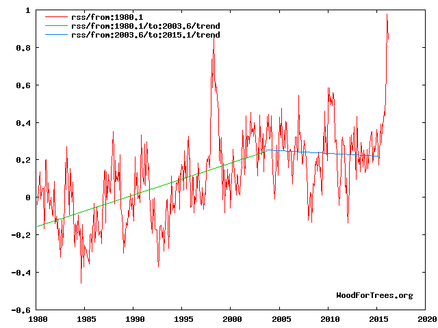
See figs 1, 3,4 and 8 at
http://climatesense-norpag.blogspot.com/2016/03/the-imminent-collapse-of-cagw-delusion.html
The millennial temperature peak is seen at about 2003.This corresponds to the solar activity peak at about 1991 Fig 8 .The previous temperature peak was at 990 +/- Fig 4
The El Nino peak is temporary aberration from the cooling trend (blue line) which will continue with various ups and downs until about 2650 +/- . Fig 4
Has anyone noticed the desperation of some to try isolate selecting a pause in warming from data, from AGW theory.
They will attack the claimed cherry picking while forgetting the very theory they are pushing makes 10 year or more pauses in warming makes those statistical pauses relevant.
CO2 in the atmosphere is causing warming of a greater order than natural variability they say, so when CO2 goes up and up, and there is a longer than 10 year pause in increasing temperatures, they attempt to isolate the statistics from the theory, and claim cherry picking.
The start data for ice levels is the biggest cherry pick in the field. But it’s apparently OK to do that
Plus temperature is following Hansen’s original C scenario (draconian cuts).
Now he’s back again claiming waterworld is on the horizon. The guy has a few screws loose
It appears from your comment that you don’t understand Scenario C or other aspects of Hansen’s paper.
You’re in good company, Steve mcIntyre made a similar error until I corrected him several years ago.
[Link, please? -mod]
Why does everyone put so much into charts , graphs, trend lines and on and on. I’m no scientist but I am a business owner for 40 years. Critical thinking skills and logic would seem appropriate. Nick wants me to believe that the 33 or so molecules in 85000 parts of our atmosphere is causing runaway heating. As silly as that seems to me, he then wants me to believe that tha ONE molecule that is human caused is the main driver of this run away climate change. Since we obviously can’t anytime soon eliminate all of this one human molecule added, what percentage does anyone think we can eliminate? And then I’m expected to believe this tiny percent change at a tremendous cost in money and possibly lives in developing countries, is worth it. Hubris falls short in defining this belief. Why don’t we invest in better preparing for what nature throws at us whether it’s hot or cold and stop goofing around trying to control it with some trumped up idea that co2 is poison.
Also that the Pause ‘insofar as it existed’ – upwards of two decades – is not significant if it doesn’t precede cooling, as opposed to demonstrating the lack of warming in the face of increasing C02 predicted by models . Not to mention the absence all the supposed consequences that are supposed to result.
Concur; once the EPA decided this low level gas was a pollutant, I knew Big Brother was here. If you want to claim its anthropogenic why not look at water vapor, SOx, NOx, etc?
John C: The way I had it put to me goes something like this: You have a v large swimming pool into which you have dumped 99,962 white ping-pong balls (which keep the water temperature fairly stable and very comfortable). You then add 38 blue balls which, as well as keeping the water healthy, have the (claimed) ability to raise the temperature by a very, very small amount – that cannot be verified with a thermometer (or by dipping a toe in the water!). You then add two more blue balls, which, although being man-made have a similar tendency to warming (it is believed). Now, do you think it would be safe to enter the water, or will it be too hot?
That’s my point. Illogical at best. Outright propaganda that too many believe. I suppose the mass of the co2 molecule can factor in but even that comparison falls short of making me fall for the tiny amount my tailpipe emits and the electricity for my house and business is doing anything. Sorry AGW promoters, I need a bigger problem to stay awake at night worrying about. I truly believe after pollution control greatly improved the air we breath, as it needed to, they needed another problem to attack business and capitalism. So they found co2. A naturally occurring gas that is great for greening of the planet and they called it a controlled substance and poison. And this came from educated pinheads. Sad state we find ourselves in today.
John C,
Why? Because…physics. Increasing the CO2 concentration in the Earth’s atmosphere will cause the temperature of the atmosphere to rise. Anyone who doubts that is simply mistaken, no matter how fervently they believe otherwise. The question is how much rise and what are the consequences. You mentioned costs; what are the costs if the majority of the science community is right about the effect of CO2 at projected concentrations?
Harry Passfield, if your analogy is meant to represent the current conditions in the Earth’s atmosphere, the number of blue balls should be continuously increasing. Also, how small is very, very? The atmospheric temperature change necessary to have a deleterious effect on the climate is many times smaller than that necessary to make a comfortable swimming pool too hot for safety.
Slipstick: Is it meant to represent the current conditions, etc? Of course not. It’s a load of balls. Oh, hang on… (And there’s always one.)
Slipstick: Let’s ignore the FACTS presented to you. Let’s also ignore the sun, water vapor, ocean cycles and all the other things we don’t understand. The agreed FACT is only one molecule in 33 is human caused. This is in 85,000 molecules of air. Let’s assume, and you seem to like assumptions as opposed to facts, that we can magically stop adding that one molecule. What affect do you think it would have? Not to mention that all the efforts the greens and government propose and are doing will have very little reduction overall. Waste of time, resources, and dangerous. Answer my question. Why don’t we put our efforts into coping with climate instead of trying to control it? logic doesn’t seem to apply only emotion and agenda. The agenda is the part I haven’t figured out yet. It’s so crazy there must be something I’m missing.
And if all you have are platitudes and Algore propaganda, don’t waste my time.
Slipstick:
‘Anyone who doubts that is simply mistaken, no matter how fervently they believe otherwise.’
Wow! You seem pretty sure about your opinion. In fact it sounds like you fervently believe it.
A rise in the equilibrium temperature of a gaseous system with an increasing proportion of CO2 exposed to infrared energy is not an opinion, it’s physics, and yes, I fervently believe in physics.
“You have a v large swimming pool”
The swimming pool is a good analogy. Imagine adding 400 ppm of ink. Then you can’t see the bottom. In the IR range, in the air, CO2 is ink. And radiant heat needs a clear view to emerge. Otherwise less efficient modes of heat transfer are used.
Nick Stokes: “The swimming pool is a good analogy. Imagine adding 400 ppm of ink. Then you can’t see the bottom.”
Totally wrong.
Stop making stuff up.
Wasn’t it Angstrom’s assistant who showed all the IR to be absorbed by CO2 was already. Adding more CO2 makes no difference unless the sun outputs more IR.
“Totally wrong.”
Your evidence?
According to Beer’s law, the total absorption of light (or IR) by a solute depends on the amount of it in the light path. If you dilute it so that the column is deeper (but same cross-section) the total absorbed is the same.
400 ppmv of ink in a 2.5m deep pool is equivalent to adding a 1mm layer and stirring. And 1 mm of ink is quite opaque.
“And radiant heat needs a clear view to emerge. Otherwise less efficient modes of heat transfer are used.”
Less efficient? The troposphere is dominated by convection; a water driven heat pump with a staggeringly large throughput running on idle most of the time. Diffusion confusion yet again. You cannot use fag packet fizzicz to calculate net radiative transfer in isolation, much less attempt it in only two dimensions assuming magic partial mirrors mounted on some toy story spherical Rubik’s cube.
All forms of energy diffusion are integrated all of the time in all directions. The usual cartoon and confusion of colour temperature with actual energy transfer are sheer stupidity and the very root of this entire nonsense.
“Less efficient?”
Yes. Upward infrared through a transparent atmosphere is efficient enough to emit all absorbed solar radiation at the snowball Earth temperature of 255K. The fact that we are at about 288K shows that all operating mechanisms including convection are far less efficient, and require a much larger driving temperature difference.
Nick , Harry et al
You don’t need ink or swimming pools.
Milk is 87% water. If you add a teaspoon of milk to a glass of clear water (about half a litre) you will not be able to see the bottom of the glass. Much of the visible light will have been reflected – yet the reflective constituents (fats and casein) only represent about 0.06% (600 ppm) of the liquid.
Try it.
John C. April 7, 2016 at 10:36 am
Slipstick: Let’s ignore the FACTS presented to you. Let’s also ignore the sun, water vapor, ocean cycles and all the other things we don’t understand. The agreed FACT is only one molecule in 33 is human caused.
That is not a FACT of any sort.
Nick,
Your ink analogy is faulty.
In the first place, the “pool” with a million balls is already inky from 30,000 H2O molecules. Second, we’re not adding 400 extra CO2 molecules, but only 115. How much inkier will 115 extra molecules out of 30,285 make the pool? To say nothing of the other GHGs at even lower concentrations.
One extra CO2 molecule per 10,000 might have a measurable effect in parts of the atmosphere with low H2O concentrations, but in most places H2O totally swamps the radiative effect of CO2, above the level required for life. Adding more CO2 generally has a negligible effect, as in fact has been observed over the past century or more of rising CO2.
The effect is so slight that Callendar, proponent of (beneficial) man-made GW during the 1930s, considered his hypothesis shown false by the 1960s, more frigid despite much more CO2 than in the ’30s. And he was right.
Under yet more CO2, the ’70s were still cold. Then the PDO flipped and the planet warmed slightly from the late ’70s to late ’90s. Since then, GASTA has stayed flat to declined. The long-awaited super El Nino has finally occurred, producing a probably temporary ever so slight uptrend since the super El Nino of 1997/8, but in all likelihood we’re headed back down in coming decades, thanks to the PDO and AMO oceanic oscillations.
Nick Stokes says:
400 ppmv of ink in a 2.5m deep pool is equivalent to adding a 1mm layer and stirring. And 1 mm of ink is quite opaque.
Fuzzy thinking. You’re just making things up and asserting them as fact. The depth of the pool is not your argument, and it also disregards the area of the pool. What matters is 400 ppm.
When I was a kid my aunt used to add what was called “bluing” to her clothes washer. It was supposed to make ‘whites whiter’.
The bluing was in a bottle, and it was as dense and dark as any India ink. She would pour a few tablespoons into the water, and my cousins and I would watch amazed as the bluing disappeared. It did not visibly change the transparency of the water at all.
Every argument made about the dangers of more CO2 amounts to evidence-free hand waving. Those arguments have remained unchanged for decades. But since hand waving is all you’ve got, that’s what you use.
If you were an honest skeptic, you would have more options.
Gloateus Maximus April 8, 2016 at 9:56 am
Nick,
Your ink analogy is faulty.
In the first place, the “pool” with a million balls is already inky from 30,000 H2O molecules. Second, we’re not adding 400 extra CO2 molecules, but only 115. How much inkier will 115 extra molecules out of 30,285 make the pool? To say nothing of the other GHGs at even lower concentrations.
Wrong, in the 15 micron band H2O does not significantly absorb compared with CO2:
http://i302.photobucket.com/albums/nn107/Sprintstar400/H2OCO2.gif
dbstealey April 8, 2016 at 10:38 am
Nick Stokes says:
400 ppmv of ink in a 2.5m deep pool is equivalent to adding a 1mm layer and stirring. And 1 mm of ink is quite opaque.
Fuzzy thinking. You’re just making things up and asserting them as fact. The depth of the pool has nothing to do with your argument, which also disregards the area of the pool. The only thing that matters is 400 ppm.
Yes your thinking is indeed fuzzy stealey. The depth of the pool is indeed critical, look up Beer’s law, absorption is proportional to concentration X path length.
When I was a kid my aunt used to add what was called “bluing” to her clothes washer. It was supposed to make ‘whites whiter’.
The bluing was in a bottle, and it was as dense and dark as any India ink. She would pour a few tablespoons into the water, and my cousins and I would watch amazed as the bluing disappeared. It did not visibly change the transparency of the water at all.
Perhaps you should have asked your aunt how laundry blue works. The dye, say Prussian Blue, is absorbed onto the clothes and therefore removed from solution, what you’ve done is to dye the clothes blue (v slightly). The slight blue color added to the clothes counteracts the dingy yellow color of the old clothes and makes them appear white.
Nick Stokes is right here. Depth has everything to do with it and area has nothing to do with it.
As far as depth is concerned, you need to take the ratios of the depths and the 400 ppm to million ppm. 400/1 000 000 has the same ratio as 1 mm/2500 mm. So if the pool were 25 m or 25 000 mm deep, you would need 10 times as much ink, or 10 mm of ink.
As for area, that does not matter. If you had a 2.5 m long straw or a 2.5 m pool the size of a city, it would still take enough ink to cover the top with 1 mm.
(On the best science site, we cannot let slip ups go unchallenged. ☺ Agreed?)
Werner,
I’ll agree that the 400 ppm is the relevant metric. Neither depth nor area have anything to do with Nick’s claim of making the water opaque, because that wasn’t his argument.
It doesn’t matter if the pool is 2.5 cm deep, or 2.5 metres, or 2.5 miles deep. Or wide. The 400 ppm (or as you say, the one molecude in 10,000) is what matters.
Also, from personal observation I don’t accept Nick’s belief that one molecule of ink in 10,000 of water will make the water opaque.
(On the best science site, we cannot let slip ups go unchallenged. Agreed? ☺)
Actually, Nick said that 4 molecules in 10,000 will make it opaque. Now turning to CO2, what was not directly addressed was the fact that nature already had 2.8 molecules of CO2 in 10,000 in 1750. Does man’s additional 1.2 molecules of CO2 in 10,000 make a further difference? And most would agree that due to the logarithmic affect, this further addition by man makes very little difference to temperature.
“Upward infrared through a transparent atmosphere is efficient enough to emit all absorbed solar radiation at the snowball Earth temperature of 255K. The fact that we are at about 288K shows that all operating mechanisms including convection are far less efficient, and require a much larger driving temperature difference.”
Absolute rubbish, we are not talking about an idealised transparent atmosphere and you’re still thinking in terms of isolated transfer mechanisms. Take a look at the temperature gradient through the entire atmosphere. Aggregate diffusion is heavily skewed by convection, which is in large part why earth has an enormous stratospheric temperature inversion (and Venus does not). The tropospheric lapse rate is linear due entirely to convection within reducing density. The assumption from colour temperatures that CO2’s effective radiative altitude for 2-dimensional SB calculation purposes is below the tropopause is not only wrong, it’s ludicrous. It confuses energy flux with temperature. Mixed gases with condensing components do not behave like black bodies or even grey bodies. Point a pyrometer anywhere you like, it cannot tell you anything about net aggregate energy transfer. Doing the physics properly requires integration of all forms of transfer in three dimensions at the micro scale, particularly the latent heat component inherent to cloud evolution. Back of a fag packet shell games in isolation are not even wrong.
A recent study showed an increase in atmospheric CO2 of 22 ppm during the period 2000-2010 produced an increase in radiative forcing of 0.2 W/m^2. That’s close to the predicted value, and evidence that added CO2 produces warming.
http://www.iflscience.com/environment/scientists-find-direct-evidence-atmospheric-co2-heats-earth-s-crust
http://www.nature.com/nature/journal/vaop/ncurrent/full/nature14240.html
The first link does not work and they want money to see the second. However the dates could not be worse to prove a point! 2000 had a La Nina and 2010 had an El Nino.
Werner, both links work on my machine. The bottom link is to an abstract where you can find the information I provided. Finally, the study shows an increase in radiative forcing and does not measure surface temperature.
“Why don’t we invest in better preparing for what nature throws at us whether it’s hot or cold and stop goofing around trying to control it with some trumped up idea that co2 is poison.”
Such a relevant, intelligent, logical question. And you know what….I cannot think of ONE logical, intelligent, relevant reason except one (but the idea itself is insane mind you)…if you wanted to control the world’s money for any reason…play with it, make buildings out of it, redistribute it, undermine your enemies….economy, people…you’d have to attack at the very root of prosperity. Which for the Western world has been the increasing ability to move freely about, and live in relative comfort, relatively inexpensively. Fossil fuels. Movers and shakers can only move and shake because of them.
Having so many powerful industrial giants sucks away vast amounts of power (money) from ever being focused one centralized place. (one world government) You gotta stop the diffusion….close down access from a lot to a few. But it would be easy to see that such an agenda was mindbogglingly dangerous and that those who believe in it were absolutely bonkers…that is… if they went after powerful and necessary business men and women and investors outright. So what would be a very clever way of bringing them down without looking like bat crap crazy, jealous, power hungry hyenas? Attack using a “scientific hypothesis” that all those evil, nasty emissions that can only be attributed to one source—fossil fuels….break down their profit margins with taxes, ruin their reputations with accusations and make the whole world believe that they are KILLING THE PLANET, and they couldn’t give a rat’s behind about it either.
Invite all the little, pathetic, powerless people of the world to become superheros for Earth….first, tell them how marginalized they really are….teach them that there’s 97% of them and only 3% of the big, bad enemy….stoke class warfare…and movements like Occupy Everything….pretend you are supporting their progress while squeezing them in subtle ways to make their suffering even more acute. You gotta keep them down so you can point out how down they are all the time! Make them angry. And scared. And feed them propaganda 24/7 from every angle. And hope with all you have in you that the climate doesn’t do what it most likely and naturally will….reach a certain point and start to cool off……BEFORE your plan is successful. After all, it would look stupid if the world starts to cool off like it always has and you haven’t implemented any of your “world saving strategies” before it does! In fact….the closer it gets to that actually happening…the more shrill and panicked and terrifying you might have to become in order to push it all past the tipping point.
And the best part is….between the advances of technology and the age old fact that some people are so stupid, so gullible, soooooo incredibly weak in the face of even basic suggestions… you wouldn’t even have to form an old fashioned physical conspiracy! No meetings….no secret handshakes….no overhead..no heads on spikes. Nothing. Just hit the public over and over and over again in their emotional soft spots….home….family….hopes….dreams….their religion….their futures….their darkest fears…..death…..destruction….insecurity….loss.
You don’t need to crest a hill with an overwhelmingly large army arrayed in shining battle gear anymore to bring your foes to their knees! Silly! Just make them feel like something that bad and that awful is coming for them if they don’t do something.
(Hint…if you spend money on preparations and adaptations for future natural disasters…they’ll realize doing so is much easier, productive, and visibly reassuring. It would give people hope and comfort and peace….and you can’t do a d@mned thing to push an agenda on hopeful, comfortable, peaceful people!)
Yes thanks
It will be interesting to see how the Satellites and NOAA/GIIS deal with the sudden drop in Sea Temps.
Will they ignore it, adjust it out or what?
See
http://notrickszone.com/2016/04/06/global-sea-surface-temperatures-have-fallen-sharply-cooled-surprisingly-negative-global-temperature-anomaly-by-end-of-2016/#sthash.vdno3ipL.dpbs
Or ignore it until they can adjust it, or simply claim that it all proves their point anyway.
Re: “effect”
The phrase “CO2 has an effect” describes something very small (if indeed it exists at all), but it has great potential to mislead. This hyper-technical phrase evokes in the average reader’s mind the false implication that CO2 has a controlling effect. In tort law, when a potential, very small, cause is OVERWHELMED by another controlling cause, the controlling cause is called a supervening causation. Here, the effect of natural drivers is the supervening cause of climate change.
To mention human CO2 emissions is unhelpful at best, damaging to the truth about causation at worst.
If an effect is obliterated by another cause, here natural climate drivers, it is accurate and wise (we are in a WAR for science realism where word-twisting by the likes of St0kes can easily fool the uninformed) to leave the conjecture about human CO2 emissions’ potential “effect” completely aside.
************************************************************
Remember Major Burns on M.A.S.H.? If he were made a general, he would lose the war, getting bogged down in bickering over hyper-technical nit-picking: winning wars takes strategy as well as technical expertise. Wisdom must guide knowledge.
*****************************************************
The STOP in warming, so far as meaningful measurement goes, IS. It has no “end” at this point.
*****************************************
ANOTHER GREAT ARTICLE, MR. BROZEK — THANK YOU!
You are welcome! But do not ignore the giants who directly or indirectly contributed, namely David Hoffer and Nick Stokes.
Maybe I’ve missed some posts but the last I read the ‘pause’ was somewhere around 18 years. What caused the sudden jump to 23? What did I miss?
Looks like you missed THIS post, Mr. G.:
2016 -1993 = 23
We are talking about two different things. See an earlier post of mine that clearly describes the differences here:
http://wattsupwiththat.com/2014/12/02/on-the-difference-between-lord-moncktons-18-years-for-rss-and-dr-mckitricks-26-years-now-includes-october-data/
In short, the 18 years had a slight negative slope. The present 23 years has a positive slope, but it is not statistically significant enough for climate scientists to be sure we really do have warming over the 23 years.
As an analogy, suppose we have a political poll that says one candidate has 40% and the other has 38%. But then they say the margin of error is 3% 19 times out of 20. So with the margin of error considered, we really cannot be sure the one candidate is favored by a majority.
Ok that makes sense now. I knew there was something fairly obvious I was missing. Thanks for clarifying.
“it is not statistically significant enough for climate scientists to be sure”
But the 23 trend observed was actually 0.92°C/Century. And while with different weather it just might have been as low as zero, it might equally have been as high as 1.84 °C/cen. This does not really have the attributes of a pause.
True, but Phil Jones and the rest of the climate science community, rightly or wrongly, use that yardstick for certain conclusions. Is that not correct?
“use that yardstick for certain conclusions”
People use the existence of statistical significance (SS, at 95%) as a yardstick. They don’t use the non-existence of SS. Lack of SS just means you don’t have enough data to be sure.
The trend of RSS since Aug 2010 had a lower CI of -0.852. Not SS (relative to 0). But the trend itself was 5.29°C/Cen. That isn’t a pause. Actually, there is an interesting paradox here. To Jan, from 8/2010, the lower CI was -0.751 – higher than Mar. But we’ve had two very hot months, and we’re less certain of positive trend? The reason is that the sudden rise increased the estimate of variability more than the rise in trend.
Thank you! That explains a puzzle I had with respect to Hadcrut4. I wrote:
For Hadcrut4.4: Since October 2001: Cl from -0.016 to 1.812 (Goes to January)
But with a high February anomaly, it got extended back to August as follows.
Temperature Anomaly trend
Aug 2001 to Feb 2016
Rate: 1.007°C/Century;
CI from -0.003 to 2.018;
t-statistic 1.954;
Temp range 0.443°C to 0.589°C
The Pause numbers for 18 years (or 18 years, X months) is based on the definition of a regression line with a slope less than 0.0
The 23 year numbers use the definition of a regression line with a slope not statistically significantly different from 0.0
The issue of statistical significance is very important, as it takes into account, in some fashion, the natural variability of the data.
The error bars on RSS are actually worse than that.
They are so big that its really pointless to compare Satellite temperatures with land temperatures
or to compare satellite temperatures with GCMs.
As to the pause..
when can we see the goofy approach of starting with today and going back in time to measure a pause?
That could take quite a while. See Nick Stokes’ excellent comment here on this point:
http://wattsupwiththat.com/2016/04/04/march-was-3rd-warmest-month-in-satellite-record/#comment-2182271
When the La Nina takes effect of course. Then you will be able to read on wuwt that the pause has lengthened.
Slipstick, you just did the propaganda response. Make a statement without any facts. You didn’t explain how this one human caused molecule in 85000 was going to have the effect you believe. And what percent reduction do you think will stop what you believe? You might need to figure out an economical method to remove as much co2 as possible to save the planet. Of coarse this will needlessly kill off many plants and cause much human and animal deaths. But you may be OK with that.
John C,
Before I can respond, to what does 85000 refer?
Molecules of what we call air in a specific volume. 400 parts per 1,000,000 is a FACT we all agree on. Do the math with some rounding of course. Of the approximately 33 molecules in 85,000 parts, only one is attributed to humans. There is some difference in mass but not enough to really make a difference in basic physics. The re radiation of absorbed heat is well known. I am only concerned with quantity because I’m applying critical thinking. I can’t see how what is claimed is possible. If co2 was at a much higher level, and I mean much higher, you may have a point. The fact that so little of co2 is human caused and our ability to reduce it and maintain a livable planet, defies logic without some very big changes.
John C.,
You’re misunderstanding two things. First, a single CO2 molecule can interact repeatedly with photons, redistributing their energy without ever using up the CO2. Second, concentration is only part of the equation, the other is the shear scale of the atmospheric air column. Here’s an analogy I wrote a long time ago to try and illustrate:
Assume a square glass jar that is 10 grains on a side. That’s 100 grains in a single layer. Now imagine the jar is 100 grains tall. 10,000 grains in all. Make 99,996 white and just 4 red, same ratio as your example above. Suppose the jar is about 10 cm tall. Now, instantly make all the white grains invisible. What would you see?
Well, you’d see a 10 cm tall jar that is mostly empty, with a fleck of red here and there. You could easily draw a vertical line from the bottom of the jar to the top without hitting any of those red flecks. In fact, you could draw a lot of them.
Now, stack thousands of those jars on top of each other in a tower 14 kilometers high. You’ll need a stack of 140 thousand jars. Now try drawing a line from bottom to top without hitting a red grain. You can’t. In fact, not only that, you can’t even do it without hitting thousands of red grains.
I’m a confirmed skeptic, but radiative physics is a bit more complex than simply drawing conclusions from concentration ratios.
John C: I hadn’t refreshed when I posted below. I figured it out …3%? Guess I was close….
Only one is attributed to humans? Using your scale, the current concentration is 34/85000 and since ~1960 the concentration has risen from ~26 to 34. Are you attributing that increase to something other than human activity? If so, what?
Perhaps it’s the ratio of CO2 that is man-made? (As opposed to natural CO2 in the atmosphere) Just guessing here.
There have been many posts on this and I am certainly not going to get into it in this post. As well, there is strong disagreement. Here is my understanding:
Out of 100 CO2 molecules that enter the atmosphere each year, 3 are due to man and 97 due to natural sources. However these 3 due to man added up over the last 250 years so that of the present 400 parts per million, 120 parts per million is the cumulative total due to man. So we caused a 40% increase in CO2. But so what? The important thing is that this has not contributed to CATASTROPHIC warming, nor will it in the future.
davidmhoffer: Thank you for the analogy with the glass jars (14km high).
I’m a confirmed skeptic, too (does it show?), but our warmist politicians – who make the carbon laws) are themselves “drawing conclusions from concentration ratios”.
I guess the thing we need to take notice of is that little bit in “ppmbv” (I’m assuming your glass jars are the “bv” bit).
I take issue with this phrase only.
The truth is we are not sure what caused the LIA and therefore we don’t know what is causing the post-LIA warming. The most popular theory is that LIA was caused by low solar activity helped by unusual volcanic activity, specially at the beginning (13th century) and at the end (1815).
We do know that on a millennial scale the planet is cooling due to lower obliquity (axial tilt) and low summer insolation in the Northern Hemisphere due to unfavorable precession.
The most reasonable explanation is that LIA was an anomalous cold period caused by unusual conditions and the planet has naturally and gradually warmed to the level that corresponds to its present orbital configuration and perhaps a bit more due to a rebound effect and helped by the increase in GHGs.
The most reasonable expectation is that after this warming period the world should resume its progressive cooling. The more we warm, the stronger the opposing cooling forces get. Paleovclimatology shows that GHGs are not a strong driver of temperatures by themselves, since the second half of the Holocene showed progressive cooling despite increasing GHGs concentration.
Most people assume that in the absence of warming forcings global average temperatures should remain more or less levelled, and that in the presence of indefinitely increasing levels of CO2 in the atmosphere temperatures should indefinitely increase. Both assumptions are wrong. Global temperatures work like a roller coaster: Once the highest point was reached in the present interglacial the only way is down, even if the fall is made of ups and downs. As high levels of CO2 did not prevent the planet from entering glacial conditions previously, and they did not prevent the cooling in the 1945-1975 period, we should not expect them from preventing a global cooling in the near future.
In conclusion you should not expect that it will continue to warm. It might continue to warm for some more time or not, but a peak warmth should be reached at some point and then global cooling should resume. Let’s hope that peak warmth was not 2015. I hope we continue getting more record warm years in the future, because it beats the alternative.
Earth has been in a long-term cooling trend for 3000 years, ie since the end of the Minoan Warm Period. The East Antarctic Ice Sheet quit retreating at that time, for instance.
Peak warmth of the Minoan WP was a little less than the Holocene Optimum, but lasted less time. The peaks of the Roman, Medieval and so far Modern WPs have each been lower than for the preceding WP. The trend is down and not our friend.
We may however be in another of the super interglacials which, based upon the orbital eccentricity cycle, occur at roughly 400K year intervals, in which case “catastrophic” warming could occur naturally over the next 20,000 years or so, ie partial melting of the Southern Dome of the Greenland Ice Sheet.
Earth has been in a long-term cooling trend for 5200 years, when the Neoglacial subperiod of the Holocene started. See Thompson, Lonnie G., et al. “Abrupt tropical climate change: Past and present.” Proceedings of the National Academy of Sciences 103.28 (2006): 10536-10543.
There is no super interglacials which occur at roughly 400K year intervals. MIS19 took place 800K years ago and was about 12,000 years long, slightly more than the Holocene so far. The astronomical signature of MIS19 is almost identical to the Holocene. The closest of all interglacials for the past million years.
Yes, you could argue that the cooling trend started at the end of the HCO c. 5 Ka, but the Minoan was as warm, briefly, as the HCO.
Dunno what data you rely upon, but the fact is that the Southern Dome of the GIS melted completely or almost so during the interglacials of c. 800 and 400 Ka. During the warmer and longer than now Eemian, it partially melted.
I can’t link to studies on the length of MISes 19 and 11, since they’re paywalled, but both interglacials were warmer and longer than the Eemian, up to 30,000 years in duration (or more, depending upon how you count).
I don’t know what you are talking about. Antarctica has been frozen for millions of years. The Antarctic ice cores do not extend further into the past because the bottom melts away due to geothermal heating, or the bottom layers get messed by horizontal shearing. They are now looking for places that could have older ice, up to 1,5 million years, because they accumulate less ice, not more.
https://www.sciencedaily.com/releases/2013/11/131105081228.htm
MIS 11 is longer than MIS 1 (Holocene), probably because the precession peak (Northern summer insolation) and the obliquity peak are separated by a little less than 10,000 years so the rise in insolation from precession compensates the fall in insolation from obliquity. But in MIS 1 the peaks are coincident, so the next peak in precession is almost 20,000 years apart with plenty of time for obliquity to fall almost to the bottom of its cycle without significant northern summer insolation from precession.
MIS 19 800k years ago was not longer than MIS 1. Nor was it warmer. Probably about the same or slightly cooler judging from deuterium levels.
The following figure is from Pol, K., et al. “New MIS 19 EPICA Dome C high resolution deuterium data: Hints for a problematic preservation of climate variability at sub-millennial scale in the “oldest ice”.” Earth and Planetary Science Letters 298 (2010): 95-103.
http://i1039.photobucket.com/albums/a475/Knownuthing/Figure%209_zpsl52xhrtm.png
MIS 1 is in red and MIS 19 in black. From highest deuterium level to the end of the plateau phase MIS 19 was about 11,000 years, and MIS 1 has already extended to 10,500 years. The accelerated cooling starts at about half way down in the obliquity cycle despite rising summer insolation from precession.
There is no basis to say that the lows in the eccentricity 400k years cycle produce longer interglacials, quite the contrary, the lower the eccentricity, the lower the northern insolation from precession and the lower the forcing to warm during precession peaks. If you check the 65°N summer insolation curves you can quickly see that the highest values are reached during eccentricity highs like the one that took place at MIS 15 200k years ago.
MIS 11 and MIS 1 are really very different astronomically so we should not expect them to behave similarly in terms of temperatures or duration. This figure shows that they can be aligned by precession or by obliquity, but not by both since the peaks are displaced. MIS 1 in red and MIS 11 in black.
http://i1039.photobucket.com/albums/a475/Knownuthing/MIS11Tzedakis_zps4fubj4yy.png
GIS means Greenland Ice Sheet. I should have spelled it out.
Here is an old link on the melting of the Southern Dome of the GIS:
http://www.livescience.com/7331-ancient-greenland-green.html
Data from Antarctica might differ, but it now appears that the Southern Dome melted twice, once during MIS 19 and again during MIS 11. As I mentioned, it partially melted during MIS 5, ie the Eemian Interglacial.
I think you got it wrong because you didn’t actually read the paper, Gloateus. The paper you are referring is this one:
http://www.ncbi.nlm.nih.gov/pmc/articles/PMC2694912/
And about the dating of the material found in the ice cores they say:
All four dating methods suggest that the Dye 3 silty ice and its forest community predate the Last Interglacial (LIG, ~130-116Ka) (Fig 2), which contrasts with the results of recent models suggesting that Dye 3 was ice-free during this period (27, 28). Indeed, all four dating methods give overlapping dates for the silty ice between 450Ka and 800Ka (Fig. 2), exceeding the current record of long-term DNA survival from Siberian permafrost of 300-400Ka (9). However, due to the many assumptions and uncertainties connected with the interpretation of the age estimates (7), we cannot rule out the possibility of a LIG age for the Dye 3 basal ice.
In plain words they think is older than 450k years and younger than 800k years. That rules out MIS 11 that took place 425k years ago, so it should be MIS 13, MIS 15, MIS 17 or MIS 19. However not all is lost, because since the dating methods are so uncertain the biological material could actually be from the Eemian, so any interglacial is a candidate.
There is simply no support for any theory about periodic super interglacials. The Holocene is just like any interglacial, about to end in one or two millennia at most.
Javier,
I read that paper and subsequent ones which found material from 800 Ka.
The Holocene might well last another 50,000 years. Or not. But the fact is that super interglacials have happened and could again.
Even is the organic material from Greenland is only 400,000 years old, it shows that the Southern Dome melted then, in a very long interglacial.
Please see comment by Bill Illis:
https://wattsupwiththat.com/2014/06/25/study-the-greenland-ice-sheet-collapsed-400000-years-ago/
Why can’t we quantify how much global warming is due to step inputs from El Nino, presumably each La Nina doesn’t fully undo each El Nino. Any remaining trend may then be attributed to third world co2 since northern hemisphere co2 consumption by farm crops exceeds northern hemisphere production if co2.
Of course each La Nina should “fully undo” each El Nino. IN THE LONG TERM.
Otherwise GMT would be set in stone on a rising trend from millenia ago.
ENSO redistributes heat in the climate system (~93% of which resides in the oceans) into the atmosphere. It all comes from the Sun ultimately.
Without an internal source of heat from the ocean bed then PDO/ENSO should cancel.
That it no longer does is due to the GHE of CO2 – up 40% due to anthro emissions.
CO2 is a tiny portion (400 ppm) of total GHG, although a very distant second to H2O (perhaps 30,000 ppm on a global average basis).
Over the past 150 years, the naturally warming Earth has benefited from having about one more CO2 molecule per 10,000 dry air molecules, ie up from around three to four. Two more such molecules would be even better for plants and other living things.
Toneb. Co2 produces downwelling infrared which only penetrates one micrometre so cannot warm the ocean, nor concentrate it’s force in such a localised part of the ocean. There is good satellite imagery which points at an ocean bed contribution. Also there is a 60 year cycle which would seem to rule out co2. There may be proxy evidence for El Nino going back centuries, further reducing the role of co2 in El Nino. If co2 plays a role in El Nino, then what role does it play in La Nina ?
The amateurish practice of fitting linear regression lines to woefully short stretches of record and then computing “the confidence intervals” based upon unverified models (e.g. “red noise”) of global temperature variability yield highly arbitrary estimates of physically meaningless “trend.” If an unequivocal indication of actual low-frequency variability is desired, a well-designed low-pass filter with a cutoff near one cycle per decade has to be employed. The results of such filtering are exact.
“a well-designed low-pass filter with a cutoff near one cycle per decade has to be employed. The results of such filtering are exact.”
Linear regression is a filter. It is a Welch filter on the differences. Or a differencing of Welch filtered.
The slope of linear regression–which is the metric used in this article–is a very crude BAND-bass filter and does NOT completely display the low-frequency content of the data series, as would a well-designed low-pass filter.
J Martin, the oceans could also presumably be assumed to have a nice layer of Water vapour hanging over it, which would swamp any effect CO2 is supposed to have
Apparently Brozek has used a test with low statistical power. The standard regression analysis shows statistical significance at the 99.9999% confidence level (p=1.21e-7). The slope of the regression line is 0.0881°C/decade, with a 95% confidence interval of 0.056-0.120°C/decade. Data source for UAH version 6 beta 5: http://vortex.nsstc.uah.edu/data/msu/v6.0beta/tlt/tltglhmam_6.0beta5.txt
The statistical significance of “standard regression analysis” is predicated upon entirely independent trials of linear relationship (i.e., “white noise” plus trend), instead of serially autocorrelated data, such as found in a geophysical setting.
Brozek’s conclusions do not take into account serial autocorrelation. If that is an issue, the evidence for that needs to be presented here. A previous study demonstrates the major global temperature trends are positive, even when controlled for serial autocorrelation.
jpaullanier,
In other words, satellite measurements are very accurate. That contradicts the alarmist talking point that satellite data is NFG.
“Brozek’s conclusions do not take into account serial autocorrelation.”
They certainly do. Ar(1). There is a discussion here. Autocorrelation has small effect on trend, but greatly increases uncertainty.
Nick, I performed a Durbin-Watson test for autocorrelation on the regression I mentioned. The Durbin-Watson statistic is 2.186. At the 1% level of significance, UL=1.637. So there is no reason to suspect autocorrelation. This is consistent with what was found earlier for major global temperature trends.
“Global temperature series have positive trends that are statistically significant even when controlling for the possibility of strong serial correlation.”
http://journals.ametsoc.org/doi/full/10.1175/1520-0442%282002%29015%3C0117%3ATAOSRT%3E2.0.CO%3B2
JPL,
“So there is no reason to suspect autocorrelation. This is consistent with what was found earlier for major global temperature trends.”
The paper you cite is using annual data. Then there is not much autocorrelation. But if you use monthly data, there is much more, and you must allow for it. Here is a post at Climate Audit where Hu McCulloch correctly criticises Steig et al for not allowing for autocorrelation with Antarctic monthly data. Steig published a corrigendum.
Of course, the extra uncertainty of monthly data with autocorrelation is compensated by the greater number of data points.
“In other words, satellite measurements are very accurate. That contradicts the alarmist talking point that satellite data is NFG.”
No they are not .. no more accurate than a GCM for temp, as they employ complex algorithms to extract the temperatature, with paparmeterisations included.
V’s 1 to 4 for RSS and v’s 1 to 6 for UAH show that.
And your “darling” dataset, or is it was since v4.0 – RSS’s chief Carl Mears says….
“A similar, but stronger case can be made using surface temperature datasets, which I consider to be more reliable than satellite datasets (they certainly agree with each other better than the various satellite datasets do!)”
Toneb, supreme expert at conflating apples with oranges, says that satellite data is…
…no more accurate than a GCM for temp…
So now a computer model output is considered “data”, equivalent to satellite data?
Admit it, you’re just winging it; a know-nothing using the alarmist tactic of ‘Say Anything’.
jpaullanier:
Durbin-Watson is a notoriously weak metric for detecting serial autocorrelation, which doesn’t conform to the AR(1) model used by Brozek in accounting for it. And the corresponding power density shows a very strong spectral peak at multi-decadal periods, a feature totally at odds with your presumed uncorrelated white noise.
dbstealey April 8, 2016 at 10:51 am
Toneb, supreme expert at conflating apples with oranges, says that satellite data is…
…no more accurate than a GCM for temp…
So now a computer model output is considered “data”, equivalent to satellite data?
The satellite data is fine it’s the angular distribution of a certain frequency range of microwave radiation due to emission by O2 (although some other sources such as ice have to be eliminated). This radiation has to be modeled to convert it into a temperature and at this time there have been difficulties in doing this accurately (hence the multiple versions of the software). In fact the difficulty in dealing with the radiation from near the surface has proved to be too difficult and the TLT product appears to be in the process of being abandoned.
1sky1:
I’m confused about where AR(1) is used. I don’t see where Brozek says he uses it, and I don’t see in the Temperature Trend Viewer site where it is used, either. Maybe I have missed something. It seems to me that Brozek needs to address this in his article. I am also wondering, if AR(1) is employed by Nick, does this allow a correction for the p-value for correlation?
GCMs (models) vs Reality:
http://i2.wp.com/poorrichardsnews.com/wp-content/uploads/2016/03/climate.jpg
jpaullanier:
Although Brozek doesn’t mention it explicitly, AR(1) variability is the (unwarranted) default assumption in “climate science.” From his comment, I suspect Nick Stokes resorts to it.
“I don’t see in the Temperature Trend Viewer site where it is used”
It’s used in the calculation of CI’s (which Werner quotes), in the significance shading, and in the plot of t-values. The original post is here. There is discussion here, here, and here.
Nick, I provided the Durbin-Watson statistic for the monthly series I used. It provides no reason to suspect autocorrelation. If there is any further calculation that needs to be performed, that must be documented in a study published in a peer reviewed scientific journal so that anyone can check it.
“Nick, I provided the Durbin-Watson statistic for the monthly series I used.”
Well, I don’t think it is right. The statistic should be about 2*(1-r) where r is the sample autocorrelation, which is positive. And r for monthly residuals is typically about 0.6 or so. See my acfs here. As for published literature, there is plenty. Here is Santer et al, where they use a Quenouille method even for seasonal (see Table 3). Here is Foster and Rahmstorf, where they contend that even Ar(1) isn’t enough.
Nick, I used the standard method for calculating the Durbin-Watson statistic. You may check it yourself. We’ll just have to leave it at that.
By the way, thanks for your comments and the sources you provided, Nick. From your acfs it does look like I have made a mistake, although I don’t see it! So thanks for taking the time to point that out. I need to learn more about autocorrelation anyway, since it applies to temperature anomalies. I’ll be studying that.
Now I see my mistake. I switched Sum of Squared Differences of Residuals and Sum of Squared Residuals. The correct value for the Durbin-Watson statistic from this method is 0.464. Using ACF, the value is 0.514. Both are less than dL, so autocorrelation is significant at both the 0.05 and 0.01 significance levels. My apologies, and thanks again, Nick.
Davidmhoffer: Actually I do understand. All the analogies we all can come up with still can’t explain how only 3% of the co2 we are responsible for can be so catastrophic to climate. There is only so much energy this little molecule can absorb and radiate. When the sun doesn’t shine, it cools very rapidly. Unless there is a lot of water vapor….curious. I, using my critical thinking for questions, would be much more worried about the 97% I have no control over. This doesn’t address the fact that we will not be able in any practical way in any reasonable time, be able to eliminate more than a small portion of what we are responsible. This ignores the fact that co2 has been much higher in the past and yet here we are arguing about tiny amounts. Seems to me that there are likely other very important drivers of climate such as the sun, oceans, and possibly cosmic rays affecting cloud cover. The fixation on co2 seems a waste of time and very political.
John C. April 7, 2016 at 4:42 pm
Davidmhoffer: Actually I do understand. All the analogies we all can come up with still can’t explain how only 3% of the co2 we are responsible for can be so catastrophic to climate.
As was explained upthread, we’re responsible for a 40% increase over background levels to date. 3% year over year adds up.
When the sun doesn’t shine, it cools very rapidly. Unless there is a lot of water vapor
And would cool even more if there were no CO2. Plus, you have to keep in mind that water vapour concentrations decline with temperature, which in turn declines with altitude. So even at the equator, over the ocean, where water vapour sits at 40,000 ppm, once you get to a certain altitude, water vapour drops off to nearly zero. CO2 on the other hand remains relatively constant to the top of the troposphere. So total effect of CO2 is outsized compared to concentration versus water vapour.
The balance of your argument I would agree with. But start with the proper physics, so that the balance of your argument has more credibility.
Can you prove humans caused all the increase? Based on your data, once co2 is in the atmosphere it never leaves. How did it come down from the much higher levels In the past? Is it hiding with the warming along with the 20 or so year pause in temperature? Which by the way doesn’t support the additive theory you want me to accept. I see ocean cycles along with sun cycles much more likely to be the driver of climate. We shall soon see as cycle 24 ramps down. By the way, cycle 24 has been very weak compared to 22 and 23. We may all wish there was much more co2 in the air if cycle 25 is also weak or even less active. All this focus on co2 in just a smoke screen. I can’t say the purpose but something isn’t logical.
Based on your data, once co2 is in the atmosphere it never leaves.
That is absolute nonsense. I never said any such thing. But I see your uninterested in learning anything.
You may wish to read:
http://wattsupwiththat.com/2010/09/24/engelbeen-on-why-he-thinks-the-co2-increase-is-man-made-part-4/
Davidm: On my interest in learning…I have read about all the beliefs you have in the boogieman co2. I just come to different conclusions. And reading the posts all the way down from here, It seems I’m not alone. So unless you have information to better support you’re position, don’t even try to infer I lack interest in learning. I just chose to apply this knowledge with logic and observation. Like I said, I have been a business owner for forty years. I grew up during the sky is falling immanent coming ice age. Didn’t buy that one either. You don’t address the sun, ocean cycles, cloud cover and cosmic radiation. You seem to be fixed on co2 even though it’s affect as a driver of climate diminishes above 400 PPM. My main point is the amount humans are adding is small. Very small. A total ban on co2 emissions across the globe would have little impact in temperature. Just look back to when co2 was 300 PPM and unless you subscribe to ALGORE fake movies and overly adjusted data, there is no there there. But I digress.
John C. April 8, 2016 at 9:15 am
I have read about all the beliefs you have in the boogieman co2.
You’ve no idea what my beliefs are. Your statement is insulting.
You’ve drawn a lot of conclusions that I agree with, but they are based on a very poor understanding of the facts. When I point out things that you could learn in order to make your own articulation of the issue stronger, you change the subject and yammer on about different issues.
David, speaking of proper physics, davidmhoffer said:
I read this comment a couple of days ago and didn’t continue reading the thread beyond it. The analogy annoyed me and has been bothering me ever since.
There are a couple of things that are quite wrong and if I understand your mind experiment correctly, then your analogy is way off track.
Parts per million (PPM) in climate science is taken to mean PPM by volume (PPMV). It is a mass ratio of the relative volumes of gasses.
Changing the temperature and pressure will not effect the mass ratio, only the volume of the mixture, which is why PPMV is a useful and handy metric.
The absolute amount of stuff (Number of molecules and their total mass.) will change but not the relative ratio of the mix.
To be clear, to prepare a PPMV mixture, you simply choose any VOLUME of a gas (Such as CO2 at any T or P, it doesn’t matter!) and you add it to a million equivalent volumes of air!
The volume of a gas (Such as CO2) includes the molecules and the empty space they move in. What you fail to demonstrate is the very tiny size of molecules and the massive amount of empty space. Even at standard temperatures and pressures (STP) your 10cm cube is 99.9% empty space.
All the “grains” (Molecules or parts.) would occupy just 0.0726% of the volume in the real world. But the volume is far smaller in the experiment because the number of parts (grains) are limited to 10,000 in your cube.
In the real case there would be about 2.5×10^19 parts/grains/molecules and of that, CO2 would occupy just one hundred millionth of the volume.
The grains analogy in a 10cm cube makes no sense in a rational world. Even to get 10,000 molecules this closely packed or their movements constrained to orbits this tight would require a tiny volume at impossible pressures.
Maybe I’m wrong about what you mean by grains/parts/volume and I will stand to be corrected, if so. However those are probably the least of the problems with the analogy!
You then stack 14 km of “cubed” jars to represent the atmosphere but the problem with that is that the density of the real atmosphere lowers with altitude.
At just 5km half the mass of the atmosphere has gone. The volume has doubled and those grains have a lot more empty space to be alone in!
Forget 14km, at 11km, only 25% of the total mass remains (The PPMV is unchanged but the volume is now huge and the number of molecules is low).
To be honest, the effect is actually worse in reality because CO2 is heavier than air and the PPMV does actually change, leading to even less CO2 at altitude.
Oddly, your model succeeds in inverting reality! It represents the exact opposite of what actually happens.
Starting with a cube of sample “stuff” that could only really exist in an impossibly compressed and unimaginably tiny space you then extrapolated. The result exposes how massively opposite reality actually is. There is much more empty space, the parts are actually vanishingly small and when you add on 14 km of additional atmosphere, an analogy that started badly only gets worse as it is sucked into the emptiness of its own vacuity* 😉
*Sorry couldn’t resist the vacuum pun!
I’m sorry that you have totally and completely missed the point of the analogy.
Not to mention that actual measurements of radiated spectrum escaping from the atmosphere back up my analogy 100%. If it is wrong, it is wrong for other reasons than you propose and certainly is not an inversion of reality as you claim. It is consistent with observational data.
Searching for a pause through noisy data is not a very reliable form of linear trend analysis. If this were my investigation, I would have to say very little about what I have found. Like when my children would bring a picture of something they have created with a crayon. Whatever they said it was, I would agree but I had not a clue as to what it really was. Your graph seems to be of the same cloth. You say it is one thing. I haven’t a clue as to what it really is.
The middle line is the slope when ignoring error bars. The region between the flat line and the steep line represent a 95% probability that the real slope is between these two lines. There is a 2.5% chance the real slope is above the highest line and also a 2.5% chance the real slope is actually negative. And that 2.5% is good enough for climate scientists to say the warming is NOT statistically significant.
Actually the opposite, the usual standard is the 0.05 level for significance, at that level the results you present show that warming is significant at the 0.05 level.
Phil, only if the degrees of freedom allows that statement. Not that I argue against warming. I have no problem saying the long term slope is a warming slope. You and I likely differ on the cause. However, in this case, my issue with this post is this: Taking such a short segment of that slope and trying to say something significant is fraught with all kinds of statistical limits. The author appears weak in dealing with noisy data and uses an inappropriate statistical method on the short string of data used.
Which opens the door to this discussion: If you have less than graduate level work in statistical analysis, you run the risk of leading your followers down a primrose path. Statistical analysis, applied carefully and within the limits of your raw data and research design, has kept many hairbrained ideas away from the general public, where if released, could do great harm. The author of this current post stands squarely in that primrose path and thus his work is easily dismissed by experienced researchers with sound statistical analysis knowledge.
A year ago, when Nick Stokes had a value of 22 years for RSS, Dr. Ross McKitrick came up with 26 years.
Hopefully Nick will address all of the above points.
Pamela Gray April 8, 2016 at 6:31 am
Phil, only if the degrees of freedom allows that statement. Not that I argue against warming. I have no problem saying the long term slope is a warming slope. You and I likely differ on the cause. However, in this case, my issue with this post is this: Taking such a short segment of that slope and trying to say something significant is fraught with all kinds of statistical limits. The author appears weak in dealing with noisy data and uses an inappropriate statistical method on the short string of data used.
No argument with that, but the statement made re warning requires a one-tailed test, doing a two-tailed test incorporates the probability of warming faster than mean + 2 σ into the probability of the slope being less than 0, which makes no sense.
I use linear trend in educational matters (but carefully is student performance is noisy). The use of linear trend when data is noisy, like it is with temperature, is a good topic to discuss. Might we begin here?
http://nimbus.cos.uidaho.edu/abatz/PDF/sap1717draft37appA.pdf
John C is onto something. First, there’s the log effect of adding more CO2:

(click in charts to embiggen)
As we see, most of the warming took place in the first few dozen ppm. At current concentrations of ≈400 ppm, any warming from more CO2 is simply too minuscule to measure.
Next, before industrial CO2 emissions began, that trace gas was 15 – 20 times higher than now:
http://2.bp.blogspot.com/_cHhMa7ARDDg/SoxiDu0taDI/AAAAAAAABFI/Z2yuZCWtzvc/s1600/Geocarb%2BIII-Mine-03.jpg
That much more CO2 did not cause any runaway global warming — or any global warming for that matter. The only verifiable correlation shows that ∆CO2 is caused by ∆temperature.
Radiative physics argues that at current concentrations, a rise in CO2 will have some small effect on global T. But then we’re back to the first chart above. Extrapolate from 400 ppm to 800 ppm. Doubling atmospheric CO2 would still not cause any measurable rise in global T. And that is what empirical observations support. But after almost twenty years of a steady rise in CO2, global T has been in stasis. That falsifies the CO2=cAGW conjecture.
And as John C points out, human CO2 emissions have been quite negligible. It is true that those emissions have brought about a rise in that trace gas. But there is no credible evidence showing that more CO2 has caused any global harm. Thus, we can state that the rise in CO2 has been “harmless”. There are peer reviewed papers that agree, and which state that the CO2=AGW predictions have been wrong by more than an order of magnitude.
And on the other hand, there is ample evidence showing that the added CO2 has been very beneficial. Agricultural productivity has measurably risen:
Plants can easily tell the difference between 300 ppm and 400 ppm. But humans cannot; it is only by using very sensitive instruments that we even know about the rise. And to put John C’s numbers another way: over the past century, CO2 has risen by just one part in 10,000. Based on the informed skepticism here, it seems preposterous that going from a natural 9,999 molecules, to one more molecule in 10,000 is the proximate cause of the predicted global warming — which anyway has failed to happen.
As Prof Richard Feynman pointed out: if your theory is contradicted by observations, then your theory is wrong. “That’s all there is to it,” explained the Prof.
If CO2 has caused some minuscule warming, it has been entirely harmless, and beneficial to the biosphere. The IPCC has been so far off base that it’s obvious they are wrong. The real world is not cooperating with their version of political science.
dbstealey;
You can’t claim that CO2 is logarithmic AND that what amounts to a 40% increase (+1 in 10k) in concentration is insignificant. You can have one or the other, but not both.
Sensitivity, feedbacks, and net impacts are matters separate and distinct which observations suggest the IPCC is dead wrong in regard to.
davidmhoffer says:
You can’t claim that CO2 is logarithmic AND that what amounts to a 40% increase (+1 in 10k) in concentration is insignificant.
Of course I can. And as I explained, it is significant to plants. The insignificant part refers to forcing global T to measurably rise. That has been endlessly predicted, but never conclusively observed.
Davidmhoffer,
“dbstealey;
You can’t claim that CO2 is logarithmic AND that what amounts to a 40% increase (+1 in 10k) in concentration is insignificant. You can have one or the other, but not both.”
Where did he claim that? What he actually said was:
“At current concentrations of ≈400 ppm, any warming from more CO2 is simply too minuscule to measure.”
In other words, the 40% concentration increase in the total amount of CO2 (from 280 ppm in 1880 to 400 ppm today = 120 ppm) can be viewed as a “significant increase in the amount of CO2,” but because of its logarithmic nature, it will take an additional 240 ppm increase over today’s 400 to get the same degree of warming that we got from the prior 120! Making each increase in CO2 less significant as far as it’s ability to increase temperatures. It’s logarithmic nature is what allows one to “have both” so to speak.
So how is he wrong? 120 ppm= 0.8C increase. Not dividing logarithmically (too lazy) 0.8 / 120= 0.007 degrees increase per 1 ppm. Too miniscule to measure. And 0.8/240= 0.003 C per each additional ppm!
Aphan April 8, 2016 at 11:21 am
Where did he claim that?
He said, and I quote:
over the past century, CO2 has risen by just one part in 10,000. Based on the informed skepticism here, it seems preposterous that going from a natural 9,999 molecules, to one more molecule in 10,000 is the proximate cause of the predicted global warming
You can’t make the “one in 10,000” argument and the logarithmic argument at the same time. CO2’s effects (be they big or small) can’t be expressed both ways. One quantifies a logarithmic relationship and the other quantifies a linear relationship. It can’t be both at the same time.
CO2’s effects (be they big or small) are logarithmic.
“You can’t make the “one in 10,000” argument and the logarithmic argument at the same time. CO2’s effects (be they big or small) can’t be expressed both ways. One quantifies a logarithmic relationship and the other quantifies a linear relationship. It can’t be both at the same time.”
What are you smoking? He didn’t express the EFFECT of CO2 in two ways! The “one in 10,000” statement is a numerical fact. It indicates a mathematical increase in number of CO2 molecules in the atmosphere. The logarithmic statement indicates the EFFECT that those molecules have on TEMPERATURE.
You might need to read up on something because what I’m saying is accurate and extremely basic scientific fact!
Aphan April 8, 2016 at 5:56 pm
The “one in 10,000” statement is a numerical fact. It indicates a mathematical increase in number of CO2 molecules in the atmosphere.
On the contrary the “over the past century, CO2 has risen by just one part in 10,000” is nonsense and misuse of the terminology (deliberately so). Over the last century CO2 has risen by ~120 parts in 400 is a more accurate statement.
If you have an increase in humidity from 3% to 4%, that’s a 33% increase in humidity not a 1% increase in humidity, that’s the same ‘error’ as the one stealey has made!
Wrong. CO2 rising from 300 ppm to 400 ppm is exactly the same as CO2 rising from 3 parts in 10,000 to 4 parts in 10,000.
The change is one part in 10,000. Basic arithmetic.
Phil:
David Hoffer:
dbstealey
Robert McCloskey
I think I understand where you are all coming from, and I more or less agree with all of you! However some things could definitely have been worded better to avoid confusion.
I will start with dbstealey. Are you suggesting we had 9999 natural molecules in 1750 and now we have 9999 natural and 1 unnatural molecule? I would not have phrased it this way. With the exception of many rare man made molecules that did not even exist in 1750 and that may be in the air in the parts per billion or parts per trillion range, what has more or less happened since 1750 is that oxygen went down from 2096 molecules per ten thousand to 2095 molecules per ten thousand. Carbon dioxide went up from (a rounded) 3 per ten thousand to 4 per ten thousand.
David Hoffer can correct me if I am wrong, but it seems to me that his thinking was that logarithmic increases can be applied to 3 and 4 but not to 9,999 and 10,000. A 40% increase is one thing, but a 0.01% increase is another. Granted, dbstealey did not say logs could be applied to 9,999. Nor did he say that logs can be applied to any increase of 1 in 10,000 without knowing whether you went from 3 to 4 or 2095 to 2096 for example. Was David Hoffer trying to connect dots that dbstealey did not intend to be connected?
I understand where Phil is coming from. Of course we all know that dbstealey meant we went from (a rounded) 3 CO2 molecules per ten thousand other dry air molecules to 4 CO2 molecules per ten thousand other dry air molecules. However it was phrased awkwardly. The way it was phrased, the conclusion to be drawn could have been that for every 10,000 CO2 molecules in 1750, there are now 10,001 molecules of CO2.
dbstealey April 8, 2016 at 7:40 pm
Wrong. CO2 rising from 300 ppm to 400 ppm is exactly the same as CO2 rising from 3 parts in 10,000 to 4 parts in 10,000.
The change is one part in 10,000. Basic arithmetic.
Indeed, but as pointed out above it is wrong, it is incorrect to express it in that way. It is an error that is often seen when referring to percentages. You of course misuse the description because you wish to diminish the increase in CO2 and can’t bear to describe it honestly, such as ‘an increase of 120 µatm’ or ‘increased by 42%’
A 40% increase is one thing, but a 0.01% increase is another.
Correct. As Nick Stokes tried to explain with his ink and a pool analogy, and as I explained in my analogy using glass jars, the shear scale of the atmospheric air column requires that even tiny concentrations make the atmosphere opaque to IR. If we agree that the effect (however large or small) is logarithmic, then it matters not if the concentration is 1 in ten thousand or 1 in ten million. All that matters is what the initial and end concentrations as a ratio to each other.
Was David Hoffer trying to connect dots that dbstealey did not intend to be connected?
I was responding to comments by John C and others to the effect (I’m paraphrasing) that a change in concentration of 1 in ten thousand could not possibly be significant on that basis alone. dbstealey spoke in support of John C, so the dots were already connected, so to speak.
I shall now retire from this thread.
Werner said:
Are you suggesting we had 9999 natural molecules in 1750 and now we have 9999 natural and 1 unnatural molecule?
No. But I agree with the rest of your comment. Mainly I was responding to this statement:
“…the ‘over the past century, CO2 has risen by just one part in 10,000’ is nonsense and misuse of the terminology (deliberately so).”
My point was as clear as it needed to be: a change of one part in 10,000 is exactly the same as a change from 300 parts per million, to 400 parts per million.
But some folks have a need, based on their insecurity, to set up strawman arguments and attack that strawman. I wrote that CO2 has risen by 1 part in 10,000 over the past century to make the point that it didn’t happen abruptly. It has been an ongoing process that is not reflected in a temperature corellation. Since I gave no beginning or ending date for that 100 years, and since it was my comment, I get to pick a start of 300 ppm and an end of 400 ppm. It was intended to make my point.
Not only was I correct as usual, but anyone who adds “deliberately so” is saying he’s a mind reader.
That chihuahua has been nipping at my heels after several of my comments in this thread. Up to now I’ve ignored the anonymous coward’s nitpicking. But I enjoy a little schadenfreude now and then, and in this case I am right and he is wrong: a change from 300 ppm to 400 ppm is exactly the same as a change of one part in 10,000. It is not “nonsense”, nor a “change in terminology”. It’s basic arithmetic.
Thank you!
I prefer to deal with numbers rather than semantics or motivations of people.
dbstealey April 9, 2016 at 8:06 pm
Werner said:
Are you suggesting we had 9999 natural molecules in 1750 and now we have 9999 natural and 1 unnatural molecule?
No. But I agree with the rest of your comment. Mainly I was responding to this statement:
“…the ‘over the past century, CO2 has risen by just one part in 10,000’ is nonsense and misuse of the terminology (deliberately so).”
My point was as clear as it needed to be: a change of one part in 10,000 is exactly the same as a change from 300 parts per million, to 400 parts per million.
No it isn’t. Percent, part per 10,000, part per million etc are all ratios. When saying that a quantity has changed by x percent it means:
the final amount is (1+0.01x) times the initial amount
similarly a change of 1 part/10,000 is:
(1+ 0.0001x) times the initial amount.
Therefore an increase in CO2 from 300ppm to 400ppm is an increase of 33%, a change of one part in 10,000 would result in a final value of 300.03ppm.
You could also use units i.e. a change of 100µatm.
Werner Brozek said:
Thank you! I prefer to deal with numbers rather than semantics or motivations of people.
Numbers are what matters, Werner. Data is what matters, and data is expressed in numbers. And of course, measurements are also expressed in numbers.
There’s a lot of defensive tap-dancing on this site, for the simple reason that those promoting the “dangeous AGW” (DAGW) scare lack the numbers to make their case. So they deflect.
I also appreciate your collaboration in these articles with “Just The Facts”. You two make a great team.
The only concern I have with the monthly reports is the magnifying effect of relying on tenth- and hundredth-degree divisions. We simply do not have instruments or coverage sufficient to create an accurate record of global temperatures (T). Further, those who preceded us did not have instruments nearly that accurate.
We have records extending back hundreds of years. To splice the latest 10th (or hundredth) of a degree measurements onto those records cannot provide an accurate trend, or an accurate comparison with past centuries.
I don’t mind using those tiny divisions. But alongside your current reports, I would suggest also using whole degrees, as our predecessors did. That way we could see if global T is rising, falling, accelerating, or if it remains pretty much on the same gentle upward trend it has been on for the past few centuries.
The implication is always that any global warming is caused by human emissions. That is an assertion without verifiable, measurable evidence. We are observing warming (or not). But the cause has not been established. No matter what the alarmist contingent asserts.
The planet is a very big place. But every human on earth could fit into a sphere one-kilometer in diameter, with room left over. It’s the same debate as adding a molecule of CO2 per X molecules of air: the human component is very small.
The problem is money — and lots of it. The federal government grants more than $1 billion every year to ‘study climate change’, and that money isn’t handed out to skeptical scientists, who point out that there is nothing unprecedented happening. The overwhelming pile of that loot goes to scientists who assert that “climate change” is a serious problem.
Several decades ago there may have been some real concern about the extra CO2 being emitted by industry. But since then, the evidence shows that the added CO2 is entirely harmless, and very beneficial to the biosphere. At this point, we should be discussing a cost/benefit analysis — not wringing our hands over re-emitting previously sequestered CO2.
Money and politics have always been a toxic combination. It’s clear that the alarmist side has decisively lost the science debate. There is no doubt. So they shifted their emphasis to a political argument, covered by a thin veneer of science. Because they want that money. And it’s never enough.
So we may not win the political debate. But the fact that the alarmists side hides out from debating their position shows that they don’t have the science on their side. Skeptics do.
@dbstealey: Thank you for your clear explanations, they are helpful to one who is not deeply into atmospheric physics PLUS they make logical sense and accord with my own reasoning and critical thinking. I have had similar doubts to those of John C.
This has been a very entertaining and enlightening thread (I wish it hadn’t come to an end) and has taken me hours refreshing and reading new comments – to the detriment of several other new posts.
Sigh! Now I’ll never catch up.
I doubt if anyone will read this comment now but I shall go ahead and ask my question anyway.
This whole question/topic of CO2 content in the atmosphere (NOT that I think it matters one iota to the global temperature) from what I have just read above seems to me to be very contentious. I have been for a long time of the mind, having read somewhere, that human contribution is of the order of 5% of the total CO2 content. But I read upthread that davidmhoffer stated this at 5.47pm: As was explained upthread, we’re responsible for a 40% increase over background levels to date. 3% year over year adds up. That, surely, indicates that there is no loss of CO2, even in 250 years, either by natural decay or loss to the stratosphere? So until we know precisely what the life of CO2 molecules are in the atmosphere (which, afaik we don’t), how can we accurately gauge the overall, nevermind the annual, contribution and total?
About half of the CO2 that humans emit stays in the atmosphere. Initially, all goes there, but since the previous equilibrium with the ocean is upset with our additions, a good portion, perhaps 40%, ends up in oceans. And a lot of the additional CO2 goes into plants undergoing photosynthesis. If all of our CO2 ended up in the atmosphere, the concentration would be 520 parts per million now instead of 400 parts per million.
Thanks for your reply, Werner.
In the figure the steady increase in coarse grains appears not to be a realistic estimate. With green revolution chemical input technology, monocrop with commercial interests [like rice, wheat, cotton, etc] have surpassed the production levels as well area under cultivation; and coase grans fall drastically as the area under these crops was replaced by commercial crops. The former group is using chemical inputs and as well irrigation potential after 1960s; and coarse grain are mostly rainfed and chemcl inputs are used rarely.
Dr. S. Jeevananda Reddy
Bindidon,
Let’s review…you state that you don’t understand why so many people feel the need to publish nonsense graphs, then link to an example of one (and 1 is not many) and then you posted a nonsense graph of your own making.
Perhaps you should ask yourself why you did that, you know, answer your own question? 🙂
Sometimes I ask me why so many people always feel the need to publish nonsense temperature trends like that of RSS’ TLT brightness measure since 1997:
http://www.woodfortrees.org/graph/rss/from:1997/plot/rss/from:1997.9/trend/plot/esrl-co2/from:1997.9/normalise/offset:0.68/plot/esrl-co2/from:1997.9/normalise/offset:0.68/trend
A simple look at Kevin Cowtans trend computer
http://www.ysbl.york.ac.uk/~cowtan/applets/trend/trend.html
before publishing would give them for that period a trend of 0.034 ± 0.174 °C / decade, where the uncertainty is about 5 times the trend, what makes it not much more than useless.
I agree: it’s boring as well to read from people insisting about CO2’s major role in climate and temperature increase.
BUT: is this a reason to always compare a pause in temperature during about twenty years with a continuous increase in CO2 atmospheric concentration during one and a half century?
The only way to make that comparison have sense is imho to start it by e.g. around 1900, and to check wether or not at least Arrhenius’ ln(CO2-today / CO2-1850) gives a match with a running mean over temperature deltas, e.g. those of HadCRUT4, GISS, NOAA or JMA.
Here is a little layman’s (!!!) plot using Excel:
http://fs5.directupload.net/images/160408/m39ab6xw.jpg
What the WFT graph above didn’t tell us you see here: the CO2 concentration (obtained from the CDIAC corner, relative to 1891) is not linear but exponential, even its logarithm stopped keeping linear.
And a look at JMA’s yearly anomalies since 1891 – scaled up to have them in acceptable relation to the CO2 concentration’s logarithm – shows us that their polynomial trend keeps far below this curve.
Maybe a specialist has time to inspect that and to explain what I did wrong here 🙁
Apologies for inconsistency :-((
The concentration’s ln has been scaled here as well, by a factor of 10 (JMA’s anomalies were by 15).
Only a math & physics specialist anyway would be able to scale all that stuff correctly, it’s just for optics here.
Moreover, we should keep in mind that Arrhenius’ ln formula in fact gives as result Watt/m², and not K or °C anomalies! The two do not correlate per definitionem I guess…
Bindidon,
Before you assign any credence to Kevin Cowtan, put ‘cowtan and way’ into the search box. You will learn a lot — not the least of which is that C&W’s paper is pseudo-scientific grant trolling.
Also, you ask why there are no charts showing Watts (power) per unit area. Here’s one:
http://s30.postimg.org/40mvrxtld/Earth_Surface_Temp_Watts_m2.png
“pseudo-scientific grant trolling”
A particularly bizarre claim. Their Acknowledgements section begins:
“This work was produced without funding in the authors’ own time; however, KC is grateful to the University of York for providing computing facilities and to the organizers of the 2013 EarthTemp network meeting (NERC Grant NE/I030127/1) for enabling him to benefit from the expertise of the other attendees.”
Nick Stokes,
Just going by the language and conclusions, it’s obvious to me, at least, that they’ve baited the hook and cast it into the grant stream…
It seems to me that I got an answer exactly at the opposite of what I expected, probably posted at a wrong corner:
Aphan April 8, 2016 at 12:09 pm
This is exactly typical of these “teachers” telling you that a plot you posted be nonsense, but of course without explaining you (or simply being unable to clearly explain) what they found ill in it. That’s exactly the contrary of my own behaviour.
Is there any chance you could provide a link to the source of your graphs?
The CO2/Temperature response graph looks a bit dodgy to me.
[Reply: You are not making it clear to whom you are replying. -mod]
First: please don’t forget my apologies about an incorrect representation of the CO2 concentration’s logarithm!
You must understand that if I try to plot, within a graph representing differential CO2 concentration starting at 0 in 1891 and ending at about 105 ppmv in 2015,
– the function “ln(Co2 now / CO2 in 1891) and
– the global temperature anomalies wrt a baseline at 1981-2010
the latter two will appear as a flat line if I don’t scale them up, because:
– the ln ranges fron 0.12 in 1891 up to 1.95 in 2015
– the anomalies do from -0.63 °C in 1891 up to +0.42 °C in 2015, thus covering a range as small as 1.05 °C.
Second: I’ll try to reconstruct the link between my txt file and the Internet sources. Two of them are:
– ftp://ftp.ncdc.noaa.gov/pub/data/paleo/icecore/antarctica/law/law_co2.txt
– ftp://ftp.cmdl.noaa.gov/ccg/co2/trends/co2_annmean_gl.txt
Third: the temp anomalies I downloaded from here:
http://ds.data.jma.go.jp/tcc/tcc/products/gwp/temp/map/grid/gst_ann_1891_last.gz
Normally I use their monthly data, but I needed an annual variant to cope with the annual CO2 data.
It wasn’t a good idea to plot CO2 concentration together with its logarithm à la Arrhenius and the temp anomalies within one graph. Mea culpa…
http://fs5.directupload.net/images/160408/7svelalx.jpg
might be a better choice… But the message keeps the same: the log stays far above the temperature deltas.
Thus even if Arrhenius certainly did good work (a Nobel prized guy usually does), the last 125 years of warming kept quite a bit lower than his computations published in 1896 (I read all of it, thanks here to Robert A. Rohde who made this precious document public).
Bindidon April 8, 2016 at 1:57 pm
First: please don’t forget my apologies about an incorrect representation of the CO2 concentration’s logarithm!
My comment was intended for dbstealey who has a history of posting misleading drivel – not you.
Thank you for admitting your first graph was nonsense.
“Thus even if Arrhenius certainly did good work (a Nobel prized guy usually does), the last 125 years of warming kept quite a bit lower than his computations published in 1896 (I read all of it, thanks here to Robert A. Rohde who made this precious document public).”
Arrhenius also recanted his 1896 computations on atmospheric sensitivity to a doubling of CO2 in 1906:
http://www.friendsofscience.org/assets/documents/Arrhenius%201906,%20final.pdf
“In a similar way, I calculate that a reduction in the amount of CO2 by half, or a gain to twice the amount, would cause a temperature change of –1.5 degrees C, or + 1.6 degrees C, respectively. “
John Finn says:
My comment was intended for dbstealey who has a history of posting misleading drivel
Please document that putative history. I look forward to correcting your lack of knowledge.
I note that more than two days after John Finn wrote his fact-free personal attack, he has yet to respond to my request for sources.
Finn must be getting his chihuahua lessons from the King of the Cut ‘n’ Paste Google-fu internet searchers; the anonymous coward who tries to convince everyone he’s a know it all. heh
dbstealey April 10, 2016 at 6:43 pm
I note that more than two days after John Finn wrote his fact-free personal attack, he has yet to respond to my request for sources.
Finn must be getting his chihuahua lessons from the King of the Cut ‘n’ Paste Google-fu internet searchers; the anonymous coward who tries to convince everyone he’s a know it all. heh
You appear to be suggesting that he follows your tactics?
We’re still waiting for you to admit your error concerning Beer’s law made over three days ago.
dbstealey:
May i suggest you study the Beer Lambert law, and in particular the importance of path-length in AGW physics (I am certain you will not)….
https://en.wikipedia.org/wiki/Beer%E2%80%93Lambert_law
This from…
http://www.realclimate.org/index.php/archives/2007/06/a-saturated-gassy-argument/
“Nobody was interested in thinking about the matter deeply enough to notice the flaw in the argument. The scientists were looking at warming from ground level, so to speak, asking about the radiation that reaches and leaves the surface of the Earth. Like Ångström, they tended to treat the atmosphere overhead as a unit, as if it were a single sheet of glass. (Thus the “greenhouse” analogy.) But this is not how global warming actually works.
What happens to infrared radiation emitted by the Earth’s surface? As it moves up layer by layer through the atmosphere, some is stopped in each layer. To be specific: a molecule of carbon dioxide, water vapor or some other greenhouse gas absorbs a bit of energy from the radiation. The molecule may radiate the energy back out again in a random direction. Or it may transfer the energy into velocity in collisions with other air molecules, so that the layer of air where it sits gets warmer. The layer of air radiates some of the energy it has absorbed back toward the ground, and some upwards to higher layers. As you go higher, the atmosphere gets thinner and colder. Eventually the energy reaches a layer so thin that radiation can escape into space.
What happens if we add more carbon dioxide? In the layers so high and thin that much of the heat radiation from lower down slips through, adding more greenhouse gas molecules means the layer will absorb more of the rays. So the place from which most of the heat energy finally leaves the Earth will shift to higher layers. Those are colder layers, so they do not radiate heat as well. The planet as a whole is now taking in more energy than it radiates (which is in fact our current situation). As the higher levels radiate some of the excess downwards, all the lower levels down to the surface warm up. The imbalance must continue until the high levels get hot enough to radiate as much energy back out as the planet is receiving.
Any saturation at lower levels would not change this, since it is the layers from which radiation does escape that determine the planet’s heat balance. The basic logic was neatly explained by John Tyndall back in 1862: “As a dam built across a river causes a local deepening of the stream, so our atmosphere, thrown as a barrier across the terrestrial [infrared] rays, produces a local heightening of the temperature at the Earth’s surface.”
…………………………………………………..
“And as John C points out, human CO2 emissions have been quite negligible.”
If you say so db, yes a 40% rise due anthropic emissions is indeed “negligible”.
In short more hand-waving science from dbstealey for the delectation of the denizens.
Toneb says:
If you say so db, yes a 40% rise due anthropic emissions is indeed “negligible”.
In short more hand-waving science from dbstealey for the delectation of the denizens.
So now we have it in black and white: Toneb doesn’t understand the difference between efolding time and the annual fraction of CO2 emitted by human activity, versus the overwhelming fraction emitted by natural processes. Nor does he understand that there is something drastically wrong with the simpleminded explanation he cut and pasted. That is proven by the real world, which is not acting at all in accordance with the way he supposes it should.
And quoting from Michael Mann’s realclimate blog is pretty amusing. That thinly trafficked blog almost went out of business. It is no more credible than Skepticalscience, so when someone uses it as their fallback ‘authority’ argument, we know they’re on thin ice. But then, it’s clear that Toneb is an amateur here.
Next, John Finn is unable to refute what I posted, so he wants to know where my graph came from. I suppose “NCDC” in the graph is too esoteric for him to figure it out.
Next, Luc Ozade says:
dbstealey: Thank you for your clear explanations, they are helpful to one who is not deeply into atmospheric physics PLUS they make logical sense and accord with my own reasoning and critical thinking.
As you point out, all it takes is critical thinking, logic and reasoning — attributes generally lacking among the climate alarmist contingent.
When one looks at the endless alarming predictions made, and observes that not a single scary prediction has ever come true, they would do well to remember Prof. Feynman’s dictum: if observations contradict your theroy, your theory is wrong. As Prof Feynman sais, “That’s all there is to it.”
The CO2=cAGW ‘theory’ is wrong. They just can’t admit it, even though everyone here can see it’s wrong.
Finally, although Bindidon is the latest in a long line of pretend skeptics, his comment that he wants to see both sides of the argument makes that claim ridiculous. Scientists should always come from the position of skepticism of claims — especially when those claims are as outlandish as “CO2 causes runanway global warming and climate catastrophe”. There is not a shred of credible evidence showing that is happening.
Aphen has ably deconstructed Bindidon’s chameleon alarmism. But this is a scientific skeptics’ site. All honest scientists are skeptics, first and foremost. But the alarmist crowd is, well, trying to alarm the public. They have no real skepticism. They are promoting a narrative, and there is no room for any skepticism in their narrative.
After a century of searching, there is still not a single verifiable, testable, empirical measurement quantifying the fraction of AGW out of all global warming. If AGW exists (I think it probably does), then it must be so minuscule that it can’t be measured. It’s down in the noise. Therefore, it is a non-problem.
All the hand-waving over cherry-picked factoids are nothing but confirmation bias. If AGW is a problem, then show us. Demonstrate with measurements and quantifiable examples of global damage and harm that CO2 is a serious problem. Produce evidence — if you can.
But so far, the alarmist clique has failed miserably. They cannot identify any global harm from the rise in CO2 — while skeptics can easily identify benefits.
It probably seems unfair to the handful of alarmists here that skeptics are saying, “Show us.” But that’s the Scientific Method for you. If you can’t support your conjecture (and it’s clear that you can’t), then your conjecture fails. You just can’t bear to admit that skeptics of your ‘dangerous AGW’ scare were right all along.
You’re right he won’t. He will either ignore your comment or try to shift the discussion.
John Finn,
Your deflection is getting tedious. Your arguments amount to baseless assertions. The planet is simply not doing as predicted, which falsifies the conjecture that the predictions are predicated upon…
…and still no measurements of AGW! But you still BELIEVE.
Wake me when you agree to honestly answer a series of questions I have ready for you. Until then, you’re just projecting.
dbstealey:
John and I are waiting for your science that contradicts the empirical stated via the B-L law re the importance of path-length in the physics of radiative emission from Earth.
Also would you care to peruse the importance of pressure broadening (or narrowing at altitude) in the passage of LWIR photons to greater height making the atmosphere far from saturated in CO2.
See (I know you wont – but for those who do )…..
http://climatemodels.uchicago.edu/modtran/
Change the altitude setting to see that effect.
At 0 km the bands are smeared out.
At 100 km discrete “windows” appear.
Toneb,
As this very subject has been discussed endlessly here over the past 7 – 8 years, you must be a newbie to have missed it. I would normally have no problem discussing it once again, but it would have to be with a rational reader, meaning a skeptic of the “dangerous AGW” (DAGW) scare.
But you are no skeptic. No climate alarmist is a skeptic going by the classical definition of skepticism. You have made up your mind that DAGW is a fact, and now your mind is closed tighter than a submarine hatch.
I keep repeating that there is nothing unusual or unprecedented happening with global temperatures, and that every alarming prediction ever made by the alarmist cult has been a miserable failure, but it’s like a duck in a rainstorm with the handful of true believers here. When you can’t refute those plain facts, you fall back on your nitpicking B-L arguments, as if they prove anything. They don’t. They’re just typical deflection.
The only Authority that matters is what Planet Earth is saying, and she’s saying your DAGW scare is nonsense. It’s a giant head fake, with no basis in the real world.
If you’re not a skeptic you’re a fake scientist. You’re pushing an agenda, that’s all. And as everyone here knows, the climate alarmist crowd has zero skepticism regarding their eco-religious beliefs. You are incapable of questioning the ongoing Narrative, and you constantly repeat the latest talking points.
I suggest Hotwhopper for you. They just love fake skeptics. But here, we prefer Popper- and Feynman-type skepticism of baseless conjectures like DAGW. For you, skepticism is just an inconvenience.
dbstealey: “The only Authority that matters is what Planet Earth is saying, and she’s saying your DAGW scare is nonsense. It’s a giant head fake with no basis in the real world.”
Indeed.
Stealey was taken to task by me for this erroneous statement:
dbstealey April 8, 2016 at 10:38 am
Nick Stokes says:
“400 ppmv of ink in a 2.5m deep pool is equivalent to adding a 1mm layer and stirring. And 1 mm of ink is quite opaque.”
Fuzzy thinking. You’re just making things up and asserting them as fact. The depth of the pool has nothing to do with your argument, which also disregards the area of the pool. The only thing that matters is 400 ppm.
To which I responded
Yes your thinking is indeed fuzzy stealey. The depth of the pool is indeed critical, look up Beer’s law, absorption is proportional to concentration X path length.
Toneb and Werner both agreed and also referred stealey to Beer’s law.
To which stealey just repeated his mistake:
dbstealey April 8, 2016 at 12:30 pm
Werner,
I’ll agree that the 400 ppm is the only relevant metric. Neither depth nor area have anything to do with Nick’s claim of making the water opaque
It doesn’t matter if the pool is 2.5 cm deep, or 2.5 metres, or 2.5 miles deep. Or wide. The 400 ppm (or as you say, the one molecude in 10,000) is what matters..
This from a man who claims to always acknowledge his mistakes!
John C says:
“You’re right he won’t. He will either ignore your comment or try to shift the discussion.”
Clearly John is right, but that won’t be news to regulars here.
So stealey your usual deflection is indeed tedious, admit you made an error about absorption, the ‘baseless assertions’ are those made by you.
Stealey was taken to task by me…
In other words, I didn’t fall for the bluster constantly being emitted by an anonymous internet coward.
Post your full name and occupation, and you will begin to get some respect.
And as Werner wrote above:
Nick Stokes is right here. Depth has everything to do with it and area has nothing to do with it.
As far as depth is concerned, you need to take the ratios of the depths and the 400 ppm to million ppm. 400/1 000 000 has the same ratio as 1 mm/2500 mm. So if the pool were 25 m or 25 000 mm deep, you would need 10 times as much ink, or 10 mm of ink.
As for area, that does not matter. If you had a 2.5 m long straw or a 2.5 m pool the size of a city, it would still take enough ink to cover the top with 1 mm.
Everyone should challenge Nick Stokes to prove he can even calculate the temperature of a volume of gas or atmospheric air. He can’t, or he’d know there is no green house effect to refer to in doing that.
The law of thermodynamics written for calculation of atmospheric chemistry doesn’t have a green house effect in it. Because there’s no such thing.
No matter how many anti scientific trolls try to claim there could be, or should be.
It doesn’t exist.
That’s all there is to that.
“It doesn’t exist.
That’s all there is to that.”
It’s not science but ……
If you say so.
Toneb as usual forgets how science works: skeptics of a conjecture have nothing to prove.
The onus is entirely on you to show that human CO2 emissions are the cause of dangerous global warming.
But you’ve failed so miserably that all you can do is to try to turn the scientific method upside down, and insist that skeptics must, in effect, prove a negative.
No wonder you lost the science debate.
dbstealey, it is important to note that adherents of a scientific theory have a responsibility to provide evidence, not proof. Absolute proof is beyond the scientific approach. It is beyond any approach. A scientific theory is the simplest explanation of evidence. When contradictory evidence is established, a theory is modified or discarded. For example, Dalton’s atomic theory defined the atom as the smallest indivisible unit of matter. When splitting of atoms was observed, the theory was modified.
It is also vital to note that it is not the responsibility of adherents of a scientific theory to convince. As the saying goes, you can lead a horse to water, but you cannot make him drink.
HadCRU is as much a work of science fiction as GISS or NOAA. As you may very well know.
Let us compare these three works of science fiction together with two others of their lamentable companions, of course all five normalised to one and the same baseline: that of UAH’s TLT brightness measurements (1981-2010).
Here is a plot with their 37 month running mean together with the corresponding OLS trends (the monthly anomalies were kept hidden to avoid overload):
http://fs5.directupload.net/images/160409/dig36ta5.jpg
To have a deeper look at these science fiction products, download the highly scalable pdf image with all the bare, smoothless monthly data:
http://fs5.directupload.net/images/160409/67rtu2n7.pdf
The trends of all five surface data for this 1891-2015 period:
– Berkeley Earth: 0,789 ± 0,012 °C /decade
– HadCRUT4: 0,723 ± 0,012 °C /decade
– Japans JMA: 0,735 ± 0,013 °C /decade
– NASA / GISS: 0,772 ± 0,013 °C /decade
– NOAA: 0,762 ± 0,012 °C /decade
Thus either science fiction is a really accurate tool in surface temperature measurements, or there is some giant conspiracy working silently in the background, where all five share the same manipulated data.
I’m sure Gloateus Maximus will prefer the latter choice.
Bindidon,
Since 1891 was well before any serious ramping up of human CO2 emissions, it is clear that what is being observed is the planet’s natural recovery from the LIA.
If you were right that the rise in CO2 causes accelerating global warming, then we would have been observing that acceleration over the past couple of decades. But instead, there has been essentially NO global warming. None. Lots more CO2 did not result in any global warming, much less accelerating (runaway) global warming.
Sorry to bust your bubble. You probably believe, like Trenberth, that the missing heat is lurking at the bottom of the oceans. Or something.
The one thing that you cannot admit, but which is obvious to scientific skeptics, is that your conjecture is simply wrong. That’s what Bill Ockham would tell you, because it’s the simplest answer. And the simplest answer is almost always the correct answer.
I don’t know where you are from, but you need to translate your charts for the masses here. Your x axis is in the middle of your graph….why? And your left “Y” axis numbers make no sense because you have given them no definition. The are listed in “thousands” but thousands of what? Degrees F, or C or K? In number of books read, or populations? If you are referring to temperature changes, you must indicate the TYPE of temperature you are talking about (Celsius, F?) and what the numbers represent….since most charts here use standard decimal point increments, your posting in “thousands of whole numbers” makes them hard to read.
For example, I THINK (but cannot be sure) that when you say Berkeley Earth: 0,789 +/- 0,012C/decade what you MEAN is 0.789 +/- 0.012C/decade. Writing them the way YOU are doing it changes them from 10ths and hundredths of degrees (fractions of degrees) into full on hundreds of degrees. 0,789 could be viewed as seven hundred and eighty nine degrees….instead of 0.789 which is seven tenths of one degree+8 one hundredths +9 one thousandths.
And you keep referring to “UAH’s TLT brightness measurements” as if we don’t know how UAH calculates temperatures. Satellites don’t actually MEASURE ground temperatures, and cannot for obvious reasons. They measure the intensity of upwelling radiation from the oxygen in the atmosphere and then run calculations that turn those numbers into temperature. Its not perfectly accurate, but neither is the land based network at the moment. So there will be discrepancies between them all. What is your point exactly?
Using commas instead of decimals is a European custom.
Aphan
I did not walk all the time up and down to look for replies to ALL my comments.
1. The X axis is indeed in the plot’s middle: this is due to the fact that in my database, ALL data basically were baselined wrt UAH’s (1981-2010).
2. The Y axis is like for WFT and others in tenths of °C.
3. What is your point exactly? Simply to give a graphic answer to
HadCRU is as much a work of science fiction as GISS or NOAA. As you may very well know.
Your x axis is in the middle of your graph….why?
That’s due to the normalization of the datasets wrt UAH’s 1981-2010 baseline. Look at WFT:
http://www.woodfortrees.org/plot/gistemp/from:1891/mean:60/offset:-0.428/plot/hadcrut4gl/from:1891/mean:60/offset:-0.294/plot/uah/from:1981/mean:60
(All my surface data begins with 1891: that’s the starting year of Tokyo Climate Center’s temp data series, so all five begin at the same point. Plots with BEST/HadCRUT from 1850, NOAA/NASA from 1880 are imho not so good.)
Moreover
– Excel is customized with all language-dependent features at installation time so I can’t simply produce a plot dedicated to the anglo-saxon context (Werner’s appreciation is correct);
– the Y axis keeps undocumented (it’s in °C – for anomalies a bit secondary); but WFT lacks it too.
I’ll switch to gnuplot when I have time to do.
Bindidon
Sigh…I meant your X axis was PRINTED in the middle of the chart…which is odd visually and not how it’s done by “scientists”. It was just one more way that the “quality” of your graph was lacking as opposed to the WFT graph…which is just a tool that helps people like you and I make graphs that are “correct”.
Yes, I am an experienced scientist, as it’s clear that you are not.
Were you not a Warmunista shill, it would have been obvious that the fictive elements in the supposed “surface data” sets are more pronounced for prior decades than since 1979. The fiction authors are constrained since then by the fact that the satellites and balloons are watching. Thus their flights of fantasy can’t soar as unrestrained by reality as for the period 1850 to 1980.
Gloateus Maximus, you pretend to be an ‘experienced scientist’ but can’t even manage to grasp such a simple plot, and prefer to pretend the plot to be a fiction, what you hardly could proof?
Aren’t you really not able to compare the surface datasets’ accuracy before and after 1979?
fs5.directupload.net/images/160411/rti8czjt.pdf
This stems exactly from the same data I downloaded from 8 providers…
Again I respectfully contemplate this evidence: ‘HadCRU is as much a work of science fiction as GISS or NOAA. As you may very well know‘
This time however I feel motivated to scrutinize what the highly experienced author of this statement might view as an alternative to this science fiction.
Maybe the author thought of e.g. lower troposphere brightness measurement by satellites?
Good idea! These measurements are of unbeatable accuracy, aren’t they?
A few months ago I read an excellent home post on Nick Stokes’ moyhu
http://moyhu.blogspot.de/2015/12/big-uah-adjustments.html
where I really stunned about a plot showing the differences, month by month over UAH’s lifespan, between the two most recent UAH revisions (5.6 and 6.0beta5). Even more amazing was the comparison of these “big UAH adjustments” with the two adjustments made by GISS in the last ten years which suddenly appeared somewhat ridiculous:
http://www.moyhu.org.s3.amazonaws.com/2015/12/uahadj1.png
what clearly differs from Roy Spencer’s nice difference plot
http://www.drroyspencer.com/wp-content/uploads/V6-vs-v5.6-LT-1979-Mar2015.gif
That’s of course due to the fact that in order to make the GISS revision differences clearly visible, you have to scale up Roy’s plot by 100%.
Well, everybody interested is free to download these UAH datasets e.g. into good ol’ Excel, and to let it compute and plot the differences between the two. Ypou obtain exactly the same as what Nick Stokes presented.
Not less interesting is to plot other comparisons (UAH has 27 different temperatures at different latitude zones: Tropics, North and South Pole etc etc).
But, more by accident than by intention, one day I mixed the anomaly differences for the Globe and the two Poles into one single plot. That was a schocking experience!
http://fs5.directupload.net/images/160409/npuhgte5.jpg
What appeared to you in a solo plot as a curve with rather huge ups and downs suddenly vanished to nearly nothing… when compared with these really huge anomaly differences especially in the North Pole region.
No, no: that’s no science fiction! That’s bare reality.
No idea how one would be able to trust in such a statistical disaster if I all the data as UAH was not managed by a scientist far above any kind of suspicion: Roy Spencer…
Granted, the adjustments were large, but were they justified? Keep in mind that before the adjustments, version 5.6 was running much hotter than RSS, but after the adjustments. 6.0beta5 was much closer to RSS.
Had they been close before but diverged afterwards, something like NOAA and GISS right after the pause buster by NOAA, that would have been highly suspicious.
Werner Brozek April 9, 2016 at 7:06 am
Thanks for the reply, though it is not satisfying: you managed to circumvent
– all what Nick Stokes pointed out, i.e. the incredible difference between the two UAH revisions and those of GISS (which led to harsh polemics in comparison with the silence concerning UAH);
– the increment I added, i.e. the even more incredible differences between the two revisions at the poles (which are often bigger than the anomalies themselves).
And sorry, but placing UAH6.0beta5 “much closer to RSS” might soon become a blind-alley, when Carl Mears & alii publish their RSS4.0 for TLT.
You are right! And do you want to know what scares me about this? On this post from February 6, Lord Monckton predicted exactly that!
https://wattsupwiththat.com/2016/02/06/the-pause-hangs-on-by-its-fingernails/
He says:
“I am not the only one to sense that Dr Mears, the keeper of the RSS satellite dataset, who labels all who ask questions about the Party Line as “denialists” and in early 2016 took shameful part in a gravely prejudiced video about global temperature change, may be about to revise his dataset sharply to ensure that the remarkable absence of predicted warming that it demonstrates is sent down the memory hole.”
I am certainly not in a position to judge why Dr. Mears is changing things now, but I do find it very disturbing that Lord Monckton called it two months ago. Was it just a coincidence or is something more sinister going on?
Werner says:
Actually, Nick said that 4 molecules in 10,000 will make it opaque. Now turning to CO2, what was not directly addressed was the fact that nature already had 2.8 molecules of CO2 in 10,000 in 1750. Does man’s additional 1.2 molecules of CO2 in 10,000 make a further difference? And most would agree that due to the logarithmic affect, this further addition by man makes very little difference to temperature.
Thanks, Werner, I agree. My comparison was arbitrary, from 300 ppm to 400 ppm (not back to 1750). That is the same ratio as rising one part in 10,000. As for being “taken to task”, that’s simply bluster. I was right.
Next, Aphan is correct as usual. My comment about adding bluing to water is based on personal observations. My two cousins and I were probably 7 or 8 at the time, and their mom used to pour the bluing into clear wash water, before any clothes were added. She made it a regular game with us, saying “Where did it go? It’s magic!” That’s because the inky blue liquid seemed to disappear.
The bottom of the porcelain washer was just as visible before and after the bluing liquid was added — and that was far more than 400 ppm. But Nick Stokes weighs in with his speculation, claiming that “adding 400 ppm of ink” to a swimming pool… “you can’t see the bottom.” If I was at all convinced that Nick was right, and if I had a swimming pool, I would do that experiment. As it is, I would bet good folding money that I could still see the bottom of the pool if I added one molecule of ink to every 10,000 water molecules.
To Popper, to Feynman, to me, and to all other honest skeptics, empirical observations always trump speculation. It is only the climate alarmist contingent that believes that conclusions should be arrived at, and then factoids should be assembled to support their conclusions. That’s no more science than Scientology.
Next, the important metric is the ratio: the one part in 10,000 change. That is a constant, whether it’s a washing machine or Lake Superior. Unless we know the size of the IR photon in question, the argument about depth is speculation.
It is not only fuzzy-headed thinking that makes people look at the current global temperature and see a climate catastrophe brewing. It is also human nature: when some people take a position early on, before they have enough information to make a well-informed decision, they can never admit afterward that they were wrong, even when it’s crystal clear that empirical observations are falsifying their original conjecture. It isn’t easy admitting you were wrong. But it’s necessary for skepticism in science — and it’s something that climate alarmists never seem to do. Their motivation is the same as martyrs have. Martyrs will die to be right.
That’s why honest skeptics are so important to the scientific process: if the facts change, we force ourselves to change our minds. If global T began to accelerate upward, then I, like most skeptics, would begin to revise my thinking. If it continued to accelerate upward along with the rise in CO2, I would accept the data and seriously consider that CO2 was the probable cause.
There was a time in the mid to late ’90’s when I thought that was the case. But since the real world has contradicted that assumption, I began to change my mind. I recall being one of the first here, if not the first commenter, to state unequivocally that the rise in CO2 was not causing global warming and other predicted scares. Before that, it was treated as a given that CO2 was the primary cause of global warming. But now it is obvious to anyone without a closed mind that CO2 is, as Willis E says, only a tiny, 3rd-order forcing. It is too small to even measure its effect in the real world.
But alarmist commenters here all share the same characteristic: they cannot admit that the real world has falsified their belief system; despite the steady rise in CO2, global T has not acted as they predicted it would. Thus, their ‘theory’ is wrong. There is nothing unprecedented or unusual happening with global T. Nothing. The alarmist cult was flat wrong. But they will not admit it, even though the overwhelming preponderance of readers here know they were wrong.
Alarmists persist in trying to argue, nitpick, deflect, cherry-pick, and misrepresent, rather than manning up and admitting that their conjecture is being falsified by the only Authority that really matters: Planet Earth.
We have just been through the most flat, benign, century-long global temperature range in all of recorded history. It is more flat and unchanging than any other time in the geologic record: ±0.7ºC.
That is nothing! It is a tiny wiggle in global T — and the only way the alarmist crowd can make it appear at all scary is by magnifying it by 10X or 100X — or sometimes even by 1,000X!
They’re lying with graphs. If they honestly compared current global T with past temperatures, it would look like this:
http://i1.wp.com/www.powerlineblog.com/ed-assets/2015/10/Global-2-copy.jpg
But you can’t scare people with a graph like that. So, like showing a caveman a microscope image of a flea, the flea looks like a terrifying monster. But it’s only a flea.
Same-same.
I assume you will agree that if you had 1 mm of ink on a plate, that you could not see the bottom of the plate. Right? So if you want to, why not take a pop bottle and partially fill it with water. Then add enough ink so it would equal 1 mm at the surface if it did not mix. Then see if you can see the bottom after the ink was mixed.
I realize the pop bottle is not 2.5 m high. However the ratio of 1 mm to 2.5 m is the same as 400 to a million. But would it make a difference if you had 1 mm of ink with no water at all or with 2.5 kilometres of water? Of course, if you had 2.5 kilometres of water, you could clearly see for several metres, but could you still see the bottom?
Werner,
Exactly. You could just use a glass cylinder. Put 1 mm of ink in the bottom. It’s opaque. Then start adding water. The total opacity is unchanged. There is the same amount of ink between your eye and the bottom.
Werner,
You’re not arriving at a conclusion, then arranging facts to support it, are you?
That sounds like an interesting experiment. How tall is the bottle, etc?
However, my original point was that I’ve observed the equivalent of that experiment, and I could see the bottom of the washer.
In fact, my central point was that going from 300 ppm to 400 ppm is equivalent to a change of one part in 10,000. I was told that was wrong. What do you think?
Finally, Planet Earth is speaking loud and clear about the effect of more CO2. Some folks just don’t want to hear it (not referring to you).
I know exactly what you mean, but the way it is written, if someone was totally new to everything, they could possibly interpret it two different ways.
Let us suppose it went from 200 ppm to 400 ppm. The most logical way to express this change is to say the concentration doubled. Right?
However you could also say that the CO2 was initially at 1 part CO2 in 5000 parts of dry air. But afterwards, it was at 2 parts CO2 in 5000 parts of dry air. However if you do not mention the “dry air”, and just say CO2 increased by 1 part in 5000, that could be interpreted as going from 5000 parts to 5001 parts of a billion or whatever number of parts you may or may not have had in mind.
P.S. Did you see Nick’s response who wrote at the same time you did?
Someone can correct me if I am wrong. But my conclusion would be that IF you have enough ink to be opaque on its own, such as 1 mm, then the depth of water does not matter any more. Is that correct?
That brings up an interesting point! If we had 1 mm solid sugar or 1 mm solid salt, they would also be opaque. But when dissolved in water, we either have individual sugar molecules or sodium and chloride ions surrounded by water molecules and the solution would no longer be opaque.
Nick Stokes,
I don’t know what type of science you are using, but it’s the weirdest form I’ve ever seen.
Something is “opaque”, by definition is not “transparent or translucent; impenetrable to light; not allowing light to pass through.”
1mm of ink at the bottom of a jar might be opaque, but the moment you start adding water to the ink, you start spreading those ink molecules apart and putting molecules of water and air in between and around them. You DILUTE the previous “concentrated opacity” the ink had when it was all together. Diluting the ink with water causes the whole mixture to become “translucent”, not opaque, which means that light is capable of penetrating it… between the surface of the mixture and the bottom of the glass cylinder and through the sides of the glass. Sure, there is the same amount of ink between my eye and the bottom, but now those molecules are spread out and interspersed with molecules I CAN See through very well.
But why are we comparing the amount of visible light viewable by the “naked human eye” to ANYTHING remotely related to infrared light absorbed and emitted by CO2 molecules? What’s next….999,600 brown cows in a barn + 400 white ones and a long discussion about how opaque the brown ones are vs the white?
(data below taken from: http://www.justfacts.com/globalwarming.asp#_ftn36 )
Fact- it is estimated that 37.5 billion tons of anthropogenic CO2 emitted per year and 770 billion tons of natural CO2 is emitted per year from land, oceans and plants. Together that = 807.5 gigatons of C02 being emitted into our atmosphere (and cycled) through Earths systems yearly. That makes the “human” contribution to the total amount of CO2 being emitted into our atmosphere a whopping 4.6 %of the total! (807.5 x 4.6%= 37.1) Let’s round up to 5% for ease of calculations.
(we’ll ignore the fact that the “estimates” for the amount of CO2 contributed by natural sources such as land, ocean and plants has error margins wide enough to put the “human” estimate inside of them several times..AND that we have absolutely no idea what amount of “natural CO2” was being emitted yearly prior to our industrial age….because if you both to stop and think about them, it makes you realize how incredibly futile and stupid the entire CO2 argument really is….and I want to pour salt in another wound instead)
Now….we’re told that since 1880 (135 years) the amount of CO2 in the atmosphere has increased from 280 ppm to 400 ppm….or 120 ppm increase. And that increase caused an increase in global average temperatures of 0.8C. If we divide the LAZY way (and make all of those CO2 molecules equally evil and heat causing-which they are not due to their logarithmic nature) and we divide 0.8C by 120 =0.00666 C warming per 1ppm (see? 666! sign of the beast…evil CO2! evil I tell you!) So, if all CO2 warming was equal (and it’s not) each and every additional part per million of CO2 warmed the planet up by 0.007 C. And if that was true, then the total of 400 ppm in our atmosphere keeps the planet 2.8 C warmer than it would be without any CO2 in the air. (obviously problems with this lazy non-logarithmic math are starting to creep up ain’t they?)
So lets go back to the logarithmic math (more or less) and our 1880 onward scenario. In reality it’s more like the first half of those 120 ppm “new human emitted CO2 molecules”…the first 60ppm, WOULD have had twice the impact on temperatures that the second 60ppm had, due to logarithmic affects. SO perhaps the first 60 molecules added to the 280 ppm caused 0.55C of warming…and the second 60 molecules only caused 0.25 C warming. Right? Now keep thinking forward……drum roll….that means that the NEXT 60 will only cause 0.125C warming!!!!!! And the 60 ppm after that????? 0.0625…which, I believe dbstealey and I both agree is an “insignificant amount of warming”.
It is this glorious logarithmic principle that assures us that CO2 has never, and will never, cause “runaway” global warming….because it simply cannot.
Aphan April 9, 2016 at 2:52 pm
Nick Stokes,
I don’t know what type of science you are using, but it’s the weirdest form I’ve ever seen.
Something is “opaque”, by definition is not “transparent or translucent; impenetrable to light; not allowing light to pass through.”
It’s called Beer’s law and states that the absorption is proportional to the product of concentration and path length. As Nick correctly stated if you poured a dye solution into a cylinder so that you could no longer see the bottom of the cylinder, then added sufficient water to double the depth (and hence half the concentration) the view through the dye would not change.
1mm of ink at the bottom of a jar might be opaque, but the moment you start adding water to the ink, you start spreading those ink molecules apart and putting molecules of water and air in between and around them. You DILUTE the previous “concentrated opacity” the ink had when it was all together. Diluting the ink with water causes the whole mixture to become “translucent”, not opaque, which means that light is capable of penetrating it… between the surface of the mixture and the bottom of the glass cylinder and through the sides of the glass. Sure, there is the same amount of ink between my eye and the bottom, but now those molecules are spread out and interspersed with molecules I CAN See through very well.
No, it doesn’t work that way, try it.
Werner says:
I know exactly what you mean,
But apparently there are mind-readers here who can’t understand.
A pretty amusing conundrum for a mind-reader, wouldn’t you say?
dbstealey April 11, 2016 at 6:49 am
Werner says:
“I know exactly what you mean,”
But apparently there are mind-readers here who can’t understand.
A pretty amusing conundrum for a mind-reader, wouldn’t you say?
Of course typical stealey to omit the context of the statement, which I have included below:
but the way it is written, if someone was totally new to everything, they could possibly interpret it two different ways.
Let us suppose it went from 200 ppm to 400 ppm. The most logical way to express this change is to say the concentration doubled. Right?
However you could also say that the CO2 was initially at 1 part CO2 in 5000 parts of dry air. But afterwards, it was at 2 parts CO2 in 5000 parts of dry air. However if you do not mention the “dry air”, and just say CO2 increased by 1 part in 5000, that could be interpreted as going from 5000 parts to 5001 parts of a billion or whatever number of parts you may or may not have had in mind.
Clearly the remainder of the statement illustrates why your use of ‘1 part in 10,000’ in your statement is improper, exactly as I said.
dbstealey April 9, 2016 at 11:16 am
As for being “taken to task”, that’s simply bluster. I was right.
No you were flat out wrong, you claimed that absorption only depended on concentration and not on the path length. Despite being referred to Beer’s law you continued to make the claim and as expected you try to change the subject. How you can try to portray yourself as a ‘honest sceptic’ and keep a straight face is beyond me.
“BEER’S LAW, sometimes also referred to as the Beer-Lambert law is a physical law stating that the quantity of light absorbed by a substance dissolved in a nonabsorbing solvent is directly proportional to the concentration of the substance and the path length of the light through the solution”
In other words, if you DISSOLVE a substance (1 mm of ink) in a nonabsorbing solvent (water) the amount of light it will absorb is directly proportional to the concentration of the substance and the path length of the light through the solution.
1 mm of ink in the bottom of a plate or glass jar etc without ANY OTHER thing added to it, makes that 1mm of ink “100% concentrated ink”. And let’s say that the path length of the light shining on it is 15 feet.
Now, let’s say that the 1mm ink is at the bottom of a glass jar that holds 2 gallons of water. We add water to the top of the jar, without moving the jar’s position. NOW…the concentration of the ink went from 100% concentrated to extremely diluted. “the concentration of the substance” CHANGED even though the “path length of the light through it” did not. And the amount of light that the substance will now absorb is now directly proportional to it’s new LOWER concentration, dissolved in the solvent (water).
Now, CO2 is a gas. It is not dissolved in a nonabsorbing solvent..it is MIXED with other molecules in our atmosphere. It does not absorb visible light, nor does the “length” of the path of light through the atmosphere have anything to do with it and global warming!!! CO2 ONLY absorbs, and instantly re-emits long wave radiation. This whole swimming pool, ink, plate, Beer’s Law tangent is just idiotic waste of time, and everyone taking issue with dbstealey and arriving at this junction had to twist and misinterpret his exact words in order to do so. So you have no business throwing stones at someone else’s honesty at all. You’re all like cats with a laser pointer. Fun to watch for a while, but completely irrelevant to anything important at all.
Mr Chihuahua, the mind-reader says:
No you were flat out wrong, you claimed that absorption only depended on concentration and not on the path length.
I’ve already explained the point I was making. Maybe I could have made it better, but in what amounts to a real world experiment, adding an opaque liquid to clear water did not make the water opaque. Bluster vs observation. Which wins?
And does it matter? A small handful of alarmists are still trying to convince the real scientific skeptics here that CO2 matters. Based on empirical observations, there is no measurable effect. So according to the Null Hypothesis, it does not matter.
The rise in (harmless, beneficial) CO2 has caused no global harm. There is nothing that can be identified that caused global effects regarding more CO2. The rise in CO2, by one part in 10,000 over a century has caused no measurable difference in global T.
But if the alarmist clique admitted that fact, their entire ‘dangerous AGW’ scare would no longer scare anyone. The rise in CO2 has been a non-problem. That fact resolves the debate in favor of skeptics.
So thealarmist losers deflect, and nitpick, and misrepresent, and argue incessantly, trying to convince rational folks that War is Peace, Ignorance is Strength… and CO2 is gonna getcha.
Thanx for the laffs.
dbstealey April 10, 2016 at 2:14 pm
Phil. says (Phil’s “mind reader” ad hom. deleted -mod.):
“No you were flat out wrong, you claimed that absorption only depended on concentration and not on the path length.”
I’ve already explained the point I was making. Maybe I could have made it better, but in what amounts to a real world experiment, adding an opaque liquid to clear water did not make the water opaque. Bluster vs observation. Which wins?
Actually your bluster loses against the real world experience of those of us who use Beer’s law on daily basis.
You actually recounted an anecdote from over 50 years ago and made some false assertions about it and claim it as the truth. I would be very surprised if your aunt covered the bottom of the washer with a depth of 1mm of blue, if she followed the instructions on the packet she would have added ~1ml (10 sq cm x 1mm). She would have added ~100l of water which would have diluted it to 1 part in 100,000 (10ppm), not to “far more than 400 ppm”.
As you say “when some people take a position early on, before they have enough information to make a well-informed decision, they can never admit afterward that they were wrong, even when it’s crystal clear that empirical observations are falsifying their original conjecture. It isn’t easy admitting you were wrong.”
Well you were wrong when you said “I’ll agree that the 400 ppm is the only relevant metric. Neither depth nor area have anything to do with Nick’s claim of making the water opaque
It doesn’t matter if the pool is 2.5 cm deep, or 2.5 metres, or 2.5 miles deep.”
So why don’t you man up and admit your error?
why don’t you man up and admit your error?
I was wrong.
Now, why don’t you man up and admit you’re wrong that CO2=AGW is simply a failed conjecture that cannot falsify the Null Hypothesis.
In case you’re inclined to nitpick and deflect as usual, I can re-phrase that in about a dozen different ways.
And who am I discussing this with, anyway? ‘Phil’ could be any one of a million different people. As Anthony says, when you identify yourself you get respect…
The “real world experience”??
Real world observations falsify the conjecture that rising CO2 will cause global warming.
For several decades beginning in the ’40’s, and for most of the past two decades, observations showed that conjecture was false.
Nobel prize winner (a real one, not a fake one like Mann) Richard Feynman made it crystal clear when he said if your ‘theory’ is contradicted by observation… “…it’s wrong.
It doesn’t matter how beautiful your ‘theory’ is, what his name is, etc. If it doesn’t agree with observations, it’s wrong. “That’s all there is to it,” Feynman concluded.
CO2=AGW is wrong, falsified by real world observations.
That’s all there is to it.
dbstealey April 11, 2016 at 3:58 pm
“why don’t you man up and admit your error?”
I was wrong.
There you go that didn’t hurt too much did it?
Now, why don’t you man up and admit you’re wrong that CO2=AGW is simply a failed conjecture that cannot falsify the Null Hypothesis.
You might want to rephrase that since I’m sure it doesn’t mean what you intended.
It’s certainly not a view I’ve ever put forward.
Then a Yes/No question:
Is human emitted CO2 a problem?
The difference between an anonymous coward and a stand up guy is that the stand up guy admits it when he’s wrong.
EVERYONE is wrong on occasion, for whatever reason: lack of sleep, not paying attention, etc.
But ‘Phil.’ never admits it when he’s wrong. He pretends he’s never wrong. As if.
And he still hides behind an anonymous screen name.
…and still no answer to my simple Yes/No question.