Satellite data shows globe will stay below 1.5°C target at the current rate of warming, resulting in 1.1°C
 December 18: University of Alabama, Huntsville
The average temperature of Earth’s atmosphere has warmed just over four tenths of a degree Celsius (almost three fourths of a degree Fahrenheit) during the past 37 years, with the greatest warming over the Arctic Ocean and Australia, said Dr. John Christy, director of the Earth System Science Center at The University of Alabama in Huntsville. Microwave sounding units on board NOAA and NASA satellites completed 37 complete years of collecting temperature data in November, giving us nearly global coverage of climate change during that time.
If that trend was to continue for another 63 years, the composite warming for the globe would be 1.1 C (about 2 degrees Fahrenheit) for the century, Christy said. That would put the average global temperature change over 100 years well under the 2.0 C (3.6 degrees F) goal set recently at the climate change summit in Paris.
Due in part (but not exclusively) to the ongoing El Niño Pacific Ocean warming event, the global temperature trend has been trending slightly warmer over the past several months, Christy said. While the current global trend is just under 0.115 C (rounded down to 0.11), he expects the trend line to cross 0.115 C in the next several months, raising the global trend to 0.12 C per decade.
Two major volcanic eruptions in the first half of the 37-year satellite temperature record (El Chichon in 1982 and Mount Pinatubo in 1991) depressed temperatures over large portions of the globe. While natural events, their random eruptions during the first half of the dataset has the effect of tilting the trend upward more than it otherwise would have been.
While a 0.12 C trend isn’t exactly a sprint to climate catastrophe (the 1.2 C or 2.2 degrees F rise over 100 years would be roughly equal to the warming seen most spring days between 10 a.m. and noon), it nonetheless has been a steady trend for the past several years. Take away the random variations caused by warm and cold weather systems, and any long-term trend, no matter how small, will produce climate records on a regular basis. Add to that long-term warming the additional heat of a large El Niño, and record-setting monthly average temperatures should be both routine and expected.
Despite that, early indications are that 2015 will end as the third warmest year in the satellite temperature record, behind 1998 and 2010. That is the early indication. Typically, the warmest temperatures are seen in the second year of an El Niño warming event, although there have been exceptions. If the typical pattern holds true, the second year of the current El Niño would be expected to bring more record high temperatures in 2016, perhaps including a new record high temperature for the year.
The fastest warming place on Earth over the past 37 years has been in the Arctic Ocean north of the Svalbard archipelago, where temperatures have been rising 0.5 C (about 0.9 degrees F) per decade. The fastest cooling spot was over the eastern Antarctic near Dome C. Temperatures there have been falling at the rate of 0.41 C (about 0.74 degrees F) per decade.
Global Temperature Report: 12/1978 through 11/2015
Global climate trend since Nov. 16, 1978: +0.11 C per decade
37-year temperature trends:
Global average trend.: +0.11 C (about 0.20 degrees Fahrenheit) per decade since December 1978.
Northern Hemisphere: +0.14 C (about 0.25 degrees Fahrenheit) per decade since December 1978.
Southern Hemisphere: +0.09 C (about 0.16 degrees Fahrenheit) per decade since December 1978.
Tropics: +0.10 C (about 0.18 degrees Fahrenheit) per decade since December 1978.
37-year composite changes:
Global Composite: +0.41 C (about 0.73 degrees Fahrenheit) composite change since December 1978.
Northern Hemisphere: +0.52 C (about 0.93 degrees Fahrenheit) composite change since December 1978.
Southern Hemisphere: +0.33 C (about 0.60 degrees Fahrenheit) composite change since December 1978.
Tropics: +0.37 C (about 0.67 degrees Fahrenheit) composite change since December 1978.
37-year warming
Trend per decade Composite
Globe +0.11 C +0.41 C
Land +0.20 C +0.74 C
Ocean +0.08 C +0.30 C
N.H. +0.14 C +0.52 C
Land +0.21 C +0.78 C
Ocean +0.09 C +0.33 C
S.H. +0.09 C +0.33 C
Land +0.18 C +0.67 C
Ocean +0.07 C +0.26 C
Tropics +0.10 C +0.37 C
Land +0.21 C +0.38 C
Ocean +0.07 C +0.26 C
NoPole +0.23 C +0.85 C
Land +0.19 C +0.70 C
Ocean +0.26 C +0.96 C
SoPole -0.01 C -0.04 C
Land -0.01 C -0.04 C
Ocean -0.01 C -0.04 C
USA48 +0.19 C +0.70 C
Australia +0.24 C +0.89 C
The complete version 6 beta lower troposphere dataset is available here:
http://vortex.nsstc.uah.edu/data/msu/v6.0beta/tlt/uahncdc_lt_6.0beta4.txt
Archived color maps of local temperature anomalies are available on-line at:
As part of an ongoing joint project between UAHuntsville, NOAA and NASA, Christy and Dr. Roy Spencer, an ESSC principal scientist, use data gathered by advanced microwave sounding units on NOAA and NASA satellites to get accurate temperature readings for almost all regions of the Earth. This includes remote desert, ocean and rain forest areas where reliable climate data are not otherwise available.
The satellite-based instruments measure the temperature of the atmosphere from the surface up to an altitude of about eight kilometers above sea level. Once the monthly temperature data are collected and processed, they are placed in a “public” computer file for immediate access by atmospheric scientists in the U.S. and abroad.
Neither Christy nor Spencer receives any research support or funding from oil, coal or industrial companies or organizations, or from any private or special interest groups. All of their climate research funding comes from federal and state grants or contracts.
— 30 —
Could this be why the ‘public servants’ at the Paris COP21 lowered the threshold from 2 degrees to 1.5 degrees? Maybe it’s just me but that looks like a CYA proposal. They know full well what the real record is so they had to both lower the (completely arbitrary) standard to look relevant, and continue to justify their draconian measures (that will not apply to them).
Yes.
The implications of the ‘pause’ is that Climate Sensitivity must be much lower than was originally claimed. It was because of this, that no consensus on Climate Sensitivity could be reached for AR5. All the recent papers in the run up to AR5 were putting Climate Sensitivity no higher than about 1.8 to 2.2. Since AR5, the figure fore Climate Sensitivity has come down.
As the ‘pause’ continues and/or lengthens, Climate Sensitivity (if any at all) must come down.
“The average temperature of Earth’s atmosphere has warmed just over four tenths of a degree”
Has the average temperature warmed? Or has the atmosphere warmed?
Quelle catastrophe! Without a “climate goal”, there will be no need for expensive, feel-good gabfest jamborees in exotic places so they can “fix” it!
Maybe they can invent a new “disaster” they can fixate on and waste $trillions on.
0.4º rise. Hmmm – 37 years ago was 1978. What important thing was going on back then?
Makes you wonder how far the temperature had fallen to create enough panic to spawn such an eerie television presentation. And if 0.4º rise is unexpected given the climate preceding 1978. Great global cooling music in the vid, btw.
It’s not 1.5c since 1978. It’s 1.5c since the beginning of the industrial age. Earth warmed 1c since the 1880s and probably much more than that since the industrial revolution began as that was in the middle of the little ice age. We’ve already reached or passed 1.5c.
I’ve asked this before, but haven’t gotten an answer (and maybe there isn’t one, I don’t know).
Anyway, we have this satellite record spanning 37 years, which has shown a gradual temperature increase, saw the 1998 El Nino/La Nina, and now shows effectively little or no temperature increases. The satellites measure the troposphere, which covers the entire earth, as compared to land or sea based systems which by definition aren’t global. It is arguably the best system for measuring global temperature trends, despite its shortcomings.
My question is, what is the scientific explanation that the warmists use to address the divergence in satellite and radiosonde data as compared to surface temperatures since 1998? I’m not looking for “because it doesn’t agree with them” as an answer. I’d like to know if anyone has actually provided a scientific explanation for the difference, and reason for their ignoring the data. Thanks in advance.
Ignoring the “surface” data tampering issue, they measure different things and shouldn’t be expected to give the same result. I like the explanation Roy Clark gives: http://hidethedecline.eu/media/BLANDET/What%20Surface%20Temperature%20V2_R%20Clark_9%2020%2010.pdf
“The MSAT [meteorological surface temperature] is the temperature of the air in an enclosure at eye level, 1.5 to 2 m above the ground. The minimum MSAT is usually a measure of the bulk air temperature of the local weather system as it passes by the weather station. The maximum MSAT is just a measure of the temperature of the warm air that is circulated by convection from the ground as it is heated by the sun during the day.”
They’ve never provided a scientific explanation for anything before. Why start now?
Greenland melting with a negative trend?
“The fastest cooling spot was over the eastern Antarctic near Dome C …”.
==========================
It’s also interesting that the Antarctic Peninsular, that ‘canary in the coal mine’ area where the ice shelf is going to collapse causing catastrophic coastal flooding, tidal waves, earthquakes, tsunamis, dogs laying down with cats, God knows what all due to human emissions has actually cooled ~ 0.8C in the past 35 years.
negative warming! get your terms right
I think we can all be gracious here – Paris climate agreements worked! Time for the AGW crowd to declare victory and move on. All skeptics can agree. Let’s get to talking about particulates, deforestation, and water pollution.
[Comment deleted. “Jankowski” has been stolen by the identity thief pest. All Jankowski comments saved and deleted from public view. You wasted your time, David. What a sad, pathetic, wasted life. -mod]
Deforestation to plant more sugar cane for ethanol.
[Comment deleted. “Jankowski” has been stolen by the identity thief pest. All Jankowski comments saved and deleted from public view. You wasted your time, David. What a sad, pathetic, wasted life. -mod]
I am in Brisbane and my climate is changing rapidly it’s 5am I had better go and pull some weeds out before it changes a bit more.
“Neither Christy nor Spencer receives any research support or funding from oil, coal or industrial companies or organizations, or from any private or special interest groups”
Which is frankly ridiculous. Every company has the right to promote research in its interest, and they should be lavishly funded in the defense of what is about 10% of the overall economy. But the climate jihadis are so feared by these helpless behemoths that most funding actually goes to their critics. The banalities of the age we live in are sometimes too bizarre to be believed.
I’m a complete layman, but I have a question that has puzzled by law educated mind for some time. This seems like a thread in which it might be appropriate to ask it. The three major non-satellite datasets combine data from land based stations recording temperature c1 metre above ground level with sea surface temperatures. The latter may actually be from surface water or a few metres down,
Why do these datasets not use the temperature c1 metre above the sea surface? Are they actually combining apples with oranges? I would welcome some enlightenment.
“Why do these datasets not use the temperature c1 metre above the sea surface?”
Because we don’t have the measurements. There is a long history of SST measurements. But air temp is much more problematic. People do measure air temp on ships, but these are very affected by the environment where measured. So it is generally reckoned that only night measures are usable (NMAT). But one problem, that is night only. Not apples. And another, it is still sparse, compared with SST.
Also with SST there is now corroborating evidence from satellite AVHRR etc.
Nick Stokes says:
Because we don’t have the measurements.
Nick, you must know that we do have those measurements. One metre above the ocean is in the lower troposphere, which satellites measure. Air temperatures are primarily the result of warming or cooling by the land or oceans. And satellite measurements are corroborated by many thousands of radiosonde balloon measurments; the satellite and balloon data is reinforced, each by the other.
But NOAA, NASA/GISS, and others are in disagreement with that data. In Rational World, the outliers are normally thrown out. But ‘climate science’ is not part of the rational world; it exists in its own bubble, kept afloat by mountains of government money, and a government/media complex that reinforces pseudo-science at the expense of honest, skeptical science. Skeptics are the only honest kind of scientists, no? Yes, Nick, that’s true.
So I would like to ask you the same question I regularly ask others on your side of the fence: what would it take to convince you that your original premise is wrong: that human CO2 emissions will cause rapid global warming and climate catastrophe? (Please don’t try to say that isn’t the alarmist meme, because without the ‘carbon’ scare there would be no good justification for the literally hundreds of billions of dollars being thrown at the ‘problem’.)
Or, could nothing ever convince you that you’re wrong? Not even this:
http://i1.wp.com/www.powerlineblog.com/ed-assets/2015/10/Global-2-copy.jpg
“One metre above the ocean is in the lower troposphere, which satellites measure.”
…
Yes, Mr. Stealey you made a correct statement.
..
Adiabatic temperature changes have nothing to do with the trend, which shows no global warming. The air column has nothing to do with the temperature trend, which shows no global warming. Air temperatures are different at the surface than they are at 4 km, but that also has nothing to do with the temperature trend — which shows no global warming.
But thanx for playing.
But using über-Alarmist Dr. Phil Jones’ own definition of when global warming either stopped, or didn’t stop, we get this.
Global warming has been stopped for many years now. That fact contradicts the alarmist narrative. They were wrong.
So Buster, you are another person who claims a 37 year old man is still growing because you can create a positive trend since his birth. LOL.
BTW Buster, the 1998 El Nino has no affect on the trend as anyone can see who actually looks at the data. It is NOT a cherry pick. In fact, it is almost impossible for skeptics to cherry pick any starting date since the one warm influence (El Nino) is almost always followed immediately by a cool La Nina that balances out the overall impact on the trend. Only alarmists can cherry pick temperature data.
Buster, if data is cyclic in nature then looking at more data is going to mislead you. If you look at the last 6000 years of data we see a cooling trend. That’s one heck of a lot more data than the satellite data. According to you that means we can ignore the warming seen in the full satellite data set. Agreed? You see, that is the problem with just making general statements. They come back to bite you.
What’s important is whether the amount of data has any meaning scientifically. We know from Santer et al 2011 that 17 years is all that is needed to understand “human effects”. If AGW is true then ALL 17 year periods should show those human effects. We now have a greater than 17 year period with no obvious warming. That means human effects are small or non-existent. It also means that using less than the full satellite record is perfectly valid.
Sorry Buster, but we are discussing temperature data. Temperature data can be measured many ways. However, that is not the main point of my response. It was just an aside to show how silly your comment was.
As I clearly stated, what is important is the what the science says about time period. AGW science says 17 years is sufficient. You’re the one that accepts AGW science. You can deny the science all you want but it isn’t going to go away.
No Buster, more data is not necessarily better. If what you said was always true than the 6000 years of data would make your piddly 37 year satellite record moot. You have to look at the data within the requirements of the science. Obviously, you don’t understand much about science. I can see I am wasting my time trying to educate someone who doesn’t want to learn.
Buster, I should have added that this is NOT a “discussion of the measurement of temperature with satelitte AMSU’s.” This is a discussion of whether 18 years and 9 months of satellite data (the pause) is a relevant measurement. Maybe if you properly form the question you will realize how you are going wrong.
“No Buster, more data is not necessarily better”
…
Sorry Buster, but your repeated attempts to ignore the real question is quite illuminating. I already showed you an example where having more data is worse (human growth). So, trying to make a blanket statement that more data is always better has already been proven false. I could produce many more examples. The fact you keep trying to push this falsified claim once again shows your lack of scientific knowledge (or is it just religious denial?).
The only time more data is better is if you KNOW there are no changes in the parameters of the measurement. Do you know that? In this example we know the warming modes of the PDO and AMO occurred in the early part of the data. They change modes towards the end. Hence, we already know for a fact these parameters of the measurement have changed.
Given this, most scientists would try to achieve a balance of say 10 years of warming mode and 10 years of cooling mode. As long as they collect at least enough data to match the 17 year requirement to understand human effects they should be pretty close. The worst result would be to use all the data where you know there is an imbalance. We already know that using 26 years of warming mode data and 10 years cooling mode data should produce overall warming. What would you learn by looking at all the data?
Buster, that is not what anyone is trying to to determine. You keep trying to change the question because you obviously don’t want to know the answer to real question … Is the pause in warming over the past two decades meaningful?
Go back to my previous point. We already KNOW that the full time period should produce some warming just from natural cycles. Hence the fact you can compute warming is meaningless. What we really want to know is whether AGW produces detectable warming in the data.
You do realize you are literally dripping with denial.
dbstealey,
Oh, well in that case …
http://2.bp.blogspot.com/-RqcviJ-LBFo/VTWzaE5AFNI/AAAAAAAAAbk/J2BX64yHG9A/s1600/GISS%2BGlobal%2Bvs%2BCMIP5%2BTemps%2BF.png
… thanks for demonstrating that the models are just about dead-nuts accurate.
… thanks for demonstrating that the models are just about dead-nuts accurate.
I didn’t demonstrate that. If that was true, then there would be no debate about climate models.
Richard M,
Which implies that some cooling can occur from just natural cycles.
Surely you don’t think that looking at the past 18 years of instrumental data when over 150 years are available is the best way to do that?
The denial from Buster continues unabated.
1) Human growth is not “data”
This is so silly I really don’t know how to respond. I guess you’re admitting you don’t even understand what data is.
2) More data is always desired in any scientific experiment
Only if relevant to the question being asked of the data. You’ve claimed the 6000 years of data is not relevant which goes against what you just stated. It’s all temperature data.
3) Guess what…..”N” is the number of observations…..look at what happens with standard error when N increases…
Not relevant to the question being asked of the data.
4) the 37 year satellite datasets (both RSS and UAH) shows warming. Do you disagree?
Never been any disagreement. Just like 6000 years of data shows cooling. However, both are meaningless when trying to determine if a two decade pause in the warming is relevant to AGW.
..
5) There is no “17 year requirment”…….one man’s opinion is not gospel truth in science
So, you are denying peer reviewed research (Santer et al 2011) which agrees in principle with Fyfe 2012.
6) Why don’t you tell me what you learn when you look at ALL the satellite data (all 37 years of it)
Simple. We only know it warmed, we learn nothing about the cause of the warming. And, more importantly, it tells us nothing about whether the two decade pause is relevant. Tell us what meaning that has when we know we’ve been cooling for 6000 years.
Richard M,
You’re singlehandedly thrashing those two climate alarmists like rented mules, and the reason is clear: they keep deflecting to anything except answering your questions (like deflecting into arguments about “adiabatic temperature changes”, and similar non-answers).
Busted Bluster says:
Everyone knows that starting your plot from the 1997/8 El Nino is a cherry pick.
What Bluster doesn’t know would fill an encyclopedia. One of the things he still understand is that the year 1997-98 was picked by Dr. Phil Jones as his starting point to determine if global warming has in fact stopped. Jones said in an interview that we need more time to determine that question statistically.
That was years ago, and global warming is still in stasis. Even the IPCC agrees with the “Pause”. So “everyone knows” really just means that Mr. Bluster didn’t know. And scientific skeptics (the only honest kind of scientists) pretty much all agree that the planet is still warming in fits and starts from the Little Ice Age. There is no argument against natural global warming, so that’s just another red herring deflection.
I agree with arch-Warmist Phil Jones: we know now that global warming stopped around 1997-98, and that it has not resumed (the “Pause”). It hasn’t been heard from since the late 1990’s, except for the fake global warming fabricated by the Muslim Outreach folks in the government. What causes the paroxysms of impotent consternation in the alarmist cult is the fact that Planet Earth is the final arbiter — and she is clearly saying that the alarmist crowd is flat wrong.
That’s not all. The biosphere is going through the most benign century and a half since the industrial age began. All the wild-eyed running around in circles, clucking and wing-flapping by the Chicken Little contingent is over a ridiculously minuscule ≈0.7ºC wiggle in global temperatures! That is such a tiny non-event that we can’t find a comparably flat time frame in the entire geologic temperature record. So the alarmist cult foolishly picked a totally benign global climate that is laughably unthreatening: an almost perfectly flat, unchanging global temperature for the past century and a half:
There is no indication of any unnatural ‘global warming’. There is no climate crisis. There is no climate emergency. There is no measurable ‘man-made climate change’. There is no Arctic ice death spiral. There is no climate catastrophe. There is no polar bear extermination. There is no coastal flooding. There is no accelerating sea level rise. There is no inundation of Tuvalu or Micronesia. There is no dangerous melting of Greenland, or of the Arctic, or the Antarctic. There is no ticking methane time bomb. There is no harm from the rise in CO2. And so on, and on… including every scary alarmist prediction ever made. Their alarming predictions were wrong. All of them. No exceptions.
And some folks still wonder why skeptics of the “dangerous AGW” climate scare laugh at the ridiculous alarmist crowd. Who wouldn’t?
There is no warming in that plot.
Gates spews silly unscientific nonsense:
Actually, it is. We know from real science (you know, the Einstein, Feynman kind) that it only takes one counter example to falsify a theory. This type of experiment has been done over and over again. If just one measurement does not match the predictions of the theory of relativity then we KNOW the theory is wrong. This has been tried many, many times. So far relativity has weathered dozens of experiments. Basic science.
We KNOW from Santer et al (2011) a period 17 years should show warming as predicted by AGW (95% criteria). Therefore, one period without that predicted warming falsifies the theory. Again, basic science.
Of course, by AGW here I am referring to climate models which generally encapsulate a climate sensitivity of around 3 C.
You really should learn a little science, Brandon.
Hi Buster,
Mostly ignoring me and vice-versa, but I just couldn’t lay off responding to that silly game with the y-axis scaling. Other than that, seems same as it ever is around here, eh?
Do I really need to show height measurements in cm for you to understand my analogy? LOL I never could have predicted anyone was that ignorant.
Yes, but the exact question is critical. You continue to ignore it. Could it be you don’t want to know the answer? Or, maybe you do know the answer which would mean you are a troll.
Of course I understand. I have a math degree. The important value was provided by Santer et al 2011. Your value is not relevant to the question being asked. I love how you continue to ignore this point. How many ways to you think you can ignore the important question without making a complete fool of yourself. (Hint: already too late)
So, you are telling us you have no knowledge of multiple proxy sources and you are in denial of the consensus. OK, I’ll pick one. Greenland ice cores. (PS. Even Marcott showed 4000 years of cooling)
Do you understand the concept of 95% confidence? Apparently not. You might as well say you deny the scientific method. What’s even more important is we know the reasons why a trend might go over 17 years and none of those conditions exist.
And, as I made clear, it is completely meaningless. One can only chuckle that you actually think you made a point. All you did is make it even more obvious you know very little about science.
BTW, YOU’VE BEEN PWNED.
Richard M,
Try Popper and Hume on the problem of induction, or Fischer (and Popper) on statistical hypothesis testing. Recall that the null hypothesis here is that humans are NOT influencing long-term temperature trends.
http://onlinelibrary.wiley.com/doi/10.1029/2011JD016263/abstract
Separating signal and noise in atmospheric temperature changes: The importance of timescale
Abstract
[1] We compare global-scale changes in satellite estimates of the temperature of the lower troposphere (TLT) with model simulations of forced and unforced TLT changes. While previous work has focused on a single period of record, we select analysis timescales ranging from 10 to 32 years, and then compare all possible observed TLT trends on each timescale with corresponding multi-model distributions of forced and unforced trends. We use observed estimates of the signal component of TLT changes and model estimates of climate noise to calculate timescale-dependent signal-to-noise ratios (S/N). These ratios are small (less than 1) on the 10-year timescale, increasing to more than 3.9 for 32-year trends. This large change in S/N is primarily due to a decrease in the amplitude of internally generated variability with increasing trend length. Because of the pronounced effect of interannual noise on decadal trends, a multi-model ensemble of anthropogenically-forced simulations displays many 10-year periods with little warming. A single decade of observational TLT data is therefore inadequate for identifying a slowly evolving anthropogenic warming signal. Our results show that temperature records of at least 17 years in length are required for identifying human effects on global-mean tropospheric temperature.
You should learn the difference between “a minimum length of time to detect a slowly evolving signal” and “the maximum amount of time required to falsify a hypothesis” — especially in a complex multivariate physical system such as AN ENTIRE PLANET.
Now I repeat — we’ve got > 150 years of instrumental temperature data to work with, surely with your superior knowledge of science you don’t think ignoring all but the last 18 years of it is the proper way to separate out a gradual, long-term increase from a bunch of noisy short-term variability?
Recall that the null hypothesis here is that humans are NOT influencing long-term temperature trends.
You go right ahead and ‘recall’ an new invented ‘null hypothesis’. Or any other fantasy you want, but as usual you’re trying to trade places with skeptics who have the only real Null Hypothesis. You’ve only got the debunked Alternative Hypothesis.
See, pretending to be a skeptic won’t work. The climate Null Hypothesis has never been falsified, which means you cannot produce any empirical, testable measurements quantifying the ‘dangerous AGW’ narrative that all alarmists desperately cling to in hopes that we don’t see that y’all have got nothin’…
…well, in your case you’ve got something: your new pet chihuahua. Good boy!
See what you get? You folks always like to start it, but Busted Bluster is learning a hard lesson:
Treat me good, I’ll treat you better
Treat me bad, I’ll treat you worse
Basic game theory.
Buster,
This wins the thread: “Of course I understand. I have a math degree.”
Brandon Gates trolls again:
No, that is not the hypothesis being test by Santer et al. His paper tests climate models which are the encapsulation of AGW theory. Face-palm.
Your entire reply is so utterly clueless I can’t even fathom you thought you were doing anything intelligent. Is your job just to try and fool a few true believers that might drop by? Keep them in the fold?
I know the difference. It was very clear in the paper that 17 years was the 95% criteria. Your silly denial shows you are either a illiterate of basic science or intentionally dishonest. I suspect it is the latter.
Richard M,
“We know from real science (you know, the Einstein, Feynman kind) that it only takes one counter example to falsify a theory.”
Indeed.
Really?
[30] On timescales longer than 17 years, the average trends in RSS and UAH near-global TLT data consistently exceed 95% of the unforced trends in the CMIP-3 control runs (Figure 6d), clearly indicating that the observed multi-decadal warming of the lower troposphere is too large to be explained by model estimates of natural internal variability. This conclusion is dependent on the fidelity with which models simulate the amplitude of observed climate noise, particularly on multi-decadal timescales – an issue that we explore later in Section 6.
Jumping down to Section 6 …
[44] These results suggest that model errors in well-observed interannual variability may not provide reliable information on the size and direction of model errors in low-frequency variability. This reflects the fact that different modes of variability have different characteristic timescales. Model performance in simulating ENSO physics, and in capturing the interannual variability induced by ENSO, is not necessarily an accurate predictor of model skill in representing longer-timescale modes of climate variability (like the Pacific Decadal Oscillation and the Atlantic Multidecadal Oscillation).
AMO, AMO … 60ish year periodicity … ah:
http://climexp.knmi.nl/data/iamo_hadsst.png
Are you sure we’re both reading the same paper?
Bluster … there might be just a chance that Richard M is now actually reading these papers instead of just regurgitating the oft-misquoted bits of them.
Richard M,
Speaking of 95% confidence levels and 150 + years of data …
http://3.bp.blogspot.com/-44o767sAtyg/VnYjEZvlczI/AAAAAAAAAgQ/V54mqEugVV0/s640/HADCRUT4%2Bvs%2BCO2%2Bmonthly.png
… right down the middle of the envelope. Note that the regression training period ends in 1987, and recall what was said about signals emerging from noise in front of Congress in 1988.
Kick him when he’s down? Bbbbbutttt ….
… he’s already declared, “V1CT0LLY!!!1111”
dbstealey,
I don’t know what the hubub is all about, Mr. Circularity …
http://2.bp.blogspot.com/-RqcviJ-LBFo/VTWzaE5AFNI/AAAAAAAAAbk/J2BX64yHG9A/s1600/GISS%2BGlobal%2Bvs%2BCMIP5%2BTemps%2BF.png
… I mean, I sure don’t see much of a difference and I’m REALLY squinting at it. Do you?
Chicken Little says:
I mean, I sure don’t see much of a difference and I’m REALLY squinting at it. Do you?
No need to squint, Chicken:
And your bogus chart upthread is debunked by the WoodForTrees database. Your fabricatewd chart pretends to show accelerating global T. Nice try, chump. But the real world disagrees:
http://l.yimg.com/fz/api/res/1.2/u.i.A9hIbX2Ql7L7LC5_jg–/YXBwaWQ9c3JjaGRkO2g9Njk5O3E9OTU7dz0xMDE1/http://notrickszone.com/wp-content/uploads/2013/09/73-climate-models_reality.gif
The problem you climate alarmist cultists have is Planet Earth. She is busy debunking everything you believe in.
http://realclimatescience.com/wp-content/uploads/2015/06/ScreenHunter_9549-Jun.-17-21.12.gif
I see the trolls are back doubling down on their foolishness. I get a good laugh when I see this level of pure ignorance. We all know the purpose of the paper was to refute claims that the pause at that time (10-12 years) was significant. That is what the quotes you mined are referring to. For example:
They are referring to the trends at the time the paper was written. This was 5 years ago. They were right. The 17 year and longer trends DID show warming at that time. But that was then and we have moved 5 years into the future. The statement is no longer true. That is the point. The current data does show periods of over 17 years with no warming.
Maybe this will help, replace “consistently exceed 95%” above with “do not exceed” and add “lack of” after the word decadal.
You need to be smart enough to apply the criteria of the paper to current data. This is obviously beyond the skill set of Brandon and Buster. Or, are they once again trolling?
Do I need to go on or are you guys done proving your incompetence?
After thinking about it for a moment I think Brandon really didn’t understand the paper at all so maybe I should help him out. The paper does two things. First, it examines the current science (climate models) to develop a criteria to test against. The criteria is the potential pause (lack of warming over time) that would extend past 95% of the pauses found in climate model runs. Essentially, this is a period of time when human effects should overpower natural variation.
What they wanted to do was test the current state of the data against this criteria. What Brandon quoted was the results of testing the criteria against the data in 2010.
What I am doing is taking the exact same criteria and testing is against the data we have today. The criteria is the 17 years with no warming. The data could be UAH or RSS or possibly surface data once we get 60% of the excess adjustments removed.
…on timescales longer than 17 years…
BUSTED.
OMG, Buster just doubled down on his ignorance. LOL. Read the paper and this time try to understand it. Even Brandon should be embarrassed by your comment. That sentence was referring to the warming up to 2010. They are not referring to current data. Try to wrap your little mind around my last comment. You are confusing a test (using criteria from the paper) using data ending in 2010 (the paper) with a test (same criteria) using current data (my claims).
Face-palm.
You can do whatever you want … it just makes you look bad. You clearly have no ability to understand this paper which is not at all a difficult one. You have proven you will ignore any factual data presented to you. You are the perfect example of a real D E N I E R.
BusterBrown@hotmail.com
Why do you believe that any “climate” temperature record follows a straight line? (Well, other than that Mann needed to draw a straight line through the Medieval Warming Period and the Little Ice Age and today’s Modern Warming Period so he could continue to collect hundred of thousands of dollars personally, and many millions of dollars professionally for his protectors at Penn State and NASA/GISS/NOAA. )
No, I want to look at ALL periods of 17 years or greater found in the data.
…
No one is ignoring it. Once again this takes a little understanding of the scientific method. If I can find ONE period of 17 years or longer that shows no warming then I have met the criteria established in Santer 2011.
All it take is one. One, just one. Get it? The fact you can find several periods of warming over 17 years is immaterial. It is meaningless to the scientific method. Maybe a simple analogy would help.
Here’s a claim …. All apples are red.
Now, if I show up with one green apple I have proven your hypothesis to be false. It matters not how many red apples you can produce. The hypothesis is false.
This is exactly what Santer et al 2011 criteria (applied to current data) does to the AGW hypothesis. The fact you can find many periods 17 years or longer that show warming is just like the red apples in my analogy. However, the fact I can find ONE period that is over 17 years is just like finding a green apple. It falsifies the hypothesis. In this case the hypothesis is AGW as encapsulated in climate models.
Sorry if you can’t understand simple science.
Nice job of falsifying AGW. Since 20 is greater than 17 you just proved my point with a nice graphic. It is now your job to find a new version of AGW that produces pauses of 18 years or more. You better be careful because there’s a good chance the pause could extend to over 20 years by this time next year.
BTW, you really should be using statistically significant trends.
Richard M,
Read the abstract again, for Pete’s sake:
[1] We compare global-scale changes in satellite estimates of the temperature of the lower troposphere (TLT) with model simulations of forced and unforced TLT changes. While previous work has focused on a single period of record, we select analysis timescales ranging from 10 to 32 years, and then compare all possible observed TLT trends on each timescale with corresponding multi-model distributions of forced and unforced trends. We use observed estimates of the signal component of TLT changes and model estimates of climate noise to calculate timescale-dependent signal-to-noise ratios (S/N). These ratios are small (less than 1) on the 10-year timescale, increasing to more than 3.9 for 32-year trends.
Do you get it yet? The longer the time period (they went to 32 years) the better the signal to noise ratio.
I admit, I feel a little silly explaining something this basic to a math major.
Skipping down a bit: Because of the pronounced effect of interannual noise on decadal trends, a multi-model ensemble of anthropogenically-forced simulations displays many 10-year periods with little warming.
Mhmmm, and real data show 30 + years of heating and cooling despite very little change in CO2 concentration:
http://3.bp.blogspot.com/-44o767sAtyg/VnYjEZvlczI/AAAAAAAAAgQ/V54mqEugVV0/s640/HADCRUT4%2Bvs%2BCO2%2Bmonthly.png
Abstract concludes: Our results show that temperature records of at least 17 years in length are required for identifying human effects on global-mean tropospheric temperature.
Read it again: at least 17 years are required to find an anthropogenic signal in the noise. Very different from 17 years of no warming = AGW falsified.
Look at the plot above. Notice the 1.96-sigma range is +/- 0.33 K indicating quite a bit of interannual and interdecadal variability. Notice that the regression period ended in 1987. Notice that 2015 is smack in the middle of the predicted range since 1988. Notice that the only time the temperature anomalies went outside the 95% range in that 28 year period were El Nino years.
C’mon, Mr. Math Degree, on what planet does a 28-year series of out-of-sample observations which go right up the middle of a 95% confidence interval constitute a BUSTED hypothesis?
Richard writes “BTW, you really should be using statistically significant trends.”
…
dbstealey,
Well sure, if you zoom in on the y-axis it makes trends look BIG and SCARY, Mr. Alarmist. Bock bock. Let’s zoom out again …
… no problem there, right? RIGHT?? That’s what that plot means, innit? Now this one again ….
http://2.bp.blogspot.com/-RqcviJ-LBFo/VTWzaE5AFNI/AAAAAAAAAbk/J2BX64yHG9A/s1600/GISS%2BGlobal%2Bvs%2BCMIP5%2BTemps%2BF.png
… nothing to see here either! I’m sold DB, I much prefer your method … not a THING to worry about, no sir! Just look at the plot — flatter than Kansas!!! Gosh I’m sure glad I bother paying attention to you … I learn so much!
not a THING to worry about, no sir!
So now you’re finally starting to get it. But if we ever do find a real reason to worry, you’re already wringing your hands and sweating enough for everyone.
Me, I laff at the climate craziness. It’s just a mass delusion.
**********
http://l.yimg.com/fz/api/res/1.2/u.i.A9hIbX2Ql7L7LC5_jg–/YXBwaWQ9c3JjaGRkO2g9Njk5O3E9OTU7dz0xMDE1/http://notrickszone.com/wp-content/uploads/2013/09/73-climate-models_reality.gif
Buster,
Just when I thought there were no more sharks for these two to jump …
BusterBrown@hotmail.com
Now that depends on the description doesn’t it?
For instance if I say it has not warmed in the last 15 years, it is appropriate to show ONLY the last 15 years.
If I say it warmed between 1975 and 1998 why should I show 1700 to present?
jim,
Bluster keeps saying he wants longer data sets:
http://www.thelivingmoon.com/47brotherthebig/04images/Antarctica/415k-year-temp-graph.jpg
These all debunk his notion that we should be worried about a little more warmth [click in images to embiggen]:
http://i.snag.gy/BztF1.jpg
Cold is the real threat. But the alarmist crowd is only worried about warmth.
http://1.bp.blogspot.com/_cHhMa7ARDDg/SsVwqCgB-LI/AAAAAAAABKo/U92CnYMmeSU/s1600-h/Vostok-400Kd.jpg
Are you worried? I’m not.
Busted?
…
Like I explained to you above. That is like bringing another red apple to the table. It is meaningless. We already have found the green apple (over 17 years with no warming). The hypothesis has been proven false.
Once again you went back to the where the paper is comparing the falsification criteria to the data through 2010 (this why they only have 32 years worth of data). I am comparing the falsification criteria to current data. Those words in the paper are meaningless.
This is like looking for apples back in 2010 and finding only red apples. Looks good. But, we are now in 2015. I just showed up with a green apple. Whatever happened in 2010 is now meaningless.
You then continue to reference the comparison to old data. Completely worthless as the lack of a green apple back in 2010 doesn’t change the fact we have now found a green apple.
Richrd M,
Bluster has no clue. It’s hard to believe, but he still doesn’t understand the concept of 18+ years of no global warming. I have a hard time believing anyone could be so dense, so I think he must be funnin’ us. If he’s really that stupid he’s on the wrong site.
dbs, yeah, I figured that out awhile ago. That is why I moved to a really simple analogy. It’s also why Brandon ran away so quickly. He finally got it.
Naw, I’m still here …
http://climexp.knmi.nl/data/itemp2000_global.png
… and more than happy to ask you to find The Hiatus in that one.
Dbstealey…
BusterBrown@hotmail.com
Gee, you draw a straight line at the end of a 140 year length of highly modified surface temperature records, then try to use that to challenge the significantly flatter (near-zero) LAST 18 years of the satellite record covering the entire globe.
Even so, look again at your graph: The last 18 years even of THAT record are flatter, rising less quickly now than the earlier period of your graph when CO2 levels were lower.
Buster
What is remarkable about the plot that you rely upon as showing that there has been no slow down in the rate of global warming is that it clearly demonstrates that there is no increase in the rate of warming between 1950 to date (that is the rate indicated by the blue line linear trend), and ~1910 to ~1945. If anything the rate of warming between about 1910 to about 1945 is greater than the rate of warming as from 1950 to date.
That is particularly damning since the IPCC accepts that manmade CO2 did not cause or contribute towards the 1910 to 1940 warming episode!!.
Whilst we know that there has been significant manmade CO2 emissions post 1950, as can be seen from your plot, this has not led to an increase in the rate of global warming. I emphasize that the rate between 1950 to date, is no greater than the rate between ~1910 to ~1945.
The fact that the rate has not increased is strong evidence to suggest that CO2 at current levels does nothing of significance.
Richard Verney,
No, it suggests that CO2 is not the only factor contributing to interdecadal surface temperature trends. I offer two additional factors for consideration:
http://climexp.knmi.nl/data/itsi_ncdc_monthly.png
http://climexp.knmi.nl/data/iamo_hadsst.png
Note the pre- and post-1950 trends. Meanwhile, below the surface …
http://climexp.knmi.nl/data/itemp2000_global.png
… the rate is clearly increasing. Strong evidence that CO2 does nothing of significance would be data which better explain observed temperature trends above AND below the surface than CO2 +/- other known factors do. If you have something which does that, now would be the time to share.
But by no means should we look at anything over 37 years. That would be ridiculous!
You are once again lacking the basic understanding of science. ALL IT TAKES IS ONE. I’ve given you a green apple and you are still insisting that each time you find another red apple it proves all apples are red.
Buster, we are not looking for the longest trends in the time series. We are comparing the time series against a specific criteria. It’s like looking at apples in a barrel. We aren’t looking to see how many red apples there are. We are looking to see if there are any apples that aren’t red. That is the criteria. Does finding 100 red apples prove that there aren’t any red apples? Of course not. That is what you are proposing. However, if I find one green apple that is all I need to know that all the apples are not red.
You really need to educate yourself on how science progresses. You are embarrassing yourself.
BusterBrown@hotmail.com
False. Dead wrong, no part of this is “simple” . (Well, other than that we do claim you are simply wrong.)
We are looking at the CHANGE in RECENT temperature trends. If we were to look at the longest time interval available – but not limit ourselves by looking foolishly at only a straight line through the data, we would see the Minoan Warming Period, the Roman Warming Period, the Dark Age, the Medieval Warming Period, the Little Ice Age, and today’s Modern Warming Period are all similar in length, shape and trends.
The facts are:
CO2 has increased significantly in the past 85 years.
For 36 years, 1940-1976, global average temperatures declined slightly.
For 22 years, 1976-1998, global average temperatures increased measurably.
For 18 years (and continuing), global average temperatures have remained steady.
Now, just what is this crisis you are so afraid of?
RA,
Actually temperatures declined sharply from c. 1940 to 1977. Look at the data used by NCAR in the 1970s, when science was so worried about a return of the ice sheets. NOAA, NASA and HadCRU have flattened and are continuing to “adjust” upward the actual observations for that chilly interval.
The cooling of the ’40so ’70s was in reality more pronounced than any warming of the late ’70s to ’90s.
You are stating another separate piece of work. However, that has nothing to do with the criteria that was developed and used in Santer et al 2011. In fact, that is exactly what our host did in his latest work that he showed in this thread.
http://wattsupwiththat.com/2015/12/17/press-release-agu15-the-quality-of-temperature-station-siting-matters-for-temperature-trends/
He thinks all those diagrams you and Brandon showed could be less accurate than they should be. Low and behold, he found your data wasn’t very accurate.
“The United States temperature trends estimated from the relatively few stations in the classes with minimal artificial impact are found to be collectively about 2/3 as large as US trends estimated in the classes with greater expected artificial impact.”
Those charts from NOAA and the JMA appear to create warming where none is actually present. Doesn’t matter how long the data runs if they use poor science in creating the data.
While that work is ongoing and related, it is different from the analysis of trends which is what we’ve been discussing. It also has nothing to do with satellite and radiosonde data which most honest people already admit is far more accurate than the highly adjusted surface data.
What I have pointed out is an analysis of the satellite/radiosonde data falsifies global climate models and their view of AGW. Your only recourse is
– demonstrate the criteria used by Santer et al is wrong
– demonstrate the satellite/radiosonde data is wrong
– come up with a new set of climate models that still show 3C of warming and contain long pauses.
Or, you could quit denying reality and accept that AGW has been significantly overstated.
RACookPE1978, I’m sorry…
(Note: “Buster Brown” is the latest fake screen name for ‘David Socrates’, ‘Brian G Valentine’, ‘Joel D. Jackson’, ‘beckleybud’, ‘Edward Richardson’, ‘H Grouse’, and about twenty others. The same person is also an identity thief who has stolen legitimate commenters’ names. Therefore, all the time and effort he spent on writing 300 comments under the fake “BusterBrown” name, many of them quite long, are wasted because I am deleting them wholesale. ~mod.)
Richard M. you post: “Low and behold, he found your data wasn’t very accurate. ”
….
(Note: “Buster Brown” is the latest fake screen name for ‘David Socrates’, ‘Brian G Valentine’, ‘Joel D. Jackson’, ‘beckleybud’, ‘Edward Richardson’, ‘H Grouse’, and about twenty others. The same person is also an identity thief who has stolen legitimate commenters’ names. Therefore, all the time and effort he spent on writing 300 comments under the fake “BusterBrown” name, many of them quite long, are wasted because I am deleting them wholesale. ~mod.)
I see Buster is big into denial.
The surface data was always been suspect to anyone with any understanding of science. It was never intended to be used for scientific purposes. Do you really think the US data is the only data that is going to be found to be improperly adjusted? What do you think will happen when the various algorithms are corrected to produce the right warming in the US? Won’t that also affect the rest of the world? Of course it will.
The oceans already show far less warming than the land. What we should see is a new algorithm that uses pristine data to correct the surface data. This will include the ocean data due to the extrapolation that is being done. What do you think it would show then?
BTW, the US data has been pretty close to the global land data in the computed trends. This also is true for satellites. This would lead one to believe the global land data also has been exaggerated by 60%.
Of course, we are getting off the track of the original discussion. It appears you finally are admitting you agree that satellite data has falsified the current set of climate models. Your response appears to be … ignore it and hope it goes away … aka denial.
LOL.
Richard M says: ” It appears you finally are admitting you agree that satellite data has falsified the current set of climate models”
…
(Note: “Buster Brown” is the latest fake screen name for ‘David Socrates’, ‘Brian G Valentine’, ‘Joel D. Jackson’, ‘beckleybud’, ‘Edward Richardson’, ‘H Grouse’, and about twenty others. The same person is also an identity thief who has stolen legitimate commenters’ names. Therefore, all the time and effort he spent on writing 300 comments under the fake “BusterBrown” name, many of them quite long, are wasted because I am deleting them wholesale. ~mod.)
You didn’t need to say a word, Buster. Your admission was inherent in your attempt to change the subject.
(Note: “Buster Brown” is the latest fake screen name for ‘David Socrates’, ‘Brian G Valentine’, ‘Joel D. Jackson’, ‘beckleybud’, ‘Edward Richardson’, ‘H Grouse’, and about twenty others. The same person is also an identity thief who has stolen legitimate commenters’ names. Therefore, all the time and effort he spent on posting 300 comments under the fake “BusterBrown” name is wasted, because I am deleting them wholesale. ~mod.)
Buster, what you obviously don’t understand is AGW is climate models and climate models are AGW. If you don’t understand this then you really shouldn’t be here discussing science.
As others have noted, it is not appropriate to seek to put a straight line linear trend through time series data of such short duration. In fact, we would not be talking about a ‘pause’ if one applies such a straight line plot across the 37 years of this time series
It is clear from the data, that there is anything but a linear trend in the data being returned. And it is also clear, that the data is a game of two halves each of about 18 years in duration..
Since launch (1979) through to the run up to the Super El Nino of 1997/98 the temperature trend was sight warming, but not statistically significant. It was all but flat. .
Post the Super El Nino of 1997/98, the temperature trend has been a slight cooling, but again not statistically significant. Once again, it has been all but flat.
The upshot is that for the first half of the series, temperatures were essentially flat, then there was a step change in temperature of about 0.27degC coincident with the Super El Nino of 1997/98, and following that event for the second half of the series temperatures have been once again essentially flat.
So this begs the question. What will happen with the current strong El Nino? Unless there is a long lasting step change coincident with this El Nino, as there was with the Super El Nino of 1997/98, we may expect that the La Nina that follows will bring temperatures down and then they are likely to settle again around the 2001 to 2003 anomaly level. Should that happen, by the time AR6 comes along, the ‘pause’ will be over 21 years in duration.
Let us see how the 2015/16 strong El Nino pans out and in particular whether there is a long lasting step change in temperature coincident with it, or whether it results in a short term peak such as that in say 2010.
We will know a lot more in the next 5 years.
,
Well if the presentation I gave above shows anything, it shows that this MIGHT be like a big swing. With the energy flopping backwards and forwards between the oceans and the land. On that ~65 year timescale so well known but somehow ignored. As to any CO2 ‘push’, I can’t say for sure.
Richard,
Your assessment is based on the satellite lower troposphere data alone. If we apply it to the surface data then we see quite different results.
In the surface data, there’s no significant difference between the trends seen between 1979 and 1998 and those seen since 1998: http://www.woodfortrees.org/plot/gistemp/from:1979/mean:12/plot/gistemp/from:1979/to:1998/trend/plot/gistemp/from:1998/trend
Even in the satellite data (RSS in this case) we can see that although the trend is slower, absolute temperatures were much higher over the later period: http://www.woodfortrees.org/plot/rss/from:1979/mean:12/plot/rss/from:1979/to:1998/trend/plot/gistemp/from:1998/trend
This thread is really on the satellite data, so we can leave GISS Temp out of the equation.
Let us not get dragged into discussions regarding the problems and issues surrounding the land based thermometer record, GISS Temp having the most severe issues. That does not mean that the satellite issue is free of issues. All data sets have issues, but at least the satellite data set is checked and calibrated against weather balloons so despite its issues, there are good prospects that it is telling us what the trends are in the lower troposphere. And of course, the AGW theorem rests upon the atmosphere warming which in turn leads to surface warming. the signal to AGW should first be detectable in what the satellite is measure before it becomes detectable at the surface where land based measurements are taken (and then adjusted and homogenised).
Your second plot, which sets out the satellite data strangely has a linear trend line for GISS Temp as from 1998. If it had a linear trend line for the RSS data itself (which is the subject matter of the plot and our discussions) as from 1998, that trend line would show slight cooling, as I have previously noted. The correct plot of your graph should have been:
[http://www.woodfortrees.org/plot/rss/from:1979/mean:12/plot/rss/from:1979/to:1998/trend/plot/rss/from:1998/trend
Now we can see that the satellite data is a game of two halves. In the first half, there is a slight warming trend of about 0.005555degCper year (ie., about 0.1 degC of warming over a period of about 18 years). Given the inherent errors of the instrument and data set, a warming in the order of 0.00555degC per year is not statistically meaningful. As I have previously noted, it is essentially flat, or cannot be distinguished from being flat.
In the second half, there is a slight cooling trend of about 0.00294Cper year (ie., about 0.05 degC of warming over a period of about 17 years). Given the inherent errors of the instrument and data set, a warming in the order of 0.00294degC per year is not statistically meaningful. As I have previously noted, it is essentially flat, or cannot be distinguished from being flat.
So we have two periods where there are essentially flat temperatures. If you like, there are two ‘pauses’ both of about the same duration (circa 17 to 18 years in duration).
There is just a one off and isolated warming episode. that warming episode coincides with the Super El Nino of 1997/98 which as far as we know is an entirely natural event.
Perhaps I should also point out that Michael Mann’s tree rings (well Briffa’s trees) also showed that there was no warming between 1979 and the run up to the super El Nino of 1997/98 and that is why he ditched the tree rings and performed his nature trick It would appear that there was no significant warming between 1979 and the run up to the Super El Nino of 1997/98, and the only reason one see warming in the like of GISS Temp is pollution/corruption of the data due to station drop outs, homegenisation, siting issues and changes, UHI and the like.
Apart from the slight typos, my post had an error in substance. The fifth paragraph which is referring to the cooling trend in the record should have read:
In the second half, there is a slight cooling trend of about 0.00294Cper year (ie., about 0.05 degC of cooling over a period of about 17 years).
I don’t think the data supports ‘flat’ anywhere. It ‘may’ be a suggestion of some, as yet undiscovered, long period cycle/wave. Time will tell.
But you are comparing point samples series with an area sampled one. There are always going to be differences in what they show. The long term ‘trend’ will be the same though.
The differences between Global Satellite and Thermometer temperature data probably only displays the inevitable difference between any point sampled series with the required interpolation/extrapolation and ones which are area/volume based.
This data appears to support some aspects of greenhouse warming/cooling. Note that Australia is one of the warmest. This appears to support water vapor being a negative feedback. If it was a positive feedback then we should see more warming in moist places.
The warming near Svalbard shows the impact of the AMO. If the greenhouse effect was the cause shouldn’t the warming be across the entire Arctic?
The cooling of Antarctica shows greenhouse cooling at high elevations.
All of this supports the idea that the greenhouse effect is real but small and negative feedback dominates. Exactly what many skeptics have been saying for years.
I would say that about 60-80% of the warming seen in the data is due to the ~60 year ocean cycles. This leaves very little warming from GHGs.
I think that the fact that there may have been a smaller weighting applied to the 60-65 year cycle than would have been prudent is begging to dawn.
Several of us predicted this bullshit.
UNFCCC ‘goal’ is with respect to suface temperatures – you know, where we live. The adjusted UAHRSS MSU data is an estimate of temperatures at around 14,000 ft.
Err….apples and pears, surely?
Village Idiot:
“…suface temperatures – you know, where we live.”
What are you, an ant? You don’t live ‘on the surface’, you live in the lower troposphere, which begins at the surface and extends at least up to your head.
Satellites measure the lower troposphere. Satellite data shows no global warming for almost 20 years now. Satellite data is coroborrated by many thousands of radiosonde balloon data points.
At what point would you finally admit that your ‘dangerous man-made global warming’ conjecture has been falsified by Planet Earth? Or, is there nothing that can ever convince you? That makes your belief religious, not scientific.
The climate alarmist contingent is made up of people exactly like you. No amount of physical evidence, or observations, or measurements can ever convince you that your original premise — that a rise in CO2 — will lead to unstoppable global warming and climate catastrophe.
There are diffferent reasons, just as there are different people. some of you are eco-religionists, who have faith that they’re right, and evidence be damned. Others just keep moving the goal posts whenever it’s clear that scientific skeptics are scoring points. Yet others simply refuse to ever admit that they could have been wrong; it’s an ego thing with them. And others, the self-serving climate charlatan scientists who are benefitting financially, and in their carreers, and having their egos stroked by a fawning media, are being bought and paid for. They’re the professional rent-seekers who have exchanged honesty and ethics for loot.
But once in a while the conscience of one of them takes hold, and they admit that empirical observations have falsified the ‘carbon’ scare. Those are the ones to be admired. They have kept their integrity despite knowing they will be attacked for it, and some have even lost their employment for honestly stating their views. and many others have been denied well deserved promotions, pay raises, and carreer advancement because they told the truth, instead of going allong. No douybt you’ve heard the maxim:
“If an honest man is wrong, after demonstrating that he is wrong, he either stops being wrong or he stops being honest.”
You have a choice, just like everyone on the climate alarmist side of the debate. I don’t blame you or anyone else for honestly arguing their point of view. But now, after many years with no global warming despite the steady rise in CO2, your continued insistence that ‘dangerous AGW’ is happening looks like you fit into one of the categories described here. To this day there are no verifiable measurements quantifying what you insist must be happening. So once again: what would it take to convince you that your original premis (CO2=DAGW) might be wrong?
How about an answer to that question?
When someone demonstrates that the Laws of Physics have, in fact, been suspended
The differences between Global Satellite and Thermometer temperature data probably only displays the inevitable difference between any point sampled series with the required interpolation/extrapolation and ones which are area/volume based.
This is no longer a concern. Despite the physics, the Paris Climate Agreement has ended all forms of Climate change, extreme weather, and sea level rise for now and for all time and we here in the USA do not have to pay for it because we are a poor nation with a large national debt, trade deficit, and unfunded liabilities. Apparently the powers that be are convinced that the sun and the oceans will be intimidated into providing an impossible ideal climate for ever after.
Hep, all this nonsense was well documented a few years ago in this documentary.
https://youtu.be/QowL2BiGK7o?t=22m30s
Would some of you WUWT readers please help me understand a few things about MODTRAN?
Here is the program: http://climatemodels.uchicago.edu/modtran/
1) What are the labels on the Water Vapor Scale? 1 is for the default, but how do you adjust it? What would a 2 mean and what would 100 mean if entered? What is the appropriate range for adjustments?
2) Is there an established relationship between Δ W/M^2 and Δ Temperature? What is it?
3) What settings would I use to replicate the Sahara desert and Death Valley, and a rain forest on the same latitude?
Good questions.
2) Isn’t the relationship between Δ W/M^2 and Δ T essentially the illusive climate sensitivity? E.g., a doubling of CO2 is equivalent to a “forcing” of 4 W/m2 which allegedly results in a 1K rise in temperature.
While we’re at it, can someone explain if Modtran calculations can take into account the influence of convection on atmospheric energy fluxes. If they don’t, how can they have any application to predicting temperature change due to changes in CO2 concentration in the atmosphere?
Chic Bowdrie,
Yes.
That’s a very specific metric which unfortunately is also referred to generically as “climate sensitivity”. It can still be related back to the more general form …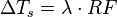
… which I posted previously. As a side note, the median estimate for temperature per 2xCO2 as of AR5 is ~3 K, not 1. So we have 3/4 = 0.75 K/(W m^-1) which is within the range of values commonly used for lambda.
The model co2islife is asking about does not.
How could a purely convective model be used to estimate temperature change if it completely ignores changes in latent heat flux? Changes in cloud cover? Changes in solar output? Changes in surface albedo?
Brandon,
My last question was poorly phrased. Any purely this or that model cannot be expected to estimate temperature change well. Long term changes in surface albedo, solar output, and cloud cover would be best reserved for a more complex model after a simpler model adequately accounting for radiation, convection, conduction, and evaporation has been developed. My question comes from wondering how the 4 W/m2 calculated from spectral changes by Modtran can be accurately associated with any specific temperature change without taking all the daily dynamic energy flux variables into account?
Chic Bowdrie,
Finally a sane question, sorry I missed it in all that excitement going on upthread. That Modtran model isn’t intended to produce publication-quality output, it’s educational. The 3.7 W/m^2 figure we read about as the change since pre-industrial comes from a combination of observations and models which do take into consideration the other fluxes and dynamics in the system we know about and have been able to estimate. (I almost said, “all the other fluxes and dynamics” … which is false, we don’t have them all by far, hence the range in estimates and appropriately big error bars on them …)
I’m too tired to Goggle (not a typo) the relevant IPCC AR5 chapter which discusses this, but if you search on “AR5 attribution CO2” yadda yadda, you can probably come up with the linky to the document.
co2islife,
2 would mean twice the mixing ratio of water vapor in the troposphere from the standard atmospheric used by the model. The range for adjustment would be whatever you think is plausible for a given average global temperature change.
NOTE that ground temperature is fixed in this model, only TOA flux changes. If you want to see what the surface temperature would be at 800 ppmv CO2 (a doubling from the default 400 ppmv), you must first note that the starting value for upward flux at TOA is 289.288 W/m^2, and then change the ground temperature offset until TOA flux returns to 289.288 (+0.9°C is the value which does it).
According to the IPCC, the formulation is:
The estimated value for λ (the climate sensitivity parameter) ranges from 0.7-0.8 K/(W m^-1).
The Sahara’s annual mean temp is about 30°C, the Amazon, 27°C (note that the Amazon is several degrees of latitude closer to the equator). Add 273.15 to those values to convert to K. Good luck figuring out realistic values for the water vapor parameter — you’ll find a lot of hits for relative humidity which won’t work in this model without conversion.
OK, that is what In was looking for. If you make the adjustments to reflect the Sahara Desert, ie water vapor = 0 for Midlatitude Summer, +7°C offset. looking down from 70km, 400ppm, fixed relative humidity, no rains for clouds.
Result = 368.95 W/M^2
Now change that to heavy rain and water vapor to 2 and the value changes to 263.038.
That is a full 105 W/M^2, or 25°C. Clearly CO2 is pretty weak relative to H2O.
H2O can alter temperatures by 25°C, and we are worried about CO2 causing 1°C? Really?
According to the IPCC, 1 K change comes from the CO2 doubling, ~2 K comes from net feedbacks, the main one of which IS water vapor.
The fact is we don’t just add water vapor or double CO2. As I understand it, the MODTRAN calculations are based on spectra of atmospheres of defined composition. The composition of humid air can change considerably throughout the day. CO2 not so much. But even if somehow 100 ppm CO2 could be injected into the air, the calculated spectra changes would have to be recorded throughout a sufficiently long period of days where the combined effects of evaporation, convection, and radiation can be appreciated. Where is the data that validates radiative-conductive models predicting temperature changes resulting from changes in atmospheric composition?
Chic,
Hundreds of papers starting from the late 1960s when the first 1 dimensional models were written. Off the top of my head try Harries (2001) I think it is, they compared the outgoing spectra observed in the 1970s with the same observations from a different satellite in the late 1990s and matched the difference up to what a radiative transfer model predicted. IIRC they considered both clear sky and cloudy sky conditions.
Brandon,
This is the abstract from a paper (Chapman et al., 2013) that extends the work of Harries et al.:
“Increased greenhouse gasses reduce the transmission of Outgoing Longwave Radiation (OLR) to space along spectral absorption lines eventually causing the Earth’s temperature to rise in order to preserve energy equilibrium. This greenhouse forcing effect can be directly observed in the Outgoing Longwave Spectra (OLS) from space-borne infrared instruments with sufficiently high resolving power 3, 8. In 2001, Harries et. al observed significant increases in greenhouse forcings by direct inter-comparison of the IRIS spectra 1970 and the IMG spectra 19978. We have extended this effort by measuring the annual rate of change of AIRS all-sky Outgoing Longwave Spectra (OLS) with respect to greenhouse forcings. Our calculations make use of a 2°x2° degree monthly gridded Brightness Temperature (BT) product. Decadal trends for AIRS spectra from 2002-2012 indicate continued decrease of -0.06 K/yr in the trend of CO2 BT (700cm-1 and 2250cm-1), a decrease of -0.04 K/yr of O3 BT (1050 cm-1), and a decrease of -0.03 K/yr of the CH4 BT (1300cm-1). Observed decreases in BT trends are expected due to ten years of increased greenhouse gasses even though global surface temperatures have not risen substantially over the last decade.”
Brightness temperature is calculated from spectra (by MODTRAN/HITRAN or some other device/model?). Note the conclusion “observed (ie calculated) decreases in BT trends are expected (ie not measured) due to ten years of increased greenhouse gasses even though global surface temperatures have not risen substantially over the last decade.” IOW, something is wrong with our model, but at least it does what we expect it to.
Chic Bowdrie,
“AIRS spectra”: http://disc.sci.gsfc.nasa.gov/AIRS/documentation/airs_instrument_guide.shtml
Trends were calculated from observations (ie, measurements).
No, IOW: even though surface temperatures have not risen substantially over the last decade, decrease in brightness temperature was observed as would be expected with an increase in greenhouse gasses. The abstract makes no predictions.
Brandon,
You said there were hundreds of papers validating radiative-conductive models. The Harries et al. paper covered an early period where the calculated model results were used to infer that increased IR active gases could have raised global temperatures. The follow up paper by Chapman it al. likewise showed that a “brightness temperature” can be calculated from changes in atmospheric composition. But the model is useless for predicting temperature changes as indicated in their own conclusion.
Just admit that there is no data that validates radiative-conductive models predicting temperature changes resulting from changes in atmospheric composition.
In regards to global temps, I would rather see maximum and minimum temperatures because we have both day and night. Blurring it all into one global average seems silly to me. It gives the perspective of a flat earth that only ever faces the sun. Eg. How would someone understand a comparison of roller coaster rides by looking at Averages?
That is a great point that people seem to miss about this issue. CO2 is transparent to visible light. CO2 has no real impact on daytime temperatures. The CO2 signature would be nighttime temperatures increasing in the dry deserts, where H2O would not be a factor. There are lots of natural “controls” for H2O, yet the Climate “Scientists” don’t seem to focus on them. Does anyone know of research demonstrating that night time temperatures are increasing over the deserts?
Yes we would expect nights to min temps to rise faster than max temps, but we still expect max temps to rise. I don’t have a handy reference, and don’t recall ever reading one that was desert specific.
Water vapor/cloud feedbacks are two of the most uncertain climate parameters according to the IPCC ARs, and they devote a lot of ink to discussing it. Why you think they’re not a focus, or is being ignored, frankly baffles me — it’s one of the most highly contested topics in current literature.
Is there any evidence that CO2 is leading to an increase in global humidity? I can see CO2 leading to more plant growth and H2O production, but that 1W/M^2 should increase H2O globally. Is there evidence of that?
https://www.climate.gov/news-features/understanding-climate/2012-state-climate-humidity
http://www.climate.gov/sites/default/files/styles/inline_all/public/SpecificHumidity_land_ocean_71-2012.png?itok=TVgMhYuS
Annual specific humidity since 1971 compared to the 1979-2003 average (dashed line) over land (brown line) and ocean (green line). Earth has become more humid in recent decades. Based on direct humidity observations made since the early 1970s. Graph adapted from Figure 2.10 in the 2012 BAMS State of the Climate report.
Bah, I muffed the image link: