Guest Post by Bob Tisdale
This post provides an initial look at climate model simulations of the top of the atmosphere (TOA) energy budget and its three components. It includes the outputs of the climate models stored in the CMIP5 archive (used by the IPCC for the 5th Assessment Report).
There are astonishing differences in the modeled estimates of the past, present and future imbalances and the three components that make up the top of the atmosphere (TOA) energy budget. That is, there is no agreement on the magnitude of TOA Earth’s energy imbalance in the models, and there are even wider disagreements in the calculated components that make up that energy budget, how they evolved in the past, and how they may evolve in the future…all suggesting, among the models, there is little agreement in the modeled processes and physics that contribute to global warming now, contributed to it in the past and might contribute to it in the future.
INTRODUCTION
For those new to this discussion, the Earth is said to have an Energy Budget. Trenberth et al. (2009) Earth’s Global Energy Budget provided a reasonably easy-to-understand discussion of the factors that impact that budget at the top of the atmosphere. My Figure 1 is Figure 1 from Trenberth et al. (2009). Focus your attention on the values of the three components at the top of the atmosphere. Those factors balance. That is, the energy from the sun (incoming solar radiation, a.k.a. Incident Shortwave Radiation) is equal to the sum of the sunlight reflected back to space (reflected solar radiation, a.k.a. Outgoing Shortwave Radiation) and the infrared radiation the Earth emits to space (Outgoing Longwave Radiation). The hypothesis of human-induced global warming says that manmade greenhouse gases cause an imbalance in that budget.

Figure 1
Note that the value for the incoming solar radiation (341.3 watts/m^2) is much less than the values you are used to seeing for Total Solar Irradiance (TSI) at the top of the atmosphere, which is about 1366 watts/m^2. Why the lower number in the energy budget? The sun only shines on half the Earth at one time and, because the Earth is spherical, sunlight is not distributed evenly across Earth’s surface. So the incident shortwave (solar) radiation is ¼ the TSI value. See the NASA EarthObservatory webpage Incoming Sunlight for a further discussion.
We’ll be discussing and illustrating the input values and the climate-model-created values of the components at the top of the atmosphere, and their difference, known as the Energy Imbalance.
Trenberth et al. (2014) Earth’s Energy Imbalance is one of a series of papers that present and discuss the imbalance in Earth’s energy budget. They begin their introduction with:
With increasing greenhouse gases in the atmosphere, there is an imbalance in energy flows in and out of the earth system at the top of the atmosphere (TOA): the greenhouse gases increasingly trap more radiation and hence create warming (Solomon et al. 2007; Trenberth et al. 2009). ‘‘Warming’’ really means heating and extra energy, and hence it can be manifested in many ways. Rising surface temperatures are just one manifestation. Melting Arctic sea ice is another. Increasing the water cycle and altering storms is yet another way that the overall energy imbalance can be perturbed by changing clouds and albedo. However, most of the excess energy goes into the ocean (Bindoff et al. 2007; Trenberth 2009). Can we monitor the energy imbalance with direct measurements, and can we track where the energy goes? Certainly we need to be able to answer these questions if we are to properly track how climate change is manifested and quantify implications for the future.
And we certainly need to look at how climate models attempt to answer those questions.
If you’re new to this discussion, you might be thinking the energy imbalance is a great big number. Sorry to disappoint you. Compared to the amount of sunlight reaching the top of the atmosphere, the imbalance is tiny…really tiny. Trenberth et al. (2014) provide a rough estimate in their Abstract:
All estimates (OHC and TOA) show that over the past decade the energy imbalance ranges between about 0.5 and 1 Wm-2.
The estimates of 0.5 to 1 watts/m^2 (watts per square meter, referenced to Earth’s surface area) are only 0.15 % to 0.29 % of the 341 watts/m^2 estimated amount of sunlight at the top of the atmosphere shown in Figure 1.
As you will see in this post, the range of the climate-modeled energy imbalance has a much larger range, about 10 times the 0.5 watts/m^2 range mentioned by Trenberth et al. (2014). And there is no agreement about how the imbalance was created in the past, or might be created in the future.
CLIMATE MODELS PRESENTED
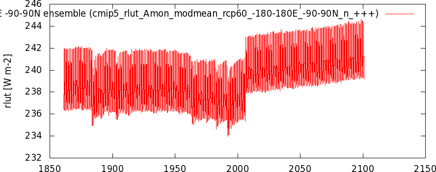
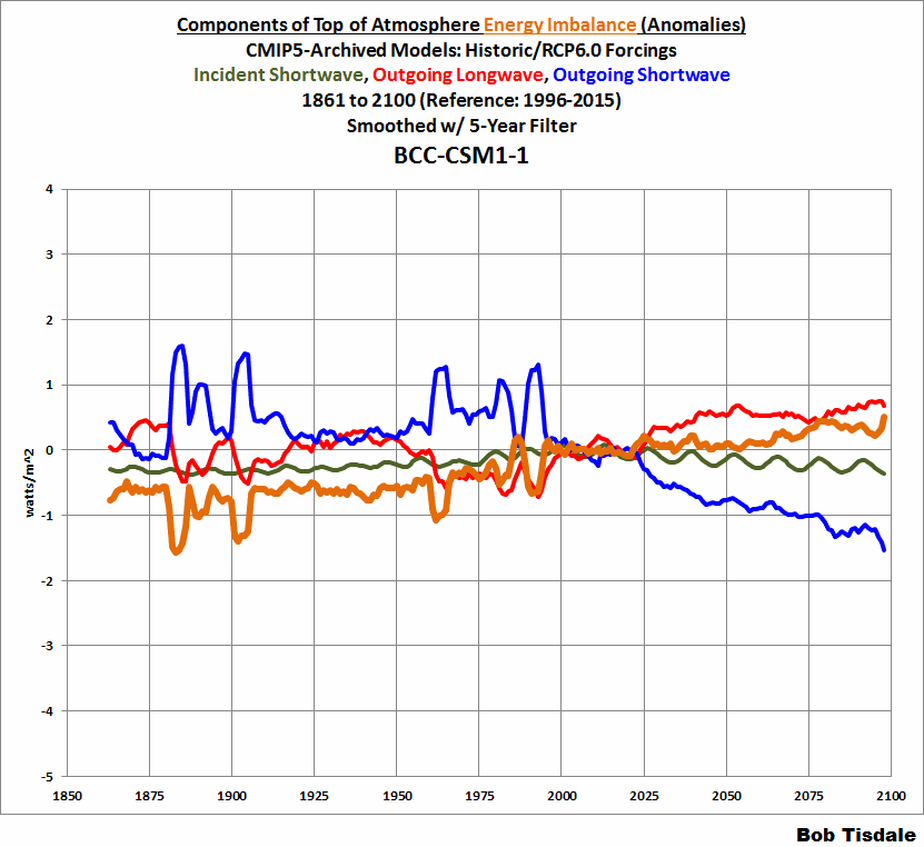
The climate models used in this post are from the Coupled Model Intercomparison Project, Phase 5 (CMIP5) archive. The source of the model outputs is the KNMI Climate Explorer, specifically from the Radiation variables on the Monthly CMIP5 scenario runs webpage. The TOA Incident Shortwave Radiation (incoming downward solar radiation) is identified as rsdt on that KNMI webpage, the TOA Outgoing Shortwave Radiation (reflected solar radiation) as rsut, and the TOA Outgoing Longwave Radiation (emitted infrared radiation) as rlut. I’ve used the higher of the middle-of-the-road scenarios, RCP6.0, and downloaded the outputs individually for each model.
I’ve excluded three models: CESM-CAM5 and two IPSL models. There were shifts at 2006 in the TOA Outgoing Longwave Radiation outputs of all three runs of the CESM-CAM5 model (one with a monstrous shift), which skewed the multi-model mean of that metric for that scenario. (I notified KNMI of that problem, and NCAR has since corrected them.) I also excluded the two IPSL models because their TOA Incident Shortwave Radiation contains a volcanic aerosol component, while all other models do not. (The other models address volcanic aerosols with the Outgoing Shortwave Radiation.)
That leaves 21 models, including BCC-CSM1-1, BCC-CSM1-1-M, CCSM4 (6 runs), CSIRO-MK3-6-0 (10 runs), FIO-ESM (3 runs), GFDL-CM3, GFDL-ESM2G, GISS-E2-H p1, GISS-E2-H p2, GISS-E2-H p3, GISS-E2-R p1, GISS-E2-R p2, GISS-E2-R p3, HadGEM2-AO, HadGEM2-ES (3 runs), MIROC5 (3 runs), MIROC-ESM, MIROC-ESM-CHEM, MRI-CGCM3, NorESM1-M, and NorESM1-ME.
For those models with multiple runs, the ensemble members are averaged before being presented in this post and before being included in the multi-model mean.
MULTI-MODEL MEAN
The multi-model mean for the radiative imbalance at the top of the atmosphere is shown in the top graph (Cell a) of Figure 2. The graphs run from 1861 to 2100. The multi-model mean of the individual components (Incident Shortwave Radiation, Outgoing Shortwave Radiation and Outgoing Longwave Radiation) are also shown in the Cells b to d. Listed on each of the graphs is the average value for the period of 1996 to 2015. (Explanation for those years: The historic portions of the simulations run from 1861 to 2005, while the forecasts based on projected RCP6.0 forcings run from 2006 to 2100. So the period of 1996 to 2015 includes the last 10 years of hindcast and first 10 years of forecast. They’ll serve as our base years for anomalies in future graphs.) The values of the averages are close to those shown in Figure 1 from Trenberth et al. (2009).

Figure 2
Note the increase in TOA Incident Shortwave Radiation from 1900 to the early 1950s (Cell b). That indicates the modelers are still trying to explain part of the warming in the first half of the 20th Century with a notable increase in the output of the sun, which may or may not have happened. Also notice the decrease in the amplitude of the solar cycle during the 21st Century. Explanation: The modelers use different lengths for the solar cycle in future decades. They grow farther out of synch with time, so the average decreases in amplitude.
Cells c and d present some interesting information about many of the models. The model mean for the outgoing shortwave radiation (Cell c) increases during the hindcast, which indicates, from 1861 to the turn of the century, clouds and volcanic aerosols allowed less sunlight to pass through the TOA to the Earth’s surface. And, even though modeled surface temperatures warmed from 1861 to 2000, outgoing longwave radiation decreased (Cell d). However, also based on the model means, the trends of both metrics reverse during the 21st Century. That is, during the 21st Century, outgoing longwave radiation increases as global surfaces warm. And some of that warming is caused by an assumed future increase in sunlight reaching the Earth’s surface. (That is, if less sunlight is being reflected to space as the future progresses, and if there is no assumed increase in the amount of sunlight reaching the top of the atmosphere, then the sunlight reaching the Earth’s surface is increasing.)
But the multi-model means are not the focus of this post. Our interests are the wide ranges in the model simulations of Earth’s Energy Imbalance at the top of the atmosphere and its components. Let’s start with the incident shortwave radiation.
INCIDENT SHORTWAVE RADIATION (INCOMING SUNLIGHT) AT TOA
The incident shortwave radiation at the top of the atmosphere is based on a climate model forcing. The CMIP5 – Modeling Info – Forcing Data webpage provides a link to the SOLARIS website for the recommended solar forcing data. The recommendations can be found here. They recommend a total solar irradiance reconstruction by Judith Lean, and provide very clear instructions for solar cycles in the future…repeat Solar Cycle 23.
Apparently there were different interpretations of the recommendations. See Figure 3, which presents the model outputs of TOA incident shortwave radiation in absolute form. There are three primary groupings. The 2 models from one modeling group start about 338.5 watts/m^2. There’s the middle grouping of 5 models that start around 340.25 watts/m^2. Then there is the grouping of the other 14 models starting about 341.5 watts/m^2.

Figure 3
You’ll note that I’ve listed the average, maximum and minimum values for the base period of 1996 to 2015. There is almost a 3 watts/m^2 spread in the TOA incident shortwave radiation among the models during our base period.
In Figure 4, the climate model outputs of TOA incident shortwave radiation are presented as anomalies, with the base years of 1996-2015. With the model outputs in anomaly form we can better see the similarities and differences in the curves. Two models from one modeling group really stand out…they’re the models that started with the lowest absolute incident shortwave radiation. Those models show a much stronger increase in solar forcing during the hindcast and they show a curious decrease in incoming sunlight from the early 2000s to 2100. The other models tend to agree with one another during the hindcast (1861-2005), but then run out of synch during the projections.

Figure 4
Not illustrated: At least one of the modeling groups appears to include a Solar Cycle 24 of lower amplitude, and then repeat Solar Cycles 22, 23 and 24 into the future.
OUTGOING SHORTWAVE RADIATION (REFLECTED SUNLIGHT) AT TOA
As a reminder, the outgoing shortwave radiation represents a portion of the incoming sunlight that’s reflected back to space, primarily by clouds and volcanic aerosols. Where incident shortwave radiation is basically an input, outgoing shortwave radiation is a model-calculated value.
Figure 5 presents in absolute terms the TOA outgoing shortwave radiation of the 21 individual CMIP5-archived models with historic and RCP6.0 forcings. The thing that stands out most is the wide range of model-manufactured values. Based on the 1996-2015 averages, there’s about a 10 watts/m^2 span from the model with the minimum average to the model with the maximum, while there was only a 3 watts/m^2 span in the amount of incoming sunlight (Figure 3).

Figure 5
The upward spikes show the impacts of volcanic aerosols on the outgoing shortwave radiation.
Figure 6 presents the long-term hindcasts and projections of outgoing shortwave radiation, but this time in anomaly form, referenced to the 1996-2015 base years. The use of anomalies allows a better visual comparison of the modeled changes before and after the transition from hindcast to forecast. Obviously, there are very wide ranges in the hindcasted and forecasted trends in model-simulated outgoing shortwave radiation. Again, note how the model mean shows increasing outgoing shortwave radiation in the past and a decrease in the future.

Figure 6
While the model mean of the outgoing shortwave radiation increases at a rate of about +0.08 watts/m^2/decade from 1861 to 2005, some models show a sizeable increase and others show little to no trend. Only one model shows a decline during the hindcast, and its trend is relatively flat at about -0.01 watts/m^2/decade. The model with the fastest increase from 1861-2005 has a trend of about +0.16 watts/m^2/decade. In other words, there’s about a 0.17 watts/m^2/decade spread in the trends of hindcast outgoing shortwave radiation.
Looking at the projections for 2006 to 2100, the model mean of outgoing shortwave radiation has a negative trend of about -0.21 watts/m^2/decade. But some models show outgoing shortwave radiation increasing slightly in the future, while others show it decreasing at a much greater rate. The greatest negative trend is about -0.48 watts/m^2/decade. At the other end of the wide spectrum is a model with a relatively slight positive trend of +0.02 watts/m^2/decade. Bottom line: there’s about a 0.5 watts/m^2/decade spread in the projected future outgoing shortwave radiation, with some models showing little change and others a sizeable decrease.
In Figure 7, I’ve smoothed the model outputs of outgoing shortwave radiation with 5-year running-mean filters to help show the differences in the shapes of the individual model curves.

Figure 7
One might conclude that a lot of different and contradicting assumptions go into the simulations of Earth’s climate. There certainly is little agreement among modeling groups about how sunlight impacted the energy imbalance in the past or might impact it in the future.
OUTGOING LONGWAVE RADIATION (EMITTED INFRARED RADIATION) AT TOA
Reminder: the TOA outgoing longwave radiation component of the Earth’s budget represents the infrared radiation emitted to space. Like outgoing shortwave radiation, outgoing longwave radiation is a model-calculated value, not an input like incident shortwave radiation.
The model simulations of outgoing longwave radiation in absolute form are shown in Figure 8. They too show a massive spread in simulated values. The 10 watts/m^2 difference during our base period indicates there is little agreement among the models on how much infrared radiation is presently being emitted by Earth to space.

Figure 8
The model simulations of outgoing longwave radiation are presented as anomalies (referenced to the base years of 1996 to 2015) in Figure 9. As noted earlier, the model mean shows outgoing longwave radiation decreasing during the hindcast but increasing during the forecast.

Figure 9
For the hindcast period of 1861 to 2005, the model mean of the outgoing longwave radiation declines at a rate of about -0.1 watts/m^2/decade. The model with the slowest decline during the hindcast has a trend of about -0.02 watts/m^2/decade, while the model with the fastest decline from 1861-2005 has a trend of about -0.17 watts/m^2/decade. That is, there’s a spread of about 0.15 watts/m^2/decade during the hindcast.
Looking at the projections for 2006 to 2100, the model mean of outgoing longwave radiation has a positive trend of about 0.1 watts/m^2/decade. But some models show outgoing longwave radiation decreasing slightly in the future, while others show it increasing. The greatest negative trend is about -0.1 watts/m^2/decade. At the other end of the wide spectrum is a model with a positive trend of 0.35 watts/m^2/decade. Bottom line: there’s an approximate 0.45 watts/m^2/decade spread in the trends of projected future outgoing longwave radiation, with some models showing an increase and others a decrease.
Figure 10 presents the modeled outgoing longwave radiation anomalies smoothed with 5-year filters, to provide a clearer view of the differences in the model simulations.

Figure 10
WHY ARE THE DIFFERENCES IN THE TRENDS OF OUTGOING LONGWAVE AND SHORTWAVE RADIATION SO LARGE?
If you’re thinking the reasons for the wide ranges in hindcast trends and, similarly, the wide ranges in the forecast trends of outgoing longwave and shortwave radiation have to do with modeled representations in clouds, you’re likely correct.
From Dolinar et al. (2014): Evaluation of CMIP5 simulated clouds and TOA radiation budgets using NASA satellite observations. Their abstract begins:
A large degree of uncertainty in global climate models (GCMs) can be attributed to the representation of clouds and how they interact with incoming solar and outgoing longwave radiation. In this study, the simulated total cloud fraction (CF), cloud water path (CWP), top of the atmosphere (TOA) radiation budgets and cloud radiative forcings (CRFs) from 28 CMIP5 AMIP models are evaluated and compared with multiple satellite observations from CERES, MODIS, ISCCP, CloudSat, and CALIPSO.
They then go on to describe the results of their study of AMIP models, which may help future CMIP models. Dolinar et al. (2014) end the abstract with (my brackets):
Through a comprehensive error analysis, we found that CF [total cloud fraction] is a primary modulator of warming (or cooling) in the atmosphere. The comparisons and statistical results from this study may provide helpful insight for improving GCM simulations of clouds and TOA radiation budgets in future versions of CMIP.
Basically, Dolinar et al. acknowledge that a large source of the uncertainties in outgoing longwave and shortwave radiation in GCMs is clouds.
PUTTING THE ANOMALY DIFFERENCES IN PERSPECTIVE
If you were to scroll up to Figures 9, 6 and 4, you’d note that the scales of the anomaly graphs are very different for the three components of the top-of-the-atmosphere energy imbalance. That is, the differences in the simulated TOA outgoing shortwave radiation are so great that the y-axis on Figure 6 spans 12 watts/m^2, while the y-axis for TOA incident shortwave radiation anomalies in Figure 4 only spans 0.7 watts/m^2. To put those metrics into perspective, for Animation 1, I’ve used a common scale for the spaghetti graphs of the model outputs. And to help minimize the model noise and show the differences between the models, I’ve smoothed them all with 5-year running-average filters.

Animation 1
That leads us to…
EARTH’S ENERGY IMBALANCE ANOMALIES IN CMIP5 MODELS
As you’ll recall, Earth’s energy imbalance is determined by subtracting the outgoing shortwave radiation (reflected sunlight) and the outgoing longwave radiation (emitted infrared radiation) from the incident shortwave radiation (incoming sunlight). In other words, for the climate models, we’re basically subtracting two computer-calculated values from a computer input.
We’ll start with the energy imbalance in anomaly form. We presented the outgoing shortwave radiation (Figure 6) and outgoing longwave radiation (Figure 9) as anomalies to show the differences between the individual models. But for the energy imbalance, Figure 11, they’re presented as anomalies to show how similar the curves are. That is, there were amazing differences in the basic curve shapes and trends of the individual model simulations of outgoing longwave and shortwave radiation, but remarkably, though not unexpectedly, the basic curves of the modeled TOA energy imbalance are much more similar in shape.

Figure 11
Figure 12 presents the TOA energy imbalance anomalies smoothed with 5-year filters.

Figure 12
Animation 2 is the same as the “perspective animation” (Animation 1) but it also includes the energy imbalance anomalies smoothed with 5-year filters.

Animation 2
Again, we presented the modeled energy imbalances to show the similarities in the curves, but our primary focus is the modeled TOA energy imbalances in absolute form.
And now the punchline:
EARTH’S ENERGY IMBALANCE (ABSOLUTE) IN CMIP5 MODELS
Figure 13 presents the simulated energy imbalance in absolute form. There is a 5 watts/m^2 span between models for the base period energy imbalances. Four of the models’ energy imbalances for the base period are negative.

Figure 13
That range in modeled energy imbalances was so great, not only did I double check all of the spreadsheets and downloads, but I cross-checked the extremes. Those extremes in the modeled energy imbalances come from two modeling groups, the two highs from one and the two lows from another. To cross-check the results, I downloaded the outputs for the 4 model runs from those two groups (2 each) but this time using the outputs of the historic/RCP8.5 (worst-case) scenario. See Figure 14. The spread is a tick higher with the RCP8.5 scenario. As one would expect, the RCP8.5 scenario also causes the energy imbalances to rise faster in the future than with RCP6.0.

Figure 14
Figures 13 and 14 reminded me of two things:
First is a statement in Hansen et al. (2011) The Earth’s Energy Imbalance and Implications. James Hansen, as you’ll recall, is the former (retired) director of GISS. In that paper, they discussed a problem with the satellite-measured energy imbalance at the top of the atmosphere and how the climate science community worked around it (my boldface):
The precision achieved by the most advanced generation of radiation budget satellites is indicated by the planetary energy imbalance measured by the ongoing CERES (Clouds and the Earth’s Radiant Energy System) instrument (Loeb et al., 2009), which finds a measured 5-yr-mean imbalance of 6.5Wm−2 (Loeb et al., 2009). Because this result is implausible, instrumentation calibration factors were introduced to reduce the imbalance to the imbalance suggested by climate models, 0.85Wm−2 (Loeb et al., 2009).
Phrased differently, because the satellites were inaccurate, climate scientists had to rely on the outputs of climate models and assume they were correct.
If a 6.5 watts/m^2 energy imbalance is considered “implausible”, what about model-simulated energy imbalances of -2.2 watts/m^2 and +2.8 watts/m^2? Are those values implausible as well? If so, why are those models used by the IPCC? Didn’t they bother to check whether the models presented plausible simulations of Earth’s energy imbalance?
What about the four models that show a negative imbalance during our base period of 1996-2015? If those models are correct, then the hypothesis of human-induced global warming has a very big problem. A negative imbalance indicates that presently more energy is being reflected and emitted by the planet than is being received from the sun…and that our emissions of greenhouse gases are returning the Earth to a balanced energy budget.
On the other hand, recall that Trenberth et al. (2014) gave us an approximate range for the energy imbalance of 0.5 to 1.0 watts/m^2. There are 5 models that produce an energy imbalance greater than 1.2 watts/m^2 for the base period of 1996-2015. If they’re right, then there’s even more heat than is presently unaccounted for. They’ll have to call out more search parties to look for all of that missing heat.
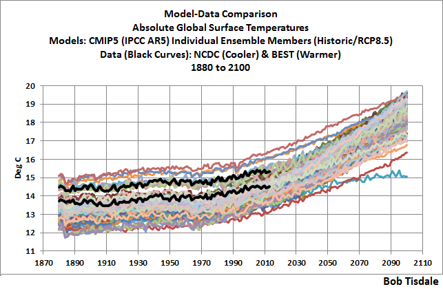
The second thing the large range of modeled energy imbalances reminded me of: there is a similar large range in the modeled global surface temperatures in absolute form. See the graph here from the post On the Elusive Absolute Global Mean Surface Temperature – A Model-Data Comparison. The span of the modeled surface temperatures in 2010 was more than 3 deg C, and that’s about 3 times greater than Earth’s surfaces have warmed since pre-industrial times according to the (much-fiddled-with) observations-based data.
Not long after I wrote the “elusive” post, Gavin Schmidt (current director of GISS) made a couple of curious statements in his blog post Absolute temperatures and relative anomalies at RealClimate. We discussed them in the post Interesting Post at RealClimate about Modeled Absolute Global Surface Temperatures. The statement by Gavin Schmidt that bears on this discussion (my boldface):
Second, the absolute value of the global mean temperature in a free-running coupled climate model is an emergent property of the simulation. It therefore has a spread of values across the multi-model ensemble. Showing the models’ anomalies then makes the coherence of the transient responses clearer. However, the variations in the averages of the model GMT values are quite wide, and indeed, are larger than the changes seen over the last century, and so whether this matters needs to be assessed.
“…needs to be assessed” indicates they hadn’t bothered to do it by then…and likely still haven’t.
Climate models have been used by the political entity called the IPCC for almost 2 ½ decades to support a political agenda known as the UNFCCC. In those 2 ½ decades, apparently the climate science community hasn’t bothered to check to see whether it matters that the spread in absolute modeled global mean temperature is three times greater than the warming that’s taken place since pre-industrial times.
Now, let’s consider the absolute values of the radiative imbalance shown in Figure 13. The model mean shows an average energy imbalance of 0.79 watts/m^2 for the base period of 1996-2015, and Earth’s energy imbalance (based on the model mean) was about 0.10 for the first 20 years of 1861-1880 (the pre-industrial values). So, based in the model mean, Earth’s energy imbalance has increased roughly 0.69 watts/m^2 since pre-industrial times. But the range of the modeled energy imbalance (based on the CMIP5-archived models with historic and RCP6.0 forcings) during the base period spans about 5 watts/m^2. That’s more than 7 times greater than the 0.69 watts/m^2 modeled increase. Can we presume that the climate science community has not bothered itself to assess whether that matters, too? Maybe they’ve been avoiding it.
We’ve already mentioned a few reasons why it does matter. And what matters even more is that there is…
NO CONSENSUS ON WHAT CREATED THE ASSUMED ENERGY IMBALANCE OR WHAT WILL CAUSE IT TO CHANGE IN THE FUTURE
Much of this post discussed and illustrated that there was no agreement among climate models about what caused the Earth’s assumed energy imbalance and how those factors might change in the future. To help drive that point home, I’ve prepared Animation 3. It includes the energy balance and its three components in anomaly form for each of the models included in this post. All outputs have been smoothed with 5-year filters to minimize the noise inherent in the models.
Animation 3
CLOSING
Let’s return to the quote from the introduction of Trenberth et al. (2014) Earth’s Energy Imbalance:
With increasing greenhouse gases in the atmosphere, there is an imbalance in energy flows in and out of the earth system at the top of the atmosphere (TOA): the greenhouse gases increasingly trap more radiation and hence create warming (Solomon et al. 2007; Trenberth et al. 2009). ‘‘Warming’’ really means heating and extra energy, and hence it can be manifested in many ways. Rising surface temperatures are just one manifestation.
Climate models have been programmed to raise modeled surface temperatures and subsurface ocean temperatures as the simulated energy imbalance increases in response to the numerical representations of manmade greenhouse gases and other climate forcings. Climate models have also been programmed to create number-crunched changes in numerous other metrics so that they show rising sea levels, decreasing sea ice, ice sheet and glacier mass, increasing precipitation, and so on as the energy imbalance increases. As a result, there is a general agreement among the models that, as the energy imbalance increases in value, the Earth will gain heat and extra energy…and that the heat and extra energy will be “manifested in many ways”.
-However-
As we’ve illustrated and discussed in this post, looking at the three factors that make up the TOA energy imbalance, there is no agreement among the climate models on the values of past, present and future outgoing shortwave and longwave radiation. As a result, there is no agreement about:
- what enhanced the warming we’ve experienced to date,
- what will enhance any future warming, and
- what the absolute values of the energy imbalance were in the past, are presently and will be in the future.
Climate models have been programmed to show global warming and all of its manifestations in response to rising energy imbalance values. But modeling groups go through very different gyrations (by manipulating clouds?) with the two computer-calculated components of the Earth’s energy budget at the top of the atmosphere in order to achieve that warming…which indicates there is no consensus on how Earth’s atmosphere and oceans have responded in the past, are responding now, and will respond in the future to manmade greenhouse gases. No consensus whatsoever.
UPDATE – SORRY, FORGOT SOMETHING IMPORTANT
My thanks to Judith Curry for suggesting papers that helped me better understand this topic and to Willis Eschenbach for taking a look at a draft of this post.
Three Legged Stool of CAGW: 1) Anthropogenic 2) Radiative Forcing 3) GCMs
Leg the 2nd
Radiative forcing of CO2 warming the atmosphere, oceans, etc.
If the solar constant is 1,366 +/- 0.5 W/m^2 why is ToA 340 (+10.7/- 11.2)1 W/m^2 as shown on the plethora of popular heat balances/budgets? Collect an assortment of these global energy budgets/balances graphics. The variations between some of these is unsettling. Some use W/m^2, some use calories/m^2, some show simple %s, some a combination. So much for consensus. What they all seem to have in common is some kind of perpetual motion heat loop with back radiation ranging from 333 to 340.3 W/m^2 without a defined source. BTW additional RF due to CO2 1750-2011, about 2 W/m^2 spherical, 0.6%.
Consider the earth/atmosphere as a disc.
Radius of earth is 6,371 km, effective height of atmosphere 15.8 km, total radius 6,387 km.
Area of 6,387 km disc: PI()*r^2 = 1.28E14 m^2
Solar Constant……………1,366 W/m^2
Total power delivered: 1,366 W/m^2 * 1.28E14 m^2 = 1.74E17 W
Consider the earth/atmosphere as a sphere.
Surface area of 6,387 km sphere: 4*PI()*r^2 = 5.13E14 m^2
Total power above spread over spherical surface: 1.74E17/5.13E14 = 339.8 W/m^2
One fourth. How about that! What a coincidence! However, the total power remains the same.
1,366 * 1.28E14 = 339.8 * 5.13E14 = 1.74E17 W
Big power flow times small area = lesser power flow over bigger area. Same same.
(Watt is a power unit, i.e. energy over time. I’m going English units now.)
In 24 hours the entire globe rotates through the ToA W/m^2 flux. Disc, sphere, same total result. Total power flow over 24 hours at 3.41 Btu/h per W delivers heat load of:
1.74E17 W * 3.41 Btu/h /W * 24 h = 1.43E19 Btu/day
Suppose this heat load were absorbed entirely by the air.
Mass of atmosphere: 1.13E+19 lb
Sensible heat capacity of air: 0.24 Btu/lb-°F
Daily temperature rise: 1.43E19 Btu/day/ (0.24*1.13E19) = 5.25 °F / day
Additional temperature due to RF of CO2: 0.03 °F, 0.6%.
Obviously the atmospheric temperature is not increasing 5.25 °F per day (1,916 °F per year). There are absorbtions, reflections, upwellers, downwellers, LWIR, SWIR, losses during the night, clouds, clear, yadda, yadda.
Suppose this heat load were absorbed entirely by the oceans.
Mass of ocean: 3.09E21 lb
Sensible heat capacity: 1.0 Btu/lb °F
Daily temperature rise: 1.43E19 Btu/day / (1.0 * 3.09E21 lb) = 0.00462 °F / day (1.69 °F per year)
How would anybody notice?
Suppose this heat load were absorbed entirely by evaporation from the surface of the ocean w/ no temperature change. How much of the ocean’s water would have to evaporate?
Latent heat capacity: 970 Btu/lb
Amount of water required: 1.43E19 Btu/day / 970 Btu/lb = 1.47E+16 lb/day
Portion of ocean evaporated: 1.47E16 lb/day / 3.09E21 lb = 4.76 ppm/day (1,737 ppm, 0.174%, per year)
More clouds, rain, snow, etc.
The point of this exercise is to illustrate and compare the enormous difference in heat handling capabilities between the atmosphere and the water vapor cycle. Oceans, clouds and water vapor soak up heat several orders of magnitude greater than GHGs put it out. CO2’s RF of 2 W/m^2 is inconsequential in comparison, completely lost in the natural ebb and flow of atmospheric heat. More clouds, rain, snow, no temperature rise.
Second leg disrupted.
Footnote 1: Journal of Geophysical Research, Vol 83, No C4, 4/20/78, Ellis, Harr, Levitus, Oort
One issue I have with adding the depth of atmosphere to the radius of the Earth is that atmosphere, being primarily transparent to energy, shouldn’t be part of a S-B “black body” calculation, that to use TOA as the surface of the sphere, a complex S-B gray-body calculation should be made taking the various emissibility factors of the atmosphere and actual surface into consideration; but the temperature calculation/energy budget claims of the alarmists are all based on straight S-B “black body” with the claim that emissivity is so close to 1 as to be irrelevant. The flawed usage of S-B based on TOA values for the “energy budget” is why, in my opinion, the “sensitivity” claims are so far-fetched.
http://meteora.ucsd.edu/~jnorris/reprints/Loeb_et_al_ISSI_Surv_Geophys_2012.pdf
Bob
Something to ponder on.
One cannot expect the energy budget cartoon to balance since it does not describe the real world.
There are so many problems with it, particularly the average approach, which if it were so, there would be all but no weather on planet Earth. It is only because conditions are not some homogenous average that one gets weather fronts. Further the Earth is 3D not 2D and where energy is absorbed is also material.
One ‘error’ not often mention is the claim that 161 watts/m^2 of incoming solar is absorbed by the surface. This cannot be correct since approximately 70% of the surface of the Earth is ocean, and water is largely transparent to solar. Incoming solar is not absorbed at the surface of the ocean but instead typically at a depth of some 70 com to 15m, but some at more than 100m. Of the solar that is absorbed at such depths some of it stays at depth and some is taken deeper by ocean over turning. It is what is maintaining the average ocean temperature of 3 to 4 degC.
Of course most if not all of the incoming solar eventually finds its way to the surface, or if driven polewards, it may be used in powering the melting of ice. But the issue here is the time scale at which it returns to the surface.
One cannot assume that all of this is a constant, or one should (to simplify matters) assume that solar absorbed at depth instantaneously makes its way to the surface. Given that the thermohaline circulation is measured in a approximately a 1000 years, it may be that solar absorbed today may take on average say 50 years or 100 years or what have you like to reach the surface and to form part of the outgoing radiation.
If one is considering todays energy budget, this begs the question of how much solar irradiance reached the oceans say 50 years ago or 100 years ago or perhaps during the Little Ice Age. etc. Perhaps aerosols were different or patterns of cloudiness were different such that in the past there was more or less solar reaching the oceans. If that was the case then one would immediately obtain an imbalance, especially when one is looking at relatively small imbalances.
Bob, this should shake up the W proponents muchly. These would appear to be graphs for ‘Policy Makers’ not scientists. What is the probability that there would be such a strong trend-changing inflection point right at the present? No real scientist or engineer would let this go without considerable thought an analysis. I note Steve Mosher, who thinks only he and two other people on the planet are educated and smart enough to have a discussion on aspects of philosophical puffery as relates to logic, hasn’t turned up yet to defend the sanctity of these atrocious models.
Steve, does the following statement perhaps supported by the philosophical logic of you three guys?:
“Because this result is implausible, instrumentation calibration factors were introduced to reduce the imbalance to the imbalance suggested by climate models, 0.85Wm−2″
The hubris is so huge in this composting field that there is indeed a large imbalance, but it is one more psychological than scientific or philosophical. Increasingly, the faithful supporters who have some scruples have been stricken with clinical depression over the pause and the suffering is from classical psychological D’Nile. Those without scruples are beyond reach. They recognized the problem and their solution was to adjust away the pause. Aren’t there laws being broken somewhere here? Engineers can be disciplined and even barred from practice for such antics. It is time to put scientists into a strait jacket of enforceable ethical rules.
+1
Excellent article. Yesterday, there was a nice article in the Chronicle of Higher Education critical of “Consensus Statements” put out by scientific organizations. The author focussed on past Psychological consensus statements that have been found to be wrong over time. He goes on to say that Physical associations feel no need to put out a “Gravity Statement” but then makes a brief waffling comment about Climate Consensus Statements. How did we get to a point where scientists vote on claims!?
My hope is that scientific organizations would refrain from consensus statements and leave the Journals to publish science that readers can assess for themselves. Identification of consensus should itself be scientific such that Meta-Analyses would be Bayesian-based: The more definitive a claim (prior probability), the more definitive the falsification when contrary data is presented. Posterior probabilities of Consensus Climate Statements should be plummeting…
“No Consensus (or Too Many Chiefs)”
More revisions to history:
http://astronomynow.com/2015/08/08/corrected-sunspot-history-suggests-climate-change-not-due-to-natural-solar-trends/
http://www.independent.co.uk/news/science/scientists-raise-doubts-over-whether-sunspot-activity-has-increased-in-recent-decades-10449102.html
Outstanding.
The warmist story and reams of grant-supported science papers are based almost exclusively on the models, and this post shows better than almost anything I’ve seen what a tissue of speculation they are.
I’m bookmarking this and will try to re-read it periodically.
Again, outstanding.
Anthony Watts….;)
Solar activity is NOT linked to global warming: Ancient error in the way sunspots are counted disproves climate change theory
The correction, called the Sunspot Number Version 2.0 was led by Frédéric Clette, Director of the World Data Centre (WDC) SILSO, Ed Cliver of the National Solar Observatory and Leif Svalgaard of Stanford University.
http://www.dailymail.co.uk/sciencetech/article-3192370/Solar-activity-NOT-linked-global-warming-Sunspot-theory-climate-change-result-ancient-error-data.html#ixzz3iWF6sHZw
that should have gone to moderation….??
well….I guess the obvious eluded someone!
It’s just an article in a newspaper that mentioned Leif…………
The obvious eludes you and the authors of the revision. Did you ever look at the solar data?
The statement made by the authors regarding a lesser trend in the v2 SSNs since the Maunder Minimum as not being responsible for climate change/global warming is a strawman argument.
Using the v2 yearly SSN data as downloaded on July 1 from http://www.sidc.be/silso/DATA/SN_y_tot_V2.0.txt (if they haven’t been revised again since then):
The modern maximum in solar activity occurred from 1935.5 to 2004.5, a 70 year period, when v2 yearly SSNs averaged 108.5, as compared to a 65.8 per year average for the 70 years between 1865.5 and 1934.5, which was a 70 year 65% increase in sunspot activity.
This takes us back before the 1880 start of the time range typically used in climate work.
Before someone accuses me of ‘cherry-picking’ – the modern era when compared to earlier times still had higher solar activity:
Using 9 whole solar cycles for each period, the 1914-2009 period that includes the modern maximum averaged 95.1 per year in SSN, and was 22.4% higher than the previous 9 cycles from 1810-1913, which averaged 71.7 annually, and was 18.4% higher than the 1712-1809 period, that averaged 78.7 annually.
The Sun caused global warming during the modern maximum, when sunspot activity was 65% higher for 70 years than the previous 70 years.
Bob they do not seem to get it, even in the face of the black and white data you have presented.
I agree. I have been perplexed by that as well. The modern maximum may not be anything out of line from the last 10,000 years, but in the last 200 yrs, the most recent (until cycle 24) stands out as significantly higher than the period going back to before the Maunder Minimum.
Instead of cherry picking, let us simply show the complete record:
http://www.leif.org/research/Comparison-GSN-14C-Modulation.png
The blue curve is the 11 yr average number of sunspot groups since 1600. The red curve is the Carbon 14 cosmic ray based cosmic ray modulation.
Translating the sunspot number into TSI, the record looks like this:
http://www.leif.org/research/New-TSI-from-Group-Number.png
Or the Open Magnetic Flux [solar wind], the cosmic ray modulation, and the sunspot groups since 1600:
http://www.leif.org/research/Usoskin-et-al-2015.png
The Group Number for the first half of the data since 1700 was 4.4+/-0.5, and for the last half also 4.4+/-0.2. Statistically indistinguishable.
Bob, here is an interesting comment in the 1959 paper by Kaplan, that refutes earlier papers by Plass. Plass is the touchstone that Gavin Schmidt lives by and is used as the input to basically all climate models… ?dl=0
?dl=0 ?dl=0
?dl=0 ?dl=0
?dl=0
I apologize that this is so large.
Bob, there is an incredibly interesting statement by Kaplan above. “Although Plass realized that the existence of clouds would DECREASE the effect of CHANGING CO2 on temperature…..”
I have not seen that discussed in the manner that Kaplan does.
Wow, and we thought all the innovation was happening today. Kaplan published a work on Remote Satellite Sounding atmospheric analysis in 1959, only two years after Sputnik was launched, and a year before Tiros 1, which only took “photos” of clouds.
Makes you wonder why it took another 20 years to start a satellite record…
Oh wait – that’s right – we HAD a satellite record that started before 1979 – it’s just that the pro-AGW “deciders” chose to ignore pre-1979 satellite data because it was “different.” More likely it’s because it didn’t start at a low point in a temperature cycle. Same reason they ignore pre-1979 satellite-based sea ice extent data.
They can homogenize and adjust and tweak and in-fill land-based data using old instruments claiming it calibrates them to the new high-tech instrumentation, but they can’t figure out how to reconcile between two satellite datasets using different instrumentation?
Nimbus 1 flew in 1964 with the High Resolution Infrared Radiometer (HRIR) (8 km resolution) which was sensitive in the band of 3.5-4.1 microns). There was also the Medium Resolution Infrared Radiometer (32 km resolution). Nimbus I only lasted 3 weeks in orbit. Nimbus II flew in 1966 and lasted for 9 months. Nimbus III flew in 1969 and lasted over a year. Lots of good data there and we helped to translate it to modern NetCDF-4 format.
Great find Dennis, so Gavin et al cherry-picked the falsified sensitivity of Plass when Kaplan’s paper was already in the literature for over 30 years.
Yeeep….
To give a less flip reply…..
Kaplan has some incredibly good insights as it was in this period that instrumentation finally became “selective” (able to discriminate individual absorption wavenumbers) for the different absorption/emission modes (stretching, rocking) of the CO2 molecule. This was done by the USAF principally because they were designing the seekers for the Sidewinder and other missiles and wanted to use bands that were not IR absorbers. This is why our missiles were so much better than the Russian missiles in Vietnam. Thus a lot of this information was highly classified at the time and it only leaked out through science papers by people like Plass, Kaplan and others who were able to get the equipment that had been paid for by USAF R&D dollars.
For those old enough to remember, this is what the “upper atmospheric research” flights by the USAF were about during that time period. There is a great quote above from Kaplan about Plass “his method is too subjective to be reproducible”. Also intriguing about Kaplan’s presentation is the influence of clouds on the ability of CO2 to absorb and emit IR. This makes a lot of sense as H2O overlaps CO2 in most of its wavebands and thus if you have an absorber that is orders of magnitude more prevalent in the same space (clouds and CO2), the energy is going to be preferentially absorbed by H2O over CO2.
I have never seen that expounded upon anywhere in the modern literature (more than happy to be corrected about this).
Thanks, Bob. Your analysis of the modeled Earth is very good. I think it shows (again) that the IPCC models are a total waste.
This RCP6.0 ensemble is bad. Now imagine what the Business as Usual outputs look like in Watts/sm spread. And it’s those RCP 8.5 ensemble that the policy makers are using justify CO2 cuts and expensive renewables.
Energy economies are being “fundamentally transformed” with the justification based on garbage. We know what the real agenda of the UNFCCC and NWO socialists is, and it has nothing to do with controlling anthropogenic CO2 global warming. With Bob’s “most excellent” exposé here, the model pseudoscience behind which this political agenda hides should be obvious to the non-climate science and engineering communities (or anyone else with a brain). Now it is time for those communities to open their eyes and quit pretending this adulteration of science is just “a bunch of d3#iers”, and to speak out loudly against the CC agenda before any further damage to science is done.
“Phrased differently, because the satellites were inaccurate, climate scientists had to rely on the outputs of climate models and assume they were correct.”
Thanks Bob, this works cuts right to the heart of AGW theory. From the perspective I offered in my post on attribution at Climate Etc., we can see that mainstream climate scientists still have no clue on how to weigh the value of different types of evidence. Throw out the direct measurements in favor of model results, and then declare yourself 95% confident in your answer!
Bob,
Some very important stuff here, mixed in with a lot of less important stuff.
The variance between model forecasts is old news; that is part and parcel of the variation in climate sensitivity. The variance between models in TOA incoming solar is no big deal since it is less than 1% and within experimental uncertainty. And the variance model in outgoing longwave radiation is not of independent concern since it is a direct consequence of the variation in albedo (since total outgoing is very nearly fixed).
But the 10% range in SW reflected is shocking (but not surprising) since that means that many of the models get a global albedo outside the measurement uncertainty. I knew that there were wide variations in zonally averaged cloud radiative effects (AR5 Fig. 9.5) but not that they were getting global albedo so wrong. The same applies for the range in TOA imbalance. There are two causes of that. One is differences in the change in ocean heat content (the physically real part of the imbalance), see AR5 Fig. 9.17. The other is that some of the models fail to conserve energy, see: Forster, P. M., T. Andrews, P. Good, J. M. Gregory, L. S. Jackson, and M. Zelinka (2013), Evaluating adjusted forcing and model spread for historical and future scenarios in the CMIP5 generation of climate models, J. Geophys. Res. Atmos., 118, 1139–1150, doi:10.1002/jgrd.50174.
Models that are significantly in variance with reality on key quantities should be deemed unacceptable. You wrote: “If so, why are those models used by the IPCC? Didn’t they bother to check whether the models presented plausible simulations of Earth’s energy imbalance?” Yes, they checked, but they don’t seem to care. I think that is the key point here, and is the central reason why IPCC and their fellow travelers should be deemed unreliable.
A second key point is that the models can not get clouds right, hence the albedo errors. High climate sensitivities (above 2.0 K) are the result of predicted cloud feedbacks. If they can’t get them right now, how can they get them right in future? Yet IPCC has “high confidence” in the cloud feedbacks. Oh, the stupidity.
A lesser issue: Please be careful about your use of the word “assumed”. For example, you wrote “… among climate models about what caused the Earth’s assumed energy imbalance”. The imbalance is not assumed, it is calculated. At best, your wording is confusing; at worst, it gives ammunition to those who look for any little reason to “prove” their critics wrong.
thanks for the perspective. somewhere jntheir assumptions, they make major mistake, zimply because the missi g heat was never there in the first place. The SW reflection is higher than they model.
Trenberth says most of the excess energy goes into the ocean. If so, do we have much idea what the lag time would be before there is an increase in atmospheric temperature? Suppose the lag time is 100 years (allowing for very slow mixing of the ocean). Then we could maintain this energy imbalance for a century before seeing an effect.
Lance, his paper said it went into the deep ocean, because ARGO did not find it down to 2000 meters. The abyssal temperature is betwee 0 and 3C. So if Trenberth were right, it would never come out. Thermodynamics. But he is wrong. Essay Missing Heat.
See my comment above [richard verney (August 11, 2015 at 7:01 am)] that comments upon a similar theme, and why it would be extremely unlikely to get a balance.
The point is that radiation out is from the surface, whereas not all radiation that reaches the ground is absorbed (or reflected) by the surface since some of the incoming solar irradiance is absorbed in the oceans at depth and it takes time for that energy to get back to the surface to be radiated from the surface.
Therefore by looking at radiation in to the surface and comparing it with radiation out from the surface one is engaged in comparing apples with pears.
Thank you Bob. A very readable post and is a complete clubbing to the notion of “consensus”.
I hope everyone appreciates the staggering amount of work that went into assembling this piece. It exposes the preposterous fact that the climate community still does not have a handle on actual measurement of the upper atmosphere’s energy imbalance. In a sane world, said measurement would be the STARTING POINT for calculating future global temperatures. Instead, we have a fleet of models that have “inferred” that imbalance in order to hind-cast actual historic global temperatures consistent with a monstrous array of other model inputs. Since that array of “other inputs” has varied from model to model, it should come as no surprise that the resulting inferred upper atmospheric energy imbalance varies over an absurd range from model to model. That fact alone should inform even the most casual observer that the fleet of AGW-based climate models is a classic collection of “garbage-in-garbage-out” and that averaging their outputs will get you “average garbage”.
„Fig.13 presents the simulated energy balance in absolute form. There is a 5W/m^2 span between models for the base period energy imbalances. Four of the models’ energy imbalances for the base period are negative.”
Thanks Bob, very interesting. Some months ago I programmed a simple EBM model. My control knob was that the annual energy imbalance at TOA should be zero because there were no long term heat sinks . Then I searched for the bugs in the program. I had to work hard but finally I succeeded.
Over the years I have seen a lot of great posts, from some of the smartest people interested in the climate and what drives it.
Bob you knocked this one over the wall for a home run. That’s why I love WUWT so much. Real science on steroids.
And always smart thoughtful comments. What more can any one with an enquiring mind want?
Man oh man, Bob, even Moshe stayed away and much of his posting has been to defend models.
Gary Pearse
August 11, 2015 at 11:04 am
Hello Gary.
One way to explain why even Moshe staying away in this particular issue of the models in question, is that defending the models at this one it will completely confuse AGW “rationale”.
cheers
Thanks Bob. Stupendous.
I keep having a problem with Trenberth’s schematic and would like some help. He has essentially set up two control volumes, one being the earth, the other the atmosphere, and is measuring energy fluxes through boundaries (earth to atmosphere, atmosphere to ‘space’). While he balances the fluxes, I recall being taught that a uniform body radiates uniformly (not referring to black body vs grey body here). One of the assumptions of CO2 theory is that the atmosphere is ‘well mixed’ or uniform. Given that assumption, and that he is already averaging the energy across the entire surface, shouldn’t the radiative flux of the atmosphere be equal in both radial directions (assuming the thin wall theory that dr<<r then dA ~0)? Why can clear atmosphere radiation towards the earth be almost twice the clear atmosphere radiation towards space? It reminds me of the Grinch's statement to Cindy Lou Who about a light bulb that only lights on one side.
A wildly oversimplified model may be helpful.
Imagine the atmosphere as consisting of, say, four stationary (!) molecules on a vertical line above the surface and that each molecule can radiate only along that vertical line–but is just as likely to radiate up as down. Now further assume that a (low-energy) photon emitted upward by the lowest molecule has only, say, a 75 % chance of exciting the next molecule up; if it doesn’t excite that one, then it has a 75% chance of exciting the molecule after that, etc. An upward photon from the highest molecule has a 100% chance of being lost to space. Of course, a downward photon from the lowest molecule has a 100% chance of exciting the surface.
The surface is concurrently being excited by high-energy photons that don’t interact with the atmosphere and is therefore the ultimate source of all the low-energy photons that excite the molecules. If you follow the probabilities, I think that you find that the rate of photon exchange between the surface and the molecules exceeds the rate of photon loss to space.
A downward photon has a 75%chance of impinging molecule and then a 50/50 chance of being directed back towards space where it has a 75%chance of escaping again, and so on down the chain.
In other words the probabilities cancel out.
gino:
I’m not 100% sure I agree with your analysis.
Look at it this way. Suppose the energy of each high-energy photon equals twice that of each low-energy photon. And, remember, low-energy photons can come into being only in response to the surface’s receiving a high-energy photon from space: the number of low-energy photons created equals twice the number of high-energy photons received from space. That means that at equilibrium the number of (in accordance with our simple model, necessarily low-energy) photons lost to space equals twice the number of high-energy photons the surface receives from space: on average, power out equals power in.
But the surface emits photons in response not only to the photons it receives from space but also (one for one) to those it receives from the molecules. So the power it emits exceeds the power lost to space.
Colloquially, this is known as the “greenhouse effect.”
When you read a book or watch a movie, you don’t get blurring by scattering of photons, letters don’t change places, and you can see exquisite detail in Saturn’s rings or moon craters, so going out of the atmosphere is pretty clear.
Joe, I understand what you are saying, but this reads more like a conservation of photons, rather than conservation of energy. At each photon absorption, those released will be at a lower energy state. What it seems like you are saying is that due to the probability gradient from surface up there is more energy transmitted at the bottom. However if you take your simple model, and create a 4 interaction chain where 25% is lost at each interaction, followed by a total loss at the last interaction shows for a 100 W input, the surface would radiate 100 (so far so good for the GH argument) but when you add up the losses from 25% losses from each level, plus the final energy loss, we get 142 out for 100 in. (each atmosphere molecule radiates equally in each direction with a 25% loss at each stage). Somehow this doesn’t make me confident. I’m still missing something.
Gino:
Sorry I missed your question.
Yes, it does sound like I’m counting photons instead of energy, but it amounts to the same thing if you’re going by the simplified model in which (contrary to reality, of course, but I think acceptable for our purposes) all photons emitted by the molecules have the same energy. (If we want, we can say that each insolation photon has, say, twice the energy of each re-radiated photon–i.e., we get a stock split–but it doesn’t really matter; you can forget photons and count ergs instead.)
But you’ve just made me realize that, although the model is simple, totaling up the emissions gets tedious. Unless (as often happens) the programming does, too, I’ll try to do a quick R script that totals it up so you can see it if you have an R interpreter.
But, believe me, it works out.
gino:
Here’s quick and dirty code to illustrate that one-dimensional greenhouse-effect model:
# A perennial difficulty with the greenhouse-effect concept is that it seems # wrong that the surface could be radiating more than the earth does to space. # Sure, atmospheric molecules absorb and re-radiate, but that radiation is # isotropic, so it seems it all ought to cancel. # # The following routine simulates the situation one-dimensionally; if a molecule # emits a photon, it emits it either up or down. We just follow the photons, # add them up, and see that more are radiated by the surface than are lost to # space. One can follow the code to see what it's doing and then run the code # to let it keep count. The result is that, as advertised, the surface emits # more than the earth emits to space. up = 1; down = -1; surface = 1; topOfAtmosphere = 4; tMax = 200; # Number of simulation time steps. # Give the optical density a sudden increase, as though the carbon-dioxide concentration suddenly increased. opticalDensity = c(rep(0.6, tMax / 2), rep(0.9, tMax / 2)); # Per layer k = 1e-6 * c(0.1, rep(1, topOfAtmosphere - 1)); # An emission-rate coefficient photonsPerInterval = function(q, k) q - 1 / (q ^ (-3) + k) ^ (1 / 3); # An arbitrarily chosen function for photon emission insolationMinusReflection = rep(300, tMax); # insolationMinusReflection[(tMax / 2):tMax] = 0; # Energy the surface absorbs from space at time t lost = numeric(tMax); # Energy lost to space at time t q = emitted = matrix(0, nrow = topOfAtmosphere, ncol = tMax); # Energy stored in at emitted from layer at time t for(t in 2:(tMax - 1)){ # Shine on surface q[surface, t] = q[surface, t] + insolationMinusReflection[t - 1]; # Have every level (surface or molecule) emit # some (or all) of its energy as radiation. for(emitter in surface:topOfAtmosphere){ photonsToEmit = emitted[emitter, t] = round(photonsPerInterval(q[emitter, t], k[emitter]), 0); # if(emitter == surface) surfaceEmissions[t] = photonsToEmit; remainingEnergy = q[emitter, t] - photonsToEmit; q[emitter, t + 1] = q[emitter, t + 1] + remainingEnergy; while(photonsToEmit > 0){ # Pick a direction in which to emit the photon direction = ifelse(runif(1) > 0.5 | emitter == surface, up, down); # Have photon travel through other molecules (layers) until absorbed or lost to space absorber = emitter + direction; if(absorber > topOfAtmosphere) lost[t] = lost[t] + 1; while(absorber >= surface & absorber <= topOfAtmosphere){ if(runif(1) topOfAtmosphere) lost[t] = lost[t] + 1; } } photonsToEmit = photonsToEmit - 1; } } } q = q[, -tMax]; lost = lost[-tMax]; emitted = emitted[, -tMax] insolationMinusReflection = insolationMinusReflection[-tMax]; plot(NA, xlim = c(0, tMax), ylim = range(0, emitted, lost), xlab = "time", ylab = "Radiation"); for(i in surface:topOfAtmosphere) lines(emitted[i, ], col = i); lines(emitted[1,], lwd = 3); lines(lost, col = topOfAtmosphere + 1, lwd = 3); lines(insolationMinusReflection, lty = 2, lwd = 3); abline(v = tMax / 2 + 1, lty = 3); # Denotes time of sudden opacity increase. legend("bottomright", legend = c("surface emissions", "emissions to space", "surface insolation"), lty = c(1, 1, 2), lwd = 3, col = c(1, topOfAtmosphere + 1, 1), bty = "n") legend("topleft", legend = paste("atm. layer", 1:(topOfAtmosphere -1)), lty = 1, col = 2:topOfAtmosphere, bty = "n"); title("Radiation from the Earth's Surface\nCompared with Radiation to Space")“Why can clear atmosphere radiation towards the earth be almost twice the clear atmosphere radiation towards space? It reminds me of the Grinch’s statement to Cindy Lou Who about a light bulb that only lights on one side.”
The cause is multiple scattering of IR radiation in the atmosphere.
It is about time that we stop talking/arguing about models on a scientific website. The entire issue revolves around “What is science?” As a scientist for many years and one who has done some modeling, models are NOT science. Let me repeat, models are NOT science. They can be useful, but only as the reflect reality–and reality is data. These models are based only on speculation, and as such they should not be treated as having anything to do with science. One example of rampant speculation, particularly in the light of the Maunder Minimum, is assuming all the future solar cycles are going to be the same as cycle 23.
While I appreciate the work you have done and what it demonstrates about the uselessness of climate models, this entire discussion about energy balance at TOA is unscientific at its core. The fact is, however, that it is not really science.
The language of science is data–hard, cold data. The argument that we as scientific climate skeptics need to make is the unscientific nature of all climate models. We need to take the argument away from the alarmist’s domain of quibbling about details to its most fundamental level–the very definition of science.
Even the temperature records, as they currently exist, are not science. How temperatures that were recorded 10 days ago can be arbitrarily altered and still be called “scientific data” is beyond me. But that is what GISS and the rest, including BEST, have done and are doing. Of course, the “temperature record” shows warming–that is how they have manipulated the actual data. The only ones that can possibly be considered data are the satellite records, but they only go back less than 40 years.
Very true. Selecting the appropriate battlefield, scientific basics, is key.
Otherwise we get lost and play by their fake rules.
I see a change in the 1990″s when all microwaves transmitters would have been focused in on the gulf .https://en.wikipedia.org/wiki/Gulf_War Was the stormy desert whipped up by weapons of mass destruction ?
http://globalmicrowave.org/
http://broadcast.homestead.com/Learnmore.html
Microwaves in a CO2 rich environment https://www.youtube.com/watch?v=lHLXVL8zpgM
CO2 does not absorb in the microwave spectrum.
http://jennifermarohasy.com/2013/12/agw-falsified-noaa-long-wave-radiation-data-incompatible-with-the-theory-of-anthropogenic-global-warming-2/
This is the more important aspect, which once again shows how wrong AGW theory is.