Guest Post by Bob Tisdale
This is the first of a series of posts about the impacts of NOAA’s new pause-buster sea surface temperature data on the global temperature products from GISS and NCEI (formerly NCDC). In this post, we’re going to compare the three recent versions of the GISS Land-Ocean Temperature Index from 1979 to 2014, from 1998 to 2014 and from 2001 to 2014.
INTRODUCTION
GISS revised their Global Land-Ocean Temperature Index product yesterday by including NOAA’s new pause-buster ERSST.v4 data as their sea surface temperature dataset of choice. As we discussed in the June global temperature update:
Even though the changes to the ERSST data since 1998 cannot be justified by the night marine air temperature dataset that was used as a reference for bias adjustments (See comparison graph here), GISS also switched from NOAA’s ERSST.v3b sea surface temperature data to the new “pause-buster” NCEI ERSST.v4 sea surface temperature data with their June 2015 update. (For a more detailed discussion of the pause-buster data, see the post here.) The GISS July 15 announcement on their Updates to Analysis page reads (my boldface):
July 15, 2015: Starting with today’s update, the standard GISS analysis is no longer based on ERSST v3b but on the newer ERSST v4. Dr. Makiko Sato created some graphs and maps showing the effect of that change. More information may be obtained from NOAA’s website. Furthermore, we eliminated GHCN’s Amundsen-Scott temperature series using just the SCAR reports for the South Pole.
For those new to the GISS product, GISS also switched sea surface temperature datasets about a year and a half ago, early in 2013, when they discovered the ones (plural) they were using didn’t satisfy their needs…some persons would say their alarmist needs. The sea surface temperature dataset used by GISS before the NOAA ERSST.v3b data was a merger of two sea surface temperature datasets: HADISST data from January 1880 to November 1981 and the satellite-enhanced Reynolds OI.v2 data from December 1981 to present. We discussed that switch in the February 2013 post A Look at the New (and Improved?) GISS Land-Ocean Temperature Index Data.
But, during the recent warming period (starting in 1979) and during the slowdown in global warming (starting in 1998 and in 2001), what are the differences between the three recent versions of the GISS Land-Ocean Temperature Index? I think you may be surprised.
SOURCES
The data for the current (ERSST.v4-based) GISS LOTI product are here. The version that ran from January 2013 to May 2015 can be found in the May (ERSST.v3b-based) GISS LOTI data, archived at the WaybackMachine here. The HADISST/Reynolds OI.v2 version is also available at the WaybackMachine through 2012, but GISS has also updated their land surface temperature data in that time and we also want to extend the data through 2014. So, I used the Map-Making Feature at the GISS website to acquire the HADISST/Reynolds OI.v2-based GISS product…one year at a time. The temperature anomalies are shown in the upper right-hand corner of the maps. It only takes a few minutes to acquire that data that way.
And the source of the sea surface temperature data presented in Figures 2 and 3 is the KNMI Climate Explorer.
FROM 1979-2014, THE WARMING RATES FOR ALL THREE VERSIONS ARE VERY SIMILAR BUT, CURIOUSLY, THE NEW DATA ARE “WARMER”
Figure 1 presents the three versions of the GISS Land-Ocean Temperature Index product for the period of 1979 to 2014. The warming rates are very similar for this multidecadal period. The warming rate of the GISS product with the satellite-enhanced (HADISST/Reynolds-based) sea surface temperature data is only slightly lower than the warming rate of the overcooked pause-buster (ERSST.v4-based) data.
They are all referenced to the same base years (1951-1980), but note how the anomalies are noticeably higher (warmer) in the most recent version (which includes the pause-buster ERSST.v4 sea surface temperature data).

Figure 1
How nice!!! Instead of 2014 being 0.68 deg C above “normal” with last month’s data, GISS can now claim that 2014 was 0.75 deg C above the base period with their magically warmed data. An instant global warming of 0.07 deg C with no muss, no fuss. Isn’t that convenient?!!!
Again, the trends are basically the same from 1979 to 2014, but during that period the new (ERSST.v4-based) data are on average about 0.036 deg C warmer than the former (ERSST.v3b-based) data. And don’t forget to add to that the unjustifiable pause-busting tweaking during the slowdown after 1998.
To see how that upward shift was accomplished, we need to plot the global sea surface temperature anomalies from 1951 to 2014 for the two NOAA datasets. See Figure 2. We’ll exclude the polar oceans as is commonly done to eliminate any influences from sea ice, so we’re looking at the latitudes of 60S-60N. Both datasets use 1951 to 1980 as base years. In the late 1970s, note the upward shift in the ERSST.v4-based pause-buster sea surface temperature anomalies compared to the former ERSST.v3b-based data.

Figure 2
In case you’re having difficulty seeing that, I’ve subtracted the ERSST.v3b sea surface temperature anomaly data from the ERSST.v4 data in Figure 3.

Figure 3
That shift occurs at about 1976/77, coinciding with the Pacific Climate Shift of 1976/77. I’ll try to chase down the location of that shift in a future post.
We’ll now return to the GISS global land+ocean surface temperature data for the rest of this post.
WITH THE NEW PAUSE-BUSTER DATA, 2014 IS ONCE AGAIN 0.02 DEG C WARMER THAN 2010
As you may recall, back in January 2015, alarmists were initially having a field day when GISS announced that global surface temperatures were the highest on record by a 0.02 deg C…yes, a measly two one-hundredths of a deg C. We reported that new “record” in the post here. Then came the announcement, with the uncertainties of the data, that 2014 was “more unlikely than likely” the warmest year, according to NOAA’s phrasing, and the NOAA data back then were showing that 2014 was warmest by 0.04 deg C. We discussed that in the post here.
By the February 2015 GISS data update (see the archived data here), the annual January to December GISS LOTI value had dropped a tick and 2014 was now only 0.01 deg C warmer than 2005 and 2010, making it even less likely that 2014 was warmest with the GISS data.
There’s good news for alarmists with their meaningless statistics: With the switch to the new pause-buster ERSST.v4 data, 2014 is now back on top again by 0.02 deg C. See Figure 4.

Figure 4
Notice also how 2014 was also warmest by 0.02 deg C when the satellite-enhanced (HADISST/Reynolds-based) sea surface temperature data is included in the GISS Land-Ocean Temperature Index. But instead of 2010 being the second-warmest year, it was 2005.
Maybe that’s why GISS switched from the HADISST/Reynolds-based sea surface temperature data to the ERSST.v3b data back in January 2013. They didn’t like 2010 being 0.01 deg C cooler than 2005. That was certainly the case back in 2008, when NOAA removed the satellite-based sea surface temperature from its ERSST.v3 sea surface temperature dataset and created the ERSST.v3b data. With the satellite-based improvements included in the ERSST.v3 data, 2005 was a tick warmer than 2010 in the combined NOAA land-ocean surface temperature data, and NOAA didn’t want that because global warming was supposed to be continuing. See the November 14, 2008 announcement from the three creators of the ERSST.v3 data here.
It’s amazing how politics influences science.
TRENDS DURING THE GLOBAL-WARMING SLOWDOWN
In this section, we’ll compare the warming rates of the three versions of the GISS Land-Ocean Temperature Index for the periods of 2001 to 2014 and 1998 to 2014.
We already know the new pause-buster (ERSST.v4) sea surface temperature data increased the warming rate of the GISS Land-Ocean Temperature Index during the global warming slowdown. But for those needing a visual confirmation, see Figure 5. Including the pause-buster sea surface temperature data doubled the warming rate of the ERSST.v3b-based and HADISST/Reynolds-based GISS LOTI data for the period of 2001 to 2014. Surprisingly, the ERSST.v3b-based and HADISST/Reynolds-based GISS LOTI data had the same warming rates during this period.

Figure 5
But did you know that, for the period of 1998 to 2014, the warming rate of the GISS LOTI product with the satellite-enhanced HADISST/Reynolds-based data had a slightly higher warming rate than the ERSST.v3b-based version, which NOAA used to replace the satellite-enhanced data? See Figure 6.

Figure 6
And of course, the pause-buster (ERSST.v4-based) data have the highest warming rate during this period.
CLOSING
So in addition to the higher warming rate during the global warming slowdown, yesterday’s update to the GISS Land-Ocean Temperature Index also:
- Shifted the surface temperature data upward to make it appear that global warming has had a greater impact, even though the warming rates of the new and older versions of the GISS data are similar from 1979 to 2014, and
- Once again, made 2014 warmer than 2010 by a statistically insignificant 0.02 deg C.
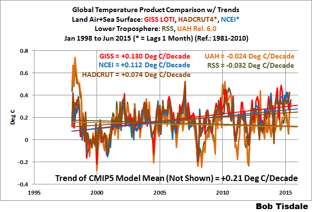
And as a reminder, during the slowdown periods of 1998-2014 and 2001-2014, the warming rate of the GISS land-ocean product with the new pause-buster sea surface temperature data still falls short of the rates predicted by the IPCC’s climate models. See the graphs here and here from the June update.
With a couple more data tweaks from NOAA and GISS, the model-data difference will be gone. It’s all a matter of time.
I’m going to again repeat a statement I made in yesterday’s monthly global temperature update, but instead of linking the graph, I’ll present it as Figure 7:
Even though the changes to the ERSST data since 1998 cannot be justified by the night marine air temperature dataset that was used as a reference for bias adjustments (See comparison graph in Figure 7), GISS also switched to the new “pause-buster” NCEI ERSST.v4 sea surface temperature data with their June 2015 update to their Land-Ocean Temperature Index product. (Also see the post here.)

Figure 7
If you’re a conspiratorialist, the many bogus data adjustments and the preponderance of obviously flawed analysis would seem to be the case of attempting to modify science to conform to a narrative. As absurd as it sounds, many of the scientists doing climate research believe so strongly that CAGW must be occurring that the bias is really a case of unreasonable expectations. When someone suggests a possible theory or rationalization for adjusting data and the result gets closer to what they expect, it’s accepted, otherwise, it’s buried in a pile of obfuscation to make it seem less plausible. At least I have the comfort of knowing with absolute certainty that I’m on the right side of the science.
Thanks for the busted pause info, Bob
Changing the reported temperature anomalies hasn’t hidden the proof that CO2 has no effect on climate. Only existing data [Phanerozoic (last 542 million years) and current ice age] and a grasp of the fundamental relation between math and the physical world are needed or used.
Proof that CO2 has no effect on climate is expressed in steps as follows:
1) Atmospheric CO2 has been identified as a possible climate change forcing. Forcings, according to the ‘consensus’ and the IPCC, have units of J s-1 m-2.
2) A forcing (or some function thereof) acting for a time period accumulates energy.
3) If the forcing varies (or not), the energy is determined by the time-integral of the forcing (or function thereof)
4) Energy, in units J m-2, divided by the effective thermal capacitance (J K-1 m-2) equals average global temperature (AGT) change (K).
5) Thus (in consistent units) the time-integral of the atmospheric CO2 level (or some function thereof) times a scale factor must closely equal the average global temperature change.
6) When this is applied to multiple corroborated estimates of paleo CO2 and average global temperature (such as extant examples from past glaciations/interglacials ice cores, and proxy data for the entire Phanerozoic eon), the only thing that consistently works is if the effect of CO2 is negligible and something else is causing the temperature change.
Identification of the two factors that do cause reported climate change (sunspot number is the only independent variable) is at http://agwunveiled.blogspot.com (now with 5-year running-average smoothing of measured average global temperature (AGT), the near-perfect explanation of AGT, R^2 = 0.97+ since before 1900).
The ongoing average global temperature trend is down. Monthly reported temperatures are being temporarily propped up by el Nino.
“It’s amazing how politics influences science.” Climate science long ago became political science, no surprise there.
When we focus in on the shorter term factors the correlation is even more evident between AMO and SSTs. SSTs are diverging from CO2.
http://woodfortrees.org/graph/hadsst3gl/mean:90/from:1960/plot/esrl-amo/from:1960/normalise/mean:90/offset:-0.025/plot/esrl-co2/normalise/offset:0.45/mean:90
I’m looking at the broader picture and very much concerned about the following: in the next 10-20 years, the world will very likely know with high certainty if global warming is on a continuing upslope or not. I’m not talking about the current catch phrase “climate change”—any person with an IQ above room temperature knows that significant climate change has been occurring over hundreds of millions of years and long before man walked the Earth—but global warming, and in particularly AGW.
If it turns out the “establishment” scientists and their associated best climate models that support the global warming mantra (currently viewed to be the majority of climate scientists) are shown to be wrong, then I fear SCIENCE is general will suffer the greatest setback in credibility, since the Dark Ages, with respect to the general population of the world. People could justifiably feel that that “science” misled them—especially with “cooked” data—and the repercussions would likely extend far beyond just climate science.
I haven’t seen this issue discussed and wonder if there is anything truly objective scientists can do to thwart this very real possibility, beyond avenues such as the website?
The damage to science has already been done. It’s incredible how many ostensibly intelligent scientists accept the broken science of the IPCC’s self serving consensus. My bigger concern is not if but when climate science is repaired, disenfranchised greenies will get more desperate and resort to eco-terrorism against the fossil fuel industry and anything not considered green enough.
http://1.bp.blogspot.com/-6Qm2Zx0Dz50/VW23v3qzBWI/AAAAAAAAAYM/V-G_QDSVh68/s1600/AGT%2Bresults%2Bsigmas%2B3%2B21%2B15%2Bsaw.jpg
If we take into account that after the El Niño will be La Nina, and this during solar minimum, and AMO falls, it is clear that the temperature of the oceans will fall significantly.
All of the CAGW data is showing warming only after being “adjusted” in this way.
There is no case without adjustments, if it is land temperature data, if it is sea level data – how satellite altimetry was re-adjusted 2003, look at ENVISAT history data, Jason 2 etc. ARGO data was improved to show warming instead of cooling, comes the sea surface temperature data and the pause is disappearing, exactly as the ice age scare disappeared from temperature history.
Another adjustment? No surprise here, was expected.
“BUT, CURIOUSLY, THE NEW DATA ARE “WARMER””
Of course. This cannot be a mistake.
The new data has to fit with the CO2 linear increase. We are almost there. Looking at all historical variations one can see step by step improvements:
https://stevengoddard.wordpress.com/2014/08/12/what-part-of-this-isnt-clear-3/
This is no science and should not be financed under science.
Климат зависит от альбедо,альбедо зависит от формы Земли.Однобокий рост внутреннего ядра Земли http://go.nature.com/w6iks3 деформируя кору изменяет форму Земли изнутри.