Guest essay by David Burton
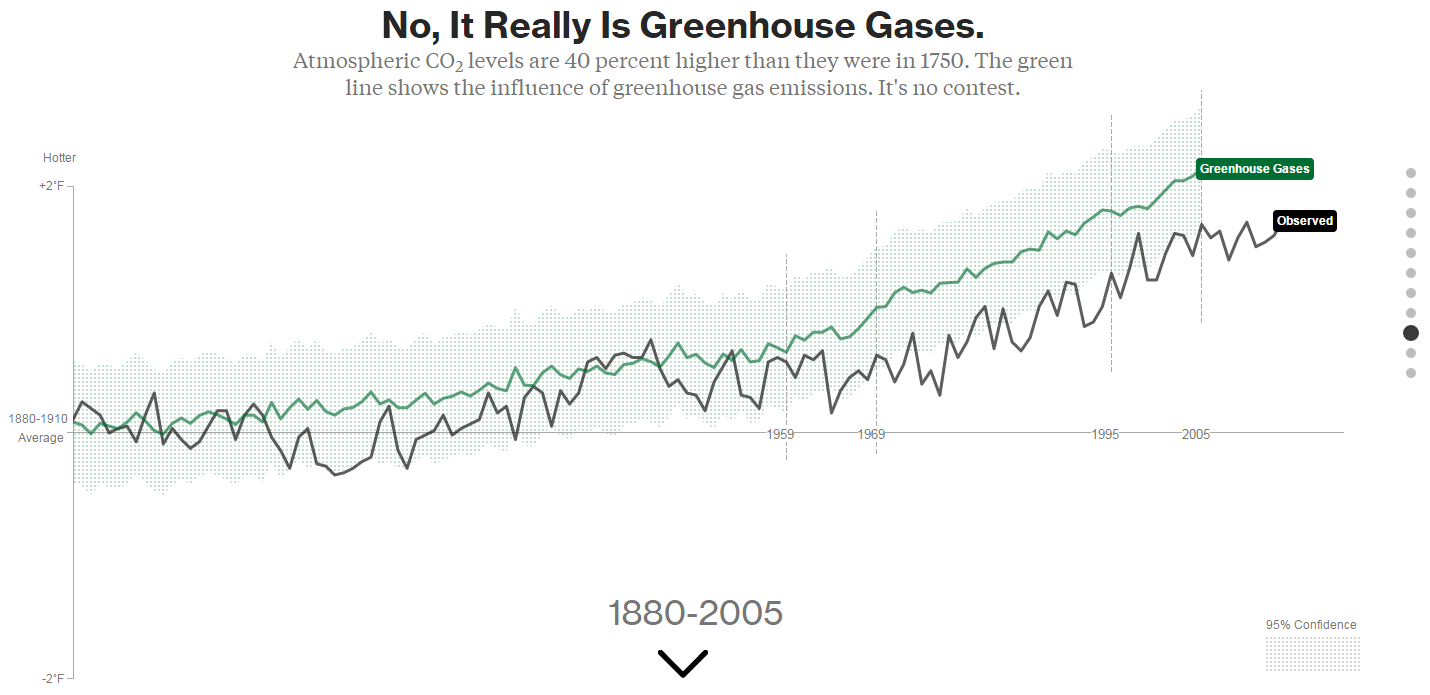
Bloomberg’s Eric Roston and Blacki Migliozzi are just regurgitating made-up, model-generated nonsense, in place of real data. You want proof? Look at their graph of “greenhouse gases.”
I saved a copy on my web site, here (with four X-axis markers spliced together from four screenshots). Here’s a shrunken version:
![bloomberg_GHGs[1]](https://wattsupwiththat.files.wordpress.com/2015/06/bloomberg_ghgs1.png?quality=75)
Click image for the full-size version:
Here’s a close-up of the key part of the full-size version of their graph, showing the period for which we have Mauna Loa CO2 measurement data (March 1958 to present):
![bloomberg_GHGs_cropped[1]](https://wattsupwiththat.files.wordpress.com/2015/06/bloomberg_ghgs_cropped1.png?quality=75)
Compare that to a graph of actual measured CO2 levels since 1958:
![co2_data_mlo[1]](https://wattsupwiththat.files.wordpress.com/2015/06/co2_data_mlo1.png?quality=75)
Reality doesn’t look very much like the Bloomberg graph, does it?
For one thing, Roston & Migliozzi ended their graph with 2005, because GISS gave them old data. That’s convenient, considering the widening divergence between models and reality:
![spencer-73-cmip5-model-fail[1]](https://wattsupwiththat.files.wordpress.com/2015/06/spencer-73-cmip5-model-fail1.png?quality=75)
For another, if you read the “methodology” section of the Bloomberg piece, you’ll discover why Roston & Migliozzi showed no separate scale for their GHG levels. It’s because, despite the “greenhouse gases” label on their graph, they did not actually graph greenhouse gas levels.
That’s right. even though the graph’s caption says, “It Really Is Greenhouse Gases,” they really did not graph greenhouse gases.
Instead, they graphed what GISS’s favorite computer model apparently calculated that temperatures ought to have been, in an alternate reality in which GHG levels increased as they really did, but all other possible causes for climate change remained constant. (That’s the sort of thing they call an “experiment” these days, at NASA GISS. The scientists who made NASA great must be spinning in their graves.)
In other words, their graph just illustrates the assumptions in their own model.
Even so, it’s still obviously very wrong, and here’s why:
First: look at all those zig-zags, up and down, in their graph of GHG levels. Out of the 47 years they graphed since 1958, they show downward-zags in GHG levels for about a dozen of those years.
But there are no downward-zags in the real GHG data. CO2 levels have been monotonically rising at least since 1958 (and almost certainly well before that), and we have excellent, precise measurements since March, 1958.
Likewise, as far as is known, the (distant) second-most-important GHG, CH4 (methane), has not seen any decreases in levels over that time period (though good measurements don’t go back as far as for CO2). CH4 levels plateaued for a while, but they have never dropped, since measurements began.
Supposedly they actually graphed the temperatures which GISS’s ModelE2 model calculated would be caused by GHG forcings alone. But those model-calculated temperatures obviously could not driven solely by GHG levels, because, if they were, they could not decline as GHG levels were continuously increasing. So, at the very least, GISS clearly had other factors in their model driving temperatures, which were conflated with GHGs, which did not remain constant, and which also affected the reported calculated temperatures. If nothing else, they’re were at least driven by pseudo-random number generators (“fake noise”).
In fact, if you examine the source code, that model has lots of pseudo-random number generator calls! ModelE2 consists of about a half-million lines of moldy Fortran code, which it is safe to assume nobody actually understands. They’ve got so many fudge factors, “knobs” and pseudo-random number generator calls in there that they can make it do just about anything at all, but It doesn’t in any sense represent an understanding of the Earth’s climate system.
That means their so-called “experiments” with varying climate inputs are just about useless. Their “experiments” don’t really test anything except their ability to write Fortran code which models their own assumptions.
“With four parameters I can fit an elephant, and with five I can make him wiggle his trunk.”
– attributed to John von Neumann
Second, look at the slope of that green line. Roston & Migliozzi show an essentially constant upward slope in “greenhouse gases” (GHG-derived modelE2-predicted temperatures) for the entire Mauna Loa CO2 record period. But that’s just plain wrong. There was actually a large, sustained acceleration in the rate of CO2 level rise in the 1960s through 1980s.
It would be instructive to compare the first ten years of that record (1959-1969) with the last ten, but since GISS / Roston & Migliozzi ended their graph with 2005 we’ll have to compare to the last ten which they graphed, instead: 1995-2005.
From 1959 (the first full year of Mauna Loa data) to 1969, the annually averaged CO2 level at Mauna Loa increased from 315.98 to 324.63, an average increase of only 0.865 ppmv per year. But from 1995 to 2005 (the last ten years of Bloomberg’s graph), CO2 went from 360.88 to 379.67, an average increase of 1.879 ppmv per year, or more than twice the 1959-1969 rate of rise.
The rate of CO2 rise more than doubled, which is a hefty acceleration, but that acceleration is missing from Bloomberg’s graph.
In fact, they actually show a slightly larger increase for the 1959-1969 period than for the 1995-2005 period. I used WebPlotDigitizer to digitize points from the green (“greenhouse gases”) line of Bloomberg’s graph, for 1959, 1969, 1995 & 2005. The increase from 1959 to 1969 is actually 12% greater than the increase from 1995 to 2005. (I digitized those points before I realized that they hadn’t actually graphed greenhouse gas levels. So, assuming that 1959 represented 315.98 ppmv CO2 and 2005 represented 379.67 ppmv CO2, from the measured graph points I calculated 1969’s CO2 level as 331.70 (compared to the actual level of 324.63), and 1995’s level as 365.54 (compared to the actual level of 360.88). In other words, if that had actually been a graph of greenhouse gas levels, then it would show a 1959-1969 ten year increase of 15.72 ppmv CO2 [compared to the actual increase of only 8.65 ppmv], verses a 1995-2005 ten year increase of only 14.14 ppmv CO2 [compared to the actual 18.79 ppmv]. That made me think of Jeff Foxworthy: If you think GHG levels increased by less from 1995 to 2005 than they did from 1959 to 1969, you might be a Bloomberg subscriber.)
They didn’t really graph GHG levels, they graphed the supposed effect on temperature of GHG levels, but even that wasn’t realistic. The warming effect of CO2 diminishes logarithmically as levels go up, so it is true that an increase in CO2 levels starting from 316 ppmv causes less warming that an increase by the same amount starting from 361 ppmv. But the warming effect is not reduced by nearly as much as the Bloomberg graph indicates.
You can calculate it (very closely) like this: (18.79 / 365.5) / (8.65 / 316) = 1.88 In other words, the 18.79 ppmv ten-year increase in CO2 from 365.5 starting in 1995 should have caused 188% of the warming which was caused by the 8.65 ppmv ten-year increase from 316 ppmv starting in 1959. But the GISS / Bloomberg ModelE2 graph shows only 90% (rather than 188%) of the warming effect from CO2 for the 1995-2005 period, compared to the 1959-1969 period.
There’s obviously something very wrong with their model. (My guess is that they’ve been “tweaking the knobs” to try to minimize the model’s divergence from reality without dialing back climate sensitivity or the importance of CO2, either of which would amount to admitting they were wrong, and anthropogenic CO2 isn’t a catastrophe.)
Third, and most obvious: look at Bloomberg’s supposed “95% confidence interval” for “greenhouse gases.” Do you see it? They have just as much “confidence” for 1880 as they do for 2015!
What nonsense! The truth is that we know almost exactly what all the GHG levels are for recent decades, and we have only very rough estimates for the 1800s and the first half of the 20th century. It is ridiculous to ignore the confidence interval of the supposed driver, when calculating the confidence interval of the supposed effect. But that’s exactly what they obviously did.
Joe Bastardi has a good Summary this weekend (http://www.weatherbell.com/saturday-summary-june-27-2015) . Towards the end he gets into the current “experiment”, which is what will happen to global temps after the current El Nino ends and both the PDO and AMO go negative. His bet is while there will be a spike in temp from the El Nino, the negative PDO and AMO will cause a cooling back to the level off the ’70’s. In other words, any step up will be temporary and the major trend will be cooling.
Of course all this will play out by 2020, so sit back, have a beer and enjoy the show….
At least JB is willing to admit he could be wrong, but he is also willing to wait and see how it all turns out.
Kinda like Iris Dement:
Not to be nitpicking or anything but Bloomberg’s graph DOES actually state that “the green line shows the INFLUENCE of greenhouse gas emissions.”
Really? Well then. Glad someone finally nailed that down. We can now stop spending billions of research dollars trying to solve that issue.
/sarc off
Yirgach,
I’ve always loved that Iris DeMent song.
“Some say they’re comin’ back in the garden, lot’s of carrots and little sweet peas..
I choose to let the mystery be.”
I will defend these journalists. They did a GREAT job. Not that I disagree with the comments made by David Burton. Indeed I am glad he mentioned this article because it is a GREAT example on how to convey information to the public and particularly the politicians. This is a masterpiece.
1. Where did they get the information: Gavin Schmidt.
2. How did they present the information: Great graphic presentation
3. Is the information relevant: NO
4. Why is the information not relevant:
a) too much information before reliable data on CO2, pre 1958, irrelevant to the current issue of industrial emission of CO2 although I would prefer to have data from about 1940.
b) lacking information on temperature anomalies after 2004, although such are available (see graph above from climate4you.com). These values were not given to them by Gavin Schmidt. Not their fault.
So don’t blame the journalists. They did a great job presenting the data given to them. Adding CO2 info pre 1958 smoothed everything. Then, removing the temperature anomalies data from 2004 to 2015 prevented them to see that while CO2 kept increasing, not so for temperature anomalies.
This is the issue at hand: we must stop using fossil fuels because CO2 is the driver.
We have the data as shown in the plot above (and many other at this site all well prepared). When was this presented to the politicians? I listened to the testimony of J. Curry before Congress and did read her prepared report. There is only one thing that counts for the public and the politicians. The relationship between CO2 and temperature during recent time. Where was THE graph to explain what is currently going on between CO2 and temperature?
“This is the issue at hand: we must stop using fossil fuels because CO2 is the driver …”.
That is a non sequitur, it doesn’t follow anything stated in the previous paragraphs besides it’s impossible and won’t happen.
Mr rd50, do you realise that the ‘dangerous global warming’ (aka Climate Change™) hypothesis as promoted by the IPCC and puffed by the media is contingent on strong positive water vapour feedback for which there is absolutely no evidence?
Look again at the graph you presented above. It did happen. You can’t deny that for a while, there was a positive correlation between CO2 and temperature increase. A picture is worth a thousand words. Now give the same data to these journalists and see what happens. There is only one thing available to convince the public and politicians. Show them the graph. Telling them that something is impossible and will not happen and that positive water vapour….and that the effect of CO2 decreases logarithmically….etc. etc. will not work.
correlation != casuation
“A picture is worth a thousand words. Now give the same data to these journalists and see what happens. There is only one thing available to convince the public and politicians. Show them the graph …”.
Well obviously Mr/Ms rd50 doesn’t, or doesn’t want to, understand my comment.
However that politicians journalists and the public can be easily fooled by deceptive chartmanship is hardy worthy of admiration, except perhaps by an admirer of the good Dr Goebbels.
To CodeTech
No, correlation does not equal causation. It never did.
What it does it make you think about a possibility, no more and no less.
for a while, there was a positive correlation between CO2 and temperature increase.
And for a while there wasn’t.
rd50
I must disagree. This is a great article if written by an activist. If the authors claim to journalists then it is a huge fail. If Bloomberg published this with the intent to influence the investments made by its readers then it is a borderline actionable act.
Why is it a fail? You gave many of the reasons why. Just a tiny bit of due diligence on the part of the authors would have uncovered the glaring holes in the “data” which was ladled to them by their source. And factual follow-up is one thing that a “journalist” should do.
On bloomberg.com I see a mission statement of sorts:
“Connecting decision makers to a dynamic network of information, people and ideas, Bloomberg quickly and accurately delivers business and financial information, news and insight around the world.”
One should note that they claim to deliver “accurate” information, but I hope their readers will be sophisticated enough to understand that an “accurate” recitation of information provided by a source is not the same as a complete and even-handed overview of the subject matter. The authors here are simply bending over forwards and backwards to further a meme. This is what activists do, not journalists.
Are they also trying to stimulate demand for certain industries in order to make money for themselves and their friends? The reader will have to judge that for himself.
As far as I know, these journalists are not activists. So I don’t want to accuse them of anything.
They received the information from, as far as they know, is a “reliable” source as I noted.
These journalists, as far as I know, may or may not have actually produced the graphs they presented.
If these graphs were prepared for them from the source they quoted, why should they be blamed instead of blaming the source? They reported.
We should blame the journalists. They only show a PART of the story, and they do this out of bias.
How many media reports ever mention that up to 7/8th of our CO2 emissions will end up in the ocean?
See the points made below in an article with quotes from Keeling himself. They are never stated, but are out there as basic realities of Co2 and climate that no journalist will mention as it will tend to undermine an alarmist narrative.
“A major factor governing the rate of uptake of CO2 by the oceans is pace at which global CO2 emissions are increasing over time. Over the past decades, fossil emissions (measured as tons of carbon) have grown at 2 to 4 percent annually, from around 2 billion tons in 1950 to 9 billion tons today. The oceans as a whole have a large capacity for absorbing CO2, but ocean mixing is too slow to have spread this additional CO2 deep into the ocean.
As a result, ocean waters deeper than 500 meters (about 1,600 feet) have a large but still unrealized absorption capacity, said Scripps geochemist Ralph Keeling. The rapid emissions growth is unlikely to continue much longer as the reserves of conventional oil, coal, and gas become depleted and steps are taken to reduce emissions and limit climate impacts. As emissions slow in the future, the oceans will continue to absorb excess CO2 emitted in the past that is still in the air, and this excess will spread into ever-deeper layers of the ocean. The ocean uptake, when expressed as a percent of emissions, will therefore inevitably increase and eventually, 50 to 80 percent of CO2 cumulative emissions will likely reside in the oceans, Keeling said.”
https://scripps.ucsd.edu/programs/keelingcurve/2013/07/03/how-much-co2-can-the-oceans-take-up/
rd50: “I will defend these journalists. They did a GREAT job.”
rd50, I agree with sciguy54 above: June 28, 2015 at 9:41 am
“This is a great article if written by an activist.”
It may be that the “journalists” are not activists as you say (?), but also not journalists. Why? This is a pure propaganda piece, trying to hide under the carpet inconvenient facts.
A parallel diagram with human greenhouse emissions would have shown a different picture. Continuing to 2015 too. human emissions mattered after 1950, before not really.
You say: “If these graphs were prepared for them from the source they quoted, why should they be blamed instead of blaming the source? They reported.”
Sorry, no.
This is the difference between journalism and “journalism”. A honest journalist has to ask inconvenient questions, verifies the story, and tries to understand if what he reports makes sense.
“The warming effect of CO2 diminishes logarithmically as levels go up”. And this statement in and of itself totally falsifies Catastrophic Anthropenic Global Warming.
wickedwenchfan: ““The warming effect of CO2 diminishes logarithmically as levels go up”. And this statement in and of itself totally falsifies Catastrophic Anthropenic Global Warming”
You would think so, wouldn’t you?
According to CAGW theory. the relatively small – and diminishing – warming caused by the increase in atmospheric CO2 will cause an increase in atmospheric water vapour and a dangerous feedback will resupt.
Unfortunately for the Alarmists, the analyses of the NASA NVAP atmospheric water vapour measurements do not bear this out. Humlum and Vonder Haar show no discernible trend, Solomon et al in fact show a decrease of ~10% in the decade starting 2000.
Vonder Haar
http://onlinelibrary.wiley.com/doi/10.1029/2012GL052094/full
Humlum
http://www.climate4you.com/GreenhouseGasses.htm
Solomon et al.
Abstract
Stratospheric water vapor concentrations decreased by about 10% after the year 2000. Here we show that this acted to slow the rate of increase in global surface temperature over 2000–2009 by about 25% compared to that which would have occurred due only to carbon dioxide and other greenhouse gases. More limited data suggest that stratospheric water vapor probably increased between 1980 and 2000, which would have enhanced the decadal rate of surface warming during the 1990s by about 30% as compared to estimates neglecting this change. These findings show that stratospheric water vapor is an important driver of decadal global surface climate change.
https://www.sciencemag.org/content/327/5970/1219.abstract
So you are indeed correct.
Let’s just sum the Bloomberg widget up in 4 words:
Garbage in, garbage out.
QED
I prefer the modern equivalent, first spotted on this site years ago:
Oooga in, Chucka out.
Actually for the global warming crowd it’s:
Garbage in, desired results out
It is interesting one data point always gets left out. http://paperspast.natlib.govt.nz/cgi-bin/paperspast?a=d&cl=search&d=NOT19100416.2.32.24&srpos=1&e=——-100–1—-0arrhenius+carbon
When you are on the Left and mostly beholden to political dogma and narratives, lying comes as naturaly as breathing.
So why dont you send this to Bloomberg and tell them to print it?
They should be sued for giving people wrong information and if they deny printing this means that they wants to misslead people.
So much for a free press !
Bishop Hill picks up more interesting points.
http://bishophill.squarespace.com/blog/2015/6/26/the-giss-graph-mystery.html
TCR of only 1.4, with aerosol forcing in-line with AR5, which is probably on the high side. So we’ve a low TCR, with a too-high aerosol componant, which would still make the model too sensitive to GHG.
They keep shooting themselves in the foot.
I agree with the comments at Bishop Hill. Yes pretty graphs and clever presentation until they add the 2004 to 2015 temperature data.
This was sent to me a few days ago by a wide-eyed mouth-breather who opined “Well I guess this about wraps it up for you skeptics!”
At first I was amused that Bloomberg, a financial rag, would go to such trouble to present (pseudo) science. Sort of like finding a stock market financial analysis in Car & Driver Then I looked a little deeper – Bloomberg is promoting the trillions of dollars that they claim are going to be invested in renewable energy stocks! What a surprise. They are serving their advertisers.
The chart and associated commentary in Bloomberg are nothing more than a classic example of financial institutions jumping on the bandwagon (creating the bandwagon) for the next big stock bubble by convincing uncritical and uneducated readers to invest their hard earned money in renewable get rich quick schemes.
So while the criticism of the science is certainly valid, it misses the point – this chart in nothing more than a carnival barker, telling whatever lies are necessary to get the rubes into the tent.
And you know that the Gore-troll is hiding somewhere under THAT bridge…ready to collect even more tolls from people being forced to cross the Green Bridge by various governments around the world.
SHOCKING !!!
Liberals caught lying about CO2 and global warming.
Shocking I tell you.
Does anyone know the source for the graph “the widening divergence between models and reality” Thanks!
I believe it originated at UAH – Roy Spencer and John Christy
“CO2 levels have been monotonically rising at least since 1958 (and almost certainly well before that), and we have excellent, precise measurements since March, 1958.”
Yah, well, no, fine… Let’s get a couple of facts wedged in here. The chemical method of the time for determining CO2 concentration was much more accurate than the NDIR machine used in the late 50’s. NDIR wasn’t so much ‘accurate’ as continuous which had not been done before.
To disregard earlier measurements is not reasonable particularly when they were more accurate and more precise.
Consider: how was the NDIR machine calibrated? Using calibration gas. How was that calibration gas certified? By chemical methods. Sure as heck not by NDIR methods because they have to be recalibrated frequently. At the Earth Monitoring Stations this is done every few hours using bottled gas and automated solenoids.
The fact that researchers don’t LIKE the chemically determined numbers from earlier in the twentieth century doesn’t make them inaccurate, just ‘off message’.
If the warming from 1920 to 1940 was primarily driven by sea temperatures there is every reason to expect the CO2 also rose (with a delay) to the values reported at the time, which is to say, above 400 ppm.
The chemical methods were perfectly fine. This is not the issue. The problem is the locations of the samples taken and competence of the analysts.
Crispin,
The alleged increase of 80 ppmv in only seven years and drop back again in only seven years is the equivalent of burning 1/3rd of all land vegetation and its regrowth, for which is not the slightest indication, as that would be visible in the 13C/12C ratio too. The same for the oceans: some sudden acidification of the oceans (undersea volcanoes?) could cause the release, but not such a fast drop in CO2 levels…
The main problem of the old measurements is where was measured: middle of towns, forests,… completely unsuitable for “background” CO2 levels then and now.
One of the main series which caused the 1942 “peak” in the historical compilation of the late Ernst Beck was in Giessen, mid-west Germany. Not far from the same place as the old station, a modern station takes CO2 samples every half hour. Here a few days in mid-summer under inversion, compared to “background” stations: Barrow, Mauna Loa and the South Pole, all raw data:
http://www.ferdinand-engelbeen.be/klimaat/klim_img/giessen_background.jpg
The historical data were taken three times a day, of which two were at the flanks of the daily curve…
Crispin,
There is no way the old methods could be used to calibrate the NDIR method: the accuracy was at best 3%, that is +/- 10 ppmv at 320 ppmv.
The first that Keeling Sr. did was making a very accurate device himself (he was a glass blower too) to measure CO2 levels with a repeatability of the measurements better than 1:40,000. That device was used to calibrate all calibration gases and equipment at Scripps, until a few years ago when it at last was sent to a museum. NDIR at Mauna Loa (and other stations) is calibrated every hour with three calibration gases and every 25 hours with an out of range mixture to control the calibration gases:
http://www.esrl.noaa.gov/gmd/ccgg/about/co2_measurements.html
That makes that CO2 measurements with the NDIR method are accurate to better than 0.2 ppmv. Some stations use GC for CO2 measurements and some samples are measured by mass spectrometer, mainly for the 13C/12C ratio.
The biography of Keeling is here:
http://scrippsco2.ucsd.edu/charles_david_keeling_biography in short, but the fascinating autobiography of Keeling about the first steps to measure CO2 more accurately and his struggle with the different administrations to maintain the CO2 measurements is gone…
“ModelE2 consists of about a half-million lines of moldy Fortran code, which it is safe to assume nobody actually understands”
When you want to manufacture millions of something whose value depends on it being RIGHT, you would assume a tendency toward very thorough checking, rechecking and testing of code and design. Surely Intel’s engineers did that yet even so they put millions of flawed Pentium processors out into the field forcing a huge recall.
Imagine the chain of logic and numerical testing from FORTRAN compiler ( vintage unknown), to assembled FORTRAN statistical libraries, to model designers and builders to grad student coders to the present day ‘versions’.
I think raking through ALL the code of any ensemble model and verifying the numerical engines alone would yield a list of ‘oops’s worth considering. Perhaps this would be a good next project for Richard Muller and his funders to organize?
Mislabelled graph? Confusing models for actual measurements? Par for the alarmist course.
if it was an honest headline it would be: “It really is Climate Models”.
This act of journalistic malpractice all is in service to a non-sequitor narrative. Ok so greenhouse gases rose, and temperature since 1880 rose. This is not news. The mere fact of correlation is not causation and in fact what is really happening is GISS built their model wit the right aerosol fudge factors to make he match ‘work’. Hindcastwise- match. Forward projections? IPCC models have been an #epicfail.
Here you have a TCR of 1.5C being used in a model to show how grandly a TCR of 1.5C lines up with hidcast models. Yippie for 1.5C TCR estimates … ah, but isnt that at the low end of what IPCC models use? Oh my, yes it is. If you want to make models match reality, you have to lower the climate sensitivity. A score for Team Lukewarmer, not that the alarmists would ever admit to it…
The really nice part of the article,…..NO comments section. Don’t want anyone calling out the errors. Helps to present only one side, just listen to any good defense lawyer without hearing the prosecution side.
Yep. But if they’d have had a comments section, I’d probably have just posted my complaints there, where hardly anyone would see them, instead of sending them to Anthony.
Can anybody explain me why having a lot of “pseudo-random number generators” in your Fortran code is a bad thing? The fact they use stochastic models (what the author calls “pseudo-random number generators”) is a good sign, because they are much better at describing complex systems such as climate, than purely deterministic models. Finance uses lots of these “pseudo-random number generators” in their code to generate a lot of money, so that’s not something stupid to do.
Can somebody explain me why “They have just as much “confidence” for 1880 as they do for 2015!” is an aggravating factor? The laws of climate are the same in 1880 as in 2015, even though measurement can be different – but here we are not talking “error bars”, we are talking how sensitive the models is to all its input parameters, that what this “confidence” thing is about. So it shouldn’t vary that much over time….
jayce asked, “Can anybody explain me why having a lot of “pseudo-random number generators” in your Fortran code is a bad thing?”
The reason it’s a problem is that they claimed their graph shows just the effect of GHGs. But that cannot possibly be true. Their graph is inconsistent with that claim. You can see immediately from the graph that factors other than GHGs must have greatly affected the graph which they generated.
Pseudo-random number generators model “noise” — i.e., forcings which cause apparently random output changes, but can’t be modeled. That’s fine for modeling an entire climate system. But they claimed that their graph shows just the effect of GHGs. It doesn’t.
That graph should have been monotonically increasing, because the only forcings which supposedly affected it were monotonically increasing. It isn’t.
Also, that graph should have exhibited acceleration since 1958, because the only forcing which supposedly affected it (log(GHGs)) accelerated tremendously (nearly doubled). It doesn’t. In fact, it shows no acceleration since 1958.
jayce also asked, “Can somebody explain me why “They have just as much “confidence” for 1880 as they do for 2015!” is an aggravating factor? The laws of climate are the same in 1880 as in 2015, even though measurement can be different – but here we are not talking “error bars”, we are talking how sensitive the models is to all its input parameters, that what this “confidence” thing is about.”
Because what they depict is error bars. Specifically, it’s supposedly a 95% confidence interval.
It’s not “how sensitive the model is” to its input parameters. The slope of the graph, not the confidence interval, is what depicts how sensitive the model is to its input parameters (forcings).
The problem with the confidence interval that they showed is that their graph is supposedly a graph of the effect on temperatures of the forcing (the “input parameters,” i.e., GHG levels). But they ignored the uncertainty in that forcing when graphing the confidence interval of the output (temperature).
jayce wrote, “The laws of climate are the same in 1880 as in 2015…”
Indeed. So why do you suppose their graph shows 12% less calculated warming effect from GHGs for the period 1995-2005 than for 1959-1969, even though log(CO2-level) increased by nearly twice the rate over the period 1995-2005, compared to 1959-1969?
Thanks for your constructive answer – I would like to pinpoint some apparent errors in what you said though:
“Pseudo-random number generators model “noise” — i.e., forcings which cause apparently random output changes, but can’t be modeled”
One other use of noise is to model microscopic systems, for instance climate parameters of a small region; In that case, the macroscopic system output (the global climate), if made of a huge numbers of these random microscopic systems, will not vary between two runs, even though the microscopic details will. So noise in this kind of scientific application is usually not used make some “random output changes”, but actually makes the macroscopic, complex system, more robust and realistic.
I still don’t understand why this article claims that using these pseudo-random numbers is such a big problem then.
“That graph should have been monotonically increasing, because the only forcings which supposedly affected it were monotonically increasing. It isn’t.”
Not necessarily, you assume a linear-response system, but climate isn’t, so a monotoneous increase of one input doesn’t mean monotoneous increase of the output.
Regarding the confidence interval stuff, I don’t see how what you have answered my question: “Can somebody explain me why “They have just as much “confidence” for 1880 as they do for 2015!” is an aggravating factor”
“Reality doesn’t look very much like the Bloomberg graph, does it?”
You compared a graph with Y-axis labels to a graph section without y-axis labels, neither of which starts at zero.
Two loads of poo, sisde-by-
side
Sorry if I was unclear, KevinM. I was talking about the shapes of the two graphs.
The graph of Mauna Loa CO2 shows dramatic acceleration since 1958, but the Bloomberg graph shows no acceleration at all over that period. The graph of Mauna Loa CO2 shows monotonic increase, with no year showing a decrease in CO2 levels compared to the preceding year, but the Bloomberg graph zig-zags up and down.
http://www.columbia.edu/itc/sipa/envp/louchouarn/courses/Pop-Land/Lab1_files/image013.gif
it is clear that it is human population, not fossil fuels that drives CO2. Regardless of technology, the relationship has been virtually unchanged since 1850.
As such we are highly unlikely to be able to change this relationship regardless of any laws passed regarding fossil fuels.
Careful, ferd – with cranks like the AGW crowd around, you just may inspire a Malthusian solution to the imagined problem.
Personally I feel no obligation to protect the delusional from their Menckenish hobgoblins – only to protect myself from their over-reactions to their own nightmares.
Nice graph. The correlation is striking, but be careful about the direction of causality. It actually runs both ways.
Obviously, population growth increases fossil fuel consumption and cement manufacturing, both of which emit CO2. But, the converse is also true. The causation also runs in the other direction. Elevated levels of what Scientific American once called the “Precious Air Fertilizer” increase population growth, by improving crop yields and reducing famines.
Ok, but a good point they made is that they compared the output of the Sun to the temp rise. Apparently they’re claiming that solar output hasn’t really changed. (I don’t know how to measure Solar output in the 1880’s but that’s a different matter.) Also, the Earth’s orbit and rotation rate haven’t really changed. Other natural factors haven’t changed.
A 1 degree Fahrenheit change seems like it must be caused by human factors, since natural factors haven’t changed. One thing that has changed is CO2 concentration. So there is a correlation between CO2 and the temp rise. Now correlation doesn’t necessarily imply causation, as any logic student will tell you. BUT it is a reasonable hypothesis that there could be a link, at least between human industrial activity and the temp rise. That the CO2 output alone is what is causing it is one step farther along the causal-logic-ladder, and very model-dependent. There really is no way to prove that assertion.
CO2 models aside, I think that the general statement that “human industrial activity in one way or another is the cause of climate change” is very compelling.
If you’d said “a cause” instead of “the cause” in your final sentence, I’d have agreed with that statement, Thomas.
However, their point about solar output is weaker than it looks. There’s a lot more to the sun than just total solar irradiance. WUWT has many relevant articles:
http://wattsupwiththat.com/category/solar/ (E.g,, scroll down to the two articles in January, 2015.)
http://wattsupwiththat.com/category/cosmic-rays/
A new “documentary” video about Svensmark’s theory (of the sun’s magnetic field affecting cosmic rays, which affect cloud formation, which affects climate) has been posted on YouTube. Documentary video productions are often very biased and unreliable sources of information, but they seem to make a very plausible case. I think it’s worth watching. Here’s the video:
The Bloomberg graph has temperature (F) on the y-axis, and the Mauna Loa shows CO2-concentration (ppm). No wonder they don’t look the same!
Martin, the Bloomberg graph shape is wrong. The Bloomberg graph supposedly depicts the effect on temperature of GHGs, mainly CO2. So it should be roughly proportional to log(C) with some time delay, where C is CO2 level.
But it isn’t. Not even close.
The first part of this article tries to compare the effects of greenhouse gases on temperature (from the Bloomberg report) to the atmospheric concentration of CO2. At that point I decided that this article is deliberately trying to be deceptive or is just wrong. So I didn’t waste any more time on it.
I let my subscription to Bloomberg Businessweek expire some time ago. My biggest complaint is that they always assumed that catastrophic AGW was a proven fact. This seeped into their news stories and was obnoxiously everpresent in their editorials. Never ever featured a story that showed the other side of the debate.